
Erin Fletcher : Fine Binding & Edition Binding
Colour
Excerpt from Theory of Colours by Johann Wolfgang von GoetheWith signed pigment-ink prints by Robert Farber
21st Editions, printed by Horton Tank Graphics, 2017
Edition of 18
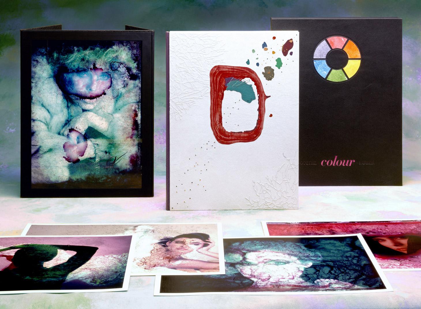
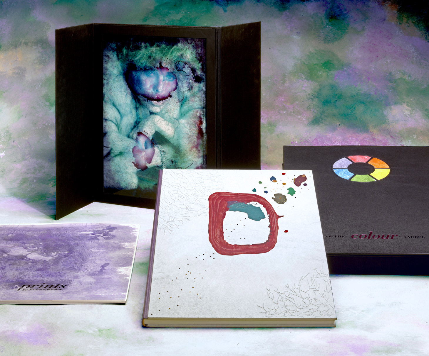
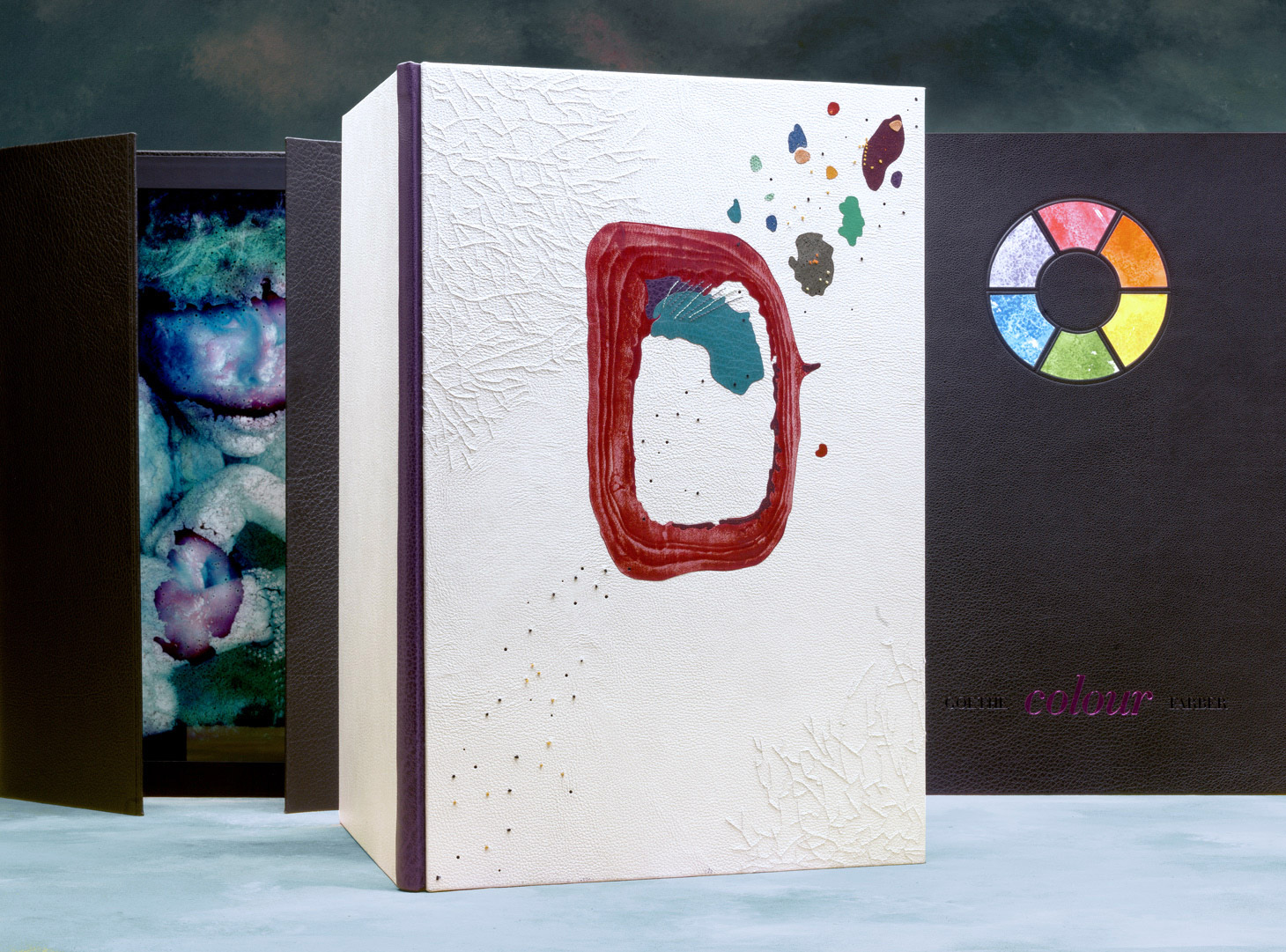
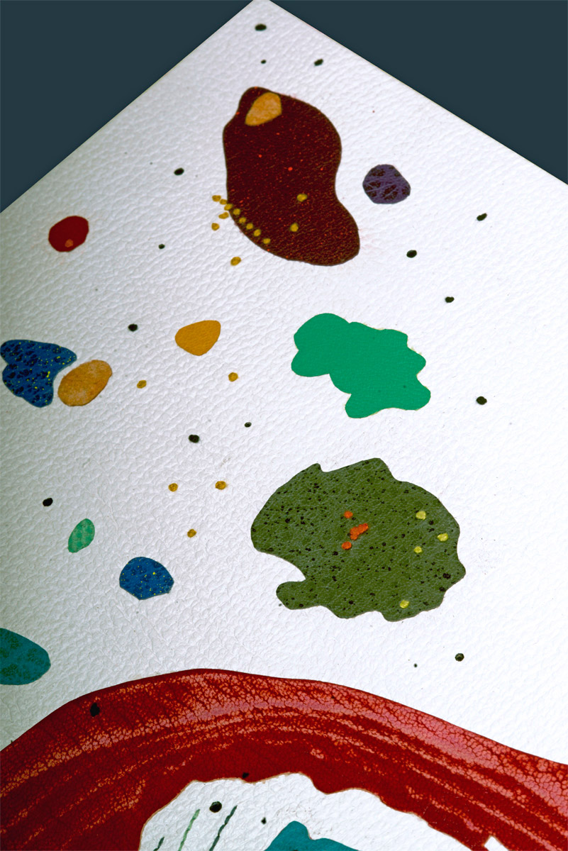
Bound as a 3-Part Bradel binding. The spine is covered in one of six colors: red, orange, green, blue and purple buffalo skin or yellow goatskin. The boards are covered in white goatskin with hand-embroidered details, various colored onlays that have been sprinkled, sanded or left plain and hand-tooled dots in black foil. Leather wrapped endbands in color complimentary to spine leather. Endpapers are handmade by the binder on Tim Barrett paper and color matches the spine leather.
Full black buffalo skin portfolio houses an aluminum dye-sublimation print. The interior is lined with black silk cloth.
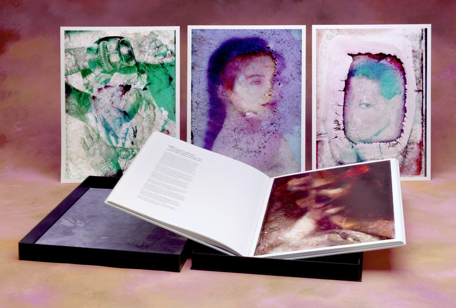
A paper wrapper houses 8 loose prints. Same decorative paper used on endpapers is the cover piece. Title stamped in black foil.
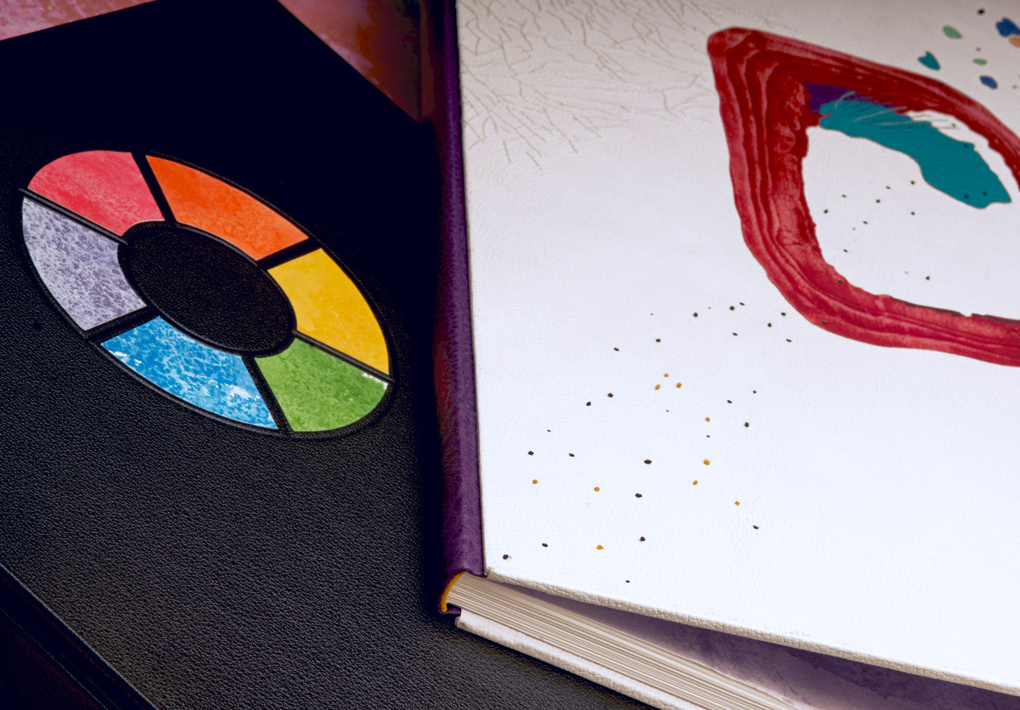
All three pieces are housed in a telescoping box with full black buffalo skin lid. Title is stamped in pink foil with author and photographer’s name stamped in black matte foil. A color-wheel is embedded in lid and assembled from decorative endpapers. Interior of lid is covered with a decorative endpaper that matches the spine of the book. Trays are covered and lined with silk cloth and adhered to a full leather base.
52.8cm x 37.3cm x 2.4cm - Completed in 2018
Exhibition History
- Celebrating 25 Years of Photography and the Book Arts with 21st Editions (2024)
National Gallery of Art, Washington, DC
University of Minnesota, Elmer L. Andersen Library, Bell Gallery, Minneapolis, MN
University of Minnesota, Elmer L. Andersen Library, Bell Gallery, Minneapolis, MN
Artist Statement
When I first gazed upon the photographs that would be included in Colour, I was instantly captivated. As I moved closer to the image, subtle blemishes as a result of the degradation began to emerge. At that point, my focus was on these web-like structures, these networks of blips and blobs. Through the design on my binding, I wanted to capture my initial reaction and draw people in to take a closer look. But I also felt that it was important to represent the words of Goethe as well. So how could I marry the work of Robert Farber with Goethe’s Theory of Colours?
Initially you are presented with a basic color wheel against a black buffalo skin. This symbol provides an instant connection to color theory and the relationship of one color to another. Opening the box you are encountered with a stark white goatskin, which was used to cover the boards of the binding. Creating this high contrast between the box and the binding was no coincidence. It was important for me to remind the viewer of how objects, colors and people relate to one another. Black and white also create a neutral backdrop that does not distract from the design. Harkening back to the color wheel, I chose to represent all six colors and their complimentary companions. This was done at the spine of the binding and by small details, such as the endbands and embroidery floss. For example, on the binding with a red spine, the endbands and floss were green.
The decoration on the binding is largely inspired by elements from the photographs. Particularly the web-like embroidery. I choose to do white embroidery on the white leather to play with the eye and draw the viewer in further. This particular leather was chosen because the embroidery is camouflaged by the grain. Further textures are added through manipulations on the leather onlays. Pieces were painted, sanded and sprinkled.
When you open the book, you are faced with a shock of color on the handmade endpapers. Each paper is unique in its appearance, but overall the design reflects the blemishes and irregularity of the photographs. The endpapers are covered in a single color matching the leather spine and manipulated through brushing and sponging the pigment onto the paper. Additionally, the papers were rotated and sprinkled with salt to create a more dynamic decoration.
Overall, I wanted a design that would capture the spirit of the photographs and how they’ve changed over time. Photography is meant to capture a moment in time and can sometimes feel stagnant, but age as given new life to these photographs. The way the film as broken down now become the focal point, but through color theory, the viewer can delve deeper into the photograph and appreciate it on a more profound level.