RSS Feed

Posts Tagged ‘virginia woolf’

  1. Bookbinder of the Month: Annette Friedrich // Post Five

    February 24, 2019 by Erin Fletcher

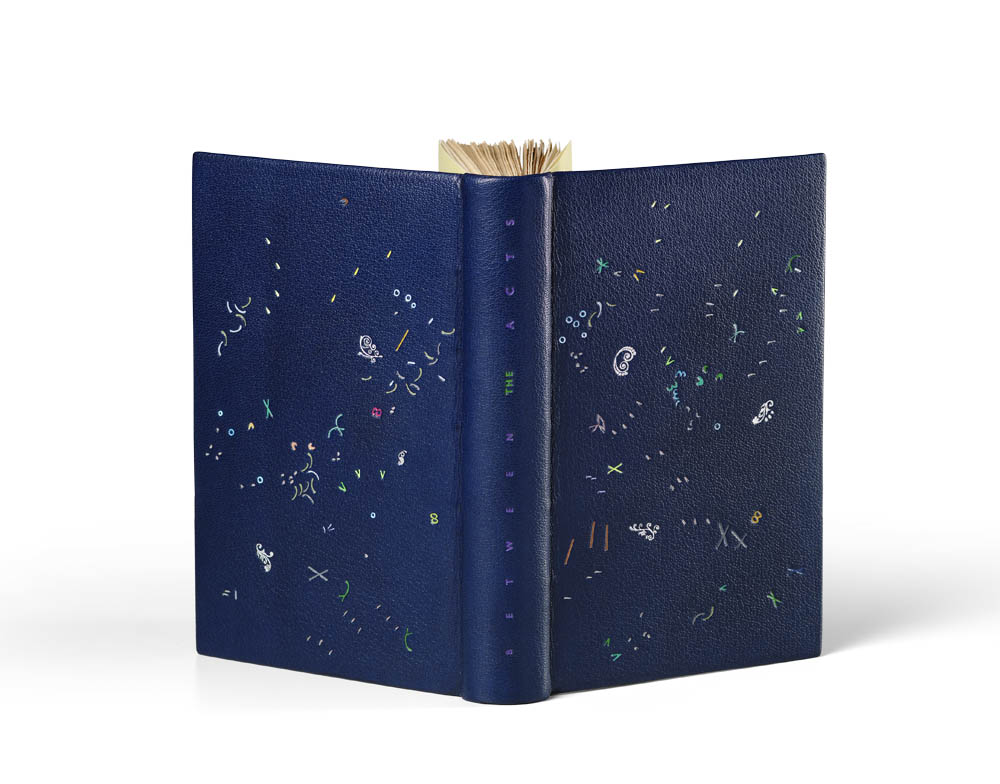
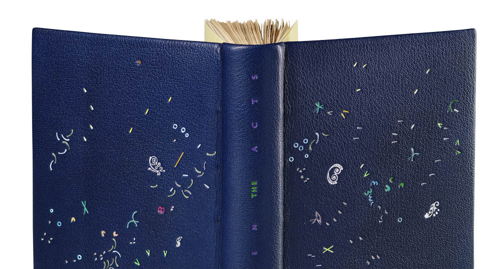
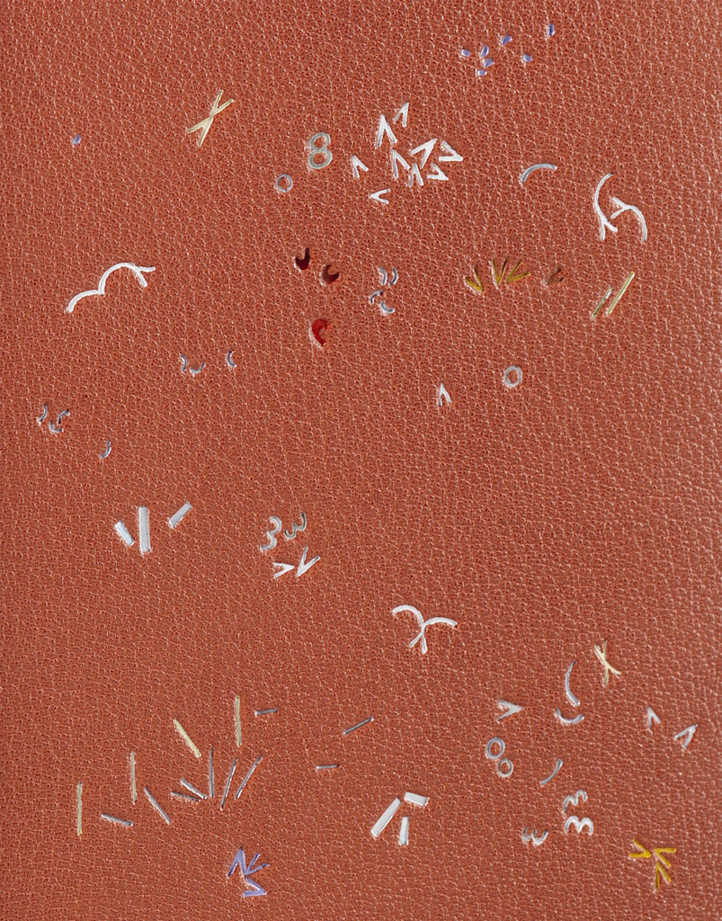
    With Annette Friedrich’s binding of Between the Acts we wind up both the series and the interview. Bound in 2018 in blue goatskin, the binding also has hand sewn endbands in green silk with champagne (with a purple tint) paper edge-to-edge doublures and yellow fly leaves.

    The design on Between the Acts is made up of an impressive number of foils and might be my favorite out of the bunch. There are three metallic foils in two shades of silver and gunmetal with an additional twenty-three pigmented foils in the following colors: white, four shades of grey, purple, three shades of blue, two shades of yellow, five shades of red, four shades of green and three shades of brown. Also making an appearance are the special guest foils: transparent pearl and transparent neon yellow.

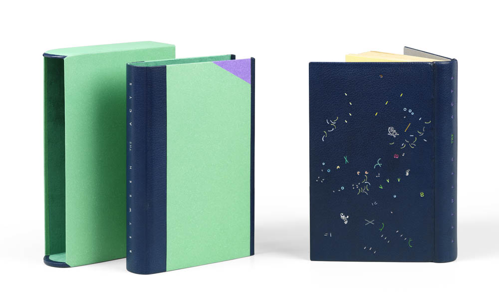
    The chemise is inlaid with green and purple hand-dyed papers with blue goatskin across the spine. The title is tooled in green and purple foil. The slipcase is covered in the same green paper and lined with an equally green Alcantara. Tooling on the binding is done by Claude Ribal.

    The final binding in the series, Between the Acts is so playful in both the design and color palette. The design is explosive and feels like a celebration; it contains more pigment colored foils than the preceding eight. Did you incorporate every tool that had been used prior?
    Thank you! Gosh, it feels as if I might just have used all of them, but I do not know for sure? Actually, no. There are no dots and only very few lines. But it does not matter, it had not been my intention anyhow.

    In the last post, we discussed the choices you made regarding the titling. In this binding and Mrs. Dalloway, you chose not to include Woolf’s name. Is there any significance to this?
    Same answer as above: artistic license. The need to come up with the best possible design for titling over-rides the rules of accuracy and correctness. So there!

    You embarked on this project in the hopes to find change and freedom outside of safety nets. You choose Virginia Woolf as your guide. I imagine you’ve developed a unique bond to Virginia; that the two of you have now walked a similar journey to discover your voices. I think the depth of what you’ve achieved is so incredible. Some binders may revisit the same title or author throughout their career; one can’t help the lure of an exceptional book. In fact, you’ve bound The Years at least three times and Mrs. Dalloway twice. Do you think you will revisit Virginia again at some point in your career?
    Thank you Erin! It is wonderful to share the results and even better to observe, via your perceptive quizzing, that the things I tried to achieve seem to communicate themselves. It was the first time that I tackled such a vast project and loved digging in as deep and all immersive as that. YES! I think it is highly likely that I will revisit her books at some point in the future. There is just so much in there and I bet that each time something else will surface at my end. But for now… I will give it a little break. Phew! New things to come!


    A beautiful documentation has now been published, that traces the development of this project, which, as it turns out, took seven years to complete. WOOLF I – IX ! 98pp, with an introductory essay and 1:1 reproductions of the bindings, background information, and text excerpts.

    Text: Annette Friedrich, Virginia Woolf
    Design: BUCHmacher, Germany
    Photo: Shannon Tofts, Scotland

    £30 + postage / reserve your copy at www.annette-friedrich.com

  2. Bookbinder of the Month: Annette Friedrich // Post Four

    February 17, 2019 by Erin Fletcher

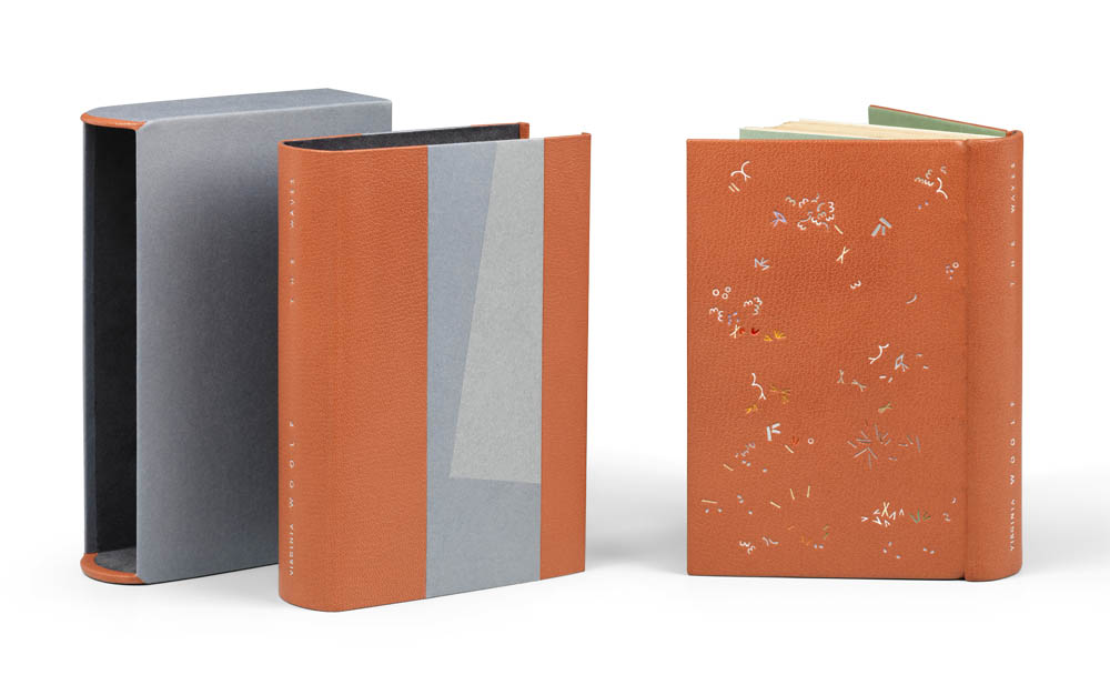
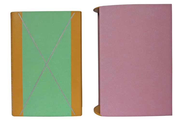
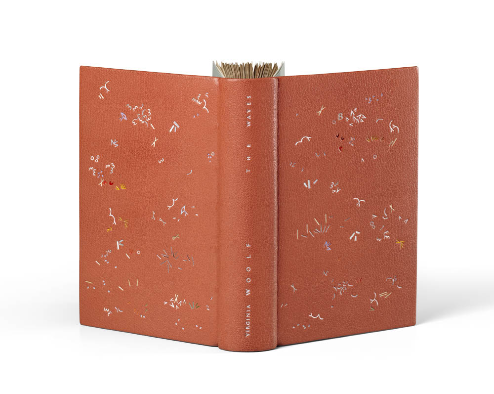
    In this post, you get two for one with a discussion on the seventh and eighth book in the series. Starting with The Waves, which Annette Friedrich bound in 2017. The binding is covered in a dusk-rose goatskin with blue silk hand sewn endbands, dark green edge-to-edge doublures and light green flyleaves.

    The number of foils is ever increasing with each design. On The Waves, Annette incorporated two metallic foils in gunmetal and matte silver with nineteen pigmented foils in the following colors: two shades of white, four shades of grey, purple, two shades of brown, two shades of yellow, five shades of red and three shades of green. Special guest foils include neon yellow, transparent pearl and iridescent silver.

    The chemise is covered in two shades of hand-dyed bluish-silver paper and dusk-rose goatskin. The title is tooled in the matte silver foil. The slipcase is covered in mauve paper with an equally mauve Alcantara. The design on the binding was executed by Claude Ribal.

    I noticed the introduction of a “V” tool on The Waves. It made me wonder, is there any significance to the shape and the novel?
    Yes, you are picking up on the fact that I am expanding my range of tools, adding to them as I find fit. I mostly do this by filing ‘blanks’ into the shapes I need. There is no real significance to the “V” shape as such, except that it is distinct and weighted. I actually cut three ever so slightly different “V” tools, all of which are on the book! Sometimes on their own, sometimes in conjunction with others, creating more complex figures.

    I also began to wonder more about your design process. At the very beginning of the design stage, how are you selecting your tools? Do you pull a combination from the cabinet and force yourself to develop a design with only those tools? Or do you allow yourself to swap out tools that don’t quite work?
    To begin with, I pull out the ones that I think I will want to work with. However, if I feel the need for others I just go and have a look if something else fits the bill, or, if I cannot find what I need, I just go and cut the shape(s) that I am missing. For example, I noticed that when I work within a cluster that a variation within size is crucial to give it ‘life’. One can observe that my toolbox has expanded steadily over the duration of the project. I have now two sizes of the ‘3’, four variants in different sizes of the “(” and three “o” etc.! Only two books earlier I would have only been working with a single shape for each… All part of the learning curve, right?

    As I mentioned in a previous post, the bindings visually appear to be part of a series, that they follow a formula. We discussed this topic with the chemise already, but I wanted to bring up another element that ties the work together: the use of hand-dyed papers. Can you speak about the reasons for using hand-dyed papers for the enclosures, doublures and fly leaves? Were these papers dyed by you and if, so what is your process?
    The reason for me to hand dye my papers is that I seem to be a complete nerd who needs to be in control of everything, down to the exact shade of color for within the bigger scheme. The process is easy, I use offset printers ink and dilute them down with turpentine. I have the four CMYK at my command, as well as screaming signal yellow and signal red, as well as silver. That’s all I need. The rest is just mixing it to the shade that you want and then use a cloth to soak up the color and apply it to the sheet of paper with circular movements from one edge to the other. The beauty of this process is that there is no visible brushstroke etcetera, just one smooth surface.

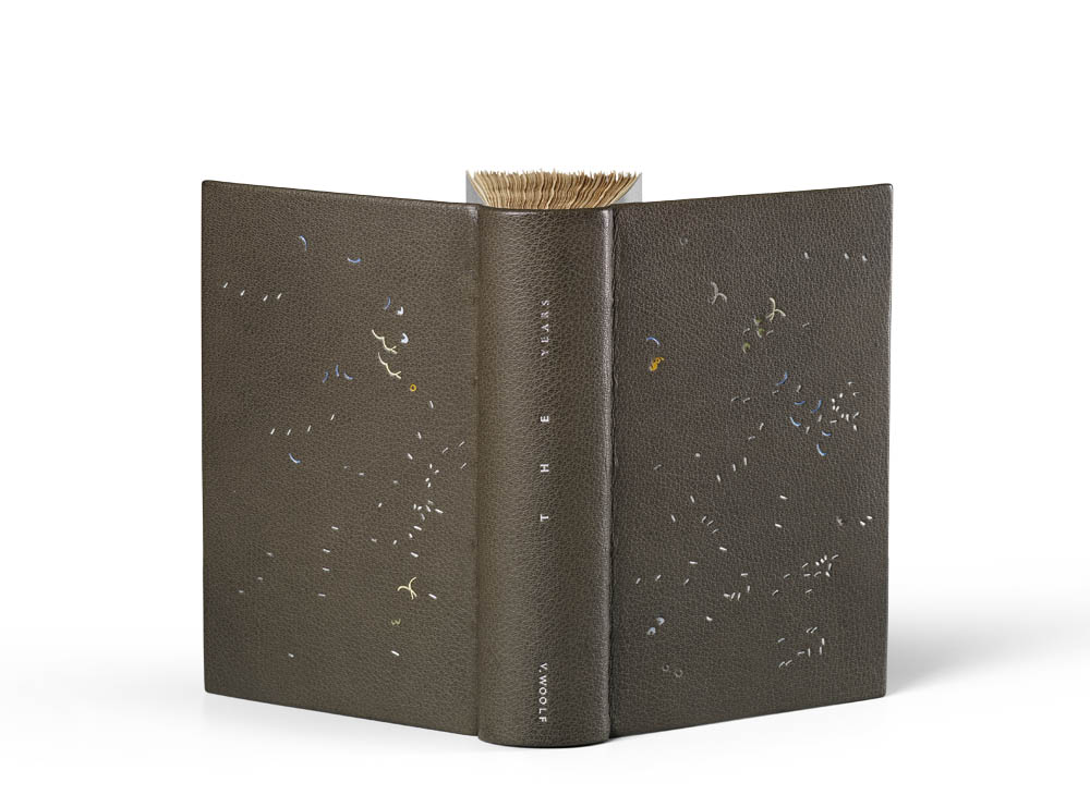
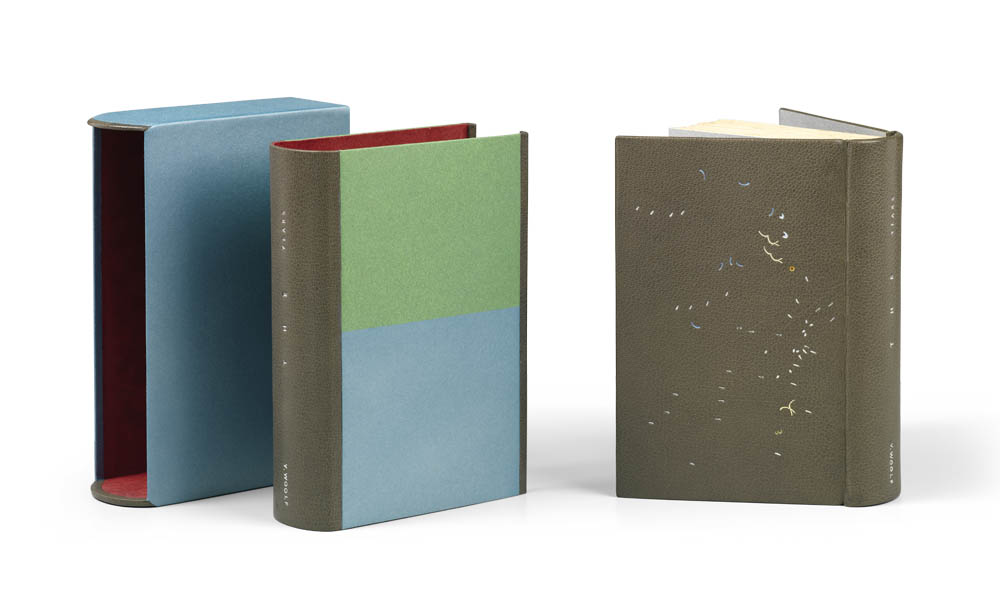
    Also bound in 2017, Annette used a grey goatskin for her binding of The Years. The binding also has hand sewn endbands using grey silk with silver edge-to-edge doublures and matching flyleaves.

    The number of foils is dialed back significantly on this binding with five shades of metallic foils, which include four shades of silver and blue. Seven pigmented foils were chosen, which include the following colors: two shades of red, grey, blue, two shades of yellow and green. Special guest foils are present with transparent pearl and transparent iridescent.

    The chemise is covered in silvery-green and silvery-blue hand-dyed papers with grey goatskin on the spine. The title is tooled in matte silver and silver foils. The slipcase is covered in the same silvery-blue paper and lined with red Alcantara. The design on the binding was tooled by Claude Ribal.

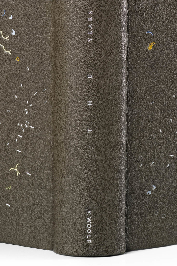
    Up until this point we’ve mainly discussed the design of the binding, I want to get into the way the books are titled. The spacing varies with each title, with The Years the spacing speaks to the agony Woolf encountered when writing this novel. For the bindings you chose to title, did you chose a layout to reflect the text or the design in some way?
    No, the titling does not reflect the text in any shape or form (but if you see a connection, feel free to do so). Neither does it reflect the design, but is rather part of the design. The title links the two sides of a book and I find it fascinating to find different ways to do this. It is only since Orlando that I cottoned on that it might be helpful for me to start taking basic typographic variants into consideration. They are spacing, direction/placement and the size of the font. Coming up with sexy titling solutions is my new hobby-horse. Thank you for noticing!

    Virginia appears as V. on The Years. This treatment is unique to this binding. Is there any reason for this?
    Yes. The trouble with titling is that you are stuck with the title and the author and that you have to work with what you’ve got. I usually design the titling after the design is executed, and normally I only work on one book/design at a time. In this instance though, for reasons of timing, the last three books of the project had gone to Claude together and, after having picked them up again, I worked on the titling for all three books at the same time. The Waves and The Years have a very similar appearance, and I think I just wanted to get some leeway by at least tightening up the length of the authors name a bit. So ahem… the answer is artistic license! I have actually done this before within the project, not with V. Woolf’s name, but for Night and Day where I exchanged the ‘and’ with a ‘+’ to get a more distinct change within the length of lines.

    The tone for The Years has darkened. The palette is heavy and moody with minimal colored foils. You mention reading Woolf’s diaries and letters in addition to biographies written about her during this project. How did Woolf’s own practice as a writer and creator inform your approach? Were you pulling influences from her thoughts as well as the novels?
    I have a whole bookshelf dedicated to Virginia Woolf, her books, her letters, her diaries, her essays… as well as the mind-blowing and insightful biography by Hermione Lee. It was wonderful to sort of get-to-know the person behind those fairly dense and abstract novels. And there are many parallels between her quest as a writer and me as a maker. The looking around, the searching, the time when one feels super apprehensive and down, as well as those where one jumps up and down with excitement and glee when one thinks that one finally has clocked something. I loved that!

    I don’t think though, that reading about her life and delving into her thoughts influenced my approach as such (the novels did!). Maybe I have just not yet noticed though? Who knows.


    A beautiful documentation has now been published, that traces the development of this project, which, as it turns out, took seven years to complete. WOOLF I – IX ! 98pp, with an introductory essay and 1:1 reproductions of the bindings, background information, and text excerpts.

    Text: Annette Friedrich, Virginia Woolf
    Design: BUCHmacher, Germany
    Photo: Shannon Tofts, Scotland

    £30 + postage / reserve your copy at www.annette-friedrich.com

  3. Bookbinder of the Month: Annette Friedrich // Post Three

    February 10, 2019 by Erin Fletcher

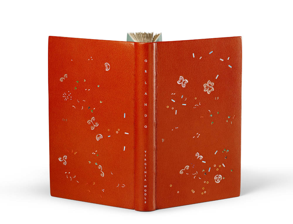
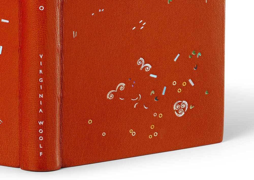
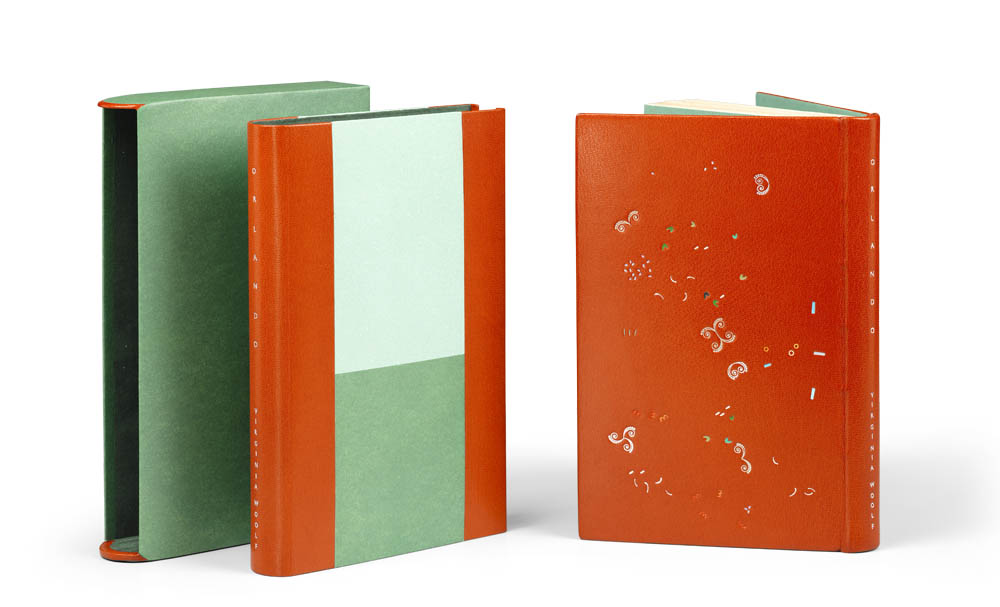
    Orlando is the sixth book in the series and was bound by Annette Friedrich in 2016. The binding is covered in a bright red goatskin with grey hand sewn endbands and green paper edge-to-edge doublures and matching flyleaves. The tooling is made up of four shades of metallic foils which include silver, champagne, purple and green. The design has an additional seventeen shades of pigmented foils in white, grey, two shades of purple, two shades of blue, three shades of yellow, three shades of red and five shades of green. Transparent pearl and iridescent silver foils are added as accents throughout the design.

    The chemise is inlaid with light and dark green paper at the sides and red goatskin across the spine. The title is tooled in iridescent and silver pearl foil. The slipcase is covered in the same hand-dyed dark green paper used on both the slipcase and flyleaves and lined with a green Alcantara. The design was tooled by Claude Ribal.

    During the design process, you describe creating around 50 versions per binding. I wondered if you could speak more specifically about this. Are you reinventing the design each time or pulling elements from previous iterations to make your final layout. I imagine you might flip the design in all directions or look at it in reverse.
    Yes, there are many versions of a design before it is ‘just so’. It’s a little bit of everything that you just mentioned. At first I start out though and cut white sheets of paper to the exact size of the boards and get my handtools and the inkpad out. I will have read the book at that point, but normally I do not go in with a preconceived idea for a design as such. However, this book is actually an exception, as I did know that I wanted to work with a distinct historic tool as a stand-alone player. But to begin with it is just plain old doodling and letting things flow. After a while something will have perked my interest, and I will start looking at this with a more inquisitive mind. I try to understand what exactly has caught my attention, how it worked and why, and then, how the hell to develop this into a full-blown design. During all of this I will continue to dip in and out of the book. Reading the authors voice, sensing the rhythm, feeds back into my design process. So at first the steps are big, then they get smaller and smaller. And yes, sometimes I look at a sheet from the reverse or flip it into a different angle, but unless I don’t actually use it for the next sheet, I would not count this as ‘a’ step. I have a light-box that helps me to carry forward the elements that I like, but there is no real telling what will stay in the game until the very end. Once I am happy with the design in black and white, I then go out in search to find the colors that build up the atmosphere.

    Woolf wrote Orlando more quickly then her previous novels. Were you aware of this as you were designing the binding? Did you try to quicken your pace as well?
    Yes I was aware of it, but it had no influence on my own process. It takes as long as it takes to get it right.

    The design for Orlando is very playful. I love how you used the historic tool in a more atypical manner, it really evokes the feeling of the novel as it floats and dances through the design.
    You make me very happy with the words you just chose. Floating and dancing: excellent! That was exactly what I was after, and it is fabulous that you mirror this back to me. Thank you!


    A beautiful documentation has now been published, that traces the development of this project, which, as it turns out, took seven years to complete. WOOLF I – IX ! 98pp, with an introductory essay and 1:1 reproductions of the bindings, background information, and text excerpts.

    Text: Annette Friedrich, Virginia Woolf
    Design: BUCHmacher, Germany
    Photo: Shannon Tofts, Scotland

    £30 + postage / reserve your copy at www.annette-friedrich.com

  4. Bookbinder of the Month: Annette Friedrich // Post Two

    February 3, 2019 by Erin Fletcher

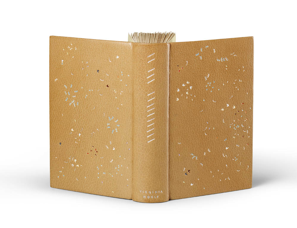
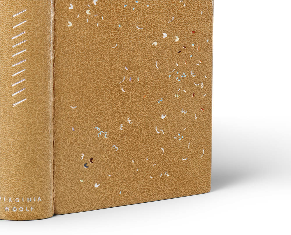
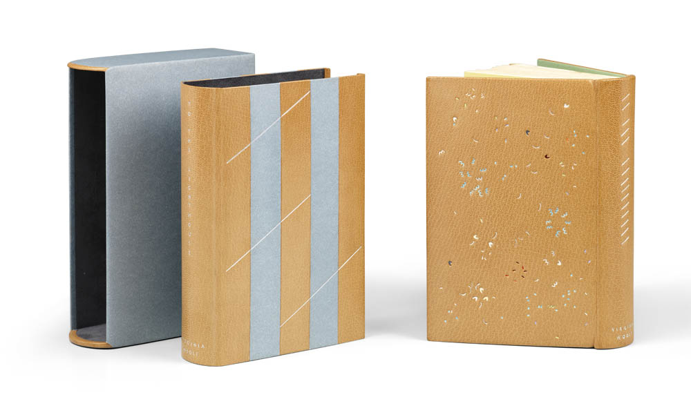
    The fifth book in Annette Friedrich’s Woolf I–IX series is To the Lighthouse, which was bound in 2015. The binding is covered in a tan goatskin with green hand sewn endbands and edge-to-edge doublures. The flyleaves are a light yellow hand-dyed paper. The design is executed by tooling through silver folio and fifteen shades of pigmented foils including white, mauve, two shades of grey, two shades of blue, three shades of yellow and four shades of red. Transparent pearl foil was also used within the design.

    The chemise is inlaid with blue grey paper and tooled with three shades of silver foil. The slipcase is covered in the same lilac paper used on the chemise and lined with mauve Alcantara. The design is tooled by Claude Ribal of Paris.

    In your description of To the Lighthouse, you mention that Woolf’s style of writing changes with this novel. In comparison, the design on To the Lighthouse incorporates more color than any of your prior bindings. Do you use color in your design as a means of representing something in the text or is it an aesthetic choice or perhaps a bit of both?
    Yes, next to her ongoing interest to tell a ‘story’ from the inside of her characters minds and link them together in one big flow (the stream of consciousness) she now adds another layer by weaving in a sense for the surrounding atmosphere and the general passing of time. In a weird way this is almost detached from the main plot… Anyhow! All I want to say is that it reverberates with pure poetry throughout and this did lead me to start working with color from a more painterly perspective: to create light, elusive moments, buzz and the occasional ‘clunk’.

    With this binding you introduce the “special guest” foils. Is your inventory of foils growing at this point? What characteristics are you looking for in your foils and what do you try to avoid?
    My collection of pigment foils has grown steadily over the years. I think I have approximately 60 different colors to work with at the moment. And only ‘recently’ have I discovered my ‘special guest’ foils, which are iridescent, pearly translucent or whatnot. They are used on top (or under) other foils and thus give it a kick into a direction that is beyond ‘regular’. I love them, but of course one needs to be a tad careful not to go too far down that particular route.

    What do I look for in my foils? Well, pigment foils are mainly created for the industry, but one has to understand that the foil is merely the clever carrier for the pigment, before heat releases it from the foil onto whatever it is meant to be on. There are two main challenges that the industry is interested in and which they have solved in a satisfactory, yet mutually exclusive, way. One is to block big and coarse areas in one go. To do this, the pigment releases easily from the foil and is not too choosy about the exact level of temperature or pressure. The downside of this is, that the edge definition tends to be blotchy and that any inner negative shapes should not be covered… well, they are very likely to get filled in regardless. So they are brilliant for the big work, but not at all good for lettering. However, no need to be depressed, for the industry has developed another type of foil that is geared up for detailed and precise work and excels in high edge definition. The problem with this one is that it is super sensitive and tricky to use for hand tooling, as the temperature window needed to pull it off is extremely narrow and the surface needs to be well prepped and super flat. So those are the characteristics one can find in foils and usually each supplier will offer the same color in the varying types. So read the description and choose the ones that fit best your needs.

    The finishing work on this binding is executed by Claude Ribal. Up until this point, you had been completing the tooling yourself, why did you decide to outsource this stage of the process moving forward?
    Yup. This is a very sad story and a big learning curve for myself as a maker. I have been working with tooled designs for years and years and am pretty good at it, even if I say so myself. However, as it turns out: not good enough! When I transfer a design onto the book, I do this in various stages, which are basically the same as for gold leaf tooling. The sole exception being that the foil is slid over the blinded in impression at the very last moment. It thus obscures the sighting and makes it extremely difficult to get the tool bang-on into the shape without fumbling around too much (lethal). Working with dots, lines and gauges is easy, but tackling complex shapes… basically blind-folded… eh!

    As we discussed earlier, this is one of the first books where I launched myself into working with color pigment foils in a massive way. Pigment foils are more temperamental to work with than metallic ones… You can guess where this is heading to? I did it once and was not quite happy. I retraced my steps, removed the leather from the book and covered it afresh. Second attempt. Again… not good enough. It only takes three or four shapes of the many to be ever so slightly off and the whole thing looks ghastly and heavy handed. I got fairly depressed, but told myself that ‘what has to be done, has to be done’. So the next time I actually bought a completely new text block and started from scratch (just in case that this particular book was doomed). When the time came for tooling, I held my breath and launched into the third round. Do you care for fun facts and figures? To execute this design in full takes 14 hours. So no small feat, particularly if it goes again pear shaped, which it DID! What was I to do? Try and try again? I felt pretty confident that if I practiced hard over the course of a year that I would be able to raise my game from my current 88% to 95%. But did I really, really want to do this? No. What I really wanted was to push on with my design work. And so I decided to get help (I still do the titling though!). A colleague recommended Claude Ribal who is a fantastic finisher in Paris, and that’s where I went. It is a little bit complicated to get everything ready for him though, for not only does he get all of my tools, foils, and my design master sheet, but also an exact guide to inform him which shape has which color. I said earlier that I have 60 shades by now and everything needs to be super clear. Nothing is left to chance, everything is specified. Claude is not only a very kind man, but he is also really good at what he does. His expertise brings the touch of lightness within the execution to the design that is absolutely needed to pull it off and that makes me very happy and grateful.


    A beautiful documentation has now been published, that traces the development of this project, which, as it turns out, took seven years to complete. WOOLF I – IX ! 98pp, with an introductory essay and 1:1 reproductions of the bindings, background information, and text excerpts.

    Text: Annette Friedrich, Virginia Woolf
    Design: BUCHmacher, Germany
    Photo: Shannon Tofts, Scotland

    £30 + postage / reserve your copy at www.annette-friedrich.com

  5. Bookbinder of the Month: Annette Friedrich // Post One

    February 1, 2019 by Erin Fletcher

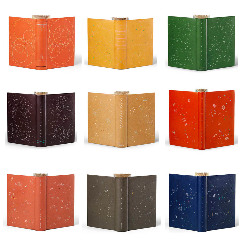
    Back in 2013, I interviewed Annette Friedrich and we only narrowly touched on the subject of her ambitious project to bind all nine of Virginia Woolf’s novels. Since that interview, Annette has completed this goal, exhibited all nine bindings at the Saatchi Gallery in London and published a gorgeous catalog! For this interview update, Annette and I will focus on the final six bindings of the series.

    I struggle with Annette’s aesthetic and that is one reason why I am so captivated by her work. The designs on her bindings really take a hold of me. I am stricken by their abstract, chaotic whimsy. Her style of binding forges so many questions for me, both as an artist and a binder, so I really wanted to take full advantage of this opportunity to interview Annette again.

    Back in 2013 when I first interviewed you for the blog, you had just completed Mrs. Dalloway aka Woolf IV, putting you about half way through your journey of binding all nine of Virginia Woolf’s novels. What sparked such an ambitious project?
    Hey Erin, well, it all began a while ago, when I noticed a few shifts within my artistic practice. This may sound a little weird, but I see my books in a timeline, where one design builds up onto the next. Obviously not directly and not even that consciously so, but with hindsight I can often detect a link.

    Do you know the late Danish author Inger Christensen? When asked about her writing, she came back with something that I can directly relate to: ‘(…) it does not matter where one is. However, one has to make sure to steer directly into the impossible. Of course one has to keep the balance on the way, though only under the single condition that the balance is made less safe. Less and less safe.’

    So when I said earlier that I noticed a shift, it was exactly that. I had already stepped onto the tight rope and had done my first fumbling steps. I saw that the haughty geometric designs were on their way out, and that, somehow, ‘life’ was casually shuffling onto the scene. I was curious beyond anything to see where this would lead me to. But I have to admit that excitement and delight shook equal hands with apprehension. The fear of not being able to reach this, to stumble, fall and fail.

    I decided to bracket this journey within a set project and started to think about what it might look like. Two factors played a guiding role, one was that I needed a good run of books to pull it off (cross the rope) and the second was to find an author who offered me a helping hand along the way. Virginia Woolf it was!

    You recently published a book documenting the project. In the introduction you write about how Virginia Woolf’s writing style changed over her career. I wonder if you feel like you are ready to leave behind some part of your design process and explore something new.
    Yes, I certainly was ready for a change and Virginia Woolf egged me on! Her novels are amazing. Each is a stepping-stone to the next. She started out with a very ‘linear’ take on writing and then pushed out her boat and explored new and experimental ways, becoming more and more abstract. She was the ideal (unbeknownst) partner for me. I decided to bind all of her nine novels in chronological order and follow suit.

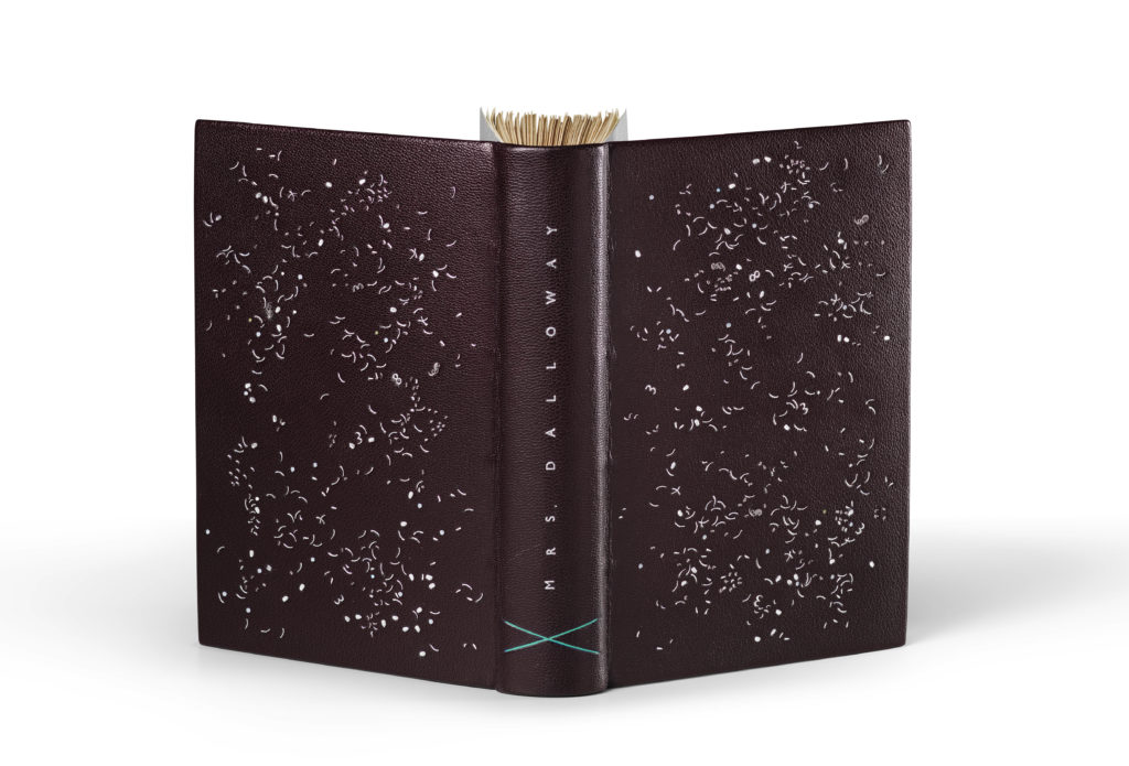
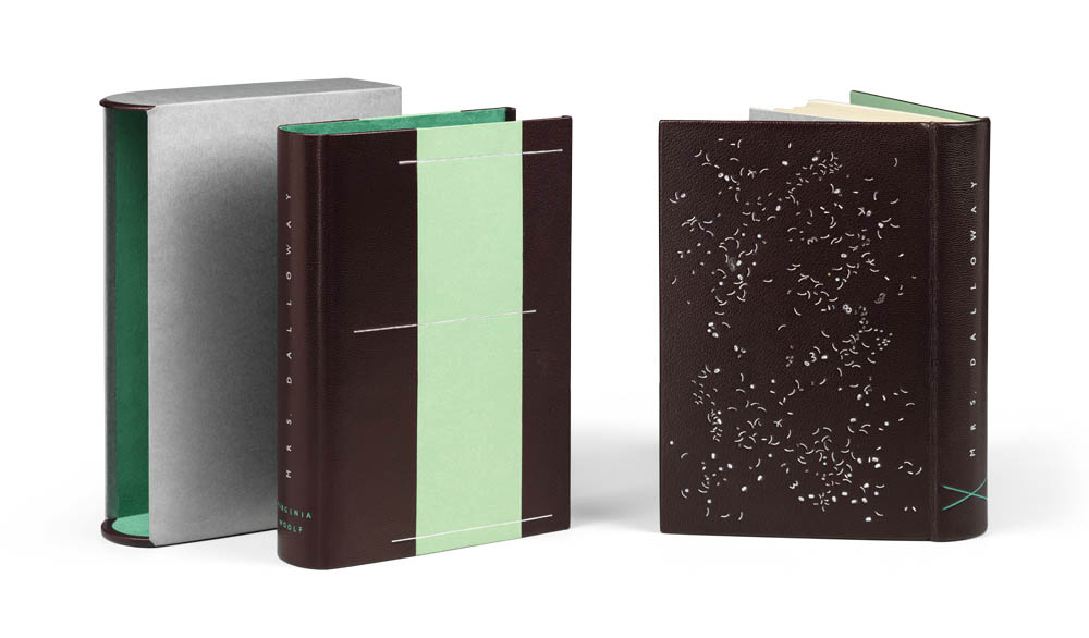
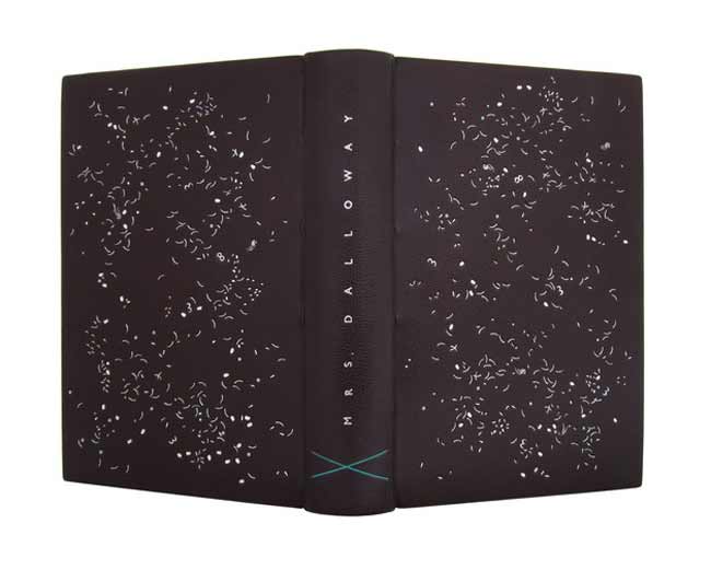
    Mrs. Dalloway was bound in 2012 in a dark aubergine goatskin. The hand sewn silk endbands and edge-to-edge doublures are green with silver flyleaves. The design is tooled with three shades of silver folio, gunmetal and five pigmented foils in white, grey, blue and two different greens. The book is housed in a chemise which is inlaid with green paper and tooled with three shades of silver foil plus a green pigmented foil. The slipcase is covered with silver paper and lined with green Alcantara (a suede-like material).

    What I enjoy about the design for Mrs. Dalloway is that at a glance the covers appear to mirror each other, but as my eyes wander back and forth the differences begin to emerge. Each cover takes on a life of it’s own. Did you design each panel to represent the two protagonists or are you finding inspiration elsewhere in the text?
    Now this is a very good question, although I immediately wanted to cry out with an alarmed ‘Nothing represents anything, ever!’. But that is not quite right either. I am interested in space, rhythm and atmosphere, and these are the points of connection with the/a novel. So in this instance, I was taken in by the fully developed stream-of-consciousness technique, that Virginia Woolf had started to explore in her previous novel, Jacob’s Room (my Woolf III). This ‘take’ of hers is very persuasive. So no, my aim was not to represent the two protagonists as such, but rather her ‘flow’. I was interested to create something that sweeps you up and in the air, from one element to the next, with no stop, no pause, connecting everything in one big move where the small mini-events get swallowed up in the overall take.

    The nine bindings in this series of work, feel cohesive and connected. There are several obvious visual tells that make this statement true. But one aspect is your treatment as a binder, you follow a formula for the binding and for the housing. I want to ask about the choices you made for styling the chemise in particular. At the beginning you include a simple linear tooled design on the chemise that contrast greatly with the design on the binding, then by the sixth book, Orlando, the tooled design on the chemise disappears and you begin playing with the layout of the paper. Any reason for this?
    I do like to work within the three-fold combo that is the book, chemise and slipcase. Every element brings something to the table and has to work/commune with the others. Obviously the book’s design calls the tune and the others join in. However, this is not done by way of repetition, but rather by adding different layers. Sometimes they enhance and sometimes they jar. It’s like music really, the main thing is that the overall soundscape makes sense.

    At the beginning of 2018, you were a part of Crafts Council’s Collect 18, an exhibition that spanned 40 galleries over 4 continents. Woolf I – IX was on exhibit at the Saatchi Gallery in London. Can you speak about how you got involved in this exhibit and how your work was received by the public. In the US, design binding work is rarely seen in a space akin to the Saatchi Gallery, is this also uncommon in England?
    Yes, it’s the same here. Bindings tend to get shown in book related environments only, such as libraries etcetera. Collect 18 was actually presented at the Saatchi Gallery, which is a great venue right at the heart of Chelsea. Amongst all of the invited craft galleries Designer Bookbinders was the only one to show books and fine bindings. There was a lot of terrific work on display and it was great to rub shoulders for once with all of the other crafts within an art gallery setting. I think the visitors were quite stunned to come across fine bindings in such a context, with many being not at all familiar with our rare, orchid-like craft. However, they were very interested and the invigilators rarely got a quiet moment.

    I witnessed this from across the aisle, as I myself had been invited by the Crafts Council to show my Woolf I – IX group on a separate solo stand. I had just finished them and was super delighted to be able to show them at such a prestigious and stimulating cross-disciplinary exhibition.

    Now that the project has come to an end, do you feel a sense of completion, that you achieved the mission set forth from the beginning of the project?
    Yes! is the short answer. I had set out in the hope of change, and ‘change’ has come. The first design is miles away from the last and I have been able to tentatively discover a completely new direction. I am still not completely sure how I got there, but over time one thing just led to the next. Everything got more difficult and complex, and I did stumble and had to pick myself up again along the way. I think though, that I have finally grown up and found my voice, so lets see where it will take me to next…


    A beautiful documentation has now been published, that traces the development of this project, which, as it turns out, took seven years to complete. WOOLF I – IX ! 98pp, with an introductory essay and 1:1 reproductions of the bindings, background information, and text excerpts.

    Text: Annette Friedrich, Virginia Woolf
    Design: BUCHmacher, Germany
    Photo: Shannon Tofts, Scotland

    £30 + postage / reserve your copy at www.annette-friedrich.com

  6. Bookbinder of the Month: Annette Friedrich

    August 25, 2013 by Erin Fletcher

    jacobsroom-annettefriedrich

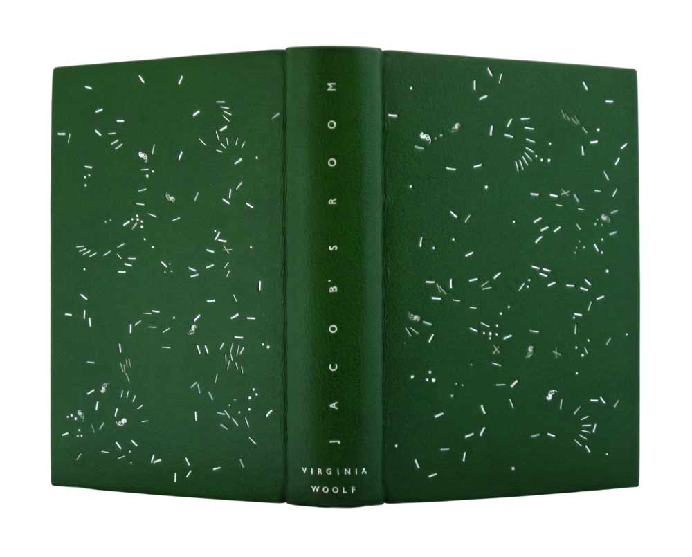
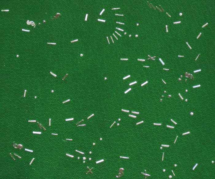
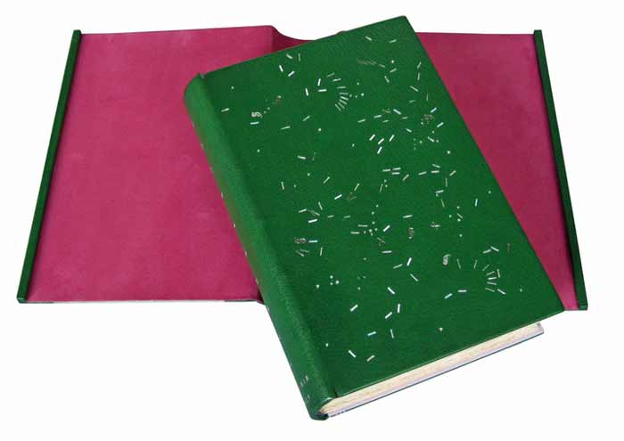
    As Annette Friedrich continues with her ongoing Virginia Woolf series, in 2012 she bound Woolf’s third novel Jacob’s RoomThis 1920’s Hogarth Press edition of Jacob’s Room was bound in full leather green goatskin. The decorative tooling on the front and back covers are done in three shades of silver, white and grey, which offer wonderful subtleties to the design. The title is tooled in matte silver along the length of the spine with the author’s name tooled in silver at the tail.

    jacobsroom2-annettefriedrich

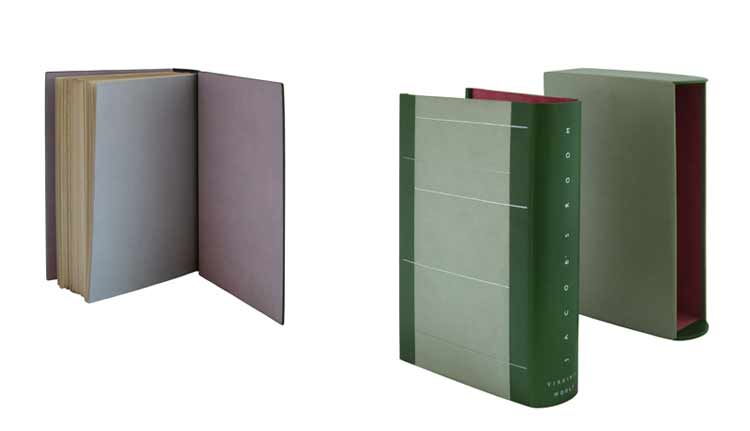
    jacobsroom5-annettefriedrichThe interior of the covers is lined with paper bord-a-bord doublures in silver rose and the fly leaves are in silver. All papers used are hand dyed. The binding is housed in a silver and green chemise with linear tooling across the sides in three shades of silver. The interior of the chemise is lined with a shockingly, vibrant pink. The spine of the chemise is tooled to mimic the spine of the binding.

    jacobsroom4-annettefriedrich


    Annette has recently added Mrs. Dalloway to her website, the fourth book in the ‘on a stroll with Mrs. Woolf’ series. It was quite a wonderful surprise to see as I’ve been frequenting her site this month. The design is similar to Jacob’s Room, with the random tooling appearing more dense and chaotic. I look forward to seeing the last five of the series! Keep up the inspiring work, Annette!mrsdalloway-annettefriedrich


  7. Bookbinder of the Month: Annette Friedrich

    August 18, 2013 by Erin Fletcher

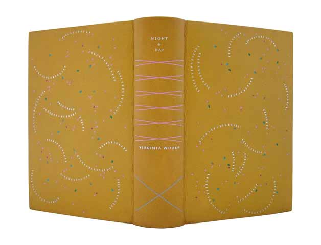
    nightandday-annettefriedrichNight and Day is Virginia Woolf’s second novel and the second book Annette Friedrich has bound for her series ‘on a stroll with Mrs. Woolf’.

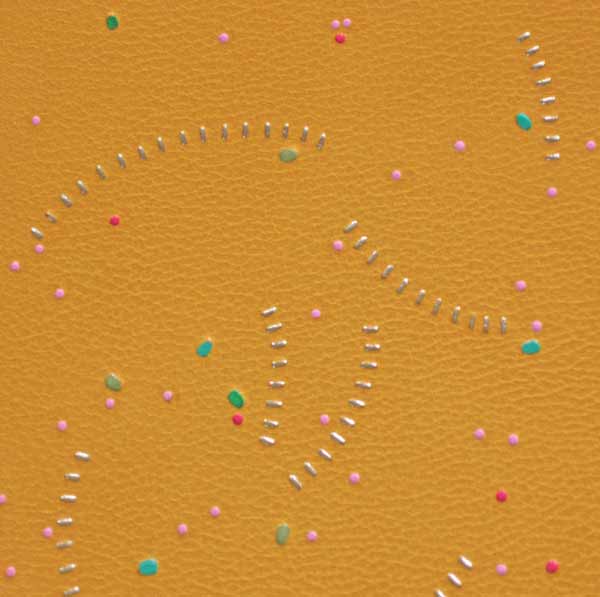
    In 2011, Annette bound this 1920 George H. Doran Company edition in full yellow goatskin. The design on the covers is tooled with platinum leaf, rose, pink and three shades of green. The spine includes the title and author tooled in platinum in addition to crosses in pink and silver. So far, this binding is my most favorite from the Virginia Woolf series. I love the whirling platinum curves and the scattered bits of color throughout the cover.

    nightandday2-annettefriedrich

    The book is housed in a green chemise with matching yellow goatskin. A silver paper cross inlay appears on the chemise, this paper matches the endpapers. The slipcase is covered in rose paper. All papers used are hand-dyed. nightandday3-annettefriedrich


  8. Bookbinder of the Month: Annette Friedrich

    August 11, 2013 by Erin Fletcher

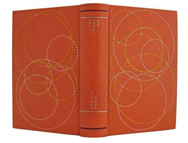
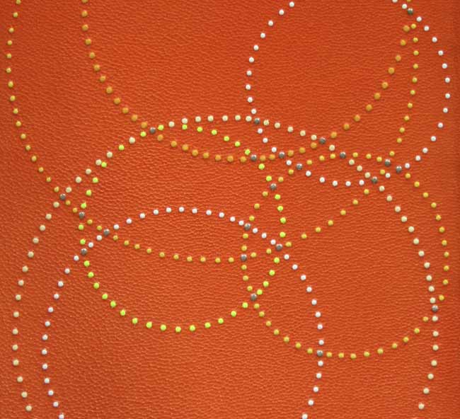
    voyageout5-annettefriedrichIn 2011, Annette Friedrich embarked on her goal of binding all nine of Virginia Woolf’s novel starting with her first book, The Voyage Out. Annette bound a 1929 Hogarth Press edition (first imprint of the unified edition) in full orange goatskin. Tooling on the covers is done with platinum leaf and four shades of yellow. The author’s name and title are tooled on the spine in platinum, in addition to two horizontal lines at the head and tail in platinum and purple.

    voyageout2-annettefriedrich

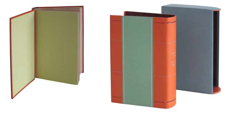
    The book is housed in a chemise covered with hand-dyed green paper and matching orange goatskin. The slipcase is covered in a hand-dyed blue paper. voyageout6-annettefriedrich


  • My name is Erin Fletcher, owner and bookbinder of Herringbone Bindery in Boston. Flash of the Hand is a space where I share my process and inspirations.
    The StudioNewsletterInstagramEmail me
  • Archives