RSS Feed

Posts Tagged ‘russell maret’

  1. My Hand // Happy Abstract

    April 29, 2020 by Erin Fletcher

    Being lost in a state of creativity and production is a splendid place to be as an artist. William Blake, the Romantic poet, painter and printmaker, referred to this as ‘happy abstract’. This concept was highlighted in a letter written by Blake to one of his patrons in 1801, where Blake expressed his apology for the delay and that something more interesting had come along.

    This letter became the content of the set book for the second OPEN • SET exhibition sponsored by the American Academy of Bookbinding. This triennial event features finely crafted design bindings from all over the world. Binders were invited to submit their work into either category: the Open Category allowed the binder to choose their own text block and the Set Category gave each binder the same text block.

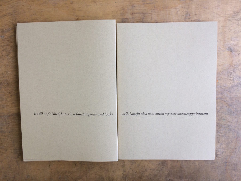
    Happy Abstract was printed by the immensely talented Russell Maret. A printmaker whose work is coveted by many and hard to obtain by many bookbinders to bind. Maret split up the letter to a single line per page descending from the head to the tail. Since this layout left a large margin around the printed text, binders were invited to add decoration to the inside of the book as well. A very exciting prospect to design throughout the entirety of the book.

    PAGES
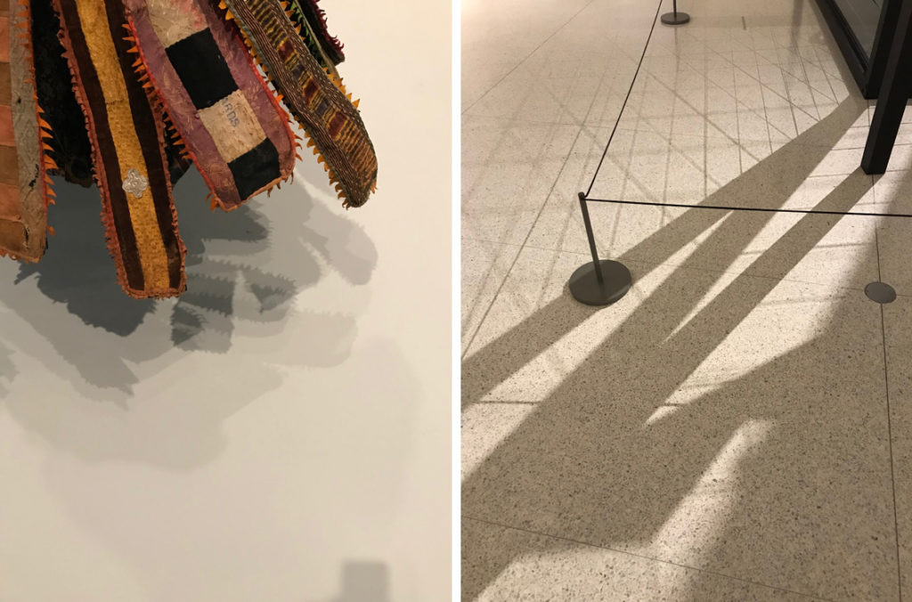
    For the design on both the pages and the binding for Happy Abstract, I wanted to create something that was inspired by the beauty of unintentional marks and shadows. The inspiration for the shadows came during visits to museums and art galleries, where I captured the shadows cast by various works of art. These complex shadows add to the aura and beauty of the work, but are also captivating on their own.

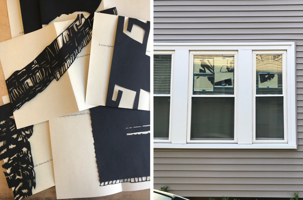
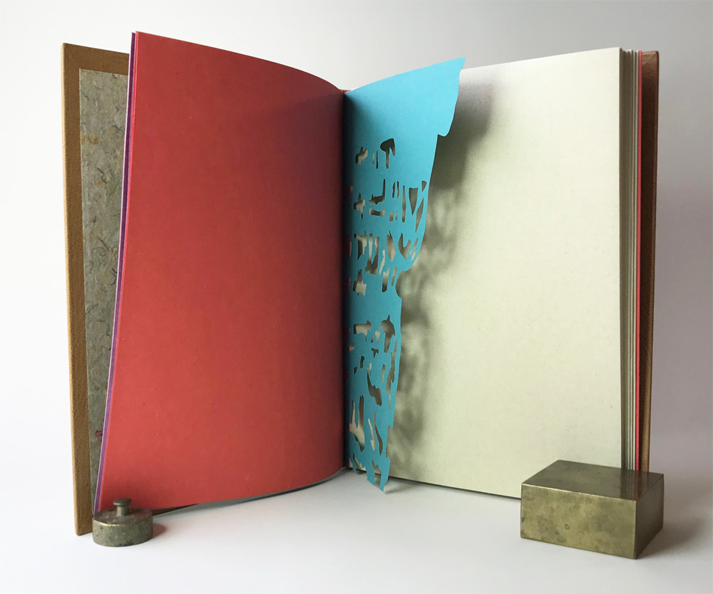
    I wanted to recreate these shadows on the pages of the book. To do this I cut stencils with black paper to act as masks during the sun-bleaching process. Some of the stencils were cut down further after a certain period of time to offer the gradation seen in the image above. I taped the pages to windows at my studio and my home for a length of about 3-4 weeks. My studio gets more direct sunlight and offered a richer ‘shadow’ from the sun-bleaching.

    The stencils were placed on only one side of the folio, the chosen side was mixed up throughout the text block. This gave a disjointed display of shadows and a spread could range from no shadows, one shadow, or two different shadows. You can see views inside the book by clicking here.

    The endsheet closest to the text block was cut to mimic one of the stencils used for sun-bleaching. The cut endsheets cast a shadow on to the first and last page of the text block, giving the reader a similar experience to what first inspired me.
    BINDING
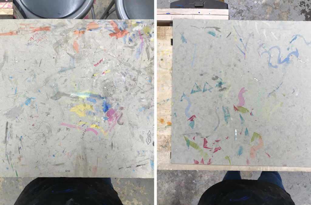
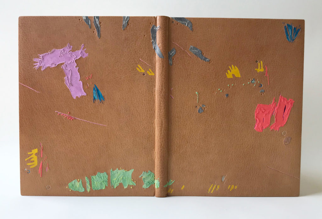
    I came to find the inspiration for the binding from my middle school students. My colleague Colin Urbina and I teach a Book Arts Middle School program through the North Bennet Street School in Boston. We teach a variety of artist book structures in addition to having them create their own content. They use all manner of instruments to do this: watercolor, crayon, colored pencils, markers, ink, charcoal and pastels. Each bench is set up with a piece of binder’s board to protect the surface from their flurry of creativity. The consequence of this creates a collection of abstract and unintentional marks.

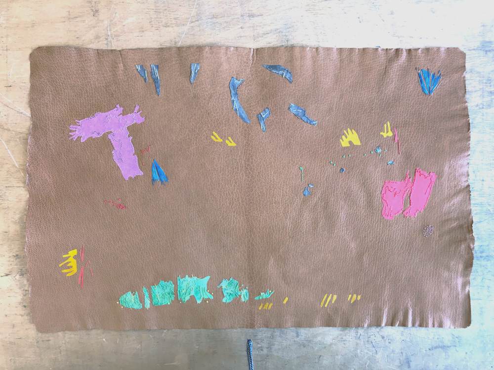
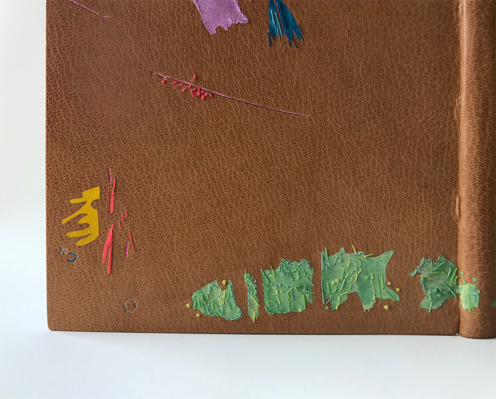
    I pulled various shapes and marks from these boards to create a new arrangement for the binding. These shapes were then translated as back-pared onlays using a mix of handmade paper and hand-dyed calfskin. To capture the spirit of the watercolor markings, I layered the dyes with a paint brush (seen on green, grey and blue onlays) to make it look mottled.

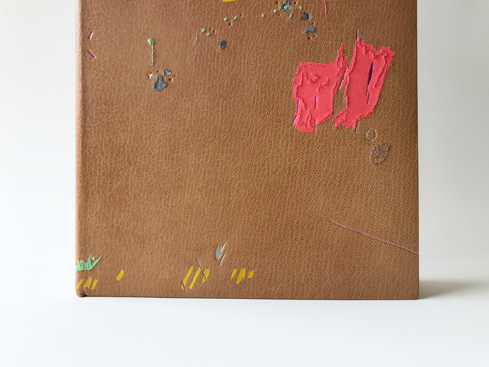
    The markings would be built up in three layers using the following techniques: onlays, embroidery and tooling. Some elements would stand alone, but I was really interested in how these techniques would interact with each other. The embroidery is done mostly in a random way, with varying lengths and thicknesses to the stitches. I also used back-stitch and French knot, two common stitches in my work.

    With the embroidery finished I moved forward with covering and the third layer of the design: tooling. I used a random selection of tools from my collection (including some handle letters) to build up the design further. Impressions were done over the onlays and right along side the embroidery. I used a variety of pigmented matte and metallic foils in similar tones to the onlay pieces. I love this small addition of color and shimmer that the tooled impressions brought to the overall design.

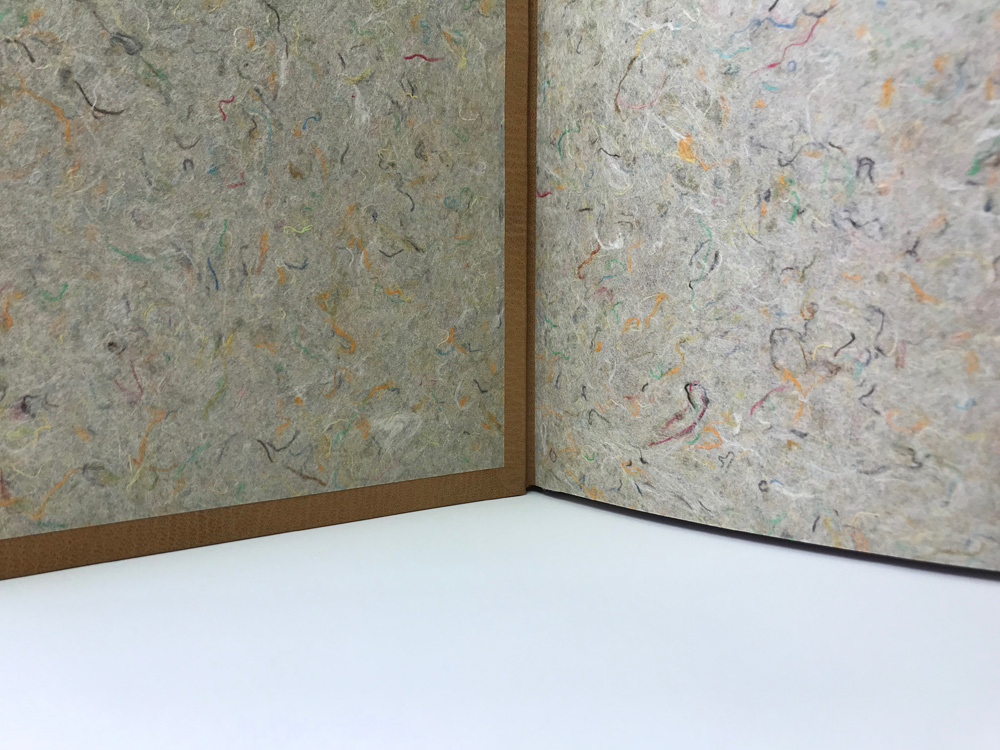
    I used a very special handmade paper for the fly leaf and paste down. Papermaker and activist Mary Hark made a trip to Ghana to aid in the building of a papermaking studio. With an abundance of kozo growing as an invasive species, the community was able to harvest this plant to benefit their environment and build their business. This Ghanian kozo handmade paper has thread inclusions collected from a nearby textile factory. The circumstances, color palette and use of thread felt like a perfect pairing to the text and design of the binding.

    To see the entire catalog of bindings in the OPEN • SET exhibit click here. Even though the exhibit will be traveling across the country, it may be challenging to see it in person for a while. The Grolier Club in New York City, which served as the opening venue, posted images from the exhibit here.
  2. Catching Up With Lori Sauer // No. 5

    August 27, 2017 by Erin Fletcher

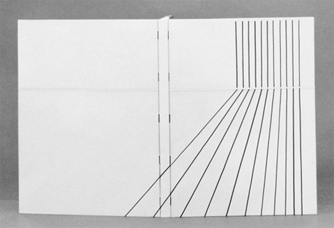
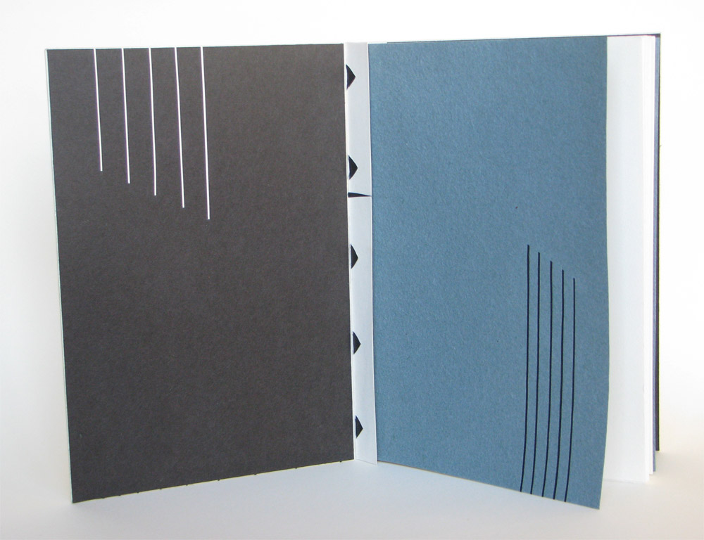
    For the final post, I wanted to highlight one of Lori Sauer’s more recent bindings. Done in 2017, Lori created a binding for Russell Maret’s Linear A to Z. Using an unusual binding style, Lori combine’s vellum and Japanese paper to create a binding that works beautifully with the text’s imagery.

    Russell Maret’s Linear A to Z is a beautifully printed book. And your play on the geometry perfectly harmonizes with the prints in this abecedarian text. Can you talk about the binding structure you used for this binding (particularly the board attachment and how it functions)? Is the vellum limp or over boards?
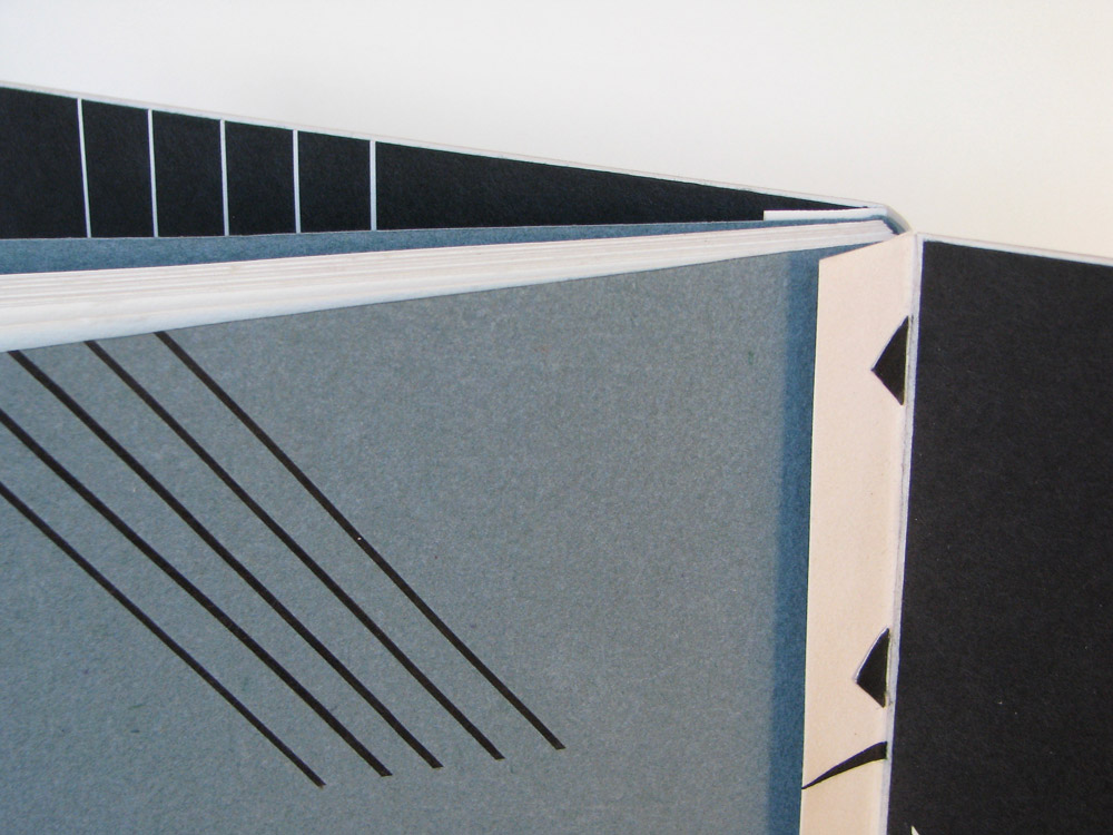
    I don’t know the name of this structure and sadly I can’t remember who showed it to me years ago. I’ll do my best to describe it. The text is sewn on vellum supports that are shaped like a bar with an arrow on each end. They have to be very precisely cut and measured as the bar is the width of the sewn spine plus the thickness of the covering material.

    The three covering pieces, in this case vellum, are cut to size. The spine piece is folded along the joint and the sidepieces are turned-in along the spine edge only. Slits are then cut in to the fold of the spine and folds of the board pieces that correspond to the sewing stations/supports. The ends of the arrows are very carefully fed through the slits. The points of the arrow shape lock the pieces together and on to the text block.

    I then tipped in a thin board to the gutter of the board vellum and drummed the vellum on resulting in a semi rigid cover. The black lines are waxed Japanese paper laid in to embossed lines. The horizontal line is cut in to the board vellum and inlaid with a laminate of vellum and paper.

    The doublures and flyleaves have black and white lines that echo the design on the outside.

    This structure can also be done in a single piece. A gusset is then formed between the inner board and text block. I hope I’ve explained this well enough. It’s very hard to describe without drawing some pictures!


  3. Trip to the 2015 New York Antiquarian Book Fair

    April 21, 2015 by Erin Fletcher

    On April 10th, I took the train down to New York City for the annual Antiquarian Book Fair and shadow show put on by the Fine Press Book Association. I spent the weekend ogling over a delightful selection of fine bindings, artist books and finely pressed editions amongst a sea of rare objects and books. I wanted to highlight a few of the gems that I saw, which there were many.

    BookFair1-ErinFletcher

    My first stop was at the shadow show, where I am afraid I was less of spectator (I only captured two images from this event). My first stop was at the Two Ponds Press table where I had a wonderful conversation with co-found Liv Rockefeller and browsed through some Gehanna Press editions and Gray Parrot bindings.

    Next, I stopped at the table of book artist Sue Higgins Leopard of Leopard Studio Editions, whose work is pictured above. We discussed the concepts behind a few of her pieces on display. After browsing through the selection of large-scale artist books on the Booklyn table, I made a point to chat with David Esslemont on his current projects. My next notable stops were with two highly accomplished and exquisite printers: Russell Maret and Gaylord Schanilec of Midnight Paper Sales. Gaylord was quite gracious with his time and walked me through this latest and most elaborate printed accomplishment, Lac Das Pleurs. It was such a pleasure to examine each print through his eyes as he pointed out subtle details, such as how each scale of one particular fish were drawn individually to capture the unique qualities of nature.

    Before leaving, I stopped by Abby Schoolman’s booth and met bookbinder Christine Giard, whose work was on display. It was such a treat to speak with her not only about her binding training, but discuss the techniques employed in her work. My goal is to get her interviewed on the blog sometime this year (Christine gladly accepted!).

    BookFair2-ErinFletcher

    From the Lux Mentis booth: left: Russell Maret’s Interstices & Intersections | right: a book from Nancy Loeber

    I spent one and a half days exploring the Antiquarian Book Fair, which was held at the Park Avenue Armory. As a former storage space for weaponry and tanks, the room was massive and has been transformed for several types of events and art installations. My first stop was at the Lux Mentis booth run by Ian Kahn. He always has delightfully strange and unique items on display, such as the work of Diane Jacobs and some fellow colleagues of mine Colin Urbina and Gabby Cooksey.

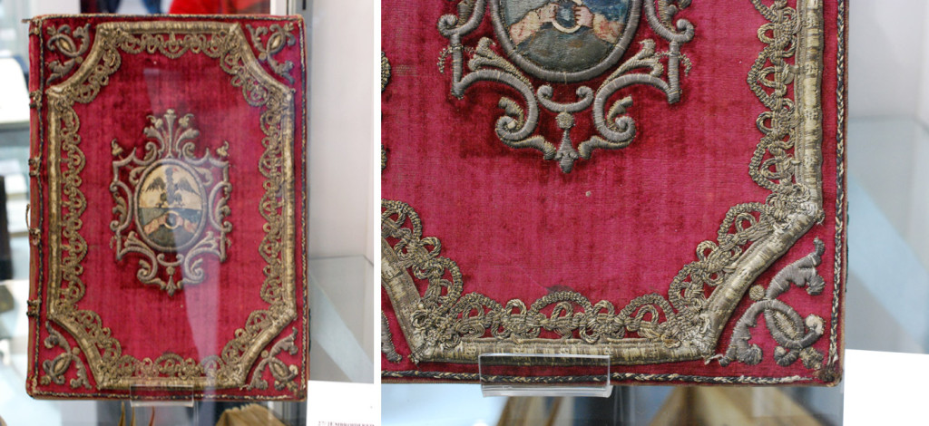
    As I wondered through the aisles, I stumbled upon one embroidered binding after another. If you are regular to the blog, you know my fascination with historical embroidered bindings and creating my own. So it was pure enjoyment to see such a pristine collection of historical embroidered bindings from England and France.

    BookFair3-ErinFletcherBookFair4-ErinFletcher

    The three embroidered bindings shown above range from 17th to 18th century and were found at the  Librairie Camille Sourget booth, a dealer from France. Click on the image to see the detail of the embroidery work.

    BookFair5-ErinFletcher

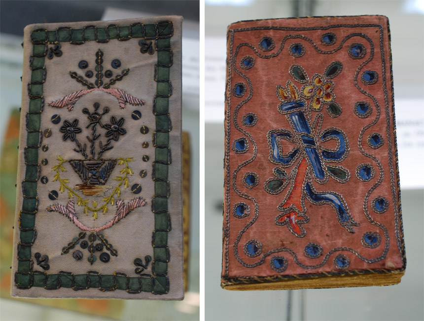
    Over at the Musinsky Rare Books booth were three really beautiful examples of embroidered French pocket Almanacs. I choose to include my two favorites. The example on the left has a great example of couched ribbon creating a bold border. The example on the right is bound in a luscious pink silk with painted appliqué pieces that build up the central design and dots. These pieces were in such wonderful condition, I don’t think they were carried around too often.

    BookFair6-ErinFletcher

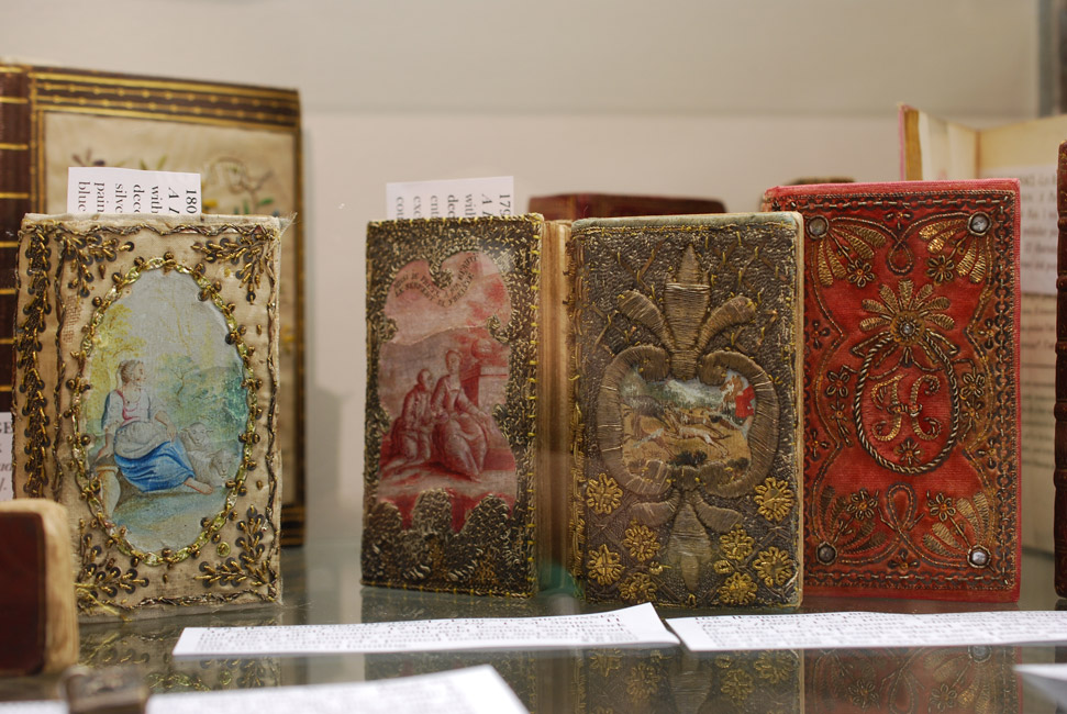
    At the very end of the fair, my eye caught this shelf of embroidered bindings. Unfortunately, in my haste I neglected to note anything about the bindings or the dealer who was exhibiting them.

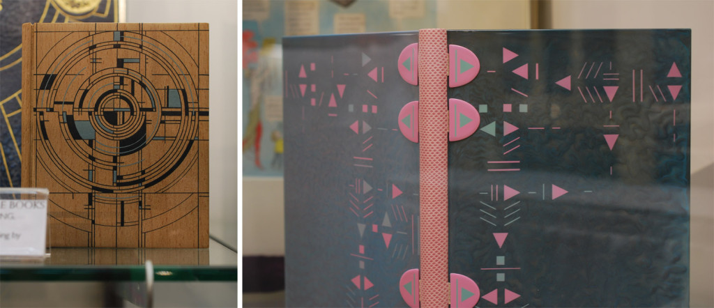
    In addition to embroidered bindings, I like to search out design bindings and binders whose name or work I recognize. One binder that popped up again and again was Brother Edgard Claes. The two books in the image below seem like they were made on two different planets, yet the bindings are actually very similar. The book on the left was spotted at the Sophie Schneideman Rare Books booth and is an example of one of Claes’ Dorfner bindings. The covers are wood veneer with delicate marquetry and hand painted elements.

    BookFair7-ErinFletcher

    The book on the right was found in the Bromer Booksellers booth. It was one of three bindings by Claes they had on display. This binding of erotica is an example of Claes’ polycarbonate bindings. The color palette is inspired by the original cover which has been included in the text block.

    BookFair8-ErinFletcher

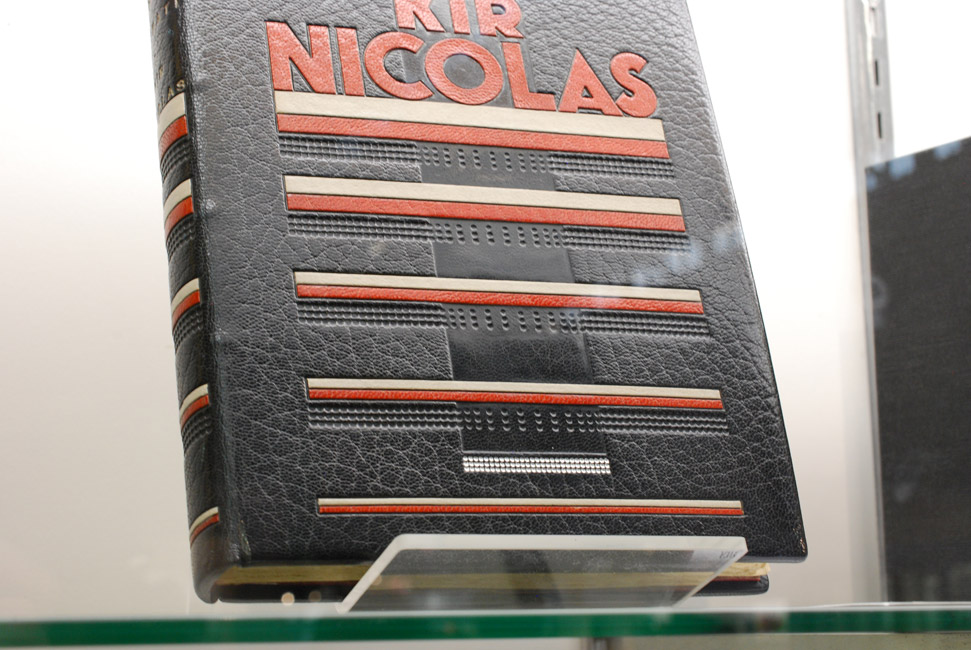
    One binder commonly found at Antiquarian Fairs is Pierre Legrain. The binding above was found at the booth of Dr. A. Flühmann of Switzerland. I took a photograph of this particular binding because it reads so differently from his other highly geometrical designs. The emphasis on typography really grabbed me.

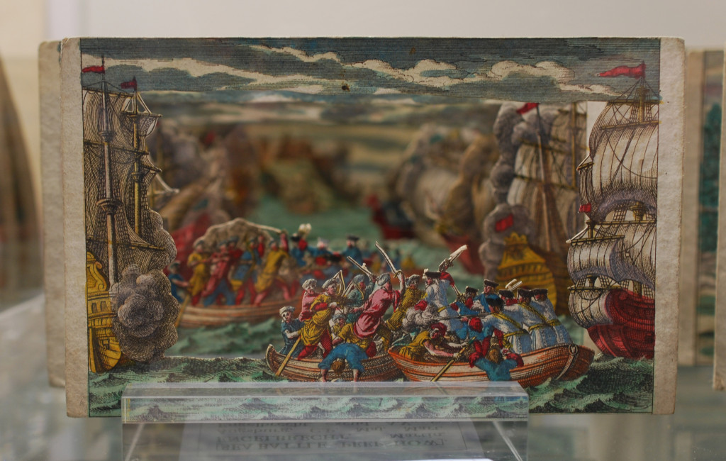
    I truly had a wonderful experience at the book fairs in New York City. I ran into familiar faces and met many wonderful artist, publishers and dealers. I’ll finish off this post with a charming engraved tunnel book discovered at one of the booths.

    BookFair9-ErinFletcher


  • My name is Erin Fletcher, owner and bookbinder of Herringbone Bindery in Boston. Flash of the Hand is a space where I share my process and inspirations.
    The StudioNewsletterInstagramEmail me
  • Archives