RSS Feed

Posts Tagged ‘rubow’

  1. My Hand…The BFG

    November 12, 2012 by Erin Fletcher

    Just 4 weeks remain at Buy Some Damn Art.

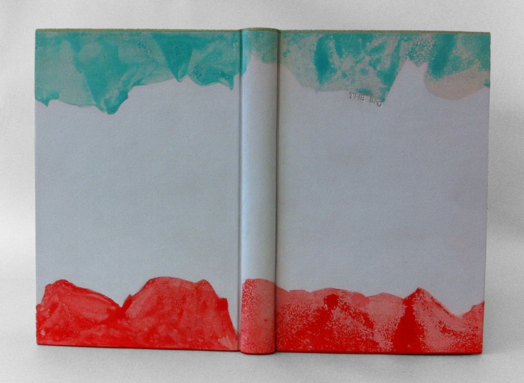
    As I reread The BFG by Roald Dahl, it quickly became clear that I wanted to illustrate the dreams and nightmares captured by the Big Friendly Giant. The reader joins little Sophie in her journey to Giant Country, where we learn about the nasty giants, snozzcumbers and the BFG’s vocation as a dream catcher. Each dream and nightmare is collected into a jar where they remain until released into children’s rooms at night. Sophie describes dreams as being small oblong pale sea-green jellyfish, soft and shimmering, while nightmares thrash around as scarlet blobs of gas and bubbles of jelly. 

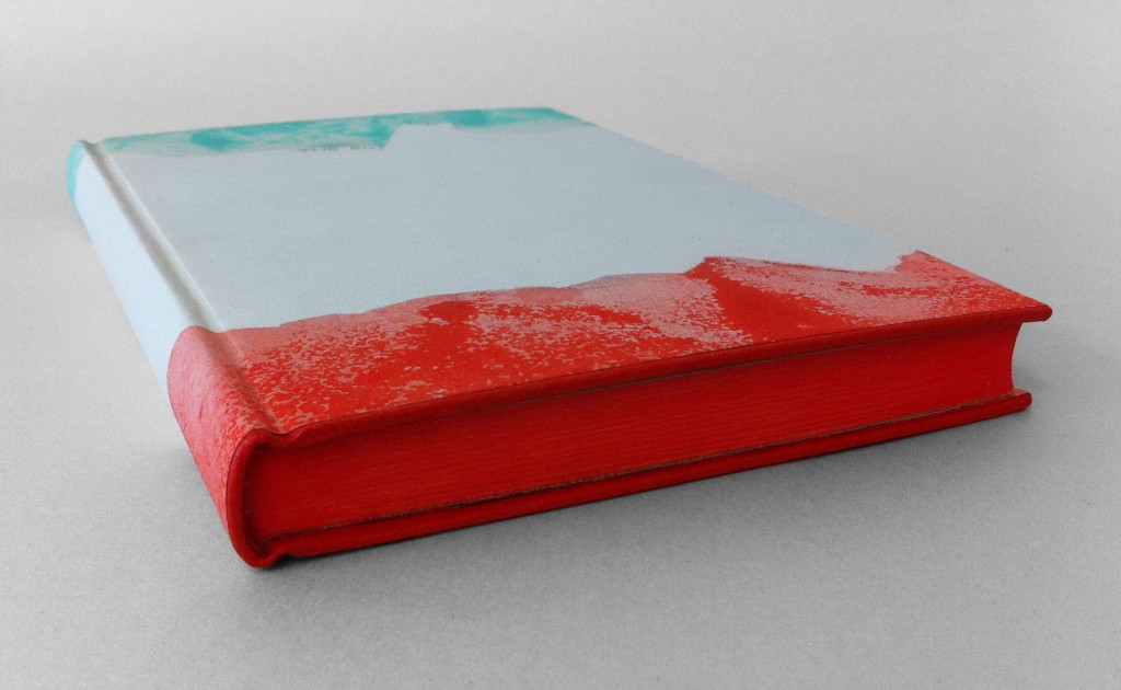
    I made the decision to bind The BFG as a millimeter binding in the Rubow style so the design could run the full length of the book uninterrupted. Using Sophie’s description as a guide for the color palette, I created a paste paper to reflect each illusion. Each area of color is a mixture of gouache, sugar and vinegar applied with a scrap piece of binder’s board. As the paint mixture dries the partially dissolved sugar crystals burst leaving a textural and dimensional effect. 

    Each color continues along the board edge and the edge decoration visually saturating each side in a single color. The tail board edge and headband are covered with scarlet goatskin from Harmatan, while the head board edge and headband are covered with buffalo from Remy Carriat in amadine (light sea-green). Each edge is painted with acrylic paint mixed with airbrush medium, water and wheat starch paste. The head edge is a sea-green blue, foredge is a light grey and the tail edge is scarlet red.

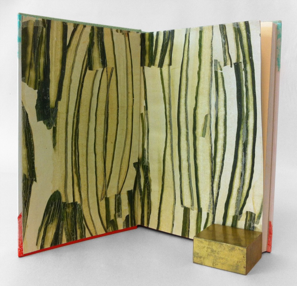
    The endpapers were so fun to make. I’ve worked with vegetable papyrus in the past and felt compelled to use the cucumber since the BFG eats only one thing: snozzcumbers. I acquired the cucumber papyrus from Hiromi Paper which are handmade by an artist in Germany. Using a thin paste wash I broke up the papyrus and collaged the pieces together on top of light gray Hahnemuhle Ingres. 

    The book is housed in a clamshell box, the trays are covered with light gray Hahnemuhle Ingres and lined with smoke Ingres. The case is covered with silver Canapetta and light gray Ingres in a quarter style covering.
  2. My Hand…Talking to Myself

    August 5, 2012 by Erin Fletcher

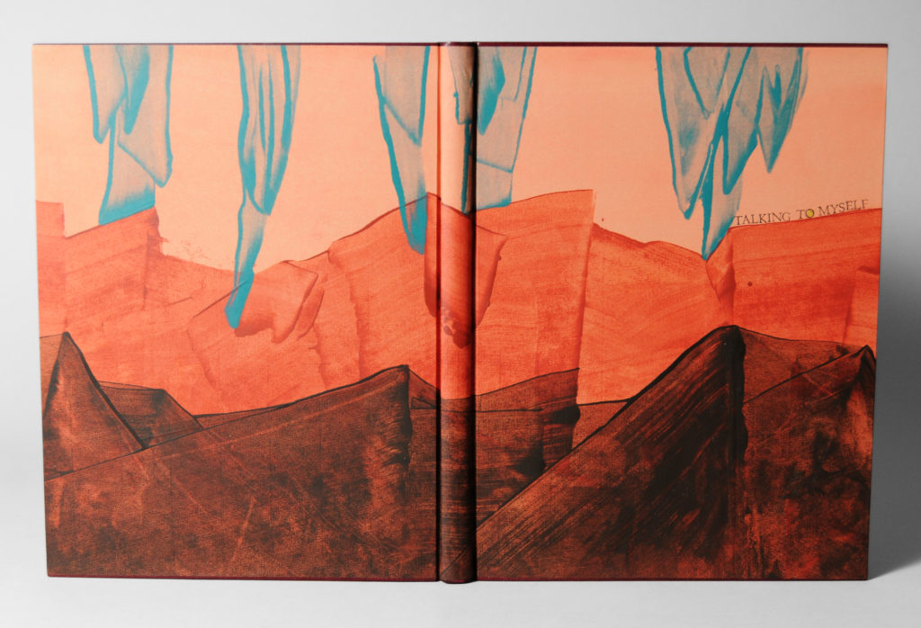
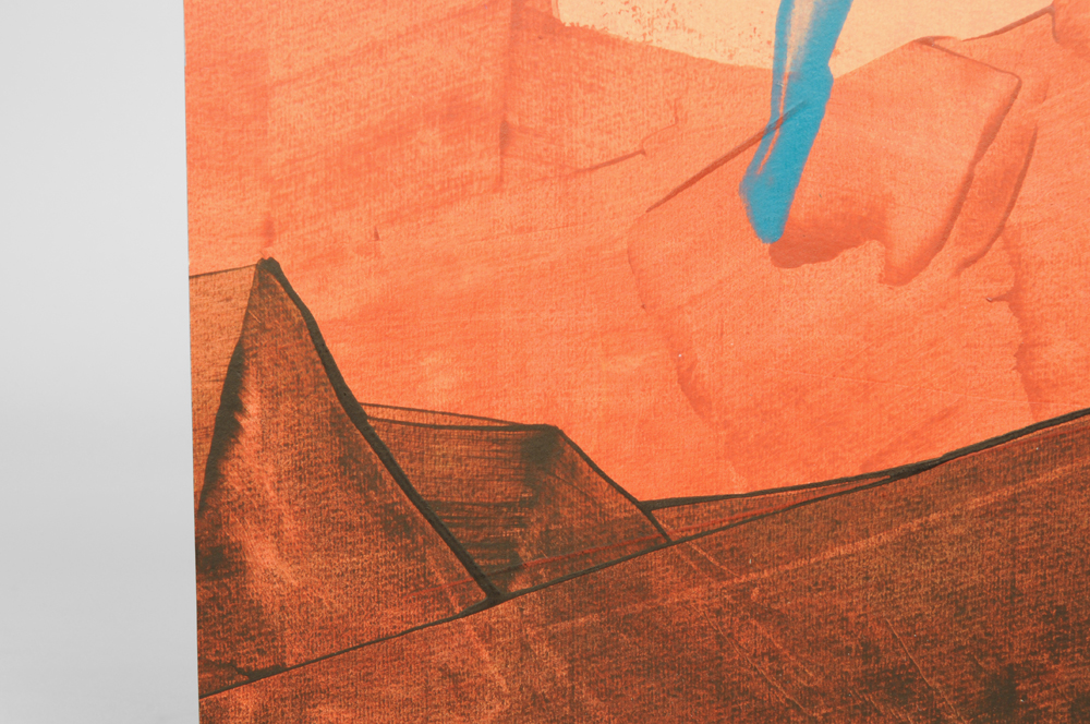
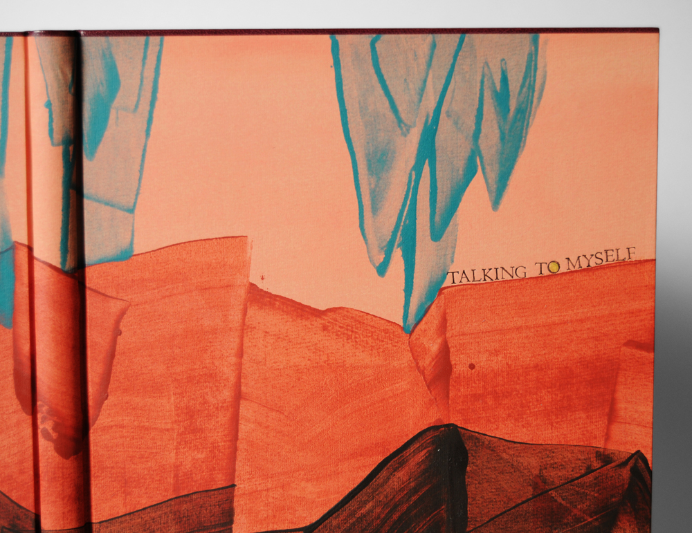
    The millimeter binding (specifically Rubow) is my most favorite structure due to its simple elegance and traditional use of handmade paste paper.  ‘Talking to Myself’ was bound with blank pages to be used as a journal.  On this binding the head edge and tail edge are lined with maroon goatskin with leather wrapped headbands in the same leather.  This paste paper was especially fun to design.  By taking inspiration from Sarah Creighton, I aimed to create an alien landscape with rich oranges and browns. 

    The initial peachy layer of acrylic paint mixed with wheat starch paste and water was applied to the Hahnemuhle Ingres paper with a sponge brush.  Once that dried completely the three other colors (of the same mixture) were applied separately with a piece of binder’s board in order to create the peaks and icicle-like forms.  The title was smoke-tooled with handle letters.  Smoke-tooling is a technique were the face of the tool is greased up with petroleum jelly and then stuck in a flame to collect carbon; the tool is then pressed into the cover leaving a trace of carbon behind.  This give a rich, deep black impression of the tool.


  3. My Hand…Fantasy & Nonsense

    July 23, 2012 by Erin Fletcher

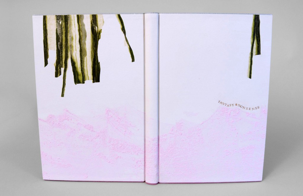
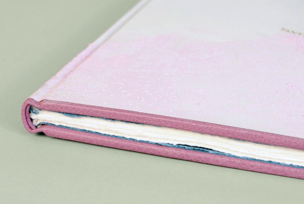
    Fantasy & Nonsense is a compilation of poems from 19th century American poet James Whitcomb Riley elegantly letterpress printed on handmade paper with wood engravings by Robert Buchert.  Riley was known for writing about rural Midwestern life to an audience of young readers.  However, this unique collection portrays a devilishly playful side of Riley’s poetry through whimsical tales of things both eerie and peculiar.  Buchert’s illustrations harmonize beautifully to the mischievous tune of Riley’s words.

    This binding was completed for an exhibition put on by the Rocky Mountain Chapter of the Guild of Book Workers.  Each submission will be judged for its level of craft and creativity. Results are still pending.

    My inspiration for this binding came from two lines in the first poem “A Nonsense Rhyme” (sea of pale pink lemonade and cringing grass).  The style of binding is referred to as Millimeter (specifically Rubow) where a millimeter of leather is exposed on the head and tail edge of the book.  I wanted to keep true to the whimsical feel of the poetry, so I used two separate leather colors, blue-gray for the head and mauve for the tail.

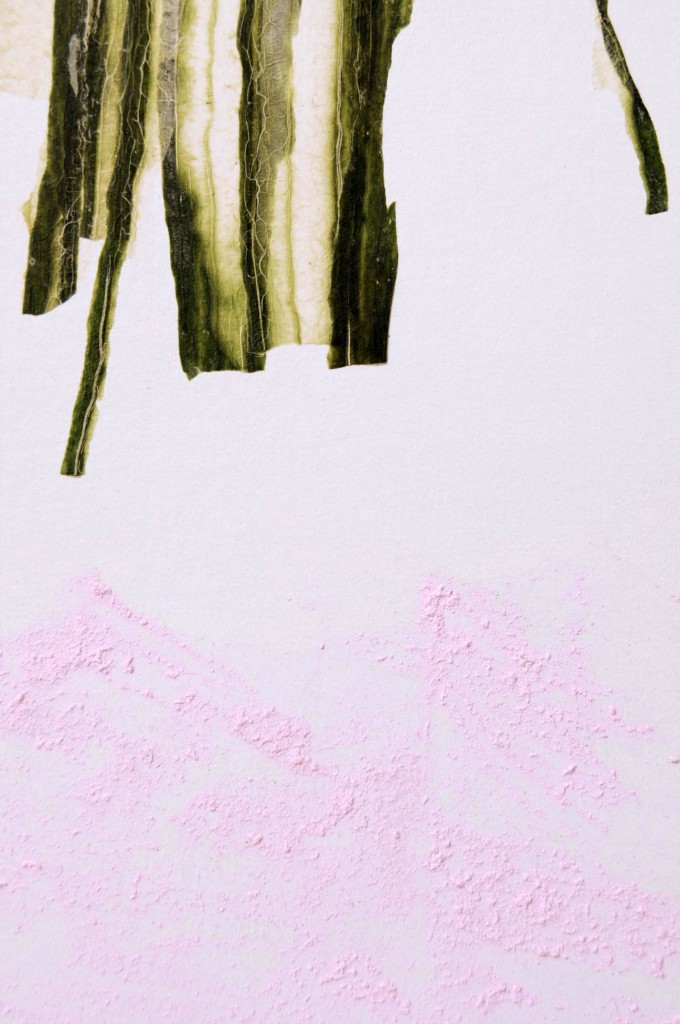
    The paste paper cover was created with a mixture of acrylic paint, distilled vinegar and sugar with accents of cucumber paper from Hiromi.

    Check out more photos after the jump.

    read more >


  • My name is Erin Fletcher, owner and bookbinder of Herringbone Bindery in Boston. Flash of the Hand is a space where I share my process and inspirations.
    The StudioNewsletterInstagramEmail me
  • Archives