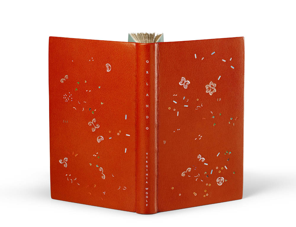
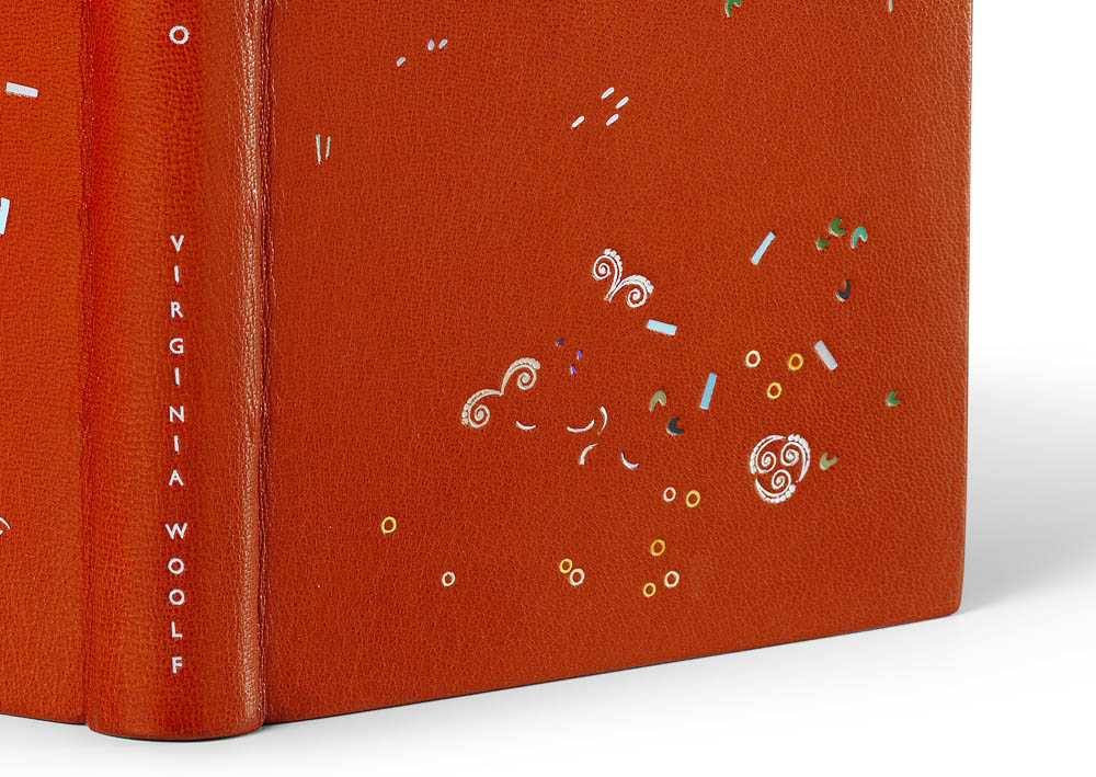
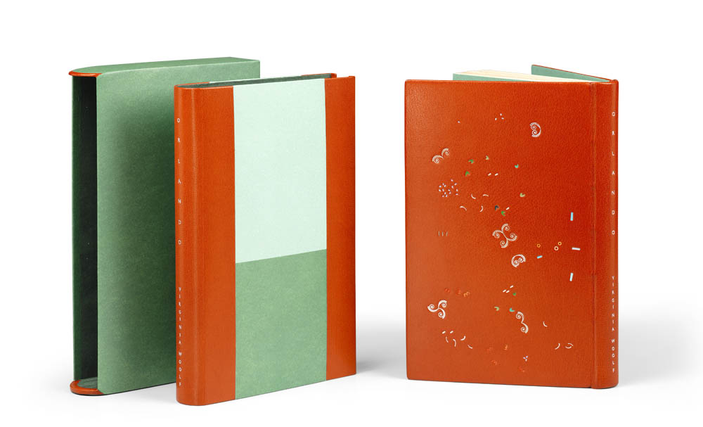
Orlando is the sixth book in the series and was bound by Annette Friedrich in 2016. The binding is covered in a bright red goatskin with grey hand sewn endbands and green paper edge-to-edge doublures and matching flyleaves. The tooling is made up of four shades of metallic foils which include silver, champagne, purple and green. The design has an additional seventeen shades of pigmented foils in white, grey, two shades of purple, two shades of blue, three shades of yellow, three shades of red and five shades of green. Transparent pearl and iridescent silver foils are added as accents throughout the design.
The chemise is inlaid with light and dark green paper at the sides and red goatskin across the spine. The title is tooled in iridescent and silver pearl foil. The slipcase is covered in the same hand-dyed dark green paper used on both the slipcase and flyleaves and lined with a green Alcantara. The design was tooled by Claude Ribal.
During the design process, you describe creating around 50 versions per binding. I wondered if you could speak more specifically about this. Are you reinventing the design each time or pulling elements from previous iterations to make your final layout. I imagine you might flip the design in all directions or look at it in reverse.
Yes, there are many versions of a design before it is ‘just so’. It’s a little bit of everything that you just mentioned. At first I start out though and cut white sheets of paper to the exact size of the boards and get my handtools and the inkpad out. I will have read the book at that point, but normally I do not go in with a preconceived idea for a design as such. However, this book is actually an exception, as I did know that I wanted to work with a distinct historic tool as a stand-alone player. But to begin with it is just plain old doodling and letting things flow. After a while something will have perked my interest, and I will start looking at this with a more inquisitive mind. I try to understand what exactly has caught my attention, how it worked and why, and then, how the hell to develop this into a full-blown design. During all of this I will continue to dip in and out of the book. Reading the authors voice, sensing the rhythm, feeds back into my design process. So at first the steps are big, then they get smaller and smaller. And yes, sometimes I look at a sheet from the reverse or flip it into a different angle, but unless I don’t actually use it for the next sheet, I would not count this as ‘a’ step. I have a light-box that helps me to carry forward the elements that I like, but there is no real telling what will stay in the game until the very end. Once I am happy with the design in black and white, I then go out in search to find the colors that build up the atmosphere.
Woolf wrote Orlando more quickly then her previous novels. Were you aware of this as you were designing the binding? Did you try to quicken your pace as well?
Yes I was aware of it, but it had no influence on my own process. It takes as long as it takes to get it right.
The design for Orlando is very playful. I love how you used the historic tool in a more atypical manner, it really evokes the feeling of the novel as it floats and dances through the design.
You make me very happy with the words you just chose. Floating and dancing: excellent! That was exactly what I was after, and it is fabulous that you mirror this back to me. Thank you!
A beautiful documentation has now been published, that traces the development of this project, which, as it turns out, took seven years to complete. WOOLF I – IX ! 98pp, with an introductory essay and 1:1 reproductions of the bindings, background information, and text excerpts.
Text: Annette Friedrich, Virginia Woolf
Design: BUCHmacher, Germany
Photo: Shannon Tofts, Scotland
£30 + postage / reserve your copy at www.annette-friedrich.com


