RSS Feed

Posts Tagged ‘north bennet street school’

  1. Half Light Bindery

    March 18, 2014 by Erin Fletcher

    HalfLightBindery5

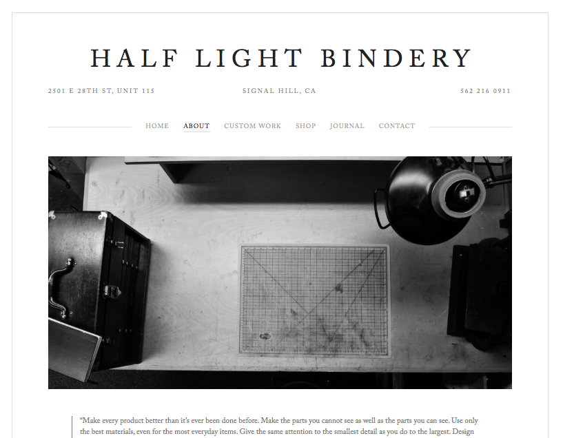
    As Kevin Sheby graduated from the full-time program at North Bennet Street School, I had to say my goodbyes. He and his wife, with their two dogs, left soon thereafter to return to California. Since graduating in 2013, Kevin has custom built an efficient bindery space where he runs Half Light Bindery (which I have to say is a wonderfully chosen bindery name).

    Kevin is so talented and has created such amazing work that is both well crafted and artistically executed. Spending time with Kevin at NBSS, made me realize the importance of whole-heartedly investigating bookbinding structures and materials. What are the limits and what are the possibilities. Kevin has such a superb attention to detail and I’m always looking forward to the work that comes out of his bindery. 

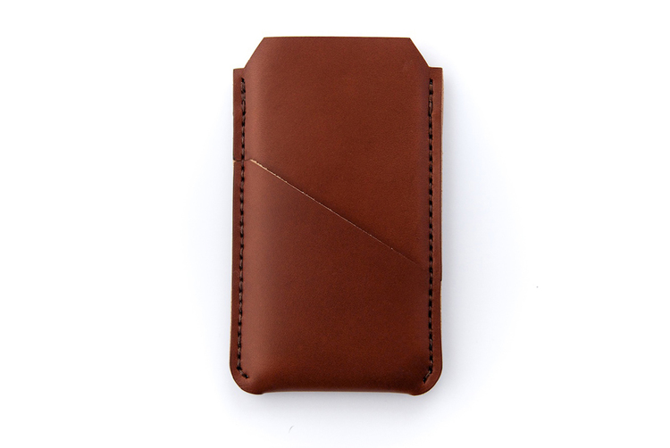
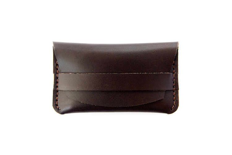
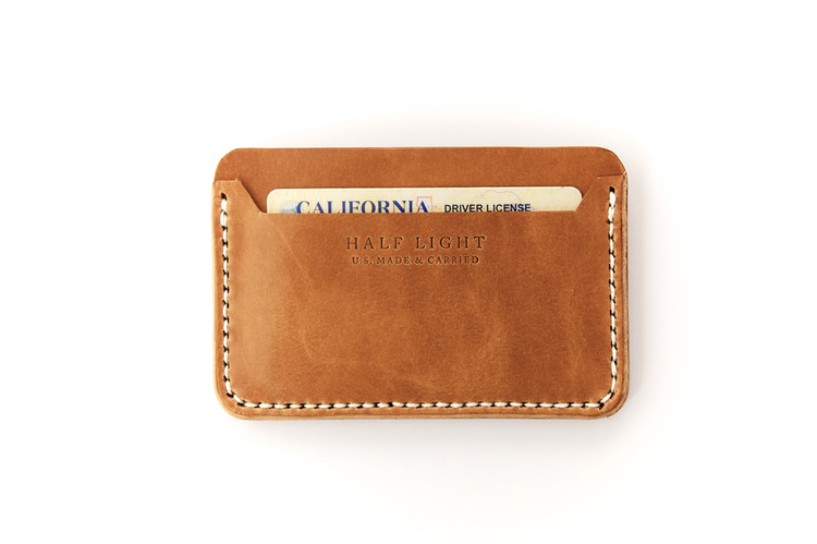
    Recently, Kevin launched a collection of handmade leather products. Again his innate attention to details are seen in every product and within the professionalism of his website. 
    HalfLightBindery7HalfLightBindery3 HalfLightBindery2


  2. February // Bookbinder of the Month: Haein Song

    February 1, 2014 by Erin Fletcher

    MythOfSisyphus-HaeinSong

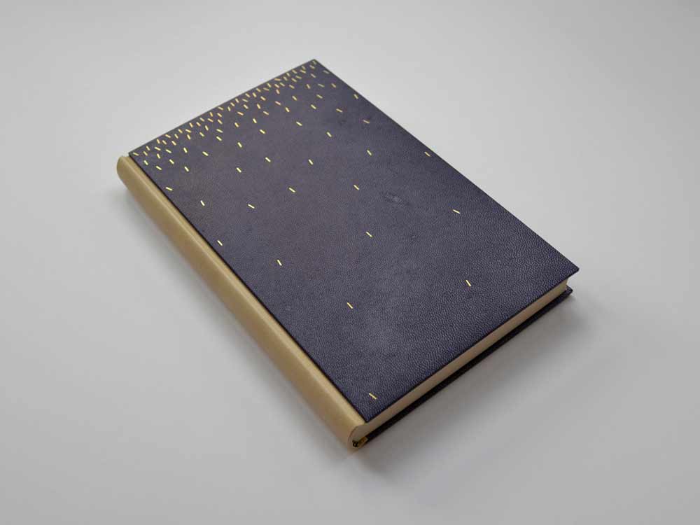
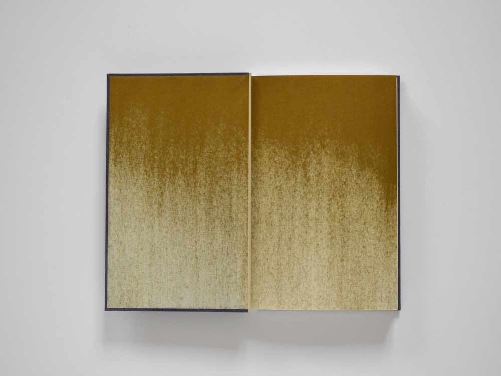
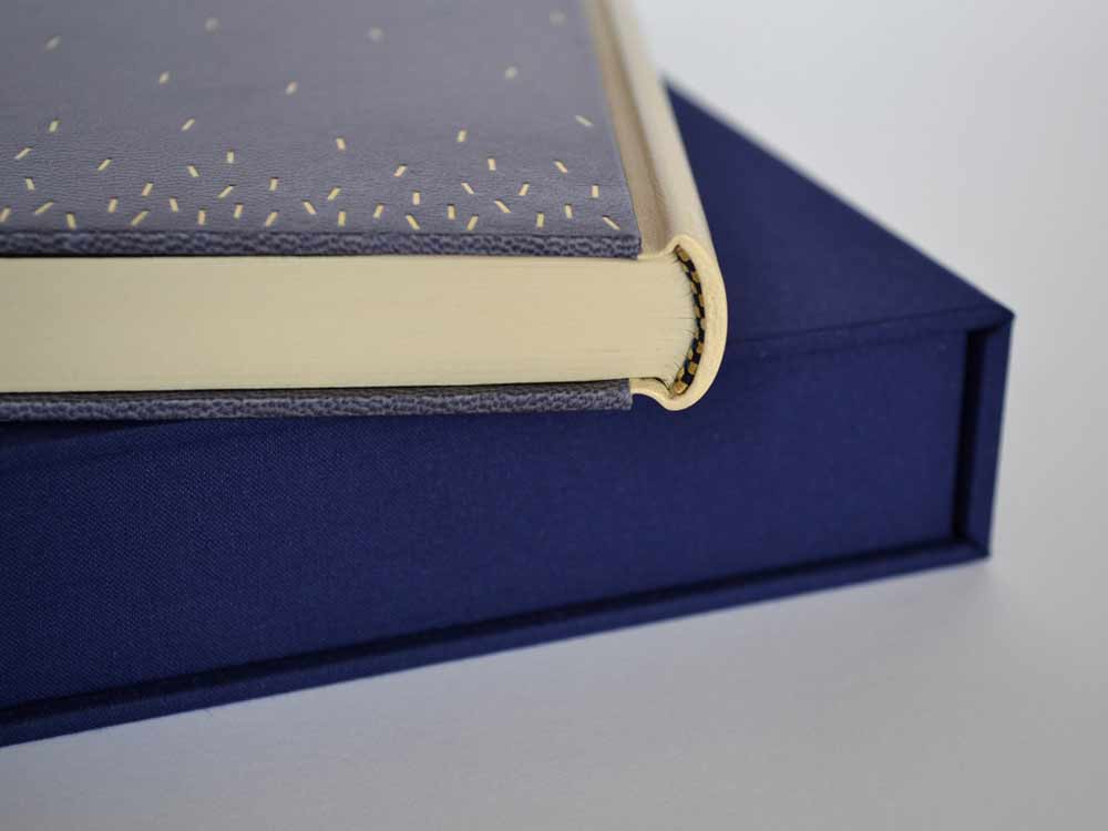
    This beautiful binding of The Myth of Sisyphus and Other Essays by Albert Camus was crafted in 2013 by Haein Song. Bound as a Bradel binding, the spine is covered in a natural goatskin with dark blue vellum covers. The sprinkled dashes on the covers are hand tooled in gold. The spectacular endpapers are hand printed. 

    MythOfSisyphus2-HaeinSongMythOfSisyphus3-HaeinSong

    This binding is absolutely stunning and so flawlessly executed. The covers are a beautiful dark blue vellum. Did you find the material difficult to work with in either the structural or tooling aspect of the binding process? I have a single experience with vellum over boards, but I know that bookbinders approach the board construction differently. May I ask if you prepped the boards for the covers in any particular way for the vellum?
    I heard few notorious rumours about vellum but I don’t think I found it difficult at the time I was working on it. Partly because it was a relatively small bradel binding and there wasn’t headcaps or joints. The spine of the book is covered in natural goatskin. 

    What I found afterwards was that the front and back vellum boards sometimes change their shapes depending on the humidity or temperature of the surrounding. But surprisingly it comes back to the original shape after some time. I was told that it needed a little bit of time to climatise.

    Later I was also told that lining vellum with a very thin paper (archival bible paper or Japanese paper) would reduce this changeable characteristic. 

    Tooling wasn’t particularly hard after practising enough on sample boards but I don’t think I have an ample amount of experience to compare differences in tooling on leather or vellum.

    – – – – – – – – – – –

    I have not yet had the pleasure of meeting Haein or been presented the opportunity of viewing her work in person. However, I’ve had her website bookmarked for a while now, checking back from time to time to ogle her work. As I began preparing a list of people to interview this year Haein’s name popped up as a suggestion from Hannah Brown, whom I interviewed at this time last year. So with Hannah’s endorsement and my growing fondness, I present the following interview with Haein Song. The interview ends with Haein’s elegantly worded philosophy on bookbinding. 

    Come back every Sunday during the month of February for more posts on Haein’s work. You don’t want to miss it, Haein shares some of the creative techniques behind her expressive and artistic bindings. 

    read more >


  3. Conservation Conversations // Lab Coat Daydreams, Part I

    January 16, 2014 by Anna Shepard

    I feel that I should share a bit of my story and recent background in this first post, in hopes of providing some context for what may follow in the next few weeks.

    There was a running joke our instructor liked to chide us with, during our training at the North Bennet Street School. He teased that, after finishing our program, we could expect to find ourselves in either a “lab” or a “studio.” Being of a more artsy bent, or at least gravitating more towards the image of the artistic bookbinder that I had visualized at the program’s beginning, I never really considered what life in a book and paper conservation lab might actually be like.

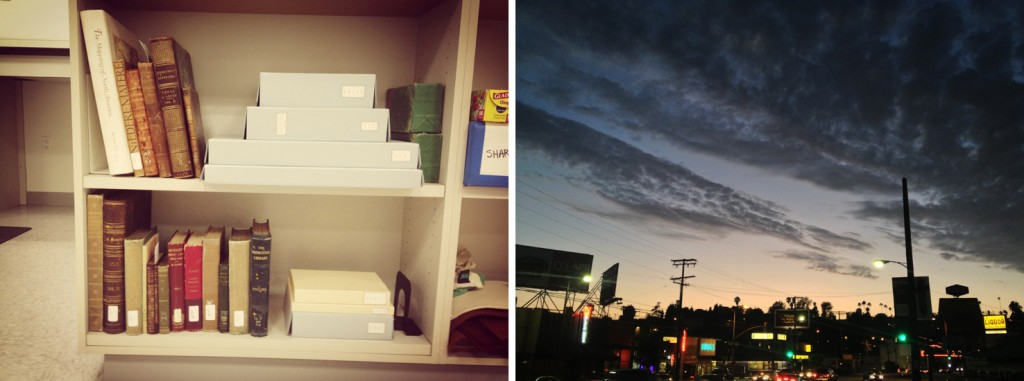
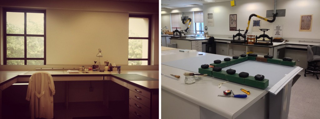
    After many slow months of picking up work where I could find it and squeezing in some binding projects on the side, I left Boston and decided to give things a shot in Los Angeles county, where my boyfriend had found steady work as a concert piano tuner & technician. With great luck, after suffering a few more painfully slow (and hot) months, I was hired as a “book & paper conservation technician” at The Huntington Library in Pasadena. I was overjoyed to find work that would allow me to employ the skills I had so recently acquired and in such an incredible setting. While my egoistic inner artist may have wept a few tears at first, I began to see the ways in which I could exercise my artistic license within the context of conservation.

    anna-part1b

    As with almost any job, there are elements of my work that sometimes feel a little wrote or tedious. O the whole though, I feel lucky to say that I engage creative and critical thinking skills with the majority of the projects that come my way. The nature of the work we do in the lab demands true flexibility and a type of problem-solving akin to what I imagine certain engineers might use. For example, while I may not have the weight of producing complex infrastructures in high-density areas looming over me, as I begin any housing project, I am asked to construct something securely and uniquely designed for each rare book or manuscript’s safe-keeping. I am asked to open my eyes to the unusual aspects of a book and give it the treatment it deserves or, as happens in triage situations, do whatever can be done for the time being.

    As conservation staff we are constantly taking into consideration how items have and will continue to age and how we can best aid the longevity of each item so that it may continue to be. Thinking in this way can lead to some pretty heavy pondering – however, if you are as submerged in the art and mechanics of creating something with your hands—directly connecting mind with body, employing experience-based knowledge to your decision making about even the smallest element of a box or binding—you find yourself at the source of budding craftsmanship. And that, after all, is what I fell in love with when this journey began.

    anna-part1a


  4. September // Book Artist of the Month: Michelle Ray

    September 2, 2013 by Erin Fletcher

    godcreatedthesea-michelleray

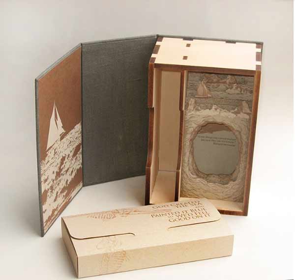
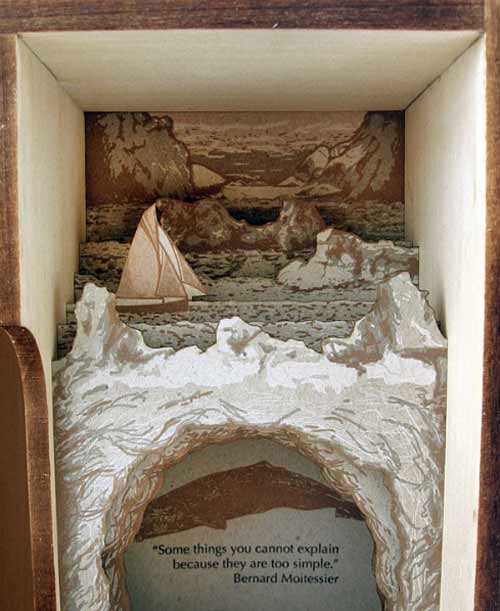
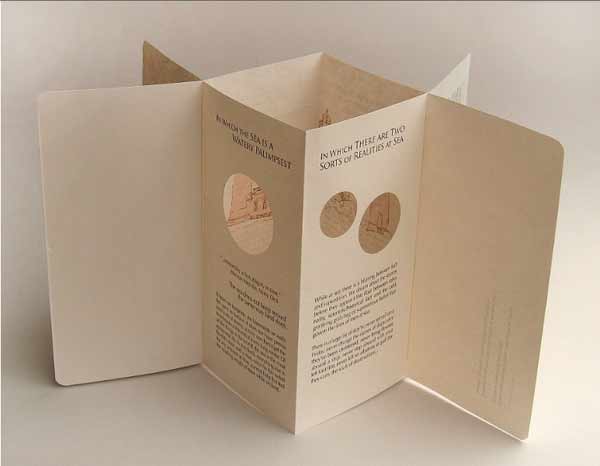
    As I read the concept behind God Created the Sea and Painted it Blue so We’d Feel Good on it, I am reminded of the Michel Gondry film The Science of Sleep and how we create vessels in the physical world to guide our journeys through our imaginary worlds. In 2013, Michelle Ray used such an experience as the inspiration for her most recent artist book. 

    godcreatedthesea3-michelleray

    Michelle first learned how to use a map while sailing. Out on the sea, where there are no landmarks just an ever-changing landscape.

    As Michelle explains: In reference to the sea, this edition’s text states, “There are no markers in this/ monochromatic/ parking lot.” In the absence of these markers, we become painfully aware of their significance. This work is about experience, perception, memory and the space in between composed of symbol, sound and object. This is the space of mediation, the space where significant things happen; it is the ocean on which my imaginary crew and I sailed­, the place for which there are no maps.

    godcreatedthesea1-michelleraygodcreatedthesea2-michelleray

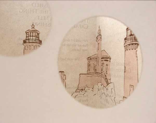
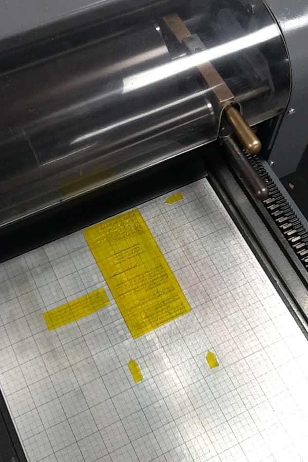
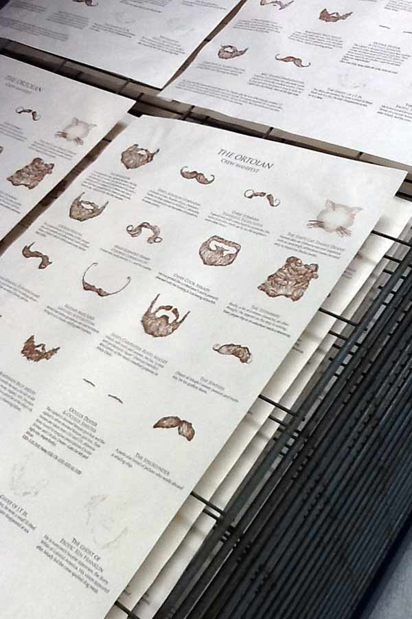
    Imagery and text have been printed using photopolymer plates on handmade cotton/abaca, French Construction and Neenah Environment papers. The photographs that follow were taken to document the printing and binding processes of God Created the Sea

    godcreatedtheseaprogress-michelleray

    Photopolymer plates on the Vandercook.

    godcreatedtheseaprogress3-michelleray

    Prints laying out on the drying rack. 

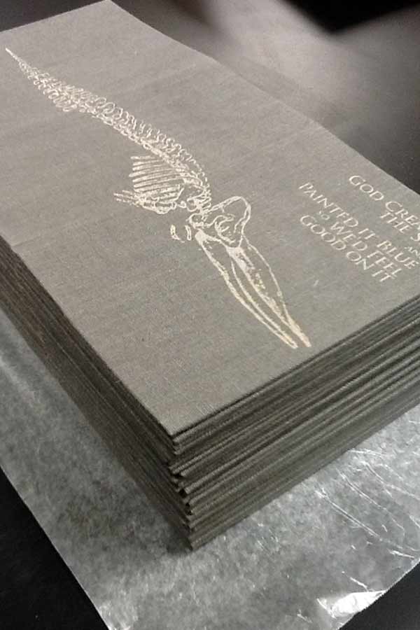
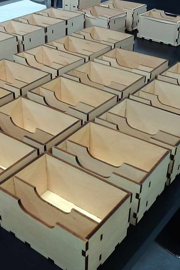
    The enclosure is made of linen and basswood. The linen is printed with the image of a whale skeleton along with the title in gold. This piece was produced in an edition of 50 at the Small Craft Advisory Press as Michelle’s creative project in the MFA Book Arts Program for The University of Alabama.

    godcreatedtheseaprogress4-michelleray

    Outer linen cloth wrapper.

    godcreatedtheseaprogress5-michelleray

    Basswood enclosures.

    God Created the Sea is already housed in several collection across the United States and in the United Kingdom. In addition, been awarded Best of Show at the Foundry Art Centre in Missouri and runner-up at The Sheffield International Artist’s Book Exhibition in the UK.

    Michelle is the recent recipient of the Artists’ Book Cornucopia IV Gallery Director’s Exhibition Award presented by the Abecedarian Gallery. This announcement is when I first discovered and fell in love with her work. Although, I’ve never had the pleasure of seeing Michelle’s work in person. Her work is clearly crafted beautifully, balancing rich content and concepts with thoughtfully executed structures. Her work will be featured in a solo Reading Room exhibition from April 18 – June 7, 2014 at the Abecedarian Gallery in Denver, Colorado. Oh, how I hope I find myself in Colorado next spring. Read the interview after the jump and come back each Monday during the month of September for more posts on the work of Michelle Ray.

    read more >


  5. Bookbinder of the Month: Sonya Sheats

    June 23, 2013 by Erin Fletcher

    pictorialwebster-sonyasheats

    Photo by Brandon Constant.

    In 2010, the New England Chapter of the Guild of Book Workers exhibited a series of juried design bindings for Johnny Carrera’s Pictorial Webster’s: A Visual Dictionary of Curiosities. As a project that began in 1996, Carrera patiently sifted through a collection of around 12,000 engravings from the Merriam-Webster Company that are now housed in Yale’s Arts of the Book Press room in hopes to create a visual dictionary inspired by the Illustrated Webster’s. Carrera’s Pictorial Webster became available to the public as a trade edition in 2010. Original letterpress copies were bound in several different styles from full leather to oak boards to full cloth. Additional copies were left unbound and made available to bookbinders.

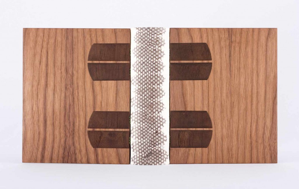
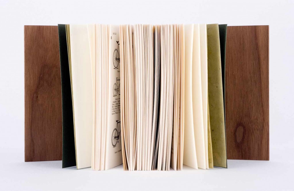
    Sonya Sheats was amongst the binders selected for the NEGBW exhibit deFINEd BINDINGS hosted at the Bromfield Gallery in Boston, MA. Bound as an open joint binding and sewn on water snakeskin and vellum tapes. The spine is white and black snakeskin and the covers are MDF and walnut veneer with dyed walnut onlays. The binding fits snuggly inside a shaped walnut slipcase. Sonya’s binding was awarded “Best Binding Structure” by North Bennet Street School

    A comment from Sonya regarding the structure of the binding: 
    Looking back, I do not think I would use an open joint structure on a book this thick. The covers essentially hang off of the book by the sewing tapes, which are hidden in a sort of de Gonet style with the dyed wooden onlays. Because of the hefty appearance of the walnut, I think it works here, but in general, I think of this structure as quite delicate and lanky. 

    pictorialwebster2-sonyasheats

    Photo by Brandon Constant.


  6. North Bennet Street School // Student & Alumni Exhibit 2013

    May 30, 2013 by Erin Fletcher

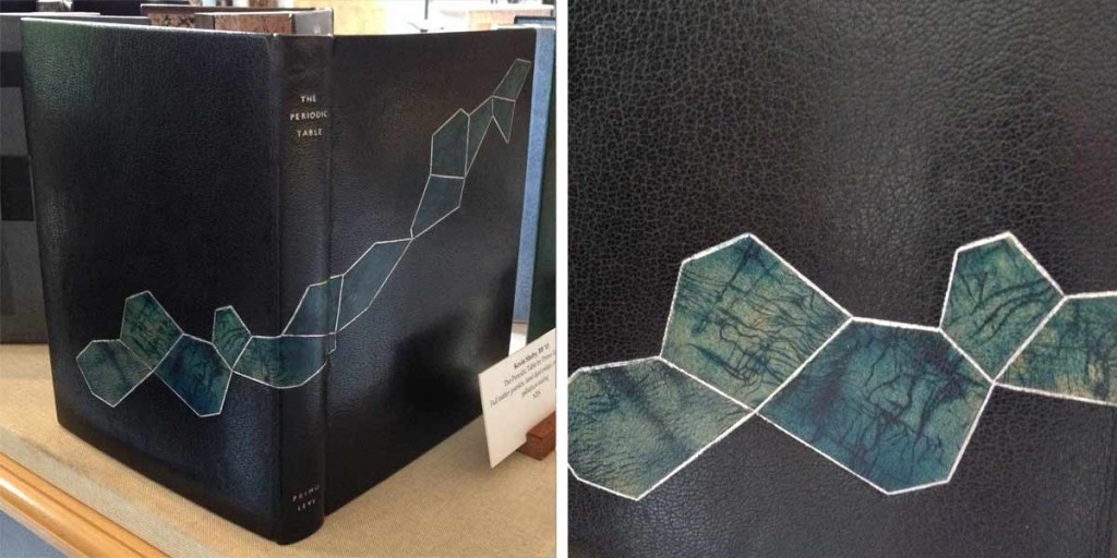
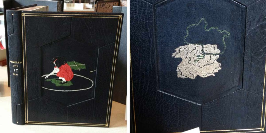
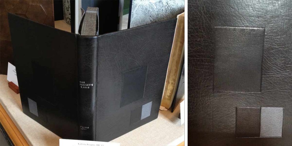
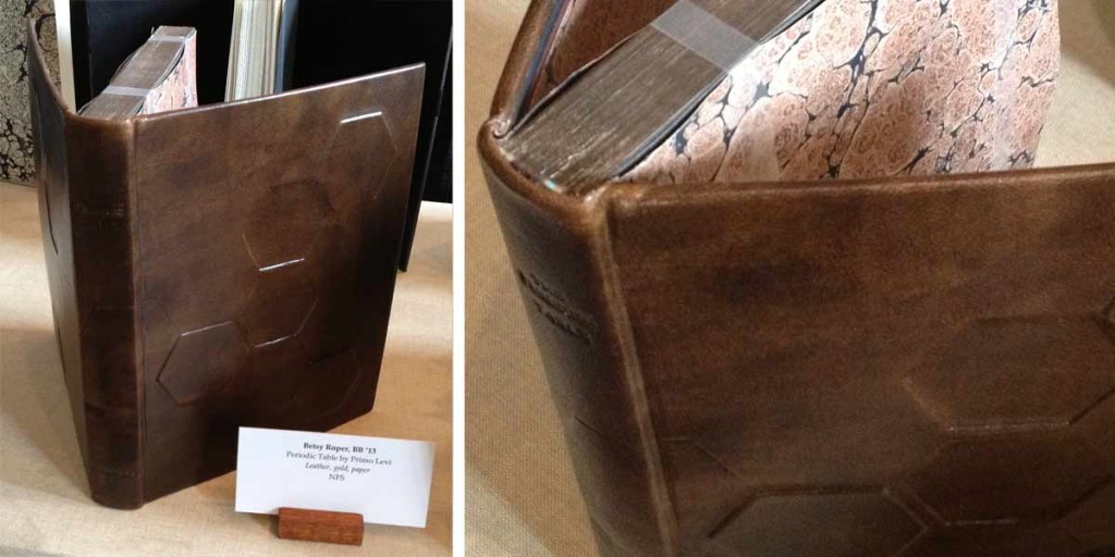
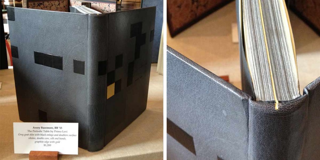
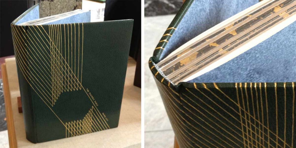
    At the annual Student & Alumni Exhibit for North Bennet Street School, the 2013 graduating Bookbinding class* showcased their design bindings for the set book The Periodic Table by Primo Levi. The text is largely a memoir of the years before and after Levi was transported to Auschwitz. Through a set of chapters titled after elements on the periodic table, Levi recounts his Jewish community in Italy and his life as a student and young chemist; exposing how life’s pleasures can resist and endure in the face of tyranny.

    studentalumni-kevinsheby

    Kevin Sheby bound his edition in black goatskin with hand-dyed goatskin onlays, tooled with palladium. The title and author are also hand tooled in palladium. Edges decorated with graphite and irregularly gilt with palladium. Kevin finished off the inside covers with black goatskin doublures and sunken ebonized veneer panels.

    studentalumni-jeannegoodman

    Jeanne Goodman covered her binding in full navy blue goatskin with sunken hexagon panels on either cover displaying two illustrations from the text. Each illustration is created through the use of several decorative techniques including feathered onlays, tooling in blind and gold and surface gilding in palladium. A tooled double border in gold runs along the outer edges of the covers. All three edges are gilt in gold and the interior is finished with handmade graphite paste papers.

    studentalumni-katrinakiapos

    Bound in full black goatskin, Katrina Kiapos, accented her design binding with a minimalist, geometric design. Three onlays in shades of black and grey mirror each other from the front and back covers. Katrina hand tooled the title and author in palladium. Edges decorated with graphite and sprinkled with palladium. The interior is covered with black goatskin doublures and leather flyleaves.

    studentalumni-betsyroper

    Betsy Roper bound her design binding in full hand-dyed goatskin. The skin was dyed to have a mottled look, creating texture and movement. Various hexagons are placed on the front and back cover, both protruding from and sinking into the boards. Title hand tooled in blind. Edges decorated in a soft brown tone. A marbled paper accents the island paste down and flyleaf.

    studentalumni-averybazemore

    Avery Bazemore created a design to reflect the chapters of the book, emphasizing the section about gold with a surface gilt square onlay on the front cover. The book is bound in full grey goatskin with additional onlays in black goatskin. Title and author were hand tooled in carbon. Head edge decorated before sewing in graphite; Avery again emphasizes the chapter in gold by gilding that particular section of the text. The single line continues onto the headband and headcap. The interior is finished off with leather doublures.

    studentalumni-laurenschott

    Covered in full dark green goatskin, Lauren Schott created a design binding reminiscent of the Art Deco era. Hand tooled gilt lines run the height of the front cover, wrapping around the spine, board edges and back cover leaving the outline of a hexagon. The title and author were also hand tooled in gold. Edges decorated with graphite and sprinkled with gold leaf.

    In addition to student work, a small handful of alumni work was also on display.

    libraryofbabel-colinurbina

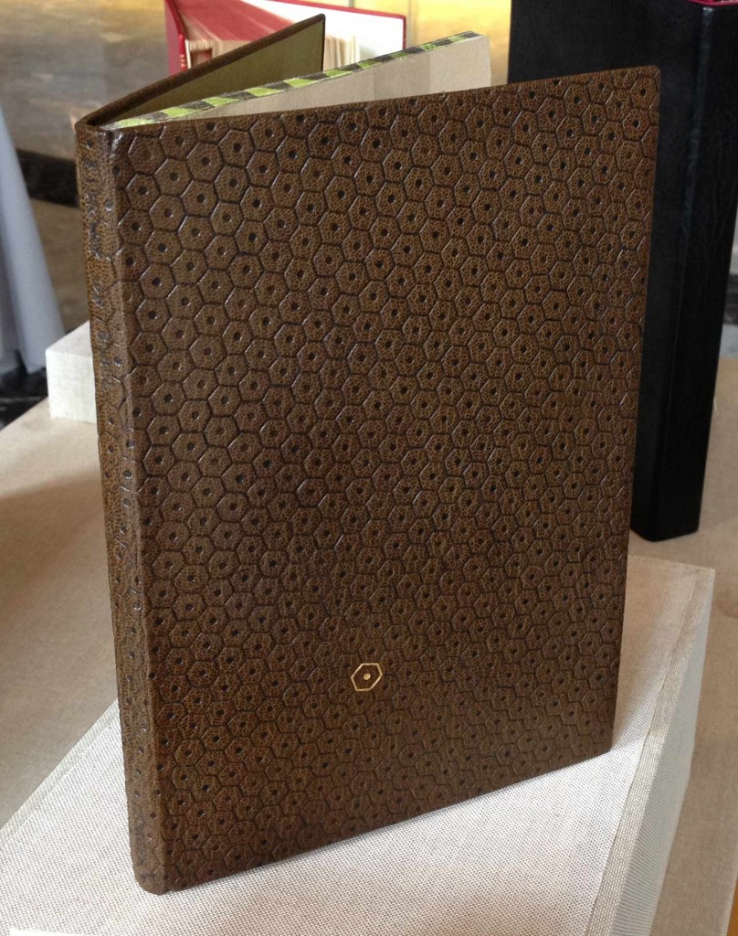
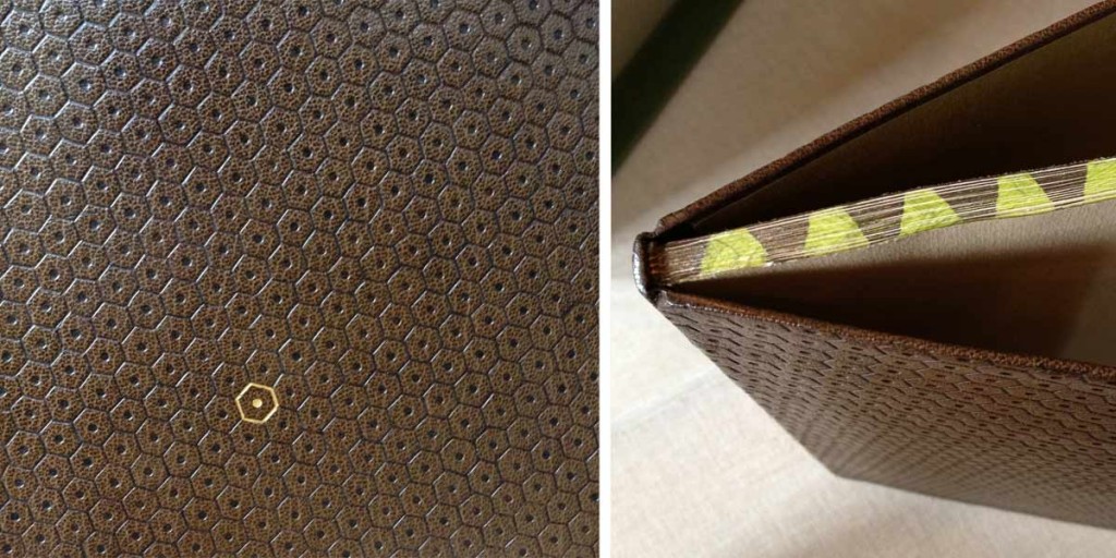
    Library of Babel bound by Colin Urbina in full brown goatskin and hand tooled in a repeating hexagon pattern. A single hexagon is gilt on the front cover. Edges decorated with alternating shades of brown and chartreuse green.

    libraryofbabel2-colinurbinawhitman-samfeinstein

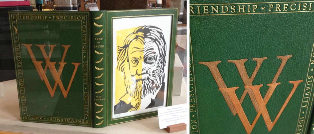
    A full leather rounded spine clamshell box from Samuel Feinstein. The front cover has a built-in window to house a printed portrait of Walt Whitman in addition to a gold tooled border along the frame.

    shakespeare-celinelombardi

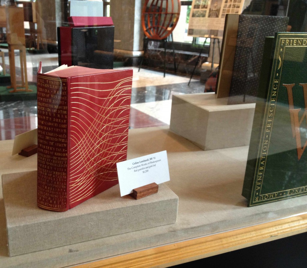
    The Complete Works of Shakespeare bound by Celine Lombardi in full red goatskin. Titling and cover design hand tooled in gold. Each title on the spine is linked to a tab on the foredge of the text block through a corresponding gilt line.

    alumnicase-erinfletcher

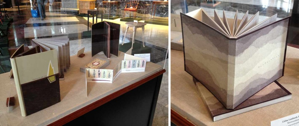
    There are four great pieces on display in this case. On either corner are two of my bindings: Fantastic Mr. Fox and James and the Giant Peach. Last year, Marie Oedel paired up with book artist Laura Davidson (whom I interviewed on my blog in April) to make custom boxes for her book Every Nib. Lastly, is Celine Lombardi’s Murmurations, a small edition printed and bound during her year long fellowship at The Center for Book Arts in New York.

    * Nancy Baker’s set book was taken from the exhibit before I could photograph it for this blog post.


  7. Interview on Bookbinding Now

    May 1, 2013 by Erin Fletcher

    bookbindingnowinterview

    I was recently invited to participate in an interview with Susan Mills for her podcast Bookbinding Now, which is a New York-based community podcast posted every other Wednesday. 

    Before the phone interview, I had the pleasure of speaking with Susan about some of her experiences and found out that our ambitions are quite similar. She was very kind and encouraging and I’m delighted to have contributed to her podcast. 

    You can listen to the interview on the Bookbinding Now website or download it through iTunes. Enjoy!


  • My name is Erin Fletcher, owner and bookbinder of Herringbone Bindery in Boston. Flash of the Hand is a space where I share my process and inspirations.
    The StudioNewsletterInstagramEmail me
  • Archives