AUGUST:
No workshops scheduled for the month of August. Enjoy your summer!
SEPTEMBER:
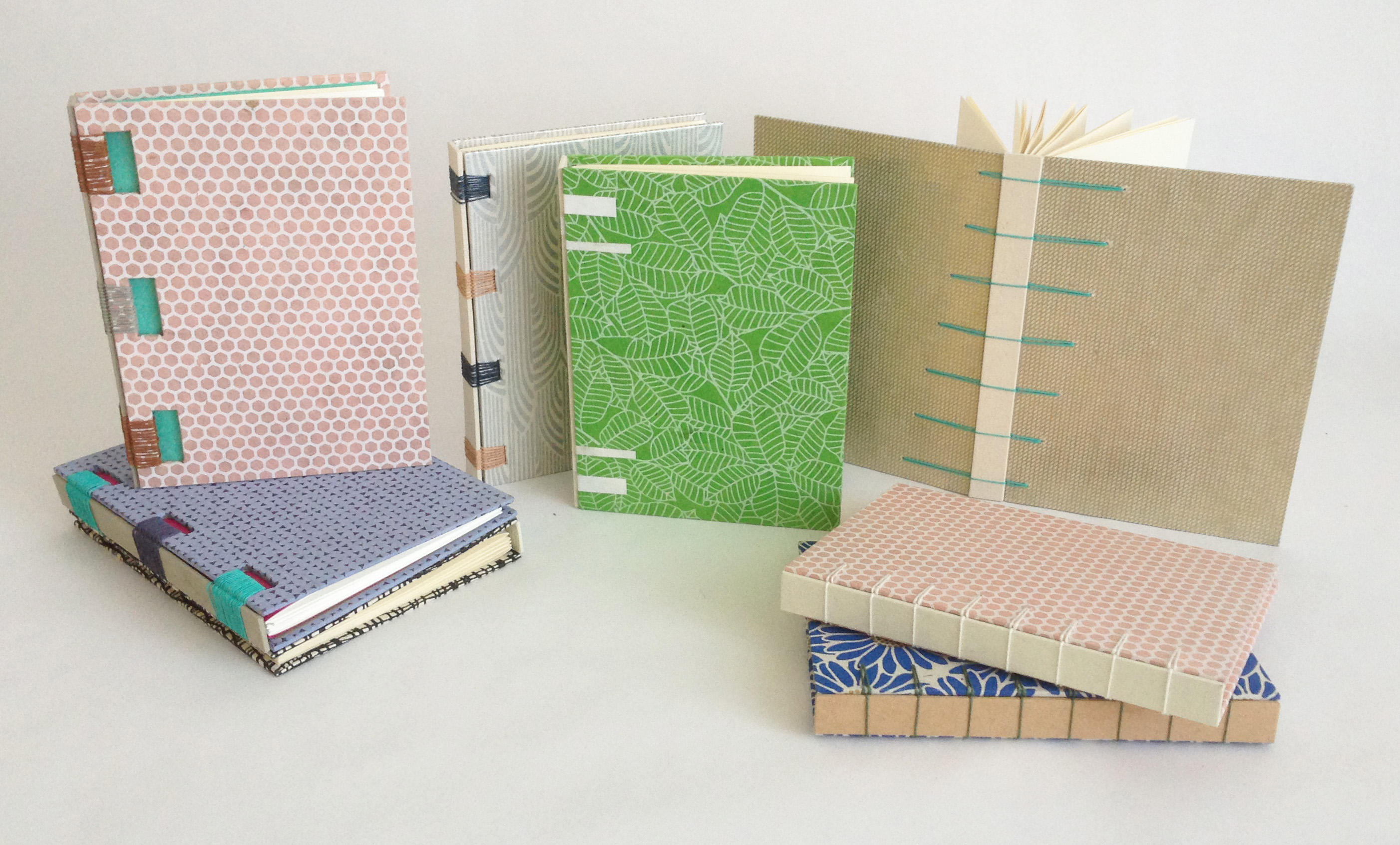
Fundamentals of Bookbinding I
September 18 – 22 (Monday – Friday)
8:30am – 4:30pm
North Bennet Street School, Boston, MA
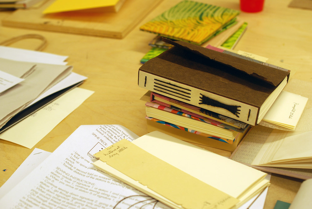
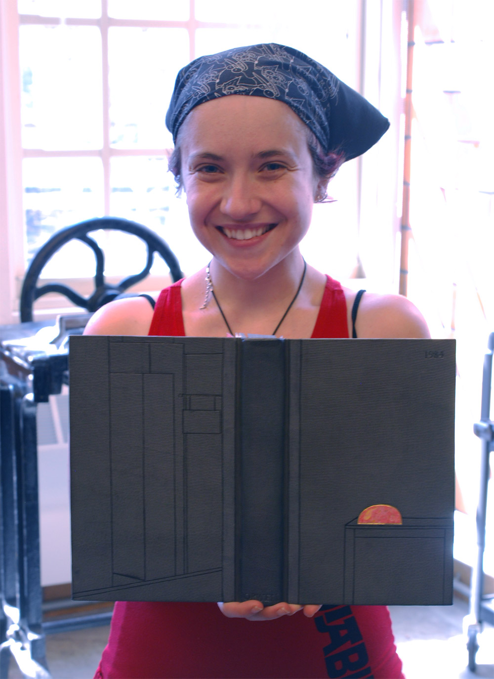
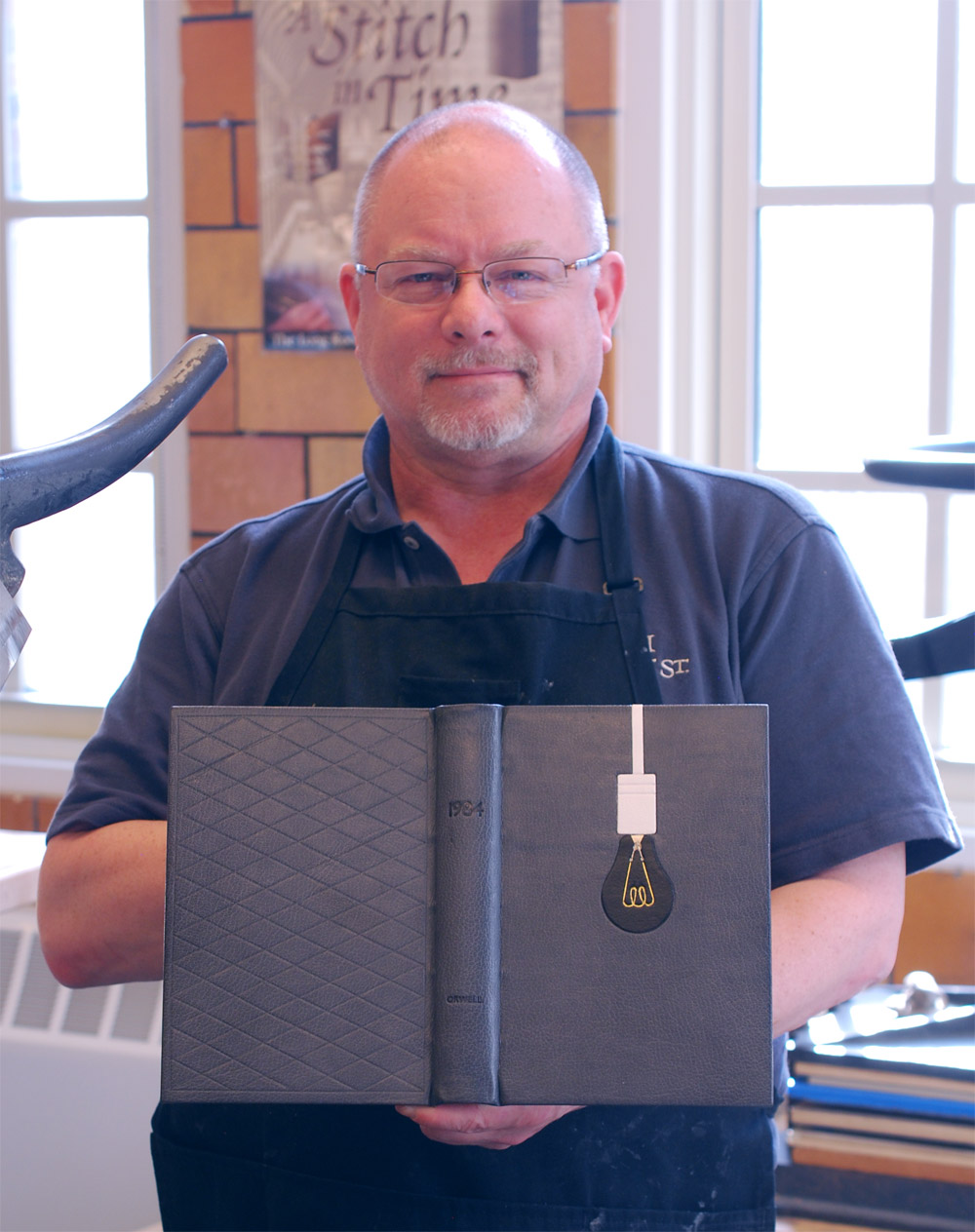
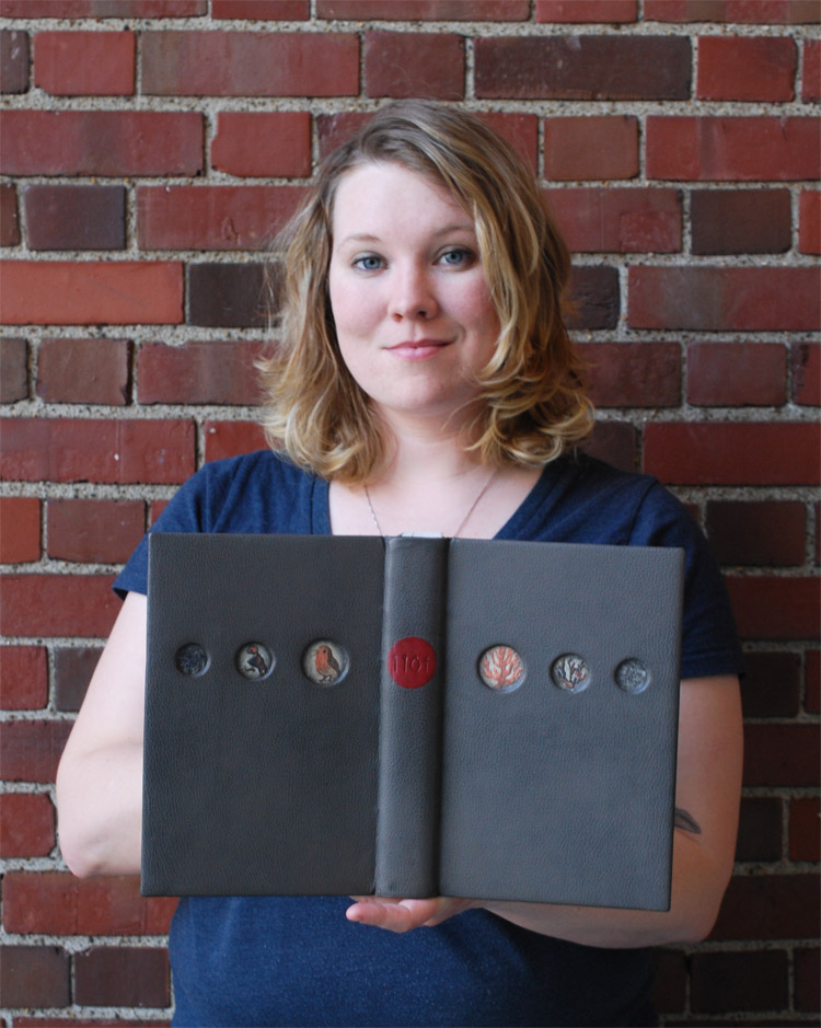
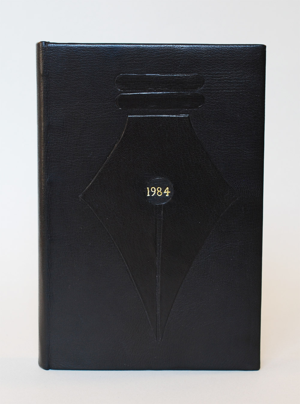
This is a great workshop if you are interested in the full-time program at North Bennet or wanting to learn a new skill. During the workshop students will explore the basics of bookbinding through a variety of non-adhesive structures and finish the week by making a flatback case binding. We will discuss materials, adhesives, tool use and students will have access to traditional bindery equipment.
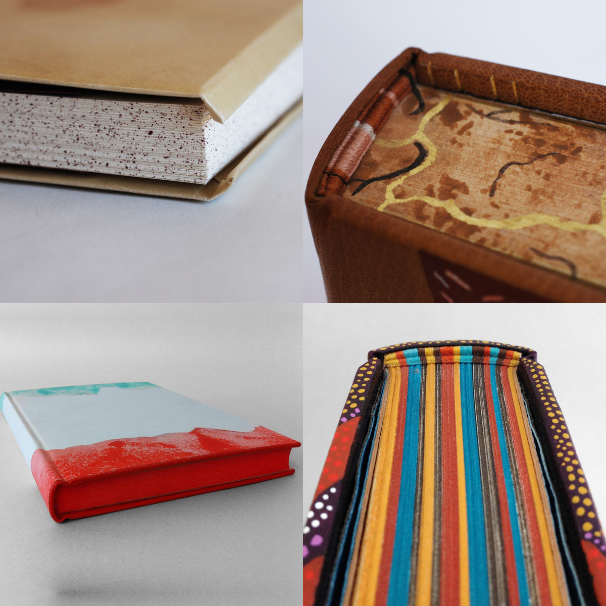
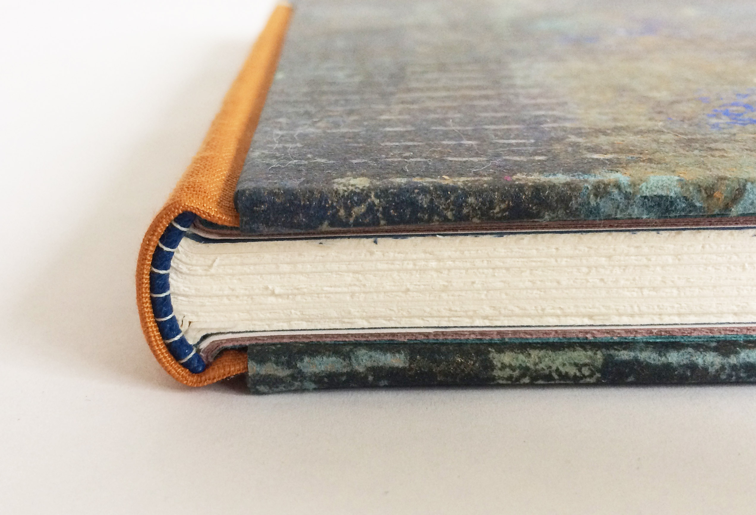
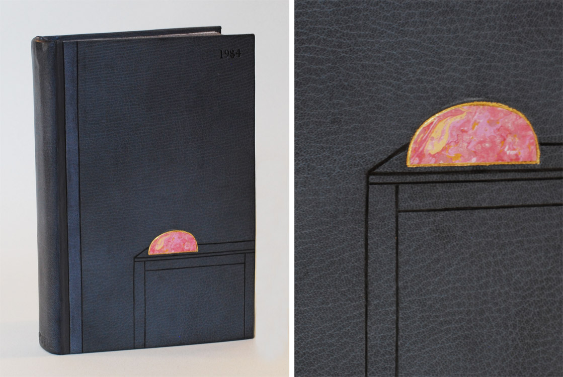
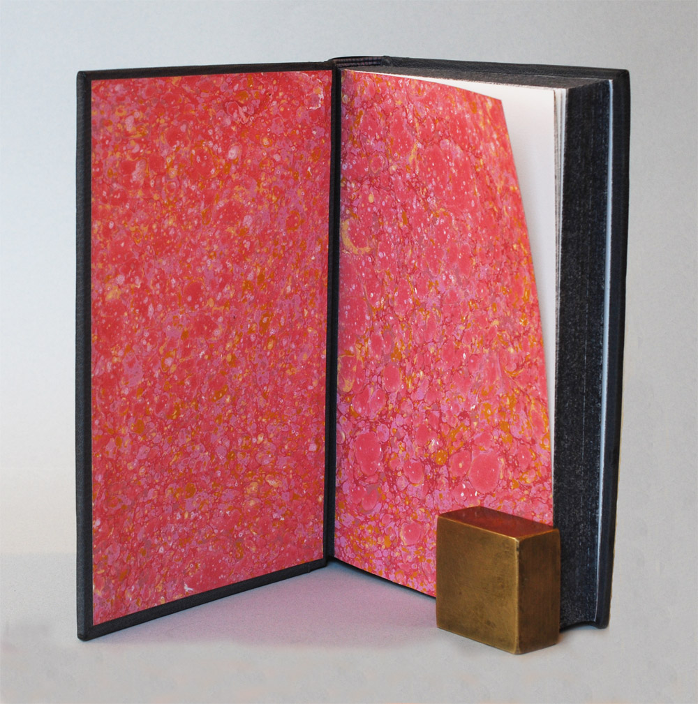
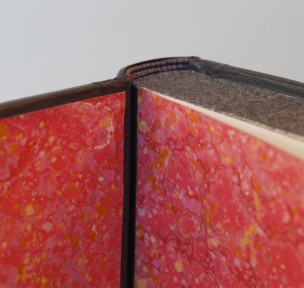
Edge Decoration
September 30 – October 1 (Saturday & Sunday)
8:30am – 4:30pm
North Bennet Street School, Boston, MA
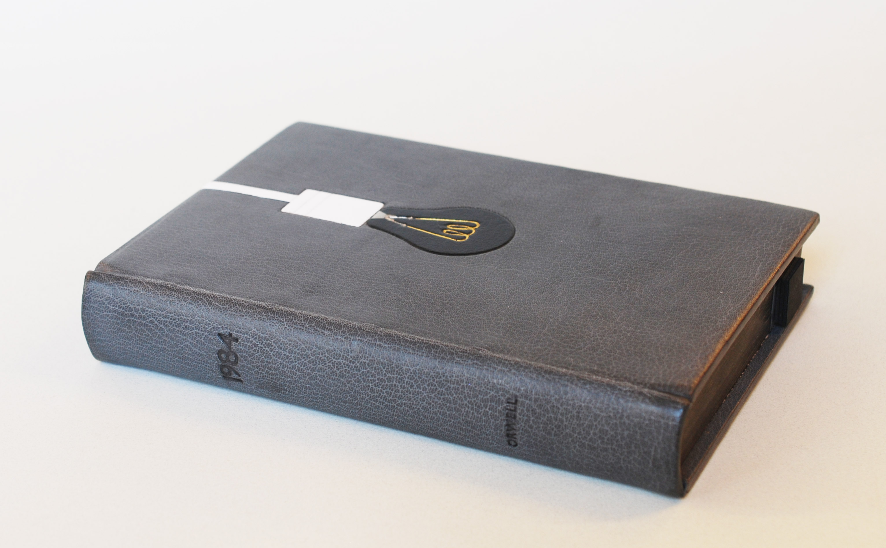
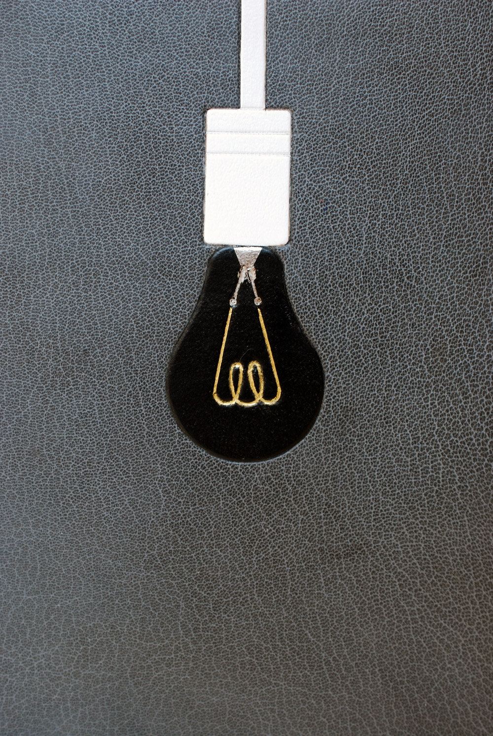
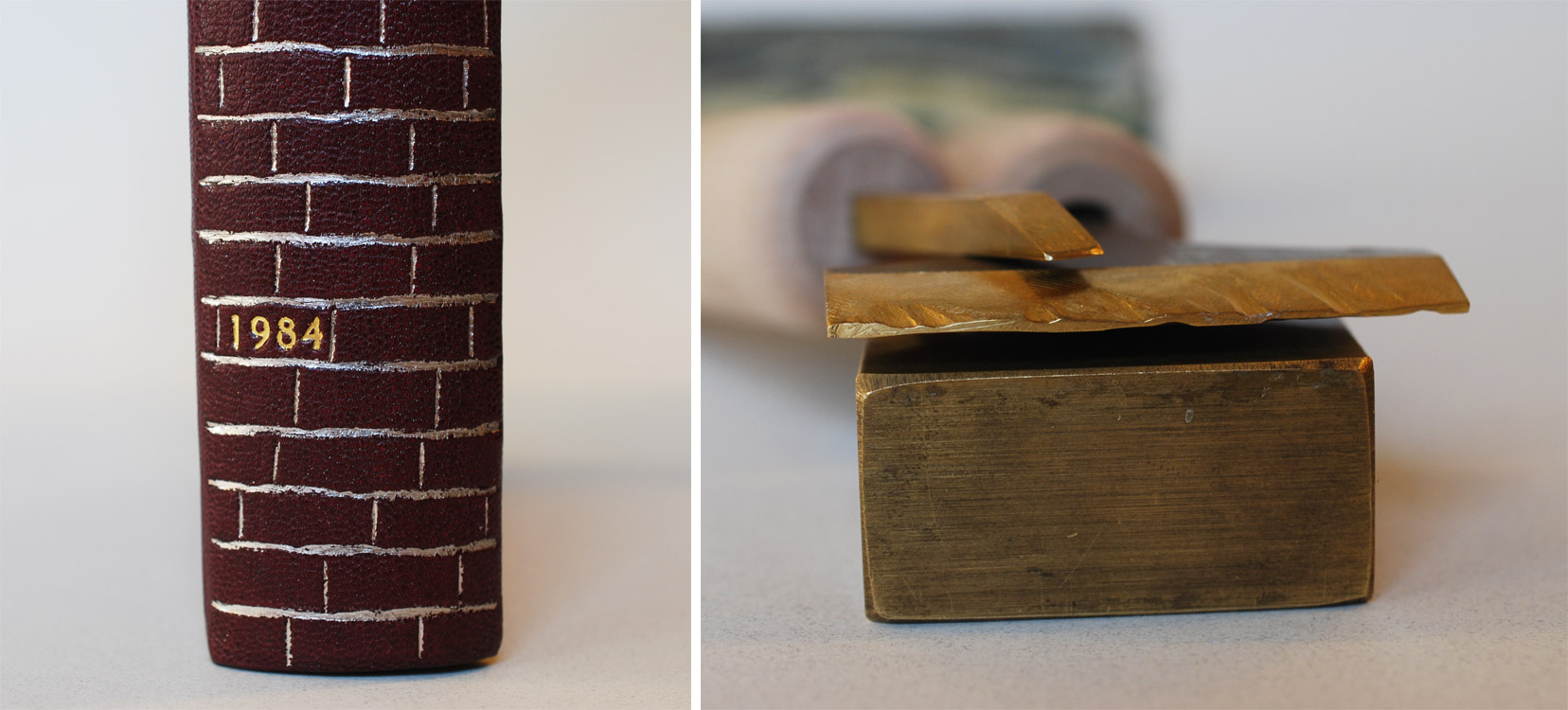
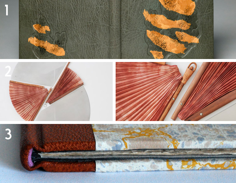
Explore a variety of ways to decorate the edges of a text block. Decorating an edge is more than just applying pigment, students learn how to properly trim and sand edges in addition to preparing pigments such as acrylic, gouache and powdered graphite. We will also explore striped edges, simple gilding and gauffering (tooled impressions).
OCTOBER:
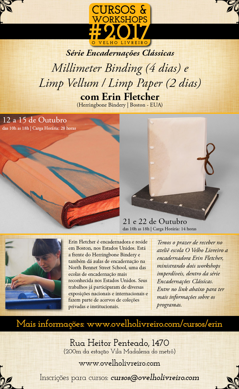
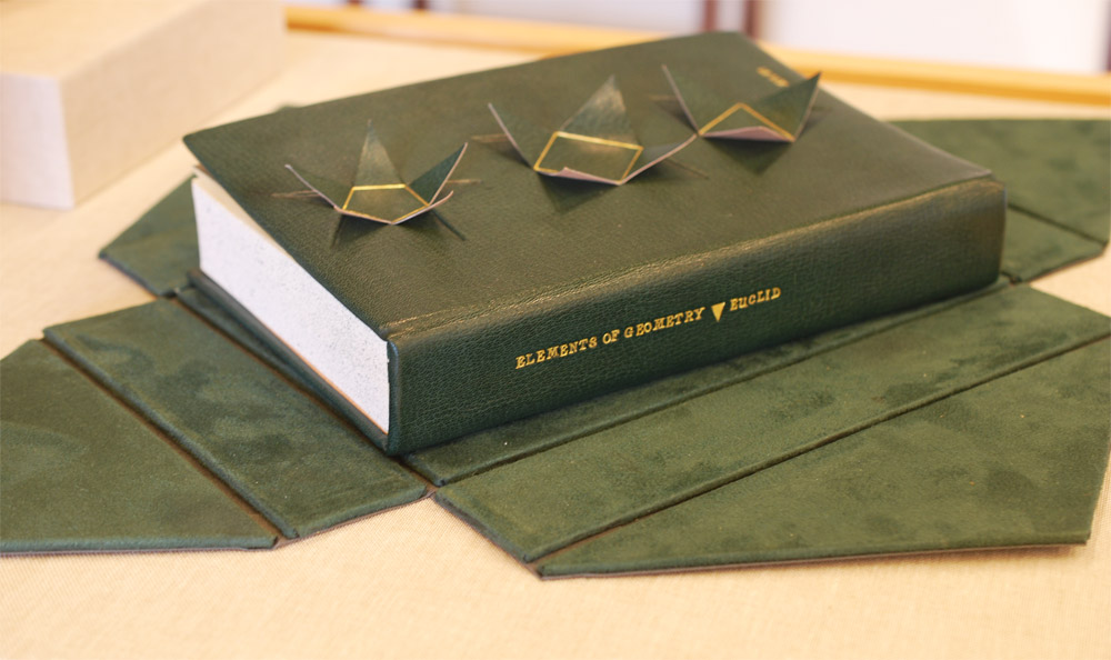
Millimeter Binding Workshop
October 12 – 15 (Thursday – Sunday)
10:00am – 6:00pm
O Velho Livreiro, São Paulo, Brazil
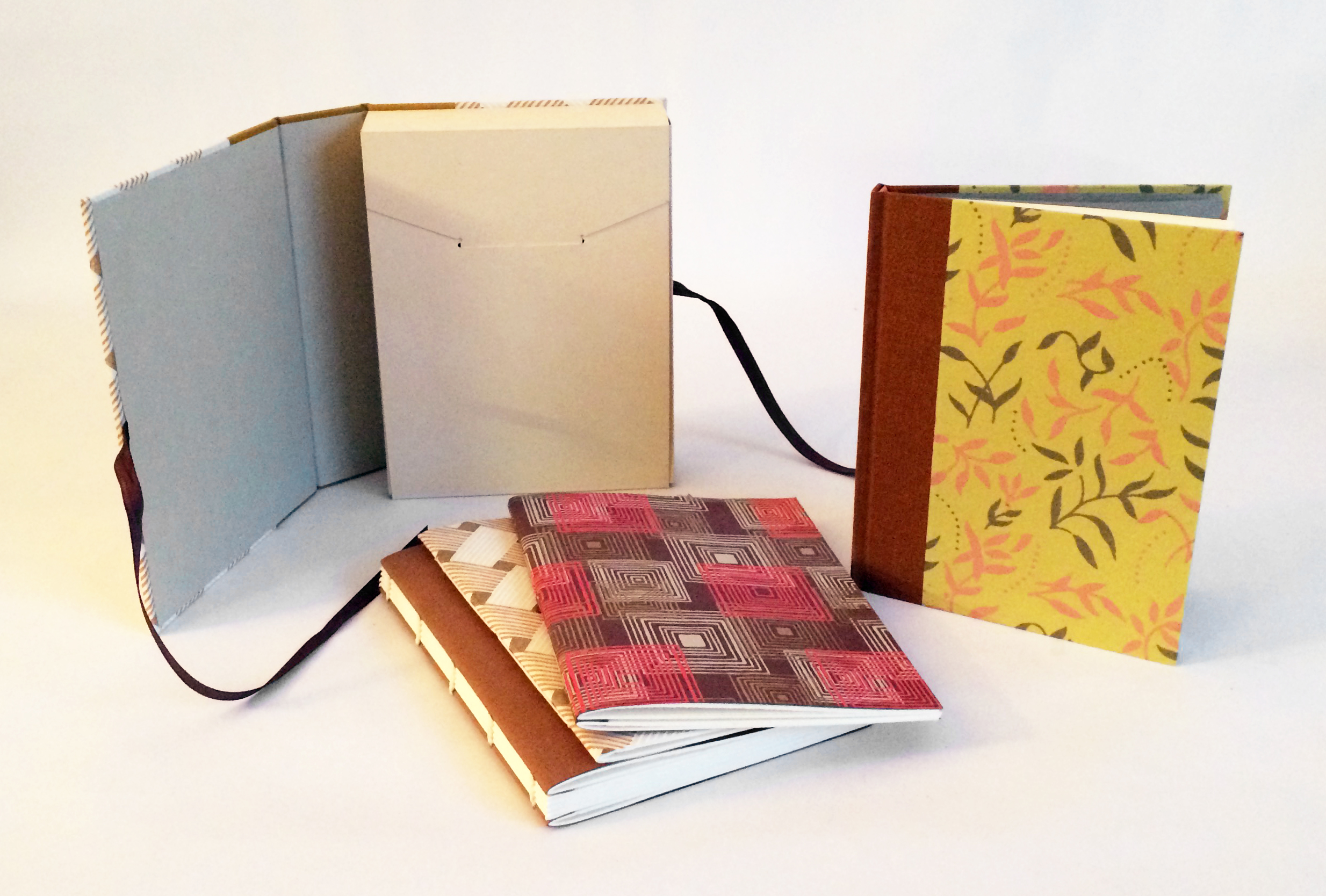
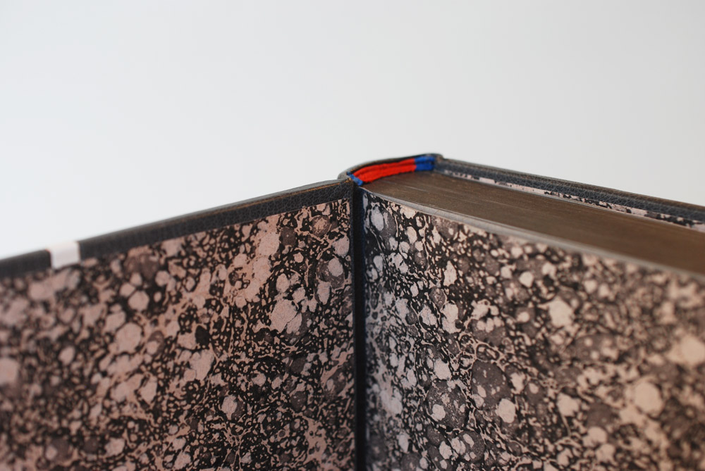
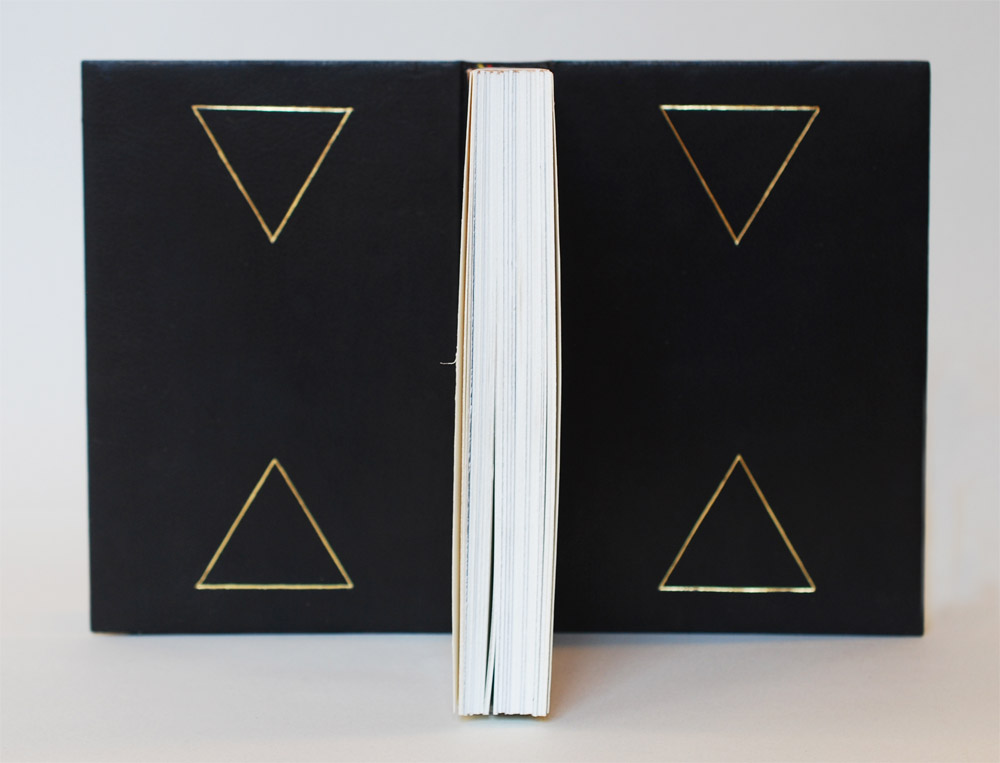
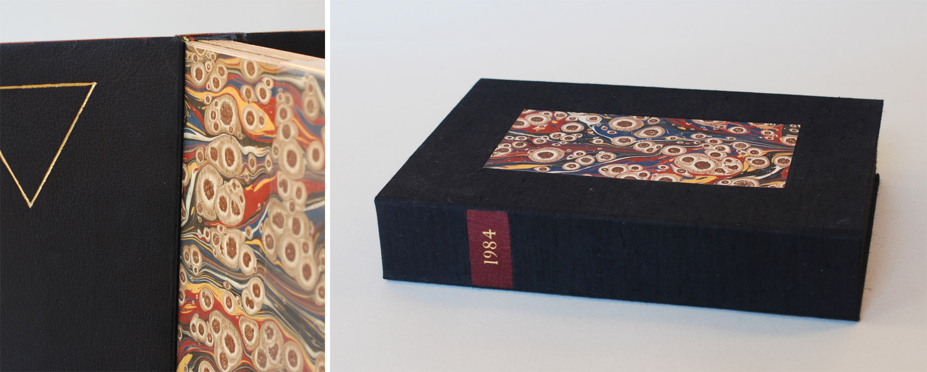
At a time in Europe when leather was a scarce commodity, binders developed a new structure known as a millimeter binding. This simple, yet refined leather binding is traditionally covered with a small amount of leather at the spine and handmade paste paper. During this workshop each student will complete a model in the Rubow-style millimeter structure, where leather runs along the head and tail edges of the book instead of the spine. Students will learn the steps to create this structure by sewing on flattened cords, rounding and backing, edge decoration and simple leather paring techniques. We will also discuss the history of millimeter bindings and alternative versions of the structure.
Limp Vellum/Paper Binding Workshop
October 21 & 22 (Saturday & Sunday)
10:00am – 6:00pm
O Velho Livreiro, São Paulo, Brazil
In this 2-day workshop students will focus on this straightforward and elegant structure that arose during the 15th century in response to the advent of the printed book. Although typically bound in vellum, students will use handmade paper to construct a Limp Paper Case Binding using traditional sewing methods for the text block and endbands. We will also go through the series of folds and interlocking corners that make up the construction of the case.


