RSS Feed

Posts Tagged ‘north bennet street school’

  1. North Bennet Street School // Student & Alumni Exhibit 2019 – The Set Book

    May 9, 2019 by Erin Fletcher

    I am thrilled once again to be writing up this post after interviewing the graduating class from the North Bennet Street School’s Bookbinding Department. To catch up those who are new to the blog, every year I interview the second year students about their design bindings which go on display in the annual Student & Alumni Exhibit. And it’s my favorite time of year, I love sitting down one-on-one with each of the students to chat about their experience crafting a design binding and how their individual backgrounds tie into their work. That latter half was ever more present with this year’s set book: Rewarding Work: A History of Boston’s North Bennet Street School by Christine Compston, Stephen Senge and Walter McDonald.

    In this comprehensive examination of the School’s history, Rewarding Work, outlines the school’s impact within the local community and how it has evolved over the years to expand that community without compromising its initial mission “to bring about meaningful lives and livelihoods for its students, who come from across the country and around the world.” You can read a more about Rewarding Work at the school’s shop page, where you can purchase a copy for yourself.

    During the interviews, I discussed with each binder how their personal history with the school may have impacted their design choices. Every binding felt perfectly unique to the student who created it, which speaks volumes to their ability to reflect upon their two years and explore it in a visually creative way. If you happen to be in the Boston area, please check out the Student & Alumni Exhibit, which will be on display at the North Bennet Street School from May 1st through June 29th. The exhibit is free and open to the public, you can find out more information on the website.

    Séphora Bergiste

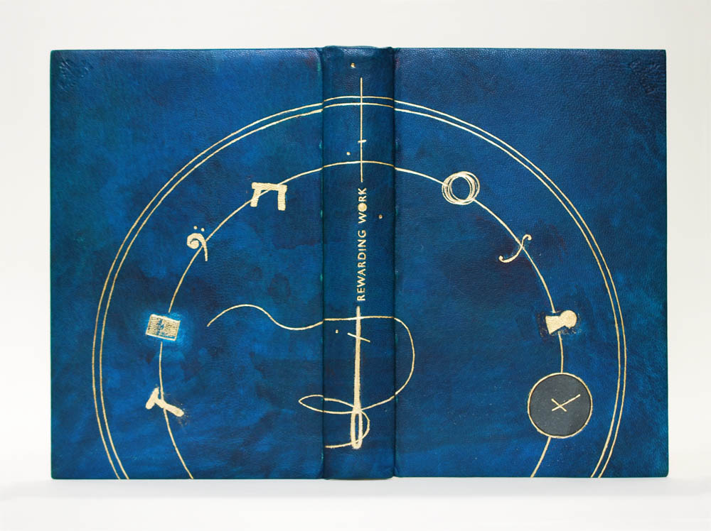
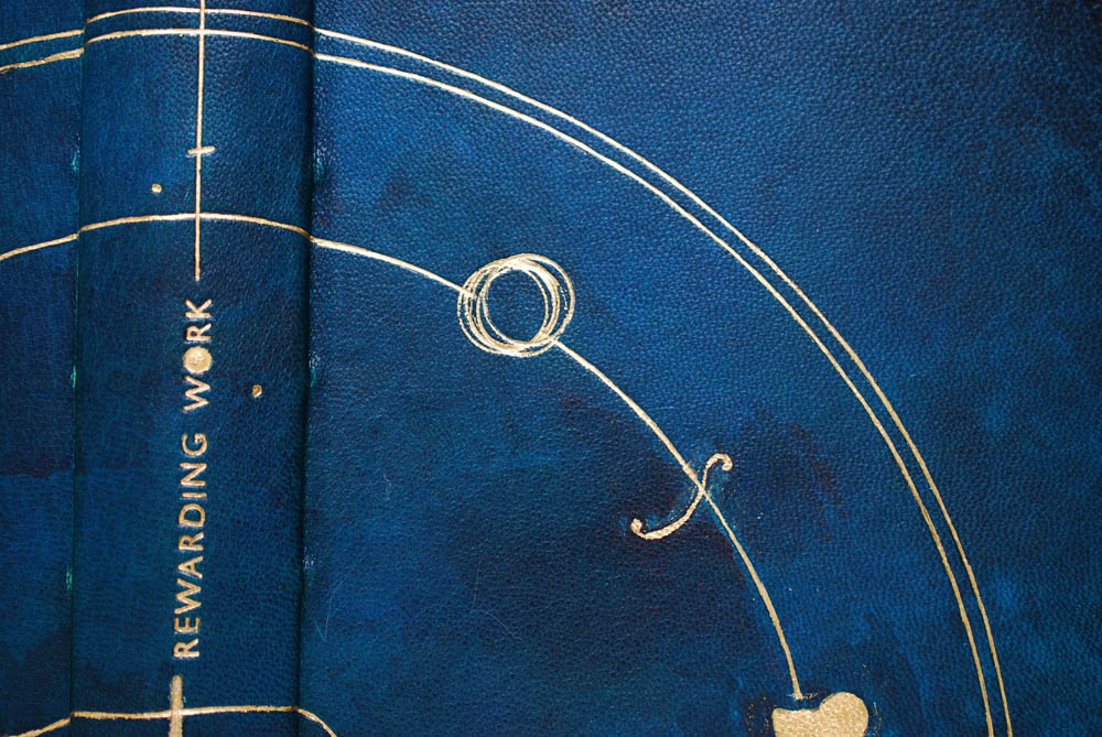
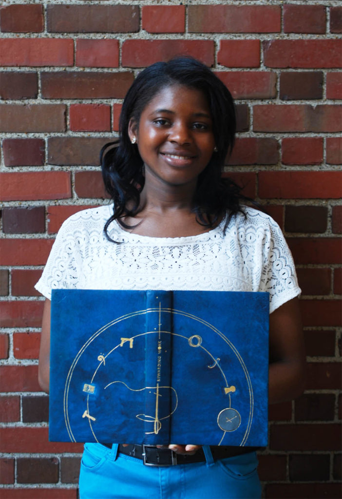
    The North Bennet Street Industrial School (the original name of the school) was established as an institution to better the lives of newly arrived immigrants through training programs to develop hand skills. Séphora Bergiste really latched onto this part of the school’s history. Séphora is also an immigrant having grown up in Haiti before moving to Rhode Island at age nine. Already her design decisions felt very personal, even before she talks about her art practice outside of bookbinding and its connection to dealing with and measuring time. The design mimics the face of a clock with the numbers replaced by symbols that represent the eight departments at NBSS.

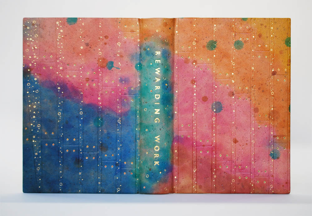
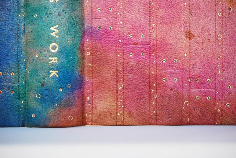
    Séphora chose a color palette which represents the school’s unofficial colors: navy blue and golden yellow. The binding is covered in a beautifully hand-dyed goatskin. Séphora applied the spirit dyes using a wet on wet method in two ways: diluting the dye with an initial layer of alcohol and by continually saturating the same areas with dye. This application of dye created a dynamic and textured effect on the leather.

    The symbols are created through either tooling or surface gilding using florentine gold leaf. Séphora represents the Bookbinding department twice through the backing hammer on the back cover and the threaded needle on the spine. Below are the symbols for the Jewelry, Violin and Locksmithing Departments. The title fits within the needle/clock hand on the spine; Séphora used Gill Sans handle letters tooled in florentine gold leaf for the title.

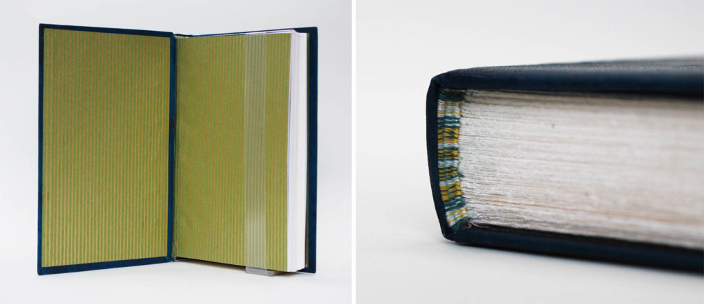
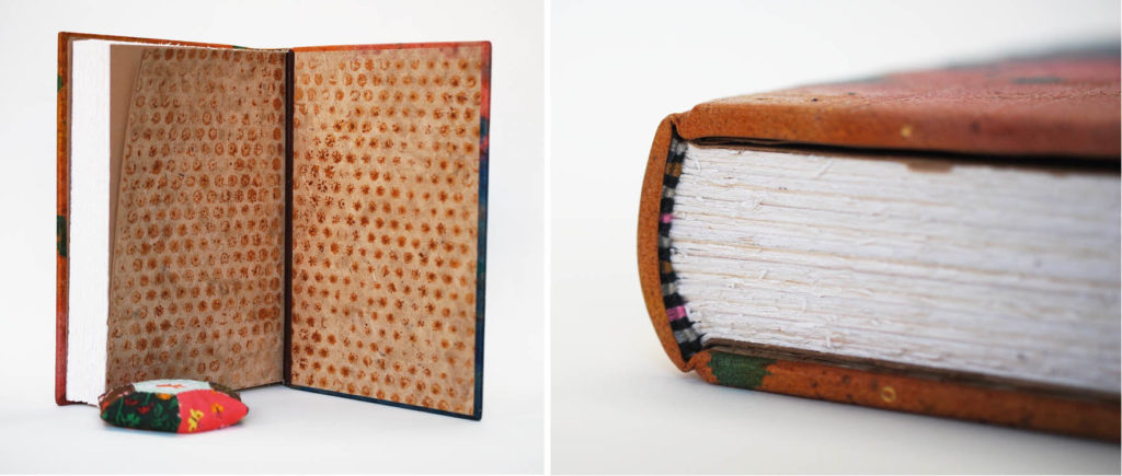
    Séphora used a handmade Japanese paper that she purchased during a trip to Japan for the paste down and flyleaves. The paper has a subtle striped pattern in olive green and gold. She used the same dyed leather for the hinges, so there is a lovely pop of color between the two paper pieces. The elaborately hand-sewn French double core endbands include alternating bands of green, yellow, light blue and white threads.

    I love that Séphora chose to dye her own skin; that she took a chance to make her binding unique. The mottled effect she was able to achieve creates a beautiful contrast to the precision of the gold tooling. And I love that it is subtle, only in a well lit room can you see the true brilliance of the leather dyeing. I interviewed Séphora in a dimly lit room and it wasn’t until I photographed the binding could I truly see the variation in color. It was a lovely surprise.

    You can follow Séphora on Instagram: @somedays.bindery or check out more of her work at her website. Séphora will continue in her position working on an extensive housing project at the W. Van Alan Clark, Jr. Library at the School for Museum of Fine Arts at Tufts University after graduation.

    Rachel Campbell

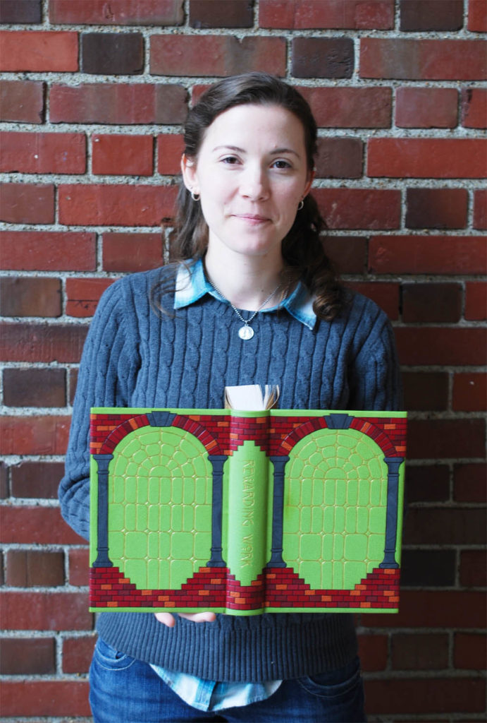
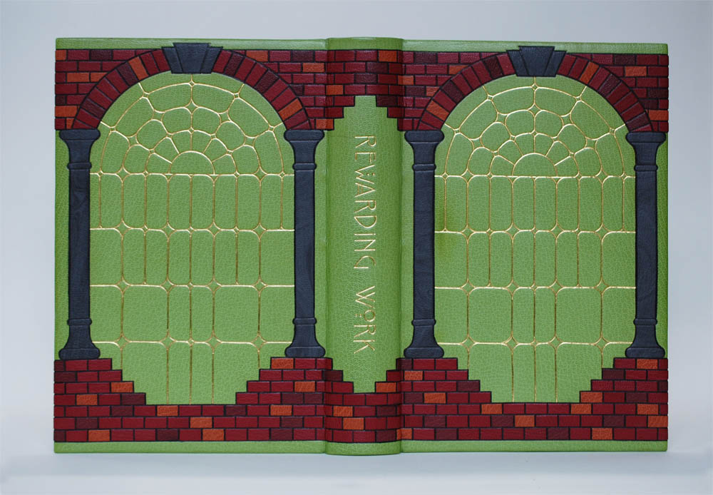
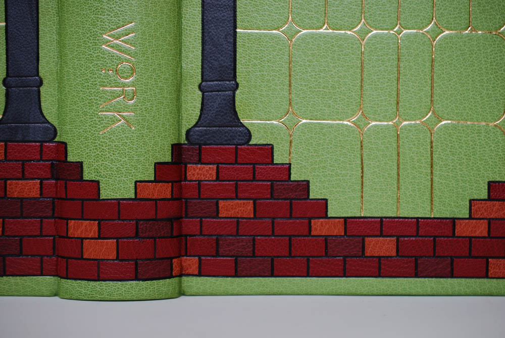
    Reading through Rewarding Work, its apparent that the accord between NBSS and the North End neighborhood allowed both to flourish. Inspired by this idea and the surrounding architecture, Rachel Campbell gleaned elements from the neighborhood to build her design. Brick and concrete are common building materials throughout the neighborhood. The brick, in particular, felt so unique to Rachel as it presents itself more than in the architecture from her home state of Oregon. Her regular visits to St. Leonard’s Church also began to inspire aspects of her design, specifically the columns and stained glass windows. This draw to building structures and decor comes from a background in interior design.

    Rachel knew that she wanted to use a frame for the basic layout of the design. After sharing several iterations with me, I saw how she worked through her design and pared it down to it’s final stage. The shape of the columns changed from a classic Corinthian style, the detailed window design was reduced to simple line work and the overall design was reworked to be symmetrically balanced from fore edge to fore edge.

    The binding is covered in a grass green goatskin with over a 100 onlays used for the bricks and columns. The bricks are carbon tooled onlays in three shades of red goatskin: terracotta, crimson and maroon. Rachel carefully planned the arrangement of bricks to feel naturally random. The columns are also carbon tooled onlays; the grey goatskin is subtly marbled with black ink to resemble concrete. The windows are tooled in dukaten leaf. The title is laid out beautifully down the spine with hand tools to mimic an Art Deco typeface.

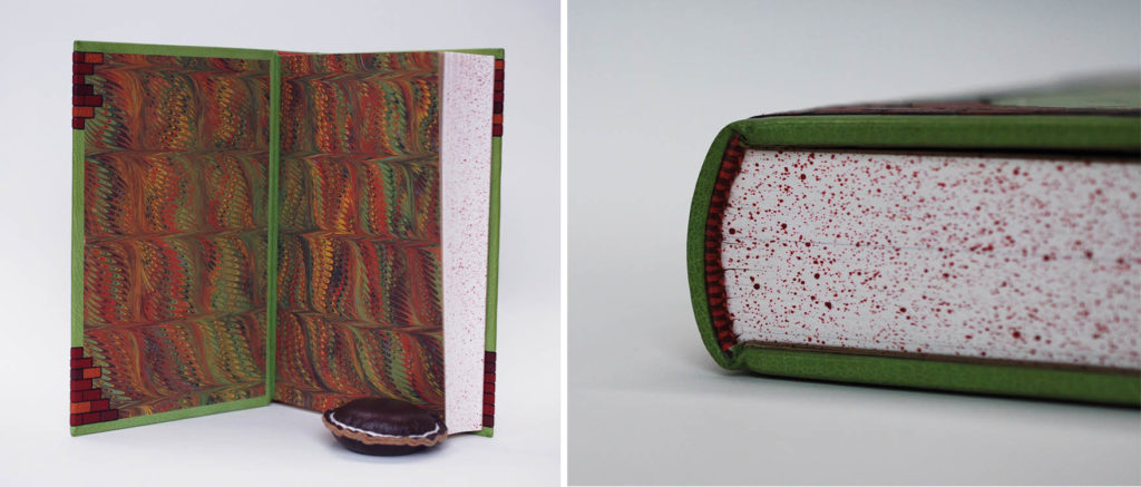
    A hand marbled paper made by Rachel is used for the paste down and flyleaf and has a color palette that perfectly pairs with the design on the cover. The marbling is irregular, but controlled within a linear frame which works well with the brick layout. Rachel also cleverly wrapped the bricks around the fore edge and over the marbled paper paste down. This is such a unique treatment and something I haven’t seen before. The text block edges are sprinkled with a brick red acrylic. The endbands are hand sewn around a single core in alternating bands of bright red and brick red.

    It is evident that Rachel put in so much thought and consideration into the design and execution of her binding. It’s clear to me that she worked very methodically and with precision as she laid in each of the onlays. Her carbon and gold tooling is so clean and so exact.

    In the recent NBSS exhibit, Bound Together, Rachel was awarded 2nd place for her binding of Emma by Jane Austen. She is incredibly talented and I can’t wait to see what binding she makes next. You can find more of Rachel’s work at her website here.

    Yi Bin Liang

    During the 2006 graduation ceremony, speaker Barry Moser, is quoted saying the following:

    The most important advice I can give you all–and forgive me if this seems glib–is to work. Work. Work. Work. Everyday. At the same time every day, for as long as you can take it. Work. Work. Work.

    You can’t depend on talent. Talent is as common as house dust…So remember that nothing is as valuable to solid craftsmanship as is the habit of work, and work has to become a habit. Has to become something that you cannot NOT do. It has to become bone within you.

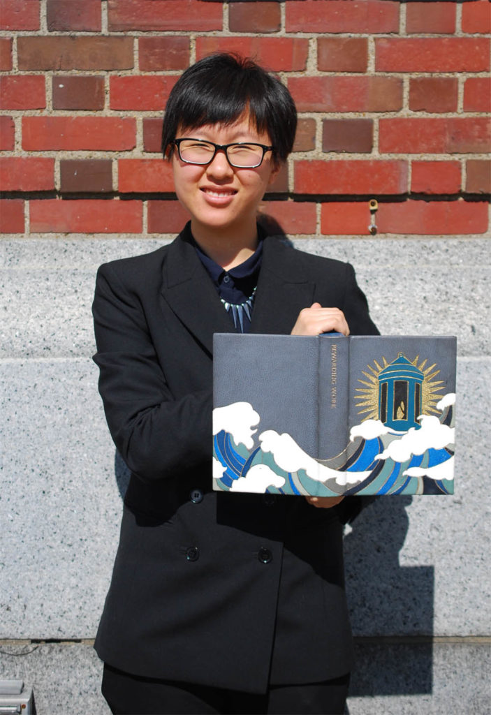
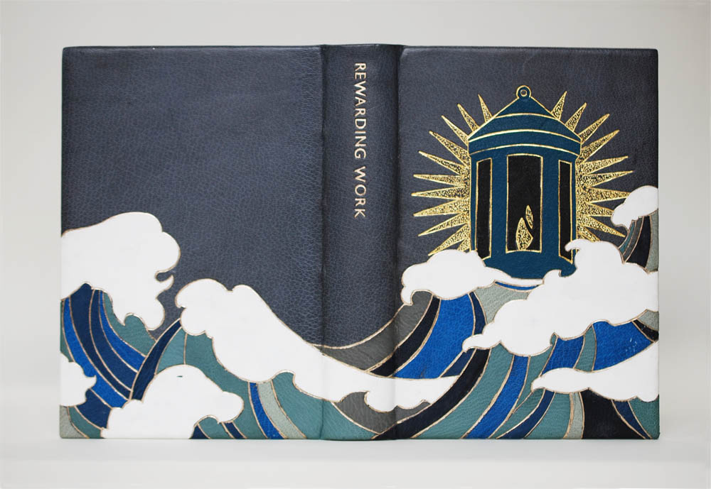
    This quote really resonated with Yi Bin Liang as a self-proclaimed workaholic, who set out to create an ambitious design binding for her copy of the set book. Featured on the front cover is the school’s logo: a lantern. However, in Yi Bin’s design it is re-imagined as a lighthouse. The school’s strong focus in traditional crafts and hand skills became a guiding light to Yi Bin after graduating from the Rhode Island School of Design. Like many of her fellow classmates, Yi Bin incorporated her own experience into her design, highlighting her transition from art school to trade school.

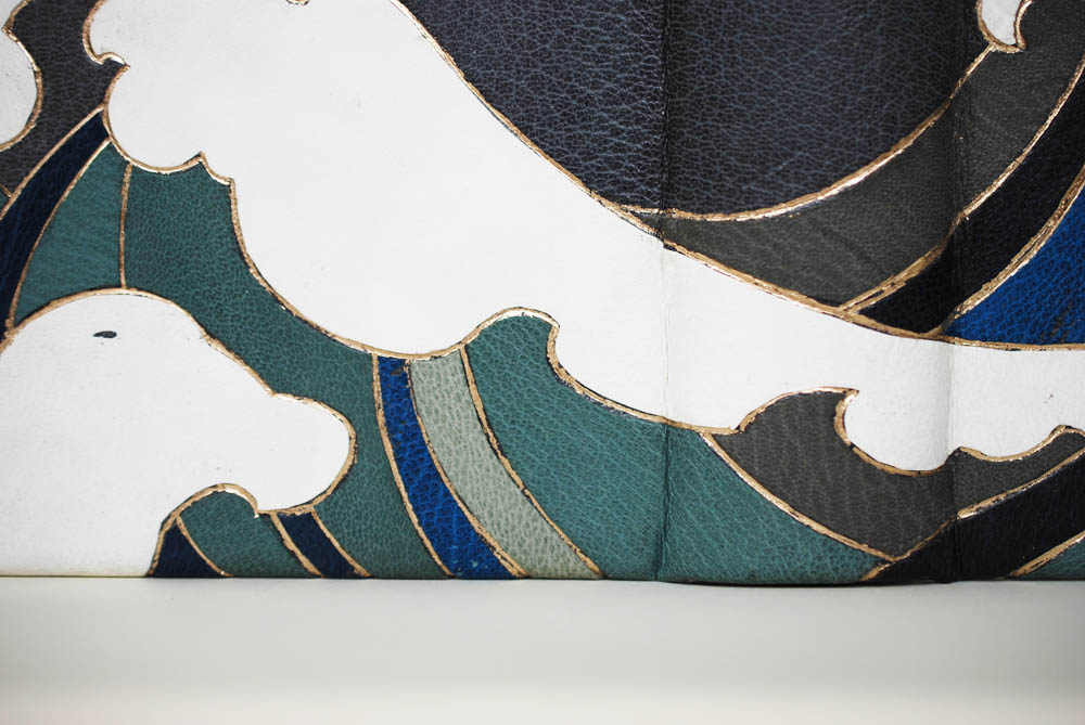
    Yi Bin used various shades of blue goatskin onlays for the waves and alum-tawed goatskin for the crests. The lantern is constructed with turquoise and black goatskin onlays. All of the onlays are tooled with a combination of moon gold and double gold. Behind the lantern is a sunburst of gold, all set to a backdrop of medium grey goatskin. The title is hand tooled down the spine in Gill Sans.

    As we discussed her process and design, she revealed that she worked almost spontaneously on the book. Although she worked initially from a planned design, some elements were added later on to build up the design providing depth and balance

    The light blue goatskin leather Yi Bin chose to use on her binding is notoriously known to fade over time. And since Yi Bin is quite resourceful, she collected various scraps from the communal bin which gave her a range of light blue tones. In choosing her materials discreetly, some piece came with tears, which Yi Bin decided to keep as an element of her design.

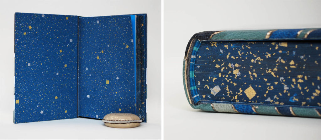
    The edge decoration beautifully mimics the handmade paper used for the paste down and flyleaf. To recreate this look, Yi Bin brushed on a dark blue goauche before laying on squares of leaf and then sprinkling small pieces of leaf. The endbands are hand-sewn in alternating bands of teal, blue and silver. I really enjoy Yi Bin’s design, it’s bright and boisterous. It really carries several emotions throughout the design, which I think, perfectly reflects anyone’s experience at NBSS.

    You can find more of Yi Bin’s work at her website or follow her on Instagram: @liang.yi.bin

    Greta Llanes

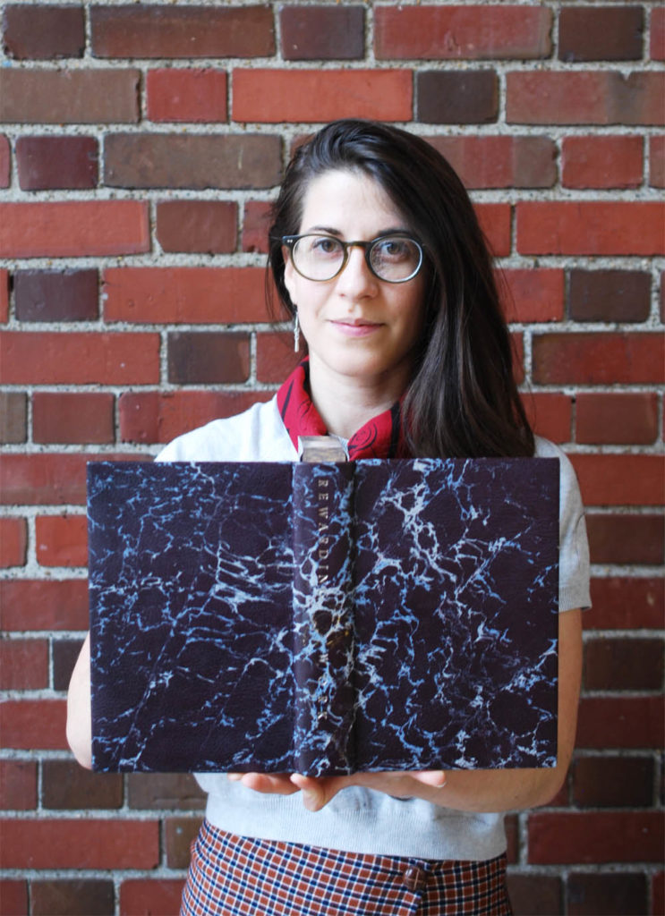
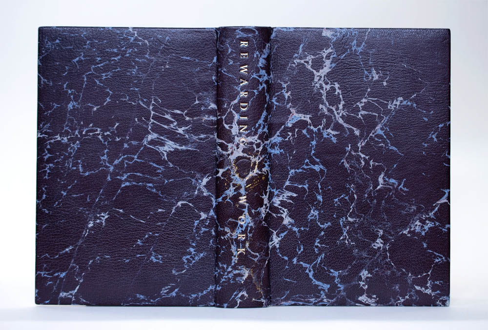
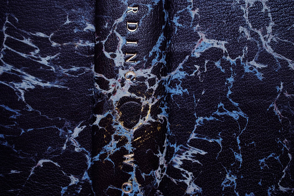
    Part of the history laid out in Rewarding Work is a timeline of the various programs offered at the school. Discussing trends and the politics on what the school should be teaching, highlighting the decisions to drop some programs and introduce others. In Greta Llanes design, she sought to capture the cultural influence of North Bennet Street School to the North End neighborhood and her own experience at the school over the past two years. These two main factors are represented as a core of energy centrally located on the spine of the binding. The veins of the marbling flow out from this point like a burst of energy.

    I really enjoyed my discussion with Greta, it became quite apparent that her design was driven from a thoughtful examination of her time at North Bennet and the surrounding community. Although her design may read as simplistic, Greta experimented greatly to achieve such a seamless design. The main component of her design is the marbling, which resembles 17th century Spanish-style marbling. Greta used acrylic pigments to marble on a blackberry goatskin.

    The color purple was very important for Greta’s design. It was her way of connecting with the color’s interesting history of discovery; that revelations can be discovered through mistakes and error. In many ways the binding embodies Greta and her experiences both leading up to and during her time at NBSS. To fully connect her design on the binding, she added gold leaf through surface gilding and by painting on shell gold to bridge the veins of the marbling to the central core on the spine. The title is tooled in moon gold down the spine using Edinburgh typeface.

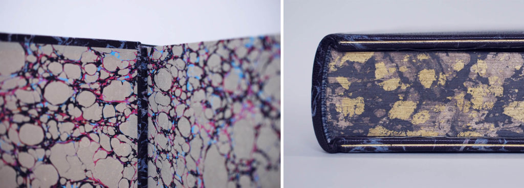
    Greta created a “marbled” effect for her edge decoration. After applying a layer of graphite, she put down different varieties of gold leaf and wrinkled them to create a vein-like effect. She continued to build up the edge in this way; the added graphite toned down the gold in the previous layer creating depth and levels of vibrancy. All edge are tooled with a single line in dukaten gold leaf. The hand-sewn French double core endbands have alternating bands of blue, light blue and two shades of grey. The marbled paste down and flyleaf are from Chena River Marblers. A really nice detail, are the marbled leather hinges which match the marbling on the cover. This creates a continuous flow from the paste down to the flyleaf.

    I really love Greta’s binding. The colors are sumptuous, the design is elegant. After speaking with Greta and being able to connect the design with her personal history makes it even more electrifying. I can’t wait to see what she does next.

    In June, Greta will be at Harvard’s Francis L. Loeb Library for a 1-month internship before teaching week-long classes on decorative paper techniques at a summer camp for kids of all ages. She’ll be rounding out the summer with the Lisa Von Clemm fellowship at the Boston Athenaeum for the following 6-months. Check out more of Greta’s work on her website here.

    Liz McHugh

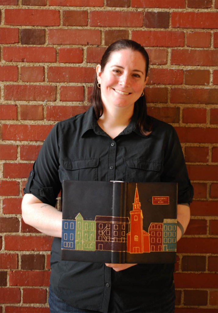
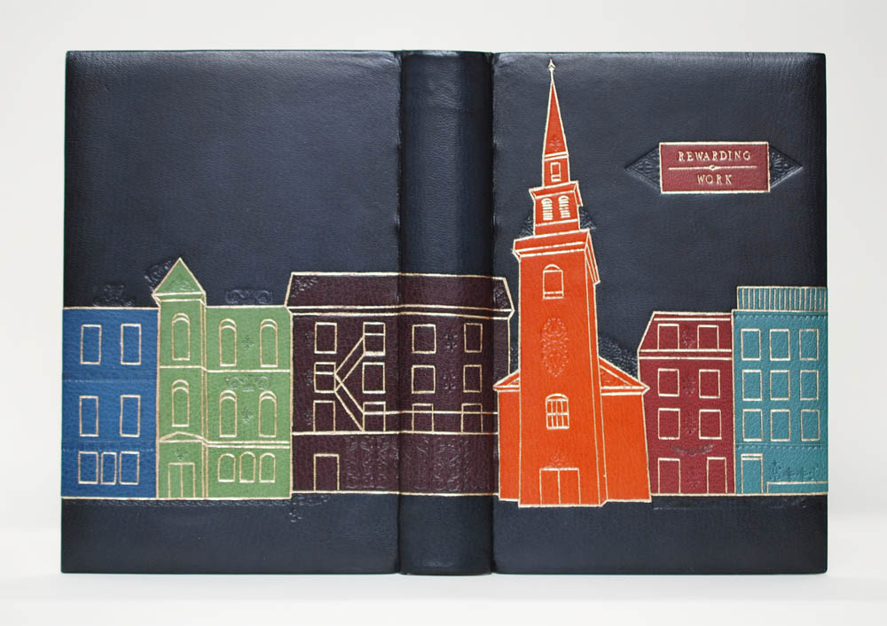
    As America’s first trade school, North Bennet Street Industrial School focused on training programs for immigrants in the North End neighborhood in the late 19th century. This connection to the North End resonated with Liz McHugh as she began to plan out her design. Being the oldest neighborhood in Boston, the North End has a unique old-world architectural feel. Liz walked around the windy, narrow streets capturing photographs of various buildings that caught her eye, which she then compiled into an imaginary landscape with the help of Illustrator.

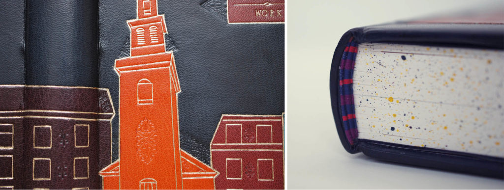
    Liz used a selection of goatskin onlays to highlight each individual building ranging from royal blue, grass green, blackberry, terracotta, maroon and turquoise. Each onlay is tooled with moon gold using a range of hand tools. It is undeniable that the most captivating structure is her depiction of the Old North Church. Easily recognizable to anyone familiar with the North End. Yet even if you can’t place it, your eyes are immediately pulled to its unique silhouette and bold color. The Old North Church is located near NBSS’s original location and has continued to serve as the venue for the school’s annual graduation ceremony.

    Liz also added subtle details through the use of blind tooling, choosing more traditional finishing tools to represent the finer architectural details without adding too much decadence. I love this element of her design. It elevates her design, creating more depth and interest. The maroon goatskin title piece is treated in the same manner as the buildings with a frame of gold and blind tooling. The edges are splattered in blue, purple and gold acrylic paint, which is paired with French double-core endbands in alternating bands of blue, purple and a pinkish red.

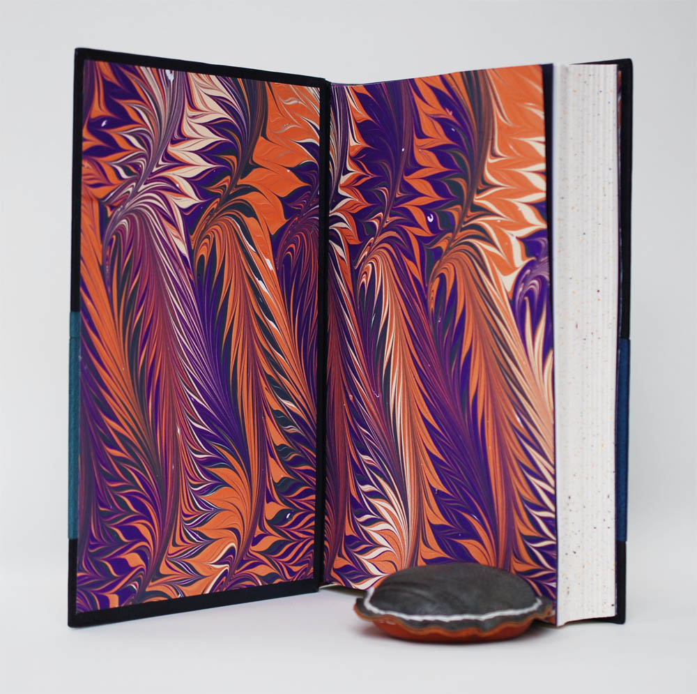
    As I opened the book, I found myself pleasantly surprised by the brightly patterned marbled paper which is used for the paste down and flyleaf. Marbled by Liz, the paper pulls colors from the cover making it an easy transition as you move from outside to inside. I also love the energy of the paper, I think it resonates with the spirit of the school and its continued success building a vibrant community.

    The color palette and playful perspective of the buildings really speaks to the intensity of the neighborhood. Liz manages to balance the colors of the landscape, while creating a central focus. She knew where to add subtle details and when to retract. I think her binding has a lovely illustrative feel and really encapsulates the feel and look of the North End.

    Liz plans to move back to her hometown of Philadelphia to start her career in field of bookbinding. You can follow her next move on Instagram: @exmchugh

    Jennifer Pellecchia

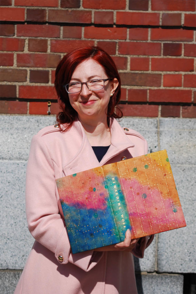
    The colorful design binding that Jennifer Pellecchia is holding was not her original design, far from it. Taking her initial inspiration from a section in the book on lap joints, Jennifer’s plan was to mimic a dovetail joint with a grey chagreen goatskin laid over a hand-dyed skin which was decorated to resemble the floor around her bench. However, the chagreen skin proved to be too difficult to work with in the paring machine. Hitting an impasse, Jennifer had to decide whether she would push forward or scrap her entire idea. She decided on the latter and I think she ended up with a spectacular binding that showcases both her skills and personality.

    Honoring the her time at NBSS, Jennifer chose to incorporate a variety of techniques she learned during her second year. This includes her unique application of leather dye, which is a technique she learned from guest instructor Nicky Oliver. The fair goatskin is dyed with spirit dyes applied with cotton balls and pom-pom applicators. Dye was also dripped through a pipette and sprayed with an atomizer. The division of color follows the blind tooled design, which resembles the paneling on the ceiling in Windgate (an area of the school that was built during the renovations to connect two existing buildings). The blind tooling pulled out a variety of shades from the various colors of dye, making the overall effect more dynamic.

    The leather was pressed with lead shot and salt, which created small irregular divets in the leather. This is quite subtle, but effective at creating depth and an interesting texture. The panel rivets are done with itty, bitty tooled onlays in complimentary colors. The gold is applied with leaf and foil in specific areas. Jennifer chose to use foil for the solid dots, since it was challenging to differentiate between the tooled dots and the impressions created by the lead shot. The title is hand tooled down the spine in Gill Sans in the same gold leaf as the design.

    The endbands are hand-sewn around a single parchment core in alternating bands of dark grey, pink, tan and off-white. Jennifer embellished the handmade Bhutanese paper used for the paste down and flyleaf by stamping the paper with dye soaked bubble wrap. The dye permeated into the paper in a spontaneous way, creating soft splotches of color. Jen was quite innovative in her solution to add a pop of flair to the interior side of her binding and I really love the results.

    I commended Jennifer on her perseverance as she struggled with her initial idea, she really tried to make the best out of a difficult material. But, in the end that battle forced her to reshape her concept and design. She created one of my favorite bindings of the bunch. I’m drawn to the wonderfully saturated colors, the playfulness of her design and the ingenuity of material use (lead shot, salt and bubble wrap). Looking forward to her next design binding.

    After graduation, Jennifer will continue in her position as Preservation Assistant at MIT working on their music collection. Follow Jennifer on Instagram: @jenn1cakes.

    Clair Emma Smith

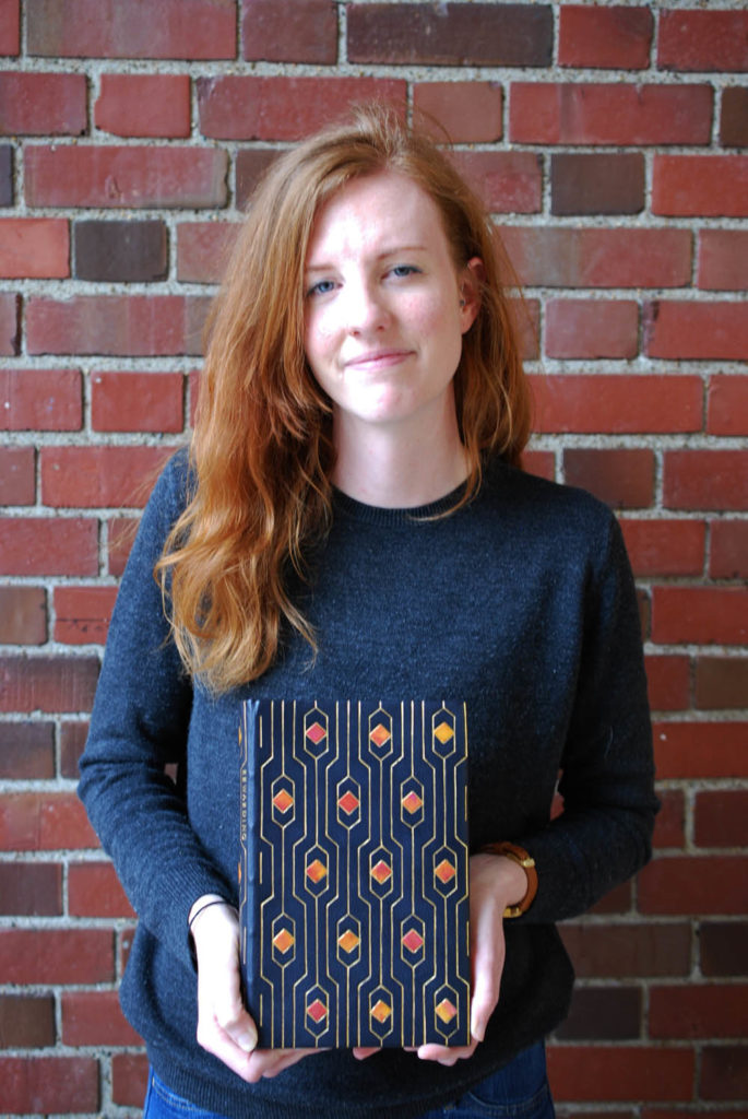
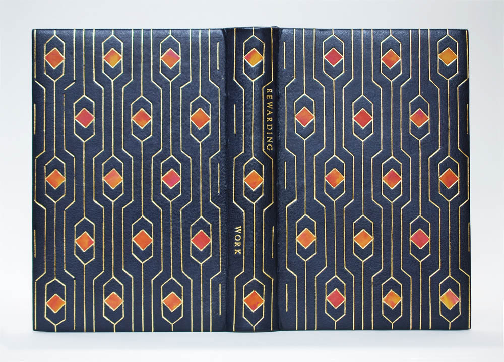
    When I spoke with Clair Emma Smith about her binding, I was intrigued not only by the gorgeous geometric pattern, but also by her design process. It was very indicative to the way binder, Annette Friedrich works to create her designs. Clair Emma worked within a set of parameters as she drew various linear designs on graph paper; penciling in lines as her mood saw fit. After building up a collection of illustrations, Clair Emma pulled elements from multiple designs in order to create what would become the final template for her binding. Her binding has a very Art Nouveau feeling and in a strange route to compliment her binding, I mentioned that it reminded me of an elegantly decorated elevator. I beam with delight at a an exceptional design in an elevator.

    This year, the second year students really experimented with a variety of leather dyes through workshops with guest instructors Nicky Oliver and James Reid-Cunningham. Roda dyes, which are metal-based dyes, were introduced to the students through the lens of conservation. Clair Emma wanted to see how these dyes could be used for creative, artistic purposes.

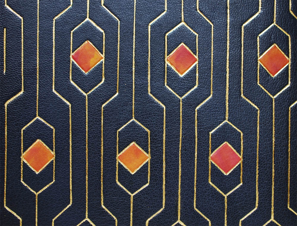
    By blending pink and yellow dyes with cotton balls, the pigments merged to create rich orange tones. These diamond shaped tooled onlays evoke jewels set in the leather. Clair Emma used a navy blue goatskin for the base leather with the geometric design tooled in dukaten gold leaf. The title is beautifully balanced into the design on the spine in Edinburgh handle letters.

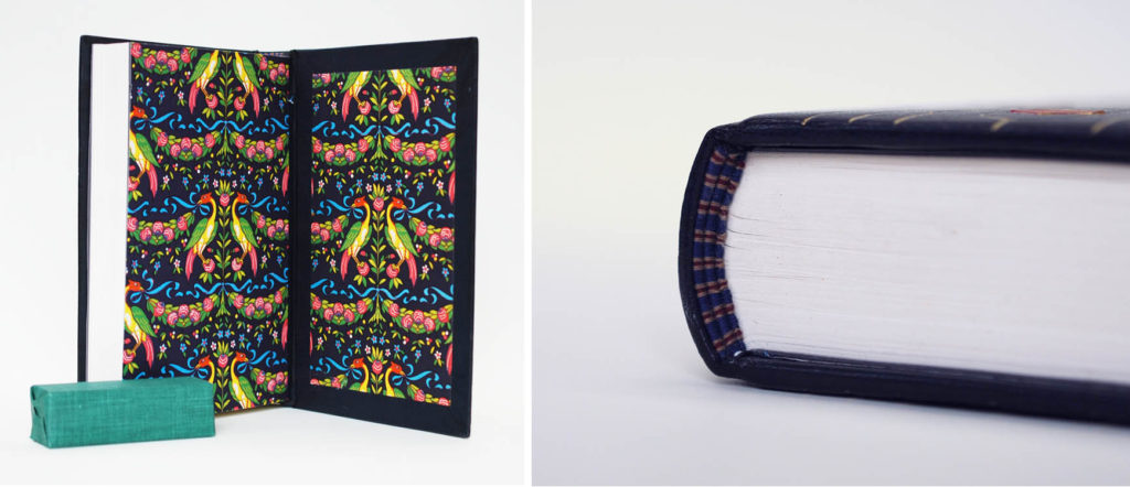
    I was pleasantly surprised when I opened Clair Emma’s binding to discover a vibrant and ornately patterned paper used for the paste down and flyleaf. This bold and lavish paper broke from the rigor of the cover design. Clair Emma noted how this paper created a nostalgic connection to her home town and felt like the perfect paper to incorporate into the binding. The French double core endbands are hand sewn with alternating bands of navy blue, gold and maroon silk threads.

    Although Clair Emma’s design may appear as a simple geometric pattern, I want to point out the precision it takes to lay out tooled lines in a straight and even fashion. Her design is beautifully balanced across the entire cover. I love her choice of color, the brilliant orange onlay leather dances against the navy blue forcing the eye to move around the cover. Her design choices are on point and they surprisingly bring me to my love of elevator interiors.

    Matthew Lawler Zimmerman

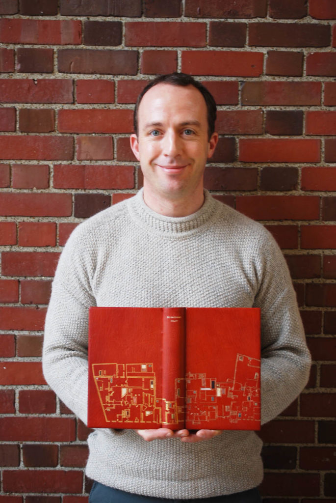
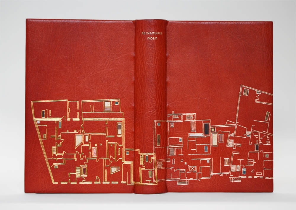
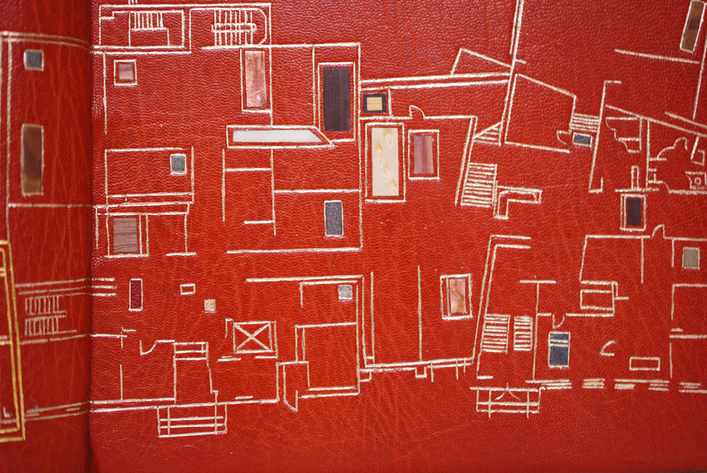
    As I’ve mentioned already, Rewarding Work is about the history of NBSS and its impact on the community in the North End. Because the text is so site specific, Matthew Lawler Zimmerman wanted to emphasize this in his design. The school recently underwent a massive change when it moved from the original location on North Bennet Street to it’s new home on North Street. Matthew chose to capture this transitional point in the school’s history by recreating the blueprints of the original location and the new location with traditional decorative techniques.

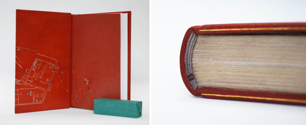
    Influenced by the brick buildings in the North End, Matthew chose to execute his design on a gorgeous vintage oxblood goatskin. A portion of the school’s original location is tooled on the back cover in dukaten gold leaf, while the new building adorns the front cover and bends around the doublure on the inside. The new building is tooled in moon gold, which is softer and less yellow than the dukaten gold leaf. I particularly love the slight overlap of the two blueprints at the spine.

    In order to engage more of the school, Matthew incorporated a variety of materials as both tooled onlays and inlays to represent all eight programs currently offered at NBSS. These include various wood veneers, such as bird’s eye maple, cedar, aspen and walnut, metals, ebony, elk bone and hand-dyed leather.

    Matthew chose the ambitious route of adding leather doublures and leather flyleaves to his design binding, using the same oxblood goatskin for the doublures and a terracotta goatskin for the flyleaves. There is a subtle difference in tone, with the terracotta being slightly darker, and has a more even grain pattern. This transition from light to dark is so seamless, especially since the design on the doublure floats onto the flyleaf into an abstract pattern. The head edge is rough edge gilt with moon gold and the board edges are tooled with a single line in dukaten gold leaf. The French double core endbands are hand sewn with grey and two bands of maroon thread.

    The students graciously allow me to handle their bindings so that I can survey every detail and lend them a critical eye. Matthew’s execution of his binding is exceptional. Crafting a full leather binding, with leather doublures and flyleaves is quite a challenge and Matthew rose to the occasion. The leather doublures in particular are flawless, which can be quite a task. I think he is quite observant and has a keen eye for detail, which really shone through in his binding. There will certainly be more design bindings in Matthew’s future and I look forward to it.

    Matthew plans to merge his printmaking background his newly honed bookbinding skills by crafting editions of work from the printed page to the custom binding. However, he also plans to pursue a career by working with other printers and binders. You can check out more of Matthew’s work at his website.

    – – –

    Thanks again to the 2019 graduating class and Jeff Altepeter, Head of Bookbinding Department. It was such a joy to get to know you all a little bit more and speak candidly about your work. I can’t wait to see how you all take your skills and apply them to our community. I wish you all the best.

    If you want more interviews from past classes check out the list here.

  2. Upcoming Workshops // March to May

    March 18, 2019 by Erin Fletcher

    APRIL:
    Focus on Case Binding
    April 8 – 12 (Monday – Friday)
    North Bennet Street School
    Boston, MA

    Explore case binding structures through repetition while experimenting with minor changes in technique with each book. The course covers structural elements, sewing variations, covering, and cutting techniques using various tools and equipment. Discussions cover terminology, paper grain and folding, selecting proper materials and tools, and adhesives and their properties. Students have ample time to repeat each technique in order to achieve precision and accuracy. This course is suitable for beginners or those who want to refresh their skills.

    Personal projects: Time will be dedicated to working on personal projects during the latter half of the workshop. Projects should be suitable for the case binding structure. While some materials can be supplied, students should bring the bulk of the materials required for their work.

    Bookbinding 101
    April 27 – 28 (Saturday – Sunday)
    North Bennet Street School
    Boston, MA

    This workshop is sold out. In this two day class, students get a quick introduction to various bookbinding techniques by exploring three different book structures. The class begins with a simple pamphlet and continues with constructing two multi-signature books known as a flatback case binding and link stitch binding. Finally, students construct a box to house all of their creations. This class is a great way to familiarize yourself with bookbinding and is perfect for those who are curious about the craft. Please bring a notebook and pencil to class.


    MAY:
    Fundamentals of Bookbinding II
    May 6 – 10 (Monday – Friday)
    North Bennet Street School
    Boston, MA

    This course will focus on hardcover structures. Students will continue with rounded back case bindings and end the course with a book with words. Throughout the course students will fine-tune their skills through repetition and develop a focus to details such as, endpapers structures and headband variations. Topics of discussion will include an overview of bindery equipment such as stamping on the Kwikprint and trimming with the plough.

    Secret Belgian Binding
    May 11 – 12 (Saturday – Sunday)
    North Bennet Street School
    Boston, MA

    This workshop is sold out. This workshop explores the Secret Belgian structure and ways to modify it. On day one, students put together two variations of this non-adhesive structure: one with exposed stitches and one with hidden stitches. On day two, students explore modified versions of the Secret Belgian binding developed by book artist, Anne Goy by playing with the length of stitching and incorporating Tyvek. The Secret Belgian binding can be constructed quickly with few tools and virtually no equipment. It opens flat and works best with thinner text blocks.


  3. Upcoming Workshops // February to April

    February 11, 2019 by Erin Fletcher

    FEBRUARY:
    Japanese Stab Binding
    February 16 (Saturday)
    North Bennet Street School
    Boston, MA

    In this workshop, students will construct a Japanese Stab binding model, more traditionally referred to as 4-Hole binding or yotsume toji. We will build the model in a traditional manner, while incorporating Western tools and equipment. This workshop will provide a better understanding of the structure and the foundation for which to alter the number of holes and sewing pattern.

    Fundamentals of Bookbinding I
    February 25 – March 1 (Monday – Friday)
    North Bennet Street School
    Boston, MA

    Students will learn the foundations of bookbinding by combining hands-on exercises and discussion. The class starts by exploring non-adhesive structures: soft cover pamphlet, Coptic, historical longstitch and link stitch. The class ends with a look at case bindings, with the creation of two hardcover flatback bindings. Students also learn different structural elements, sewing variations, covering and cutting techniques using various materials, tools and equipment. Throughout the course discussions will cover terminology, paper grain and folding, selecting proper materials and tools, and adhesives and their properties.


    MARCH:
    Fundamentals of Bookbinding II – This class is sold out
    March 4 – 8 (Monday – Friday)
    North Bennet Street School
    Boston, MA

    This course will focus on hardcover structures. Students will continue with rounded back case bindings and end the course with a book with words. Throughout the course students will fine-tune their skills through repetition and develop a focus to details such as, endpapers structures and headband variations. Topics of discussion will include an overview of bindery equipment such as stamping on the Kwikprint and trimming with the plough.

    Due to the popularity of this class another workshop will be offered from May 6 – 10 (Monday – Friday). You can find registration for that class here.


    APRIL:
    Focus on Case Binding
    April 8 – 12 (Monday – Friday)
    North Bennet Street School
    Boston, MA

    Explore case binding structures through repetition while experimenting with minor changes in technique with each book. The course covers structural elements, sewing variations, covering, and cutting techniques using various tools and equipment. Discussions cover terminology, paper grain and folding, selecting proper materials and tools, and adhesives and their properties. Students have ample time to repeat each technique in order to achieve precision and accuracy. This course is suitable for beginners or those who want to refresh their skills.

    Personal projects: Time will be dedicated to working on personal projects during the latter half of the workshop. Projects should be suitable for the case binding structure. While some materials can be supplied, students should bring the bulk of the materials required for their work.

    Bookbinding 101
    April 27 – 28 (Saturday – Sunday)
    North Bennet Street School
    Boston, MA

    In this two day class, students get a quick introduction to various bookbinding techniques by exploring three different book structures. The class begins with a simple pamphlet and continues with constructing two multi-signature books known as a flatback case binding and link stitch binding. Finally, students construct a box to house all of their creations. This class is a great way to familiarize yourself with bookbinding and is perfect for those who are curious about the craft. Please bring a notebook and pencil to class.


  4. Upcoming Workshops // August to October

    August 15, 2018 by Erin Fletcher

    AUGUST
    I have no workshops scheduled for the month of August. Go outside and enjoy your summer!


    SEPTEMBER
    3-Part Bradel Binding

    September 7 – 10 (Thursday – Sunday)
    San Francisco Center for the Book
    San Francisco, CA

    Register here. 

    The 3-Part Bradel binding offers a unique aesthetic over a traditional case binding. As the name suggests, the binding is assembled in three parts, which encourages the binder to use different materials to cover the spine and covers. For this workshop, students will use leather to cover the spine and cloth or paper for the covers. Students will be guided as they pare their own leather.

    Students will also be using a variety of bindery equipment such as a sewing frame, job backer, plow and Kwikprint to complete their structure. We will also cover how to create a simple painted, decorative edge and stamp a custom label.

    Millimeter Binding
    September 23 – 29
    Maine Media Workshops + College
    Rockport, ME

    Register here.

    The millimeter binding came about during the first World War when leather became a scarce resource for binders. Still wanting to provide an elegant leather binding to their clients, binders would use a minimal amount of leather to cover the spine, putting a millimeter or two of leather onto the boards. In this workshop students, will be creating a Rubow-style millimeter binding, learning how to make paste papers and work with leather. Each student will finish the course with a book wrapped in their own paste paper and with a thin strip of leather running across the top and bottom of the binding. This class is open to all and a great introduction to book arts!


    OCTOBER
    Fundamentals of Bookbinding I
    October 1 – 5 (Monday – Friday)
    North Bennet Street School
    Boston, MA

    This is a great workshop if you are interested in the full-time program at North Bennet or wanting to learn a new skill. During the workshop students will explore the basics of bookbinding through a variety of non-adhesive structures and finish the week by making a flatback case binding. We will discuss materials, adhesives, tool use and students will have access to traditional bindery equipment.

    Bookbinding 101 
    October 9, 16, 23 & 30 (Tuesday evenings)
    North Bennet Street School
    Boston, MA

    ​In this two day class, students get a quick introduction to various bookbinding techniques by exploring three different book structures. The class begins with a simple pamphlet and continues with constructing two multi-signature books known as a flatback case binding and link stitch binding. Finally, students construct a box to house all of their creations. This class is a great way to familiarize yourself with bookbinding and is perfect for those who are curious about the craft.


  5. Upcoming Workshops // July to September

    June 15, 2018 by Erin Fletcher

    JULY
    Cross Structure Binding
    July 14 – 15 (Saturday – Sunday)
    North Bennet Street School
    Boston, MA

    This workshop is currently sold out. The Cross Structure binding is a non-adhesive structure that offers much freedom to the text block. This 20th century design is greatly inspired by the Long Stitch bindings of the medieval era. It is suitable for conservation or new bindings, such as travel journals or decorative bindings. The structure is uniquely constructed by interlocking the front and back covers at the spine. In this 2-day workshop, students will work on 4 variations of the Cross Structure, creating models in both handmade paper and leather. If time permits, students will have an opportunity to decorate their covers.

    Bookbinding 101
    July 28 – 29 (Saturday – Sunday)
    North Bennet Street School
    Boston, MA

    This workshop is currently sold out. In this two day class, students get a quick introduction to various bookbinding techniques by exploring three different book structures. The class begins with a simple pamphlet and continues with constructing two multi-signature books known as a flatback case binding and link stitch binding. Finally, students construct a box to house all of their creations. This class is a great way to familiarize yourself with bookbinding and is perfect for those who are curious about the craft.


    AUGUST
    I have no workshops scheduled for the month of August. Go outside and enjoy your summer!


    SEPTEMBER
    3-Part Bradel Binding

    September 7 – 10 (Thursday – Sunday)
    San Francisco Center for the Book
    San Francisco, CA

    Register here. 

    The 3-Part Bradel binding offers a unique aesthetic over a traditional case binding. As the name suggests, the binding is assembled in three parts, which encourages the binder to use different materials to cover the spine and covers. For this workshop, students will use leather to cover the spine and cloth or paper for the covers. Students will be guided as they pare their own leather.

    Students will also be using a variety of bindery equipment such as a sewing frame, job backer, plow and Kwikprint to complete their structure. We will also cover how to create a simple painted, decorative edge and stamp a custom label.

    Millimeter Binding
    September 23 – 29
    Maine Media Workshops + College
    Rockport, ME

    Register here.

    The millimeter binding came about during the first World War when leather became a scarce resource for binders. Still wanting to provide an elegant leather binding to their clients, binders would use a minimal amount of leather to cover the spine, putting a millimeter or two of leather onto the boards. In this workshop students, will be creating a Rubow-style millimeter binding, learning how to make paste papers and work with leather. Each student will finish the course with a book wrapped in their own paste paper and with a thin strip of leather running across the top and bottom of the binding. This class is open to all and a great introduction to book arts!


  6. North Bennet Street School // Student & Alumni Exhibit 2018 – Alumni Work

    May 10, 2018 by Erin Fletcher

    In this next installment covering the 2018 Student and Alumni Exhibit, I will be showcasing some of the work submitted by former bookbinding students at North Bennet Street School. If you missed my previous post where I interviewed the graduating class on their set book, check it out here.
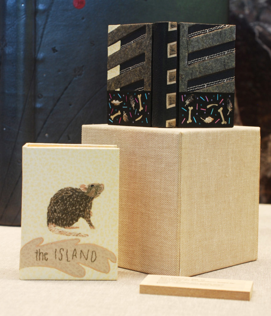
    This year I submitted two of my own bindings. I’ll begin with my miniature binding of The Island: An Amsterdam Saga by Geert Mak with illustrations by Max Kisman. This binding was apart of Stichting Handboekbinden Miniature Bookbinding Competition and was first exhibited at the Meermanno Museum in The Hague.

    Bound in as a three-part Bradel, the boards are split into two designs. The top half is constructed with stone veneer, embroidery and ivory leather panel pieces. The bottom half is a mix of foil tooling, vellum onlays and embroidered feathers. The spine is covered in leather with painted suede onlays. The book is housed in a full leather box with an embroidered rat. You can see more of images of this binding on my website.

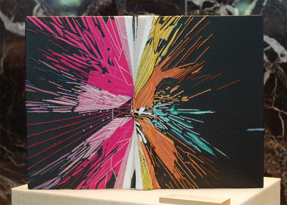
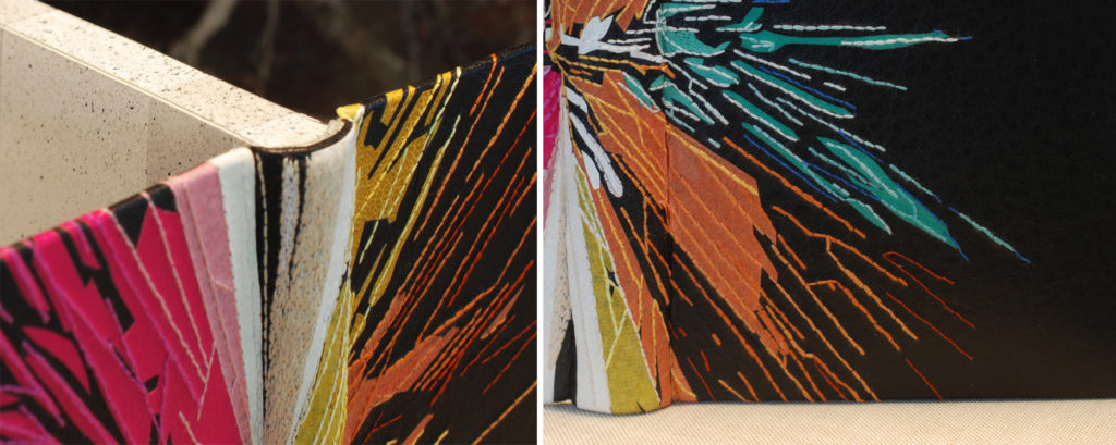
    My second binding is 2001: A Space Odyssey by Arthur C. Clarke. The book is bound in black buffalo skin with goatskin onlays in white, yellow, teal, lavender and fuchsia. The teal and lavender are attached suede side up. There are additional kozo paper onlays in yellow, orange and pink. All of the onlays are adorned with embroidered floss to expand on the explosion of color. The back board includes four stanzas from Dies iræ.

    The head edge is painted with a white base and misted with black pigment. This sprinkled effect continues along the fore edge. The fly leaves are also decorated in this pattern to give the illusion of one continuous look.

    Lauren Calcote, ’15
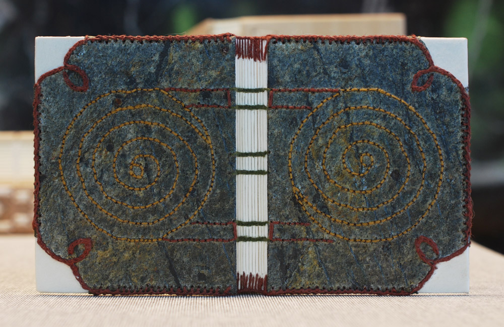
    This miniature binding of The Wild Swans by Hans Christian Andersen was bound by Lauren Calcote. Done as a Coptic binding, the boards are covered in vellum and decorated with embroidered stone veneer. I love the seamless continuation of thread that spans from the endbands onto the boards framing the stone veneer. 

    Fionnuala Gerrity, ’11
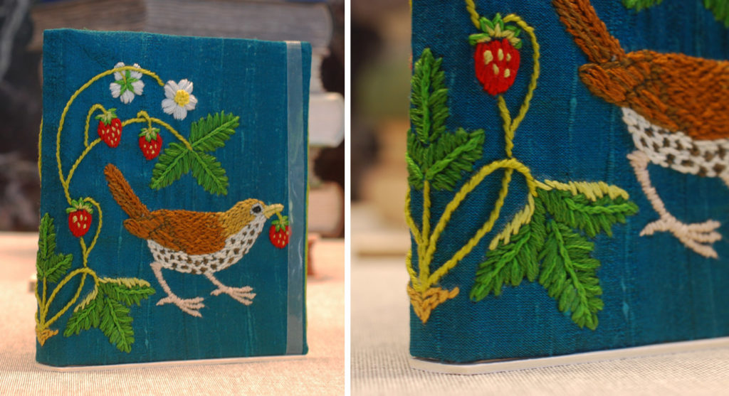
    Strawberry Thief is wrapped in a cheerful embroidered chemise on deep teal dupioni silk done by Fionnuala Gerrity. The light-hearted design is mirrored on the back board. Fionnuala’s use of hefty cotton floss creates so much texture and height to the embroidery. 

    Kate Levy, ’17
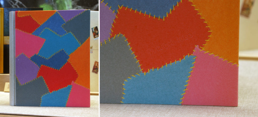
    Bound as a three-part Bradel, the book itself features a range of artists working with textiles and fiber as their medium of choice. By piecing together scraps of colorful handmade paper with embroidery floss, Kate Levy plays homage to one of the artists featured in this binding of Stitchillo. By clicking on the images below, you can see that the title is stamped in clear foil on the lower red paper panel. Working with thread on paper is such a delicate task, but the effect is so lovely. 

    Anne McLain, ’10
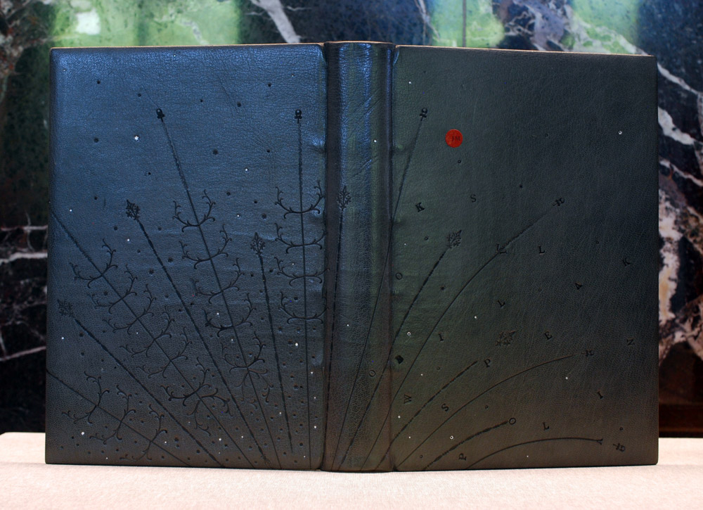
    Anne McLain demonstrates the playfulness of traditional decorative tools in her binding of Julia Miller’s Books Will Speak Plain. Thoughtfully placed ornamental lines span across the binding in a way that connotes a firework explosion. Small accents, such as silver foil dots and blind letters, are scattered amongst the flares. A small red dot holds the initials JM to signify the author. The endbands are hand sewn in alternating bands of white and dark grey. The head edge is splattered with various shades of grey and splotches of white.

    James Reid-Cunningham, ’90
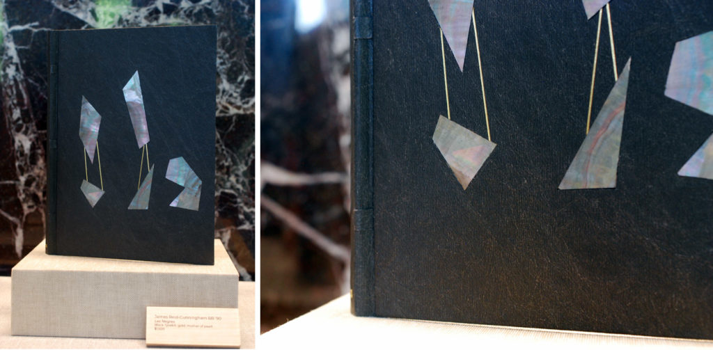
    What a surprising mix of materials in James Reid-Cunningham’s binding. Les Negres is a play by French dramatist Jean Genet and is bound in black Tyvek. The cover is adorned with mother of pearl and lines of gold tooling. Their is a really lovely relationship between the figures of mother of pearl. The iridescent quality of the material provides movement against the black background. 

    You can see all of these bindings in person and others while the show is open. This year the Student and Alumni Exhibit will be on display at two locations: from May 7 – 23 at Two International Place and from June 4 – 30 at North Bennet Street School (both located in Boston). Check out the website here for more details and opening hours.

    SaveSave


  7. North Bennet Street School // Student & Alumni Exhibit 2018 – The Set Book

    May 8, 2018 by Erin Fletcher

    It’s that time of year again, when the next group of future bookbinders and book conservators will leave their cosy benches at North Bennet Street School and enter the next stage of their journey. And I’m happy to be back with another round of interviews with the graduating class on their set books, which will be on display during the Student & Alumni Exhibit along with work from students and alum of the other seven programs at NBSS. This year the Student & Alumni Exhibit will be on display at two locations: from May 7 – 23 at Two International Place and from June 4 – 30 at North Bennet Street School (both located in Boston). Check out the website here for more details and opening hours.

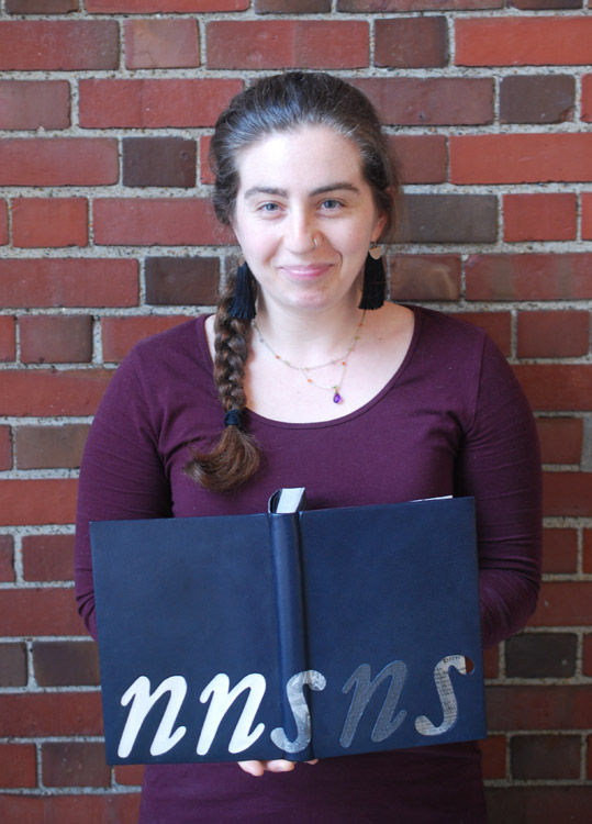
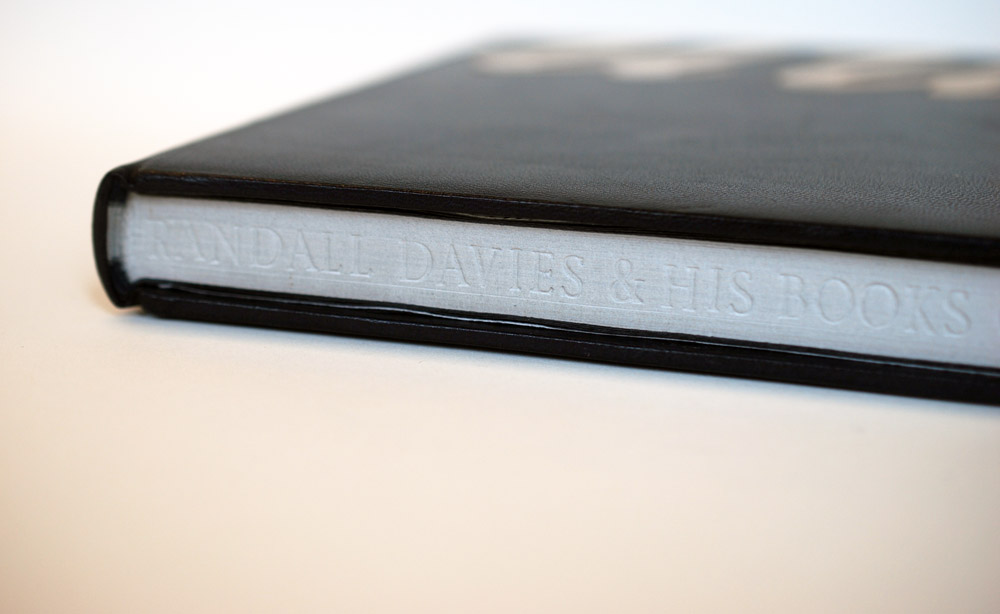
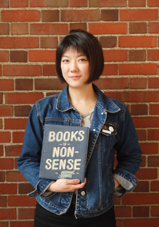
    This first post will focus on the Set Book bound be each of the seven graduating students. My next post will highlight some of my favorite alumni pieces from the show. Each student was given a copy of the same book (referred to as the set book) and asked to create a full leather design binding. The set book for this year is Randall Davies and his Books of Nonsense published by Incline Press in 2014. This edition compiles both Davies’ original Lyttel Book of Nonsense published in 1912 and Cayme Press’ production of A Little More Nonsense into one volume. Each page contains a woodcut illustration along with a charmingly inaccurate limerick written by Davies.

    The text block is printed on Wookey Hole mould-made paper which has a beautiful pale grey hue. The introduction was machine set in Garamond and the limericks were hand set in Italic. The 15th – 16th century woodcut illustrations are reproduced from Davie’s books and printed from line blocks. According to the introduction by historian Dr. Paul W. Nash, the original woodblocks were collected by Davies from London-based printers and bookbinders. During the interviews, I spoke with each binder about the inspiration behind their designs and how their chose to execute their concept.

    I was blown away by the range of styles brought forth by the students and the level of craft. Many of the designs were quite tricky to execute and certainly caused some challenges along the way, but their efforts certainly paid off.

    Rachel Jackson

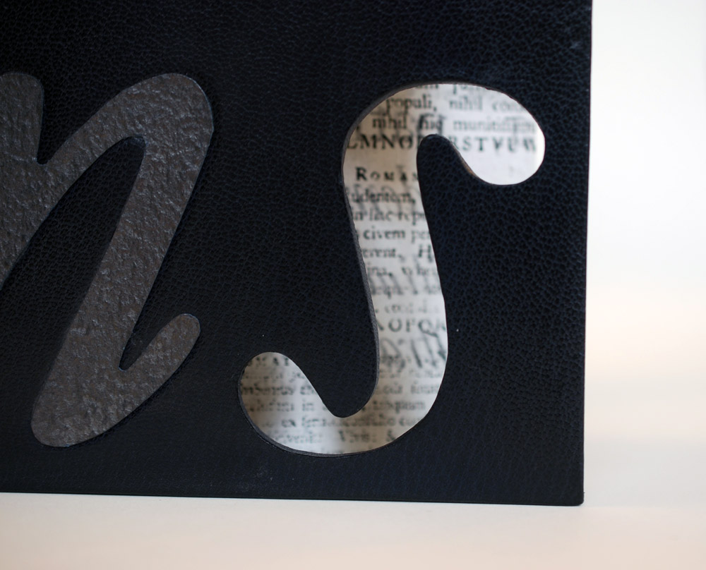
    The word nonsense is the most vital part of the title and had the most influence over many of the student’s designs. In Rachel Jackson’s design, she flips the idea of nonsense to find structure. In reducing the word down to its consonants, she could focus on the orderly process of printmaking. Each letter is composed of a different material to represent each step in the printing process. The woodblock used to carve the illustrations is represented by an inset piece of bleached oak veneer. Next in line is a paper onlay followed by a hand marbled letter s, which is marbled with suminigashi ink on the suede side to represent the ink of the printing press.

    The final n is a piece of indigo Cave Paper coated with graphite inset into the board to represent lead type. The printed result is depicted in the final s. Instead of an onlay, Rachel cut out a window in the shape of an s to expose a printed page below and to invite the viewer into the book. What you see is a piece of tissue printed on both sides showing a specimen of the typeface used in the text block. The entire design sits upon a base of navy blue goatskin.

    The French double-core endbands were hand sewn in alternating bands of navy, dark grey and light grey. The head edge is gauffered in the most unique way, Rachel used this portion of the binding to place the majority of the title using Edinburgh handle letters agains the bare pages.

    In simplifying her design, Rachel creates curiosity which is only heightened by the cut-out window. Chaos and structure commingle beautifully within the five thoughtfully placed letterforms. Each hinting to something specific, but when read to together complete both the title of the book and the technique of crafting the content within the book.

    Upon graduation, Rachel will be focusing on her building her own business. You can check out more of Rachel’s binding work in addition to her calligraphy here.
    Sarah Kim

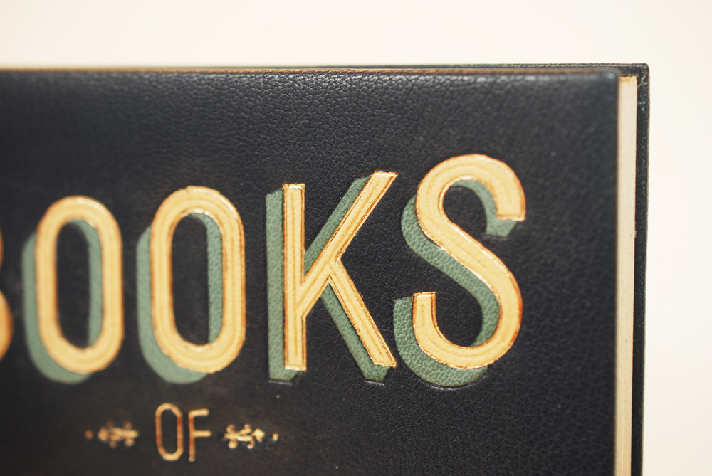
    Sarah Kim used her love of typography to help grapple with the chaos and to bring a sort of order to this senseless content. Her binding is covered in a medium blue goatskin with onlays in light blue and fair goatskin. By layering the fair goat over the light blue, Sarah creates a dimensional effect to the text. Each layer also receives its own special treatment. The gold tooled fair goat onlays contain a blind tooled line running through the center of the letter. The light blue onlays are blind tooled and are textured with blind tooled lines running at an angle. These subtle additions really added more depth and balance to the design.
    Sarah created the “of” through gouges and line palettes and sandwiched the word between two ornate tools. To anchor the design of the front cover, Sarah incorporates a commonly used design motif: the ribbon banner. A light blue tooled onlay, the banner contains the name of the author and is also complimented by two ornate tools.

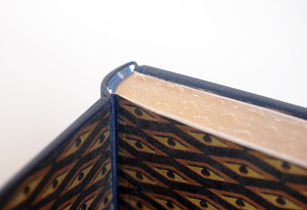
    The French double-core endbands are hand sewn with strands of light blue and grey. The endbands sit over a gilt and gauffered edge. I think it was really smart for Sarah to add little touches of decoration with hand tools. In addition to the gauffered edge, the spine is also minimally tooled to help balance the overall design of the binding. When Sarah opened her binding to show me the inside, I was pleasantly surprised by the boldly patterned chiyogami paper. At once you leave the stillness of the cover to only be put on alarm before entering the text of the book.

    Sarah sought to convey her concept through the use of typography; to have the viewer read beyond the words and understand that it was communicating much more than the title of the book. When paired with the decorative paper on the inside, her concept really delivers. Her design was skillfully executed and beautifully laid out. You can follow Sarah on instagram and stay apprised of her work.

    Allie Rosenthal

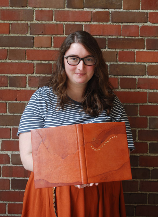
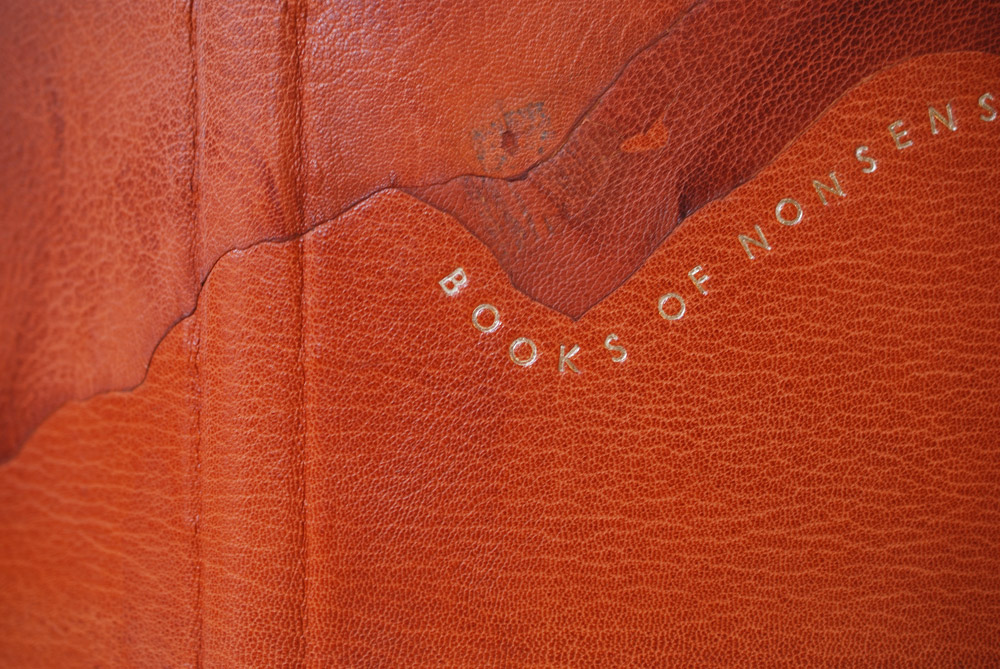
    Many of the students reflected that Randall Davies’ limericks were loosely inspired by the woodcut illustrations they were meant to reflect. But every once in a while, Davies’ would incorporate a flaw from the illustration into the composition. For example, interpreting a crack as a bullet whizzing through the drawing. Allie Rosenthal found her inspiration in this and chose to incorporate the flaws and rough edges of the terra-cotta goatskin into her design. This abstract, landscape-esque design is formed by presenting the flaws in a leather skin. Putting a spotlight on the irregular coloration, tears, toggle marks from stretching the skins and flattening folds in the skin. The individual pieces were attached as back-pared onlays and laid down over hefty boards.

    The title is hand-tooled in moon gold and playfully wraps along the edge of an onlay. Allie chose the modern typeface Gill Sans for the title. Other elements of Allie’s binding include French double-core endbands hand sewn in stripes of maroon, grey and brown. The head edge is rough edge sprinkled with lemon and moon gold over a ground of Armenian boule. Prior to decorating the edge, Allie mixed up the signatures. So the final result was even more chaotic in appearance than a traditional sprinkled edge.

    The interior is covered in matching edge-to-edge doublures with gold tooling that perfectly mimics the erratic lines and tears created by the onlays on the cover. The style of tooling emulates the technique employed by Tracey Rowledge and Ivor Robinson where the impressions are laid with a stepped effect. The paste papers were created by fellow classmate, Liz McHugh. The texture of the paper compliments the terra-cotta beautifully.

    Following graduation, Allie will be starting her Von Clemm Fellowship at the Boston Athenaeum followed by the Driscoll Family Fellowship. Her fellowship will span over 15 months.

    Ned Schultz

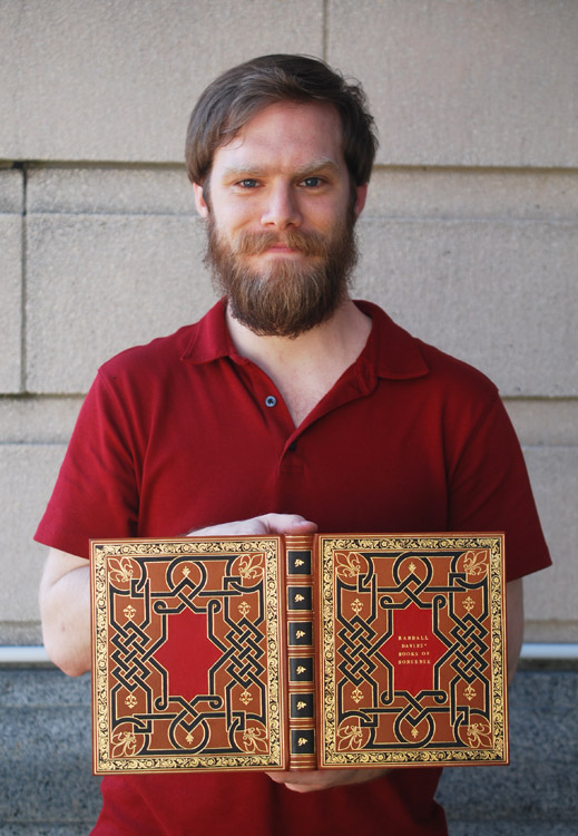
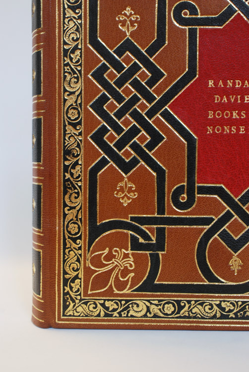
    As mentioned in the introduction, Davies collected woodcuts dating back to the 15th and 16th century. To pay homage to this period in history, Ned Schultz created a spectacular reflection of a 16th century English-style binding. Working with a historical color palette, Ned chose a medium brown goatskin for his binding. The outer frame and knot work are achieved with several black gold tooled onlays. I imagine getting the size of the gouges just right, particularly in those small, tight turns was tricky, but Ned achieved the look flawlessly. The center is adorned with a red tooled onlay and features the title on the front cover. The spine is tooled to mark the placement of bands with black tooled onlays in the spaces between.

    Additional floral hand tools and a large fleur-di-lis were used as accents to the knot work. On the outer black frame, Ned used a decorative roll to nearly cover the entire space in gold. This perfectly symmetrical design glimmering in gold is so attractive to the eye and recreating work from this time period is quite impressive for someone so new to finishing.

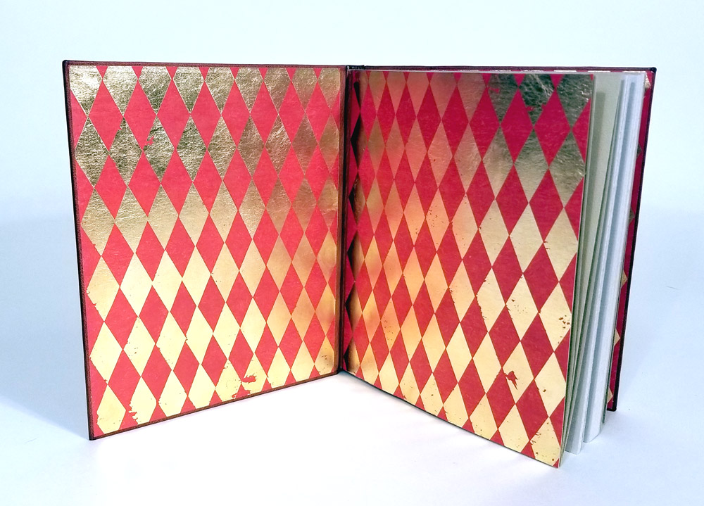
    Opening to the interior of the book, the viewer can only be delighted by the patterned paper of gold diamonds against a bright red background. Ned coated the paper with vermillion before painstakingly applying each diamond (twice) through the application of heat. The endpapers work so beautifully with Ned’s cover design and harken to the Dutch Gilt papers of the 16th century.

    I am so impressed with Ned’s binding and can not express it enough. I look forward to seeing the next historical binding reproduction that comes out of his studio. Ned plans to pursue a career in conservation, but also hopes to further hone his skills in finishing.

    Jon Simeon

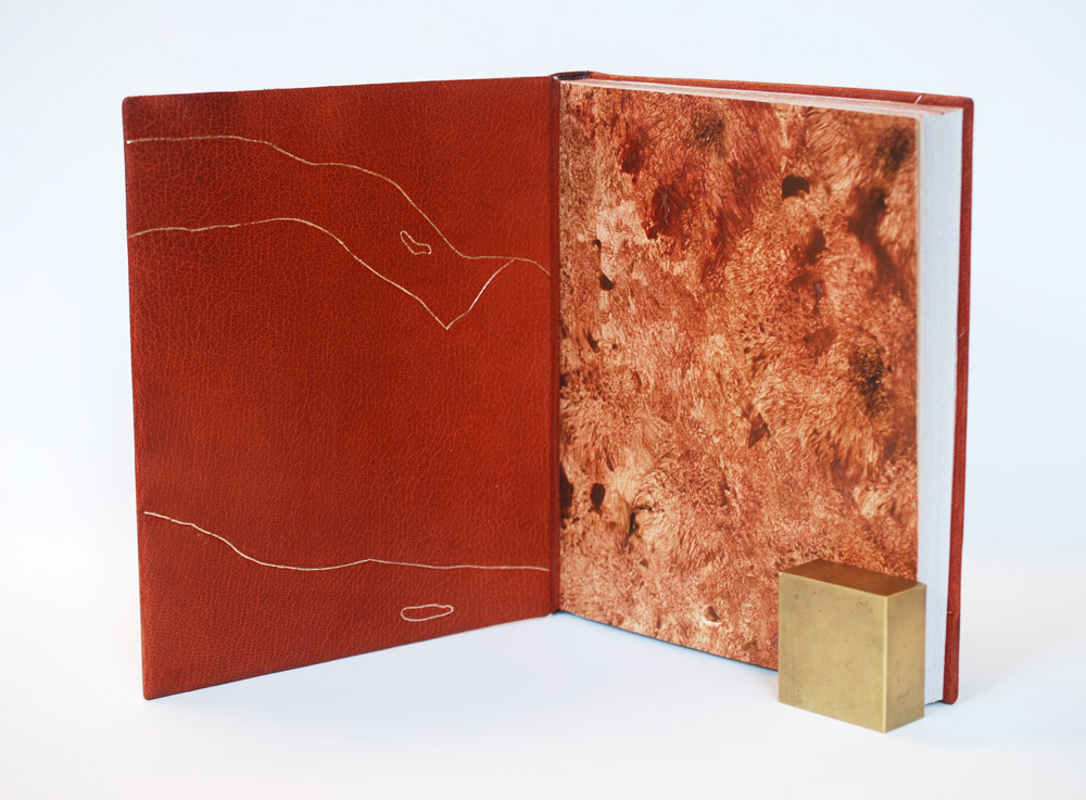
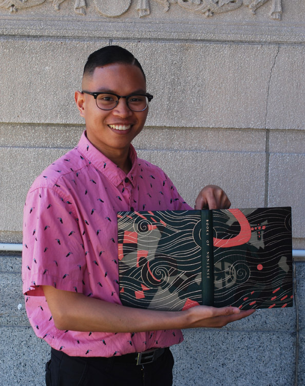
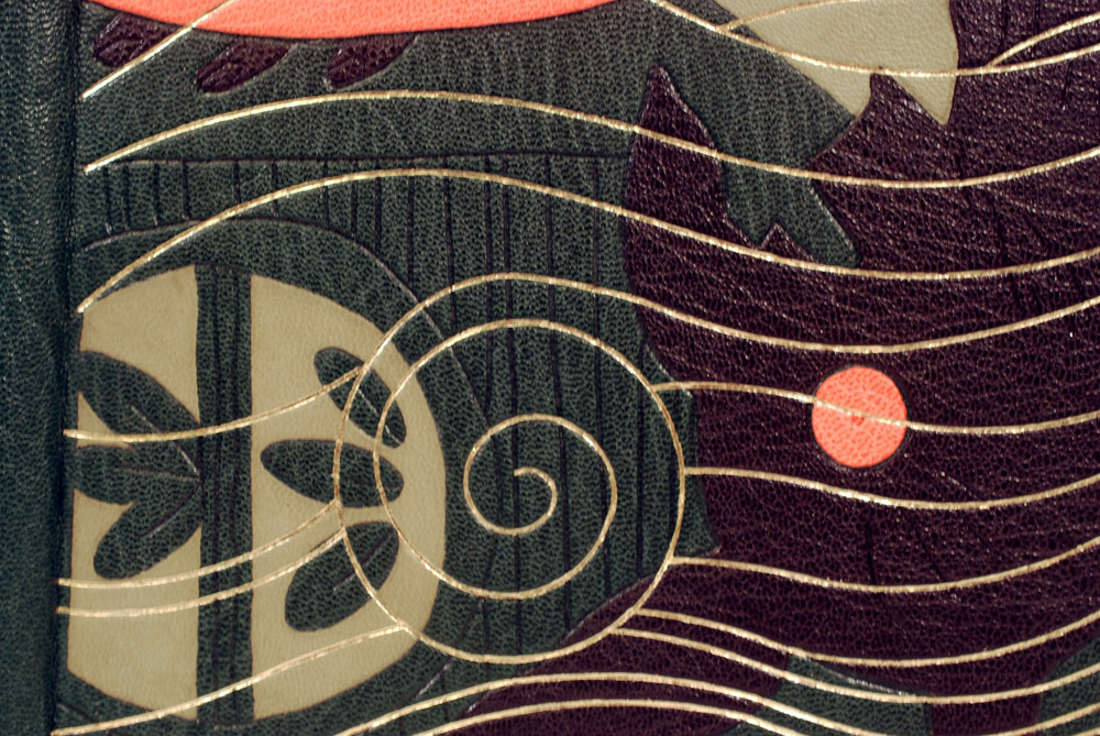
    Jon Simeon took the theme of chaos to heart with this binding; taking his inspiration from how Davies disregarded the illustration when writing each limerick. Jon took elements from the illustration on the title page and cropped and layered his concept into a surreal design. The base layer is dark green oasis with back-pared olive green goatskin onlays and tooled onlays in black and pink goatskin.

    Trying to decipher his actions, I asked Jon to break down his process step by step. After adhering all of the onlays, blind tooling came next. Using an ascona tool, Jon wanted to highlight the carved lines from the woodcut illustrations and did so first with the blind tooled lines and then with the gold tooled waves and swirls. The pink and black onlays are outlined and giving dimension with blind tooled lines. I love how Jon seemingly reversed a traditional image, burying the major elements behind the background.

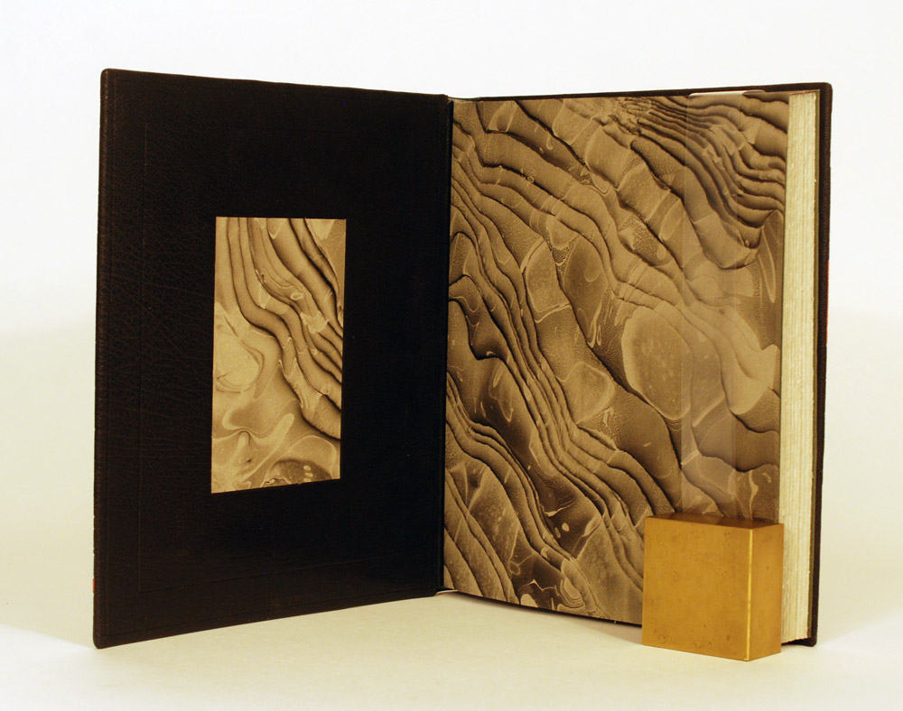
    The title is tooled along the spine amidst a blank canvas. This break in the design was thoughtfully placed to relieve the eye. This same idea continues onto the inside of the binding. Black goatskin doublures are paired with a hand marbled paper in a moire pattern. I love how this paper evokes the movement from the front cover. Other elements of Jon’s binding include hand sewn French double-core endbands in alternating bands of green, pink and olive green. The head edge is gilt with moon gold over a graphite ground and sprinkled with palladium.

    This binding experience has really driven Jon to further focus on finishing after graduation. I can’t wait to see what Jon creates next. You can follow Jon on instagram so you don’t miss any of the amazing work he is bound to make in the future (pun intended).

    Rebecca Fisher Staley

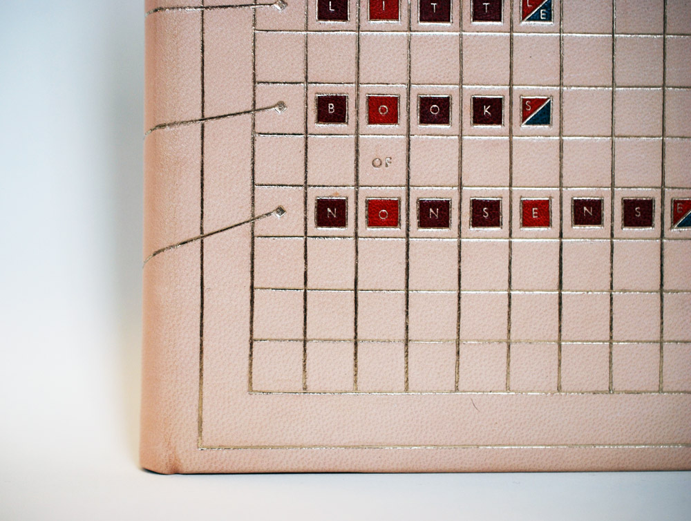
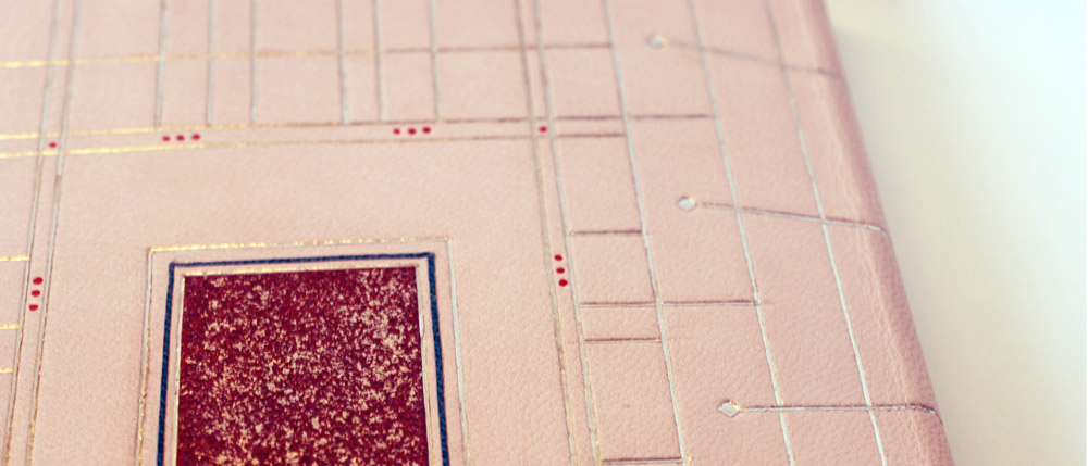
    Rebecca Fisher Staley found the connection between the limericks and woodcut illustrations to be awkward and chaotic. To find some sense in this book of nonsense, Rebecca created an elaborately structured design for her binding. Taking inspiration from the anapestic meter, which dictates the syllabic makeup and stress pattern of a limerick, Rebecca constructed two unique grids. Each designed to represent the two opposing centuries found within the book: woodcut illustrations from the 15th-16th century and limericks from the 20th century.

    Rebecca chose a fair goatskin for the base of her design, which developed a slight pink hue over the course of the binding process. This change in the skin blends so beautifully with the rest of her chosen color palette. The grid on the front cover is sleek and modern and holds a series of small square tooled onlays in pepper red, crimson and teal. The strategic placement of color depicts the stress pattern of a limerick in addition to containing each letter of the title.

    The grid on the back board is more representative of an old English 15th century pattern. To set up this grid, Rebecca was guided by the syllable count of a limerick. The tooled crimson onlay in the center is sprinkled with moon gold to represent the chaos Rebecca found in the book and by being placed in the center of the board, the onlay physically pushes the lines of the grid closer together to create spaces of varying size. The small red dots placed just outside the inner frame are hand painted in tooled impressions. Both grids are connected across the spine in an asymmetric layout harkening back to the loose connection between woodcuts and limericks.

    The interior is covered in matching edge-to-edge doublures with a sunken panel of cherry veneer which is framed by crimson leather onlays. The hand sewn endbands are traditional French double-core wrapped with stripes of white, off-white and red.  The head edge is sprinkled directly on the gray paper in moon gold. The sheer amount of planning and reworking that was put into this design is astounding. Rebecca’s design is so striking, her color choices are spot on and I can’t wait to see what she makes next.

    Rebecca will be working to complete two commissioned artist book editions over the summer before moving back to the Los Angeles area where she plans to open a design studio with two colleagues.

    Frances Wentworth

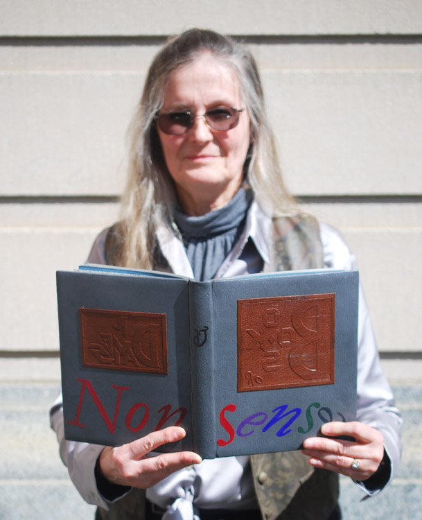
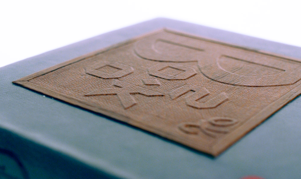
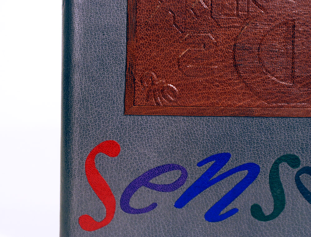
    With Frances Wentworth’s design, she playfully arranges the title in such a way that cuts the word nonsense into two words. When the book is closed the title reads as Books of Sense. The viewer is only revealed of the true title after peering to the backside. This whimsical layout takes direct cues from the layout of the book, where the woodcut illustration sits above the italicized limerick. To create the look of a woodcut block, Frances first crafted the letterforms in 20pt. museum board pieces on a 10pt. museum board base then covered it in a medium brown goatskin. The letterforms on the front cover are rigid and angular while the typography on the back cover is more wild and playful. These are direct responses to the sharpness of the illustrations and whimsy of the limericks.

    The “blocks” are inset into the boards and framed with separate pieces of 10pt. museum board covered in the same medium brown goatskin. I love that Frances chose to emulate the woodcut block instead of the illustration. Viewing part of the text in reverse just adds to the humor and quirkiness of the design.

    The remaining portion of the title is done in back-pared onlays in various colors of goatskin. All of the design is backed by a medium grey goatskin. Frances added a French double-core endband in stripes of blue and red silk against a graphite edge on the head. Frances chose a 19th/20th century reproduction printed endpaper with blue grey Bugra endpapers.

    Although design binding isn’t what Frances sought out to do at NBSS, her concept really worked with the book. It is compelling, thoughtfully executed and sparks a bit of humor. Frances plans to pursue a career in conservation after graduation.

    That brings us to the end of the interview. I have to say again how impressed I am with the finished bindings. Everyone’s personalities and interests really shine through in their designs. Best of luck to everyone in the Class of 2018!

    SaveSave

    SaveSave

    SaveSaveSaveSave


  8. Upcoming Workshops // March to May

    March 15, 2018 by Erin Fletcher

    MARCH
    No more workshops scheduled in March


    APRIL
    Secret Belgian Binding
    April 7 – 8 (Saturday & Sunday)
    8:30am – 4:30pm
    North Bennet Street School, Boston, MA

    This class is currently full. On day one, students assemble two variations of this non-adhesive structure, which is simple and can be quickly constructed. It opens flat and is perfect for thinner text blocks. On day two, students explore modified versions of the Secret Belgian binding by playing with the amount and size of sewing holes and incorporating Tyvek.

    Secret Belgian Binding
    April 28 (Saturday)
    9:00am – 4:00pm
    Wishcamper Center, University of Southern Maine, Portland, ME

    During this single-day workshop, students will assemble two variations of this non-adhesive structure, which is simple and can be quickly constructed. It opens flat and is perfect for thinner text blocks.


    MAY
    Introduction to Embroidery on Leather
    May 13 – 24
    Paper & Book Intensive at Ox-Bow in Saugatuk, Michigan

    Historical examples of embroidered bindings typically date back from the close of the 14th c. to the mid-17thc., and were primarily done on silk, satin, velvet or canvas. These highly decorative bindings grew out of a tradition of textile bindings popular in England during the 14th and 15th centuries. The embroidered designs found can be classified in three categories: heraldic, scriptural symbolism, and floral and arabesque designs. The makers of these bindings included both professional (predominately male artisans) and amateur needle workers (typically women in their homes).

    Contemporary bookbinders and book artists have been incorporating embroidery and other sewing techniques into their work. The range of materials and methods has certainly expanded beyond the historical examples. Using thread on traditional binding techniques allows the artist to express their vision in an unusual way and introduces a different tactile experience to the binding. Embroidered threads can be used to draw in the abstract or to add highlights and shadows to an illustrative design. The threads can be kept neat or left to tangle.

    In this workshop, students will learn a range of hand-embroidery stitches and the best techniques for sewing into leather. We will look at the stitches most commonly found on historical models and ways to use them on a modern binding. We will also discuss ways to transfer the design onto leather and how to prepare the finished embroidered leather for covering. No prior experience with embroidery or leather is necessary, but some hand skills are encouraged.


  9. Upcoming Workshops & Events // November to January

    November 14, 2017 by Erin Fletcher

    NOVEMBER:
    North Bennet Street School Open House
    November 17 – 18 (Friday & Saturday)
    10:00am – 2:00pm
    150 North Street, Boston

    I’ll be hanging out in the Bookbinding Department with fellow NBSS Workshop Instructor James Reid-Cunningham for the NBSS Open House. This is a great chance to see the space in action, chat with us about workshops and check out the work being produced by the full-time students. The other seven departments will also be open to guests, so make sure to check out the rest the school has to offer.


    DECEMBER:
    Northampton Book and Book Arts Fair
    December 2 – 3 (Saturday & Sunday)
    1:00pm – 5:00pm & 10:00am – 4:00pm
    Smith College Campus Center
    100 Elm Street (Route 9)
    Northampton, MA

    Stop by the 3rd annual Northampton Book and Book Arts Fair. This will be my second year attending alongside my studio mate and colleague Colin Urbina. I will have some of my recent embroidered bindings on display along with information about upcoming workshops and ways to participate in the Guild of Book Workers.


    JANUARY:
    Bookbinding 101
    January 27 – 28 (Saturday & Sunday)
    8:30am – 4:30pm
    North Bennet Street School, Boston, MA

    This class is currently full, but another will be added soon. This shorter workshop focuses on technique as students will construct through the aid of kits. Students will make three different binding structures and create an enclosure to house everything. This workshop is perfect for anyone curious about bookbinding and what North Bennet has to offer. No prior experience necessary.

    SaveSave


  10. Upcoming Workshops & Events // October to December

    October 15, 2017 by Erin Fletcher

    OCTOBER:
    No workshops schedule for October.


    NOVEMBER:
    Bookbinding 101
    November 5 & 12 (Sunday)
    8:30am – 4:30pm
    North Bennet Street School, Boston, MA

    This class is currently full. This shorter workshop focuses on technique as students will construct through the aid of kits. Students will make three different binding structures and create an enclosure to house everything. This workshop is perfect for anyone curious about bookbinding and what North Bennet has to offer. No prior experience necessary.


    DECEMBER:
    Northampton Book and Book Arts Fair
    December 2 – 3 (Saturday – Sunday)
    1:00pm – 5:00pm & 10:00am – 4:00pm
    Smith College Campus Center
    100 Elm Street (Route 9)
    Northampton, MA

    Stop by the third annual Northampton Book and Book Arts Fair. This will be my second year attending alongside my studio mate and colleague Colin Urbina. I will have some of my recent embroidered bindings on display along with information about upcoming workshops and ways to participate in the Guild of Book Workers.


  • My name is Erin Fletcher, owner and bookbinder of Herringbone Bindery in Boston. Flash of the Hand is a space where I share my process and inspirations.
    The StudioNewsletterInstagramEmail me
  • Archives