RSS Feed

Posts Tagged ‘monique lallier’

  1. Best of 2014

    December 31, 2014 by Erin Fletcher

    As the year 2014 comes to a close, I want to send out another thank you to the nine bookbinders and book artists who took time away from their busy schedules to participate in my interviews. Another thank you goes to those who read and subscribe to my blog and I especially appreciate the kind comments I’ve received either in person or via email.

    Now to reflect on my year: Herringbone Bindery was busy yet again this year. I had the opportunity to work on some really great projects, amongst them were commissions from the Old State House in Boston, artist Laura Davidson and the Veatchs booksellers. An unusual amount of traveling this year took me to Rare Book School for the first time, up to Maine for a mini-conference and across the country to Vegas for the Guild of Book Workers conference.

    Things to expect in the New Year:
    – an updated website with all the projects I completed in 2014 (including some beautiful design bindings)
    – a Herringbone Bindery newsletter
    – more posts on my own projects (expect to see more on Dune as I will be covering right after the holidays)
    – another round of interviews

    As we ring in the new year, I just wanted to share my favorites posts from 2014.

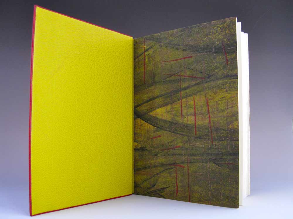
    bestof2014a

    1. February // Bookbinder of the Month: Haein Song
    Haein Song was recommend to me by Hannah Brown and I was so thankful for her suggestion. Haein’s work is so clean and skillfully crafted. Her headcaps are so impeccable that I gape in awe.
    2. Artist: Marcela Cárdenas
    3. May // Bookbinder of the Month: Monique Lallier
    I greatly admire the work of Monique Lallier and was just ecstatic that she agreed to be interviewed for the blog. She has become such an influence in our field and openly shares her support and wisdom.

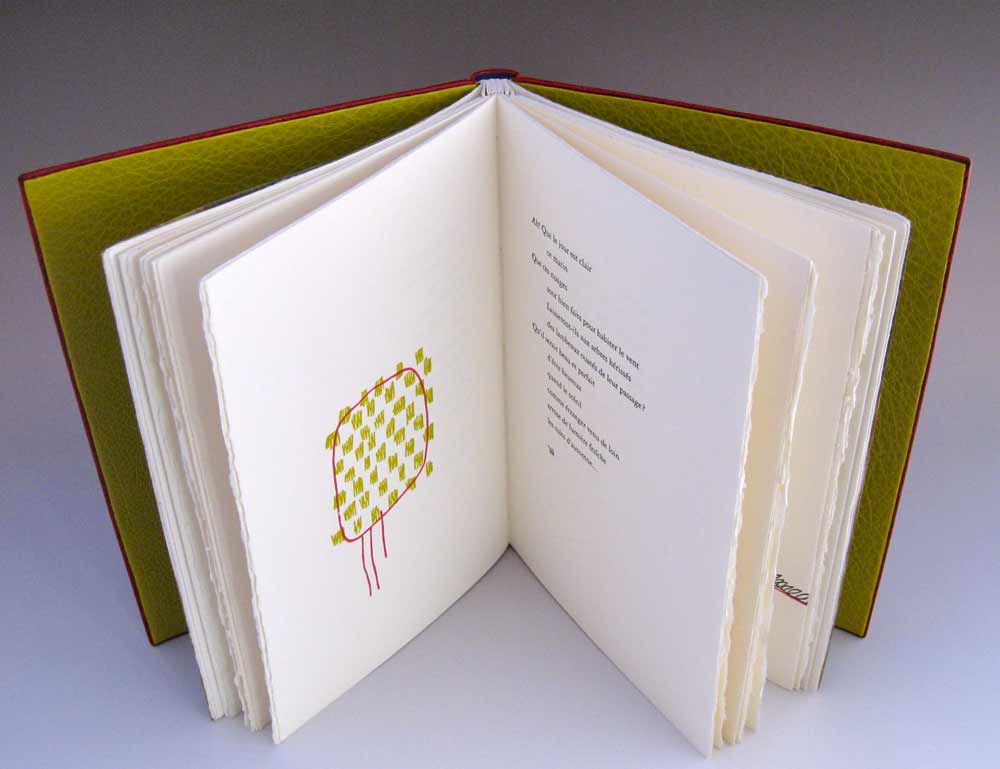
    bestof2014b

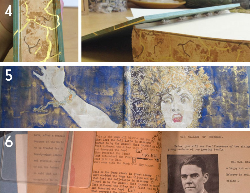
    4. My Hand: A Desert Inspired Edge for Dune
    5. August // Bookbinder of the Month: Mark Cockram
    The interview with Mark Cockram captures the boisterous and enthusiastic charms of both his personality and love of the craft. Each post examines the intensity of his designs and complexity of his techniques.
    6. Conservation Conversations Column
    Beginning this year, I invited six of my colleagues working in conservation to post about a field that encapsulates their professional lives. Topics range from using the appropriate adhesive and what to consider when building a conservation lab to various conservation considerations and philosophies.

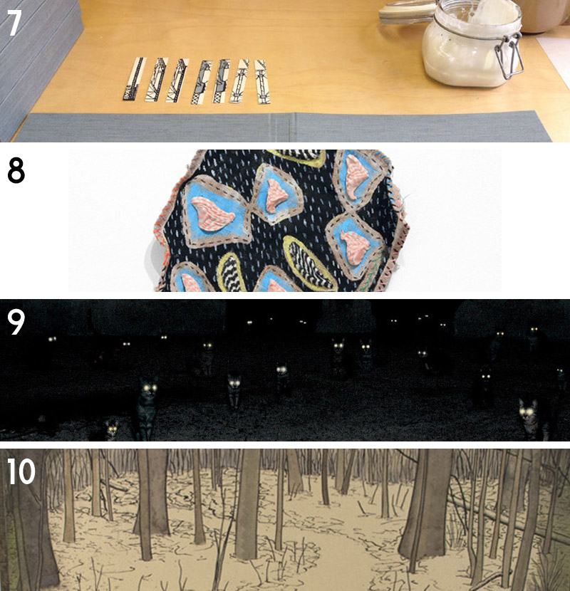
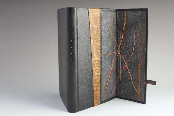
    bestof2014c

    7. My Hand: Boxes for Laura Davidson
    My first project with Laura Davidson after interviewing her on my blog.
    8. Artist: Lydia Hardwick
    9. Photographer: Andrea Galvani
    10. January // Book Artist of the Month: Mary Uthuppuru
    I’m so charmed both Mary Uthuppuru and her work. She really engages the craft by exploring and experimenting with bookbinding and printmaking techniques. Mary is quite inspiring.

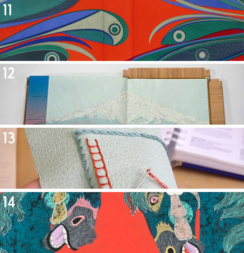
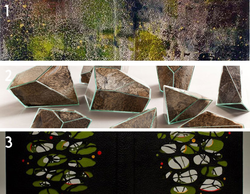
    bestof2014d

    11. November // Bookbinder of the Month: Sol Rébora
    It was a pleasure to interview Sol Rébora. Her insights to bookbinding in Argentina were refreshing, as are her imaginative and unique design bindings.
    12. February // Book Artist of the Month: Diane Jacobs
    Diane Jacobs employs important topics like feminism, body issues and societal issues against women in book arts and other art forms. I am very engaged and compelled by these issues and enjoyed dissecting her work in the interview.
    13. My Hand: Leather Embroidery Samplers
    14. Artist: Jennifer Davis

    Happy New Year!

  2. Bonus // Bookbinder of the Month: Monique Lallier

    May 25, 2014 by Erin Fletcher

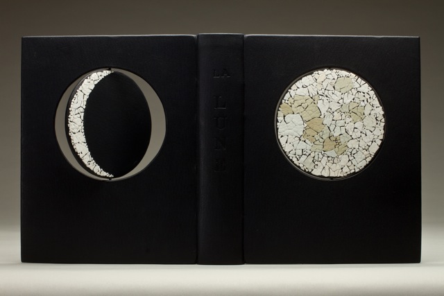
    LaLune1-MoniqueLallier

    As much as I would like to feature every single binding from Monique Lallier’s portfolio, the month as finally come to an end. But I thought I’d sneak in one last binding to leave you in awe.

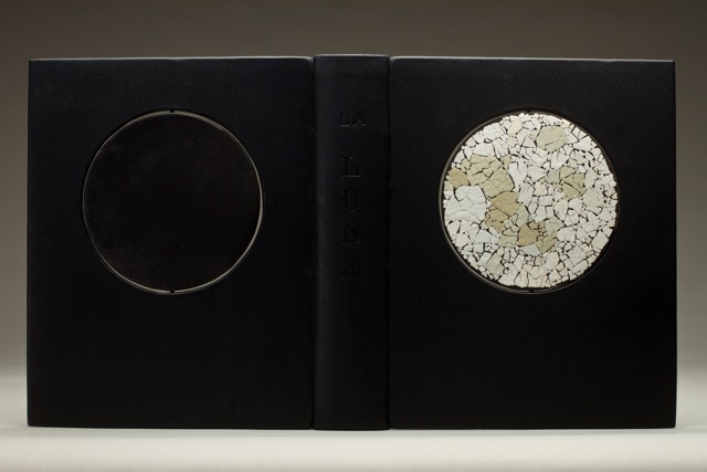
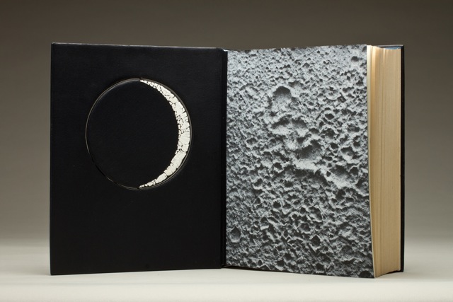
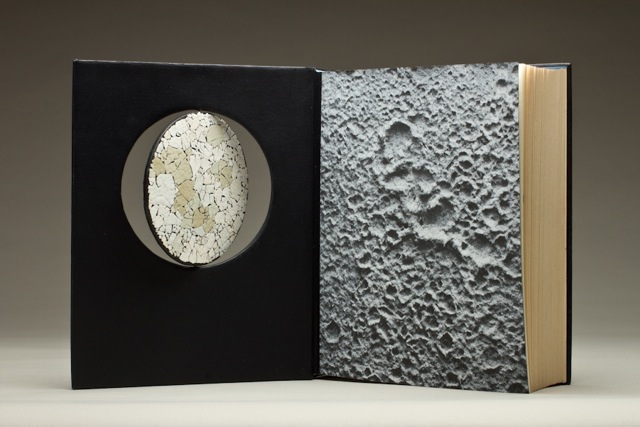
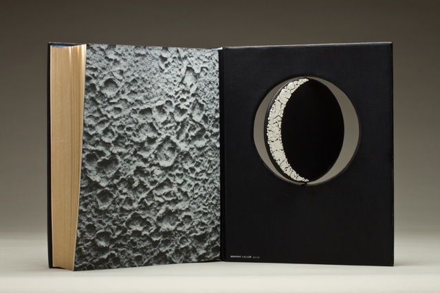
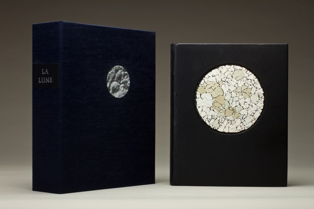
    La Lune was recently bound by Monique using dark blue smooth goatskin from Steven Siegel with matching edge to edge doublures. The endpapers perfectly match the design and title of the book. The ‘moon’ paper came from Andrea Peterson of Hook Pottery Paper.

    Throughout the month we’ve looked at your hidden panel bindings which offer a distinct element to your work and unique movement to the structure. We’ve also looked at bindings that include depth and texture through the use of laser cutting or lacunose. With the binding for La Lune you really bring together movement and texture in such a brilliant and unique way. What can you tell us about the concept for the binding and how the rotation of the moon was constructed?
    La Lune was a commission from an artist friend. I wanted to have texture for the full moon so I choose egg shells of different tones of blue to white. The crescent are of white shells, the new moon is of black vellum that has some gray tone in it. I had the circles laser cut. I cut a channel in each circle for the metal rod and put it in place before covering. From the inside of the boards I cut another channel, longer at the top than the bottom one so I could push the rod up until I could adjust it in the bottom channel. The rod has to stay free to allow the rotation.

    LaLune2-MoniqueLallier LaLune3-MoniqueLallier LaLune4-MoniqueLallierLaLune5-MoniqueLallier LaLune6-MoniqueLallier


  3. Bookbinder of the Month: Monique Lallier

    May 25, 2014 by Erin Fletcher

    LaPetitePouled'Eau-MoniqueLallier

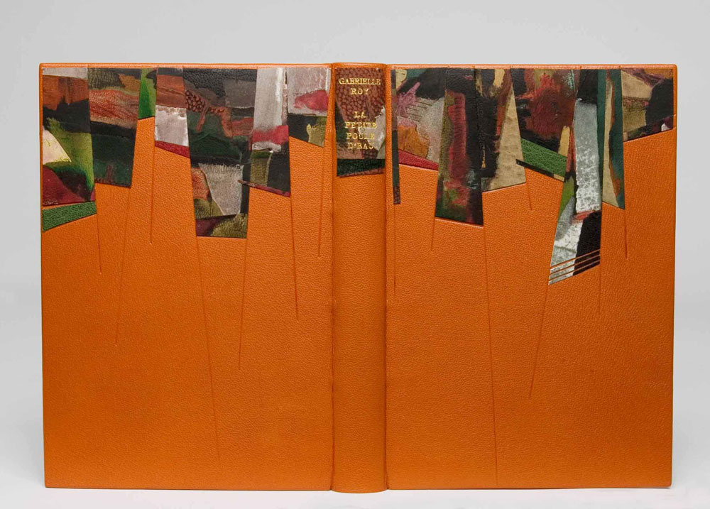
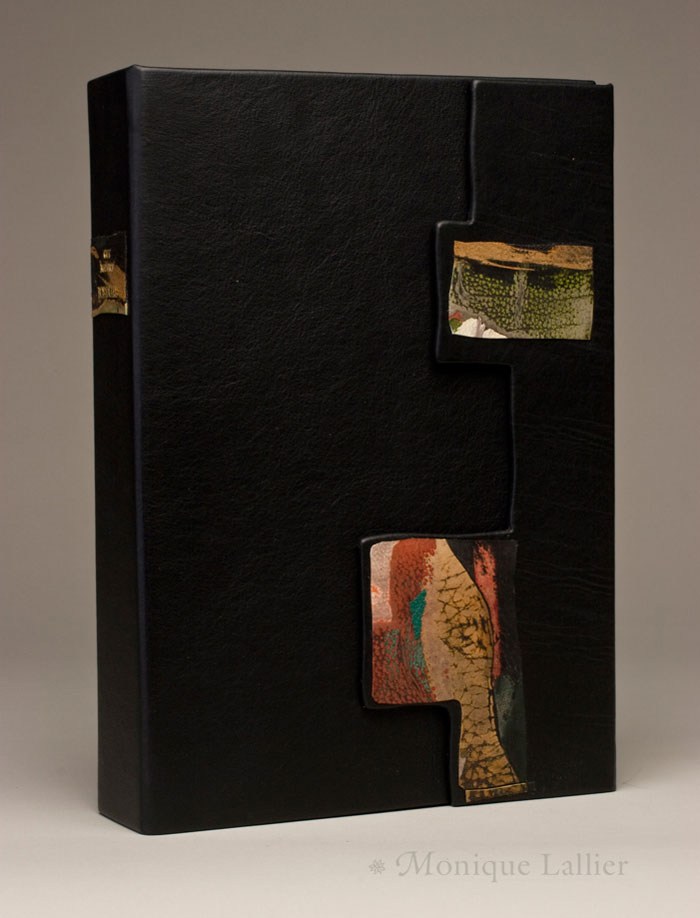
    La Petite Poule d’Eau by Gabrielle Roy was bound by Monique Lallier in the French technique in full leather with onlays of lacunose. This technique transforms leather into a uniquely distinct design, offering texture and depth. The process calls for patience and muscle. Lacunose is created through a series of layers of thin leather pieces which are covered in a PVA wash and sanded smooth between each layer. The result is a build-up of various leathers in a seamlessly smooth finish, which can than be used as a decorative onlay.

    Another design element visible throughout your work is the lacunose onlay. The lacunose technique can be quite time consuming as you begin to add more and more layers. What is your process for the lacunose and how long does the process take?
    This is the story of a village in Manitoba, Canada, called La Petite Poule d’Eau. I wanted to convey a sense of structure and colorful personalities. I had seen Paul Delrue demonstrating “Lacunose” at the Standards and I thought it would be nice on my binding. Little did I know how long it would take me to achieve the result I wanted, but I am patient and determine so I kept sanding…It took several days, as you have to wait for the leather to dry between sanding sessions. Now I have several boards covered with “Lacunose” or (cuir peaufiné) sanded leather as they call it in France, because it’s a nice way to use your bits and pieces of leather. I have done some with one or two colors of different shades…you can play with it and do it in between steps in bookbinding…it’s fun!

    box-MoniqueLallier MoniqueLallier


  4. Bookbinder of the Month: Monique Lallier

    May 18, 2014 by Erin Fletcher

    ThePhoenix-MoniqueLallier

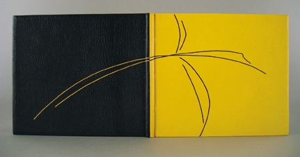
    In Flight ran from 2003 – 2005 as the triennial traveling exhibit organized by the Guild of Book Workers. For the exhibit, Monique Lallier bound The Phoenix. The most obviously astonishing design element executed by Monique on this binding is the use of two separate leathers with a seamless connection down the center of the spine. Bound in yellow and black goatskin over laced-in boards, the dual color scheme continues in the hand sewn headbands and the stylized phoenix design creating with contrasting onlay leather lines.

    The line quality of the phoenix is reminiscent of lines from a fashion sketch. Do you think your background in fashion plays any part in your overall design choices?
    I love this binding. I think it illustrates the story perfectly. Everything that we do in life, every experience stays with us and you are influenced because it is deep in you and when you are searching and “struggling” with a design you go within you, like in a well to retrieve what you need, whether you realize it or not.

    As I entered my undergraduate studies, I was determined to go into Fashion Design. However, I was pulled in another direction, but I find that I’m still drawn to the latest couture designs. Do you seek out fashion as an artistic inspiration?
    I don’t look too much at fashion anymore, I look more at design and craft magazines, or visit galleries and museums everywhere I go. Although I noticed that laser cutting is big in fashion now.


  5. Bookbinder of the Month: Monique Lallier

    May 11, 2014 by Erin Fletcher

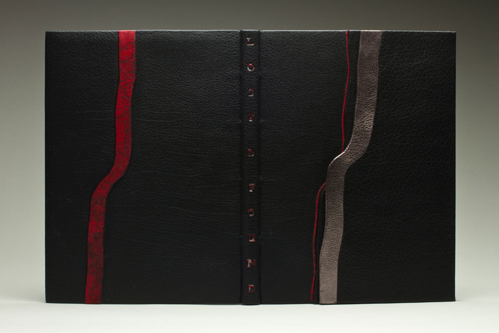
    LostAndFound-MoniqueLallier

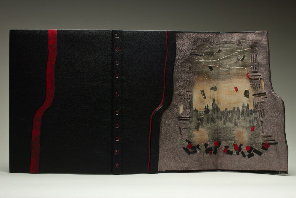
    This beautiful fine binding has a secret. It’s a secret (technique) that only Monique Lallier and a few of her students know about. The front cover has a panel that swings open along the fore-edge to reveal an elaborate, hidden design. This technique is unique to Monique’s portfolio.

    Lost and Found is a work about illustrator Rachel Rackett and was recently bound by Monique for InsideOUT, an international exhibition organized by the Designer Bookbinders that celebrates the craftsmanship of contemporary binders and private press printers. I can not wait until this exhibit arrives at the Houghton Library in September, you can bet on a future post about the show.

    LostAndFound2-MoniqueLallier

    Another signature design element seen throughout your portfolio is the front panel, which opens to reveal a hidden design. What is the history of this design technique, where did you learn about it?
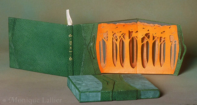
    In 1985 I designed L’Ecorce et le Vent with a front panel opening on a “forest” of layers of trees, the first layer being goat skin and the two other layers being Japanese paper. This was my first attempt and it was a great success at the 1986 exhibition L’Association des Relieurs du Quebec. This book is now in the collection of the Morgan Library in New York. I really don’t know where I had this idea of the hidden design. In my first attempt it was to show a forest and I wanted the three dimensional aspect of looking at a forest, so it had to be free and moving, not static like an onlay.

    LEcorceEtLeVent-MoniqueLallier

    For The Knell of Cock Robin I wanted to express the feeling of a bird (on the agate) flying into the forest.

    TheKnellOfCockRobin-MoniqueLallier

    For Lost and Found, the story is about Rachel Rackett, an illustrator of books. When she died they found a box filled with drawings that had never been used, so they produced the book to show her work and many illustrations were about the blitz of London during the war, so I thought that the hidden design of destruction was perfect for the story.

    I don’t know anybody else, other than my students, that used this technique in the same way. I have seen front panels that cover the entire surface of the front or back covers, it creates a very different design.

    – – – – – – – – – – –

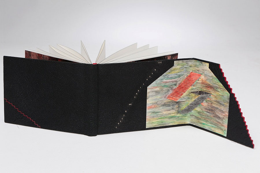
    Just one more panel binding to end the post. The following binding was completed in 2012, for the ARA-Canada exhibit Les escaliers de Québec. The portfolio binding is covered in black morocco goat with highlights of red morocco. The text block is an accordion attached to the lower board only and has a graphite colored head edge. The hidden décor panel opens to a colorful scene created by Masahiro Chatami with a photograph of Québec City tipped behind the staircases. The marbled paper endleaves are by Claude Delpierre.

    LesEscaliersdeQuebec-MoniqueLallier


  6. Bookbinder of the Month: Monique Lallier

    May 4, 2014 by Erin Fletcher

    LaColouerduVent-MoniqueLallier

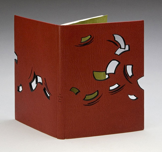
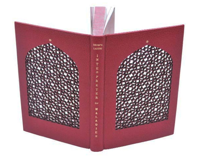
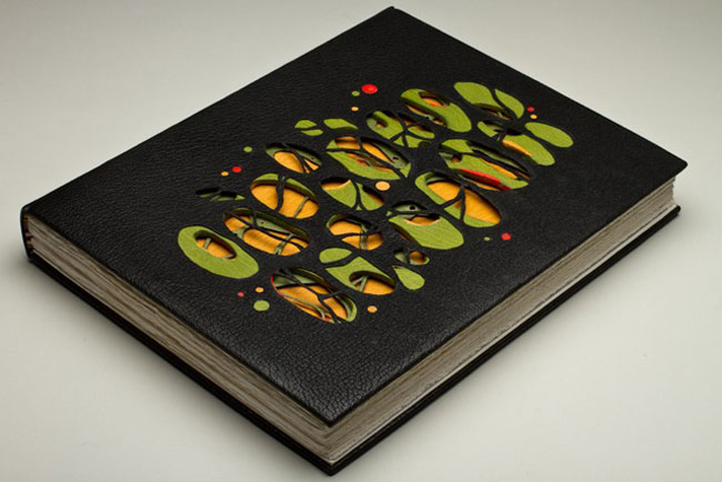
    La Couleur du Vent was bound in 2013 by Monique Lallier for the ARA-Canada exhibition that I may have mentioned just once or twice (even thrice) in the past. I brought up the window element in Monique’s work during the interview on the first of the month with her binding The Drawings of Caravaggio. When I saw Monique’s binding of Interpreter of Maladies at an exhibition in Chicago, I was awed and intrigued by its construction. With this binding Monique began experimenting with laser cutting technology to create detailed and intricate work. 

    IntrepreterOfMaladies1-MoniqueLallierI want to further the discussion from last week on the progression of the window element in your designs. Except this time I would like to focus on technique. The covers of La Colouer du Vent and Interpreter of Maladies were laser cut to achieve the intricacies of the design. Do you approach the structure differently on a fine binding when including laser cut elements?
    When I choose to use laser cutting I have to do a “case” binding as I have to finish the inside doublures before the laser cutting and the cover has to be flat on the table of the laser cutter. I still consider it a fine binding. 

    Did you have to alter anything about the process from your first attempt to the most recent one?
    I think I figured it out right on the first time and it worked well, so I repeated the same technique.

    – – – – – – – – – – –

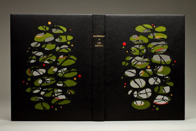
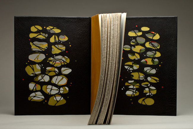
    In addition, during the interview, I included a sneak peek of one of Monique’s recent bindings of Les Sonnets by Shakespeare. The complexity of the design is literally jaw-dropping. Two layers of board have been cut and sandwiched between the covering leather and leather doublures, which have also been laser cut.

    LesSonnets-MoniqueLallier LesSonnets2-MoniqueLallier LesSonnets3-MoniqueLallier


  7. May // Bookbinder of the Month: Monique Lallier

    May 1, 2014 by Erin Fletcher

    DrawingsOfCaravaggio-MoniqueLallier

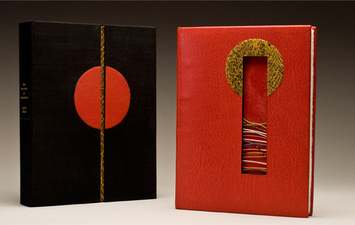
    This stunning binding was created by Monique Lallier almost ten years ago. Yet the design appears so fresh and relevant to the experimentations happening with contemporary design bindings. When you land on Monique’s website, this is the binding you are greeted with and it will, no doubt, cause you to click through every single page of the gallery. The Drawings of Caravaggio by Ally Jones was bound in full scarlet leather in the French technique. The boards have been cut to reveal the red suede fly leaves through a collection of wires that have been embedded into the thickness of the board. Straddled around the top edge of the cut-out is an onlay of snakeskin. 

    The book is housed in a box covered in black silk with matching red and snakeskin onlays.

    If I remember correctly you told me that this is one of the first bindings you completed and that it is still your favorite. I love this binding as well for many reasons: the use of bright colors, contrasting textures from the goatskin, suede flyleaves and snakeskin onlay and the inclusion of a window cut-out of the cover. This window element is peppered throughout your portfolio. What does this element bring to your designs and why do you keep coming back to it?
    This binding was done in 2005. I had done the “window element” before to give space for an agate in 1985, so I suppose it evolved to an opening that was not totally filled-in like The Fables of Aesop where I have wires imbedded in the thickness of the front board and you see, through the opening to the lion stamped on the leather fly leave, or this Caravaggio, also with wires imbedded in the thickness of the boards. It was done in an advanced class for AAB (American Academy of Bookbinding) and I wanted to show the students how to line the thickness of the boards with black leather in this case.

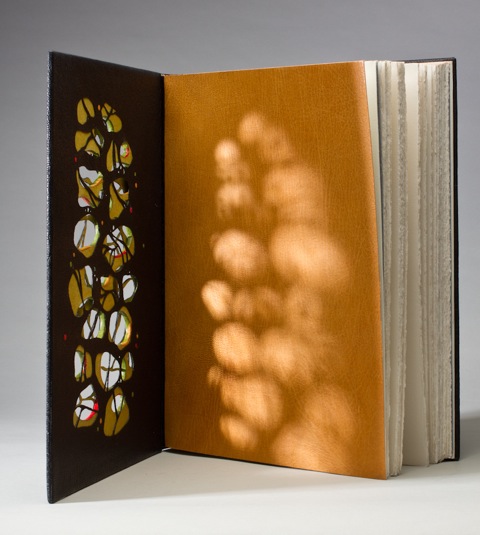
    I suppose I keep coming back to it because I like the effect of “seeing through”, like in Les Sonnets (shown below) where the boards, the covering leather and the leather doublures are all cut out. In this case, it was to illustrate how Les Sonnets have an impression on you. (More images on this binding later!)

    LesSonnets4-MoniqueLallier

    Monique’s work is awe-inspiring. Not only do I find her bindings to be so, but also her involvement in the bookbinding community.  Our community and the craft of bookbinding thrives when talented and dedicated people like Monique become teachers. Between my first and second year at North Bennet Street School, I jumped at the opportunity to take a week-long private workshop with Monique at her home in North Carolina, where I absorbed everything she had to offer (no doubt an infinitesimal amount to the vast knowledge she holds).

    I’m really honored that Monique agreed to be interviewed for my blog, which she has complimented me about several times. So without furthering gushing, please enjoy the interview after the jump. Stay updated with posts by signing up for an email subscription. Since Monique has an ample collection of work, each week I’ll be showcasing multiple bindings including a few newly bound and unseen works!

    read more >


  8. December // Bookbinder of the Month: Karen Hanmer

    December 1, 2013 by Erin Fletcher

    booksspeakplain1-karenhanmer

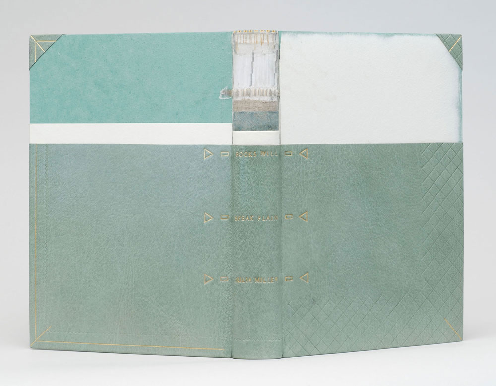
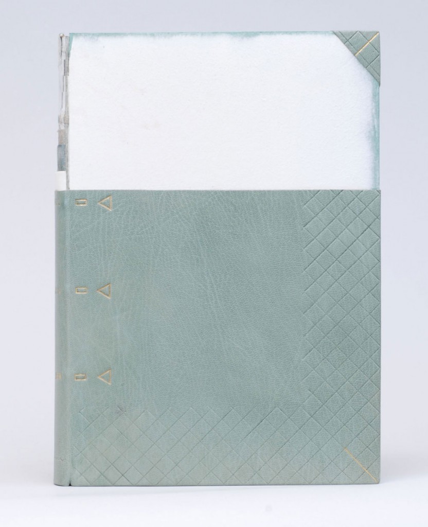
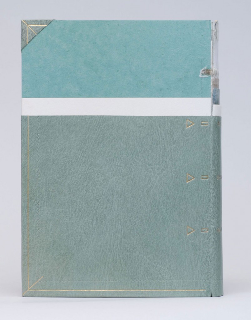
    The Midwest Chapter of the Guild of Book Workers recently revealed the exhibitors for a traveling exhibition called Plainly Spoken, which celebrates Books Will Speak Plain, a comprehensive survey of historical bindings by Julia Miller. Amongst the highly skilled and wide variety of bindings is a cutaway model by Karen Hanmer

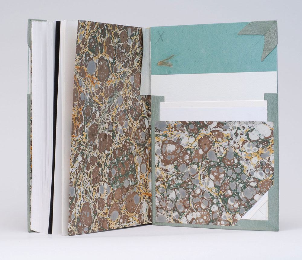
    Karen bound her copy of Books Will Speak Plain as a traditional fine binding, sewn on flattened cords with laced-in boards. Partially covered in a beautiful light blue goatskin, otherwise hidden elements of the structure stay visible in this cutaway model. Tooling is done in blind and 23kt. gold foil to emphasize the location of sewing supports and lacing-on in addition to turn-ins, fills, sanding of the boards and formation of corners. The use of tooling as both an aesthetic treatment and as visual aid is just brilliant!

    booksspeakplain2-karenhanmerbooksspeakplain4-karenhanmer

    Although the book may appear to be incomplete, it includes all the necessary details that make a book a fine binding. The headbands are hand sewn using silk thread and the head edge is sponged with acrylic inks and sprinkled with gold leaf. The inside continues with the cutaway theme showing off the leather hinge, marbled paper endpapers, fills and corners. 

    booksspeakplain5-karenhanmer

    How did you approach this cutaway binding? Did you study Mark Esser’s models at the University of Iowa?
    I’ve made a lot of partially-finished models. They’re useful for teaching and help me remember process. But cutaways are something different since they appear unfinished and fully complete at the same time. Peter Verheyen has loaned me his springback cutaways several times, and I used them for reference when making my first cutaways. I’d admired Mark Esser’s two cutaway fine bindings in the University of Iowa’s online collection for a long time and was able to spend time with them on two trips to Iowa City this spring.

    I was able to use my design binding on Books Will Speak Plain twice this fall: for both an online exhibit of cutaways, and in a traveling set book exhibition. For the latter I added tooling to reference the binding process: the sewing supports and lacing, the turn-ins and fills, and the board-shaping.

    – – – – 

    The online exhibit that Karen mentioned above, is an annual themed exhibit held by the Book Arts Web called Bind-O-Rama. For 2013, the theme was historical cutaway models. The online exhibit can be viewed here

    Although I don’t know Karen very well (yet), she’s been incredibly sweet and supportive of my work. I first met Karen at her bindery in Glenview, Illinois. My friend, Anna, and I were in town for an exhibition at the Chicago Public Library; where both Karen and I had bindings on display. Since then I’ve kept in touch with Karen, leaning on her from time to time when I needed help. 

    I’ve had two opportunities to watch her work, which is quite fun. Once when she came to North Bennet Street School to teach us the flag book structure and most recently during the Standards of Excellence 2013 conference in Washington, DC. I hope to have more opportunities like this in the future. 

    After the jump is a wonderfully thoughtful interview with Karen, where she shares her experiences with bookbinding, teaching and marketing. Come back each Sunday during the month of December for more in-depth posts on Karen’s work in the field of bookbinding and artist books. 

    read more >


  9. July // Bookbinder of the Month: Coleen Curry

    July 1, 2013 by Erin Fletcher

    lacouleurduvent-coleencurry

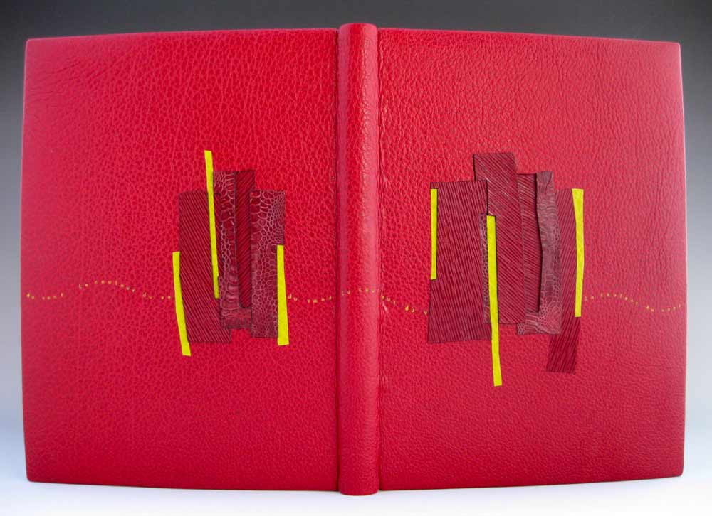
    Coleen Curry was amongst the talented bookbinders who participated in the ARA-Canada exhibit La Couleur du Vent, an international design binding exhibition starting in Paris before traveling to Quebec in September 2013 and then Montreal in November 2013. La Couleur du Vent is a collection of poems by Gilles Vigneault, illustrated and designed by Nastassja Imiolek under the artistic direction of Cécile Côté. If it sounds familiar, I posted about this exhibition during last month’s interview with Sonya Sheats

    Coleen bound this copy of La Couleur du Vent as a ‘Montage sur onglets’ style so the prints would not get lost in the gutter. The term ‘Montage sur onglets’ refers to the signatures being sewn on stubs to release them from the confines of the gutter and offering a less restricted opening. Sewn on cords with laced-in boards, the book is bound in red water buffalo with chartreuse water buffalo edge to edge doublures. Exotic leather inlays of varying depths decorate the front and back covers. Title tooled with gold foil. The flyleaves are decorated papers made by Coleen. 

    A brief explanation about the design from Coleen:
    The colors match the prints in the book.  I took some of the shapes from the prints and altered them to create a feeling of blowing in the wind and to create movement.

    lacouleurduvent2-coleencurry lacouleurduvent3-coleencurry

    Coleen’s work has been on my radar ever since I came across her binding of Toni Morrison’s A Mercy at the Chicago Public Library’s exhibition One Book, Many Interpretations in 2011. I attended the opening reception not only because I love design bindings, but to see my own binding of Arthur Miller’s The Crucible. This was the first time I had a binding on exhibit and I was quite honored to be on display with so many other talented binders.

    A Mercy by Toni Morrison bound by Coleen Curry

    A Mercy by Toni Morrison bound by Coleen Curry

    Coleen’s work masterfully mixes traditional leathers with some non-traditional textures such as exotic leathers, agate, and horsetail (to name a few). But I am more attracted to Coleen’s brilliant use of color; either by adding pops of color, subtle hints or just out-right all-over bold color palettes. 

    Read the interview after the jump and come back each Sunday in the month of July to view more gems from Coleen’s portfolio.

    read more >


  • My name is Erin Fletcher, owner and bookbinder of Herringbone Bindery in Boston. Flash of the Hand is a space where I share my process and inspirations.
    The StudioNewsletterInstagramEmail me
  • Archives