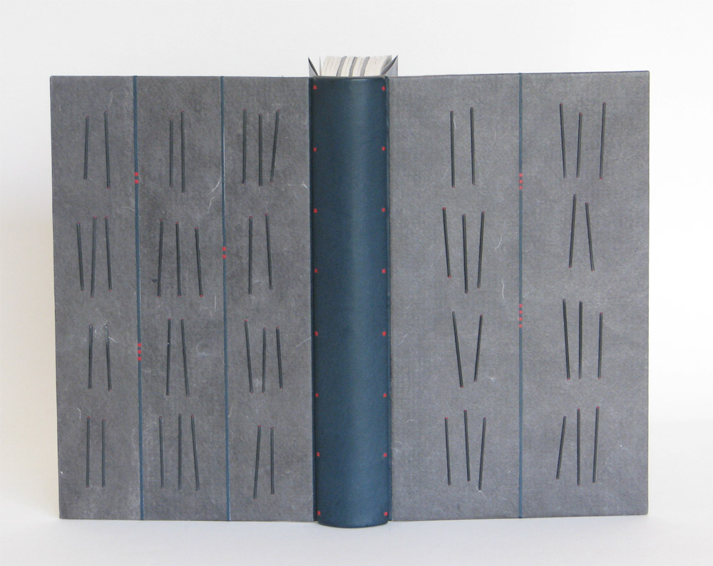
In 2016, Lori Sauer was one of six Designer Bookbinder Fellows selected to bind one the six titles shortlisted for the Man Booker Prize. Lori bound Madeleine Thien’s Do Not Say We Have Nothing, which was presented to the author on the night of the award ceremony.
Your designs are so delicate, but have the power to capture deep emotion. Each element feels meticulously planned and placed in perfect harmony. Can you go through the stages of planning for Do Not Say We Have Nothing, specifically touching on the placement of the small red pieces?
This is a binding done for the Man Booker Prize shortlist, work that always has a very tight deadline. I loved the novel, an epic tale spanning three generations of two separate families, who lived through a turbulent time of Chinese history in the mid twentieth century (the Cultural Revolution through to Tiananmen Square). There is a book within the book, called The Book of Records that ties the families and generations together. Classical music also plays a big part, in particular The Goldberg Variations, a piece based on repeated patterns and mathematics.
I usually tend to work in light and pale colours, my penchant for minimalism. This is the first dark binding I’ve done for a long time but I felt it was needed to capture the psychological temper of the period. All of Chinese society at the time wore uniforms – drab, dark colours with only the Red Guard having something bright.
With all of these elements stewing around in my mind I begin to sketch and when some of them start to work for me I make paper mock-ups – cutting out the right colours and shapes and moving them about – and take photos of the best compositions. I also work on my iPad with a drawing app. (I like Art Rage). I eventually settle on something that makes my fingers want to start work. Sometimes I settle on a design that’s a very long way from my starting point but I’m not unduly bothered that I move off in a sideways direction, as a good design will stand up on its own.
The final design is my visual solution to a novel about music, the passage of time, families and Chinese writing.
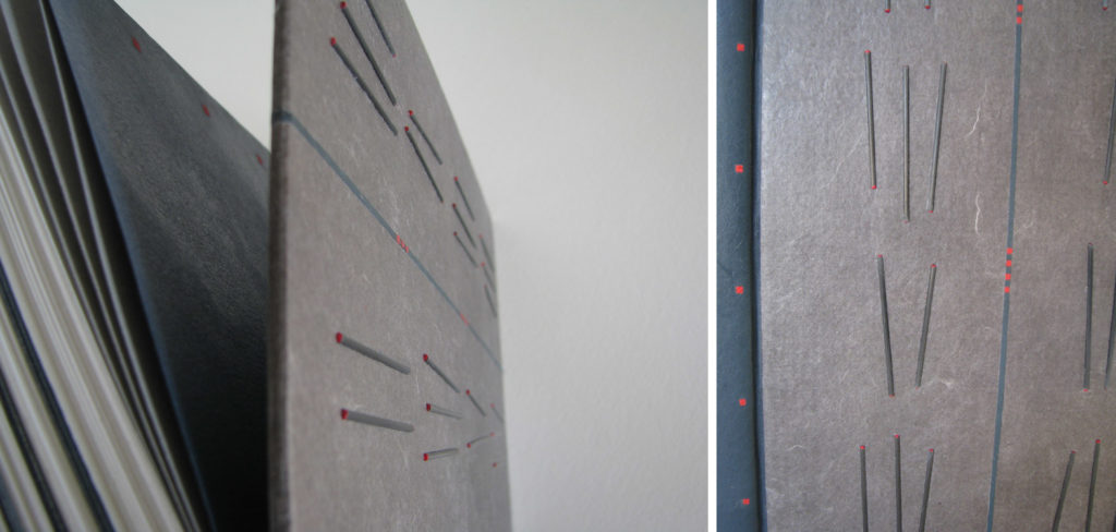
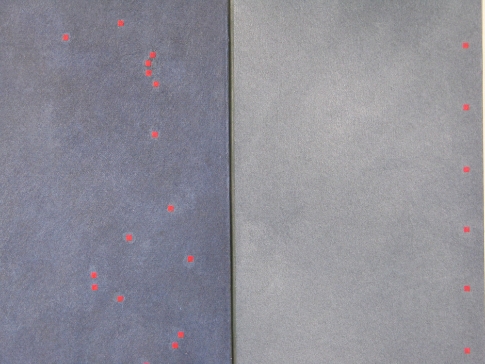
You’ve asked specifically about the small red dots. The ones on the outside (leather, shown above) were placed for compositional balance and add a necessary shot of colour. The dots on the doublures (paper, shown below) were very randomly applied. I worked instinctively and fairly quickly here and photographed a pattern I liked so I could use it for reference when gluing them down later.


