RSS Feed

Posts Tagged ‘leather binding’

  1. Bookbinder of the Month: Sol Rébora

    November 23, 2014 by Erin Fletcher

    LesRencontres1-SolRebora

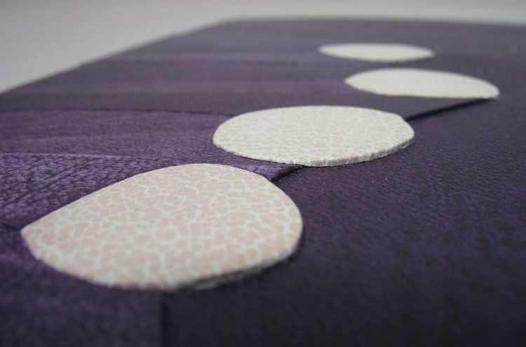
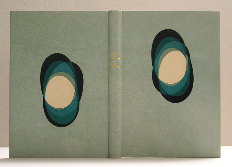
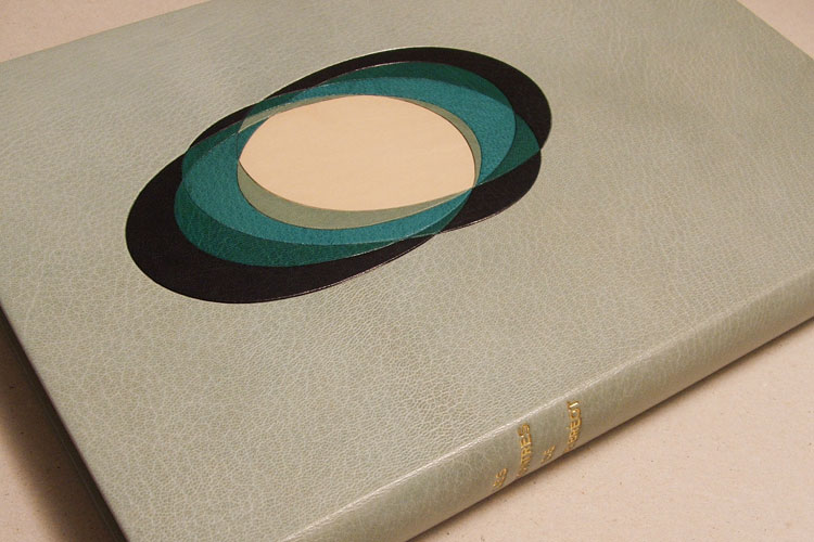
    This is my favorite binding to date from bookbinder Sol Rébora. A french text bound in full goatskin with onlays that create a striking, eye-catching design. The overlapping ellipses are creating by using a combination of goatskin and calf. Combining these two skins as onlays is a technique Sol has used in other bindings (like this one or this one). I quite love the look of the textured goat against the smooth calf.

    The binding was created for Les Rencontres de M. de Bréot, which is a novel written by French author Henri-François-Joseph de Regnier in 1904.

    Although it’s hard to choose a favorite, I think this binding might be the one. Did this design stem from a love of 20th century French design binding?
    It could be, I bound this book for an Argentinean bookseller. He participates every year in the Antiquarian book fair in Paris and I specially bound this book so that he could show my work at this fair in Paris. It is a French book and so there you have the result.
    LesRencontres2-SolRebora LesRencontres4-SolRebora


  2. Bookbinder of the Month: Sol Rébora

    November 16, 2014 by Erin Fletcher

    FaustoA-SolRebora

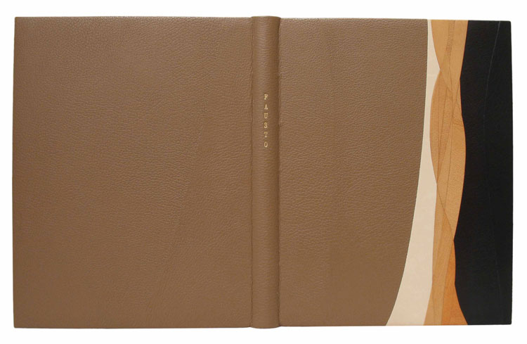
    In this post on Sol Rébora, I am presenting two of her bindings of the text Fausto. Just as was the case with the two bindings she completed on Alice in Wonderland, Sol found inspiration in the individual editions, thus creating two independent and unique design bindings. Fausto was written by Argentinian poet Estanislao del Campo is 1866; the story describes a laborer that goes to see Charles Gounod’s opera Faust and believes the events to really be happening.

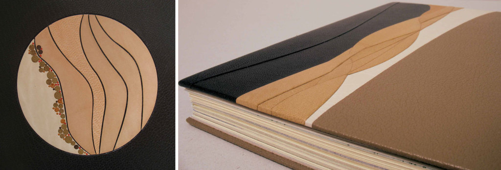
    The binding above is bound in full black goatskin. The circular design includes strips of goatskin and calf, offering a nice variety of textures. The title is tooled in gold along the spine.

    The binding below is bound in full calfskin with detail along the front cover fore edge in the signature style we’ve seen on some of Sol’s other bindings. On this binding, the goatskin and calf onlays sit on five tooled levels. The title is tooled in gold along the spine. FaustoB-SolRebora

    These two bindings of Faust0 are quite different. Can you talk about the concepts behind each binding and what made you design them differently?
    After the explanation of the process I use to make a design binding, probably there are not too much to say about.

    Those are totally different editions, different clients, different years, and different prices, which is another very important point that I didn’t mention before, and it is a big condition of course.

    Most of the tooling on your bindings seem reserved to the titles or is done blind. Is there a reason for excluding this technique from your bindings?
    Well, maybe I don’t use traditional tooling on my designs, besides the titles, but it just depend on the designs, if I feel it needs it, I used traditional tooling to make gold lines it as I did on Milongas, Borges.

    I think I just use what I need when I need.

    I mostly like to work with a metal or brass folder, a very thin tool which helps me to make the finishing work on the inlay and the onlay. I do not love the strong lines around the inlays and my feeling is that it makes the composition looks stronger.

    FaustoAB-SolRebora

    Click image to enlarge.


  3. Bookbinder of the Month: Sol Rébora

    November 9, 2014 by Erin Fletcher

    BaladaParaUnLoco1-SolRebora

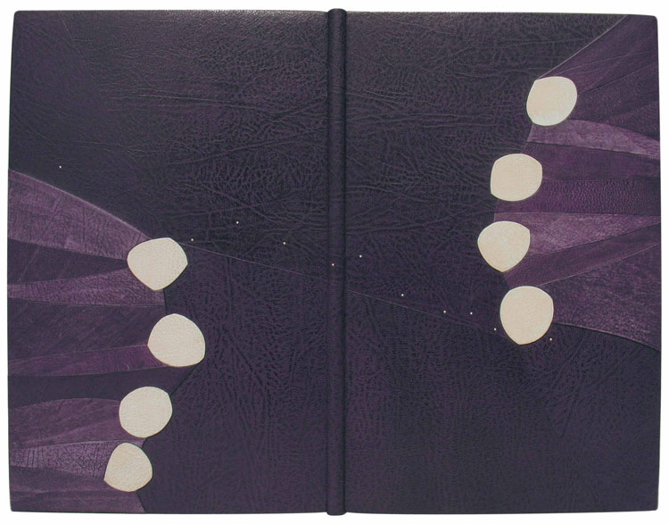
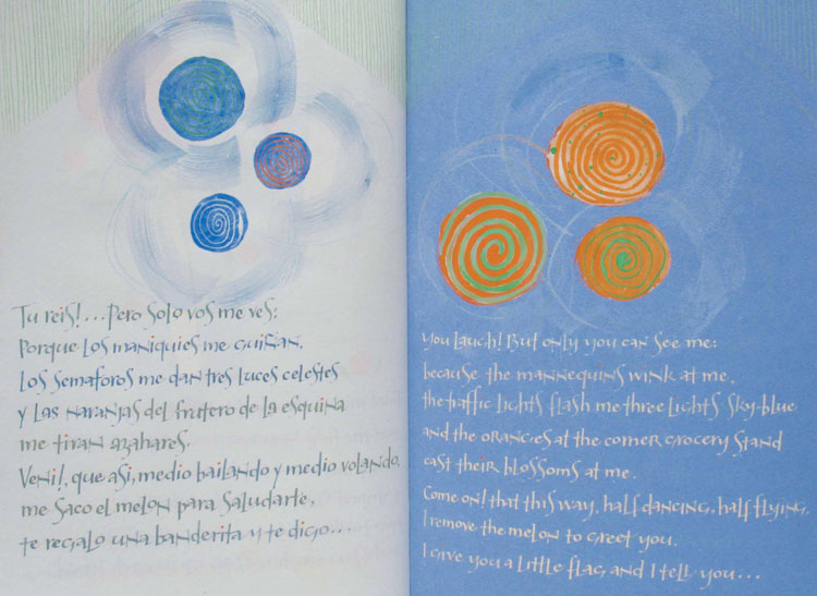
    Sol Rébora bound this special one of a kind text by calligrapher Nancy Leavitt after a serendipitous meeting. The book is bound in the French-style of fine binding in full violet goatskin. The decoration is divided into six levels with onlays in purple and white goatskin.

    The text within this binding is a special edition by Nancy Leavitt. Do have a connection with Nancy, who is a calligrapher and book artist based in Northern Maine?
    I met Nancy in New York in 2006, at the 100th Anniversary Guild of Book Workers Conference. I love her work and I like her very much; she is really a beautiful person and a great artist. I proposed to her that we make a book together and she accepted; so we started to work on it. We looked for a topic which we both like to work with and [settled on the subject of] Tango. After some research we chose [the popular song] Balada para un loco [by poet Hector Ferrer].

    Sometime later she had finished the book, she sent it to me by mail, and I worked on the binding. Both of us worked totally free on our feelings.

    BaladaParaUnLoco2-SolReboraBaladaParaUnLoco3-SolRebora

    Nancy found a way to make a translation, which is very difficult for Tango. With the text and the song, she found a base to create the book.

    Later I bound the book, working with the same process I use for every design binding, but with the plus that I had been part of the creating process of the text in some way. I sent the design to Nancy before I began, (even if she didn’t ask it) and she liked it very much, so I started to work on it.

    It was a wonderful experience.

    Did you find inspiration in the text or do you draw from another source?
    To explain my way to work on a design or to find inspiration I have quite a clear process of work.

    As a starting point in the design process, I engaged in the act of reading the text of the book to be bound or I inquire about the context and history of the edition. To continue as a general basis of the process, I found very necessary to observe carefully all the aspects of the book:

    – Typography: The design of the typeface, its predominant form, size and color.
    – Print Layout: Book cover, typographic case and blank surfaces around the text.
    – Paper: Color, texture and paper weight.
    – Illustrations: Techniques used for illustrations, predominant color, size and quantity thereof.
    – Size and shape of the book: I observe the size of the book, number of booklets [signatures], leaflets or free sheets, and finally the weight of the book.

    From the evaluation of these conditions, I can begin to work on the design of the binding:
    – Structure and construction process: What may be the most appropriate structure and format and sewing by weight.
    – Materials to use: wire, paper, paperboard, leather, fabric, or alternative materials such as acrylic, wood, metal, etc.
    – Textures: Choosing textures in every material used for union or for opposition to the qualities that brings the book.
    – Colors: Colors of the materials I decide to use.
    – Design: Drawings, designs, models, colors and material testing.

    I think the openness and the preservation are the most important points on the construction process of a contemporary design binding, together with “good techniques and aesthetic criteria”.

    These are technical conditions that a binding should have to preserve the criteria that the book brings from the edition, which is accompanied by an aesthetic thought of form and color text, based on the text, work which is responsible editors, designers and illustrators.

    The design and the aesthetics or the artistic expression of the binding should be integrated to create one piece with intellectual and sensory reading from the outside. Finally, I would say the construction techniques of the structure, along with the design of the cover and applied materials, play together to achieve this unit.


  4. Bookbinder of the Month: Mark Cockram

    August 24, 2014 by Erin Fletcher

    DieNibelungen-MarkCockram
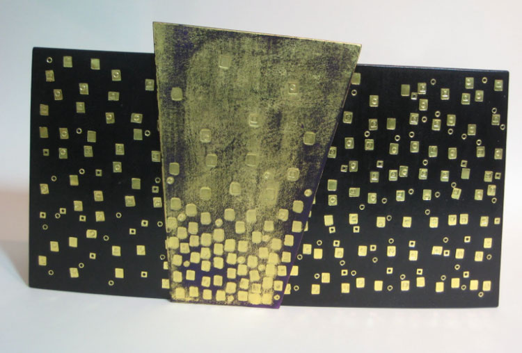
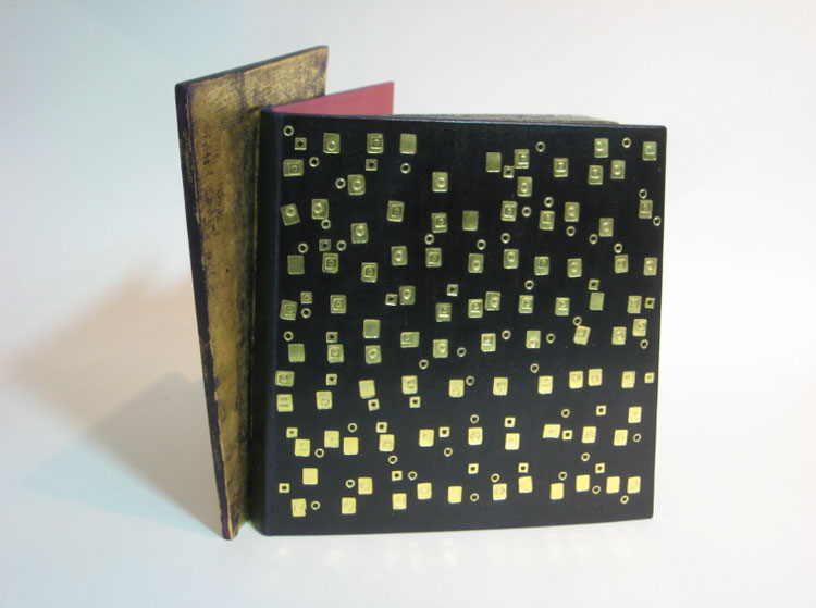
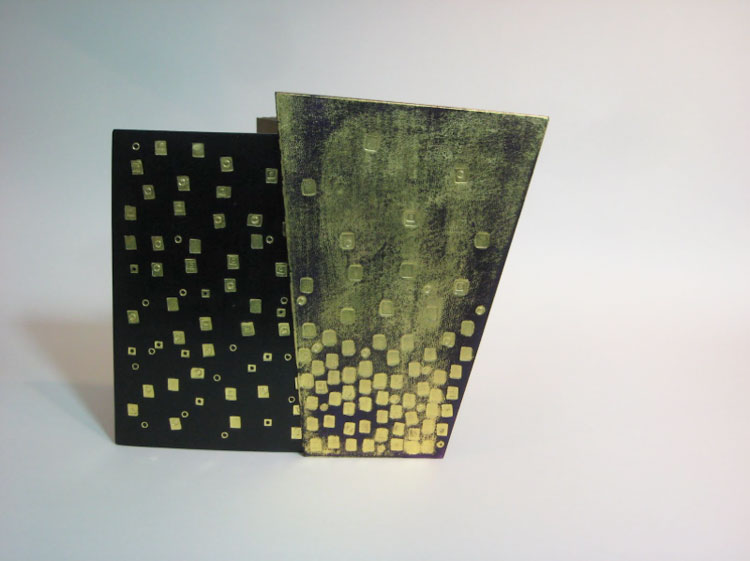
    Die Nibelungen arrived in Mark Cockram‘s studio bound together with staples. After removing the pesky binding material, Mark transformed this book into an intriguing sculptural object.

    What’s the inspiration behind this sculpted binding? The additional panel almost appears to swing between each cover, although I believe it is attached to the lower cover.
    This is a charming book with fantastic illustrations. One aspect of the illustrations are the backgrounds, often of buildings. The outlines of the buildings create a framework for the rest of the illustration. I wanted to explore this with the binding. You are correct to say that the panel is attached to the back board. The concept is simple, but like a lot of simple things it works well. The edge of the binding is extended beyond the normal square. When the book is partially open the panel gives us an angular perspective, again a reflection of the illustrative style.

    The leather is hand dyed with traditional gold tooling, I tend to make my own simple tools and adapt them as I work. I set out to produce a simple, controlled, rather elegant book with angles and forms. As with all my work, I had fun making Die Nibelungen.

    DieNibelungen2-MarkCockram DieNibelungen3-MarkCockram


  5. Bookbinder of the Month: Mark Cockram

    August 17, 2014 by Erin Fletcher

    BrushUpYourShakespeare-MarkCockram

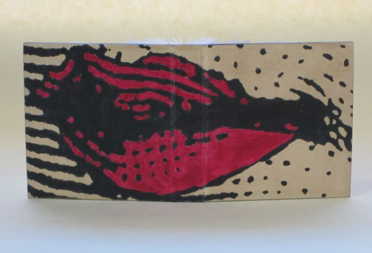
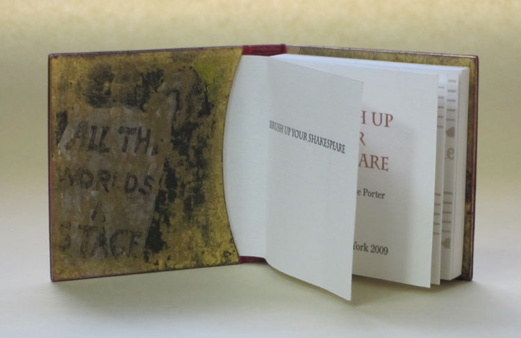
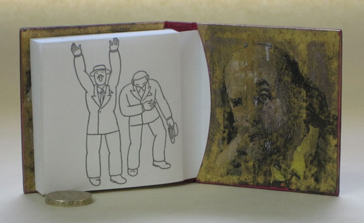
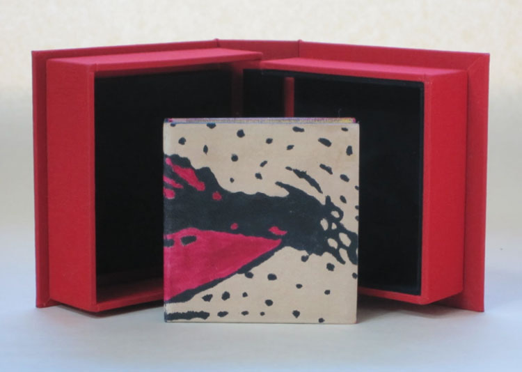
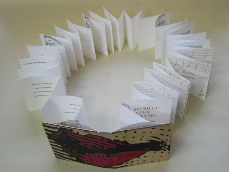
    Brush Up Your Shakespeare is a limited edition accordion from the Piccolo Press in New York. The text is a combination of music and words to the song Brush Up Your Shakespeare from the musical Kiss Me Kate (which is inspired by The Taming of the Shrew) and includes charming illustrations by Seymour Chwast.

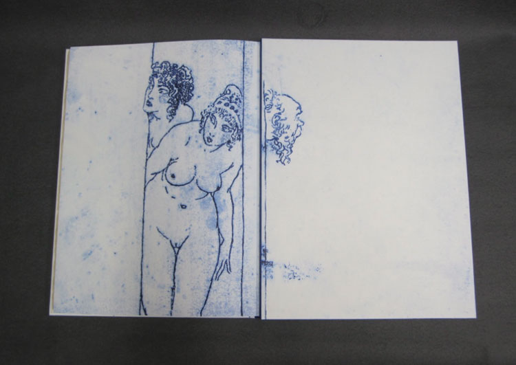
    Mark Cockram bound a chemise in full leather fair goat with a stylized image of a pair of pouty lips. The dye was applied carefully with a brush. The doublures double as a pocket which hold the first and last pages of the text. The doublures are hand-printed using soft plate off-set and colored with a layer of worked cold gold.

    BrushUpYourShakespeare4-MarkCockram BrushUpYourShakespeare3-MarkCockramBrushUpYourShakespeare5-MarkCockram

    You mention that you weigh down the lid of the clamshell box for your miniature books. How do you go about doing this?
    For Brush Up Your Shakespeare I made a two tray drop back box. The box is the last thing to be made and the first thing to be seen. It protects, it informs and I like to think of the opening of the box like the parting of theatre curtains. The box sets the scene, it can hint at the contents, tantalising us, making us want to see inside. The opening and closing, the fit of the book can tell us, from the very outset the skill of the maker.

    I have made a number of miniature books and bindings. One of the common issues is the opening and closing of the box. The way the air is expelled as the lid closes and the slight tug of the vacuum on opening. This is not only down to the accuracy of the box, but also the weight of the materials involved, the bigger the box the heavier the overall weight of the materials. The smaller the box the more difficult it is to keep the lid closed, it has a habit of just popping open that fraction of a mil. One way to counter this is to use magnets. I do not like to use magnets for the simple reason that magnets attract metal particles (it is in the nature of magnets to do this). These metal particles can, in turn begin to rust leading to all manner of issues.

    I prefer to use lead to gently weight the upper lid. After varnishing in a metal lacquer I place the small piece of lead in a recess created in the upper tray (this is done in the construction) the recess is covered on one side by the outer case of the box and the inner lining of the upper tray. Simple and very effective.

    BrushUpYourShakespeare2-MarkCockram


  6. Bookbinder of the Month: Mark Cockram

    August 10, 2014 by Erin Fletcher

    Lysistrata-MarkCockram

    Bound in 2010, this is just one binding of Lysistrata that Mark Cockram has bound. Grabbing illustrations from the text for both the cover design, doublures and endpapers; Mark transforms them into a visual experience rarely seen on a book. The cover mimics that of a fresco painting.

    The book was bound in fair goat which was hand-dyed and the design was initially blind tooled onto the leather. Mark handcrafted 7 new tools for the book, which were modified throughout the tooling process. He discusses his technique more in depth below.

    This binding is by far my most favorite from your portfolio. There are so many artistic details I find to be rather captivating. I wanted to ask you about your technique for distressing the gold leaf?
    My glib answer would be to say that shouting at gold leaf usually distresses it, though I feel that is not the answer you were looking for.

    Though gold leaf and other metals are used in bookbinding, gold leaf and the like tend to be used in a static manner. By static manner I refer to the traditional way in which it is applied to books. Please forgive me if I do not elaborate on finishing/tooling with gold leaf, there are many books, workshops and bits and bobs on the Internet for those who wish to find out more. There is so much more to the application of gold leaf than traditional gold tooling or finishing, one only has to look outside of bookbinding to realise that.There is great skill in finishing, indeed, the training for a finisher is usually longer than for a forwarder, with the finisher being paid more. What has always made me smile is the way the layman is always amazed with the gold tooling, but fails to see the book. If it were not for the forwarder there would be nothing for the finisher to do except, perhaps, wall panels and the like. This brings to mind one lecture and one question in particular. I was asked by a very earnest student what I thought of fine binding? I asked her to tell me what a ‘fine binding’ was.  Her reply was the usual ” Well, it is full leather with gold tooling …….. of course.” After a considered pause I told her that I had seen many full leather bindings with lashings of gold tooling and that in no way would I call them fine. Any book beautifully made, balance of materials, fit for purpose, harmony of craft and art is a fine binding in my eyes. I cannot remember her response, but I do remember her looking over to a small group of people, arms folded, scowls and mumbling between themselves, whom I can only assume were her teachers. I only hope that the student began to ask questions and open not only her eyes, but ears also.I suppose that like many people, bookbinders and collectors like things to be classified to make them easy to understand. Just as a point, if one were to ask what is fine art? Would the answer be oil paint on canvas? I, of course, doubt that to be any answer that any serious artist or those appreciating the arts would give. So why is it that so many contemporary bookbinders and collectors, curators and so on appear to have the pre-impressionist salon approach to what fine binding is? To carry this forward we could argue that though both the salon artists (the establishment) and the Impressionists (non establishment) used the same materials, it was the application of the materials and the way the artists saw their work that was different. One challenged the preconceptions of what is and painted what they felt and saw, the other hid behind technique and history (I realise this is a somewhat simplified view, but I hope you get my drift). I always have half an eye on technique and history, but I will not let them get in the way or limit what I want to produce. Please do not assume that I consider myself to be in any way akin to the Impressionists, I only use them to make a point.

    With the 2010 Lysistrata I wanted to echo the illustrations in the text block. One method commonly used is to copy an illustration, have a block made and use that to do the tooling with. Another method is to transfer the image to thin paper, blind tool through that and then tool in the usual way. However, I feel that the line is static, it has no life. I know that by putting the tool down at an angle the reflected light creates an impression of movement, but there is still that feeling of it being contrived. I suppose I am of the ilk that think if you want something to look like a splash of paint then splash with paint, there is no need to spend hours, days in trying to get gold tooling to look like a spontaneous splash of paint. Are we meant to admire the technique ? That it looks so much like a spontaneous (even though it is not) splash of paint or do we admire the spontaneity of the person who is able to splash the binding with paint? The paint being an intrinsic element of the book as opposed to an applied decoration. Is this a case of seeing the technique and not seeing the book? Perhaps people find it easier to admire technique as that is quantifiable and can be tweaked, whereas the spontaneous is less quantifiable and in no way can be tweaked. The spontaneous it is less safe and one has to live with the result, in other words it is alive.

    Lysistrata6-MarkCockram Lysistrata5-MarkCockram
    Lysistrata4-MarkCockram

    I do not think that I have to say that in some of my work I am spontaneous with the 2010 Lysistrata captureing some of that working style. The leather was hand dyed off and on the book. The black line and cold gold work is loose, it is the sketch like quality of the line that creates the tension and that all so elusive movement. The gold is adhered (please do not ask me what adhesive I use, a boy has to have a secret or you could come to a workshop) to the binding after the black line work with the tooling done with a number of warmish hand tools. The gold is further worked with 000 grade, oil free, wire wool. I wanted the finished work to resemble a wall painting or fresco, I think I am somewhere near the mark. The work was a commission and I kept the client informed of progress, he would pop into the studio and watch me work. He delighted in the non formulaic approach, so far from the rest of his collection. I prefer to work with collectors that give me and the book space to breath, to expand and explore what is or maybe possible and not to rely on what has been.

    Lysistrata2-MarkCockram

  7. Bookbinder of the Month: Mark Cockram

    August 3, 2014 by Erin Fletcher

    TheLivesofGallantLadies-MarkCockram

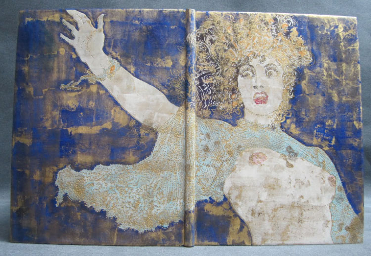
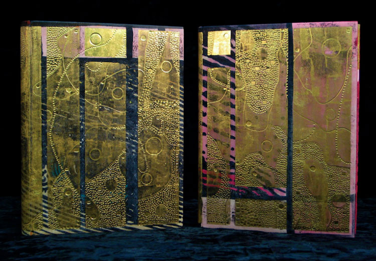
    In 2009, Mark Cockram bound a two volume set of The Lives of Gallant Ladies. Bound in full leather with hand dyed elements, layers of gold leaf and tooled shapes creating brilliant texture and depth. Just like many of Mark’s bindings, you can read about the progression of the design on his blog here.

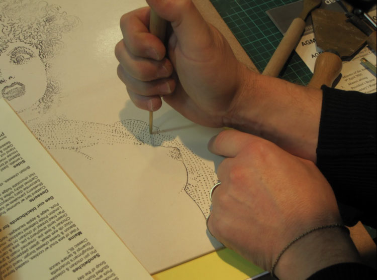
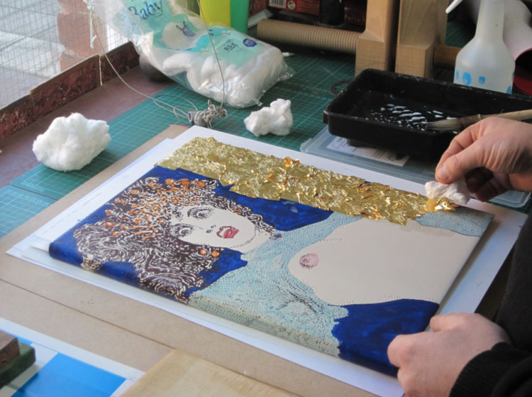
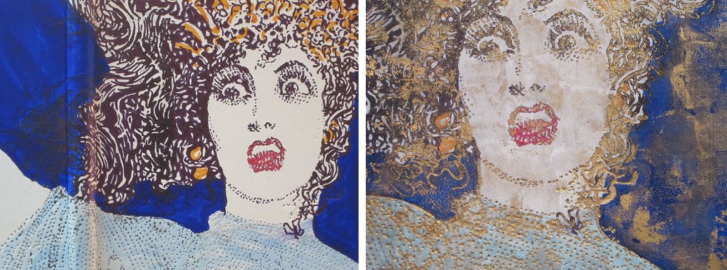
    Below on the left shows the leather freshly pared with the first layer of dye carefully brushed on depicting a portion of a woman’s face. Later, after covering the binding more color is added to the skin.

    TheLivesOfGallantLadies_progress-MarkCockram

    After each square of gold leaf was carefully applied, the tooling was done in a free-style way offering for a more expressive design. Finally the gold was lightly rubbed away using a fine wire wool brush revealing the layer of dyed imagery.

    TheLivesOfGallantLadies_progress3-MarkCockram

    The base layer of this binding is revealed through the series of in-progress photographs included on your blog. Much of the design of the base layer is hidden under the blocks of gold. Why do you lean towards heavy applications of gold on your bindings? How does the use of gold project your artistic concepts?
    I enjoyed The Lives of Gallant Ladies. It is always nice to work on multiple volumes, more area to express and create a narrative. The images are built up with dyes then layered over with gold and cold tooled. I feel that working this way allows for great freedom in the mark making process. The gold is then re-worked to create layers that draw us into the binding.

    Though the gold may look heavy in the images online, the reality is that they are very light. When viewed at certain angles the images become more or less defined, rather like looking through a silk drape. Gold like other metals we use in bookbinding is traditionally used with hot tools, glaire and so on. I wanted something that was less stiff and moved. Using gold in this way enabled me to create a soft, final layer to the finished work. I tend to look outside of bookbinding to see what other artists do with similar materials, adopting and adapting to suit my requirements.

    TheLivesofGallantLadies2-MarkCockram TheLivesofGallantLadies3-MarkCockram


  8. Bonus // Bookbinder of the Month: Monique Lallier

    May 25, 2014 by Erin Fletcher

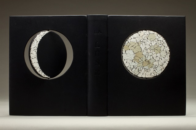
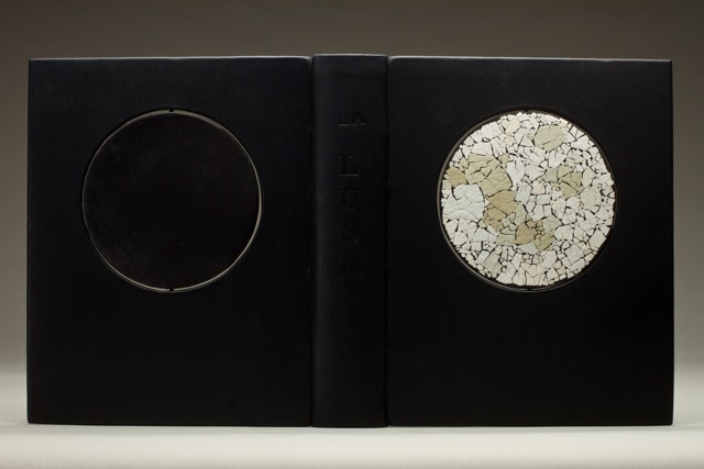
    LaLune1-MoniqueLallier

    As much as I would like to feature every single binding from Monique Lallier’s portfolio, the month as finally come to an end. But I thought I’d sneak in one last binding to leave you in awe.

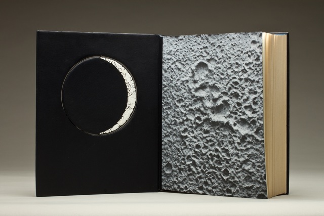
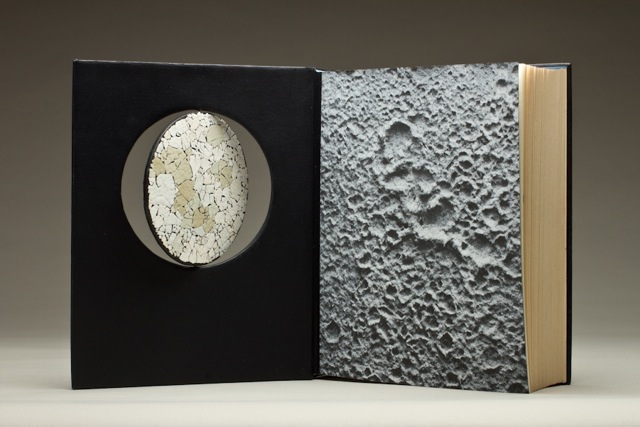
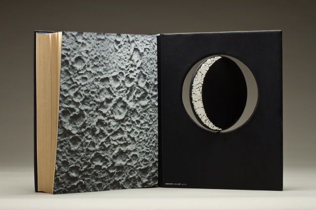
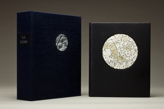
    La Lune was recently bound by Monique using dark blue smooth goatskin from Steven Siegel with matching edge to edge doublures. The endpapers perfectly match the design and title of the book. The ‘moon’ paper came from Andrea Peterson of Hook Pottery Paper.

    Throughout the month we’ve looked at your hidden panel bindings which offer a distinct element to your work and unique movement to the structure. We’ve also looked at bindings that include depth and texture through the use of laser cutting or lacunose. With the binding for La Lune you really bring together movement and texture in such a brilliant and unique way. What can you tell us about the concept for the binding and how the rotation of the moon was constructed?
    La Lune was a commission from an artist friend. I wanted to have texture for the full moon so I choose egg shells of different tones of blue to white. The crescent are of white shells, the new moon is of black vellum that has some gray tone in it. I had the circles laser cut. I cut a channel in each circle for the metal rod and put it in place before covering. From the inside of the boards I cut another channel, longer at the top than the bottom one so I could push the rod up until I could adjust it in the bottom channel. The rod has to stay free to allow the rotation.

    LaLune2-MoniqueLallier LaLune3-MoniqueLallier LaLune4-MoniqueLallierLaLune5-MoniqueLallier LaLune6-MoniqueLallier


  9. Bookbinder of the Month: Monique Lallier

    May 25, 2014 by Erin Fletcher

    LaPetitePouled'Eau-MoniqueLallier

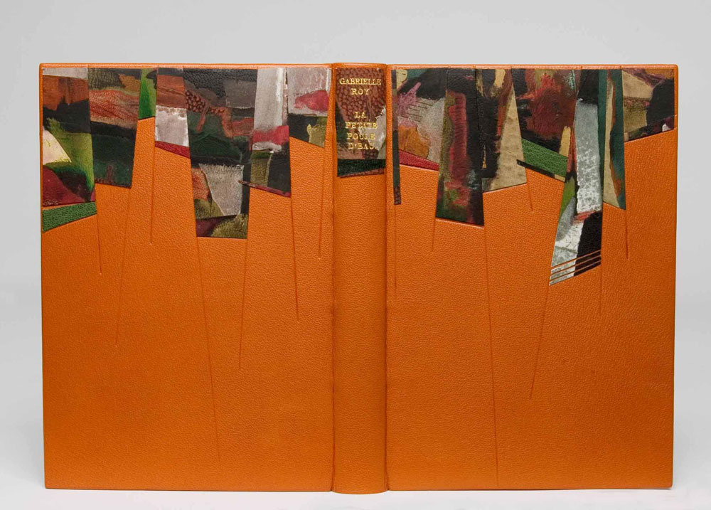
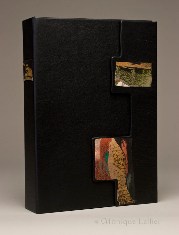
    La Petite Poule d’Eau by Gabrielle Roy was bound by Monique Lallier in the French technique in full leather with onlays of lacunose. This technique transforms leather into a uniquely distinct design, offering texture and depth. The process calls for patience and muscle. Lacunose is created through a series of layers of thin leather pieces which are covered in a PVA wash and sanded smooth between each layer. The result is a build-up of various leathers in a seamlessly smooth finish, which can than be used as a decorative onlay.

    Another design element visible throughout your work is the lacunose onlay. The lacunose technique can be quite time consuming as you begin to add more and more layers. What is your process for the lacunose and how long does the process take?
    This is the story of a village in Manitoba, Canada, called La Petite Poule d’Eau. I wanted to convey a sense of structure and colorful personalities. I had seen Paul Delrue demonstrating “Lacunose” at the Standards and I thought it would be nice on my binding. Little did I know how long it would take me to achieve the result I wanted, but I am patient and determine so I kept sanding…It took several days, as you have to wait for the leather to dry between sanding sessions. Now I have several boards covered with “Lacunose” or (cuir peaufiné) sanded leather as they call it in France, because it’s a nice way to use your bits and pieces of leather. I have done some with one or two colors of different shades…you can play with it and do it in between steps in bookbinding…it’s fun!

    box-MoniqueLallier MoniqueLallier


  10. Bookbinder of the Month: Monique Lallier

    May 18, 2014 by Erin Fletcher

    ThePhoenix-MoniqueLallier

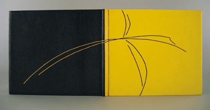
    In Flight ran from 2003 – 2005 as the triennial traveling exhibit organized by the Guild of Book Workers. For the exhibit, Monique Lallier bound The Phoenix. The most obviously astonishing design element executed by Monique on this binding is the use of two separate leathers with a seamless connection down the center of the spine. Bound in yellow and black goatskin over laced-in boards, the dual color scheme continues in the hand sewn headbands and the stylized phoenix design creating with contrasting onlay leather lines.

    The line quality of the phoenix is reminiscent of lines from a fashion sketch. Do you think your background in fashion plays any part in your overall design choices?
    I love this binding. I think it illustrates the story perfectly. Everything that we do in life, every experience stays with us and you are influenced because it is deep in you and when you are searching and “struggling” with a design you go within you, like in a well to retrieve what you need, whether you realize it or not.

    As I entered my undergraduate studies, I was determined to go into Fashion Design. However, I was pulled in another direction, but I find that I’m still drawn to the latest couture designs. Do you seek out fashion as an artistic inspiration?
    I don’t look too much at fashion anymore, I look more at design and craft magazines, or visit galleries and museums everywhere I go. Although I noticed that laser cutting is big in fashion now.


  • My name is Erin Fletcher, owner and bookbinder of Herringbone Bindery in Boston. Flash of the Hand is a space where I share my process and inspirations.
    The StudioNewsletterInstagramEmail me
  • Archives