RSS Feed

Posts Tagged ‘la couleur du vent’

  1. Preparing the La Couleur du Vent Exhibit + Opening Reception

    July 24, 2014 by Erin Fletcher

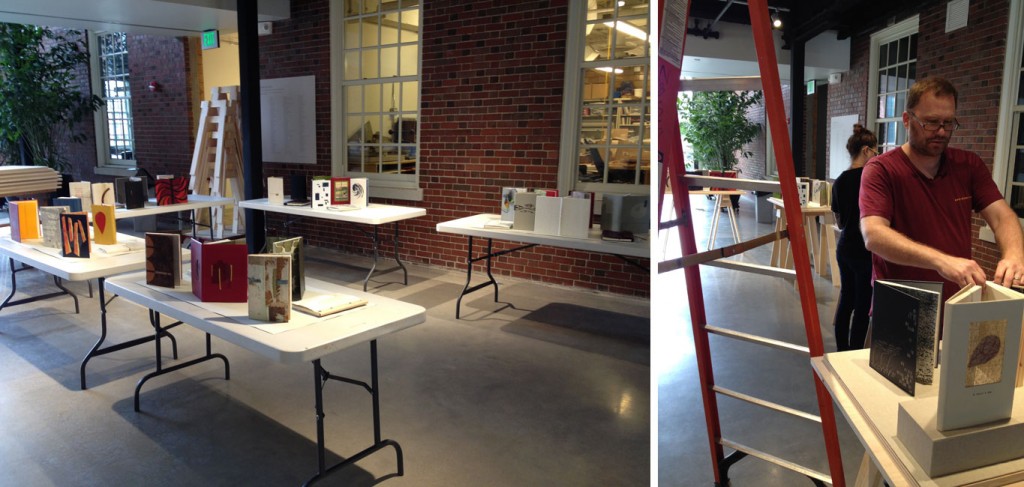
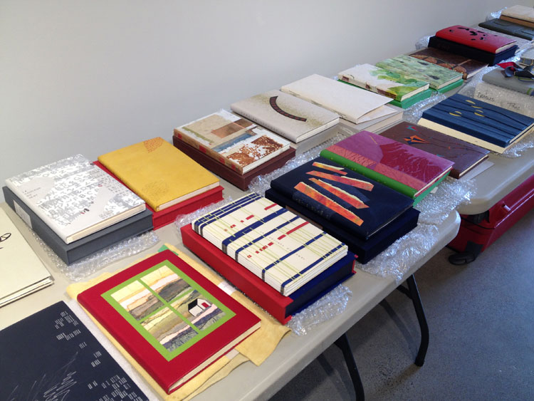
    Last week, North Bennet Street School opened their first bookbinding exhibit in the Windgate Gallery. During the set-up, along with Jeff Altepeter and Katie Barber, I had the pleasure in handling the design bindings for ARA-Canada‘s La Couleur du Vent exhibit. To start off, I unpacked all of the books, unraveling them from their protective layering while keeping everything organized.

    LaCouleurDuVent1-ErinFletcher

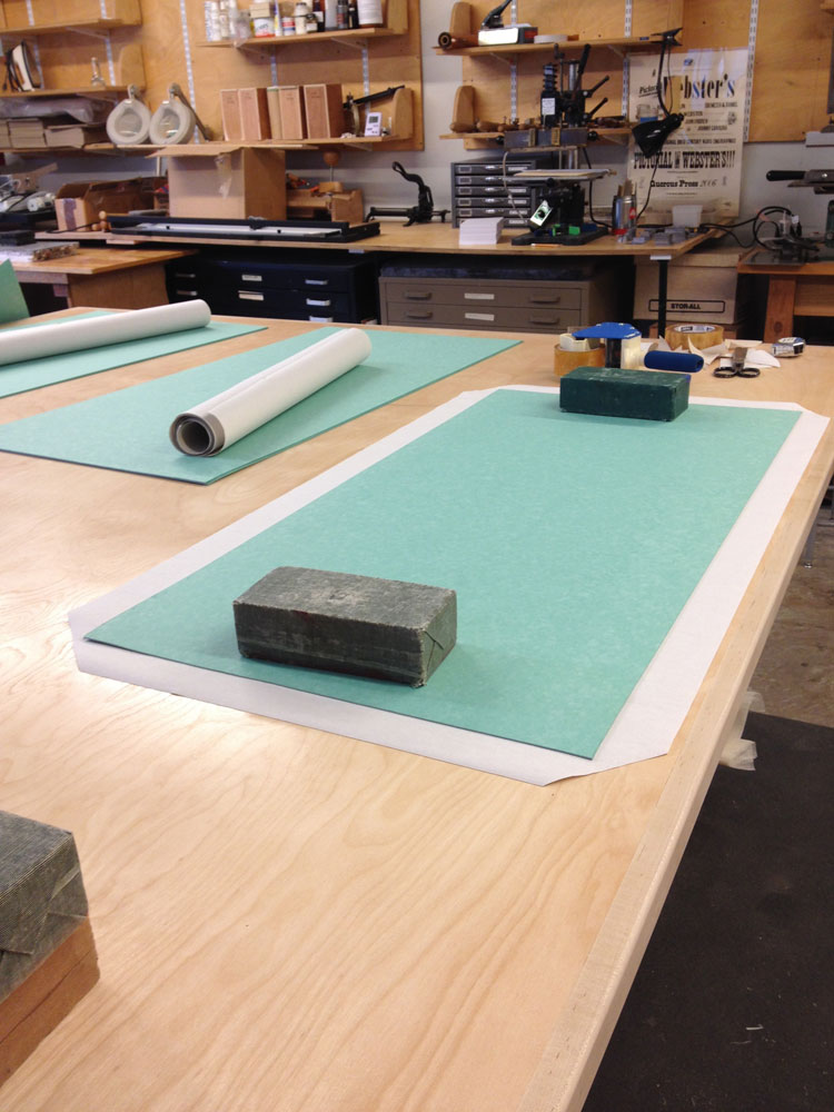
    Jeff and I then went to task in laying out the books in their respective spots, doing our best to arrange the cases in a complimentary fashion. The school recently built new wooden bases for the exhibit with sawhorse-style legs. In order to have an adequate base, we decided to hide the wood by making some custom wrapped boards in a suitable and subtle bookcloth. After the wooden bases were installed we put the bindings in their final place, making minor adjustments by adding risers and wedges for the books lying flat.

    LaCouleurDuVent2-ErinFletcher LaCouleurDuVent3-ErinFletcher

    In addition to the bindings, a table was set up with a facsimile of the printed text. This gave real insight to the inspiration many of the binders saw within the illustrations, many of the graphics were replicated or abstracted on several of the bindings.

    LaCouleurDuVent5-ErinFletcher

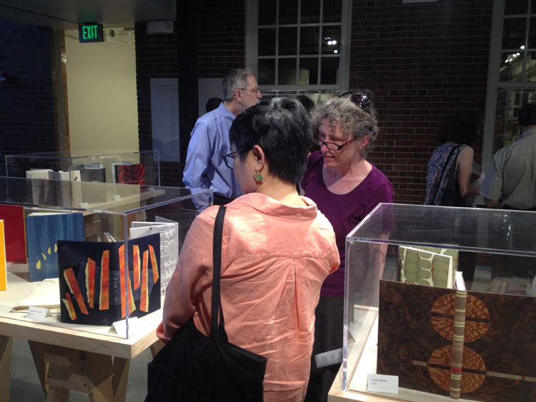
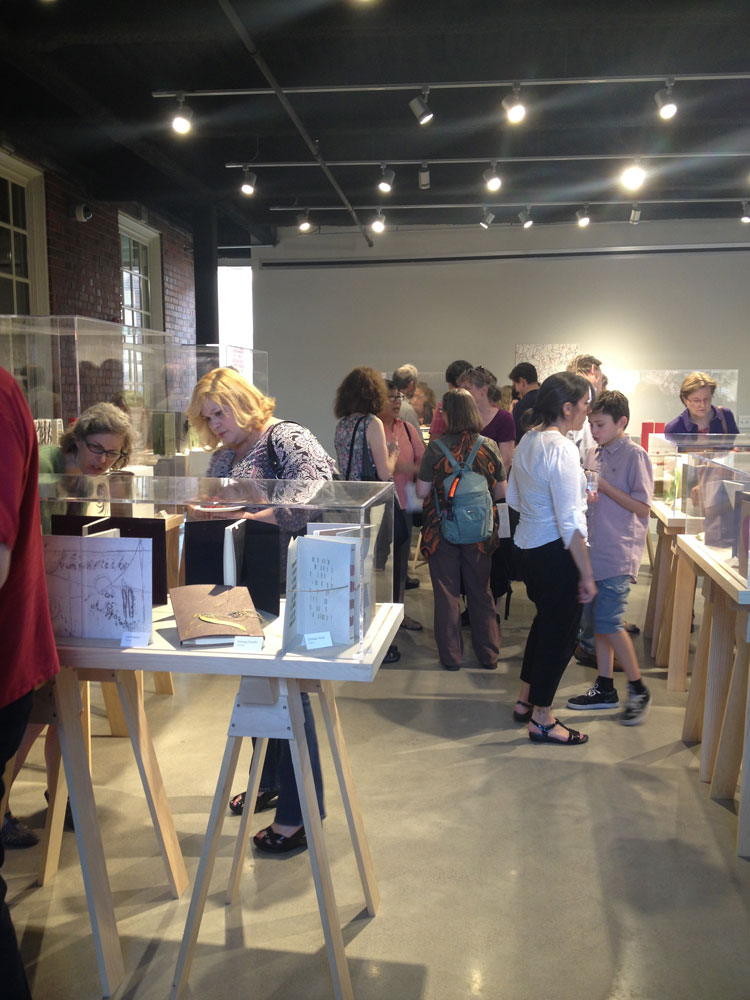
    The night of the reception was attended by quite a crowd of binders coming from as far as France and Canada. Odile Douet of École Estienne in Paris was accompanied by Jonathan Tremblay, president of ARA-Canada (both with beautiful bindings in the show). Odile gave a heartwarming talk about the transformation of this simple idea and how it flourished into an international traveling exhibit. If you haven’t had a chance to view the exhibit, you can do so until it closes on September 14th.
    LaCouleurDuVent7-ErinFletcher LaCouleurDuVent6-ErinFletcher


  2. La Couleur du Vent Exhibit is Coming to Boston

    June 22, 2014 by Erin Fletcher

    La couleur du vent is an international fine binding exhibit organized by ARA-Canada, which I may have mentioned a few times on the blog before. After traveling around France and Canada, the exhibit will be coming to the new Windgate Gallery space at the North Bennet Street School in Boston. Needless to say, I’m really looking forward to it. The exhibit is being sponsored by the New England Chapter of the Guild of Book Workers and the American Academy of Bookbinding, along with North Bennet Street School. 

    The exhibit will feature 51 design bindings on a selected project titled La couleur du vent (The color of the wind). The text is a collection of poems by Gilles Vigneault, illustrated and designed by Nastassja Imiolek under the artistic direction of Cécile Côté.

    The opening reception will be held on:
    July 18, 2014
    North Bennet Street School
    150 North Street
    6:00 – 8:00

    But if you can’t make the reception, the exhibit will be open until September 14, 2014. Check out NBSS’s website for the official press release. Hope to see you there. 


  3. Bookbinder of the Month: Monique Lallier

    May 4, 2014 by Erin Fletcher

    LaColouerduVent-MoniqueLallier

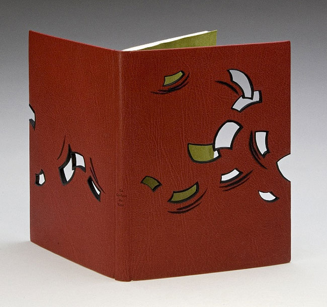
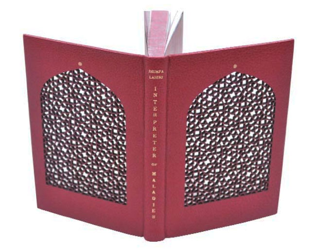
    La Couleur du Vent was bound in 2013 by Monique Lallier for the ARA-Canada exhibition that I may have mentioned just once or twice (even thrice) in the past. I brought up the window element in Monique’s work during the interview on the first of the month with her binding The Drawings of Caravaggio. When I saw Monique’s binding of Interpreter of Maladies at an exhibition in Chicago, I was awed and intrigued by its construction. With this binding Monique began experimenting with laser cutting technology to create detailed and intricate work. 

    IntrepreterOfMaladies1-MoniqueLallierI want to further the discussion from last week on the progression of the window element in your designs. Except this time I would like to focus on technique. The covers of La Colouer du Vent and Interpreter of Maladies were laser cut to achieve the intricacies of the design. Do you approach the structure differently on a fine binding when including laser cut elements?
    When I choose to use laser cutting I have to do a “case” binding as I have to finish the inside doublures before the laser cutting and the cover has to be flat on the table of the laser cutter. I still consider it a fine binding. 

    Did you have to alter anything about the process from your first attempt to the most recent one?
    I think I figured it out right on the first time and it worked well, so I repeated the same technique.

    – – – – – – – – – – –

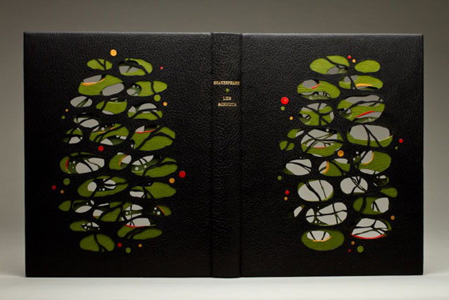
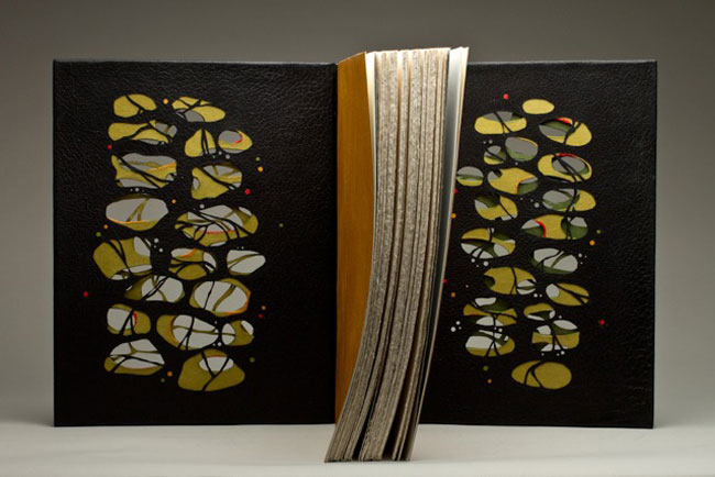
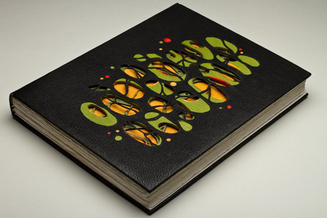
    In addition, during the interview, I included a sneak peek of one of Monique’s recent bindings of Les Sonnets by Shakespeare. The complexity of the design is literally jaw-dropping. Two layers of board have been cut and sandwiched between the covering leather and leather doublures, which have also been laser cut.

    LesSonnets-MoniqueLallier LesSonnets2-MoniqueLallier LesSonnets3-MoniqueLallier


  4. March // Bookbinder of the Month: Lang Ingalls

    March 1, 2014 by Erin Fletcher

    LaCouleurDuVent-Lang Ingalls

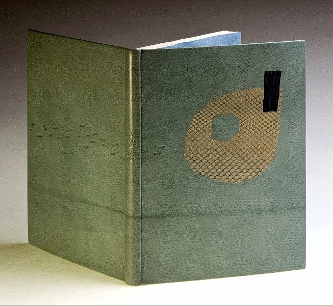
    At this point I think it’s safe to say that I have found the recent ARA-Canada exhibition La Couleur du Vent to be filled with many beautiful and inspiring bindings. This particular binding was created by Lang Ingalls and is the fourth binding from the exhibition to be featured on the blog (the other three: Sonya Sheats, Coleen Curry and Karen Hanmer).

    So in case you missed those three posts I highly recommend you check them out after reading this one, but first let me summarize the exhibit. This international design binding exhibition was put together by ARA-Canada in partnership with École Estienne in Paris. The exhibition started in 2013 in Paris before traveling to Quebec then Montreal (which ended on February 28th). The show will continue to travel during this year, showing in Trois-Rivières from March to April. La Couleur du Vent is a collection of poems by Gilles Vigneault, illustrated and designed by Nastassja Imiolek under the artistic direction of Cécile Côté.

    Let’s get back to Lang’s binding. The set text is bound in the French technique using sea foam blue goatskin. On the front cover are inlays of python and lizard. A series of irregular shapes are tooled blind and span across the full length of the binding with the title also tooled blind on the spine. What I love most about this binding (besides the superb color choices) is the bold inclusion of the spine. Lang so wonderfully highlights the material and uses the natural elements of the leather to create an even more compelling design.

    This binding is stunning. The design you’ve created really celebrates the natural qualities of the materials. Can you talk about your concept behind the design?
    I bought the python and lizard used for the inlays in Paris years ago, but really love the texture and color of them — I tend to make monochromatic color choices in my books, this one is an example of that.

    – – – – – – – – – – –

    I chose to interview Lang for a few different reasons. Her work has been and continues to display thoughtful experimentation and courage with her materials. Her designs continue to engage and perplex me. She’s also just a wonderful person to be around. Lang is part of a handful of people I look forward to seeing once a year at the Guild of Book Workers Standard of Excellence Conference. Lastly, Lang’s educational experiences have greatly differed from my own. Since graduating from North Bennet Street School and having the opportunity to study with various guest instructors I’ve come to value the importance of creating what Lang describes as a ‘tool box’: gathering techniques on structures and decoration from binders with various talents and backgrounds.

    After the jump is my interview with Lang, it discusses heavily her varied educational experiences. Every Sunday this month I will feature some more of Lang’s bindings, so don’t forget to email subscribe and receive reminders when posts go live. You won’t want to miss out!

    read more >


  5. Bookbinder of the Month: Karen Hanmer

    December 29, 2013 by Erin Fletcher

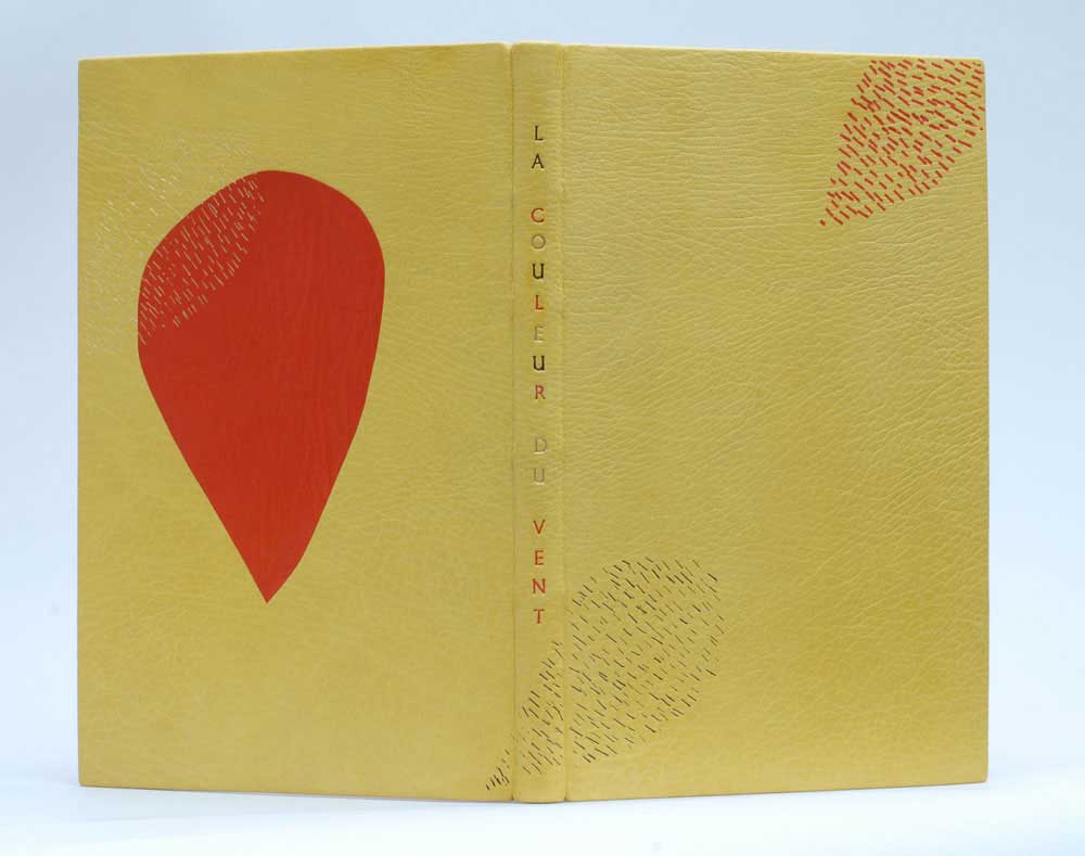
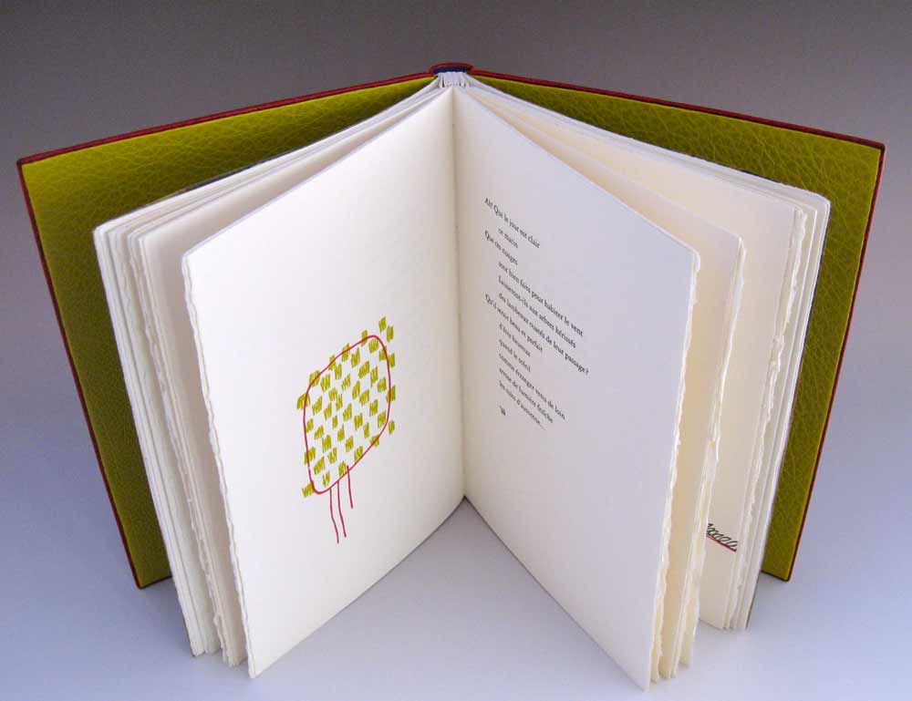
    LaCouleurDuVent-KarenHanmerLa Couleur du Vent is an exhibition featuring 50 bindings interpreting text of the same title. I previously posted about this exhibition in Sonya Sheat’s interview this past June. ARA-Canada in partnership with the École Estienne in Paris, organized an international exhibition of bookbinding to be held in both Paris and Canada during 2013 and 2014. I found Karen Hanmer’s design for the text to be quite striking and unusual from her other fine bindings. The overall design is simplistic, but the arrangement of fine, short lines creates a beautiful texture against the grain of the vibrant yellow leather. 

    Bound in full goatskin as a traditional French-style fine binding, Karen’s copy of La Couleur du Vent was sewn on flattened cords and the boards are laced-on. The red teardrop is a back-pared onlay, while the other teardrops are tooled using black, gold and red foils. The title is hand tooled using the same colored foils. 

    How did you come to participate in this exhibition? Are you a member of ARA Canada?
    Yes, I am a member of ARA Canada, and this is the third time I have exhibited with them. Their exhibitions travel in Canada and sometimes in France, and they still produce printed catalogs.

    Prior to a family vacation I posted on the Book_Arts-l asking for suggestions of things to see in Montreal. Cécile Côté invited us to visit her studio, and I was able to see the text block for this set book exhibit, which was designed, illustrated and printed by an intern under Cécile’s direction. [From the ARA-Canada website: This is a collection of poems by Gilles Vigneault, illustrated and designed by Nastassja Imiolek under the artistic direction of Cécile Côté.] I unable to find a translation of the text, so my design is based on the illustrations, borrowing often-used colors and the repeated teardrop shape and cross-hatching.


  6. July // Bookbinder of the Month: Coleen Curry

    July 1, 2013 by Erin Fletcher

    lacouleurduvent-coleencurry

    Coleen Curry was amongst the talented bookbinders who participated in the ARA-Canada exhibit La Couleur du Vent, an international design binding exhibition starting in Paris before traveling to Quebec in September 2013 and then Montreal in November 2013. La Couleur du Vent is a collection of poems by Gilles Vigneault, illustrated and designed by Nastassja Imiolek under the artistic direction of Cécile Côté. If it sounds familiar, I posted about this exhibition during last month’s interview with Sonya Sheats

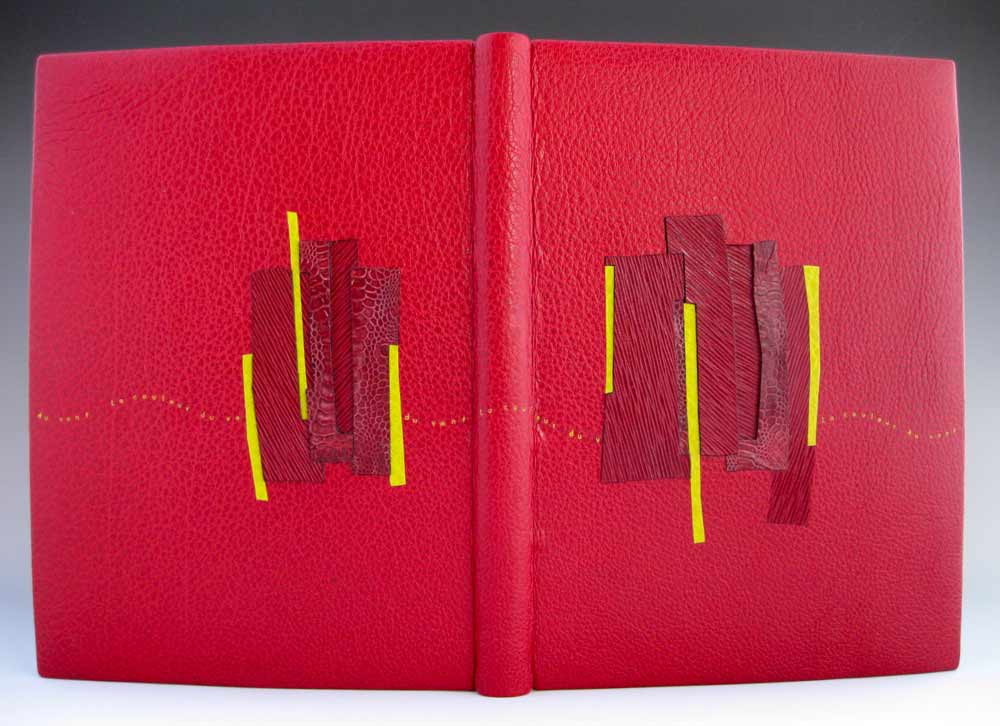
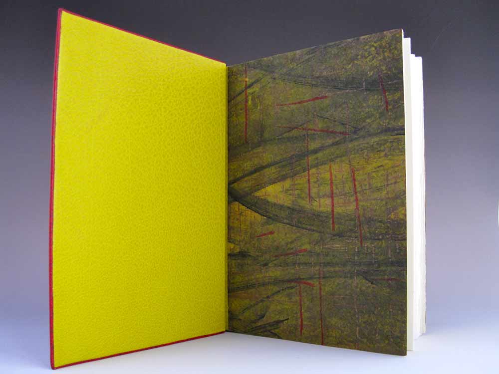
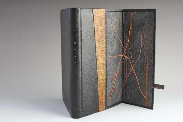
    Coleen bound this copy of La Couleur du Vent as a ‘Montage sur onglets’ style so the prints would not get lost in the gutter. The term ‘Montage sur onglets’ refers to the signatures being sewn on stubs to release them from the confines of the gutter and offering a less restricted opening. Sewn on cords with laced-in boards, the book is bound in red water buffalo with chartreuse water buffalo edge to edge doublures. Exotic leather inlays of varying depths decorate the front and back covers. Title tooled with gold foil. The flyleaves are decorated papers made by Coleen. 

    A brief explanation about the design from Coleen:
    The colors match the prints in the book.  I took some of the shapes from the prints and altered them to create a feeling of blowing in the wind and to create movement.

    lacouleurduvent2-coleencurry lacouleurduvent3-coleencurry

    Coleen’s work has been on my radar ever since I came across her binding of Toni Morrison’s A Mercy at the Chicago Public Library’s exhibition One Book, Many Interpretations in 2011. I attended the opening reception not only because I love design bindings, but to see my own binding of Arthur Miller’s The Crucible. This was the first time I had a binding on exhibit and I was quite honored to be on display with so many other talented binders.

    A Mercy by Toni Morrison bound by Coleen Curry

    A Mercy by Toni Morrison bound by Coleen Curry

    Coleen’s work masterfully mixes traditional leathers with some non-traditional textures such as exotic leathers, agate, and horsetail (to name a few). But I am more attracted to Coleen’s brilliant use of color; either by adding pops of color, subtle hints or just out-right all-over bold color palettes. 

    Read the interview after the jump and come back each Sunday in the month of July to view more gems from Coleen’s portfolio.

    read more >


  7. June // Bookbinder of the Month: Sonya Sheats

    June 1, 2013 by Erin Fletcher

    lacouleurduvent-sonyasheats

    Photo by Denis Larocque.

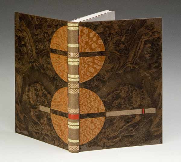
    La Couleur du Vent is a collection of poems by Gilles Vigneault, illustrated and designed by Nastassja Imiolek under the artistic direction of Cécile Côté. Sonya Sheats bound this copy for an international design binding exhibition organized by ARA-Canada and the École Estienne in Paris. The exhibition is currently on display in Paris until it travels to Quebec and then to Montreal. The exhibition is also viewable online at ARA-Canada: La Couleur du Vent

    Sonya bound this edition as an open joint sewn with tapes made out of vellum and box calf, spine is tanned calf skin with onlaid bands of muted green and taupe water-snake skin and one band of red calf skin, boards in MDF and walnut burl veneer, and onlays in lace wood and calf skin. The subtle accent on red comes straight from the illustrations in the book.

    While finishing my second year at North Bennet Street School, Sonya was invited to teach my class the simplified binding structure, a technique she learned from Sün Evrard. Initially, I had the pleasure of meeting Sonya during an open studio event in Cambridge. I was able to tour her space and handle many of her bindings. I am very intrigue and captivated by Sonya’s clean design and level of skill. I would like to thank Sonya for taking the time to share her experiences and skills with me through this interview

    Read the interview after the jump and come back each Sunday in the month of June to read more about Sonya’s work. 

    read more >


  • My name is Erin Fletcher, owner and bookbinder of Herringbone Bindery in Boston. Flash of the Hand is a space where I share my process and inspirations.
    The StudioNewsletterInstagramEmail me
  • Archives