RSS Feed

Posts Tagged ‘karen hanmer’

  1. Swell Things No. 44 // Henry Hébert

    June 30, 2017 by Erin Fletcher

    Back for another guest post is my good friend and fellow classmate, Henry Hébert. His picks this year include some fellow bookbinders (and one of their cats), a secluded bookbinding haven and some old comforts.
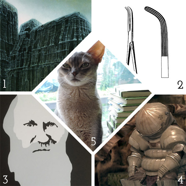
    1. Zdzisław Beksiński, Untitled, oil on fibreboard: Beksiński’s dystopian surrealism is gorgeous and haunting. My favorite paintings are like this one, combining religious iconography with almost alien textures. You can see a virtual gallery of his work here.
    2. Lahey Hemostatic Foreceps: Adam Larsson, Conservator at Uppsala University Library, clued me in to using long surgical tools for quickly lacing sewing supports through paper case bindings.
    3. Darwin: I picked this print up at Horse + Hero in Asheville, NC. This line from some of Charles Darwin’s 1861 correspondence pretty much sums up how I feel most mornings.
    4. Dark Souls: I think this video game from 2011 is still one of the best games ever made. Fun to play, excellent design, and weird, weird story telling.
    5. Bradel the Cat: Noted bookbinder and artist Karen Hanmer is the caretaker of this wonderful Abyssinian cat.
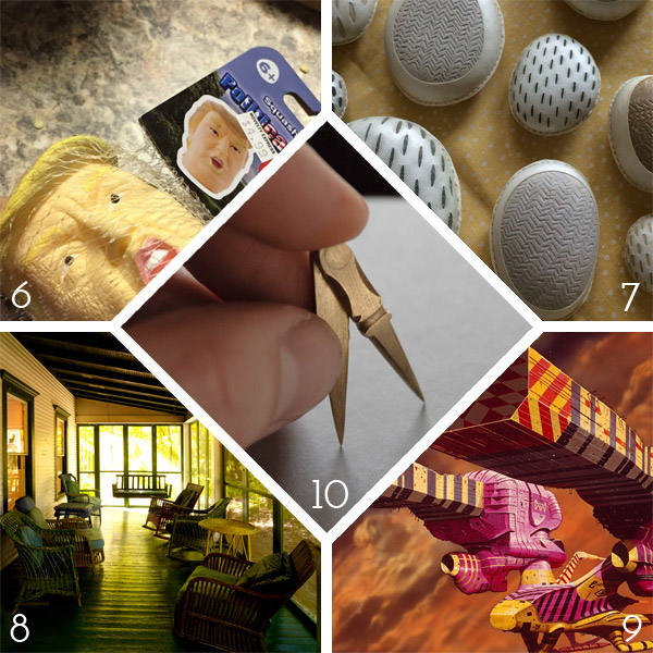
    6. Trump stress ball: News getting you down? Take your frustration out by squeezing a tiny version of our president’s dumb head.
    7. Rocks: I recently saw some of these decorated, parchment-wrapped rocks made by Shanna Leino. They were just such curious, fun little objects – I had to put them on this list.
    8.  Oxbow: I just attended my first Paper & Book Intensive, held at the Ox-bow School of Art in Saugutuck, MI. It was a pretty magical opportunity to disconnect from the outside world and focus on bookbinding.
    9. Jodorowsky’s DuneThis documentary about Alejandro Jodorowsky’s failed attempt to make a film based on Frank Herbert’s Dune is wonderful. Some of my favorite artists were all set to collaborate on the project, and many award-winning projects were produced from the wreckage.
    10. Mini-dividers: Brien Beidler makes some really nice brass tools. I just happened to have a pair of tiny plastic hands on me when he showed me these mini brass dividers. I still laugh every time I look at this mini-hand-modeling photo.


  2. Guild of Book Workers – Standards of Excellence Seminar // Cleveland 2015

    October 25, 2015 by Erin Fletcher

    I woke up very, very early on a Thursday morning to catch a flight out of Boston to Cleveland in order to attend the evening festivities planned for the first day of the Guild of Book Workers Standards of Excellence Seminar. I was delighted to be on the same flight with Deborah Howe, Collections Conservator at the Baker-Berry Library at Dartmouth College. The weekend-long event filled with book-related discussions had officially begun.

    We arrived in Cleveland to a brisk, yet sunny morning. My wonderful friends and colleagues, Henry Hebért and Jeanne Goodman, picked us up at the airport and we were off to the hotel located just a short walk from Lake Erie (and the Rock and Roll Hall of Fame).

    The first day of Standards began with book-related tours across the city. At the last moment, I was able to snag a spot on the tour of the Cleveland Museum of Art. Our docent, a fellow GBW member, gave us a brief tour through the Western Art galleries, stopping from time to time to show off books from their spectacular collection. It was a real treat to see some fine examples of Western-style bindings and manuscripts.

    StandardsCleveland1-ErinFletcher

    In 2002, the Museum underwent renovations that included this beautiful 39,000 square foot enclosed glass atrium that connects the original building with the newer wing and is where we met our tour guide. (click to enlarge images)

    StandardsCleveland2-ErinFletcher

    We appropriately began our tour of early bindings with an Egyptian Book of the Dead of Hori scroll on papyrus dating roughly around 1969 – 945 BC. We swiftly made our way to the 11th century as our docent pointed out this beautiful Byzantine binding with the primary headbands still intact.

    We then saw a small collection of illuminated manuscripts with pigments that had been wonderfully preserved and appeared as bright as if they were created yesterday.

    StandardsCleveland4-ErinFletcher

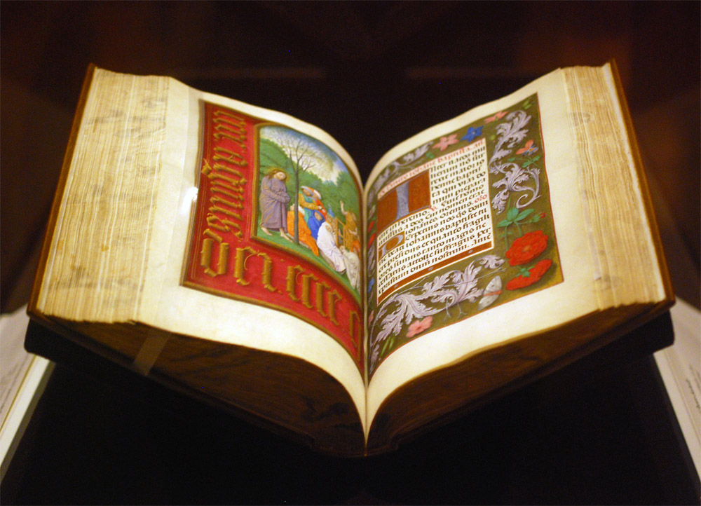
    As a great lover of Flemish art, Queen Isabella treasured her library of devotional books; on display at the museum is a Book of Hours crafted for her by the most talented manuscript painters active in Ghent and Bruges during early 1500s. This circle of artists were renowned for their border decoration that often featured realistically painted flowers, scrolling acanthus leaves, birds and butterflies.

    StandardsCleveland3-ErinFletcher

    The Gotha Missal dating from about 1370 – 72 is shown in the image above (left) opens to a lovely miniature painting with vines running along the margins. Since the interest for most displayed book is in the content, binders get to see very little of the actual binding. Fortunately, the CMA has digitized and photographed a large portion of their collection. The leather binding over wooden boards is quite a beautiful example of a decorative medieval binding. The tooling could have been completed with a decorative roll and covers the entire surface of the covers.

    Next in the tour was a highly decorated leather case with cut-work and hand painted details in blue once used to cover a Qu’ran dated to sometime in the 15th century. We also saw a leaf from a Jain manuscript from India dating to sometime in the 15th – 16th century. But the final piece we saw was by far my favorite.

    StandardsCleveland5-ErinFletcher

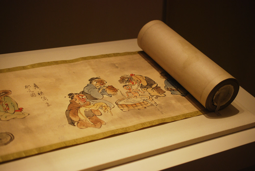
    An Illustrated Marriage of Apparitions (Bakemono konrei emaki) is a humorous hand scroll created in the mid-1800s. The story is mainly told through imagery with cartouches scattered amongst the illustrations as a way to describe the scene (much like a comic book). The scroll is displayed open to the part of the story with the birth of the first child between two apparitions or bakemono. A procession of 100 whimsical and supernatural monsters follow the couple through their matchmaking, engagement, marriage and finally to childbirth.
    StandardsCleveland6-ErinFletcher

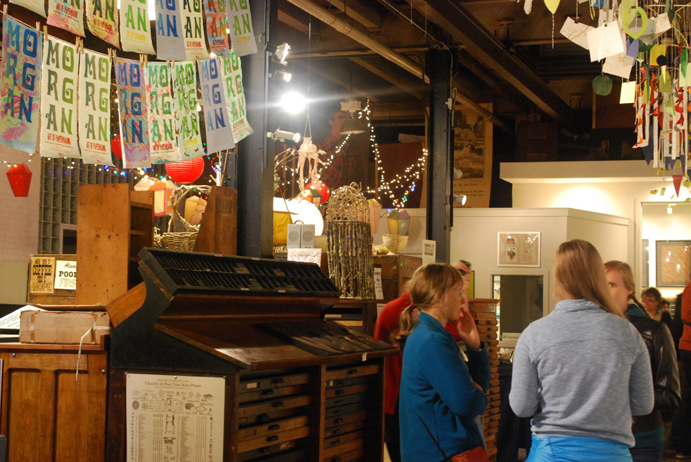
    The evening reception occurred at the Morgan Art of Papermaking Conservatory and Education Foundation. This was my first time at the Morgan and I was blown away by the size of the space. It was covered with a multitude of various creations. From what I could gather, the space was divided into different areas, a small shop right near the entrance, an area for printing, the center of the room was used as an exhibitions space, and the back half was for paper making and other workshops. I did miss out on the tour of the garden just outside the building in the back, but I heard it was absolutely gorgeous.

    StandardsCleveland7-ErinFletcher

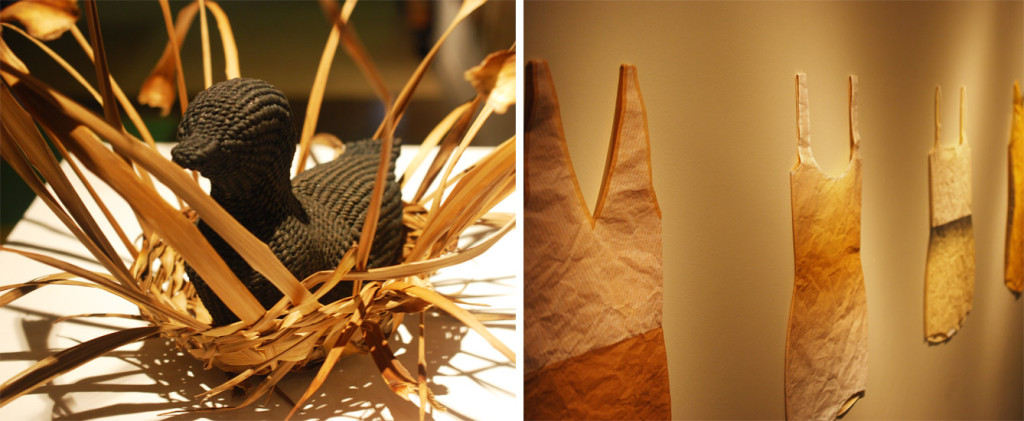
    Buoyancy was the exhibit on view at the Morgan, which explores themes of water and swimming and includes the work of Aimee Lee and Kristen Martincic. I really enjoyed Kristen’s realistic paper recreations of objects used in the water. Aimee created a large and impressive assortment of intricately woven sculptural ducks from hanji dyed with natural pigments.

    StandardsCleveland8-ErinFletcher

    left: Aimee Lee | right: Kristen Martincic

    Being that we were on the turf of the Midwest Chapter, members were invited to bring books for a pop-up exhibit. To our delight, this was also on display during the opening reception.

    StandardsCleveland9-ErinFletcher

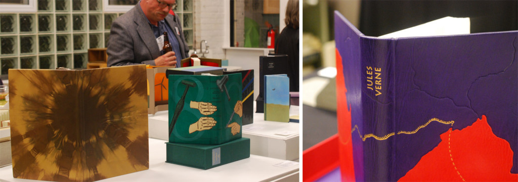
    The books on display in the image above from left to right are: Cris Clair Takacs: Remembering Jan Bohuslav Sobota, Karen Hanmer: Bookbinding with Numerous Engravings and Diagrams and Richard BakerLe Tour du Monde en Quatre-Vingts Jours (Around the World in Eighty Days).

    StandardsCleveland10-ErinFletcher

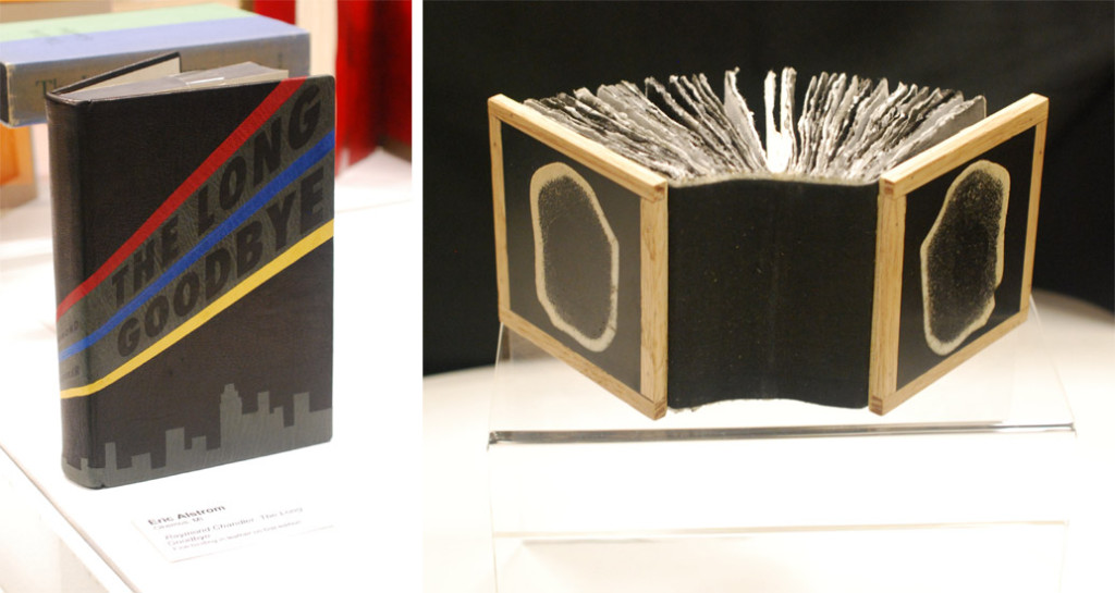
    Working down the exhibit table is Eric Alstrom’s The Long Goodbye (seen on the left) and Charles Wisseman‘s World Bones. 

    StandardsCleveland11-ErinFletcher

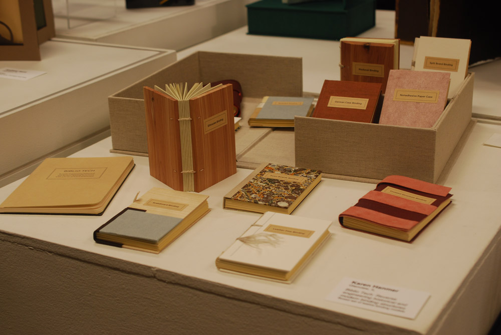
    Next up Biblio Tech: Reverse engineering historical and modern binding structures from Karen Hanmer.

    StandardsCleveland12-ErinFletcher

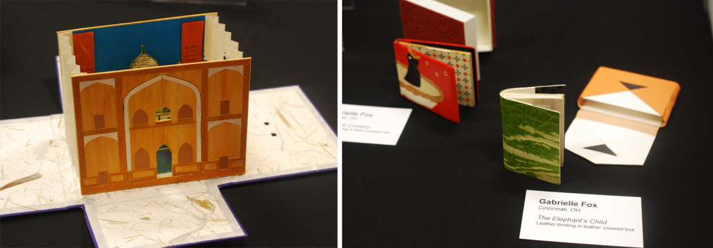
    On the left is Tunnel of Love from Mary Uthuppuru with miniatures from Gabrielle Fox on the right.
    StandardsCleveland13-ErinFletcher

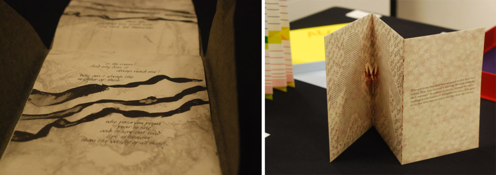
    Wrapping up my tour of the exhibit table is Joanna Kluba‘s Rainer Maria Rilke: Poems on the left and Emily Martin‘s Who Gets to Say on the right.

    That concludes day one of the Standards Seminar. Stay tuned for part two of the post soon.


  3. Bonus // Bookbinder of the Month: Karen Hanmer

    December 29, 2013 by Erin Fletcher

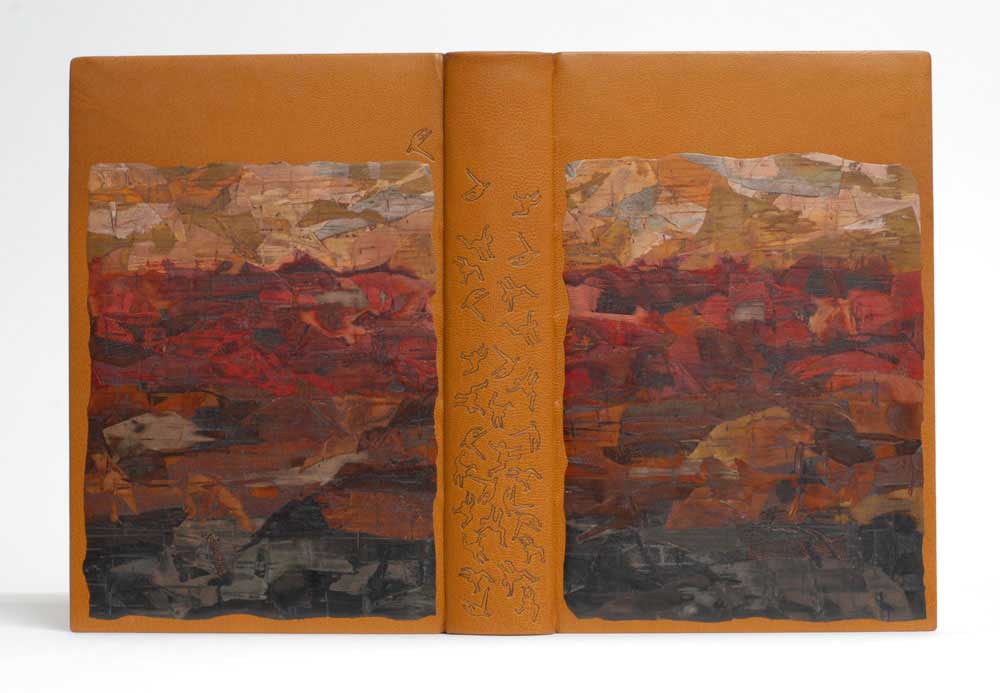
    OverTheEdge-KarenHanmerIt was so hard to narrow down just 5 pieces from Karen Hanmer’s portfolio to feature during the month of December. So I present this bonus post, which includes 2 additional bindings, to wrap up both Karen’s feature and the interview segment for 2013.

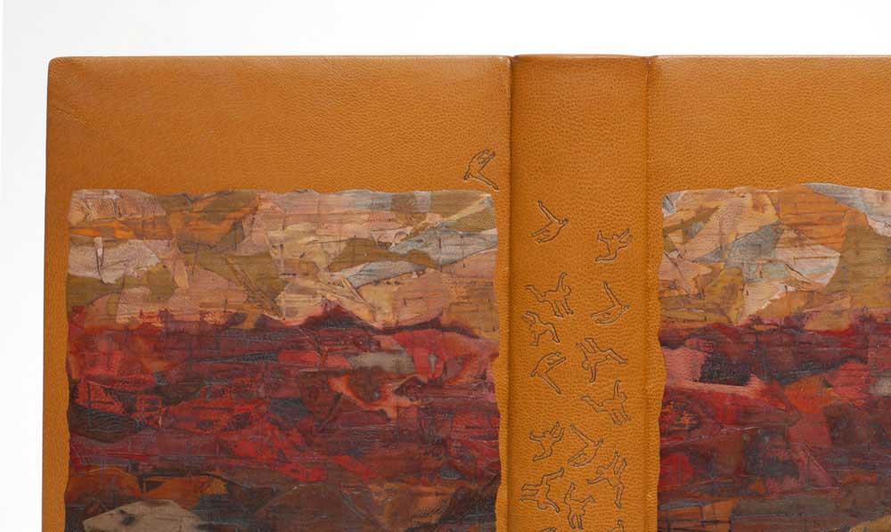
    Over the Edge: Death in Grand Canyon (by Thomas M. Myers and Michael P. Ghiglieri) may be the reason why I first began to admire Karen Hanmer’s work and how I fell in love with the lacunose technique. This French-style fine binding is covered in full goatskin and features two large goatskin lacunose onlays. The tumbling figures are tooled in gold using custom brass tools, both on the covers, spine and edge-to-edge doublures, which have left a mirrored impression on the suede flyleaves (which you can see here). 

    RightStuff-KarenHanmer

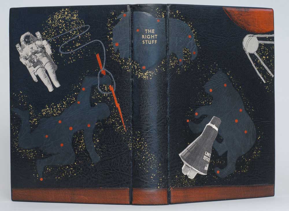
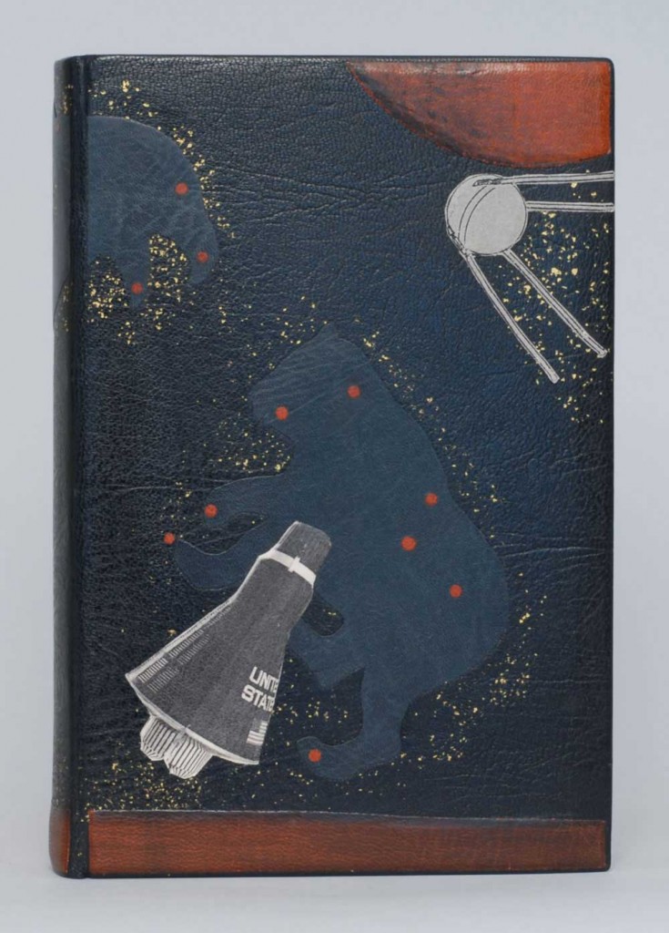
    After visiting with Karen in her home bindery, I attended the One Book, Many Interpretations exhibit at the Chicago Public Library in 2011. I had just been treated to handling some of Karen’s earlier works, that I was so awed by her recent fine binding of The Right Stuff by Tom Wolfe. Karen employs so many techniques on this binding, but every part is flawlessly executed into a harmonious composition.

    Bound as a French-style fine binding in full goatskin with back-pared and cushioned onlays; some laser-printed. Sprinkled gold leaf creates a cosmic stream across the boards. The edges are decorated with graphite and sprinkled with gold leaf.

    These two bindings are amongst my favorites within your portfolio. The techniques you employed made for quite striking designs. Can you discuss the lacunose technique and using laser-printed onlays?
    I don’t draw, paint, airbrush, or do any kind of traditional printmaking, so to get imagery into my designs, I use the computer, or in the case of lacunose, brute force.

    OverTheEdgedetail-KarenHanmer

    I saw Paul Delrue present the lacunose technique at the Guild of Book Workers meeting in 2005. Thin bits of leather are adhered to a substrate or directly to the book, sanded, a PVA wash is applied and dried, and the leather is sanded again. More bits of leather can be applied, tooling can add additional texture, and color can be added to the wash to alter the tone. This process is repeated numerous times with finer and finer sandpaper, then finished with beeswax on a cloth.

    RigthStufffront-KarenHanmer

    Laser-printing on leather is a technique I learned from Peter Verheyen. Pare leather to onlay thickness, paste it to tissue, dry flat. Print the desired image first onto paper so you can properly position the leather. Place the leather over the image just printed on the paper, and tape down the leading edge. Make a second laser print, this time on the leather. After the print is cool, fix the image with a protective coating. I use Cellugel. Krylon spray will also work, and SC6000 or Renaissance wax will probably work also, but be careful not to rub the toner off the surface as you rub on the protective coating. Then remove the leather from the copier paper and proceed to use the printed leather as an onlay or inlay.

    – – – – – – – – – –

    I want to thank Karen again for such a wonderful and thoughtful interview!


  4. Bookbinder of the Month: Karen Hanmer

    December 29, 2013 by Erin Fletcher

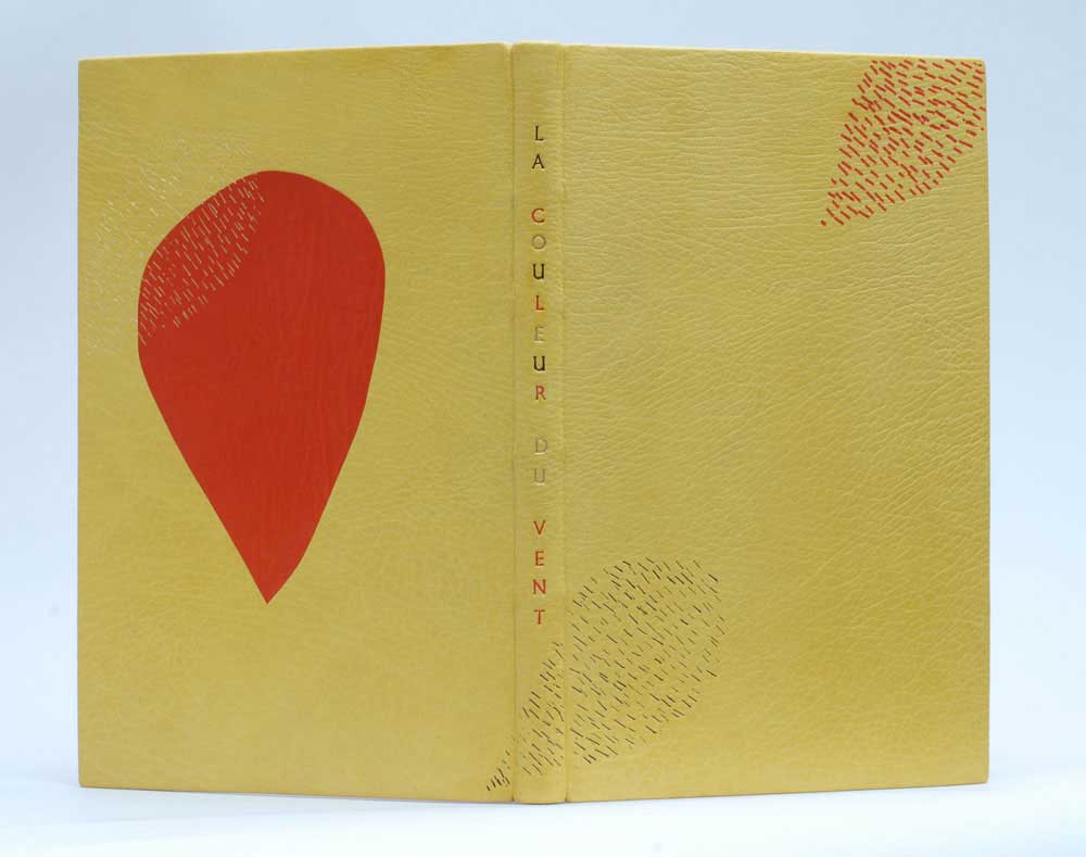
    LaCouleurDuVent-KarenHanmerLa Couleur du Vent is an exhibition featuring 50 bindings interpreting text of the same title. I previously posted about this exhibition in Sonya Sheat’s interview this past June. ARA-Canada in partnership with the École Estienne in Paris, organized an international exhibition of bookbinding to be held in both Paris and Canada during 2013 and 2014. I found Karen Hanmer’s design for the text to be quite striking and unusual from her other fine bindings. The overall design is simplistic, but the arrangement of fine, short lines creates a beautiful texture against the grain of the vibrant yellow leather. 

    Bound in full goatskin as a traditional French-style fine binding, Karen’s copy of La Couleur du Vent was sewn on flattened cords and the boards are laced-on. The red teardrop is a back-pared onlay, while the other teardrops are tooled using black, gold and red foils. The title is hand tooled using the same colored foils. 

    How did you come to participate in this exhibition? Are you a member of ARA Canada?
    Yes, I am a member of ARA Canada, and this is the third time I have exhibited with them. Their exhibitions travel in Canada and sometimes in France, and they still produce printed catalogs.

    Prior to a family vacation I posted on the Book_Arts-l asking for suggestions of things to see in Montreal. Cécile Côté invited us to visit her studio, and I was able to see the text block for this set book exhibit, which was designed, illustrated and printed by an intern under Cécile’s direction. [From the ARA-Canada website: This is a collection of poems by Gilles Vigneault, illustrated and designed by Nastassja Imiolek under the artistic direction of Cécile Côté.] I unable to find a translation of the text, so my design is based on the illustrations, borrowing often-used colors and the repeated teardrop shape and cross-hatching.


  5. Bookbinder of the Month: Karen Hanmer

    December 22, 2013 by Erin Fletcher

    fragmentsofcapri2-karenhanmer

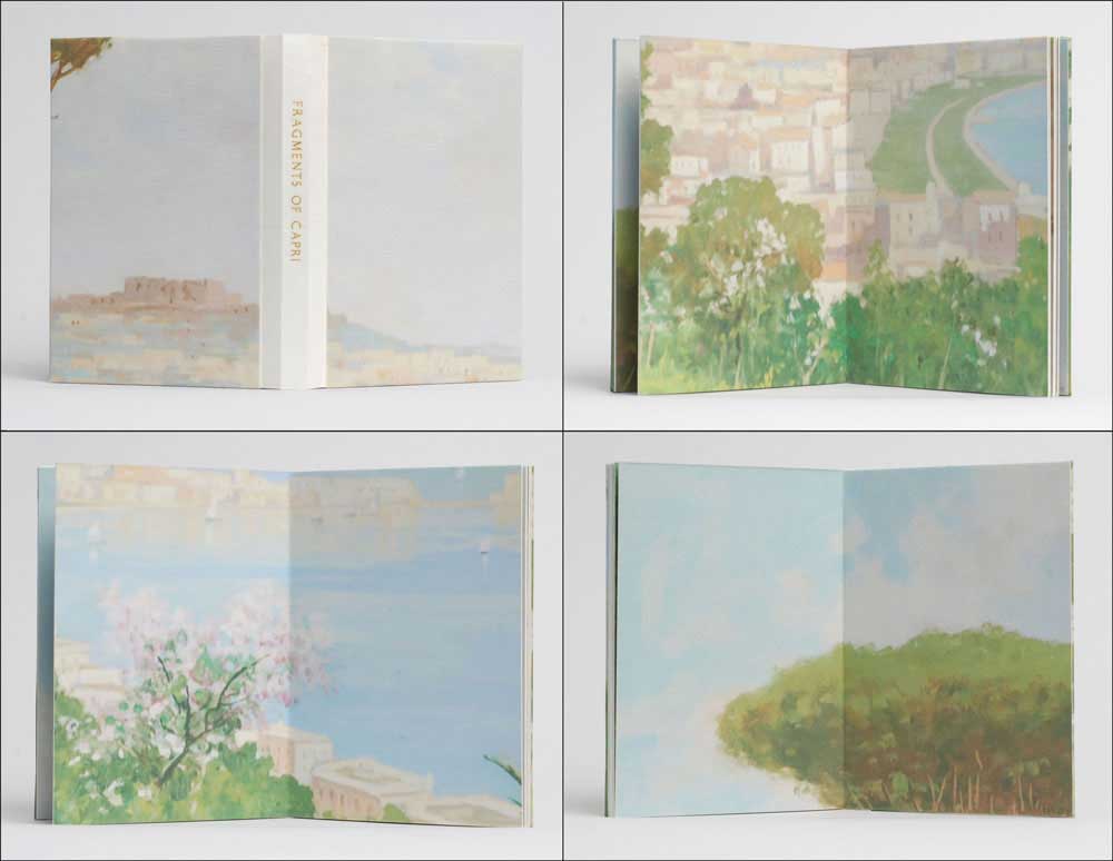
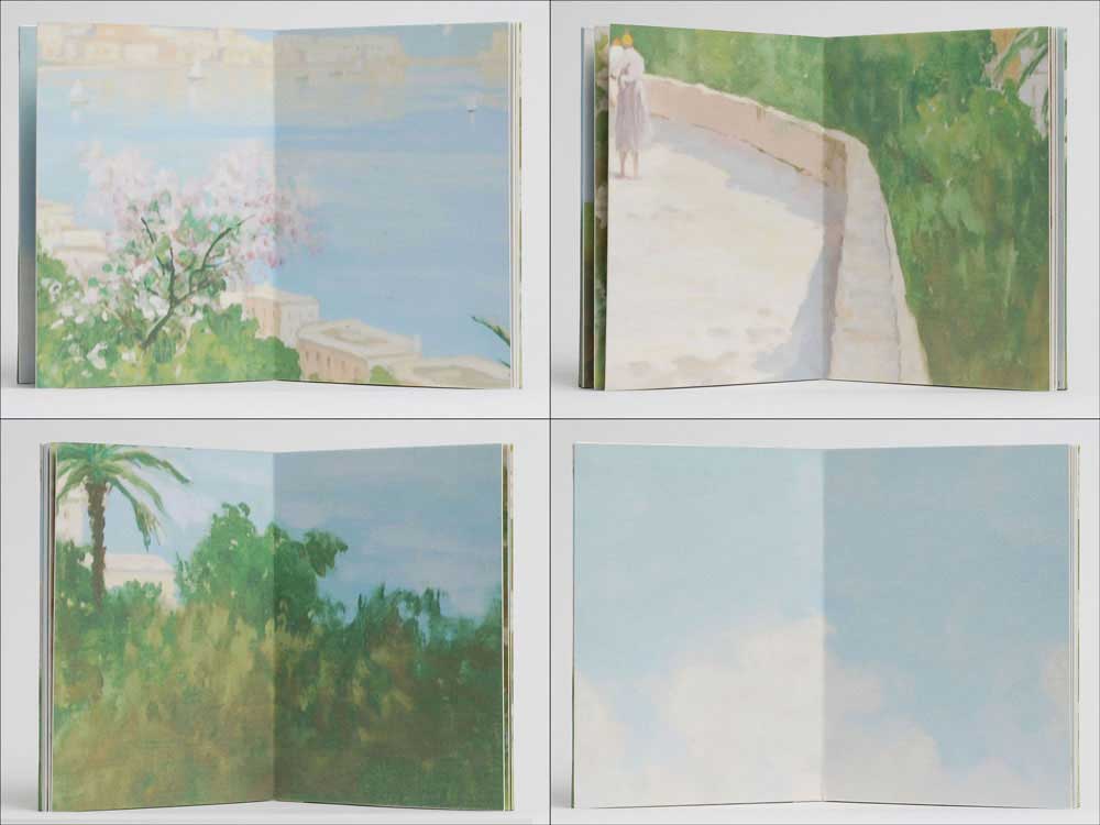
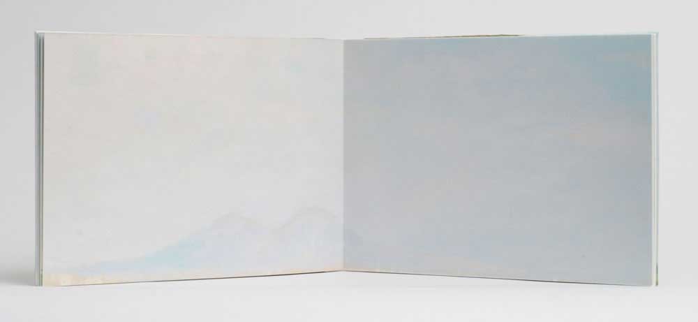
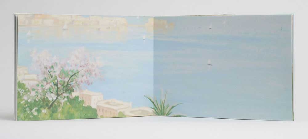
    A painting that hung above the sofa in the childhood home of Karen Hanmer became the inspiration and source material for Fragments of Capri. Taking an object that had become so engrained in the landscape of her surroundings, Karen reproduced the painting full size as several inkjet prints then proceeded to trim the painting down to postcard size pieces.

    fragmentsofcapri1-karenhanmer

    Bound within the pages of this drum leaf structure the viewer is given a disjointed look at the painting. Although each spread creates an appealing and what appears to be finished painting, a sense of belonging quickly creeps into the narrative. Created in 2011, Fragments of Capri, is an unnumbered edition of 100. Each book is unique in the variation to covers and interior pages. The spine piece is vellum stamped with gold foil.

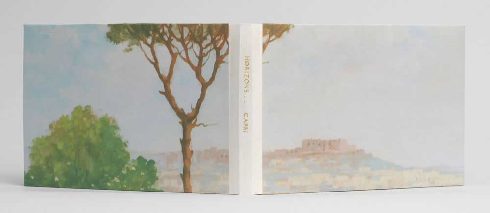
    Horizons… Capri is a similar edition where Karen continues to deconstruct and reformat this familiar painting, further fragmenting our memories of the past.  

    horizons1-karenhanmer

    Bound in the drum leaf structure with a stamped vellum spine piece, Horizons… Capri was also created in 2011 in an unnumbered edition of 30. This artist book is currently on display as part of the Guild of Book Workers traveling exhibition: Horizon

    horizons3-karenhanmer horizons2-karenhanmer

    I love these two books. The soft edges and pastel colors of the painting are beautifully paired with vellum and a touch of gold foil. Did your initial concept include both books or did one stem from the other?
    Before I began binding, I photographed my husband’s family painting hanging above the sofa it was commissioned to match. Ever since, I’d wanted to make something with my family’s painting. I was invited to make a piece for an exhibit where the works would be assembled by the viewer. I thought of a puzzle or maybe a cube constructed from a photo of the painting. That fell through, but then a friend asked for a set of 50 of something to include in his Fluxus-inspired journal. I photographed the painting, color-corrected the file to match the original, inkjet-printed several copies life-size, then cut them into postcard-size pieces.

    Working with these small prints gave me the idea to use the photograph of the painting for books also. I liked the idea of a fragmented walk through the dreamy landscape, and my first idea was to reference a pocket-sized travel-guide. The Guild of Book Workers had announced the theme “Horizon” for their next traveling exhibit, and I realized if I cut the full-size printed photo of the painting into eight long rectangles, each piece would contain an obvious horizon line. I’d been hoping for a chance to use vellum as a spine for a drum leaf or sewn boards edition, and I think the gold stamped title makes the vellum look particularly luminous.


  6. Bookbinder of the Month: Karen Hanmer

    December 15, 2013 by Erin Fletcher

    nevermoredeluxeandstandard-karenhanmer

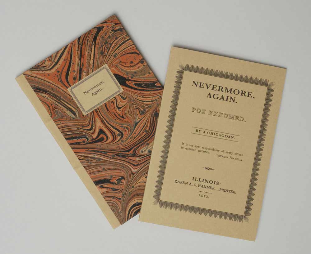
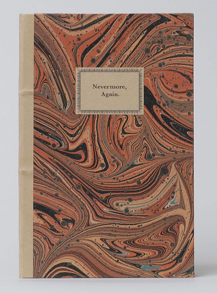
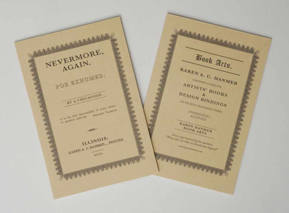
    Nevermore Again: Poe Exhumed is an artist book from Karen Hanmer presented in multiple bound formats. The content of the work mirrors the tales of Edgar Allen Poe to contemporary economic and political stories. Pictured above on the left is the Deluxe edition which is presented as an early 19th century style publisher’s binding covered in marbled paper by Pamela Smith. The endpapers incorporate the design of the wrapper from the Standard edition, which is pictured above on the right.

    Nevermore Again: Poe Exhumed is offered for purchase in several different formats. Why have you chosen to produce this piece in various editions? Have you found one edition to be more successful over another?
    Nevermore, Again is an artists’ book exploring how current events mirror stories written by Edgar Allan Poe. I could not decide between two structures for the binding, so for the first time, I produced a book in several editions.

    The deluxe edition uses the publishers’ boarded binding I learned from Jeff Peachey. It is historically appropriate for Poe’s era, and I was eager to use this interesting cusp-of-the-industrial-revolution structure in an edition. But as I researched Poe’s bibliography, I became fascinated by Tamerlane and Other Poems, the rare first edition of Poe’s first published work. To make my book more conceptually sound, I decided that in typography, size, and structure the standard edition should be a facsimile of Tamerlane, which was presented in a simple paper wrapper. Olivia Primanis at the Harry Ransom Center sent me detailed measurements of their copy of Tamerlane, and I went to the University of Chicago to examine another in person. The only change I made was sewing through the fold instead of stabbing adjacent to the spine. I wanted my book to open well.

    nevermoredeluxe-karenhanmer nevermorestandard-karenhanmer

    I’m very pleased with the text I wrote for Nevermore, and I wanted it to have readership extending beyond those with a collector’s budget, so I made a laser-printed chapbook version also.

    I’ve sold many chapbook versions, all but one to individuals. The deluxe edition at $450 has sold significantly more copies than the standard at $275. This surprises me, especially because of pressures on institutional budgets, but I realize that Pam Smith’s marbled paper on the deluxe is hard to resist.


  7. Bookbinder of the Month: Karen Hanmer

    December 8, 2013 by Erin Fletcher

    bluestem2-karenhanmer

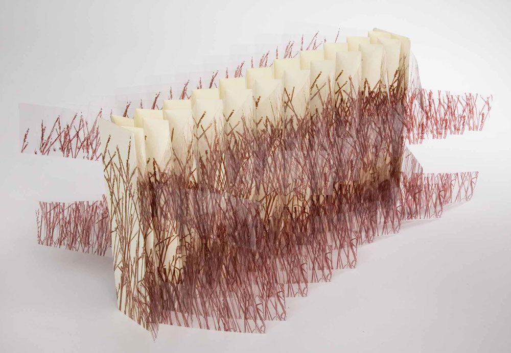
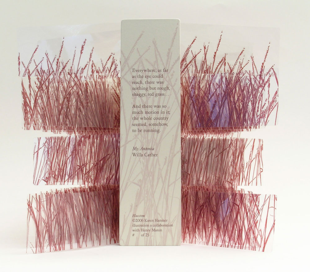
    The flag book structure has become a reoccurring model in Karen Hanmer’s work. She has quite an eye for transforming flat imagery into interesting movable objects. Bluestem was created in 2006 in a small edition of 25, the work is inspired by Willa Cather’s My Antonia and includes a quote printed on the rear panel.

    bluestem-karenhanmerThe grass imagery is inkjet printed on polyester film and bound on either side of the panels creating a double-sided variation on the flag book structure. As you open and close this book a nice rustle is created by the movement of the pages. It’s quite simple and beautiful. 

    Inspired by the work of Hedi Kyle, you have, on several pieces used the flag book structure. How does this structure best represent your concept?
    Women and Cars by Susan King was among the first artists’ books I saw, and it has remained an inspiration. King’s use of the flag book structure gave me a model for everything I wanted to accomplish when making a non-codex book. It pairs multiple narratives with photographs, can be held in the hand and read like a traditional codex, opens fully enough to look commanding and compelling on exhibit, and gives viewers enough to enjoy that they will not focus on the book being printed digitally if that is an issue for them.

    The Bonefolder chose flag books as the theme for our 2008 online Bind-O-Rama exhibit. Although my previously editioned flag books were quite elaborate with multiple texts and imagery on inside and outside of the spine and boards, Bluestem appeals to my minimalist side. There’s almost nothing there: just a few words of text from Willa Cather’s My Antonia on the rear board and lines representing grass printed on clear polyester film and paper, yet the piece also effectively represents the boundlessness of the prairie.

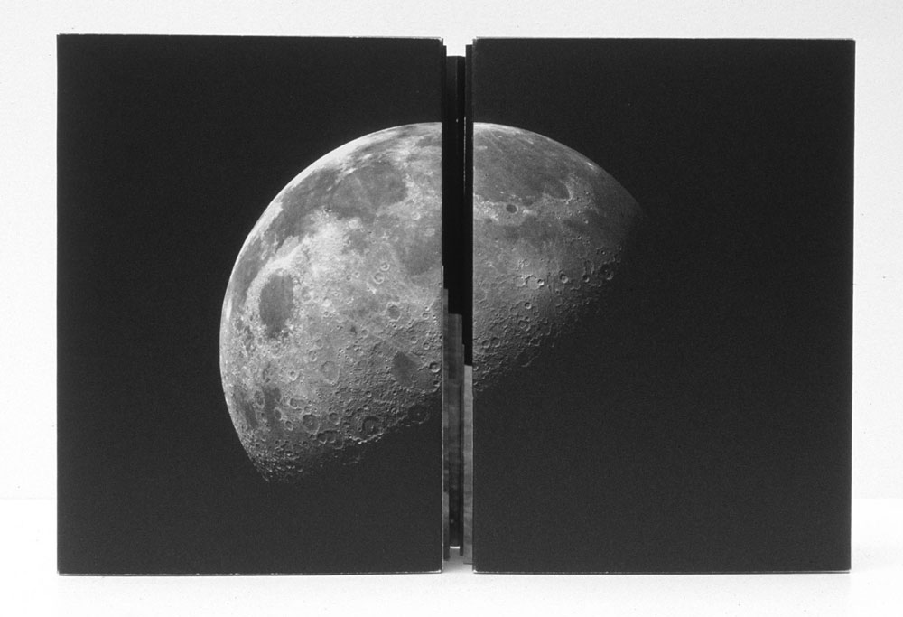
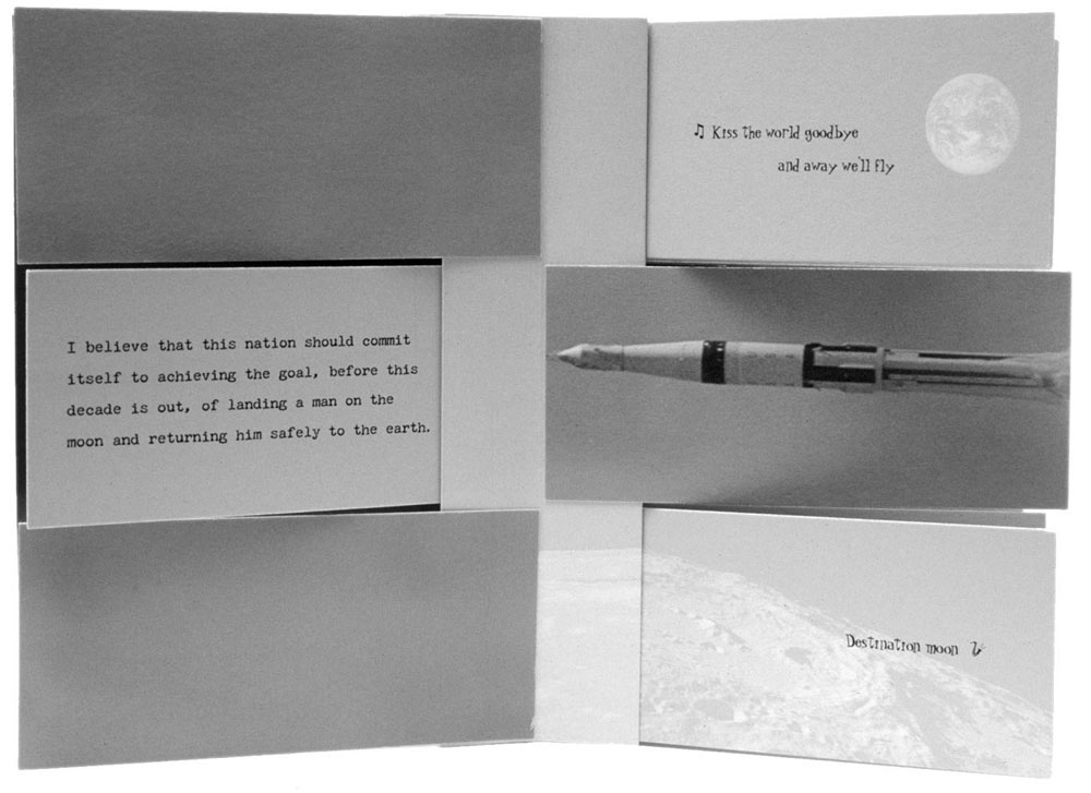
    destinationmoon-karenhanmerCreated in 2003, Destination Moon, is another simple flag book structure that involves a complex layering of material related to the moon. Archival images pertaining to the Apollo Manned Space Program are on the reverse of John F. Kennedy’s “Man on the Moon” speech in addition to the song lyrics for Roy Alfred and Marvin Fisher’s Destination Moon, about a romantic journey to the moon. 

    destinationmoon2-karenhanmer

    But when the book is fully opened, all the viewer sees is an image of the space shuttle on its way toward the moon.

    destinationmoon3-karenhanmer

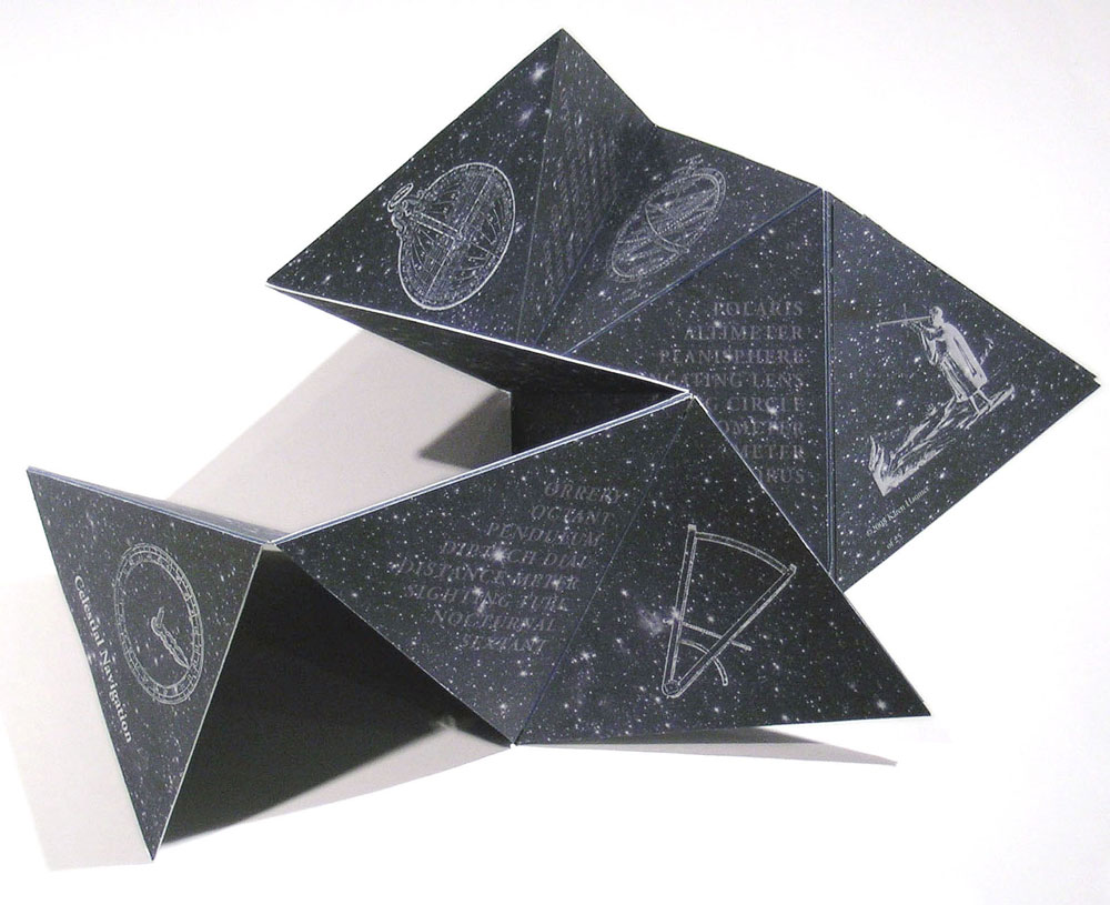
    Besides the flag book, Karen has played around in a variety of movable and folded structures. In her work Celestial Navigation, the triangular pages can be held in the hand and read like a traditional book or unfolded to reveal star charts. The structure is quite playful and can be folded into fantastic sculpted shapes. 

    celestialnavigation-karenhanmer

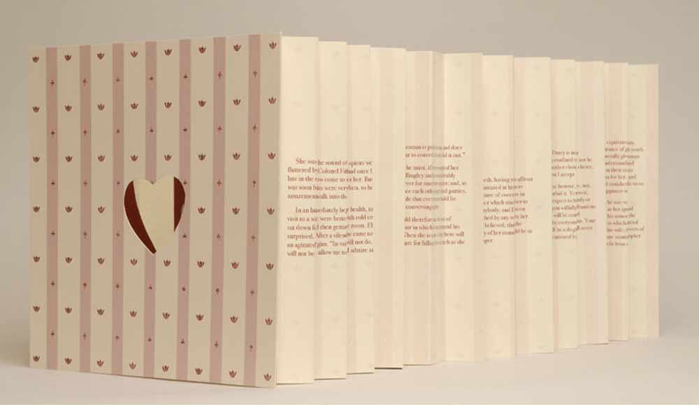
    In Pride Prejudice Passion: Tunnel of Love, Karen appropriately uses the tunnel book structure. This works combines text from the classic romance novel by Jane Austen with images cut from covers of the modern romance novel. As the term suggests, the content can be viewed through the length of the structure, similar to peering down a tunnel. 

    tunneloflove-karenhanmer


  8. December // Bookbinder of the Month: Karen Hanmer

    December 1, 2013 by Erin Fletcher

    booksspeakplain1-karenhanmer

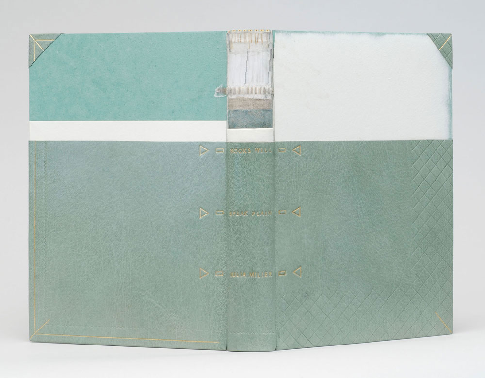
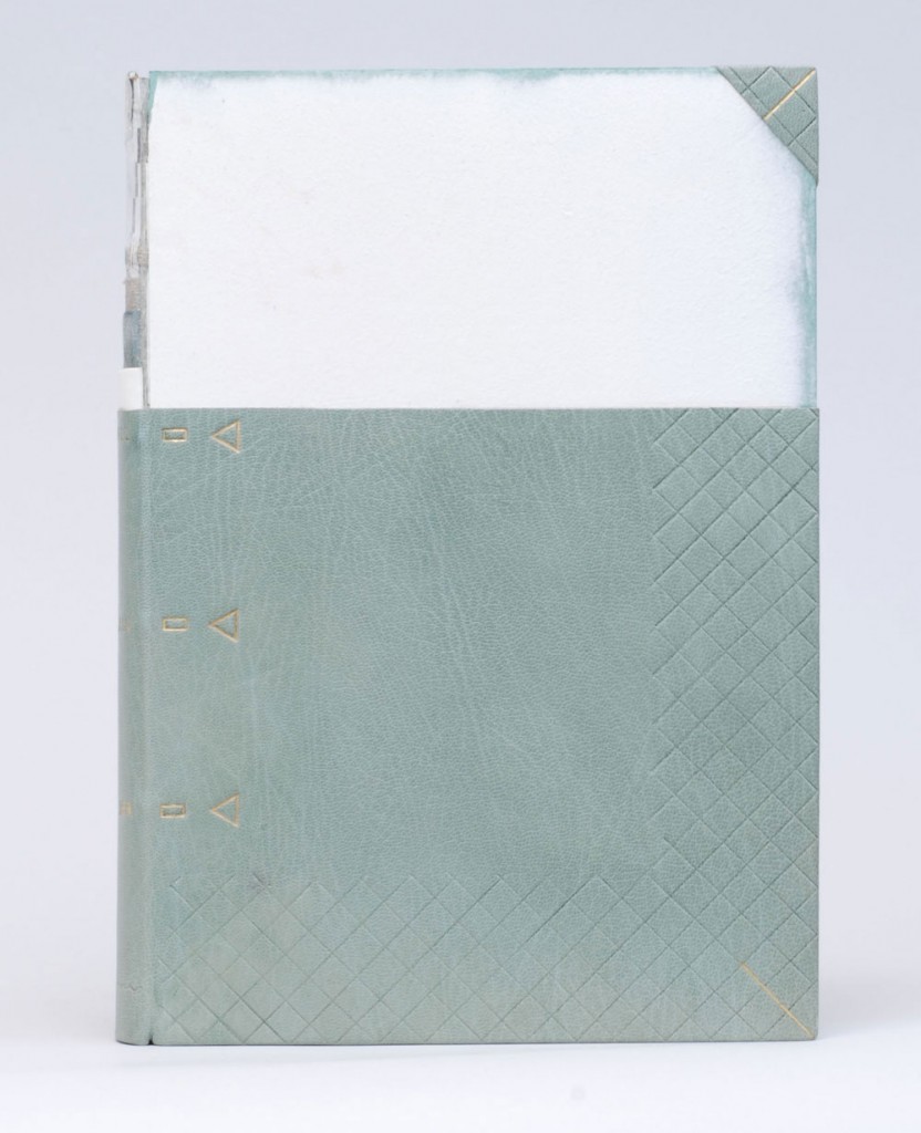
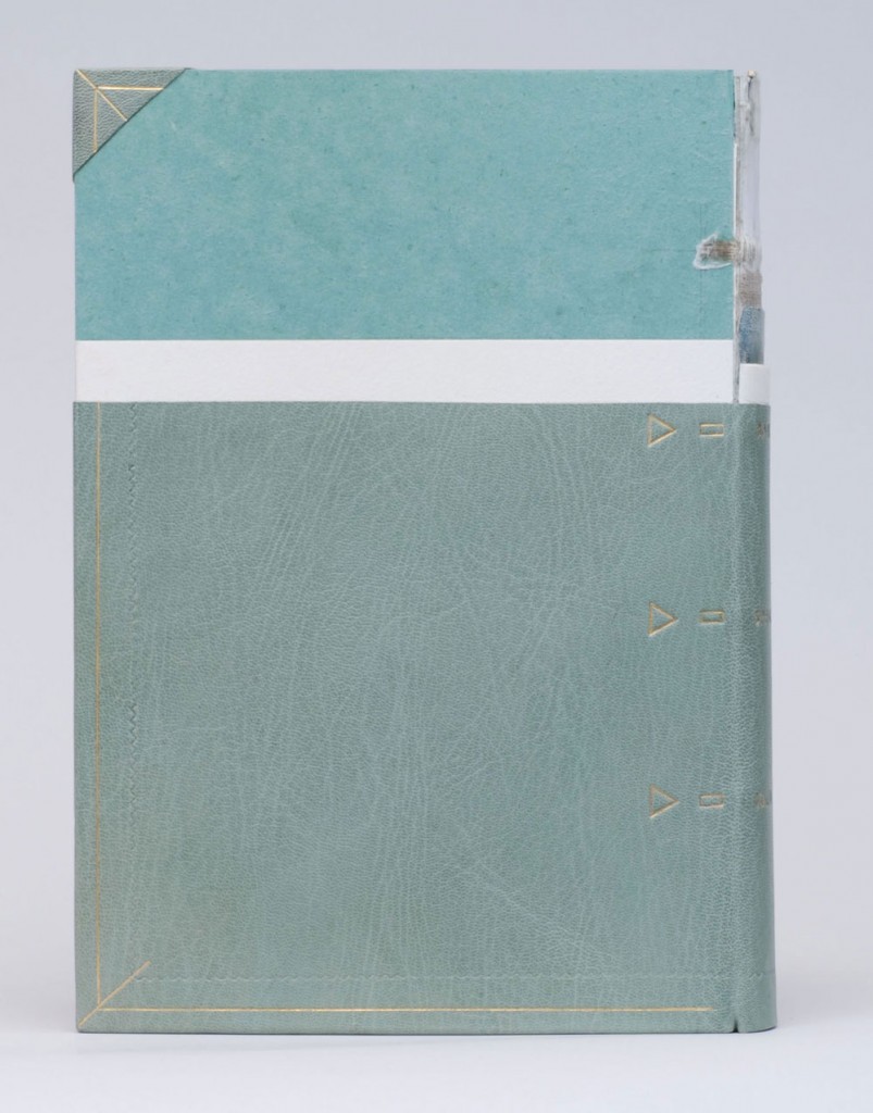
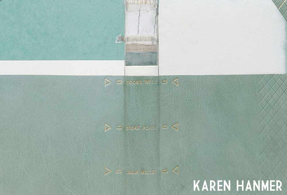
    The Midwest Chapter of the Guild of Book Workers recently revealed the exhibitors for a traveling exhibition called Plainly Spoken, which celebrates Books Will Speak Plain, a comprehensive survey of historical bindings by Julia Miller. Amongst the highly skilled and wide variety of bindings is a cutaway model by Karen Hanmer

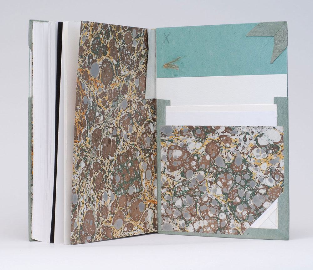
    Karen bound her copy of Books Will Speak Plain as a traditional fine binding, sewn on flattened cords with laced-in boards. Partially covered in a beautiful light blue goatskin, otherwise hidden elements of the structure stay visible in this cutaway model. Tooling is done in blind and 23kt. gold foil to emphasize the location of sewing supports and lacing-on in addition to turn-ins, fills, sanding of the boards and formation of corners. The use of tooling as both an aesthetic treatment and as visual aid is just brilliant!

    booksspeakplain2-karenhanmerbooksspeakplain4-karenhanmer

    Although the book may appear to be incomplete, it includes all the necessary details that make a book a fine binding. The headbands are hand sewn using silk thread and the head edge is sponged with acrylic inks and sprinkled with gold leaf. The inside continues with the cutaway theme showing off the leather hinge, marbled paper endpapers, fills and corners. 

    booksspeakplain5-karenhanmer

    How did you approach this cutaway binding? Did you study Mark Esser’s models at the University of Iowa?
    I’ve made a lot of partially-finished models. They’re useful for teaching and help me remember process. But cutaways are something different since they appear unfinished and fully complete at the same time. Peter Verheyen has loaned me his springback cutaways several times, and I used them for reference when making my first cutaways. I’d admired Mark Esser’s two cutaway fine bindings in the University of Iowa’s online collection for a long time and was able to spend time with them on two trips to Iowa City this spring.

    I was able to use my design binding on Books Will Speak Plain twice this fall: for both an online exhibit of cutaways, and in a traveling set book exhibition. For the latter I added tooling to reference the binding process: the sewing supports and lacing, the turn-ins and fills, and the board-shaping.

    – – – – 

    The online exhibit that Karen mentioned above, is an annual themed exhibit held by the Book Arts Web called Bind-O-Rama. For 2013, the theme was historical cutaway models. The online exhibit can be viewed here

    Although I don’t know Karen very well (yet), she’s been incredibly sweet and supportive of my work. I first met Karen at her bindery in Glenview, Illinois. My friend, Anna, and I were in town for an exhibition at the Chicago Public Library; where both Karen and I had bindings on display. Since then I’ve kept in touch with Karen, leaning on her from time to time when I needed help. 

    I’ve had two opportunities to watch her work, which is quite fun. Once when she came to North Bennet Street School to teach us the flag book structure and most recently during the Standards of Excellence 2013 conference in Washington, DC. I hope to have more opportunities like this in the future. 

    After the jump is a wonderfully thoughtful interview with Karen, where she shares her experiences with bookbinding, teaching and marketing. Come back each Sunday during the month of December for more in-depth posts on Karen’s work in the field of bookbinding and artist books. 

    read more >


  9. Coming Soon: Karen Hanmer

    November 12, 2013 by Erin Fletcher

    hanmerpreview

    Beginning in December, interviews will be back starting with the wonderfully talented Karen Hanmer. Come back on the first of December for the interview. Throughout the month, I’ll be featuring Karen’s work and asking her a brief question about each piece. 

    I received a lot of intriguing suggestions for future interviews from past interviewees. So stay tuned each month for more thoughtful and in-depth interviews with bookbinders, book artists and more. 


  10. Online Exhibit // New England Chapter of the Guild of Book Workers

    May 12, 2013 by Erin Fletcher

    bookartstudiohandbook-mckeyberkman

    bound by McKey Berkman

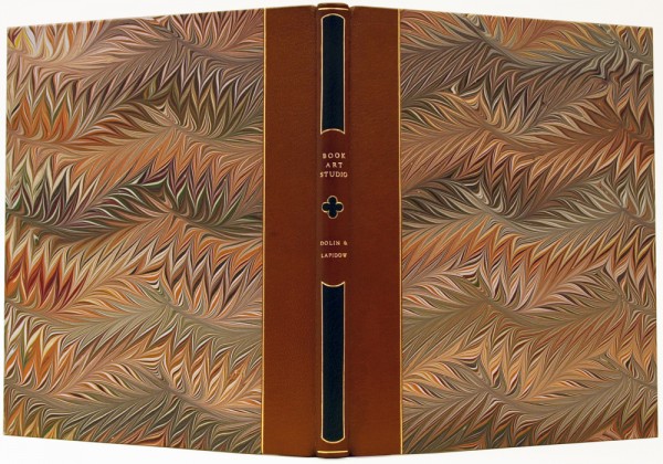
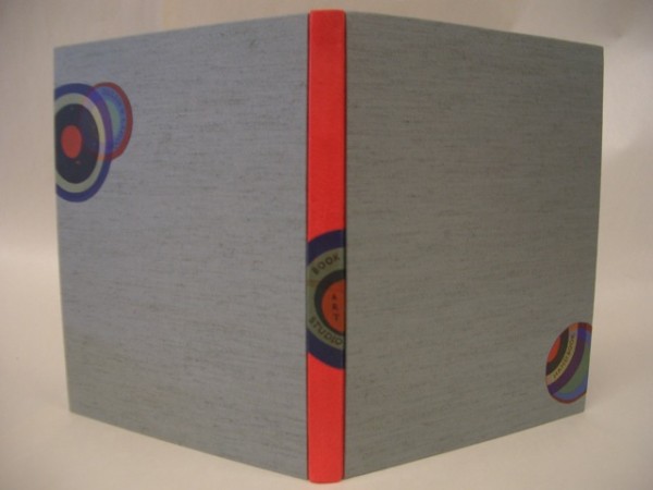
    Members of the New England Chapter of the Guild of Book Workers recently bound copies of Book Art Studio Handbooka practical guide to bookbinding co-written by Amy Lapidow and Stacie Dolin. This handbook is filled with great tips on setting up a studio, buying tools and plenty of projects that vary in complexity and skill. 

    OLYMPUS DIGITAL CAMERA

    bound by Samuel Feinstein

    hebard_students

    bound by Barbara Hebard and students at Boston College

    hanmer

    bound by Karen Hanmer


  • My name is Erin Fletcher, owner and bookbinder of Herringbone Bindery in Boston. Flash of the Hand is a space where I share my process and inspirations.
    The StudioNewsletterInstagramEmail me
  • Archives