RSS Feed

Posts Tagged ‘interview’

  1. Bookbinding Now // Interview with Henry Hébert

    January 23, 2014 by Erin Fletcher

    bookbindingnowhenry

    In May 2013, Susan Mills interviewed me for her podcast Bookbinding Now. In addition to that interview, Susan offered me the opportunity to suggest someone for a future interview or conduct my own for the podcast.

    Up until this point I had only conducted written interviews on the blog, so I was intrigued to test out my interview skills in a live, one-on-one scenario. I chose to interview my friend and colleague, Henry Hébert. In the interview we chat about his experiences in the field of conservation leading up to attending North Bennet Street School and what he’s done since graduating in 2012. Spoiler: his talents and expert skills have landed him the position of Rare Book Conservator at the University of Illinois at Urbana-Champaign. You can download the episode (no. 69) on iTunes or listen to it here


  2. January // Book Artist of the Month: Mary Uthuppuru

    January 2, 2014 by Erin Fletcher

    AndThenThereWere8_3-MaryUthuppuru

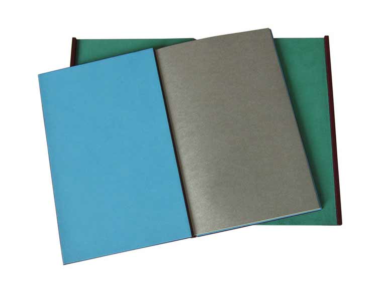
    In preparation for their 2013 Annual Open House and Silent Auction, the Morgan Conservatory presented participants with two sheets of paper made at the Morgan and asked them to create a piece of art to be auctioned off during the event. Mary Uthuppuru was given one sheet of charcoal grey and the other of bright white.

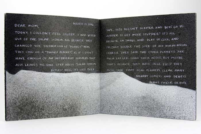
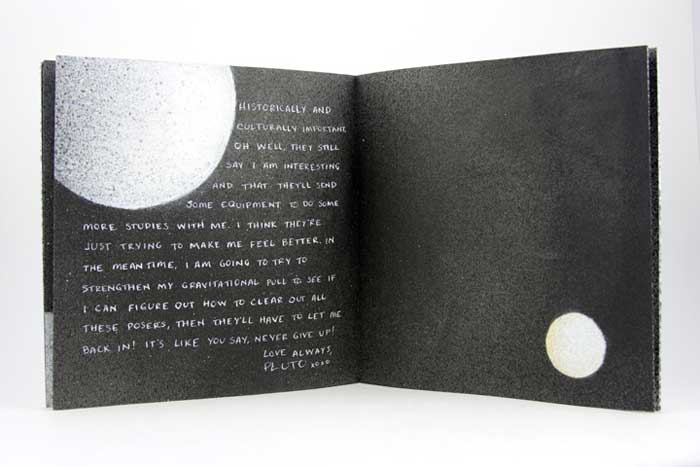
    Mary found inspiration from the recent drop Pluto experienced from its rank as a planet and the heated discussions that followed. As the sole character in this artist book, Mary personifies the now dwarf planet in the form of a letter, where Pluto freely express himself after hearing this news of rejection. You can read more about Mary’s process in her blog post, Poor Pluto

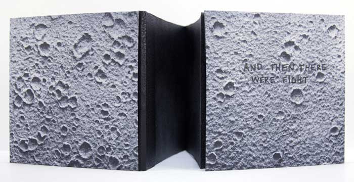
    And Then There Were Eight is bound as an accordion with a removable spine piece, when fully opened the viewer can experience the vast and expanding qualities of outer space. The covers are most appropriately wrapped in beautiful handmade Moon Paper from Hook Pottery Paper. The paper appears to be a 3-dimensional print of the moon, but it is actually smooth (like paper). The interior pages were given an airbrush look by using a mouth atomizer and drawing inks.

    AndThenThereWere8-MaryUthuppuruAndThenThereWere8_4-MaryUthuppuruAndThenThereWere8_2-MaryUthuppuruI really enjoyed reading about your thought process behind this book. Not only did you find inspiration in a literary influence, but also in your own sense of humor. The application of pigment really captures the atmosphere and depth of space. Can you talk about the challenges and benefits to using a mouth atomizer?
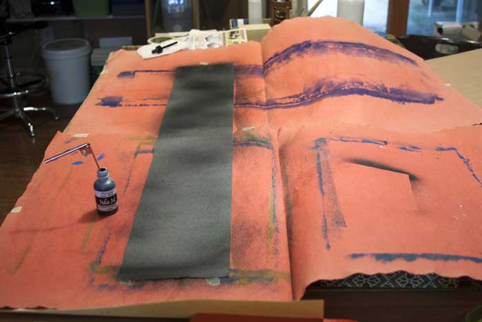
    The mouth atomizer was a really fun thing to use. I actually had it for over ten years before I discovered its use during this project. It looks a lot like a compass, but without the pencil. One end goes into whatever liquid you are using (in the case of the Pluto book it was India ink and Winsor & Newton drawing ink) and then you blow on the other tube.

    The benefit in its use is also its challenge. So long as you have the lung capacity, this tool is very simple. Blow in the horizontal tube, and the ink is sprayed from the vertical tube. The difficulty is in style. If you are trying to get consistent coverage, then you have to be consistent with the pressure behind your breath. But it is easy to get used to with a practice piece of paper. Also, beware your work space. Cover anything surrounding the piece you are working on with newsprint or other waste unless you want a speckled work space.

    ThereWere8_Atomizer-MaryUthuppuru

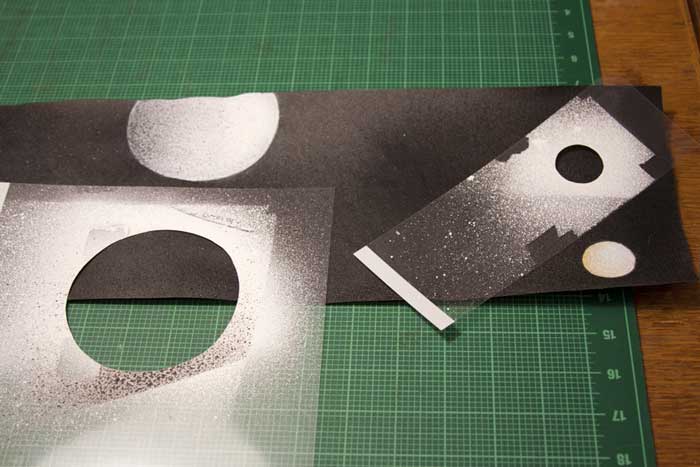
    There is more than one way to use it too. In this book, for example, I cut stencils from transparency sheets to create the planetary bodies. This allowed for a clean, shaded shape that is much faster and reads truer than a traditional stippling stenciled technique. It is also easy to clean by running it under water then drying.

    ThereWere8_Stenciling-MaryUthuppuru

    I first met Mary in Chicago for the One Book, Many Interpretations exhibit at the Chicago Public Library, where both Mary and I had work in the show. I’ll be featuring her binding of Interpreter of Maladies from that show later this month. From the beginning, I noted Mary’s impeccable skill and her exceptional eye for detail, but I can’t forget to mention her infectious personality. Her humor mixed with kindness and generosity makes her a delightful person to engage with and learn from.

    Like myself, Mary, is just beginning her career in the field of bookbinding. Her ambition and creativity are inspiring, as is the interview (after the jump). Mary discusses her love for bookbinding and how she caught “the book bug”. Later in the interview, Mary talks about setting up her own home studio and how being self-employed has its ups and downs. But it’s quite clear to see that Mary tackles her obstacles with smarts and humor. 

    Come back each Monday during the month of January for more on Mary Uthuppuru and her work, which will bounce between bookbinding and book arts.

    read more >


  3. December // Bookbinder of the Month: Karen Hanmer

    December 1, 2013 by Erin Fletcher

    booksspeakplain1-karenhanmer

    The Midwest Chapter of the Guild of Book Workers recently revealed the exhibitors for a traveling exhibition called Plainly Spoken, which celebrates Books Will Speak Plain, a comprehensive survey of historical bindings by Julia Miller. Amongst the highly skilled and wide variety of bindings is a cutaway model by Karen Hanmer

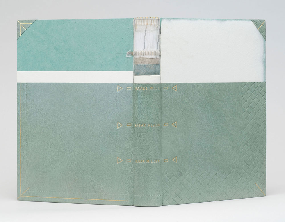
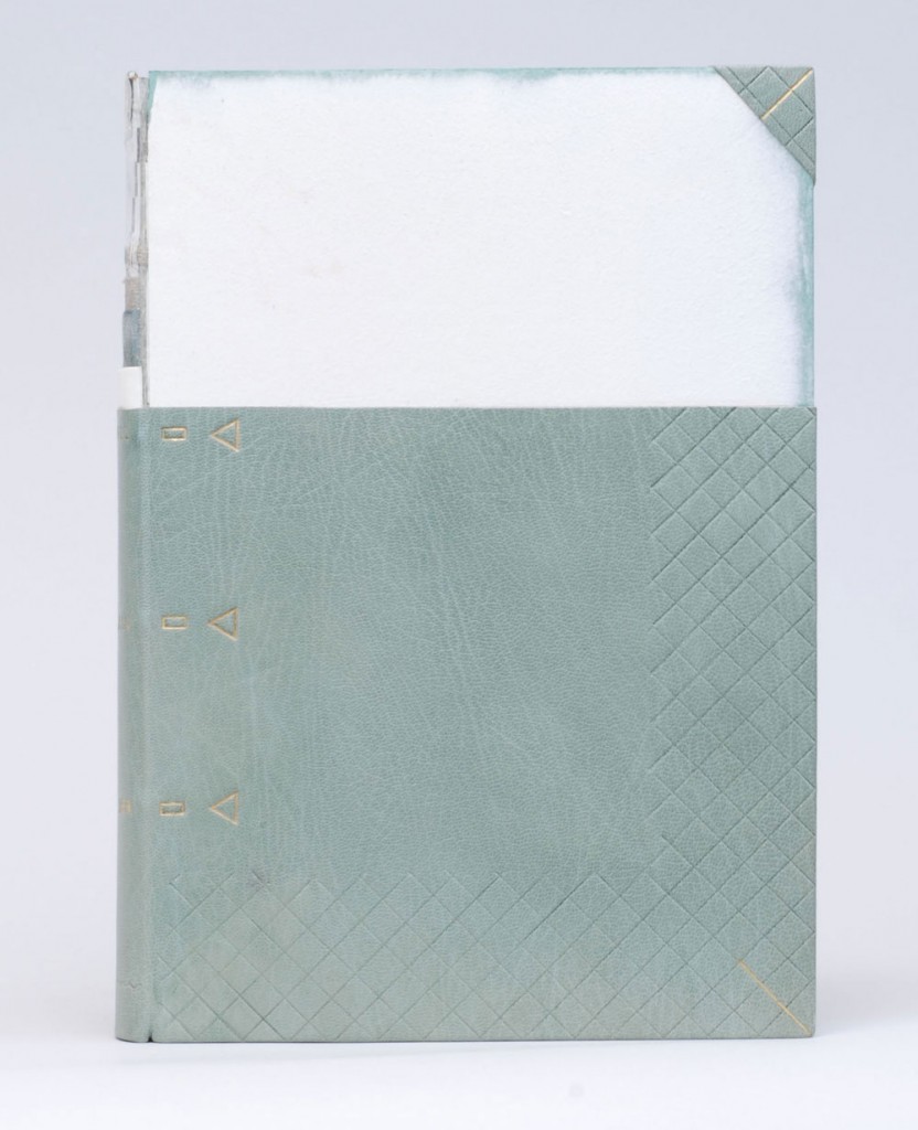
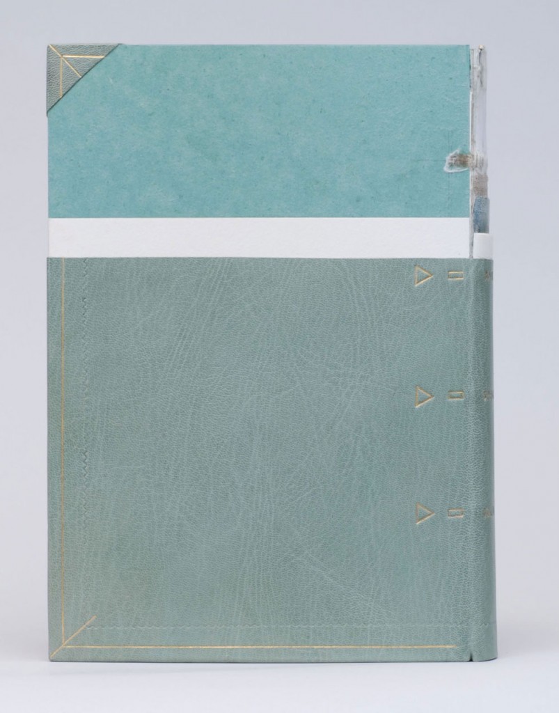
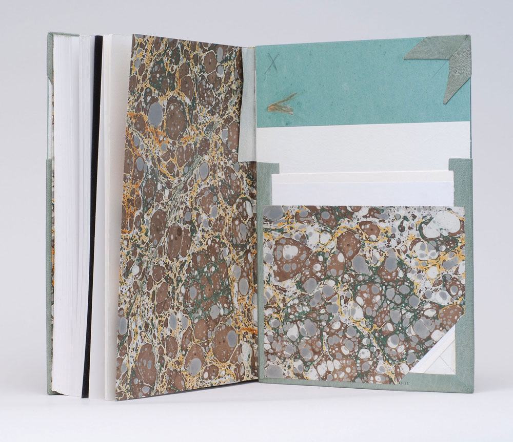
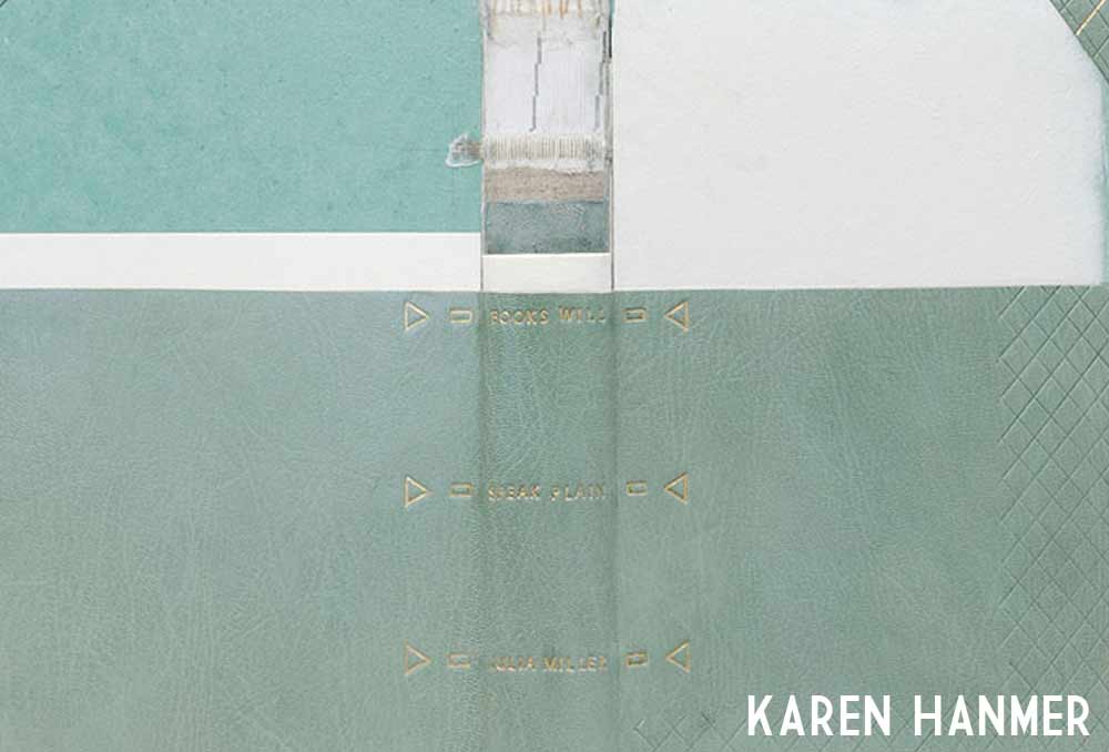
    Karen bound her copy of Books Will Speak Plain as a traditional fine binding, sewn on flattened cords with laced-in boards. Partially covered in a beautiful light blue goatskin, otherwise hidden elements of the structure stay visible in this cutaway model. Tooling is done in blind and 23kt. gold foil to emphasize the location of sewing supports and lacing-on in addition to turn-ins, fills, sanding of the boards and formation of corners. The use of tooling as both an aesthetic treatment and as visual aid is just brilliant!

    booksspeakplain2-karenhanmerbooksspeakplain4-karenhanmer

    Although the book may appear to be incomplete, it includes all the necessary details that make a book a fine binding. The headbands are hand sewn using silk thread and the head edge is sponged with acrylic inks and sprinkled with gold leaf. The inside continues with the cutaway theme showing off the leather hinge, marbled paper endpapers, fills and corners. 

    booksspeakplain5-karenhanmer

    How did you approach this cutaway binding? Did you study Mark Esser’s models at the University of Iowa?
    I’ve made a lot of partially-finished models. They’re useful for teaching and help me remember process. But cutaways are something different since they appear unfinished and fully complete at the same time. Peter Verheyen has loaned me his springback cutaways several times, and I used them for reference when making my first cutaways. I’d admired Mark Esser’s two cutaway fine bindings in the University of Iowa’s online collection for a long time and was able to spend time with them on two trips to Iowa City this spring.

    I was able to use my design binding on Books Will Speak Plain twice this fall: for both an online exhibit of cutaways, and in a traveling set book exhibition. For the latter I added tooling to reference the binding process: the sewing supports and lacing, the turn-ins and fills, and the board-shaping.

    – – – – 

    The online exhibit that Karen mentioned above, is an annual themed exhibit held by the Book Arts Web called Bind-O-Rama. For 2013, the theme was historical cutaway models. The online exhibit can be viewed here

    Although I don’t know Karen very well (yet), she’s been incredibly sweet and supportive of my work. I first met Karen at her bindery in Glenview, Illinois. My friend, Anna, and I were in town for an exhibition at the Chicago Public Library; where both Karen and I had bindings on display. Since then I’ve kept in touch with Karen, leaning on her from time to time when I needed help. 

    I’ve had two opportunities to watch her work, which is quite fun. Once when she came to North Bennet Street School to teach us the flag book structure and most recently during the Standards of Excellence 2013 conference in Washington, DC. I hope to have more opportunities like this in the future. 

    After the jump is a wonderfully thoughtful interview with Karen, where she shares her experiences with bookbinding, teaching and marketing. Come back each Sunday during the month of December for more in-depth posts on Karen’s work in the field of bookbinding and artist books. 

    read more >


  4. Coming Soon: Karen Hanmer

    November 12, 2013 by Erin Fletcher

    hanmerpreview

    Beginning in December, interviews will be back starting with the wonderfully talented Karen Hanmer. Come back on the first of December for the interview. Throughout the month, I’ll be featuring Karen’s work and asking her a brief question about each piece. 

    I received a lot of intriguing suggestions for future interviews from past interviewees. So stay tuned each month for more thoughtful and in-depth interviews with bookbinders, book artists and more. 


  5. August // Bookbinder of the Month: Annette Friedrich

    August 1, 2013 by Erin Fletcher

    thetempest1-annettefriedrich

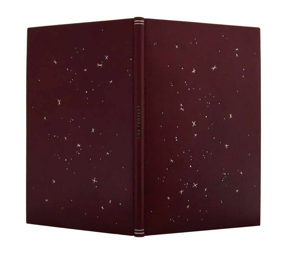
    This edition of The Tempest by William Shakespeare from The Nonesuch Press, was bound by Annette Friedrich in 2012. Bound as a full leather fine binding in red-brown goatskin. Decorative tooling on the covers in white, grey, two shades of blue, metallic green and silver. The title is tooled along the center of the spine in metallic green with matte silver lines at the head and tail.

    thetempest3-annettefriedrichOn the inside, the paper bord-a-bord doublures are bright blue, matching leather joints and fly leaf in silver. All papers used are hand dyed.

    thetempest4-annettefriedrich

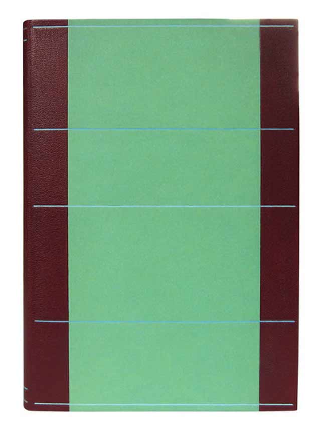
    The binding is housed in a green chemise and slipcase. The chemise is decorated with linear tooling across the sides in two shades of blue. The author’s name is tooled in metallic green in the center the spine of the chemise along with tooled lines in matte silver and blue at the head and tail.

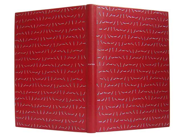
    I first stumbled upon Annette’s work through the Autumn 2012 Newsletter of Designer Bookbinders. The cover offers a detailed image of Annette’s binding Water bound in 2008.

    water-annettefriedrich

    The fine binding work of Annette Friedrich is delightful! Her portfolio matures with every new binding as she skillfully depicts the essence of each story with delicate and artistic flair. Read the interview after the jump and come back each Sunday in the month of August for more posts on the work of Annette Friedrich.

    read more >


  6. May // Book Artist of the Month: Susan Collard

    May 2, 2013 by Erin Fletcher

    interlinear-susancollard

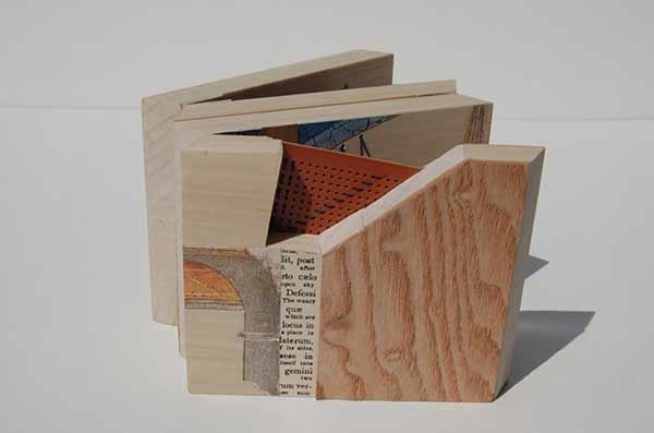
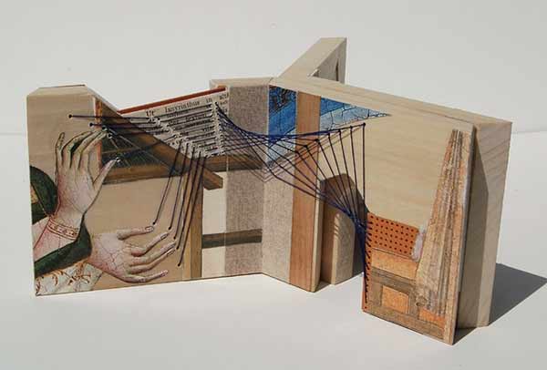
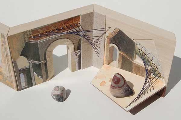
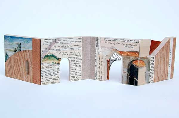
    In 2011, Susan Collard crafted Interlinear, a wooden accordion-like structure collaged with various imagery and texts. I’m particularly attracted to the inclusion of delicate embroidery threads; connecting the illustrations in a playful manner and drawing the viewer’s eye from page to page through doorways and into secret compartments. 

    interlinear2-susancollard interlinear3-susancollard interlinear4-susancollard

    During my first year at North Bennet Street School, the students were invited to aid in the set-up of the Marking Time Exhibition at Dartmouth College. It was here that I first saw and played with Susan’s work. As we gathered around her work, we dropped one of the steel balls to investigate the hidden channels and pathways between each page. 

    Read the interview after the jump. Come back each Monday during the month of May for more posts about Susan’s work, which include in progress photos for A Short Course in Recollection and more detailed images of Camera Obscura

    read more >


  7. Interview on Bookbinding Now

    May 1, 2013 by Erin Fletcher

    bookbindingnowinterview

    I was recently invited to participate in an interview with Susan Mills for her podcast Bookbinding Now, which is a New York-based community podcast posted every other Wednesday. 

    Before the phone interview, I had the pleasure of speaking with Susan about some of her experiences and found out that our ambitions are quite similar. She was very kind and encouraging and I’m delighted to have contributed to her podcast. 

    You can listen to the interview on the Bookbinding Now website or download it through iTunes. Enjoy!


  8. April // Book Artist of the Month: Laura Davidson

    April 2, 2013 by Erin Fletcher

    fortpointtunnelbook-lauradavidson

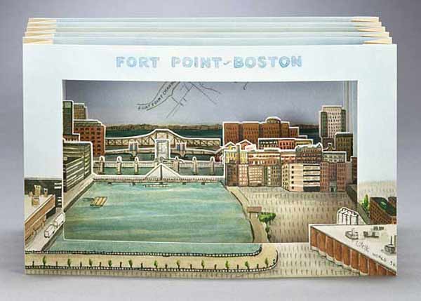
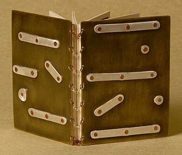
    Fort Point-Boston is part of an ongoing series of tunnel books from artist Laura Davidson completed in 2011. The point of view shows the harbor walk from the Gillette building to the Boston Harbor, passing by bridges and buildings along the Fort Point Channel. Each copy is numbered and signed. Laura’s tunnel books are available through her website or at the Made in Fort Point store.

    I’ve been working in the Fort Point neighborhood of Boston for almost a year now and I’ve already seen changes in the landscape around me. Laura has been in Fort Point for 30 years. After realizing that we are practically neighbors, Laura so graciously invited me to visit her studio. Laura pulled piece after piece out of her display cabinet, allowing me to handle each one. We discussed details of her work from the handmade hinges to the paper mosaics to the various nibs Laura uses to create her drawings. After surveying Laura’s work one can clearly see how her environment both in and out of the studio acts as inspiration. Laura has created several works showcasing her point of view of a neighborhood to which she calls home.

    fortpointflorafauna-lauradavidsonflorafaunadetail-lauradavidson

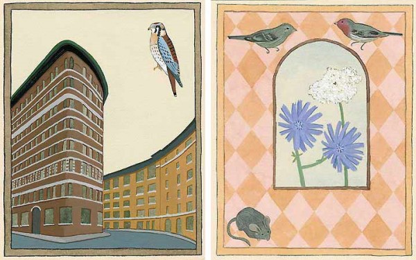
    Fort Point Flora and Fauna is an offset printed accordion book from 2003. One side showcases full color drawings of the various animal and plant-life in the Fort Point area that Laura has observed. The reverse side is sepia toned text giving explanation to the images. I first saw this lovely little book at the FPAC Gallery and it opened my eyes to the idea of nature thriving in the urban environment of Fort Point. Now as I walk around the neighborhood I find myself being greeted by signs of life. Most recently a wild turkey, but I image that was quite unusual.

    fortpointilluminated-lauradavidsonilluminateddetail-lauradavidson

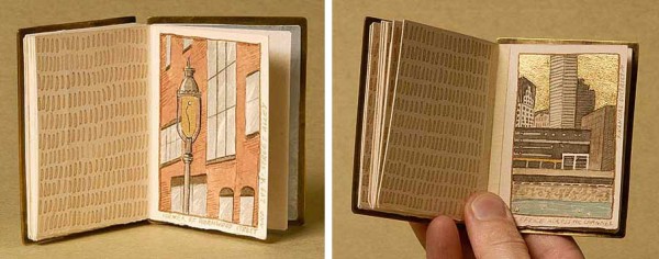
    In 2006, Laura created Fort Point Illuminated, a miniature book filled with images of her neighborhood. Each image is painted with ink and wash and illuminated with gold leaf. The covers are sterling silver with copper and brass elements and is bound with a sterling silver necklace chain. This book is in the Collection of the Boston Athenaeum.

    It was a real treat to meet Laura and get a glimpse of her studio life. An organized and inspirational workshop is conducive to creating successful pieces of art. On one side of Laura’s studio is a completely magnetized wall, where Laura displays old tintype portraits, pieces of ephemera, fragments of her current work and photographs of her family. A magnetized wall is quite appealing and something I may implement in my studio. 

    I want to thank Laura again for inviting me into her studio and sharing stories of her work and life with me.

    Read the interview after the jump and come back each Monday in the month of April for more of Laura’s work.

    read more >


  9. April // Bookbinder of the Month: Derek Hood

    April 1, 2013 by Erin Fletcher

    dumasanddecoster-derekhood

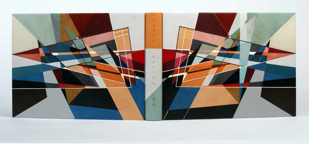
    Dumas/de Coster is a beautiful collection of photographs of bookbindings from 1935-1980. It was published in a limited edition of 100 in Paris for the Librarie Auguste Blaizot in 1981. The catalogue is printed on tinted Romana paper, with 14 color and 19 black and white photographs, signed by both artists.

    Commissioned by a collector, Derek Hood bound this book as a laced-in boards binding sewn on pleister tapes. (I’m not familiar with this term, but Derek describes them as the French type that you can then fray and lace into the boards after sewing.) The individual pages were guarded before sewing. The spine was covered in three separate parts and the boards were attached using the leather over boards technique (also referred to as a Bradel binding), once completed. The top edge is hand gilt in 24kt leaf and the headbands sewn with silk thread.

    dumasdoublure-derekhood

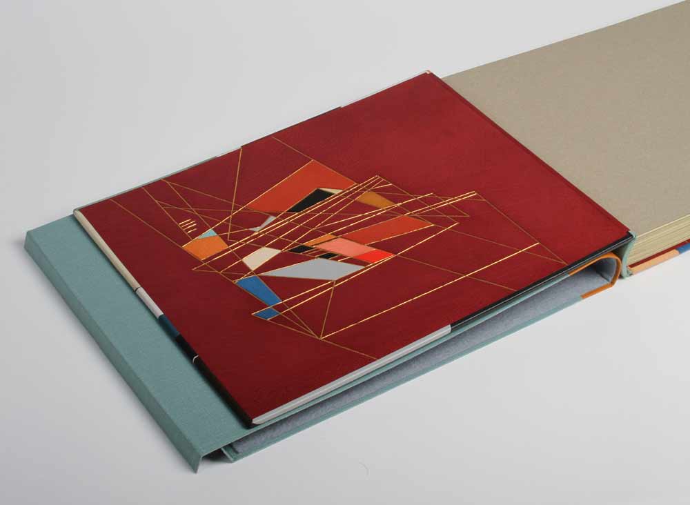
    The endpapers are leather jointed with leather doublures, which are decorated with onlays and gold tooling in a similar manner as the cover design. The book is housed in a quarter leather chemise and a leather entry slipcase. 

    I always look forward to the moment when my inbox receives material for the next interview. As I opened the folder containing images of Derek Hood’s more recent bindings I was struck by the image of this binding. I’m greatly inspired by Derek’s work and was so pleased he agreed to be interviewed on my blog.

    The design of this binding is incredibly complex. The linear and triangular forms along with the range of colors offers intrigue and depth. Derek shares his inspiration and process behind the design.
    The design was abstracted from a pencil landscape drawing by Germaine de Coster. Initially, the whole image was traced in simplistic linear form, outlining the buildings, mountains and sunrays, so that every pencil stroke was essentially accounted for. Areas of interest were then honed and focused on until the main triangular form was realized. The finished piece has only an essence of the original drawing, but it is intended to convey the same idea of sunlight and shadow bouncing off multiple planes whilst crossing a vast landscape.

    In 2006, Derek was elected a Licentiate member of the Designer Bookbinders and assigned Paul Delrue and Lori Sauer as mentors. Derek never formally visited either of them during his licentiateship, but discussed the topics of art and books regularly on the telephone. “I like them and their work a lot. It was nice to have two strong, but totally different perspectives on life within the realms of Designer Bookbinders.” Derek now holds the position of a Fellow in the Designer Bookbinders.

    Read the interview after the jump and come back each Sunday in the month of April for more of Derek’s work.

    read more >


  10. Daily Glimpse: Interview with Josh

    October 31, 2012 by Erin Fletcher

    Josh is my dearest older brother, just 2 years apart. We had a lot of fun growing up together: playing football in the snow, excavating for dinosaur bones, attempting to bake a cake, combating in the world of Mortal Kombat, and on and on. Over the past month, Josh finally set forth a plan that was years in the making. He bravely quit both of his jobs and left the safe haven of Omaha to spend a month hiking in the mountains of Colorado. During this time he also found himself an apartment, a job and towards the tail end of the month moved all of his belongings from Omaha to Denver. I just spoke with him on the phone and he declared Colorado was the place for him, having everything he wants: SPORTS, MOUNTAINS & MUSIC.
     
    INTERVIEW: 
    I want to give my thanks for agreeing to join me on this project.  The first few days were a bit rough with the uncertainty of signal access on your end, but we prevailed and I was able to experience the beautiful wilderness of Colorado while living in my urban environment. Looking back on our collection of photographs, I was hoping we would have more similarities.  Knowing you were hiking around Colorado I tried to impose the sculpted nature of Boston into our photo sets with Day 3 & Day 16, but I think you captured more interesting shots of nature.  What is your overall analysis of the project? 
    I loved the idea of this project and how I was going to be involved in it. For me being away from home for weeks, made it even more interesting. I didn’t know where I was going to be, what I would see and encounter. I was a little worried that it would be an issue to do, for the fact I would be in the wilderness with the chance of no cellular signal. But everywhere i went my iPhone worked. Yeah there were times I had to go walk over to this hill, or over to this cliff, or prop my phone up and point it to the skies. The worst spot was at Molas Lake. That’s were it would only work in two spots. One spot was at the lake where Day 16 picture was taken. That was random. I was walking along and my email’s started pouring in. Perfect time for a picture. Second spot was at my campsite on the picnic table. My iPhone had to be propped up on my book at a 45 degree angle pointing towards the southern sky. I had so many options and ideas for this project. There were so many areas, things, and places that I have never seen. At times i felt I needed to switch things up because all that I was sending was pictures of the mountains. To me though, that’s all i wanted to see and for everyone else to see. That’s what drove me to come out to Colorado. After my solo trip throughout Colorado, I went back to Denver to stay with my buddy. I felt that’s where my pictures didn’t capture my everyday life. Towards the end of the project I finally download Instagram. I wish I did that from the get go. The boring simple everyday life pictures turned out more spectacular using a photo app. 
     
    DAY SIXTEEN 

    We did come across with a few similarities, like the fact that we were both moving into new homes.  Day 23 captures this nicely, I like to imagine that we were dealing with the stress of moving around the same time.  Thoughts on this?
    I thought us moving at the same time was pretty funny. My stress level was probably a lot higher than yours. This was my first big move in my life. I have never lived in another state before. Stressing about driving a u-haul across Nebraska while pulling my car was nerve-wracking but it went pretty smoothly. I think at this point in our lives, we finally feel at home and at a place were we want to be for awhile. 

    Finally, I would like to comment on my favorite photos from the set: Day 5 and Day 24.  In Day 5, you captured the most perfect portrait of yourself (that is definitely the face you make in the morning) and overall we both photographed an enclosed space.  On the other hand Day 24 captures a restful, quiet moment in my life while capturing the complete opposite as you attended a Big Red football game (plus I like the contrast in vibrant colors versus the infamous ‘sea of red’).  What are your favorites from the collection?
    Day 1 was for sure one of my favorites. It was the first time I have attempted a mountain summit all by myself. It was the beginning of this project and felt it was the best start to it. Me and the mountain. Day 23 showed how common and similar our day can be compared to how different our lives and days usually are. Day 24 will be one to remember for the rest of my life. That was the best send off present a buddy could give. That’s all Nebraska has to offer. Big Red football. It was amazing to be there at that time. You were relaxing but I was screaming and jumping up and down with joy.
     
    DAY ONE


    Any final thoughts?
    I would love to do this again. I have so many ideas for this project. I wish I could have used the pictures from my digital camera but I didn’t have my Macbook around at the time. I captured some amazing photos of Colorado. You can tell the difference in both of our iPhone’s. Mine being an older model, didn’t have the sharp, crisp look of what your iPhone could do.   

  • My name is Erin Fletcher, owner and bookbinder of Herringbone Bindery in Boston. Flash of the Hand is a space where I share my process and inspirations.
    The StudioNewsletterInstagramEmail me
  • Archives