RSS Feed

Posts Tagged ‘helene jolis’

  1. Bookbinder of the Month: Lang Ingalls

    March 16, 2014 by Erin Fletcher

    FantasyAndNonsense-LangIngalls

    The exhibition showcasing design bindings of the Tryst Press edition of Fantasy & Nonsense has been mentioned a few times on the blog. I first discussed the exhibition with my own submission, then again when I featured the work of Coleen Curry and Mary Uthuppuru. The book itself is a compilation of works by the American poet James Whitcomb Riley paired with beautiful wood engravings by Berrot H. Hubrecht. Each of the exhibitors really captured the whimsy of the poems and illustrations, transforming each binding into a unique object.

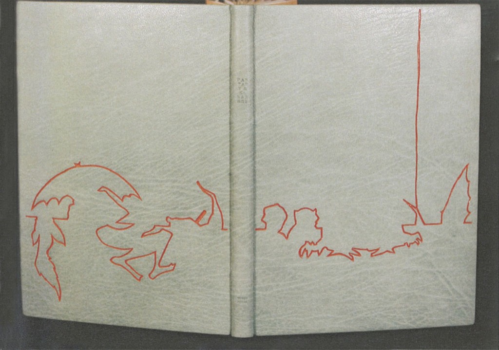
    Lang Ingalls‘ binding of Fantasy & Nonsense is no different in this respect. Her simple yet elegant design extracts the illustrations and complies them to form an intriguing landscape across the open binding. Lang created the binding in 2012 for the exhibition which was hosted by the Rocky Mountain Chapter of the Guild of Book Workers and displayed at the J. Willard Marriott Library at the University of Utah. Bound in the French technique in full light blue goatskin. The linear design was painted with acrylic inside a pulled leather line. Other design elements include colored head edge, custom paste paper endsheets and hand tooled title in blind on the spine.

    I love the color palette on this binding. Even though I had the opportunity to view this binding in person, I was stumped by how you created such a fine line of color in the leather. Can you talk about the technique you employed in this binding?
    This is one of the techniques I learned form Hélène Jolis — it is called an incision line. You actually cut the two sides of the line with a scalpel, remove the leather and paint with acrylics (yes, you need a paintbrush with only three bristles!) inside the line. I advise an optivisor for the work…
  2. July // Bookbinder of the Month: Coleen Curry

    July 1, 2013 by Erin Fletcher

    lacouleurduvent-coleencurry

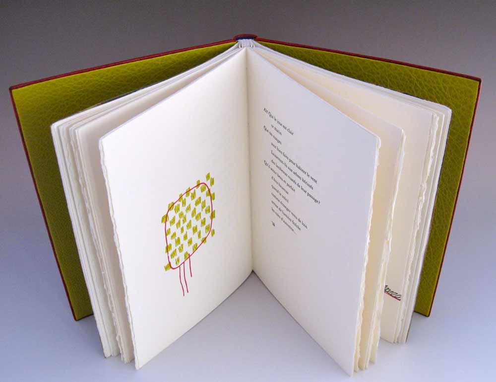
    Coleen Curry was amongst the talented bookbinders who participated in the ARA-Canada exhibit La Couleur du Vent, an international design binding exhibition starting in Paris before traveling to Quebec in September 2013 and then Montreal in November 2013. La Couleur du Vent is a collection of poems by Gilles Vigneault, illustrated and designed by Nastassja Imiolek under the artistic direction of Cécile Côté. If it sounds familiar, I posted about this exhibition during last month’s interview with Sonya Sheats

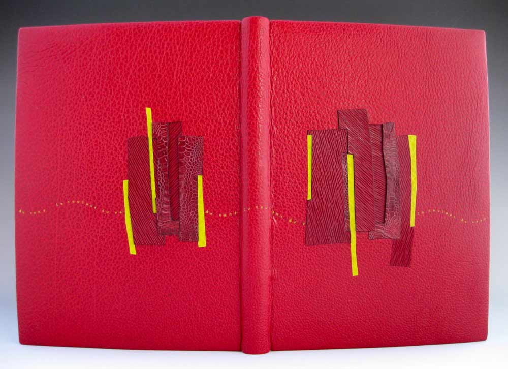
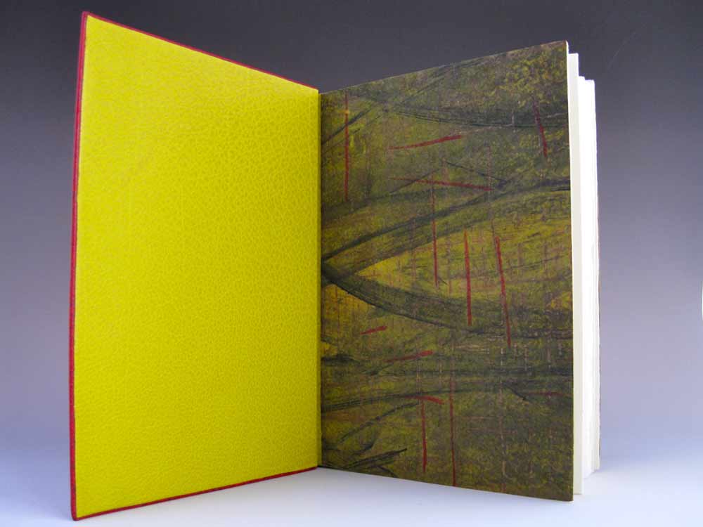
    Coleen bound this copy of La Couleur du Vent as a ‘Montage sur onglets’ style so the prints would not get lost in the gutter. The term ‘Montage sur onglets’ refers to the signatures being sewn on stubs to release them from the confines of the gutter and offering a less restricted opening. Sewn on cords with laced-in boards, the book is bound in red water buffalo with chartreuse water buffalo edge to edge doublures. Exotic leather inlays of varying depths decorate the front and back covers. Title tooled with gold foil. The flyleaves are decorated papers made by Coleen. 

    A brief explanation about the design from Coleen:
    The colors match the prints in the book.  I took some of the shapes from the prints and altered them to create a feeling of blowing in the wind and to create movement.

    lacouleurduvent2-coleencurry lacouleurduvent3-coleencurry

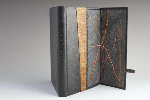
    Coleen’s work has been on my radar ever since I came across her binding of Toni Morrison’s A Mercy at the Chicago Public Library’s exhibition One Book, Many Interpretations in 2011. I attended the opening reception not only because I love design bindings, but to see my own binding of Arthur Miller’s The Crucible. This was the first time I had a binding on exhibit and I was quite honored to be on display with so many other talented binders.

    A Mercy by Toni Morrison bound by Coleen Curry

    A Mercy by Toni Morrison bound by Coleen Curry

    Coleen’s work masterfully mixes traditional leathers with some non-traditional textures such as exotic leathers, agate, and horsetail (to name a few). But I am more attracted to Coleen’s brilliant use of color; either by adding pops of color, subtle hints or just out-right all-over bold color palettes. 

    Read the interview after the jump and come back each Sunday in the month of July to view more gems from Coleen’s portfolio.

    read more >


  • My name is Erin Fletcher, owner and bookbinder of Herringbone Bindery in Boston. Flash of the Hand is a space where I share my process and inspirations.
    The StudioNewsletterInstagramEmail me
  • Archives