RSS Feed

Posts Tagged ‘guild of book workers’

  1. Bookbinder of the Month: Coleen Curry

    July 21, 2013 by Erin Fletcher

    fantasynonsense-coleencurry

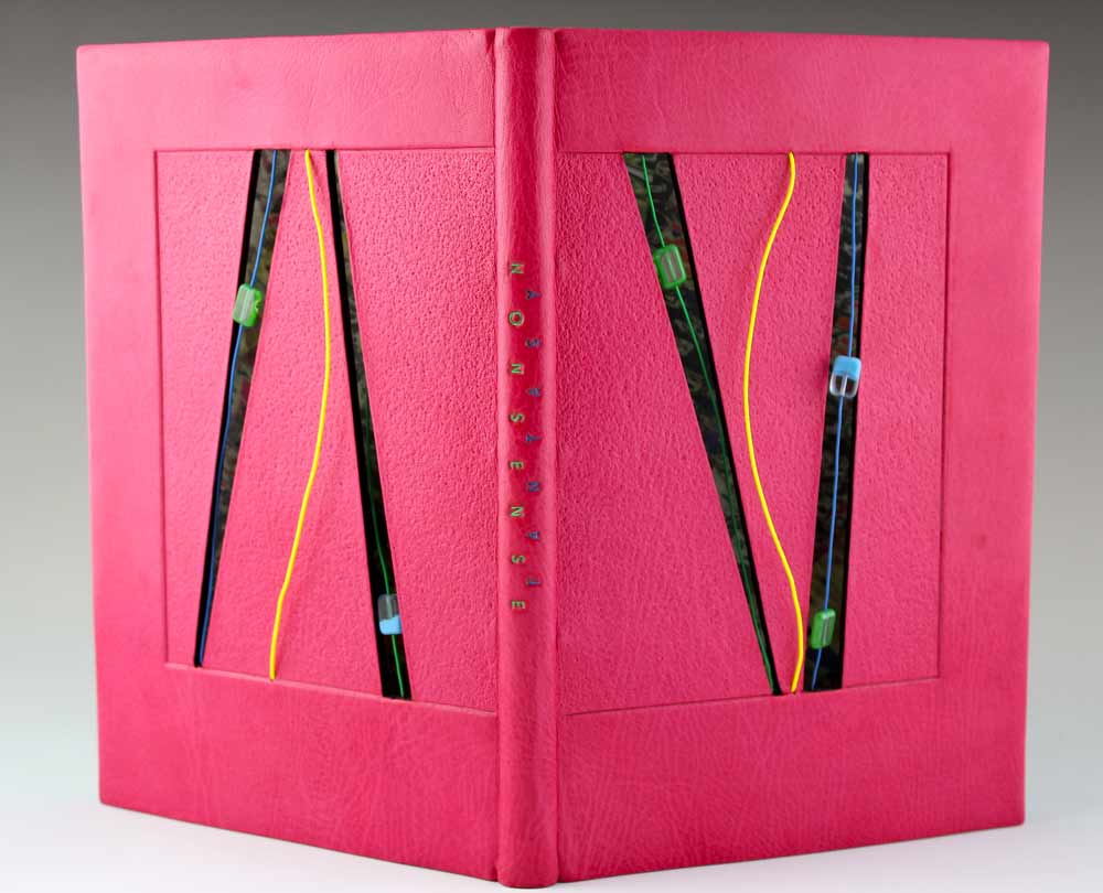
    In 2012, the Rocky Mountain Chapter of the Guild of Book Workers put on a juried set-book exhibition which was held in conjunction with the Standards of Excellence conference at the J. Willard Marriott Library at the University of Utah in Salt Lake City. The set-book, Fantasy and Nonsense, is a collection of poems from 19th century American poet James Whitcomb Riley with peculiar wood engravings by Berrot Hubrecht. The text was letterpress printed on handmade paper in an edition of 230 from Tryst Press.

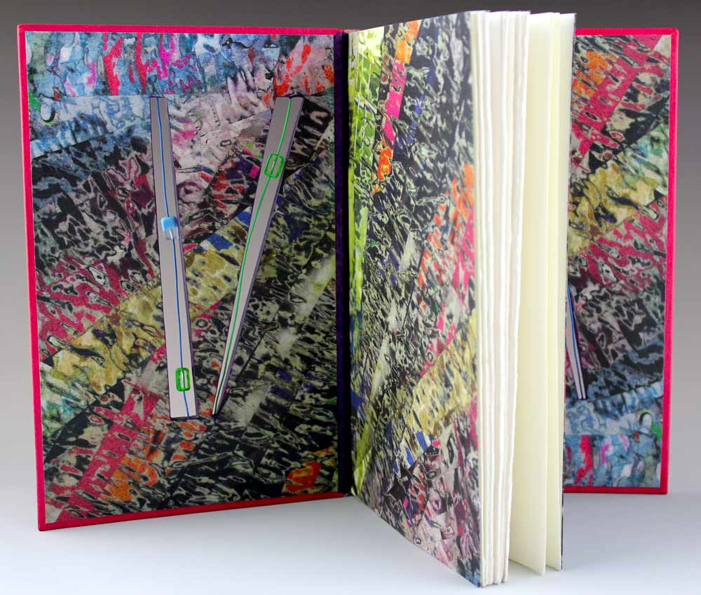
    The first prize went to Coleen Curry’s traditional French-style fine binding covered in a custom-dye pink Harmatan goatskin. Sewn on 4 cords with laced-in boards. The front and back cover cutouts have embedded electrical wires strung with floating glass beads. The decorative endpapers are made by Coleen; a collage made by laminating magazine strips, then sanding and painting the surface. The finished collage was then scanned and inkjet printed onto arches text wove. The bold color palette is a reflection of the whimsical nature of the poems and illustrations.
    fantasynonsense2-coleencurry


  2. Bookbinder of the Month: Coleen Curry

    July 14, 2013 by Erin Fletcher

    desertdreams-coleencurry

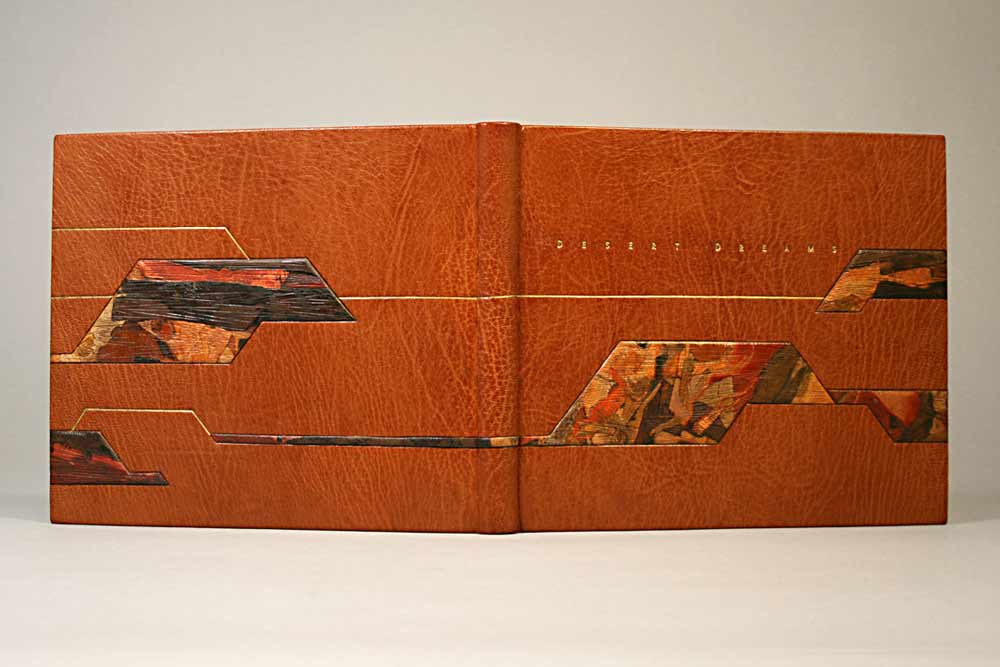
    West of the Plains was a juried exhibition put on by the Rocky Mountain Chapter of the Guild of Book Workers between 2008-09. Coleen Curry submitted two fine bindings to this exhibition, Desert Dreams by Lawrence G. Van Velzer with illustrations by Peggy Gotthold and Grand and Sublime Scenery by W.W. Elliot. 

    In 2008, Desert Dreams was bound as a traditional French-style fine binding, sewn on 5 cords with laced-in boards. Bound in Harmatan goatskin with matching doublures and suede fly leaves. Lacunose-style sanded leather raised onlays decorate the covers. Blind and gold leaf tooling, title is hand tooled with golf leaf. The head edge is gilded. The binding is housed in a clamshell box lined with ultra suede and covered in ‘Duo’ cloth using magnets for closure. A colored agate slice decorates the box cover. 

    Coleen was inspired by the vast mesa in Utah. While she drives to Telluride from California, she often travels through an area of Utah called the Paradox Valley. The colors on the binding are that very mesa. Coleen is excited about the lacunose technique because it so easily creates a feeling of landscape and motion. 

    Laura Wait acted as an exhibit juror and wrote quite the review of Coleen’s work: “Californian Coleen Curry’s binding “Desert Dreams”, is perhaps the finest example of traditional French binding in the show, with leather doublures, suede flyleaves and raised onlays. It also opens well!”


  3. Bookbinder of the Month: Coleen Curry

    July 7, 2013 by Erin Fletcher

    grandandsublimescenery-coleencurry

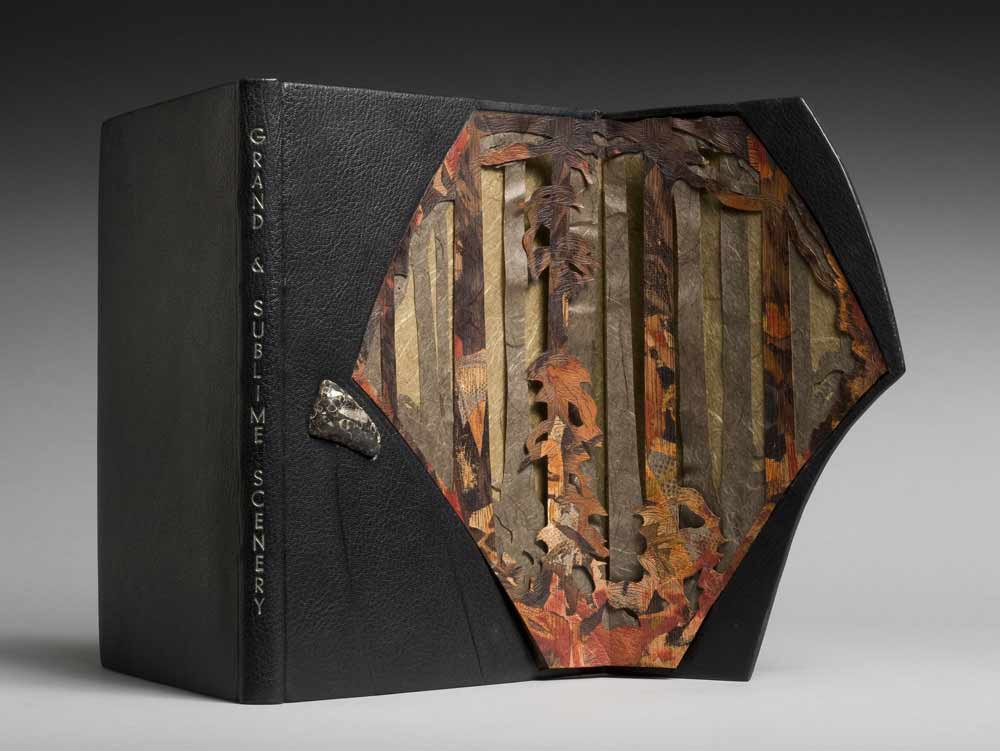
    W.W. Elliot’s Grand and Sublime Scenery was bound by Coleen Curry in 2008 as a French-style fine binding, sewn on cords with lace-in boards. Covered in black Morocco goatskin with matching edge to edge doublures; cover has an embedded Colorado agate. The head edge is decorated with graphite and title is hand-tooled in palladium. 

    The book is about the grandeur of the Sierra Nevada, which inspired Coleen to create a structure that would excite awe and showcase the timeless expanse of the landscape. The front cover panel is held in place by magnets and opens three-quarters outward to reveal elements of rock and giant redwood trees. The interior panel is designed with a layer of blind tooled lacunose (sanded leather) and two layers of Japanese paper.

    In 2009, Coleen’s binding was selected for the Guild of Book Workers traveling juried exhibition Marking Time. The exhibition traveled throughout the country until March 2011.


  4. July // Book Artist of the Month: Ellen Knudson

    July 2, 2013 by Erin Fletcher

    americanbreedingstandards-ellenknudson

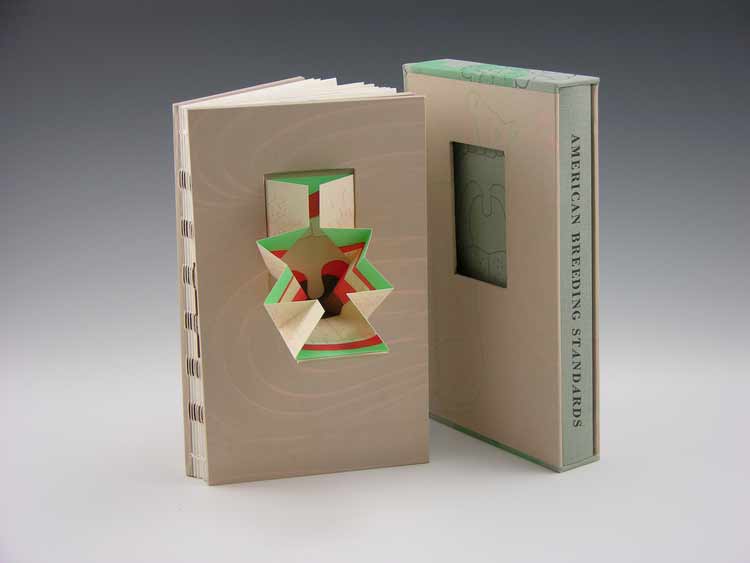
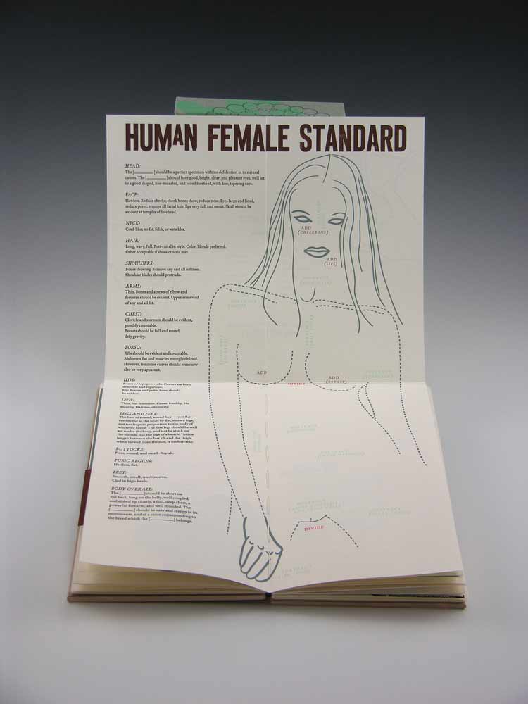
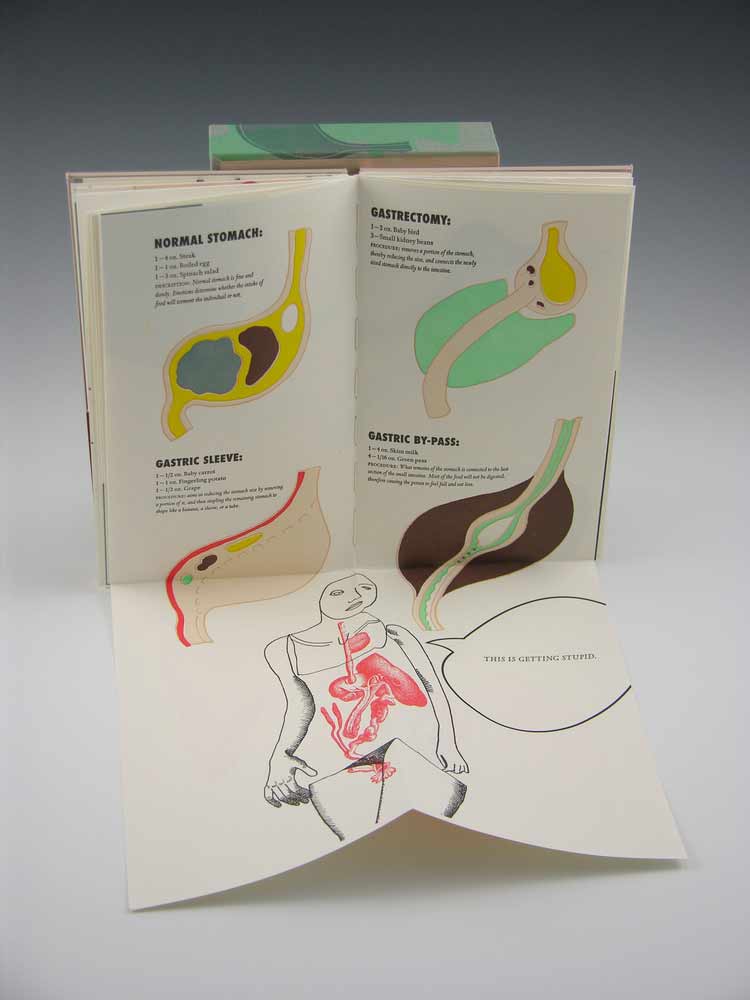
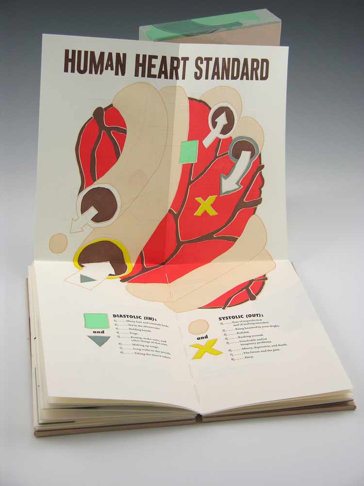
    American Breeding Standards is the most recent work from Crooked Letter Press run by book artist and graphic designer Ellen Knudson and was produced in an edition of 60 in 2012-2013 in Gainesville, Florida. This artist book explores the systemized rules about what comprises a good or bad horse, a good or bad woman — and the steps one might take to achieve the breed standard.

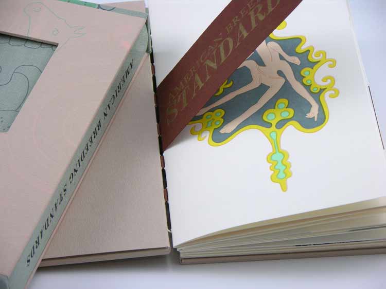
    American Breeding Standards was designed and letterpress printed on Zerkall Book paper. The illustrations and text are printed from photo-polymer plates and handset metal types. Some text excerpted from American Horses and Horse Breeding (John Dimon, 1895) and Canine Breeding Standards of the German Shepherd (American Kennel Club, 2012), while the rest of the text and illustration are by Ellen.

    The binding structure is an exposed spine sewn on Cave Paper tapes and attached to paste paper covered boards. The cover of the book has a hinged pop-up that folds out. There are also 3 additional foldout pages throughout the book.

    americanbreedingstandards2-ellenknudsonamericanbreedingstandards5-ellenknudson americanbreedingstandards3-ellenknudson americanbreedingstandards6-ellenknudsonamericanbreedingstandards4-ellenknudson

    While setting up the Marking Time exhibition for the Guild of Book Workers at Dartmouth College, I came across Ellen’s piece Self-Dual (How to Walk a 30,000 Mile Tightrope). By the way, I’ll be featuring this book in a post later this month. The prints featured in this artist book are beautifully illustrated and printed in rich and muted earth tones. The book was favorably executed as the dos-a-dos style binding. 

    I’m excited to present this interview with Ellen and to post a portion of her work throughout the month of July. Ellen has such a versatile design sense, offering a range of artist books so throughly executed. Read the interview after the jump and come back each Monday in the month of July for more posts on Ellen Knudson.

    read more >


  5. Bookbinder of the Month: Sonya Sheats

    June 23, 2013 by Erin Fletcher

    pictorialwebster-sonyasheats

    Photo by Brandon Constant.

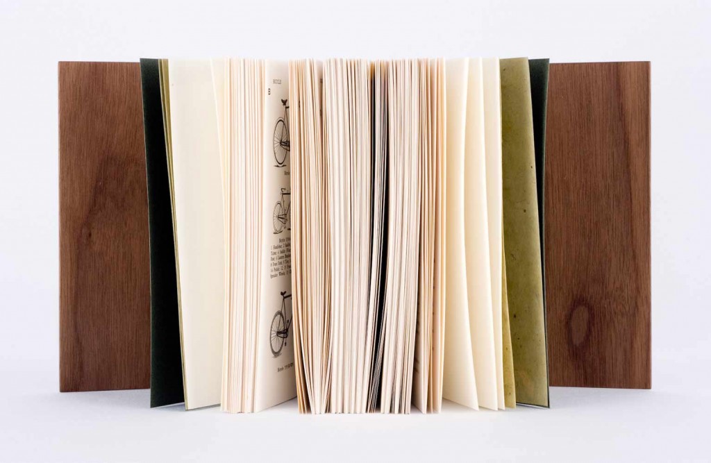
    In 2010, the New England Chapter of the Guild of Book Workers exhibited a series of juried design bindings for Johnny Carrera’s Pictorial Webster’s: A Visual Dictionary of Curiosities. As a project that began in 1996, Carrera patiently sifted through a collection of around 12,000 engravings from the Merriam-Webster Company that are now housed in Yale’s Arts of the Book Press room in hopes to create a visual dictionary inspired by the Illustrated Webster’s. Carrera’s Pictorial Webster became available to the public as a trade edition in 2010. Original letterpress copies were bound in several different styles from full leather to oak boards to full cloth. Additional copies were left unbound and made available to bookbinders.

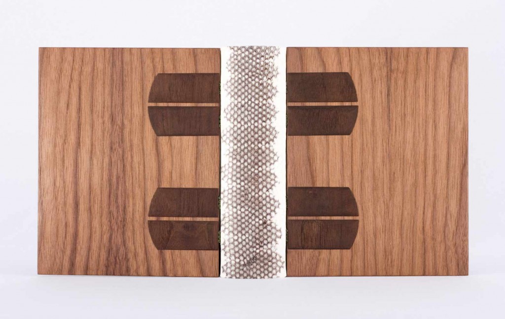
    Sonya Sheats was amongst the binders selected for the NEGBW exhibit deFINEd BINDINGS hosted at the Bromfield Gallery in Boston, MA. Bound as an open joint binding and sewn on water snakeskin and vellum tapes. The spine is white and black snakeskin and the covers are MDF and walnut veneer with dyed walnut onlays. The binding fits snuggly inside a shaped walnut slipcase. Sonya’s binding was awarded “Best Binding Structure” by North Bennet Street School

    A comment from Sonya regarding the structure of the binding: 
    Looking back, I do not think I would use an open joint structure on a book this thick. The covers essentially hang off of the book by the sewing tapes, which are hidden in a sort of de Gonet style with the dyed wooden onlays. Because of the hefty appearance of the walnut, I think it works here, but in general, I think of this structure as quite delicate and lanky. 

    pictorialwebster2-sonyasheats

    Photo by Brandon Constant.


  6. Book Artist of the Month: Susan Collard

    May 13, 2013 by Erin Fletcher

    shortcourse-susancollard

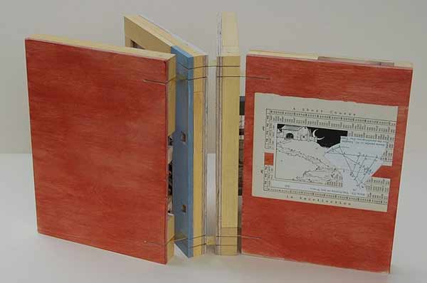
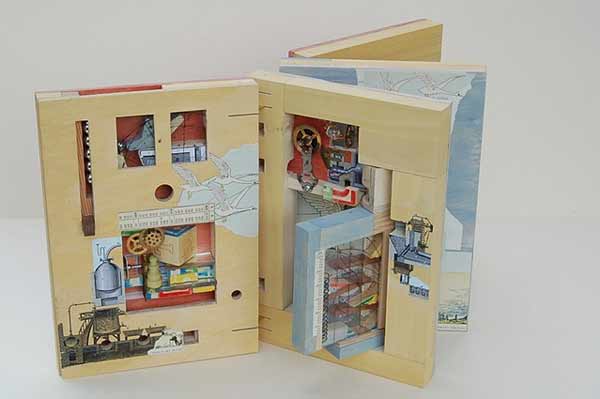
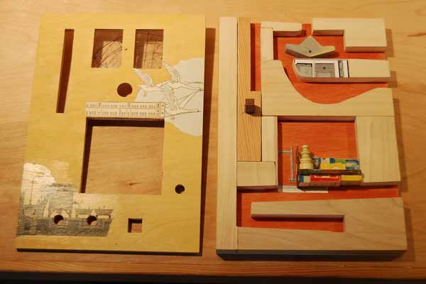
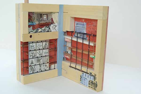
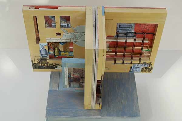
    A Short Course in Recollection was built by Susan Collard in 2009 for the Guild of Book Workers national exhibit Marking Time and through this book I was introduced to Susan’s work. Although the book may appear fairly plain on the outside, the interior pages are an inch thick in order to house a series of ramps and switchbacks. Susan began with her fascination of children’s toys built of ramps and towers. This literal marking of time in a direct, mechanistic, clattering fashion appealed to Susan (as did the technical challenge of interpreting that into a book).

    shortcourse2-susancollard

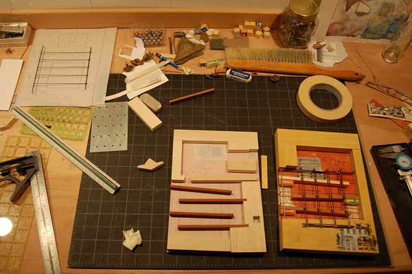
    At the top left of the first page is a vertical slot where the steel marbles are fed into the course. A blue toggle switched to the left stales the first marble upon its decent. The next marble will knock the toggle to the right and both marbles will move forward into the course on different paths. This toggle trick was inspired by woodworker, Matthias Wendel, who builds complex and ingenious marble machines. Susan approached the design of Short Course just as many artists do, by considering her materials first. In order to reduce any awkward bulkiness to the book, Susan choose steel marbles that are smaller then normal (about 7/16″). The ramps are made from ½” poplar and the face of the pages are aircraft plywood. The pages are bound together with slotted brass hinges. 

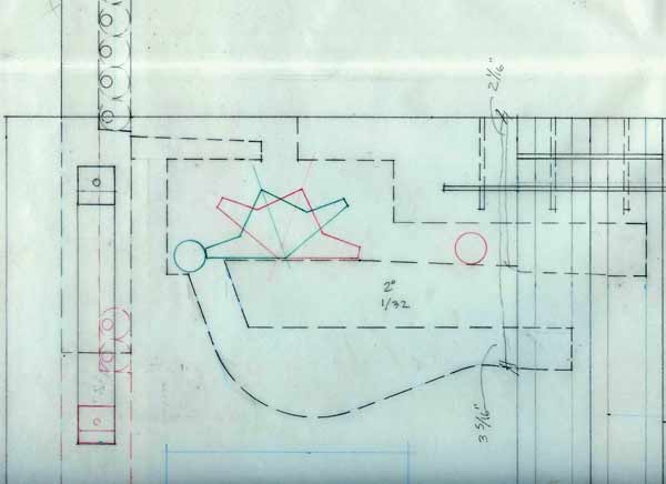
    Susan drafted full-size diagrams of the pages and made a cardboard model to aid in the building of Short Course. This is more planning that usual for Susan and all aesthetic elements came in after the pages started taking shape and the title of the book was chosen. 

    shortcourseprocess3-susancollardshortcourseprocess-susancollard shortcourseprocess2-susancollardshortcourse4-susancollard

    The third and fourth pages are more open, where the steel marbles can navigate more reliably. The marbles that fall to the right of the first toggle switch come down a ramp above the sleeping girl’s head, then hit a second toggle switch at her feet.

    The book can only function in one position, with the pages butted together tightly so the marbles can travel freely between them. There are three distinct courses, regulated by two toggle switches. The mechanism of the book does work, but rather temperamentally and can be viewed as a metaphor for memory. Some marbles will travel the course flawlessly, while others get hung up between pages, jump a guardrail or cause a traffic jam. As Susan so elegantly says “it seems easy to extend the metaphor to include these accidents of blockage and retrieval. Perhaps the book, as is, is a better representation of our own flawed memories than if it worked reliably every time. Which is not to say I wouldn’t fix it in a heartbeat if I had the ability. Probably my favorite thing about this book was integrating more childish elements (the fairy tales, alphabet blocks, even the colors of the milk paint) with the very intricate mechanisms and depictions of machinery—as if to suggest childhood is a serious and convoluted endeavor, or that understanding the world requires great leaps of nonsense and whimsy.” 

    shortcourse3-susancollard


  7. Online Exhibit // New England Chapter of the Guild of Book Workers

    May 12, 2013 by Erin Fletcher

    bookartstudiohandbook-mckeyberkman

    bound by McKey Berkman

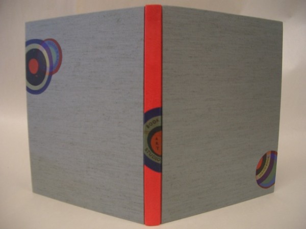
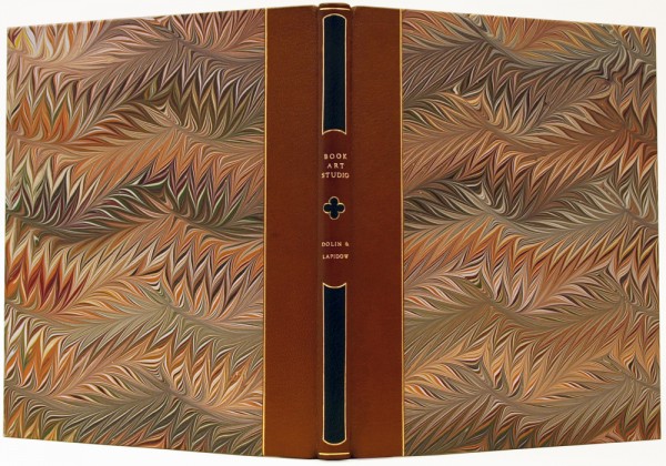
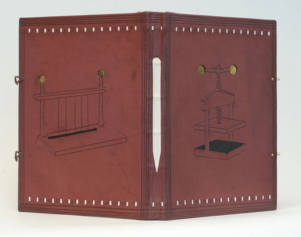
    Members of the New England Chapter of the Guild of Book Workers recently bound copies of Book Art Studio Handbooka practical guide to bookbinding co-written by Amy Lapidow and Stacie Dolin. This handbook is filled with great tips on setting up a studio, buying tools and plenty of projects that vary in complexity and skill. 

    OLYMPUS DIGITAL CAMERA

    bound by Samuel Feinstein

    hebard_students

    bound by Barbara Hebard and students at Boston College

    hanmer

    bound by Karen Hanmer


  8. Horizon: Online Catalog

    March 5, 2013 by Erin Fletcher

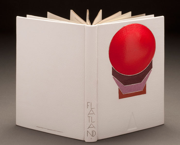
    Flatland-ErinFletcher

    After waiting patiently for months, the catalog for the Guild of Book Workers Traveling Exhibition: Horizon is now online!! I am so honored to be apart of this show, exhibiting with other binders and book artists whom I respect. Here are a few of my favorites from the show:

    1. I love the dyed goatskin and layered elements which include painted lizard on Coleen Curry’s Tamalpais Walking
    2. I am always amazed by the work of Mark Esser. His craftsmanship is always executed perfectly: William Anthony, Fine Binder
    3. Ever since I visited Karen Hanmer at her home bindery where she graciously allowed me to handle her work, this book has been one of my favorites: Horizons… Capri
    4. Horizon, Where Earth Meets Sky bound by Priscilla Spitler, whom I believe is one of the best at executing pictorial designs out of leather and other materials
    5. 42nd Parallel bound by Wendy Withrow is such an elegantly designed book on a theme we can all relate

    I also had the delight of being exhibited alongside three of my classmates from North Bennet Street School:
    1. Flatland: A Romance of Many Dimensions bound by Erin Fletcher (that’s me)
    2. The Silmarillion bound by Heather Bain
    3. Dance of Death bound by Samuel Feinstein
    4. Hiroshima bound by Rebecca Koch


  9. My Hand…Flatland: A Romance of Many Dimensions

    August 6, 2012 by Erin Fletcher

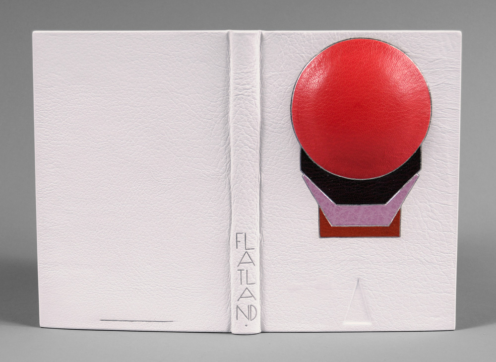
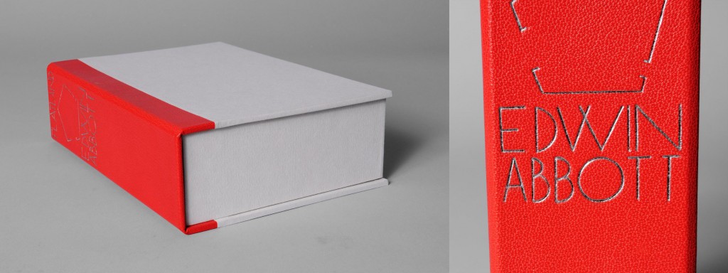
    This fine binding of Flatland: A Romance of Many Dimensions by Edwin A. Abbott was completed for the Guild of Book Workers National Traveling show ‘Horizon‘.  The show opened on June 8th at The Great Hall at the Margaret I. King Special Collections Library in the University of Kentucky and will soon be traveling to the Utah Museum of Fine Arts in Salt Lake City for the grand opening of the Standards Seminar on October 11, 2012.

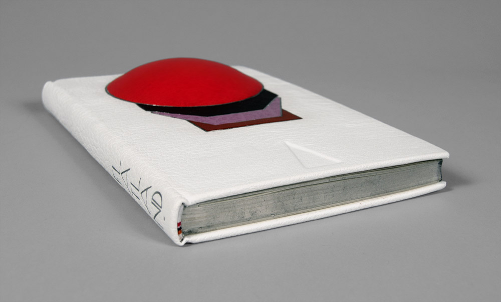
    I choose Flatland (not only because it’s one of my favorite science fictions novels), but I wanted to challenge myself by creating a 3-dimensional cover for the binding.  Abbott’s novella is an observation on the social hierarchy of Victorian culture set in a fictional 2-dimensional world known as Flatland whose denizens are geometric figures which defines their place in the social ladder (women are depicted as lowly lines).  Readers are guided through the text by a Square who dreams of other dimensions and challenges the authority of the high class Circle.  As you move around the book, a sphere begins to emerge from the cover, illustrating the Square’s discovery of the third dimension.

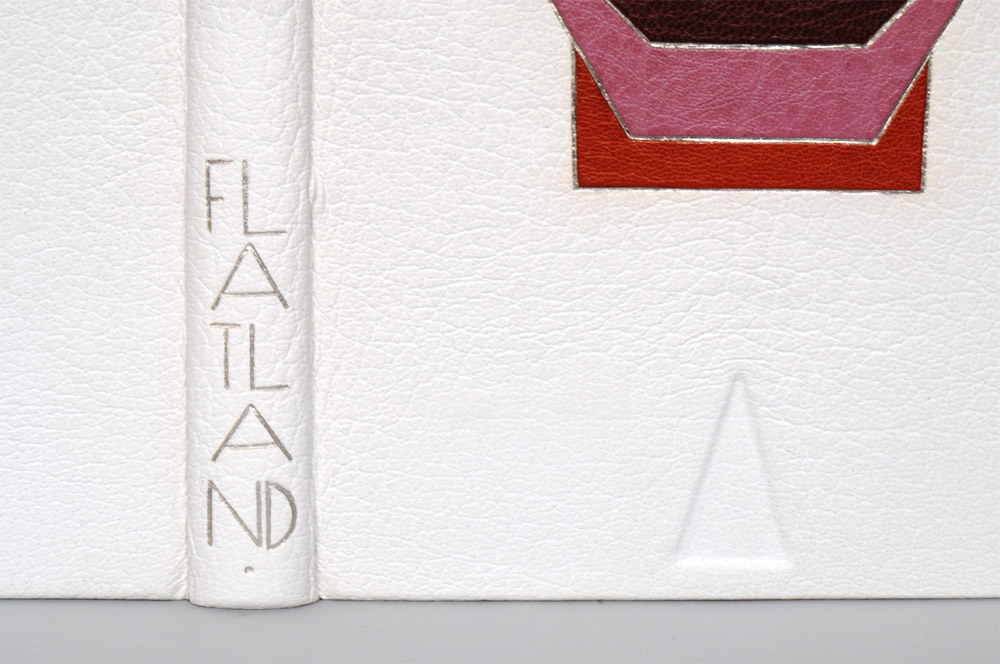
    The book has been bound in white buffalo skin, while the shapes are tooled onlays of both goat and buffalo with palladium outlines.  A plastic lens was mounted to bass wood to give the right dimension for the sphere and adhered to the front board before covering.  The order of the shapes was taken from the hierarchy listed in the book, while the layout was greatly inspired by Art Deco bindings of the early 1900s.  The edges of the text block are gilt with Palladium leaf over a base of graphite; headbands have been sewn to mimic the color pattern created by the shapes.

    The title was tooled with palladium using a series of line palettes and gouges to create a custom font.

    At the beginning and end of the text block a pop-up of a cube is revealed representing another opportunity to transform a 2-dimensional object into a 3-dimensional one.  The book is housed in an elaborate enclosure, in order to protect the raised area of the cover a spacer was constructed with a circle cutout.  The spacer is lined with leather and white suede on the side facing the book and paper on the other.  A chemise lined with white suede encompassed the spacer and book.  All three components rest inside a leather spine clamshell box.  The title and an image of the Flatlander’s home are tooled on the spine of the box.


  • My name is Erin Fletcher, owner and bookbinder of Herringbone Bindery in Boston. Flash of the Hand is a space where I share my process and inspirations.
    The StudioNewsletterInstagramEmail me
  • Archives