RSS Feed

Posts Tagged ‘fine binding’

  1. Bookbinder of the Month: Derek Hood

    April 28, 2013 by Erin Fletcher

    ulysses-derekhood

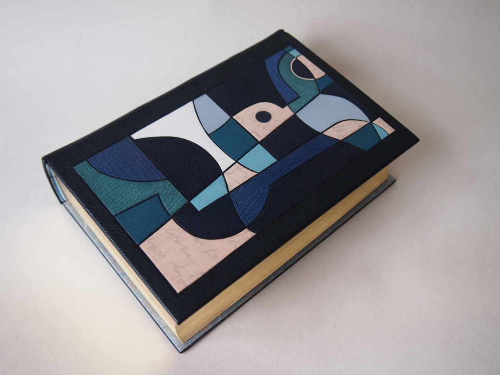
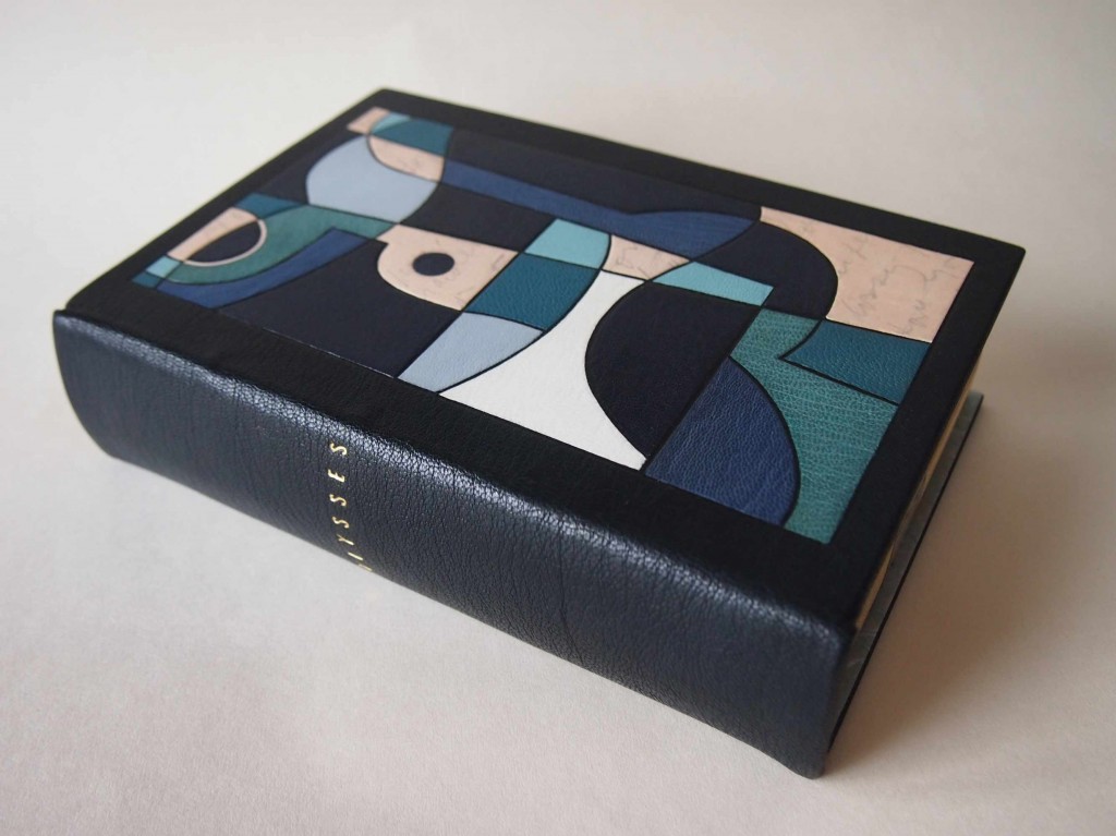
    In 2012, Derek Hood bound a copy of James Joyce’s Ulysses in full dark blue goatskin with onlays and inlays in various leathers. Printed on natural calfskin (and used as onlays) are excerpts from Joyce’s recently released handwritten manuscript of Ulysses. The book was sewn on hemp cords, which were laced into the boards. The book edges are gilt in 24kt leaf, as is the title on the spine. Endpapers are leather jointed, with Japanese Kozo doublures.

    A hand drawn map of Leopold Bloom’s Dublin by Vladimir Nabokov inspired the design. It follows Bloom’s heady journey, starting from Dublin Bay and meandering across the Liffe. The simple map is intertwined with two fractured Greek masks.

    This first edition copy of Ulysses was published by Random House of New York in 1934. 
    ulysses2-derekhood


  2. Bookbinder of the Month: Derek Hood

    April 21, 2013 by Erin Fletcher

    lookslikenothing-derekhood

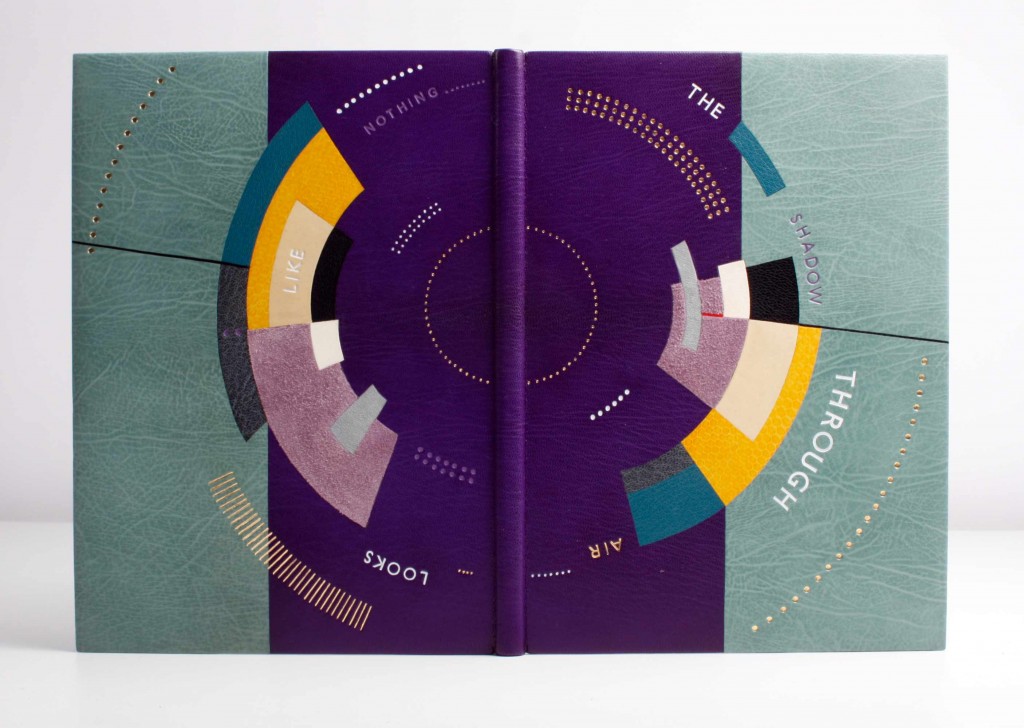
    Looks Like Nothing The Shadow Through Air was published by Circle Press in 1972 in a limited edition of 175. Letterpress printed in Times Roman on T.H. Saunders mould-made paper, the content is previously unpublished poems written by Larry Eigner between 1960-1969. The edition includes illustrated relief prints by Ronald King. 

    Derek Hood covered the binding in multiple inlaid leathers including suede, calf and snakeskin. The top edge is hand gilt in 24kt gold leaf. Lettering is tooled in white, purple and 24kt leaf. Endpapers are leather jointed with Japanese Kozo paper doublures, which are tooled with purple arcs.

    The cover artwork is a direct response to the poetry of Larry Eigner. The space between the lines, that Eigner creates, say as much to the reader as the words upon them. The circular movement reflects Eigner’s constant referral to the moon, the sun and the interplay of light between the two. The gold dots are used to emulate the keys of Eigner’s 1940s Royal manual typewriter, which he used to type all of his poetry on. The title is lettered around the book to reflect the informal style in which Eigner laid out his poetry on the page.


  3. Bookbinder of the Month: Derek Hood

    April 14, 2013 by Erin Fletcher

    phaedoofplato-derekhood


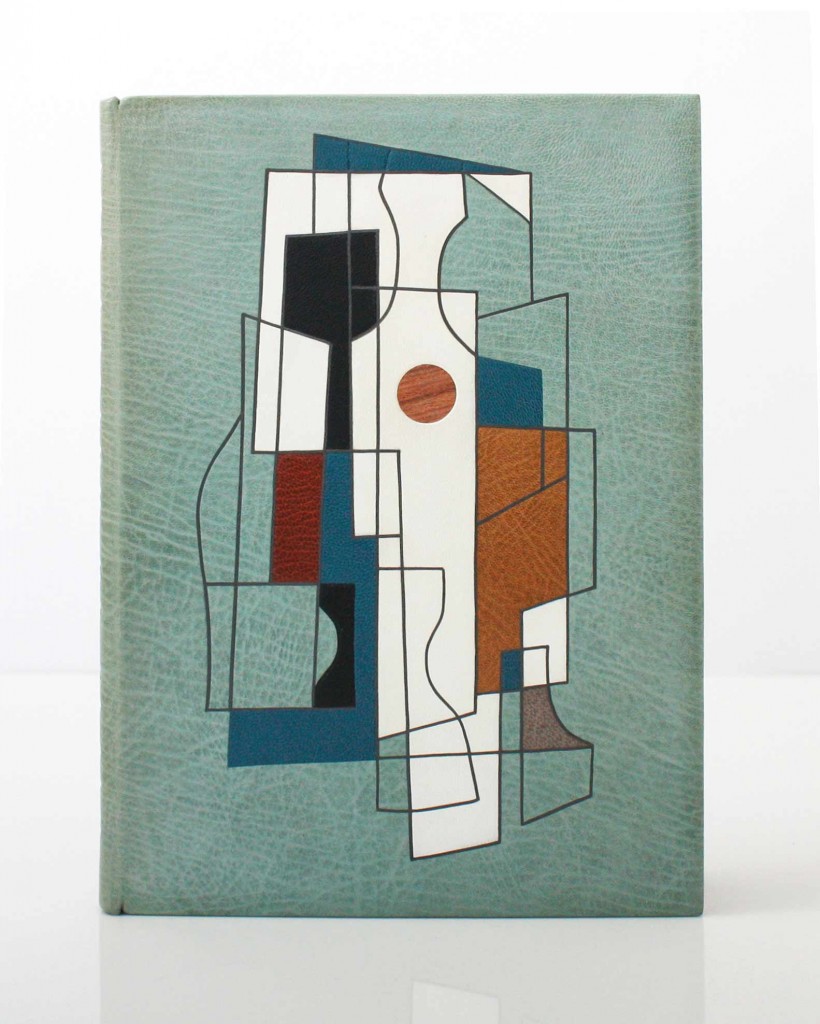
    Published by Golden Cockerel Press in 1930 in an edition of 500, this copy of The Phaedo of Plato is number 392. Written by Plato and translated into English by Benjamen Jowett, this edition also includes ornaments and initial letters by Eric Gill.

    In 2012, Derek Hood bound this copy for the Flow Gallery Exhibition. The binding is covered in light-blue goatskin with inlays of goatskin and alum-tawed calfskin. The outlines are recess onlayed with strips of grey goatskin. The book has Japanese Kozo paper doublures, which are leather jointed. The top-edge is hand gilt with the other two sides left deckled. Titling with Gill Sans hand letters are used in gold on the spine. The binding is housed in a cloth chemise and contrasting slipcase.

    The front cover shows a central abstract figure representing Socrates. The fractured image contains elements of his impending poisoning and transition from this world to the next. The muted palette and use of a wooden sphere are used to echo Socrates’ philosophical obsession with natural order. 


  4. Bookbinder of the Month: Derek Hood

    April 7, 2013 by Erin Fletcher

    revolutioninmind-derekhood

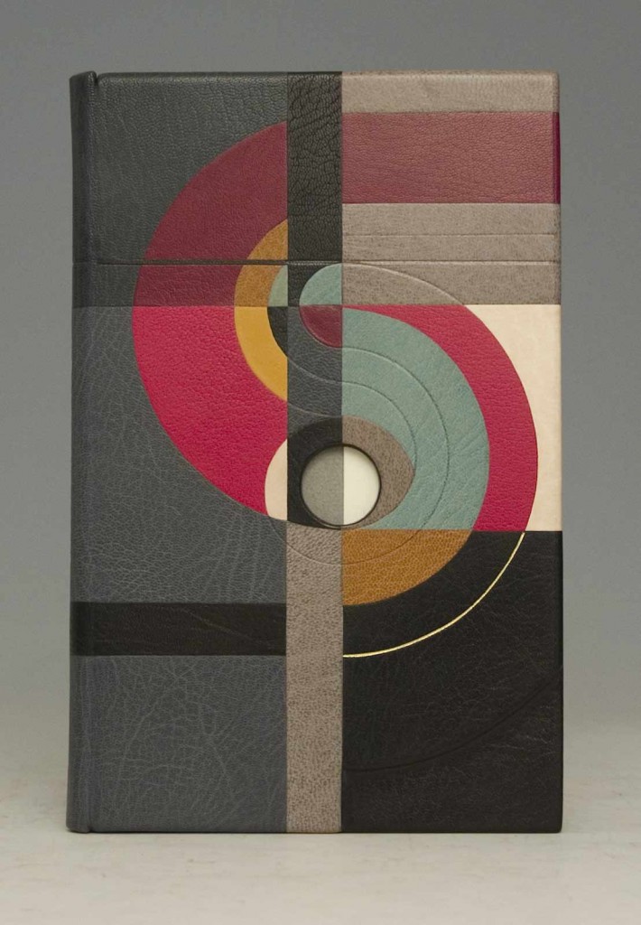
    Revolution in Mind and Practice written by Robert Owen and was published by Effingham Wilson of London in 1849. Derek Hood created this fine binding as a commission for Lord Tom Sawyer as part of an exhibition of 12 books to celebrate 200 years of Socialism. A private viewing of the books was held at the House of Lords.

    Covered in multiple inlays over sculpted boards. The design follows a fluid path based around the letter ‘S’ which represents the word Society and Owen’s revolutionary view of what it could become. The circular movement around the central hole – the minds eye – simulates the flow of his cognitive thought process.


  5. April // Bookbinder of the Month: Derek Hood

    April 1, 2013 by Erin Fletcher

    dumasanddecoster-derekhood

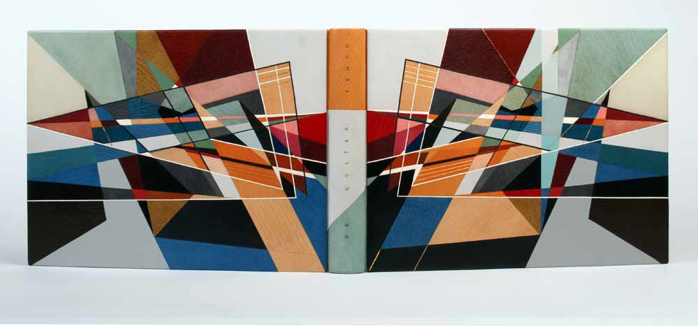
    Dumas/de Coster is a beautiful collection of photographs of bookbindings from 1935-1980. It was published in a limited edition of 100 in Paris for the Librarie Auguste Blaizot in 1981. The catalogue is printed on tinted Romana paper, with 14 color and 19 black and white photographs, signed by both artists.

    Commissioned by a collector, Derek Hood bound this book as a laced-in boards binding sewn on pleister tapes. (I’m not familiar with this term, but Derek describes them as the French type that you can then fray and lace into the boards after sewing.) The individual pages were guarded before sewing. The spine was covered in three separate parts and the boards were attached using the leather over boards technique (also referred to as a Bradel binding), once completed. The top edge is hand gilt in 24kt leaf and the headbands sewn with silk thread.

    dumasdoublure-derekhood

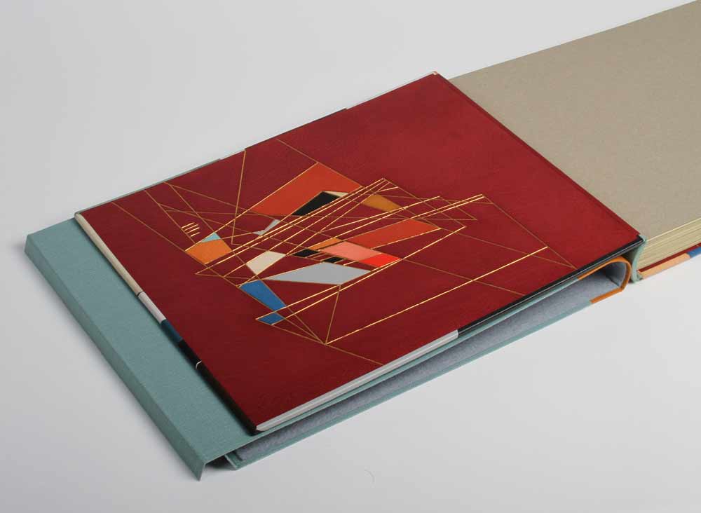
    The endpapers are leather jointed with leather doublures, which are decorated with onlays and gold tooling in a similar manner as the cover design. The book is housed in a quarter leather chemise and a leather entry slipcase. 

    I always look forward to the moment when my inbox receives material for the next interview. As I opened the folder containing images of Derek Hood’s more recent bindings I was struck by the image of this binding. I’m greatly inspired by Derek’s work and was so pleased he agreed to be interviewed on my blog.

    The design of this binding is incredibly complex. The linear and triangular forms along with the range of colors offers intrigue and depth. Derek shares his inspiration and process behind the design.
    The design was abstracted from a pencil landscape drawing by Germaine de Coster. Initially, the whole image was traced in simplistic linear form, outlining the buildings, mountains and sunrays, so that every pencil stroke was essentially accounted for. Areas of interest were then honed and focused on until the main triangular form was realized. The finished piece has only an essence of the original drawing, but it is intended to convey the same idea of sunlight and shadow bouncing off multiple planes whilst crossing a vast landscape.

    In 2006, Derek was elected a Licentiate member of the Designer Bookbinders and assigned Paul Delrue and Lori Sauer as mentors. Derek never formally visited either of them during his licentiateship, but discussed the topics of art and books regularly on the telephone. “I like them and their work a lot. It was nice to have two strong, but totally different perspectives on life within the realms of Designer Bookbinders.” Derek now holds the position of a Fellow in the Designer Bookbinders.

    Read the interview after the jump and come back each Sunday in the month of April for more of Derek’s work.

    read more >


  6. September // Bookbinder of the Month: Sybil Pye

    September 1, 2012 by Erin Fletcher

    Last April, I had the honor of handling not one, but two bindings by Sybil Pye at the Fitzwilliam Museum in Cambridge, England. Her designs are striking with the use simple shapes and minimal color palette. Her execution is immaculate. Once a certified nursery school teacher, Sybil ran a private kindergarten from 1900-1903 until she fell ill.  During this time she began teaching herself bookbinding through the guidance of Douglas Cockerell’s Bookbinding and the Care of Books. Early on in her career she decided on a forwarding style and stuck with it; a rather flat back sewn on raised cords with simple headbands, she never trimmed her text blocks on a plough or guillotine (any necessary trimming was done by hand) and finally her endpapers were usually plain white (which held true to the two examples I saw in England).

    Her earliest known binding is from 1906, during this year she met poet T. Sturge Moore and artist Charles Ricketts, whom she kept as close friends throughout the years using them for design advice and occasionaly borrowing tools from Ricketts. Sybil used a small assortment of simple tools for finishing.  Many of which she designed herself, in Women Bookbinders by Marianne Tidcombe, her collection of tools are shown illustrated (taken directly from her bindings). Up until 1925, Pye had produced around 50 bindings, many included blind or gold tooling, while 18 of them contained inlay work.  At the time the majority of her works were bound in either natural or dyed pigskin with inlays of pigskin or vellum.

    After 1925, she began to work exclusively in goatskin developing the style she is known for today. Her designs are often mislabeled as cubist inspired, but in fact she took many elements from Byzantine art, Charles Ricketts and the architectural drawings of Michelangelo. Her designs appear to be symmetrical with the central axis at the spine, but in fact there are subtle differences between the upper and lower covers.  

    Pye documented every book she bound from the beginning to the end of her career (1925-58), this included a list of 164 bindings.  Her work was exhibited regularly from 1910-46. During the last ten years of her binding career, the quality of her work suffered due to an injury to her wrist that never healed properly. She died in 1958 at the age of 79. 


  7. My Hand…Little Birds

    August 20, 2012 by Erin Fletcher

    In April 2011, I took my first trip out of the country to London.  While I was there I made my way to the Natural History Museum for their touring exhibition of Sexual Nature, a show on the sexual habits of various animal species from the praying mantis to rams to angler fish to humans. I was intrigued and shocked by the facts and imagery presented in the exhibit, particularly the Green Porno shorts by Isabella Rossellini. On my way out I perused the gift shop and decided on a whim to purchase two books by Anaïs Nin (Little Birds and Delta of Venus).

    Both books are a collection of short stories published in the late 1970s posthumously. Written in the 1940s, Nin and a group of writers were given the task of writing erotica for an anonymous private collector. Her erotic shorts deal with various sexual themes, some quite taboo (varying from pedophilia to lesbianism), all the while she maintains a focus on the study of women and her female characters.

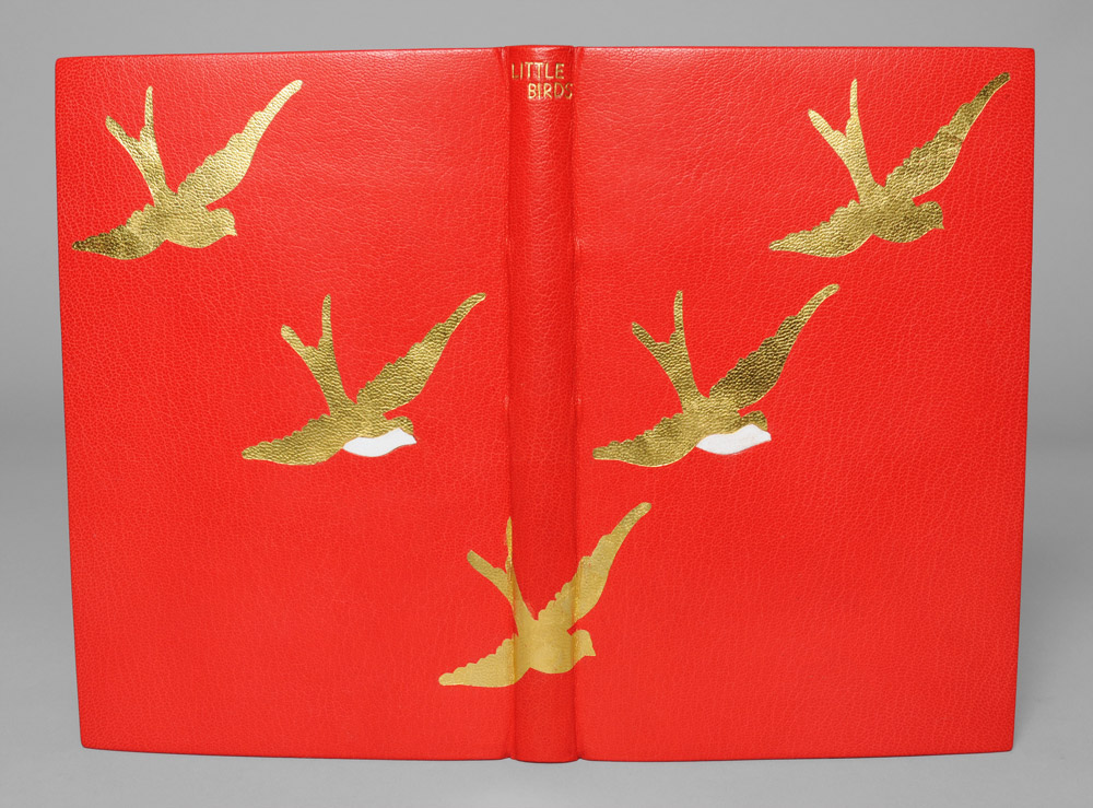
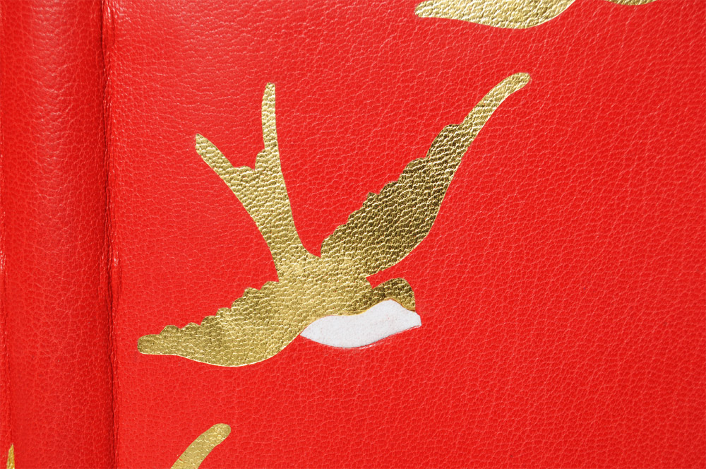
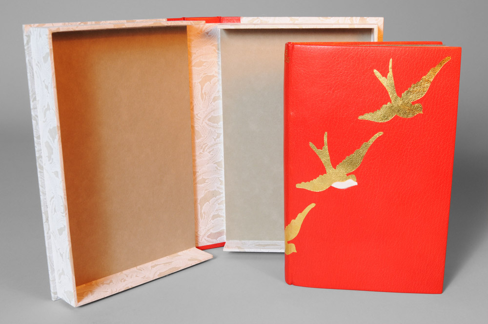
    The cover design for Little Birds was taken from the title pages of the individual stories, a ‘V’ formation of sparrows. I chose a simple color palette for my simple design, red (the color of love and seduction), white (the color of purity and innocence) and gold (the color of luxuriance). The book is bound in full scarlet goatskin leather from Harmatan.  The sparrows are surface gilt in gold leaf with white suede inlays.

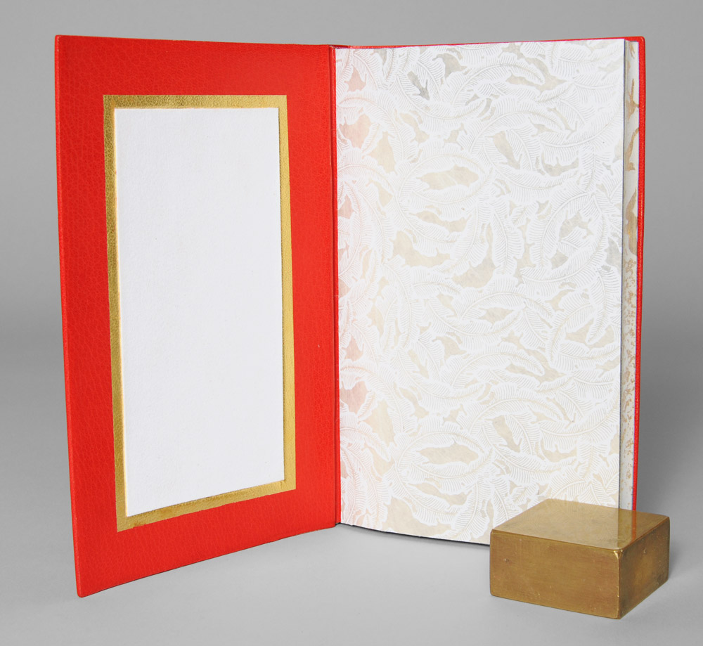
    I covered the inside of each board with a leather edge to edge doublure in the same scarlet goatskin. An edge to edge doublure describes a technique where a thinly pared piece of leather covers the inside of the board, stretching from edge to edge creating a seamless transition from the outside to the inside.  The doublure also stretches over the joint and onto the text block creating a very strong attachment. Along with the leather doublure is a sunken panel filled with white suede framed in surface gilt gold leaf. The fly leaf is a handmade Lokta paper from Nepal, printed with a pattern of white feathers on a natural base.

    The book is housed in a rounded spine clamshell box, using the same materials as the binding. The spine is lined with scarlet goatskin with the title hand tooled in gold.  The case and trays are covered in the same feather pattern Lokta paper and are lined with Hahnemühle Ingres in smoke.


  8. My Hand…Flatland: A Romance of Many Dimensions

    August 6, 2012 by Erin Fletcher

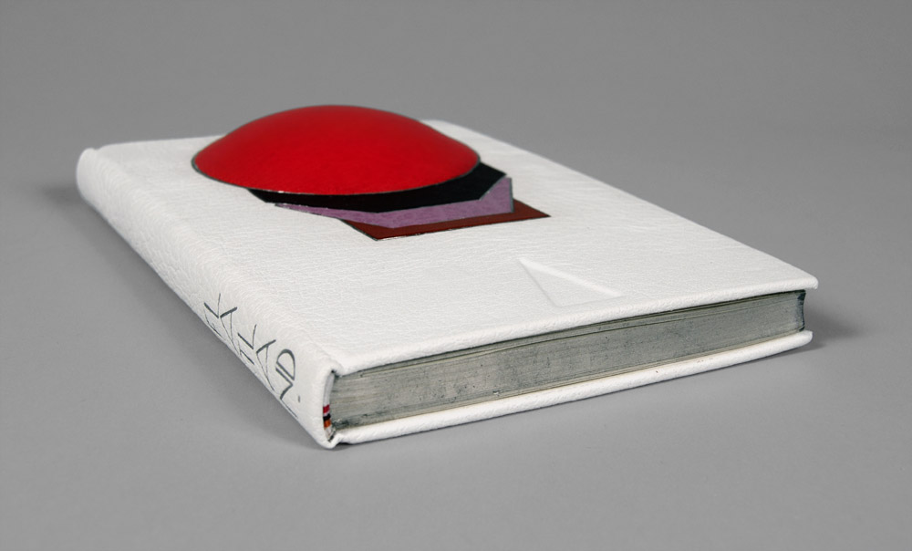
    This fine binding of Flatland: A Romance of Many Dimensions by Edwin A. Abbott was completed for the Guild of Book Workers National Traveling show ‘Horizon‘.  The show opened on June 8th at The Great Hall at the Margaret I. King Special Collections Library in the University of Kentucky and will soon be traveling to the Utah Museum of Fine Arts in Salt Lake City for the grand opening of the Standards Seminar on October 11, 2012.

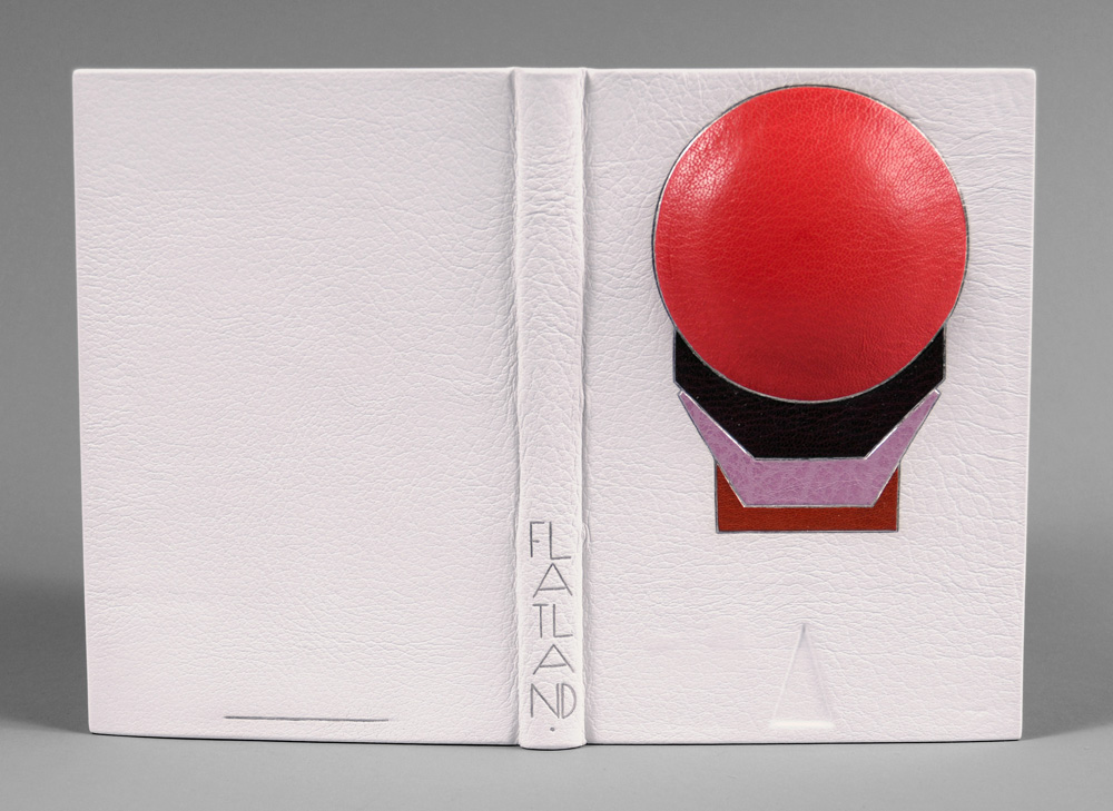
    I choose Flatland (not only because it’s one of my favorite science fictions novels), but I wanted to challenge myself by creating a 3-dimensional cover for the binding.  Abbott’s novella is an observation on the social hierarchy of Victorian culture set in a fictional 2-dimensional world known as Flatland whose denizens are geometric figures which defines their place in the social ladder (women are depicted as lowly lines).  Readers are guided through the text by a Square who dreams of other dimensions and challenges the authority of the high class Circle.  As you move around the book, a sphere begins to emerge from the cover, illustrating the Square’s discovery of the third dimension.

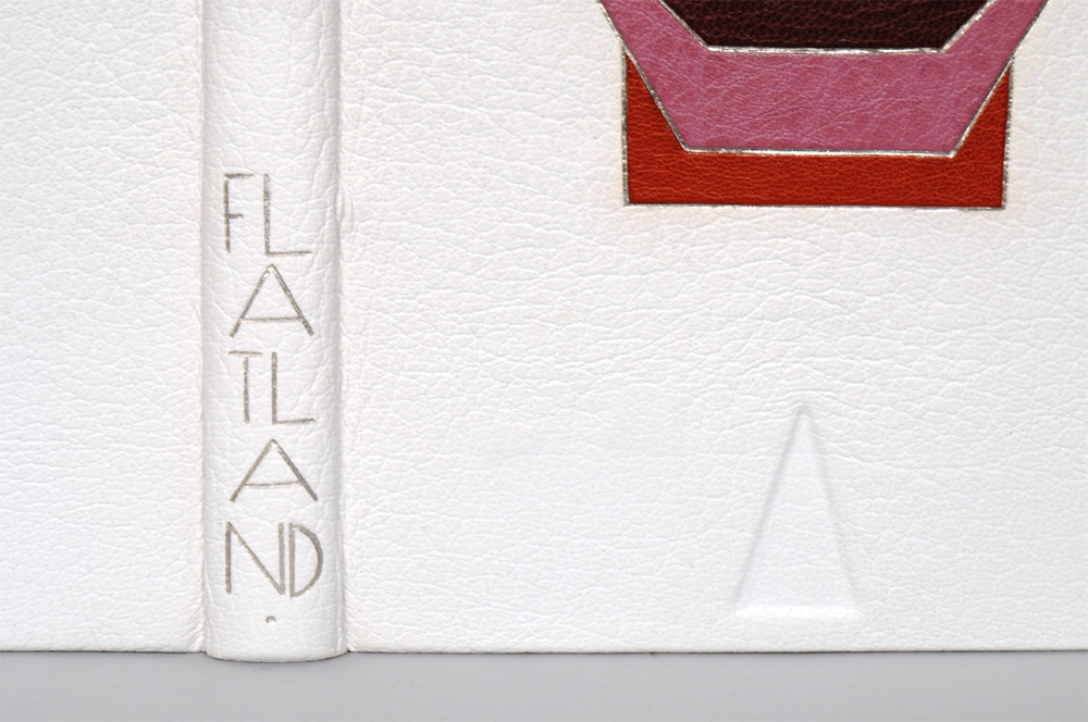
    The book has been bound in white buffalo skin, while the shapes are tooled onlays of both goat and buffalo with palladium outlines.  A plastic lens was mounted to bass wood to give the right dimension for the sphere and adhered to the front board before covering.  The order of the shapes was taken from the hierarchy listed in the book, while the layout was greatly inspired by Art Deco bindings of the early 1900s.  The edges of the text block are gilt with Palladium leaf over a base of graphite; headbands have been sewn to mimic the color pattern created by the shapes.

    The title was tooled with palladium using a series of line palettes and gouges to create a custom font.

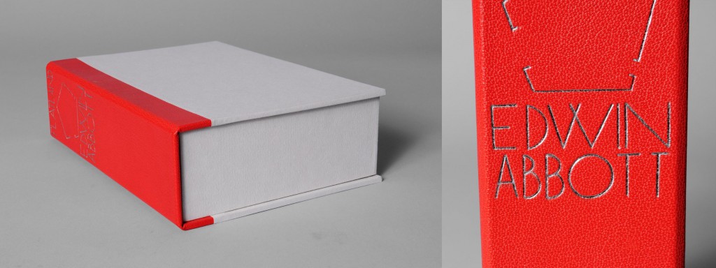
    At the beginning and end of the text block a pop-up of a cube is revealed representing another opportunity to transform a 2-dimensional object into a 3-dimensional one.  The book is housed in an elaborate enclosure, in order to protect the raised area of the cover a spacer was constructed with a circle cutout.  The spacer is lined with leather and white suede on the side facing the book and paper on the other.  A chemise lined with white suede encompassed the spacer and book.  All three components rest inside a leather spine clamshell box.  The title and an image of the Flatlander’s home are tooled on the spine of the box.


  9. My Hand…The Songlines

    July 17, 2012 by Erin Fletcher

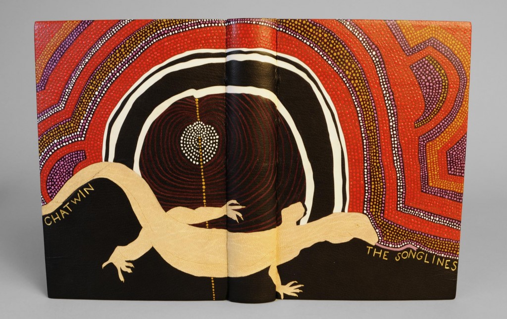
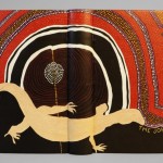
    In the second and final year at North Bennet Street School all students are given the same book in sheets (known as a set book) to complete as a fine binding.  Given complete freedom over the materials and design, the inspiration should be derived from the set book.  This year we bound copies of The Songlines by Bruce Chatwin.

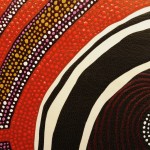
    My main inspiration came from an Aboriginal painting depicting imagery referred to as Dreaming.  At the moment a mother is conscience of conception, the unborn child receives the spirit of a totemic ancestor connected with the location when awareness occurred.  In a general sense, the Dreaming relates to a period before the memory of living creatures, during the time of the creator ancestors and supernatural beings.  The paintings themselves are visual representations of the artist’s individual spiritual beliefs.

    read more >


  • My name is Erin Fletcher, owner and bookbinder of Herringbone Bindery in Boston. Flash of the Hand is a space where I share my process and inspirations.
    The StudioNewsletterInstagramEmail me
  • Archives