RSS Feed

Posts Tagged ‘erin fletcher’

  1. Client Work: Large-scale Coptic with Collaged Paper Covers

    May 14, 2013 by Erin Fletcher

    copticopen-erinfletcher

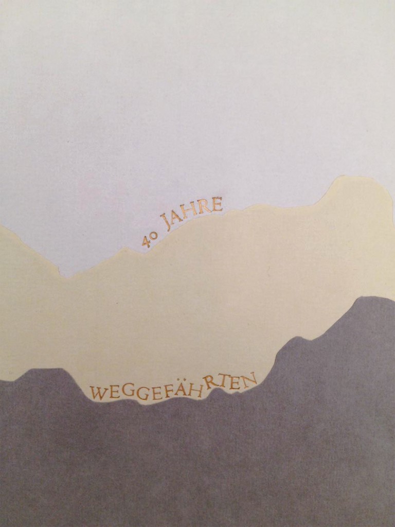
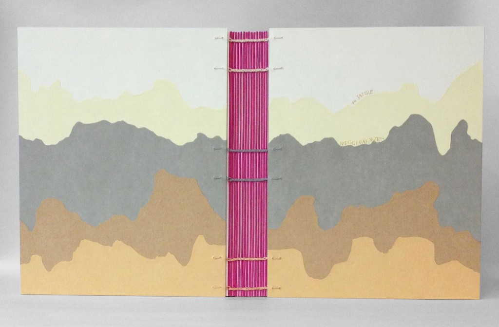
    Weggefährten is a German word that roughly translates to companions. I was approached by my client, Nadja to create a Coptic binding for a series of letters and collaged pages to present as a gift for her partner’s 40th birthday. Each page was submitted by someone who had made a meaningful connection with her partner during the course of his life. The ‘mountainous’ landscape on the covers was chosen by my client from a previous design I had done. She enjoyed the organic quality of the design and how it mimicked the pathways of life.

    When I originally covered a Coptic in this manner, each section would overlap and turn-in at the tail of book. This created a very bulky edge at the tail of the book that was five layers thick as oppose to only one layer at the head. In order to avoid that excessive bulk, I cut each color section to the sized required. Once I drew out the design I was able to trace the shapes onto the paper, building in for turn-ins and a 2mm overlap. I used various shades of Hahnemuhle Ingres to create the design.

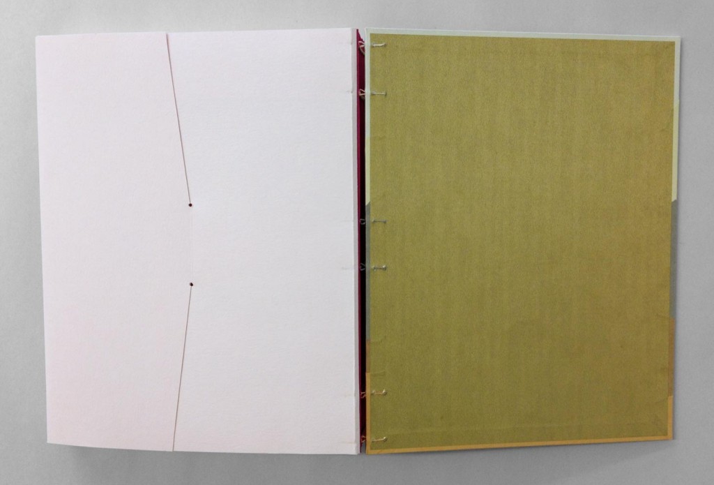
    The Coptic was bound with hand-dyed linen thread to match the shade of Ingres at the six sewing stations.

    copticdetail-erinfletcher

    In addition to Weggefährten, the Coptic was also stamped with the phrase 40 Jahre, which translates to 40 years. The words were individually stamped with brass handle letters to follow the horizon of the pathways. In order to do this irregular stamping on paper, I first trace the line my word will follow onto tracing paper. I place a piece of gold foil onto the cover, then lay down my piece of tracing paper. The hot tool stamps through the tracing paper and the gold foil. I do not remove either layer until the word is complete, this allows me to easily see where to stamp the next letter.

    copticpastedown-erinfletcher

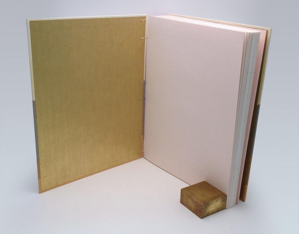
    The color scheme of the book was quite surprising with pops of color and metallics in unusual places. The fold of each signature was highlighted with a bit of magenta Lokta to contrast with the subtle tones of the Ingres. The paste down is a gold metallic paper, which pairs nicely to the pale pink fly leaves.

    copticenvelope-erinfletcher

    In addition to the single pages of letters and collages, was a seven page comic and CD. Using the same pale pink paper as the fly leaf, I included a 4-flap enclosure at the end to house these additional pieces of reverence. The entire book is enclosed inside a magenta 4-flap enclosure for protection.

    It was incredibly enjoyable to work on this project because it was outside my usual flow of work. The client’s reaction was ecstatic as she saw her vision come into being and couldn’t wait to present it to her partner. Check out more Custom Projects at Herringbone Bindery.

  2. Client Work: Clamshell Box for Seven Miniature Shakespeare Books

    May 7, 2013 by Erin Fletcher

    clamshellmini8-erinfletcher

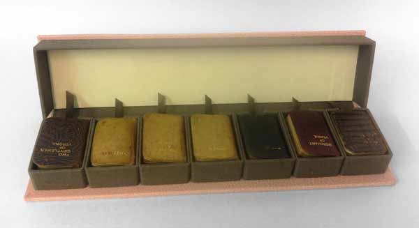
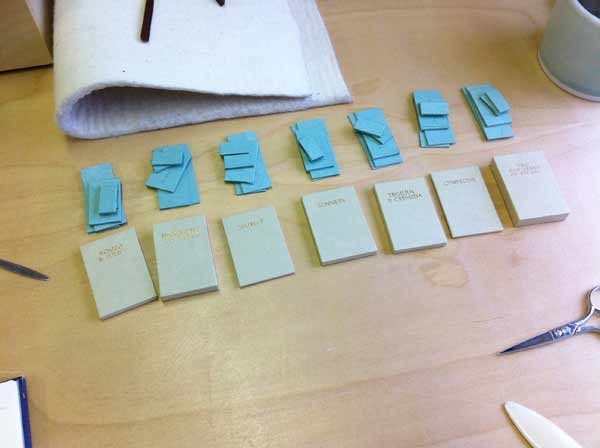
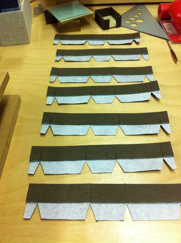
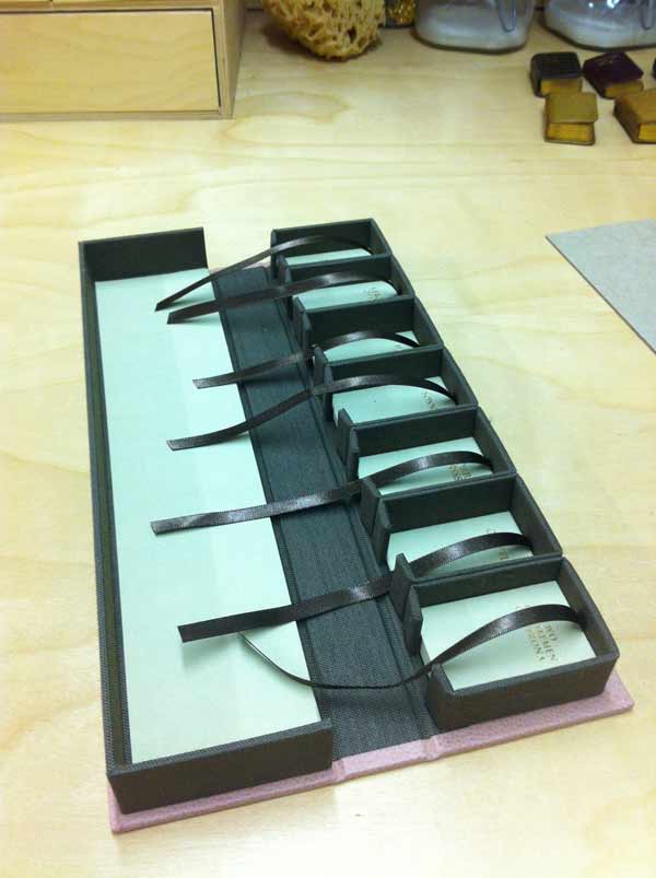
    A client came to me with a set of seven miniature limp-leather Shakespeare bindings in need of a clamshell box. The length of each book was exactly the same, but the width and height varied slightly. As a solution I built individual French trays for each book and assembled them side by side as the A tray for the clamshell box.

    clamshellmini4-erinfletcher

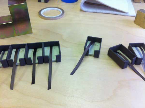
    The French trays were constructed with a single opening at the tail of each book, exposing a piece of satin ribbon. The ribbon was installed for ease in removing each book and to put less stress on the book during this process. When measuring for each French tray, I was less concerned about the width (as I knew they would vary) and the length (as they were all consistent). However, I wanted the French trays to be the same height. Since the books varied from 12mm to 19mm, I adjusted the thickness of the trays by laminating board together so the books would rest at a uniform height.

    Since each French tray would be custom fitted to a specific book, I stamped each title with gold foil on the Hahnemuhle ingres used to line the base of each tray. This would prevent any confusion when replacing the books and to make sure the books rest in their properly fitted tray.

    clamshellmini3-erinfletcher

    The walls were made from millboard and covered with brown Canapetta bookcloth.

    clamshellmini2-erinfletcher clamshellmini`-erinfletcher

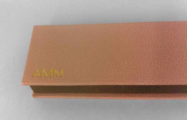
    Once all of the French trays were assembled I was able to measure out the materials for the B tray and the case. The B tray was covered with the same brown Canapetta cloth and lined with earth Hahnemuhle ingres. The exterior of the box was covered with a dusty pink buffalo skin and stamped with gold foil the initials of my client’s wife. As this was to be a gift for Christmas.

    clamshellmini6-erinfletcher

    I was very satisfied with the overall construction and feel of the box, as was my client. I enjoyed the challenge that was presented by this project and working with miniatures was a nice change of pace from my regular line-up. You can see more client work on the Services page at Herringbone Bindery.

  3. Interview on Bookbinding Now

    May 1, 2013 by Erin Fletcher

    bookbindingnowinterview

    I was recently invited to participate in an interview with Susan Mills for her podcast Bookbinding Now, which is a New York-based community podcast posted every other Wednesday. 

    Before the phone interview, I had the pleasure of speaking with Susan about some of her experiences and found out that our ambitions are quite similar. She was very kind and encouraging and I’m delighted to have contributed to her podcast. 

    You can listen to the interview on the Bookbinding Now website or download it through iTunes. Enjoy!


  4. My Hand // Etsy Shop Launch

    March 18, 2013 by Erin Fletcher

    etsyopening

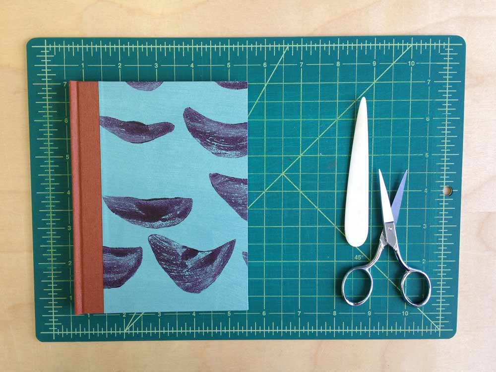
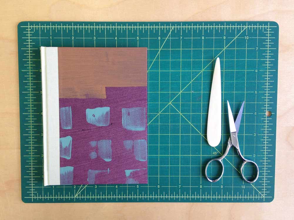
    I’m so proud and excited to announce the opening of my shop on Etsy! In my practice I get to work on a lot of interesting projects under the guide of my clients. The items on Etsy sprang into life during the brief moments of freedom between client work, giving way to personal, limitless flashes of expression. I began with a collection of Lokta papers in a broad range of colors, which inspired the hand-dyed thread on the Coptics and paste papers used for the flatback journals and jotters. 

    Check out my previous post on paste papers. My most favorite pattern is the plum scallops over mint!

    smflatback_purplescallops smflatback_sagebricks

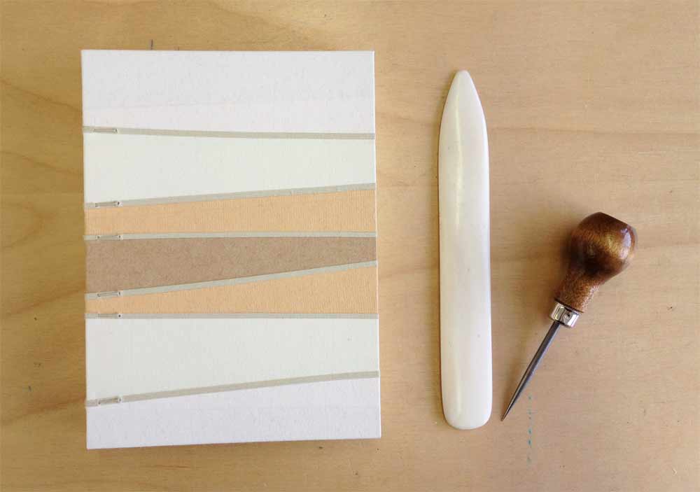
    I’m also a fan of the linear Coptic journals (available in earth tones and blue tones). Inspiration for this design came during my first year at North Bennet Street School from a poster that was hung in front of my bench. The minimalistic design is fresh and enhanced by the soft, muted tones of the Hahnemuhle Ingres. 

    linearearth

    Check out the Herringbone Bindery shop and leave a comment about your favorite product. Thanks in advance!! 


  5. Horizon: Online Catalog

    March 5, 2013 by Erin Fletcher

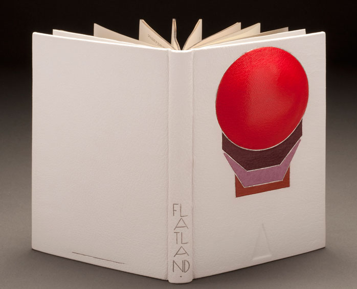
    Flatland-ErinFletcher

    After waiting patiently for months, the catalog for the Guild of Book Workers Traveling Exhibition: Horizon is now online!! I am so honored to be apart of this show, exhibiting with other binders and book artists whom I respect. Here are a few of my favorites from the show:

    1. I love the dyed goatskin and layered elements which include painted lizard on Coleen Curry’s Tamalpais Walking
    2. I am always amazed by the work of Mark Esser. His craftsmanship is always executed perfectly: William Anthony, Fine Binder
    3. Ever since I visited Karen Hanmer at her home bindery where she graciously allowed me to handle her work, this book has been one of my favorites: Horizons… Capri
    4. Horizon, Where Earth Meets Sky bound by Priscilla Spitler, whom I believe is one of the best at executing pictorial designs out of leather and other materials
    5. 42nd Parallel bound by Wendy Withrow is such an elegantly designed book on a theme we can all relate

    I also had the delight of being exhibited alongside three of my classmates from North Bennet Street School:
    1. Flatland: A Romance of Many Dimensions bound by Erin Fletcher (that’s me)
    2. The Silmarillion bound by Heather Bain
    3. Dance of Death bound by Samuel Feinstein
    4. Hiroshima bound by Rebecca Koch


  6. My Hand: Skype Workshop with Benjamin Elbel

    March 4, 2013 by Erin Fletcher

    shrigley2-erinfletcher

    When I was presented with the challenge of binding a book for a set of photography prints that would need to open flat, I sent my former instructor, Jeff Altepeter, an email to help me brainstorm. After discussing a few options, I received another email from Jeff showcasing the upcoming workshops at BINDING re:DEFINED. All of the workshops looked intriguing, but Benjamin Elbel’s Onion Skin Binding and The Shrigley appeared to be suitable solutions for my current project.

    My only problem was being in Boston and wanting to take a workshop in England. I contacted Benjamin through the help of Lori Sauer (who runs BINDING re:DEFINED and will be featured on my blog through the month of March). Benjamin and I decided to experiment and run the workshop through Skype (a recent topic of interest on the Book Arts Listserv).

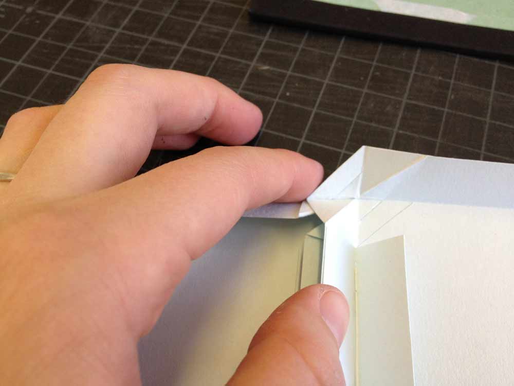
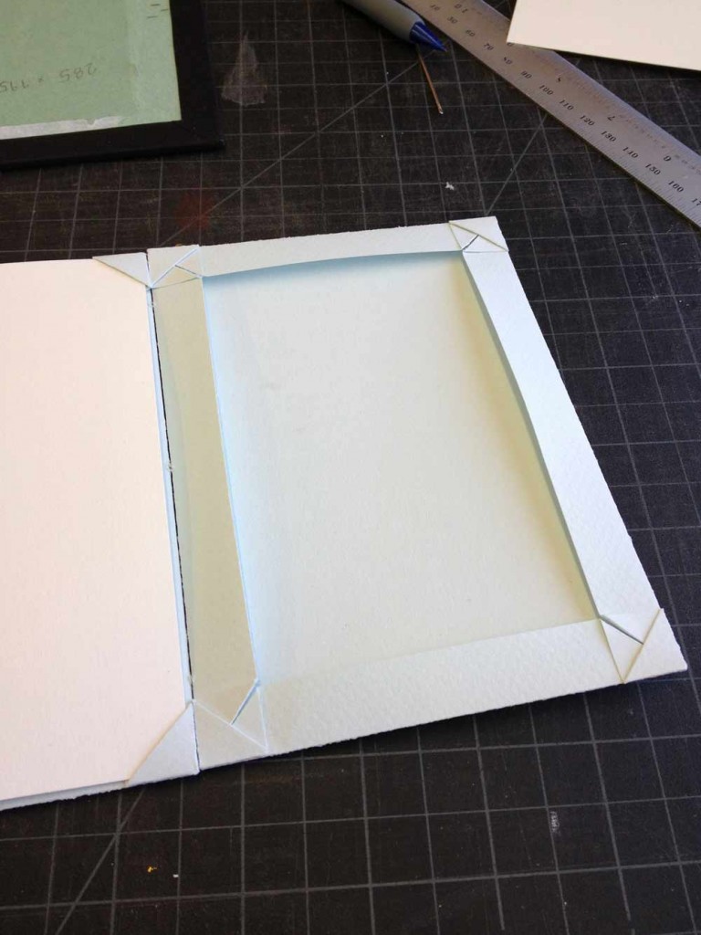
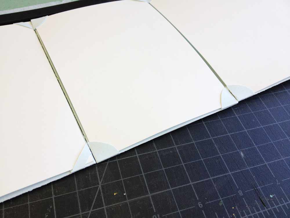
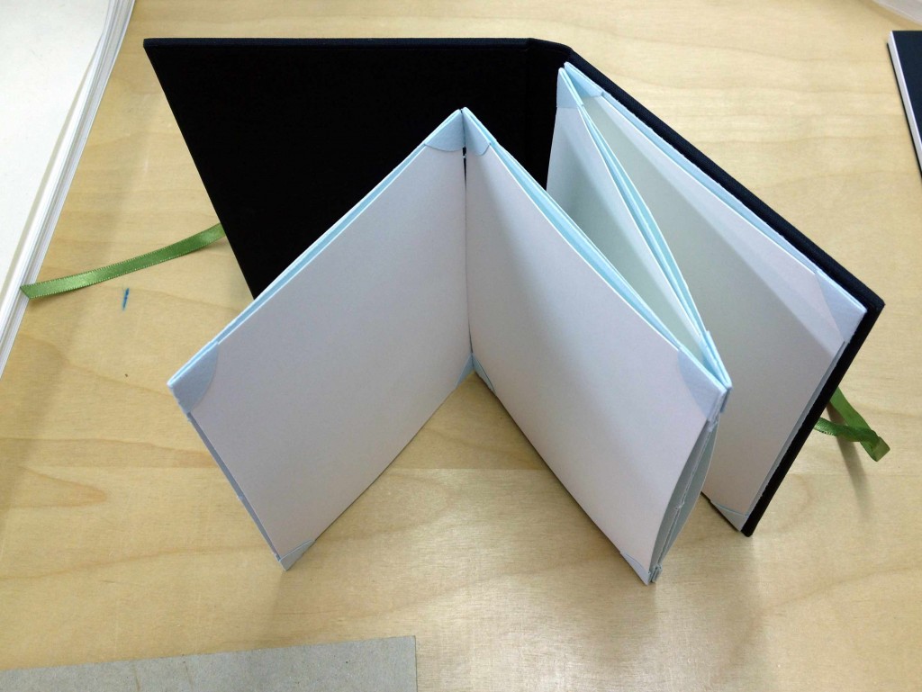
    The workshop was based on The Shrigley structure and ran for 2.5 hours over 2 Skype sessions. The initial session was half an hour long. During this time I received instruction on creating the folded frames and cutting the corners. Benjamin had a camera set-up directly over his workspace and it was incredibly easy to see what he was doing. Our connection never lagged and the video image stayed clear, making it easy for me to read any measurements or notes that Benjamin jotted down. 

    shrigley7-erinfletchershrigley8-erinfletchershrigley6-erinfletcher

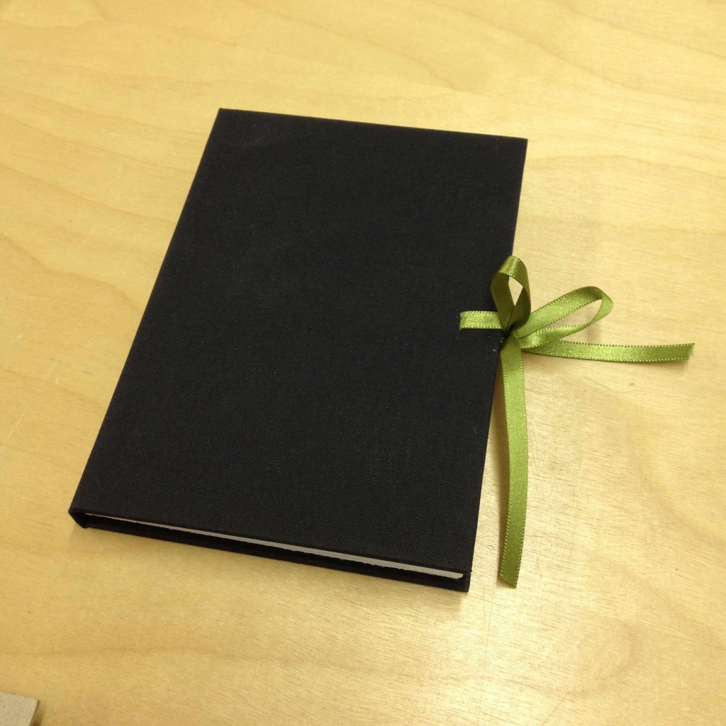
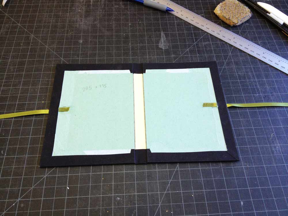
    During our second session, Benjamin walked me through the sewing and a simple hardcover case to house the frames. We did a pamphlet stitch to connect the frames in a concertina style. The case was constructed with two pieces of millboard and a thin, flexible spine piece covered in cloth. Ribbon was inserted into the boards to aid in the closure of the book.

    shrigley4-erinfletcher

    Once the cloth lining was pasted in, the frames could be fixed to the case. Overall, I think the workshop was successful. It was easy for me to follow Benjamin’s instruction. However I had made a mistake while folding my frames, which I didn’t realize until the near end of the workshop. In hindsight, we discussed the importance of reviewing my work before proceeding to the next step. In order to do this with the built-in camera I was using on my laptop, I would have to hover my work in front of the camera and move it around so Benjamin could assess what I had done. 

    shrigley3-erinfletcher

    I think performing workshops through an online interactive video platform such as Skype or Google Hangout could serve as a viable way for bookbinders to connect and spread their teachings further through the community. There are still some kinks that need to be worked out. I know within the Listserv there has been some discussion regarding this topic, but I would love to hear your opinions and whether you’ve been on either end of an interactive video workshop.


  7. My Hand: Sneak Peek on Paste Papers

    February 25, 2013 by Erin Fletcher

    pastepaper-erinfletcher

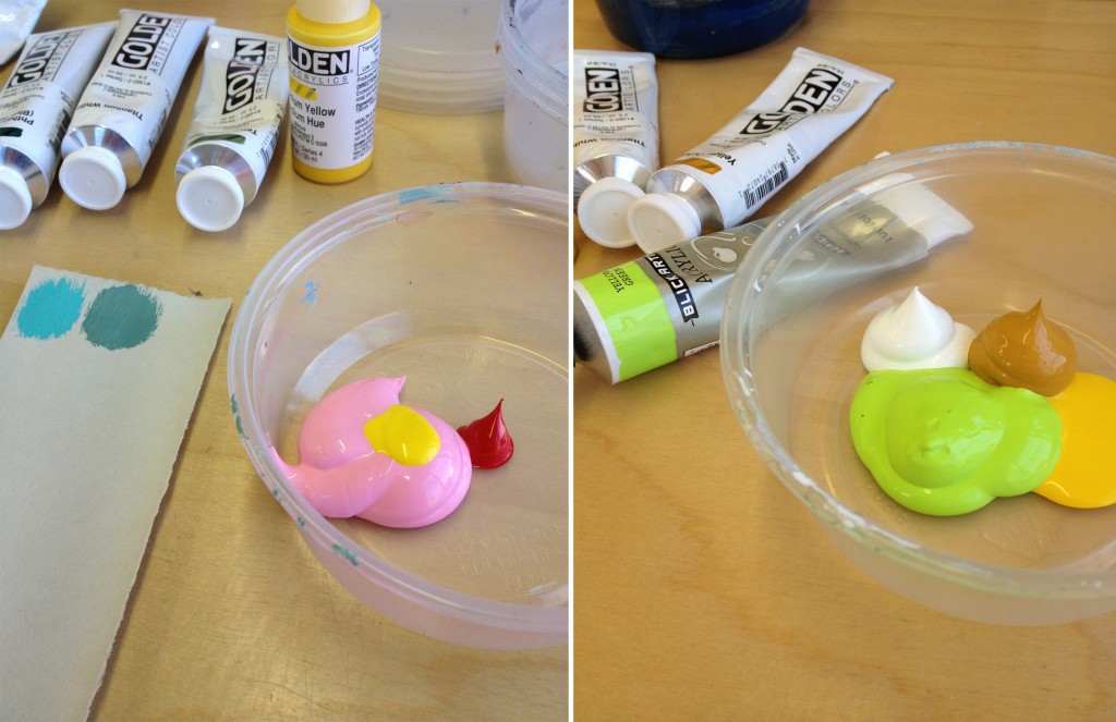
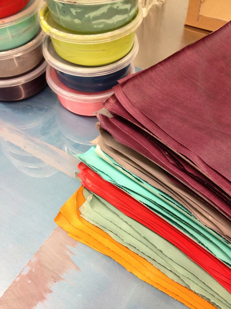
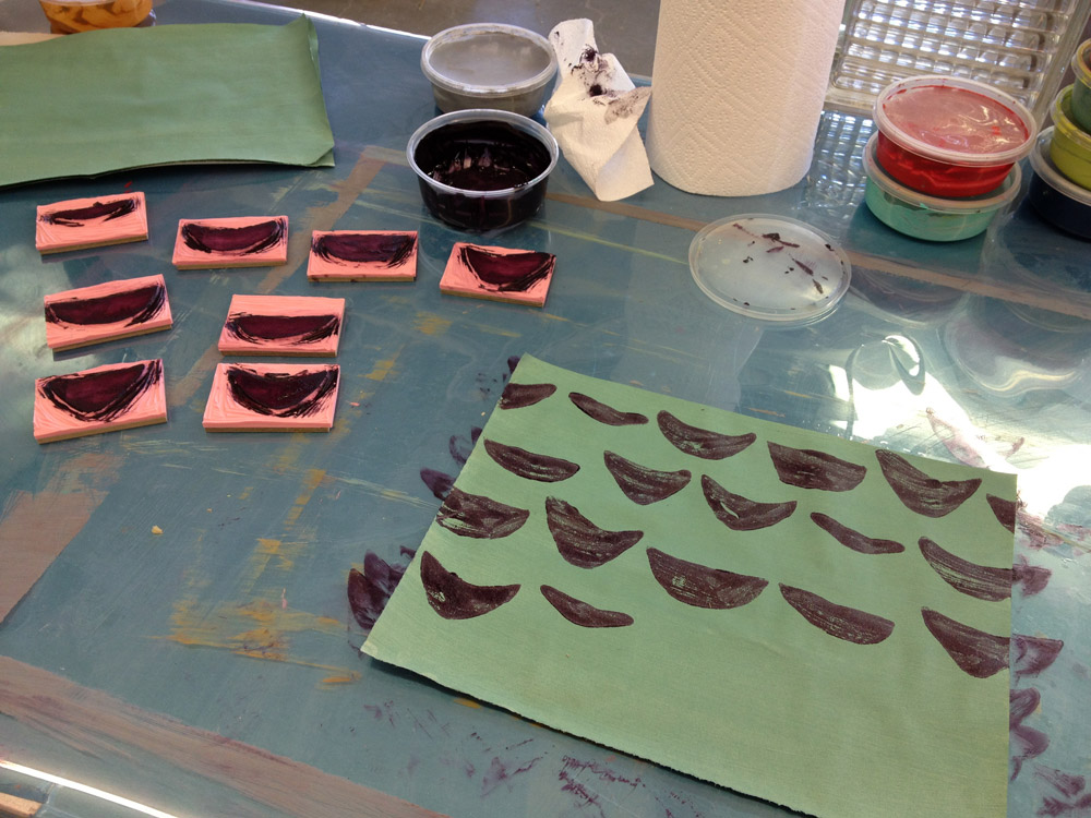
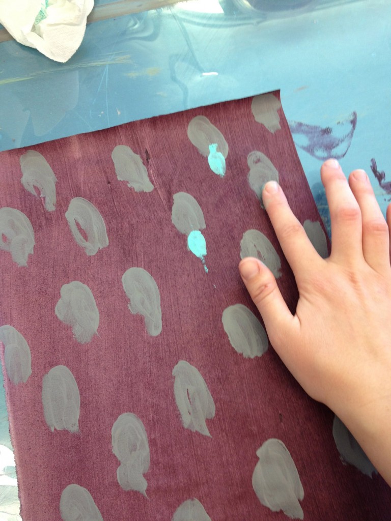
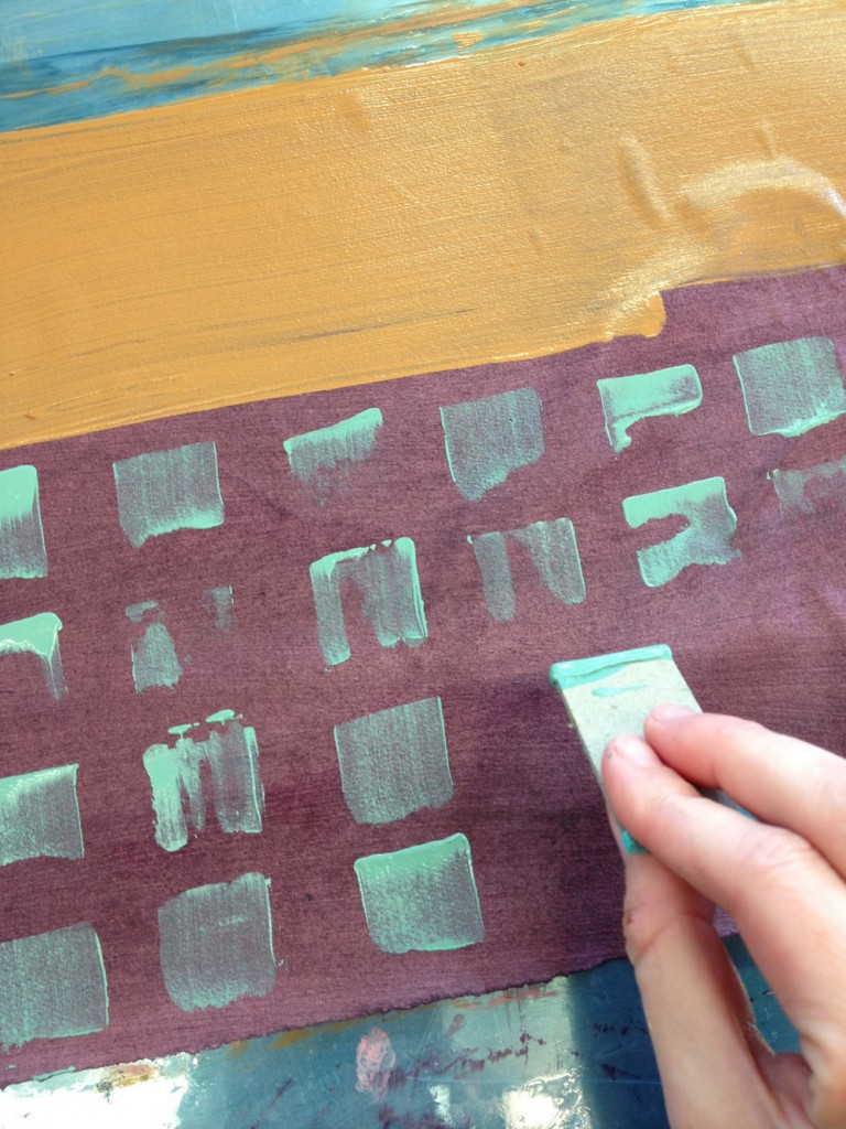
    This past week I’ve been mixing up paints and making paste papers to adorn journals and jotters for my upcoming shop launch on Etsy. The act of making paste papers is like finger paintings for adults, so needless to say it’s super fun. I love using Hahnemuhle Ingres for my paste papers because it absorbs the pigments and becomes wonderfully malleable during covering.

    pastepapers5-erinfletcher

    After the initial pass of the base color, I then add the additional design elements. I love using simple tools to create the designs, such as brushes, scrap board and my fingers. For this series of paste papers, I also carved some handmade stamps into linoleum. This was a new technique for me, but I dove right in, choosing simple irregular half-moon shapes. 

    I’ll be launching my shop in mid-March, so stay tuned to see how these paste papers get transformed into journal covers. 

    pastepaper4-erinfletcherpastepaper3-erinfletcherpastepaper2-erinfletcher


  8. My Hand…Charlie and the Chocolate Factory

    December 3, 2012 by Erin Fletcher

    This is the last week to view my work on Buy Some Damn Art!!

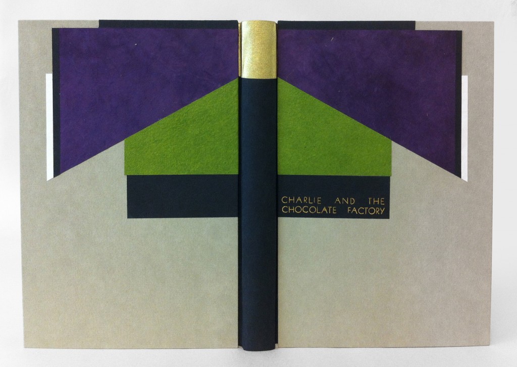
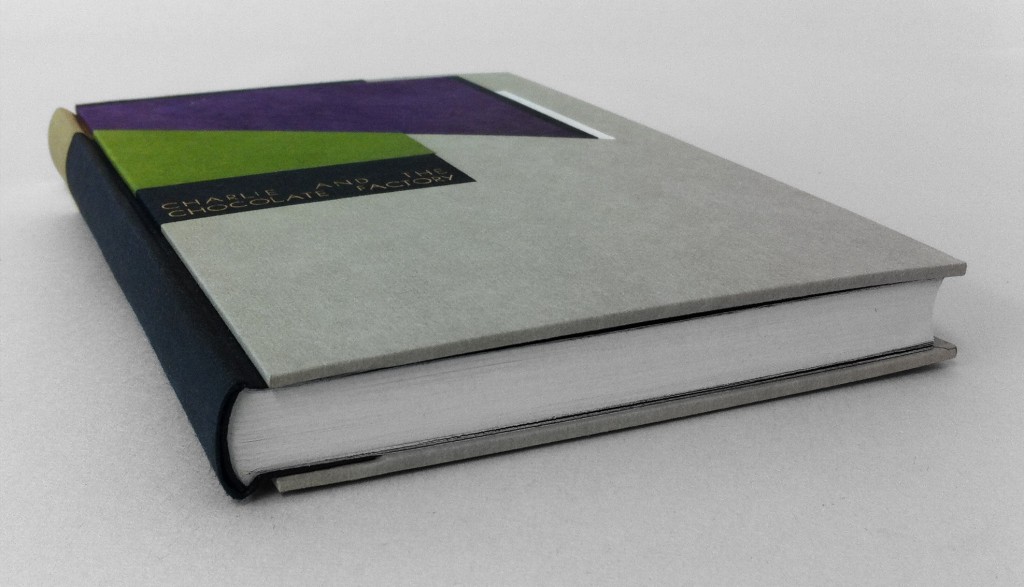
    The sixth and final book in my Roald Dahl series is Charlie and the Chocolate Factory, which may be his most well-loved story inspiring several adaptations such as the 1971 film with Gene Wilder (that we all love), the 2005 Tim Burton version (that we all might not love), various live theatrical performances plus one theme park ride. As I read through this book again, I found myself scribbling note after note from the abundance of imagination and imagery sprouting from the text. I needed to settle on an idea and I knew that I wanted to incorporate Art Deco elements into the design. And so the inspiring words are those that make up the detailed description of Willy Wonka’s appearance: black top hat, tail coat of plum-colored velvet, pants were bottle green, gloves were pearly gray, and a gold topped walking cane.

    Working within the limitations of my chosen color palette I created a stacked design of shapes according to their position on the body. The cane became the center point of the design and the binding and so I chose to use Peter Verheyen’s variation on the German case binding, which is the same structure used for Fantastic Mr. Fox, so that I could cover the spine separately from the boards. The spine is covered in black Hahnemuhle Ingres with Ferro gold as the tip. The headbands are wrapped with paper corresponding to the black Ingres or Ferro gold. The boards were initially covered in smoke Hahnemuhle Ingres before adding the paper onlays one at a time. Carefully measuring to make sure the design would remain square and that both boards would successfully mirror each other. I used various papers for the design because my main goal was to match the distinctive color palette. All of the black elements are Hahnemuhle Ingres; I choose purple Lokta, lime Cave Paper and Echizen ribbon Japanese paper for the other elements. 

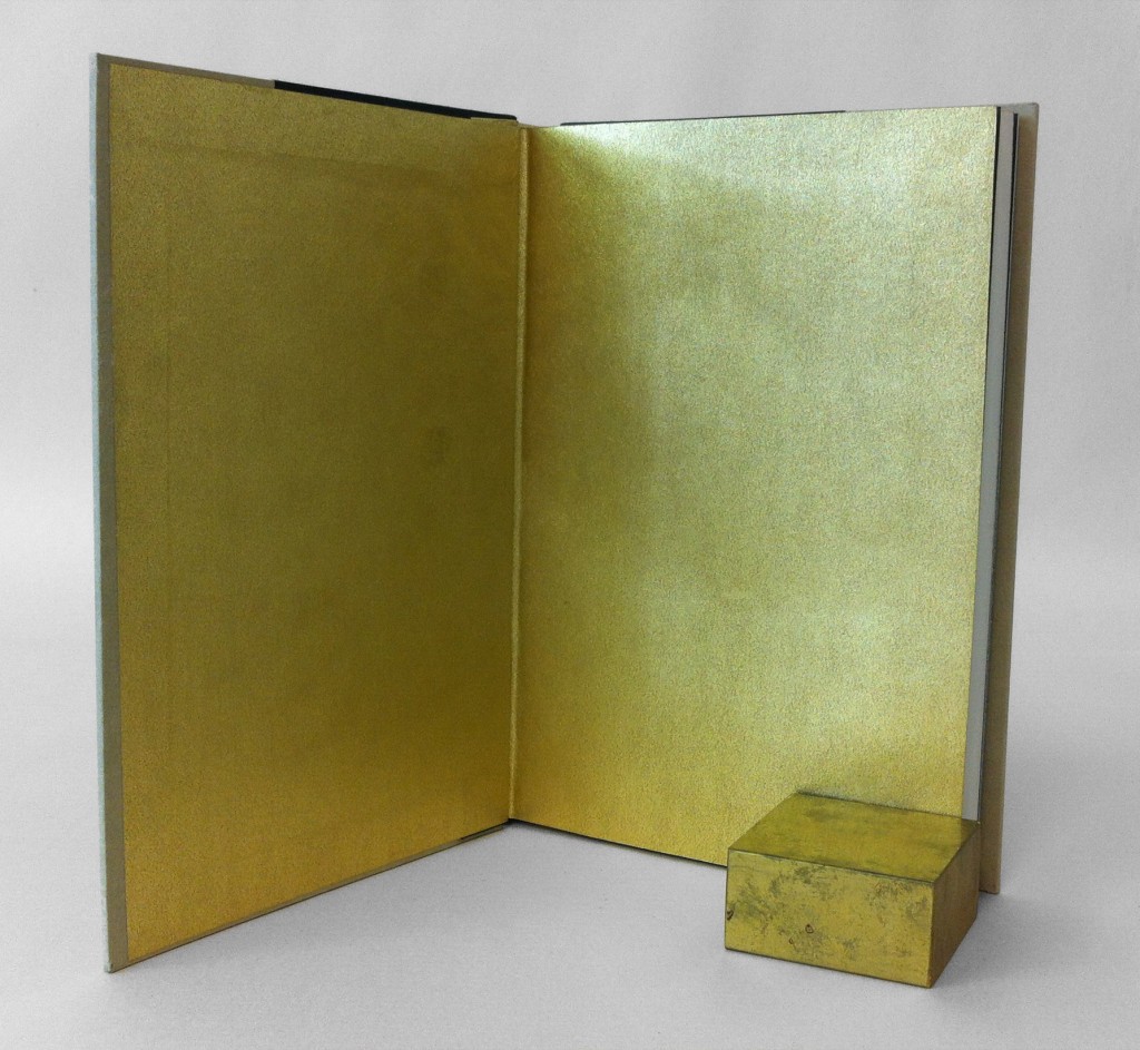
    The edges were painted with a mixture of light gray acrylic paint, water, wheat starch paste and airbrush medium. This mixture creates a fluid pigment that can be applied as an even, thin coat, which prevents the paint from flaking. The made endpapers could only be gold as a homage to the golden ticket.

    The book is housed in a clamshell box, the trays are covered with smoke Hahnemuhle Ingres and lined with light gray Ingres. The case is covered in full black Iris bookcloth.


  9. My Hand…The Twits

    November 26, 2012 by Erin Fletcher

    Only 2 weeks left in my exhibition at Buy Some Damn Art

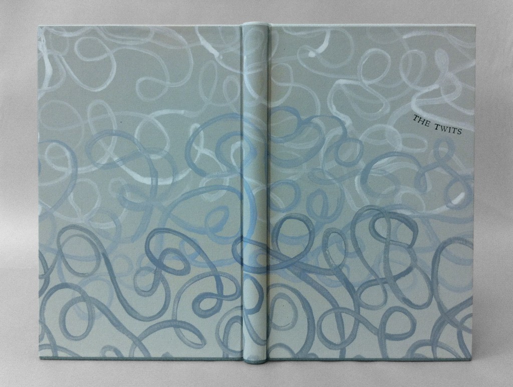
    I found the pranks between the terrible couple in The Twits to be wicked yet entertaining, which is why I read the book so much as a kid. One particularly gruesome trick that inspired the design for this binding was the worm spaghetti that Mrs. Twit served Mr. Twit. This devious couple live in a cement windowless house complete with a rotting garden, caged monkeys and a big dead tree where Mr. Twit captures birds for pie. The couple get what they deserve in the end as the monkeys and birds play their own clever trick on them, turning their home upside down.

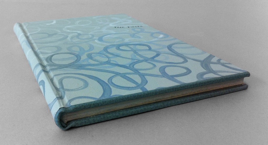
    I bound The Twits in the millimeter Rubow style with white buffalo skin lining the head edge and flanelle buffalo skin lining the tail edge. The color of the leather wrapped headbands correspond to leather edge. The paste paper was a simple design of free forming squiggles painted on with a long bristled brush. The initial layer was a mixture of titanium white acrylic, water and wheat starch paste. For the next two layers I added a bit of bone black and cerulean blue acrylic to create a blue gray ending with a match for the flanelle buffalo. The title was stamped with Centaur handle letters in carbon.

    The edges were painted with a light gray acrylic mixture.  The book opens to reveal smoke Hahnemuhle Ingres paste downs with light gray Hahnemuhle fly leaves before reaching the text block. I wanted to keep the book to be as gray and drab as possible, representing the sad existence of the Twits inside their cement home.

    The book is housed in a clamshell box. The trays are covered in smoke Hahnemuhle Ingres and lined in light gray Ingres. The case is covered quarter-style with black Iris bookcloth and smoke Hahnemuhle Ingres.


  10. My Hand…The Enormous Crocodile

    November 19, 2012 by Erin Fletcher

    Only 3 weeks remain to view or purchase my bindings on Buy Some Damn Art.

    I had never read The Enormous Crocodile when I was a child, therefore, I experienced this devilish tale as a young adult. The Enormous Crocodile lives in the jungle and is a rather sinister character. When meeting other jungle creatures, he boasts about his clever plans to snatch up children in order to eat them. All of the creatures are horrified by this idea and foil his plans along the way. The Elephant has quite enough of this crocodile’s antics and decides to put an end to it. Grabbing the Enormous Crocodile by the tail, the Elephant swings him around with such speed, he is projected far into the atmosphere until he hits the sun and is ‘sizzled up like a sausage’.

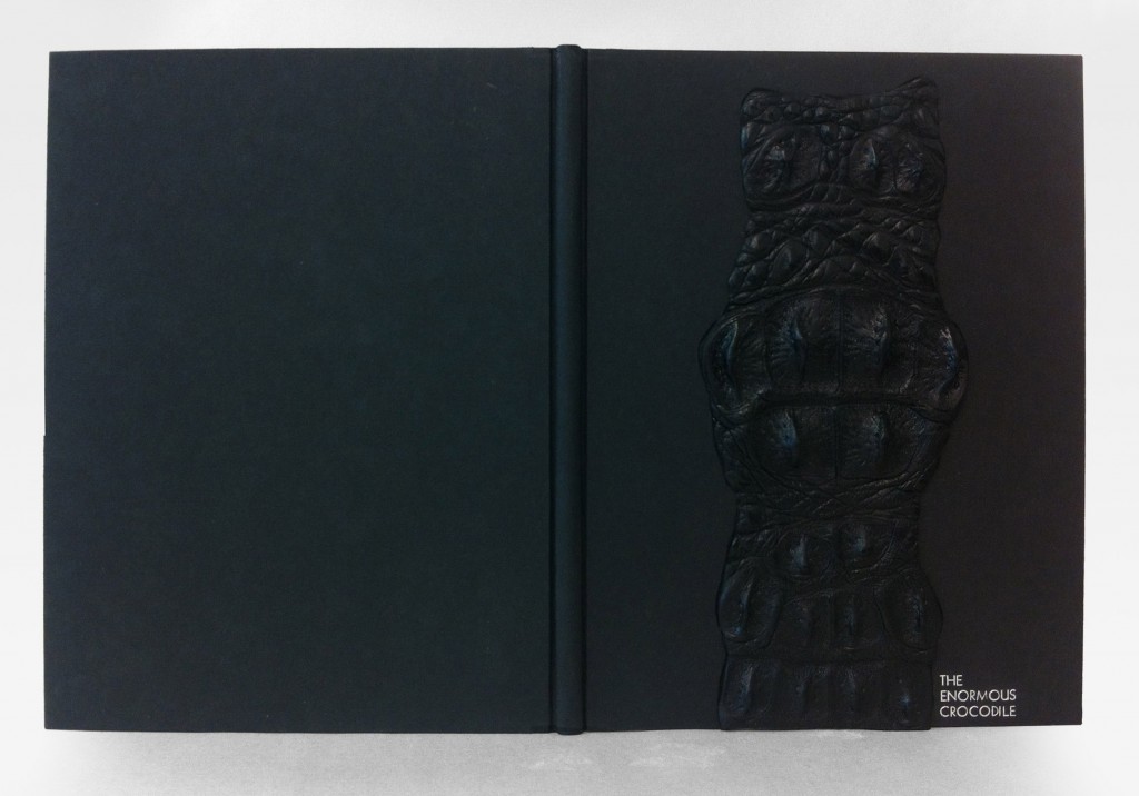
    Quite an ending, one that surprised me as a reader. Very few Roald Dahl books contain color, but The Enormous Crocodile is filled with vibrant greens and yellows. When considering the cover design I didn’t want to compete with such a colorful palette plus I couldn’t get the image of a sizzled crocodile out of my mind. This led to the decision of doing a monochromatic binding in black. 

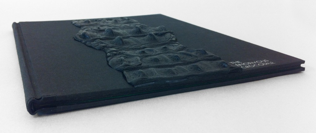
    The book is bound as a millimeter binding with black Pergamena goatskin running along the headcaps and joint. The rest is covered in black Hahnemuhle Ingres. A recess was built into the front board before covering as a well for the crocodile skin. Due to the bumpy texture of the crocodile skin, paring was impossible, but also unnecessary.  Once the skin was glued up and placed in the well, layers of foam were sandwiched between the cover and press boards, this kept the skin flat while drying. The title was stamped in a sans serif typeface with silver foil before gluing down the crocodile skin.

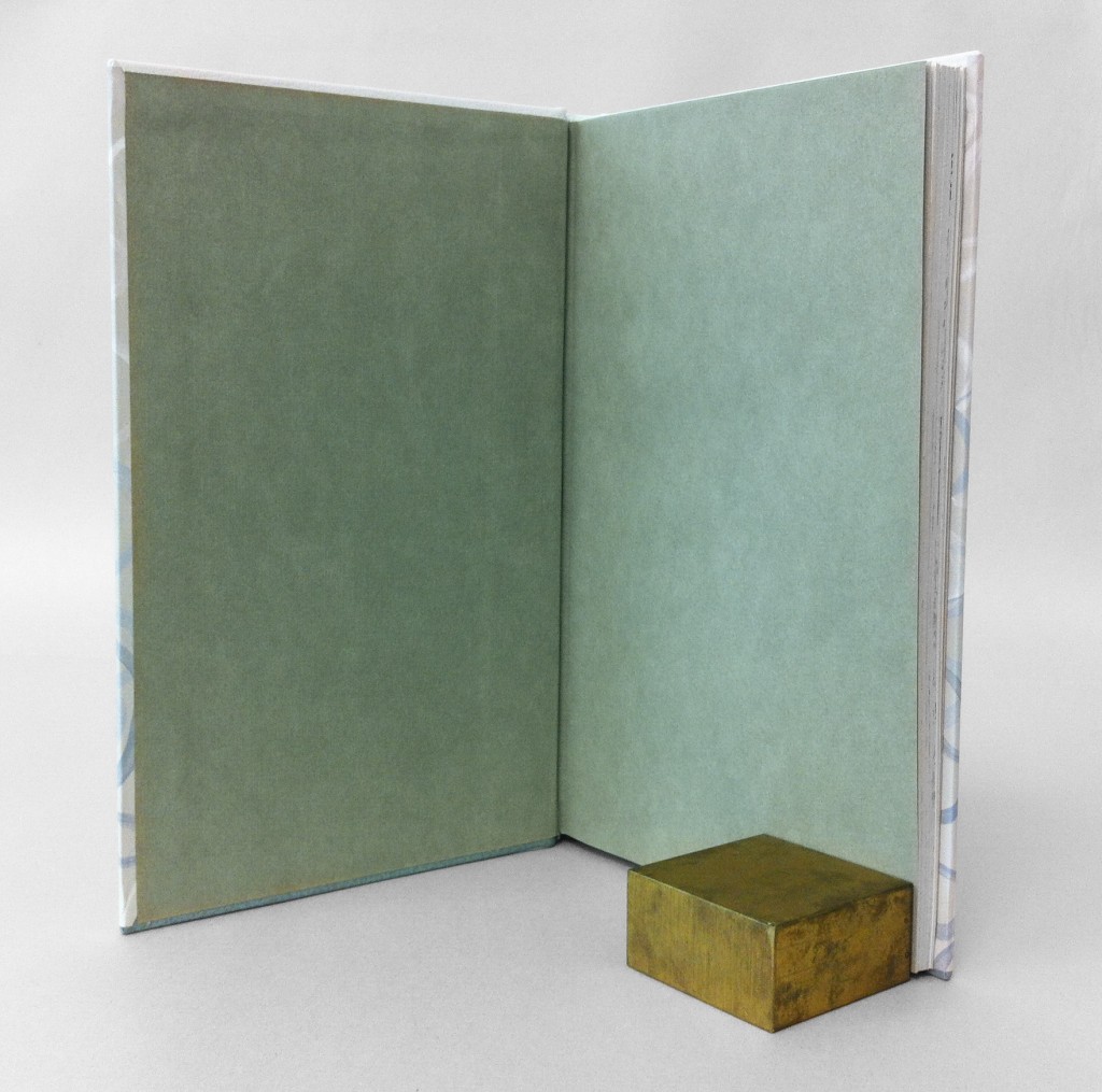
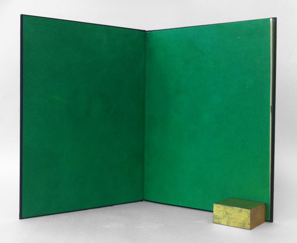
    Continuing with a monochromatic look, the edges were painted black. Using a combination of fluid acrylic, airbrush medium and wheat starch paste I was able to apply a thin yet opaque layer of pigment. When you open the front cover, a rush of brilliant green floods your vision. The endpapers were constructed with emerald green Lokta paper.

    The book is housed in a black clamshell box. The trays are covered and lined with black Hahnemuhle Ingres with Volara foam cushioning the front cover. The case is covered in black Iris bookcloth and kept closed with black satin ribbon.


  • My name is Erin Fletcher, owner and bookbinder of Herringbone Bindery in Boston. Flash of the Hand is a space where I share my process and inspirations.
    The StudioNewsletterInstagramEmail me
  • Archives