RSS Feed

Posts Tagged ‘erin fletcher’

  1. My Hand // A Desert Inspired Edge for Dune

    November 6, 2014 by Erin Fletcher

    I am currently working on a first edition copy of Dune by Frank Herbert for two reasons: 1) I plan to submit it to a bookbinding competition with the hopes that it will travel around the country and 2) there is a towering stack of books from the Dune series on my husband’s bookcase and he deserves a finely bound copy of his favorite (he exhaustively quotes from) book.

    At the beginning of the design phase, I consulted with my husband for inspiration and to make sure I was capturing the spirit of this iconic science fiction novel with precision (I may have subconsciously derived some inspiration from both Lynch’s visual masterpiece and Jodorowsky’s sadly unfinished film). After finalizing my design, I began working on the binding. First step was to remove it from its trade binding and mend the signatures. After the book was re-sewn, then rounded and backed, I ploughed the edges in preparation for the edge decoration.

    DuneEdgeDecoration-ErinFletcher

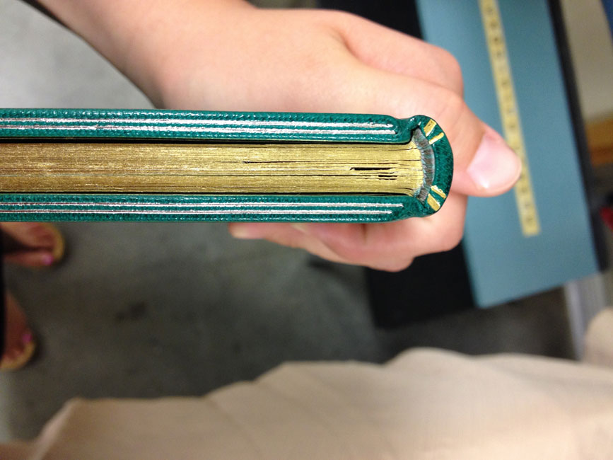
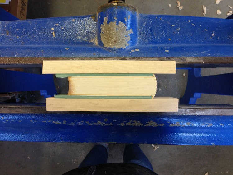
    At this point in the process, I’ve already completed the decoration on the fore edge and will go through the steps to decorate the tail edge in this post. As always, I decorate the edges in the following order: fore edge, tail edge, head edge. The book is placed between two wooden finishing boards that are angled at the top in order to apply more pressure to the book’s edge.

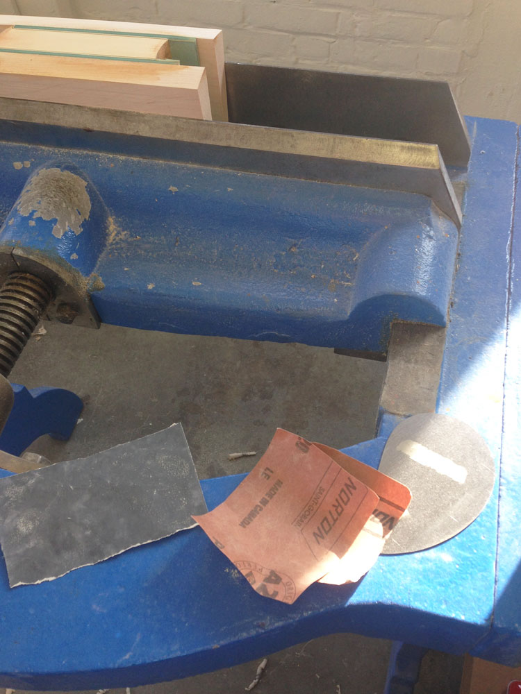
    Before I can apply any decoration, I need to scrap and sand the edge until it has a smooth feeling and an almost sheen-like finish. I scrap the edge first with a curved scraper, then I sand the edge beginning with a course grit sandpaper and work the edge with a finer and finer grit to get that nice luster finish.

    DuneEdgeDecoration2-ErinFletcher

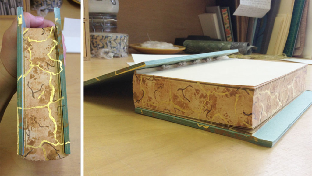
    The sanding phase can be an arduous task in the decoration process, but quite necessary to a successful edge. I usually sand the edge smooth, then apply my base layer of pigment, allow it to dry, then sand the edge smooth again. After the second phase of sanding, I’m ready to apply the final base layer of pigment. For the edge on Dune, I wanted to achieve the look of a cracked, dry desert ground by combining gouache and gold leaf.

    The mixture of gouache also included water and paste. I paint the mixture onto the edge, then use a sponge to thin down the color. I allow the first layer to dry a bit before applying more pigment with a sponge which offers a mottled and textured effect to the edge.

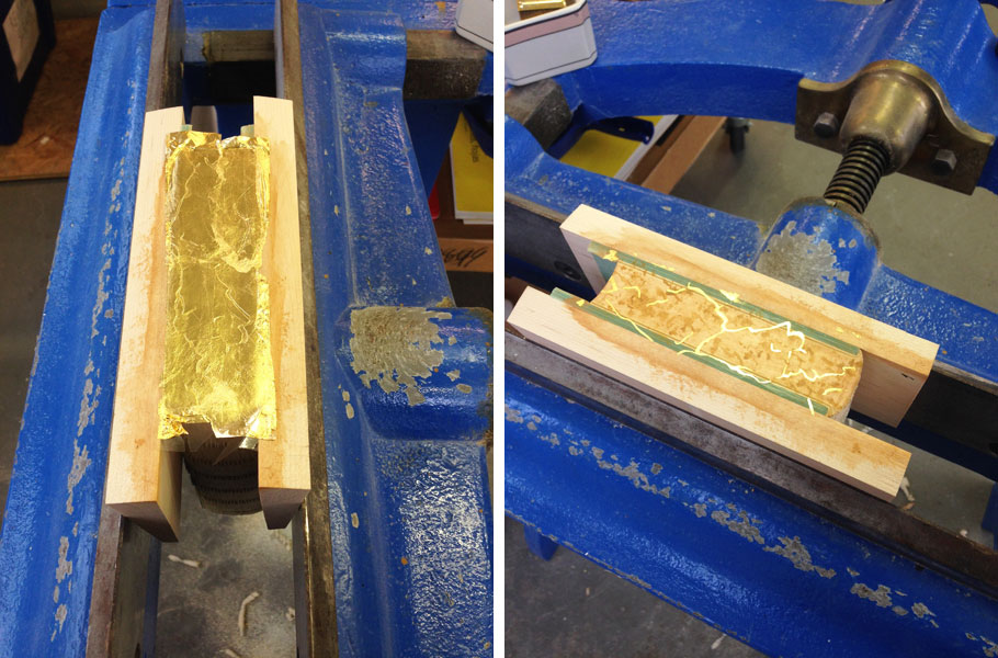
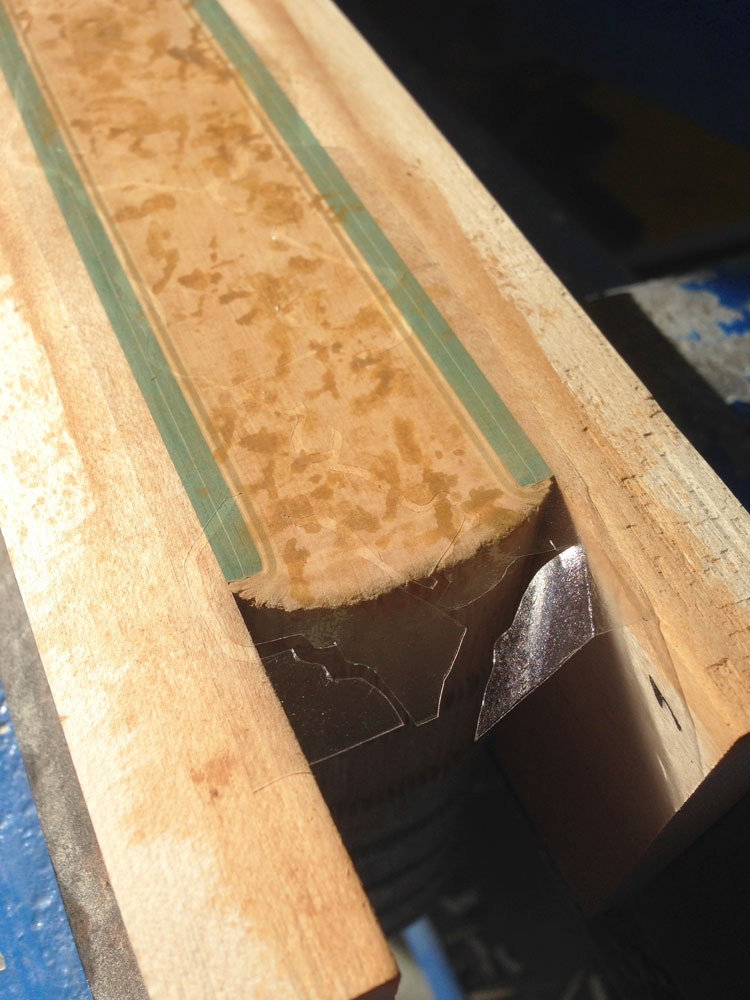
    As this layer is drying, I draw out the imagery to represent the cracks of the dry ground on some Frisket film. The cracks are going to be gilt onto the edge, the Frisket film is used to mask out the areas I don’t want to be gilt. Frisket is a great material to work with because it has a low tack and will not disturb the gouache layer underneath.

    DuneEdgeDecoration3-ErinFletcher

    In the image above you can see the mottled gouache layer through the clear Frisket film (which is also hanging over the edge of the spine). The exposed areas will be covered by gold leaf.

    in the next step, I apply a PVA wash as the size (adhesive) for the gold leaf. At first the PVA wash absorbs quickly into the edge, but eventually the PVA wash will sit on top the edge. At this point, the gold leaf can be laid down. The PVA wash acts almost like a vacuum as it sucks the gold leaf to the edge.

    Before the PVA wash is completely dry underneath, the leaf needs to be set; this can be done by carefully applying downward pressure with a piece of flannel wrapped around the squishy part of my thumb. A second layer of gold leaf is laid down using the same steps, this creates a more vibrant and fuller look to the gilding.

    DuneEdgeDecoration4-ErinFletcher

    Once the PVA wash is completely dry, I burnish the edge and remove the Frisket film. This initial burnishing of the edge is done through a protective layer of silicone release paper. After some time, when I know the edge is dry and the decoration is secure, I burnish the edge once more (this time the agate burnisher is in direct contact with the edge).

    For the final step of the decoration process, I add some accents of dark brown gouache (this mixture also included water and paste). The darker pigment is added simply with a brush in the desired areas. When I am satisfied with the decoration and the last bit of gouache is dry, I burnish the edge on last time.

    After removing the book from the press, I whack the edge against the edge of the table. This cracks open the text block, separating the pages. This step can be a bit nerve-racking, at this point any poorly attached layer can crack or flack off. Luckily my edges came out beautifully!

    DuneEdgeDecoration5-ErinFletcher

    Now on to the headbands, but not before I cap up (wrap up with a thin paper) the text block. After spending three days creating such a complex decorative edge, I want to make sure it stays safe from any scrapes or scuffs.
  2. Fort Point Arts Community Open Studios // October 17 – 19

    October 14, 2014 by Erin Fletcher

    FPAC-OpenStudios

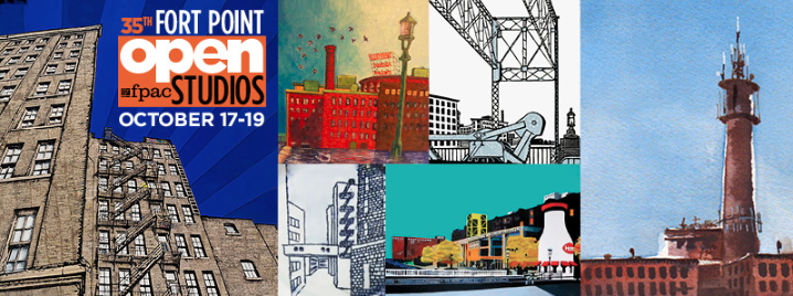
    Come by the historic waterfront neighborhood of Fort Point for the 35th FPAC Open Studios. Stroll through the many warehouses that are home to painters, sculptors, ceramicists, jewelers, performance artists, printmakers, book artists, photographers and more. Herringbone Bindery will be participating along with Colin Urbina of Third Year Studio at 369 Congress Street on the 6th floor.
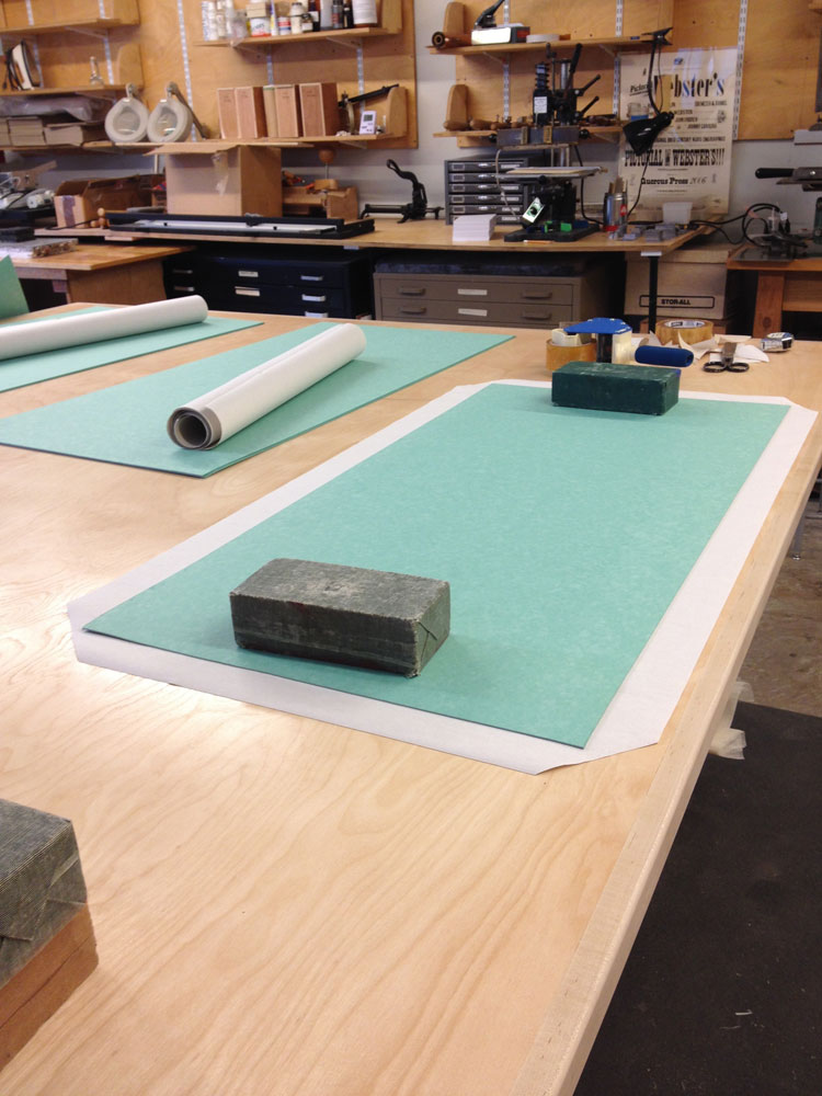
    I’ll be around to show off some of my work both completed and in progress. I will also have a selection of items for sale, all of which can be found in my Etsy shop.

    Ours is just one of the 14 buildings in the Fort Point neighborhood, as well as galleries and pop-up exhibit venues. All buildings are in easy walking distance of each other. However, there will be a free shuttle to help you get around the neighborhood.

    The event is free to the public with free parking available! You can’t beat that. For more details and directions check out the Fort Point Arts Community website.


  3. Bright Light City Gonna Set My Soul

    October 7, 2014 by Erin Fletcher

    J-Wiley-Photography-rural-countryside-pastoral-pasture-urban-gritty-landscape-las-vegas-neon-sign-boneyard-roadtrip-mountains-sunlight-2698

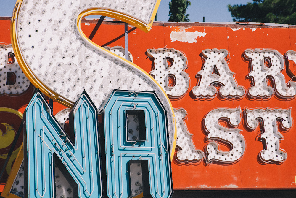
    I’ll be embarking on a trip to the City of Lights for the Guild of Book Workers annual Standards of Excellence Seminar, which will take place at the Excalibur Hotel. I’m looking forward to the late night excitement, warm weather and chatting with all the wonderful book-y people attracted to this event. Plus all the leather (for bookbinding, of course) that I’ll be buying.

    Look forward to a post about the Seminar upon my return mid-October.


  4. New England Chapter of the Guild of Book Workers // Mini-Conference in Maine – Day One

    September 23, 2014 by Erin Fletcher

    What began as a simple workshop idea between myself and papermaker Katie MacGregor, turned into a weekend long mini-conference event. Over the past year, part of the NEGBW team (myself, Todd Pattison and Lauren Telepak) along with Katie MacGregor, Nancy Leavitt and Alan Furth put together the plans for a mini-conference at the Cobscook Community Learning Center in the small northeastern town of Trescott, Maine.

    To our wonderment, we had an almost full attendance and participants traveled as far as Florida and California. The conference was held from September 12th – 14th. I’m going to write about this event in two separate posts; beginning with the events on day one.

    FRIDAY, SEPTEMBER 12
    1:00 – 2:30
    Tour at University of Maine, Machias
    My day began in Boston, driving northbound toward Machias, Maine. The town of Machias is small and charming. The town had a wonderful shop called The French Cellar selling local cheeses, wines and other delicious items. I also made a stop at the local art supplies shop/framers/gallery. It was there that I picked up a beautiful piece of pottery crafted by a local artist. But the real reason to stop in Machias was for the first event of the conference.

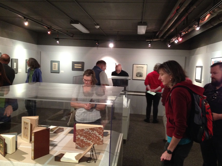
    Also located in Machias, is the University of Maine, which enrolls about 1,000 students coming from all around New England for their undergraduate studies. An average of fifty students participate in the Book Arts Program per year. Bernie Vinzani, Director of the Book Arts Studio, lead a tour of their facility. The tour began with a trip to the gallery, displaying works by both students, local artists and historical documents.

    MaineConferenceTour2-ErinFletcher

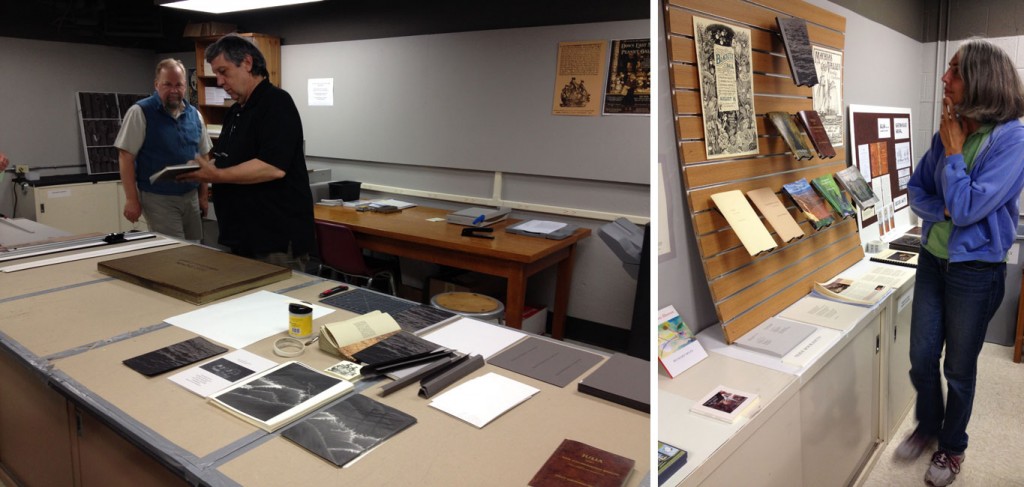
    We then moved into the other various rooms of the Book Arts Studio, which included the bindery, print shop and a multi-purpose room. Bernie explained that the students are involved in a single project each year in which they must work together. Each student receives a particular job and they learn the process of creating a book, printing a book, assembling a book and then selling a book. The components of their most recent project was laid out for us, along with a wall display of past projects.

    MaineConferenceTour-ErinFletcher

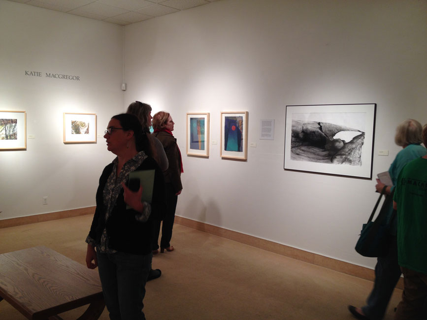
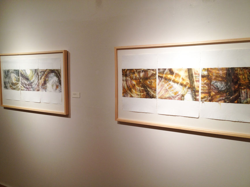
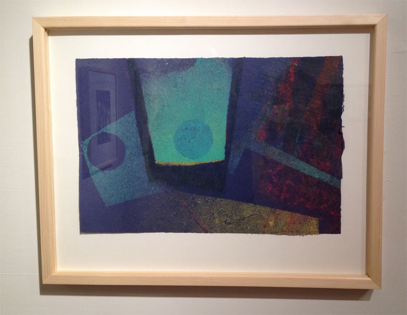
    As a treat, a solo exhibition of Katie MacGregor’s pulp paintings and other artworks were installed early. This part of the tour was quite thrilling for me. I’ve only known the papermaking side of Katie and was intrigued by her creative side.

    MaineConferenceTour3-ErinFletcher MaineConferenceTour4-ErinFletcher

    MaineConferenceTour5-ErinFletcher

    Moon Travel – Katie MacGregor

    5:00 – 8:30
    Presentations and Evening Reception
    The conference participants reconvened at the Cobscook Community Learning Center for the evening festivities. The CCLC hosted most of the activities for the weekend and even had a lodge onsite where many of the participants slept. The lodge was newly built and our group are one of the first to occupy it. I chose a quad for economic reasons and was delighted by the four bunk beds I ended up having to myself. Each room has its own private bathroom complete with shower. 

    Starting off the evening, was a presentation from CCLC Executive Director, Alan Furth, who introduce us all to the Center by giving a brief overview of its history and mission. The Center formed in 1999 as a group of community members from the Passamquoddy Tribe, the Euro-American community, and a community of Canadians from New Brunswick wanted to improve life in this rural region. Paying particular attention to the education models of many Danish folk schools, they developed a center aimed at empowering high school students and to strengthen their community.

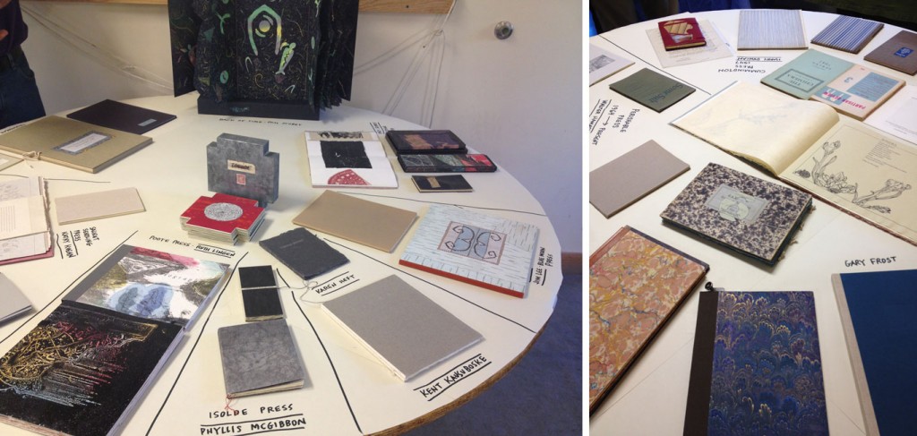
    The following presentation was giving by local printer and book artist, Walter Tisdale. Walter filled three tables with wonderful examples of his own work, the work of his friends and some collaborative projects. Walter began his training at the University of Wisconsin in Madison studying book arts with Walter Hamady. Although typography is his real passion, as is collaborating with writers and artists for enriching content; Walter also plays around with book forms. Walter’s aversion for glue forces him to develop innovative non-adhesive structures. Making dummies is his forte. And so he shared some of these models with us.

    MaineConferenceTour6-ErinFletcher MaineConferenceTour7-ErinFletcher

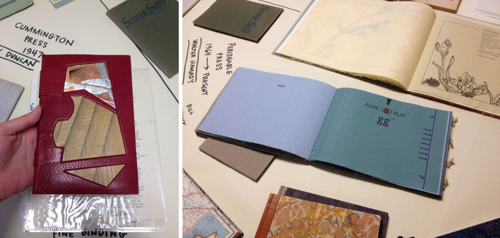
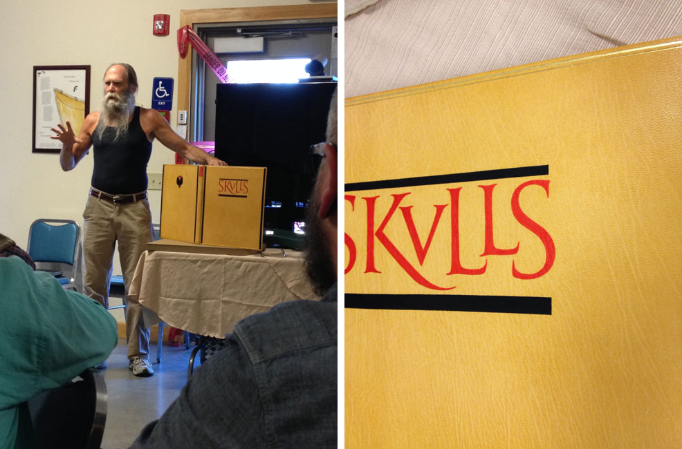
    Last, but certainly not least was a presentation by the imitable bookbinder Gray Parrot (also a local to Maine). With an early interest in 18th century bindings, Gray began to build his collection until the habit became to expensive therefore pushing his interests onto pulp and science fiction novels. Gray was an Enlgish Literature major at Harvard before he embarked on studying bookbinding with Arno Werner in Pittsfield, Massachusetts in 1971. Gray studied with Arno for less than a year before going to Ascona to learn finishing techniques.

    MaineConferenceTour8-ErinFletcher MaineConferenceTour10-ErinFletcher

    In 1973, he opened his own bindery and worked on his first edition project just a year later. To date he’s worked with some very talented printers and respectable presses such as Leonard Baskin, Barry Moser, Pennyroyal Press and Gehanna Press. In addition to his presentation, Gray brought an abundant collection of his own bindings. All of which, he let us handle and gawk at. His hand skills are superb and his tooling immaculate. Gray pays attention to every little detail and leaves no space bare without purpose. I discovered a tooled line on the top lip of a leather covered tray on a clamshell box!

    MaineConferenceTour9-ErinFletcher

    After those three exciting presentations we were eager for dinner, which was served up by a local catering business run by two sisters. Once we took our last bites of decadent chocolate cake, chatter soon arose about the possibility of seeing the Northern lights. We took a short walk out to an open field and patiently waited until a blanket of stars. Sadly, we never saw any sign of the Northern lights and headed back to the lodge to rest after our first day of the conference. (Although some of us were lucky to see a few good shooting stars!)


  5. My Hand // Boxes for Laura Davidson

    September 19, 2014 by Erin Fletcher

    LauraDavidsonBoxes6-ErinFletcher

    Photo courtesy of Laura Davidson

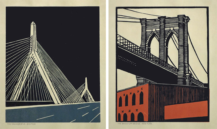
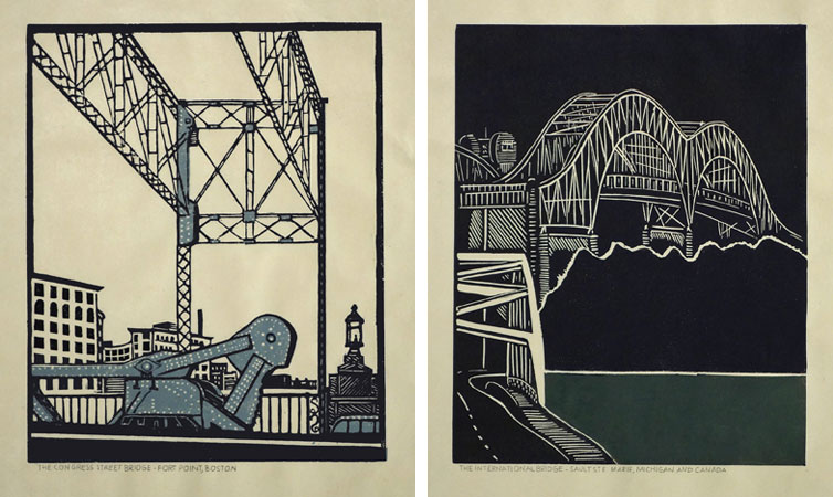
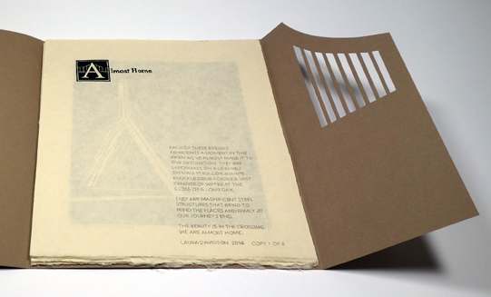
    A while back, I had the chance to interview the artist Laura Davidson as a part of my Book Artist of the Month series. Since then, Laura and I have stayed in contact with each other, which has given me the opportunity to view some of her works in their various stages. Most recently Laura completed a set of prints illustrating various bridges across the country. These six bridges were chosen due to their close proximity to the many spaces Laura views as home. The act of crossing these bridges, Laura is filled with the anticipation of almost being home, therefore, the set of prints are aptly titled Almost Home.

    AlmostHome2-LauraDavidson

    Photo courtesy of Laura Davidson

    AlmostHome3-LauraDavidson

    Photo courtesy of Laura Davidson

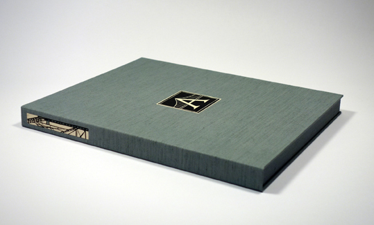
    Laura presented me with the opportunity to build an edition of boxes to house the prints from her Almost Home series. I was quite elated. I’ve really enjoyed Laura’s work and was excited to be working with her. Laura knew she wanted a clamshell box, something sleek and clean. I’m came by her studio and we discussed material options and how the prints would fit in the box.

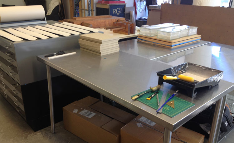
    After everything was settled and the materials were ordered, I began working on the small edition of 8 clamshell boxes. Clamshell boxes are pretty straight forward, but with Laura’s boxes I would be adding a few custom elements. First, the base of the interior tray would include some padding. The prints themselves had no discernible thickness, but Laura wanted the box to be at least ½” thick.  So the outward appearance of the box was the right height for Laura and the interior height of the tray was right for the prints.

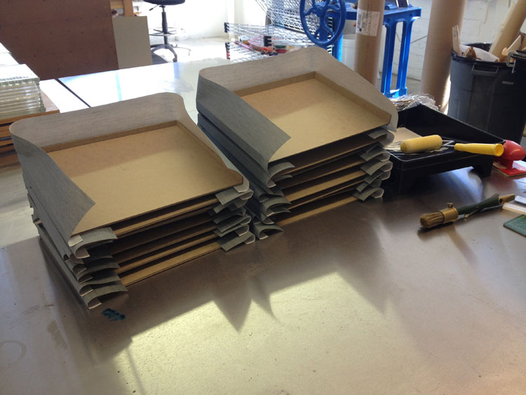
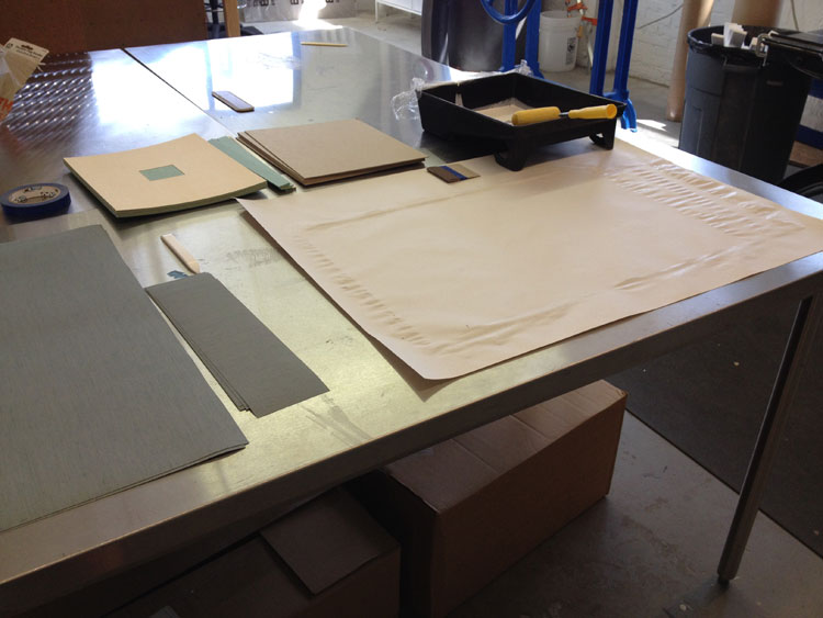
    Once the binders board was cut and the trays were assembled, it was time to cover them. Laura chose silver Canapetta cloth for its durability and textural qualities. The color also complimented the prints and the industrial feel of bridges. To streamline the process I used a small paint roller and paint tray filled with PVA.

    LauraDavidsonBoxes7-ErinFletcherLauraDavidsonBoxes2-ErinFletcher

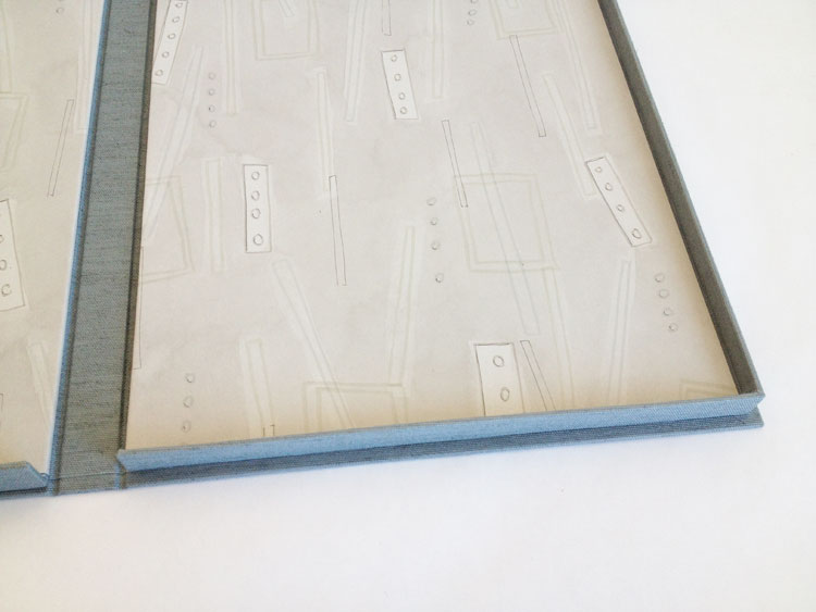
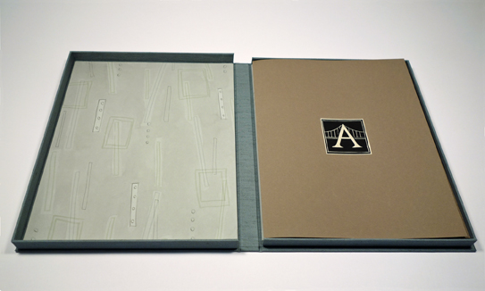
    The second custom element came as the material used on the lining of the trays. Laura provided me with 8 sheets of hand-drawn decorative paper. Using a combination of ink and markers, Laura’s custom lining paper pulled imagery from the prints and grabbed colors from the boxes and brown wrapper. Below is an image of one of the finished boxes showcasing the lining.

    LauraDavidsonBoxes9-ErinFletcher

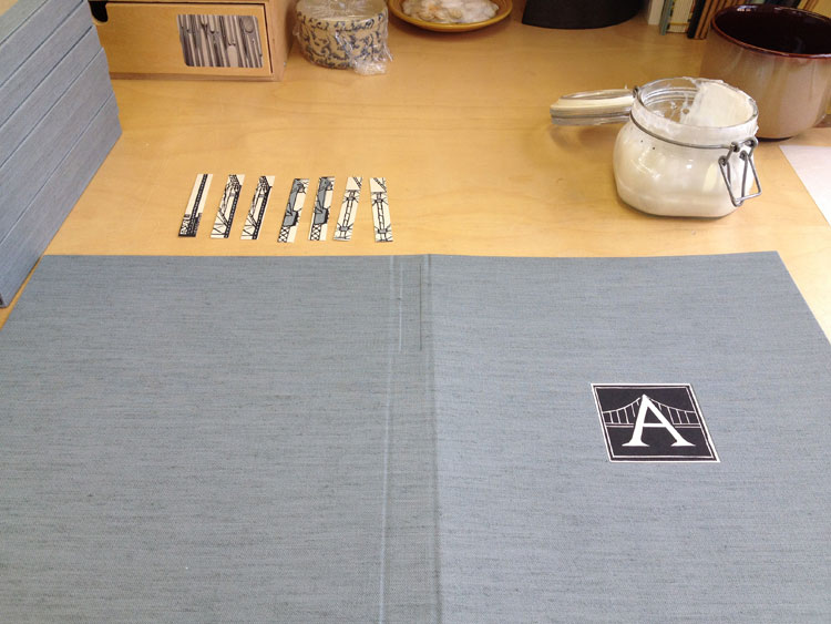
    Finally, it was time to make the cases, which were also covered in silver Canapetta cloth. Before covering, however, I had to create a label well on the front cover board and the spine piece. Each of these wells would be filled with a printed label that Laura had provided me. I also used a paint roller to streamline the process of making the cases.

    LauraDavidsonBoxes3-ErinFletcherLauraDavidsonBoxes4-ErinFletcher

    The hand-printed label on the front cover is an ‘A’ both acting as the support beams of the bridge and the first letter to the title of the series. The label on the spine came from extra prints from the series. Laura artistically cut down the print to isolate some compelling and inciting imagery.

    It was quite a joy to create these boxes and to work for an artist as talented as Laura!

    LauraDavidsonBoxes5-ErinFletcher

    Photo courtesy of Laura Davidson

    LauraDavidsonBoxes8-ErinFletcher

    Photo courtesy of Laura Davidson


  6. My Hand // Recreating the Stepped Roofs of Bermuda on a Book

    August 25, 2014 by Erin Fletcher

    Bermuda3-ErinFletcher

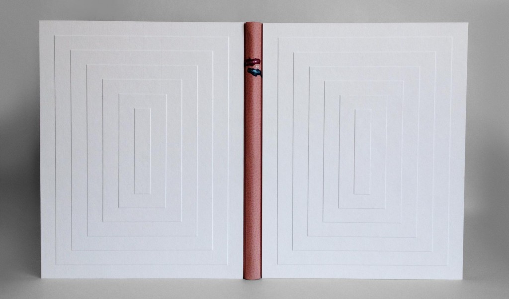
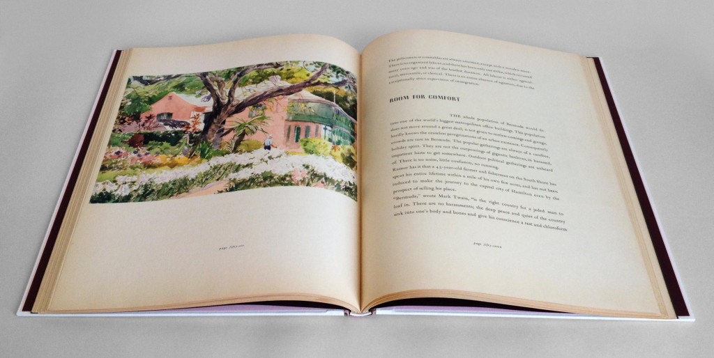
    A client of mine presented me with a copy of Residence in Bermuda, a promotional text published by Bermuda Trade Development Board in an edition of 2,000 copies. This particular book was copy 591 and bound as a quarter cloth binding with a simple stamped label. My client wanted the book to be rebound in a more artistic binding, extracting colors and inspiration from one of the many photographs printed in the text.

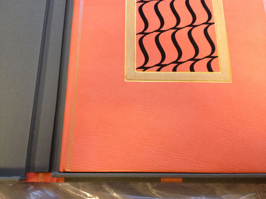
    In search of inspiration I began to page through the book when I came across one image of a watercolor painting of an iconic Bermuda home. The imagery became my direction for the exterior of the binding; the exterior walls of the house were painted a sherbet pink, which popped against the white stepped roof. The vibrancy and brushstrokes of the surrounding landscape became my inspiration for the label on the spine.

    Bermuda5-ErinFletcher

    Since the binding needed to be completed in a fairly short time period and I wanted to work the boards separately, I chose to use a variant of the Bradel structure. Peter Verheyen published an article and tutorial titled Der Gebrochene Rücken: a variation of the German case binding, which was my guide throughout its construction.

    But before any binding could take place, the book had to be removed from its original case. The spine was cleaned by removing the lining and adhesive. The pages showed sign of age with some scuff marks here and there, which called for a bit of surface cleaning. The exterior folio was guarded with tissue to stabilize the paper in preparation for sewing. The original endpapers were quite beautiful and richly printed. However, they were not salvageable for the new binding, but I’ll come back to that later. So I created some new endpapers using three sheets of Canford paper in blush, plum and forest (all colors derived from my inspiration source).

    With the forwarding complete, I attached a piece of pared buffalo skin in the same sherbet pink of the house to the spine. The benefit of this particular binding allows the binder to use a specific material on the spine and another for the boards, so the cover is completed in three parts. This German-style of binding is very similar to the French simplified binding.

    While the book lay to rest, I started working on the boards (which in my opinion are what make this binding superb). In order to best represent the iconic stepped roofs of Bermuda architecture, I decided to create stepped boards. Once I had the final size of my boards, I went to work figuring out the proper dimensions of each layer. I made a single template of each layer which I used to draw out their placement on the boards. Each layer was attached with PVA and pressed. Finally, I glue out a piece of white Hahnemuhle Ingres (which was pre-dampened with a sponge), laid it over the board and put it in the press with some foam which helped sculpt the paper around each layer or step.

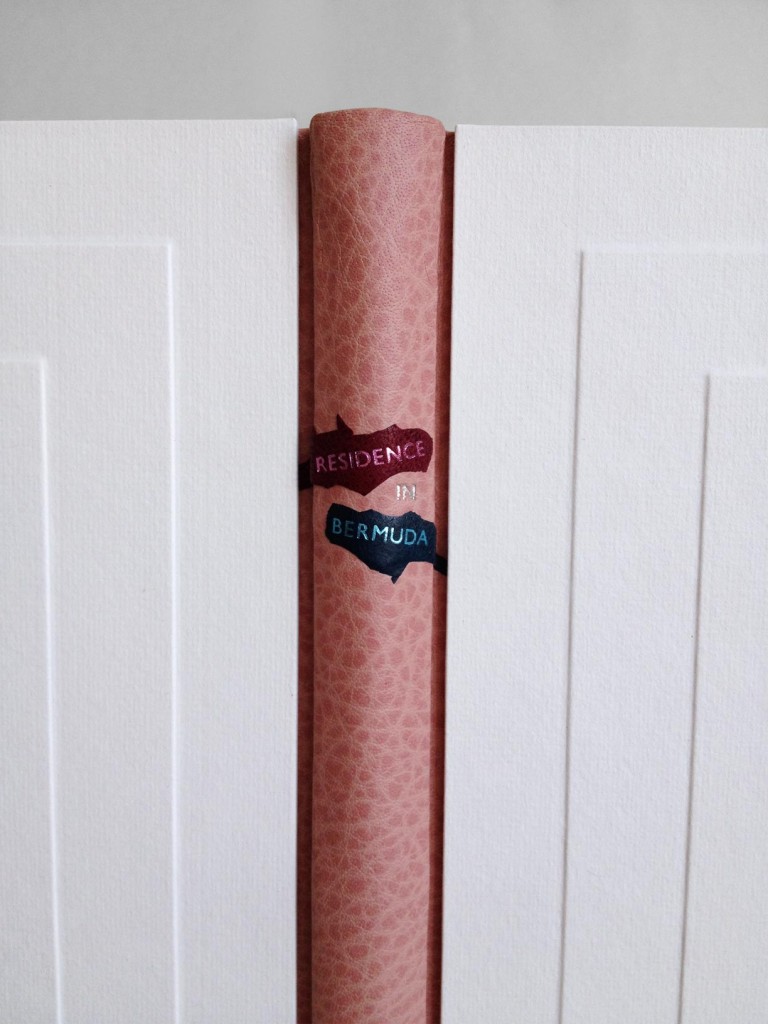
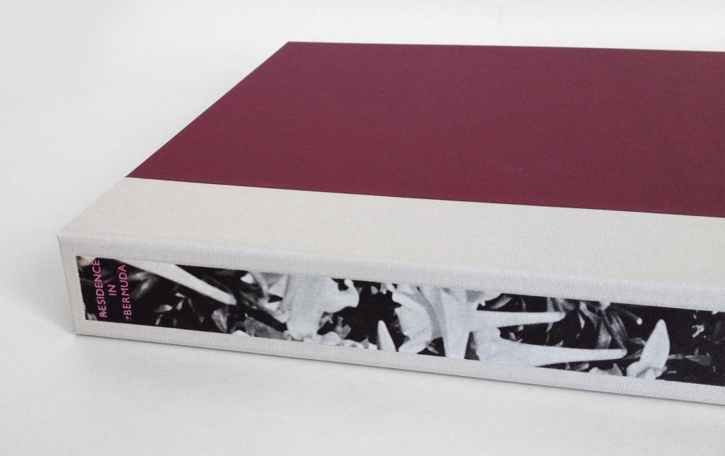
    Before attaching the boards, I placed the two labels on the spine which curved down around the shoulder and onto the flange which connects the boards to the binding. Using two separate leathers with matching metallic foil, I stamped the word RESIDENCE and BERMUDA in Gill Sans using a Kwikprint. The leather was then pared away to offer a rough silhouette of a brushstroke. The word IN was hand-tooled directly on the spine in palladium.

    Bermuda4-ErinFletcher

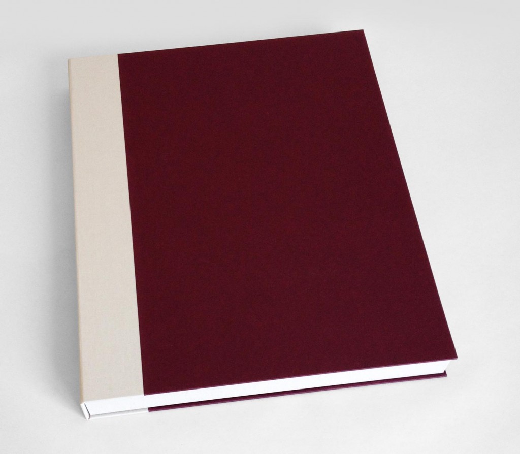
    A large book with white covers needs a box or it will never appear in such pristine condition again. The clamshell box was simply made with a cloth spine sided up with paper. The spine of the box includes a long paper label stamped in metallic pink with the title. The decorative paper label is a strip of the original endpaper. The trays are lined with a frame of Volara foam for the book to rest on, preventing it from teetering side to side.

    Bermuda-ErinFletcher Bermuda2-ErinFletcher

    My client was thrilled with the book’s transformation. He plans to present it as a wedding gift to the Governor of Bermuda’s daughter. I hope she is equally thrilled with my interpretation of her rich and colorful surroundings.


  7. My Hand // Multi-Section Slipcase

    August 5, 2014 by Erin Fletcher

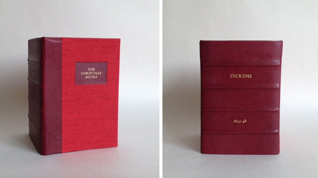
    For the past few months, I’ve been creating a collection of boxes for an aspiring book collector client of mine. Each box is similar in its format and design, only the colors change; a clamshell box with a rounded leather spine with false raised bands. The author and date of the imprint are hand tooled in gold on the spine with the title stamped in gold foil on a leather label recessed on the front board. The trays are covered in Canapetta bookcloth and lined with Bugra paper.

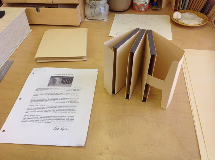
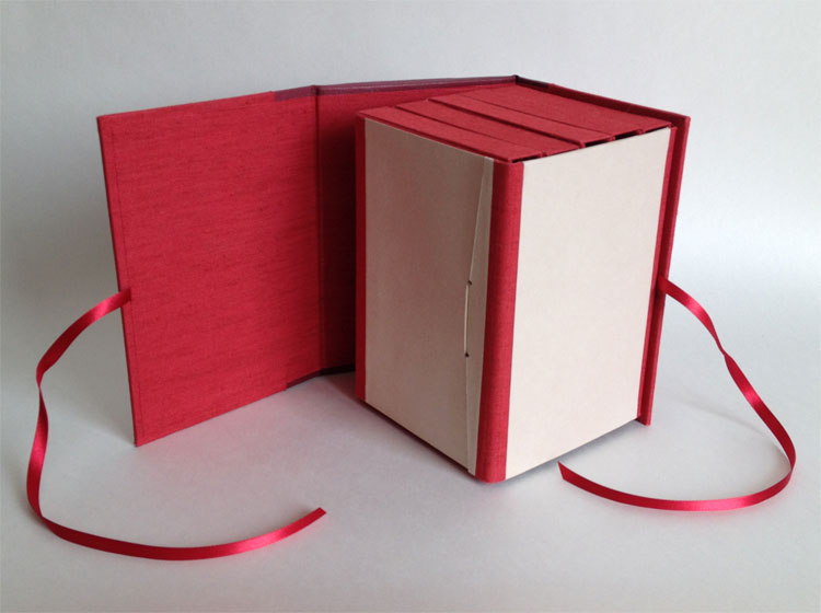
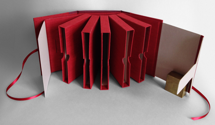
    Five boxes into this ongoing project, my client presented his five volume set of The Christmas Books by Charles Dickens, asking for a box to hold all five that could also mimic the other clamshell boxes I had already made. I remembered a tutorial of Hedi Kyle’s that I had printed out some time ago on a multi-section slipcase, which she presented in 2005 at the GBW Standards held in Portland, Oregon. So I set out to create a model to present to my client.

    MultiSectionSlipcase-ErinFletcher

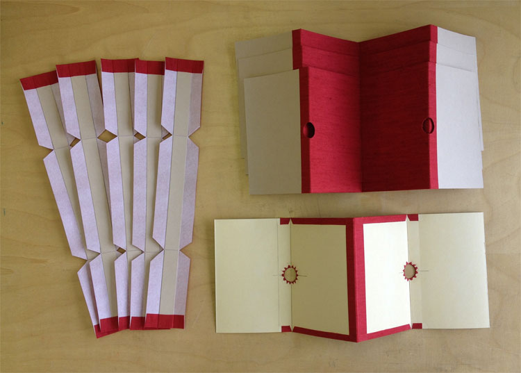
    The model was constructed using 20 pt. museum board and some scrap bookcloth. For the client’s box, I had to devise a way to cover the 20 pt. using Canapetta bookcloth and Bugra. Since a full sheet of 20 pt. laminated with bookcloth would get too bulky in the fold, the walls were assembled with four separate panels leaving a slight gap creating proper movement at the hinge.

    My client also requested notches on the walls for easy removal of the books. Semi-circles were cut out along the edge of the panels and the cloth was cut into triangles to successfully turn-in around the curve.

    MultiSectionSlipcase2-ErinFletcher

    Construction of this multi-section slipcase could be rather finicky at times, making it difficult to keep each component square. Once the slipcase sections were assembled and the interior ‘tongue and slot’ closure was added, it was time to construct an exterior case to mimic the clamshell boxes. I began by shaping the spine, which was rather difficult on a box that was wider than either of its other dimensions. The false bands were added and finally the leather was pasted down. The spine was then tooled and the leather label was laid into its well on the front board.

    MultiSectionSlipcase3-ErinFletcher MultiSectionSlipcase4-ErinFletcher

    The slipcase block is mounted to the back board of the exterior case, which can freely swing away and aid in the movement of the slipcases.

    MultiSectionSlipcase5-ErinFletcher


  8. Preparing the La Couleur du Vent Exhibit + Opening Reception

    July 24, 2014 by Erin Fletcher

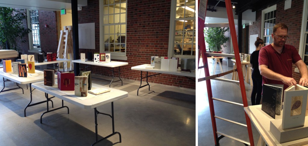
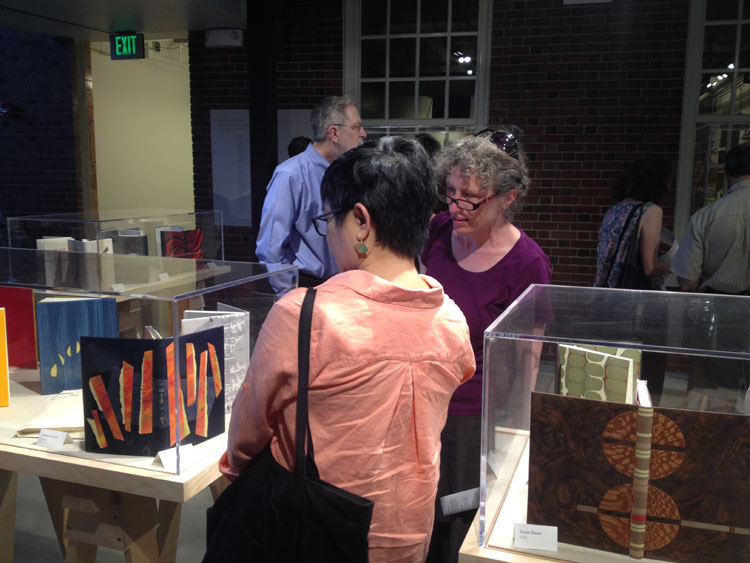
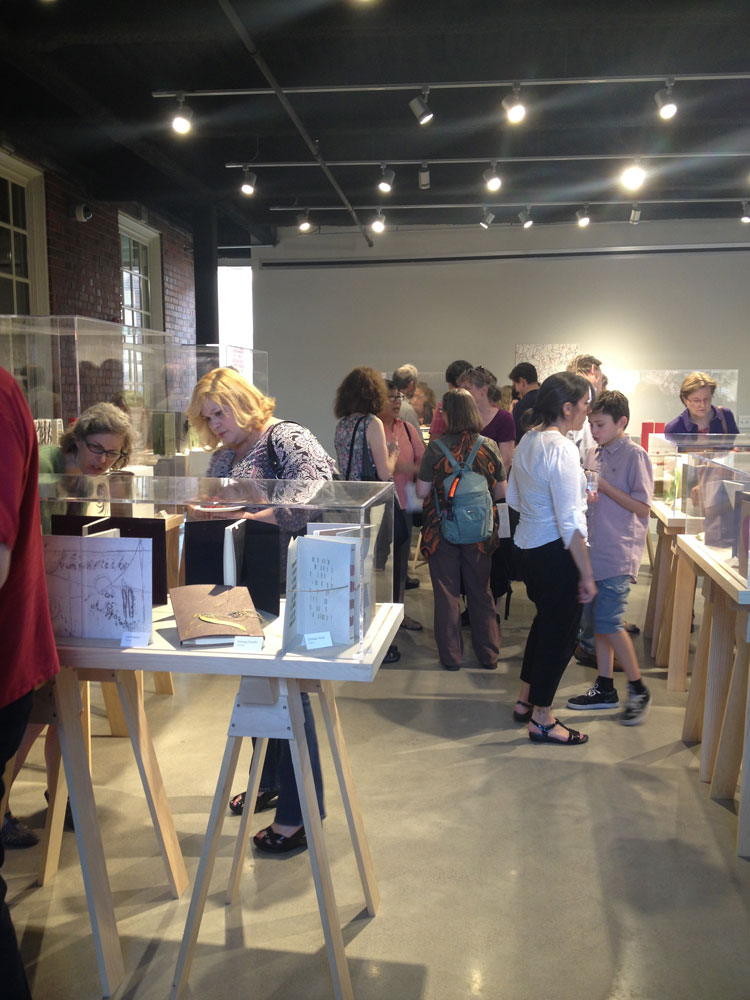
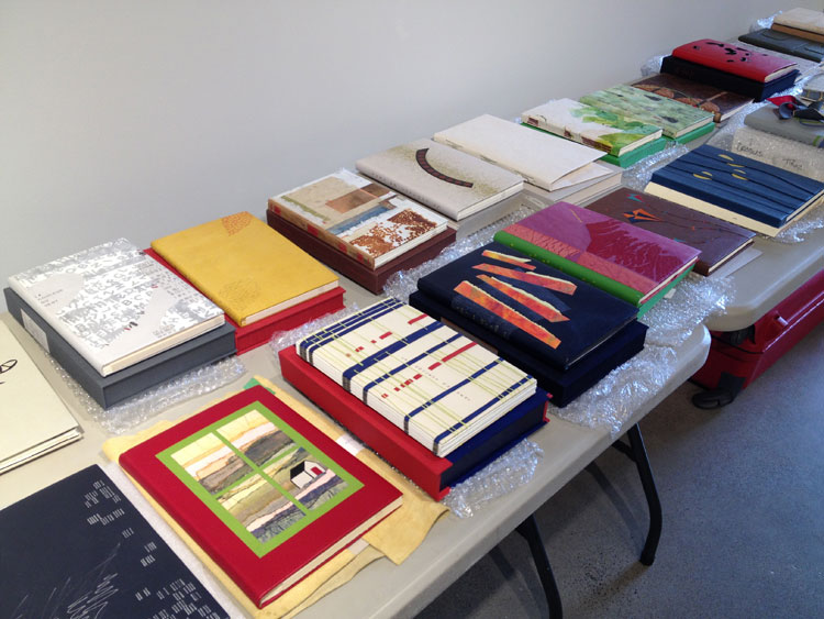
    Last week, North Bennet Street School opened their first bookbinding exhibit in the Windgate Gallery. During the set-up, along with Jeff Altepeter and Katie Barber, I had the pleasure in handling the design bindings for ARA-Canada‘s La Couleur du Vent exhibit. To start off, I unpacked all of the books, unraveling them from their protective layering while keeping everything organized.

    LaCouleurDuVent1-ErinFletcher

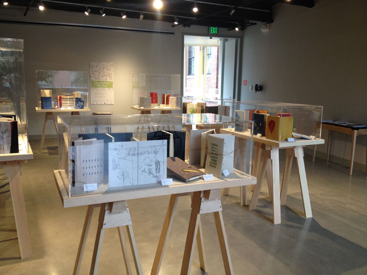
    Jeff and I then went to task in laying out the books in their respective spots, doing our best to arrange the cases in a complimentary fashion. The school recently built new wooden bases for the exhibit with sawhorse-style legs. In order to have an adequate base, we decided to hide the wood by making some custom wrapped boards in a suitable and subtle bookcloth. After the wooden bases were installed we put the bindings in their final place, making minor adjustments by adding risers and wedges for the books lying flat.

    LaCouleurDuVent2-ErinFletcher LaCouleurDuVent3-ErinFletcher

    In addition to the bindings, a table was set up with a facsimile of the printed text. This gave real insight to the inspiration many of the binders saw within the illustrations, many of the graphics were replicated or abstracted on several of the bindings.

    LaCouleurDuVent5-ErinFletcher

    The night of the reception was attended by quite a crowd of binders coming from as far as France and Canada. Odile Douet of École Estienne in Paris was accompanied by Jonathan Tremblay, president of ARA-Canada (both with beautiful bindings in the show). Odile gave a heartwarming talk about the transformation of this simple idea and how it flourished into an international traveling exhibit. If you haven’t had a chance to view the exhibit, you can do so until it closes on September 14th.

    LaCouleurDuVent7-ErinFletcher LaCouleurDuVent6-ErinFletcher


  9. My Time at Rare Book School

    July 24, 2014 by Erin Fletcher

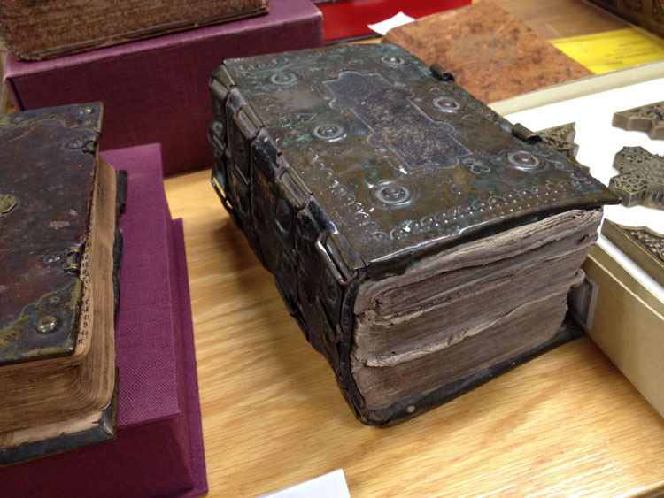
    Rare Book School uses the term rare not to refer to objects that are expensive and uncommon, but in regards to the object’s uniqueness and unusual excellence in artistic quality and craftsmanship. I would describe my experience at RBS as the latter sense of the word. The carefully crafted instruction that was delivered in my course by Jan Storm van Leeuwen was impeccable. His passion for bookbinding and decades-long research produced a rather intensive look through the long history of bookbinding.

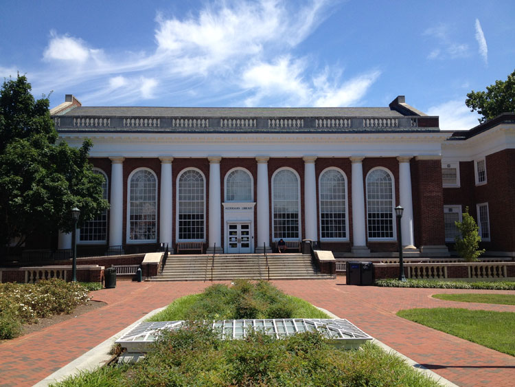
    Each day began with a stroll across the grounds of the University of Virginia as I made my way from the Brown College dorms to Alderman Library where the classes were held on the 4th floor. Which can be accessed by either going down three flights of stairs or taking the elevator down. Trust me.

    RareBookSchool1-ErinFletcher

    Once inside, we were greeted with a complimentary breakfast, complete with the necessary cup of tea to start off my day. These breaks between lectures became a frenzy of chatter as introductions were made and curiosity ensued. Any chance to mingle amongst fellow book lovers and discuss bookbinding for a week straight can only be viewed as no less than phenomenal. Amongst the sea of book nerds, were librarians, archivists, catalogers, graduate students, conservators, book dealers and, a few like myself, bookbinders.

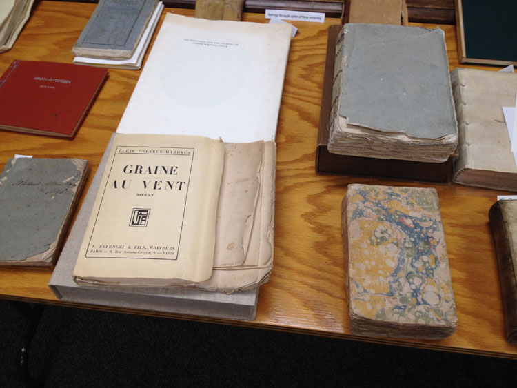
    I wish that I would have taken more pictures of the day’s events, but I found myself deeply occupied by either furious note-taking or mingling with the other students. Jan took us on a journey through bookbinding history beginning with the most earliest known bound examples up through the late 20th century. Each lecture was paired with show and tell a specimens from the massive collection held by Rare Book School.

    RareBookSchool2-ErinFletcherRareBookSchool5-ErinFletcher

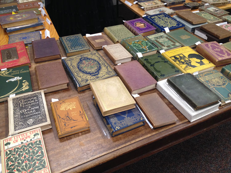
    We ended the week with an introduction to Publishers’ Bindings, discussing the styles seen in France, England, United States, Germany and Holland. Below are some fine examples of French Publishers’ Bindings. The image on the right is referred to by Jan as a ‘Chocolate Box’ binding. The paper covers are printed and embossed before covering. A window is also cut out to showcase a small color-litho print. These prints were attached to several different titles and were not necessarily representative of the content.

    RareBookSchool3-ErinFletcherRareBookSchool4-ErinFletcher

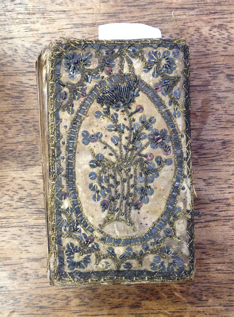
    This rather small embroidered binding was one of the highlights of my week. The binding was so fragile and weak. The silk/satin had deteriorated at the board edge and had popped away from the upper (front) cover. This was quite exciting for me. For the first, time I had the opportunity to get a look at the construction of the binding and covering material. It was wonderful to see how the stitches were somewhat haphazardly applied.

    RareBookSchool6-ErinFletcher

    In addition to our lectures and show and tell sessions, we were tasked at deciphering leathers based on their follicle patterns and characteristics. It proved to be quite difficult at times to decide between goatskin and sheepskin. But as it wants, the sheepskin tends to turn fluffy and brittle, usually popping away from the boards

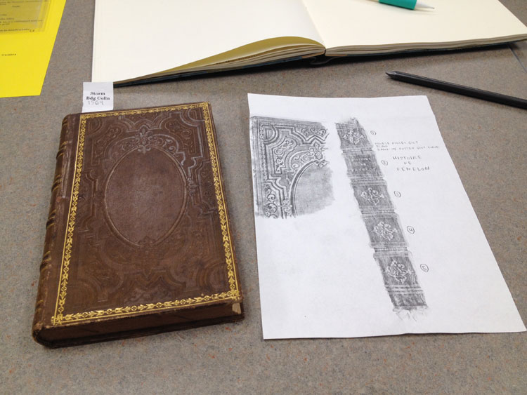
    Jan also gave us a brief hands-on demonstration of his strategy for taking rubbings, which is something that should be done properly and with care so as not to abrade the surface of the binding. Using a thin sheet of custom-made paper for the The Dutch Royal Library in the Hague, we lightly brushed a soft, pure graphite stick over the surface in various patterns. The design of the bindings slowly began to emerge and as I worked the graphite stick from side to side, then diagonally and finally in circular motions, the finest details were picked up. Jan also demonstrated how to properly rub the spine of a binding and the proper way to label your rubbings.

    RareBookSchool7-ErinFletcher

    Now that I’m filled to the brim with bookbinding knowledge, I hope to take another trip to Rare Book School next year. If you have the opportunity to attend RBS, I highly recommend it, I don’t think you’ll be disappointed in the slightest.


  10. Giveaway – Flash of the Hand Turns 2!!

    July 11, 2014 by Erin Fletcher

    foth-anniversary

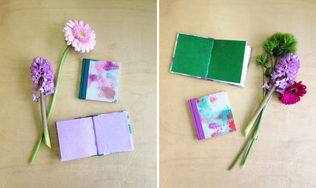
    Flash of the Hand turns 2 today! Working on this blog has brought me close to so many wonderful and talented bookbinders and artists. The comments and compliments I receive have been so thoughtful and encouraging. To show my appreciation to all of you wonderful supporters, I’m giving away 2 mini notebooks to 2 lucky winners.

    giveaway-FotH

    To be eligible to enter, all you need to do is comment on this post saying you did the following:
    – Like Herringbone Bindery on Facebook
    – Write a comment on any post in the blog (make sure to include the link to the post you commented on)
    Subscribe to the blog

    Giveaway ends on July 18th (12:00am EST). Winners will be contacted via email, so don’t forget to include your email address.

    Thanks everyone! I’m looking forward to the next year of blogging.


  • My name is Erin Fletcher, owner and bookbinder of Herringbone Bindery in Boston. Flash of the Hand is a space where I share my process and inspirations.
    The StudioNewsletterInstagramEmail me
  • Archives