RSS Feed

Posts Tagged ‘erin fletcher’

  1. Upcoming Workshops // April to June

    April 15, 2017 by Erin Fletcher

    APRIL:
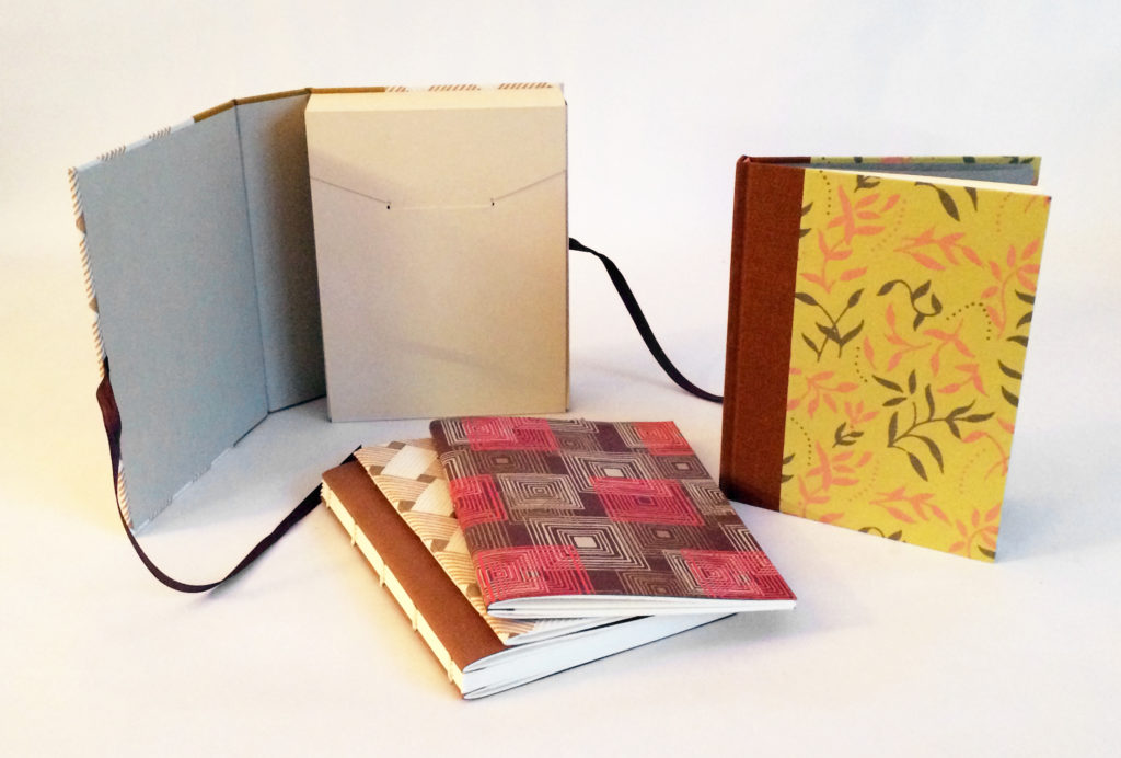
    Fundamentals of Bookbinding I
    April 24 – 28 (Monday – Friday)
    8:30am – 4:30pm
    North Bennet Street School, Boston MA

    There are still a few seats available for this workshop. This is a great workshop if you are interested in the full-time program at North Bennet or wanting to learn a new skill. During the workshop students will explore the basics of bookbinding through a variety of non-adhesive structures and finish the week by making a flatback case binding. We will discuss materials, adhesives, tool use and students will have access to traditional bindery equipment. This workshop is also available in June, see below for dates and link.


    MAY:
    Secret Belgian Binding – 3 Ways
    May 6 – 7 (Saturday & Sunday)
    8:30am – 4:30pm
    North Bennet Street School, Boston MA

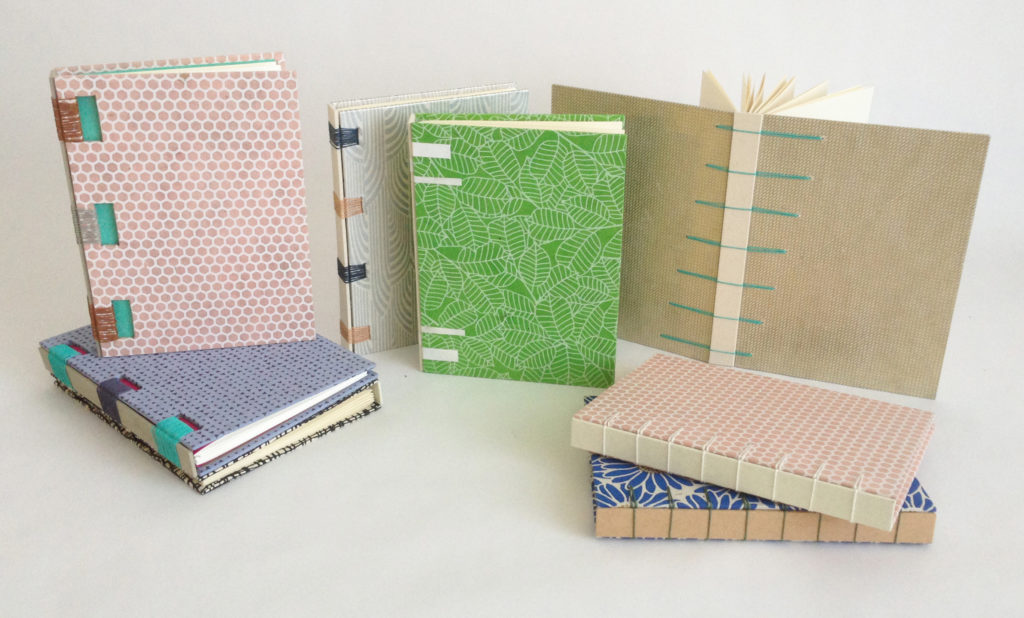
    This workshop is sold out. On day one, students assemble two variations of this non-adhesive structure, which is simple and can be quickly constructed. It opens flat and is perfect for thinner text blocks. On day two, students explore modified versions of the Secret Belgian binding by playing with the amount and size of sewing holes and incorporating Tyvek.

    Make Your Own Punching Cradle
    May 20 (Saturday)
    9:00am – 1:00pm
    North Bennet Street School, Boston MA

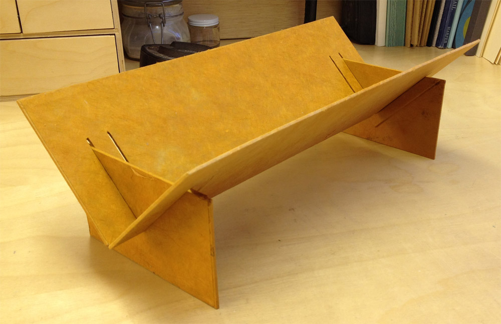
    A punching cradle is a very useful piece of equipment for bookbinders. During this class, students create a collapsible punching cradle with a variable length. The collapsible cradle is lightweight, saves space, and is perfect for traveling or working in small spaces.


    JUNE:
    Fundamentals of Bookbinding I
    June 19 – 23 (Monday – Friday)
    8:30am – 4:30pm
    North Bennet Street School, Boston, MA

    This is a great workshop if you are interested in the full-time program at North Bennet or wanting to learn a new skill. During the workshop students will explore the basics of bookbinding through a variety of non-adhesive structures and finish the week by making a flatback case binding. We will discuss materials, adhesives, tool use and students will have access to traditional bindery equipment.

    Three-Part Bradel Binding
    June 26 – 30 (Monday – Friday)
    8:30am – 4:30pm
    North Bennet Street School, Boston, MA

    The 3-Part Bradel binding offers a unique aesthetic over a traditional case binding. As the name suggests, the binding is assembled in three parts, which encourages the binder to use different materials to cover the spine and covers. For this workshop, students will use leather to cover the spine and a cloth or paper of their choice for the covers. Students will be guided as they pare their own leather.

    Students will also be using a variety of bindery equipment such as a sewing frame, job backer, plow and Kwikprint to complete their structure. We will also cover how to create a painted edge and stamp a custom label. Experience with leather is not necessary, but encouraged.

  2. New England Chapter Print Exchange

    April 5, 2017 by Erin Fletcher

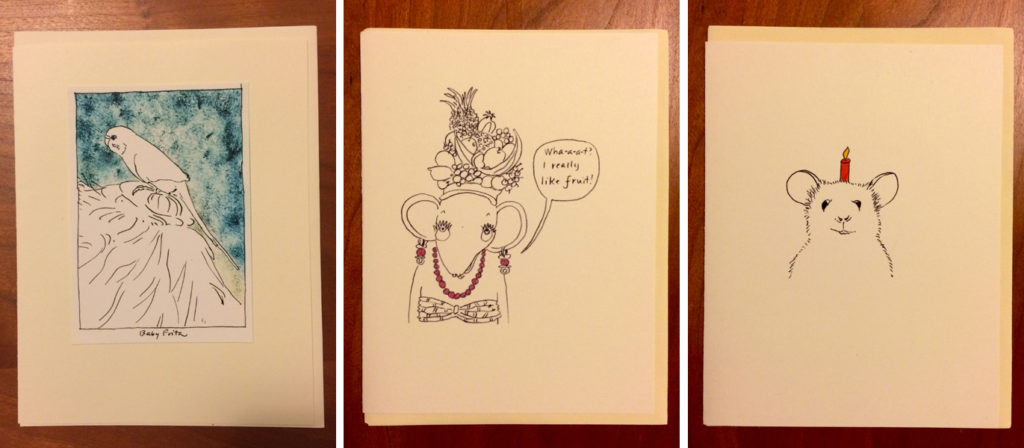
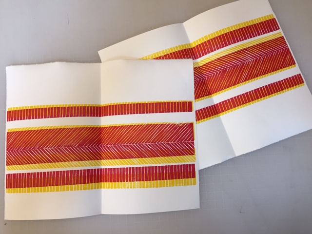
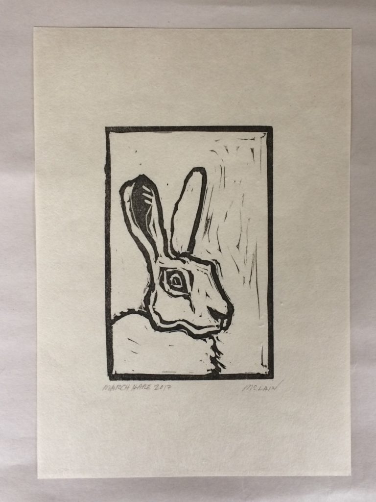
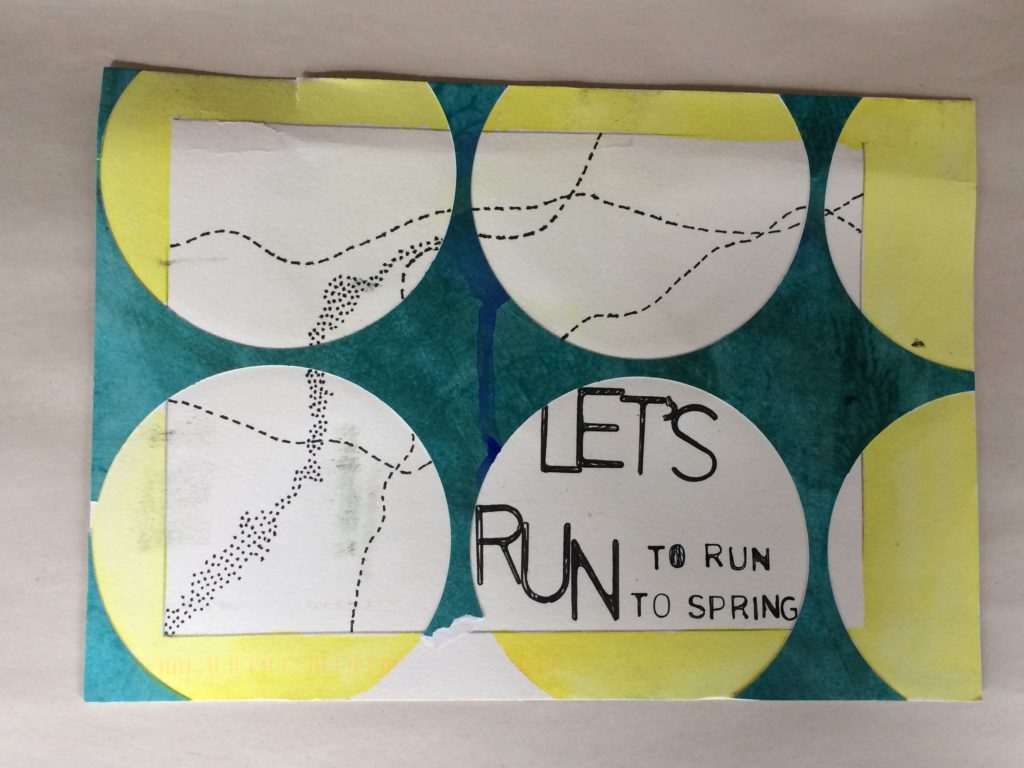
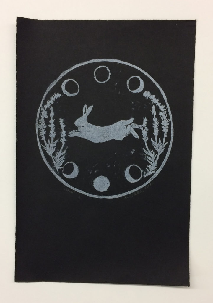
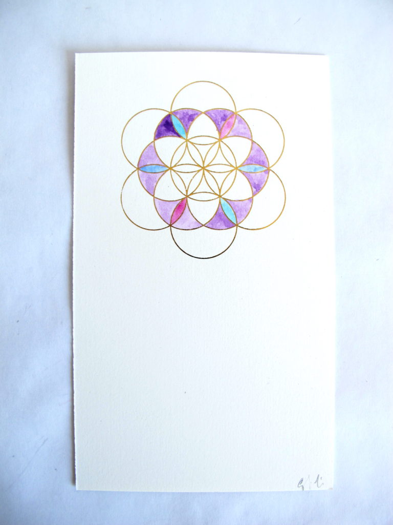
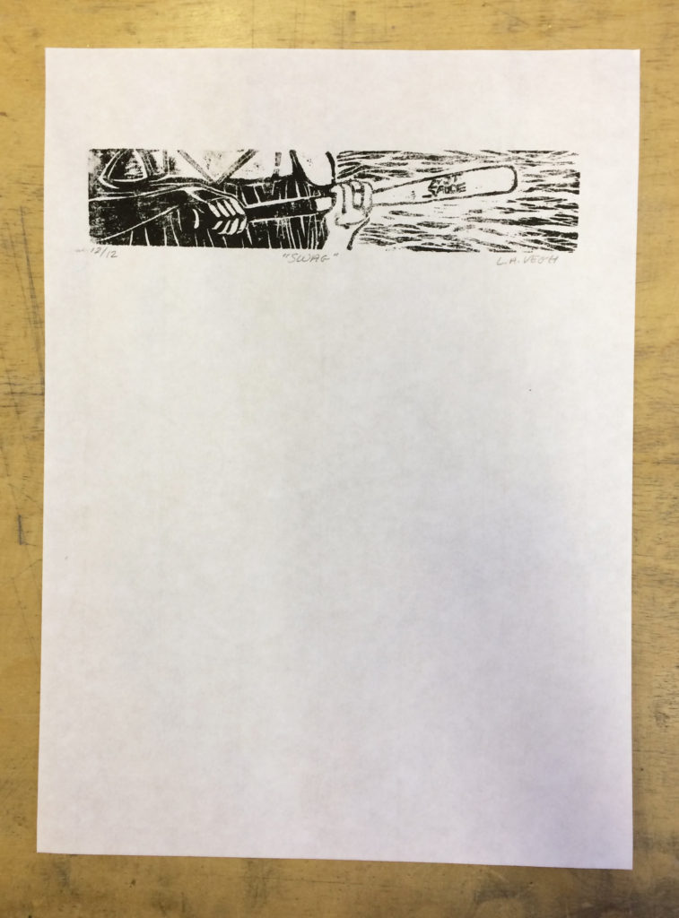
    I recently participated in a print exchange with a few fellow members of the New England Chapter of the Guild of Book Workers. Our instructions were to create a print edition using any medium we desired around the optional theme of Spring. The prints were then sent through the mail to each other. So in the end I made 11 prints (plus a few extras) and received 11 different prints from everyone else.

    Erin Fletcher

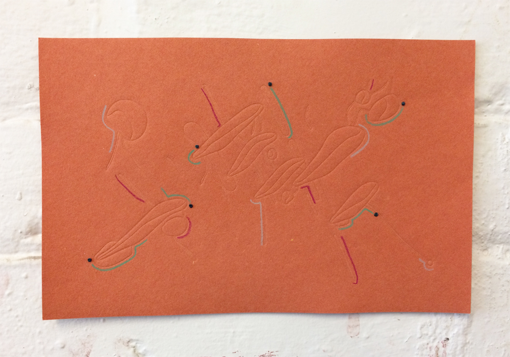
    The print I created was part collaboration with my husband. He drew an image that I had turned into a metal die, which was heated and pressed into paper. I chose two papers handmade by Katie MacGregor, orange and a sort of dull algae green. Once the impression was made, I then drew several marks with colored pencils. The dots are hand-stitched french knots.

    It was fun to send these out into the world, but it was more fun to receive so much interesting mail over the course of a week. Here are the rest of prints from the exchange:

    Katherine Beaty

    Carol Blinn

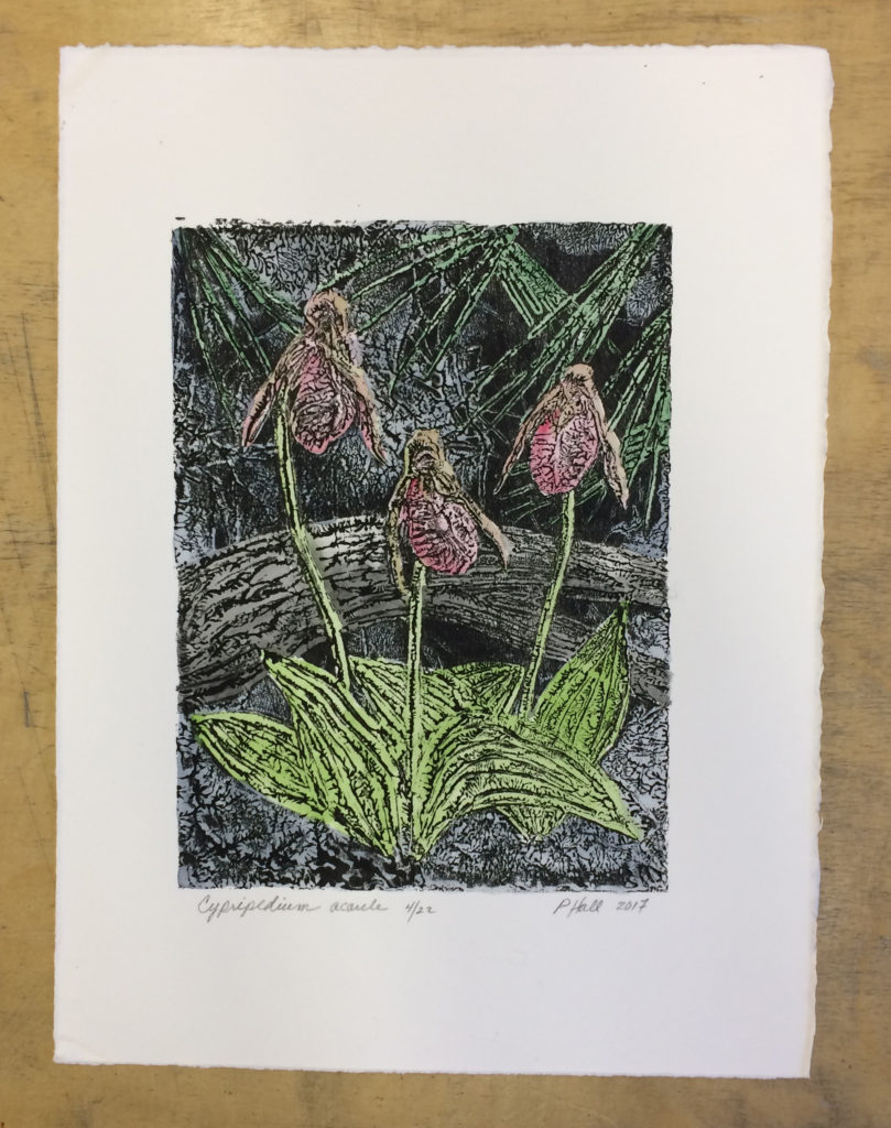
    Penelope Hall | Cypripedium acaule

    Martha Kearsley

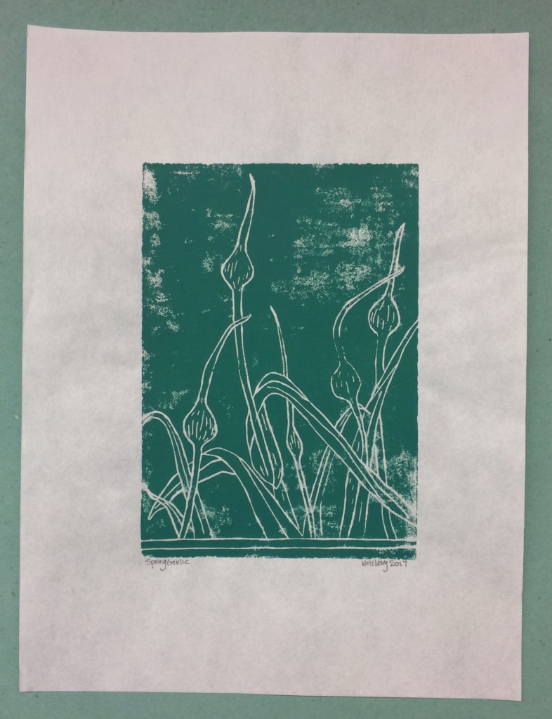
    Kate Levy | Spring Garlic

    Anne McLain | March Hare

    Melanie Mowinski

    Emily Patchin | Ostara

    Colin Urbina

    Linnea Vegh | Swag


  3. Upcoming Workshops // March to May

    March 17, 2017 by Erin Fletcher

    Fundamentals of Bookbinding I
    April 24 – 28 (Monday – Friday)
    8:30am – 4:30pm
    North Bennet Street School, Boston MA

    This is a great workshop if you are interested in the full-time program at North Bennet or wanting to learn a new skill. During the workshop students will explore the basics of bookbinding through a variety of non-adhesive structures and finish the week by making a flatback case binding. We will discuss materials, adhesives, tool use and students will have access to traditional bindery equipment.


    Secret Belgian Binding – 3 Ways
    May 6 – 7 (Saturday & Sunday)
    8:30am – 4:30pm
    North Bennet Street School, Boston MA

    Just a few spots left in this workshop. On day one, students assemble two variations of this non-adhesive structure, which is simple and can be quickly constructed. It opens flat and is perfect for thinner text blocks. On day two, students explore modified versions of the Secret Belgian binding by playing with the amount and size of sewing holes and incorporating Tyvek.

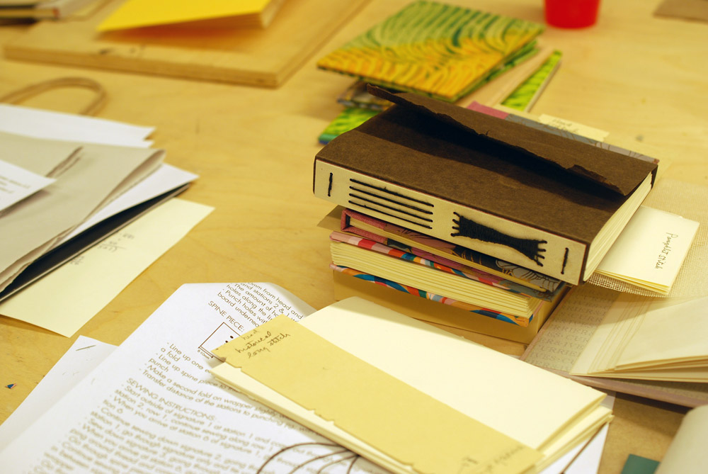
    Make Your Own Punching Cradle
    May 20 (Saturday)
    9:00am – 1:00pm
    North Bennet Street School, Boston MA

    A punching cradle is a very useful piece of equipment for bookbinders. During this class, students create a collapsible punching cradle with a variable length. The collapsible cradle is lightweight, saves space, and is perfect for traveling or working in small spaces.


  4. Upcoming Workshops // February to April

    February 15, 2017 by Erin Fletcher

    Here’s a list of my upcoming workshops, which will be taught at the North Bennet Street School in Boston.

    Bookbinding 101
    February 28 – March 9 (Tuesday and Thursday evenings)
    6:00pm – 9:00pm

    This shorter workshop focuses on technique as students will construct through the aid of kits. Students will make three different binding structures and create an enclosure to house everything. This workshop is perfect for anyone curious about bookbinding and what North Bennet has to offer. No prior experience necessary.

    Register here.


    Limp Vellum Binding
    March 4 – 5 (Saturday and Sunday)
    8:30am – 4:30pm

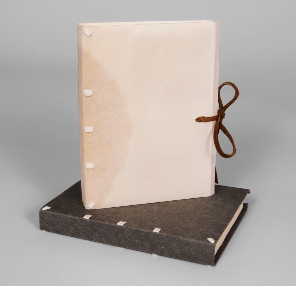
    This two-day workshop will focus on the classic and elegant limp vellum binding. Students will learn how to sew over alum-tawed thongs using a sewing frame, create hand-sewn endbands and manipulate vellum.

    Register here.


    Fundamentals of Bookbinding I
    April 24 – 28 (Monday – Friday)
    8:30am – 4:30pm

    There are still a few seats available in this workshop. This is a great workshop if you are interested in the full-time program at North Bennet or wanting to learn a new skill. During the workshop students will explore the basics of bookbinding through a variety of non-adhesive structures and finish the week by making a flatback case binding. We will discuss materials, adhesives, tool use and students will have access to traditional bindery equipment.

    Register here.


  5. My Hand // Into This World

    October 18, 2016 by Erin Fletcher

    IntoThisWorld8-ErinFletcher

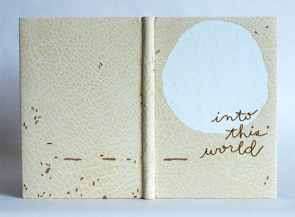
    I recently completed a French-style fine binding around Natalie Goldberg’s Into This World. The letterpress printed text is paired with woodblock prints both carved and printed by Clare Dunne and hand-tinted by Sialia Rieke. The texture of the prints were my inspiration for the design for the binding. By combining the natural texture of the buffalo skin with embroidery and leather onlays, I hoped to capture the pops and cracks between the layers of color.
    With this plan in mind, I used a single print as my inspiration to lay out the design. For the embroidered elements of the design, I chose to play with the technique in two new ways: an embroidered title and embroidered paper doublures.

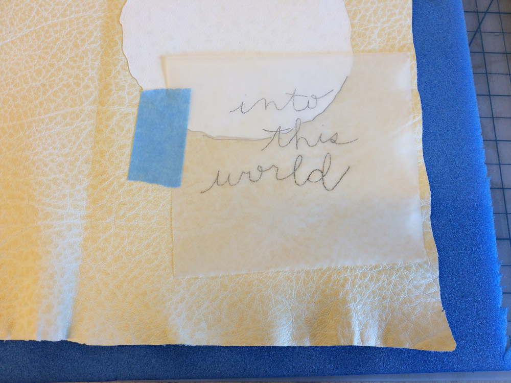
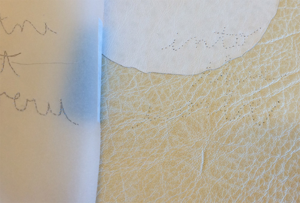
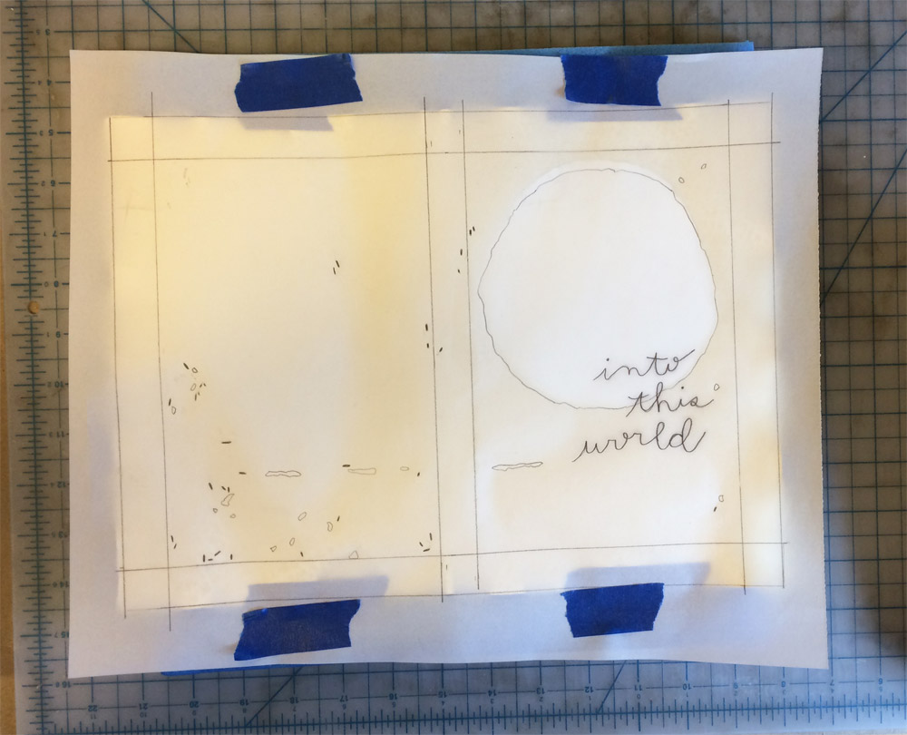
    The script used for the title mimics the author’s own handwriting taken from her signature on the title page. The title was drawn onto tracing paper and taped in place, overlapping the white buffalo back-pared onlay. I tend to pre-punch the holes for embroidery, especially when I am trying to achieve something exact. For the pre-punching, I put a thin embroidery needle in my pin vise and placed the leather onto a piece foam. Then I used the tracing paper to guide my pin vise.

    IntoThisWorld-ErinFletcherIntoThisWorld2-ErinFletcher

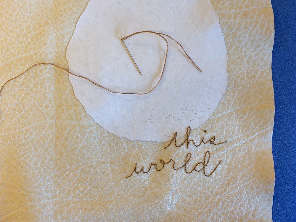
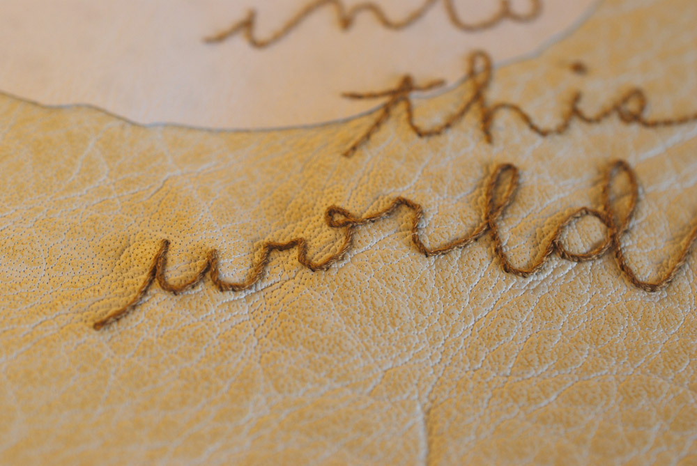
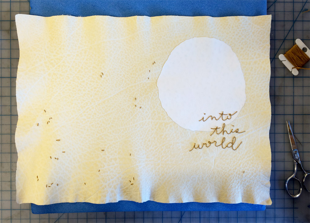
    The embroidery for the title happened in two steps: back-stitch to spell-out the letters with french knots for the i’s dots and then I wrapped the stitches to create a raised, more defined line.

    IntoThisWorld3-ErinFletcher IntoThisWorld5-ErinFletcher

    After the title was completed, several seed stitches were scattered around the binding with the majority of them appearing on the back cover. I used the same technique to pre-punch the holes for the seed stitches, this time using the full-scale template. The title and seed stitches were sewn with 2-ply cotton thread in an ochre yellow.

    IntoThisWorld6-ErinFletcherIntoThisWorld7-ErinFletcher

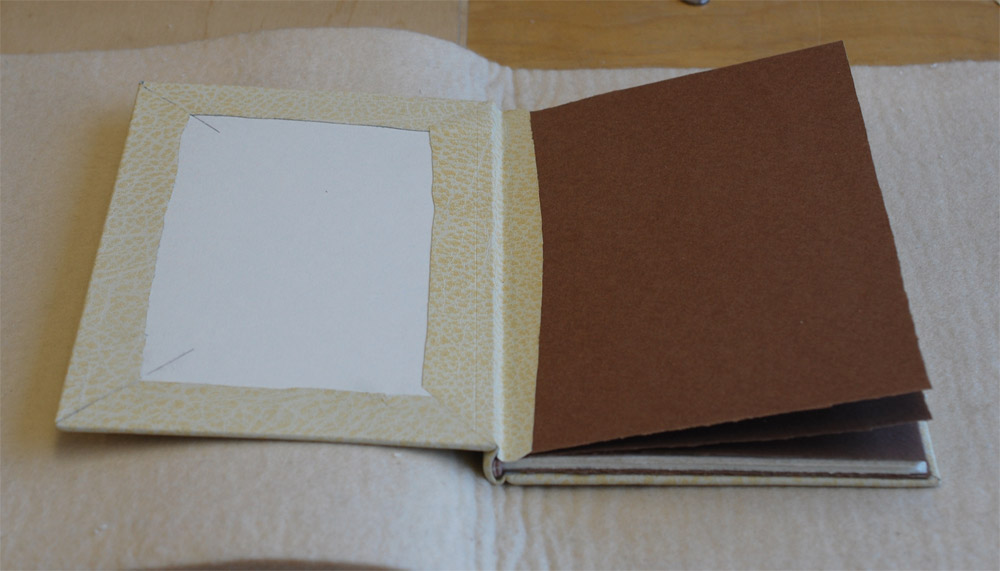
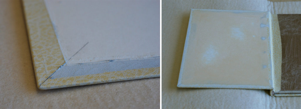
    The second embroidered element in the binding are the edge-to-edge paper doublures. The prep for paper doublures is very similar to the set-up for leather doublures; for paper I allowed a wider turn-in as I trimmed out, this would ensure a smoother surface under the paper. Below you can see the turn-ins post covering and with the leather hinge in place.

    IntoThisWorld10-ErinFletcher

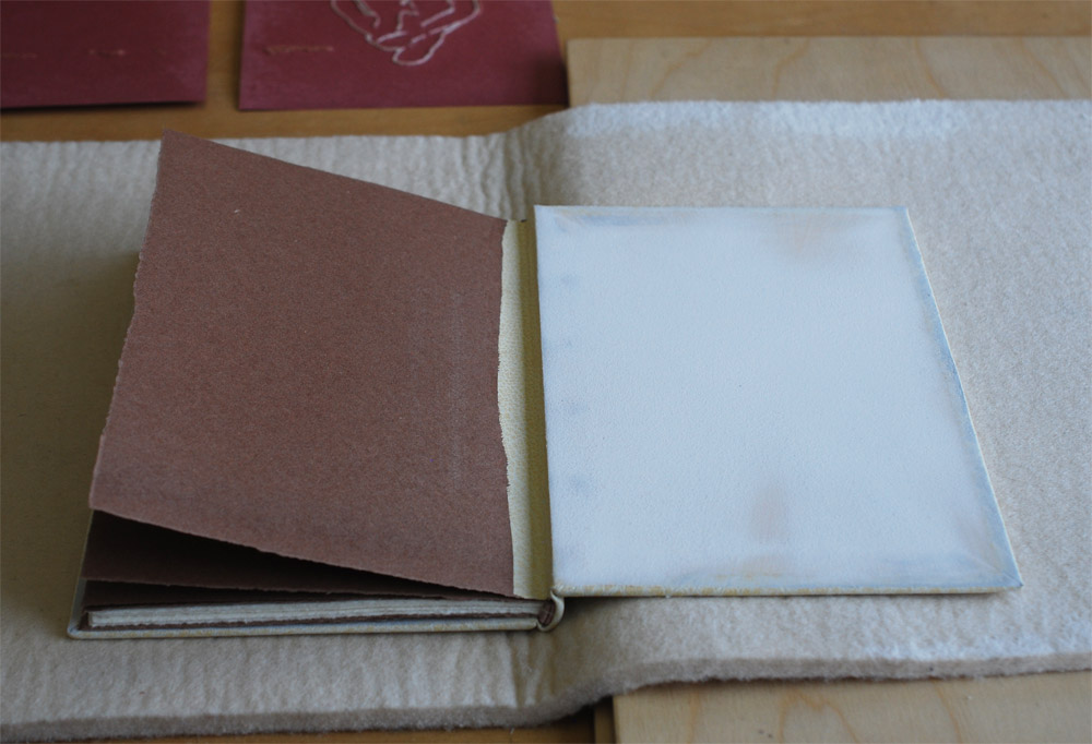
    After scoring a frame around the board and spine edge, I began to trim off the excess leather at a slight bevel. In order to create a successful doublure, several layers are added to the board (one at a time) and sanded to make the board as smooth as possible. The first layer (shown on the right in the image below) was a piece of 10pt. card, first sanded along all four edges and attached with a PVA/methylcellulose mix. After allowing that layer to dry under weight for an entire day, I sanded the edges smooth (which is the state visible in the image below).

    IntoThisWorld11-ErinFletcher

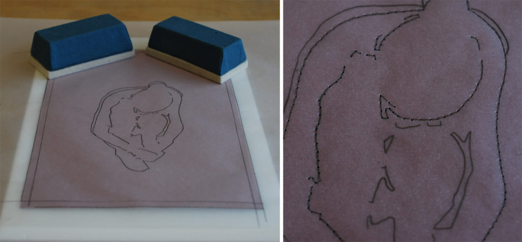
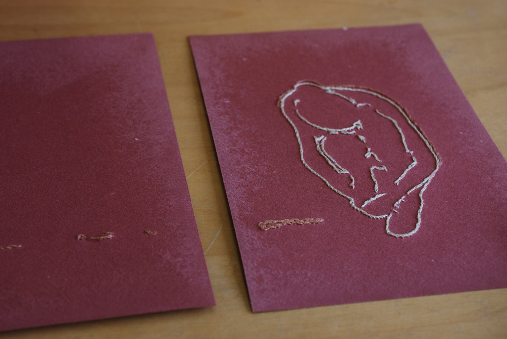
    In between these stages, I began working on the embroidered paper doublures. Referencing the same print used to inspired the covers, I traced an outline of the figure from the image. I felt that her pose embodied the sentiments of the text perfectly. Using the tracing paper once again as my guide for punching the holes, I placed the paper onto a piece of foam and poked through the tracing paper into the doublure paper.
    IntoThisWorld12-ErinFletcherIntoThisWorld13-ErinFletcher

    Once the paper pieces were fully embroidered, I carefully sanded the backside of the paper to create a smoother feel along the edges once glued down to the board. Below you can see the board in it’s final stage. After sanding down the 10pt. card, I attached a medium weight smooth paper. This piece was slightly oversized on three edges and sanded down on the spine side. After allowing it to dry under weight, I sanded it down smooth. The embroidered paper doublures were attached with MIX and put under weight for a day in order to dry thoroughly and to prevent the board from cupping inward.

    IntoThisWorld14-ErinFletcher

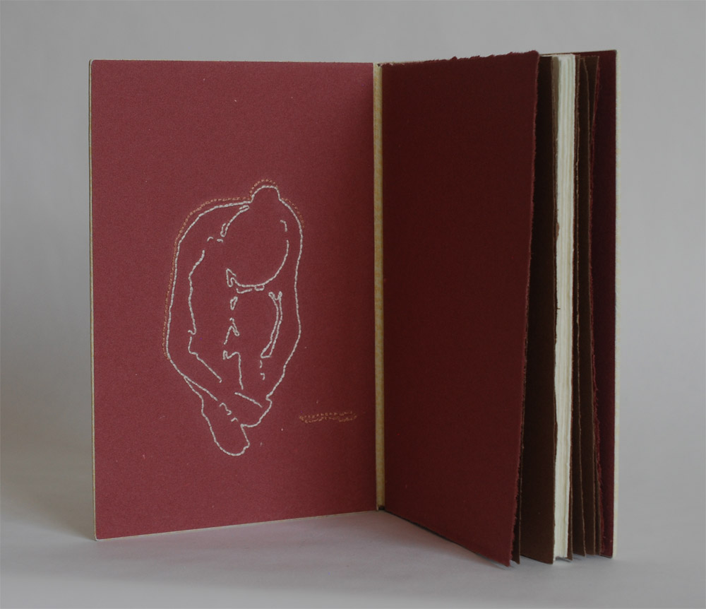
    And here are the final results. I am so pleased with the outcome of the embroidered paper doublures, it will most certainly be a technique I use again on a future binding. To see more images of the binding and it’s embroidered quarter leather clamshell box, click here.

    IntoThisWorld9-ErinFletcher


  6. Exquisite Corpse Collaboration

    July 10, 2016 by Erin Fletcher

    ExquisiteCorpse
    As Program Chair for the New England Chapter of the Guild of Book Workers, I had the pleasure of organizing a project brought to me by one of our members. Jonathan Romain, a recent graduate of the North Bennet Street School Bookbinding Program, brought forth the idea of a collaborative project between the students at NBSS and the NEGBW. I loved this idea and so with the help of instructor Jeffrey Altepeter, we put this plan in motion.

    An Exquisite Corpse is a method of illustration invented by Surrealists in the early 1910s, where each collaborator adds to a composition in sequence usually without seeing the prior portion. Upon reveal this rule to hide the previous sequences offers up an abstract and amusing portrait. Each student created a plaquette covered in neutral leather (we used Harmatan Terracotta and Brown goatskin) and also completed the “head” portion of the figure. The plaquette’s were about 18in x 6in; allowing each participant to cover a 6in square portion of the board.

    The project spanned over 3 months as each participant received and worked on their portion over the course of a month. At the end of May, the finished pieces were on display as part of NBSS’s Student & Alumni Show, an annual exhibit that showcases work from current students and alumni from the various programs.

    I had the pleasure of receiving the finished pieces and bringing them back to the students. We gathered around one another as each student revealed the unique and strange characters that developed over the course of the project. Each piece is displayed below with a brief description from each collaborator remarking on their concept and use of materials.

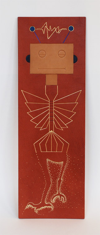
    Jeffrey Altepeter – Samuel Feinstein – Lang Ingalls

    JeffSamuelLang-Corpse
    Jeffrey Altepeter
    The robot head was inspired by my son’s fascination with mechanical and technological design and construction. It is made up of traditional leather decoration techniques—leather onlays, tooled with gold leaf, foil and carbon.


    Samuel Feinstein
    Chicago, IL

    Gold and blind tooling.


    Lang Ingalls
    Crested Butte, CO

    I opted for humor in my approach to the Exquisite Corpse. The design concept was to depict bird legs: the initial tests were for tooling in the positive; it became clear that the negative space would be more interesting. I used four sizes of “dots” in gold foil to produce the background behind the legs. Repetition and rhythm became the focal point.

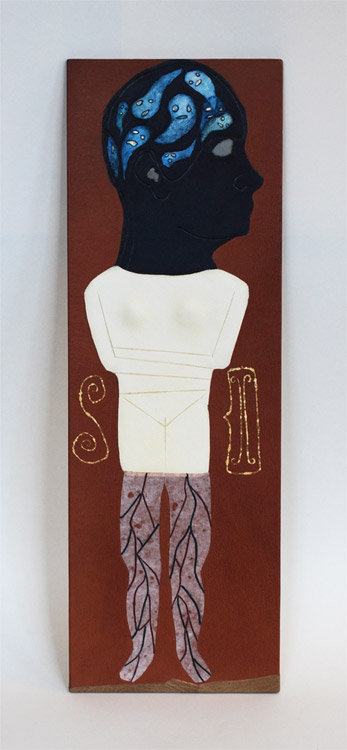
    Emily Patchin – Barbara Adams Hebard – Athena Moore

    EmilyBarbaraAthena-Corpse Emily Patchin
    This head was created as an onlay piece. The main portion was cut out of navy blue goat skin, pared thin. The sections for the eye, ear, and ghosts were all cut out, and their edges beveled on the flesh-side. Light blue leather for the eye and ear were glued to the back before pasting to the base leather. The ghosts were cut out from parchment; their faces backed with thinly pared gold leather, and painted with watercolor before being glued in place. The outline of the original drawing was then blind tooled over the leather. The intention behind the design was to look at intense personal struggles (depression, intrusive thoughts, insomnia) through a lens of whimsy and humor.

    Barbara Adams Hebard
    Melrose, MA

    Melrose, MAWhite alum-tawed goatskin onlay with blind tooled details, inspired by the shape of an Early Cycladic marble female torso (2800-2300 BC, Keros-Syros Culture). Flanking the torso are shapes commonly found incised on Early Cycladic pottery, a spiral and a two-headed ax, executed in surface gilding.


    Athena Moore
    Somerville, MA

    My materials were leather and hand-cast paper (made by the artist). The concept was a bit literal, since I had the last portion and was finishing the body with the legs, but I was inspired by a particular set of medical prints from Yale’s collection.

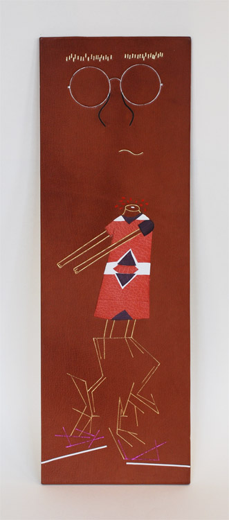
    Jonathan Romain – Erin Fletcher – James Reid-Cunningham

    JonathanErinJamesJonathan Romain
    a shapeless face, 18 karat gold, palladium, and ascona onlay


    Erin Fletcher
    Boston, MA

    I wanted to created something really playful with my portion of the plaquette. When I saw no indication of where to begin, I chose to create a headless girl with comically long arms. The girl’s dress is a series of blind tooled onlays in pink and purple goatskin and white buffalo. Her skin is gold tooled. And the blood spurting from her headless stump is painted with red acrylic.


    James Reid-Cunningham
    Cambridge, MA

    The design is largely non-representational, with a vague suggestion of legs. Otherwise, there is no concept. Tooled in gold and metallic foil, with inset lines of white box calf.

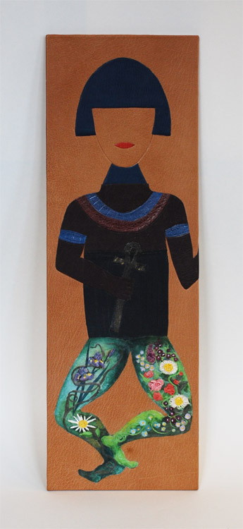
    Mary Grace Whalen – Eric Alstrom – Penelope Hall

    MaryGraceEricPenelope-CorpseMary Grace Whalen
    Blue Pageboy, a leather tool-edged onlay made of goatskin is inspired by the Russian pioneer of geometric abstraction, Kazimir Malevich’s costume design and his Yellow Man painting. Blue Pageboy gives off a theatrical and mysterious vibe. Who is s/he? Only the body will tell!


    Eric Alstrom
    Okemos, MI

    After many ideas, I kept coming back to the idea of ancient Egypt and their exquisite corpses.  My design is based on various historic paintings, but did not copy any single on in particular. The design is made from various colors of goat painted with acrylics and blind tooled


    Penelope Hall
    Kingfield, ME

    Inlay consisting of glazed earthenware, scraps of Thai papers, and wheat paste. Colored with watercolor. Additional adhesives used are E-6000, and Jade 403 PVA. Finish coat on the inlay is SC 6000 acrylic polymer and wax emulsion.

    Nicole Campana – Jan Baker – Colin Urbina

    NicoleJanColin-Corpse

    Nicole Campana
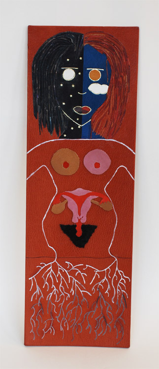
    This design was inspired by nothing more than a common theme in much of my art: day and night. I’m drawn to the color palette each time presents and the way in which our perceptions of those colors change as the light does. The techniques utilized are predominantly onlays and gold tooling, however a variation of the lacunose technique and an Ascona tool were used for the hair.


    Jan Baker
    Providence, RI

    what i lost this year:
    – my ovaries
    – my fallopian tubes
    – my uterus
    – all of my hair
    – and my brother


    Colin Urbina
    Boston, MA

    When I’m sketching, I often come back to the roots of a plant. For this project I decided to attempt the same type of free flowing, loose, many-from-one nature of these sketches with traditional gouges. Using five or six tools I built up the legs of this plaquette, and then added acrylic paint into them that gets darker as the roots go lower. The dirt is represented by grain manipulation with sandpaper, changing the surface of the leather and giving it a different look and feel.

    Peggy Boston – John Nove – Shannon Kerner

    PeggyJohnShannon-Corpse

    Peggy Boston
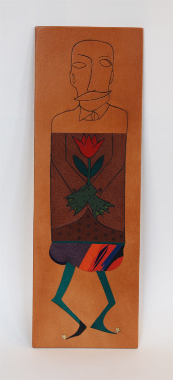
    My inspiration for this project came from a group of mustachioed, high-collared, quirky members of the Viennese Secessionist art movement. This movement was part of the golden age of illustration and graphic design in Vienna and Germany from 1897 to 1918. Their main influences were derived from William Morris and the English Arts and Crafts movement which sought to bridge the applied and fine arts. The Secessionists favored hand-made object opposing machine techniques. Hand tooling and acrylic paint.


    John Nove
    South Deerfield, MA

    The initial description of the project attributed the Exquisite Corpse to the Surrealists. My concept was of a Magritte-ian gentleman – fine suit, hands crossed in the standard coffin pose holding the usual flower  — but then with an amphibian’s green gnarly ‘hands’. Carbon tooling and goatskin onlays.


    Shannon Kerner
    Easthampton MA

    The vivid colors on the chubby tum were used to inspire whimsy, as well as the funny shape of the legs, which took inspiration from the cartoon Invader Zim, a silly plot animation focusing on an alien sent to Earth and meant to blend in. Stars: gold and palladium mixed together is a challenging medium to tool as they are different weights, but the outcome is very rewarding and attractive. Leather onlays, gold and palladium tooling.

    Todd Davis – Jason Patrician – Jacqueline Scott

    ToddJasonJackie

    Todd Davis
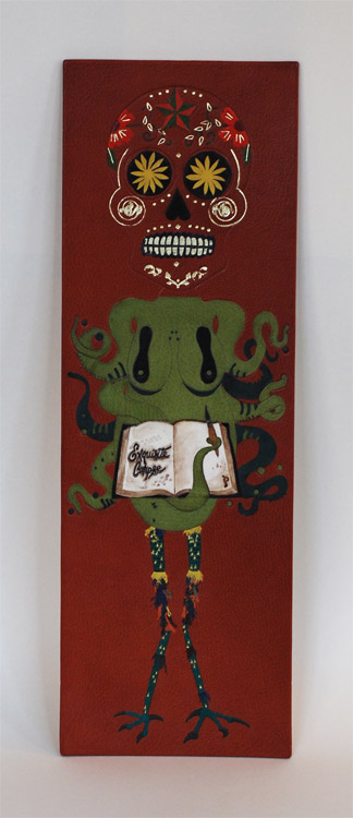
    The design of this head is inspired by the sugar skulls used as part of the Mexican celebration of Dia de los Muertos (day of the dead). On that day, these skulls, made of sugar, are part of an altar made to honor and celebrate dead ancestors, particularly children. Blind tooled outline filled with raised, ascona, and back-pared onlays. It is finished with blind and lemon gold tooling, and surface gilded teeth.


    Jason Patrician
    New London, CT

    I wanted to stay true to the surrealist exercise of the exquisite corpse by combining the distorted human figure and nature. For my design I chose the octopus, the master of disguise, which doubles as the female torso. Leather onlays (Harmatan and Pergamena), vellum inlay (Pergamena) with walnut ink wash and Prismacolor marker detail, blind tooling throughout.


    Jacqueline Scott
    Somerville, MA

    Materials: goatskin leather, gold leaf
    Concept: I wanted my plaquette section to be whimsical and colorful and wanted to utilize the feathered onlay technique. Something about chicken legs appealed to me, so I ran with that, though I think they ended up looking more like reptile legs with funny leg warmers.

  7. Manipulating Stone Veneer with Coleen Curry

    April 22, 2016 by Erin Fletcher

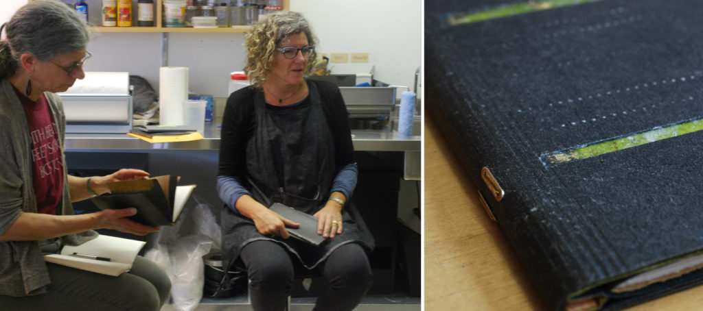
    Over the first weekend in April, Third Year Studio hosted a workshop organized by the New England Chapter of the Guild of Book Workers. Third Year Studio is located in Boston and is run by Colin Urbina, who just so happens to be my friend and studio mate (Herringbone Bindery is run out of Third Year Studio). This was the first workshop we hosted and Colin was so gracious to opened his space to members of NEGBW and to our guest instructor Coleen Curry.

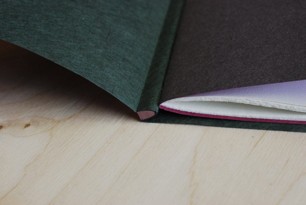
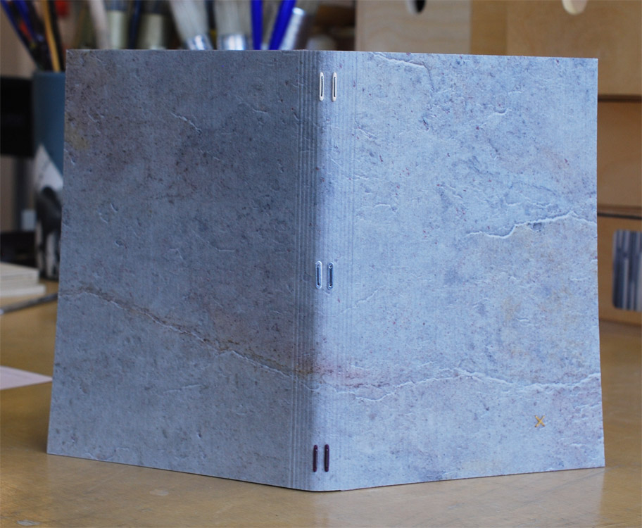
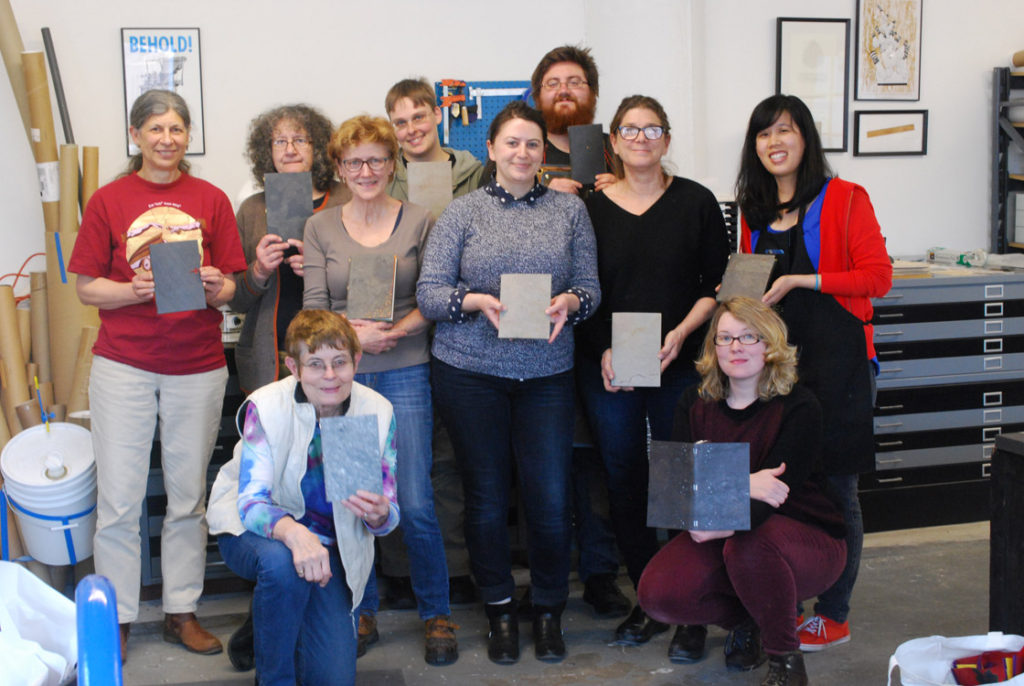
    Coleen traveled to a unseasonably warm, then snowy Boston to teach 10 local New England binders, book artists and conservators Staple Binding in Stone Veneer. Coleen learned this innovative structure from Sün Evrard, who developed this binding as a conservation solution under the Tomorrow’s Past ideology. We began the first day of the workshop by handing around models of the Stone Veneer binding while introducing ourselves and learning about the structure and its history. The stone veneer comes from a place in Italy where it is cut to a veneer-thickness by use of lasers. This process puts an adhesive coating on the surface, while the back is coated with a cotton-fiberglass layer. The veneer comes in two varieties: slate or quartzite. Yet within these two categories you can find a range of textures, patterns and tones.

    StoneVeneerWksp-ErinFletcher

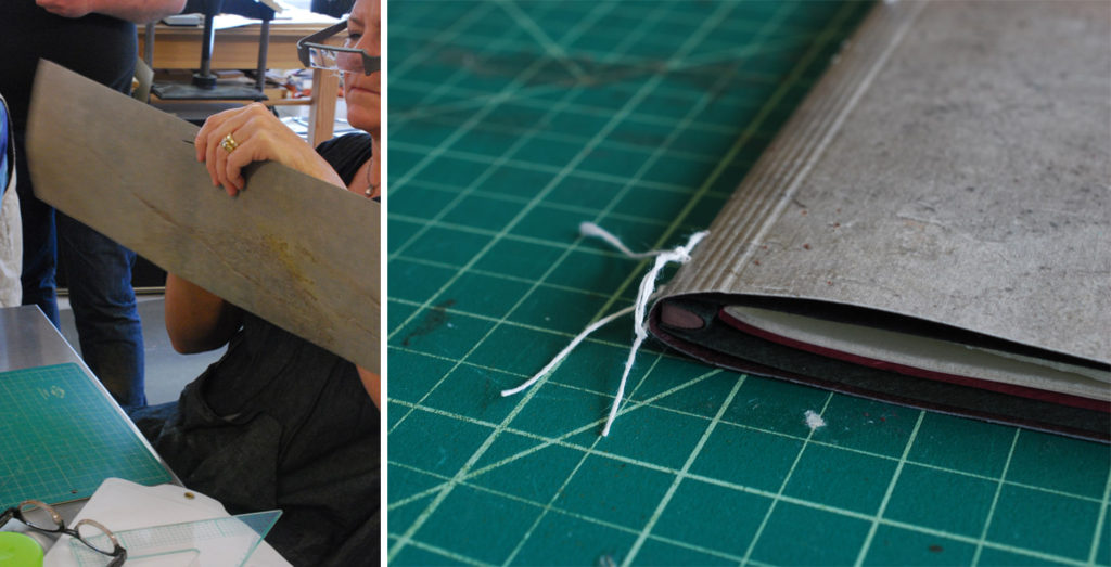
    left: Dorothy Africa and Coleen Curry | right: detail of  Toad Poems

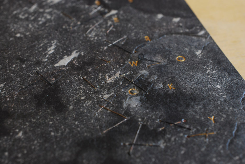
    The decoration on the slate stone veneer binding of Toad Poems above was achieved by placing a gilt piece of paper behind a cut-out in the covers. The windows are aligned with the staples, an example of how to incorporate the layout of the staples with the overall design.

    StoneVeneerWksp2-ErinFletcher

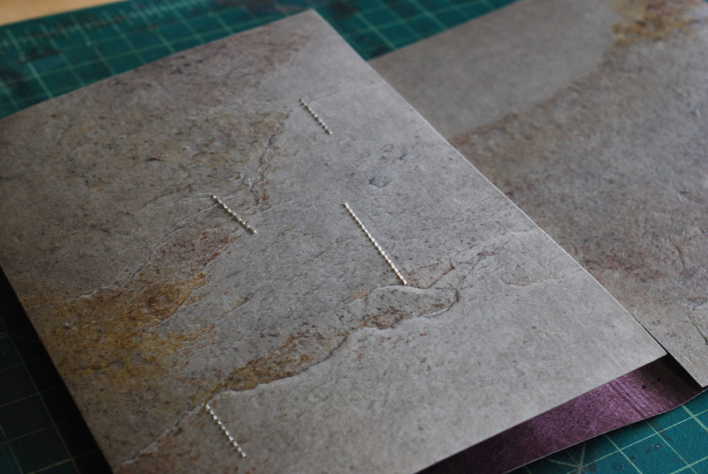
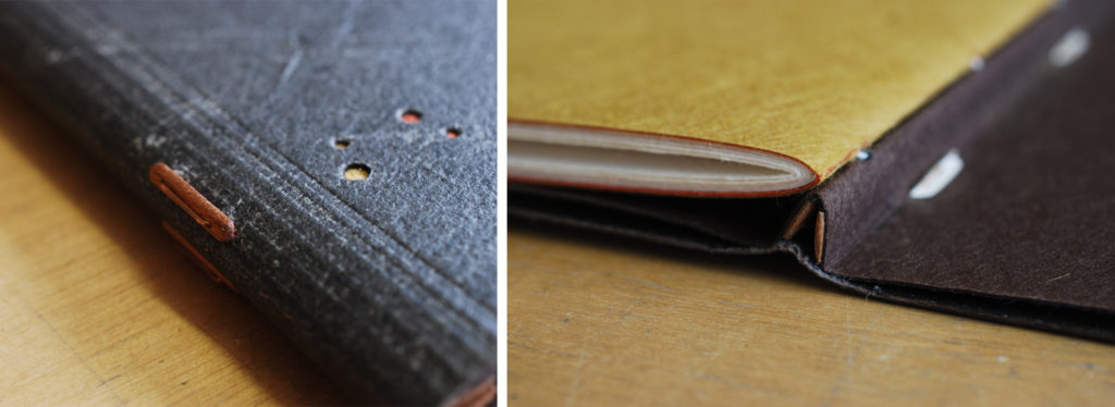
    The details of the binding above are of the blank model that Coleen made during the workshop with Sün, where she learned this structure. The covers were decorated using a Japanese screw punch. The circular cut-outs were backed with various colored Japanese tissues, offering a small pop of color against the grey slate. The image on the left shows part of the interior construction.

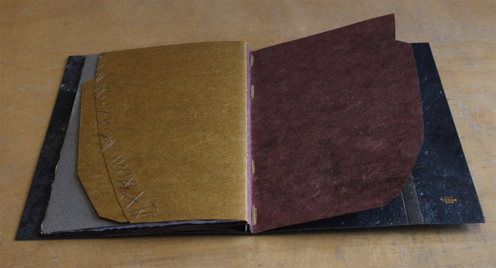
    Another example binding that Coleen shared with us, is this binding of Jabberwocky by Lewis Carroll. It was a great example of how well the stone tools and how it can handle embroidered decorations.

    StoneVeneerWksp4-ErinFletcher

    I especially loved the playfulness of the patched endpapers and use of embroidery to mend the edges.

    StoneVeneerWksp3-ErinFletcher

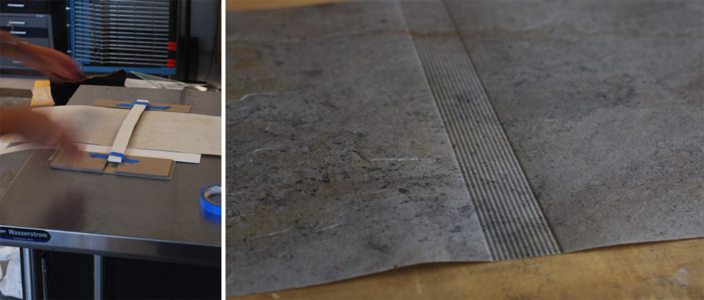
    After looking through Coleen’s examples, it was time for us to make our own model. After choosing our unique piece of stone (I chose a lovely light colored slate with splashes of yellows, pinks and purples), we were instructed to stamp a series of parallel lines into the center (or spine) of the stone. We did this by strapping our stone and a heated brass rule into a contraption and keeping it under the weight inside our large press. Afterward, we laminated a second layer of Japanese tissue to the backside of the stone. While that was put to bed, we laminated together pieces of colored Japanese tissue that would ultimately become our endpapers.

    StoneVeneerWksp5-ErinFletcher

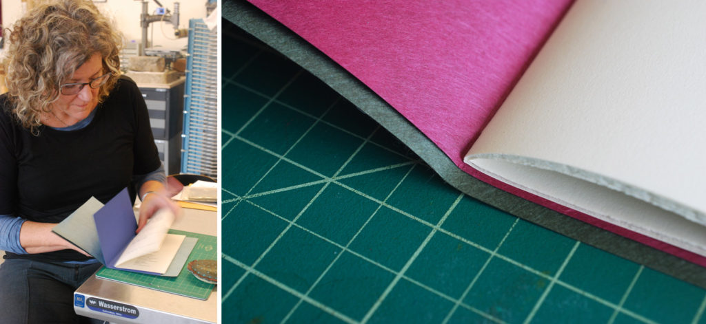
    While our stone continued to dry, we trimmed down our endpapers to either match our text block or extend slightly behind the edges. The image below shows Coleen demoing the pamphlet stitch that we would use on the text block. The image on the right shows how I trimmed my endpapers. In the end I didn’t like how much of a square I gave the outer (green) endpaper. With the additional square from the stone, the overall square became to large for the size of the text block.

    StoneVeneerWksp6-ErinFletcher

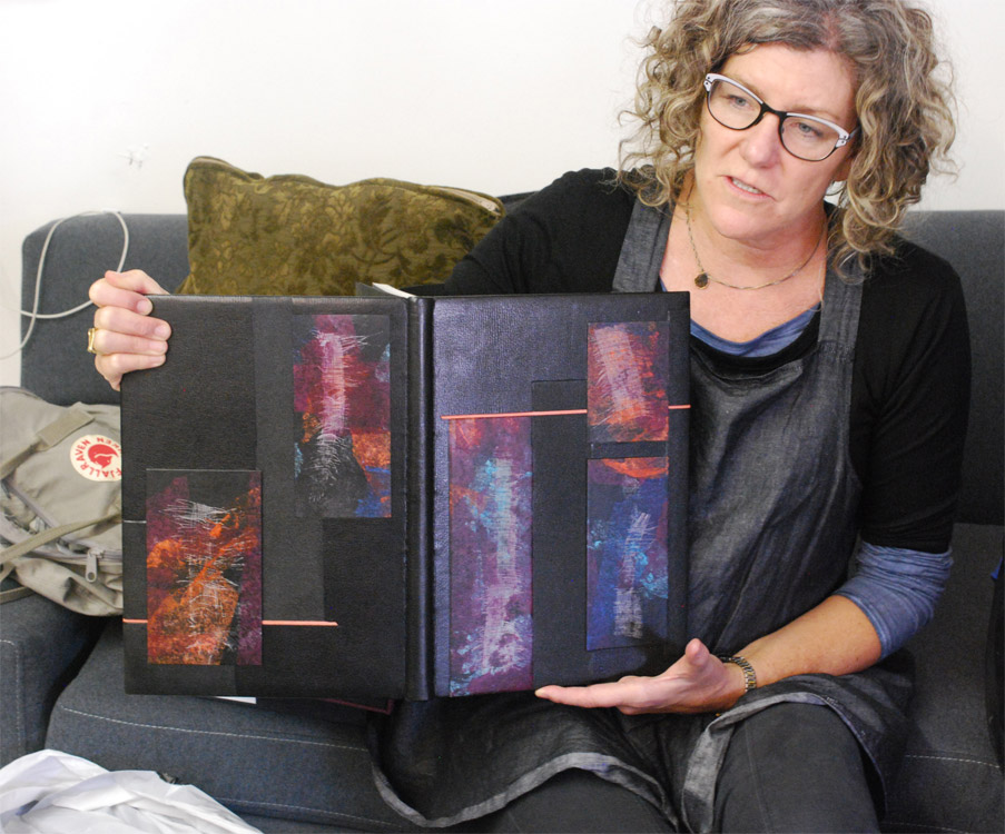
    At the end of day one, Coleen shared with us two fine bindings on loan from a local collector. It was an unexpected and delightful treat to handle and speak with Coleen about her bindings and decorative techniques.

    StoneVeneerWksp7-ErinFletcher

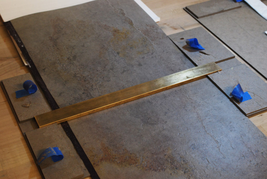
    On day two of the workshop, we were all reunited with our backed stone veneer. We went through the unnerving task of stamping our veneer with the brass rule three more times to redefine the lines and make sure we had an even amount on the outside and odd number on the inside. It was very important to register the brass rule correctly each time, so that our lines stayed crisp and parallel to one another. I snapped a photograph at the very end when I was ready to take the brass rule and stone out of our jig.

    StoneVeneerWksp8-ErinFletcher

    We also advanced on the text block by attaching the wooden spine stub piece. This stub could be made from a number of materials, but we choose from a selection of basswood pieces that were cut down and laminated to match the height of the outer endpaper and thickness of the text block. The wooden piece was also shaped to match the roundness of the folded signature. I painted the ends of my spine piece to offer a bit of decoration to the head and tail. After trimming, shaping and painting, the spine piece was affixed to the outer endpaper and the fore edge was finally trimmed to the final width.

    StoneVeneerWksp9-ErinFletcher

    At this point, we were ready to attach our text block to the stone veneer. The first steps were to create a punching jig to guide our awls to punch holes in the folds of the outer endpaper and in the stone cover. The stone was easy to pierce, once you felt it was in the right place, I simply used an awl to poke through the stone. We laced our text block temporarily into the stone covers in order to fold the fore edge and trim off any excess.

    StoneVeneerWksp10-ErinFletcher

    Before laminating the folded stone onto itself, you have the opportunity to add any decorative elements such as cut-outs, sewing, tooling, etc. Due to time constraints (I had to remake a painted wooden stay that I dropped on the floor), I chose to add some simple embroidered stitches just to see how well I could sew through the stone. This was mostly done on the inside of the front cover.

    StoneVeneerWksp11-ErinFletcher

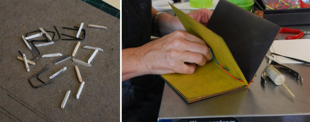
    With a pile of stays (wooden, metal and vellum) and metal staples in hand, I was ready to securely attach the text block to the stone veneer covers. In the image on the right below, Coleen is demonstrating how to use plastic tubing to make it easier to insert the staples and stays.

    StoneVeneerWksp12-ErinFletcher

    For my binding, I chose to use both metal connectors and wooden stays. I painted one set of wooden stays to match the dark purple laminated to the backside of my stone. The staple is inserted through the stay and the vellum catches the legs of the staples on the inside of the endpaper. We stuck an orange stick into a piece of cork, this strange looking tool (seen above) aided in folding over the legs of staples. And viola! The binding is complete. At this point I could still add tooling, but I loved the look of my stone, that I chose to leave it untouched.

    StoneVeneerWksp13-ErinFletcher

    We had a great workshop with Coleen, she brought so much experience and knowledge to the workshop. Her patience and persistence ensured that everyone walked away satisfied and with a finished binding.

    StoneVeneerWksp14-ErinFletcher


  8. My Hand // The Nightingale and the Rose

    February 16, 2016 by Erin Fletcher

    Nightingale1-ErinFletcher

    This binding was featured very briefly on the blog last year in my review of the North Bennet Street School’s 2015 Student and Alumni Show. After the show, I sent it off to England for the Society of Bookbinder’s International Competition. Just last week, I was finally reunited with this macabre little binding. Its presence on my bench reminded me that this binding needed a proper post documenting the steps involved in its creation.

    NightingaleAndTheRose1-ErinFletcher

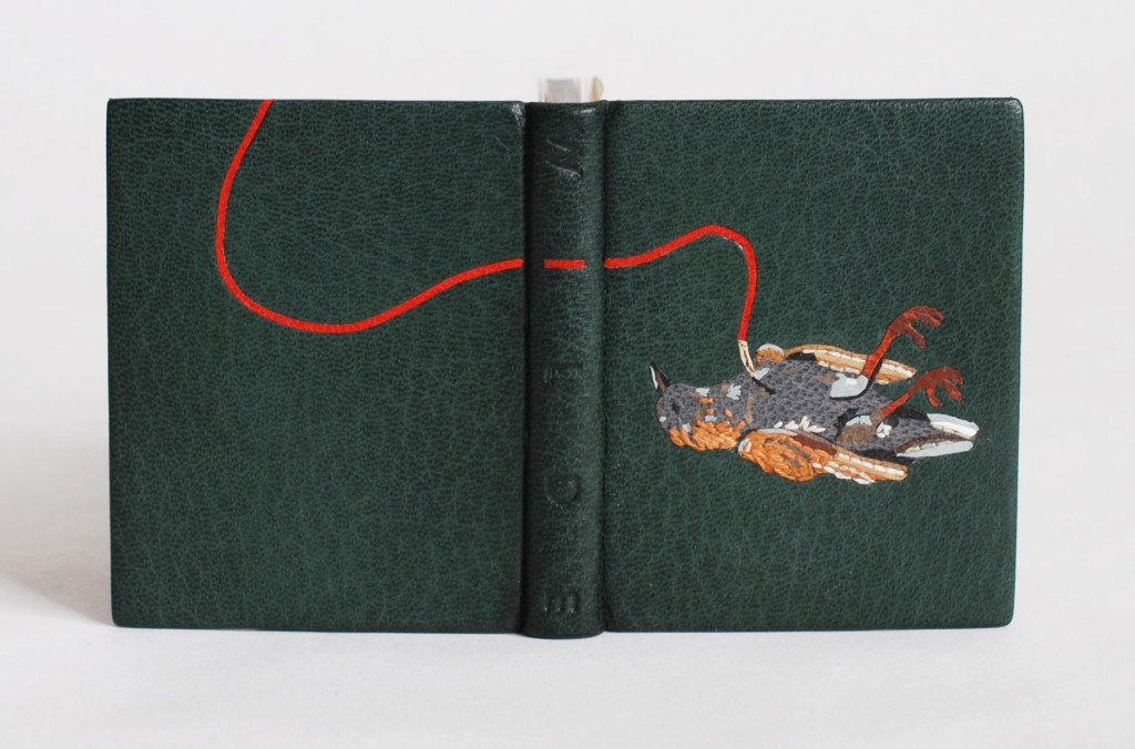
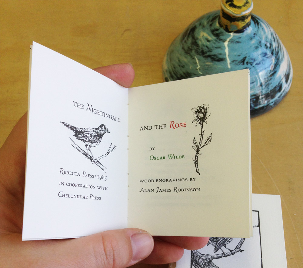
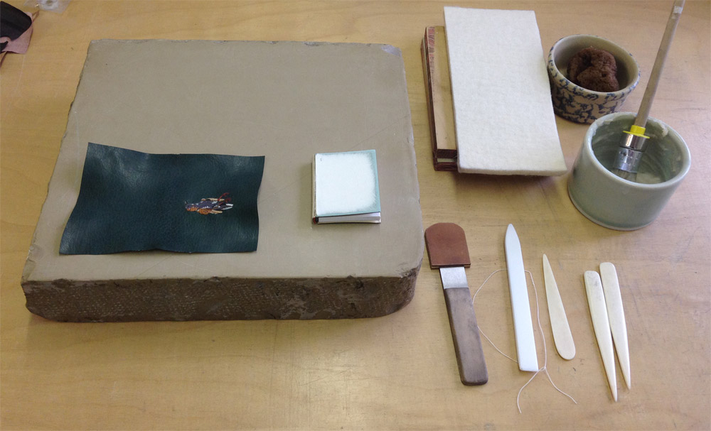
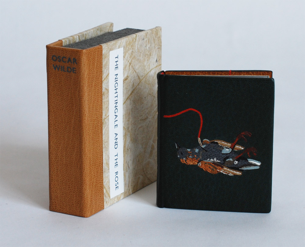
    This edition of Oscar Wilde’s The Nightingale and the Rose was printed by Rebecca Press in 1985 and includes wood engravings by Alan James Robinson of Cheloniidae Press. My design for both the nightingale and the rose are drawn straight from Robinson’s engravings. The text block was sewn on two flattened cords and rounded and backed in a job backer. Which was a bit excessive for such a tiny binding, but offered me a bit a humor. In lieu of a backing hammer, I used the flat, rounded side of my bone folder to achieve the rounded shape of the spine.

    NightingaleAndTheRose2-ErinFletcher

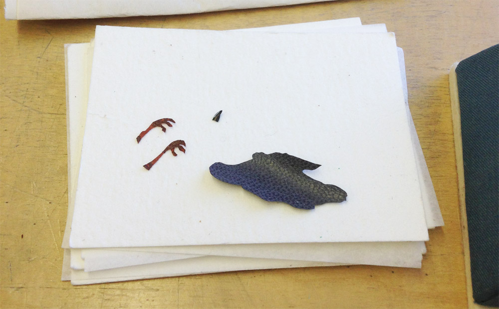
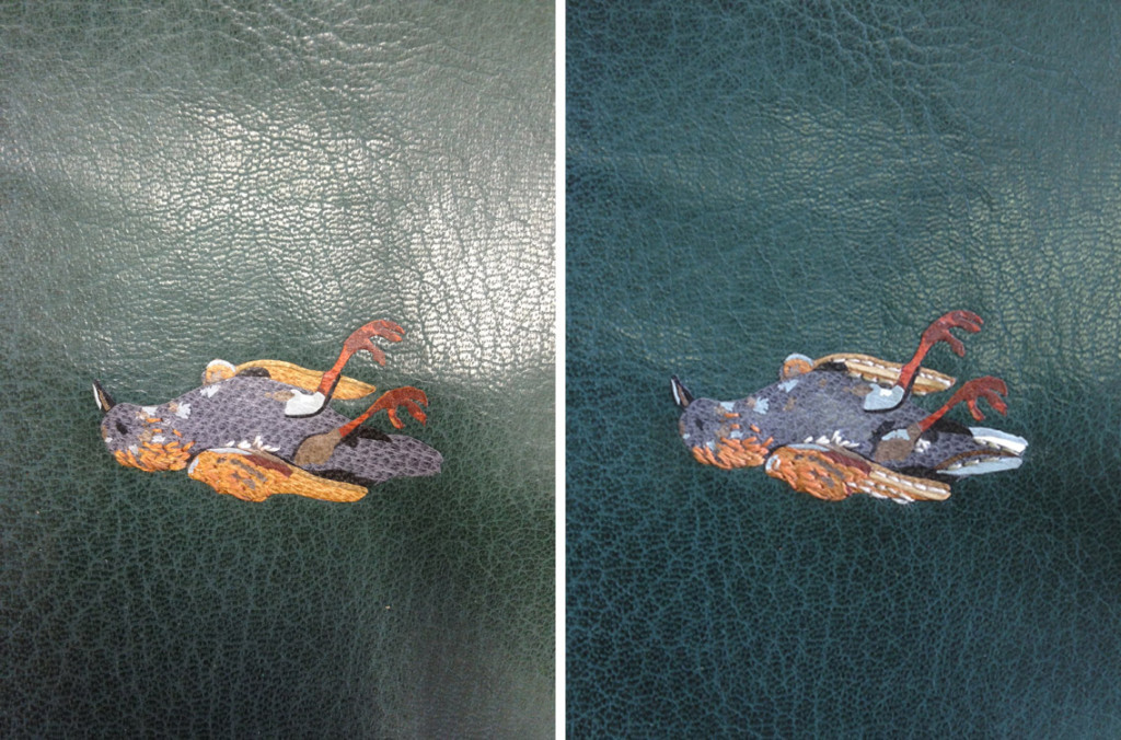
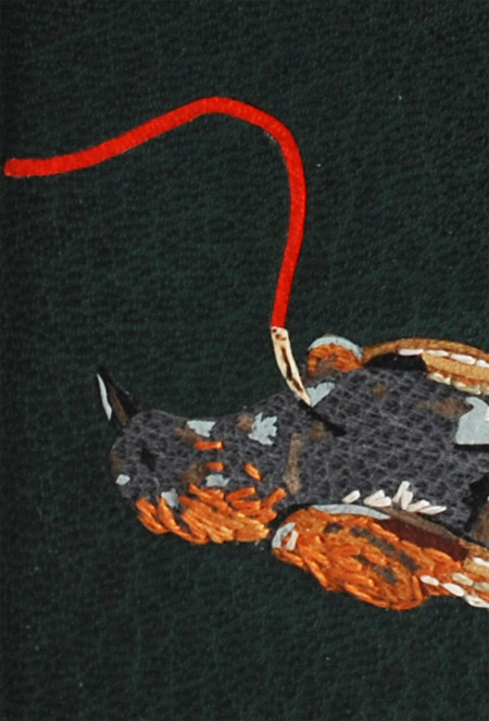
    Once the forwarding on the book was complete, I could focus on the design. I photocopied the image of the nightingale and rose from the text; enlarging them to the desired size. These photocopies became my guide for drawing out each shape of the bird and flower. Beginning with the bird, the first onlays attached to the base leather were a silhouette of the body, the beak and feet. In order to get some depth and texture to the bird’s feet, before cutting out the two shapes I laid feathered onlays of maroon goatskin over thinned out terracotta goatskin.

    NightingaleAndTheRose3-ErinFletcher

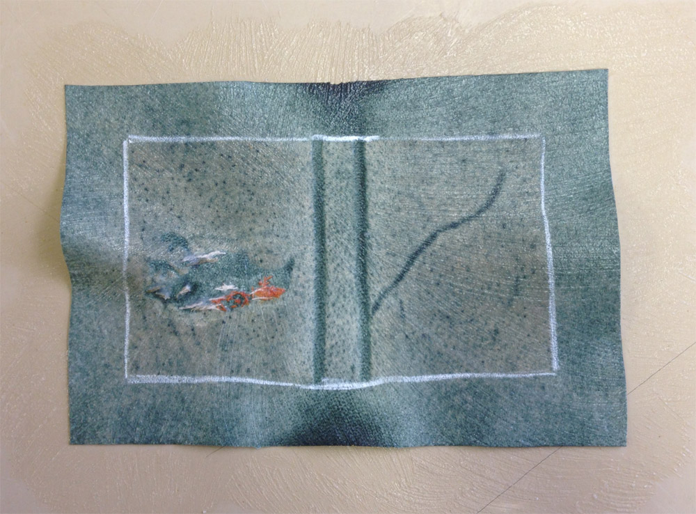
    Although I would normally use PVA to place my onlays onto the leather, I chose to use paste because I was worried about staining the tiny pieces of leather when applying the PVA. After the the onlays went down, I pressed the skin between acrylic boards. Then I back-pared the leather. In the image below you can see the shape of the onlays on the reverse side of the leather (the change in color appears because more flesh is being pared from the areas with onlays, this creates a smooth transition from onlay to base leather on the surface.)

    NightingaleAndTheRose6-ErinFletcher

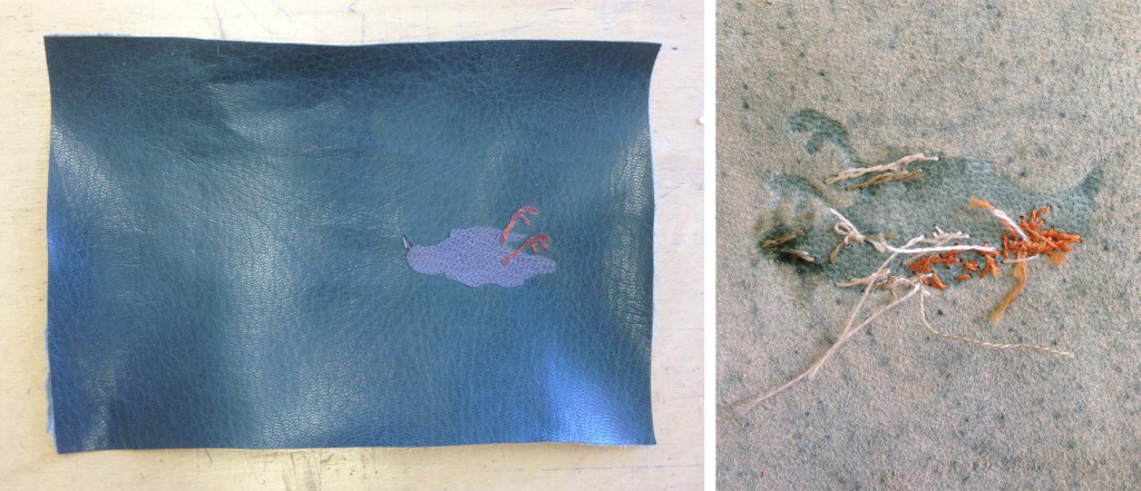
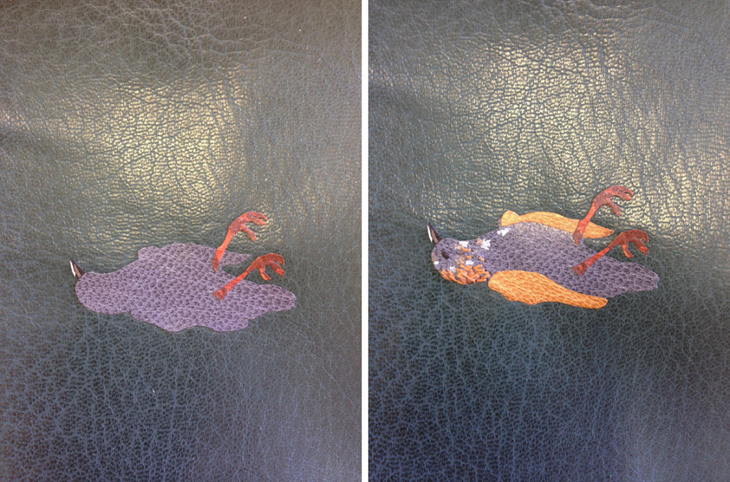
    After paring the leather, I was free to begin with the embroidery. When I embarked on this task, I had very loose plans and approached it in a very free form way. I would build up the image with embroidery and then switch to adding feathered onlays, then more embroidery until I felt satisfied with the look of the bird. You can see this progression below (please forgive the poor photography and variation in color).

    NightingaleAndTheRose7-ErinFletcherNightingaleAndTheRose8-ErinFletcher

    With the design of the bird fully assembled and embroidered, I prepped for covering. After pasting out the leather, I laid down any stray tails from the embroidery beside a stitch to hide its appearance from the front. Then I progressed with the covering, formed the endcaps, wrapped the turn-ins around the cover boards and pleated the corners. After setting the boards, I put the book to rest between a small scrap of felt in my small wooden press.

    NightingaleAndTheRose9-ErinFletcher NightingaleAndTheRose10-ErinFletcher

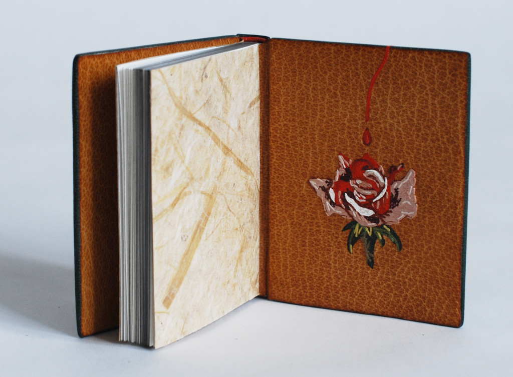
    Once the book had dried, I carefully opened each cover and began the steps to prep the inside for the leather doublures. The back doublure was embellished with a multi-onlay and embroidered rose. The steps involved in creating the rose mimic those used to create the bird. The tricky part here happened while back-paring. It was impossible to pare to the desire thickness for doublures without slicing through the rose onlay. So the rose is not a true back-pared onlay, it actually sits on the surface of the leather. I was worried this extra thickness might impact the neighboring flyleaf or the way the book closed, but neither became an issue.

    Nightingale2-ErinFletcher

    The Nightingale and the Rose is a tale about a nightingale who chooses to give her life so that a young man may find love. By piercing her breast into the thorn of a rose, her blood stains a white rose red. This part of the story is illustrated with a tiny wood veneer inlaid “thorn”. The red goatskin Ascona onlay runs from the top of the thorn across the spine (at the “I” in Wilde) and to the rose on the back doublure.

    NightingaleAndTheRose12-ErinFletcher

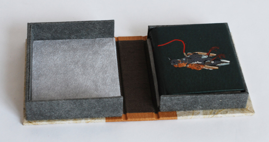
    The book is housed in a miniature quarter leather clamshell box. I used the same tan goatskin on the spine of the box which was used on the doublures. The rest of the case is covered in a paper I made using cotton and leek skins, also used for the flyleaves in the binding. The author name is stamped in matte grey foil on the spine and the title is stamped on a Mohawk label that sits in a recessed well. The trays are covered in granite colored Cave Paper.

    NightingaleAndTheRose13-ErinFletcherNightingaleAndTheRose14-ErinFletcher

    The trays are lined with a light grey Silsuede fabric. I prefer using a faux suede to line boxes for embroidered books and veneer bindings, I think it offers a bit more cushion and less chance of wear on the binding.

    I’m really proud of this little binding. My embroidered work is definitely evolving and I like the direction it took with The Nightingale and the Rose. I have a few fine bindings lined up to complete this year and I look forward to sharing their designs and techniques with you.


  9. Client Work // Ye Sette of Odd Volumes

    October 15, 2015 by Erin Fletcher

    SetteOddVolumes-ErinFletcher

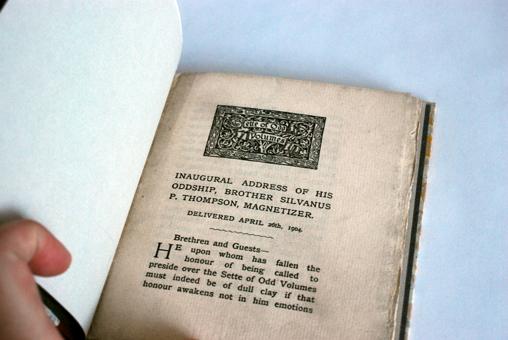
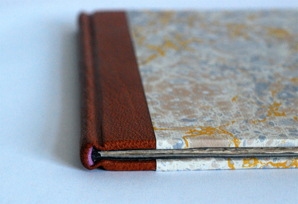
    It’s been a while since I’ve posted on my own work due to having a crazy summer, but I recently completed this binding of the 1904 Inaugural Address of his Oddship, Brother Silvanus P. Thompson, Magnetizer for Ye Sette of Odd Volumes. I’m sharing this particular project because it has a really great back story and is the slimmest book I’ve ever bound in leather.

    SetteOddVolumes2-ErinFletcher

    My client who presented me with this project is a member of the Club of Odd Volumes, a private social club founded in 1887 and is a society of bibliophiles with the following mission statement:

    The objects shall be to promote an interest in, and a love for whatever will tend to make literature attractive as given in the form of printed and illustrated volumes, to mutally assist in making researches and collections of first and rare editions, and to promote elegance in the production of Odd Volumes.

    The club’s headquarters is located at the former home of Sarah Wyman Whitman in the neighborhood of Beacon Hill in Boston, Massachusetts. The Club of Odd Volumes is a direct influence of Ye Sette of Odd Volumes, an English bibliophile dining-club formed in 1878.

    As I mentioned above, this particular pamphlet is the inaugural address of Brother Silvanus P. Thompson. During the planning phase for the binding, I did some investigative work on dear old Silvanus. At the age of 27, Thompson was appointed to professor of Physics at the City and Guilds Technical College in Finsbury, England. He had a talent for communicating complicated scientific concepts in a clear and interesting manner. He is best known for this work as an electrical engineer and his most enduring publication, Calculus Made Easy, a 1910 book that teaches the fundamentals of infinitesimal calculus.

    What really spurred my curiosity was the descriptor of Magnetizer added to the end of Thompson’s name in the pamphlet’s title. In 1910, Thompson was involved in early attempts to stimulate the brain using a magnetic field. After this death this technique would eventually be recognized as Transcranial Magnetic Stimulation. This story really inspired me to use a sheet of the hand marbled paper that I made while I was a student at the North Bennet Street School.

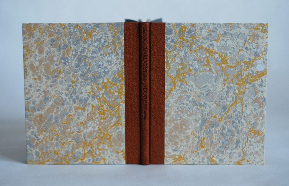
    The stone pattern of the marbling has a very organic, almost cellular feel to it. The movement of the yellow veins reminded me of electric currents flowing through the brain. What a perfect fit!

    The structure of the binding is inspired by Ingela Dierick’s article Single Section Bradel Binding in The New Bookbinder (Volume 32, 2012). I’ve created a binding from this tutorial before and even posted about it on the blog. If you want to see/read more about the process, check out this prior post.

    SetteOddVolumes4-ErinFletcher

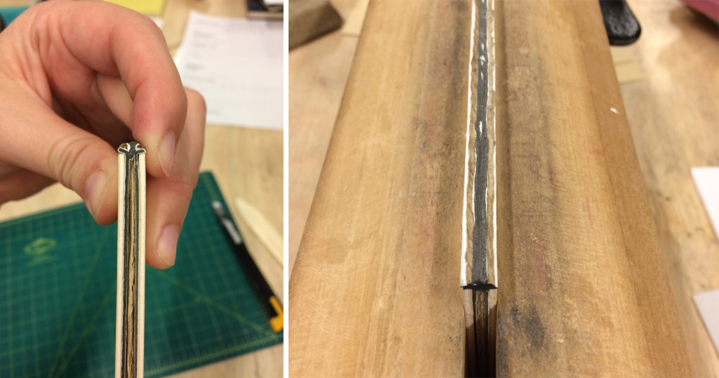
    The single signature pamphlet is sewn on a stub of equal thickness. This stub is then shaped to create a false round, which allows you to continue with a binding suitable for a leather covering. In the image above you can see the finished binding. Below you can see the book right after I’ve shaped the spine with the help of hemp cord that create false shoulders (in the image on the right, you can see that I also painted the cord to blend in with the grey colored paper used for the stub).

    SetteOddVolumes5-ErinFletcher

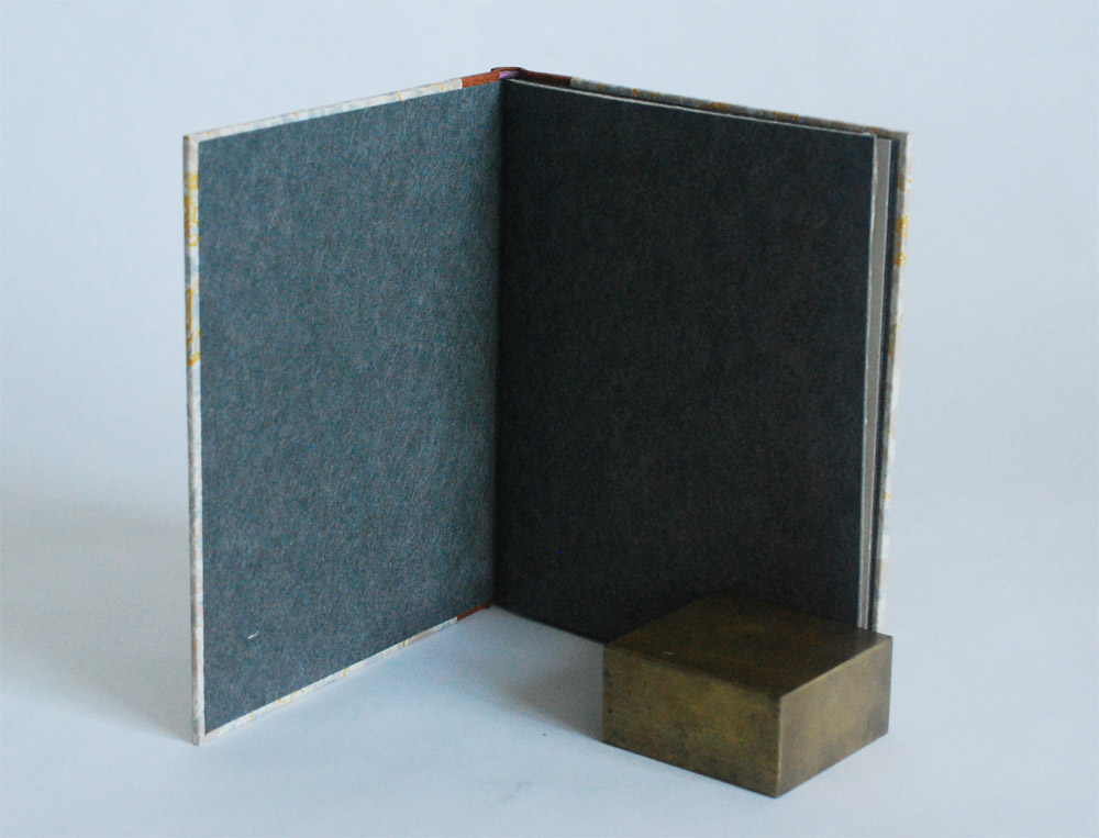
    Other details of the binding include leather wrapped headbands in mauve buffalo skin that add a small pop of color. The paste down and flyleaf are Cave Paper in granite. I also hand tooled in blind an abbreviated title onto the spine: S.O.V. INAUGURAL ADDRESS 1904.

    SetteOddVolumes3-ErinFletcher

    I find these single signature bindings to be just as challenging as a multiple signature book. But it offers a certain level of satisfaction to turn something so thin and simple into a substantial leather binding.


  10. Giveaway – Flash of the Hand Turns 3!!!

    July 11, 2015 by Erin Fletcher

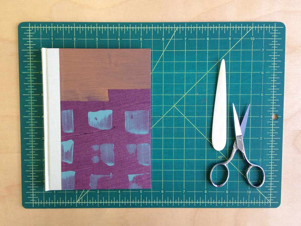
    anniversay2015Flash of the Hand turns 3 today!!! I’m so grateful to my readership (that’s all of you). Your comments (both on and offline) are joyful surprises that affirm the work that I put into every post. To date I’ve conducted over 25 interviews with many wonderful bookbinders and book artist, I’ve shared my work from the bindery and just launched a newsletter! This year has been crazy busy and I’m glad to have brought you in on the journey. To celebrate I’m offering the following giveaway.

    smflatback_sagebricks

    In order to enter and win the book shown above I need you to do one of the following tasks (and then let me know about it in the comment section of this post):
    sign up for my monthly newsletter
    OR
    subscribe to the blog

    It’s that simple. If you’re already signed up for one (or both :)), then just say so in the comment section. Giveaway ends on July 31st (12:00am EST). The winner will be announced via email, so don’t forget to include it when you submit.

    Looking forward to another year of posts! Thanks everyone!


  • My name is Erin Fletcher, owner and bookbinder of Herringbone Bindery in Boston. Flash of the Hand is a space where I share my process and inspirations.
    The StudioNewsletterInstagramEmail me
  • Archives