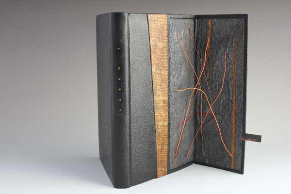
At this point I think it’s safe to say that I have found the recent ARA-Canada exhibition La Couleur du Vent to be filled with many beautiful and inspiring bindings. This particular binding was created by Lang Ingalls and is the fourth binding from the exhibition to be featured on the blog (the other three: Sonya Sheats, Coleen Curry and Karen Hanmer).
So in case you missed those three posts I highly recommend you check them out after reading this one, but first let me summarize the exhibit. This international design binding exhibition was put together by ARA-Canada in partnership with École Estienne in Paris. The exhibition started in 2013 in Paris before traveling to Quebec then Montreal (which ended on February 28th). The show will continue to travel during this year, showing in Trois-Rivières from March to April. La Couleur du Vent is a collection of poems by Gilles Vigneault, illustrated and designed by Nastassja Imiolek under the artistic direction of Cécile Côté.
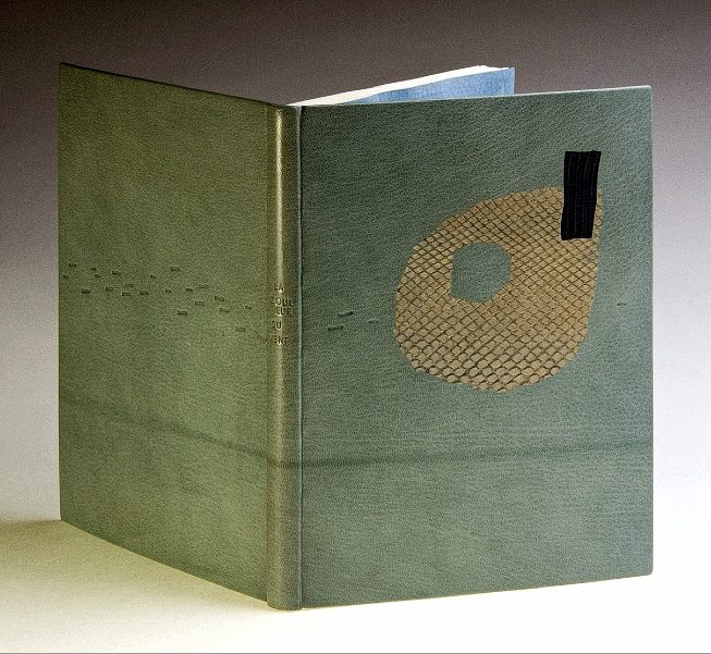
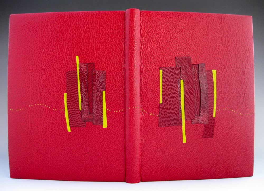
Let’s get back to Lang’s binding. The set text is bound in the French technique using sea foam blue goatskin. On the front cover are inlays of python and lizard. A series of irregular shapes are tooled blind and span across the full length of the binding with the title also tooled blind on the spine. What I love most about this binding (besides the superb color choices) is the bold inclusion of the spine. Lang so wonderfully highlights the material and uses the natural elements of the leather to create an even more compelling design.
This binding is stunning. The design you’ve created really celebrates the natural qualities of the materials. Can you talk about your concept behind the design?
I bought the python and lizard used for the inlays in Paris years ago, but really love the texture and color of them — I tend to make monochromatic color choices in my books, this one is an example of that.
– – – – – – – – – – –
I chose to interview Lang for a few different reasons. Her work has been and continues to display thoughtful experimentation and courage with her materials. Her designs continue to engage and perplex me. She’s also just a wonderful person to be around. Lang is part of a handful of people I look forward to seeing once a year at the Guild of Book Workers Standard of Excellence Conference. Lastly, Lang’s educational experiences have greatly differed from my own. Since graduating from North Bennet Street School and having the opportunity to study with various guest instructors I’ve come to value the importance of creating what Lang describes as a ‘tool box’: gathering techniques on structures and decoration from binders with various talents and backgrounds.
After the jump is my interview with Lang, it discusses heavily her varied educational experiences. Every Sunday this month I will feature some more of Lang’s bindings, so don’t forget to email subscribe and receive reminders when posts go live. You won’t want to miss out!
