RSS Feed

Posts Tagged ‘edgar mansfield’

  1. Bookbinder of the Month: Edgar Mansfield

    November 25, 2012 by Erin Fletcher

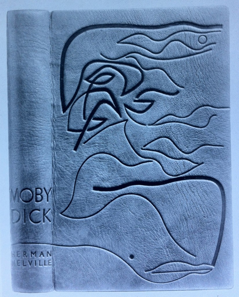
    Moby Dick by Herman Melville is the classic novel possessing the iconic white sperm whale, whose image graces the cover of this binding by Edgar Mansfield. Following the design of Baudelaire’s Les Fleurs du Mal (1952) and A Rage to Live by John O’Hara (1952), Mansfield created this design for Moby Dick in 1953. Tooling in black, Mansfield creates movement and depth with variations in tone and line width.  The book is bound in a native dyed red morocco.

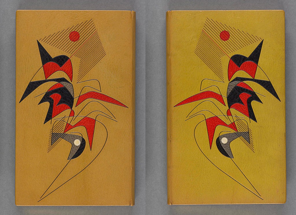
     Les Fleurs du Mal by Baudelaire (The Harvill Press. 1952), bound in yellow morocco inlaid in red and black, tooled in blind

    A Rage to Live by John O’Hara (Random House. 1949), bound in orange-red morocco tooled in blind

  2. Bookbinder of the Month: Edgar Mansfield

    November 18, 2012 by Erin Fletcher

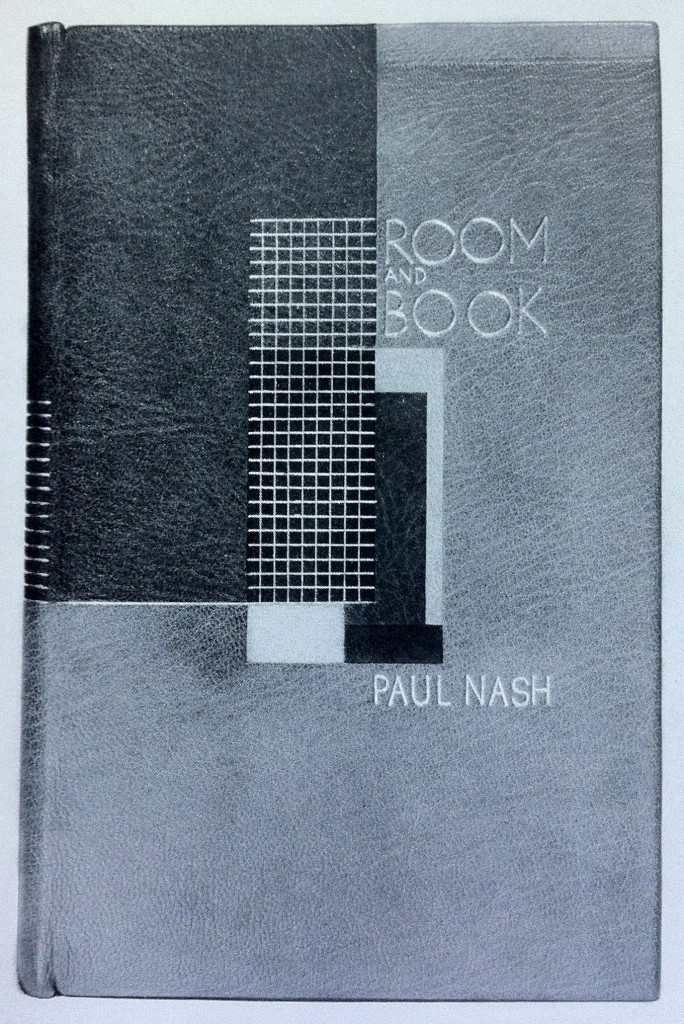
    This is an earlier binding from Edgar Mansfield, before he really developed his expressionist style. Room and Book by Paul Nash was published by Soncino Press in 1932 and was bound by Mansfield in 1941. Covered in yellow ochre and red brown morocco with inlays in natural, red, browns and black. All tooling in gold. 

    I particularly love this binding because of its rigidly angular and balanced design; a nice transition from the popular Art Deco bindings and to the surrealist and expressionist designs he’s best known for. 


  3. Bookbinder of the Month: Edgar Mansfield

    November 11, 2012 by Erin Fletcher

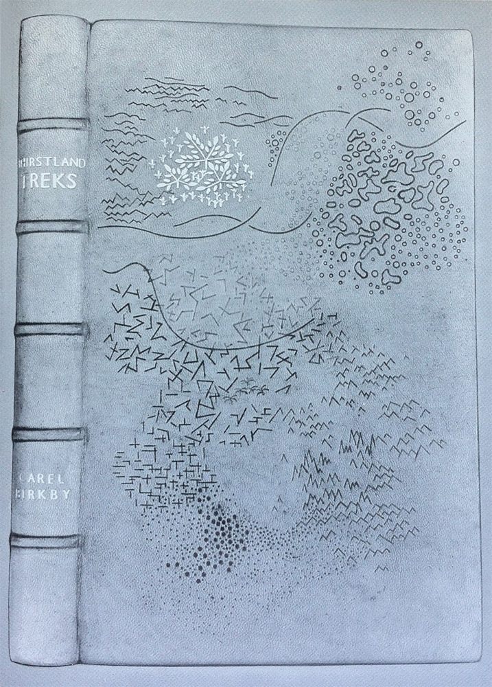
    I wish this image were in color, it’s a really striking design; the marks are almost sketch-like appearing at random to build a dimensional landscape. Thirstland Treks by Carel Birkby was printed by Faber and Faber in 1936 and this copy was bound by Edgar Mansfield in 1948. Covered in a native dyed yellow-brown morocco skin with slight creasing in the grain. The tooling is a combination of light and dark blind with a small amount of gold on the cover and spine.

    This is the first experiment with using the grain as an active and expressive element in the design.

    Reference: Modern Design in Bookbinding: The Work of Edgar Mansfield, pg. 27


  4. Bookbinder of the Month: Edgar Mansfield

    November 4, 2012 by Erin Fletcher

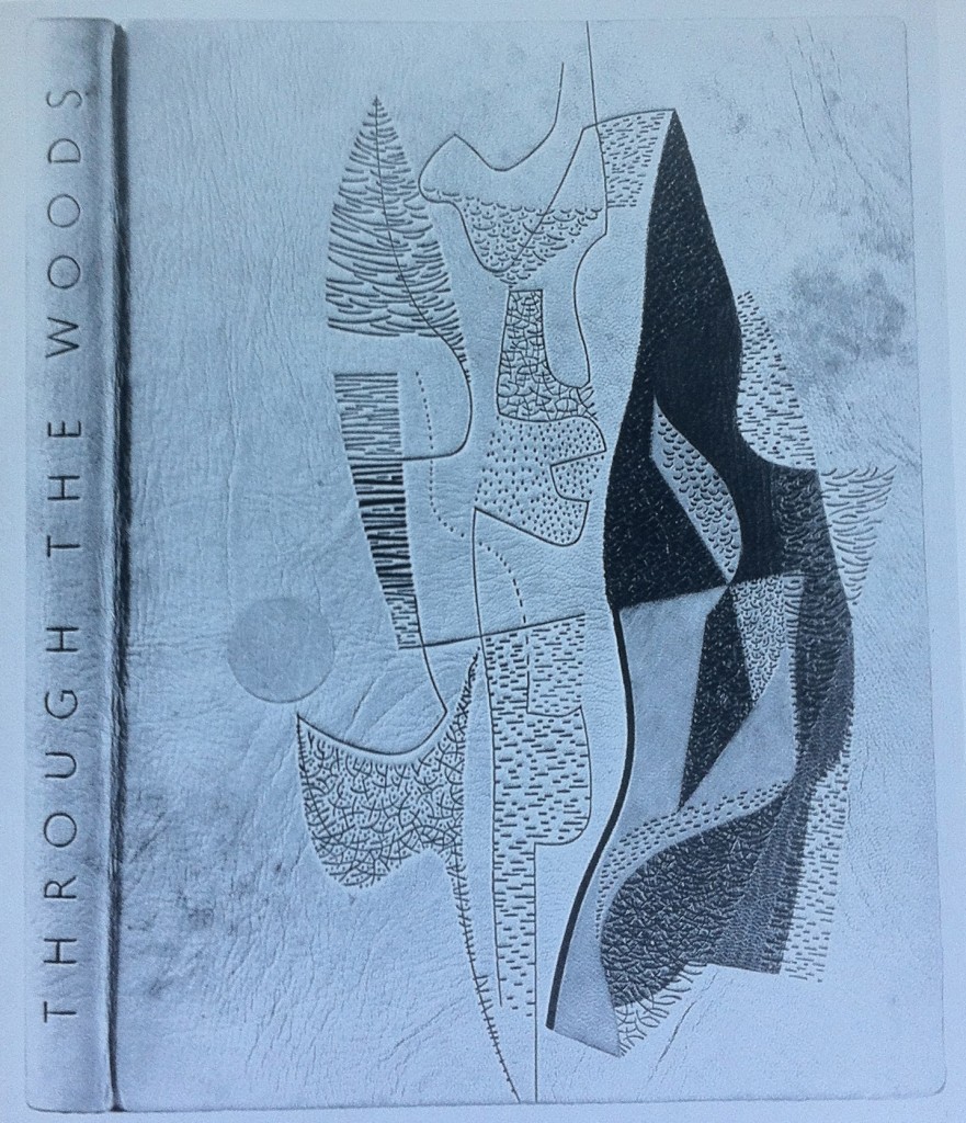
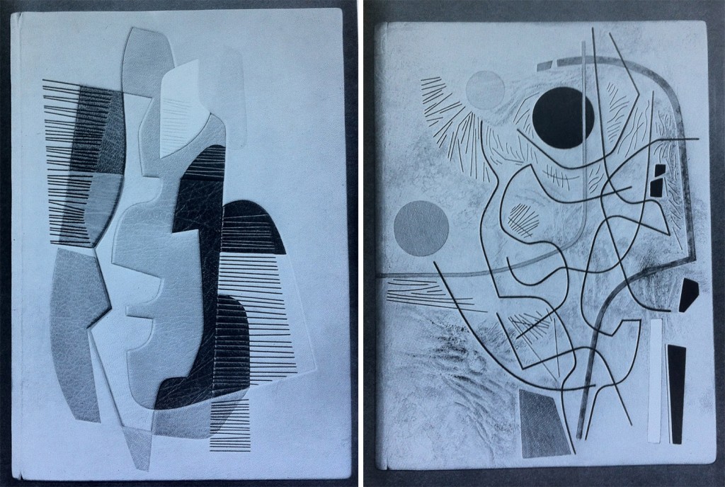
    Throughout Edgar Mansfield’s career as a bookbinder, he bound several copies of Victor Gollancz’s Through the Woods. Twelve of them are represented in The Work of Edgar Mansfield. The binding in the first image was bound in 1958; covered in a native tanned natural morocco with brown markings (both natural and added by Mansfield). The grain creases were induced during covering. All tooling is blind, with inlays of rust-red, greens and chrome yellow.

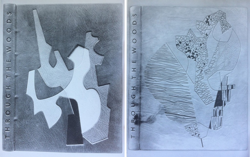
    left side: Bound in 1959 in a native dyed red morocco. The inlaid design spans over four levels built into the cover; inlay leather of chrome yellow, warm black, stone, neutralised green, natural and lemon yellow. All tooling in blind.

    right side: Bound in 1959 in a native tanned natural morocco with natural markings. The grain was creased during covering. All tooling in blind; the solid areas are built up with a short pallet to produce tonal and textural variations.

    left side: Bound in 1960 in a native tanned natural morocco. Inlaid design spans over three levels built into the cover; inlay leather of white, yellows, orange, browns and greens. Tooling in green and blind.

    right side: Bound in 1960 in a native tanned natural morocco with creases added to the grain while covering. Brown staining was added to the areas of the leather built up. Recessed inlays in yellow, red, white, black, grey and green. Tooling in light and dark blind.


  5. November // Bookbinder of the Month: Edgar Mansfield

    November 3, 2012 by Erin Fletcher

    Edgar Mansfield was born in London in 1907. Four years later his parents took him to New Zealand where he spent the next 23 years of his life before returning to England. 

    Starting in 1948, Mansfield began teaching at the London School of Printing, where in regards to bookbinding was a advocate for expressive design inspired by the spirit of the book as opposed to decorative pattern making. Mansfield developed as a binder outside of traditional training, his approach was first as an artist and then a craftsman. However, his execution was impeccable; he excelled in inlays and onlays, shaped his own finishing tools, and developed a technique to heighten the texture of leather during cover. Fellow binder Trevor Jones wrote the following after Mansfield’s death in 1996:

    The nature of the surface of a Mansfield binding and its tactile quality is most important, as befits the work of a sculptor. His preference was always for unpolished and unpressed goatskin enlivened with surface markings and blemishes, especially the native tanned and dyed skins once obtainable from Nigeria that displayed variations of tone and colour, if necessary with his own added ink markings. He often heightened the grain texture on the leather of his bindings by rolling the damp skin on itself before pasting, and later brushing towards the spine with the palm of his hand across the surface of the leather in the act of covering the book….

    read more >


  • My name is Erin Fletcher, owner and bookbinder of Herringbone Bindery in Boston. Flash of the Hand is a space where I share my process and inspirations.
    The StudioNewsletterInstagramEmail me
  • Archives