RSS Feed

Posts Tagged ‘christine ameduri’

  1. Trip to the 2015 New York Antiquarian Book Fair

    April 21, 2015 by Erin Fletcher

    On April 10th, I took the train down to New York City for the annual Antiquarian Book Fair and shadow show put on by the Fine Press Book Association. I spent the weekend ogling over a delightful selection of fine bindings, artist books and finely pressed editions amongst a sea of rare objects and books. I wanted to highlight a few of the gems that I saw, which there were many.

    BookFair1-ErinFletcher

    My first stop was at the shadow show, where I am afraid I was less of spectator (I only captured two images from this event). My first stop was at the Two Ponds Press table where I had a wonderful conversation with co-found Liv Rockefeller and browsed through some Gehanna Press editions and Gray Parrot bindings.

    Next, I stopped at the table of book artist Sue Higgins Leopard of Leopard Studio Editions, whose work is pictured above. We discussed the concepts behind a few of her pieces on display. After browsing through the selection of large-scale artist books on the Booklyn table, I made a point to chat with David Esslemont on his current projects. My next notable stops were with two highly accomplished and exquisite printers: Russell Maret and Gaylord Schanilec of Midnight Paper Sales. Gaylord was quite gracious with his time and walked me through this latest and most elaborate printed accomplishment, Lac Das Pleurs. It was such a pleasure to examine each print through his eyes as he pointed out subtle details, such as how each scale of one particular fish were drawn individually to capture the unique qualities of nature.

    Before leaving, I stopped by Abby Schoolman’s booth and met bookbinder Christine Giard, whose work was on display. It was such a treat to speak with her not only about her binding training, but discuss the techniques employed in her work. My goal is to get her interviewed on the blog sometime this year (Christine gladly accepted!).

    BookFair2-ErinFletcher

    From the Lux Mentis booth: left: Russell Maret’s Interstices & Intersections | right: a book from Nancy Loeber

    I spent one and a half days exploring the Antiquarian Book Fair, which was held at the Park Avenue Armory. As a former storage space for weaponry and tanks, the room was massive and has been transformed for several types of events and art installations. My first stop was at the Lux Mentis booth run by Ian Kahn. He always has delightfully strange and unique items on display, such as the work of Diane Jacobs and some fellow colleagues of mine Colin Urbina and Gabby Cooksey.

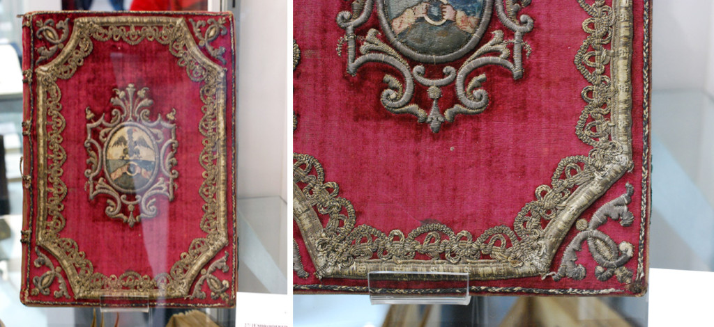
    As I wondered through the aisles, I stumbled upon one embroidered binding after another. If you are regular to the blog, you know my fascination with historical embroidered bindings and creating my own. So it was pure enjoyment to see such a pristine collection of historical embroidered bindings from England and France.

    BookFair3-ErinFletcherBookFair4-ErinFletcher

    The three embroidered bindings shown above range from 17th to 18th century and were found at the  Librairie Camille Sourget booth, a dealer from France. Click on the image to see the detail of the embroidery work.

    BookFair5-ErinFletcher

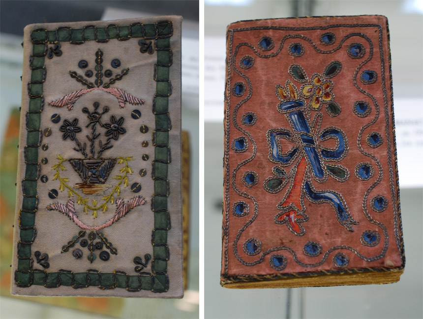
    Over at the Musinsky Rare Books booth were three really beautiful examples of embroidered French pocket Almanacs. I choose to include my two favorites. The example on the left has a great example of couched ribbon creating a bold border. The example on the right is bound in a luscious pink silk with painted appliqué pieces that build up the central design and dots. These pieces were in such wonderful condition, I don’t think they were carried around too often.

    BookFair6-ErinFletcher

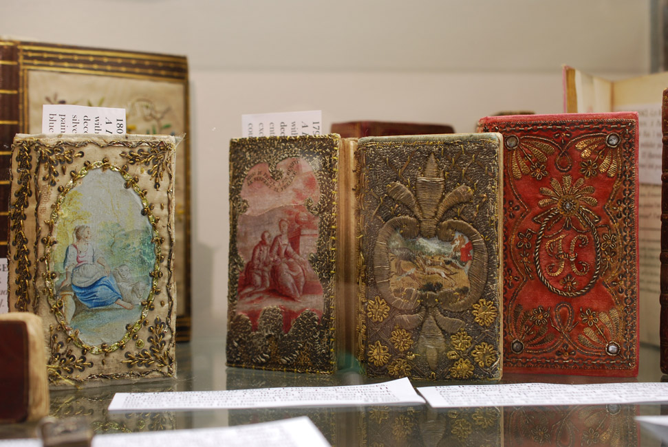
    At the very end of the fair, my eye caught this shelf of embroidered bindings. Unfortunately, in my haste I neglected to note anything about the bindings or the dealer who was exhibiting them.

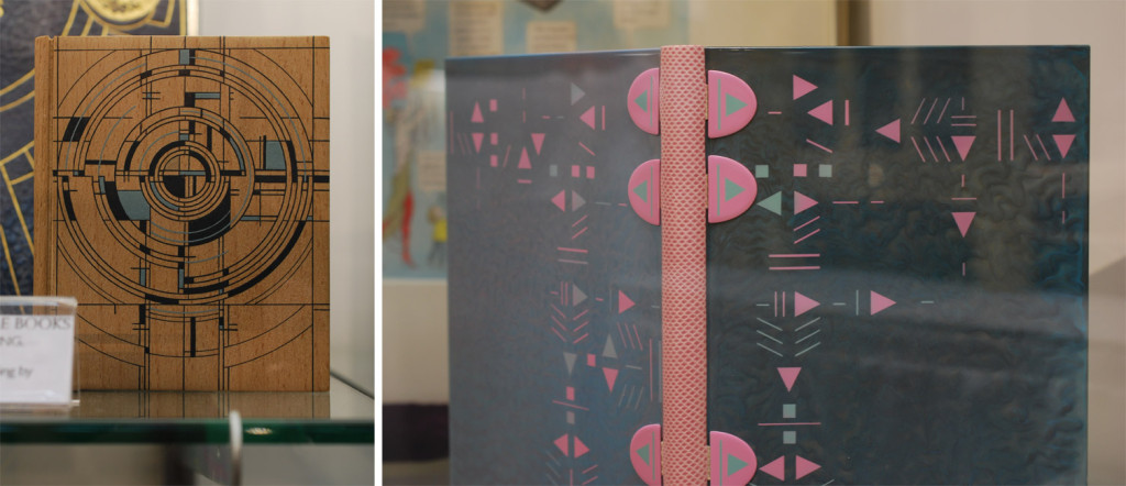
    In addition to embroidered bindings, I like to search out design bindings and binders whose name or work I recognize. One binder that popped up again and again was Brother Edgard Claes. The two books in the image below seem like they were made on two different planets, yet the bindings are actually very similar. The book on the left was spotted at the Sophie Schneideman Rare Books booth and is an example of one of Claes’ Dorfner bindings. The covers are wood veneer with delicate marquetry and hand painted elements.

    BookFair7-ErinFletcher

    The book on the right was found in the Bromer Booksellers booth. It was one of three bindings by Claes they had on display. This binding of erotica is an example of Claes’ polycarbonate bindings. The color palette is inspired by the original cover which has been included in the text block.

    BookFair8-ErinFletcher

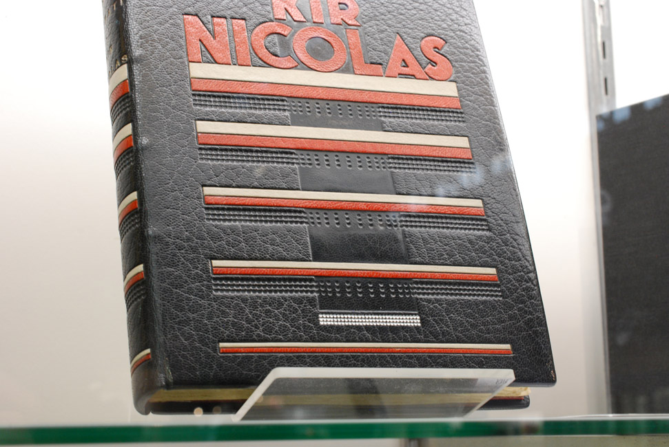
    One binder commonly found at Antiquarian Fairs is Pierre Legrain. The binding above was found at the booth of Dr. A. Flühmann of Switzerland. I took a photograph of this particular binding because it reads so differently from his other highly geometrical designs. The emphasis on typography really grabbed me.

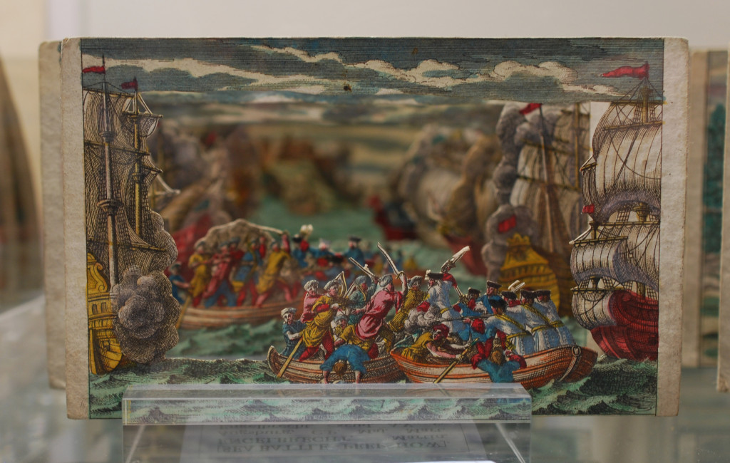
    I truly had a wonderful experience at the book fairs in New York City. I ran into familiar faces and met many wonderful artist, publishers and dealers. I’ll finish off this post with a charming engraved tunnel book discovered at one of the booths.

    BookFair9-ErinFletcher


  2. North Bennet Street School // Student & Alumni Exhibit 2014

    May 13, 2014 by Erin Fletcher

    Every year the North Bennet Street School hosts an exhibit to celebrate the work of current students and alumni across several of its departments, which include Bookbinding, Violin Making, Jewelry, Cabinet and Furniture Making, and Preservation Carpentry. The exhibit opened on May 10th and runs through the end of the month. The opening reception will take place on the evening of Tuesday, May 13th for the Annual Evening of Craft when supporters of the school and exhibitors come together to discuss and explore the handcrafted items.

    As an exhibitor this year, I had the opportunity to help set up the show, which allowed me to document and chat with each of the graduating students about their fine bindings. The photographs in this post were taken during the set-up, so please excuse the occasional body in the background or roll of blue tape.

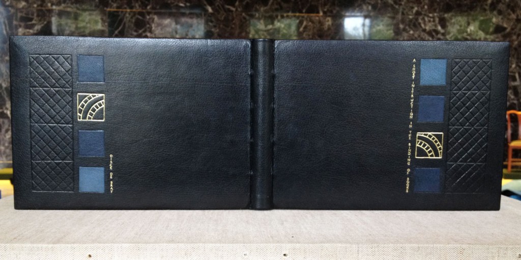
    Dirck de Bray: A Short Instruction in the Binding of Books was chosen as this year’s set book for the graduating bookbinding class. The earliest known Dutch bookbinding manual is a tiny illustrated manuscript from 1658, in which, Dirck de Bray described the making of a full leather binding and a parchment laced-case binding as the most common techniques of the 17th century. The manuscript is illustrated with 16 instructive drawings in pen and watercolor. This 17th century bookbinding manual originally appeared for the public in a 1977 edition, which has been re-edited in the 2012 edition that the students bound. This second edition includes each original page from the 1658 manuscript along with an in-depth look at the life of Dirck de Bray and the time period he lived in, as well as, the way books would normally look, the master’s test for bookbinders and other early manuals.

    The 2012 edition was printed in an unusual oblong format to include the historical Dutch paired with a contemporary Dutch and English translation next to the original page from the 17th century manuscript. I asked each of the graduating students to share with me their concept for their design.

    DirckDeBray5-AlcamyHenriksen

    Alcamy Henriksen
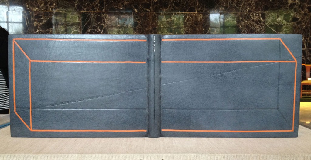
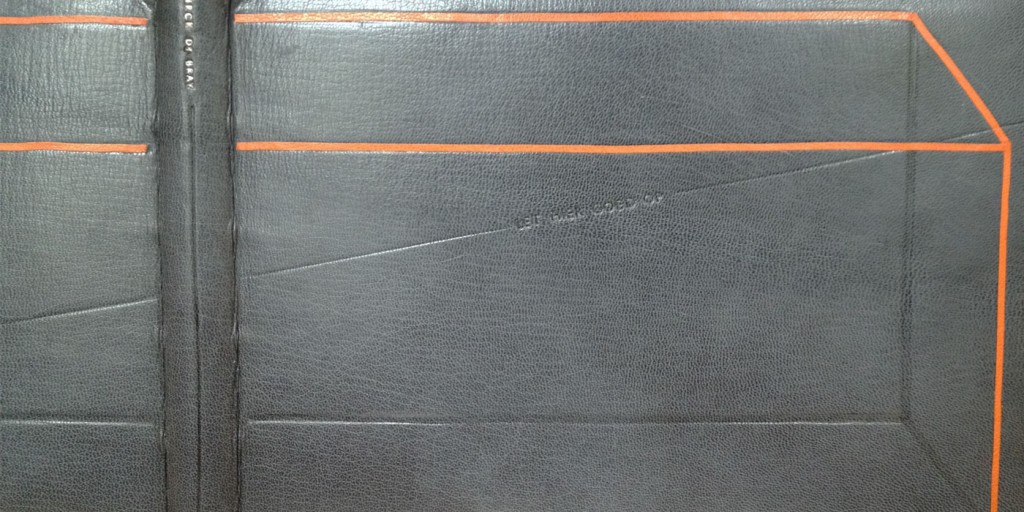
    As I mentioned above, the set book was written in both Dutch and English. Alcamy ran with this theme by including a phrase from the text: “This is where you must really pay attention” is blind tooled on the back cover, while “Let hier goed op” is the Dutch translation blind tooled on the front cover. These two phrases are enclosed within a box created through the use of orange onlays.

    Dirck de Bray was a talented artist across several mediums, but principally known for his paintings and worked on the murals of “Orange Hall” (Oranjezaal) in Huis ten Bosch, a royal palace in The Hague. The orange cube spanning across the covers represents the space of the artist’s creavity and its challenging limitations.

    DirckDeBray4-AlcamyHenriksenDirckDeBray2-AlcamyHenriksen

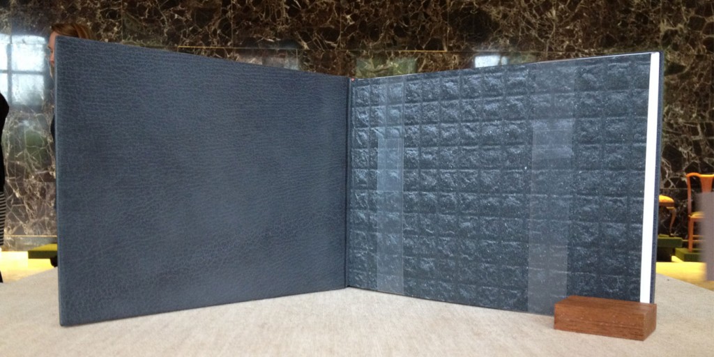
    Alcamy’s binding is bound in gray Harmatan goatskin with matching leather doublures. She used handmade papers from Hook Pottery Paper as the made flyleaf. The head edge is decorated with graphite with a single line of orange running the length of the edge. Alcamy’s design is really striking and made great use of long horizontal shape of the binding.

    – – – – – – – – – – –

    DirckDeBray1-ChristineAmeduri

    Christine Ameduri
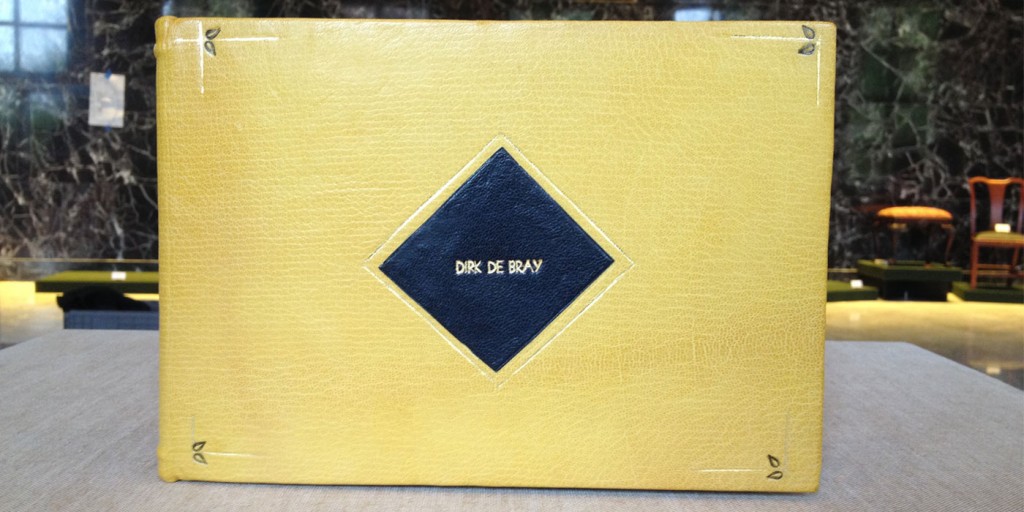
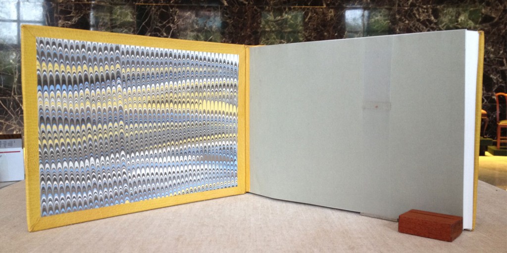
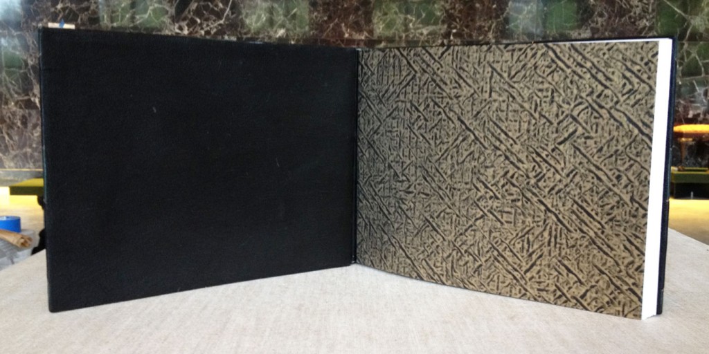
    Inspired by 17th century Dutch tile designs, Christine reinterprets the design as a broken frame of simple corner ornaments. The intersecting gilt lines at each corner are paired with two small smoke-tooled droplets. The center tile is a black onlay tooled with de Bray’s name and framed within gilt lines. Bound in yellow Harmatan goatskin with matching leather hinges. Inset on the inside of the boards is a panel of handmade marbled paper made by Christine herself.

    DirckDeBray2-ChristineAmeduri

    – – – – – – – – – – –

    DirckDeBray1-GabrielleCooksey

    Gabrielle Cooksey
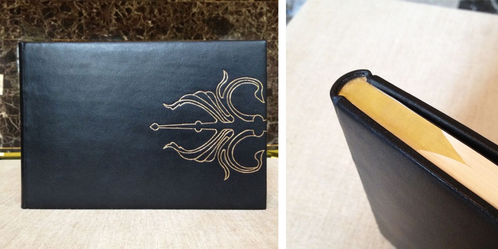
    In the classic drawing style that I’ve seen emerge on Gabrielle’s work during her two years at NBSS, she has created an elegant and simple design binding. The motif on the front cover is reflected on the back cover and was created from a series of line palettes and gouges through gold foil. The motif was inspired by Gothic door frames. The edge decoration mimics the shape of the design on the covers.

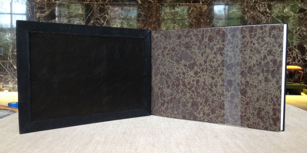
    Bound in dark blue Pergamena goatskin with matching leather hinges. A panel of black leather fills the inside of the boards. The made flyleaf is a handmade marbled paper.

    DirckDeBray2-GabrielleCooksey

    – – – – – – – – – – –

    DirckDeBray1-LeslieTo

    Leslie To
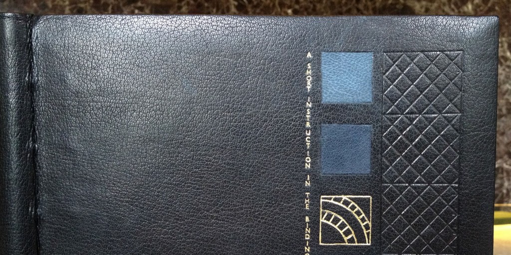
    The diaper-style design and onlays of various blue leathers are extracted from the illustrations in the manuscript. de Bray mentions that in art you must look past the surfaces of your surroundings to find the details. Leslie captures the background details of the archways, windows and blue tile flooring through both gilt and blind tooling. The head edge is decorated with green pigment, which is also pulled from the manuscript illustrations. 

    DirckDeBray3-LeslieTo DirckDeBray2-LeslieTo

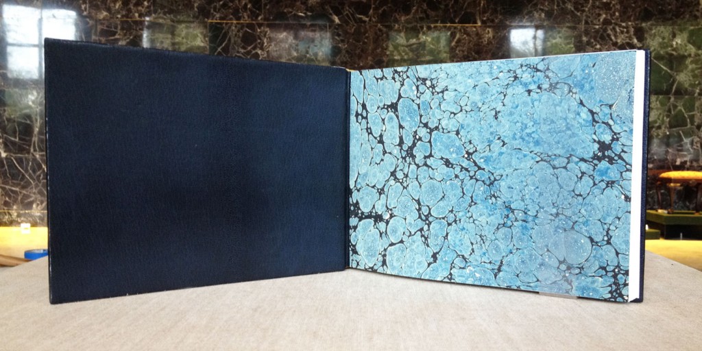
    Bound in black goatskin with navy blue doublures. Leslie hand marbled the paper used on the made flyleaf. Pulling from the architectural elements within the illustrations, Leslie has created a complimentary structural design on her binding.

    – – – – – – – – – – –

    DirckDeBray1-ElizabethCurran

    Elizabeth Curran
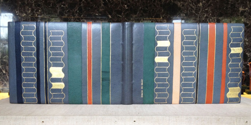
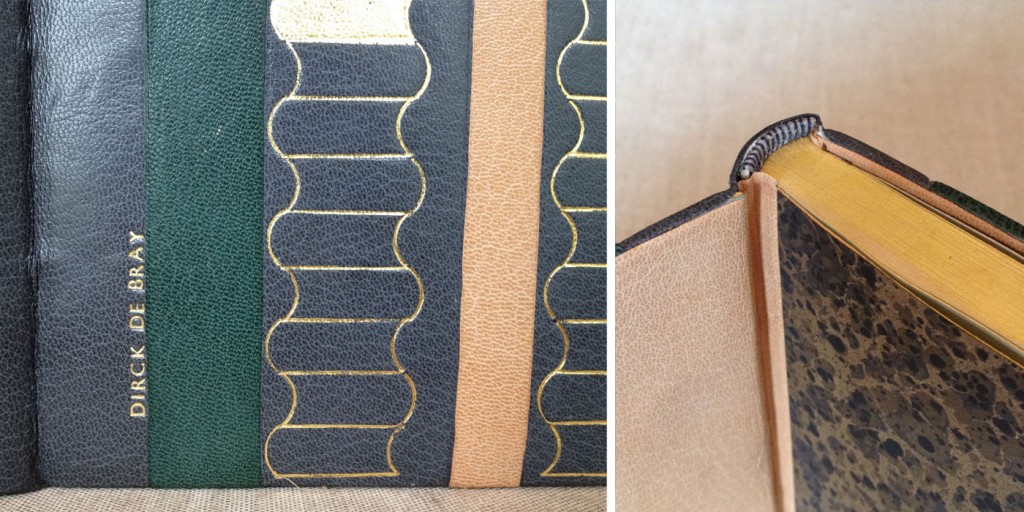
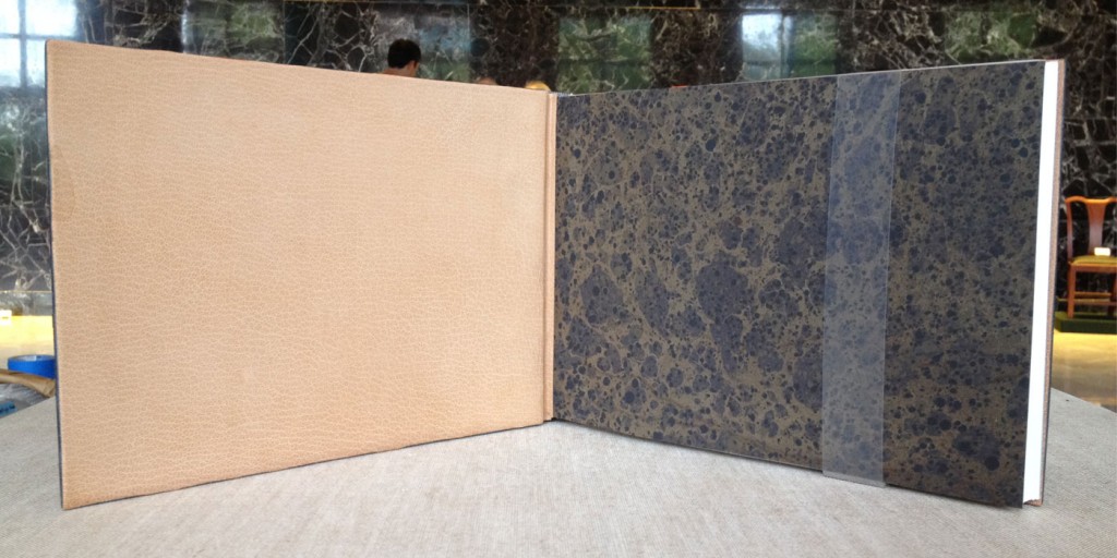
    Elizabeth also found inspiration in the original manuscript illustrations, but put her focus on the illustrations of stacked books to create a design of an abstracted library. The stacked books on her binding are created through a series of gilt line palettes and gouges, with a few being surface gilt. Separating the stacked books are a series of vertical stripes of colored onlays, some being tooled onlays. A nice detail that Elizabeth included, was wrapping the colored onlays onto the board edges.

    The design is quite striking and each cover can stand alone or be displayed fully open as the image above displays.

    DirckDeBray3-ElizabethCurran DirckDeBray2-ElizabethCurran

    Bound in grey Harmatan goatskin with biscuit-colored goatskin doublures paired with a handmade marbled made flyleaf. The headbands are hand sewn around a flat rectangular core made from laminated goatskin and vellum.

    – – – – – – – – – – –

    DirckDeBray1-MariannaBrotherton

    Marianna Brotherton
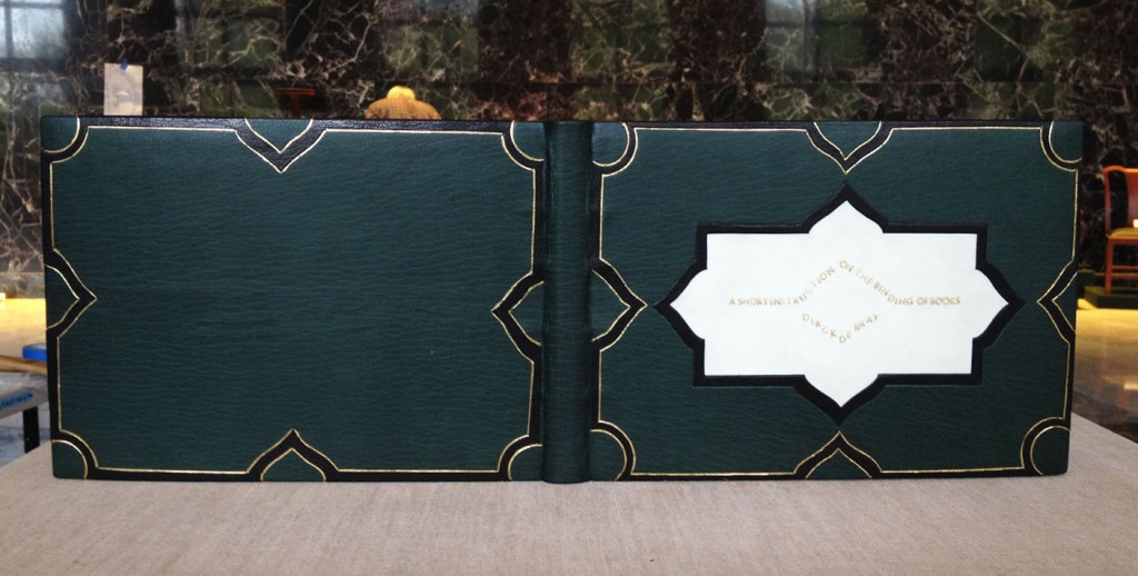
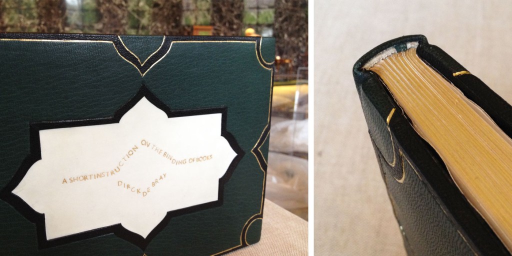
    Marianna took her inspiration from designs on mid-17th century bindings, a period that is contemporary to the original manuscript. The frame is created with a black onlay and tooled using an ascona tool over gold foil. The center inlay panel of vellum is framed with a black onlay mimicking the style of the outer border. Marianna wanted to incorporate vellum in her design as a homage to the original vellum binding of the manuscript. The title, along with de Bray’s name, has been hand-tooled with gold foil onto the vellum.

    Bound in green Pergamena goatskin and vellum with black goatskin doublures paired next to a stunning Claire Maziarcyk paste paper made flyleaf.

    DirckDeBray3-MariannaBrotherton DirckDeBray2-MariannaBrotherton

    – – – – – – – – – – –

    DirckDeBray1-JeffAltepeter

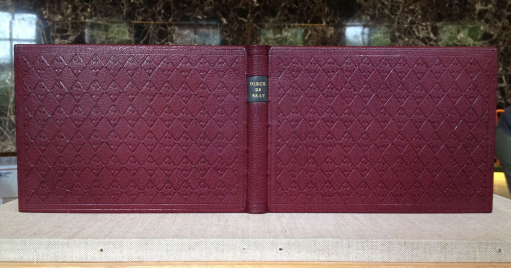
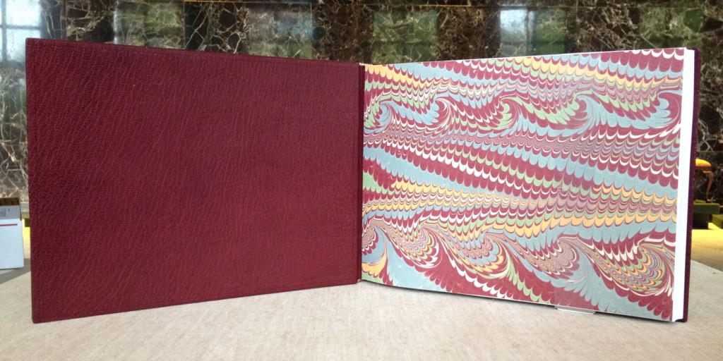
    And last, but certainly not least is the binding created by NBSS instructor and alum, Jeff Altepeter. Bound in crimson goatskin with matching doublures. The boards are blind tooled in a lozenge pattern using a single hand-carved finishing tool which mimics the classic ‘cusped edge stamp’. de Bray’s name is hand tooled on a leather label pasted on the spine. Marbled ‘Dutch curl’ endpapers in the typical 18th century palette are used for the made flyleaf.

    DirckDeBray2-JeffAltepeter


  • My name is Erin Fletcher, owner and bookbinder of Herringbone Bindery in Boston. Flash of the Hand is a space where I share my process and inspirations.
    The StudioNewsletterInstagramEmail me
  • Archives