RSS Feed

Posts Tagged ‘breakfast at tiffany’s’

  1. Swell Things No. 54

    July 31, 2020 by Erin Fletcher

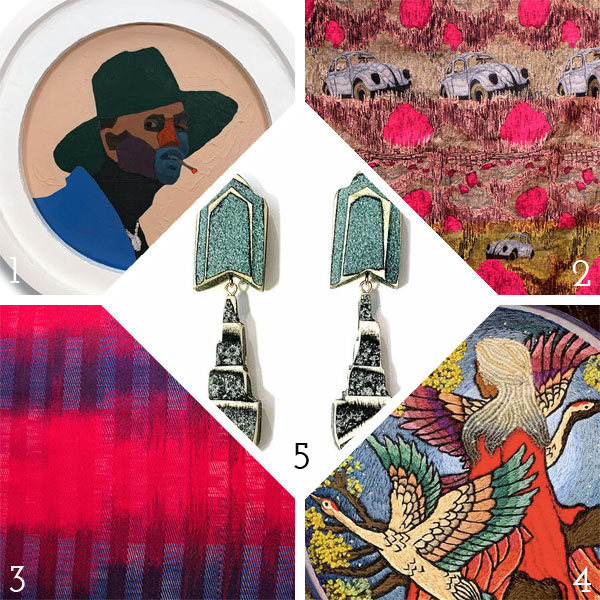
    1. The subjects in Andrew Gray‘s artwork have this an unmistakable gravitational pull. His keen eye for design and color are most unique and part of the allure. Gray is a Baltimore-based artist creating work influenced by his diverse upbringing and studies within African-American history, Russian propaganda, contemporary realism and color abstraction. The latter is readily recognizable by the unusual color-blocking used in his paintings.
    2. The textile work of recent RISD grad Kelly Lucero Hughes is a beautiful blend of textures, desert hues and captivating imagery. Influenced by the New Mexico landscape she grew up in, Kelly often incorporates physical elements of nature into her work.
    3. I am in love with everything that Daniel Garver has created: every textile, ceramic piece and illustration. I am reminded of the geometric work created by Sol LeWitt. Another favorite artist of mine! Purely simple, absolutely brilliant.
    4. Eboni Hogan is an incredible embroidery artist. Her technique of dense stitches and thick, black outlines gives her work an luminous quality, like stained-glass. She also has an amazing talent for creating realistic textures and movement in her work. The piece above was inspired by Toni Morrison’s Song of Solomon and illustrates Eboni’s ability and determination to accurately stitch the subject’s lovely locks. 
    5. Anyone who knows me, knows that I’m an earring fanatic. Which is why I’m obsessed with the jewelry made by Morgan Hill. I love the asymmetric quality of her work, the colors, the texture, the multi-faceted shapes, I love it all!

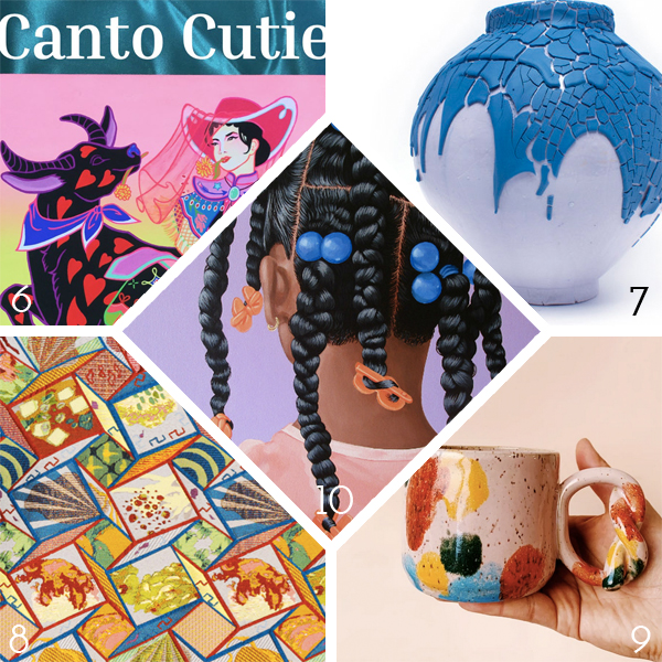
    6. Canto Cutie is a literary zine developed by Katherine Leung as a way to collect and share stories from artists who self-identify as Cantonese. Contributors can freely express their thoughts about identity surrounding the Cantonese diaspora and reflect on both historical and contemporary events. Volume 1 is available now!
    7. Tiffany Tang is creating some fabulous ceramic work. In the series, Mini Moons, the color palette is sweet and luscious, which contrasts beautifully with the harsh and heavy glazes. Blue & White, shows a softer and more delicate hand which evokes a more classic look of porcelain. All of her work is engaging and strikingly beautiful. Ceramics has the ability to blur the line between function and art, Tiffany plays with this dichotomy well within her work.
    8. When you are led by a love for color, structure and anything odd, it’s no wonder Daphne Chen has the ability to craft such unique and chaotic patterned knits and weaves. Her work undoubtedly stems from an exploration of identity, place and family. All of these complex ideas morph into equally complex prints, weaves and illustrations.
    9. Mugs: my other obsession! Oh how, I love the work of Mud Witch, run by Viviana Matsuda. Her work is so incredibly popular, that I have yet to snag a mug before they sell out. After inheriting pottery supplies from her late father, Viviana began working with clay as a means to work through her grief. As a fellow curvaceous lady, I love that Viviana’s pottery reflects her body positivity: chubby and curvy.
    10. Working predominantly in portraiture, Jessica Spence is a New York-based artist whose work reflects her own life and black female identity. Her pieces put the focus on the subject’s hair, emphasizing an importance for self-care, the care of others and expression. As an outsider to this culture, I don’t profess to understand the discrimination or stigmatization black women experience based on the way they choose to style their hair. But I appreciate the shear beauty and talent of Jessica’s work and how it invites me to investigate these topics further. Check out this interview on Girls United by Essence.
  2. Catching Up With Hannah Brown // No. 1

    April 2, 2017 by Erin Fletcher

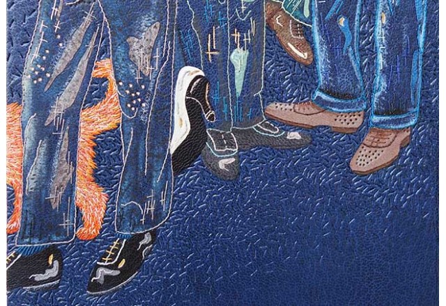
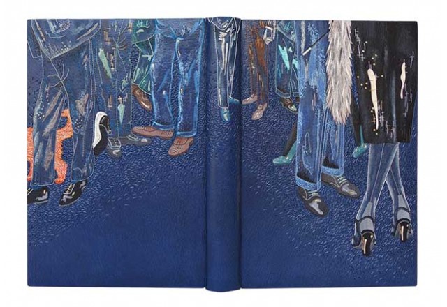
    The first interview on the blog was conducted back in February 2013 with the very talented Hannah Brown. Over the past four years, her work has really matured in both design and technique. So over the course of April, I’ll be catching up with Hannah by featuring work made over the past four years. Let’s start with one of my favorites, bound in 2014 is Hannah’s copy of Truman Capote’s Breakfast at Tiffany’s.

    Bound in dark blue goatskin with a variety of leather onlays in grey, black, brown, green, blue, cream and orange. The design is then amplified through the use of machine and hand embroidery, as well as areas that are sanded and painted with acrylics. Texture has been added to the binding through the use of blind and gold tooling. Hannah received the Mansfield Medal for Best Book in Competition in the 2014 Designer Bookbinders Annual Competition.

    The design on the binding for Breakfast at Tiffany’s combines a range of techniques that include machine and hand embroidery, painting, onlay work and tooling. I would love for you to speak about working through such a complex design. Are you planning each stitch and every painted element beforehand or are you working in a spontaneous way?
    For every binding I do I make a sample board of a small section of the design. I have done this since my very first binding and now have a extensive physical archive of all my books to date. I started making these sample boards for a few reasons, mainly it was to test out colours, but given I now have quite a collection they are an invaluable aid for teaching purposes and for showing to clients.

    The sample board tends to be the spontaneous part of my working process as I use it to test out colours and stitches ahead of working on the binding itself. I certainly don’t plan every stitch but do try and work methodically through the design when it comes to the embroidery work, executing the outlines first before filling in the gaps with more intricate embroidery.

    With Breakfast at Tiffany’s I worked through the same method as with all of my bindings. The onlays had to be applied first so the leather could be back-pared ahead of the embroidery. The next step was brushing on the paints and the whole thing was then brought to life with the needlework by adding the outlines, adding tonal colours and securing down the onlays with stitches. I have different tracing paper templates for each stage of the process to ensure everything gets put in the correct place. The last thing is the tooling as of course this is done once the leather is on the book.

    I am not a huge fan of drawing people so for this particular binding I thought a good way around this was by just depicting the legs. Because this book was for the Designer Bookbinders Annual Competition I was working to a tight deadline therefore I incorporated a lot of machine embroidery for the outlines of the legs first (for speed) and then hand-whipped these stitches afterwards. I was very happy with this method for this particular binding as I was able to put the cover design together more speedily.


  3. Bookbinder of the Month: Ben Elbel

    July 26, 2015 by Erin Fletcher

    BreakfastAtTiffanys6-BenElbel

    I am wrapping up this month’s interview with Ben Elbel by showcasing his recent binding of Breakfast at Tiffany’s. Read on to discover the technique behind the decorative covers and what secrets lay within the binding.

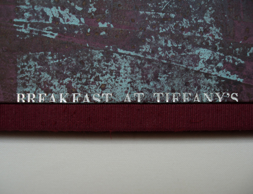
    Breakfast at Tiffany’s is covered in beautifully decorated leather, which caught me by surprise. Having only seen this binding online, my initial guess is that the boards are covered in paper. Can you describe how you manipulated the leather to achieve such a wonderful range of color and texture?
    Indeed it is leather, not paper. The technique consists essentially of glueing thin paper to suede leather and then sanding away the paper. I have never actually tried replacing leather with paper but I imagine that paper would probably tear during the process.

    BreakfastAtTiffanys4-BenElbel

    A few years back I was terrified about doing anything to a material. I used materials as they came from the suppliers and found it increasingly frustrating because bookbinding materials only come in a limited range of colours.

    I was working at Shepherds Bookbinders at the time and because we had a splitting machine there were bags full of beautiful suede that would go straight to the bin. So one evening after work I started messing around with suede, glue, leather dyes, papers, etc, having absolutely no idea what I was doing.

    There were a couple of ‘happy accidents’ and after some time, I had identified what had lead to those happy accidents and found that I had a process, so simple that I was even able to teach it. I have a nice collection of these pieces and they are a great starting point for a design binding.

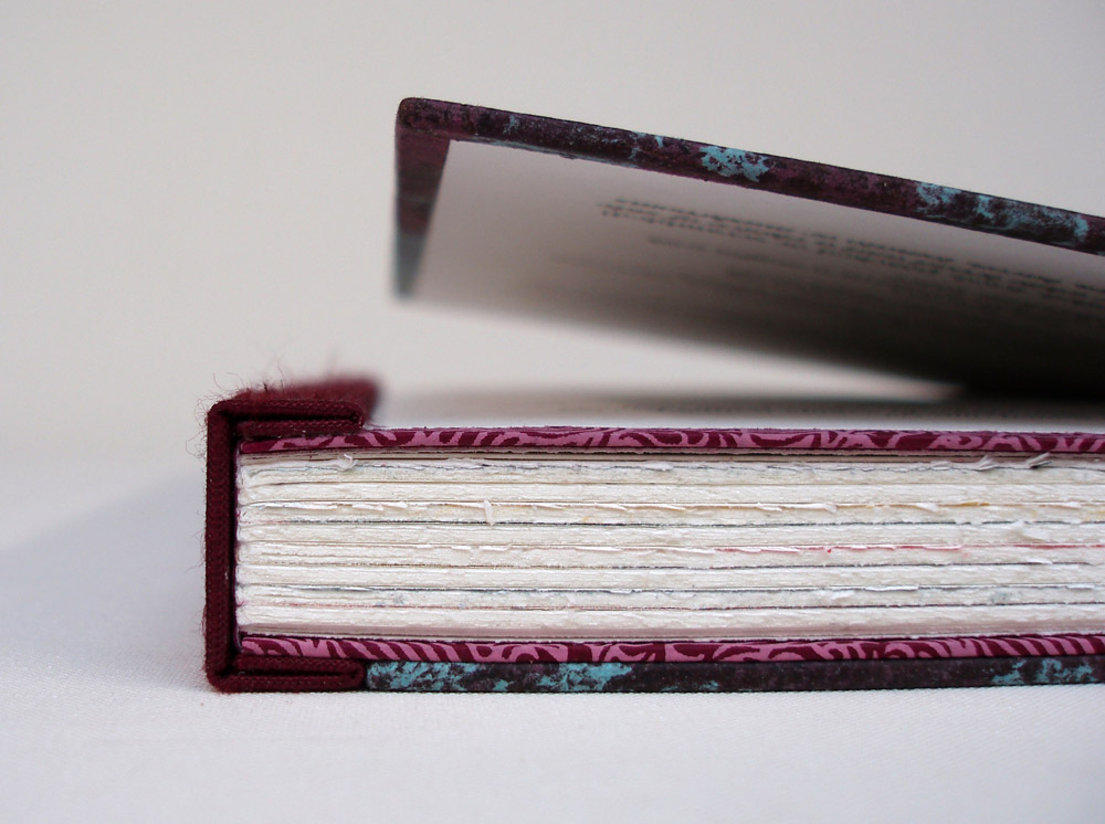
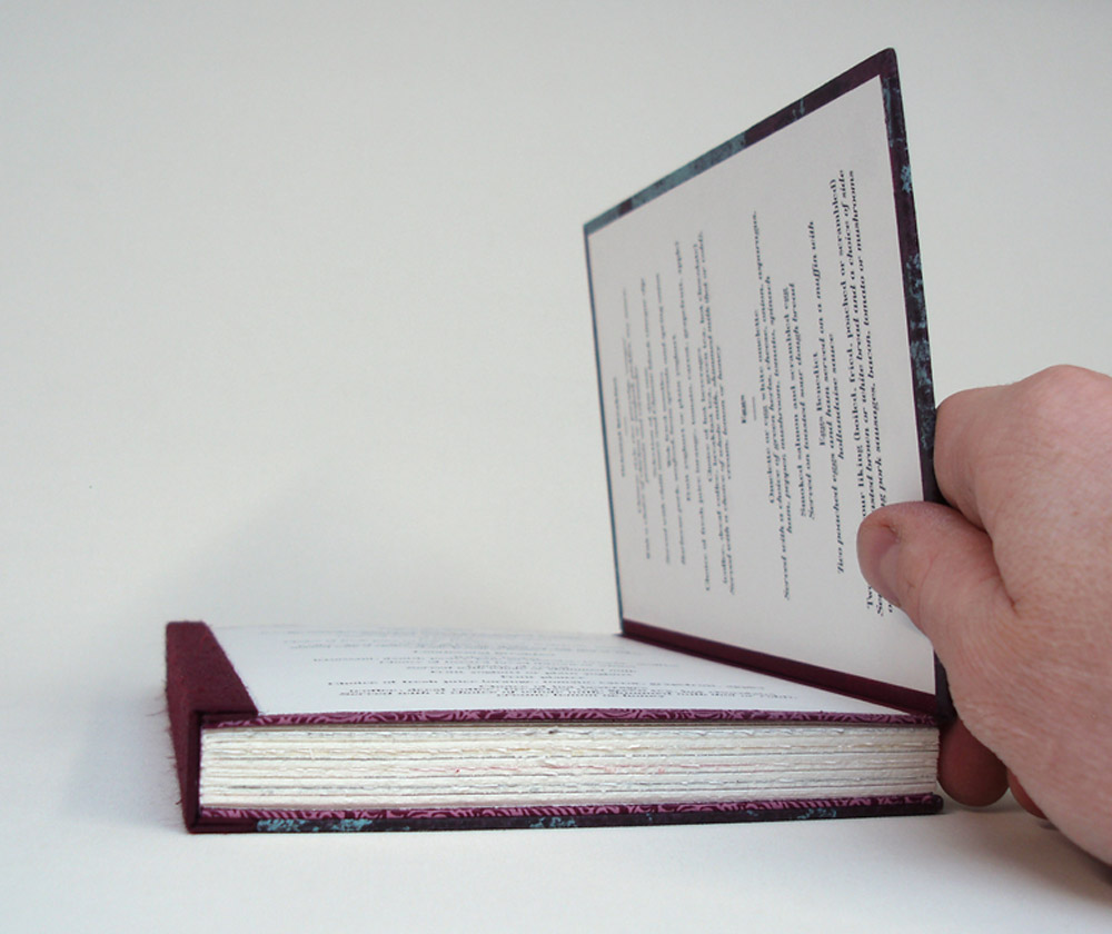
    In this binding, you’ve included a hidden component. The front cover opens up to reveal two panels of text, can you elaborate on your concept for this part of the binding? Does it have a magnetic closure?
    The latest version of my dos rapporté binding has boards made of two layers, hinged at the fore-edge. The two layers are glued together with a flange from the textblock in between. The aim is to provide a very strong cover to text attachment, but of course it is very tempting to see a design opportunity; why not include something in there, and shut the boards with magnets rather than glue.

    BreakfastAtTiffanys3-BenElbel

    The opportunity came with Breakfast at Tiffany’s, the set book from Designer Bookbinders 2014 Competition. At the time we were also producing menus for a hotel in London, and this is how a breakfast menu ended up between the two layers of the front board.

    BreakfastAtTiffanys2-BenElbel


  • My name is Erin Fletcher, owner and bookbinder of Herringbone Bindery in Boston. Flash of the Hand is a space where I share my process and inspirations.
    The StudioNewsletterInstagramEmail me
  • Archives