RSS Feed

Posts Tagged ‘bookbinding’

  1. Bookbinder of the Month: Lang Ingalls

    March 23, 2014 by Erin Fletcher

    Chanson-LangIngalls2

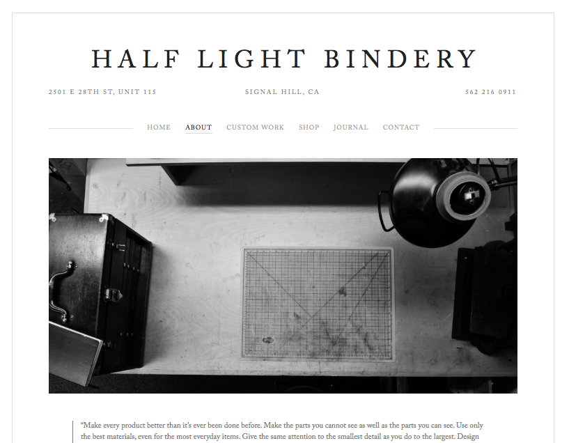
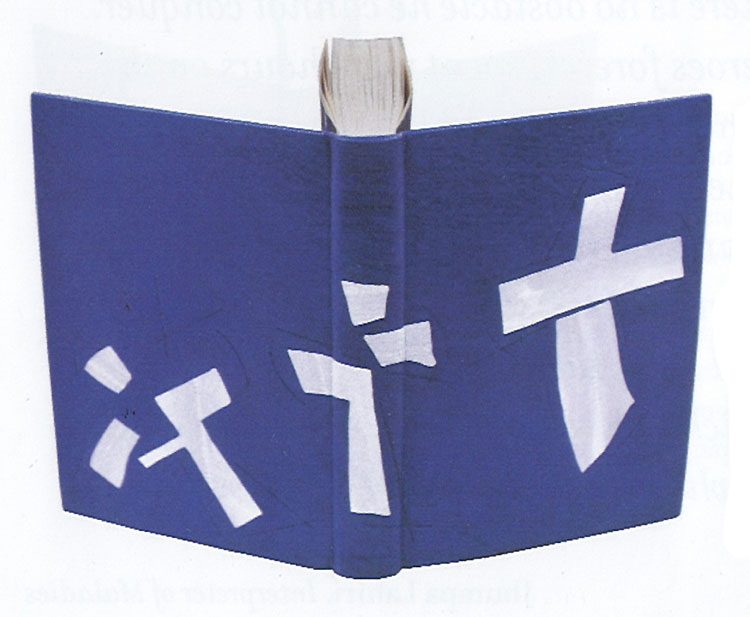
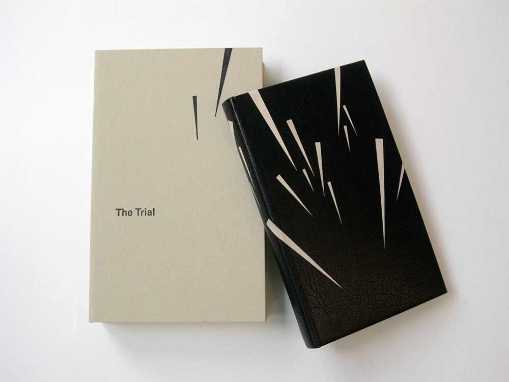
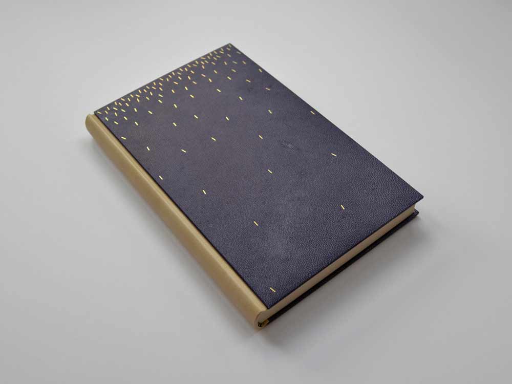
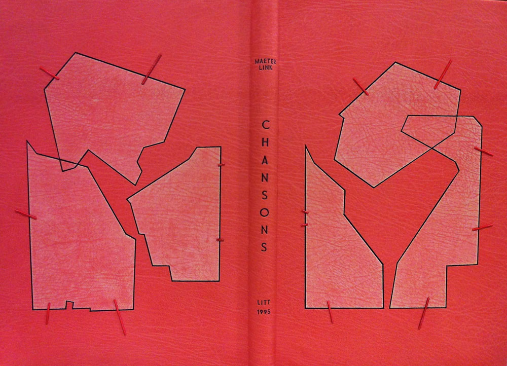
    Chansons is a text written by the Belgian poet and playwright Maurice Maeterlink. This particular 1995 edition is in French and includes engravings by Ginette Litt; the copy is signed by Litt and bibliophile G.A. Dassonville. Lang Ingalls bound this copy in 2013 and it will be exhibited from April 4 to June 30 of this year in a show titled ‘Belgian Writers, a Binding Homage’ sponsored by Bibliotheca Wittockiana and ARA Belgica.

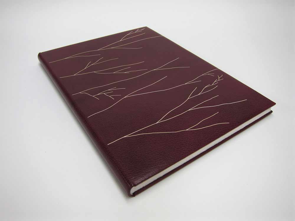
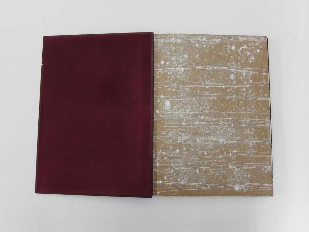
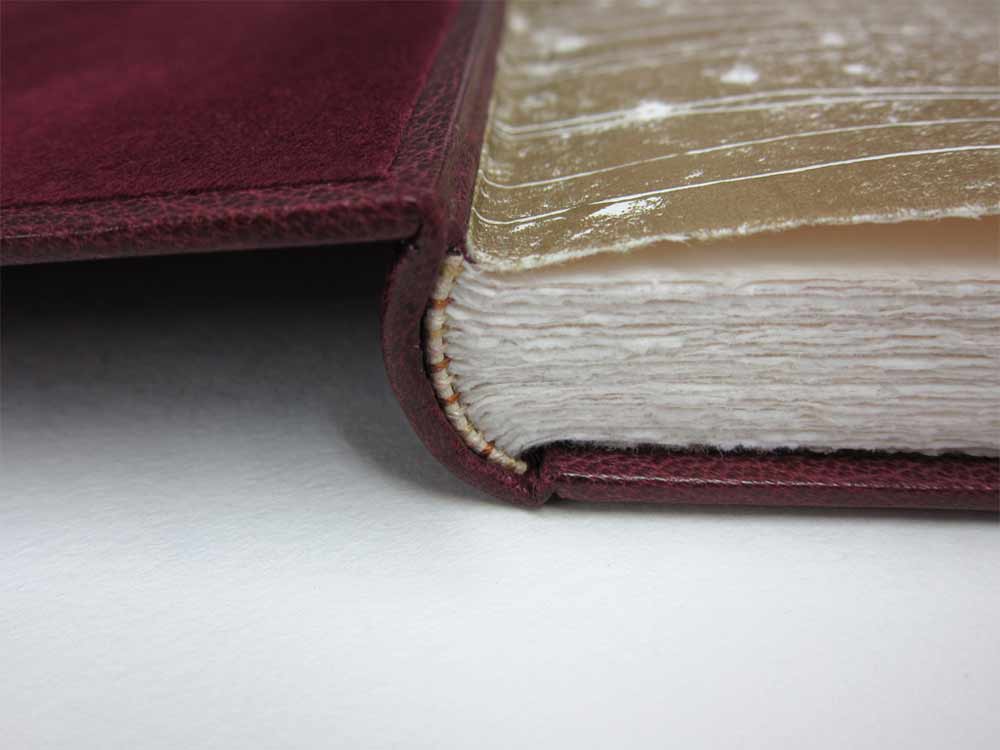
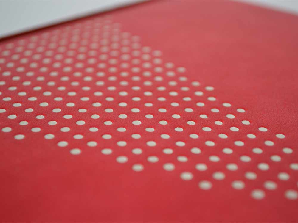
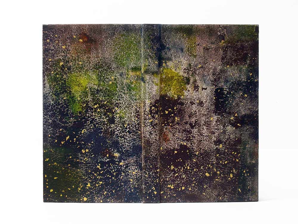
    The binding is bound in the French technique in pink goatskin. Lang describes the cover design inspiration and techniques below in response to my question. However, not shown are the hand-sewn silk headbands and black suede pastedowns and flyleaves.

    Once again, you’ve created such a beautiful binding. I would just love for you to discuss your concept behind the design and how you translated that into the materials used on the binding.
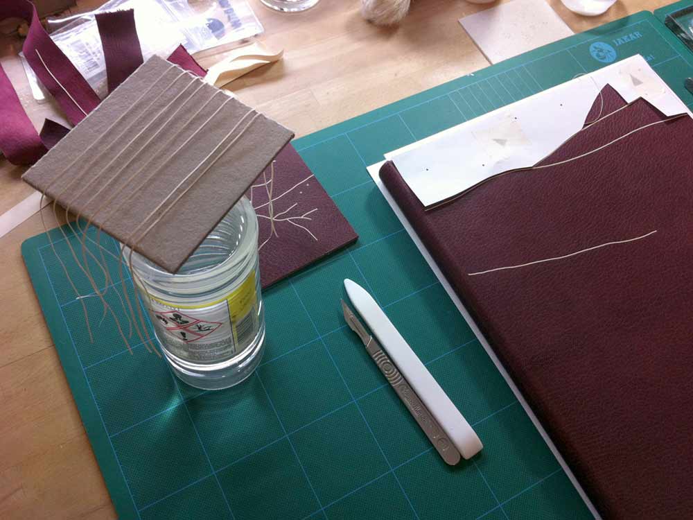
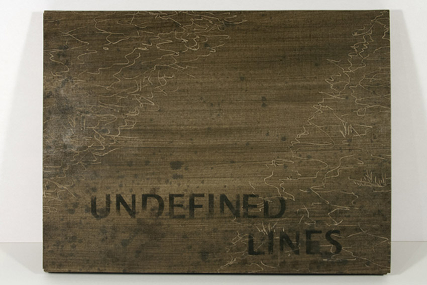
    This binding is recent, and one that took a long time to develop, and one that is amongst my favorites I’ve made. The shapes on both the recto and verso are taken from the etchings of Ginette Litt, one for each song (six). The shapes were removed and sanded, then re-adhered to the covers. The incision lines were painted black. The small connecting lines are thin twine that has been wound with silk thread in a near-pink hue, then adhered in a tooled line. The title is blind tooled then painted in the same black as the incisions.


  2. Half Light Bindery

    March 18, 2014 by Erin Fletcher

    HalfLightBindery5

    As Kevin Sheby graduated from the full-time program at North Bennet Street School, I had to say my goodbyes. He and his wife, with their two dogs, left soon thereafter to return to California. Since graduating in 2013, Kevin has custom built an efficient bindery space where he runs Half Light Bindery (which I have to say is a wonderfully chosen bindery name).

    Kevin is so talented and has created such amazing work that is both well crafted and artistically executed. Spending time with Kevin at NBSS, made me realize the importance of whole-heartedly investigating bookbinding structures and materials. What are the limits and what are the possibilities. Kevin has such a superb attention to detail and I’m always looking forward to the work that comes out of his bindery. 

    Recently, Kevin launched a collection of handmade leather products. Again his innate attention to details are seen in every product and within the professionalism of his website. 

    HalfLightBindery7HalfLightBindery3 HalfLightBindery2


  3. Bookbinder of the Month: Lang Ingalls

    March 9, 2014 by Erin Fletcher

    GoTellItOnTheMountain2-LangIngalls

    In 2011, Lang Ingalls won the Best Binding Award from the Chicago Public Library’s One Book Many Interpretations exhibition for her binding of Go Tell It on the Mountain by James Baldwin. It was during the reception for this exhibition that I met Lang. I was drawn to her binding because of the stark contrast between the rich purple leather and bright white onlays.

    Bound in the French technique and covered in purple goatskin. Spanning across the covers and spine are white eel onlays.  Other design details along with the title are hand tooled blind.

    This is the binding that led to our being introduced during an exhibit in Chicago. I am so attracted to the brilliant contrast between the vivid purple leather and the bright white eel skin onlays. I have little experience using exotic leathers, how does eel skin compare to traditional bookbinding leathers?
    This eel skin is really really thin, perfect for onlays, and not difficult to execute. I had fun deciding which way the spine parts would go to complement the design.


  4. March // Bookbinder of the Month: Lang Ingalls

    March 1, 2014 by Erin Fletcher

    LaCouleurDuVent-Lang Ingalls

    At this point I think it’s safe to say that I have found the recent ARA-Canada exhibition La Couleur du Vent to be filled with many beautiful and inspiring bindings. This particular binding was created by Lang Ingalls and is the fourth binding from the exhibition to be featured on the blog (the other three: Sonya Sheats, Coleen Curry and Karen Hanmer).

    So in case you missed those three posts I highly recommend you check them out after reading this one, but first let me summarize the exhibit. This international design binding exhibition was put together by ARA-Canada in partnership with École Estienne in Paris. The exhibition started in 2013 in Paris before traveling to Quebec then Montreal (which ended on February 28th). The show will continue to travel during this year, showing in Trois-Rivières from March to April. La Couleur du Vent is a collection of poems by Gilles Vigneault, illustrated and designed by Nastassja Imiolek under the artistic direction of Cécile Côté.

    Let’s get back to Lang’s binding. The set text is bound in the French technique using sea foam blue goatskin. On the front cover are inlays of python and lizard. A series of irregular shapes are tooled blind and span across the full length of the binding with the title also tooled blind on the spine. What I love most about this binding (besides the superb color choices) is the bold inclusion of the spine. Lang so wonderfully highlights the material and uses the natural elements of the leather to create an even more compelling design.

    This binding is stunning. The design you’ve created really celebrates the natural qualities of the materials. Can you talk about your concept behind the design?
    I bought the python and lizard used for the inlays in Paris years ago, but really love the texture and color of them — I tend to make monochromatic color choices in my books, this one is an example of that.

    – – – – – – – – – – –

    I chose to interview Lang for a few different reasons. Her work has been and continues to display thoughtful experimentation and courage with her materials. Her designs continue to engage and perplex me. She’s also just a wonderful person to be around. Lang is part of a handful of people I look forward to seeing once a year at the Guild of Book Workers Standard of Excellence Conference. Lastly, Lang’s educational experiences have greatly differed from my own. Since graduating from North Bennet Street School and having the opportunity to study with various guest instructors I’ve come to value the importance of creating what Lang describes as a ‘tool box’: gathering techniques on structures and decoration from binders with various talents and backgrounds.

    After the jump is my interview with Lang, it discusses heavily her varied educational experiences. Every Sunday this month I will feature some more of Lang’s bindings, so don’t forget to email subscribe and receive reminders when posts go live. You won’t want to miss out!

    read more >


  5. Bookbinder of the Month: Haein Song

    February 23, 2014 by Erin Fletcher

    RomeoAndJuliet1-HaeinSong

    In 2012, Haein Song bound this copy of Shakespeare’s Romeo and Juliet in full leather maroon goatskin. The delicate linear design was created by applying a series of natural goatskin onlays. The endpapers are monprinted in gold with suede doublures. 

    RomeoAndJuliet3-HaeinSong RomeoAndJuliet2-HaeinSong

    At first glance, the decorative elements appear to be hand tooled, but those thin lines are actually several onlays. Did you find it difficult to manipulate such delicate and thin pieces of leather?
    Leather pieces are paired down very thin (0.2.mm) and I cut them into long lines of a width of 1mm. It isn’t easy to glue the pieces so I put pva and paste mix on the glass surface then lay the piece on top so it can catch the adhesives. Then with a help of scalpel and tweezers I lay them on the the cover of the book based on my design. I think the idea of doing it seems more challenging than actually executing it. Once you are used to the thinness and longness of the piece it become a little bit like a drawing tool. And when I was laying down the pieces I had a feeling that I was drawing with a leather.

    RomeoAndJulietOnlays-HaeinSong


  6. Bookbinder of the Month: Haein Song

    February 16, 2014 by Erin Fletcher

    TheTrial1-HaeinSong

    The striking design on this fine binding of The Trial by Franz Kafka was created by the talented Haein Song in 2011. This Folio Society edition is covered in full black goatskin with reverse pared natural goatskin onlays. Keeping in fashion with her other bindings, the endpapers are hand printed and sit opposite a leather joint. 

    TheTrial2-HaeinSong

    The head edge and tail edge of the text block are decorated with black acrylic, leaving the whiteness of the paper on the fore edge exposed. Breaking up the edge decoration like this can be very interesting for the overall concept of the design and I think Haein is really playful in this area of the book. 

    TheTrial4-HaeinSong TheTrial3-HaeinSong

    You’ve created design bindings for some prominent authors such as Camus, Kafka and Kipling. Do you have an affinity for these authors? Do you plan to bind more of their works?
    I’m an admirer of few authors, which include Beckett, Camus, Kafka, Borges, Pessoa, Calvino, Kundera, Perec, Hesse and Carroll. I’m also very fond of playwriters associated with The Theatre of the Absurd. Whenever I have an urge and space I look for some of those authors’ books and I have few waiting to be bound. How I came to bookbinding is from the love of reading and interest in language. I don’t think it was easy for me to acquire a second language after being a grown-up so my love is mixed with the frustration I had to go through. And some of the authors I mentioned above express what I want to say through their books eloquently, articulately and poetically.


  7. Bookbinder of the Month: Haein Song

    February 9, 2014 by Erin Fletcher

    JustSoStories-HaeinSong

    This Folio Society edition of Just So Stories by Rudyard Kipling was bound by Haein Song in 2010. Bound in the Bradel binding structure, the spine is covered in reverse goatskin. The front and back boards are covered in hand dyed goatskin. The geometric pattern is tooled in white. The monoprinted endpapers sit opposite a leather joint. 

    JustSoStories3-HaeinSong JustSoStories-Tooling-HaeinSong

    Haein shared this image showing the the tooling in-progress. I love how clean and organized her space looks, a perfect calm environment for tooling.

    JustSoStories4-HaeinSong

    I choose to feature this binding because I’m such a proponent of using a single color to create sublty in design. Sometimes the simplest ideas can create the most extraordinary pieces of art. Using reverse goatskin for the spine creates not only a deeper red, but introduces a change in texture. For this binding, you utilize the Bradel binding, which allows you to create the exterior in three parts. Is there a fondess to this structure that you find supports your design sense more than a full leather binding?
    I like what Bill Evans, an American pianist and composer, said about that – “The simple things, the essences, are the great things, but our way of expressing them can be incredibly complex.” I’m attracted to the very essential and elemental quality of seemingly simple forms like dots, lines, squares and circles.

    When it comes to the structure I don’t think I prefer a bradel binding to a full leather binding – both have different qualities and attractions. But as you’ve mentioned a bradel bindings can provide simple design solution by changing materials or colours and there is a something architectural about that. I used a bradel binding for this book precisely because of that reason.


  8. Bookbinder of the Month: Haein Song

    February 2, 2014 by Erin Fletcher

    Whistler-HaeinSong

    The design on this full leather binding from Haein Song really transforms the material to mimic a textured painted canvas. Haein bound this copy of Whistler by Haldane Macfall in 2009. Sprinkled on top of the hand colored natural goatskin are flecks of gold leaf. The title is also tooled in gold on the front cover. If you click on the image above, you can see the title on the front cover toward the tail. I spotted the “H” first. Happy hunting. 

    The endpaper and matching panel doublures are monoprinted and sit opposite a leather joint. The edges are decorated with blue and brown acrylic pigment and sprinkled with gold leaf. 

    Whistler2-HaeinSongWhistler3-HaeinSong

    There seems to be quite an influence from Mark Cockram in the design of this binding. I can tell you were a student of his. The decoration on the leather has such a painterly quality to it, can you talk about your technique for achieving this affect?
    Do you think so? That is quite interesting as I haven’t thought in that way. Mark’s teaching involved structures, materials, tools and many tips from his experience except aesthetics. He thought, I believe, everyone has different aesthetics. But I suppose what you see influences how you express.

    Few Whistler’s paintings were on display at Tate Britain when I started this book. I remember walking around feeling his paintings titled Nocturne. I wanted to convey that feeling to the cover. Back then I was trying simple but different dyeing and printing technique. How it was achieved was simply rolling few different chosen (or mixed) relief inks onto the glass surface then lay the leather on top and rub it. Endpapers were made in similar way. There is a little bit of trial and error until you get the desirable outcomes. Also depending on the amount of inks and pressure you can achieve a very different look. Whistler was very much interested in Japanese prints. To finish I used a technique called Sunago (Japanese technique in woodblock printmaking, which involves sprinkled or scattered gold leaf) to reflect that.


  9. February // Bookbinder of the Month: Haein Song

    February 1, 2014 by Erin Fletcher

    MythOfSisyphus-HaeinSong

    This beautiful binding of The Myth of Sisyphus and Other Essays by Albert Camus was crafted in 2013 by Haein Song. Bound as a Bradel binding, the spine is covered in a natural goatskin with dark blue vellum covers. The sprinkled dashes on the covers are hand tooled in gold. The spectacular endpapers are hand printed. 

    MythOfSisyphus2-HaeinSongMythOfSisyphus3-HaeinSong

    This binding is absolutely stunning and so flawlessly executed. The covers are a beautiful dark blue vellum. Did you find the material difficult to work with in either the structural or tooling aspect of the binding process? I have a single experience with vellum over boards, but I know that bookbinders approach the board construction differently. May I ask if you prepped the boards for the covers in any particular way for the vellum?
    I heard few notorious rumours about vellum but I don’t think I found it difficult at the time I was working on it. Partly because it was a relatively small bradel binding and there wasn’t headcaps or joints. The spine of the book is covered in natural goatskin. 

    What I found afterwards was that the front and back vellum boards sometimes change their shapes depending on the humidity or temperature of the surrounding. But surprisingly it comes back to the original shape after some time. I was told that it needed a little bit of time to climatise.

    Later I was also told that lining vellum with a very thin paper (archival bible paper or Japanese paper) would reduce this changeable characteristic. 

    Tooling wasn’t particularly hard after practising enough on sample boards but I don’t think I have an ample amount of experience to compare differences in tooling on leather or vellum.

    – – – – – – – – – – –

    I have not yet had the pleasure of meeting Haein or been presented the opportunity of viewing her work in person. However, I’ve had her website bookmarked for a while now, checking back from time to time to ogle her work. As I began preparing a list of people to interview this year Haein’s name popped up as a suggestion from Hannah Brown, whom I interviewed at this time last year. So with Hannah’s endorsement and my growing fondness, I present the following interview with Haein Song. The interview ends with Haein’s elegantly worded philosophy on bookbinding. 

    Come back every Sunday during the month of February for more posts on Haein’s work. You don’t want to miss it, Haein shares some of the creative techniques behind her expressive and artistic bindings. 

    read more >


  10. Book Artist of the Month: Mary Uthuppuru

    January 27, 2014 by Erin Fletcher

    UndefinedLines4-MaryUthuppuru

    In 2012, Mary Uthuppuru created Undefined Lines. This unique artist book is designed with a cover that converts into an easel, making the image heavy content read as a guided tour along a trail commonly traveled by Mary. Using ink and watercolors to layout each scene on Rives BFK, the pages have a very soft, nostalgic feeling.

    UndefinedLines2-MaryUthuppuruUndefinedLines3-MaryUthuppuruUndefinedLines-MaryUthuppuru

    Undefined Lines is a really unique structure. The binding acts as an easel to direct the point of view of the imagery. Where did your inspiration come from for this structure?
    I chose to depict a hike I take every morning in a forest near my house. It is there that I sort out the agenda for the day, contemplate what might be on my mind or just clear my head. Being a little reserved with letting imagery be the message in my books, I decided that this book would be centered on large ink drawings with watercolors.

    This structure was a complete response to the content. In an unusual way, unusual to me, I created the pages of the book before considering how it would come together in the binding. As I finished the image panels, it occurred to me that I did two things: I created single sheets that then needed to be bound, and the image format begged for each page to be upright when viewed.

    UndefinedLines-inprocess-MaryUthuppuru

    So I leaved through all of the books about artist books I could find, hoping something would trigger an idea for my unique situation. First, I stumbled upon one of Claire Van Vliet’s bindings and I remembered the quilted books for which I first came to know her. The Lilly Library has a copy of her book Woven and Interlocking Book Structures from the Janus so I paid a visit and found a binding style that worked for my pages. The woven paper allowed me to bind the single sheets in an elegant and mostly hidden way. Another inspiration for the binding came from Susan Skarsgard, from whom I took a class at the Paper and Book Intensive in 2011. She showed us a non-adhesive structure that allowed the spine piece to slide into the cover to allow for the pages to open completely flat, something I found out I needed once I decided on the cover format.

    UndefinedLines-inprocess2-MaryUthuppuru

    Woven binding detail.

    Next, was to find a way to get the pages upright. I wanted the viewer to have the experience that they were walking through the forest with me. With the images as large as they are, I thought this would be possible especially if I could get the pages to turn towards the viewer. As each page is turned down, the viewer would find themselves in a new scene. I looked for inspiration in objects that are propped up for use that already exist like iPad cases and art easels. I made a few mock ups, but none of those things would work without making the book look clunky. Remembering that the box itself could act as the “easel”, I found the simplest ways possible to prop up the book. Having the box act as the cover in the form of a multi-flap portfolio was a good solution not only can all of the flaps be folded back for my purposes, but it also had a good-for-travel sort of feel. Once all the flaps are closed, it is self-contained.

    UndefinedLines5-MaryUthuppuru

    Last week you discussed your use of painted tissue for the cover of Fantasy & Nonsense. For Undefined Lines, Interpreter of Maladies and other works you’ve used paste cloth. Can you talk about your process for creating paste cloth?
    I first learned about paste cloth at my first Standards in 2008 in Toronto. Martha Cole demonstrated her beautiful technique of creating and using paste cloth for books as well as textile pieces. She even provided everyone with her recipes. I don’t use her recipe but I make a very simple recipe for mine which is just paste cooked as though you are using it for repair work, strained and thinned to the desired consistency, then divide the paste to be mixed with Golden acrylic paints. For the cloth, I use undyed natural cotton or linen…usually cotton since it has a consistent texture and tight weave that provides a nice smooth surface for combing if desired. All of my paste work with paste cloth is done on Mylar taped to a hard surface for drying.

    PasteCloth-MaryUthuppuru

    The cloth is sprayed with water and spread flat on the Mylar. At this stage, I make sure the fabric is laying evenly and the threads are not warped or distorted. The cloth is then pasted out with clear paste until the whole piece is evenly coated. Using your hands or a long ruler, turn the pasted cloth over onto the same piece of Mylar and smooth out gently with your hands getting rid of any air bubbles. At this point, you have to start making design decisions. If you plan on combing or drawing through the paste, then you need to decide if you will allow the color of the cloth to come through, by applying a layer of clear paste first, or if you want to build different colors on top of one another, in which case you just start your painting. If you are merely painting a design with the paste/paint mixture, you are ready to begin. Paste cloth lends itself to building rich designs by layering different colors or patterns on top of one another which is really fun to play with depending on the book’s subject matter.

    – – – – – – – – – – –

    Thanks Mary for a wonderful interview. It was great of you to share some of your techniques and creative processes.

    – – – – – – – – – – –

    UPDATE: Check out this wonderful review on Undefined Lines over at the Abecedarian Gallery Blog. The post includes a great slideshow of each page of the book!


  • My name is Erin Fletcher, owner and bookbinder of Herringbone Bindery in Boston. Flash of the Hand is a space where I share my process and inspirations.
    The StudioNewsletterInstagramEmail me
  • Archives