RSS Feed

Posts Tagged ‘bookbinding’

  1. Bookbinder of the Month: Ben Elbel

    July 5, 2015 by Erin Fletcher

    Water-BenElbel
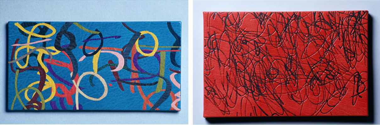
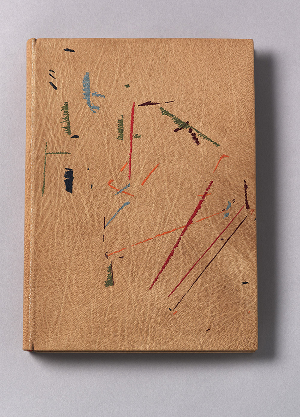
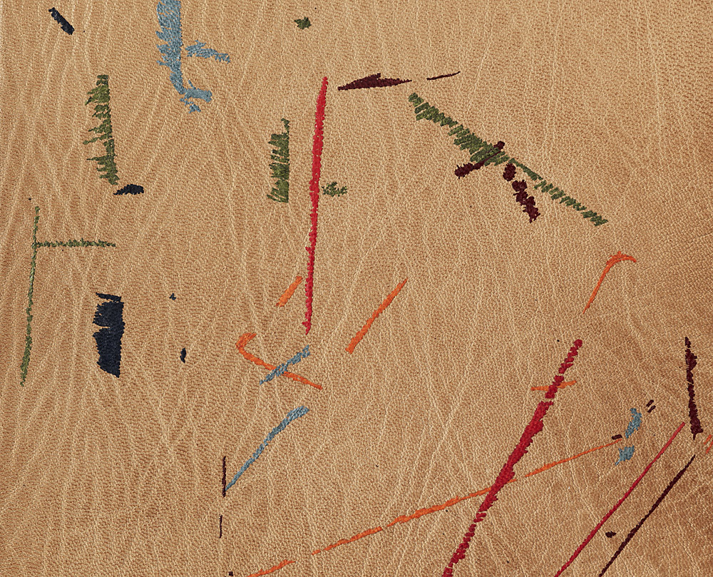
For the Designer Bookbinders International Bookbinding Competition in 2009, binders were invited to produce a binding for the set book Water, a collection of poems and illustrations based on the the theme of water. The set book was published by Incline Press in a limited, letterpress edition that included images from various talented illustrators and marblers. This was the first international competition since the organization began offering competitions back in 1975.

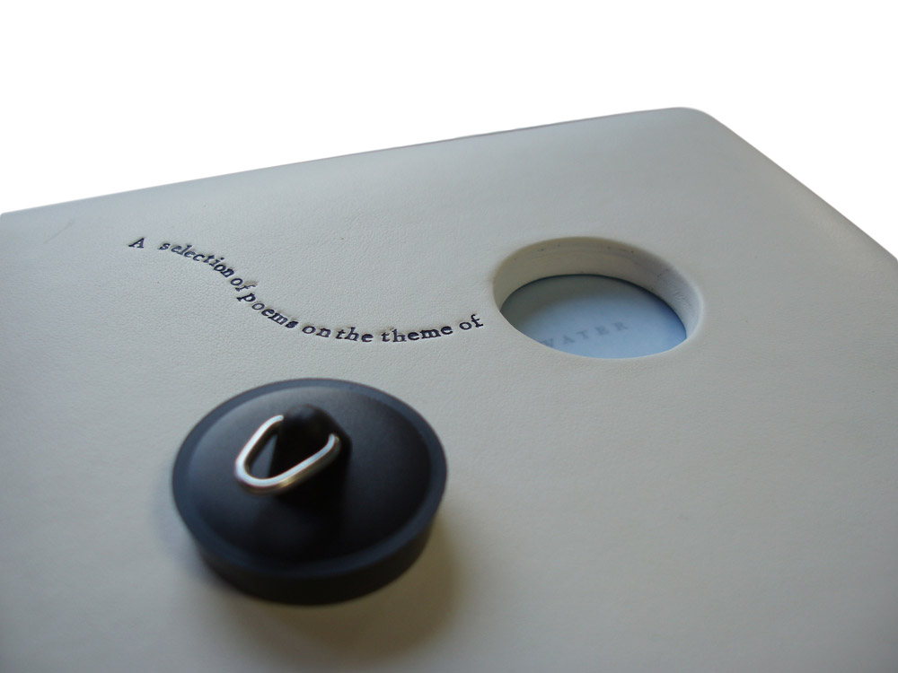
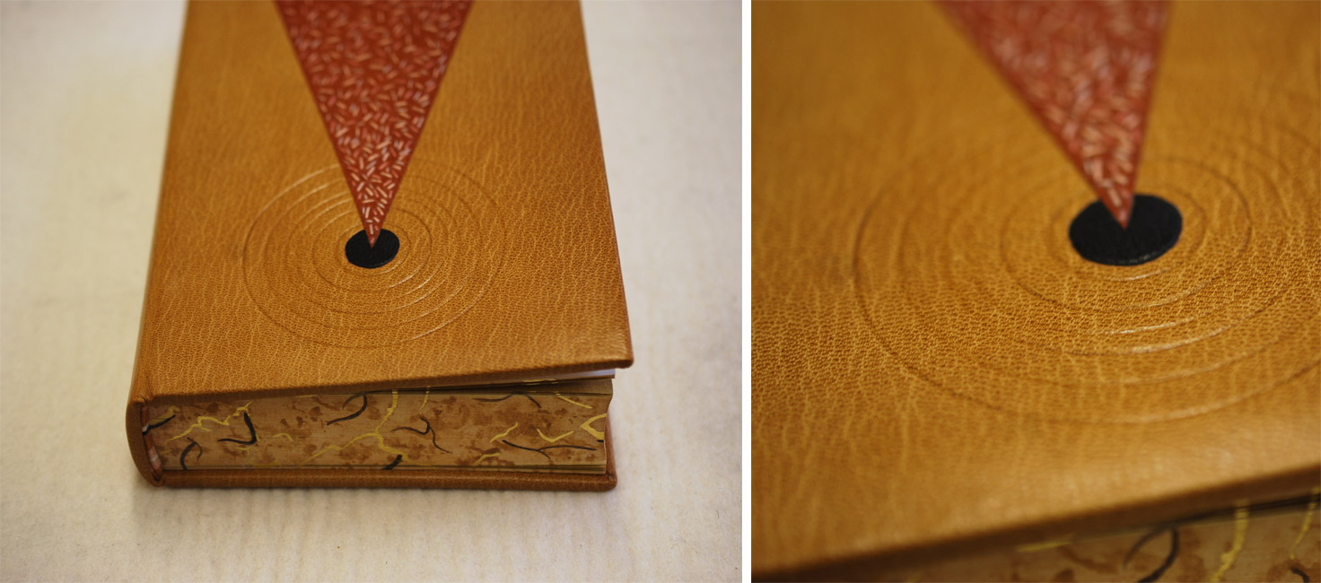
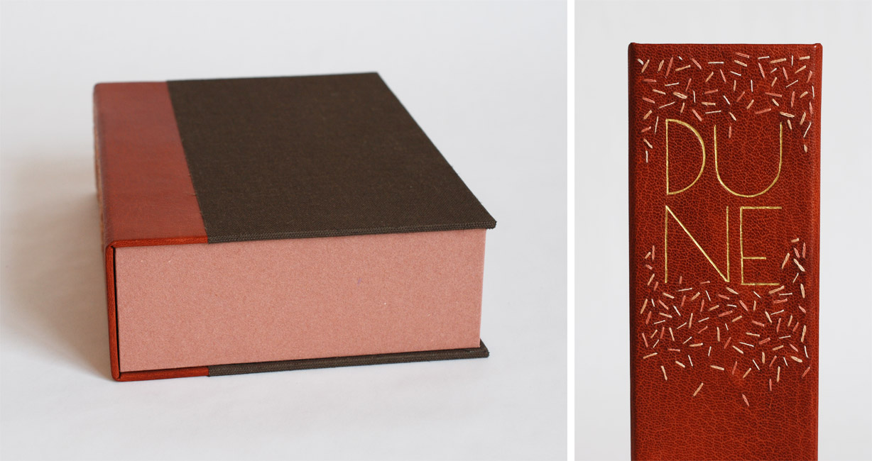
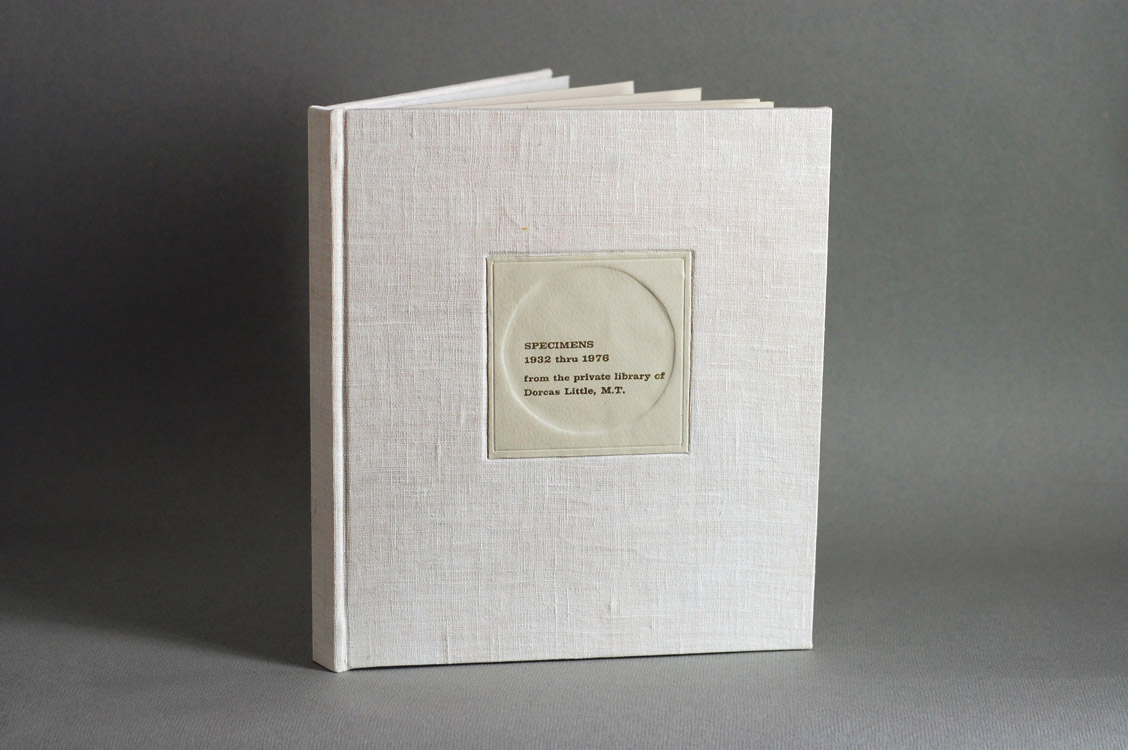
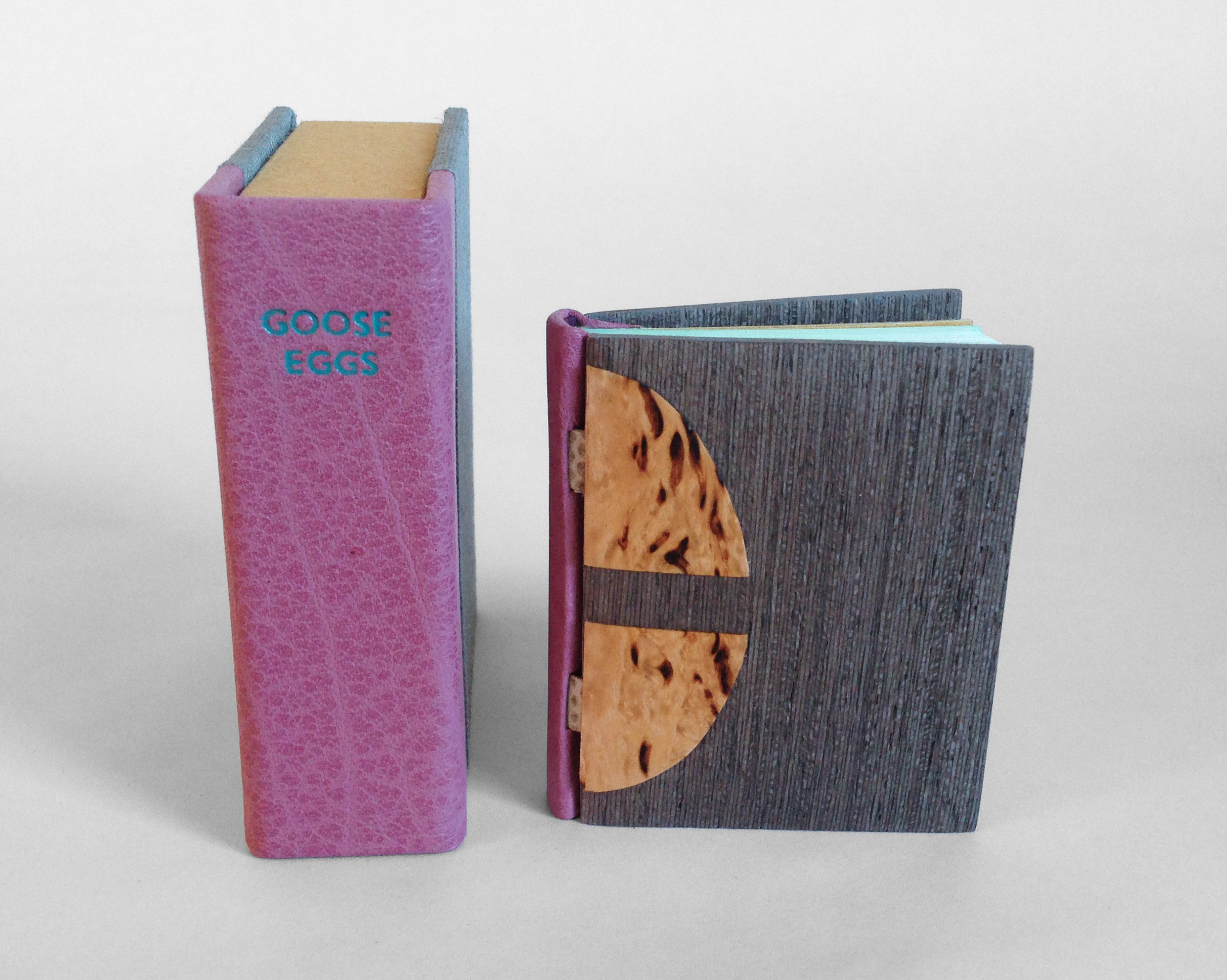
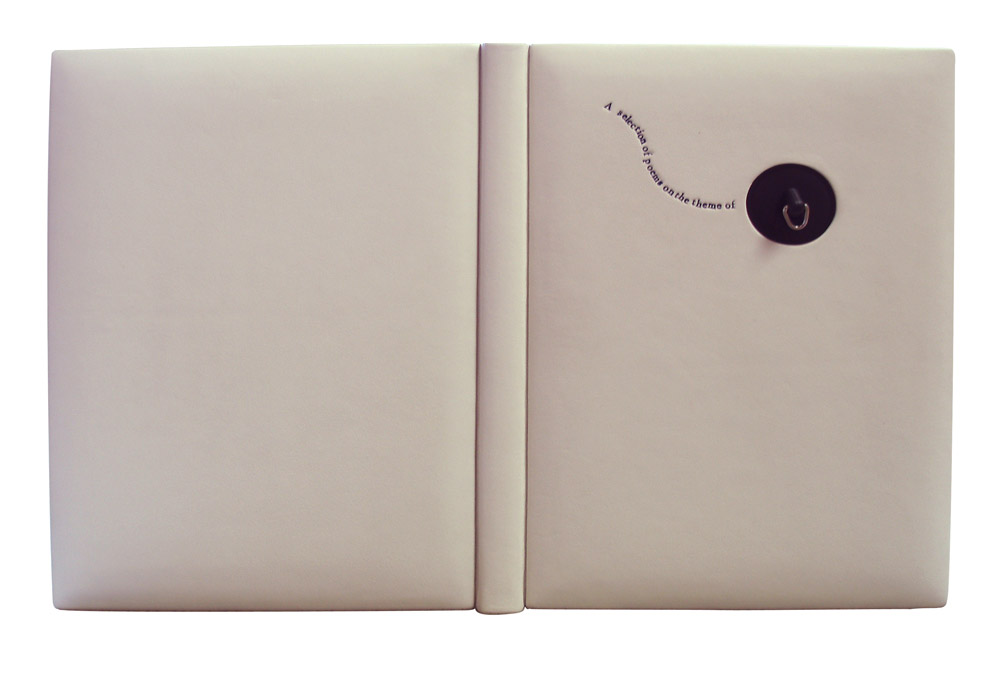
    Ben Elbel put together a beautiful binding in white calf (and quite impressive in how pristine it looks). The bath plug fits snugly into the front cover, but is easily removable to reveal the end of the title.

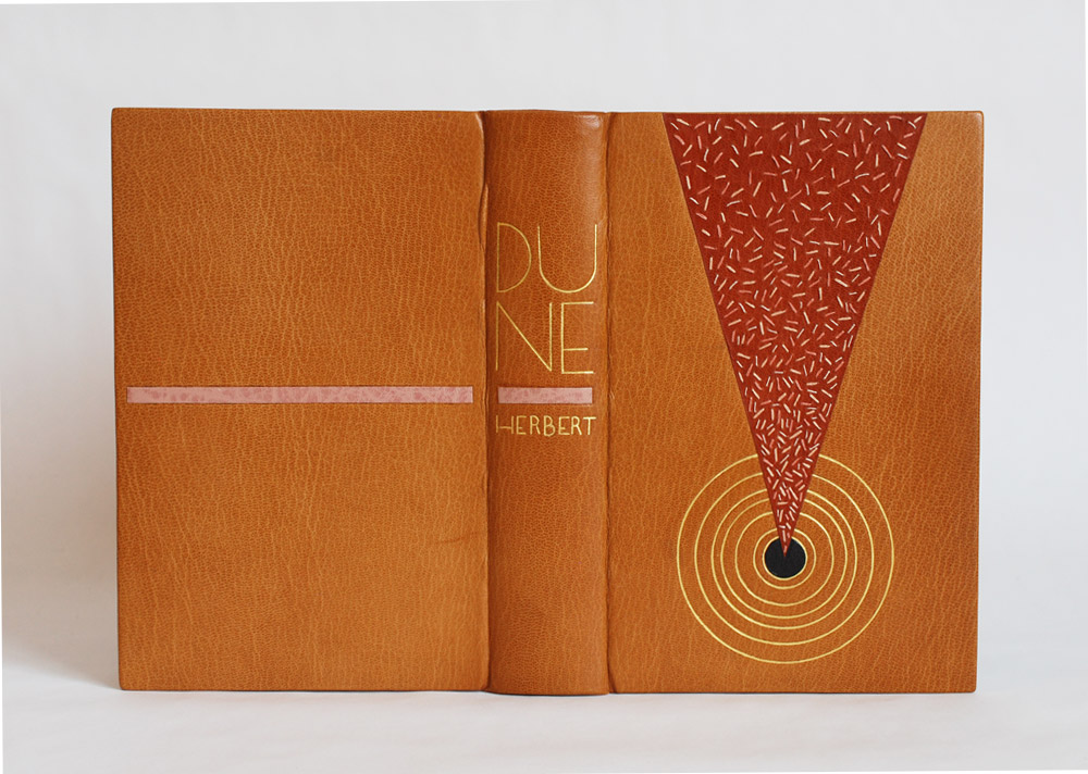
    This binding is so clever and probably the first binding of yours I ever saw. Can you talk about the process of fitting the plug into the front cover?
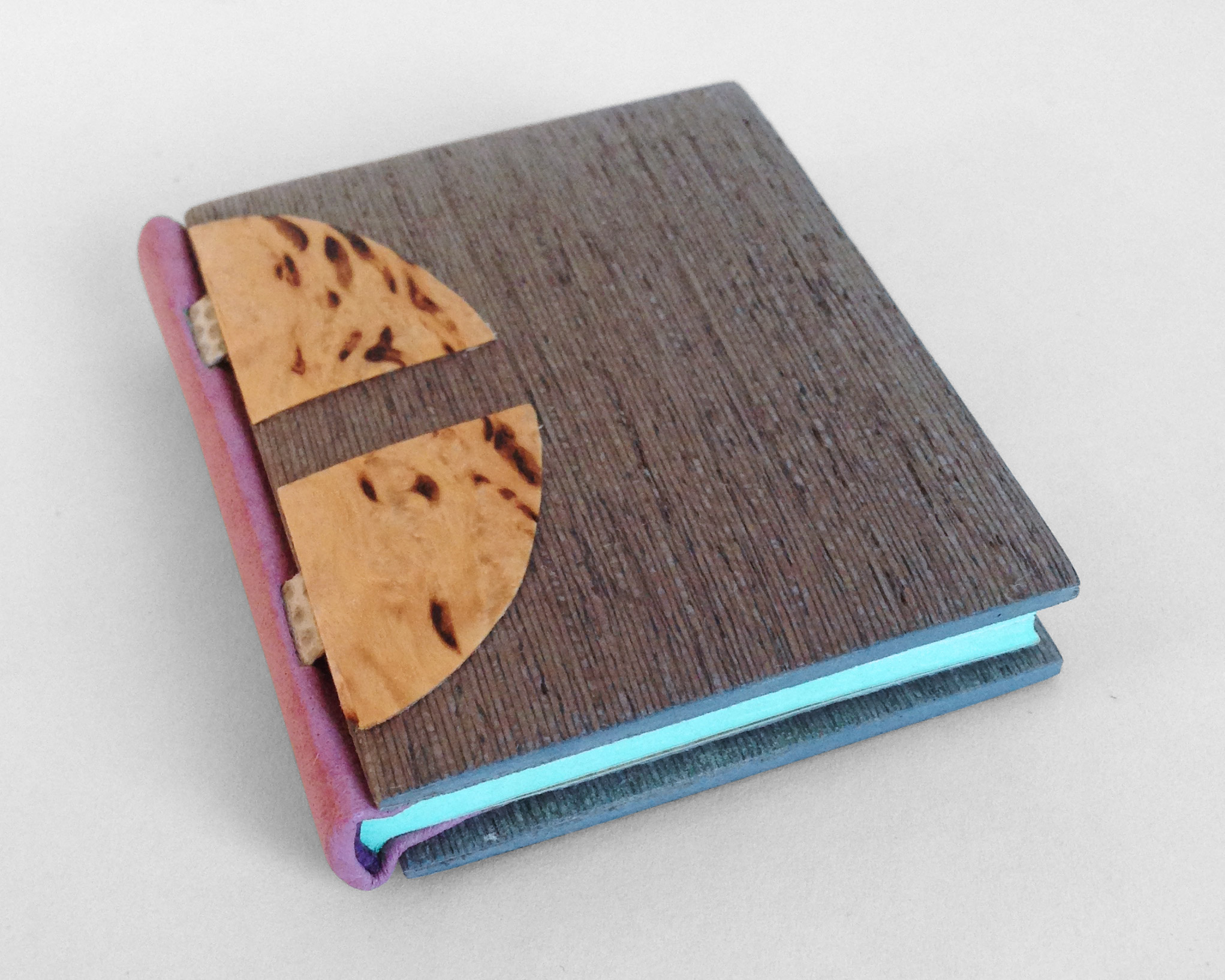
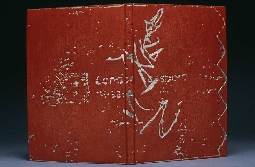
    This binding was my entry for the 2009 Designer Bookbinders international competition and was among the prize winners.

    My initial plan was to have the boards produced from enameled steel, the material from old fashioned bath tubs, but a quote from a supplier made me change my mind.

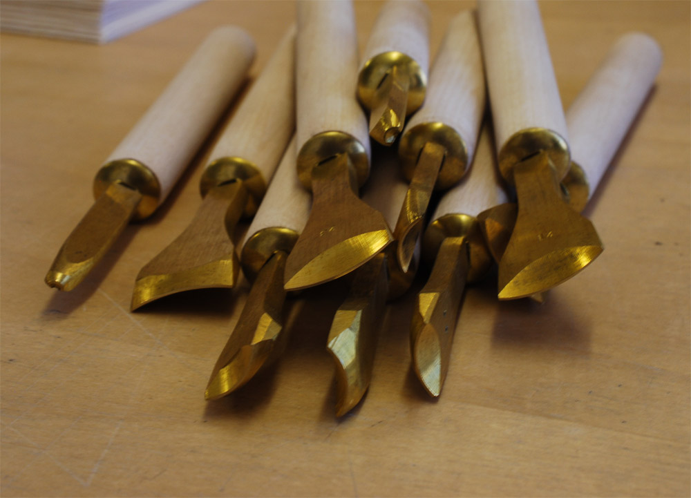
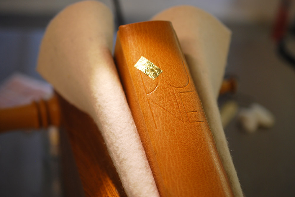
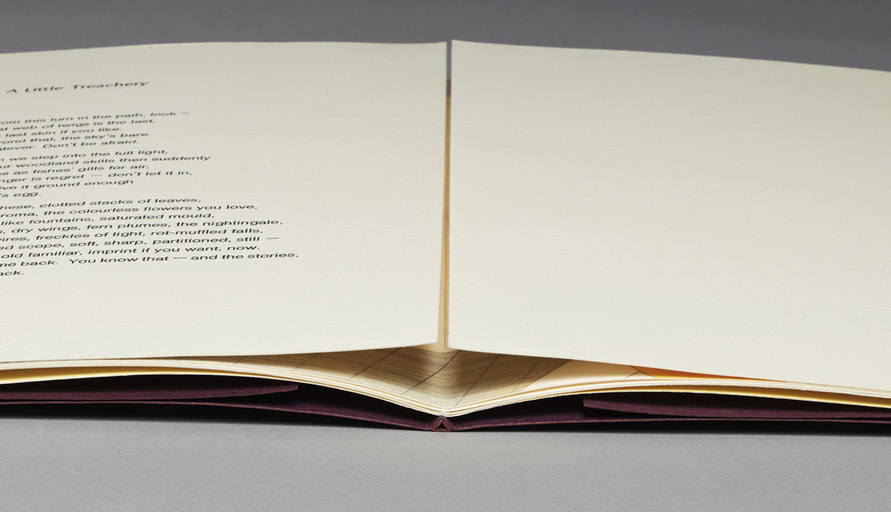
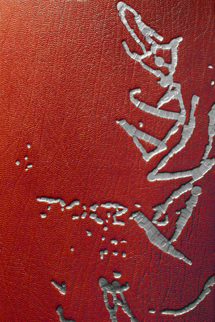
    The boards are made up from 2x 3mm boards, so a total thickness of 6mm. They are heavily beveled around the edges but retain full thickness in the middle to accomodate the plug. The leather was also very thick and I had to thin it down locally to turn it in the hole. This is how I did it.

    Water2-BenElbel


  2. My Hand // Dune

    May 1, 2015 by Erin Fletcher

    It’s been a while since I wrote about my binding of the science fiction classic Dune. After sharing my technique for the edge decoration, hand-sewn headbands and the process of covering, I’m finally ready to unveil the finished binding.

    Dune11a-ErinFletcher

    So now I’ll go over the steps that led to the finished look. After covering and letting the book rest, I began working on the remainder of the design for the front cover, which included a series of concentric circles. All seven circles would be tooled using gold leaf, but only the inner circle would also include a leather onlay. In the image below (on the left) is my initial sketch of the front cover design. It includes a list specifying the size gouge for each circle. The image on the right is the final outline drawn on tracing paper, which includes fewer circles due to spacing issues. This also became the template I would use to transfer the design to the book (hence the wrinkles and cut out squares).

    Dune13-ErinFletcher

    In the image below you can see the tooling template attach to the underside of the front board. At this point, I’ve flipped it off the book to check the placement of the first circle.

    Dune8-ErinFletcher

    Happy with the first circle, I continued working my way through the remaining 6 circles. Each circle was initially placed onto the leather with a plastic circle template and thin bone folder. I then used the appropriately sized gouge to make the first impression, with the tool being cold. Below is an image of all the different gouges used on the binding.

    Dune12-ErinFletcherDune9-ErinFletcher

    In the midst of winter and in an incredibly dry studio, I began to add the gold to the circles. After a few failed attempts and some adjustments I made to the atmosphere, the gold started to stick. In between the tooling process on the front cover, I moved to the spine where I tooled in the title and author’s last name.

    Inspired by the lettering seen on French fine bindings from the 1920s and 30s, I used a combination of gouges and line palettes to design my own alphabet. In the image below, I’ve finished the initial blind layer and am about to begin the gold tooling.

    Dune10-ErinFletcher

    The title and author’s name are divided by a blind tooled onlay of buffalo skin in a lovely light pink, which also appears on the back cover. This design is again a play on the French fine bindings from the 1920s and 30s.

    With the outside complete, I moved to the inside of the book. The fly leaves are a soft suede in dark brown which matches the onlay on the front cover. The matching DUNEblures (a silly nicknamed coined by my witty studio mate Colin Urbina) are tooled in a design that mirrors itself on the back cover. The angle of the lines match that of the triangle on the front cover. The spacing between the lines is consistent with the spacing between the concentric circles.

    Dune14-ErinFletcher

    The book is housed in a quarter leather clamshell box using the same terracotta goatskin as for the triangle back-pared onlay. The leather has been embroidered in the same fashion and tooled with the title. The rest of the case is covered in brown Canapetta cloth. The trays are covered with handmade paper I bought from Katie MacGregor and lined with the same suede as the fly leaves.

    Dune16-ErinFletcher Dune15-ErinFletcher

    In mid-April, I received the exciting news that my binding of Dune will join the Guild of Book Workers Traveling Exhibit: Vessel! This will be the second time I’ve participated in a GBW show and what’s more exciting is that this exhibit will be hosted by the North Bennet Street School. So halfway through the tour, I’ll get the chance to revisit my binding.

    The exhibit will open later this year in California and I’ll be writing a post to remind those nearby.


  3. Book Artist of the Month: Natalie Stopka

    April 20, 2015 by Erin Fletcher

    Specimens1-NatalieStopka

    Up until this post, Natalie Stopka has shared her techniques for natural dyeing, as well as her methods for marbling and suminagashi. In the last two posts for the month, we’ll look at two artist book projects starting with her 2011 book Specimens.

    Can you talk about the concept behind this work and your inspiration for the book’s structure?
    I’m very interested in the notion of fabricated histories, including artifacts of dubious or bogus provenance such as the Voynich Manuscript or Cottingley fairy photographs. In creating Specimens I bound together the textile fragment collection of the (fictional) Dorcas Little, seemingly a phony collection that she had created and catalogued in the mid-1900s. Each textile fragment was hand sewn from vintage materials to look as if the fibers were is some aspect growing or reproducing. Mounted in a petri-shaped window, each piece is visible from both sides.

    Specimens3-NatalieStopkaSpecimens4-NatalieStopka

    I have a love/hate attitude towards album structures, which are very useful for a book such as this, but generally inelegant and tedious to bind. I elected to use a double guarded album binding, which has the institutional appearance I was hoping for, but a somewhat more graceful movement. As if, in order to augment the appearance of authenticity, the collection’s owner had commissioned the housing.

    Specimens2-NatalieStopka


  4. Book Artist of the Month: Natalie Stopka

    April 6, 2015 by Erin Fletcher

    CompleteDye-NatalieStopka

    As a continuation from last week’s post, I extended the conversation on natural dyes with book artist, Natalie Stopka. During her time at the Center for Book Arts as a Van Lier/Stein Scholar, Natalie also completed a collection of case bindings, where each component beautifully represents the subtleties of natural dyes.

    CompleteDye2-NatalieStopka

    The variation between the different materials is subtle and beautiful. I wonder what your inspiration was for this project?
    Besides my enjoyment of the process of foraging and dyeing with plants, I love the sympathy between natural dyes and fibers, as well as the resonance of using historical methods with historical materials. Prior to the discovery of synthetic dye in 1856, all books were decorated with naturally derived dyes, inks, and pigments. That is a lot of artistic heritage that has been largely supplanted in the past 150 years. I wanted to create some books that were all of a piece referencing that period just prior to the advent of synthetics, using a hollow-back structure with linen book cloth, hand sewn headbands, uncut pages folded down from full sheets, and, of course, natural dyes. I ended up binding a dozen books in different colors, partly as an exercise in honing my binding skills, as well as a continuation of my dye experiments.

    Can you walk through your dying process from the creation of the pigments to the dying of the materials? Where did you learn these techniques?
    Beginning with the techniques I learned at the Textile Arts Center, I extended my natural dye experiments into bookbinding. There was some trial and error at first as I selected and mordanted paper samples. Papermakers generally color the pulp with pigment prior to forming sheets, so there is not a lot of information on how to dye paper, or how the dyes and mordants affect it over time. But paper is just cellulose fiber like many fabrics I had experience dyeing, so I jumped in. I decided to use Zerkall Ingres, which is quite absorbent due to its composition, but also has good wet strength. And when folded down it makes a lovely signature size.

    The first step in dyeing is to source or collect plant material. In this case I used plants I foraged in upstate New York including oak leaves, cherry bark, Queen Anne’s lace, apple bark, and yarrow, the only exception being indigo. I chopped and soaked or simmered the plant material to extract the dye, then strained the dye liquor into a big stainless steel vat containing the mordanted paper and other book materials. After about 12 hours in the vat, everything was ready to carefully remove and dry.

    DyeProcess-NatalieStopka

    As with my embroidered botanical illustrations, these books demonstrate the different shades of color (sometimes slight) that result when a single dye is applied to various substrates. The linen cover, silk headbanding thread, Zerkall Ingres pages, and linen binding thread were all dyed in the same vat. The endpapers were made from the uppermost sheet of paper in the bath, which became patterned by the evaporation of the dye. My favorite book was dyed with black cherry bark – I left the dye vat outside overnight, and a light frost left crystal patterns on the endpapers! Initially I expected the papers to take the dye evenly in a uniform shade, but most dyes were absorbed with a good deal of variation, making a richly toned surface.

    CompleteDye3-NatalieStopka


  5. Extra Bonus // Bookbinder of the Month: Tracey Rowledge

    March 31, 2015 by Erin Fletcher

    ALittleTreachery1-TraceyRowledge

    To finish off the interview series with Tracey Rowledge, I wanted to present one final binding (or two really). Just last year Tracey bound two copies of A Little Treachery by Libby Houston, one in full leather and one in paper.

    It can seem challenging to push the envelope with a single signature text block. Yet, I think, when one begins to experiment, the creativity flows and the possibilities seem endless. What were your goals for the binding of A Little Treachery and how did you come to settle on this 2-part pamphlet structure?
    I was commissioned to bind this book, having already bound it once as a full leather fine binding. The client liked the first binding but wanted his binding to be paper-covered. This commission gave me the luxury to revisit and develop the image I’d created for the first binding. As always, and as with the first binding I made, I wanted the book to open flat, so I devised this structure.

    ALittleTreacheryLeather-TraceyRowledge

    A Little Treachery by Libby Houston with dry point by Julia Farrer (Circle Press Publications 1990) // Bound in purple/blue goatskin, sewn on a stub, with leather-jointed hand-coloured endpapers, rounded and backed and gold tooled in Palladium.

    Creating a structure bespoke for this book is no different to my creating a structure for an antiquarian book, or for a fine binding that may have alterations in the structure unbeknownst to the viewer. Really I approach all that I do in the same way: I always put the needs of the book first, employing all that I know in order to do the best thing for the book.

    ALittleTreachery2-TraceyRowledge ALittleTreachery3-TraceyRowledge

    My creative input is always there, it’s what gives the object its look, shape and feel. It’s just that in some bindings I may give deference to the age of the text-block and therefore leave room for the book as an artefact to take centre stage, rather than allowing myself to butt in with anything I might feel a pressing need to convey at that moment. Perhaps it’s all about trying to have good manners, about knowing when is the right moment to speak and when is the right moment to listen.


  6. Bookbinder of the Month: Tracey Rowledge

    March 29, 2015 by Erin Fletcher

    LeatherPanels2-TraceyRowledge

    So far in this interview with Tracey Rowledge we’ve looked at her binding work and her works on paper, more specifically the work inspired by markings either found or interpreted. The leather panels presented in this post are a wonderful representation of art created using traditional binding and finishing techniques. The panel above is called 3 Milk and was created in 2000; the panel is covered in black goatskin with gold tooled design. The detail of this panel will awe you and make you think about tooling combinations differently.

    LeatherPanels4-TraceyRowledge

    Many of your leather wall panels are tooled representations from found paper scraps with markings. The gold tooled marks that decorate your fine bindings appear spontaneous. Are you creating these free-form designs in response to the work being bound or do they come from found paper scraps?
    It’s a mixture. Sometimes I found I had the exact response to a book in my ‘found archive’, other times I set about creating images for a book myself, as time went on the latter was more and more the case. Sometimes though a found image was so strong a driving force that I felt I needed to make a piece of work with it that wasn’t a book. In these instances, the materials and decorative techniques I used and the proportions of the wall piece would all be guided by the original scrap of paper I’d found. Really, what I’m describing is that I created a framework for these pieces of work, whereby the decisions were half made by the found material itself.

    LeatherPanels-TraceyRowledge

    LEFT: Where, covered in mid-blue calfskin, gold-tooled, 2003   RIGHT: Diptych, covered in baby pink goatskin with grey goatskin recessed inlays, 2000

    LeatherPanels5-TraceyRowledge

    LEFT: Buff, covered in turquoise goatskin with leather inlays, 2004   RIGHT: Fidget, stretched native red goatskin, tooled in carbon, 2004

    LeatherPanels3-TraceyRowledge

    Cash, gilded gesso panel on wood, 2005


  7. Bonus // Bookbinder of the Month: Tracey Rowledge

    March 26, 2015 by Erin Fletcher

    Vathek1-TraceyRowledge

    To continue with the same theme from the prior post, I wanted to discuss another unique binding from Tracey Rowledge’s portfolio. The binding is of a 1929 edition of Vathek by William Beckford published by the Nonesuch Press. Bound as a fine binding in biscuit colored goatskin and feathered onlays.

    Vathek3-TraceyRowledge

    This binding is unique within your portfolio. The markings are created through feathered leather onlays instead of gold tooling. Onlays are used rather sparingly in your work, can you talk about the reason why your chose to use onlays on Vathek as opposed to a gold tooled design or colored foils?
    This book contains wonderful illustrations by Marion V. Dorn and the binding further explores my wanting to alter the language of a fine binding. The book has a rough-edge gilt top edge, the endpapers are the same colour as the text-block and are hand-coloured with coloured pencil so that when the book is open the endpapers frame the text-block with the same colours the illustrations contain.

    Vathek2-TraceyRowledge

    The leather-joints are red, the same colour as the endbands, this union I felt brought these two elements together, like an elastic band encircling the book. The natural colour of the leather is for me like a grainy blank canvas and the coloured onlays give the impression of the making of a drawing with coloured pencils: you know when you’re drawing and you lean on another piece of paper and the pencil runs off: over the edge. That’s what I wanted to create – a remnants drawing. Gold tooling wasn’t the right medium for the image, also, I didn’t want the image to be made from tooled impressions, I wanted for the image to sit on the surface of the leather. This was the only way the image felt right.


  8. Bookbinder of the Month: Tracey Rowledge

    March 22, 2015 by Erin Fletcher

    TheEssenceOfBeeing-TraceyRowledge

    The prior posts on Tracey Rowledge’s work have focused on her designs mostly inspired by abstract markings. However, there are a few pieces in her portfolio that stand out for their sheer difference in design. The above binding of The Essence of Beeing by Michael Lenehan with illustrations by Alice Brown-Wagner is bound in black goatskin with a gold tooled design.

    The second binding featured in this post is a copy of William Shakespeare’s Hamlet, which was bound by Jen Lindsay in a red native-dyed goatskin with rough-edge gilding. Tracey completed the binding by gold tooling the title in 2012.

    Even though letterforms can be viewed as markings in their own right, I wanted to find out why Tracey veered toward a typographic design for these particular bindings.

    I love your use of typography as the single design element on these two bindings. The texture you create by overlapping a word or building up a letter with several impressions of a single tool is really genius. What draws you to use typography over the abstract markings you often employ in your designs?
    With The Essence of Beeing I was interested in combining my handwriting, the nature of the crosshatched images in the book and the wonderful title, to create an image that was the title – to see how far a fine binding could be simplified in appearance – to see if at first glance it could look like an art book. I don’t know if this makes sense, but to try to explain it another way – I really enjoy the look and feel of a fine binding, but I sometimes wonder if they look to others overly laboured. I was exploring in this work, whether I could remove this element.

    Hamlet-TraceyRowledge

    Hamlet was bound by Jen Lindsay in 2002 and it came to me in 2012 to be lettered. Although there was a ten year gap in between the time Jen completed the binding and I gold tooled the lettering, it was very much a collaborative process. We felt it was really important that the lettering worked with the incredible grain of the native red goatskin Jen had bound the book in. The Hamlet lettering is gold tooled using Jen’s handwriting, it being uppercase and superimposed, creates an image that also evokes something about Hamlet itself.


  9. My Hand // Goose Eggs & Other Fowl Expressions

    March 16, 2015 by Erin Fletcher

    GooseEggs4-ErinFletcher

    At the Guild of Book Workers’ Standards Conference in DC, I picked up a couple miniature text blocks from Gabrielle Fox. One of the them being Goose Eggs & Other Fowl Expressions printed by Rebecca Press in 1991. The letterpress printing was done in a vibrant purple with hints of mint blue and bright yellow. The image below is a spread from the book.

    GooseEggs-ErinFletcher

    For the binding, I decided to test the limitations of the Dorfner binding in a miniature format. Last year I had the chance to learn this very special binding structure. Unfortunately not from Edgard Claes himself, but from Colin Urbina who had the opportunity to take a workshop from the celebrated Belgian binder. The Dorfner-style binding was originally developed by German binder Otto Dorfner.

    I sadly did not take any images during the process of creating this binding as it was the first miniature I’ve ever bound and was delighted by how quickly I was able to move through each step. So needless to say, I forgot to stop and take images, but I will explain the binding process a bit in this post.

    GooseEggs6-ErinFletcher

    The book is sewn on two silver snakeskin tapes (initially lined with silk) before being rounded and backed. The edges were properly prepped for a layer of mint blue gouache paint. Leather wrapped headbands decorate the head and tail in a skin that perfectly matches the purple ink from the text block.

    The spine piece is wrapped in mauve buffalo skin, which was shaped and the headcaps were formed off the book. After cutting away to expose the tapes, the spine piece is attached to the text block and then the light grey suede flyleaves are put in place.

    GooseEggs5-ErinFletcher

    Now comes the fun part. The MDF boards are carefully shaped, first with a power sander and then by hand to offer an elegant cushioned edge. Afterward, the boards are laminated on both sides with a wood veneer. For this binding, I used an unknown wood that I found in a sample pack of domestic and exotic woods (so if anyone can identify this wood, please let me know). A channel is cut out of the veneer and the tapes are glued down to attach the board. To hide the tapes a second veneer is cut and glued down. For this binding, I cut four tabs out of Karelian birch in the shape of a goose egg.

    GooseEggs3-ErinFletcher

    The book is housed in a tiny clamshell box. The spine is covered in the same mauve buffalo skin and silver canapetta cloth that mimics the veneer on the cover boards. The trays are covered in a yellow handmade paper from Katie MacGregor, which was also used as the book’s endpapers. The book is protected with a light grey suede lining.

    GooseEggs1-ErinFletcher

    Goose Eggs is the second Dorfner binding that I’ve made to date. I really love this structure, it has a unique elegance and it can be assembled rather quickly. So I’m looking forward to working with this structure again and hope to incorporate some common elements of my work like gold tooling and embroidery. I also hope to learn more about marquetry in order to create intricate designs in the veneer.


  10. Bookbinder of the Month: Tracey Rowledge

    March 15, 2015 by Erin Fletcher

    AuggieWrensChristmasStory1997-TraceyRowledge

    This is one of my favorite bindings from Tracey Rowledge; the tooling is brilliantly executed and in such a way that is perplexing. Which is precisely why it was included in the interview. Tracey bound this edition of Auggie Wren’s Christmas Story by Paul Auster in 1997 using native red goatskin.

    I’m really intrigued by the design for the binding of Auggie Wren’s Christmas Story that you created in 1997. I would love to hear about the steps involved in executing the design; from the detailed image of this book, the tooling appears staggered, as if the depth of the impressions varied. Were you using a series of hand-made tools to create the overall design and this effect?
    This was a pivotal binding for me, as this image dictated that I alter my gold tooling technique from using albumen glaire and laying the gold on the book, to using BS Glaire and picking the gold up on the tool (Ivor’s method). The tooling was done using a series of pallets and irregular shape brass finishing tools (which I’d made), that overlapped in order to fill various shapes in the image. This was the first time I’d used Caplain leaf (18 carat), it’s a difficult leaf to work with as it’s quite brittle. It remains a favourite leaf to use as it doesn’t tarnish and has a wonderful melancholic tone.

    This book took about 100 hours to gold tool.

    AuggieWrensChristmasStory1997detail-TraceyRowledge


  • My name is Erin Fletcher, owner and bookbinder of Herringbone Bindery in Boston. Flash of the Hand is a space where I share my process and inspirations.
    The StudioNewsletterInstagramEmail me
  • Archives