RSS Feed

Posts Tagged ‘bookbinding’

  1. Tutorial: Top Secret Belgian Binding

    November 19, 2013 by Erin Fletcher

    secretbelgian1-erinfletcher

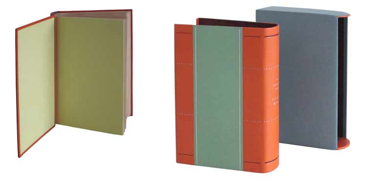
    The Secret Belgian binding is just one of many structures on my long list models to make. With the aid of a tutorial posted on the BookArtsWeb tutorial and references page, I was on my way to checking this structure off my list. Unfortunately the link seems to be broken now. However, within this post you’ll find my instructions, which are very comprehensive and any skill level can complete this simple structure in a matter of hours. So let’s get started*:

    *This tutorial is for a modified version I’m calling the Top Secret Belgian. This version of the structure is sewn differently and extra steps are taken to hide the interior thread. If you are looking for more instructional content, I have a growing list of tutorials and I also teach live workshops in-person and online. Check out my list of Upcoming Workshops.

    MATERIALS: 
    – binder’s board for 2 covers and 1 spine piece
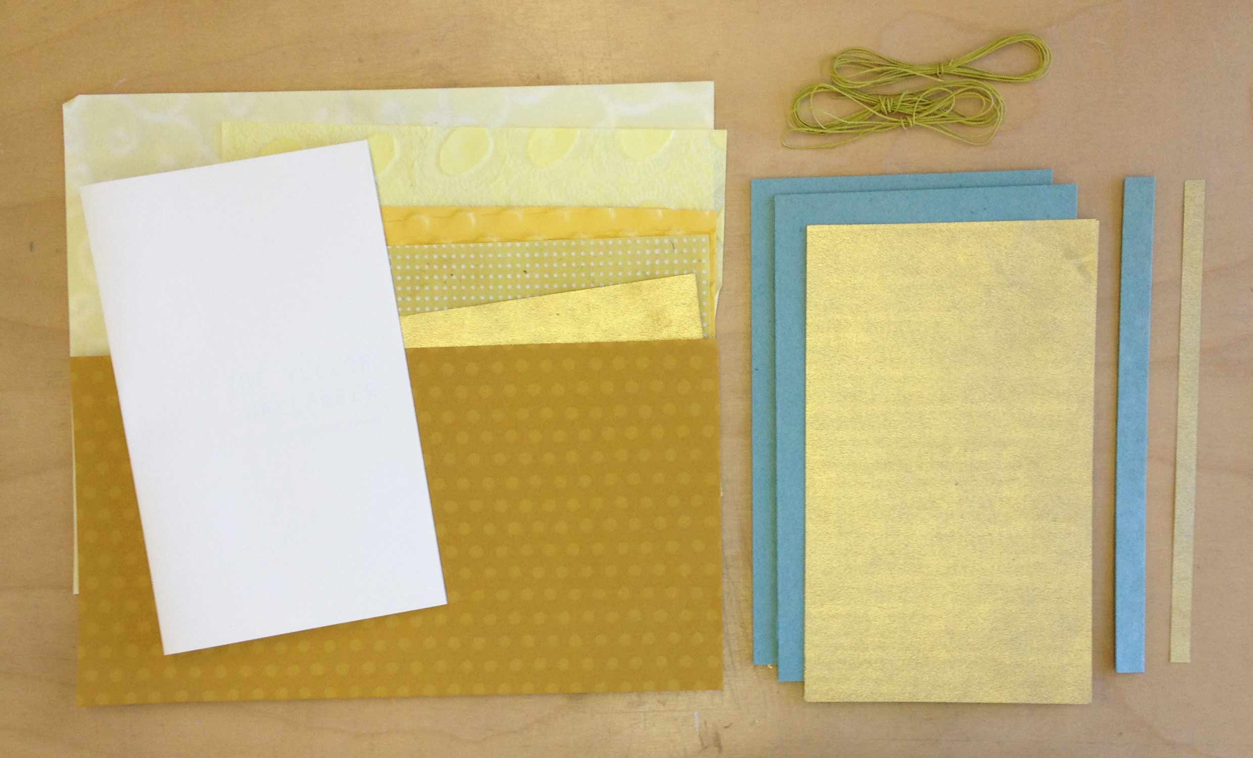
    – decorative paper
    – paper to line covers and spine piece (aka paste downs)
    – colored thread
    – text block (3-5 signatures, about 3-4 folios each)
    – PVA
    – wax

    TOOLS: 
    – needle
    – bone folder
    – glue brush
    – scalpel (preferably with curved blade)
    – x-acto
    – scissors
    – pencil
    – triangle
    – awl
    – dividers (optional)

    STEP ONE: 
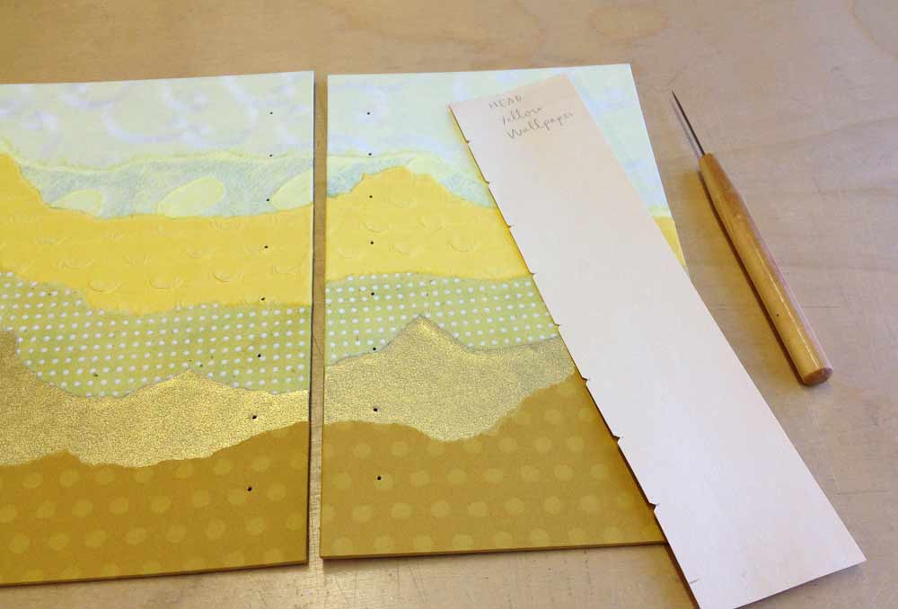
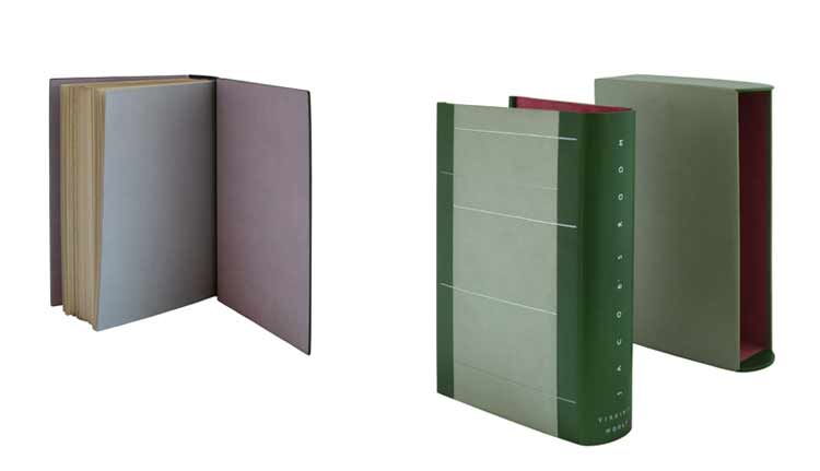
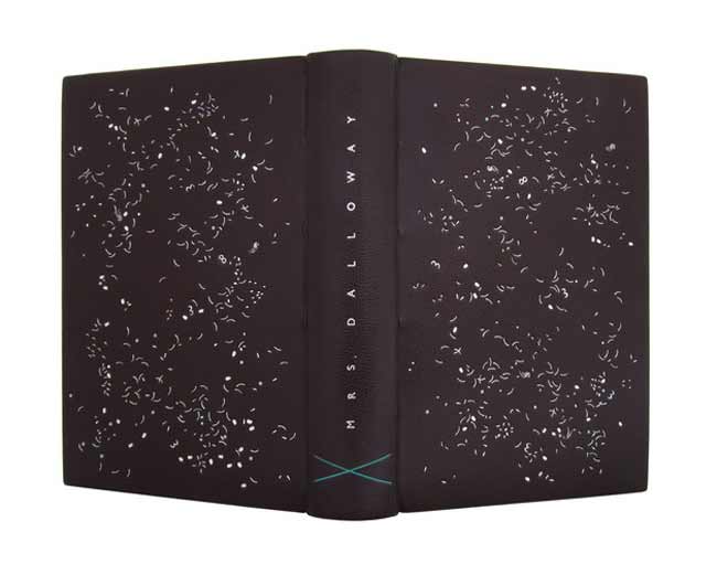
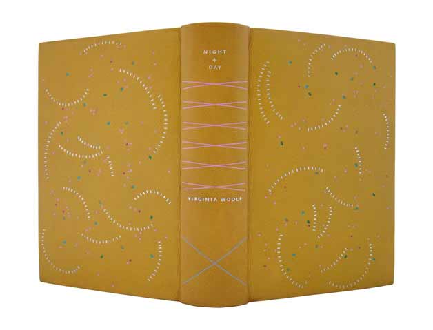
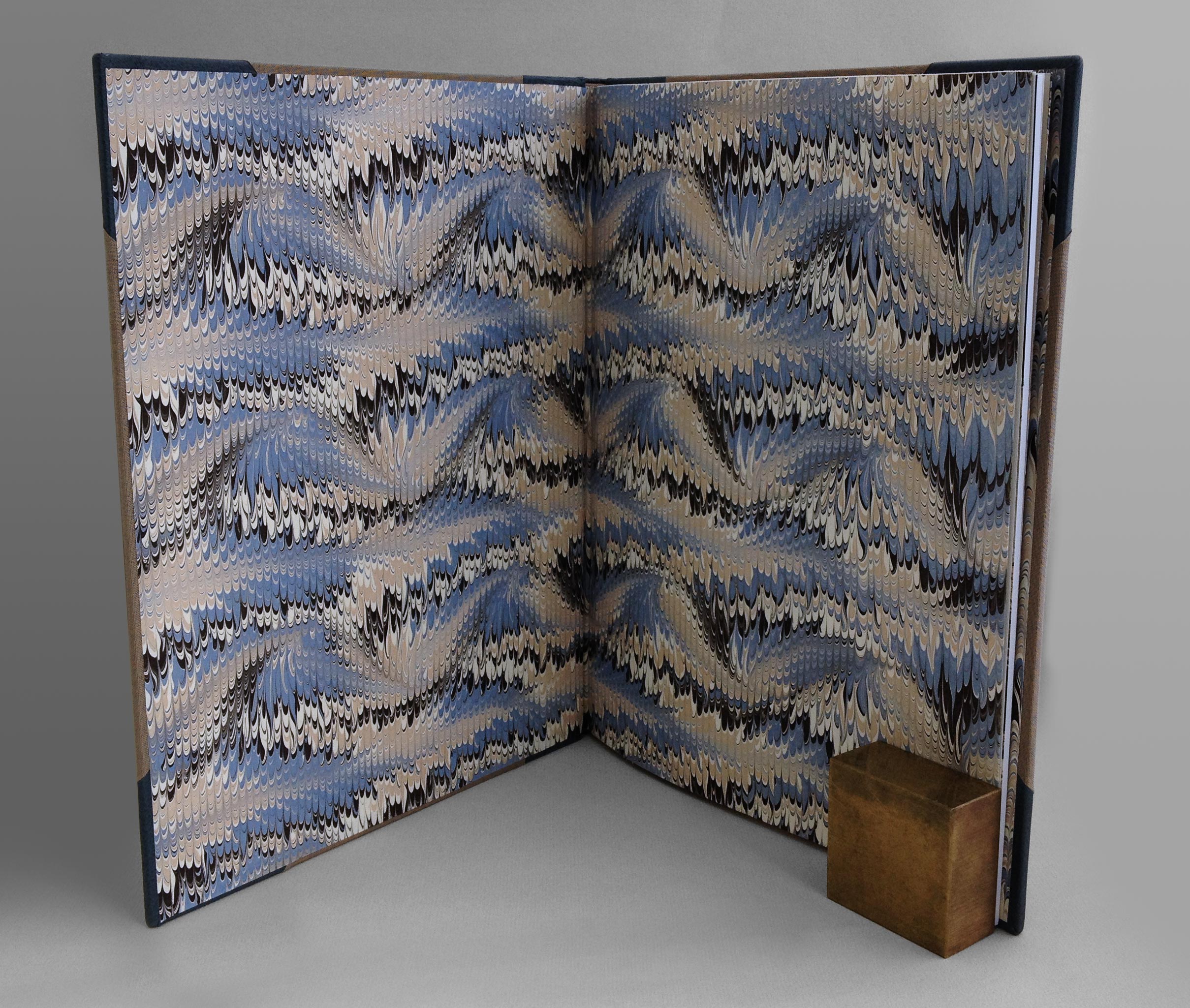
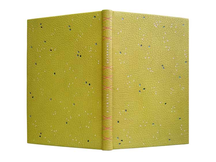
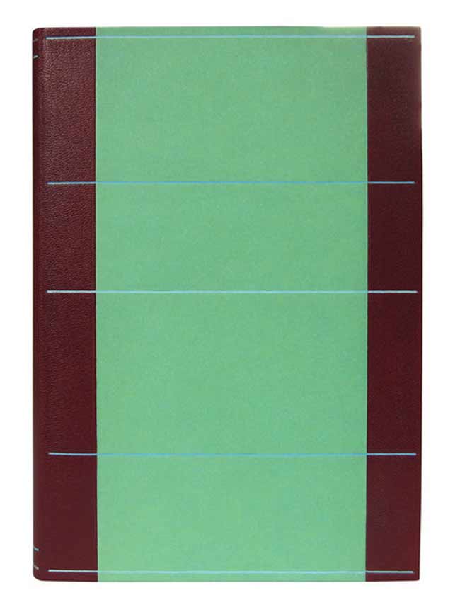
    For this tutorial I bound a copy of The Yellow Wallpaper by Charlotte Perkins Gilman. My inspiration for the covers came at the moment in the story when the main character begins to tear away the maddening yellow wallpaper in a desperate attempt to relieve her agony and pain. Whatever you choose as your text block, whether it be a short story, poetry or blank pages, prepare those now and fold to their final size.

    From the text block, measure the height of the signature and add about 5-7mm. Measure the width of the folded signature and add about 3-4mm. This will determine the dimension of the covers with added squares.

    The height of the spine piece will be the same as the covers. The width is determined by the thickness of your text block. Pinch the text block about 20mm from the spine, measure the flared out signatures. Add 2mm to this measure to find the width of the spine piece.

    MY MEASUREMENTS:
    text block height: 201mm
    text block width: 121mm
    text block thickness: 10mm

    cover height: 208mm
    cover width: 125mm

    spine piece height: 208mm
    spine piece width: 12mm

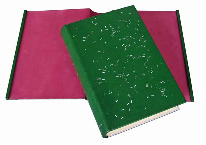
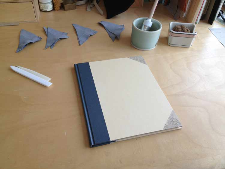
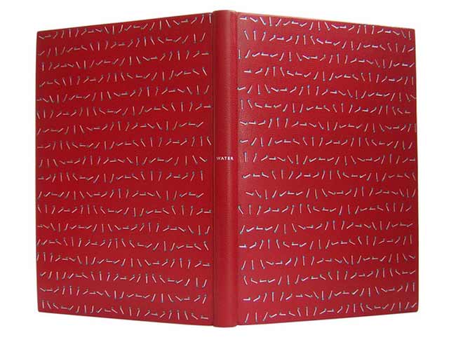
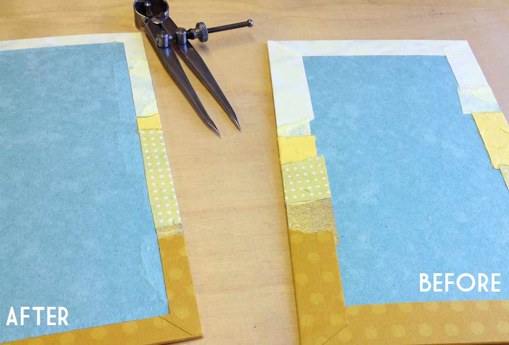
    Cut down the decorative paper to include excess for turn-ins (about 20mm, less for the spine piece). Cut down the paper for the paste downs, allowing a 3mm margin on all sides. Glue up the decorative paper and cover both boards and spine piece.

    secretbelgian2-erinfletcher

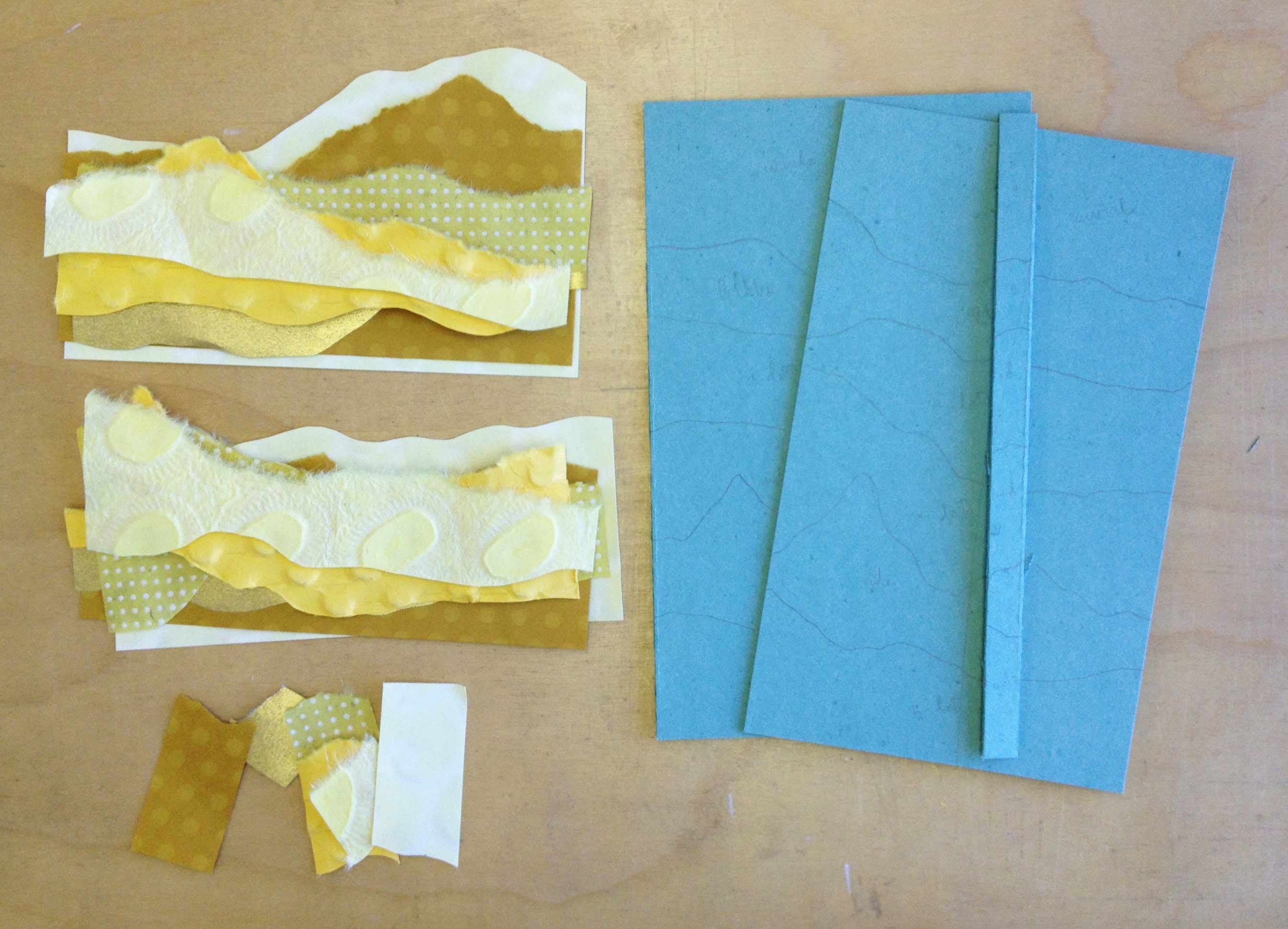
    Trim out the inside of the covers, so the turn-ins are even and straight. This can be done quickly with a set of dividers. Simple measure out the desired distance, lightly score a line along all four sides. Trim off excess along scored guideline with an x-acto or scalpel. Tear away the excess by pulling toward the edge of the cover.

    secretbelgian3-erinfletcher

    Glue down the paste down onto the spine piece and set aside under weight to dry.

    STEP TWO:
    Prepare a jig for punching holes into the covers. The holes should be evenly spaced along the height of the covers allowing for a fair amount of sewing stations. Using an awl punch the holes 16mm from the spine edge. The needle on the awl should have a continuous gauge and not be graduated. This way all of the holes are the same size.

    secretbelgian4-erinfletcher read more >


  2. Free Shipping at Herringbone Bindery on Etsy!

    September 6, 2013 by Erin Fletcher

    readabook-sept6blog

    In the market for a new journal or sketchbook? Need a gift for the writer or artist in your life. Celebrate the Book this weekend at my Herringbone Bindery Etsy shop and receive free shipping on all orders of $10 or more. Just enter code: READABOOK10 at checkout. Have a wonderful and book-worthy weekend.


  3. Book Artist of the Month: Jody Alexander

    August 26, 2013 by Erin Fletcher

    exposedspines-jodyalexander

    Over the span of a year, Jody Alexander, created a series of altered books under the title Exposed SpinesThis series of work is a celebration of the most beautiful part of the book that is so often covered. Each object is comprised of discarded books, fabric and thread. 

    exposedspines2-jodyalexander

    At the end of the year in 2012, Jody exhibited Preparing for Evanescence at the Cabrillo Art Gallery in Aptos, California. This massive installation combined three different series: Sedimentals, Uphosterables and Suspendables. The Exposed Spines pieces are considered Uphosterables in this installation, although they were created before the concept of this exhibit, they were the catalyst.

    Statement for Preparing for Evanescence at Cabrillo Art Gallery
    Preparing for Evanescence addresses the relative ephemeral nature of humans compared to the belongings that we accumulate, and how we cope with our mortal awareness. The treatment of the objects in this installation exhibits a concern for their well-being, and the caretaker’s need to create and protect in the face of powerlessness and dematerialization. Each possession has been attentively prepared and placed for safekeeping between the folds of fabric, stitches of thread, in the sediment of a household.

    In the final days in this space the caretaker found that he/she was evanescing – or gradually disappearing.  The treatment of objects was as much for their care as it was a necessary process for the caretaker – a busying of the hands, a distraction from the inevitable.  Equal attention has been given to objects of use and sentiment as well as space and time.

    exposedspines4-jodyalexander

    exposedspines3-jodyalexanderpreparingforevanescence2-jodyalexander preparingforevanescence3-jodyalexander


  4. Bookbinder of the Month: Annette Friedrich

    August 25, 2013 by Erin Fletcher

    jacobsroom-annettefriedrich

    As Annette Friedrich continues with her ongoing Virginia Woolf series, in 2012 she bound Woolf’s third novel Jacob’s RoomThis 1920’s Hogarth Press edition of Jacob’s Room was bound in full leather green goatskin. The decorative tooling on the front and back covers are done in three shades of silver, white and grey, which offer wonderful subtleties to the design. The title is tooled in matte silver along the length of the spine with the author’s name tooled in silver at the tail.

    jacobsroom2-annettefriedrich

    jacobsroom5-annettefriedrichThe interior of the covers is lined with paper bord-a-bord doublures in silver rose and the fly leaves are in silver. All papers used are hand dyed. The binding is housed in a silver and green chemise with linear tooling across the sides in three shades of silver. The interior of the chemise is lined with a shockingly, vibrant pink. The spine of the chemise is tooled to mimic the spine of the binding.

    jacobsroom4-annettefriedrich


    Annette has recently added Mrs. Dalloway to her website, the fourth book in the ‘on a stroll with Mrs. Woolf’ series. It was quite a wonderful surprise to see as I’ve been frequenting her site this month. The design is similar to Jacob’s Room, with the random tooling appearing more dense and chaotic. I look forward to seeing the last five of the series! Keep up the inspiring work, Annette!mrsdalloway-annettefriedrich


  5. Bookbinder of the Month: Annette Friedrich

    August 18, 2013 by Erin Fletcher

    nightandday-annettefriedrichNight and Day is Virginia Woolf’s second novel and the second book Annette Friedrich has bound for her series ‘on a stroll with Mrs. Woolf’.

    In 2011, Annette bound this 1920 George H. Doran Company edition in full yellow goatskin. The design on the covers is tooled with platinum leaf, rose, pink and three shades of green. The spine includes the title and author tooled in platinum in addition to crosses in pink and silver. So far, this binding is my most favorite from the Virginia Woolf series. I love the whirling platinum curves and the scattered bits of color throughout the cover.

    nightandday2-annettefriedrich

    The book is housed in a green chemise with matching yellow goatskin. A silver paper cross inlay appears on the chemise, this paper matches the endpapers. The slipcase is covered in rose paper. All papers used are hand-dyed. nightandday3-annettefriedrich


  6. Bookbinder of the Month: Annette Friedrich

    August 11, 2013 by Erin Fletcher

    voyageout5-annettefriedrichIn 2011, Annette Friedrich embarked on her goal of binding all nine of Virginia Woolf’s novel starting with her first book, The Voyage Out. Annette bound a 1929 Hogarth Press edition (first imprint of the unified edition) in full orange goatskin. Tooling on the covers is done with platinum leaf and four shades of yellow. The author’s name and title are tooled on the spine in platinum, in addition to two horizontal lines at the head and tail in platinum and purple.

    voyageout2-annettefriedrich

    The book is housed in a chemise covered with hand-dyed green paper and matching orange goatskin. The slipcase is covered in a hand-dyed blue paper. voyageout6-annettefriedrich


  7. Client Work // Single Section Half Leather Binding

    August 6, 2013 by Erin Fletcher

    STORY ABOUT THE TEXT: An article titled The Roxbury Defenders Committee: Reflections on the Early Years by the Chief Justice Roderick L. Ireland was recently published in Volume 95, No. 1 of the Massachusetts Law Review. The article speaks about the establishment of the Roxbury Defenders, a committee founded in 1971 to provide legal referrals to those who suffered financially in Roxbury, Massachusetts. The committee was founded by Ireland and his colleague and friend, Professor Wallace W. Sherwood. 

    ABOUT THE BINDING: For my client, I bound two copies of the Massachusetts Law Review journal, one for the Chief Justice and one for Professor Sherwood. The journals came to me straight from the press and bound together with staples. The staples were removed and bound as a single section bradel binding. This structure has been described in a previous Client Work post you can check out here and here.

    masslawreview1-erinfletcher

    Since the journal is printed in black ink only, I chose materials that reflected the gorgeous and vibrant image on the cover. The journals are bound a half leather binding, where the same covering material for the spine is used to cover the corners. I chose to bind the journals in a blue-gray buffalo skin against a taupe Iris bookcloth. For the endpapers I chose a beautiful handmade Cockerell marbled paper from Cambridge, England, in addition to a folio of marbled grey Bugra and off-white Hahnmühle Ingres.

    masslawreview2-erinfletcher

    Setting up my bench in preparation for covering the corners with blue-gray buffalo skin.

    To finish off the bindings, the title and volume of the journal were hand tooled along the spine with Centaur handle letters. The title was gilt with gold leaf.  

    masslawreviewspine-erinfletcher masslawreviewopen-erinfletcher


  8. Book Artist of the Month: Jody Alexander

    August 5, 2013 by Erin Fletcher

    zelda-jodyalexander

    If She Thought It Would Help, Zelda Would Use Her Antediluvian Curse Cache to Attain Her Revenge is the title for a ‘boxed book’ project that Jody Alexander created in 2004. The wooden box is packed with books on the left and found objects in compartments on the right. The exposed spines of the books display a variety of sewing structures including packed sewing over split thongs, Coptic, longstitch, ticketed, French stitch and sewing over cords. 

    Jody expresses that the title says enough for the viewer to fill in the rest in regards to the concept of the piece. So please, make your own conclusions. 

    zeldadetail-jodyalexander


  9. Bookbinder of the Month: Annette Friedrich

    August 4, 2013 by Erin Fletcher

    ovidselegies-annettefriedrichIn 2010, Annette Friedrich bound Ovid’s Elegies and Epigrams of Sir John Davies by Ovid and Sir John Davies with woodcut illustrations by John Nash. This is one of my favorite bindings of Annette’s due to the rich, vibrant colors and the contrast between the smooth tooled lines and the textural grain of the leather.

    Bound as a full leather binding in yellow levent goatskin. Tooling on the covers is done in three shades of grey and silver. The spine is divided into three segments by crosses tooled in pink; the title is centered in between the crosses in silver. Matching leather joints and endpapers are light blue. The fine binding is housed by a chemise and slipcase covered in the same yellow goatskin and blue-grey and purple hand-dyed papers. 

    This binding is held in a private collection in Southall, United Kingdom.

    ovidselegies2-annettefriedrich

    In addition, Annette sent along this image of herself tooling the spine of Ovid’s Elegies during the sweltering heat. 

    toolingovid-annettefriedrich


  10. August // Bookbinder of the Month: Annette Friedrich

    August 1, 2013 by Erin Fletcher

    thetempest1-annettefriedrich

    This edition of The Tempest by William Shakespeare from The Nonesuch Press, was bound by Annette Friedrich in 2012. Bound as a full leather fine binding in red-brown goatskin. Decorative tooling on the covers in white, grey, two shades of blue, metallic green and silver. The title is tooled along the center of the spine in metallic green with matte silver lines at the head and tail.

    thetempest3-annettefriedrichOn the inside, the paper bord-a-bord doublures are bright blue, matching leather joints and fly leaf in silver. All papers used are hand dyed.

    thetempest4-annettefriedrich

    The binding is housed in a green chemise and slipcase. The chemise is decorated with linear tooling across the sides in two shades of blue. The author’s name is tooled in metallic green in the center the spine of the chemise along with tooled lines in matte silver and blue at the head and tail.

    I first stumbled upon Annette’s work through the Autumn 2012 Newsletter of Designer Bookbinders. The cover offers a detailed image of Annette’s binding Water bound in 2008.

    water-annettefriedrich

    The fine binding work of Annette Friedrich is delightful! Her portfolio matures with every new binding as she skillfully depicts the essence of each story with delicate and artistic flair. Read the interview after the jump and come back each Sunday in the month of August for more posts on the work of Annette Friedrich.

    read more >


  • My name is Erin Fletcher, owner and bookbinder of Herringbone Bindery in Boston. Flash of the Hand is a space where I share my process and inspirations.
    The StudioNewsletterInstagramEmail me
  • Archives