RSS Feed

Posts Tagged ‘bookbinding’

  1. Book Artist of the Month: Mary Uthuppuru

    January 13, 2014 by Erin Fletcher

    InterpreterOfMaladies5-MaryUthuppuru

    Mary Uthuppuru received ‘Best Binding’ for her work based on Interpreter of Maladies. This award was given at the opening reception for the second edition of One Book, Many Interpretations exhibition at the Chicago Public Library in 2011. A total of ten titles were chosen by the CPL, a handful of bindings were created for each title and the award for ‘Best Binding’ was awarded to one binding for each title. 

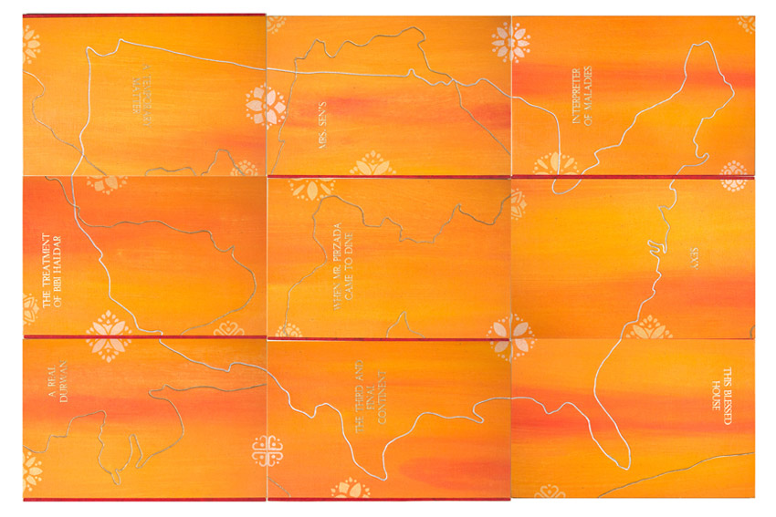
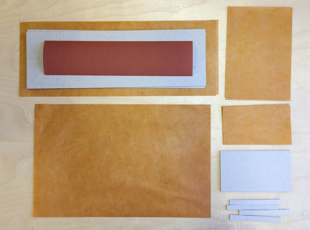
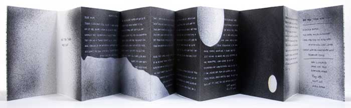
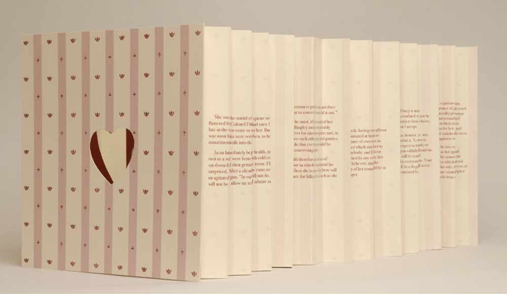
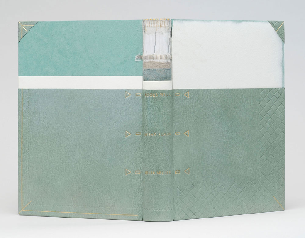
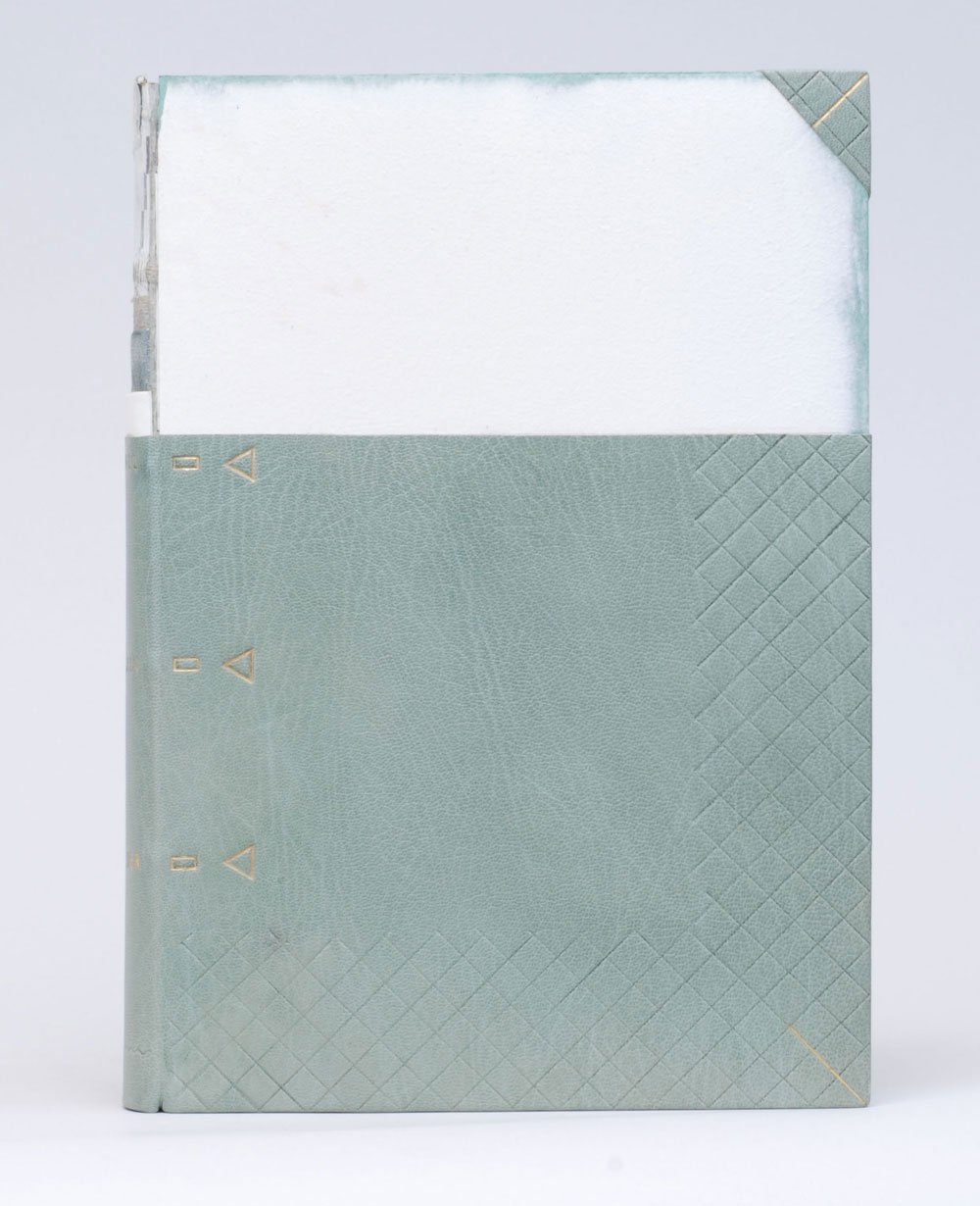
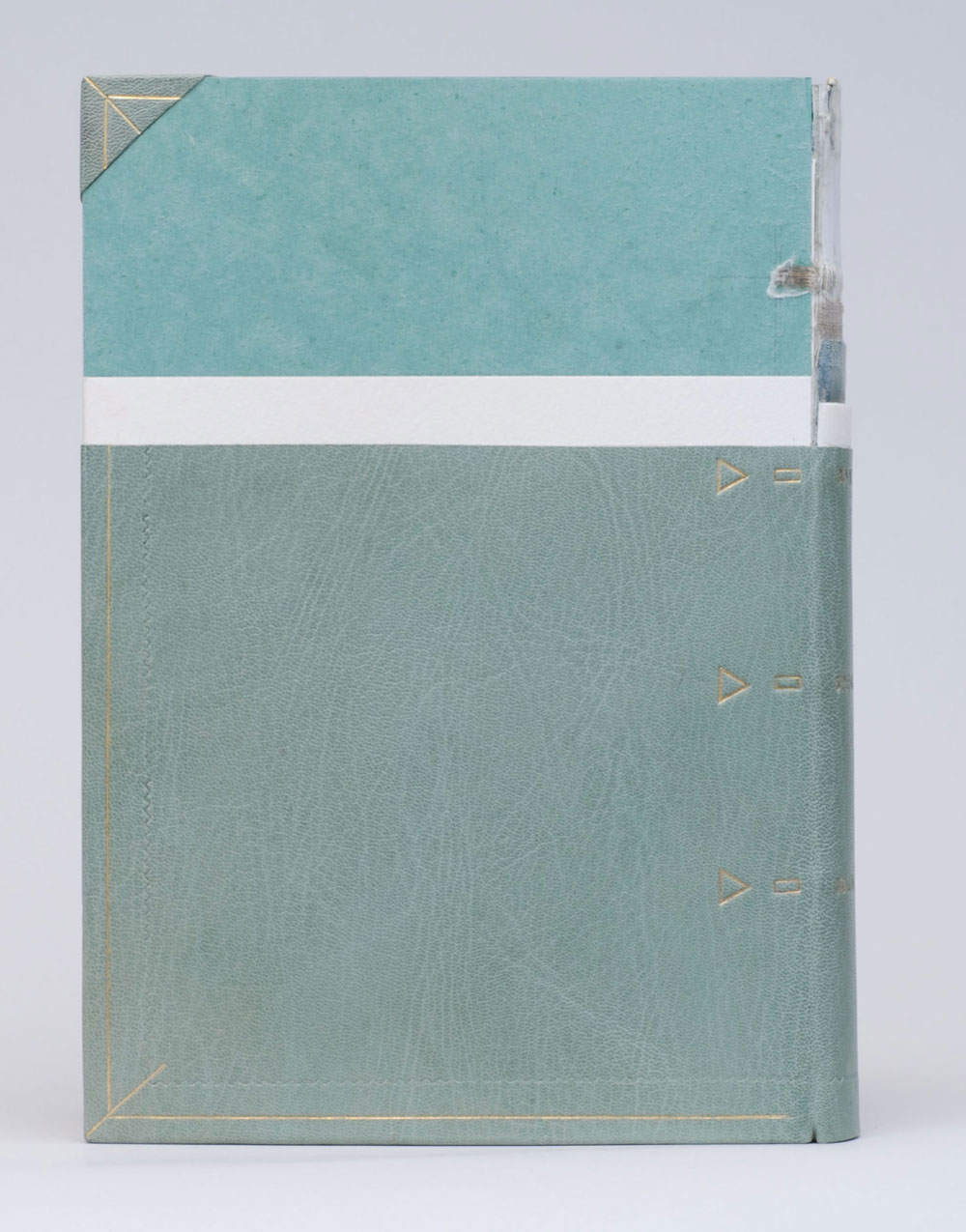
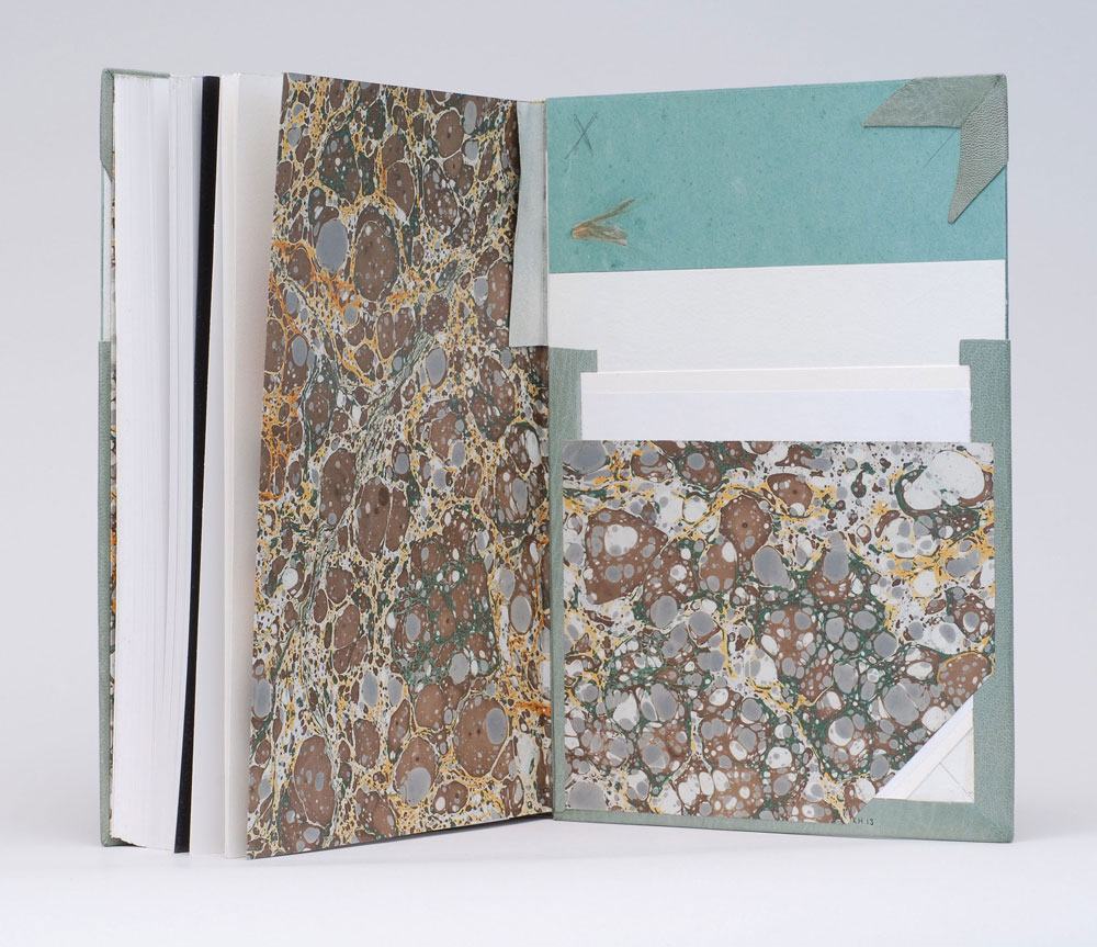
    Housed in a beautifully shaped slipcase are nine individual books. Each book is bound in the Bradel binding style with handmade paste cloth. Details explained below are hand stenciled. Titles are stamped in gold. 

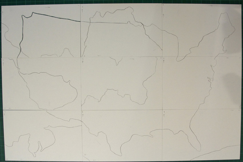
    This piece is so complex; you divided Interpreter of Maladies into nine books, which can be arranged two different ways to create either a map of India or the United States. I’ve never read these short stories by Jhumpa Lahiri, what inspiration did you find within the text to execute the binding in this manner? 
    This was my first competition binding and it was a perfect book for me because I have an intimate look into the content of Lahiri’s subject matter. Interpreter of Maladies is a compilation of nine stories featuring Indian people both in India and the United States as they deal with cross cultural issues and in some cases, the westernization of India. While the stories are about a specific culture, Lahiri writes them in such a way that they speak to a more universal experience.

    My husband is the son of an Indian father and a Japanese mother who moved to the United States for college in the 1960s. They moved here at a time when communication and travel is nothing like it is today. Letters were written and silences between phone calls were very long if at all possible. My first memories of visiting them were the numerous maps throughout the house. After a while it became clear that when you move to a new country with your family on the other side of the world, especially at the time that they did, there is comfort in looking at a map and seeing the two places a little closer together. It is this element that helped me tie the content of Interpreter with what became familiar to me.

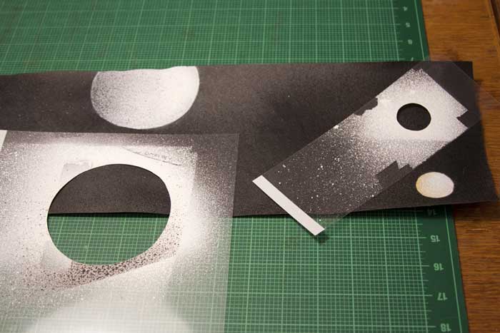
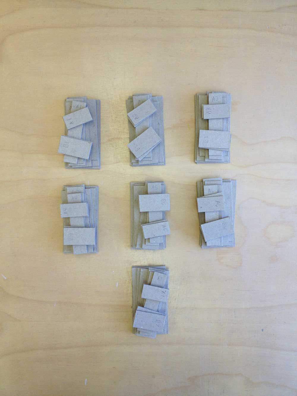
    Since the stories take place in India and the United States I wanted both maps to be a part of the design. However, I didn’t want to overload the books with too many design features. Having the maps only appear one at a time as simple line drawings inset in the cover was the perfect solution. Additionally, I wanted the ability to create an intense color similar to marigolds, a flower present in various aspects of Indian culture, so I created paste cloth for my cover material. This also allowed me to easily stencil guides for arranging the maps into both configurations without which would make it nearly impossible for the viewer to figure out their order.

    InterpreterOfMaladies-process2-MaryUthuppuru

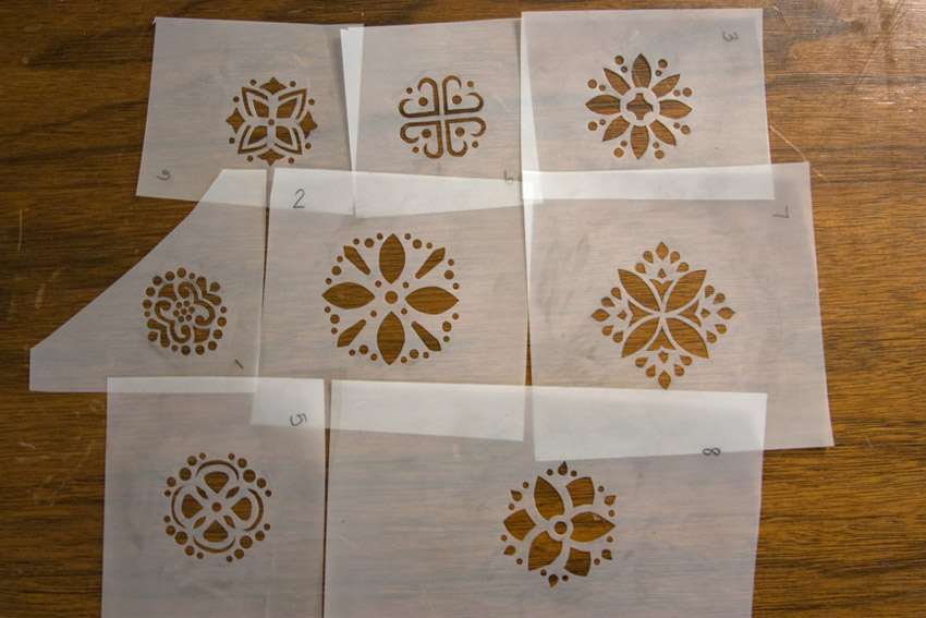
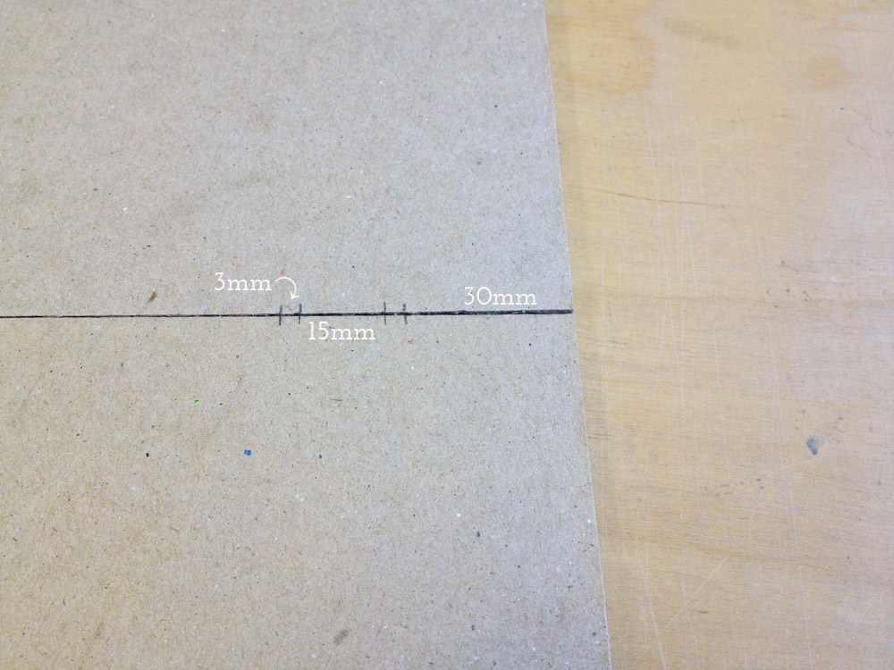
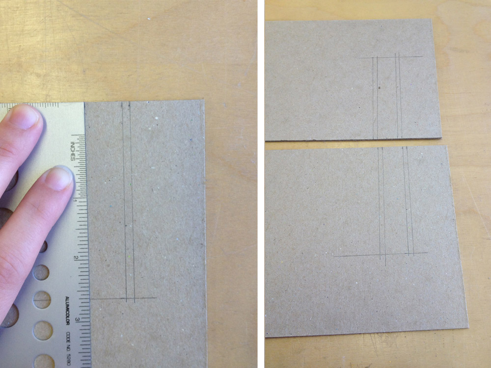
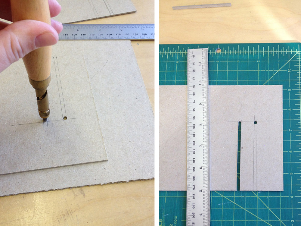
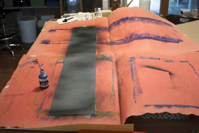
    Stencils used to create guides to help in arranging maps.

    This shuffling of book covers and rearranging them to create the two countries helped reinforced the difficulty of the themes in the book: life is a challenge, and when you move to a new place or what once was familiar changes, you have to make adjustments…and it can be difficult.

    – – – – – – – – – – –

    Below are images of the map blueprints and how the covers can be arranged to create both the United States and India. 

    InterpreterOfMaladies-process4-MaryUthuppuruInterpreterOfMaladies2-MaryUthuppuruInterpreterOfMaladies6-MaryUthuppuru


  2. Tutorial: Collapsible Punching Cradle

    January 3, 2014 by Erin Fletcher

    PunchingTrough1-ErinFletcher

    A punching cradle is a useful tool to have around in one’s bindery. There are a lot of models available for purchase, but it’s quite simple to make one yourself using just a few tools and materials. I have a few in my bindery that range in size, but I find my collapsible punching cradle to be the most useful. Especially when I am traveling to teach workshops.

    The following tutorial will go through the steps to create your own collapsible punching cradle. I’ve including all of my measurements, but the best part about this tool is that you can customize it for your own purposes. This particular cradle will consist of a detachable cradle and 2 leg supports. The cradle will have two different size options, which makes this particular version even more versatile. I discovered this collapsible punching cradle while taking a private workshop with Monique Lallier. She allowed me to take down the measurements and I made my own once I returned to my studio.

    If you are looking for more instructional content, I have a growing list of tutorials and I also teach live workshops in-person and online. Check out my list of Upcoming Workshops.

    MATERIALS: 
    – paper for covering (I used Lokta)
    – binder’s board
    – book cloth
    – PVA
    – methyl cellulose (optional)

    TOOLS: 
    – pencil
    – ruler
    – 90º triangle
    – Japanese screw punch with 3mm bit
    – cutting mat
    – x-acto blade
    – glue brushes in various sizes
    – bone folder
    – scissors

    STEP ONE:
    Determine the length of workable space for your cradle. For example, if you tend to work large, then perhaps you want to make a cradle long enough for paper that is 12″ tall. The cradle I’m making in this tutorial is slightly longer than ones I currently have. The total width of my cradle is 395mm (~15½”), the two outer slots give me a workable area of 325mm (~12½”) and the inter slots give me a workable area of 288mm (~11¼”).

    PunchingCradle2a-ErinFletcher

    Once you’ve decided on your dimensions, grab some binder’s board and cut down 2 pieces the same size for the cradle. The dimensions for the legs and support stubs can really vary depending on the distance you want between the bottom of the cradle and your work surface. The lower the cradle is the more likely that your awl will pierce your work surface if left unprotected. But you can start by using my measurements below and then make your own modifications.

    MY MEASUREMENTS:
    cradle (cut 2 pieces the same size):
    395mm x 125mm

    legs (cut 2 pieces the same size):
    150mmx 88mm

    support stubs (cut 4 pieces the same size):
    110mm x 11mm

    STEP TWO:
    Mark with a pencil where you would like the two slots to be on both cradle pieces. On my cradle the outer slot starts 30mm in from either end. Each slot is 3mm wide and they sit 15mm apart.

    PunchingCradle3a-ErinFletcher

    The height of my slots are 80mm from the bottom edge of the cradle. Using a 90º triangle, draw a line from your mark up to the desired height. Do this on either side and on both cradle pieces.

    PunchingCradle4-ErinFletcher

    Using a Japanese screw punch with a 3mm bit, punch a hole at the top of the slots. Make sure to have a scrap board underneath to protect your work surface. With an x-acto blade, carefully cut out the slots by slowly cutting through each layer. DO NOT try and cut through the entire thickness in one stroke, the blade could kickback and slice your finger. As you cut, angle your blade as perpendicular to the binder’s board as you can, this will make a nice straight cut. Sand the slots smooth.

    PunchingCradle5-ErinFletcher

    read more >


  3. January // Book Artist of the Month: Mary Uthuppuru

    January 2, 2014 by Erin Fletcher

    AndThenThereWere8_3-MaryUthuppuru

    In preparation for their 2013 Annual Open House and Silent Auction, the Morgan Conservatory presented participants with two sheets of paper made at the Morgan and asked them to create a piece of art to be auctioned off during the event. Mary Uthuppuru was given one sheet of charcoal grey and the other of bright white.

    Mary found inspiration from the recent drop Pluto experienced from its rank as a planet and the heated discussions that followed. As the sole character in this artist book, Mary personifies the now dwarf planet in the form of a letter, where Pluto freely express himself after hearing this news of rejection. You can read more about Mary’s process in her blog post, Poor Pluto

    And Then There Were Eight is bound as an accordion with a removable spine piece, when fully opened the viewer can experience the vast and expanding qualities of outer space. The covers are most appropriately wrapped in beautiful handmade Moon Paper from Hook Pottery Paper. The paper appears to be a 3-dimensional print of the moon, but it is actually smooth (like paper). The interior pages were given an airbrush look by using a mouth atomizer and drawing inks.

    AndThenThereWere8-MaryUthuppuruAndThenThereWere8_4-MaryUthuppuruAndThenThereWere8_2-MaryUthuppuruI really enjoyed reading about your thought process behind this book. Not only did you find inspiration in a literary influence, but also in your own sense of humor. The application of pigment really captures the atmosphere and depth of space. Can you talk about the challenges and benefits to using a mouth atomizer?
    The mouth atomizer was a really fun thing to use. I actually had it for over ten years before I discovered its use during this project. It looks a lot like a compass, but without the pencil. One end goes into whatever liquid you are using (in the case of the Pluto book it was India ink and Winsor & Newton drawing ink) and then you blow on the other tube.

    The benefit in its use is also its challenge. So long as you have the lung capacity, this tool is very simple. Blow in the horizontal tube, and the ink is sprayed from the vertical tube. The difficulty is in style. If you are trying to get consistent coverage, then you have to be consistent with the pressure behind your breath. But it is easy to get used to with a practice piece of paper. Also, beware your work space. Cover anything surrounding the piece you are working on with newsprint or other waste unless you want a speckled work space.

    ThereWere8_Atomizer-MaryUthuppuru

    There is more than one way to use it too. In this book, for example, I cut stencils from transparency sheets to create the planetary bodies. This allowed for a clean, shaded shape that is much faster and reads truer than a traditional stippling stenciled technique. It is also easy to clean by running it under water then drying.

    ThereWere8_Stenciling-MaryUthuppuru

    I first met Mary in Chicago for the One Book, Many Interpretations exhibit at the Chicago Public Library, where both Mary and I had work in the show. I’ll be featuring her binding of Interpreter of Maladies from that show later this month. From the beginning, I noted Mary’s impeccable skill and her exceptional eye for detail, but I can’t forget to mention her infectious personality. Her humor mixed with kindness and generosity makes her a delightful person to engage with and learn from.

    Like myself, Mary, is just beginning her career in the field of bookbinding. Her ambition and creativity are inspiring, as is the interview (after the jump). Mary discusses her love for bookbinding and how she caught “the book bug”. Later in the interview, Mary talks about setting up her own home studio and how being self-employed has its ups and downs. But it’s quite clear to see that Mary tackles her obstacles with smarts and humor. 

    Come back each Monday during the month of January for more on Mary Uthuppuru and her work, which will bounce between bookbinding and book arts.

    read more >


  4. Bonus // Bookbinder of the Month: Karen Hanmer

    December 29, 2013 by Erin Fletcher

    OverTheEdge-KarenHanmerIt was so hard to narrow down just 5 pieces from Karen Hanmer’s portfolio to feature during the month of December. So I present this bonus post, which includes 2 additional bindings, to wrap up both Karen’s feature and the interview segment for 2013.

    Over the Edge: Death in Grand Canyon (by Thomas M. Myers and Michael P. Ghiglieri) may be the reason why I first began to admire Karen Hanmer’s work and how I fell in love with the lacunose technique. This French-style fine binding is covered in full goatskin and features two large goatskin lacunose onlays. The tumbling figures are tooled in gold using custom brass tools, both on the covers, spine and edge-to-edge doublures, which have left a mirrored impression on the suede flyleaves (which you can see here). 

    RightStuff-KarenHanmer

    After visiting with Karen in her home bindery, I attended the One Book, Many Interpretations exhibit at the Chicago Public Library in 2011. I had just been treated to handling some of Karen’s earlier works, that I was so awed by her recent fine binding of The Right Stuff by Tom Wolfe. Karen employs so many techniques on this binding, but every part is flawlessly executed into a harmonious composition.

    Bound as a French-style fine binding in full goatskin with back-pared and cushioned onlays; some laser-printed. Sprinkled gold leaf creates a cosmic stream across the boards. The edges are decorated with graphite and sprinkled with gold leaf.

    These two bindings are amongst my favorites within your portfolio. The techniques you employed made for quite striking designs. Can you discuss the lacunose technique and using laser-printed onlays?
    I don’t draw, paint, airbrush, or do any kind of traditional printmaking, so to get imagery into my designs, I use the computer, or in the case of lacunose, brute force.

    OverTheEdgedetail-KarenHanmer

    I saw Paul Delrue present the lacunose technique at the Guild of Book Workers meeting in 2005. Thin bits of leather are adhered to a substrate or directly to the book, sanded, a PVA wash is applied and dried, and the leather is sanded again. More bits of leather can be applied, tooling can add additional texture, and color can be added to the wash to alter the tone. This process is repeated numerous times with finer and finer sandpaper, then finished with beeswax on a cloth.

    RigthStufffront-KarenHanmer

    Laser-printing on leather is a technique I learned from Peter Verheyen. Pare leather to onlay thickness, paste it to tissue, dry flat. Print the desired image first onto paper so you can properly position the leather. Place the leather over the image just printed on the paper, and tape down the leading edge. Make a second laser print, this time on the leather. After the print is cool, fix the image with a protective coating. I use Cellugel. Krylon spray will also work, and SC6000 or Renaissance wax will probably work also, but be careful not to rub the toner off the surface as you rub on the protective coating. Then remove the leather from the copier paper and proceed to use the printed leather as an onlay or inlay.

    – – – – – – – – – –

    I want to thank Karen again for such a wonderful and thoughtful interview!


  5. Bookbinder of the Month: Karen Hanmer

    December 29, 2013 by Erin Fletcher

    LaCouleurDuVent-KarenHanmerLa Couleur du Vent is an exhibition featuring 50 bindings interpreting text of the same title. I previously posted about this exhibition in Sonya Sheat’s interview this past June. ARA-Canada in partnership with the École Estienne in Paris, organized an international exhibition of bookbinding to be held in both Paris and Canada during 2013 and 2014. I found Karen Hanmer’s design for the text to be quite striking and unusual from her other fine bindings. The overall design is simplistic, but the arrangement of fine, short lines creates a beautiful texture against the grain of the vibrant yellow leather. 

    Bound in full goatskin as a traditional French-style fine binding, Karen’s copy of La Couleur du Vent was sewn on flattened cords and the boards are laced-on. The red teardrop is a back-pared onlay, while the other teardrops are tooled using black, gold and red foils. The title is hand tooled using the same colored foils. 

    How did you come to participate in this exhibition? Are you a member of ARA Canada?
    Yes, I am a member of ARA Canada, and this is the third time I have exhibited with them. Their exhibitions travel in Canada and sometimes in France, and they still produce printed catalogs.

    Prior to a family vacation I posted on the Book_Arts-l asking for suggestions of things to see in Montreal. Cécile Côté invited us to visit her studio, and I was able to see the text block for this set book exhibit, which was designed, illustrated and printed by an intern under Cécile’s direction. [From the ARA-Canada website: This is a collection of poems by Gilles Vigneault, illustrated and designed by Nastassja Imiolek under the artistic direction of Cécile Côté.] I unable to find a translation of the text, so my design is based on the illustrations, borrowing often-used colors and the repeated teardrop shape and cross-hatching.


  6. Bookbinder of the Month: Karen Hanmer

    December 22, 2013 by Erin Fletcher

    fragmentsofcapri2-karenhanmer

    A painting that hung above the sofa in the childhood home of Karen Hanmer became the inspiration and source material for Fragments of Capri. Taking an object that had become so engrained in the landscape of her surroundings, Karen reproduced the painting full size as several inkjet prints then proceeded to trim the painting down to postcard size pieces.

    fragmentsofcapri1-karenhanmer

    Bound within the pages of this drum leaf structure the viewer is given a disjointed look at the painting. Although each spread creates an appealing and what appears to be finished painting, a sense of belonging quickly creeps into the narrative. Created in 2011, Fragments of Capri, is an unnumbered edition of 100. Each book is unique in the variation to covers and interior pages. The spine piece is vellum stamped with gold foil.

    Horizons… Capri is a similar edition where Karen continues to deconstruct and reformat this familiar painting, further fragmenting our memories of the past.  

    horizons1-karenhanmer

    Bound in the drum leaf structure with a stamped vellum spine piece, Horizons… Capri was also created in 2011 in an unnumbered edition of 30. This artist book is currently on display as part of the Guild of Book Workers traveling exhibition: Horizon

    horizons3-karenhanmer horizons2-karenhanmer

    I love these two books. The soft edges and pastel colors of the painting are beautifully paired with vellum and a touch of gold foil. Did your initial concept include both books or did one stem from the other?
    Before I began binding, I photographed my husband’s family painting hanging above the sofa it was commissioned to match. Ever since, I’d wanted to make something with my family’s painting. I was invited to make a piece for an exhibit where the works would be assembled by the viewer. I thought of a puzzle or maybe a cube constructed from a photo of the painting. That fell through, but then a friend asked for a set of 50 of something to include in his Fluxus-inspired journal. I photographed the painting, color-corrected the file to match the original, inkjet-printed several copies life-size, then cut them into postcard-size pieces.

    Working with these small prints gave me the idea to use the photograph of the painting for books also. I liked the idea of a fragmented walk through the dreamy landscape, and my first idea was to reference a pocket-sized travel-guide. The Guild of Book Workers had announced the theme “Horizon” for their next traveling exhibit, and I realized if I cut the full-size printed photo of the painting into eight long rectangles, each piece would contain an obvious horizon line. I’d been hoping for a chance to use vellum as a spine for a drum leaf or sewn boards edition, and I think the gold stamped title makes the vellum look particularly luminous.


  7. Bookbinder of the Month: Karen Hanmer

    December 15, 2013 by Erin Fletcher

    nevermoredeluxeandstandard-karenhanmer

    Nevermore Again: Poe Exhumed is an artist book from Karen Hanmer presented in multiple bound formats. The content of the work mirrors the tales of Edgar Allen Poe to contemporary economic and political stories. Pictured above on the left is the Deluxe edition which is presented as an early 19th century style publisher’s binding covered in marbled paper by Pamela Smith. The endpapers incorporate the design of the wrapper from the Standard edition, which is pictured above on the right.

    Nevermore Again: Poe Exhumed is offered for purchase in several different formats. Why have you chosen to produce this piece in various editions? Have you found one edition to be more successful over another?
    Nevermore, Again is an artists’ book exploring how current events mirror stories written by Edgar Allan Poe. I could not decide between two structures for the binding, so for the first time, I produced a book in several editions.

    The deluxe edition uses the publishers’ boarded binding I learned from Jeff Peachey. It is historically appropriate for Poe’s era, and I was eager to use this interesting cusp-of-the-industrial-revolution structure in an edition. But as I researched Poe’s bibliography, I became fascinated by Tamerlane and Other Poems, the rare first edition of Poe’s first published work. To make my book more conceptually sound, I decided that in typography, size, and structure the standard edition should be a facsimile of Tamerlane, which was presented in a simple paper wrapper. Olivia Primanis at the Harry Ransom Center sent me detailed measurements of their copy of Tamerlane, and I went to the University of Chicago to examine another in person. The only change I made was sewing through the fold instead of stabbing adjacent to the spine. I wanted my book to open well.

    nevermoredeluxe-karenhanmer nevermorestandard-karenhanmer

    I’m very pleased with the text I wrote for Nevermore, and I wanted it to have readership extending beyond those with a collector’s budget, so I made a laser-printed chapbook version also.

    I’ve sold many chapbook versions, all but one to individuals. The deluxe edition at $450 has sold significantly more copies than the standard at $275. This surprises me, especially because of pressures on institutional budgets, but I realize that Pam Smith’s marbled paper on the deluxe is hard to resist.


  8. Bookbinder of the Month: Karen Hanmer

    December 8, 2013 by Erin Fletcher

    bluestem2-karenhanmer

    The flag book structure has become a reoccurring model in Karen Hanmer’s work. She has quite an eye for transforming flat imagery into interesting movable objects. Bluestem was created in 2006 in a small edition of 25, the work is inspired by Willa Cather’s My Antonia and includes a quote printed on the rear panel.

    bluestem-karenhanmerThe grass imagery is inkjet printed on polyester film and bound on either side of the panels creating a double-sided variation on the flag book structure. As you open and close this book a nice rustle is created by the movement of the pages. It’s quite simple and beautiful. 

    Inspired by the work of Hedi Kyle, you have, on several pieces used the flag book structure. How does this structure best represent your concept?
    Women and Cars by Susan King was among the first artists’ books I saw, and it has remained an inspiration. King’s use of the flag book structure gave me a model for everything I wanted to accomplish when making a non-codex book. It pairs multiple narratives with photographs, can be held in the hand and read like a traditional codex, opens fully enough to look commanding and compelling on exhibit, and gives viewers enough to enjoy that they will not focus on the book being printed digitally if that is an issue for them.

    The Bonefolder chose flag books as the theme for our 2008 online Bind-O-Rama exhibit. Although my previously editioned flag books were quite elaborate with multiple texts and imagery on inside and outside of the spine and boards, Bluestem appeals to my minimalist side. There’s almost nothing there: just a few words of text from Willa Cather’s My Antonia on the rear board and lines representing grass printed on clear polyester film and paper, yet the piece also effectively represents the boundlessness of the prairie.

    destinationmoon-karenhanmerCreated in 2003, Destination Moon, is another simple flag book structure that involves a complex layering of material related to the moon. Archival images pertaining to the Apollo Manned Space Program are on the reverse of John F. Kennedy’s “Man on the Moon” speech in addition to the song lyrics for Roy Alfred and Marvin Fisher’s Destination Moon, about a romantic journey to the moon. 

    destinationmoon2-karenhanmer

    But when the book is fully opened, all the viewer sees is an image of the space shuttle on its way toward the moon.

    destinationmoon3-karenhanmer

    Besides the flag book, Karen has played around in a variety of movable and folded structures. In her work Celestial Navigation, the triangular pages can be held in the hand and read like a traditional book or unfolded to reveal star charts. The structure is quite playful and can be folded into fantastic sculpted shapes. 

    celestialnavigation-karenhanmer

    In Pride Prejudice Passion: Tunnel of Love, Karen appropriately uses the tunnel book structure. This works combines text from the classic romance novel by Jane Austen with images cut from covers of the modern romance novel. As the term suggests, the content can be viewed through the length of the structure, similar to peering down a tunnel. 

    tunneloflove-karenhanmer


  9. My Hand // Bullet Boxes

    December 3, 2013 by Erin Fletcher

    Earlier this year my family experienced the passing of Richard Gradowski, known by me and my cousins as Dzia which is Polish for Grandpa. My Dzia loved so many things in life and his passions created lasting relationships that touched so many lives. First was his love for Polka music both as an avid listener and talented musician on the harmonica and accordion. I remember hearing the cheerful rhythm of Polka music softly playing from the antique wooden radio in the kitchen upon each visit. 

    Secondly, my Dzia loved ducks, particularly mallards and loons. Seated at his work bench, my Dzia would carefully carve out the shape of each duck from a block of wood and hand paint each detail with superb skill and patience. These sculptures were scattered throughout the house and even gifted to my mother and aunts. 

    Lastly, my Dzia engaged in any material regarding WWII. His interest in war, no doubt came from his experience in the 1950s during the Korean War; where he was stationed at a United States Air Force base in DC as part of the motor vehicle squadron. As my family lay his body to rest, a military salute commenced. My mother was given seven casings from the volleys fired. One casing was meant for my Nana, while the remaining six would be given to her children. To honor the memory of my Dzia, I created a clamshell box to safely house each casing. 

    bulletboxes7-erinfletcher

    These are, by far, the tiniest clamshell boxes I’ve ever constructed. Using a thin binder’s board the pieces were carefully measured and cut down using the spring gauge on the board shear. 

    bulletboxes1-erinfletcher

    The boxes were constructed just like a standard sized clamshell box, except the interior tray has four walls instead of three. The trays are covered in navy Cialux bookcloth

    bulletboxes2-erinfletcherbulletboxes4-erinfletcher

    I wanted the casing to be surrounded by a soft material with plenty of padding. After laminating a few pieces of binder’s board to Volara foam, I tightly wrapped the padding with bright white Ultrasuede. The interior tray was lined with Ultrasuede as well and the pads lined both long walls. A piece of satin ribbon attached to the backside of the thicker pad allows for easy removal of the casing. 

    bulletboxes5-erinfletcher

    The case is covered in a matching navy Harmatan goatskin. The exterior tray is lined with blue Hahnemühle Ingres and stamped in gold foil with my Dzia’s name and the year of his birth and death.

    bulletboxes8-erinfletcher

    Each box was handed out during my family’s Thanksgiving celebration. Sadly, my husband and I could not attend this year for the feast and festivities, but my cousins Meg and Gina sent me some wonderful pictures of the casing sitting snugly in its clamshell box.

    bulletboxes9-erinfletcher


  10. December // Bookbinder of the Month: Karen Hanmer

    December 1, 2013 by Erin Fletcher

    booksspeakplain1-karenhanmer

    The Midwest Chapter of the Guild of Book Workers recently revealed the exhibitors for a traveling exhibition called Plainly Spoken, which celebrates Books Will Speak Plain, a comprehensive survey of historical bindings by Julia Miller. Amongst the highly skilled and wide variety of bindings is a cutaway model by Karen Hanmer

    Karen bound her copy of Books Will Speak Plain as a traditional fine binding, sewn on flattened cords with laced-in boards. Partially covered in a beautiful light blue goatskin, otherwise hidden elements of the structure stay visible in this cutaway model. Tooling is done in blind and 23kt. gold foil to emphasize the location of sewing supports and lacing-on in addition to turn-ins, fills, sanding of the boards and formation of corners. The use of tooling as both an aesthetic treatment and as visual aid is just brilliant!

    booksspeakplain2-karenhanmerbooksspeakplain4-karenhanmer

    Although the book may appear to be incomplete, it includes all the necessary details that make a book a fine binding. The headbands are hand sewn using silk thread and the head edge is sponged with acrylic inks and sprinkled with gold leaf. The inside continues with the cutaway theme showing off the leather hinge, marbled paper endpapers, fills and corners. 

    booksspeakplain5-karenhanmer

    How did you approach this cutaway binding? Did you study Mark Esser’s models at the University of Iowa?
    I’ve made a lot of partially-finished models. They’re useful for teaching and help me remember process. But cutaways are something different since they appear unfinished and fully complete at the same time. Peter Verheyen has loaned me his springback cutaways several times, and I used them for reference when making my first cutaways. I’d admired Mark Esser’s two cutaway fine bindings in the University of Iowa’s online collection for a long time and was able to spend time with them on two trips to Iowa City this spring.

    I was able to use my design binding on Books Will Speak Plain twice this fall: for both an online exhibit of cutaways, and in a traveling set book exhibition. For the latter I added tooling to reference the binding process: the sewing supports and lacing, the turn-ins and fills, and the board-shaping.

    – – – – 

    The online exhibit that Karen mentioned above, is an annual themed exhibit held by the Book Arts Web called Bind-O-Rama. For 2013, the theme was historical cutaway models. The online exhibit can be viewed here

    Although I don’t know Karen very well (yet), she’s been incredibly sweet and supportive of my work. I first met Karen at her bindery in Glenview, Illinois. My friend, Anna, and I were in town for an exhibition at the Chicago Public Library; where both Karen and I had bindings on display. Since then I’ve kept in touch with Karen, leaning on her from time to time when I needed help. 

    I’ve had two opportunities to watch her work, which is quite fun. Once when she came to North Bennet Street School to teach us the flag book structure and most recently during the Standards of Excellence 2013 conference in Washington, DC. I hope to have more opportunities like this in the future. 

    After the jump is a wonderfully thoughtful interview with Karen, where she shares her experiences with bookbinding, teaching and marketing. Come back each Sunday during the month of December for more in-depth posts on Karen’s work in the field of bookbinding and artist books. 

    read more >


  • My name is Erin Fletcher, owner and bookbinder of Herringbone Bindery in Boston. Flash of the Hand is a space where I share my process and inspirations.
    The StudioNewsletterInstagramEmail me
  • Archives