RSS Feed

Posts Tagged ‘ben elbel’

  1. Swell Things No. 32

    April 30, 2016 by Erin Fletcher

    stno32b

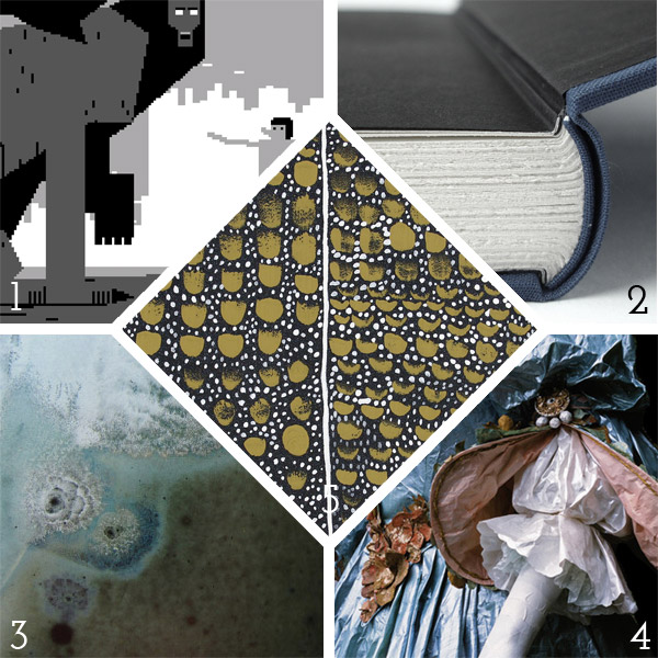
    1. I don’t know much about the origins of this website, only that it is incredibly addictive. Choose from seven 8-bit images (or play around with all of them) that are automatically resized by the movement of your mouse. As the picture is reduced in scale, it alters the original image. The one pictured above is The Sphinx resizeable.
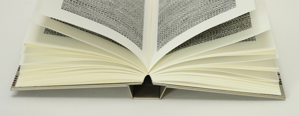
    2. Ben Elbel recently wrote an article summarizing a recent experiment he conducted on English case bindings. Ben specifically wanted to reduced the pull on the endpaper and text block when opening the cover. It’s a really interesting read and he documented his efforts very well.
    3. Discovering a mold-ridden box of photographic glass plates could induce anxiety and dread to any conservator or archivist. Yet art historian Luce Lebart spun this potential nightmare into a published collection of mesmerizing imagery in the book Mold is Beautiful.
    4. The construction of garments from the Victorian era to contemporary Haute Couture can be complex and almost mystifying. Isabella de Borchgrave replicates these complicated pieces out of paper. Her ability to give paper the appearance and movement of fabric is incredible. Some garments are displayed on mannequins, while others are worn by models. The paper garments can not only function like proper textiles garments, but they can be folded up and stored in the same way as clothes.
    5. Stephanie Clark has a talent for manipulating paint on the canvas, creating such beautiful textures and composition. Another great artist who could inspire a future design on a binding.

    stno32a

    6. Richard Keeling‘s Shadow Shapes series is geometric paradise. I love the play of color and shapes, some are layered with a multitude of color while others employ a simpler palette. And as the title indicates, an angular shadow is cast, adding dimension to these seemingly flat prints.
    7. German sculptor, Angela Glajcar, has an amazing portfolio of large-scale paper installations. Angela masterfully twists, drapes and manipulates layers of paper to create flowing landscapes and captivating tunnels.
    8. It’s as if two worlds collided with one another in Furniturish, a series of sculpture pieces by Tom Shields. Crafted and modeled after traditional styles, Tom seemingly builds one piece inside of another and sometimes builds several pieces around each other. The work is mind-boggling and beautiful.
    9. I love these illustrations from French painter Léa Maupetit. So whimsical and amusing.
    10. Five heart-shaped boxes dating to the 16th and 17th centuries were discovered in France. These boxes were in fact shrines containing actual hearts representing the long memorial tradition of heart burial. This find was exciting for many different communities, such as researchers at the Molecular Anthropology and Synthesis Imaging and the Institute of Metabolic and Cardiovascular Diseases. These hearts gave researchers a rare opportunity to examine organic matter from 400 years ago.

  2. Best of 2015

    December 31, 2015 by Erin Fletcher

    Wow, this has been a busy, busy year and I can’t believe that 2015 is coming to end. I want to extend my gratitude to the people who have helped contribute to the blog this year:

    Interviews:
    – Kathy Abbott
    – Ben Elbel
    – Tini Miura
    – Tracey Rowledge
    – Natalie Stopka
    Conservation Conversations Contributors:
    – Marianna Brotherton
    – Henry Hébert
    – Becky Koch
    – Athena Moore
    – Jacqueline Scott

    I also want to thank everyone who reads the blog, subscribes to the blog and newsletter and to those who’ve left comments. It has really warmed my heart to see the growth of interest and recognition that the blog has receive over the course of the year.

    At this time I like to reflect on my year. Herringbone Bindery saw a nice shift in workflow this year. As I removed conservation and repair services, I saw more edition work come my way. A few of these projects will be finishing up early in the new year and I plan to write up a post about them. I had another successful year teaching at North Bennet Street School with roughly 85% of my offered workshops running. I also began my second year as a Middle School Book Arts instructor. It’s been so delightful to see the creativity flow from the kids, stay tuned for a new feature on the blog.

    What to expect in the New Year:
    – an updated website: My husband and webmaster has been working on a beautiful new and easy to navigate website. We hope to have it up and running before the end of March.
    – I’ll be working on a fair amount of design bindings in 2016 and will be posting about them along the way
    – another round of interviews

    As I do every year, here is my list of favorite posts from 2015.

    bestof2015a

    1. December // Bookbinder of the Month: Kathy Abbott
    I am really delighted by this interview with Kathy Abbott. She is very methodical about her approach to design binding from selecting the perfect goatskin to applying her decorative techniques. Kathy’s discipline is inspiring and so are her simplistic designs.
    2. Artist: Rachel Foullon
    3. Client Work // Ye Sette of Odd Volumes

    bestof2015b

    4. Makin’ Care of Business Interview
    In July, I was interviewed by Rachel Binx at Makin’ Care of Business. It was a great way to reflect on my successes and how I’ve overcome challenges throughout the years I’ve been in business. I was honored to be apart of this collection of interviews with other talented craftsman and artisans working successfully as entrepreneurs.
    5. Artist: Nicholas Schutzenhofer
    6. North Bennet Street School // Student and Alumni Exhibit 2015 – Part One & Part Two
    I love writing this post every year. It’s a joy to speak with the students about their design bindings; detailing their concepts and techniques, what worked and what didn’t. This year’s exhibit also included a lovely selection of bindings from alumni, which you can read about in Part Two.

    bestof2015c

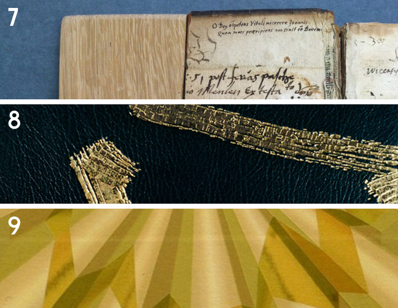
    7. Conservation Conversations // Making an Old Book Whole Again by Jacqueline Scott
    Jacqueline Scott had a slew of internships this past summer, which offered great material for the Conservation Conversations column on the blog. I particularly enjoyed this treatment of a binding in the collection at the Newberry Library in Chicago.
    8. March // Bookbinder of the Month: Tracey Rowledge
    I am so awed by the art work and bindings from Tracey Rowledge. Her responses to my interview questions were so thoughtful and inspiring. There is no mistake that she is a talented craftsperson with an impeccable ability to meld her artistic capabilities into her bindings.
    9. Artist: Tomma Abts

    bestof2015d

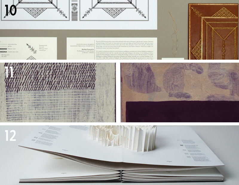
    10. Seventh Triennial Helen Warren DeGolyer Exhibition and Bookbinding Competition 2015
    As a first time participant in the DeGolyer Exhibit and Competition, I found the experience to be quite rewarding (despite the fact that I didn’t actually win anything). It forced me to execute an idea for a design binding in a new and more extensive way. This post goes into detail about my own proposal and the proposal from winner, Priscilla Spitler.
    11. Artist: David Quinn
    12. July // Bookbinder of the Month: Ben Elbel
    An innovator in the field, Ben Elbel has continuously churned out variations on structures and has developed several new styles of binding. I am always looking forward to his next project; to read about the challenges posed by the binding and the elegant solutions he comes up with.

    bestof2015e

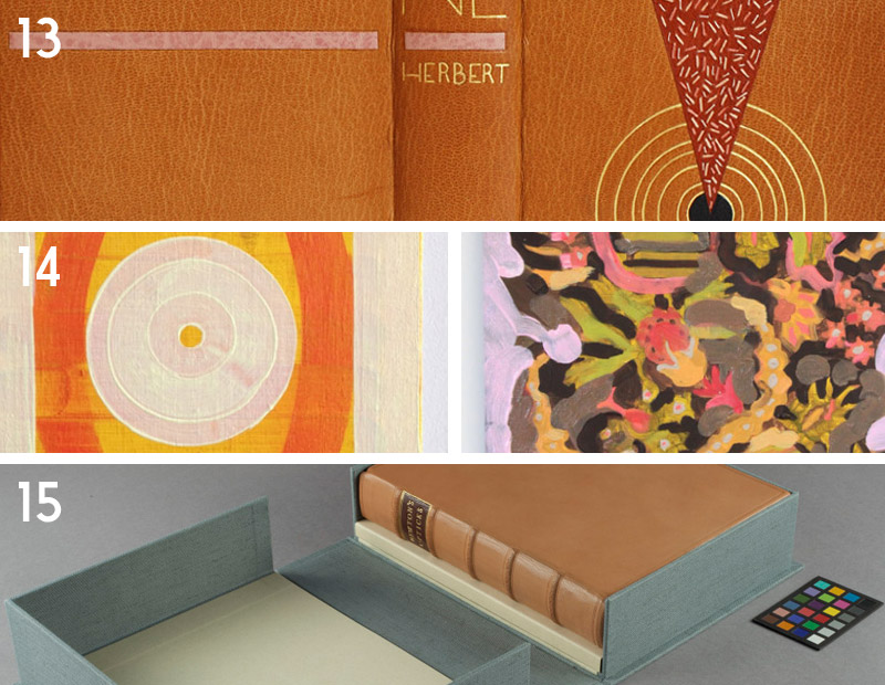
    13. My Hand // Dune
    This year I finished my design binding for Dune, that was then accepted into the Guild of Book Workers Traveling Exhibit: Vessel. I am very pleased with the outcome of this binding, particularly with the edge decoration and the successfully gilt concentric circles. No easy task.
    14. Artist: Lily Stockman
    15. Conservation Conversations // The Continuum by Henry Hébert
    Henry Hébert has been writing for the Conservation Conversations post for 2 years now and has continuously delivered interesting and sometime hilarious content. The outcome of Henry’s treatment shared in this post is stunning. The new binding is well executed and is treated with respect to the binding’s historical content.

    Happy New Year!


  3. Bookbinder of the Month: Ben Elbel

    July 26, 2015 by Erin Fletcher

    BreakfastAtTiffanys6-BenElbel

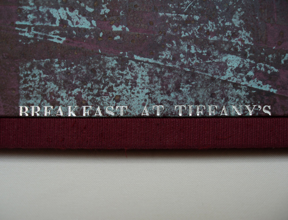
    I am wrapping up this month’s interview with Ben Elbel by showcasing his recent binding of Breakfast at Tiffany’s. Read on to discover the technique behind the decorative covers and what secrets lay within the binding.

    Breakfast at Tiffany’s is covered in beautifully decorated leather, which caught me by surprise. Having only seen this binding online, my initial guess is that the boards are covered in paper. Can you describe how you manipulated the leather to achieve such a wonderful range of color and texture?
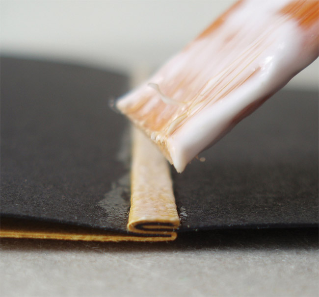
    Indeed it is leather, not paper. The technique consists essentially of glueing thin paper to suede leather and then sanding away the paper. I have never actually tried replacing leather with paper but I imagine that paper would probably tear during the process.

    BreakfastAtTiffanys4-BenElbel

    A few years back I was terrified about doing anything to a material. I used materials as they came from the suppliers and found it increasingly frustrating because bookbinding materials only come in a limited range of colours.

    I was working at Shepherds Bookbinders at the time and because we had a splitting machine there were bags full of beautiful suede that would go straight to the bin. So one evening after work I started messing around with suede, glue, leather dyes, papers, etc, having absolutely no idea what I was doing.

    There were a couple of ‘happy accidents’ and after some time, I had identified what had lead to those happy accidents and found that I had a process, so simple that I was even able to teach it. I have a nice collection of these pieces and they are a great starting point for a design binding.

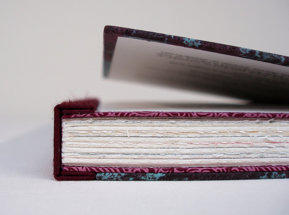
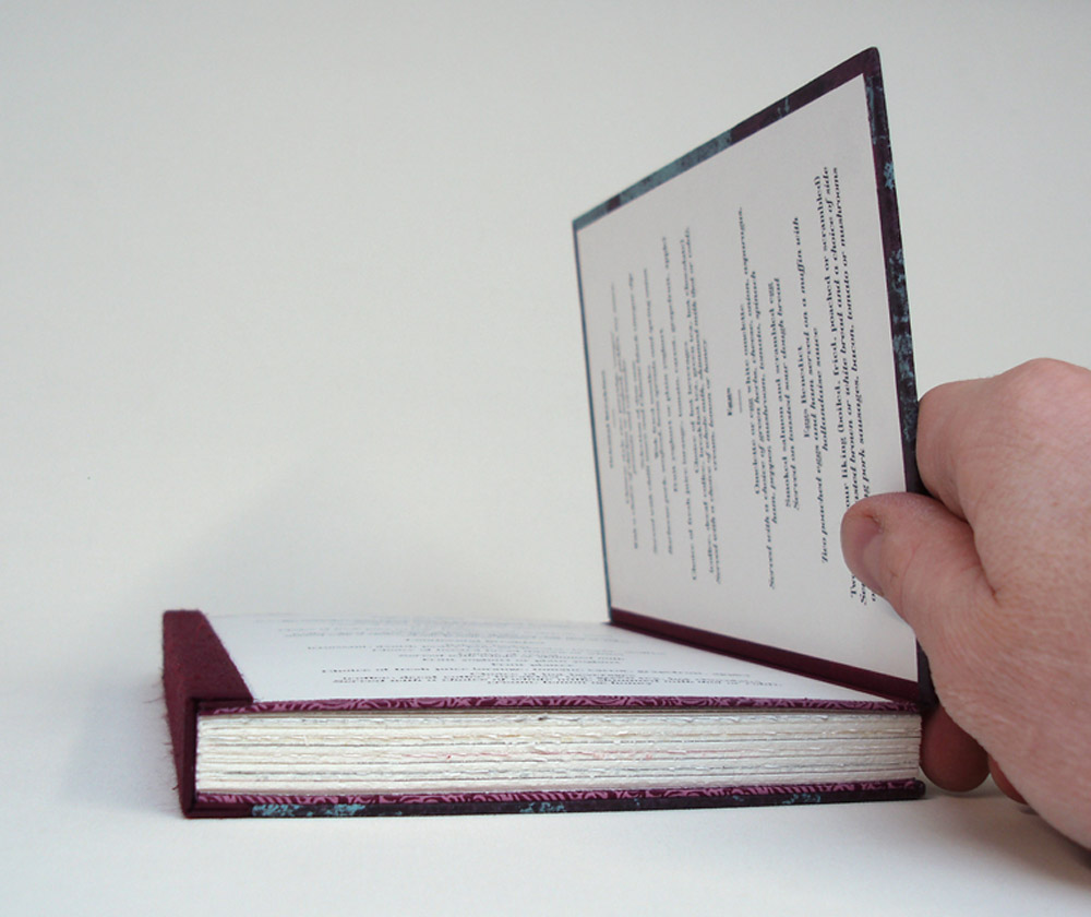
    In this binding, you’ve included a hidden component. The front cover opens up to reveal two panels of text, can you elaborate on your concept for this part of the binding? Does it have a magnetic closure?
    The latest version of my dos rapporté binding has boards made of two layers, hinged at the fore-edge. The two layers are glued together with a flange from the textblock in between. The aim is to provide a very strong cover to text attachment, but of course it is very tempting to see a design opportunity; why not include something in there, and shut the boards with magnets rather than glue.

    BreakfastAtTiffanys3-BenElbel

    The opportunity came with Breakfast at Tiffany’s, the set book from Designer Bookbinders 2014 Competition. At the time we were also producing menus for a hotel in London, and this is how a breakfast menu ended up between the two layers of the front board.

    BreakfastAtTiffanys2-BenElbel


  4. Bookbinder of the Month: Ben Elbel

    July 19, 2015 by Erin Fletcher

    Sonnet-BenElbelandMarjaWilgenkamp

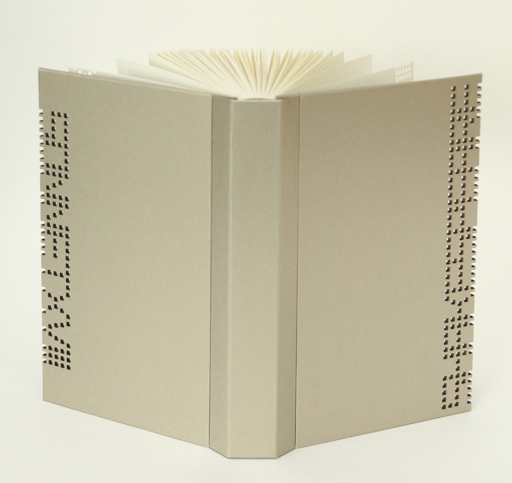
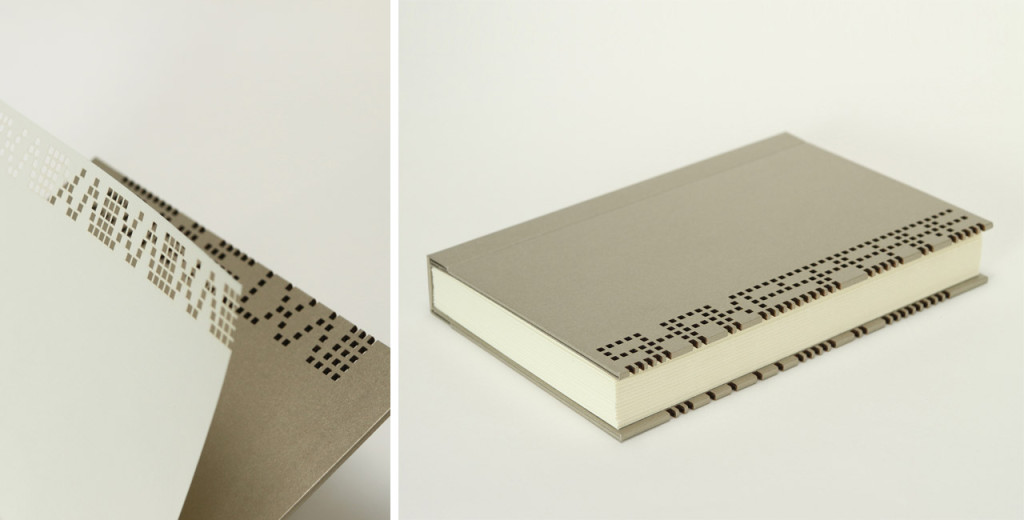
    In Sonnet XVII, Dutch bookbinder Marja Wilgenkamp has reimagined Shakespeare by using a process developed by the artist collective La Société Anonyme. The sonnet was initially read out aloud and recorded, which was then encoded into binary code. The code was then printed making it potentially accessible to the future.

    Offset printed in an edition of 65 copies on Hahnemuhle Ingres paper, the book is still available for purchase here.

    Ben Elbel executed the binding according to Marja’s design. The binding is covered in So Silk paper. The text has been laser cut into the cover boards and flyleaves; inspiration for the design came from costuming seen during Shakespeare’s time.

    ‘Dos Rapporte’ is another structure that you’ve developed and is the style of binding you used on Sonnet XVIII, a collaborative project between you and Marja Wilgenkamp. Can you talk about its design and function and why you chose to use it on this project?
    There have been many efforts in recent years to improve the opening of books and the dos rapporte is my own personal contribution to the subject. In a few words let’s say it is a mixture of a type of industrial brochure as practiced by (among others) the dutch company Hexspoor + Gary Frost’s sewn board binding + the old fashioned springback binding. What is special about my design is that the spine is made separately from the book (this is what ‘dos rapporté’ refers to) and is attached by gluing its inner part, the one that folds back on itself, onto the boards. This makes for a very fluid opening action as well as an interesting profile and a very clean hinge on the outside.

    Sonnet3-BenElbelandMarjaWilgenkamp

    We thought that the strict character of the structure would work well with the laser cut pattern that Marja designed for this edition.

    Sonnet2-BenElbelandMarjaWilgenkamp


  5. Bookbinder of the Month: Ben Elbel

    July 12, 2015 by Erin Fletcher

    OnionSkin3-BenElbel

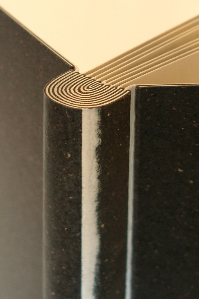
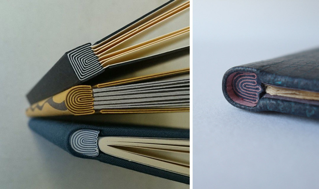
    I love this structure developed by Ben Elbel, which he appropriately named Onion Skin Binding. A lovely description inspired by layering effect that creates the mesmerizing maze-like spine. In this post I talk about this structure with Ben starting with its development to how he’s adapted the structure.

    The Onion Skin is another one of your innovative structures. Did you develop the structure around an existing project or was it simply a product of play and experimentation?
    Absolutely a product of play back in my student years when I had a lot of time on my hands. :)

    It was born from playing around with the idea of guards/stubs in photo albums. I introduced colour, and tried to use uninterrupted pieces of paper and suddenly the pattern was born. Readability is a key element of my personal work. I like to be able to follow a line, understand how something is built and be able to take it appart mentally. This is also the idea behind my ‘dos rapporté’ binding.

    OnionSkin2-BenElbel

    The Onion Skin binding is another structure that you offer as an online workshop and is also how I learned the technique. I found it to be surprisingly simple once I understood the pattern of the layering. Is this a challenging structure to teach (particularly online)?
    Exactly as you say. Once you have understood the sequence it is very simple to make, and consequently very simple to teach too.

    If you don’t have the opportunity to take Ben’s online course, you can simply purchase his comprehensive tutorial here.

    You’ve really played around with this structure; can you talk about how you’ve adapted the binding?
    I have adapted the principle for a single section binding- the signature is sewn on a single stub made from different layers of paper, which are then folded and glued around the initial connection, until it is thick enough to form shoulders to accommodate boards, exactly as in a traditional binding.

    OnionSkin5-BenElbel


  6. Bookbinder of the Month: Ben Elbel

    July 5, 2015 by Erin Fletcher

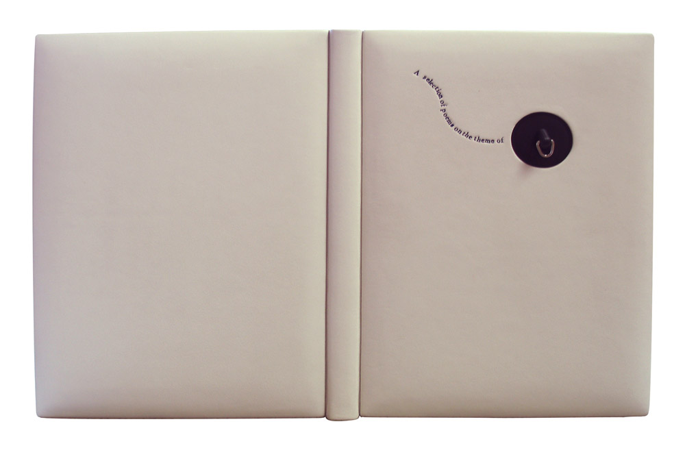
    Water-BenElbelFor the Designer Bookbinders International Bookbinding Competition in 2009, binders were invited to produce a binding for the set book Water, a collection of poems and illustrations based on the the theme of water. The set book was published by Incline Press in a limited, letterpress edition that included images from various talented illustrators and marblers. This was the first international competition since the organization began offering competitions back in 1975.

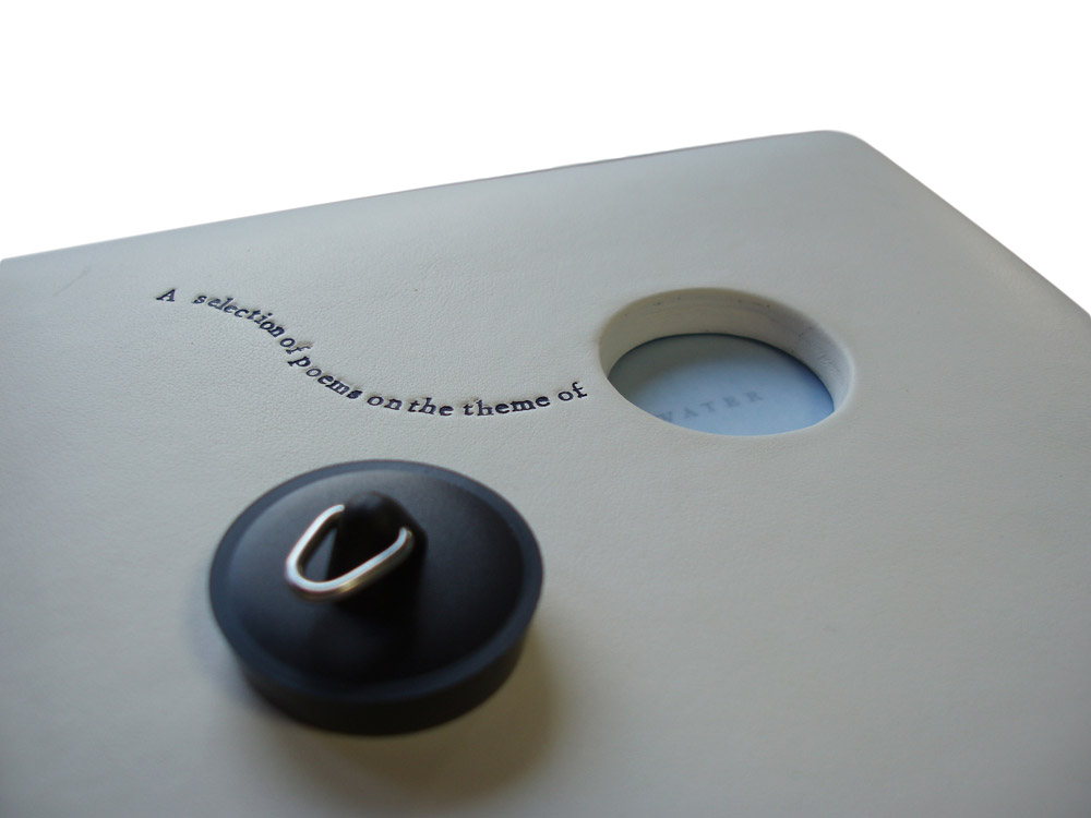
    Ben Elbel put together a beautiful binding in white calf (and quite impressive in how pristine it looks). The bath plug fits snugly into the front cover, but is easily removable to reveal the end of the title.

    This binding is so clever and probably the first binding of yours I ever saw. Can you talk about the process of fitting the plug into the front cover?
    This binding was my entry for the 2009 Designer Bookbinders international competition and was among the prize winners.

    My initial plan was to have the boards produced from enameled steel, the material from old fashioned bath tubs, but a quote from a supplier made me change my mind.

    The boards are made up from 2x 3mm boards, so a total thickness of 6mm. They are heavily beveled around the edges but retain full thickness in the middle to accomodate the plug. The leather was also very thick and I had to thin it down locally to turn it in the hole. This is how I did it.

    Water2-BenElbel


  7. July // Bookbinder of the Month: Ben Elbel

    July 1, 2015 by Erin Fletcher

    BovenKamer1-BenElbel

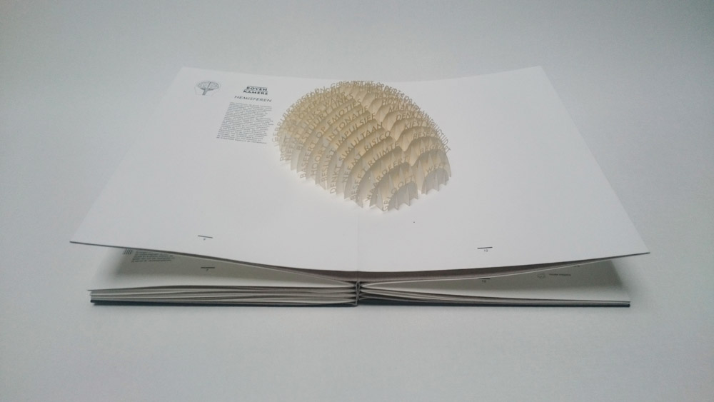
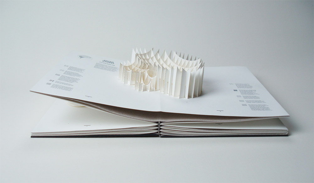
    Boven Kamers is a collaborative Dutch pop-up book between neuroscientist Gerard J. Boer, professor Harry B.M. Uijlings, paper artist Ingrid Siliakus and graphic designer Moon Brouwer. The book contains a total of six laser cut pop-up spreads which send the reader on a tour through the human brain and its functions. Printed in a limited edition of 50, each book is numbered and signed.

    Ben Elbel‘s innovative rebinding of this book was just completed earlier this year.

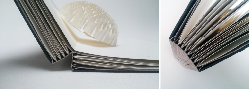
    I have been waiting in anticipation to see this binding after you spoke to me about it. In your newsletter on this binding, you mention that the compensation folios are sewn together. The spine opens to a sharp ‘V’ allowing the pages to lay flat, can you elaborate on the sewing structure and any treatment done to the spine?
    Boven Kamers (literally means upper rooms in Dutch, a colloquial expression meaning brain), is an exploration of the human brain in the form of a pop up book, by the young Dutch designer and publisher Moon Brouwer.

    I was commissioned to re-bind the book by the Dutch Royal Library (The Hague).

    When I first received it, the book presented itself as a series of folios laminated with one another, each folio containing a pop up. A hard cover was provided but disconnected from the textblock.

    Technically, the challenge was to provide compensation for the pop-ups as well as a perfectly flat surface for them to smoothly unfold, all of this without sewing and without introducing blank pages between the folios.

    After some research I concluded that none of the existing binding structures (traditional or contemporary) were quite suitable to do all this, so I created a new one from scratch.

    BovenKamer7-BenElbelBovenKamer4-BenElbel

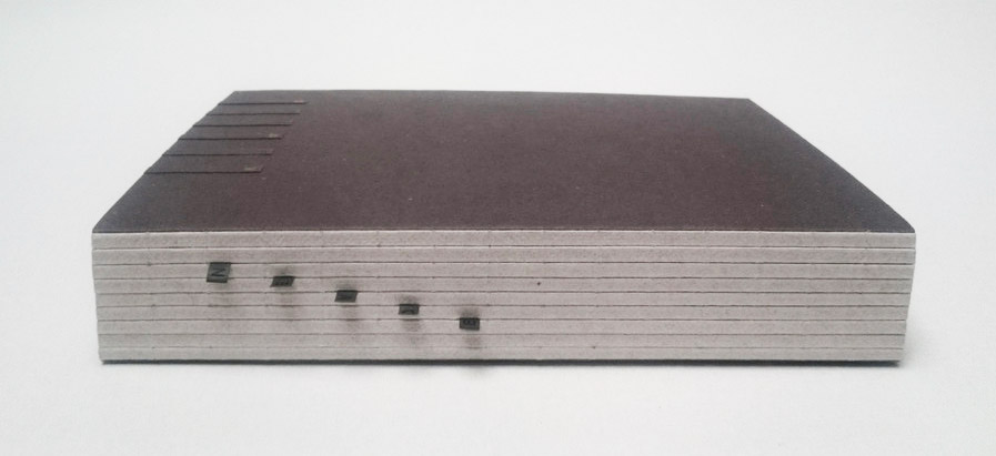
    It took about a year and the result is a series of ‘T’ elements made from heavy paper, sewn with one another. The folios are inserted between each T and secured only at the fore-edge. On the next images one can see how the spread ‘floats’ on top of the binding, allowing the pop up to fully unfold. The original cover was mounted at the back of the book and a lettering was created, on the spine and front board, to evoke a kind of staircase leading to the upper rooms.

    BovenKamer6-BenElbel

    You can read a bit more about the binding and see some images of the book at various stages through the design process here.

    – – – – – – – – – – –

    Ben and I have kept in contact ever since he embarked on offering online courses (more on that in the interview). His work and business ethic are quite inspiring as Elbel Libro has expanded beyond the traditional bindery. He ceases to amaze me with his sleek designs and innovative binding structures. There seems to be no stopping his creativity.

    Check out the interview after the jump and make sure you come back during the month of July for even more probing questions regarding a selection of Ben’s work. You can get email reminders by subscribing to the blog, just click hereread more >


  • My name is Erin Fletcher, owner and bookbinder of Herringbone Bindery in Boston. Flash of the Hand is a space where I share my process and inspirations.
    The StudioNewsletterInstagramEmail me
  • Archives