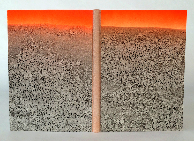
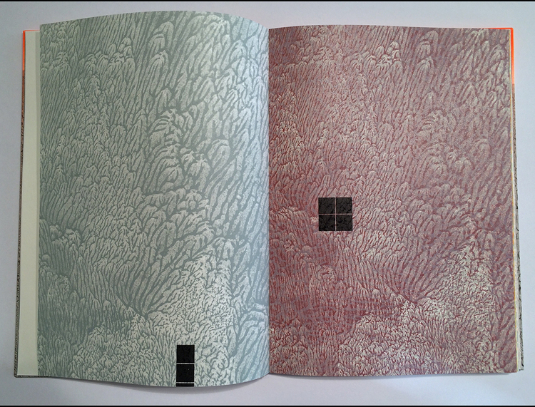
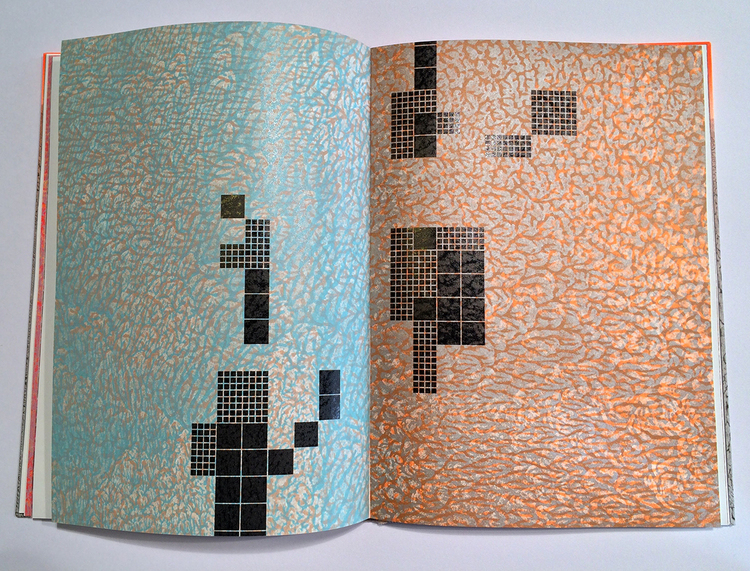
The Colour Out of Space stems from the imagination of horror writer H.P. Lovecraft and also happens to be the focus of Amy Borezo‘s most recent artist’s book. A strange color emerges from the devastation left by a meteorite that hits a small fictional town in Western Massachusetts. The ill effects this foreign objects leaves on the land, vegetation and the people of the town mirrors Lovecraft’s own disdain for industrialization and modernization.
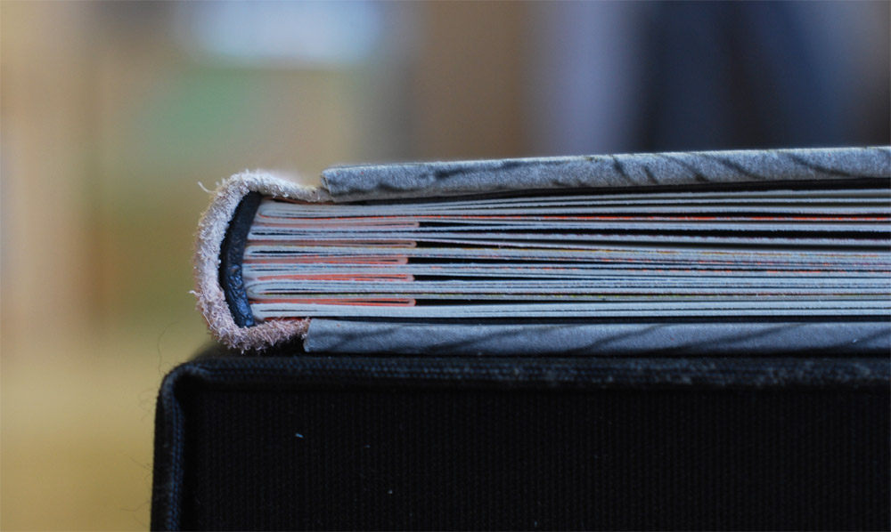
Bound in an edition of 40, the binding is a three-part Bradel structure with the text block sewn onto a shaped concertina.
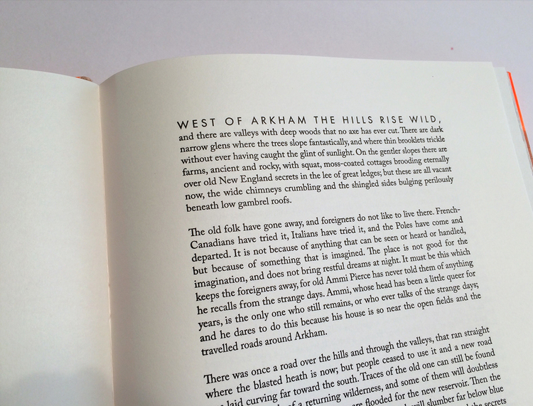
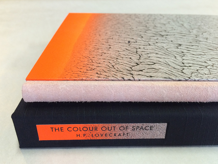
The spine is covered with buffalo suede and the boards are covered with a beautifully designed pulled paste paper. Relief printing was achieved on a letterpress through photopolymer plates and printed on Zerkall Book. The body text is Caslon with titles in Futura.
The book is housed in a cloth presentation box. The title and author are printed on scraps of the same paste paper used on the covers.
One of the last things we discussed during my visit to your studio, was the technique behind your incredible pulled paste papers. For the paper used on The Colour Out of Space, the rhythm of the pull created that gorgeous pattern. Can you share your process for making pulled paste papers?
After adding acrylic paint to the paste in the desired amount, I brush out a large, even area onto a sheet of mylar. I have a water bottle nearby in case the mixture needs more moisture. I lay the sheet of paper down onto the pasted area and press the sheet into the paste mixture gently by using a brayer on the back of the sheet of paper. I then pull up the sheet from one direction. For the covers of The Colour Out of Space, I then also let the sheet gently back down and pulled from a different direction. This allowed the “veins” created by the pulling to orient both vertically and horizontally. It also creates more surprises. No two sheets were alike and I enjoyed the “dance” of pulling in different directions to create different effects.
How does the paste paper reflect the story?
I was searching for a way to evoke the landscape and setting of the story without being literal or illustrating it. Because I live very near what many consider to be the site of the fictional story, I am familiar with the landscape. A big part of my “research” for this project, was simply walking along wooded paths near the site. There are large, imposing trees along the paths that lead to the reservoir that submerged a few towns. I wanted to capture the dark romanticism inherent there. The pulled patterns mimic patterns found in the natural world like rock formations, sediment at the edge of water, foliage. At the same time, the paste papers also reminded me of wallpaper patterns of the nineteenth century and the kind of neo-Gothic interior world that Lovecraft embodies. Not only do I use the paste papers on the cover of the book but I also created photopolymer plates from the papers I made. I then used these plates to print the imagery for the book. I printed the veined, pulled patterns in multiple colors and layered these on top of each other. These then become the backdrop to the “geometry” of the encroaching reservoir. The organic forms of the pulled papers are a foil to this rigidity.
With many of your prior artist’s books, you used the accordion structure in some way. Can you talk about why this particular binding is different and what influenced you to use a different structure?
As a painter I kept coming back to the accordion format because it allowed me to create a larger scale “canvas” when the pages are fully extended. But, with this book, a more traditional format seemed fitting because of Lovecraft’s own distaste for the modern, and because I was printing a full story, which I hadn’t done before. I wanted to make a traditional codex, but enhance it with slightly unusual features like the suede spine, the shaped concertina, and the fluorescent orange airbrushing detail. I also very much wanted to use the shaped concertina structure because I had developed it a few years ago on a book for a client, but I had not had the chance to use it on my own work. Sewing into the shaped concertina also allows for imagery to subtly emerge among the passages of text.
– – – – – – – – – – –
While I was a student at North Bennet Street School, I made the decision that upon graduation, Boston was to become my new home. So I began to investigate the community around me, which is how I stumbled upon Shelter Bookworks and the amazingly talented Amy Borezo. I was lured in by her artist’s books; their inventiveness and flawless printing really heightened my desire to work within this medium again. To say the least, Amy’s work is inspiring.
Last month, I had the chance to visit her studio in Orange, Massachusetts. She shared with me each of her artist’s books and some work she had done for Abigail Rorer and 21st Editions. Check out the interview after the jump (my first interview of the year) and come back each Sunday during the month of May for more on Amy’s work. You can subscribe to the blog and receive email reminders, so you never miss post.
