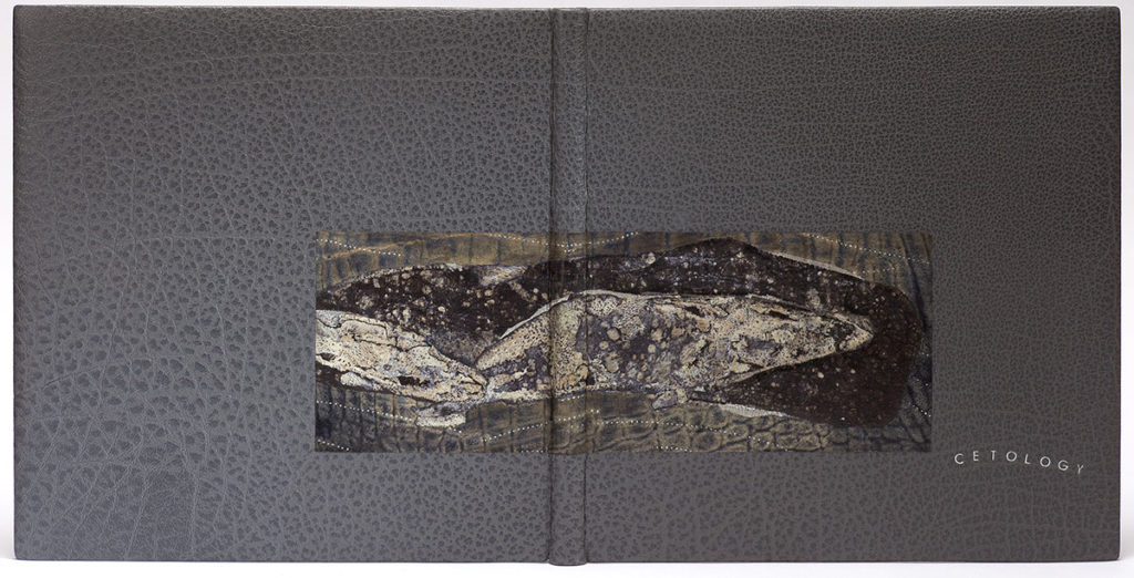
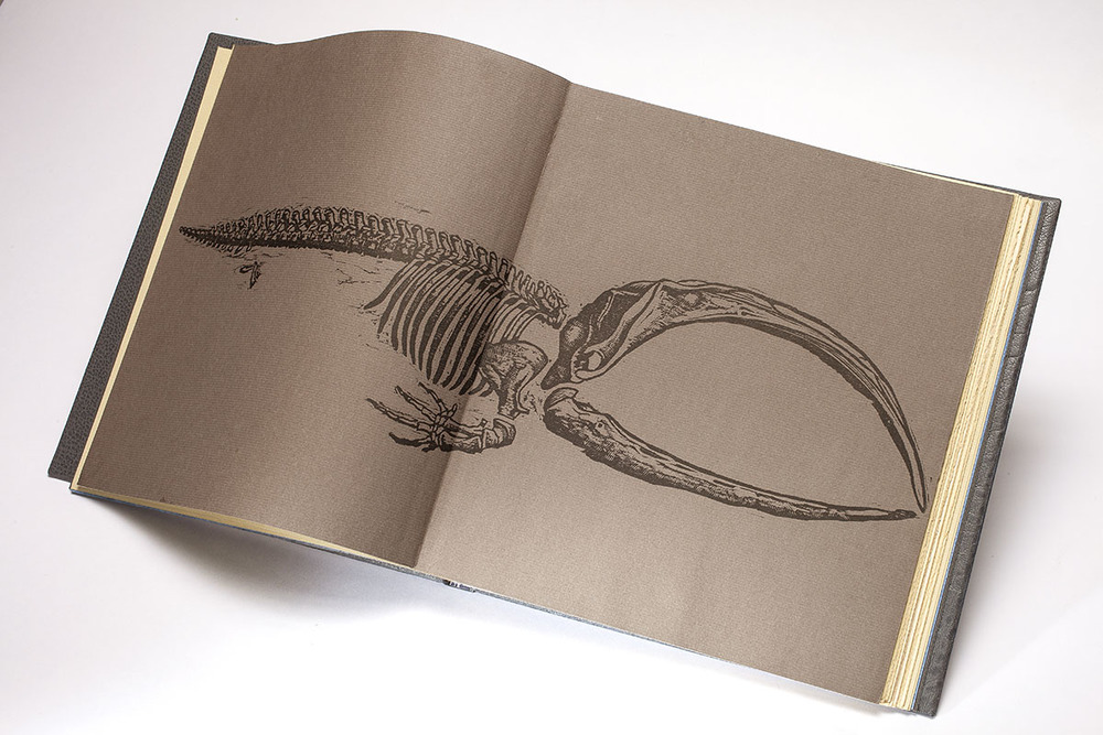
Cetology is a finely printed text from The Red Angel Press that includes excerpts from Herman Melville’s Moby Dick. The book was designed and illustrated by Ronald Keller.
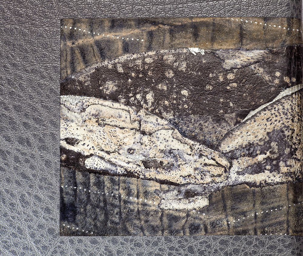
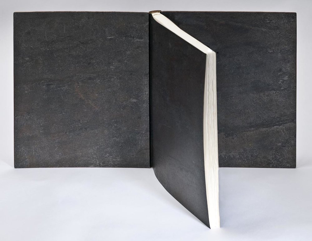
Coleen Curry bound this copy in 2016. The text is sewn ‘Montage sur onglets’ and bound in dark grey buffalo skin. The decorative inlay is a collage of top and back-pared leather mounted on an alligator belly split. The collage has been tooled with the binder’s brass roulette through silver foil. The interior is covered with buffalo edge-to-edge doublures and flyleaves made from hand-dyed Okawara paper.
With the decorative onlay piece on Cetology, you’ve really managed to unite the textures from the prints with the skin of an actual whale. To create such a textural piece, you worked with alligator skin (not a typical leather found on bookbindings), how did you manipulate it and what challenges did you encounter working with this leather?
For Cetology, my design inspiration was threefold: 1) Melville’s text and Keller’s art regarding the remarkable size range of cetaceans from a 1.5 meter porpoise to the majestic 30 meter blue whale, 2) my own fascination with how some whales carry up to 1000 pounds of whale barnacles on their bodies and, serendipitously, 3) my bindery overlooks the Pacific Ocean in Northern California where my design process was inspired by a dozen sightings of a mother Humpback and her calf, breaching off the coast during in the late fall of 2015 while I was in the midst of creating this binding.
I strove to create textured barnacles, the salty fresh scent of a turbulent ocean, and the awesome graceful motion of cetaceans swimming in light shimmering waves.
The decorative piece is actually an inlay, flush with the cover leather that I made off the book. The inlay consists of a collage made from a variety of leathers and then mounted onto an alligator leather split that was pre-tooled in silver foil. Once that piece was created, I then chose the shape of the inlay and cut into the binding to place it. The collage was my attempt to create that motion and texture by suggesting an abstracted pod of cetaceans varying in size and class.
I have been experimenting with collaging various leathers and enjoy this technique immensely. I am able to create texture, dimension, and curiosity, while the look is elegant without being clunky. It is similar to Lacunose in that both techniques require building up of layers of leather; however in lacunose, the surface is removed by sanding; for my collages, I make the surface prior to adhering it to the panel. To construct these pieces, it takes time to choose leathers that work together, taking care to pare them very thin and experimenting with adhesives. I press the pieces multiple times and often back pare between layers. I tool and emboss during the process and often add acrylic paint as well to achieve the effect I desire.
For Cetology, I encountered a few difficulties with the inlay panel as the gray water buffalo leather binding has laced on boards and a flat back. I had to pare the leathers thin as the piece had to be flat enough to extend across both boards and both joints. While the boards were prepared with extra layers of material to allow me to recess the panel deeper within them, the joints are merely the thickness of the leather at the joint. Therefore, my panel was thinner at the joints to allow for easy opening, without breaking the visual across the panel at the joints. All that required forethought. To inset the inlay, I cut into the covering leather – cutting across the joint is a precarious procedure as you I don’t want to cut through the leather hinge! I also experimented with adhesives on the materials used because there are multiple pressing of the collage, leakage of PVA onto suede for example can alter how it looks. I want to know before-hand what to use to achieve the result I strive to create.
The title, CETOLOGY, is tooled in silver gilt on front board to the right of the inlay panel, the letters in all caps in a barely perceptible arabesque (think gentle wave swell). Its placement took time for me to figure out as the panel across the cover looked like a panel across a cover. I noticed the buffalo leather grain was distinctly flowing towards the lower right board, exactly where one’s hands would open the book. It was a perfect location to title and invite the reader into the book.
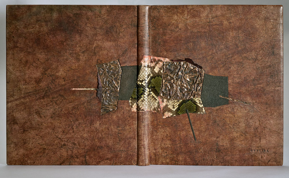
Also bound in 2016, is Coleen’s binding of Outside. A Nawakum Press edition that includes six short stories by Barry Lopez accompanied by “mediation” engravings from Barry Moser. The stories are taken from Lopez’s Notes trilogy, written over a span of almost twenty years. The engravings reflect Lopez’s insight into relationships between humans and animals, creativity and beauty, life and death as he describes both exterior and interior landscapes.
This same tension is found in Coleen’s binding covered in hand-dyed and embossed kangaroo leather with inlays of copper and inlays and onlays of snake and calfskin. The title is blind tooled at the lower right hand corner of the front cover and almost blends into the background. The interior is lined with stone veneer edge-to-edge doublures and matching fly leaves.
This binding was included in the American Academy of Bookbinding’s 2017 Open/Set International Competition and was received ‘Highly Commendable for Onlays and Inlays’.
I had a chance to handle this binding while setting up for the Open/Set Exhibit and it was a real treat. Once again the cover leather is elevated through hand-dying. The irregular patterning of the dye compliments the texture of the crinkled copper and snakeskin inlays so well. Did you alter the snakeskin or is that its natural coloring?
Lopez’s prose is rich in metaphors and vivid imagery offering a total physical, spiritual, and visual experience which served as inspiration for my design and material choices. His writing captivated me.
Featuring the natural world, the short stories flow together as a series, reminiscent of native American story-telling connected to spirituality. This led me to create six shapes woven together, each a story by itself, yet connected through a common spirit. Lopez’s prose has ethereal dimensions of reality providing me the opportunity to abstractly incorporate them into the design with specific materials.
This is one of my favorite bindings– it feels so soft and familiar like a precious leather journal. I chose kangaroo leather to bind the book, and hand-dyed it several times. The smoothness of the kangaroo leather offers a sensual feeling while holding the binding. I applied many types of manipulation and dying techniques such as craquele, embossing and tooling, to create a map documenting a surreal journey through both the physical and spiritual worlds. Visually it is worn, textured, rich, with unidentifiable tracks and lots of movement. The kangaroo is such a gorgeous material. It lacks grain, similar to calf, and therefore is a blank canvas for me to create the texture and colors that I want.
The shapes are all inlaid individually and consist of a coral and green snake skin, bronze salmon skin, distressed copper, and painted calf splits. I purchased the snake skin in France from an Atelier that supplies exotic leather to luxury fashion houses such as Prada, Gucci, and Hermes. It is a python skin that was hand painted by in-house artists. I did add touch ups of coral and green acrylics in the pockets underneath the scales on the skin, as these pop open across the spine as the book opens and closes. On some bindings, I glue these bits down to keep the look tight and flat, but for this binding I wanted the movement to remain. The snake skin represents “a storm pattern rug woven out of the mind of a Navajo Woman”.
I chose copper to represent mother earth. It is associated with the goddess Venus in alchemy, owing to its lustrous beauty, its ancient use in producing mirrors, and its association with Cyprus, which was sacred to the goddess. The patina was applied after I crinkled the copper to give it depth. The treated suede ruffles secured under the copper edges softens the metal and offers a somewhat feminine feel.
The edge-to-edge doublures and fly leaves are thin slate stone veneer, an amazing material from Italy used in architectural applications. It is actual stone that has been laser cut to .3 mm and backed with a polyester and fiberglass backing, then vaporized with a sealant on the surface. I’ve used it for many bindings and it is similar to working with cloth yet it has an immense amount of texture and natural variation.
One can’t tell from the photographs, but the binding has many minute sparkles that reflect the light. I used micaceous iron oxide many ways to emulate “Dust feels like graphite”; lightly washed over the blind tooled title area to emphasize the spiritual world; painted over the stone doublures “Black rocks glistening in the moonlight” in contrast to the bare stone flyleaves “Dreams of boulders”.
There are many instances where you are placing an inlay or onlay across the spine of the book. What sort of technical challenges have you experienced from this placement and what solutions have you found? I imagine certain materials would inhibit the movement of the board, how does this limitation effect you during the design stage?
I usually design and then try to figure out how to make it work, often experimenting with materials and methods. If I am to make an inlay on the spine, I will make a tight-back binding so as to not take the risk of cutting through the hollow. There are technical challenges taking a design over the joints across the spine. The joints are delicate and vulnerable with much thinner leather than on the boards to allow for easy opening of the book. Any material that is placed across the spine, inlay or onlay, also needs to be thin at the joint crease thus limiting the kind of materials that can be used. Many exotic leathers have too much texture variation to allow for easy opening; metals and stone will fail in the crease over time; Thick leather won’t work as the joint needs to be very thin. I have also found that inlays across the spine work best when flush with the covering leather. I have brought designs across the spine by building up the boards or spine prior to covering and sanding the pieces to zero at the crease. This is a different look. Alternatively, onlays can cross the spine, and I have seen two ways, one is to cut the onlay at the joint, similar to tooling where the line breaks at the joint. I have also made bindings where the piece lifts off at the spine, attached into the boards. Don Glaister uses this technique in on many of his bindings.
