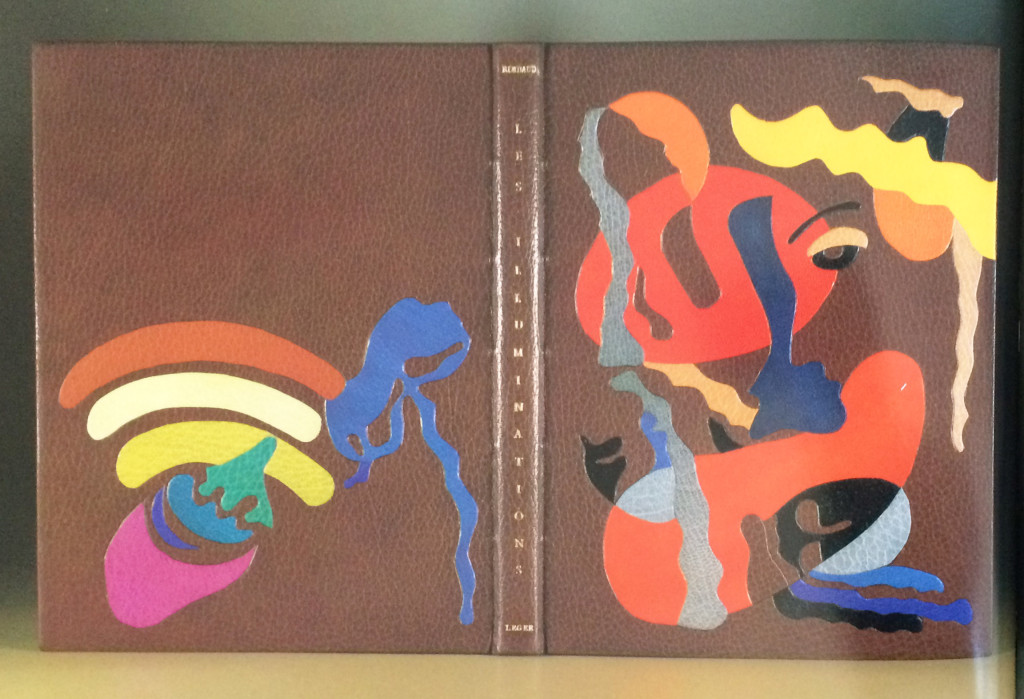
I think this binding from Tini Miura of Les Illuminations by Arthur Rimbaud and is one of my favorite bindings in her portfolio. Published in 1949, this edition includes illustrations by Fernand Leger. Bound in 1985, the book is covered in brown morocco and includes a series of colorful onlays. The title and last names of the author and illustrator are gold tooled onto the spine. There are also a few subtle blind tooled lines within the design on the front cover.
Tini embraced the range of colors from Leger’s illustrations, which reflect the visual impact of Rimbaud’s poetry.
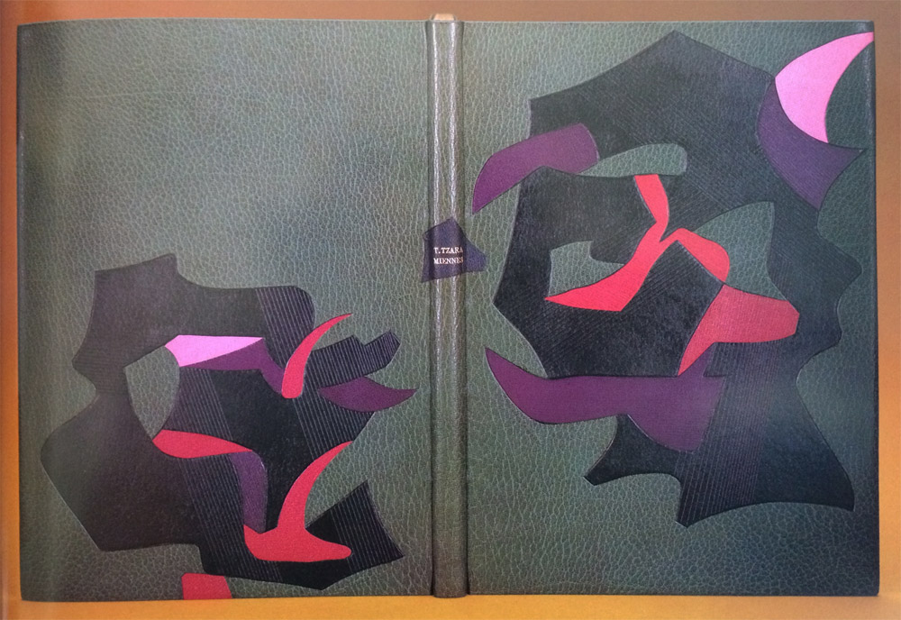
I also wanted to include Tini’s binding of Miennes by Tristan Tzara in this post because of its visual similarity to her binding of Les Illuminations (in that they are both unique to her typical way of designing).
Bound in 1989, this book is covered in grey morocco with onlays in black, purple, red and pink leather. The title and author are gold tooled over an onlay on the spine. Tini’s response to the design in her book (A Master’s Bibliophile Bindings, 1990) is as follows:
The colors and forms express the state of mind in a devastated society after the First World War, when Dadaism’s leader Tristan Tzara rejected the traditional ideas of formal beauty.
The designs on these two bindings have very unique looks from your other work. Can you talk about the inspiration behind the designs?
It is difficult to capture an artist’s images without copying him. I try to find spaces between the shapes of their illustrations to honor them and keep the feeling they invoked me.
Les Illuminations incorporates a wide spectrum of colored leather. Do you dye your leathers to produce the perfect shades or are you sourcing your leather from different tanneries? Do you use a combination of vegetable and chrome-tanned skins?
I have a large range of leathers, all bought in Paris. I don’t dye them myself for durability reasons.


