Check out the six Roald Dahl titles I rebound for Buy Some Damn Art. At the beginning of each week I will feature a post on the creative process behind each binding. Check out this week’s post on Fantastic Mr. Fox.

October 30, 2012 by Erin Fletcher
Check out the six Roald Dahl titles I rebound for Buy Some Damn Art. At the beginning of each week I will feature a post on the creative process behind each binding. Check out this week’s post on Fantastic Mr. Fox.
October 29, 2012 by Erin Fletcher

Starting tomorrow at Buy Some Damn Art, six of my books will be featured and on sale for six weeks. Follow my blog during that time to see a post on the making of each title.
I’ve been greatly inspired by Art Deco bindings and wanted to incorporate that style into this binding of Fantastic Mr. Fox by Roald Dahl. As a child I read this story over and over, imagining blueprints of the underground tunnels created by those devious foxes. In the spirit of Art Deco design I simplified these underground channels, wrapping them around three colorful, geometric farmhouses.
The binding is a variation on a German case structure by Peter Verheyen where the boards are covered separately from the book. The spine and boards were covered with earth Hahnmühle Ingres. To make the farmhouses I layered various handmade and commercially made papers which include Moriki, Hahnmühle Ingres, Cave Paper and Lokta. There is a line of red walnut Cave Paper running the width of each board representing the ground and dividing up the levels of the farmhouses; the walnut Cave Paper is the dirt far below the top soil, highlighting the tunnels around each farmhouse. The title was stamped in a sans serif typeface with brown foil.

The headbands are wrapped red walnut Cave Paper around cord. The edges were painted with an acrylic/paste wash, once dry the edges were carefully brushed with sandpaper to give a more textural look. The end papers are red walnut Cave Paper. I loved using Cave Paper for this binding for a few reasons: the handmade quality, use of natural dyes and the textural characteristics seemed most suitable to represent the living, moist dirt deep underground. The book is housed in a clamshell box. The trays are covered in lime Moriki and lined with rose Hahnmühle Ingres and the case is covered with brown Canapetta.

October 25, 2012 by Erin Fletcher

Check out my show on October 30th over at Buy Some Damn Art. I rebound 6 titles from the crafty and clever Roald Dahl (my childhood favorite). All of the books are for sale and would make the perfect addition to your library.
Stay updated on upcoming exhibitions by signing up to BSDA’s mailing list. Every week you are introduced to exciting artistic talents, plus at a low cost you can start covering those bare walls or shelves.
September 17, 2012 by Erin Fletcher

The University of Utah’s J. Willard Marriott Library is hosting an exhibition from September 7th – November 4th showcasing bindings of the set book Fantasy and Nonsense printed by Tryst Press; my binding will be included in this show. If you happen to be in the area during the second weekend in October, head over to the Utah Museum of Fine Arts to see the Horizon exhibition, where my binding of Flatland will be on display. Both of these exhibitions coincide with the Standards of Excellence Seminar held by the Guild of Book Workers.
August 20, 2012 by Erin Fletcher
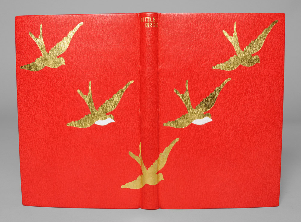
In April 2011, I took my first trip out of the country to London. While I was there I made my way to the Natural History Museum for their touring exhibition of Sexual Nature, a show on the sexual habits of various animal species from the praying mantis to rams to angler fish to humans. I was intrigued and shocked by the facts and imagery presented in the exhibit, particularly the Green Porno shorts by Isabella Rossellini. On my way out I perused the gift shop and decided on a whim to purchase two books by Anaïs Nin (Little Birds and Delta of Venus).
Both books are a collection of short stories published in the late 1970s posthumously. Written in the 1940s, Nin and a group of writers were given the task of writing erotica for an anonymous private collector. Her erotic shorts deal with various sexual themes, some quite taboo (varying from pedophilia to lesbianism), all the while she maintains a focus on the study of women and her female characters.
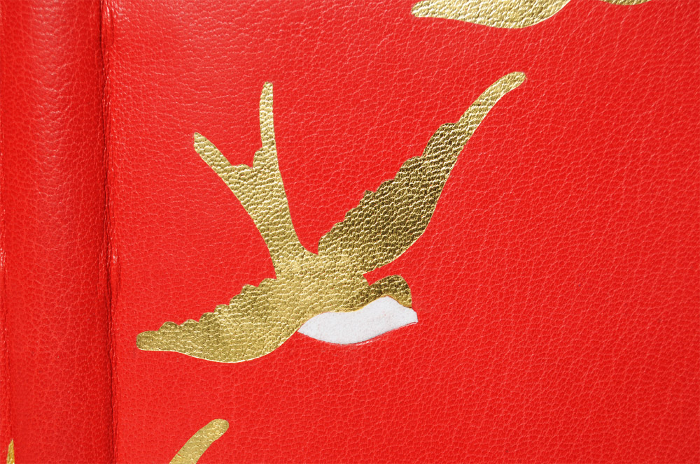
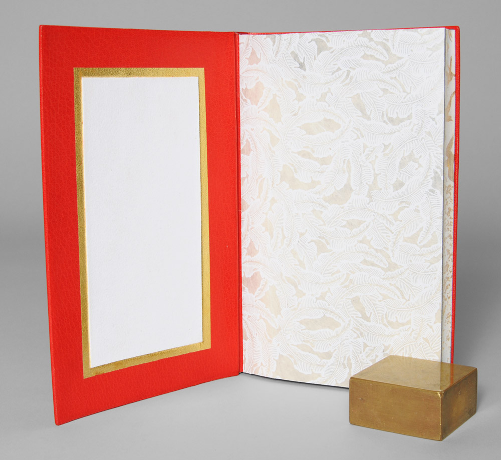
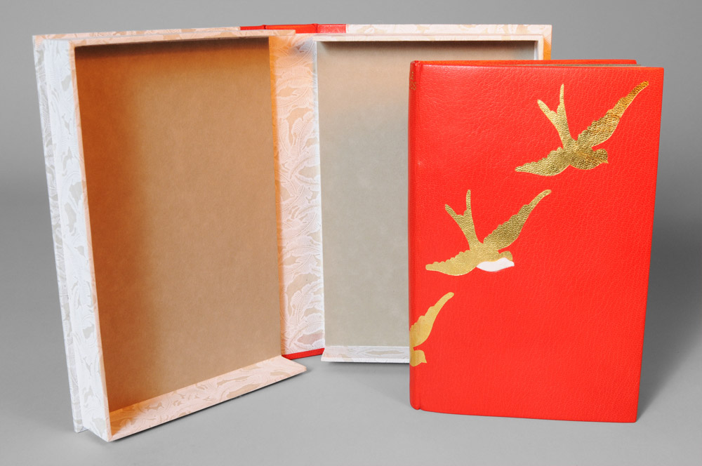
The cover design for Little Birds was taken from the title pages of the individual stories, a ‘V’ formation of sparrows. I chose a simple color palette for my simple design, red (the color of love and seduction), white (the color of purity and innocence) and gold (the color of luxuriance). The book is bound in full scarlet goatskin leather from Harmatan. The sparrows are surface gilt in gold leaf with white suede inlays.
I covered the inside of each board with a leather edge to edge doublure in the same scarlet goatskin. An edge to edge doublure describes a technique where a thinly pared piece of leather covers the inside of the board, stretching from edge to edge creating a seamless transition from the outside to the inside. The doublure also stretches over the joint and onto the text block creating a very strong attachment. Along with the leather doublure is a sunken panel filled with white suede framed in surface gilt gold leaf. The fly leaf is a handmade Lokta paper from Nepal, printed with a pattern of white feathers on a natural base.
The book is housed in a rounded spine clamshell box, using the same materials as the binding. The spine is lined with scarlet goatskin with the title hand tooled in gold. The case and trays are covered in the same feather pattern Lokta paper and are lined with Hahnemühle Ingres in smoke.
August 6, 2012 by Erin Fletcher
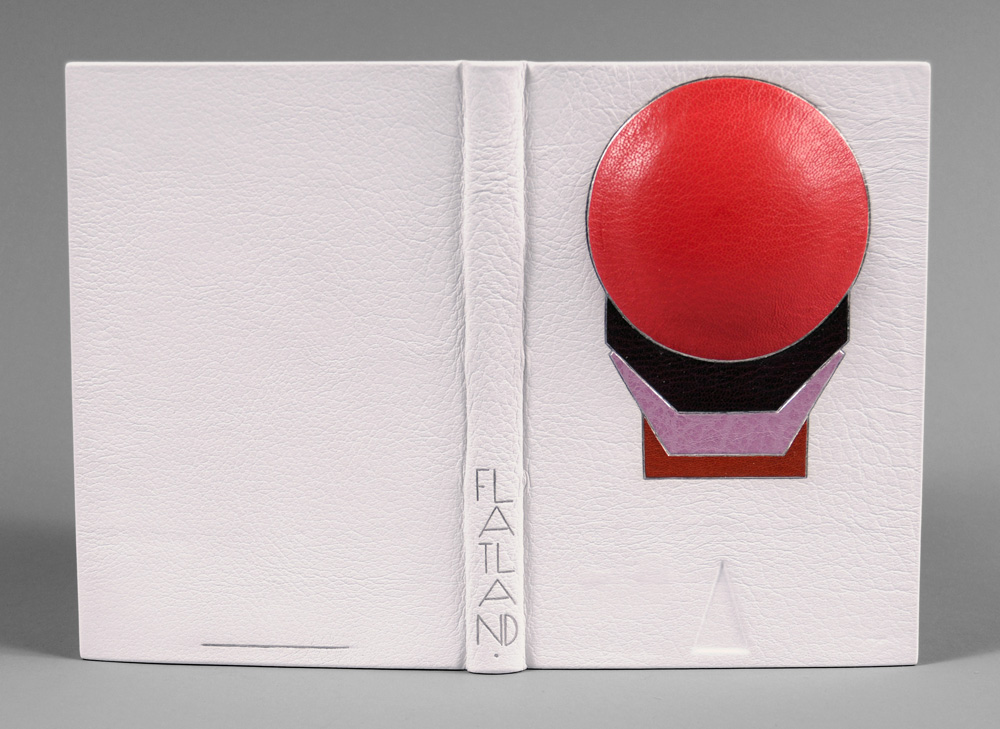
This fine binding of Flatland: A Romance of Many Dimensions by Edwin A. Abbott was completed for the Guild of Book Workers National Traveling show ‘Horizon‘. The show opened on June 8th at The Great Hall at the Margaret I. King Special Collections Library in the University of Kentucky and will soon be traveling to the Utah Museum of Fine Arts in Salt Lake City for the grand opening of the Standards Seminar on October 11, 2012.
I choose Flatland (not only because it’s one of my favorite science fictions novels), but I wanted to challenge myself by creating a 3-dimensional cover for the binding. Abbott’s novella is an observation on the social hierarchy of Victorian culture set in a fictional 2-dimensional world known as Flatland whose denizens are geometric figures which defines their place in the social ladder (women are depicted as lowly lines). Readers are guided through the text by a Square who dreams of other dimensions and challenges the authority of the high class Circle. As you move around the book, a sphere begins to emerge from the cover, illustrating the Square’s discovery of the third dimension.
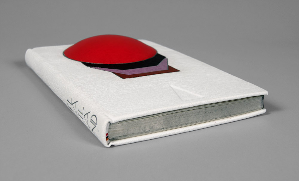
The book has been bound in white buffalo skin, while the shapes are tooled onlays of both goat and buffalo with palladium outlines. A plastic lens was mounted to bass wood to give the right dimension for the sphere and adhered to the front board before covering. The order of the shapes was taken from the hierarchy listed in the book, while the layout was greatly inspired by Art Deco bindings of the early 1900s. The edges of the text block are gilt with Palladium leaf over a base of graphite; headbands have been sewn to mimic the color pattern created by the shapes.
The title was tooled with palladium using a series of line palettes and gouges to create a custom font.
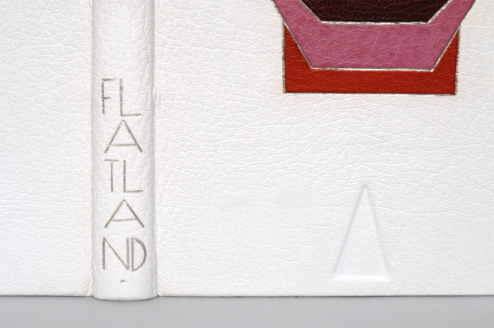
At the beginning and end of the text block a pop-up of a cube is revealed representing another opportunity to transform a 2-dimensional object into a 3-dimensional one. The book is housed in an elaborate enclosure, in order to protect the raised area of the cover a spacer was constructed with a circle cutout. The spacer is lined with leather and white suede on the side facing the book and paper on the other. A chemise lined with white suede encompassed the spacer and book. All three components rest inside a leather spine clamshell box. The title and an image of the Flatlander’s home are tooled on the spine of the box.

August 5, 2012 by Erin Fletcher
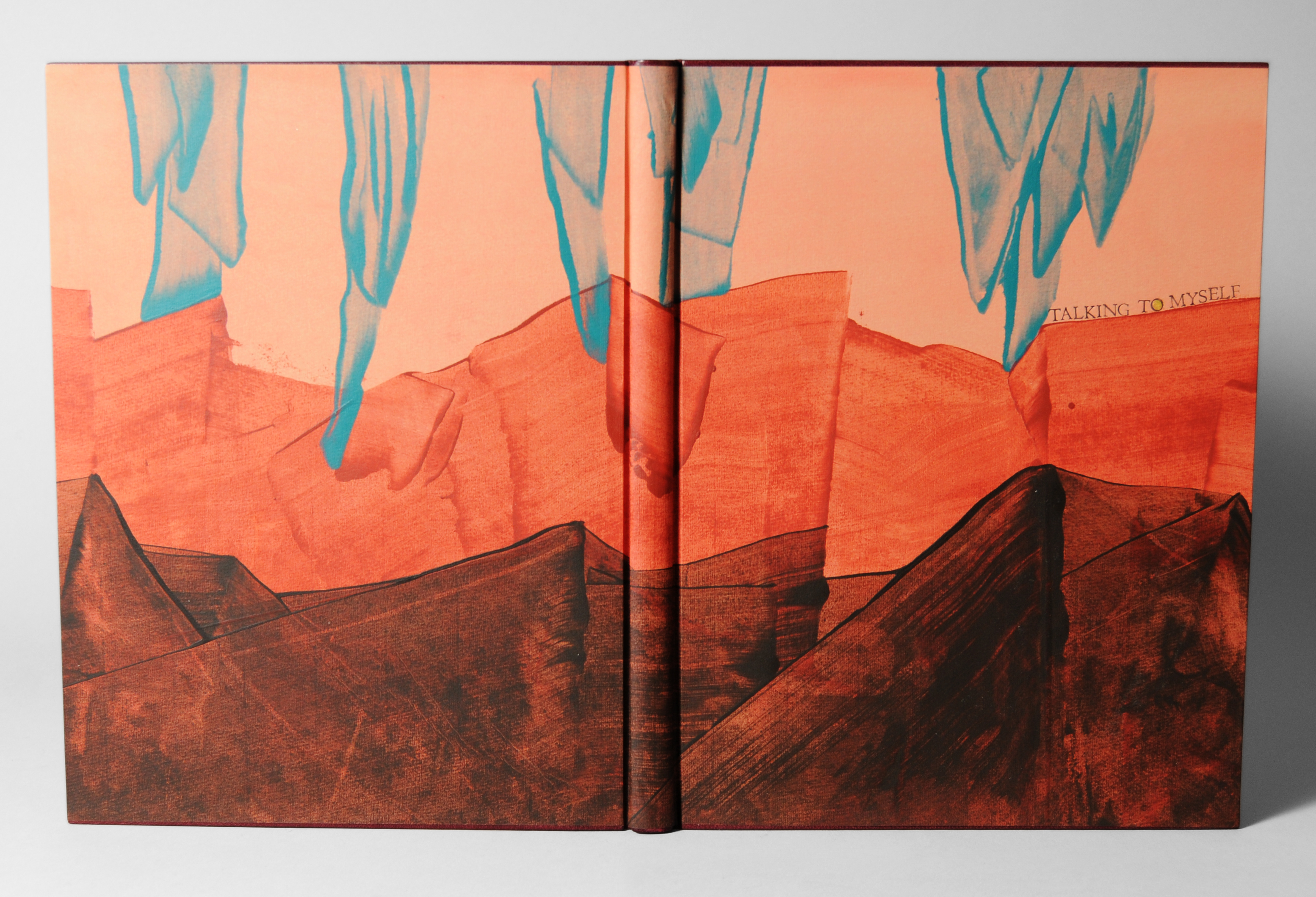
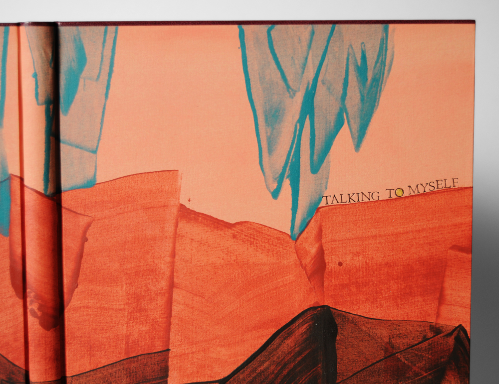
The millimeter binding (specifically Rubow) is my most favorite structure due to its simple elegance and traditional use of handmade paste paper. ‘Talking to Myself’ was bound with blank pages to be used as a journal. On this binding the head edge and tail edge are lined with maroon goatskin with leather wrapped headbands in the same leather. This paste paper was especially fun to design. By taking inspiration from Sarah Creighton, I aimed to create an alien landscape with rich oranges and browns.
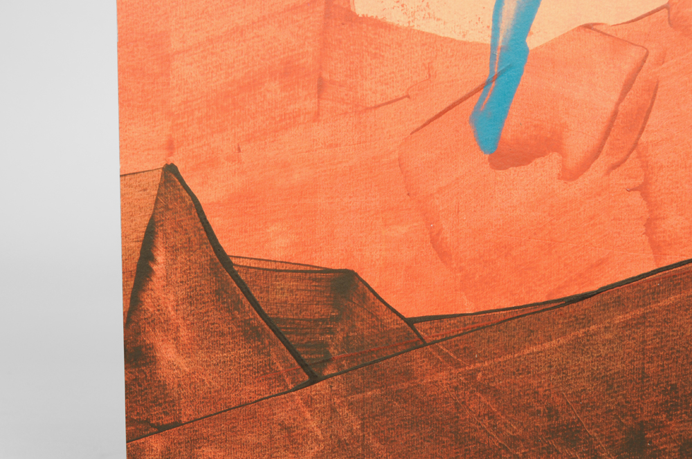
The initial peachy layer of acrylic paint mixed with wheat starch paste and water was applied to the Hahnemuhle Ingres paper with a sponge brush. Once that dried completely the three other colors (of the same mixture) were applied separately with a piece of binder’s board in order to create the peaks and icicle-like forms. The title was smoke-tooled with handle letters. Smoke-tooling is a technique were the face of the tool is greased up with petroleum jelly and then stuck in a flame to collect carbon; the tool is then pressed into the cover leaving a trace of carbon behind. This give a rich, deep black impression of the tool.
July 23, 2012 by Erin Fletcher
Fantasy & Nonsense is a compilation of poems from 19th century American poet James Whitcomb Riley elegantly letterpress printed on handmade paper with wood engravings by Robert Buchert. Riley was known for writing about rural Midwestern life to an audience of young readers. However, this unique collection portrays a devilishly playful side of Riley’s poetry through whimsical tales of things both eerie and peculiar. Buchert’s illustrations harmonize beautifully to the mischievous tune of Riley’s words.
This binding was completed for an exhibition put on by the Rocky Mountain Chapter of the Guild of Book Workers. Each submission will be judged for its level of craft and creativity. Results are still pending.
My inspiration for this binding came from two lines in the first poem “A Nonsense Rhyme” (sea of pale pink lemonade and cringing grass). The style of binding is referred to as Millimeter (specifically Rubow) where a millimeter of leather is exposed on the head and tail edge of the book. I wanted to keep true to the whimsical feel of the poetry, so I used two separate leather colors, blue-gray for the head and mauve for the tail.

The paste paper cover was created with a mixture of acrylic paint, distilled vinegar and sugar with accents of cucumber paper from Hiromi.

Check out more photos after the jump.
July 17, 2012 by Erin Fletcher

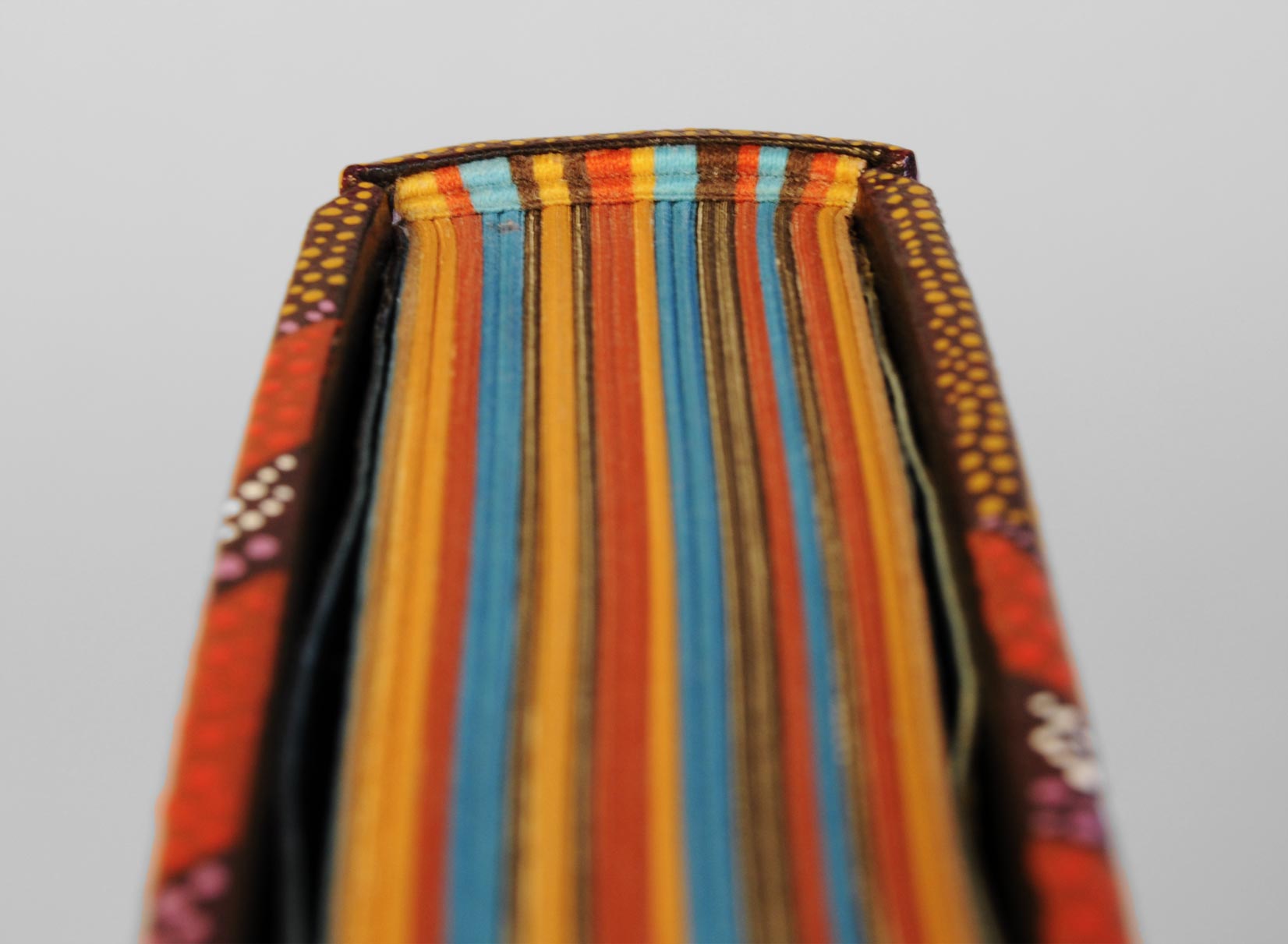
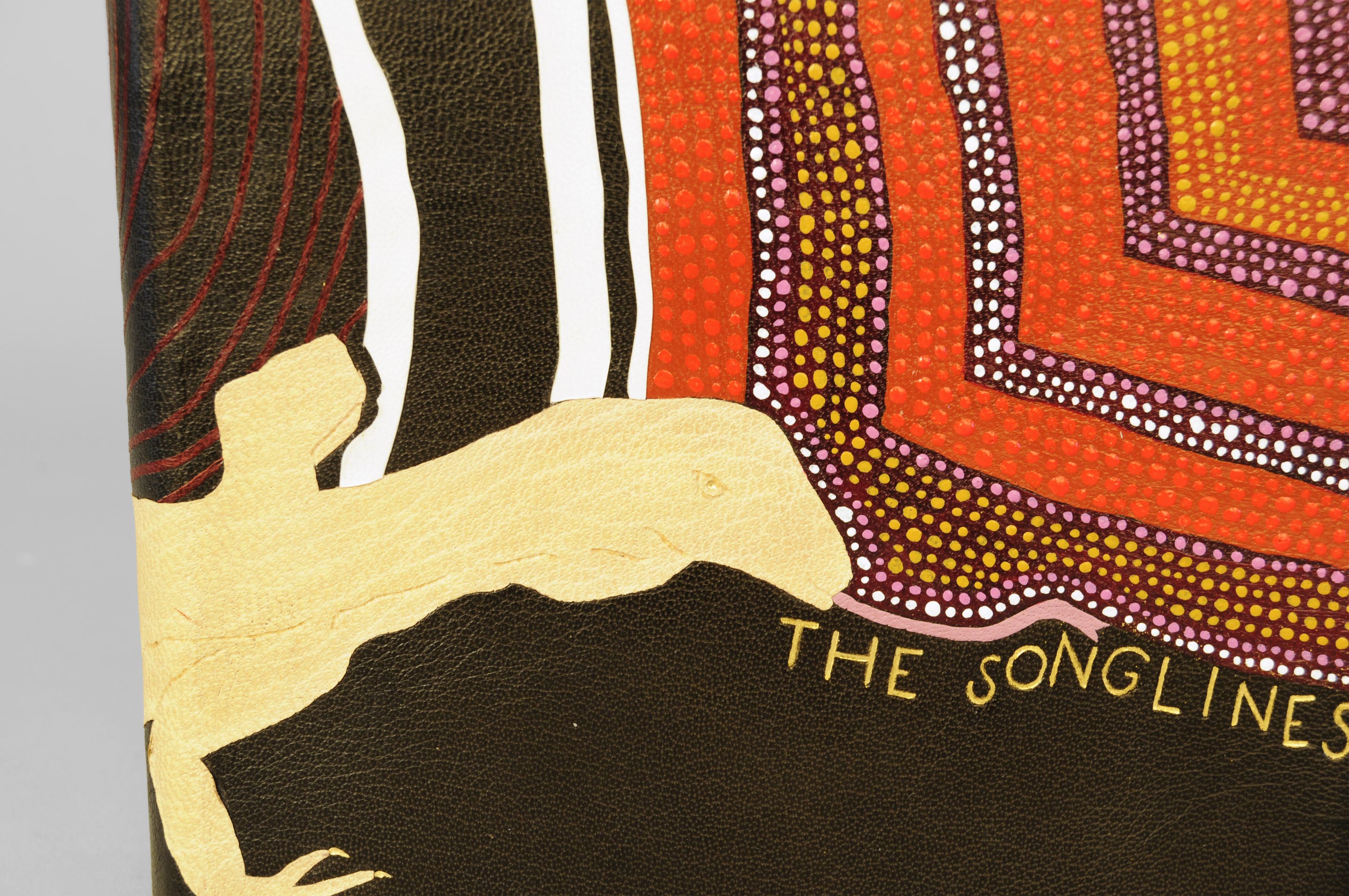
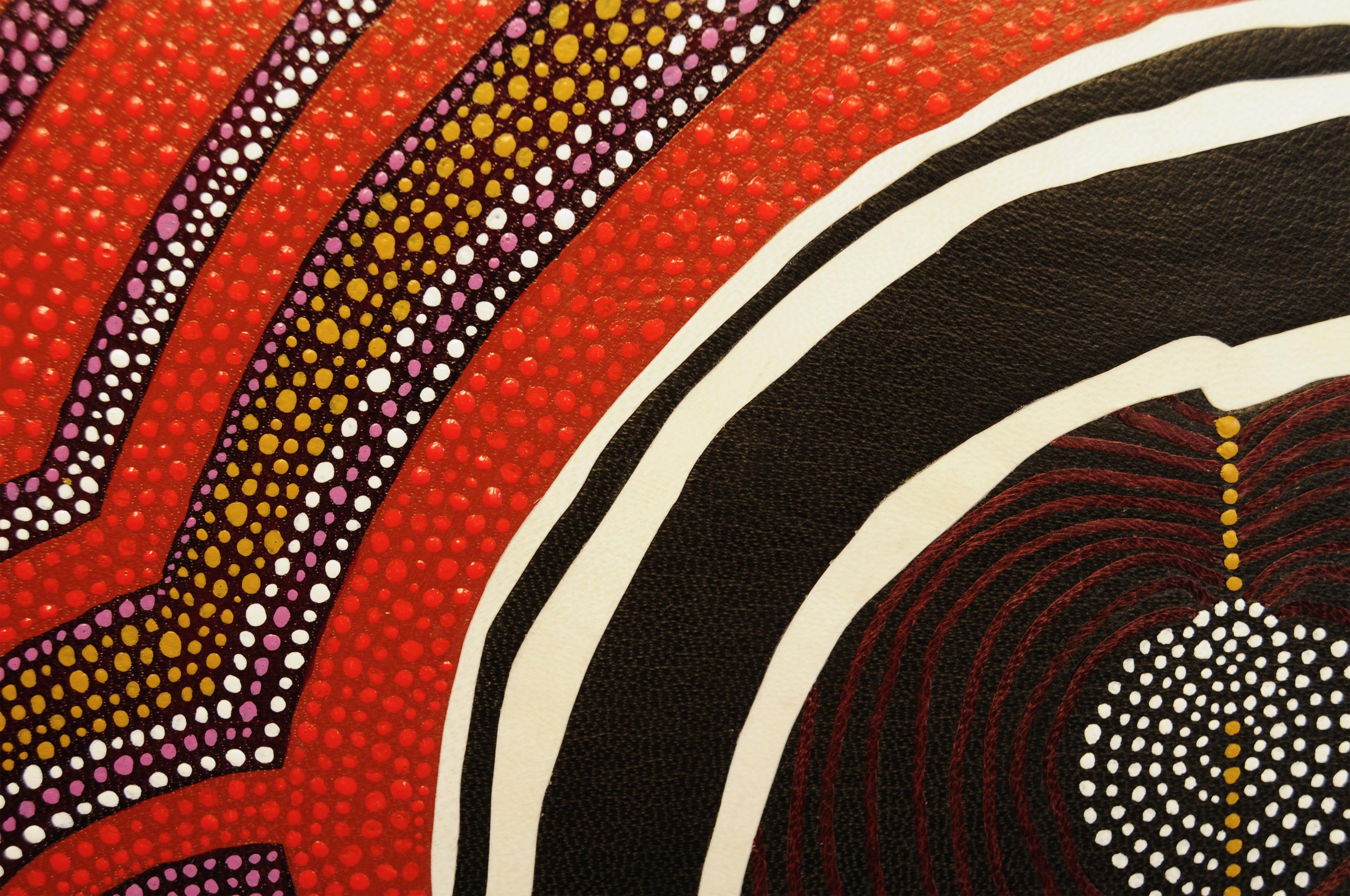
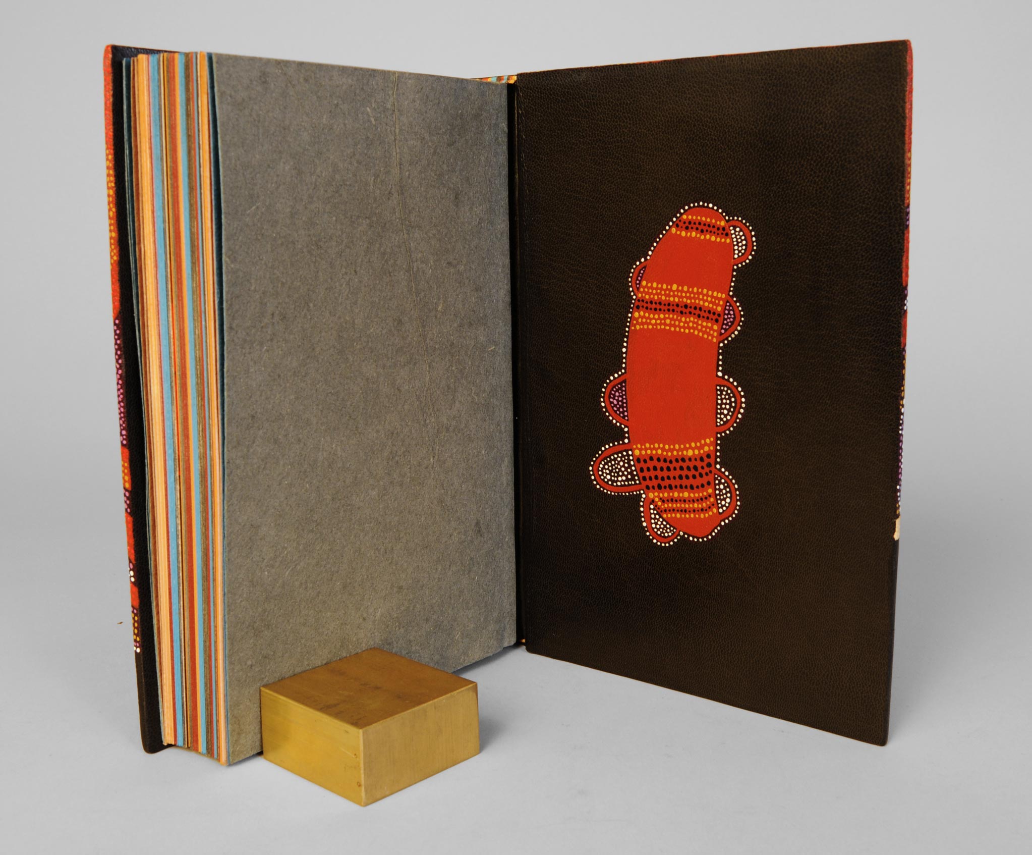
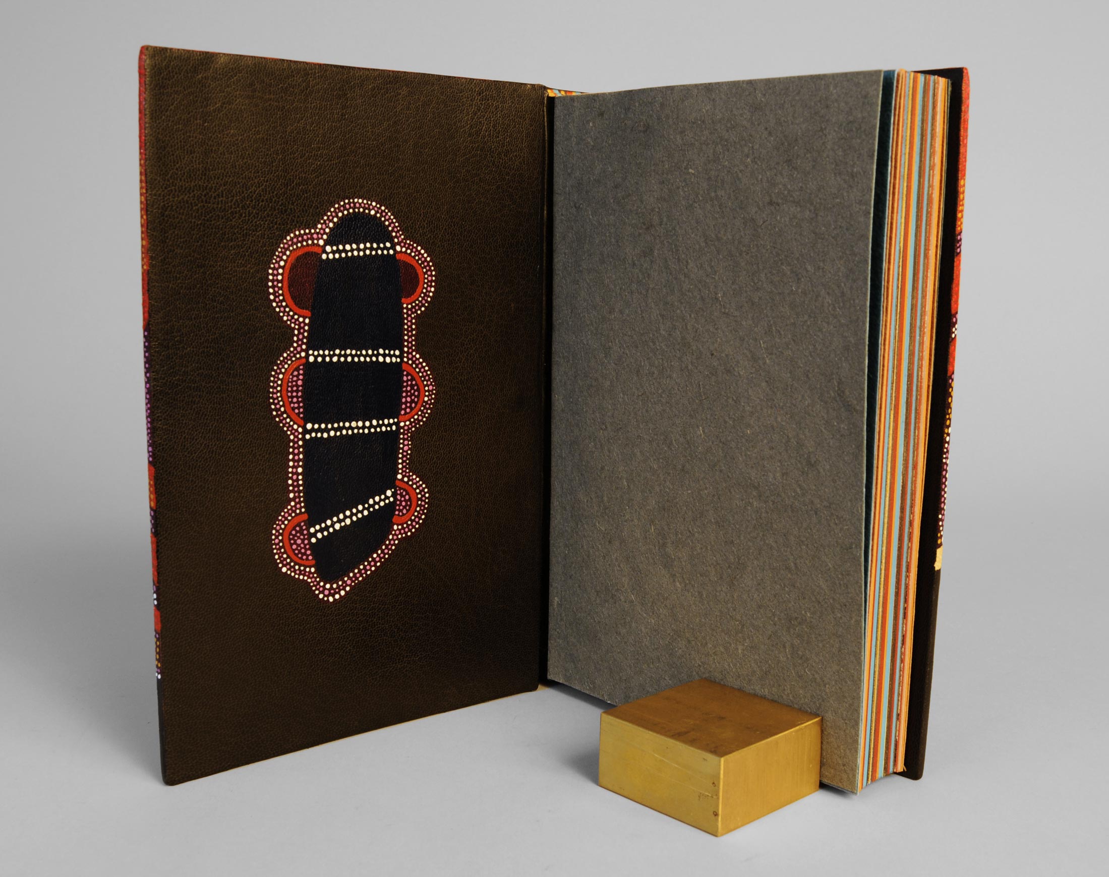
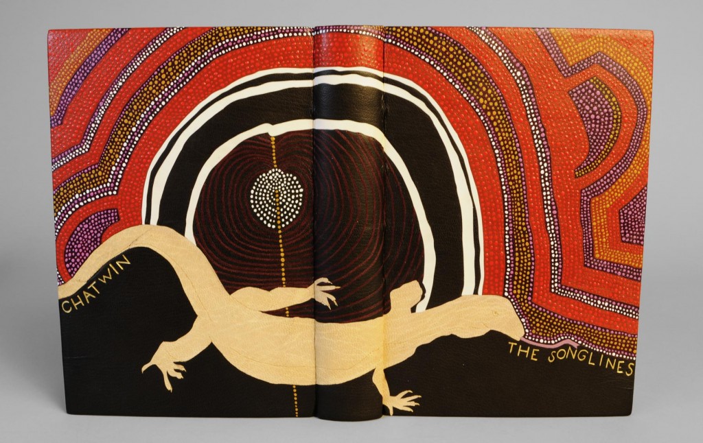
In the second and final year at North Bennet Street School all students are given the same book in sheets (known as a set book) to complete as a fine binding. Given complete freedom over the materials and design, the inspiration should be derived from the set book. This year we bound copies of The Songlines by Bruce Chatwin.
My main inspiration came from an Aboriginal painting depicting imagery referred to as Dreaming. At the moment a mother is conscience of conception, the unborn child receives the spirit of a totemic ancestor connected with the location when awareness occurred. In a general sense, the Dreaming relates to a period before the memory of living creatures, during the time of the creator ancestors and supernatural beings. The paintings themselves are visual representations of the artist’s individual spiritual beliefs.