RSS Feed

‘my hand’ Category

  1. My Hand // Field Book of Western Wild Flowers: Part Two

    October 15, 2013 by Erin Fletcher

    wildflowers4-erinfletcher

    If you missed part one, you can find it here.

    After hours of embroidery work, I was finally ready to cover the binding. The book itself had been removed from its original case binding, taken apart signature by signature and resewn. Once rounded and backed with boards attached, the edges were ploughed and sanded down in preparation for edge decoration. At this point, I had been filling in for Jeff Altepeter at North Bennet Street School and conveniently the students already had everything set up for edge decoration and gilding. I spent the day perfecting the edge, experimenting with the application of gouache through various brushes and sponges. Finishing off the edge with the sprinkling of gold leaf. 

    The hand sewn double-core French headbands came next. I love sewing my headbands in an asymmetrical pattern and by extracting colors from the binding. Sadly, I didn’t take any in-progress photos of these two steps, but you can see hints of the edge and headband in some of the images to follow. 

    Now, back to covering. 

    wildflowers5-erinfletcher

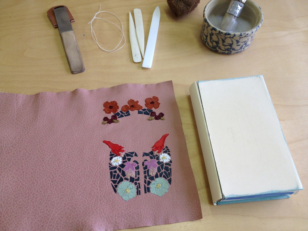
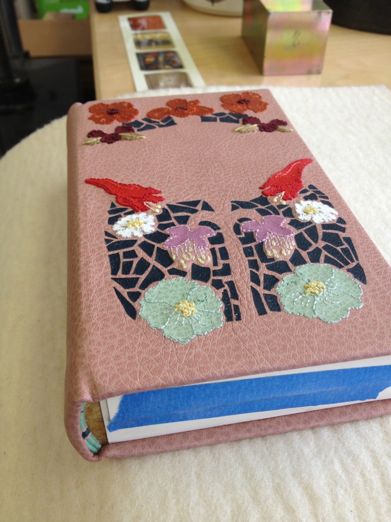
    After applying a healthy dose of wheat starch paste, the embroidered leather was wrapped around the binding, being folded and tucked and squished into place. The leather had expanded after paring more than expected, so covering became difficult to keep the shape of the design within the confines of the board. 

    wildflowers6-erinfletcher

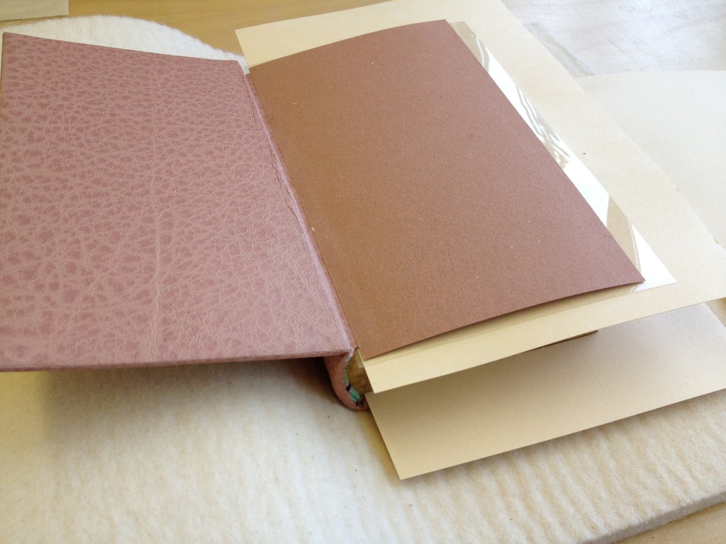
    The covered binding was put to rest under control weight between a bed of felt and acrylic boards. The next day I eased open the boards. Once the finishing design elements were added to the front cover I was able to line the inside of the boards and joint with matching edge to edge leather doublures. The handmade paper fly leaves are a perfect color match and came to me by happenstance from papermaker Katie MacGregor at Standards last year. 

    wildflowers8-erinfletcher

    Part three coming next week…

  2. Client Work: Leather Panel Redesign

    October 15, 2013 by Erin Fletcher

    panelredesign-erinfletcher

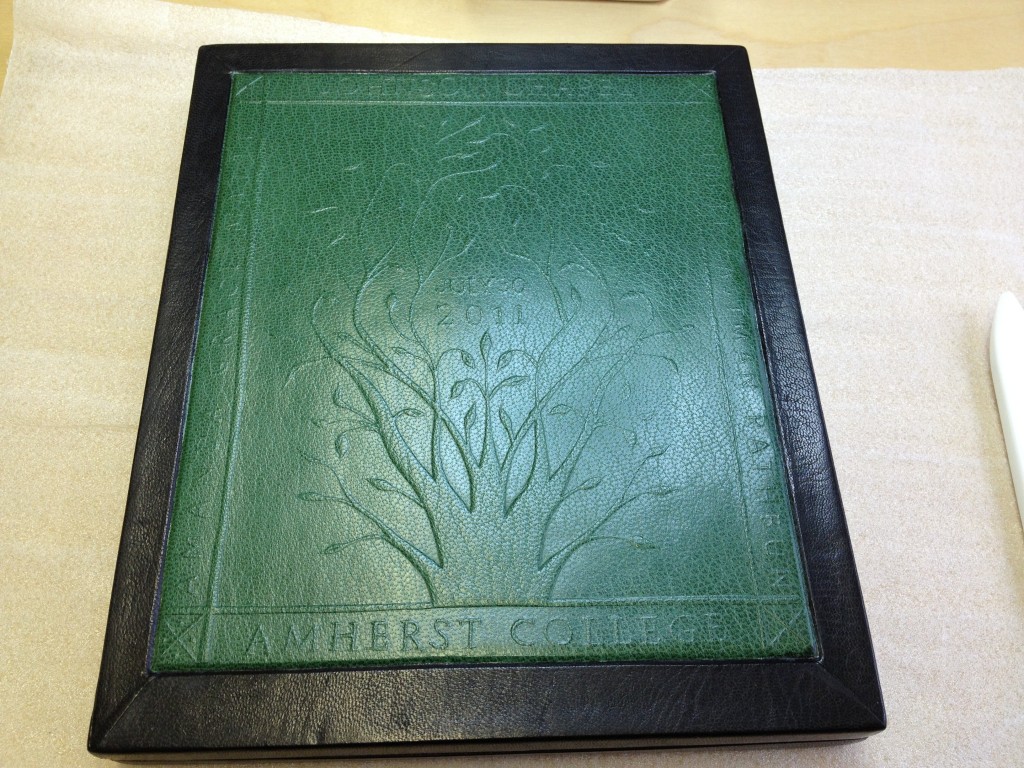
    This beautiful leather box was crafted by a student at North Bennet Street School. The green leather panel was stamped with a hand carved wooden block to create the delicate design. Unfortunately, the color and subtleness of the design conflicted with the client’s vision. Placed inside the box is a daguerreotype-style plaque of Johnson Chapel located at Amherst College, where the couple noted on the cover got married. The client approached me to have the panel redesigned using the color of Amherst: purple. 

    panelredesign2-erinfletcher

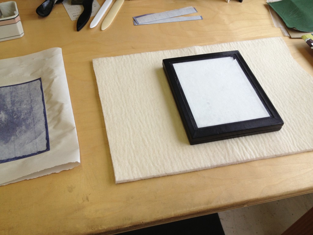
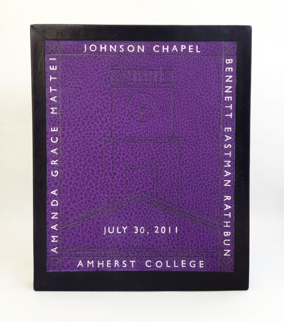
    The green leather panel was carefully removed and a new piece of purple leather was cut down and pared to the right size. For the new design, I kept the original border layout and text placement, which indicates the location of the wedding, the couple’s names and the date of the ceremony. The center motif is inspired by the Johnson Chapel building. Using simple architectural lines, the tower of the chapel was recreated through carbon tooling. The clock at the top of the tower indicates the time at which the wedding ceremony began. 

    All of the text on the new purple panel has been hand tooled using Gill Sans handle letters and palladium leaf. Palladium was chosen to mimic the look of the plaque inside.

    panelredesign3-erinfletcher

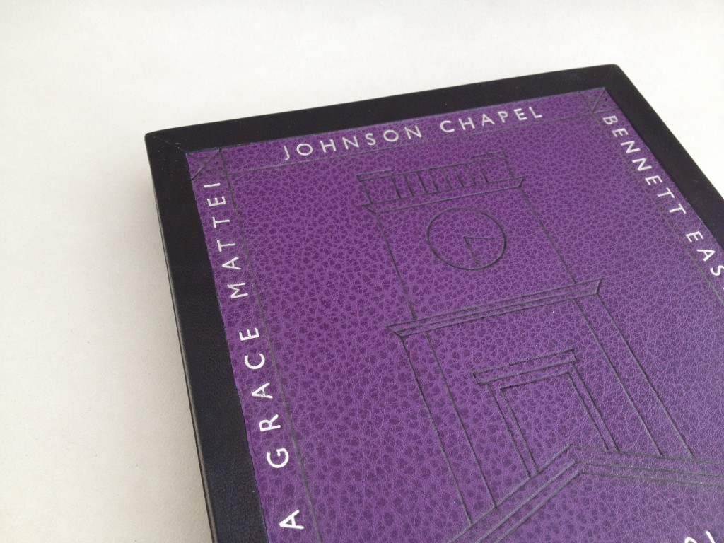
    The design on the box was rather tricky to capture within the limitations of my photo-documentation set-up. But the image below highlights the design through raking light, bringing out the grain of the leather against the blackness of the tooled lines. The client was very happy with the newly completed box and couldn’t wait to present the couple with their overdue wedding present. 

    panelredesign4-erinfletcher


  3. My Hand // Field Book of Western Wild Flowers: Part One

    October 8, 2013 by Erin Fletcher

    During my first year at North Bennet Street School, I stumbled upon this underrepresented category of bookbindings referred to quite accurately as embroidered bindings. Embroidery has been an interest and hobby of mine since I was a child. My research into this style of binding led me as far as Cyril Davenport’s Book of English Embroidered Bookbindings, which is one of a handful of books written solely on embroidered bindings. 

    From my research, I set out to create an embroidered binding using similar materials and techniques. I bound The Crucible in 2011. The overall layout and imagery on the covers are inspired by traditional outlines and iconography seen in historical embroidered bindings. The Crucible was a success (landing me Best Binding from the OBMI Chicago Public Library Exhibition) and ever since embroidery has been a technique that I’ve been wanting to translate onto a fine binding.

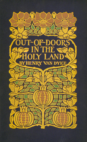
    Entering for the first time to the most recent Society of Bookbinders International Competition, I decided to bind a copy of Margaret Armstrong’s Field Book of Western Wildflowers. Margaret Armstrong is notable for designing covers for Publishers’ Bindings during the 1920s. As an illustrator, she also enjoyed drawing life-like representations of wild flowers. Margaret published Field Book in 1915, surveying wild flowers throughout the western hemisphere of the United States. The book includes 500 black and white illustrations and 48 colored plates. For the design of my fine binding I wanted to capture Margaret’s fame as a designer and skill as an illustrator. The cover on my fine binding is inspired by Margaret’s design for Henry Van Dyke’s Out of Doors in the Holy Land.

    07.04

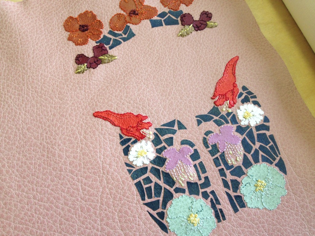
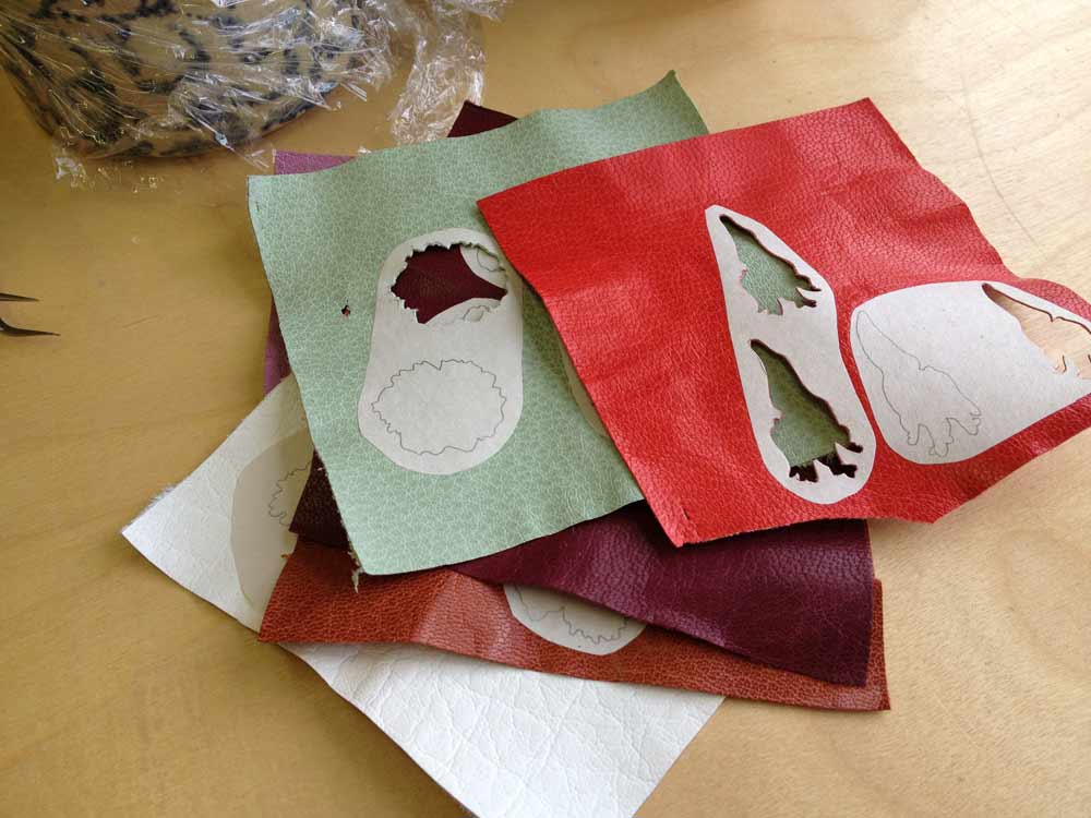
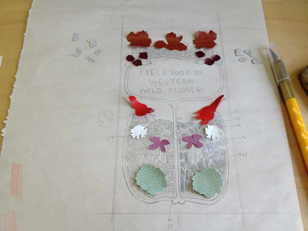
    Beginning with a detailed sketch of the cover design, I labeled each onlay with a number and color. Each flower is taken directly from one of Margaret’s illustrations. The onlay leather ranged from goatskin to buffalo, the colors chosen to best represent the natural color of that specific species of flower. The leather was pared down to almost nothing, the illustrations were then pasted down to the leather and carefully cut out.

    wildflowers-erinfletcher

    I carefully arranged each piece of leather onto the sketch as a means to keep order to the mounting onlays, which came out to a total of 93 itty bitty pieces.

    wildflowers1-erinfletcher

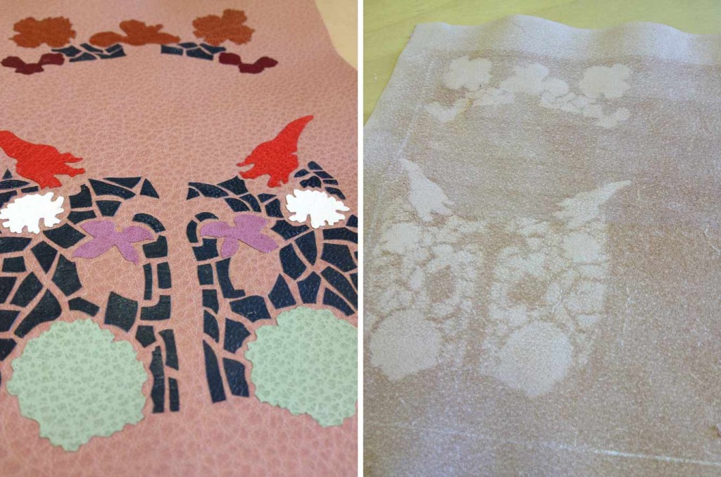
    I cut down the base leather to it’s final size, I chose a dusty pink buffalo skin both for it’s soft, muted color and texture. I glued down each onlay one by one with PVA, pressing it between acrylic boards as I went. Once the onlays were in place and secured, I pared the entire skin to it’s final thickness. While paring the blade is removing more flesh from the areas with onlays creating a ghost-like silhouette, thus the technique of a back-pared onlay. This allows for a smoother transition between the base leather and the onlay leather.

    wildflowers2-erinfletcher

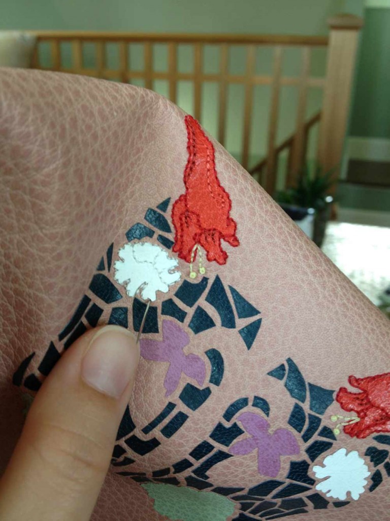
    At this point, the leather was ready to be embroidered and this became my favorite part. Each flower onlay was outlined with a floss that best matched the color of the leather. Additional colors were chosen to add highlights and shadows. Stitching through leather was surprisingly easy. However, a misguided needle could leave a lasting hole, so it was very important to accurately pierce through the leather. 

    wildflowers3-erinfletcher

     Part Two coming soon… 

  4. Free Shipping at Herringbone Bindery on Etsy!

    September 6, 2013 by Erin Fletcher

    readabook-sept6blog

    In the market for a new journal or sketchbook? Need a gift for the writer or artist in your life. Celebrate the Book this weekend at my Herringbone Bindery Etsy shop and receive free shipping on all orders of $10 or more. Just enter code: READABOOK10 at checkout. Have a wonderful and book-worthy weekend.


  5. Client Work // Single Section Half Leather Binding

    August 6, 2013 by Erin Fletcher

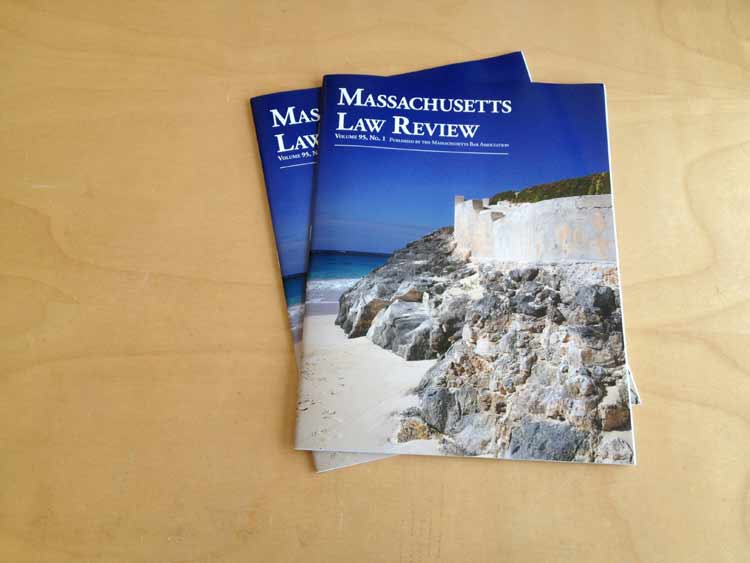
    STORY ABOUT THE TEXT: An article titled The Roxbury Defenders Committee: Reflections on the Early Years by the Chief Justice Roderick L. Ireland was recently published in Volume 95, No. 1 of the Massachusetts Law Review. The article speaks about the establishment of the Roxbury Defenders, a committee founded in 1971 to provide legal referrals to those who suffered financially in Roxbury, Massachusetts. The committee was founded by Ireland and his colleague and friend, Professor Wallace W. Sherwood. 

    ABOUT THE BINDING: For my client, I bound two copies of the Massachusetts Law Review journal, one for the Chief Justice and one for Professor Sherwood. The journals came to me straight from the press and bound together with staples. The staples were removed and bound as a single section bradel binding. This structure has been described in a previous Client Work post you can check out here and here.

    masslawreview1-erinfletcher

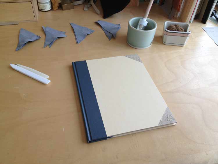
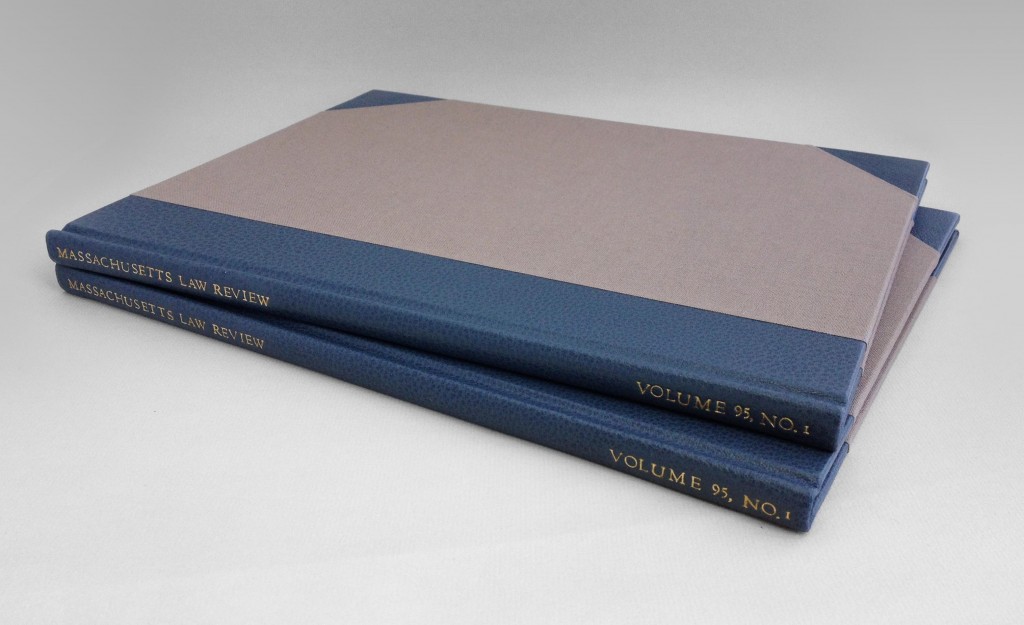
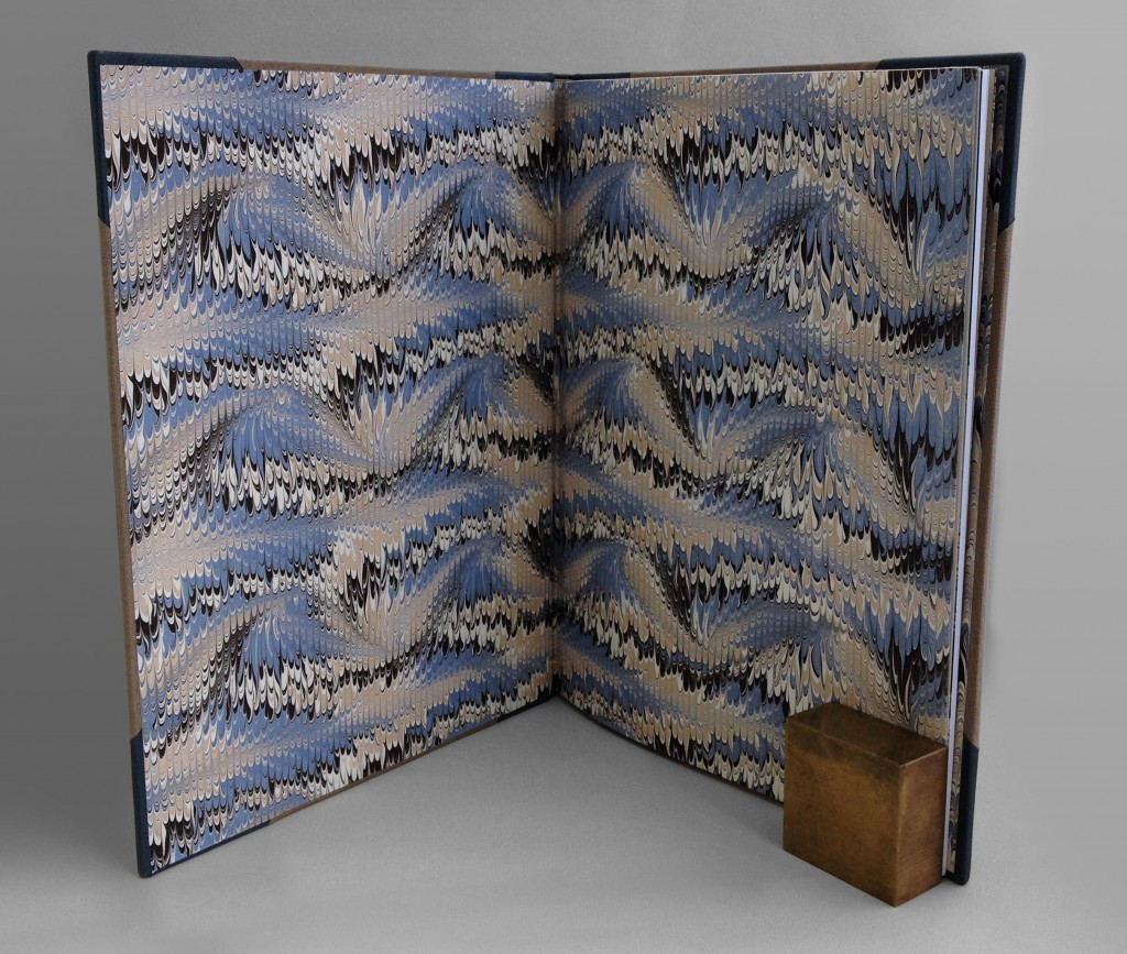
    Since the journal is printed in black ink only, I chose materials that reflected the gorgeous and vibrant image on the cover. The journals are bound a half leather binding, where the same covering material for the spine is used to cover the corners. I chose to bind the journals in a blue-gray buffalo skin against a taupe Iris bookcloth. For the endpapers I chose a beautiful handmade Cockerell marbled paper from Cambridge, England, in addition to a folio of marbled grey Bugra and off-white Hahnmühle Ingres.

    masslawreview2-erinfletcher

    Setting up my bench in preparation for covering the corners with blue-gray buffalo skin.

    To finish off the bindings, the title and volume of the journal were hand tooled along the spine with Centaur handle letters. The title was gilt with gold leaf.  

    masslawreviewspine-erinfletcher masslawreviewopen-erinfletcher


  6. Client Work: Single Section Full Leather Binding // Part Two

    August 1, 2013 by Erin Fletcher

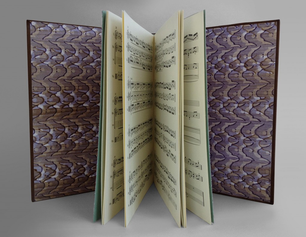
    musicalscoresbinding8-erinfletcher

    If you missed Part One of this post, you can check it out here.

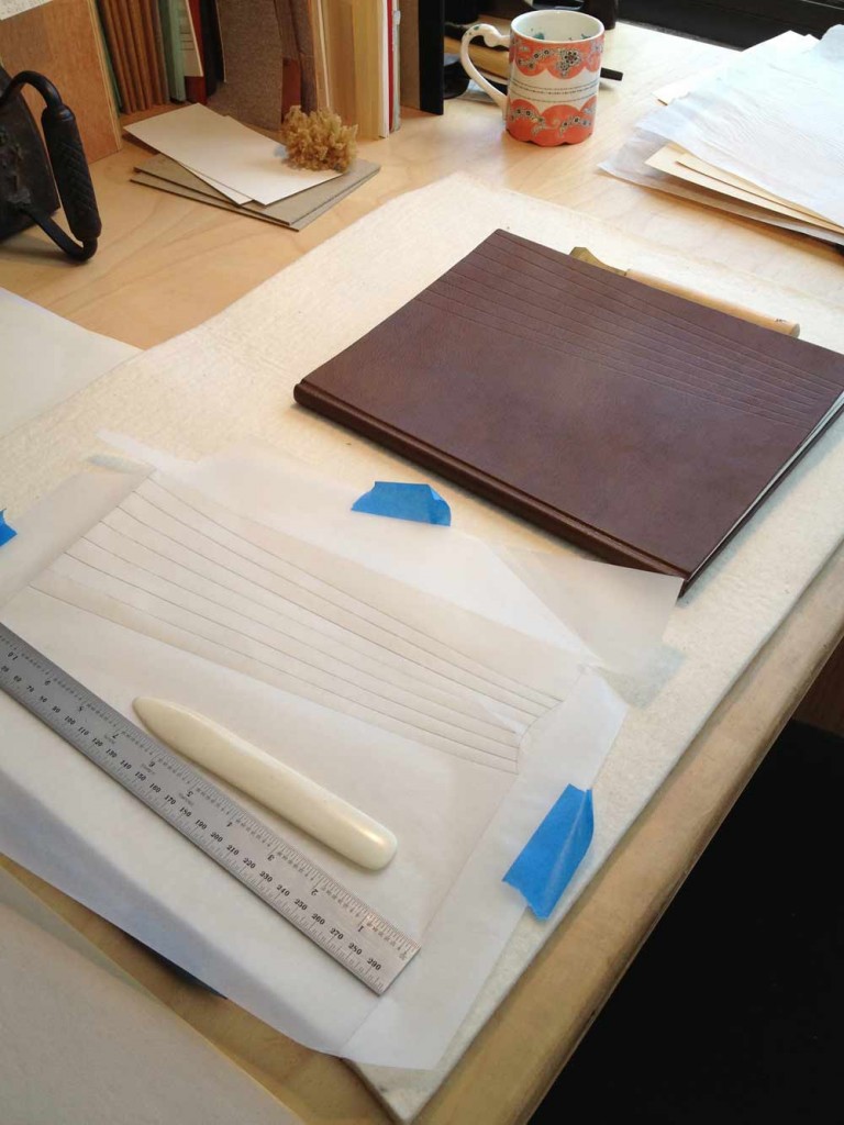
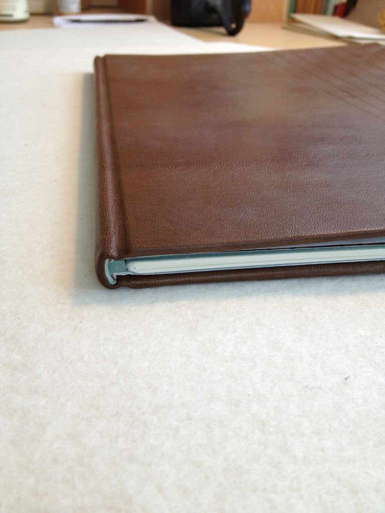
    After cautiously and carefully paring a rather large piece of goatskin, I was ready to cover. Being that it’s summertime and rather warm in our bindery, I was faced with the challenge of a thirsty piece of leather and quick-drying paste. After wrestling with the leather, particularly the headcaps and corners, the book was successfully covered and put to rest overnight. 

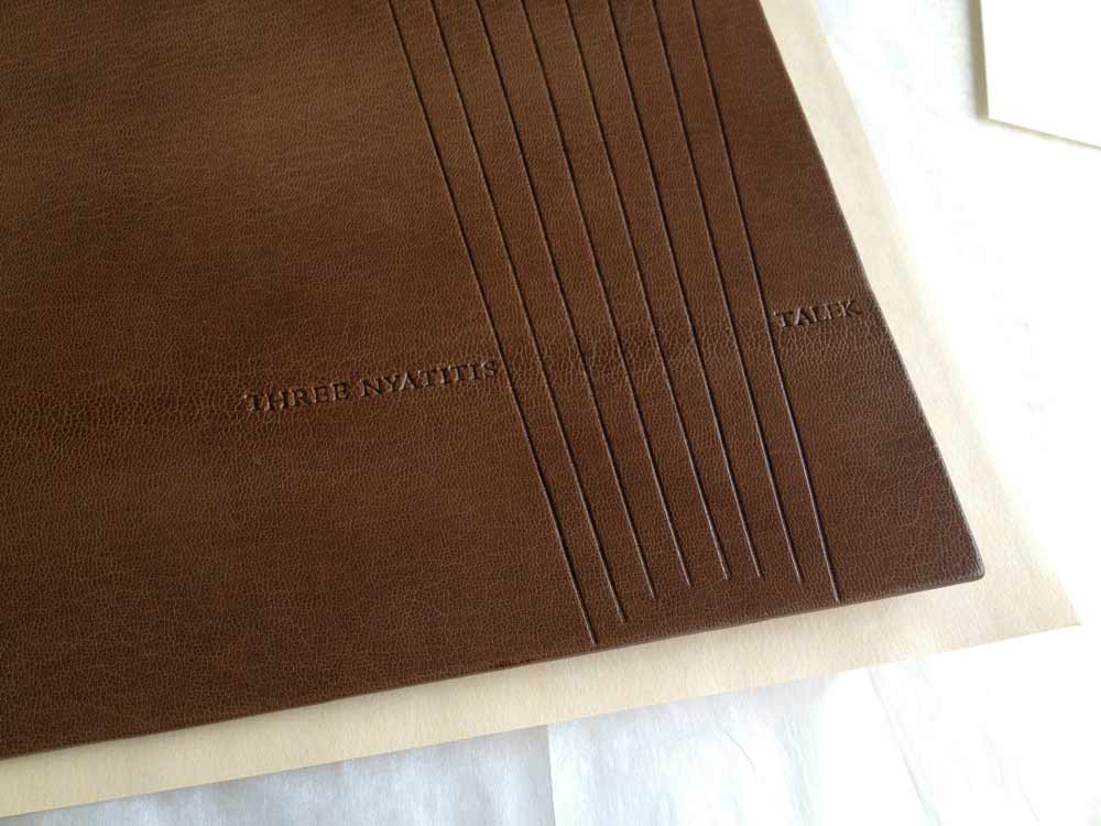
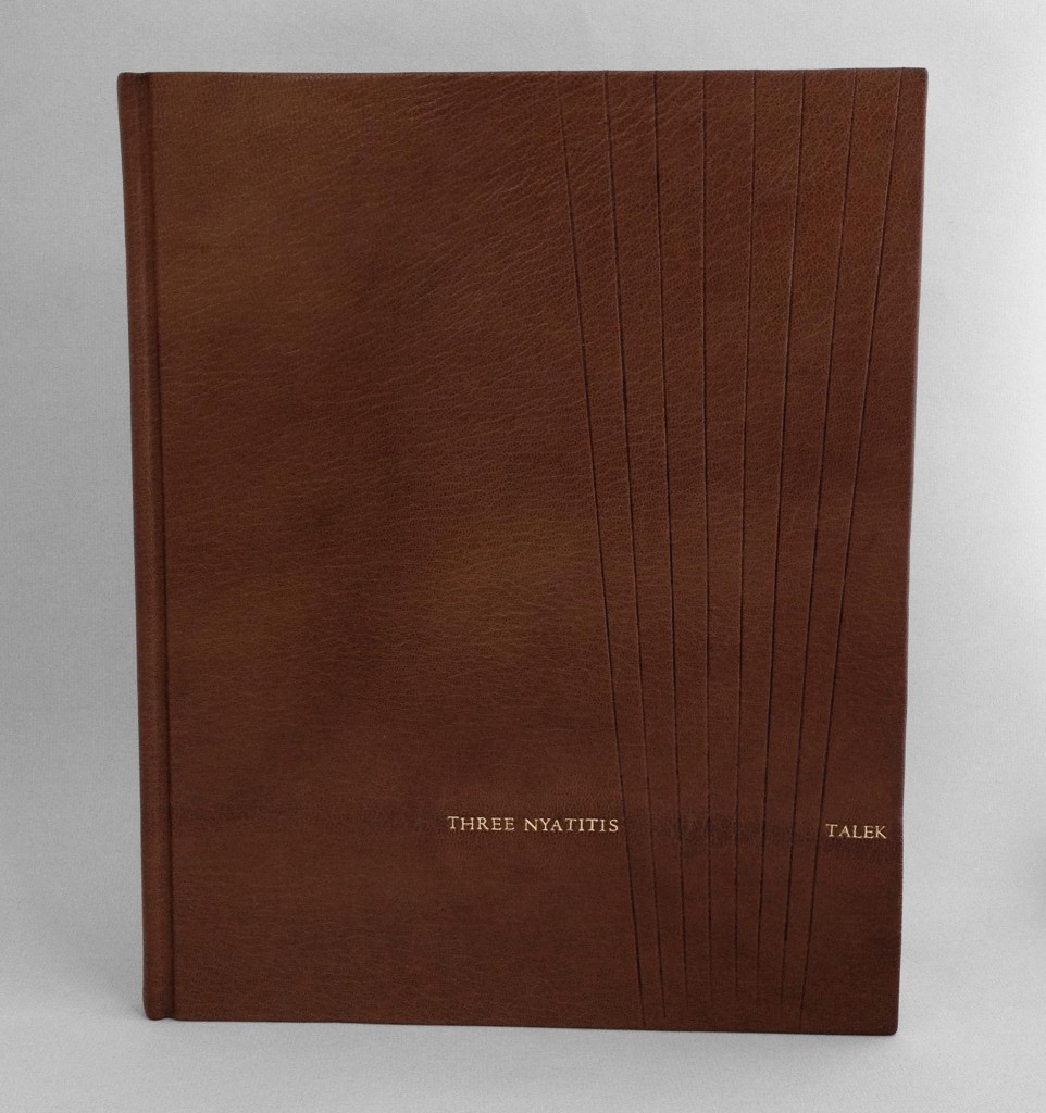
    The design on the cover is quite simplistic, an inspiration from the first musical score titled Three Nyatitis. A nyatiti is a five to eight-stringed plucked lyre from Kenya. The eight lines are spaced wider at the head of the cover then at the tail, where they end to form a partial circular shape. This negative space represents the sound hole of the instrument. The lines have been blind tooled into the leather.  

    musicalscoresbinding9-erinfletcher musicalscoresbinding7-erinfletcher

    The title for each composition has been gold tooled along the visible spine of the leather on either side of the blind-tooled lines. Each title has been hand-tooled with 16 point Centaur handle letters.

    sheetmusic-erinfletcher sheetmusictext-erinfletcher

    An interior shot showcasing the beautifully handmade paste papers from Deena Schnitman.


  7. Client Work: Single Section Full Leather Binding // Part One

    July 30, 2013 by Erin Fletcher

    STORY OF THE TEXT: For his 50th birthday, my client, commissioned two pieces of music to be played during his celebration in Kenya. Each piece is inspired by two distinct features of Kenya, the Talek river and the nyatitis, an eight-stringed lyre instrument. As a commemoration of this event, he approached me to bind the sheet music into a full leather binding.

    ABOUT THE BINDING: The sheet music came to me as 17 individual loose sheets. At the same time, the most recent The New Bookbinder (Volume 32) from the Designer Bookbinders appeared at our bindery. The journal contains an excellent and detailed article by Ingela Dierick titled Single Section Bradel Binding.

    Using this article as a guide, I decided to guard the scores as a single signature. A single sheet of light green/gray Hahnemühle ingres was used to divide the two compositions. A single folio of the same ingres and a folio of pool blue handmade paper from Katie MacGregor was wrapped around the single signature to act as endpapers. 

    musicalscorebinding1-erinfletcher

    Once the signature was ready, I prepared a stub out of the same pool blue handmade paper to the thickness of the signature. The signature was pamphlet sewn to the stub, the layers of the stub were glued together using PVA and then put under weight until the next day. After trimming the text block and stub to size, I was ready to attach my final endpaper. A single sheet of waste paper was tipped onto the stub at the height of my shoulder. The waste sheet is then folded back and the endpaper is tipped onto the same position. The waste paper is then wrapped back around the fold of the endpaper. This creates a zig-zag and leaves a pocket for the false shoulder. This final endpaper will also act as the paste down and is a handmade paste paper designed by Deena Schnitman

    musicalscorebinding3-erinfletcher

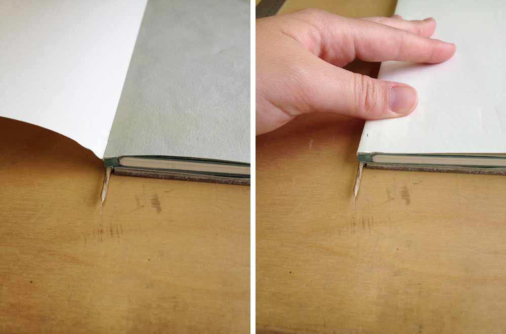
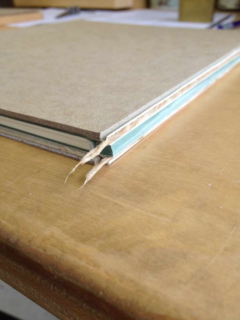
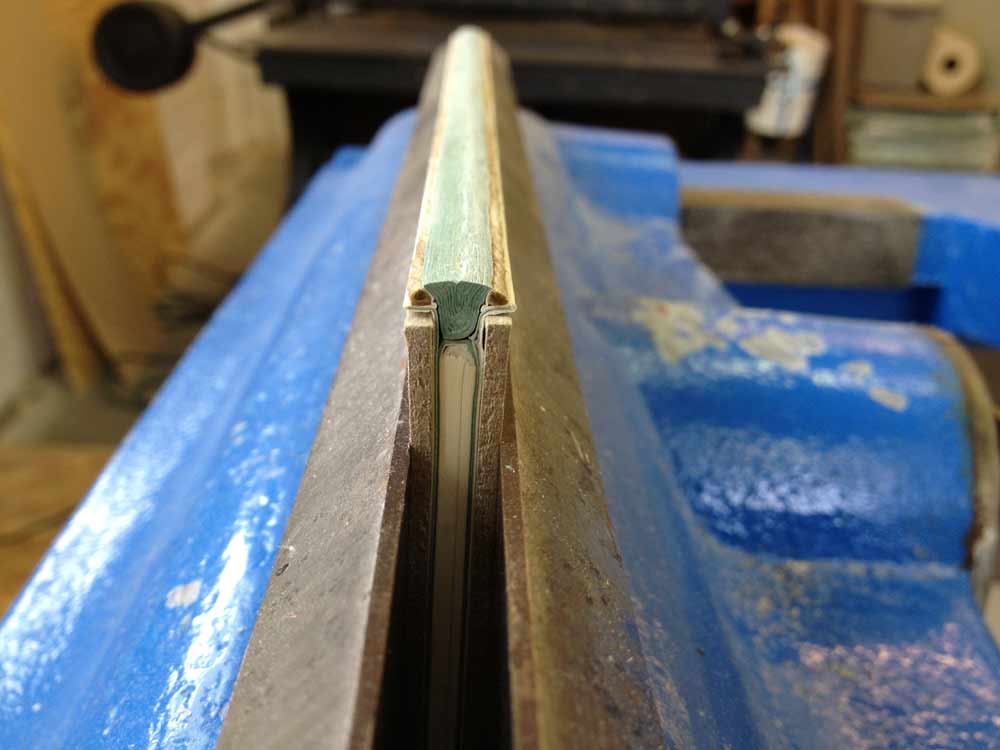
    A false shoulder made from cord of appropriate thickness is tipped into the pocket between the waste paper that is tipped to the stub and where it wraps around the endpaper. The book is then placed into a press or job backer and the stub is rounded to create the shape of the spine and the shoulder. This is done with a bone folder and some force. From here I added the leather wrapped headbands and six layers of spine linings, which extend beyond the head and tail. Once the spine is dry, it is then sanded down smooth.  

    musicalscorebinding4-erinfletcher

    At this point, I attached a bonnet to the spine. The bonnet included a spine stiffener and was then slit to allow for the leather turn-in at the headcaps. Boards were laminated from 1.5 mm millboard and 20 pt. and attached to the waste sheet. The waste sheet was then torn off and smoothed down. Lastly, the boards were sanded to have a subtle chamfered shape. 

    musicalscorebinding5-erinfletcher


  8. New Items in the Herringbone Bindery Etsy Shop

    June 11, 2013 by Erin Fletcher

    newetsyitems

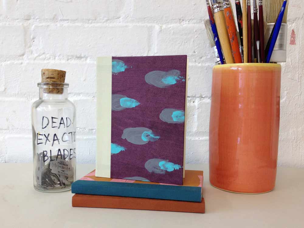
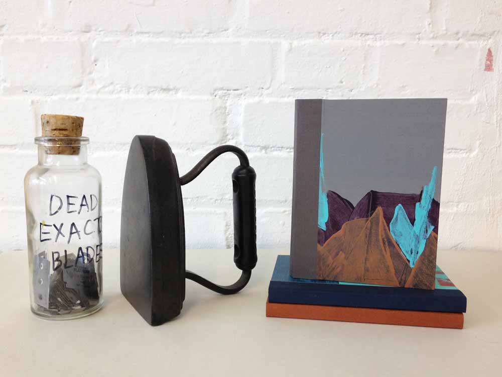
    During a recent workshop, I revisited the Gary Frost sewn-board binding structure. Remembering how much I enjoy that structure I decided to bind a few for my Etsy shop using the same series of paste papers as the previous collection of books. Each sewn-board journal is filled with 48 blank Mohawk pages and accented with book cloth on the spine and board edges near the spine. 

    Check out Herringbone Bindery at Etsy

    sewnboardpurplecheetahHand Bound Sewn-board Blank Notebook // Grey Cheetah – $25.00

    sewnboardmountainHandmade Sewn-board Blank Notebook // Mountain – $25.00


  9. Client Work: Large-scale Coptic with Collaged Paper Covers

    May 14, 2013 by Erin Fletcher

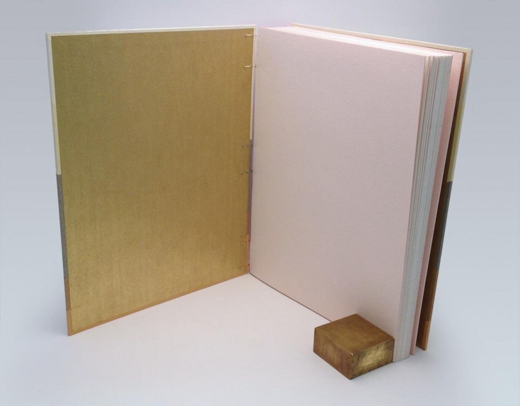
    copticopen-erinfletcher

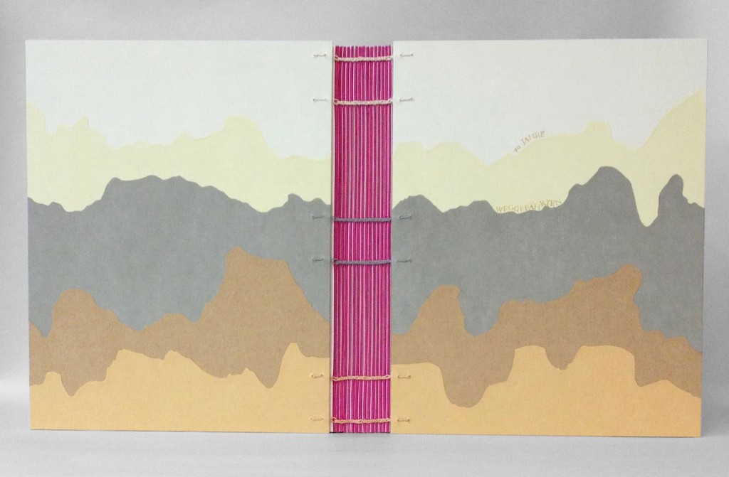
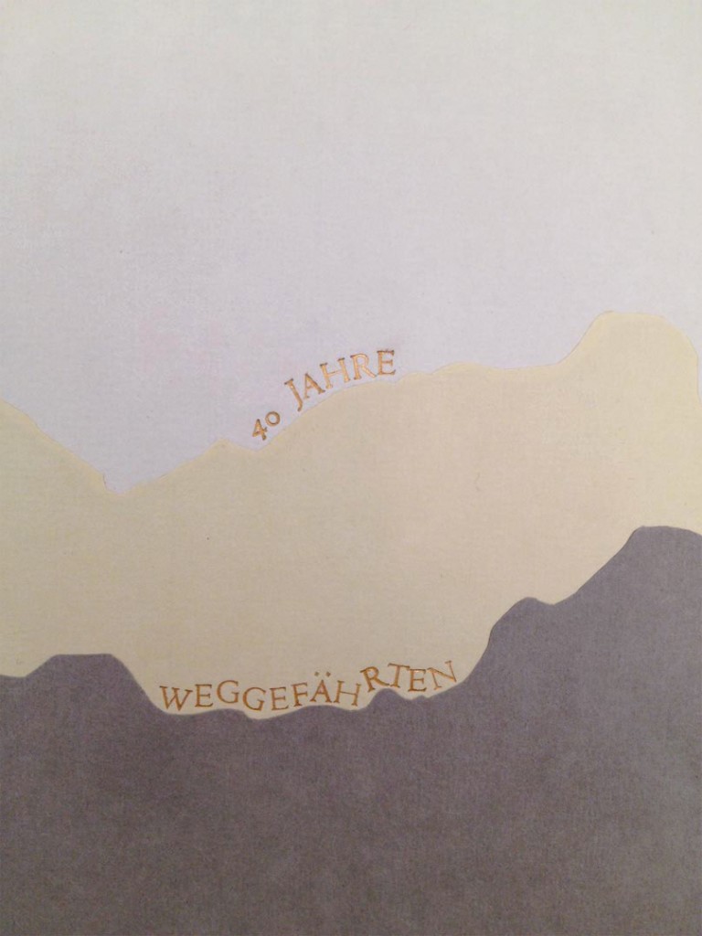
    Weggefährten is a German word that roughly translates to companions. I was approached by my client, Nadja to create a Coptic binding for a series of letters and collaged pages to present as a gift for her partner’s 40th birthday. Each page was submitted by someone who had made a meaningful connection with her partner during the course of his life. The ‘mountainous’ landscape on the covers was chosen by my client from a previous design I had done. She enjoyed the organic quality of the design and how it mimicked the pathways of life.

    When I originally covered a Coptic in this manner, each section would overlap and turn-in at the tail of book. This created a very bulky edge at the tail of the book that was five layers thick as oppose to only one layer at the head. In order to avoid that excessive bulk, I cut each color section to the sized required. Once I drew out the design I was able to trace the shapes onto the paper, building in for turn-ins and a 2mm overlap. I used various shades of Hahnemuhle Ingres to create the design.

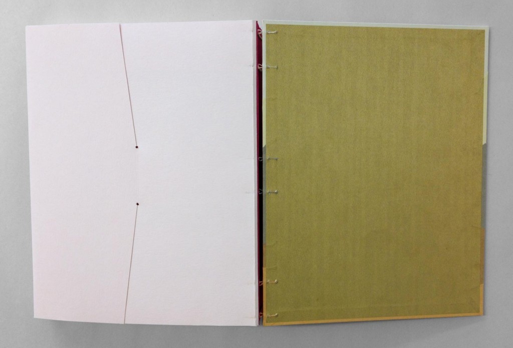
    The Coptic was bound with hand-dyed linen thread to match the shade of Ingres at the six sewing stations.

    copticdetail-erinfletcher

    In addition to Weggefährten, the Coptic was also stamped with the phrase 40 Jahre, which translates to 40 years. The words were individually stamped with brass handle letters to follow the horizon of the pathways. In order to do this irregular stamping on paper, I first trace the line my word will follow onto tracing paper. I place a piece of gold foil onto the cover, then lay down my piece of tracing paper. The hot tool stamps through the tracing paper and the gold foil. I do not remove either layer until the word is complete, this allows me to easily see where to stamp the next letter.

    copticpastedown-erinfletcher

    The color scheme of the book was quite surprising with pops of color and metallics in unusual places. The fold of each signature was highlighted with a bit of magenta Lokta to contrast with the subtle tones of the Ingres. The paste down is a gold metallic paper, which pairs nicely to the pale pink fly leaves.

    copticenvelope-erinfletcher

    In addition to the single pages of letters and collages, was a seven page comic and CD. Using the same pale pink paper as the fly leaf, I included a 4-flap enclosure at the end to house these additional pieces of reverence. The entire book is enclosed inside a magenta 4-flap enclosure for protection.

    It was incredibly enjoyable to work on this project because it was outside my usual flow of work. The client’s reaction was ecstatic as she saw her vision come into being and couldn’t wait to present it to her partner. Check out more Custom Projects at Herringbone Bindery.


  10. Client Work: Clamshell Box for Seven Miniature Shakespeare Books

    May 7, 2013 by Erin Fletcher

    clamshellmini8-erinfletcher

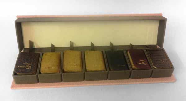
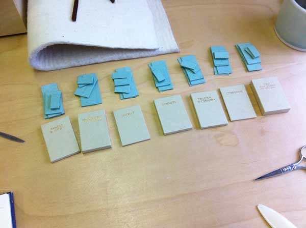
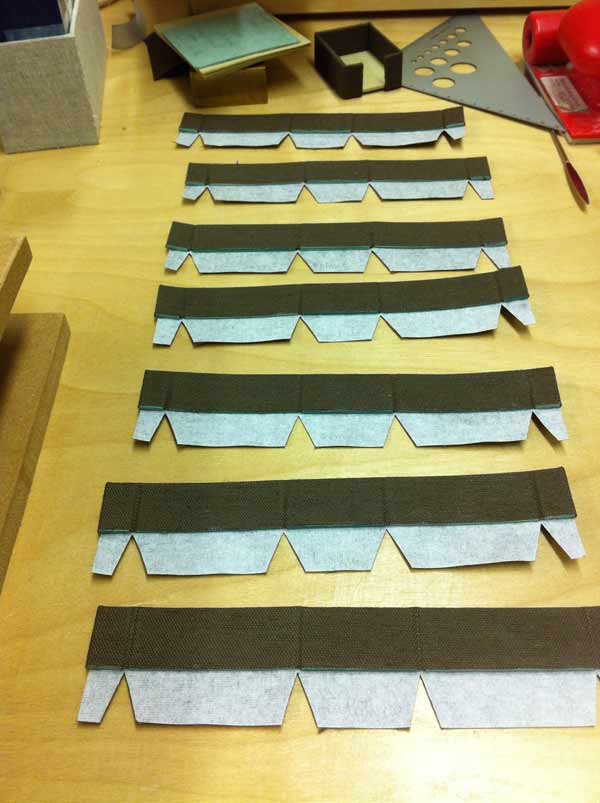
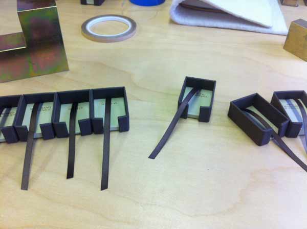
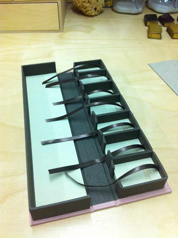
    A client came to me with a set of seven miniature limp-leather Shakespeare bindings in need of a clamshell box. The length of each book was exactly the same, but the width and height varied slightly. As a solution I built individual French trays for each book and assembled them side by side as the A tray for the clamshell box.

    clamshellmini4-erinfletcher

    The French trays were constructed with a single opening at the tail of each book, exposing a piece of satin ribbon. The ribbon was installed for ease in removing each book and to put less stress on the book during this process. When measuring for each French tray, I was less concerned about the width (as I knew they would vary) and the length (as they were all consistent). However, I wanted the French trays to be the same height. Since the books varied from 12mm to 19mm, I adjusted the thickness of the trays by laminating board together so the books would rest at a uniform height.

    Since each French tray would be custom fitted to a specific book, I stamped each title with gold foil on the Hahnemuhle ingres used to line the base of each tray. This would prevent any confusion when replacing the books and to make sure the books rest in their properly fitted tray.

    clamshellmini3-erinfletcher

    The walls were made from millboard and covered with brown Canapetta bookcloth.

    clamshellmini2-erinfletcher clamshellmini`-erinfletcher

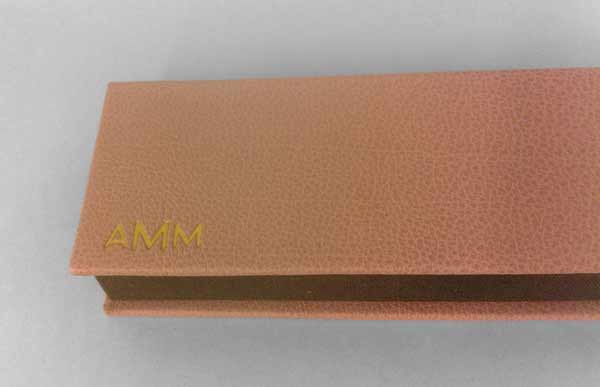
    Once all of the French trays were assembled I was able to measure out the materials for the B tray and the case. The B tray was covered with the same brown Canapetta cloth and lined with earth Hahnemuhle ingres. The exterior of the box was covered with a dusty pink buffalo skin and stamped with gold foil the initials of my client’s wife. As this was to be a gift for Christmas.

    clamshellmini6-erinfletcher

    I was very satisfied with the overall construction and feel of the box, as was my client. I enjoyed the challenge that was presented by this project and working with miniatures was a nice change of pace from my regular line-up. You can see more client work on the Services page at Herringbone Bindery.


  • My name is Erin Fletcher, owner and bookbinder of Herringbone Bindery in Boston. Flash of the Hand is a space where I share my process and inspirations.
    The StudioNewsletterInstagramEmail me
  • Archives