RSS Feed

‘my hand’ Category

  1. My Hand // Goose Eggs & Other Fowl Expressions

    March 16, 2015 by Erin Fletcher

    GooseEggs4-ErinFletcher

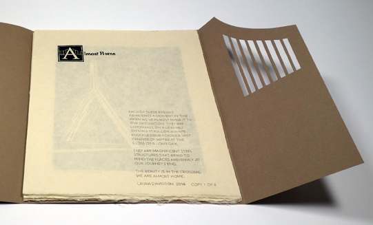
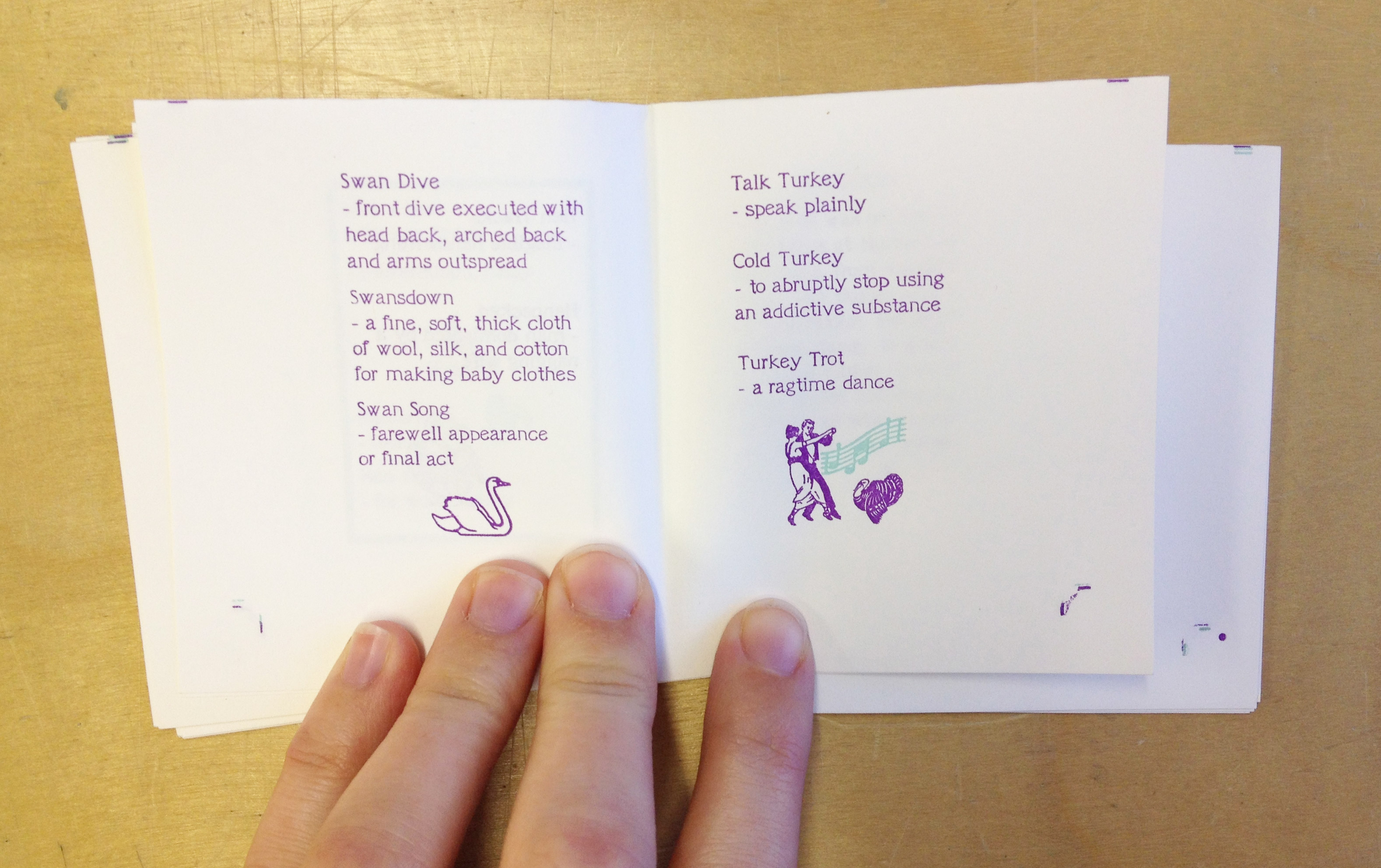
    At the Guild of Book Workers’ Standards Conference in DC, I picked up a couple miniature text blocks from Gabrielle Fox. One of the them being Goose Eggs & Other Fowl Expressions printed by Rebecca Press in 1991. The letterpress printing was done in a vibrant purple with hints of mint blue and bright yellow. The image below is a spread from the book.

    GooseEggs-ErinFletcher

    For the binding, I decided to test the limitations of the Dorfner binding in a miniature format. Last year I had the chance to learn this very special binding structure. Unfortunately not from Edgard Claes himself, but from Colin Urbina who had the opportunity to take a workshop from the celebrated Belgian binder. The Dorfner-style binding was originally developed by German binder Otto Dorfner.

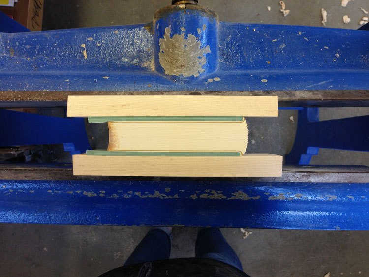
    I sadly did not take any images during the process of creating this binding as it was the first miniature I’ve ever bound and was delighted by how quickly I was able to move through each step. So needless to say, I forgot to stop and take images, but I will explain the binding process a bit in this post.

    GooseEggs6-ErinFletcher

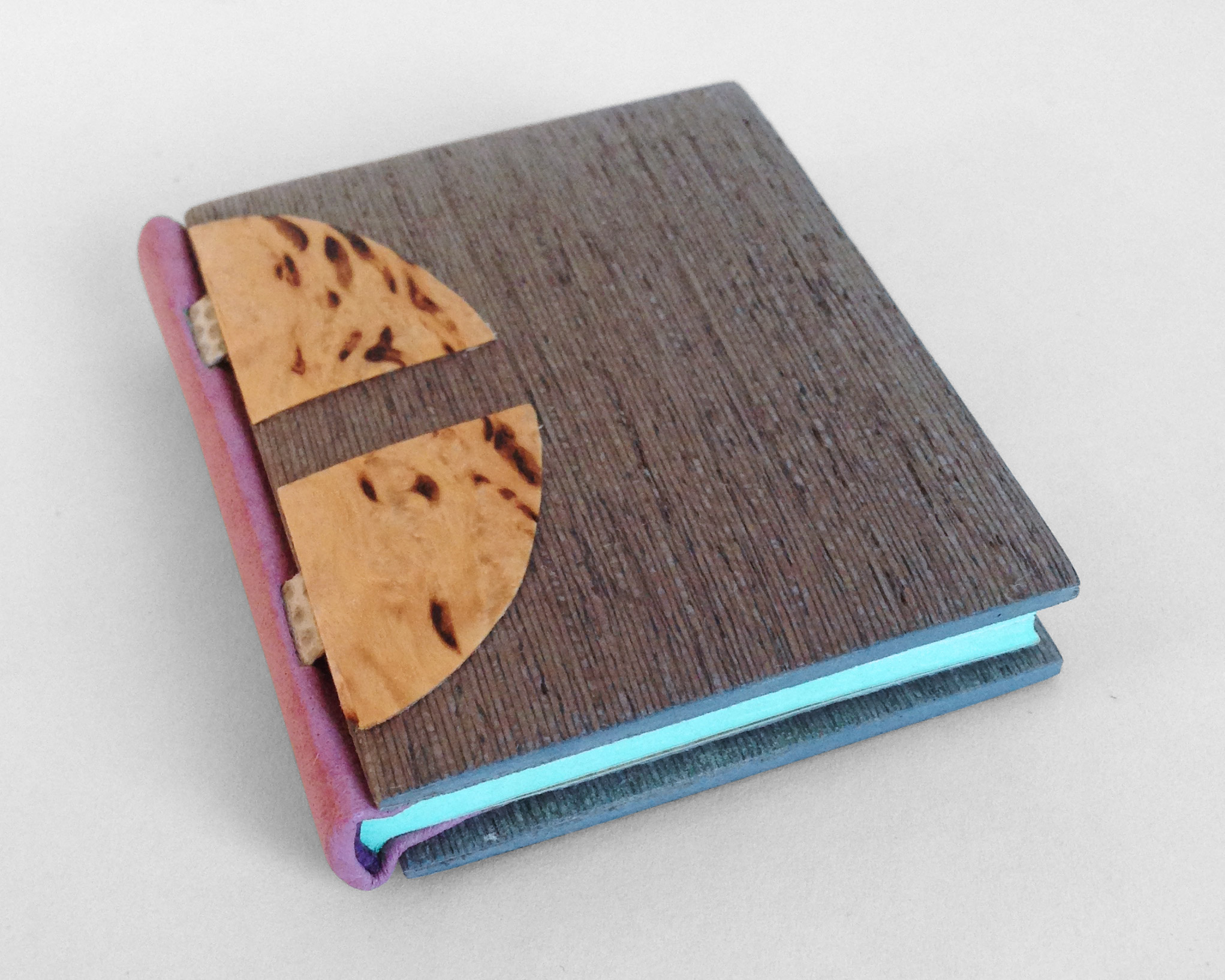
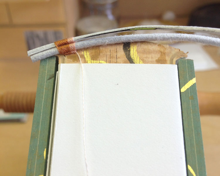
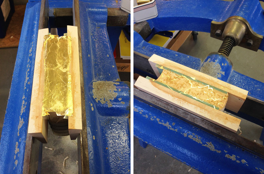
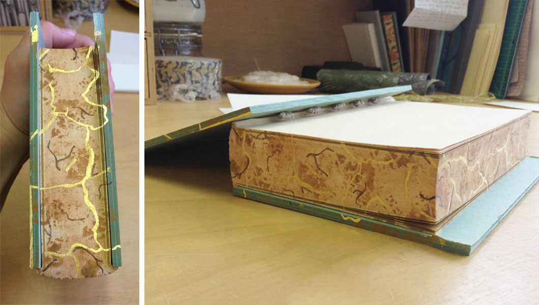
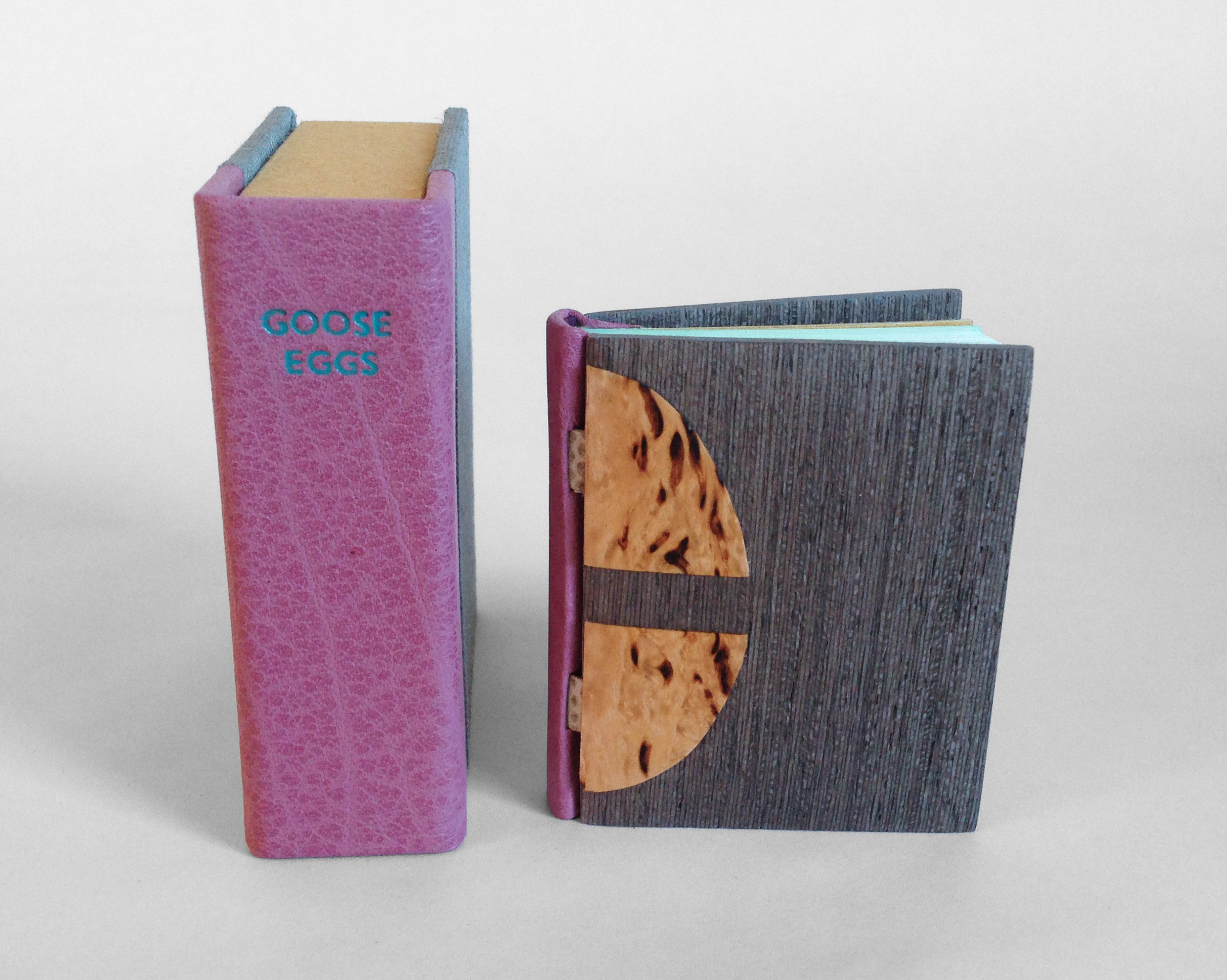
    The book is sewn on two silver snakeskin tapes (initially lined with silk) before being rounded and backed. The edges were properly prepped for a layer of mint blue gouache paint. Leather wrapped headbands decorate the head and tail in a skin that perfectly matches the purple ink from the text block.

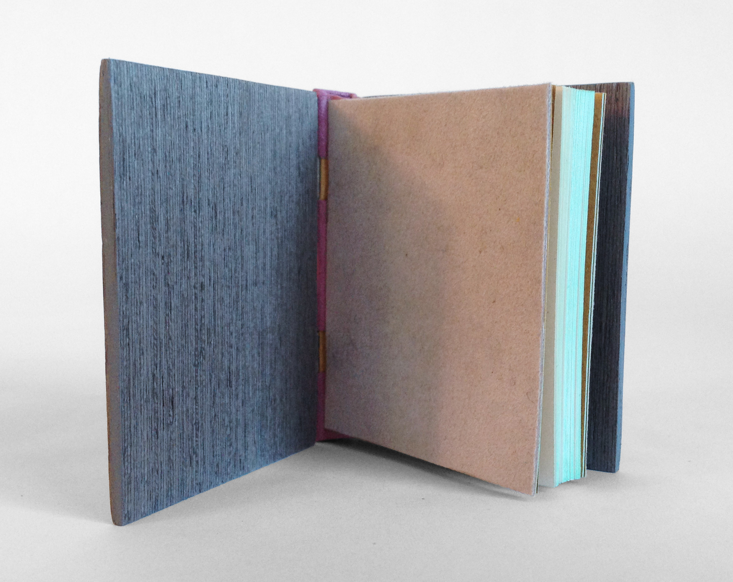
    The spine piece is wrapped in mauve buffalo skin, which was shaped and the headcaps were formed off the book. After cutting away to expose the tapes, the spine piece is attached to the text block and then the light grey suede flyleaves are put in place.

    GooseEggs5-ErinFletcher

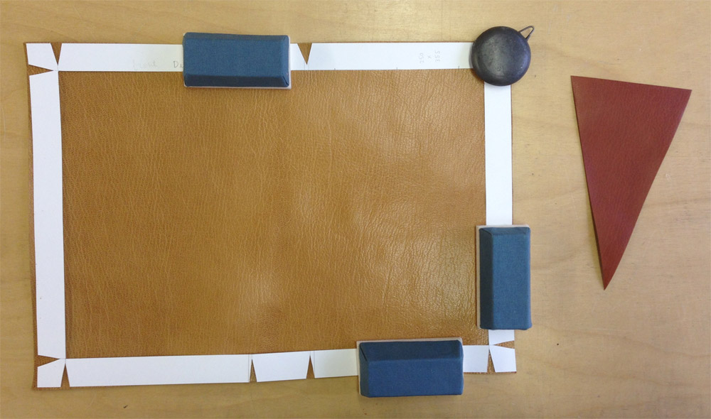
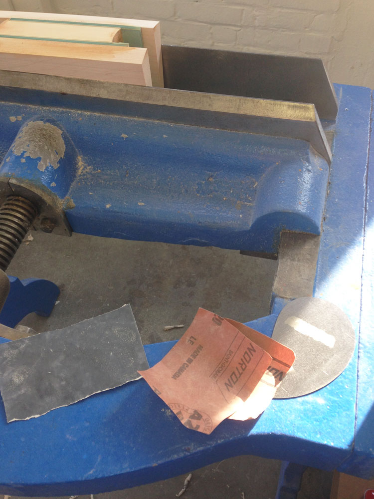
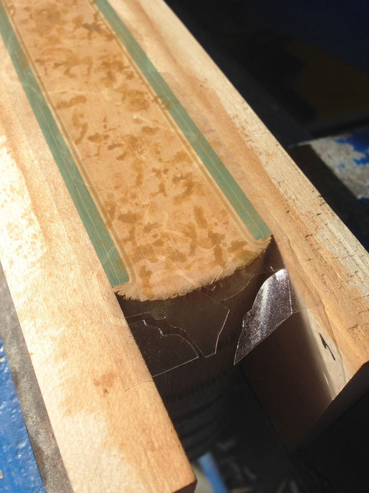
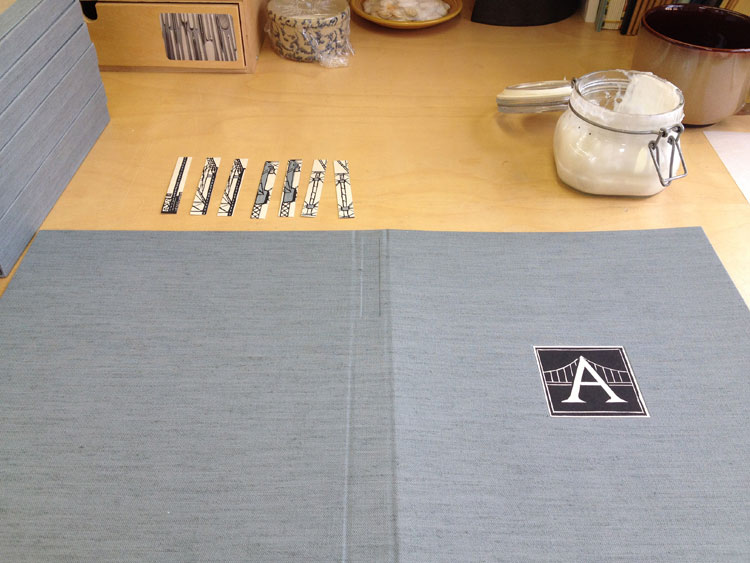
    Now comes the fun part. The MDF boards are carefully shaped, first with a power sander and then by hand to offer an elegant cushioned edge. Afterward, the boards are laminated on both sides with a wood veneer. For this binding, I used an unknown wood that I found in a sample pack of domestic and exotic woods (so if anyone can identify this wood, please let me know). A channel is cut out of the veneer and the tapes are glued down to attach the board. To hide the tapes a second veneer is cut and glued down. For this binding, I cut four tabs out of Karelian birch in the shape of a goose egg.

    GooseEggs3-ErinFletcher

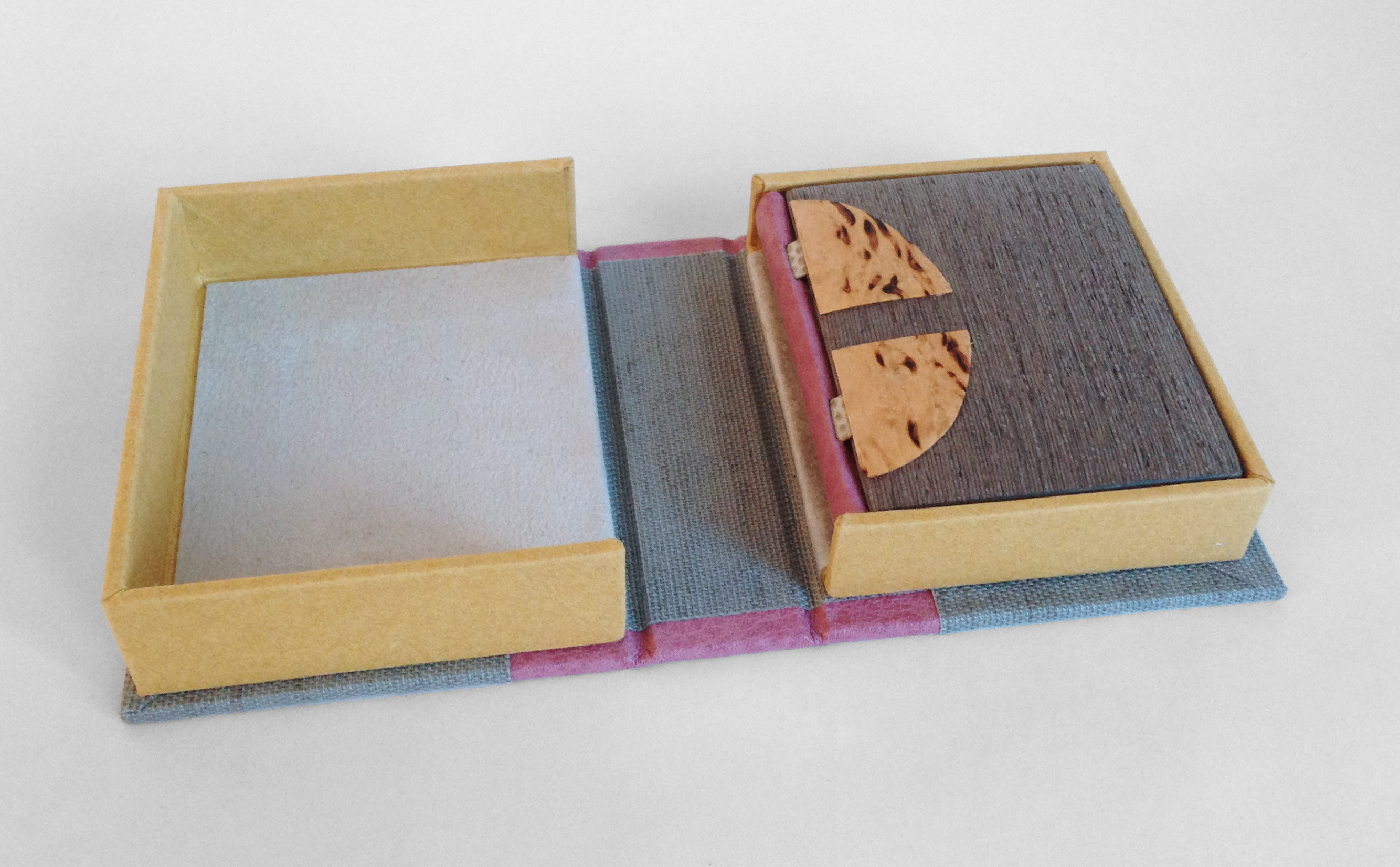
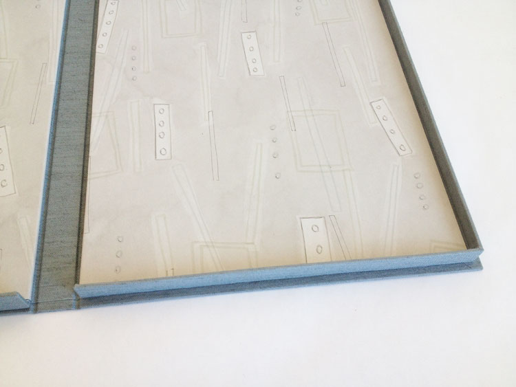
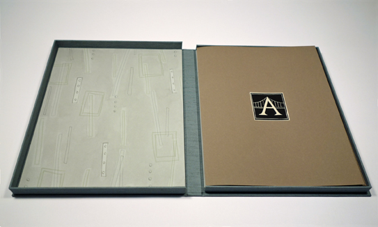
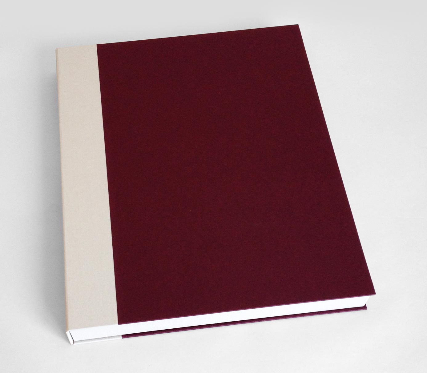
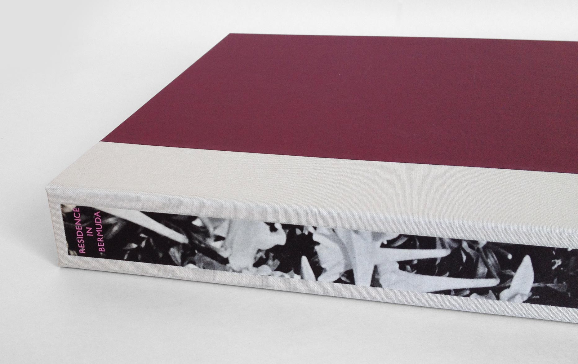
    The book is housed in a tiny clamshell box. The spine is covered in the same mauve buffalo skin and silver canapetta cloth that mimics the veneer on the cover boards. The trays are covered in a yellow handmade paper from Katie MacGregor, which was also used as the book’s endpapers. The book is protected with a light grey suede lining.

    GooseEggs1-ErinFletcher

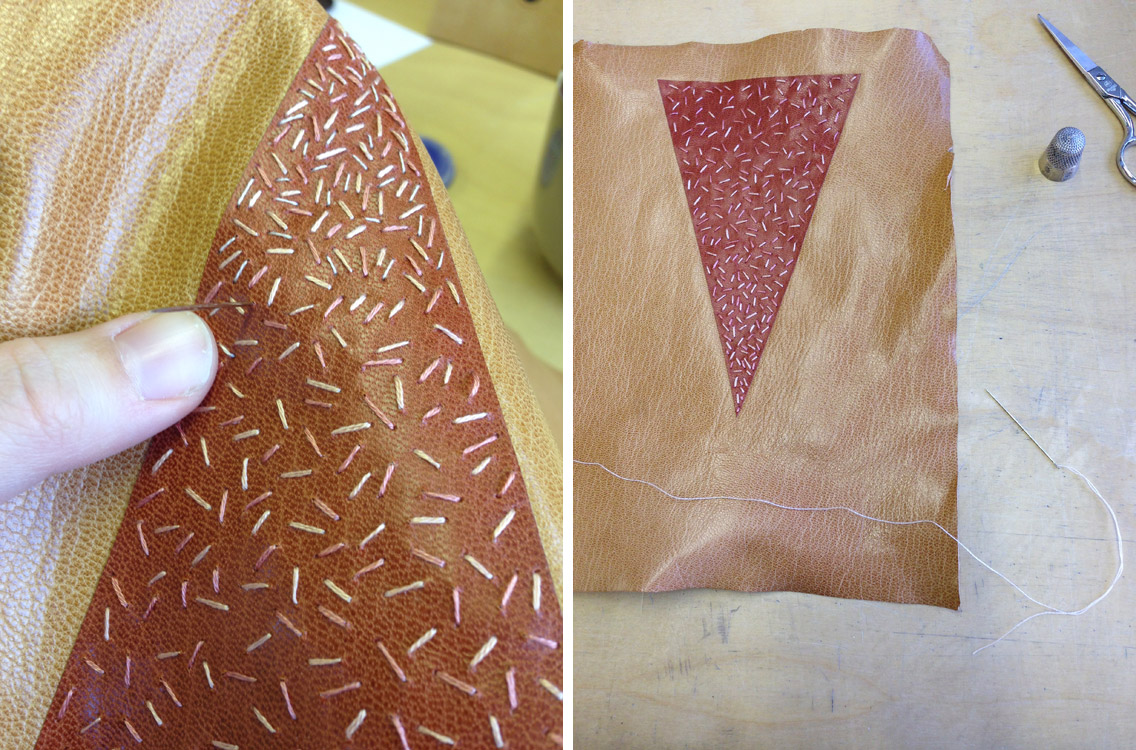
    Goose Eggs is the second Dorfner binding that I’ve made to date. I really love this structure, it has a unique elegance and it can be assembled rather quickly. So I’m looking forward to working with this structure again and hope to incorporate some common elements of my work like gold tooling and embroidery. I also hope to learn more about marquetry in order to create intricate designs in the veneer.


  2. My Hand // Covering Dune

    February 10, 2015 by Erin Fletcher

    CoveringDune1-ErinFletcher

    As I have mentioned on a prior post, my inspiration for the binding of Dune came from several sources: my husband (super fan) plus Lynch and Jodorowsky’s cinematic interpretations. Once I put pencil to paper, I drew from the geometric shapes and simple forms of the French Art Deco design bindings of the 1920s/30s.

    After creating a plaquette of the final design, I outlined the steps of execution for the covering and design work. The isosceles triangle onlay was to be embroidered, which meant it needed to be attached before any paring. The triangle onlay was pared to be incredibly thin from a terracotta Harmatan goatskin then glued down to the base tan Harmatan goatskin using PVA. It’s crucial to use PVA, since the steps for covering requires moisture which could lift the onlay if paste were used.

    In the image above, I’ve laid down a paper template (this paper template is the exact dimensions of the book, it includes the turn-ins and width of the joint). It also has the markings showing me where to glue the terra-cotta triangle onlay. Once the triangle was in place, I sandwich the leather between two acrylic boards and put it in the press to dry.

    CoveringDune2-ErinFletcher

    At this point, the leather is ready to be pared. The paring went through several stages. I began by paring the whole piece of leather using a Schärf-fix, this process turned the triangle onlay into a back-pared onlay. Next I pared the edges down in preparation to use a spokeshave to cushion pare the rest.

    CoveringDune5-ErinFletcher

    Once the skin was perfectly pared, I got straight to the embroidery of the triangle onlay. I used three different shades of pink in varying thread thickness to sew lines in a random manner (being more densely applied near the point of the triangle).

    CoveringDune6-ErinFletcher

    With the embroidery complete and the leather pared, I continued with the final steps of the plan: covering the book. I’m going to keep you in suspense to see the full design once the binding is complete! Stay tuned!


  3. My Hand // Hand Sewn Headbands on Dune

    November 11, 2014 by Erin Fletcher

    DuneHeadband-ErinFletcher

    After reacquainting myself (with the help of Jane Greenfield and Jenny Hille’s Headbands: How to Work Them) on the techniques for sewing a French double core headband, I embarked on creating the headbands for Dune. The headbands are made up of four different colored threads wrapped around two leather cords of different sizes. A third row of thread is created around a core of thread referred to as the bead. You can see this in the image above, the colored thread is wrapped around the white thread that is dangling in front of the headband. The beading step also locks the tension, keeping everything nice and orderly as you move further along the cord.

    Three of the colored threads will be used as embroidered elements on the design of the binding. The dark brown thread was incorporated to extend the dark brown pigment from the edge decoration onto the headband itself. (Click on the image to enlarge).

    DuneHeadband2-ErinFletcher

    With the headbands completed, I will be moving forward with the spine linings and board shaping. I foresee a bit of sanding in my future.


  4. My Hand // A Desert Inspired Edge for Dune

    November 6, 2014 by Erin Fletcher

    I am currently working on a first edition copy of Dune by Frank Herbert for two reasons: 1) I plan to submit it to a bookbinding competition with the hopes that it will travel around the country and 2) there is a towering stack of books from the Dune series on my husband’s bookcase and he deserves a finely bound copy of his favorite (he exhaustively quotes from) book.

    At the beginning of the design phase, I consulted with my husband for inspiration and to make sure I was capturing the spirit of this iconic science fiction novel with precision (I may have subconsciously derived some inspiration from both Lynch’s visual masterpiece and Jodorowsky’s sadly unfinished film). After finalizing my design, I began working on the binding. First step was to remove it from its trade binding and mend the signatures. After the book was re-sewn, then rounded and backed, I ploughed the edges in preparation for the edge decoration.

    DuneEdgeDecoration-ErinFletcher

    At this point in the process, I’ve already completed the decoration on the fore edge and will go through the steps to decorate the tail edge in this post. As always, I decorate the edges in the following order: fore edge, tail edge, head edge. The book is placed between two wooden finishing boards that are angled at the top in order to apply more pressure to the book’s edge.

    Before I can apply any decoration, I need to scrap and sand the edge until it has a smooth feeling and an almost sheen-like finish. I scrap the edge first with a curved scraper, then I sand the edge beginning with a course grit sandpaper and work the edge with a finer and finer grit to get that nice luster finish.

    DuneEdgeDecoration2-ErinFletcher

    The sanding phase can be an arduous task in the decoration process, but quite necessary to a successful edge. I usually sand the edge smooth, then apply my base layer of pigment, allow it to dry, then sand the edge smooth again. After the second phase of sanding, I’m ready to apply the final base layer of pigment. For the edge on Dune, I wanted to achieve the look of a cracked, dry desert ground by combining gouache and gold leaf.

    The mixture of gouache also included water and paste. I paint the mixture onto the edge, then use a sponge to thin down the color. I allow the first layer to dry a bit before applying more pigment with a sponge which offers a mottled and textured effect to the edge.

    As this layer is drying, I draw out the imagery to represent the cracks of the dry ground on some Frisket film. The cracks are going to be gilt onto the edge, the Frisket film is used to mask out the areas I don’t want to be gilt. Frisket is a great material to work with because it has a low tack and will not disturb the gouache layer underneath.

    DuneEdgeDecoration3-ErinFletcher

    In the image above you can see the mottled gouache layer through the clear Frisket film (which is also hanging over the edge of the spine). The exposed areas will be covered by gold leaf.

    in the next step, I apply a PVA wash as the size (adhesive) for the gold leaf. At first the PVA wash absorbs quickly into the edge, but eventually the PVA wash will sit on top the edge. At this point, the gold leaf can be laid down. The PVA wash acts almost like a vacuum as it sucks the gold leaf to the edge.

    Before the PVA wash is completely dry underneath, the leaf needs to be set; this can be done by carefully applying downward pressure with a piece of flannel wrapped around the squishy part of my thumb. A second layer of gold leaf is laid down using the same steps, this creates a more vibrant and fuller look to the gilding.

    DuneEdgeDecoration4-ErinFletcher

    Once the PVA wash is completely dry, I burnish the edge and remove the Frisket film. This initial burnishing of the edge is done through a protective layer of silicone release paper. After some time, when I know the edge is dry and the decoration is secure, I burnish the edge once more (this time the agate burnisher is in direct contact with the edge).

    For the final step of the decoration process, I add some accents of dark brown gouache (this mixture also included water and paste). The darker pigment is added simply with a brush in the desired areas. When I am satisfied with the decoration and the last bit of gouache is dry, I burnish the edge on last time.

    After removing the book from the press, I whack the edge against the edge of the table. This cracks open the text block, separating the pages. This step can be a bit nerve-racking, at this point any poorly attached layer can crack or flack off. Luckily my edges came out beautifully!

    DuneEdgeDecoration5-ErinFletcher

    Now on to the headbands, but not before I cap up (wrap up with a thin paper) the text block. After spending three days creating such a complex decorative edge, I want to make sure it stays safe from any scrapes or scuffs.


  5. Fort Point Arts Community Open Studios // October 17 – 19

    October 14, 2014 by Erin Fletcher

    FPAC-OpenStudios

    Come by the historic waterfront neighborhood of Fort Point for the 35th FPAC Open Studios. Stroll through the many warehouses that are home to painters, sculptors, ceramicists, jewelers, performance artists, printmakers, book artists, photographers and more. Herringbone Bindery will be participating along with Colin Urbina of Third Year Studio at 369 Congress Street on the 6th floor.

    I’ll be around to show off some of my work both completed and in progress. I will also have a selection of items for sale, all of which can be found in my Etsy shop.

    Ours is just one of the 14 buildings in the Fort Point neighborhood, as well as galleries and pop-up exhibit venues. All buildings are in easy walking distance of each other. However, there will be a free shuttle to help you get around the neighborhood.

    The event is free to the public with free parking available! You can’t beat that. For more details and directions check out the Fort Point Arts Community website.


  6. My Hand // Boxes for Laura Davidson

    September 19, 2014 by Erin Fletcher

    LauraDavidsonBoxes6-ErinFletcher

    Photo courtesy of Laura Davidson

    A while back, I had the chance to interview the artist Laura Davidson as a part of my Book Artist of the Month series. Since then, Laura and I have stayed in contact with each other, which has given me the opportunity to view some of her works in their various stages. Most recently Laura completed a set of prints illustrating various bridges across the country. These six bridges were chosen due to their close proximity to the many spaces Laura views as home. The act of crossing these bridges, Laura is filled with the anticipation of almost being home, therefore, the set of prints are aptly titled Almost Home.

    AlmostHome2-LauraDavidson

    Photo courtesy of Laura Davidson

    AlmostHome3-LauraDavidson

    Photo courtesy of Laura Davidson

    Laura presented me with the opportunity to build an edition of boxes to house the prints from her Almost Home series. I was quite elated. I’ve really enjoyed Laura’s work and was excited to be working with her. Laura knew she wanted a clamshell box, something sleek and clean. I’m came by her studio and we discussed material options and how the prints would fit in the box.

    After everything was settled and the materials were ordered, I began working on the small edition of 8 clamshell boxes. Clamshell boxes are pretty straight forward, but with Laura’s boxes I would be adding a few custom elements. First, the base of the interior tray would include some padding. The prints themselves had no discernible thickness, but Laura wanted the box to be at least ½” thick.  So the outward appearance of the box was the right height for Laura and the interior height of the tray was right for the prints.

    Once the binders board was cut and the trays were assembled, it was time to cover them. Laura chose silver Canapetta cloth for its durability and textural qualities. The color also complimented the prints and the industrial feel of bridges. To streamline the process I used a small paint roller and paint tray filled with PVA.

    LauraDavidsonBoxes7-ErinFletcherLauraDavidsonBoxes2-ErinFletcher

    The second custom element came as the material used on the lining of the trays. Laura provided me with 8 sheets of hand-drawn decorative paper. Using a combination of ink and markers, Laura’s custom lining paper pulled imagery from the prints and grabbed colors from the boxes and brown wrapper. Below is an image of one of the finished boxes showcasing the lining.

    LauraDavidsonBoxes9-ErinFletcher

    Finally, it was time to make the cases, which were also covered in silver Canapetta cloth. Before covering, however, I had to create a label well on the front cover board and the spine piece. Each of these wells would be filled with a printed label that Laura had provided me. I also used a paint roller to streamline the process of making the cases.

    LauraDavidsonBoxes3-ErinFletcherLauraDavidsonBoxes4-ErinFletcher

    The hand-printed label on the front cover is an ‘A’ both acting as the support beams of the bridge and the first letter to the title of the series. The label on the spine came from extra prints from the series. Laura artistically cut down the print to isolate some compelling and inciting imagery.

    It was quite a joy to create these boxes and to work for an artist as talented as Laura!

    LauraDavidsonBoxes5-ErinFletcher

    Photo courtesy of Laura Davidson

    LauraDavidsonBoxes8-ErinFletcher

    Photo courtesy of Laura Davidson


  7. Free Shipping at Herringbone Bindery Etsy – Celebrate National Read a Book Day

    September 5, 2014 by Erin Fletcher

    readabook-sept6blog14

    Just in time for the school year, grab yourself a new journal or notepad. Celebrate the book this weekend for National Read a Book Day at my Herringbone Bindery Etsy shop and receive free shipping on all orders of $10 or more. Just enter code: READABOOK10 at checkout. Have a wonderful and book-worthy weekend.


  8. My Hand // Recreating the Stepped Roofs of Bermuda on a Book

    August 25, 2014 by Erin Fletcher

    Bermuda3-ErinFletcher

    A client of mine presented me with a copy of Residence in Bermuda, a promotional text published by Bermuda Trade Development Board in an edition of 2,000 copies. This particular book was copy 591 and bound as a quarter cloth binding with a simple stamped label. My client wanted the book to be rebound in a more artistic binding, extracting colors and inspiration from one of the many photographs printed in the text.

    In search of inspiration I began to page through the book when I came across one image of a watercolor painting of an iconic Bermuda home. The imagery became my direction for the exterior of the binding; the exterior walls of the house were painted a sherbet pink, which popped against the white stepped roof. The vibrancy and brushstrokes of the surrounding landscape became my inspiration for the label on the spine.

    Bermuda5-ErinFletcher

    Since the binding needed to be completed in a fairly short time period and I wanted to work the boards separately, I chose to use a variant of the Bradel structure. Peter Verheyen published an article and tutorial titled Der Gebrochene Rücken: a variation of the German case binding, which was my guide throughout its construction.

    But before any binding could take place, the book had to be removed from its original case. The spine was cleaned by removing the lining and adhesive. The pages showed sign of age with some scuff marks here and there, which called for a bit of surface cleaning. The exterior folio was guarded with tissue to stabilize the paper in preparation for sewing. The original endpapers were quite beautiful and richly printed. However, they were not salvageable for the new binding, but I’ll come back to that later. So I created some new endpapers using three sheets of Canford paper in blush, plum and forest (all colors derived from my inspiration source).

    With the forwarding complete, I attached a piece of pared buffalo skin in the same sherbet pink of the house to the spine. The benefit of this particular binding allows the binder to use a specific material on the spine and another for the boards, so the cover is completed in three parts. This German-style of binding is very similar to the French simplified binding.

    While the book lay to rest, I started working on the boards (which in my opinion are what make this binding superb). In order to best represent the iconic stepped roofs of Bermuda architecture, I decided to create stepped boards. Once I had the final size of my boards, I went to work figuring out the proper dimensions of each layer. I made a single template of each layer which I used to draw out their placement on the boards. Each layer was attached with PVA and pressed. Finally, I glue out a piece of white Hahnemuhle Ingres (which was pre-dampened with a sponge), laid it over the board and put it in the press with some foam which helped sculpt the paper around each layer or step.

    Before attaching the boards, I placed the two labels on the spine which curved down around the shoulder and onto the flange which connects the boards to the binding. Using two separate leathers with matching metallic foil, I stamped the word RESIDENCE and BERMUDA in Gill Sans using a Kwikprint. The leather was then pared away to offer a rough silhouette of a brushstroke. The word IN was hand-tooled directly on the spine in palladium.

    Bermuda4-ErinFletcher

    A large book with white covers needs a box or it will never appear in such pristine condition again. The clamshell box was simply made with a cloth spine sided up with paper. The spine of the box includes a long paper label stamped in metallic pink with the title. The decorative paper label is a strip of the original endpaper. The trays are lined with a frame of Volara foam for the book to rest on, preventing it from teetering side to side.

    Bermuda-ErinFletcher Bermuda2-ErinFletcher

    My client was thrilled with the book’s transformation. He plans to present it as a wedding gift to the Governor of Bermuda’s daughter. I hope she is equally thrilled with my interpretation of her rich and colorful surroundings.


  9. My Hand // Multi-Section Slipcase

    August 5, 2014 by Erin Fletcher

    For the past few months, I’ve been creating a collection of boxes for an aspiring book collector client of mine. Each box is similar in its format and design, only the colors change; a clamshell box with a rounded leather spine with false raised bands. The author and date of the imprint are hand tooled in gold on the spine with the title stamped in gold foil on a leather label recessed on the front board. The trays are covered in Canapetta bookcloth and lined with Bugra paper.

    Five boxes into this ongoing project, my client presented his five volume set of The Christmas Books by Charles Dickens, asking for a box to hold all five that could also mimic the other clamshell boxes I had already made. I remembered a tutorial of Hedi Kyle’s that I had printed out some time ago on a multi-section slipcase, which she presented in 2005 at the GBW Standards held in Portland, Oregon. So I set out to create a model to present to my client.

    MultiSectionSlipcase-ErinFletcher

    The model was constructed using 20 pt. museum board and some scrap bookcloth. For the client’s box, I had to devise a way to cover the 20 pt. using Canapetta bookcloth and Bugra. Since a full sheet of 20 pt. laminated with bookcloth would get too bulky in the fold, the walls were assembled with four separate panels leaving a slight gap creating proper movement at the hinge.

    My client also requested notches on the walls for easy removal of the books. Semi-circles were cut out along the edge of the panels and the cloth was cut into triangles to successfully turn-in around the curve.

    MultiSectionSlipcase2-ErinFletcher

    Construction of this multi-section slipcase could be rather finicky at times, making it difficult to keep each component square. Once the slipcase sections were assembled and the interior ‘tongue and slot’ closure was added, it was time to construct an exterior case to mimic the clamshell boxes. I began by shaping the spine, which was rather difficult on a box that was wider than either of its other dimensions. The false bands were added and finally the leather was pasted down. The spine was then tooled and the leather label was laid into its well on the front board.

    MultiSectionSlipcase3-ErinFletcher MultiSectionSlipcase4-ErinFletcher

    The slipcase block is mounted to the back board of the exterior case, which can freely swing away and aid in the movement of the slipcases.

    MultiSectionSlipcase5-ErinFletcher


  10. My Time at Rare Book School

    July 24, 2014 by Erin Fletcher

    Rare Book School uses the term rare not to refer to objects that are expensive and uncommon, but in regards to the object’s uniqueness and unusual excellence in artistic quality and craftsmanship. I would describe my experience at RBS as the latter sense of the word. The carefully crafted instruction that was delivered in my course by Jan Storm van Leeuwen was impeccable. His passion for bookbinding and decades-long research produced a rather intensive look through the long history of bookbinding.

    Each day began with a stroll across the grounds of the University of Virginia as I made my way from the Brown College dorms to Alderman Library where the classes were held on the 4th floor. Which can be accessed by either going down three flights of stairs or taking the elevator down. Trust me.

    RareBookSchool1-ErinFletcher

    Once inside, we were greeted with a complimentary breakfast, complete with the necessary cup of tea to start off my day. These breaks between lectures became a frenzy of chatter as introductions were made and curiosity ensued. Any chance to mingle amongst fellow book lovers and discuss bookbinding for a week straight can only be viewed as no less than phenomenal. Amongst the sea of book nerds, were librarians, archivists, catalogers, graduate students, conservators, book dealers and, a few like myself, bookbinders.

    I wish that I would have taken more pictures of the day’s events, but I found myself deeply occupied by either furious note-taking or mingling with the other students. Jan took us on a journey through bookbinding history beginning with the most earliest known bound examples up through the late 20th century. Each lecture was paired with show and tell a specimens from the massive collection held by Rare Book School.

    RareBookSchool2-ErinFletcherRareBookSchool5-ErinFletcher

    We ended the week with an introduction to Publishers’ Bindings, discussing the styles seen in France, England, United States, Germany and Holland. Below are some fine examples of French Publishers’ Bindings. The image on the right is referred to by Jan as a ‘Chocolate Box’ binding. The paper covers are printed and embossed before covering. A window is also cut out to showcase a small color-litho print. These prints were attached to several different titles and were not necessarily representative of the content.

    RareBookSchool3-ErinFletcherRareBookSchool4-ErinFletcher

    This rather small embroidered binding was one of the highlights of my week. The binding was so fragile and weak. The silk/satin had deteriorated at the board edge and had popped away from the upper (front) cover. This was quite exciting for me. For the first, time I had the opportunity to get a look at the construction of the binding and covering material. It was wonderful to see how the stitches were somewhat haphazardly applied.

    RareBookSchool6-ErinFletcher

    In addition to our lectures and show and tell sessions, we were tasked at deciphering leathers based on their follicle patterns and characteristics. It proved to be quite difficult at times to decide between goatskin and sheepskin. But as it wants, the sheepskin tends to turn fluffy and brittle, usually popping away from the boards

    Jan also gave us a brief hands-on demonstration of his strategy for taking rubbings, which is something that should be done properly and with care so as not to abrade the surface of the binding. Using a thin sheet of custom-made paper for the The Dutch Royal Library in the Hague, we lightly brushed a soft, pure graphite stick over the surface in various patterns. The design of the bindings slowly began to emerge and as I worked the graphite stick from side to side, then diagonally and finally in circular motions, the finest details were picked up. Jan also demonstrated how to properly rub the spine of a binding and the proper way to label your rubbings.

    RareBookSchool7-ErinFletcher

    Now that I’m filled to the brim with bookbinding knowledge, I hope to take another trip to Rare Book School next year. If you have the opportunity to attend RBS, I highly recommend it, I don’t think you’ll be disappointed in the slightest.


  • My name is Erin Fletcher, owner and bookbinder of Herringbone Bindery in Boston. Flash of the Hand is a space where I share my process and inspirations.
    The StudioNewsletterInstagramEmail me
  • Archives