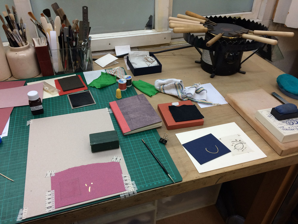
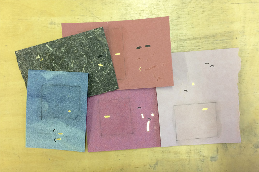
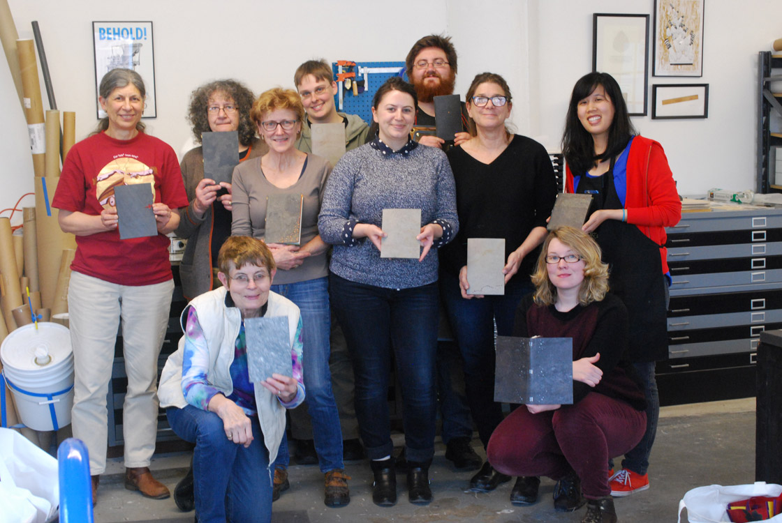
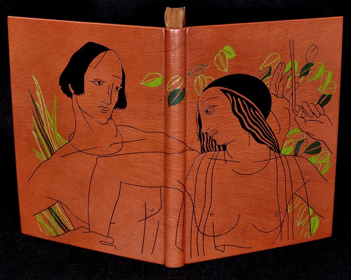
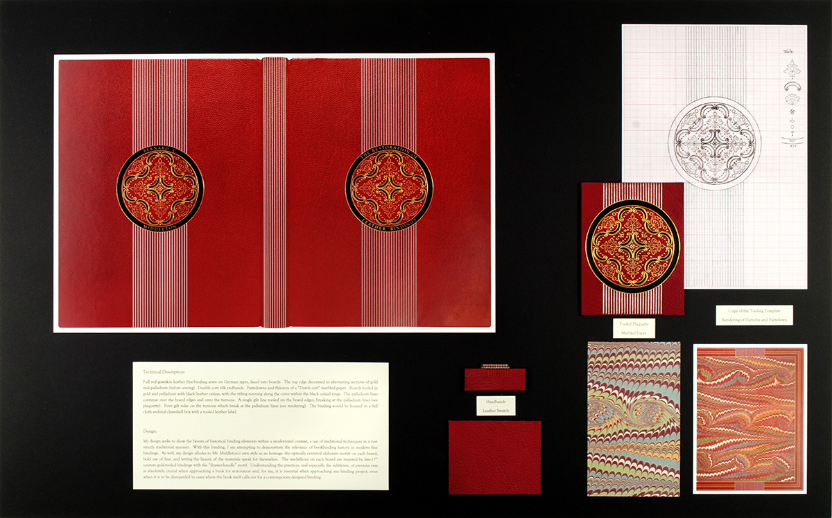
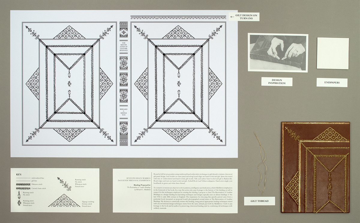
I recently participated in a print exchange with a few fellow members of the New England Chapter of the Guild of Book Workers. Our instructions were to create a print edition using any medium we desired around the optional theme of Spring. The prints were then sent through the mail to each other. So in the end I made 11 prints (plus a few extras) and received 11 different prints from everyone else.
Erin Fletcher
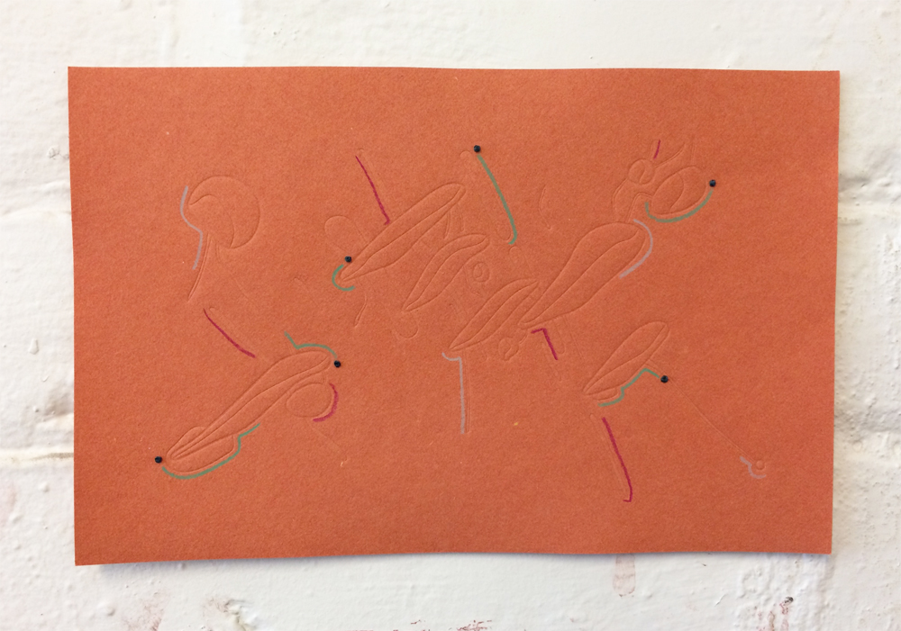
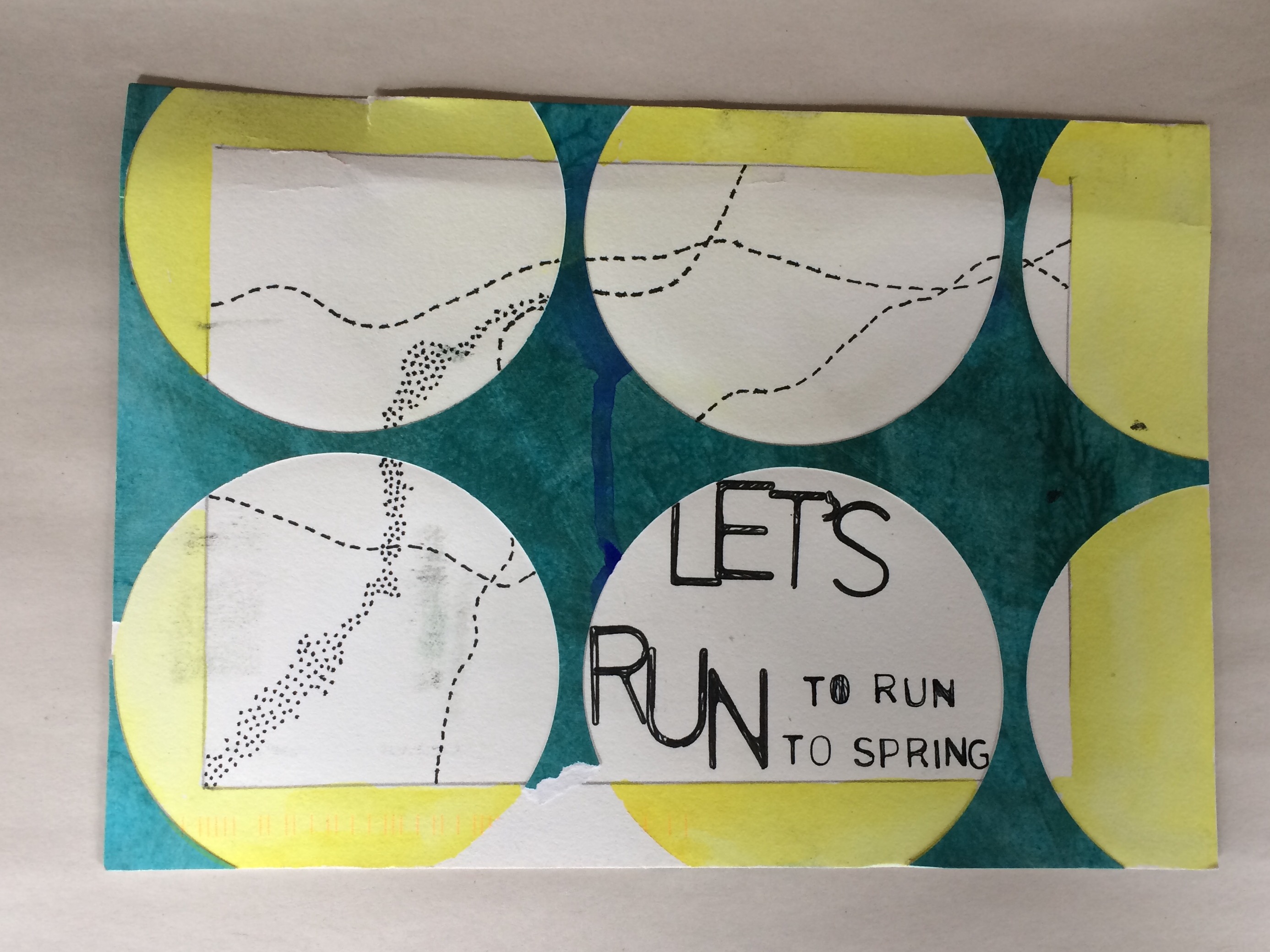
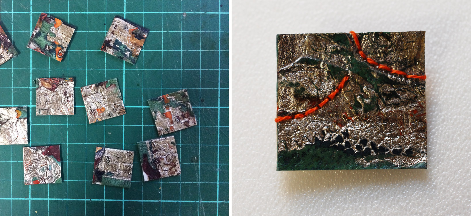
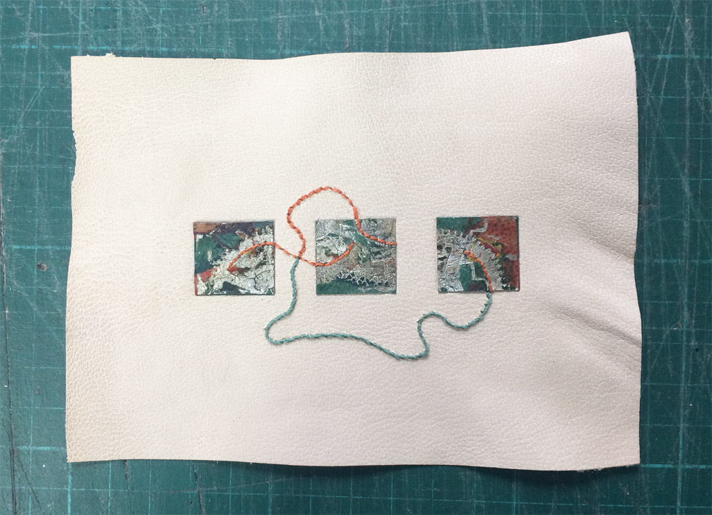
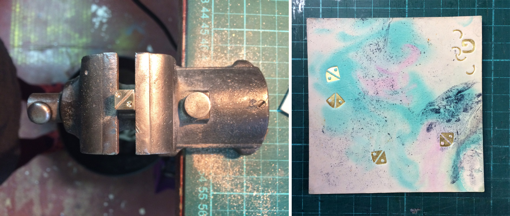
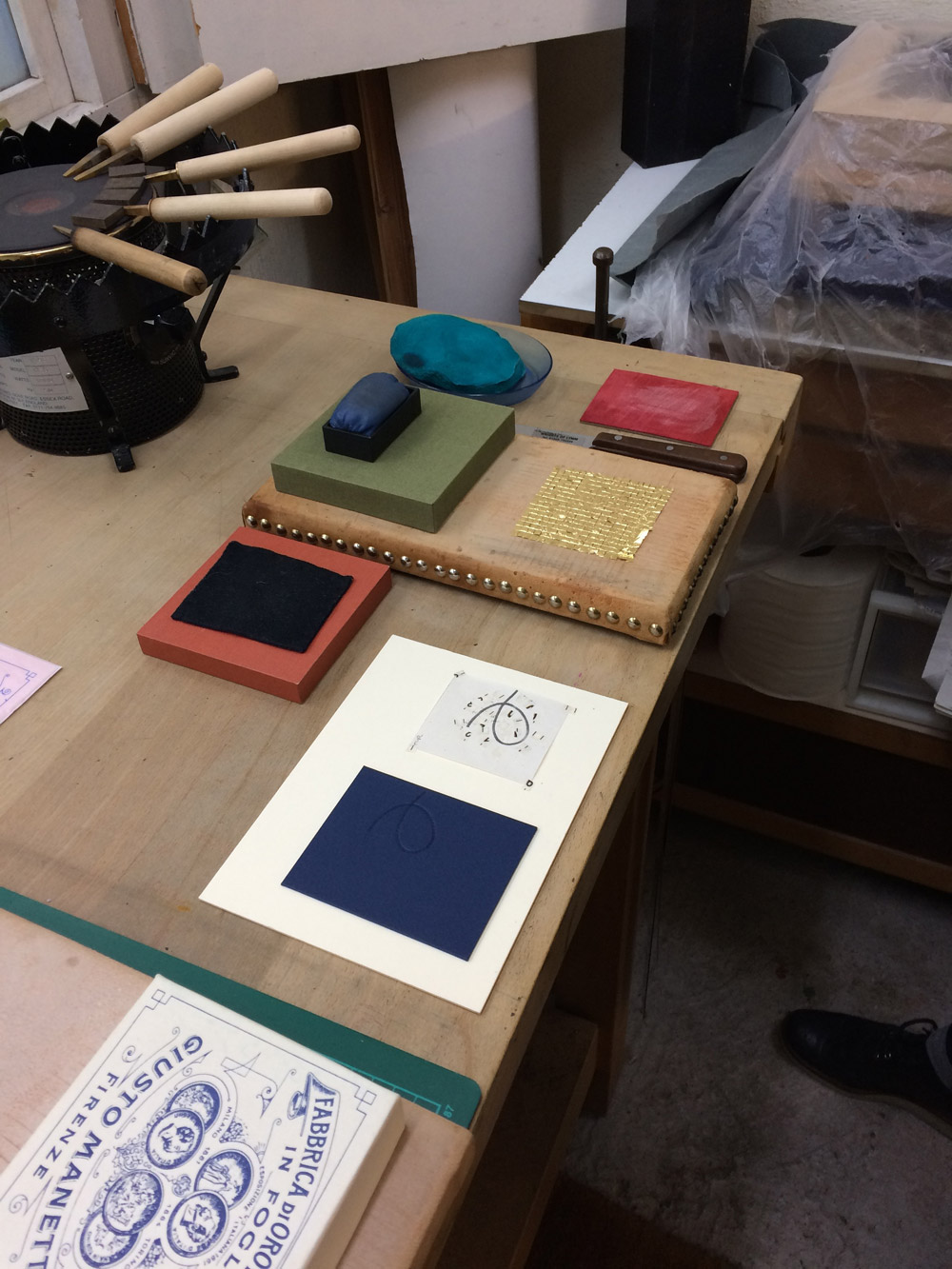
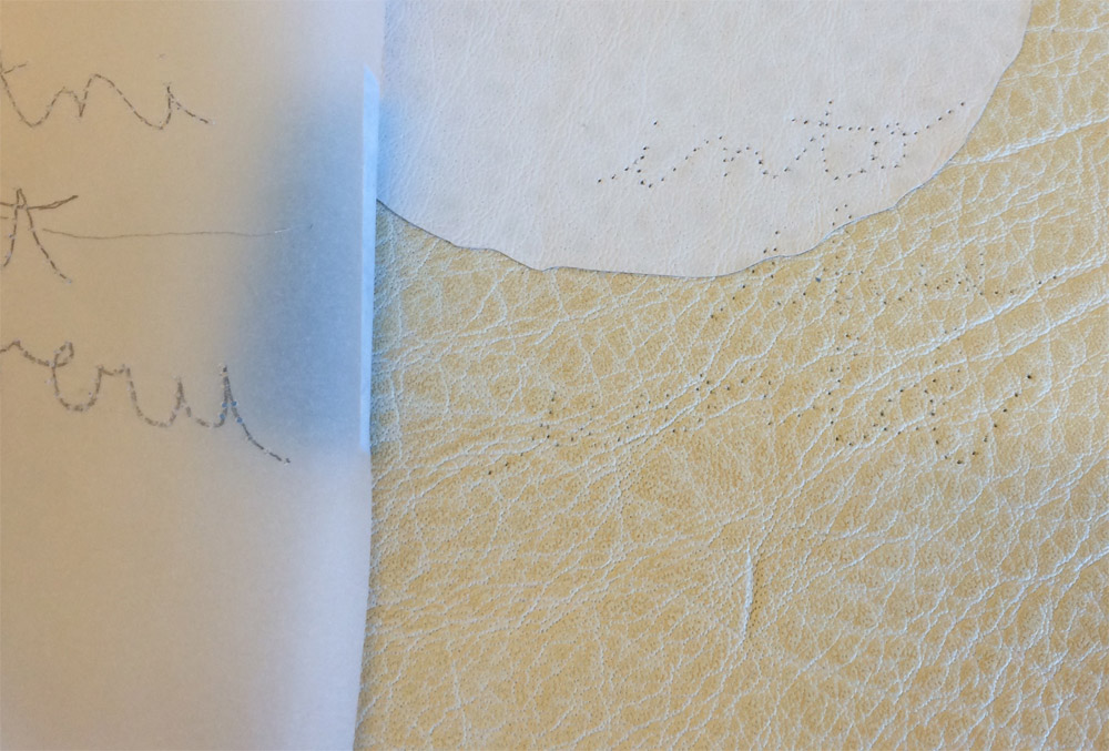
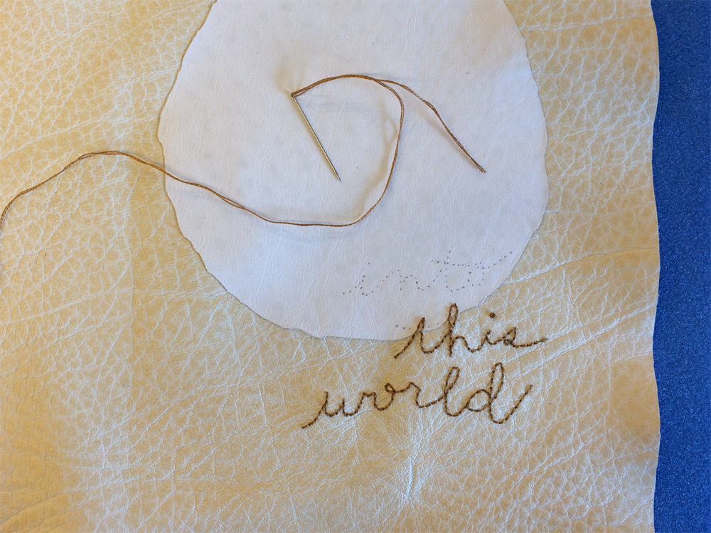
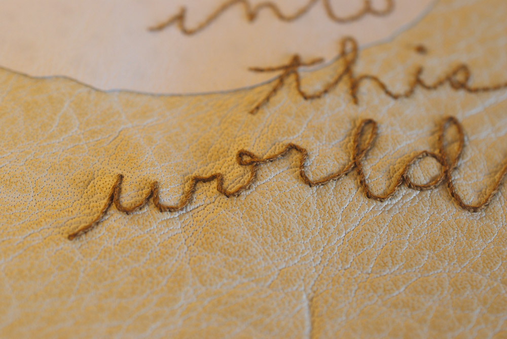
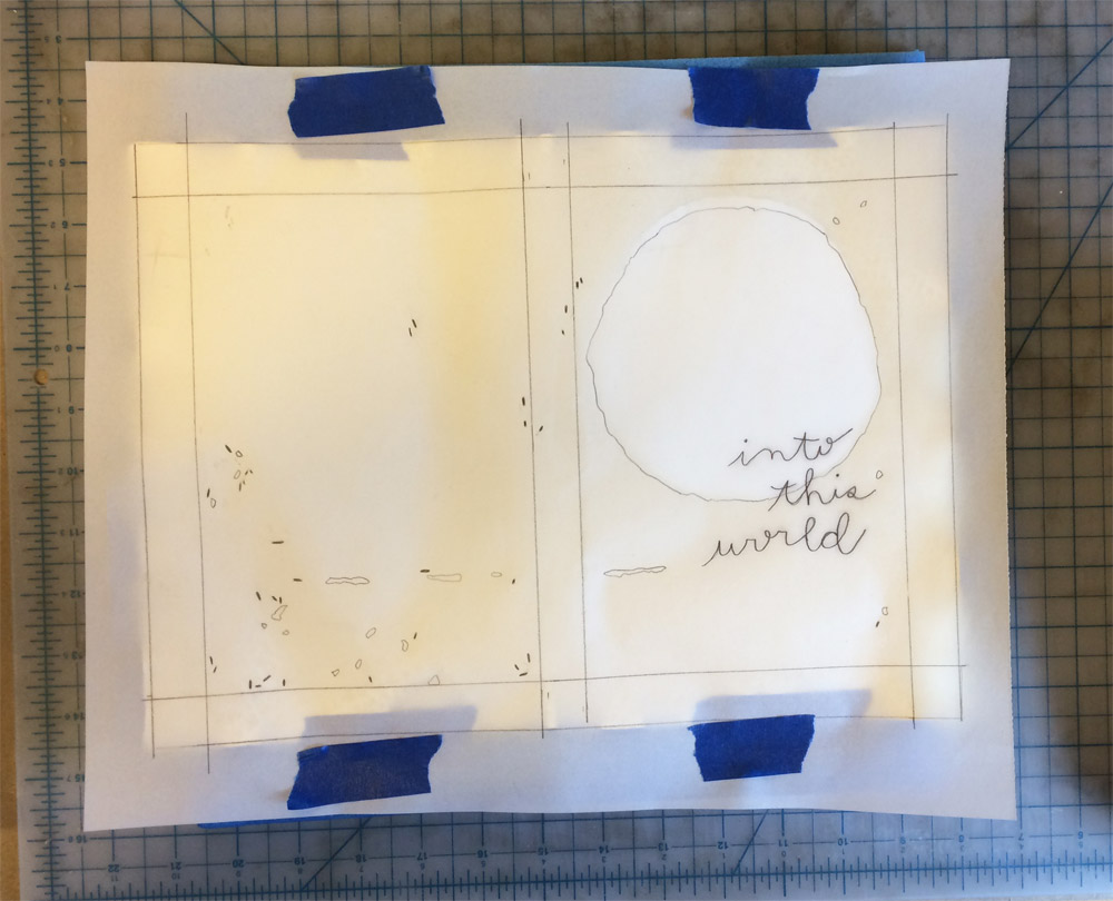
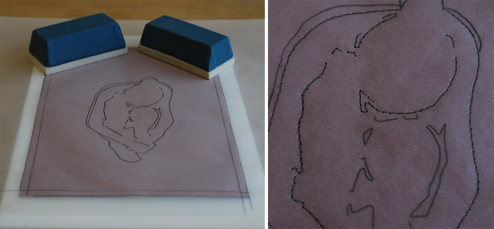
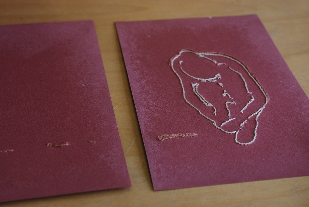
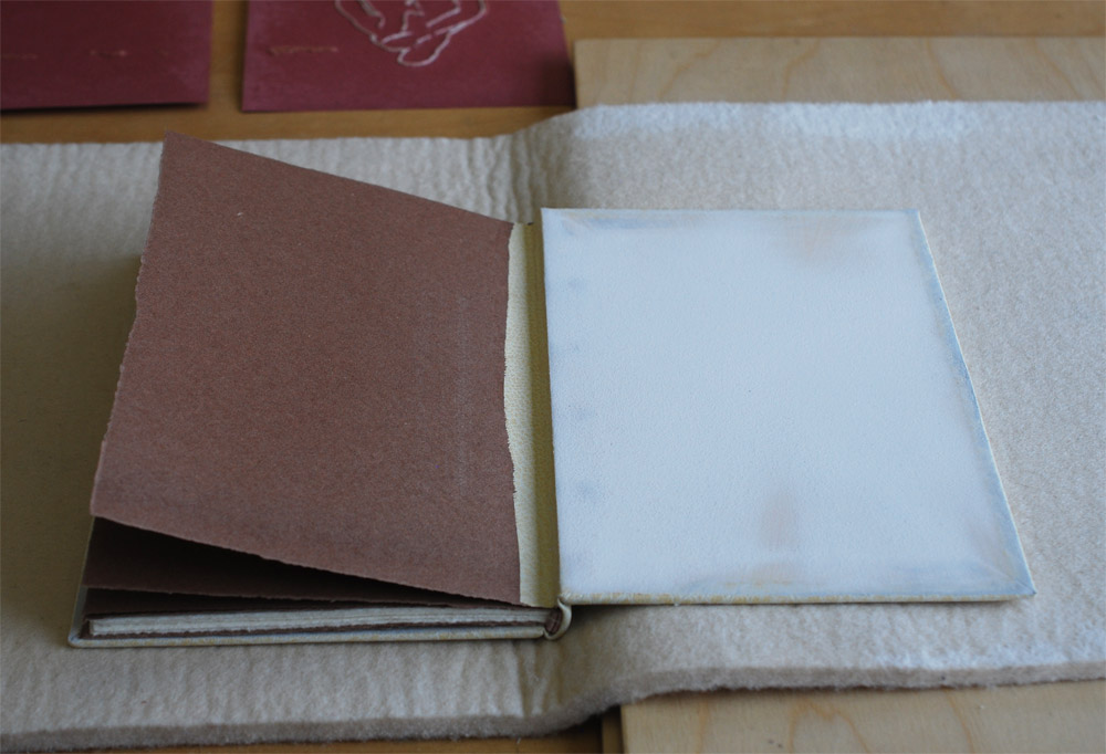
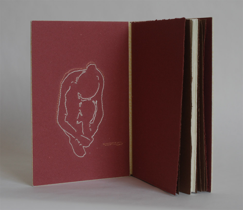
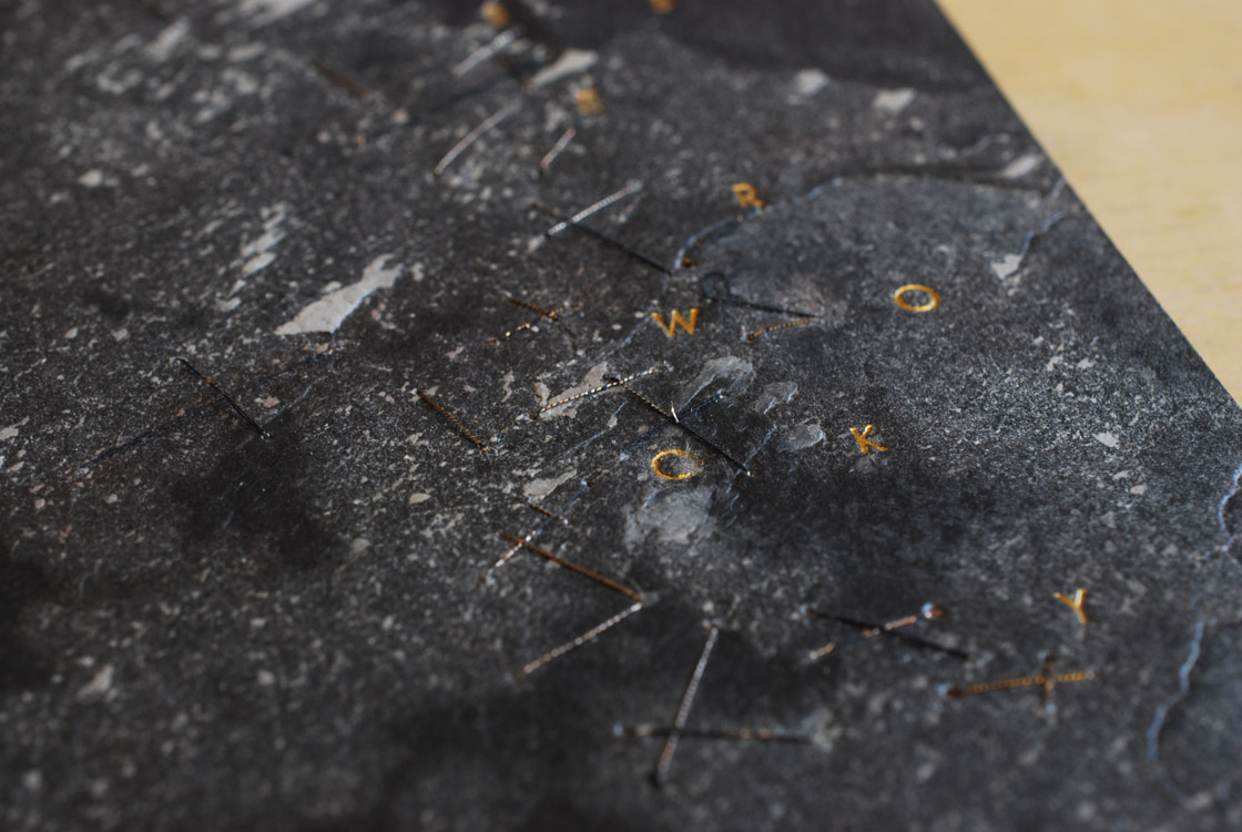
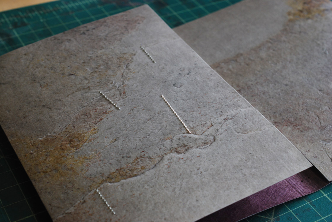
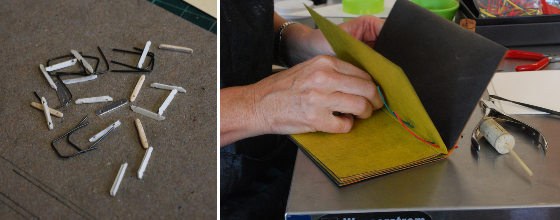
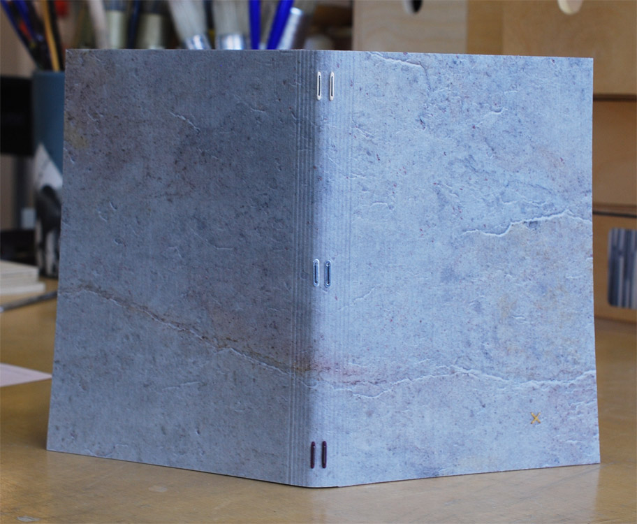
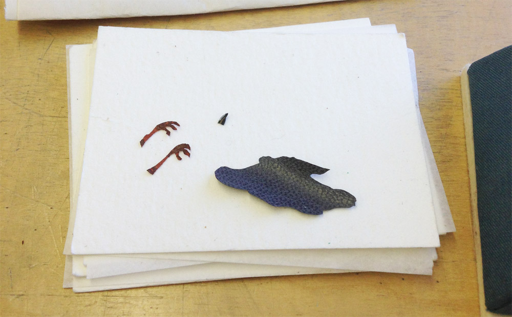
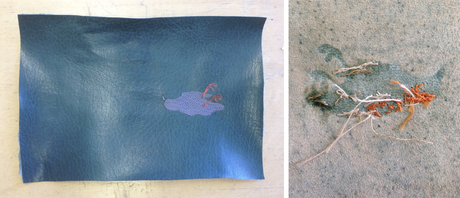
The print I created was part collaboration with my husband. He drew an image that I had turned into a metal die, which was heated and pressed into paper. I chose two papers handmade by Katie MacGregor, orange and a sort of dull algae green. Once the impression was made, I then drew several marks with colored pencils. The dots are hand-stitched french knots.
It was fun to send these out into the world, but it was more fun to receive so much interesting mail over the course of a week. Here are the rest of prints from the exchange:
Katherine Beaty

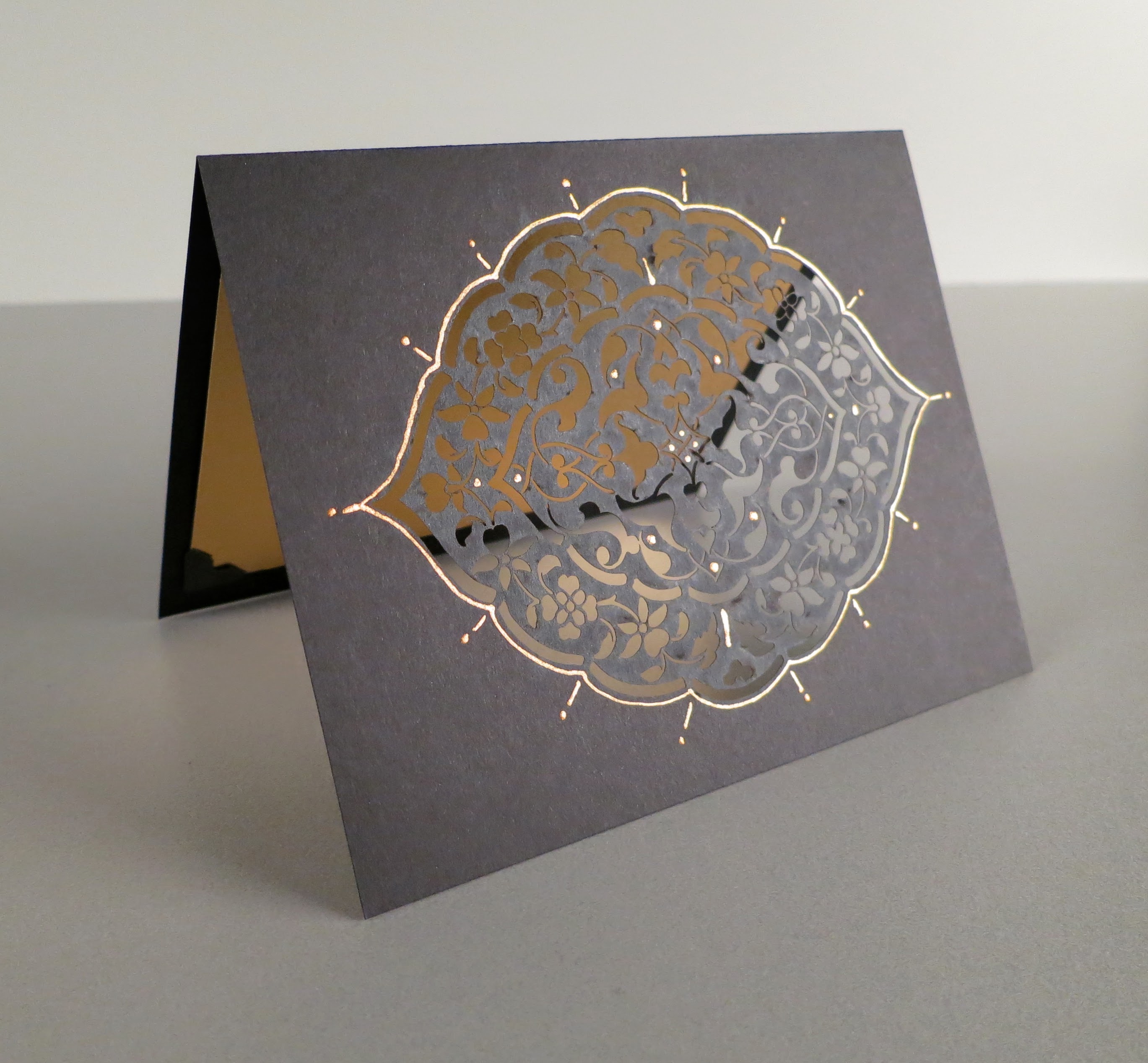
Carol Blinn
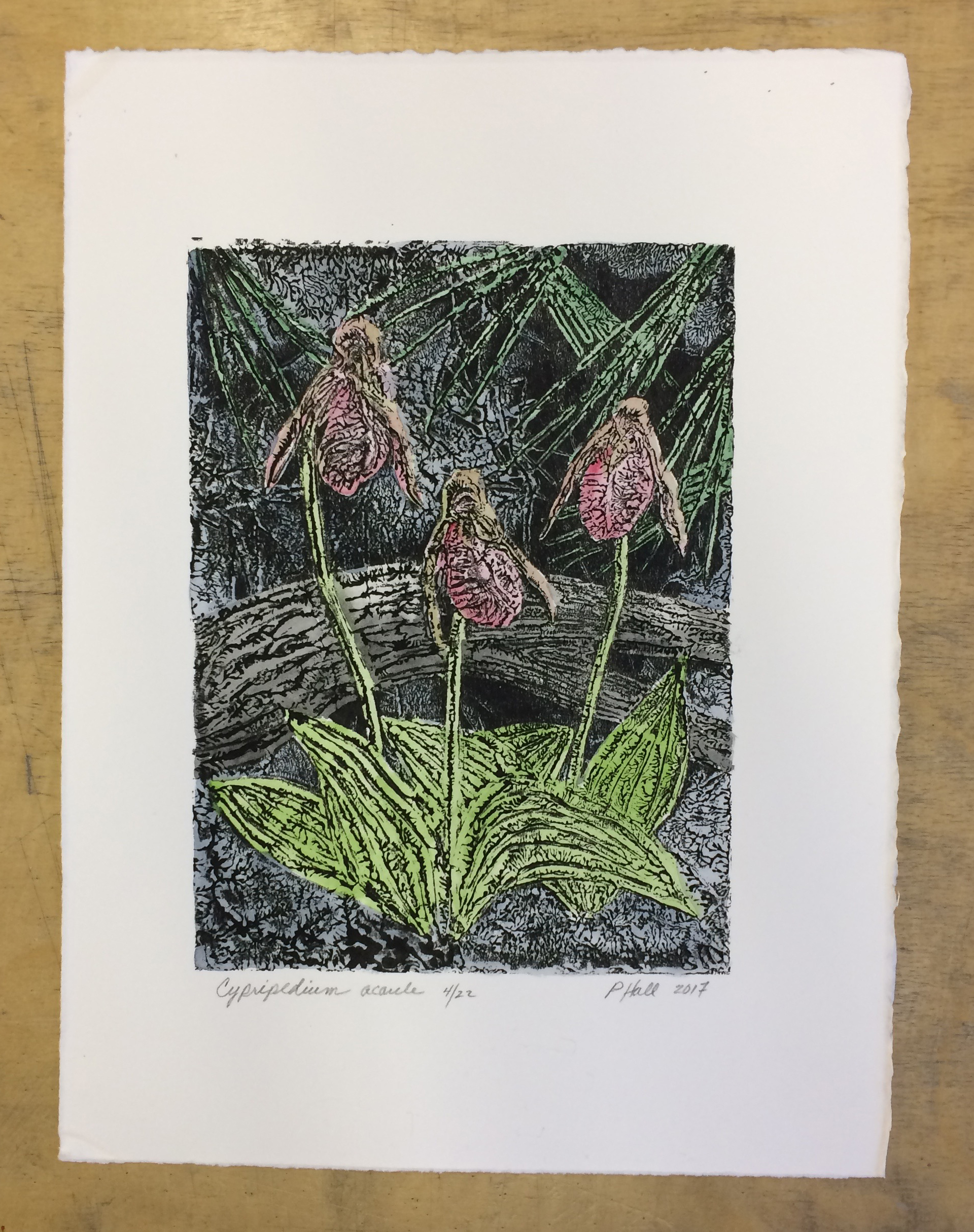
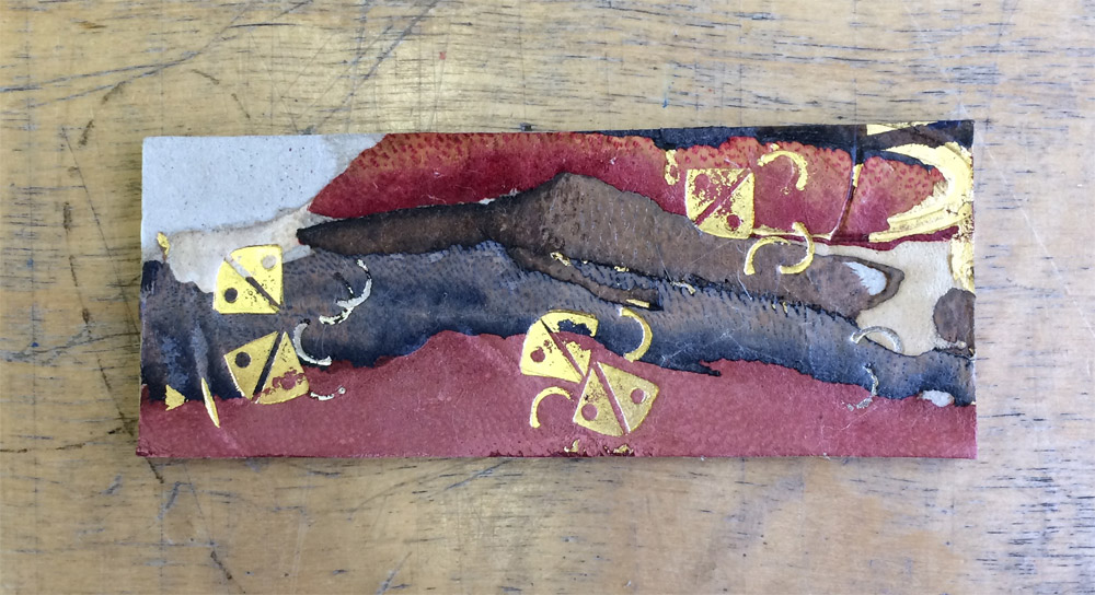
Penelope Hall | Cypripedium acaule
Martha Kearsley
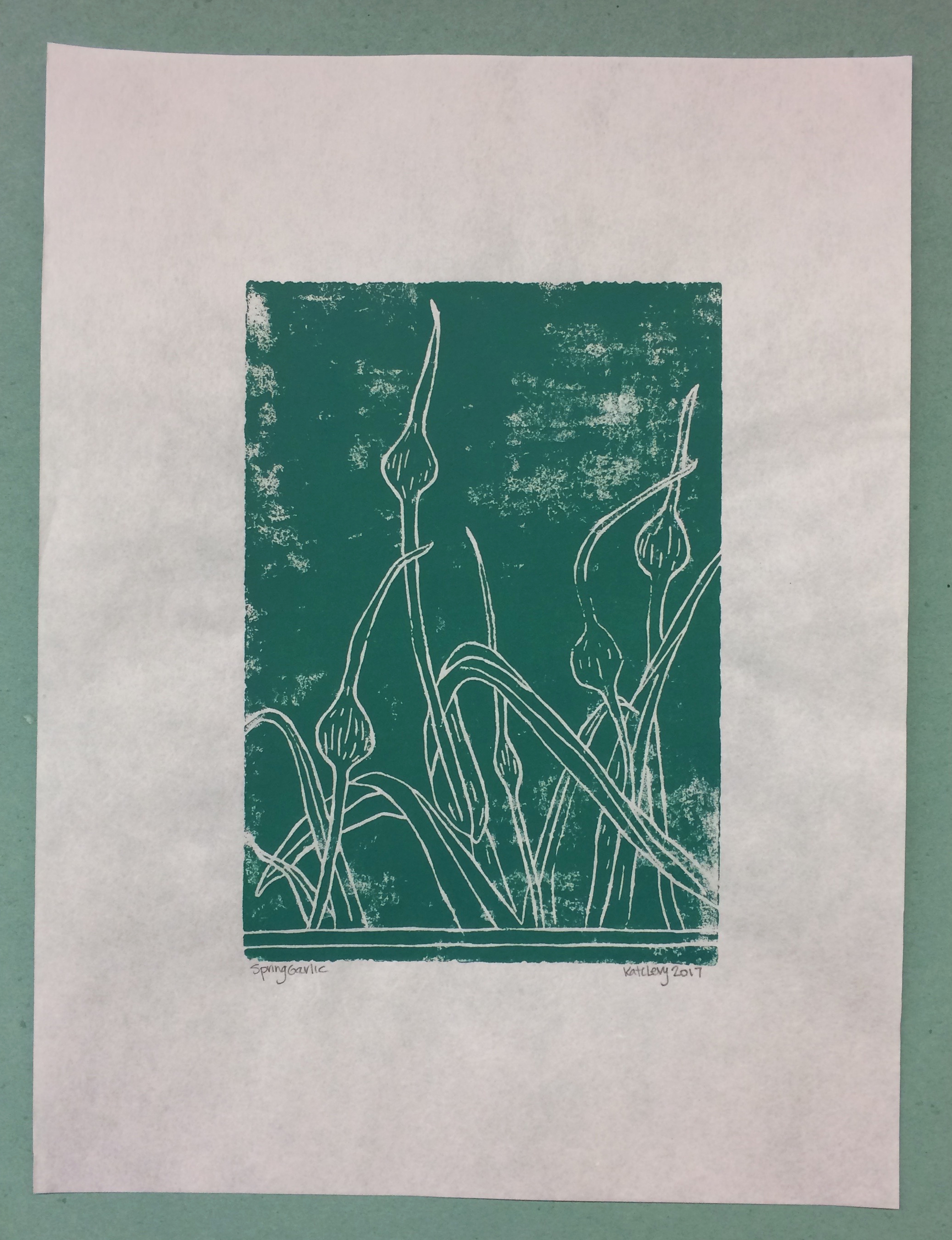
Kate Levy | Spring Garlic
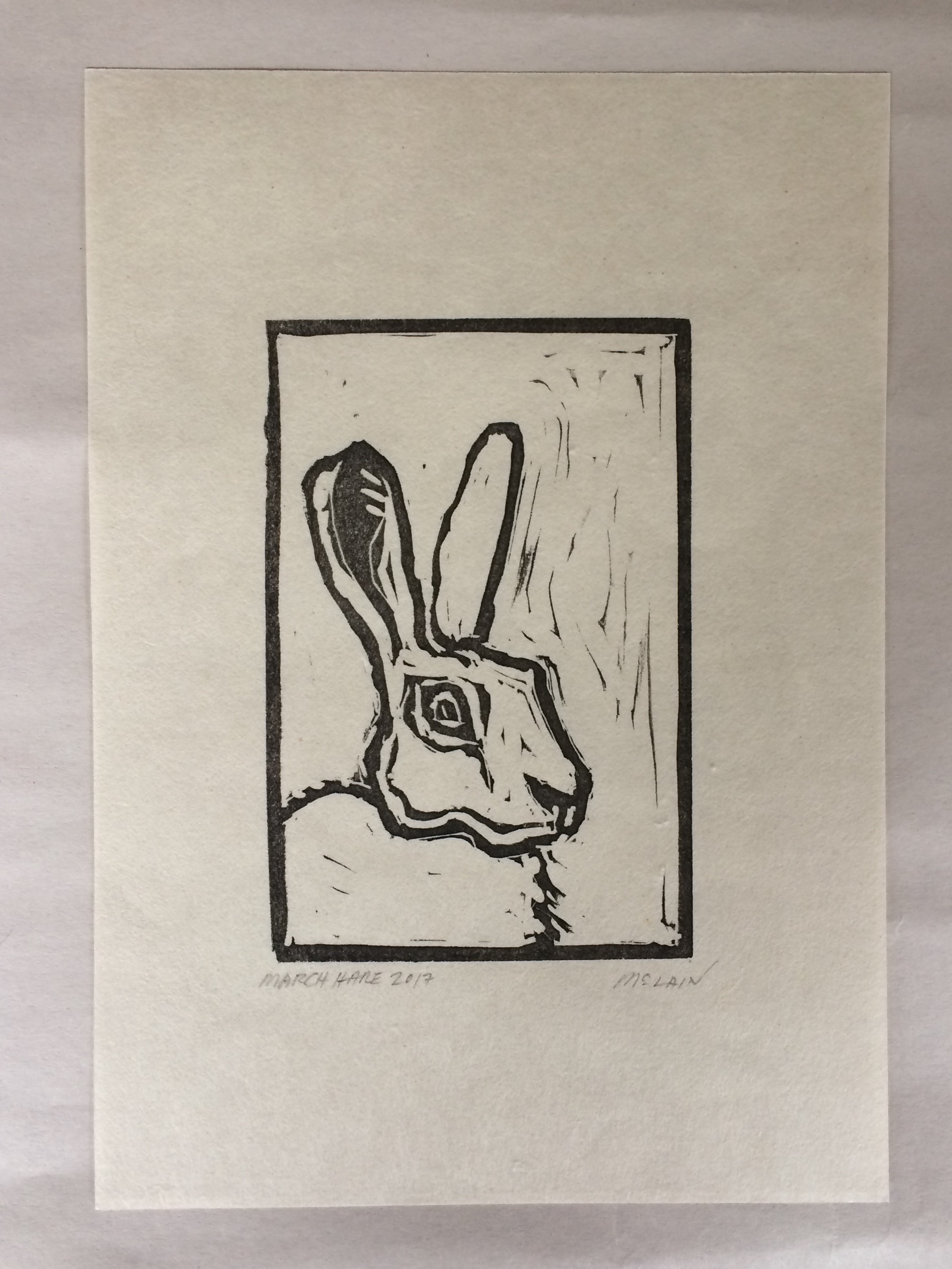
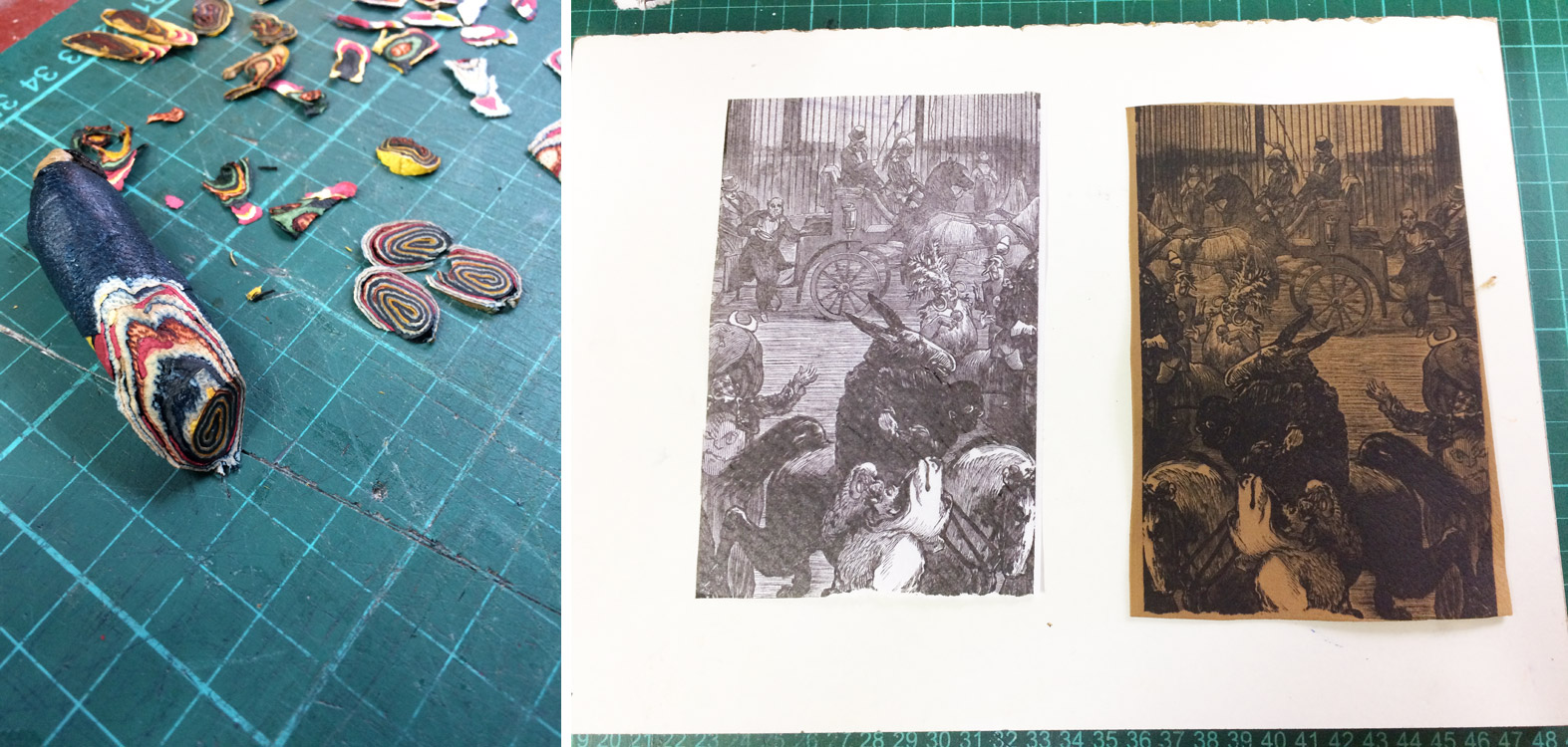
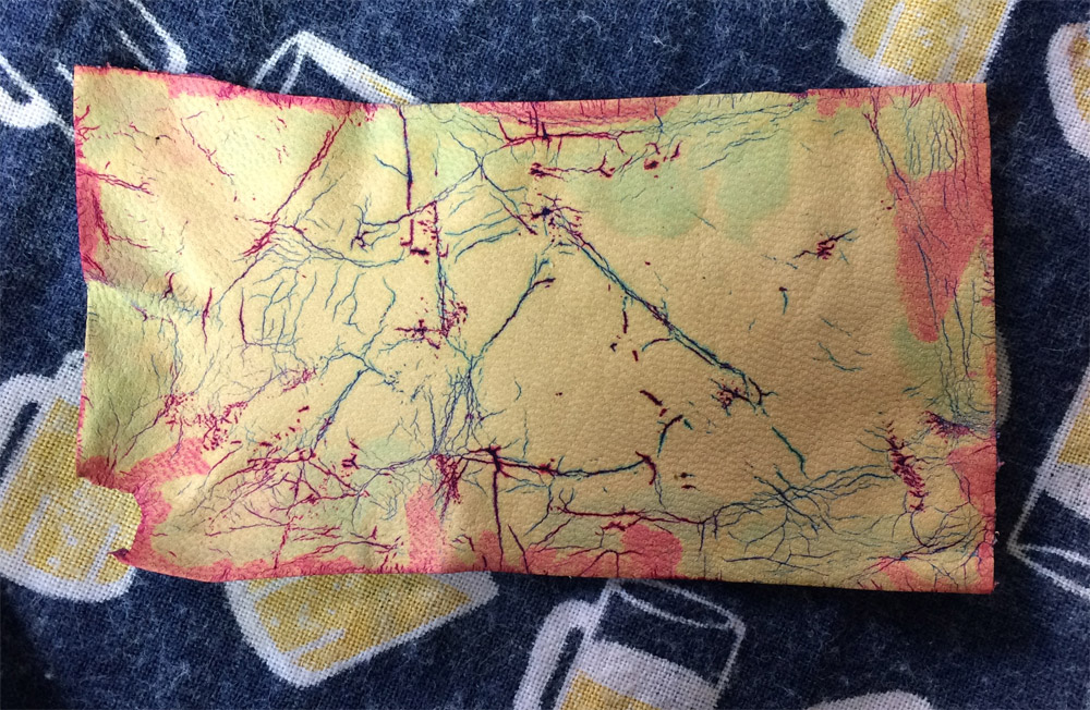
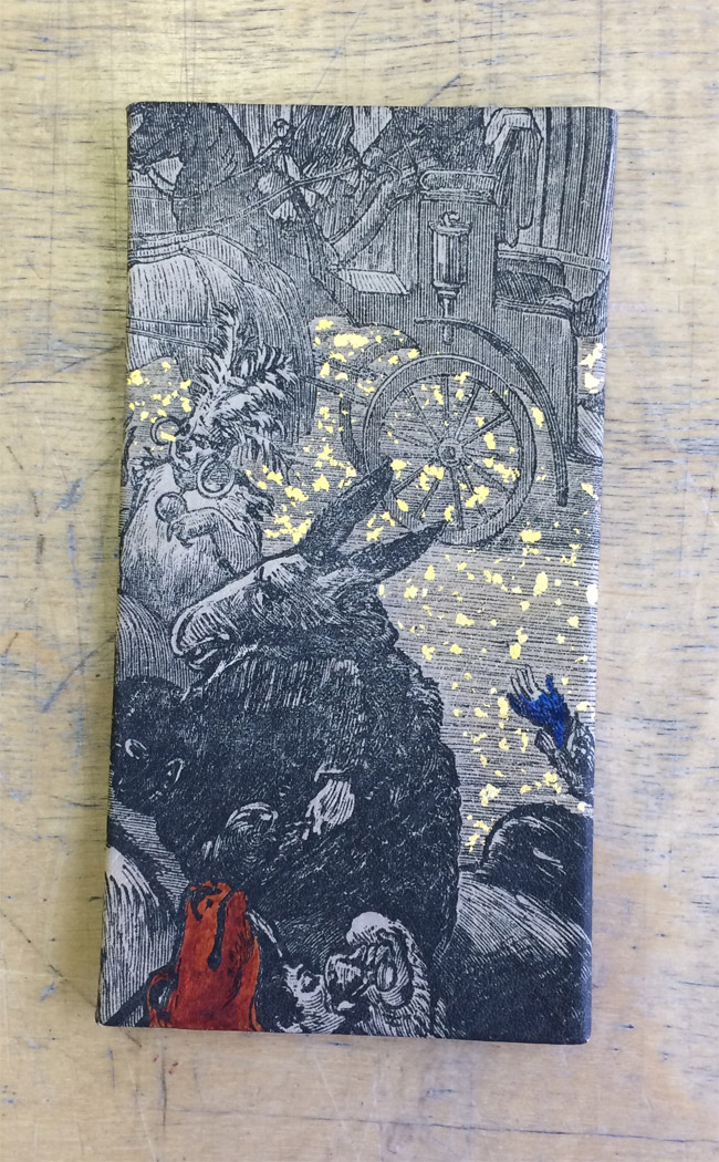
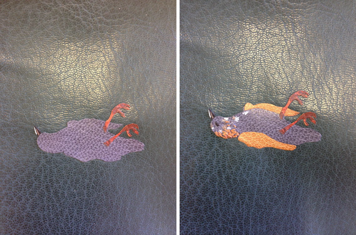
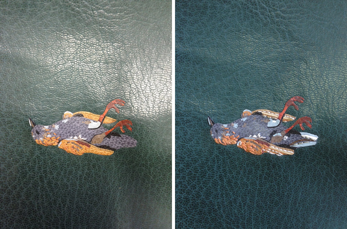
Anne McLain | March Hare
Melanie Mowinski
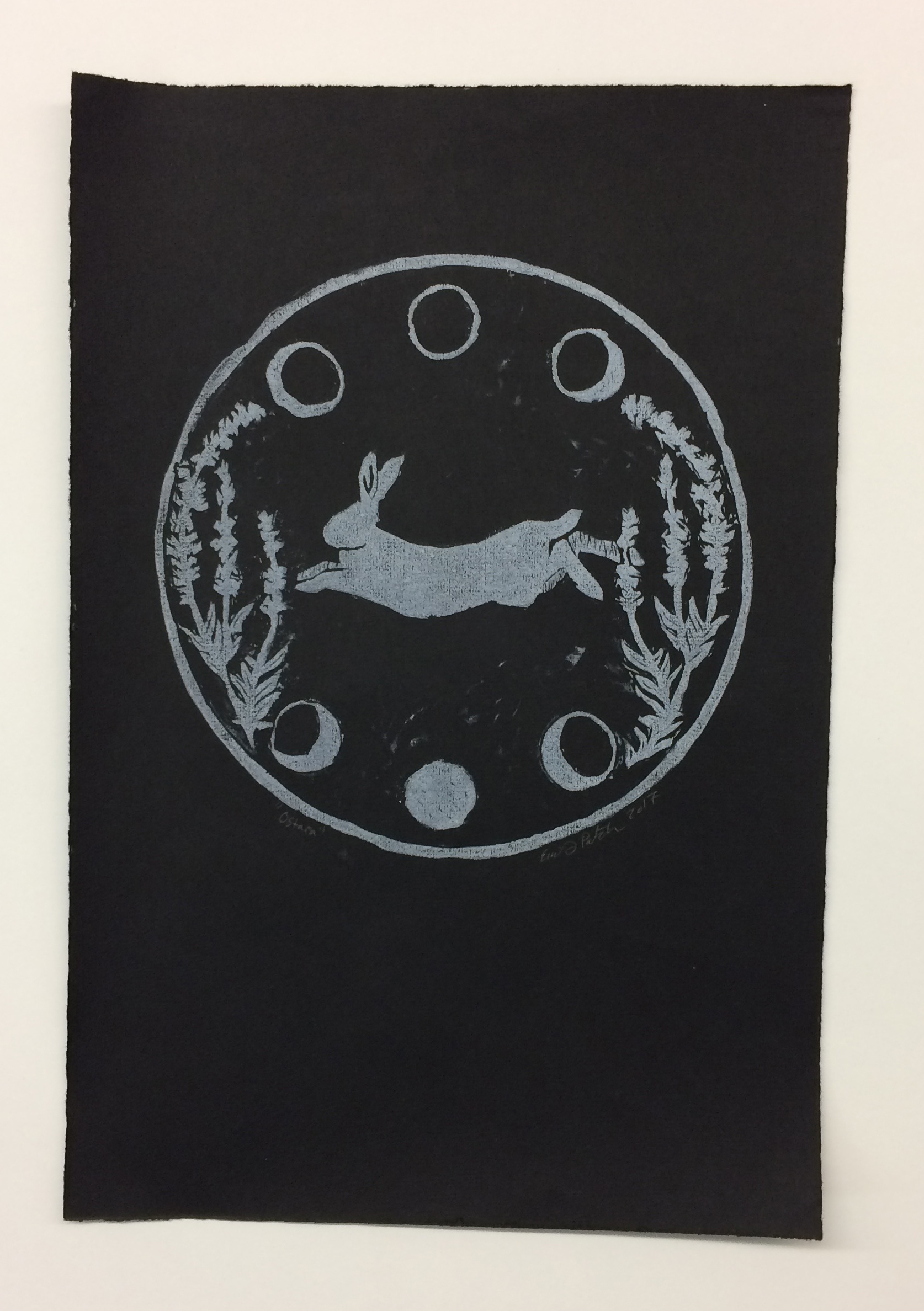
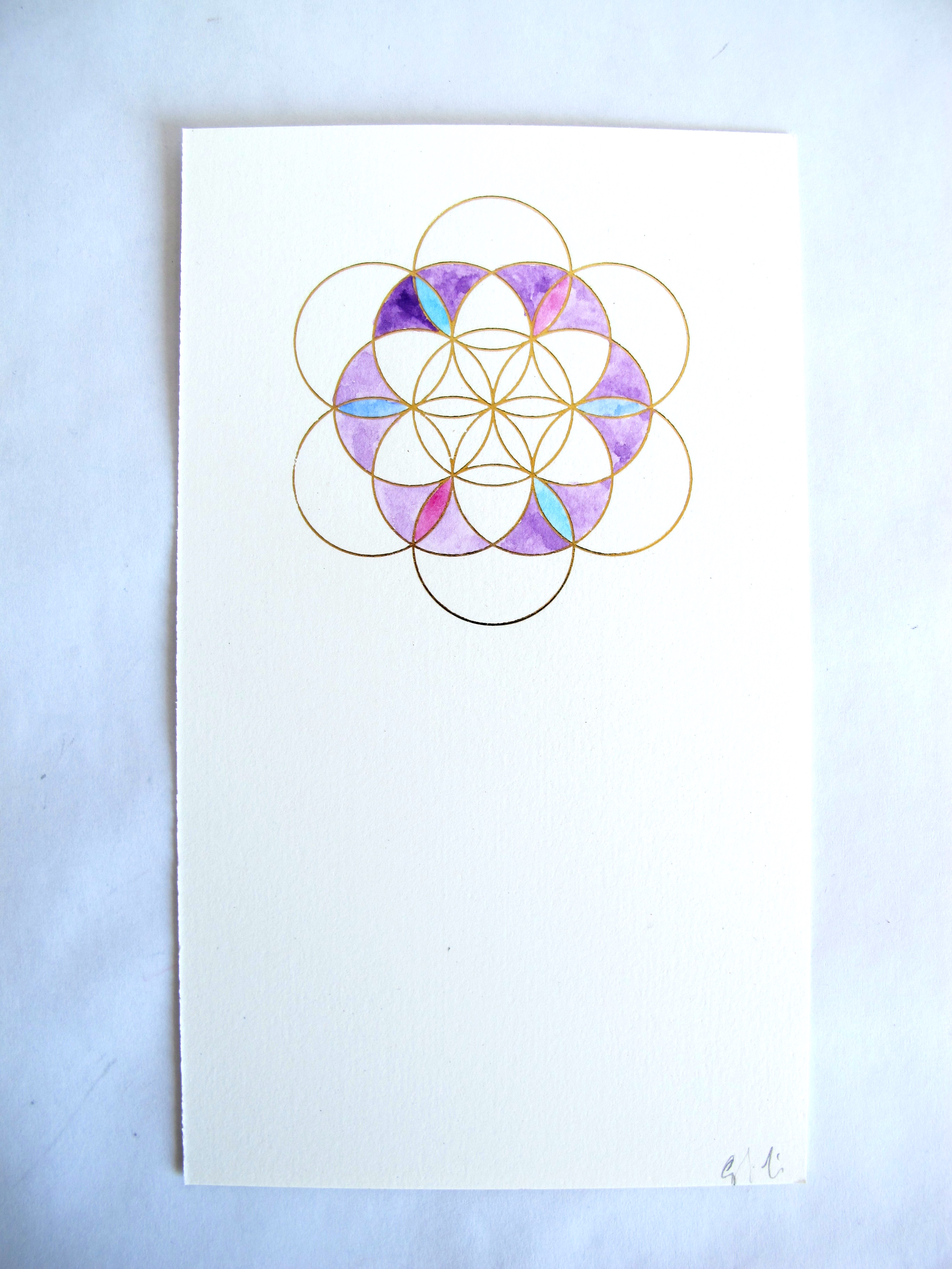
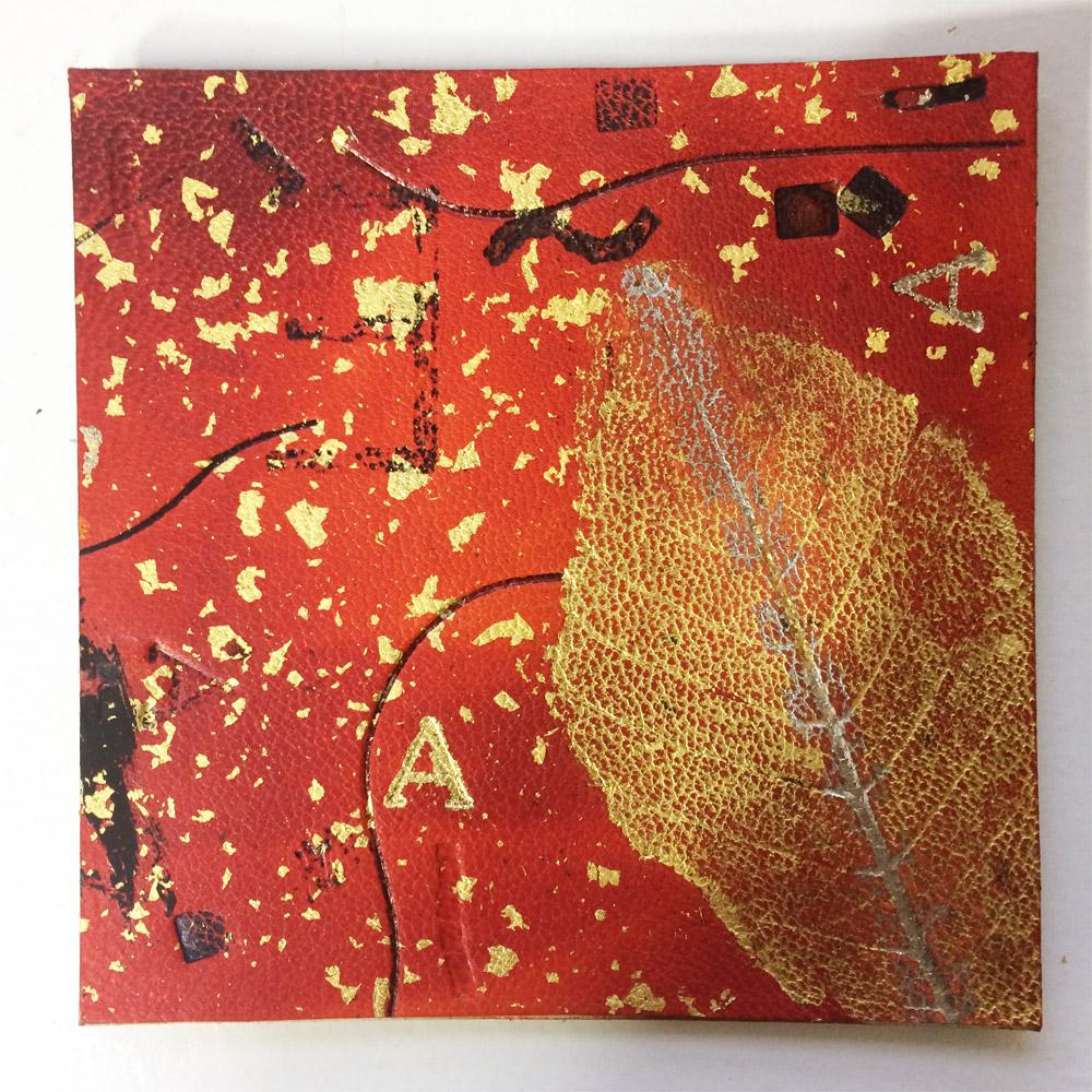
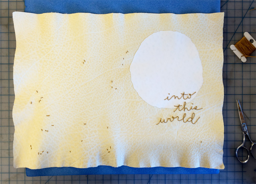
Emily Patchin | Ostara
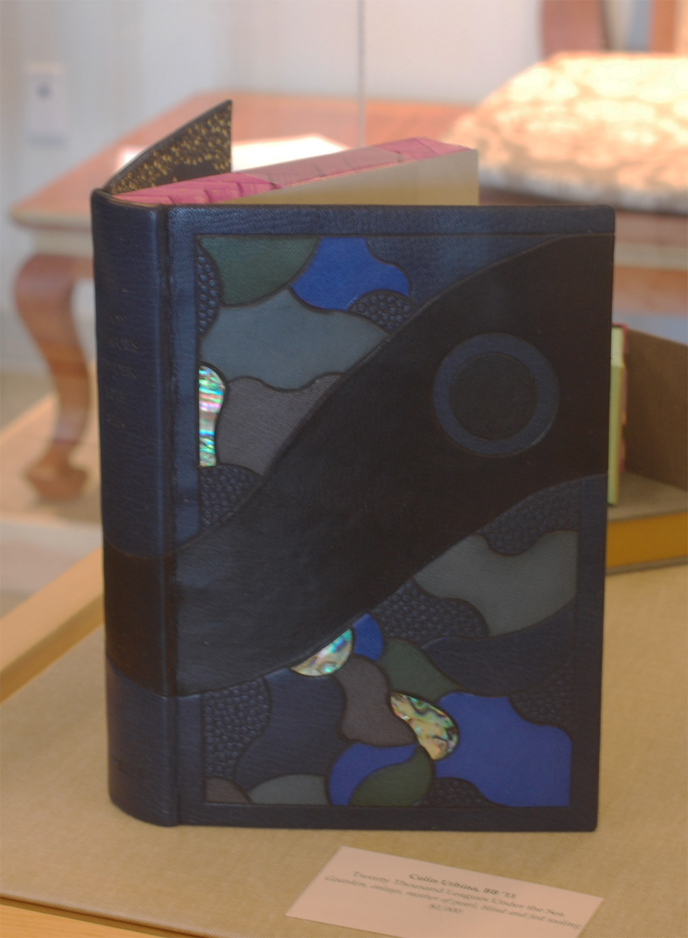
Colin Urbina
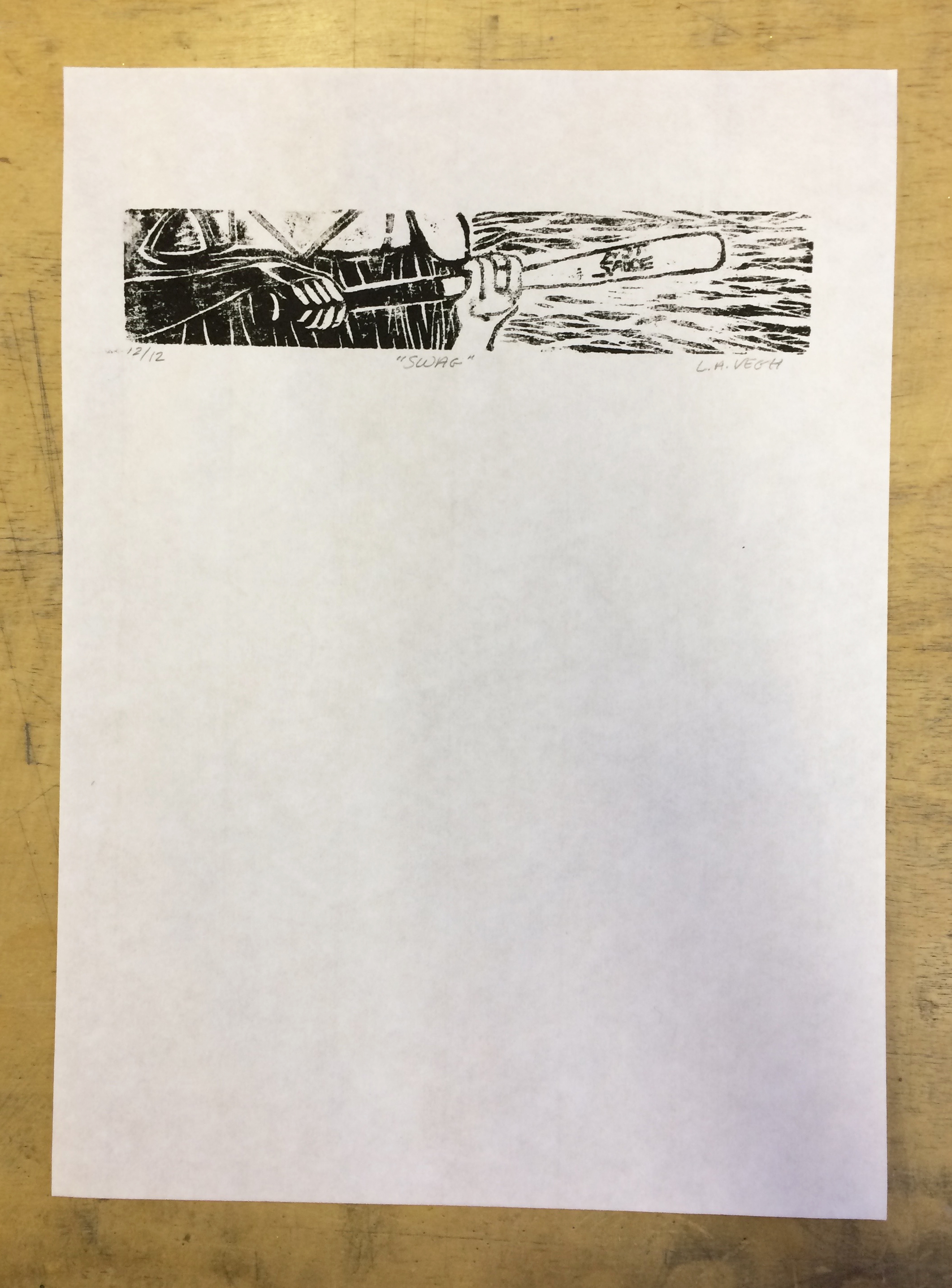
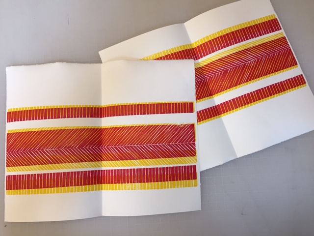
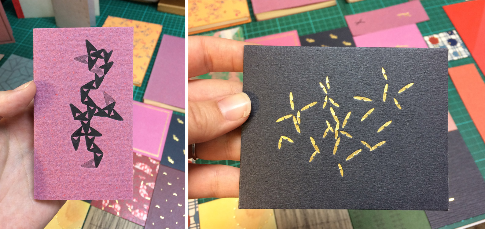
Linnea Vegh | Swag


