RSS Feed

‘my hand’ Category

  1. 100 Day Project // Panels 10 – 18

    April 6, 2021 by Erin Fletcher

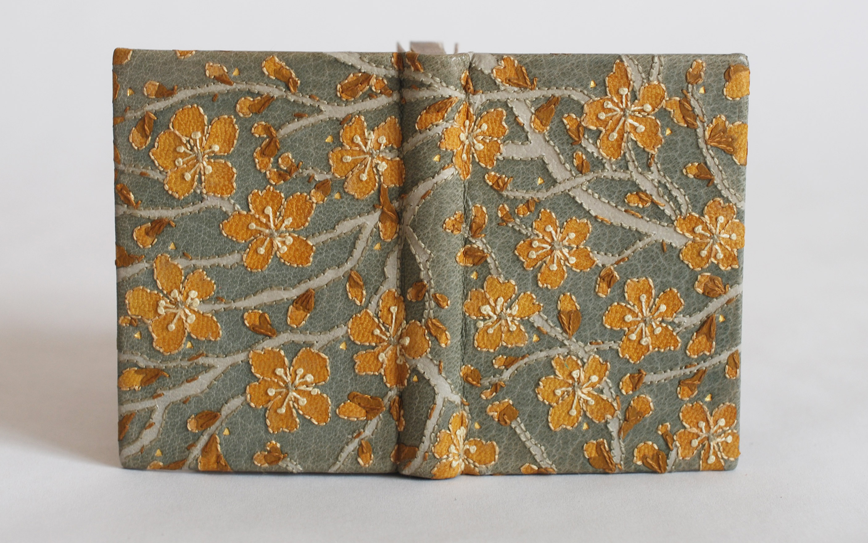
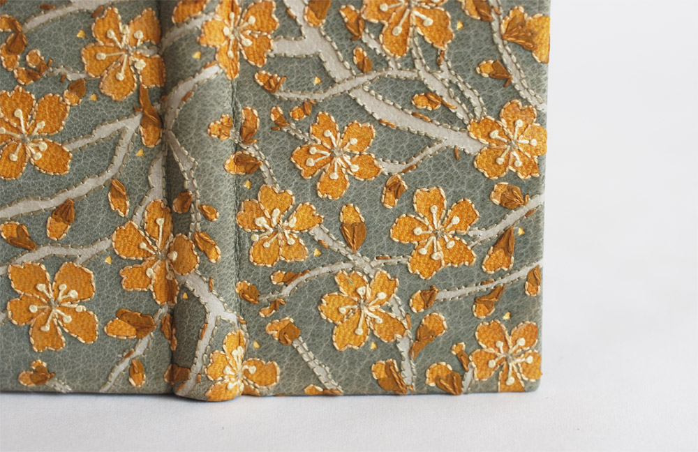
    Here are the next nine panels in my 100 day project.

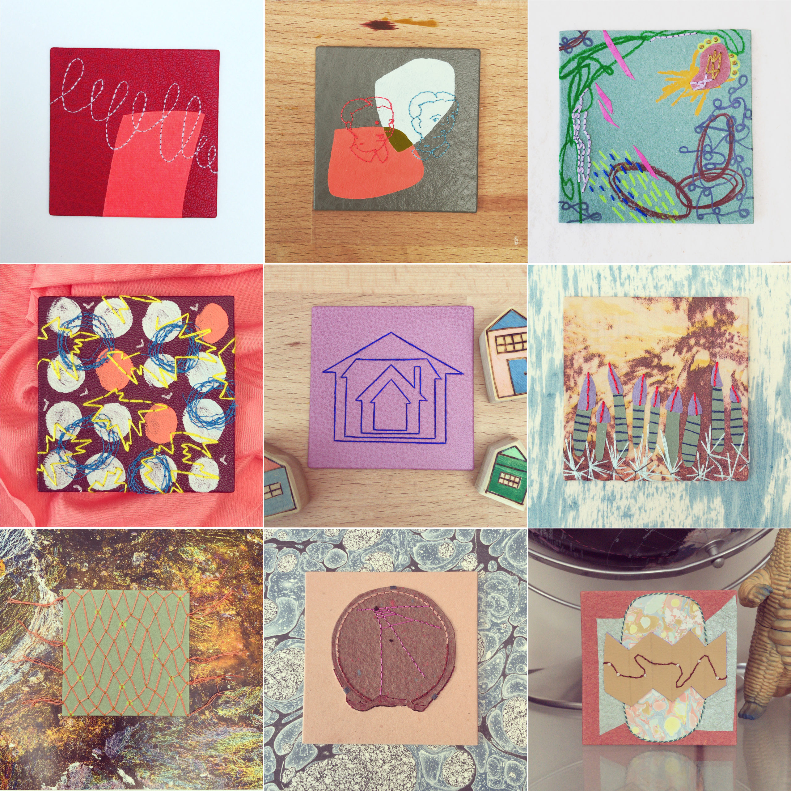
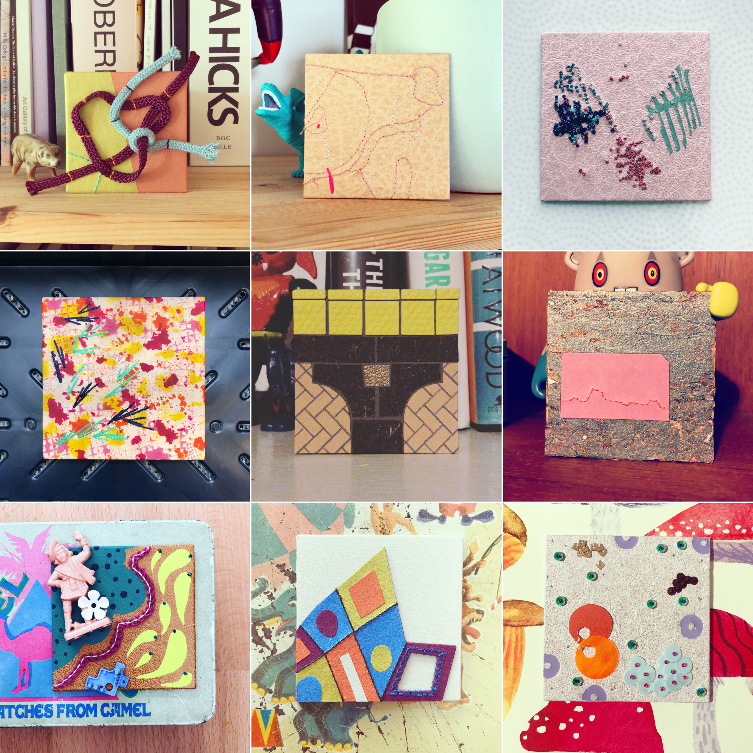
    Panel No. 10 // Tangle

    These panels are giving me the opportunity to play around with materials I might not consider for a binding and so I grabbed some cording I had picked up from a recent trip to Britex in San Francisco. This panel is covered in tangerine cowhide and chartreuse Moriki paper. Two strands of cord are tacked on with orange and navy blue silk thread. In the bottom corner are two stitched lines of emerald silk thread.

    Photographed on a bookshelf with a John Hook ceramic pig.

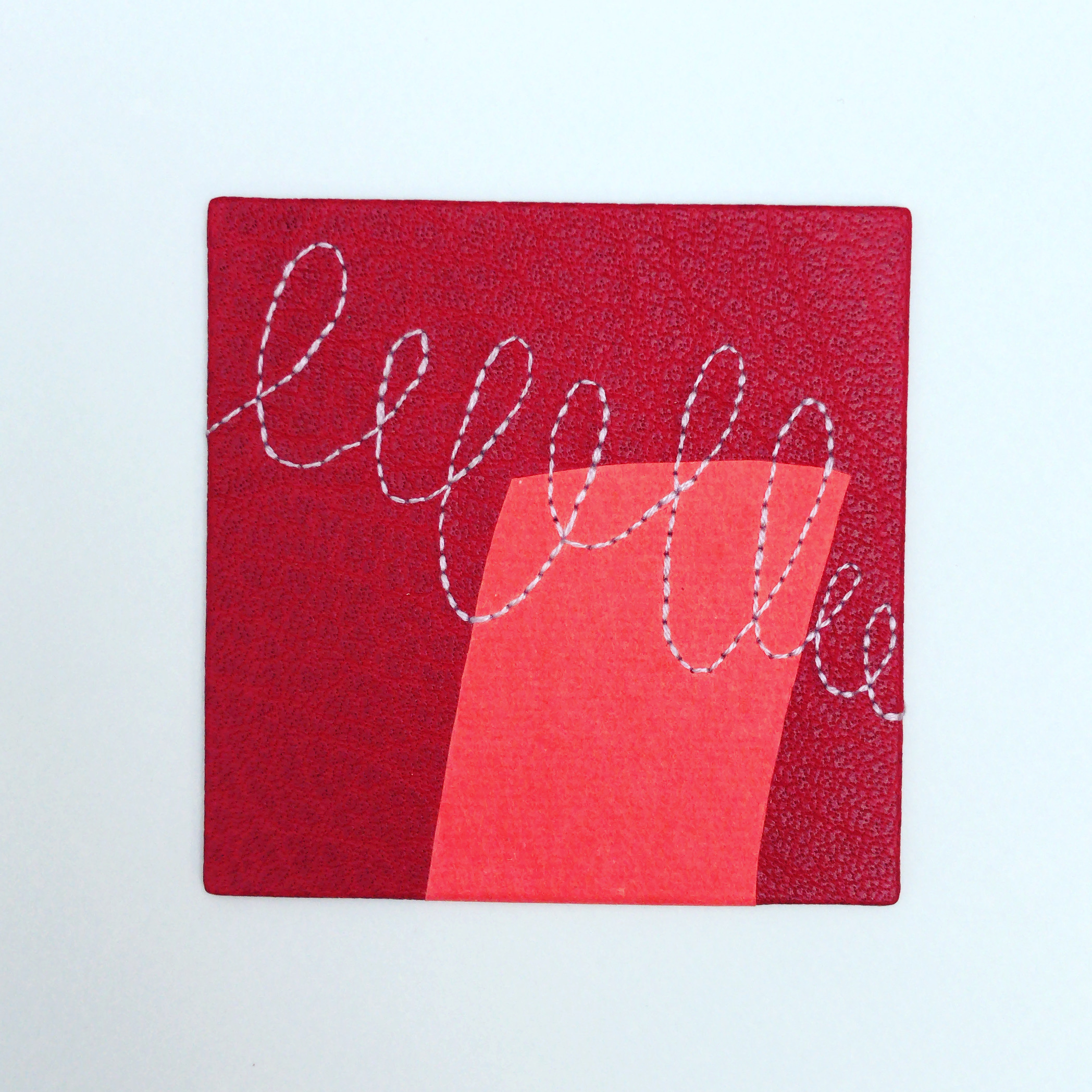
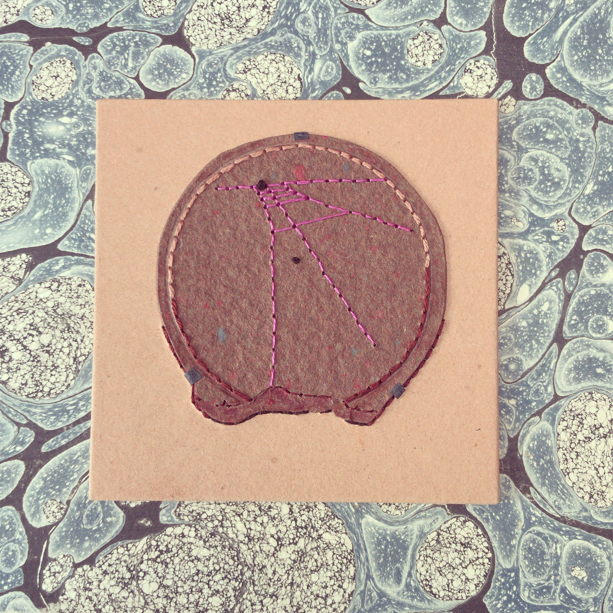
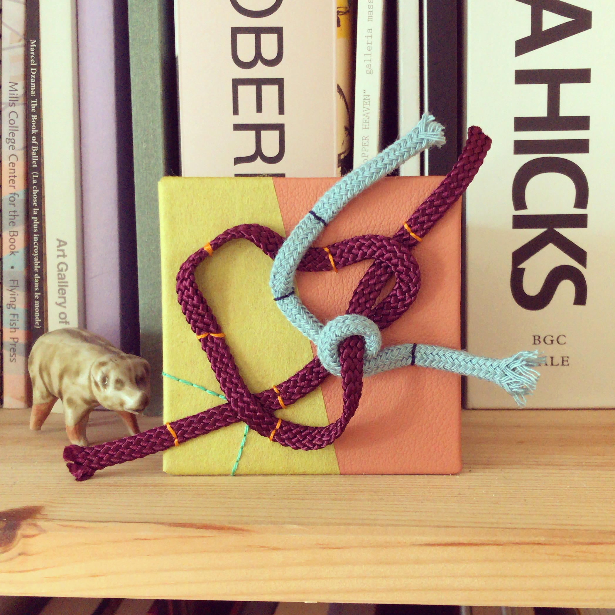
    Panel No. 11 // Sad Mole

    My husband and brother-in-law often collaborate together on drawings. I love their style of drawing and the line work can translate very easily into embroidery. This panel is covered in natura buffalo skin with embroidery in dark peach and desert sand cotton floss. Painted elements in opera gouache.

    Photographed next to a planter and plastic stegosaurus. Made while listening to Jónsi.

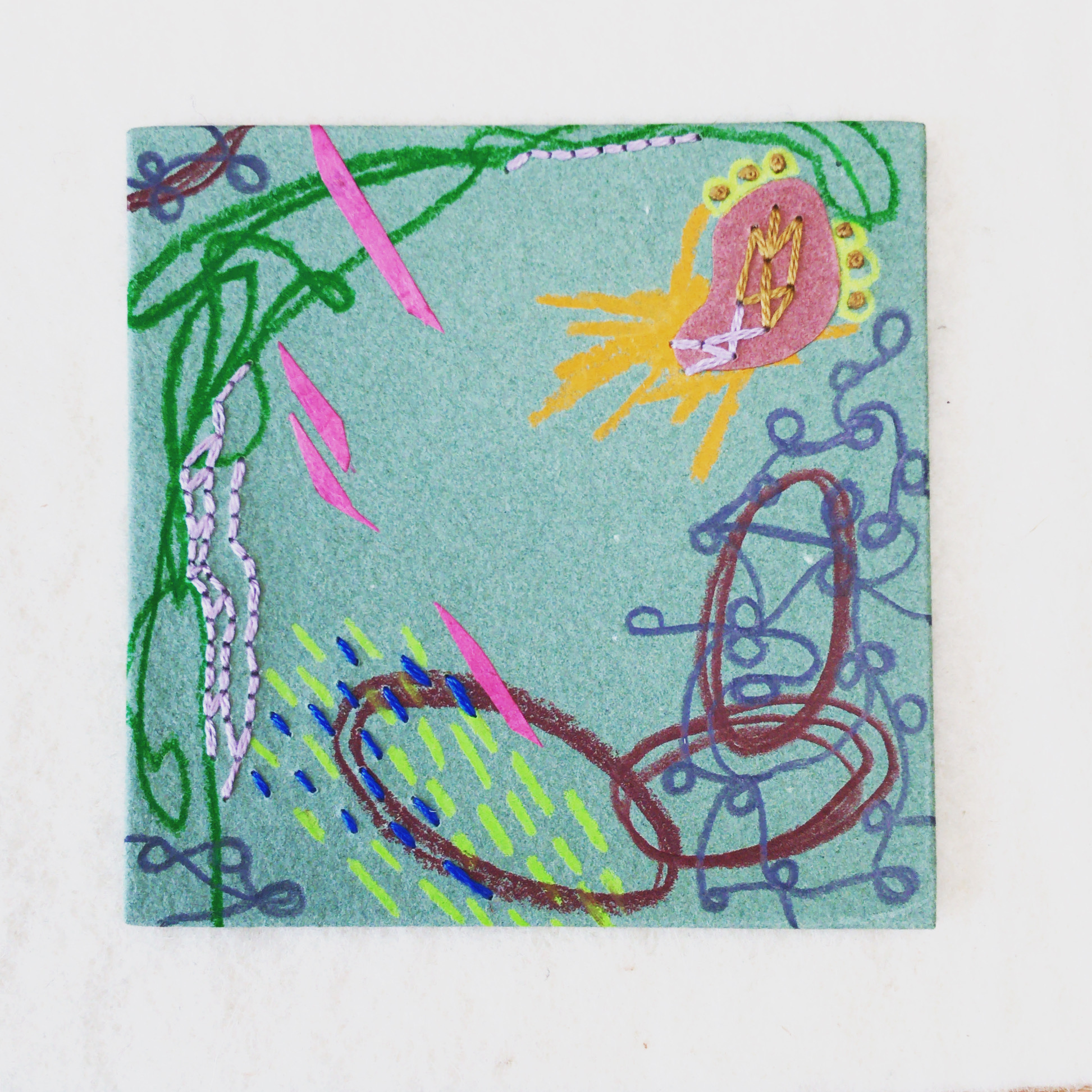
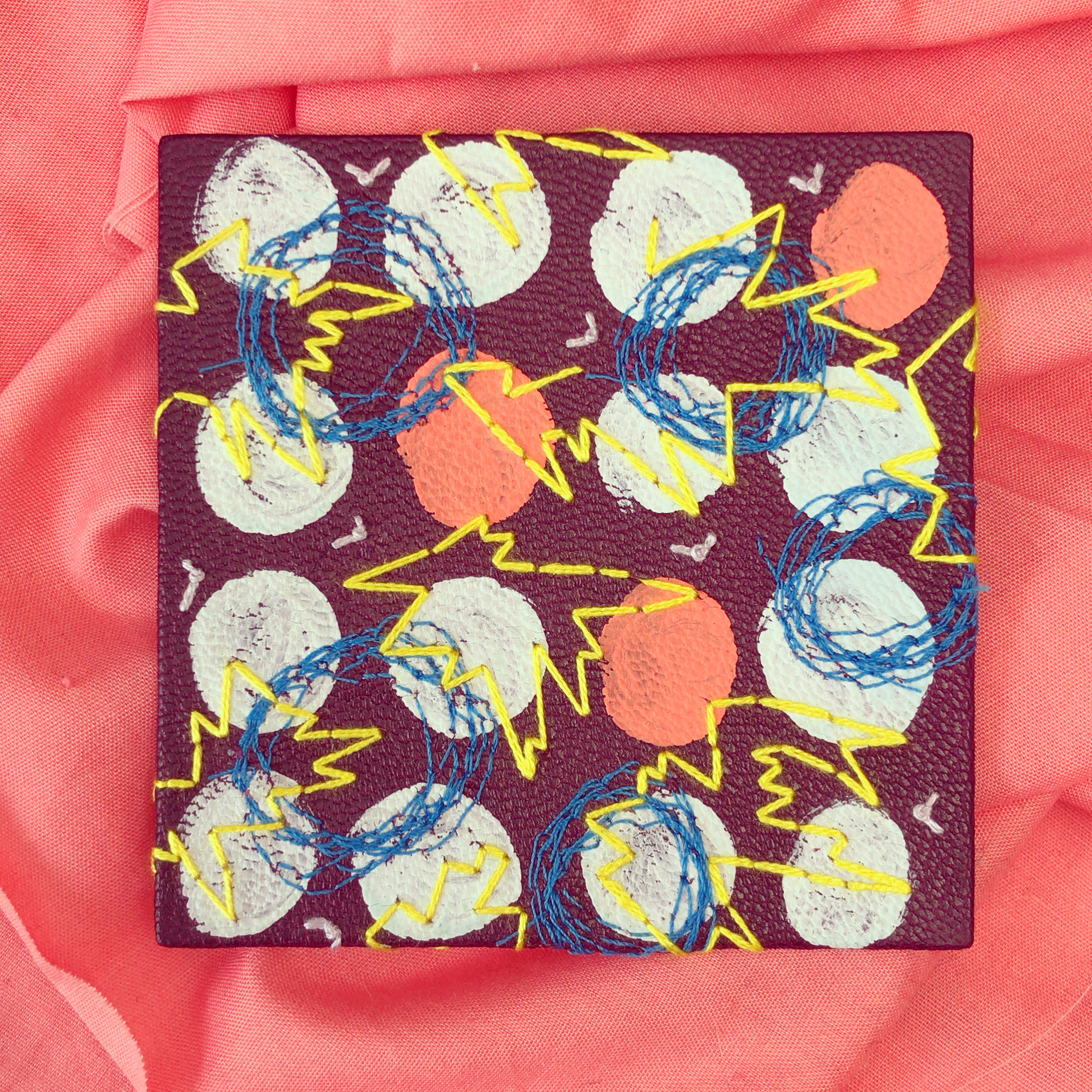
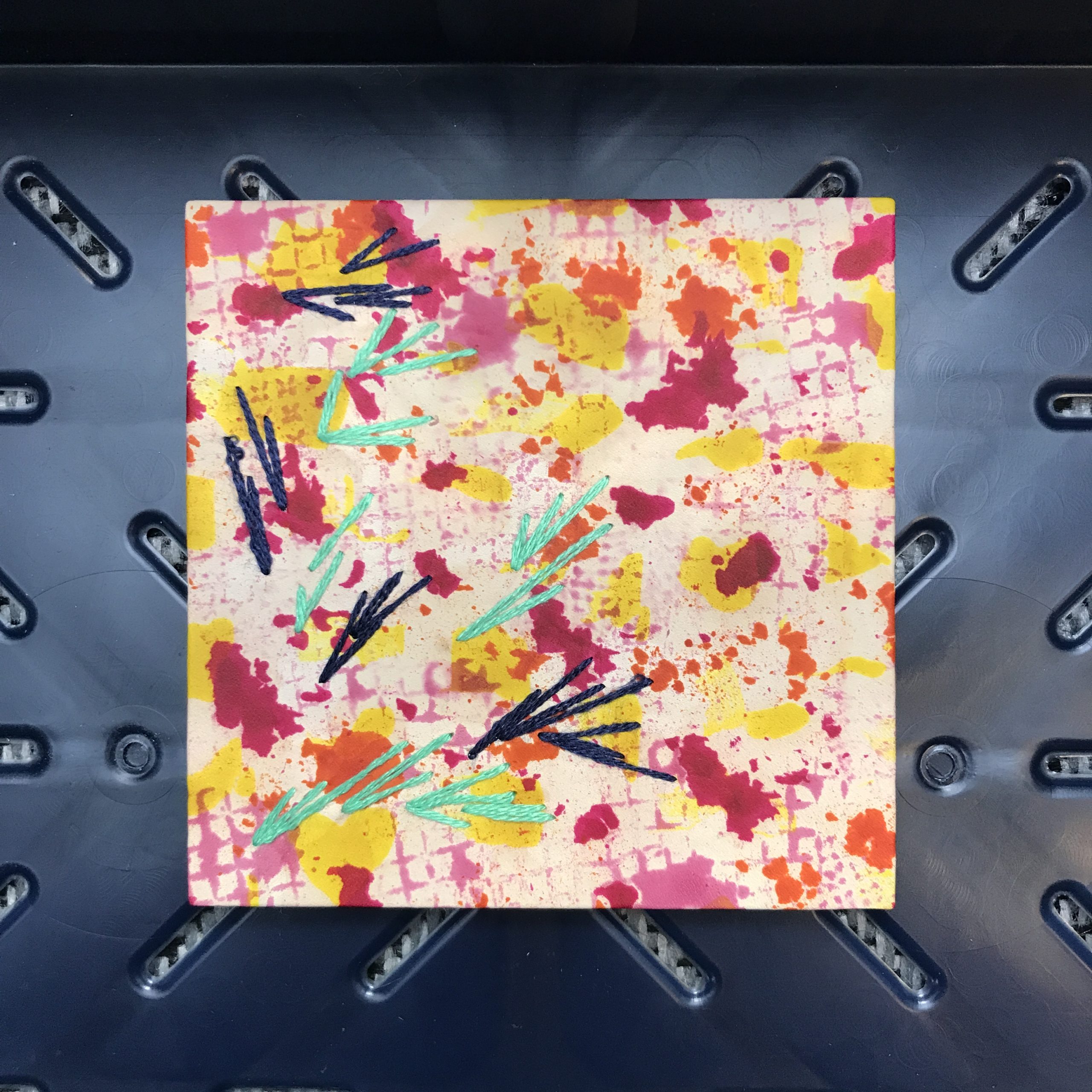
    Panel No. 12 // What’s Going Around

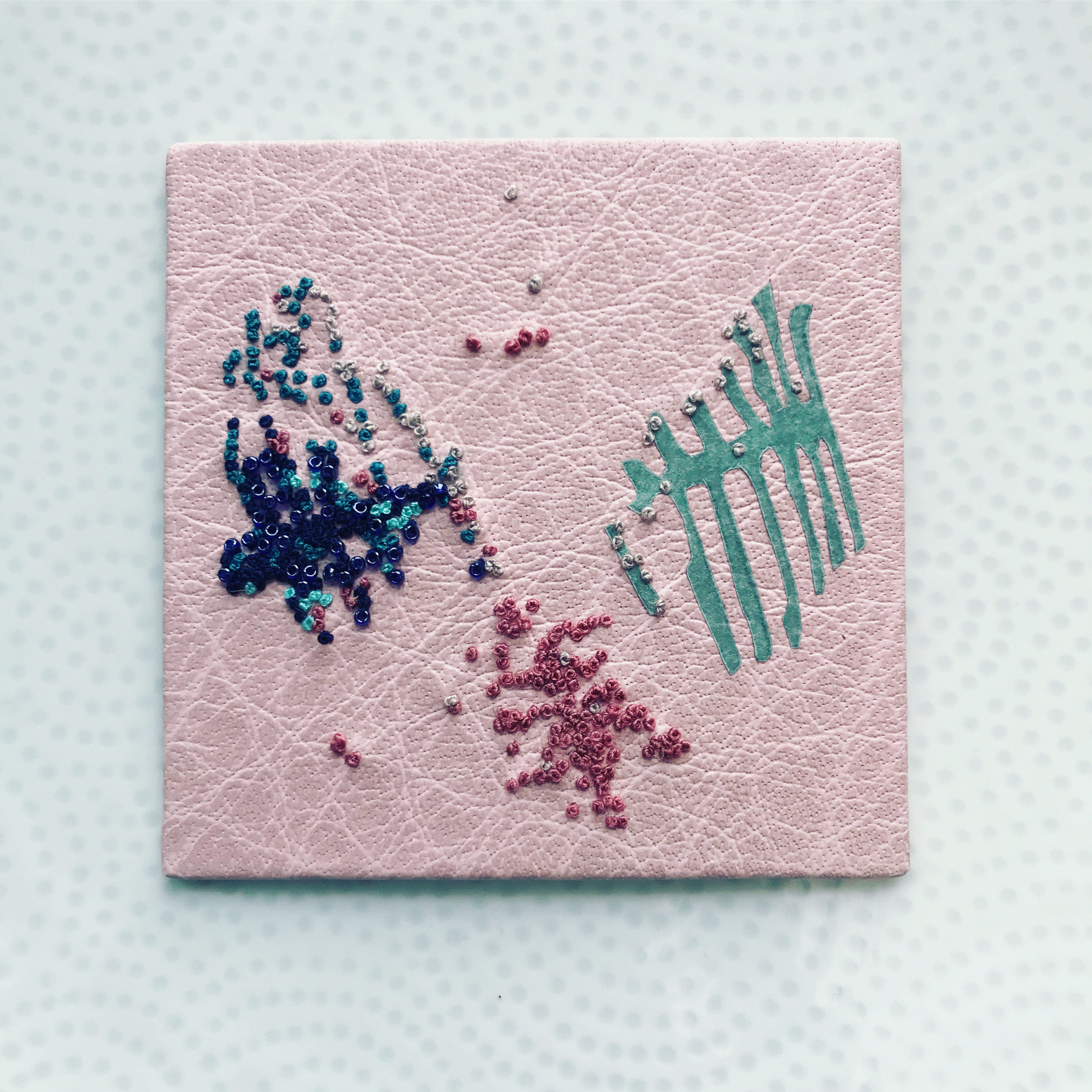
    I had been wanting to play around with beadwork on leather for a while. The inspiration for this panel came from an image of a petri dish. French knots and beads could easily emulate the growth of the colorful fungus. The embroidery is done in silk thread in navy blue, jade, green aqua, cafe au lait and desert rose. Dark denim glass beads attached with navy blue silk thread. A single paper onlay from handmade translucent abaca paper in teal.

    Photographed on a dinner plate and made while listening to The Strokes.

    Panel No. 13 // Ice Skaters in Spring

    This panel was covered in fair calfskin hand-dyed with various spirit dyes. To apply the yellow dye, I cut strips of paper and dipped them into the dye before brushing it onto the skin. The orange and red dyes were applied with wool daubers to create irregular blobs and spots. Bordeaux powder dye was applied with waffle patterned furniture pads. Longs strands of silk embroidery floss stitched in jade and navy blue.

    Photographed on a navy blue Hay crate and made while listening to Jay-Z.

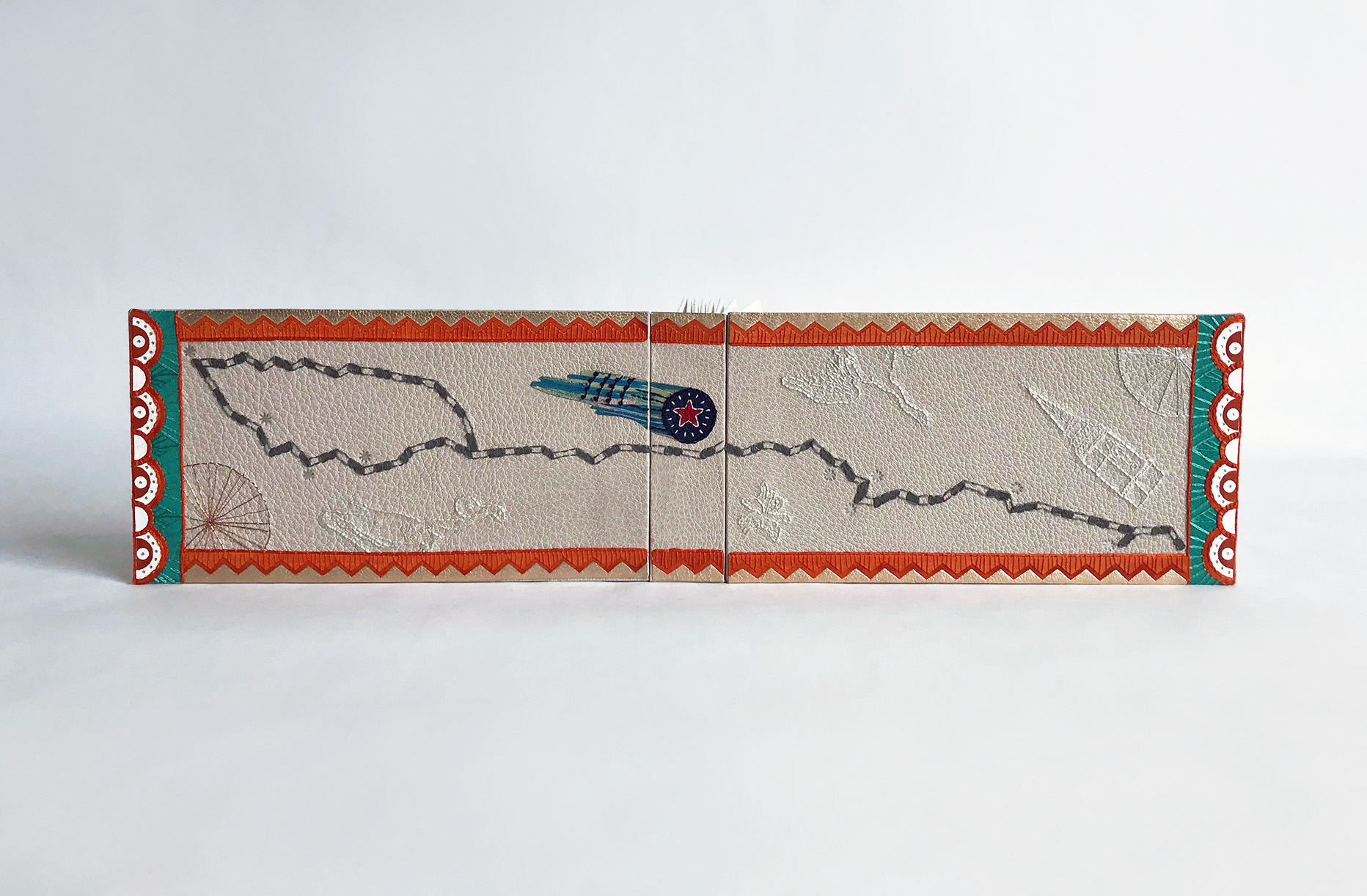
    Panel No. 14 // Central – Cambridge

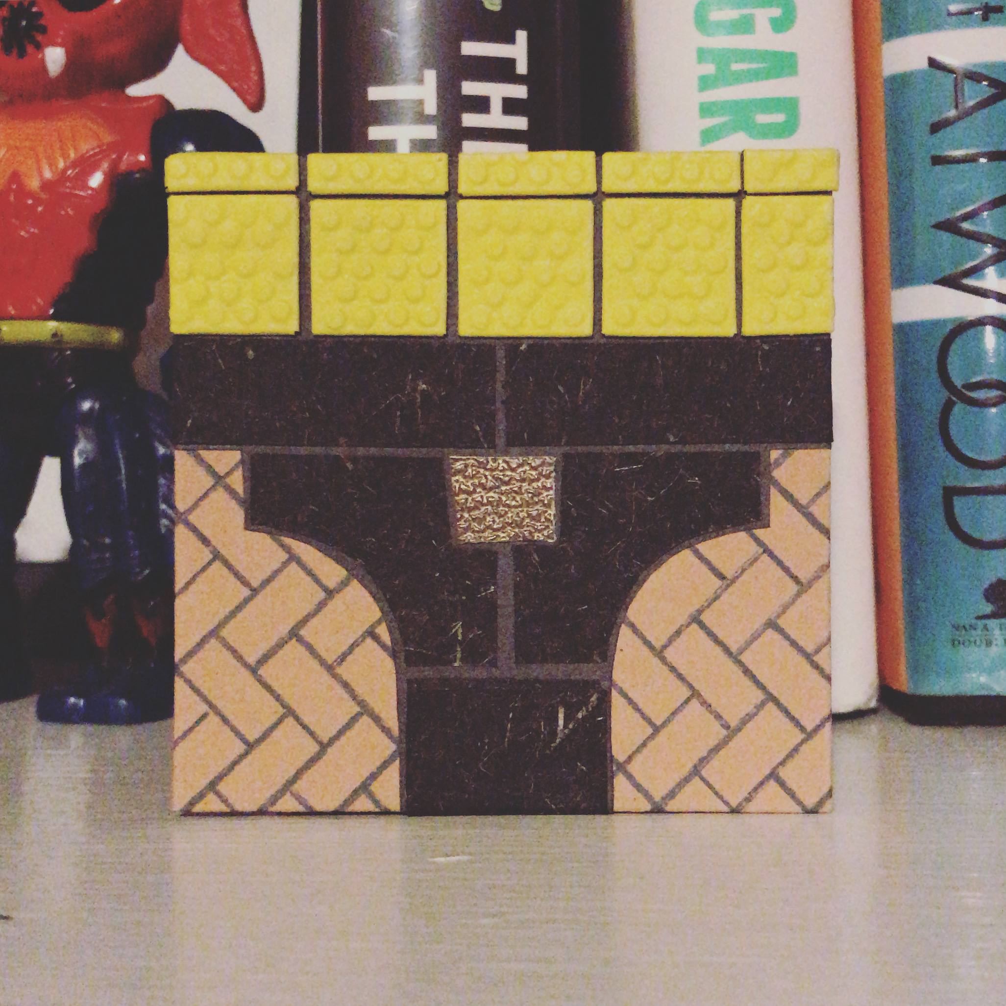
    I love photographing the ground under my feet, particularly tiles and subway platforms. I have mistakenly named this panel for Central Station in Cambridge, so the search continues to figure out its precise location. This panel is made from mostly layers of paper. The bottom layer is a piece of peach paper with lines drawn in slate grey to mimic tiling. The darker tiles are cut from dyed Japanese tissue and wheatstraw paper in black from Hook Pottery paper. The central gold tile is a piece of embossed metallic gold leather. The tenji tiles are made from 20pt. museum board and covered in sunburst cowhide.

    Photographed on a bookshelf next to a vintage action figurine. Made while listening to Jay-Z.

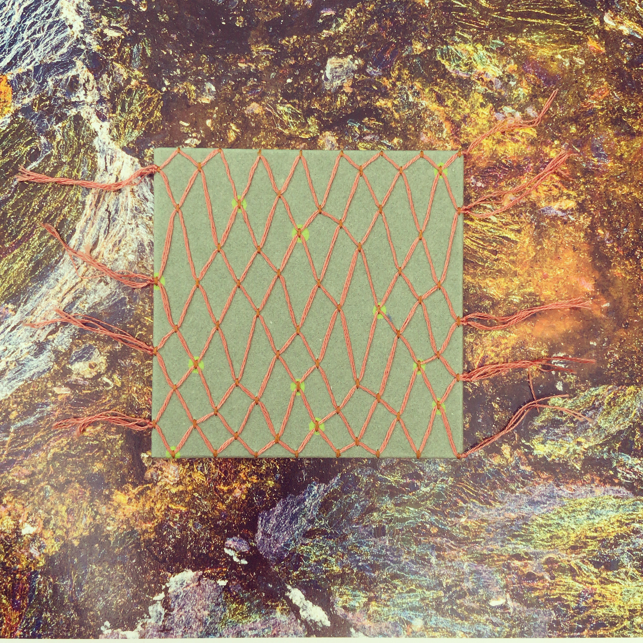
    Panel No. 15 // Pulse

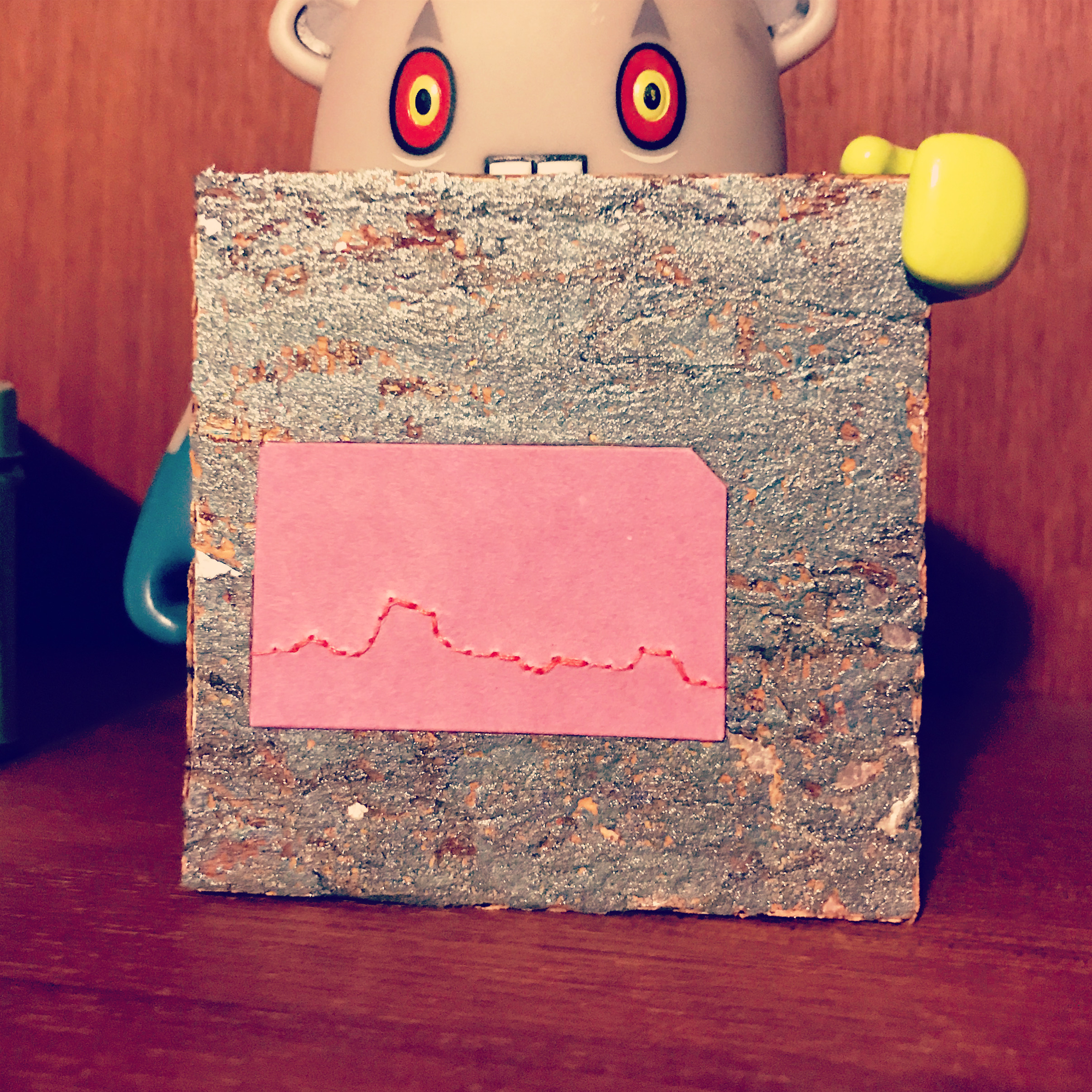
    This cork metallic paper has a beautiful texture, but does not wrap well around the edge of the board. The purple rectangle is a paper covered inlay made from 20pt. museum board and handmade paper. It is slightly thicker than the cork and therefore sits a little raised. The inlay has been embroidered with coral red polyester thread.

    Photographed next to a vinyl figurine.

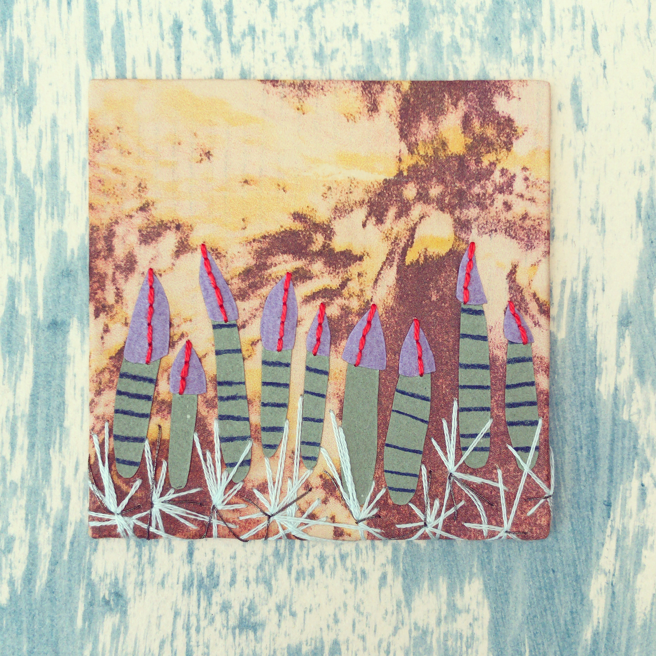
    Panel No. 16 // Greetie

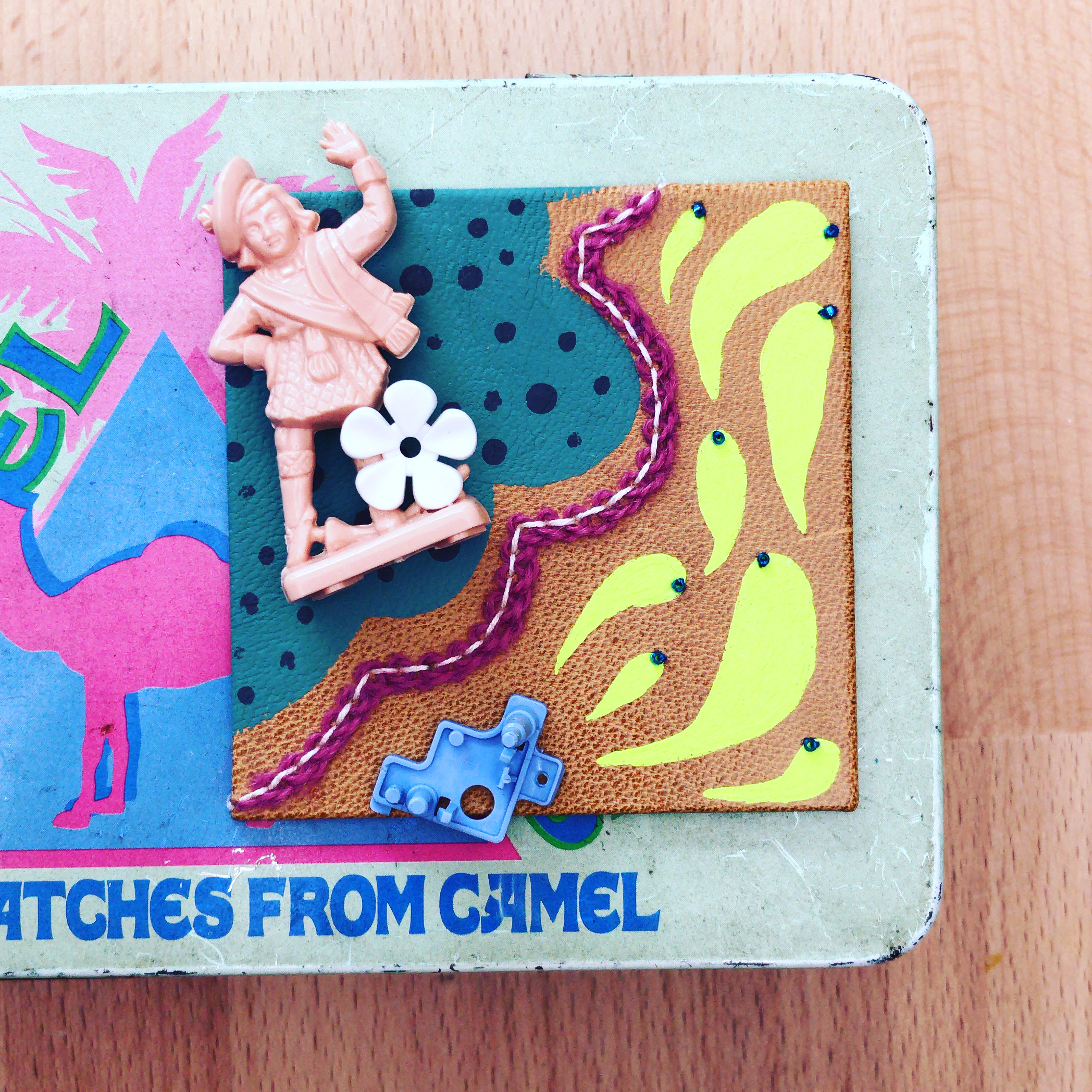
    This panel began to take shape with the inclusion of the two plastic trinkets which were ultimately glued to the finished board. The panel is covered in a medium brown goatskin with hand-painted details in ash green, neutral grey and leaf green. A pekinese stitch surrounds the cloud embroidered in light peach cotton floss with a strand of fuchsia wool thread twisted underneath. Seed beads in dark blue stitched to the ends of each droplet.

    Photographed on a vintage Camel cigarettes tin.

    Panel No. 17 // Everlasting Gobstopper

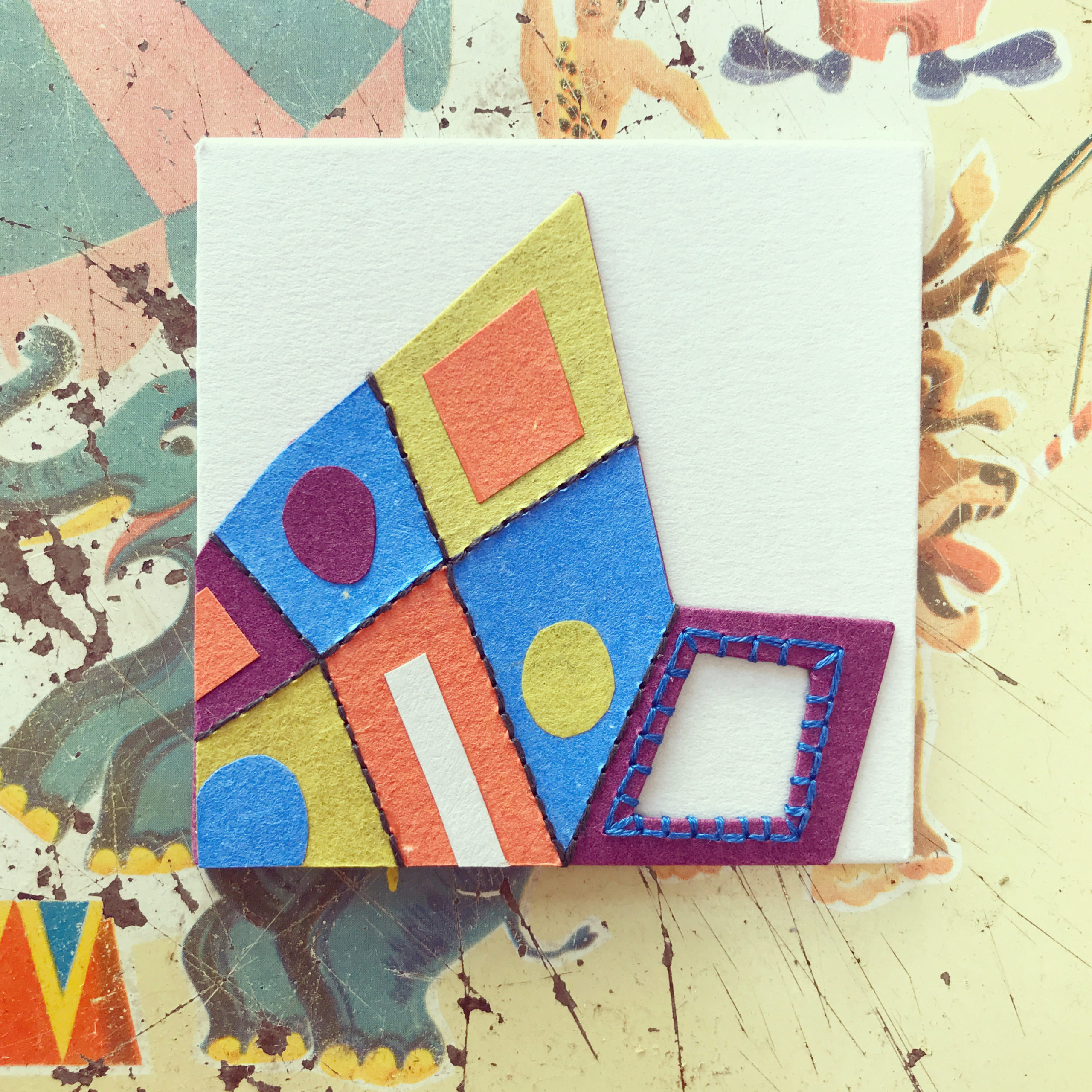
    This panel was inspired by a student in my Embroidered Leather Binding workshop. We discussed ways she could create a window in the cover and embroider around it. The panel is covered in steel blue Stonehenge paper with a collaged raised onlay. The raised onlay is covered in various handmade papers in dark orchid, bright blue, chartreuse yellow and tangerine. Edges are embroidered with dark grey cotton floss. The window is stitched with blue cotton floss and wraps around the edges.

    Photographed on a vintage serving tray.

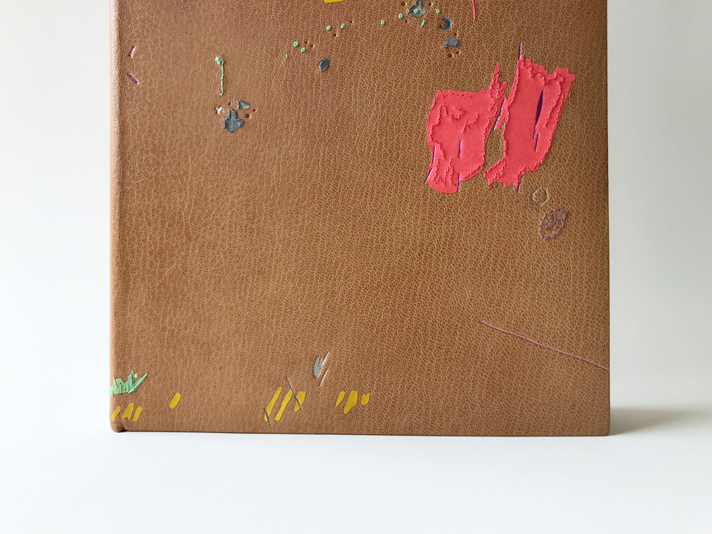
    Panel No. 18 // Saccharine

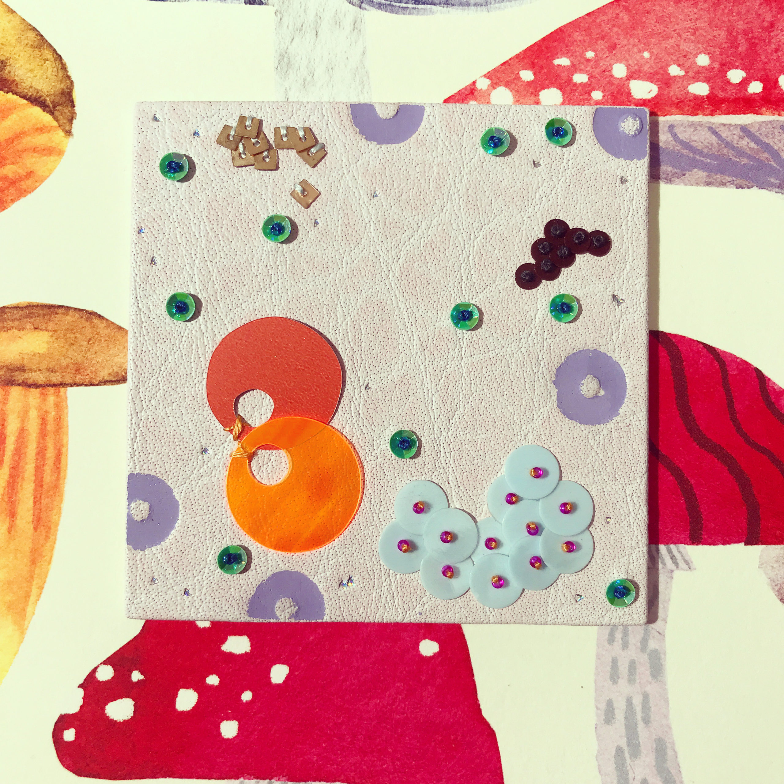
    In addition to playing around with beadwork on leather, I’ve also been wanting to add sequin to the mix. This panel explores a range of sequin and styles of attachment. The sequin are paired with dark denim and fuchsia seed beads and tooling done with matte lilac and holographic foil.

    Photographed on a mushroom print folder repurposed from a Paper Source calendar.


  2. 100 Day Project // Panels 1 – 9

    March 30, 2021 by Erin Fletcher

    At the beginning of February, I decided to embark on a 100 day project where I would craft decorative panels. Working on an intense project like this has been on my life list for a while and I hoped that it would force me to be spontaneous and free in my work. The only perimeters I set for myself was to keep the panels to 3×3″.

    With these panels I wanted to let loose and play around with material and technique combinations that have been on my list to explore for some time now. Some panels have inspired others, while some inspirations have come from the people around me. I am already seeing these explorations seep into my binding work. You can follow the daily updates on my Instagram, but over the next 11 weeks, I’ll outline each panel further here on the blog.

    Panel No. 1 // Squiggles

    To jump start the project, I made a list of about 30 ideas and a handful of sketches. For the first panel I pulled from one of these sketches. It’s a simple design of red buffalo skin with a handmade coral red paper onlay. The paper comes from the Morgan Conservatory and was attached with PVA. The embroidery is a simple looped line stitched with Splendor lilac silk thread in back stitch using a combination of 1- and 2-ply thread.

    The panel is photographed on white paper and was made while listening to Jay-Z.

    Panel No. 2 // Boys

    The illustration of these two boys comes from one of my middle school students created during an exercise in blind contour drawing. I’ve loved this illustration and had fun recreating it in embroidery on leather. The panel is covered in dark grey buffalo skin with hand-painted shapes using Acryla gouache in coral red, misty blue and olive. The embroidery is done in back-stitch and French knots in melon and peacock blue DMC cotton floss. The line weight varies between 1- and 2-ply thread.

    The panel is photographed on my bench and was made while listening to Jenny Wilson.

    Panel No. 3 // Summer Drops

    This panel was a random collection of marks made through colored pencil, paper and embroidery. The panel is covered with handmade Katie MacGregor paper in celadon green. I used Caran d’Ache Luminance colored pencils to create the doodles through the piece. Embroidery was employed in back stitch, seed stitch and French knots using DMC cotton floss in light antique violet, electric blue and khaki brown. There are a few paper onlays in fuchsia Lokta and handmade Katie MacGregor paper in rosewood, all attached with PVA.

    The panel is photographed on white paper.

    Panel No. 4 // Playdaze

    As I was building this panel, it began to remind me of a roller skating rink I often visited as a kid. The panel is covered in maroon goatskin with painted circles using Acryla gouache (coral red and misty blue). The embroidery is done both by hand and with a sewing machine. The electric blue circles were created with the machine; playing with the settings created stitches that were loose and irregular. The bright yellow bursts are stitched with Gloriana silk thread. The French knots with dual tails are done in Splendor lilac silk thread.

    Photographed on salmon pink cotton fabric and made while listening to Jay-Z and Jessica Pratt.

    Panel No. 5 // Neighborhood No. 1

    This design is half of an idea that was rejected by a client during the design phase of their project. I really loved this stack of houses and wanted to see it realized at some point. This panel is covered in mauve buffalo skin with lines tooled in matte bright blue foil.

    Photograph with house blocks and made while listening to Joan as Police Woman

    Panel No. 6 // Sea Vents

    The base leather became the inspiration for the overall design of this panel. It is printed calfskin which was meant to be used for another project, but the printer was low on ink and therefore the color came out wrong. The imagery of the printed calfskin is a photograph of a tide pool (created by Rebecca Chamlee), which inspired me to create a scene of deep sea vents with handmade paper onlays using paper made by Katie MacGregor (celadon with drawn lines in navy blue colored pencil) and the Morgan Conservatory (orchid). Embroidery is done in back stitch in dark melon cotton floss. Long stitches of icy blue cotton floss and gunmetal metallic thread surround the base of the sea vents.

    Photographed on paste paper and made while listening to Jay-Z.

    Panel No. 7 // Veil

    This panel was generated by the drive to use the cloud filling stitch. I wanted to create an irregular pattern with this stitch and allow it live outside the three inches of the panel. The panel is covered with handmade Katie MacGregor paper in celadon green. Dots colored with Caran d’Ache Luminance pencil in spring green. To create the cloud filling stitch, vertical stitches are placed into the paper with old gold DMC cotton floss. The netting effect is created by running a light terra cotton DMC cotton floss under the initial vertical stitches. These running threads were tied at the ends with the tails left visible along the edges.

    Photographed on image from Gowanus Waters by Steven Hirsch and made while listening to Joanna Newsom.

    Panel No. 8 // Tranquil

    This panel is my re-imaging of an object from the Louvre that I found calmed my nerves. The panel is covered with handmade peach Katie MacGregor paper. The object is made from brown St. Armand colored paper and embroidered with various tones of pink: burgundy polyester thread, dark rosewood, light rosewood, and plum cotton floss. French knots created with black brown cotton floss.

    Photographed on marbled paper and made while listening to Joanna Newsom and John Wizards.

    Panel No. 9 // Outing

    I grabbed The Ideation Deck by Julie Chen and Barbara Tetenbaum to help generate the design for this panel. The result combined various textures through paper, leather and embroidery. The panel is covered in tomato red St. Armand colored paper with onlays of soft pearl mint crinkle paper and pastel marbled paper outlined in a whipped back stitch using dark teal green and light nile green cotton floss. The accordion map is an onlay of cornsilk cowhide with edges painted with lilac Acryla gouache. Route stitched in dark rosewood DMC cotton floss with points stitched in French knots using light beige grey DMC cotton floss.

    Photographed against a vintage Replogle globe and kaiju figurine.


  3. Maker Talk // Creating a Design Binding

    May 26, 2020 by Erin Fletcher

    I was invited by North Bennet Street School to speak about my binding in the exhibit Drop Dead Gorgeous: Fine Bindings of La Prose du Transsibérien Re-creation. It was a real joy to participate in this exhibit with so many other incredible binders, many of whom I seek out for design and technique inspiration.

    I chose to create a design that would highlight both of the original contributors: Blaise Cendrars and Sonia Delaunay-Terk. Since the text is a facsimile of the original 1913 artist book, I also wanted to give a nod to Kitty Maryatt who set about on an ambitious project of letterpress printing and traditional French pochoir.

    In my talk I discuss my general process for creating a design binding, while looking at the specific design and techniques used on La Prose. The design on the cover is pulled directly from Cendrars’ poem in a loose interpretation of 17th century star charts. Below is a slide pulled from my presentation showing how I used images of St. Basil’s Cathedral in Moscow to design the border of my design.

    Slide from Presentation

    Check out the presentation to learn more about my embroidery technique and what other inspirational elements from the text found their way into the design.


  4. My Hand // Happy Abstract

    April 29, 2020 by Erin Fletcher

    Being lost in a state of creativity and production is a splendid place to be as an artist. William Blake, the Romantic poet, painter and printmaker, referred to this as ‘happy abstract’. This concept was highlighted in a letter written by Blake to one of his patrons in 1801, where Blake expressed his apology for the delay and that something more interesting had come along.

    This letter became the content of the set book for the second OPEN • SET exhibition sponsored by the American Academy of Bookbinding. This triennial event features finely crafted design bindings from all over the world. Binders were invited to submit their work into either category: the Open Category allowed the binder to choose their own text block and the Set Category gave each binder the same text block.

    Happy Abstract was printed by the immensely talented Russell Maret. A printmaker whose work is coveted by many and hard to obtain by many bookbinders to bind. Maret split up the letter to a single line per page descending from the head to the tail. Since this layout left a large margin around the printed text, binders were invited to add decoration to the inside of the book as well. A very exciting prospect to design throughout the entirety of the book.

    PAGES
    For the design on both the pages and the binding for Happy Abstract, I wanted to create something that was inspired by the beauty of unintentional marks and shadows. The inspiration for the shadows came during visits to museums and art galleries, where I captured the shadows cast by various works of art. These complex shadows add to the aura and beauty of the work, but are also captivating on their own.

    I wanted to recreate these shadows on the pages of the book. To do this I cut stencils with black paper to act as masks during the sun-bleaching process. Some of the stencils were cut down further after a certain period of time to offer the gradation seen in the image above. I taped the pages to windows at my studio and my home for a length of about 3-4 weeks. My studio gets more direct sunlight and offered a richer ‘shadow’ from the sun-bleaching.

    The stencils were placed on only one side of the folio, the chosen side was mixed up throughout the text block. This gave a disjointed display of shadows and a spread could range from no shadows, one shadow, or two different shadows. You can see views inside the book by clicking here.

    The endsheet closest to the text block was cut to mimic one of the stencils used for sun-bleaching. The cut endsheets cast a shadow on to the first and last page of the text block, giving the reader a similar experience to what first inspired me.

    BINDING
    I came to find the inspiration for the binding from my middle school students. My colleague Colin Urbina and I teach a Book Arts Middle School program through the North Bennet Street School in Boston. We teach a variety of artist book structures in addition to having them create their own content. They use all manner of instruments to do this: watercolor, crayon, colored pencils, markers, ink, charcoal and pastels. Each bench is set up with a piece of binder’s board to protect the surface from their flurry of creativity. The consequence of this creates a collection of abstract and unintentional marks.

    I pulled various shapes and marks from these boards to create a new arrangement for the binding. These shapes were then translated as back-pared onlays using a mix of handmade paper and hand-dyed calfskin. To capture the spirit of the watercolor markings, I layered the dyes with a paint brush (seen on green, grey and blue onlays) to make it look mottled.

    The markings would be built up in three layers using the following techniques: onlays, embroidery and tooling. Some elements would stand alone, but I was really interested in how these techniques would interact with each other. The embroidery is done mostly in a random way, with varying lengths and thicknesses to the stitches. I also used back-stitch and French knot, two common stitches in my work.

    With the embroidery finished I moved forward with covering and the third layer of the design: tooling. I used a random selection of tools from my collection (including some handle letters) to build up the design further. Impressions were done over the onlays and right along side the embroidery. I used a variety of pigmented matte and metallic foils in similar tones to the onlay pieces. I love this small addition of color and shimmer that the tooled impressions brought to the overall design.

    I used a very special handmade paper for the fly leaf and paste down. Papermaker and activist Mary Hark made a trip to Ghana to aid in the building of a papermaking studio. With an abundance of kozo growing as an invasive species, the community was able to harvest this plant to benefit their environment and build their business. This Ghanian kozo handmade paper has thread inclusions collected from a nearby textile factory. The circumstances, color palette and use of thread felt like a perfect pairing to the text and design of the binding.

    To see the entire catalog of bindings in the OPEN • SET exhibit click here. Even though the exhibit will be traveling across the country, it may be challenging to see it in person for a while. The Grolier Club in New York City, which served as the opening venue, posted images from the exhibit here.


  5. My Hand // 2001: A Space Odyssey Part Two

    June 13, 2019 by Erin Fletcher

    In my previous post, I went through the various enclosures crafted to hold my binding of 2001: A Space Odyssey and how they represented different parts of the Clarke’s text and Kubrick’s film. This post will focus on the binding itself, the inspiration and the process.

    Sitting inside the clamshell box is a binding decorated with a burst of color that plays homage to one of the most iconic scenes from Kubrick’s film. It is at this point, that the protagonist Dave flees the now inhospitable spaceship that was intended to carry him and his crew safely to Saturn. To recreate these star streaks, I bound the book in black buffalo skin with a range of back-pared onlays in goatskin, suede and handmade kozo paper. Additional embellishment is created through hand embroidery. Many times I create a template for my embroidery work. For this design I worked more spontaneously.

    Each stitched line was first marked out by scoring with a thin bone folder against a ruler in the desired spot. Then I pre-punch holes along this line in preparation for the embroidery. You can see my progression below as I was building up the design with both the onlays and the embroidery.

    This slideshow requires JavaScript.

    Tucked in between the section of pink onlays is a segment from Verdi’s Requiem Mass (Dies Irae) which is achieved with couching the embroidery floss and French knots for the notes. After narrowly escaping Hal’s attempt to kill him, Dave dismantled the computer and spent time in the ship contemplating his next move. He played a range of music to combat the silence. Verdi was blasted across the ship at the height of his loneliness and despair.

    Dave finally flees the empty ship and enters the final stages of his evolution. This is communicated by the interior side of the boards, flyleaves, edge decoration and endpapers. In his escape pod, Dave enters a space with gaping black shafts filled with squares, triangles and polygons before emerging into a white space peppered with a myriad of tiny black specks overhead.

    Dave ends this portion of his journey in a room where the objects seem familiar but at closer inspection deemed poor replicas. Dave calls out how two paintings hung on the walls are quite blurry yet recognizable. These two paintings are Van Gogh’s Bridge of Arles and Wyeth’s Christina’s World. I altered and cropped these paintings for the endpapers to be the final visual representation of the book before getting to the actual text.

    And that’s my rendition of this iconic science fiction story. You can see more images of the binding and boxes at my website.


  6. My Hand // 2001: A Space Odyssey Part One

    April 22, 2019 by Erin Fletcher

    If you ask a binder what book they would love to bind, I’m sure they would have a list of titles at the ready. I’ve had 2001: A Space Odyssey by Arthur C. Clarke on my list for sometime now. After working on the binding on and off for over a year, I can finally check it off my list.

    I was first enchanted by this story not by reading the science fiction novel by Clarke, but through the film by Stanley Kubrick. It’s one of my favorite films and I see it on the big screen any chance I can. It wasn’t until after I read Clarke’s telling of 2001, that I began to investigate the unusual collaboration that produced both the film and the novel. Kubrick and Clarke wrote the story together, yet parts of the story don’t appear in the film and vice versa. Each respective storyteller put their own unique spin on the tale.

    The film actually debuted before the novel, which makes me feel better about not reading the book before watching the movie. In fact, I think the novel enriches the film, expanding on the story in a way that could not be visualized in the film.

    When I embarked on binding a copy of 2001, I had all of this history in the back of my mind. I read the novel again, this time through the lens of a designer, pulling out segments and phrases I found inspirational. Unconsciously, I was also visualizing imagery from the film; scenes that were so impactful and had influence on my design. I could not separate the two when working on the design.

    One other hurdle I came upon, was the sheer volume of inspiration from the novel and film. There were too many significant moments; which do I highlight? So, I came to the conclusion that I needed to create a design that would represent each major moment of the story.

    In this multi-part post, I will describe each aspect of the piece, going into detail about the inspiration for the design and how I chose to execute it through various materials and techniques.

    Let’s start with the outermost enclosure: the storage box. The entire collection of enclosures and binding are housed in a standard full cloth clamshell box. I don’t really view this box as part of the overall concept, it merely serves the purpose of storing the contents safely. However, this is the only piece where the title appears as a label on the spine. The title is embroidered in a futuristic font on handmade paper from Hook Pottery Paper.

    Sitting inside the storage box is a paper wrapper, which is meant to represent Part I: Primeval Night. The story begins at the dawn of humankind, witnessing the moment that our primitive ancestors develop tools to be used for killing animals for consumption, but soon this same tool becomes a weapon against an enemy tribe as it is used to murder the leader of a neighboring group. The 4-flap wrapper is made from yellow ochre St. Armand paper, which is a nod to the vast desert setting for this incident. A coyote foot bone aids in opening the wrapper and is an obvious cue to this significant part of the story.

    Unfolding the wrapper reveals the interior clamshell box, which includes the elusive monolith. A symbol that appears throughout the novel. This transition from wrapper to clamshell is referencing two moments: the monolith first appears to the primitive humans at the precise moment described above and then not seen again for centuries until it is unearthed on the moon. So the action of unfolding the paper wrapper to reveal the monolith underneath speaks to these two moments in the story and moves into Part II: TMA-1 and Part III: Between Planets.

    The monolith onlay is constructed according to the 1:4:9 ratio described in the book. I used black calf skin wrapped around 20pt. museum board. After attaching the leather, I pressed the piece with mylar to create a shiny surface on the leather. Depth is created through the simple addition of three blind tooled lines at the left side and bottom edge.

    The monolith is surrounded by a frame of handmade moon paper from Hook Pottery Paper and paper from Moth Designs with a scribble design.

    The case is covered with black buffalo skin and the same moon paper is used to cover the trays. The purple paper, which I used for the label on the storage box lines the interior of the box.

    That covers all of the enclosures for the binding. In my next post I will go into detail about the concept and construction of the binding and how I worked in the remaining portion of the story.


  7. My Hand // The New House

    August 21, 2018 by Erin Fletcher

    If you’ve ever visited your childhood home as an adult, you were probably flooded with emotional memories and feelings of nostalgia. These experiences are at the center of David Mamet’s poem in The New House. Printed in 1989 from Rebecca Press, this miniature text also includes wood engraving by Sarah Chamberlain.

    For the design of the binding, I wanted to reflect the warm nostalgic feelings felt by the poem’s protagonist. Something as simple as a color, texture or pattern could bring those memories to the fore front of your mind. I choose a floral patterned wallpaper as my inspiration and reimagined it in a soft color palette of light blues and a range of yellows.

    To create the design, my first step was to paint the branches. I wanted the design to exist on multiple planes, so I chose to paint the branches rather than create them out of leather onlays. So to do this, I hand cut a template out of frisket film first, then laid that onto the light blue goatskin. After burnishing down the edges, I painted over the entire skin with a mix of pale blue grey fluid acrylic paint.

    The frisket peels away from the leather rather easily once the paint is fully dry. It’s now time to adhere the onlays. Due to the quantity of onlays, I drew out the shapes in their exact location on both the lighter and dark yellow skins, placing them on the blue leather as I cut them out. I didn’t want to risk losing any pieces or adhereing them in the wrong place. After both yellow skins were in place, it was time to back pare the leather and prepare the embroidery.

    I always pre-punch the holes before sewing, but this time I wasn’t working off a separate template, I used the edges of the painted branches and the floral onlays to guide my pin vise while punching. Everything is outlined in a simple back stitch with cotton floss. The stamen are stitched using French knots with tails. I added additional texture and a bit of shimmer with tiny gold tooled triangles that are scattered amongst the blossoms.

    The use of wood grain as a design element is inspired from Mamet’s reference to nicks in the wooden floors of the house. All three edges of the text block are hand painted to resemble wood grain in warm brown and pink tones. The leather wrapped endbands in mauve have additional wraps in a darker mauve cotton floss.

    In the image below, you can also see that the painted branches and onlays wrap around the board, but the embroidery stops at the edge.

    The interior side of the board is covered in the same light blue goatskin doublure with a sunken walnut veneer panel that is framed with handmade paper from Katie MacGregor. The same paper is used for the fly leaves. The endpapers are comprised of additional handmade paper from Katie MacGregor, but in an ochre yellow. Working further into the binding is a folio of soft yellow unryu which has a fabric-like feel. This material is designed to continue the feeling of comfort.

    This edition includes a loose wood engraving depicting the entrance of the home. The print is mounted in a paper frame covered in the same ochre Katie MacGregor paper as the endpapers. Both the print and book live inside of a house-shaped telescoping box.

    The base of the box includes two compartments; the compartment for the binding sits within and under the spot for the print. I first cut the shape of the base tray and then cut out a cavity to fit the size of the loose print. Within the base for the print, I cut out another cavity for the box. Then I supported all the pieces with walls. The entire base is wrapped in paper, a combination of handmade Katie MacGregor paper and Bugra. The book sits on a lining of cream suede.

    The base tray is attached to a leather wrapped board and a step of walnut veneer runs the perimeter to support the lid and add an additional accent of tone and texture.

    The lid is covered in the same medium brown goatskin as the base board. The raised design on the lid is pulled from the embossed design on the title page.

    To create the delicate design of the raised structure, I first laminated a piece of 10pt. museum board to the millboard I was using to build the box. I then drew out the design and carefully cut through the 10pt. board. Then I pulled away all of the waste, leaving my complete design on the board.

    The leather was edge pared to match the pentagon shape of the box and the title was embroidered before attaching. The addition of foam was used while pressing in order to work the leather down around the sides of the 10pt. board and around the embroidered stitches. In order to do this, the walls were assembled after the leather was attached and dried. I could then proceed to attach and cover the walls on both sides and line the interior.

    The box was rather challenging to construct. My main issues were figuring out how to cut the turn-ins, particularly around the corners, and the overall fit of the lid to the base. I will admit that I made the lid twice as the fit on my first attempt was just a bit too snug for my liking.

    Overall, I’m really pleased with this little gem and it’s unique presentation. The delicate design and soft color palette offers the feelings of warmth and comfort that I was hoping to convey.


  8. My Hand // Invisible Cities

    March 13, 2018 by Erin Fletcher


    I was introduced to the work of Italo Calvino through his 1972 novel Invisible Cities. I became infatuated with his writing style and imagination. The tales within Invisible Cities project so much imagery and color and emotion. And so I set forth to create a binding worthy of Calvino’s descriptive tales of fantastical cityscapes; the binding was completed in 2017.

    Bound as a traditional French-style fine binding, the book is covered in two separate pieces of buffalo skin which meet along the center horizon. The top half is busy and heavy; the collaged materials depict abstract images of buildings with gilt “scaffolding”. The abstract building structures were achieved through various onlays of suede, goatskin, stone veneer and palladium lacunose. The stone veneer and palladium lacunose were too textured and too stiff to back-pare, so to achieve the look I wanted I attached stand-in onlays in the full shape of the collaged structures before paring.

    Once pared down, the top half was attached to the book and the stand-in onlays were removed to make way for the final onlay pieces. In order to cut each onlay to the correct size, I used additional pieces of tissue drawn with the same shapes used for the back-paring. The final onlay pieces were cut out through the tissue to ensure their exactness.

    The palladium lacunose is a technique I learned during a workshop with Mark Cockram. An assemblage of goatskin and suede scraps was surface gilt with palladium. Additional texture was created through stamping, tooling, sanding and paring.

    With all of the onlays placed in the top portion, I was ready to work on the bottom half. My first step was to trim both halves at a bevel to create a seamless connection at the center of the book. The design was marked in the leather and sewn with a cotton floss in a matching light grey color. Some shapes span across both halves of leather, so it was vital to have the embroidery line up with the onlay pieces.

    The final aspect of the design to put in place was the “scaffolding”. After making my own thin line brass tools, the top half was tooled in palladium, while the bottom half was left blind.

    Despite finding the entire book inspirational, one particular city drew me in deeper than the rest. Within chapter seven under the group “the dead” Eusapia speaks of an underground city where the dead attempt to mimic the living or vice versa. These opposing forces of truth and falsehood are represented by the two opposing panels. The lower portion of the design is meant to poorly mimic the top portion. This was achieved by removing the color, texture and glisten of the upper panel.

    This theme of polarity and symmetry continues onto the edge of the book and the leather doublures. The entire edge was initially covered in graphite, then palladium was applied to just the head edge and half of the fore edge. The palladium was left looking distressed to compliment the broken palladium on the lacunose onlays.

    As you open to the interior side of the covers, more imagery is unearthed leading you back into the richness of the text. Pulling from Calvino’s references to building structures and the solar system, the front doublure depicts the orbits in our solar system with inlays representing the planets. The bottom half shows the constellation for Cancer. The stars are embroidered in a matching cotton floss with connecting lines tooled in blind.

    The back is similarly styled with a palladium tooled dome and the constellation for Pisces. The fly leaf is a metallic cork paper. The book is housed in a quarter leather clamshell box. The spine of the box hints at the design of the binding with three small inlays collaged together. The rest of the box case is covered in stone veneer. The trays are covered in handmade Katie MacGregor paper and lined in the same faux suede used on the binding.

    This binding was apart of the Student and Alumni Show at North Bennet Street School before going on display for the Society of Bookbinders International Competition 2017 in Keele, England. You can read more about my concept and see even more images here.


  9. My Time at Penland

    October 21, 2017 by Erin Fletcher

    I had the chance to spend the last few weeks of summer at Penland School of Crafts on a work-study scholarship. This was my first time attending Penland and I hope it won’t be my last. It was a truly unique experience and one that forced me to slow down and relax. It also gave me the freedom to be expressive in a medium outside of bookbinding.

    I came to Penland to take Rebecca Ringquist‘s Maximalist Embroidery workshop. Her work has intrigued and inspired me for years. The level of detail and depth she can create through embroidery really drew me in and I wanted to learn more. She uses a combination of hand embroidery and “drawing” with the machine. My goal for the taking this workshop was to see if I could incorporate any of the techniques into my binding work particularly with leather.

    Mistletoe in Paradise by Rebecca Ringquist

    We jumped in right away, not on cloth, but on paper with drawing exercises. Rebecca is a collector of flash cards and we used the simple imagery as our guide for blind contour drawings. In bursts of 60 – 30 – 15 seconds, we soon had a slew of drawings to inform our embroidery. After selecting one our favorite pieces, we then free-handed the drawing onto a piece of cloth. We were limited to one hour and could use any stitch we wanted. I recreated a drawing of GIRL using bright pink thread on a peach cotton cloth. I used back stitch in various thread thicknesses.

    We continued to use our contour drawings with other techniques for transferring. After finishing GIRL, I transferred my image of DRESS onto Sulky Solvy (a starch-based product with a sticky backing that dissolves in water). This time I used the sewing machine to “draw” my image onto the fabric.

    Using these two techniques I began to build on my design. Adding machine-sewn flowers with reverse appliqué centers and hand stitched trees that were drawn by a fellow classmate. The yellow dots are just the start of a field of french knots and the dividers were created on the machine.

    As the week progressed so did my piece, I continued to layer with more drawings, found embroidered pieces, dense machine stitching, appliqué and trimmings. I also got into machine couching, which offers a faster alternative to hand couching and a different effect. The way I chose to execute this technique was with the use of the Sulky Solvy. I placed my design and used a royal blue thread to couch a royal blue scrap of yarn by stitching mainly through the center. Throughout the week, we held three small critiques to voice our compliments and suggestions. It was refreshing to be back in a setting where we could freely discuss our ambitions and struggles. And it was wonderful to see how my classmates incorporated this feedback and battled through their own fears with destruction, layering and creation.

    At the end of the week, I created a nearly finished piece. I’ve taken to Rebecca’s strategy and stowed it away for now to be reviewed later. Rebecca informed us that she will continue to work on a piece over several months or even years, keeping it in a drawer and out of sight from time to time. The following images showcase my final piece and some work from my classmates.

    left: Sophie Fields | right: Annabel Wrigley

    left: Laura Martin | from right to left: Kate Webb, Vicki Bradley, Paisley Holloway, Deb Menz

    As I mentioned before, I was able to attend with the aid of a work-study scholarship. This meant that I had to arrive and work a day before and after my week-long workshop. I ended up with washing duties in the kitchen during my week shifts. It was hard to pull myself away from the studio at times to go wash pots, but this community action is part of the foundation of the school and how it continues to thrive. Since I was able to stay a few days beyond my duties, I got to participate in the end of the season bonfire with some of my fellow work-study mates, the staff and fellows at Penland, plus the community that lives around campus. It was the perfect send off.

    SaveSaveSaveSave


  10. My Hand // Feed Sacks: The Colourful History of a Frugal Fabric

    August 4, 2017 by Erin Fletcher

    I was recently invited, along with fourteen other talented binders, to bind a copy of Feed Sacks: The Colourful History of a Frugal Fabric by Linzee Kull McCray. This project all began when Todd Pattison, received a generous gift of unbound copies from the publisher and designer of Feed Sacks, Janine Vanpool at UPPERCASE Magazine.

    The book offers insight into how a plain utilitarian fabric evolved into a highly sought after commodity that was soon crafted into trendy garments, homewares and toys by housewives and seamstresses. The book also contains a plethora of images, which include scans from the impressive collections of two vintage feed sack collectors.

    For my binding, I wanted to incorporate an authentic feed sack fabric and I just so happen to find a pattern straight from the book.

    The book itself is bound as a 3-Part Bradel binding. The spine is covered in handmade paper from Katie MacGregor. The endpapers are a combination of paper from Katie MacGregor and Hook Pottery Paper. The boards are covered in the vintage fabric and wrapped with a hand embroidered Japanese tissue. The design of the wrapper pulls elements from the labels found on feed sacks, taking cues from the language and typography used. I used Okawara tissue for the wrapper and cotton embroidery floss. The center motif was back with a piece of muslin to strengthen the area prior to stitching. The vibrant red was added with colored pencil.

    Embroidering onto tissue was a very delicate process, but one that I had been interested in testing out for a while. In hindsight, I would have done things a bit differently. Working directly on the tissue caused warping and wrinkling, which was impossible to correct. In the future, I would attach the tissue to the covering material first, sewing through both layers.

    To see more images of my binding and the other binder’s interpretations of the text, check out the online gallery here.

    SaveSave


  • My name is Erin Fletcher, owner and bookbinder of Herringbone Bindery in Boston. Flash of the Hand is a space where I share my process and inspirations.
    The StudioNewsletterInstagramEmail me
  • Archives