RSS Feed

‘interview’ Category

  1. February // Book Artist of the Month: Diane Jacobs

    February 2, 2014 by Erin Fletcher

    HairTalk3-DianeJacobs

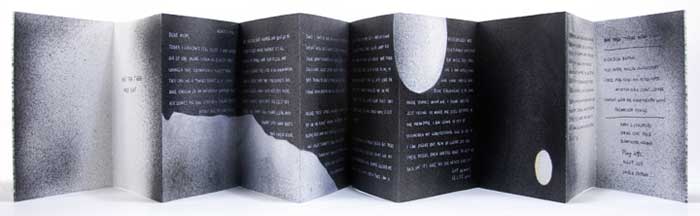
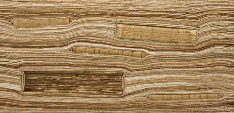
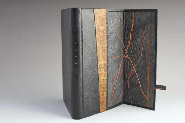
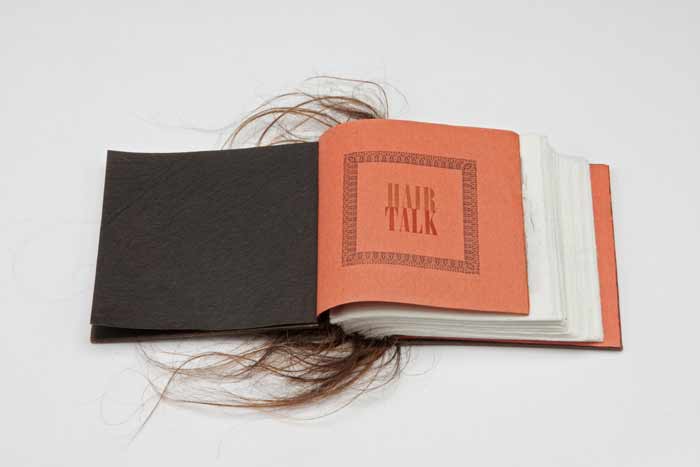
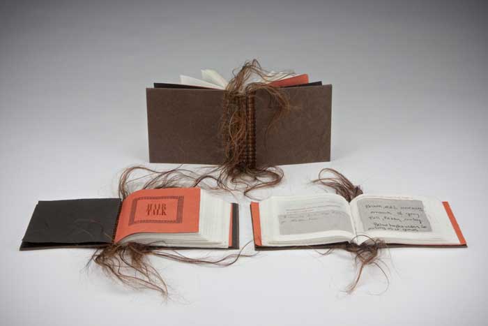
    Hair Talk is a three volume artist book set that was created by Diane Jacobs over the course of three years from 2009 to 2011. The structure is inspired from a binding by Roberta Lavadour, except in this case, Diane binds the series in human hair. The content within each book are the collected replies to a set of questions, where an individual wrote about their feelings regarding their own hair. 

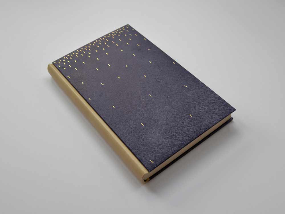
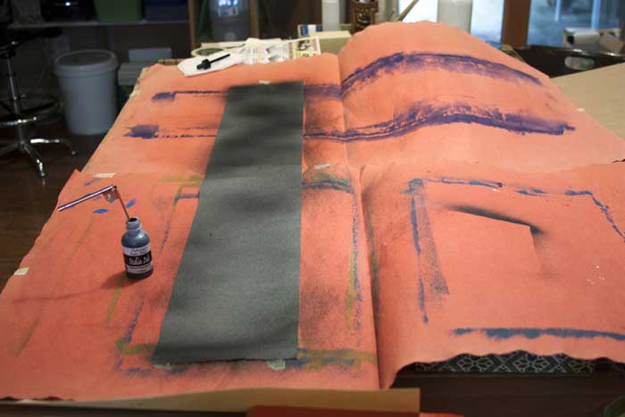
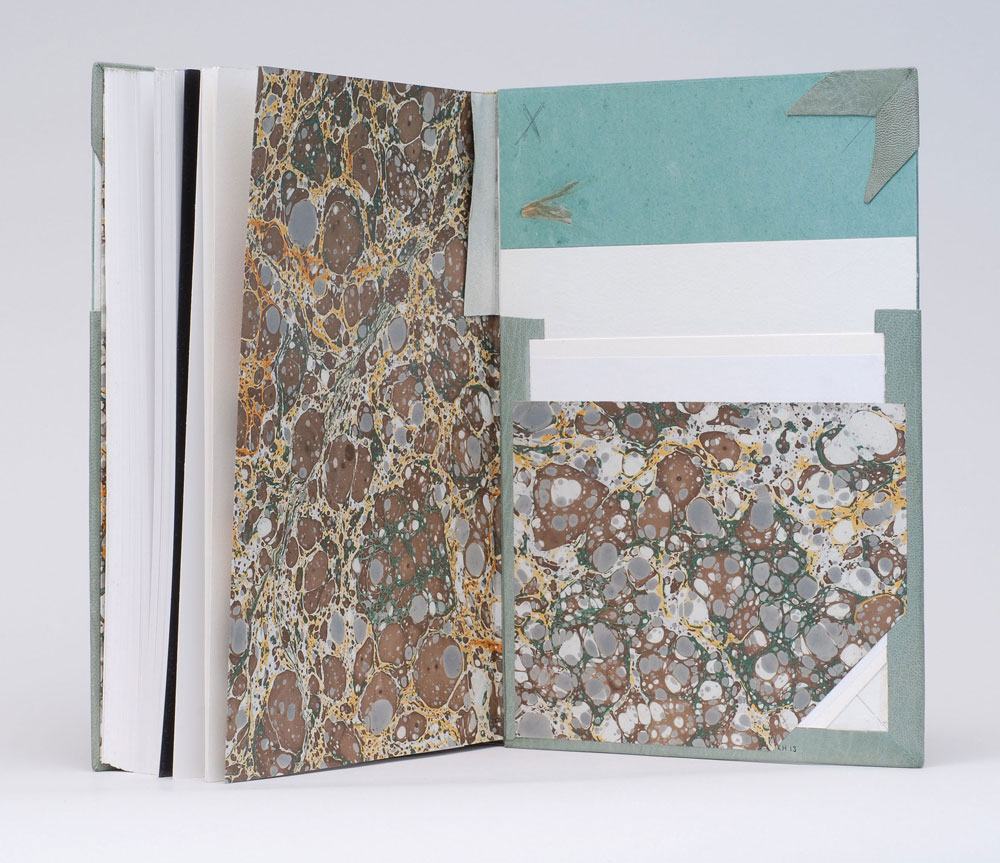
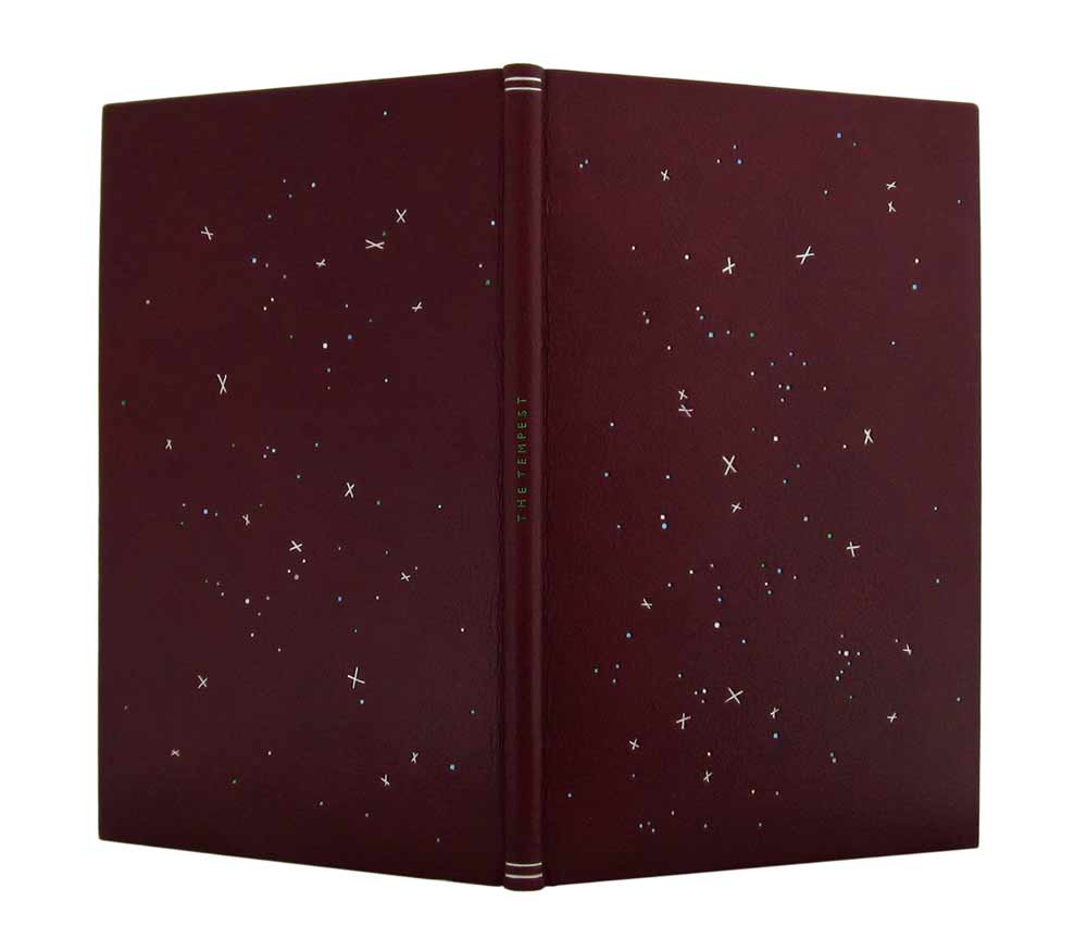
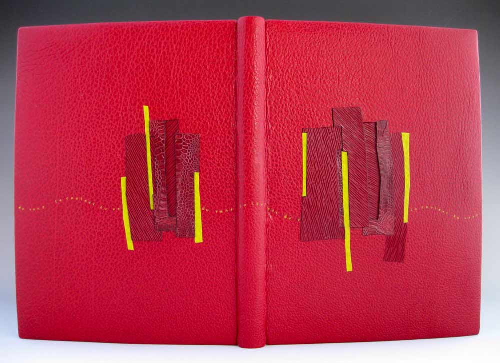
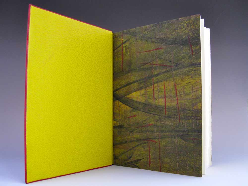
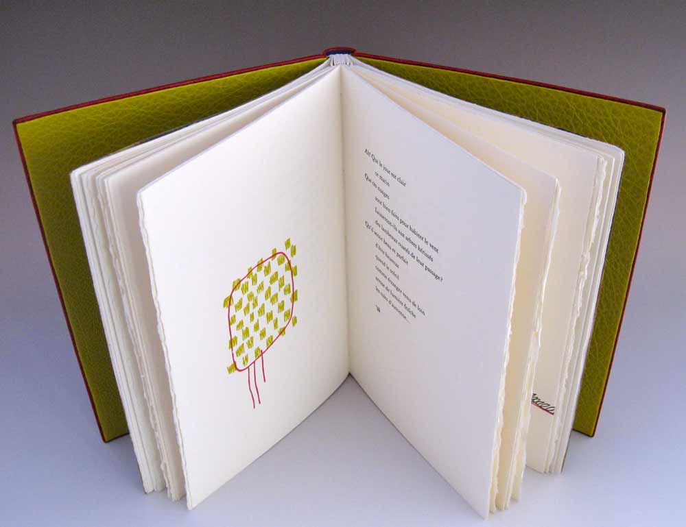
    The books are letterpress printed and bound with covers made from Cave Paper. 

    HairTalk2-DianeJacobs

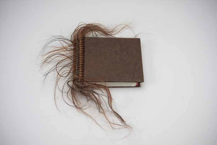
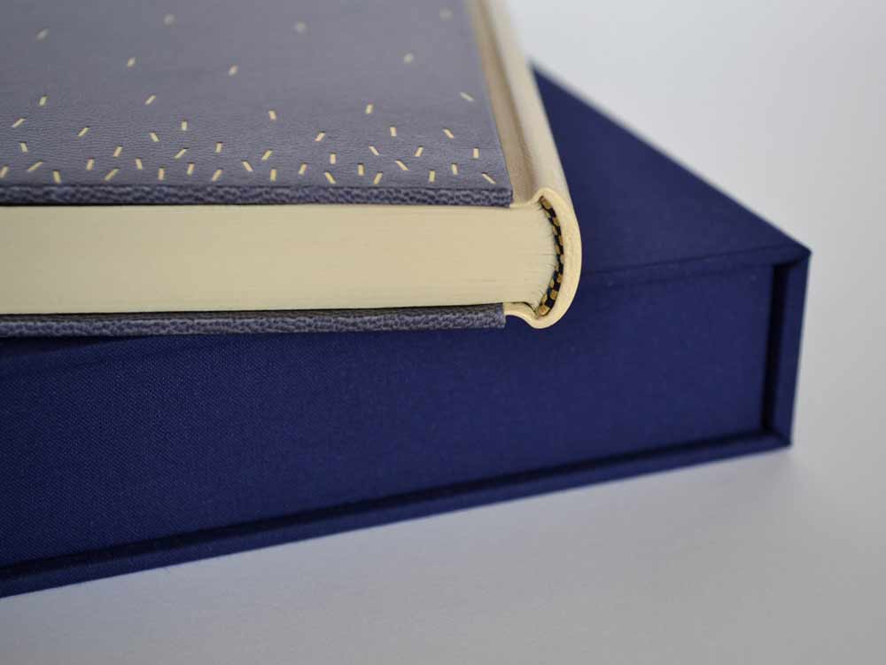
    When binding this book with human hair, did you find the material to be tricky to work with or did you treat the hair first (like a bookbinder would wax their thread)?
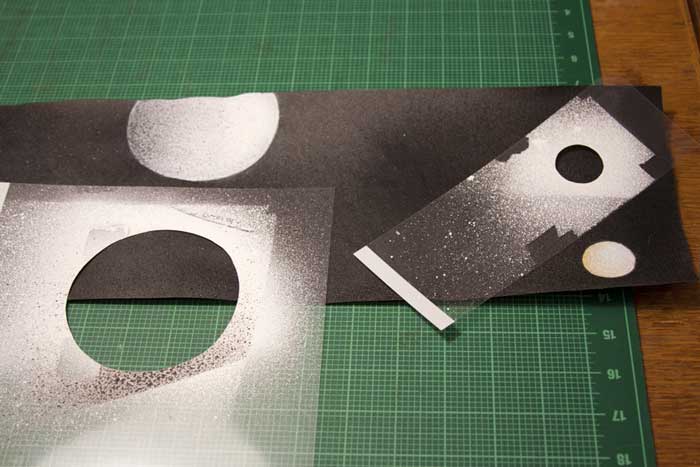
    I learned this binding from Roberta Lavadour. It is a twine binding technique that she invented. Instead of twine I used human hair and transparent thread that resembles hair. Each folio is a set of four questions, so in order for that particular person’s responses to stay together I needed to sew each folio individually into the spine. With Roberta’s book, she would sew a thick signature with each twine line. I did not treat the hair with anything. It was a little tricky, but do able.

    The way a person chooses to wear and style their hair can suggest a lot about them, whether these connotations be positive or negative. What did you hope to extract from this survey and what did you find to be surprising?
    I was surprised that more people did not want to trade their hair in for different hair. The majority of people wanted to keep their hair. My questions were not about style (that would have been interesting) they were:            
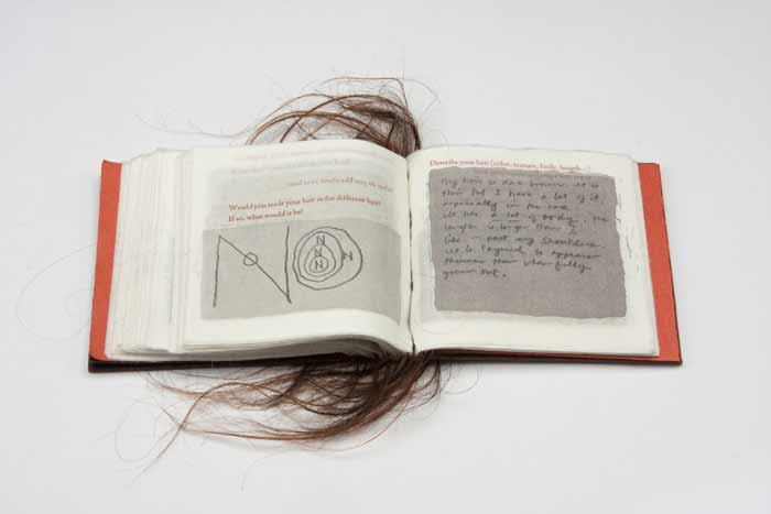
    Question 1: Describe your hair (color, texture, body, length…)
    Question 2: What don’t you like about your hair?
    Question 3: What do you like about your hair?
    Question 4: Would you trade your hair in for different hair? If so, what would it be?

    HairTalk4-DianeJacobs HairTalk5-DianeJacobsHairTalk-DianeJacobs

    Diane’s work is intriguing and thought provoking. She is driven by the language that inhabits issues surrounding women, racism, equality and other social issues. Her work spans over several mediums from artist books and sculptures to prints and two-dimensional pieces. This month long interview will cover some of Diane’s artist books plus a few additional pieces I found to be relevant to my set of questions. 

    See the interview after the jump and come back each Monday during the month of February for more posts on the work of Diane Jacobs. She discusses her materials and inspirations sources such as feminism and nature. 

    read more >


  2. February // Bookbinder of the Month: Haein Song

    February 1, 2014 by Erin Fletcher

    MythOfSisyphus-HaeinSong

    This beautiful binding of The Myth of Sisyphus and Other Essays by Albert Camus was crafted in 2013 by Haein Song. Bound as a Bradel binding, the spine is covered in a natural goatskin with dark blue vellum covers. The sprinkled dashes on the covers are hand tooled in gold. The spectacular endpapers are hand printed. 

    MythOfSisyphus2-HaeinSongMythOfSisyphus3-HaeinSong

    This binding is absolutely stunning and so flawlessly executed. The covers are a beautiful dark blue vellum. Did you find the material difficult to work with in either the structural or tooling aspect of the binding process? I have a single experience with vellum over boards, but I know that bookbinders approach the board construction differently. May I ask if you prepped the boards for the covers in any particular way for the vellum?
    I heard few notorious rumours about vellum but I don’t think I found it difficult at the time I was working on it. Partly because it was a relatively small bradel binding and there wasn’t headcaps or joints. The spine of the book is covered in natural goatskin. 

    What I found afterwards was that the front and back vellum boards sometimes change their shapes depending on the humidity or temperature of the surrounding. But surprisingly it comes back to the original shape after some time. I was told that it needed a little bit of time to climatise.

    Later I was also told that lining vellum with a very thin paper (archival bible paper or Japanese paper) would reduce this changeable characteristic. 

    Tooling wasn’t particularly hard after practising enough on sample boards but I don’t think I have an ample amount of experience to compare differences in tooling on leather or vellum.

    – – – – – – – – – – –

    I have not yet had the pleasure of meeting Haein or been presented the opportunity of viewing her work in person. However, I’ve had her website bookmarked for a while now, checking back from time to time to ogle her work. As I began preparing a list of people to interview this year Haein’s name popped up as a suggestion from Hannah Brown, whom I interviewed at this time last year. So with Hannah’s endorsement and my growing fondness, I present the following interview with Haein Song. The interview ends with Haein’s elegantly worded philosophy on bookbinding. 

    Come back every Sunday during the month of February for more posts on Haein’s work. You don’t want to miss it, Haein shares some of the creative techniques behind her expressive and artistic bindings. 

    read more >


  3. January // Book Artist of the Month: Mary Uthuppuru

    January 2, 2014 by Erin Fletcher

    AndThenThereWere8_3-MaryUthuppuru

    In preparation for their 2013 Annual Open House and Silent Auction, the Morgan Conservatory presented participants with two sheets of paper made at the Morgan and asked them to create a piece of art to be auctioned off during the event. Mary Uthuppuru was given one sheet of charcoal grey and the other of bright white.

    Mary found inspiration from the recent drop Pluto experienced from its rank as a planet and the heated discussions that followed. As the sole character in this artist book, Mary personifies the now dwarf planet in the form of a letter, where Pluto freely express himself after hearing this news of rejection. You can read more about Mary’s process in her blog post, Poor Pluto

    And Then There Were Eight is bound as an accordion with a removable spine piece, when fully opened the viewer can experience the vast and expanding qualities of outer space. The covers are most appropriately wrapped in beautiful handmade Moon Paper from Hook Pottery Paper. The paper appears to be a 3-dimensional print of the moon, but it is actually smooth (like paper). The interior pages were given an airbrush look by using a mouth atomizer and drawing inks.

    AndThenThereWere8-MaryUthuppuruAndThenThereWere8_4-MaryUthuppuruAndThenThereWere8_2-MaryUthuppuruI really enjoyed reading about your thought process behind this book. Not only did you find inspiration in a literary influence, but also in your own sense of humor. The application of pigment really captures the atmosphere and depth of space. Can you talk about the challenges and benefits to using a mouth atomizer?
    The mouth atomizer was a really fun thing to use. I actually had it for over ten years before I discovered its use during this project. It looks a lot like a compass, but without the pencil. One end goes into whatever liquid you are using (in the case of the Pluto book it was India ink and Winsor & Newton drawing ink) and then you blow on the other tube.

    The benefit in its use is also its challenge. So long as you have the lung capacity, this tool is very simple. Blow in the horizontal tube, and the ink is sprayed from the vertical tube. The difficulty is in style. If you are trying to get consistent coverage, then you have to be consistent with the pressure behind your breath. But it is easy to get used to with a practice piece of paper. Also, beware your work space. Cover anything surrounding the piece you are working on with newsprint or other waste unless you want a speckled work space.

    ThereWere8_Atomizer-MaryUthuppuru

    There is more than one way to use it too. In this book, for example, I cut stencils from transparency sheets to create the planetary bodies. This allowed for a clean, shaded shape that is much faster and reads truer than a traditional stippling stenciled technique. It is also easy to clean by running it under water then drying.

    ThereWere8_Stenciling-MaryUthuppuru

    I first met Mary in Chicago for the One Book, Many Interpretations exhibit at the Chicago Public Library, where both Mary and I had work in the show. I’ll be featuring her binding of Interpreter of Maladies from that show later this month. From the beginning, I noted Mary’s impeccable skill and her exceptional eye for detail, but I can’t forget to mention her infectious personality. Her humor mixed with kindness and generosity makes her a delightful person to engage with and learn from.

    Like myself, Mary, is just beginning her career in the field of bookbinding. Her ambition and creativity are inspiring, as is the interview (after the jump). Mary discusses her love for bookbinding and how she caught “the book bug”. Later in the interview, Mary talks about setting up her own home studio and how being self-employed has its ups and downs. But it’s quite clear to see that Mary tackles her obstacles with smarts and humor. 

    Come back each Monday during the month of January for more on Mary Uthuppuru and her work, which will bounce between bookbinding and book arts.

    read more >


  4. December // Bookbinder of the Month: Karen Hanmer

    December 1, 2013 by Erin Fletcher

    booksspeakplain1-karenhanmer

    The Midwest Chapter of the Guild of Book Workers recently revealed the exhibitors for a traveling exhibition called Plainly Spoken, which celebrates Books Will Speak Plain, a comprehensive survey of historical bindings by Julia Miller. Amongst the highly skilled and wide variety of bindings is a cutaway model by Karen Hanmer

    Karen bound her copy of Books Will Speak Plain as a traditional fine binding, sewn on flattened cords with laced-in boards. Partially covered in a beautiful light blue goatskin, otherwise hidden elements of the structure stay visible in this cutaway model. Tooling is done in blind and 23kt. gold foil to emphasize the location of sewing supports and lacing-on in addition to turn-ins, fills, sanding of the boards and formation of corners. The use of tooling as both an aesthetic treatment and as visual aid is just brilliant!

    booksspeakplain2-karenhanmerbooksspeakplain4-karenhanmer

    Although the book may appear to be incomplete, it includes all the necessary details that make a book a fine binding. The headbands are hand sewn using silk thread and the head edge is sponged with acrylic inks and sprinkled with gold leaf. The inside continues with the cutaway theme showing off the leather hinge, marbled paper endpapers, fills and corners. 

    booksspeakplain5-karenhanmer

    How did you approach this cutaway binding? Did you study Mark Esser’s models at the University of Iowa?
    I’ve made a lot of partially-finished models. They’re useful for teaching and help me remember process. But cutaways are something different since they appear unfinished and fully complete at the same time. Peter Verheyen has loaned me his springback cutaways several times, and I used them for reference when making my first cutaways. I’d admired Mark Esser’s two cutaway fine bindings in the University of Iowa’s online collection for a long time and was able to spend time with them on two trips to Iowa City this spring.

    I was able to use my design binding on Books Will Speak Plain twice this fall: for both an online exhibit of cutaways, and in a traveling set book exhibition. For the latter I added tooling to reference the binding process: the sewing supports and lacing, the turn-ins and fills, and the board-shaping.

    – – – – 

    The online exhibit that Karen mentioned above, is an annual themed exhibit held by the Book Arts Web called Bind-O-Rama. For 2013, the theme was historical cutaway models. The online exhibit can be viewed here

    Although I don’t know Karen very well (yet), she’s been incredibly sweet and supportive of my work. I first met Karen at her bindery in Glenview, Illinois. My friend, Anna, and I were in town for an exhibition at the Chicago Public Library; where both Karen and I had bindings on display. Since then I’ve kept in touch with Karen, leaning on her from time to time when I needed help. 

    I’ve had two opportunities to watch her work, which is quite fun. Once when she came to North Bennet Street School to teach us the flag book structure and most recently during the Standards of Excellence 2013 conference in Washington, DC. I hope to have more opportunities like this in the future. 

    After the jump is a wonderfully thoughtful interview with Karen, where she shares her experiences with bookbinding, teaching and marketing. Come back each Sunday during the month of December for more in-depth posts on Karen’s work in the field of bookbinding and artist books. 

    read more >


  5. September // Book Artist of the Month: Michelle Ray

    September 2, 2013 by Erin Fletcher

    godcreatedthesea-michelleray

    As I read the concept behind God Created the Sea and Painted it Blue so We’d Feel Good on it, I am reminded of the Michel Gondry film The Science of Sleep and how we create vessels in the physical world to guide our journeys through our imaginary worlds. In 2013, Michelle Ray used such an experience as the inspiration for her most recent artist book. 

    godcreatedthesea3-michelleray

    Michelle first learned how to use a map while sailing. Out on the sea, where there are no landmarks just an ever-changing landscape.

    As Michelle explains: In reference to the sea, this edition’s text states, “There are no markers in this/ monochromatic/ parking lot.” In the absence of these markers, we become painfully aware of their significance. This work is about experience, perception, memory and the space in between composed of symbol, sound and object. This is the space of mediation, the space where significant things happen; it is the ocean on which my imaginary crew and I sailed­, the place for which there are no maps.

    godcreatedthesea1-michelleraygodcreatedthesea2-michelleray

    Imagery and text have been printed using photopolymer plates on handmade cotton/abaca, French Construction and Neenah Environment papers. The photographs that follow were taken to document the printing and binding processes of God Created the Sea

    godcreatedtheseaprogress-michelleray

    Photopolymer plates on the Vandercook.

    godcreatedtheseaprogress3-michelleray

    Prints laying out on the drying rack. 

    The enclosure is made of linen and basswood. The linen is printed with the image of a whale skeleton along with the title in gold. This piece was produced in an edition of 50 at the Small Craft Advisory Press as Michelle’s creative project in the MFA Book Arts Program for The University of Alabama.

    godcreatedtheseaprogress4-michelleray

    Outer linen cloth wrapper.

    godcreatedtheseaprogress5-michelleray

    Basswood enclosures.

    God Created the Sea is already housed in several collection across the United States and in the United Kingdom. In addition, been awarded Best of Show at the Foundry Art Centre in Missouri and runner-up at The Sheffield International Artist’s Book Exhibition in the UK.

    Michelle is the recent recipient of the Artists’ Book Cornucopia IV Gallery Director’s Exhibition Award presented by the Abecedarian Gallery. This announcement is when I first discovered and fell in love with her work. Although, I’ve never had the pleasure of seeing Michelle’s work in person. Her work is clearly crafted beautifully, balancing rich content and concepts with thoughtfully executed structures. Her work will be featured in a solo Reading Room exhibition from April 18 – June 7, 2014 at the Abecedarian Gallery in Denver, Colorado. Oh, how I hope I find myself in Colorado next spring. Read the interview after the jump and come back each Monday during the month of September for more posts on the work of Michelle Ray.

    read more >


  6. August // Book Artist of the Month: Jody Alexander

    August 2, 2013 by Erin Fletcher

    sedimentals1-jodyalexander

    Sedimentals is an altered book project that Jody Alexander completed between 2011 and 2012. This collection of art objects include found furniture stuffed with layers of discarded books and fabric. These layers appear like a cross section of sediment revealing treasures between the layers. 

    sedimentalsdetail1-jodyalexandersedimentals2-jodyalexander alexanderdetail2-jodyalexander

    While reading the interview, you will begin to understand the depth of Jody’s commitment to her materials and characters. This exclusive connection is the cause for such a well-rounded body of work. Her dedication to teaching is just as exceptional, offering her skills to several venues both online and in person. Read the interview after the jump and come back each Monday during the month of August for more posts on Jody Alexander.

    read more >


  7. August // Bookbinder of the Month: Annette Friedrich

    August 1, 2013 by Erin Fletcher

    thetempest1-annettefriedrich

    This edition of The Tempest by William Shakespeare from The Nonesuch Press, was bound by Annette Friedrich in 2012. Bound as a full leather fine binding in red-brown goatskin. Decorative tooling on the covers in white, grey, two shades of blue, metallic green and silver. The title is tooled along the center of the spine in metallic green with matte silver lines at the head and tail.

    thetempest3-annettefriedrichOn the inside, the paper bord-a-bord doublures are bright blue, matching leather joints and fly leaf in silver. All papers used are hand dyed.

    thetempest4-annettefriedrich

    The binding is housed in a green chemise and slipcase. The chemise is decorated with linear tooling across the sides in two shades of blue. The author’s name is tooled in metallic green in the center the spine of the chemise along with tooled lines in matte silver and blue at the head and tail.

    I first stumbled upon Annette’s work through the Autumn 2012 Newsletter of Designer Bookbinders. The cover offers a detailed image of Annette’s binding Water bound in 2008.

    water-annettefriedrich

    The fine binding work of Annette Friedrich is delightful! Her portfolio matures with every new binding as she skillfully depicts the essence of each story with delicate and artistic flair. Read the interview after the jump and come back each Sunday in the month of August for more posts on the work of Annette Friedrich.

    read more >


  8. July // Book Artist of the Month: Ellen Knudson

    July 2, 2013 by Erin Fletcher

    americanbreedingstandards-ellenknudson

    American Breeding Standards is the most recent work from Crooked Letter Press run by book artist and graphic designer Ellen Knudson and was produced in an edition of 60 in 2012-2013 in Gainesville, Florida. This artist book explores the systemized rules about what comprises a good or bad horse, a good or bad woman — and the steps one might take to achieve the breed standard.

    American Breeding Standards was designed and letterpress printed on Zerkall Book paper. The illustrations and text are printed from photo-polymer plates and handset metal types. Some text excerpted from American Horses and Horse Breeding (John Dimon, 1895) and Canine Breeding Standards of the German Shepherd (American Kennel Club, 2012), while the rest of the text and illustration are by Ellen.

    The binding structure is an exposed spine sewn on Cave Paper tapes and attached to paste paper covered boards. The cover of the book has a hinged pop-up that folds out. There are also 3 additional foldout pages throughout the book.

    americanbreedingstandards2-ellenknudsonamericanbreedingstandards5-ellenknudson americanbreedingstandards3-ellenknudson americanbreedingstandards6-ellenknudsonamericanbreedingstandards4-ellenknudson

    While setting up the Marking Time exhibition for the Guild of Book Workers at Dartmouth College, I came across Ellen’s piece Self-Dual (How to Walk a 30,000 Mile Tightrope). By the way, I’ll be featuring this book in a post later this month. The prints featured in this artist book are beautifully illustrated and printed in rich and muted earth tones. The book was favorably executed as the dos-a-dos style binding. 

    I’m excited to present this interview with Ellen and to post a portion of her work throughout the month of July. Ellen has such a versatile design sense, offering a range of artist books so throughly executed. Read the interview after the jump and come back each Monday in the month of July for more posts on Ellen Knudson.

    read more >


  9. July // Bookbinder of the Month: Coleen Curry

    July 1, 2013 by Erin Fletcher

    lacouleurduvent-coleencurry

    Coleen Curry was amongst the talented bookbinders who participated in the ARA-Canada exhibit La Couleur du Vent, an international design binding exhibition starting in Paris before traveling to Quebec in September 2013 and then Montreal in November 2013. La Couleur du Vent is a collection of poems by Gilles Vigneault, illustrated and designed by Nastassja Imiolek under the artistic direction of Cécile Côté. If it sounds familiar, I posted about this exhibition during last month’s interview with Sonya Sheats

    Coleen bound this copy of La Couleur du Vent as a ‘Montage sur onglets’ style so the prints would not get lost in the gutter. The term ‘Montage sur onglets’ refers to the signatures being sewn on stubs to release them from the confines of the gutter and offering a less restricted opening. Sewn on cords with laced-in boards, the book is bound in red water buffalo with chartreuse water buffalo edge to edge doublures. Exotic leather inlays of varying depths decorate the front and back covers. Title tooled with gold foil. The flyleaves are decorated papers made by Coleen. 

    A brief explanation about the design from Coleen:
    The colors match the prints in the book.  I took some of the shapes from the prints and altered them to create a feeling of blowing in the wind and to create movement.

    lacouleurduvent2-coleencurry lacouleurduvent3-coleencurry

    Coleen’s work has been on my radar ever since I came across her binding of Toni Morrison’s A Mercy at the Chicago Public Library’s exhibition One Book, Many Interpretations in 2011. I attended the opening reception not only because I love design bindings, but to see my own binding of Arthur Miller’s The Crucible. This was the first time I had a binding on exhibit and I was quite honored to be on display with so many other talented binders.

    A Mercy by Toni Morrison bound by Coleen Curry

    A Mercy by Toni Morrison bound by Coleen Curry

    Coleen’s work masterfully mixes traditional leathers with some non-traditional textures such as exotic leathers, agate, and horsetail (to name a few). But I am more attracted to Coleen’s brilliant use of color; either by adding pops of color, subtle hints or just out-right all-over bold color palettes. 

    Read the interview after the jump and come back each Sunday in the month of July to view more gems from Coleen’s portfolio.

    read more >


  10. June // Bookbinder of the Month: Sonya Sheats

    June 1, 2013 by Erin Fletcher

    lacouleurduvent-sonyasheats

    Photo by Denis Larocque.

    La Couleur du Vent is a collection of poems by Gilles Vigneault, illustrated and designed by Nastassja Imiolek under the artistic direction of Cécile Côté. Sonya Sheats bound this copy for an international design binding exhibition organized by ARA-Canada and the École Estienne in Paris. The exhibition is currently on display in Paris until it travels to Quebec and then to Montreal. The exhibition is also viewable online at ARA-Canada: La Couleur du Vent

    Sonya bound this edition as an open joint sewn with tapes made out of vellum and box calf, spine is tanned calf skin with onlaid bands of muted green and taupe water-snake skin and one band of red calf skin, boards in MDF and walnut burl veneer, and onlays in lace wood and calf skin. The subtle accent on red comes straight from the illustrations in the book.

    While finishing my second year at North Bennet Street School, Sonya was invited to teach my class the simplified binding structure, a technique she learned from Sün Evrard. Initially, I had the pleasure of meeting Sonya during an open studio event in Cambridge. I was able to tour her space and handle many of her bindings. I am very intrigue and captivated by Sonya’s clean design and level of skill. I would like to thank Sonya for taking the time to share her experiences and skills with me through this interview

    Read the interview after the jump and come back each Sunday in the month of June to read more about Sonya’s work. 

    read more >


  • My name is Erin Fletcher, owner and bookbinder of Herringbone Bindery in Boston. Flash of the Hand is a space where I share my process and inspirations.
    The StudioNewsletterInstagramEmail me
  • Archives