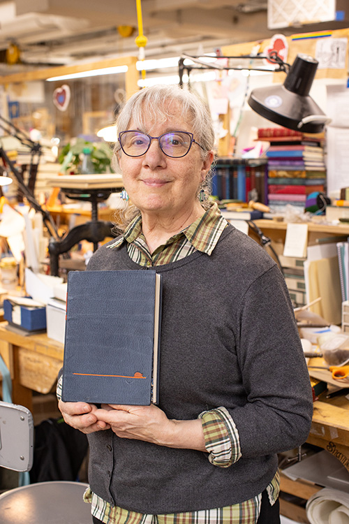
In February, I traveled to Boston to teach a workshop at the North Bennet Street School. Since moving to Austin, I’ve only been traveling back to teach during the summer. A happy coincidence during my winter visit was that I got the chance to speak with most of the second year students about their set books. They were in the process of forwarding their text blocks and finalizing their designs. It has been a few years since I’ve been able to have these preliminary conversations and it was such a joy to learn about their ambitions and talk through any challenges presented by their designs. I couldn’t wait to conduct these interviews to see how their final bindings turned out.
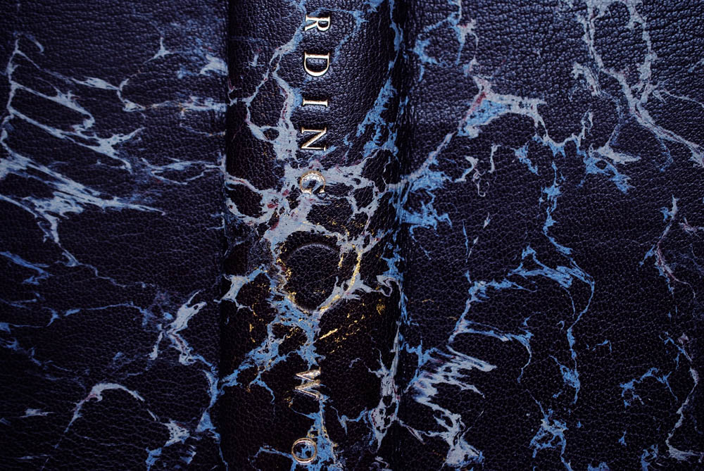
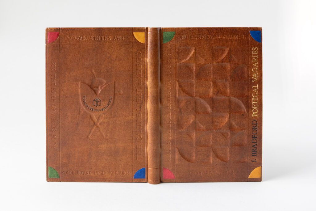
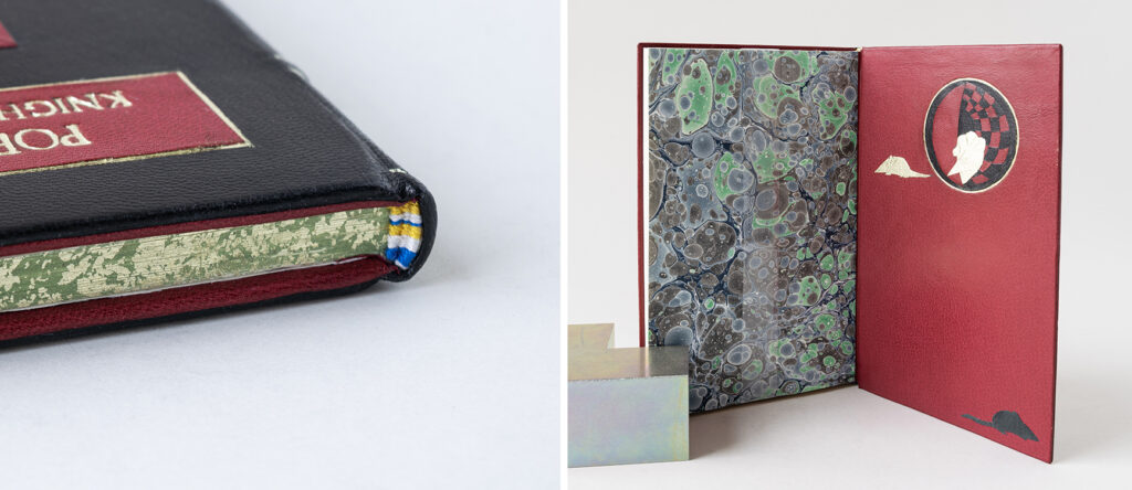
The set book for this year’s graduating class was The Poetical Vagaries of a Knight of the Folding-Stick, of Paste-Castle. Note: you will find several variations of this title on the student’s bindings. Many bookbinders may be familiar with the poem The Binder’s Curse, which was part of a collection of poetry written by John Bradford. First published in 1815, this series of bookbinding-related poems were written by a journeyman bookbinder based in New York City. Many students commented about the delight in being a bookbinder binding a book about bookbinding as one of their final projects in the bookbinding program. This particular book has a really interesting history that is explored deeply in Jeff Peachey’s article “The Binder’s Curse”: John Bradford and Early Nineteenth-Century American Bookbinding found in Suave Mechanicals: Essays on the History of Bookbinding, Volume VIII.
The students bound a facsimile printed in 1993 by Sandlin’s Books & Bindery, which replicates the original layout and punctuation as best as possible. The publishers noted that a portion of the original writing was omitted “due to its indiscernible ramblings which distracted from the delightful poetry about bookbinding.” This section is titled The History of the Garret, Translated from the Hierglyphics of the Society. By a Member of the order of the Blue-string, which is a satire about secret societies. The absurdity of such clubs is laid out through stream of conscientiousness and with little editing from the author. However, some of the students chose to indicate this omitted section from the 90s publication by including a portion of blank black or off-white pages to the back of their text block.
The topics of Bradford’s poetry speak to the working conditions and livelihoods for bookbinders in the early nineteenth-century. Using wordplay and quirky humor, Bradford mentions ownership over tools, striking against long workdays, the daily workflow of a bindery, workplace politics and monetary hardships. Peachey goes into greater detail of the poems and fleshes them out further with additional historical references.
Featured on several of the student’s bindings is the Knight of the Folding-Stick either in the form of text or as a decorative element. Bradford’s focus on tools goes beyond possession and complaints, but speaks to the embodiment of our tools as craftspeople. They are an extension of ourselves and our work. The knight is a human-like figure literally built from tools found in a bindery. Peachey discusses a few ways this imagery could be interpreted in his article, but many of the students spoke about the knight as a figure fighting for the bookbinder.
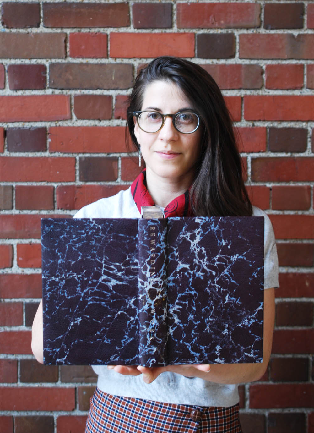
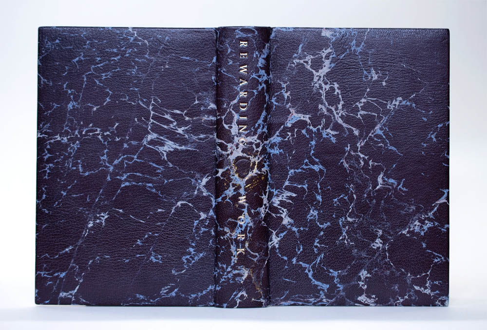
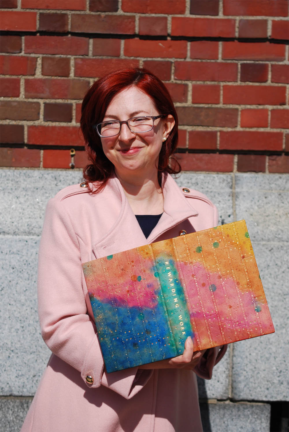
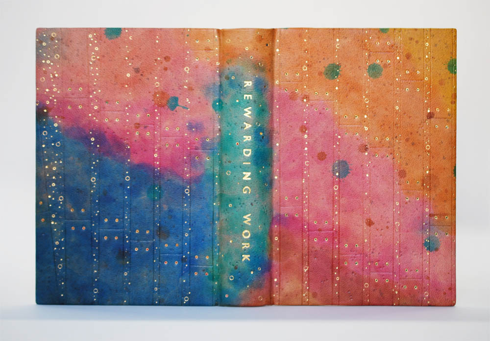
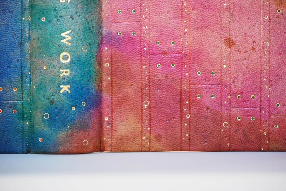
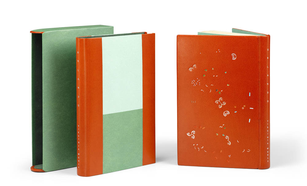
All of the bindings will be on display as part of the 2025 exhibition Meaningful Work at NBSS in Boston until July 3rd. The greater theme of the show highlights how the work created by students and alumni have transformed their lives, communities and values. I hope you enjoy the following interviews conducted with the 2025 Bookbinding graduates. We spoke about much more during the interviews and I wish I could have included it all. I recommend reaching out to congratulate and welcome these wonderful folks into our community!
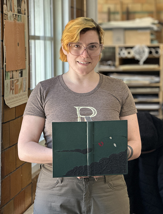
Yaara Buksbaum
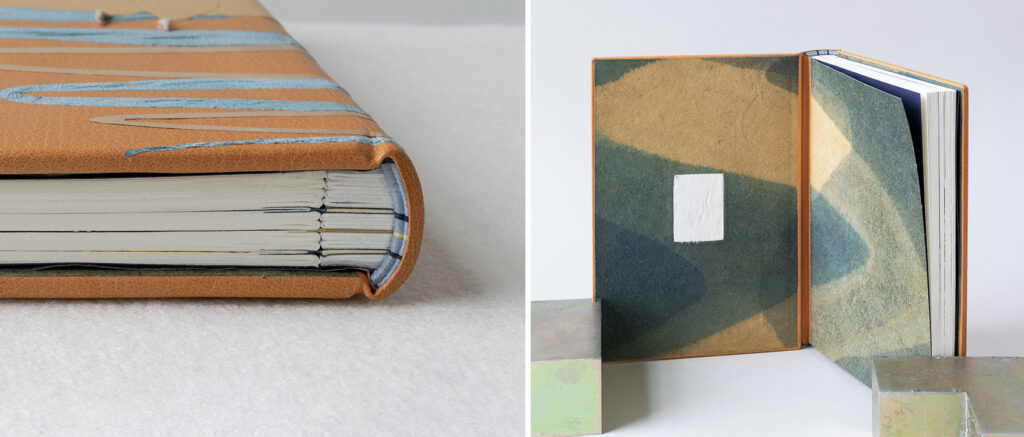
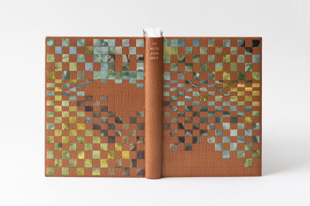
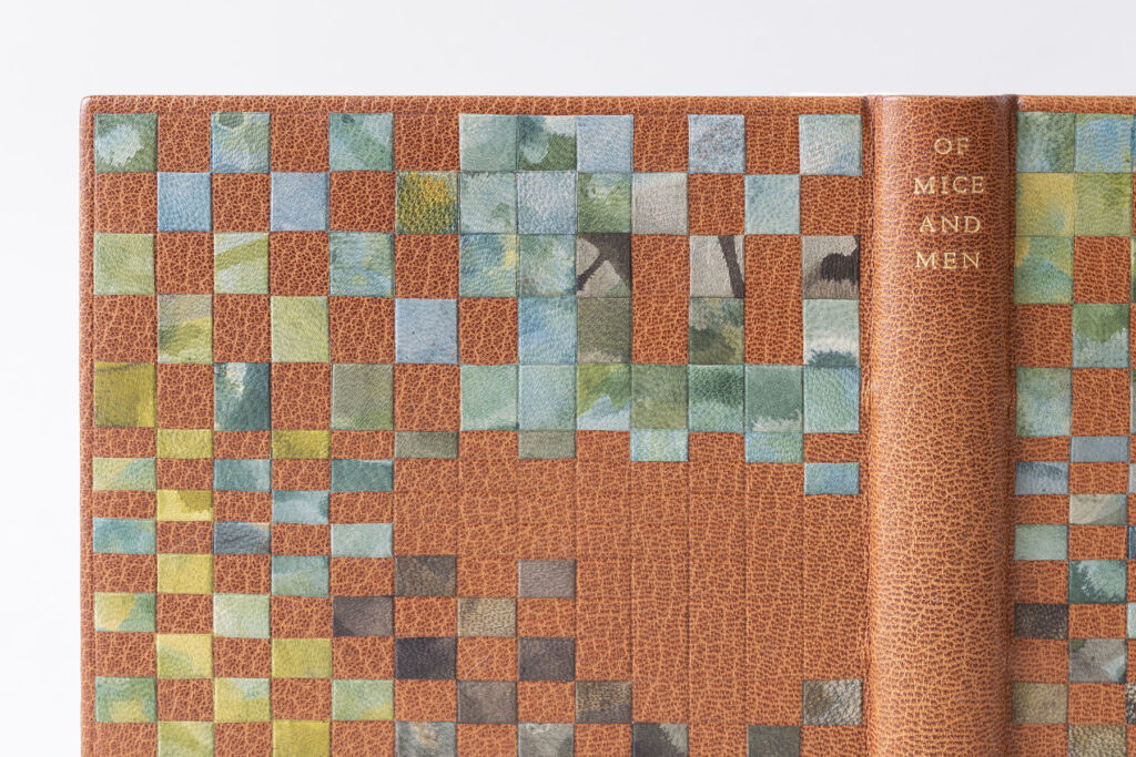
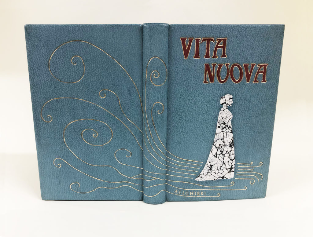
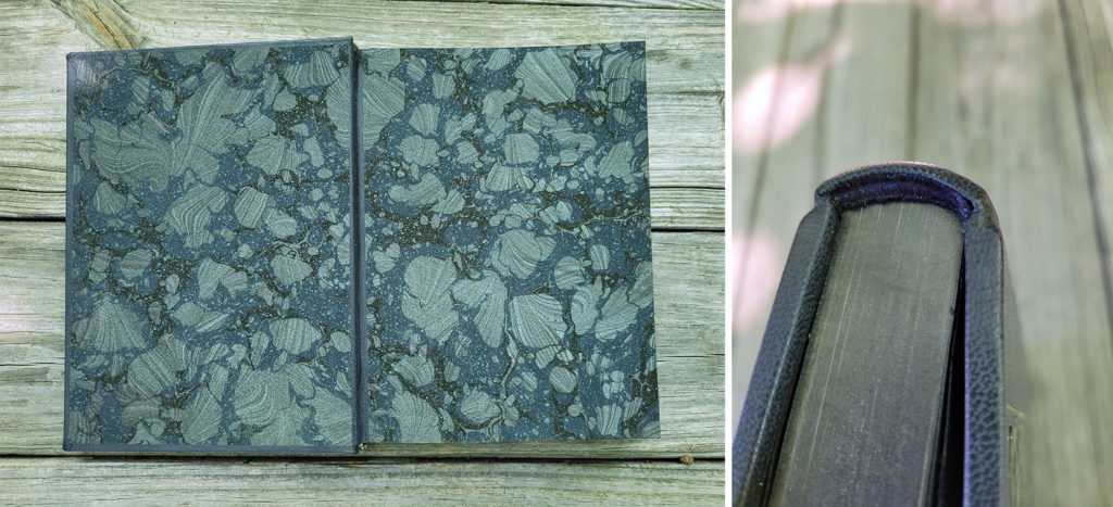
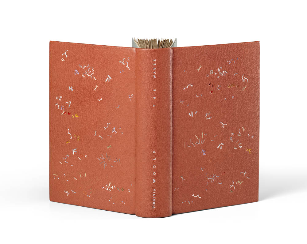
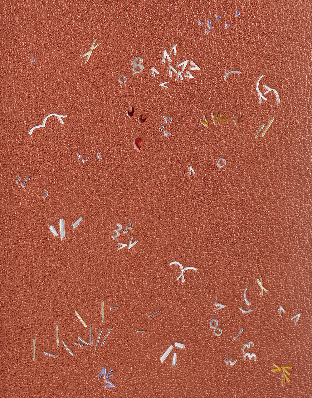
The painful political and social commentaries concealed within the poems are peppered with some slight absurdities. It was this whimsy that gave Yaara permission to be playful in her own design as she attempted to capture the spirit of Bradford’s words. Her initial designs leaned into the layout of political pamphlets and posters of the nineteenth-century. However, after finding little visual inspiration, she moved into the twentieth-century where mid-century modern designs captured her attention. Yaara expressed her love of hand-cutting and knew she wanted to create a design that would lean heavily into this technique. She wanted to explore this artistic style of bookbinding through a technique that would bring her joy while also challenging herself pragmatically.
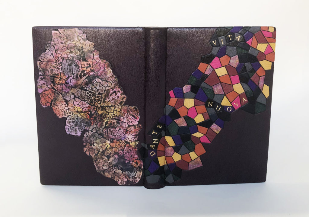
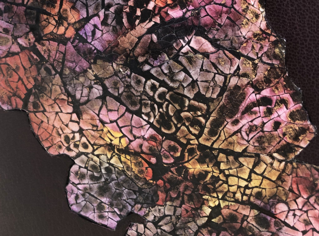
Yaara chose to dye all of the leather for her binding, this includes the base leather, onlays and hinges. When applying the brown Roda dye, the leather absorbed the liquid irregularly which created an interesting mottled effect. Prior to covering, the boards were built up in various layers of 10pt. and 20pt. board to create deep recesses, mid-points and raised areas of the designs on both the front and back covers. Although Yaara pared her leather on the thinner side, created several tests and worked diligently to push the material into these shapes, it ultimately created a softer appearance than she intended.
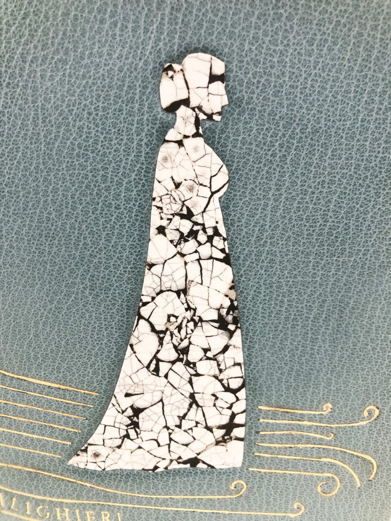
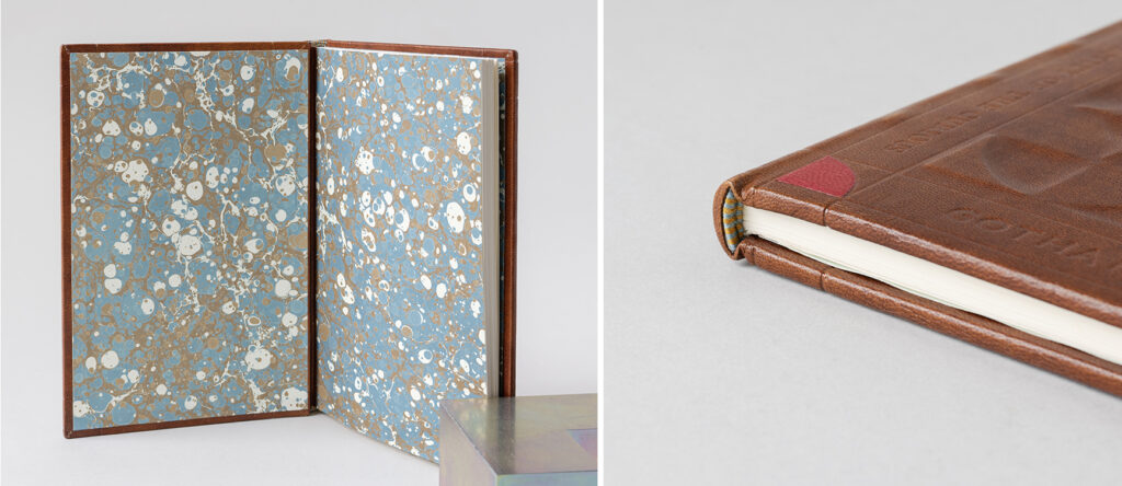
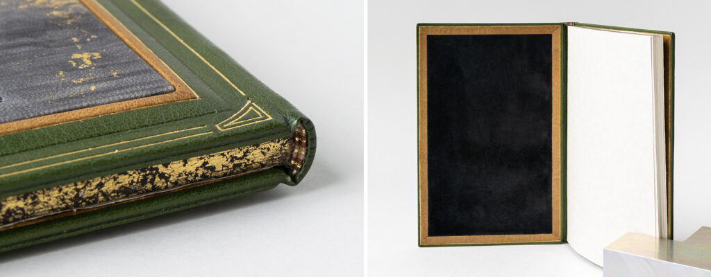
Tooled onlays of saturated colors anchor the design onto the covers and help define the outer blind tooled frame. On the front cover, Yaara hand-tooled the main title with gold leaf and the author’s name in carbon inside this frame. Her choice to use carbon was to place the author’s name in the dark as he did not sign the work within. The remaining blind tooled text on the front cover notes Gotham as the place of publication, acknowledges the Knight of the Folding-Stick and snippets from the poems. The latter is continued on the back cover with more lines from the poems, which are all meant to demonstrate the author’s humor and social messages. The infamous Knight of the Folding-Stick is recessed on the back cover behind a raised shield. Yaara carbon tooled the phrase To Bless Our Troubled World onto the shield along with an open book. This phrase in particular really resonated with Yaara as she continues to deal with the challenges of leaving Israel before war broke out.
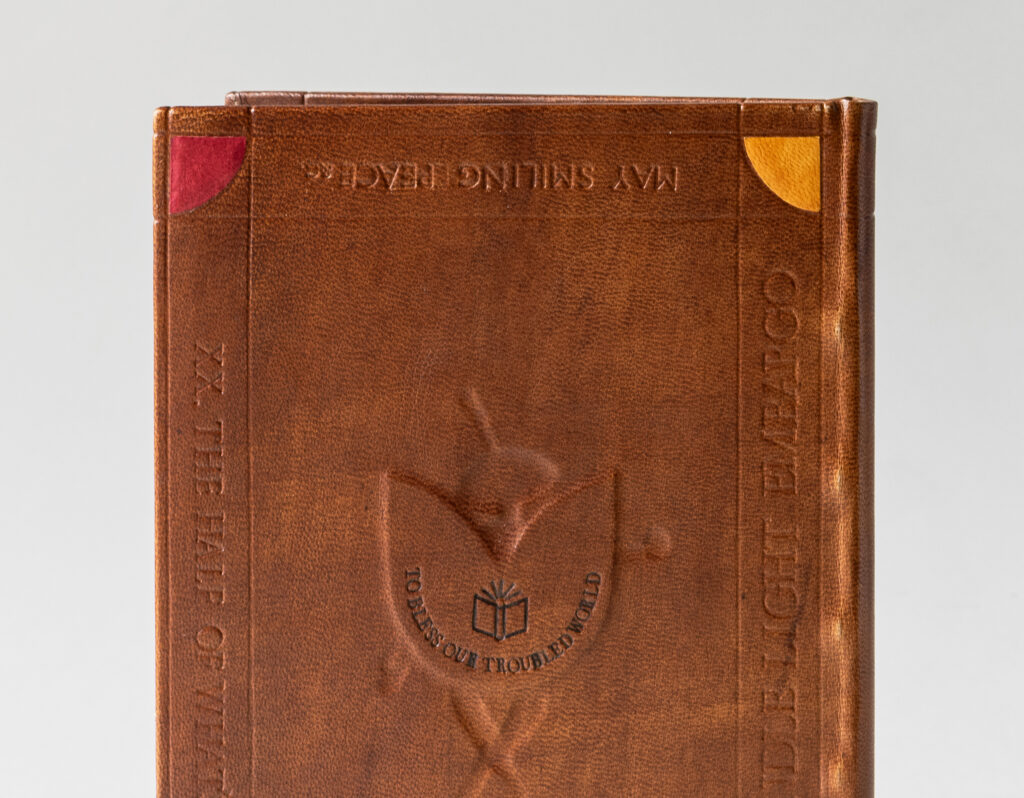
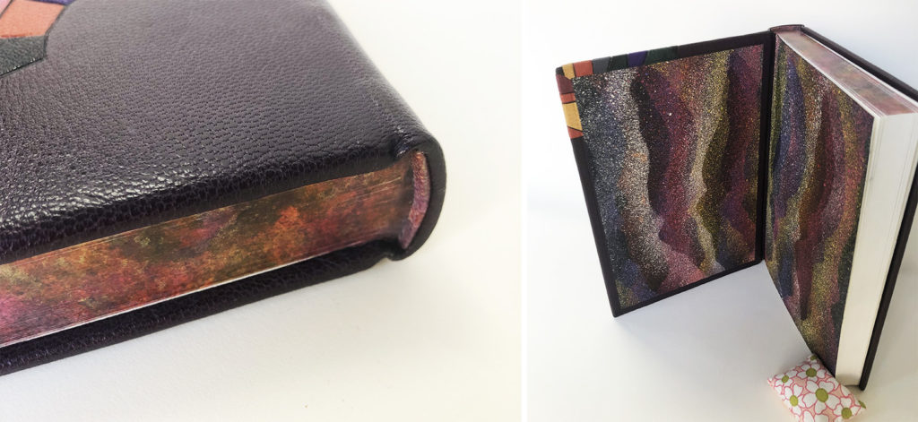
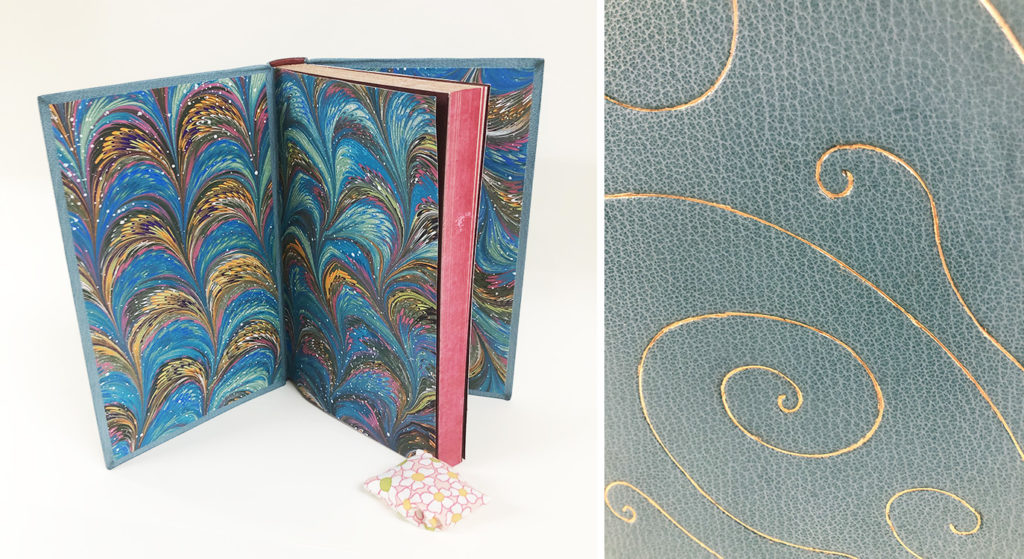
The blind tooled frames on the cover extend onto the spine at the head and tail while also wrapping around the board edges before landing on the turn-ins. The endbands were sewn around a rectangular core with bands of yellow and light blue. Yaara used a marbled paper made by alumni Abra Mueller for the paste downs and fly leaves. While the students do make their own marbled paper throughout the year, Yaara selected one of Abra’s papers for its complimentary color scheme to her binding.
Yaara has a background in social work and sociology, which she did up until the pandemic. As many of us felt burnt out during that time period, Yaara chose to pivot into a new field and gained an archival studies diploma. During a field trip to a conservation lab in Jerusalem, she immediately felt inspired and at home in the space. The conservators suggested that she study abroad as there were no opportunities in Israel. This started Yaara on a windy path to considering West Dean before ultimately landing at North Bennet Street School, a place she only discovered during a trip to visit family in Boston. However, upon finding the school, she felt that same sense of place. After graduation, Yaara will be at the Boston Athenaeum for a year-long Fellowship in Book Conservation provided by the Von Clemm and Driscoll Family.
Sandra Haynes
Aliens Read My Diary
@aliensreadmydiary
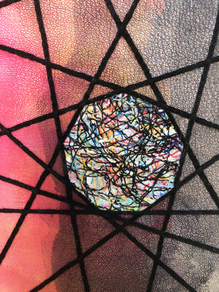
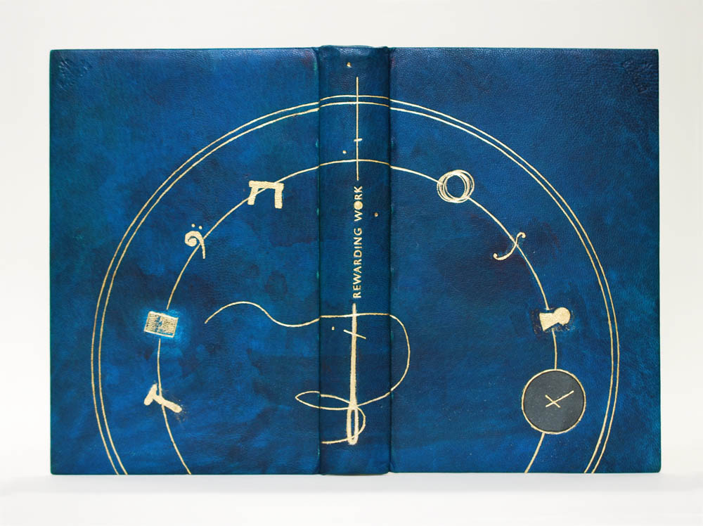
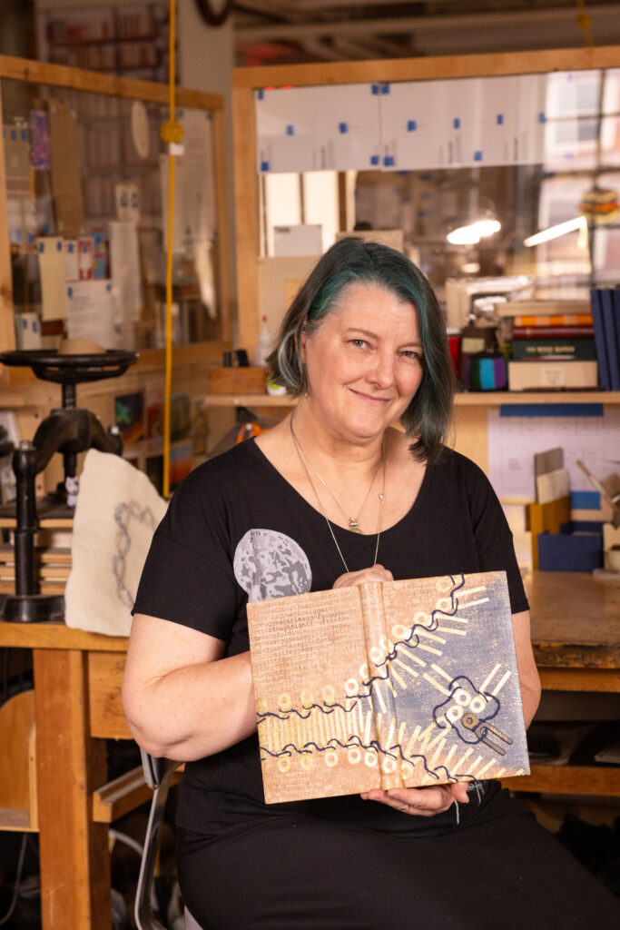
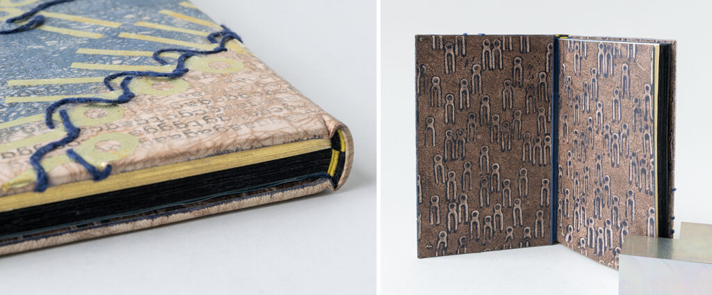
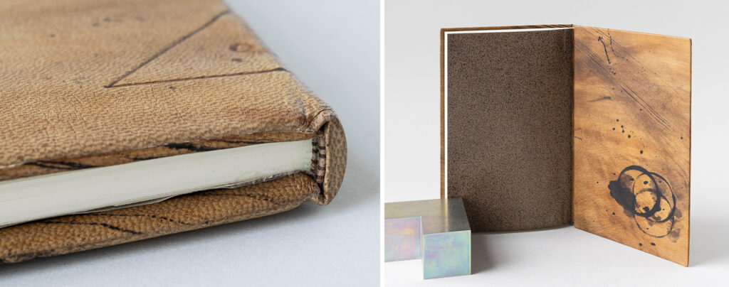
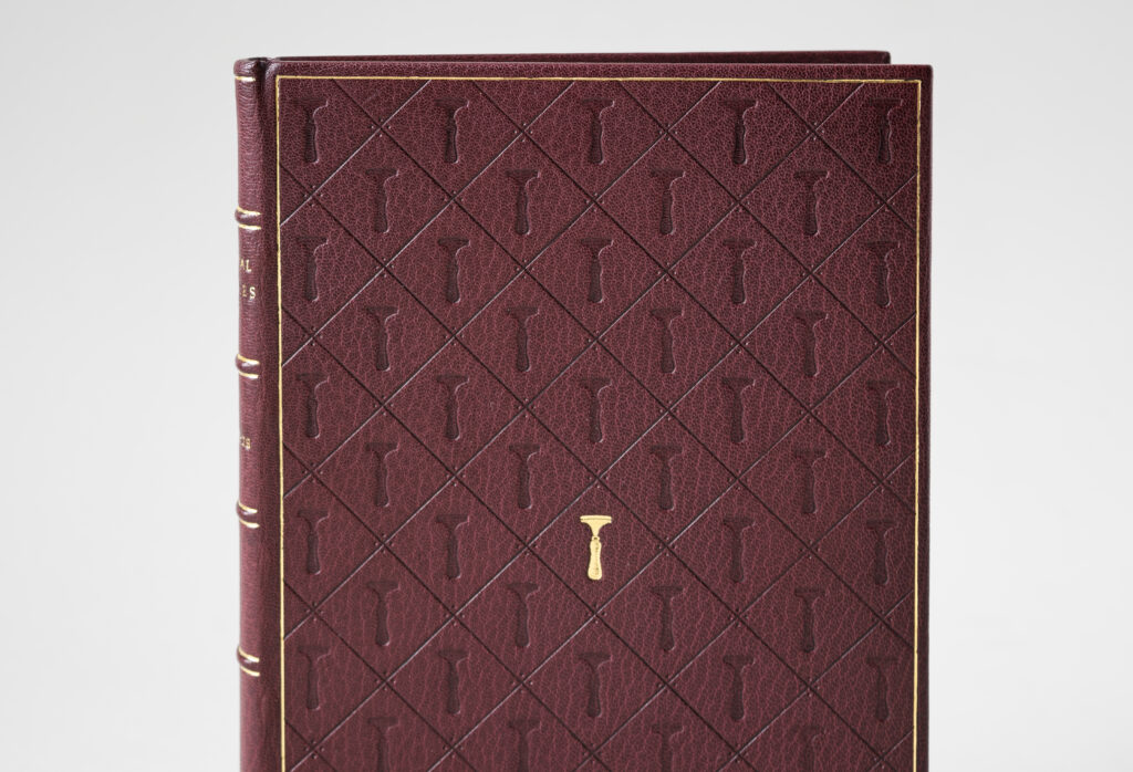
Prior to reading the set book, Sandra read the aforementioned article by Peachey and latched onto an illustration of a sewing key. Within the pages of her diary, Sandra played around by stamping the shape of a sewing key into various patterns. One pattern in particular reminded Sandra of a strand of DNA, or the master key of life. Sandra noted that she was once an aspiring biologist and often comes back to DNA in her work. Bradford’s affinity for wordplay gave Sandra license to make her own connection between the history of bookbinding and genetic coding. This is demonstrated by using a sewing key to illustrate a strand of DNA. As keys within these strands are loosened and wound up over time future generations are affected in how the code is expressed in our bodies (or how prior generations of bookbinding innovation inform how contemporary binders work).
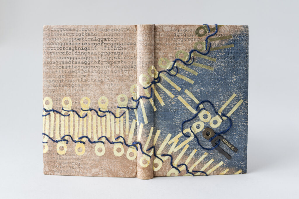
Sandra’s design is incredibly layered with various techniques. The DNA sequence is the initial layer which is a photo transfer covered with a light wash of pale brown leather dye. Using the craquelle technique, Sandra laid brown and blue leather dye over thick and thin paste to achieve two distinct textures and areas of the design. The keys were surface gilt on the leather with one isolated as an inlaid piece of brass. Although Sandra’s tests found that the rabbit skin size worked best for the surfacing gilding, the reality of working on her actual binding turned out differently. Sandra had to apply separate layers of PVA size and rabbit skin size in order to achieve successful surface gilding for the sewing keys.
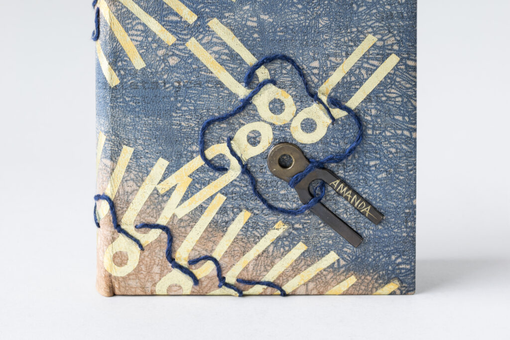
The inlaid brass has the name Amanda etched into one of the ends. Bradford writes about the control he has over his tools, not allowing any of his colleagues to use them. Another poem titled Technical Description of Somebody speaks about a woman’s beauty and the name Amanda appears within the stanzas. Could she have been a colleague of Bradford’s? Would she have been equally controlling over her tools? The life and experiences of women in binderies were often not documented, as is the case with Bradford’s poems. Sandra wanted to nod to this omission by singling out this individual sewing key. The four interlocking keys on the front cover represent both a coat of arms and a transcription that is turning to unfold the strand of DNA. The blue yarn was stitched through the leather after covering. Sandra achieved this by punching a hole into the leather and then carefully slipping a needle underneath.
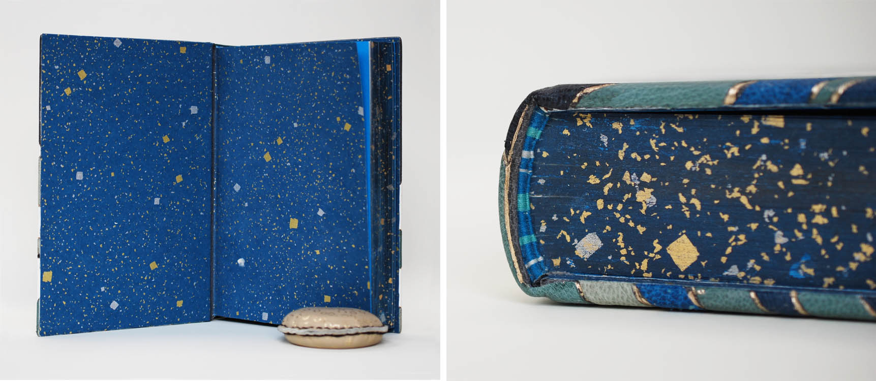
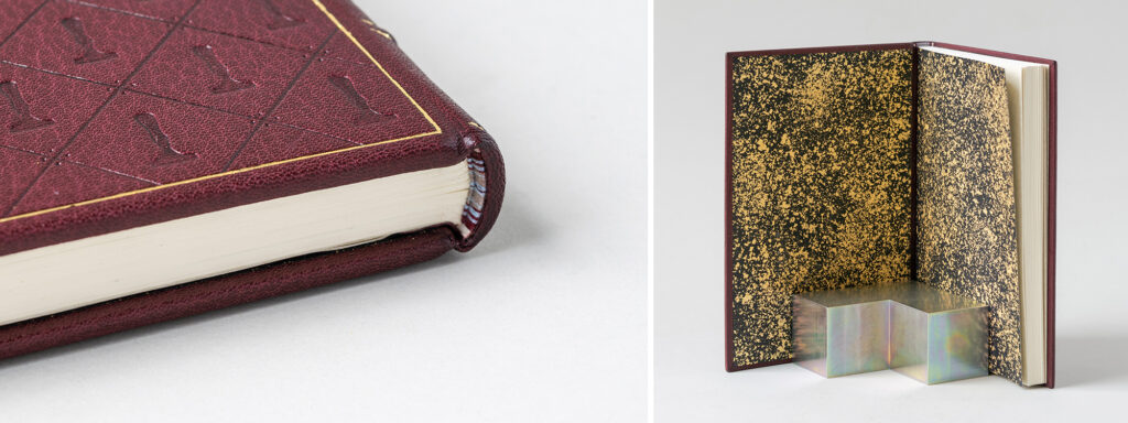
Sandra’s passion for preserving personal stories meant the exclusion of The History of the Garret was unacceptable. Therefore, she created extra signatures made of black paper to represent this omission. This distinction is clearly seen along the edges of the text, which the pages of the set book rough edge gilt. The French double-core endbands play with this separation by alternating gold and black threads in a cleverly woven design. Another one of Sandra’s initial sewing key patterns made its way onto the custom papers used for the paste downs and fly leaves. Sandra created a textured brown background then stamped the sewing key with a heavy application of dark blue paint that had pooled at the edges. This created a thick silhouette of blue around the sewing keys. The use of walnut browns and indigo blues were intentionally chosen to reference the 1812 embargo on fabrics, which led to more neutral tones being used for fashion at this time, particularly for women’s work wear.
After graduation, Sandra is looking forward to connecting with members of her community and finding ways of sharing her knowledge to folks interested in bookbinding and making artist books. She wants to focus on binding styles that are great for writing or drawing inside and plans to explore these structures further. Her lifelong practice of maintaining a diary has led her to find the American Diary Project. As a recently appointed board member, Sandra will be surveying the current collection to help determine what treatments might be necessary and how she can offer her skills to this ambitious project.
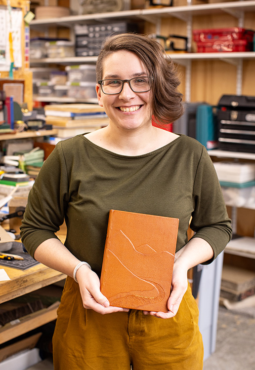
Laura Kraegel
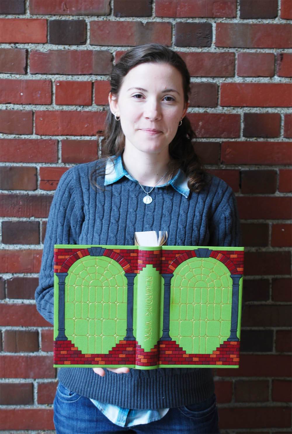
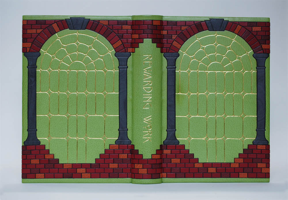
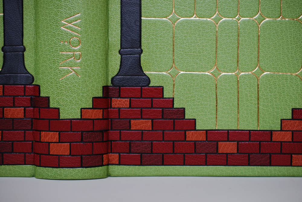
Every student in the Bookbinding Program at NBSS gets their own bench and as the year progresses it becomes a reflection of who they are as a maker. Some thrive in a chaotic, messy space, while others might find peace in a clean, minimal space. Each bench showcases years of history through its markings and pigmented spots along with the student’s signatures who claimed it during the year. Laura wanted to celebrate the work bench and its ability to accrue messes through the bustle of the school year in her design. Our tools are also incredibly personal, becoming an extension of our own hands. This can often make it difficult to lend them to others as noted by Bradford in the poem A Proclamation. Laura sketched out a range of tools for her design initially, but in the end only her absolute favorites made the cut for the final binding.
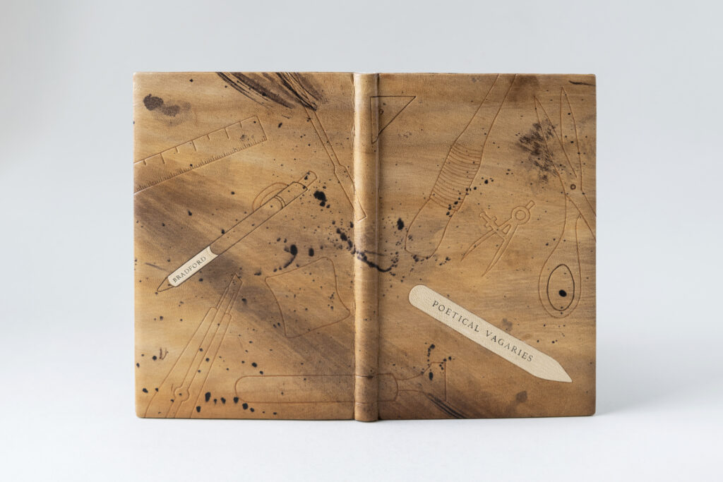
Laura transformed an undyed goatskin to reflect all those beautiful imperfections of her bench. Working with a selection of brown Roda dyes, she used a range of applicators in order to achieve various textures. This included sponges, rags and stiff bristle brushes. From the beginning, Laura had intended to use leather dyeing and tooling in her design. Her goal for the former was to use this technique more creatively rather than technically as required for conservation. And indeed, Laura found dyeing to be rather freeing while creating an abstracted interpretation of the bench.
To find a balance between hand-sketched and minimalist design for the tools, Laura streamlined the lines needed to define each tool while also peppering in subtle irregularities. In addition, the scale of each tool is augmented to be either smaller or larger than its real-life counterpart. While two of the tools were non-negotiable in their placement, the location became mostly informed by the look of the dyed leather. Laura felt that the bone folder was most appropriate for the title as a nod to the Knight of the Folding-Stick and since the line palette is her favorite tool, it also needed to be featured on the front cover. After testing a variety of options to further define the tooled impressions, Laura landed on painting the outlines with two tones of brown dye rather than blind, gold or carbon tooling. The painted dye also created a softer look to the design, which ultimately felt more harmonious than a crisp tooled outline.
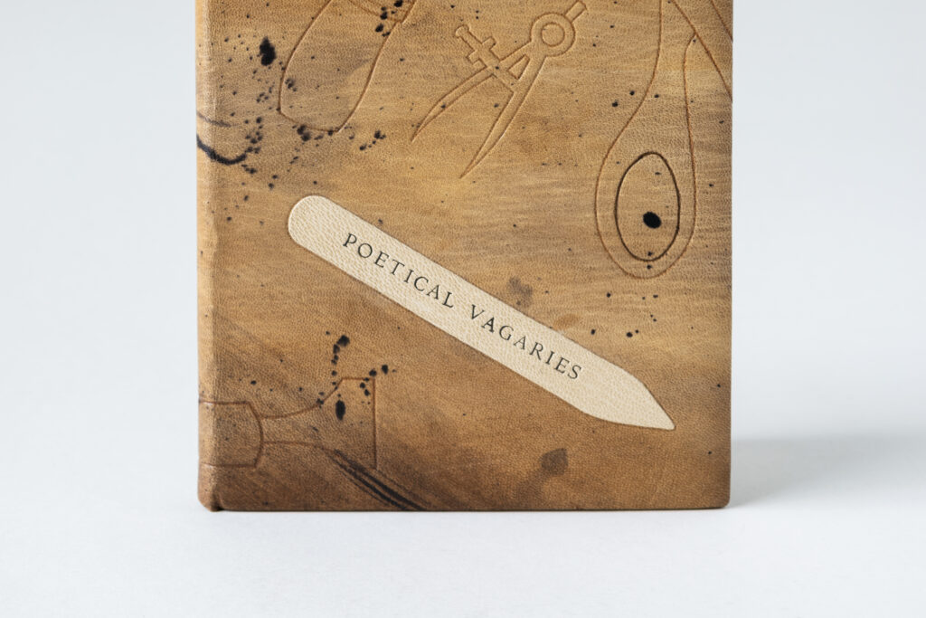
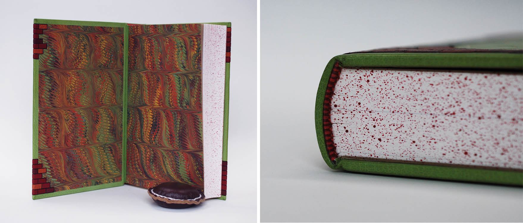
As mentioned above, the bone folder was used for titling on the front cover and the pen barrel on the back cover showcases the author’s name. Both were hand-tooled using handle letters in carbon over a lightly hand-dyed goatskin onlay. The endbands are sewn over a rectangular core in three shades of brown. Although Laura’s first instinct was to sprinkle the head edge, she backed away from that choice in order to create a moment of pause before opening the binding. The edge-to-edge doublures are dyed with the same energy as the covers and each were given one feature. The front doublure is adorned with a tooled illustration of Laura’s favorite pair of tweezers, while the back doublure highlights Laura’s tea habit in the bindery. She used the very Christmas mug that she drinks tea from everyday to achieve the cup rings on the back doublure. The speckled flyleaves are a decorative paper from Dirk Lange Handmarmorpapier, which matches Laura’s binding perfectly.
Laura found bookbinding during her undergraduate studies, but didn’t pursue it further until much later on when she heard about NBSS through a WBUR radio piece. After taking a few Community Education classes, she decided to enter into the full-time program. During the past two years, Laura has embraced every new experience with excitement. She’s built on her training by interning at Haverford College over the summer and taking courses on the history of bookbinding at Rare Book School along with a course on the history of book structures taught by Julia Miller at the University of Michigan. With all of these experiences under her belt, Laura is looking forward to planning her next move.
Ash Nunez
Ashen Briar Bindery
@ashenbriarbindery
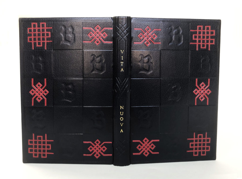
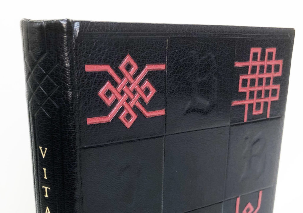
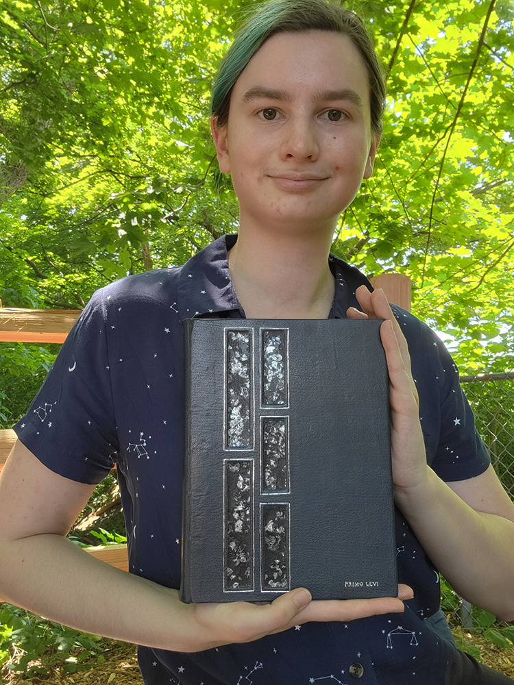
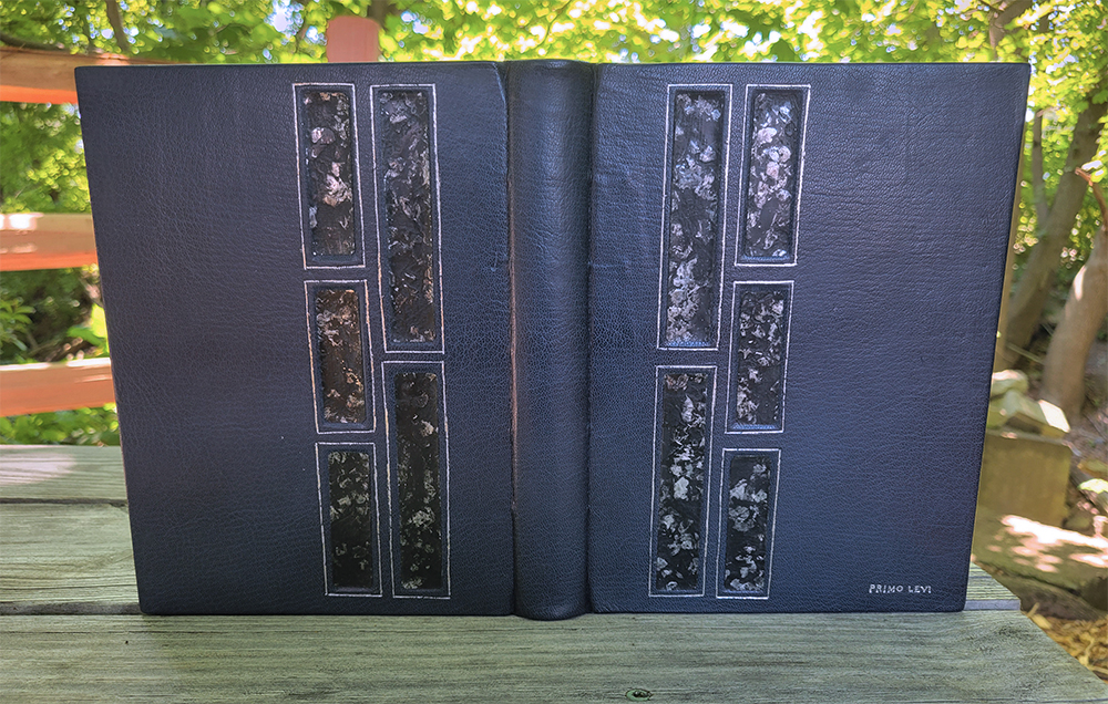
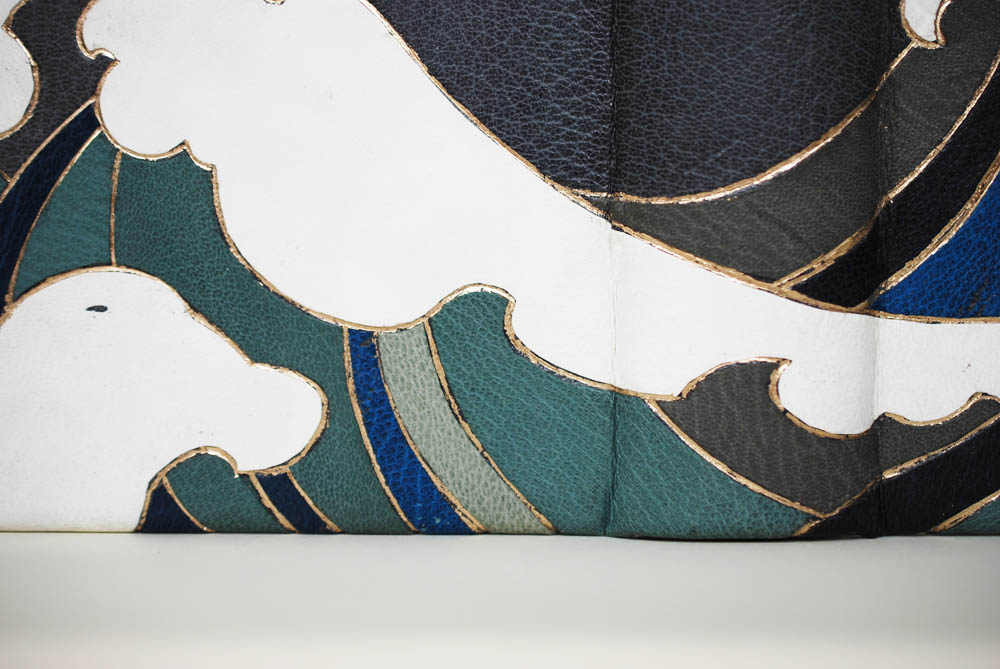
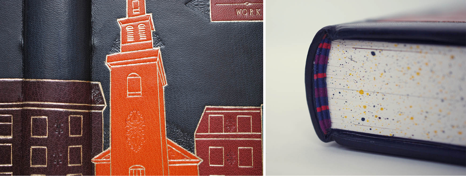
Ash found inspiration from armorial bindings found in England and Italy during the nineteenth-century along with Bradford’s satirical commentary on secret societies. Both of these influences connected their personal maximalist aesthetics and interests in heraldry. Rather than recreating the exact appearance of an ornate armorial binding, Ash’s goal was to elevate this look through a contemporary lens while also making a direct connection to the text block. Although the illustration of the Knight of the Folding-Stick is a part of the omitted text, it does appear at the beginning of Peachey’s article. This gave Ash a great source of inspiration to build the details of the shield for the front cover of their binding.
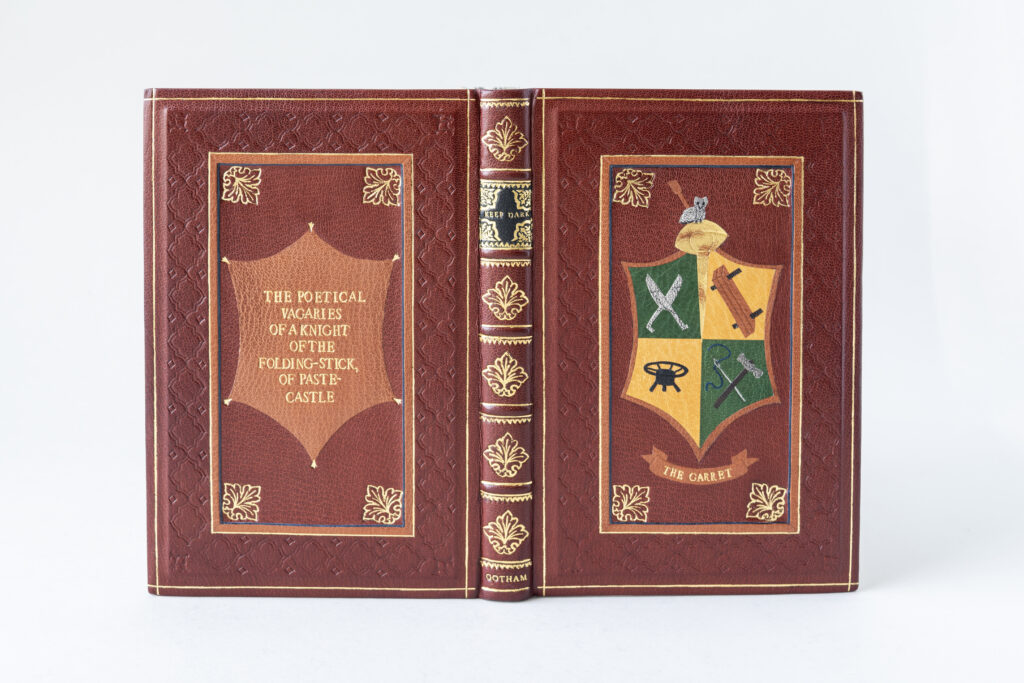
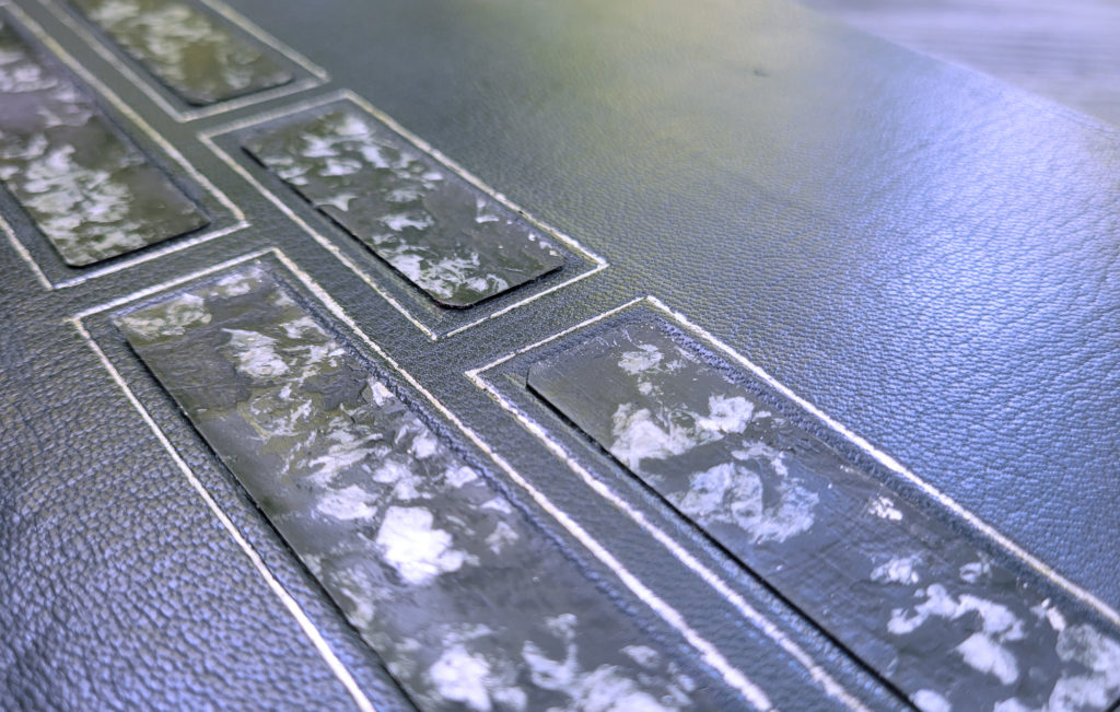
The binding is covered in a cherry goatskin, however the decorative panels in the center of each board are actually sunken inlays. An extra layer of board was laminated to the covers and you can catch a glimpse of a shadow at the board edges in the photograph below. The front cover panel is masterfully layered using techniques that Ash learned during a workshop with Coleen Curry on inlays and onlays. The green and yellow goatskin blocks that make up the background of the shield (along with the surface gilt elements) were butt together first, then trimmed to the final shape. After being framed with a piece of light brown goatskin, the entire shield was inlaid into a piece of cherry goatskin. At this point the individual tools were added. Onlays in light grey, brown, dark grey and black were used to create the brush, owl, shears, lying press, finishing stove and hammer. The needle was tooled with palladium along with a small dot to indicate the hinge of the shears. The thread is an ascona onlay with blue leather to represent the Order of the Blue-string. Further details on the tools are blind tooled while the owl’s features are smoke tooled.
The panel on the back cover is constructed slightly differently. The shape on the back matches the shield, but it is also meant to mimic a piece of stretched leather with the clips represented by a small decorative arrow tooled in gold. This piece is an onlay that has been hand-tooled with the full title. The decorative sunken panels are surrounded by a frame of blue leather and a tooled light brown onlay. The central panels are further framed with a blind tooled pattern meant to mimic a design that could be achieved by using a brass wheel, but it is actually made up of three separate finishing tools. A single tooled gold line is the final frame on the covers.
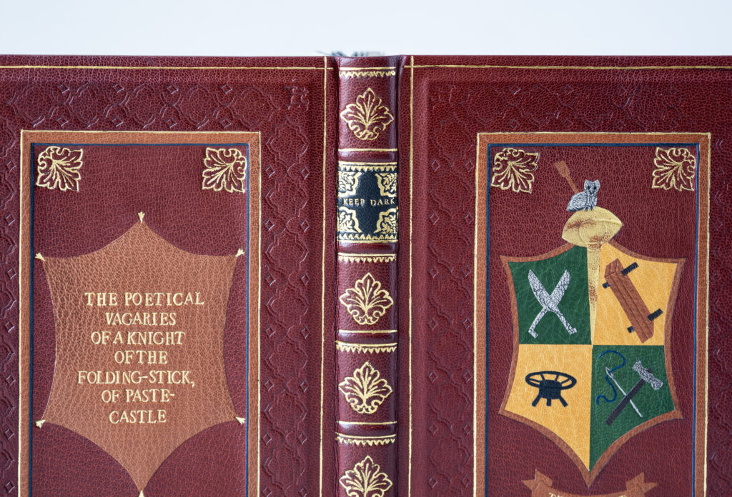
The aesthetics of armorial bindings are continued on the heavily tooled spine where Ash added false raised bands on the hollow to create the different compartments. Each band is tooled along the edges with two different finishing tools. The lettering piece features the words Keep Dark as a nod to the phrase Keep dark, Can’t tell which is found at the top of the illustration and is nineteenth-century slang for keeping quiet. The lettering piece is also heavily tooled with corner motifs matching the boldness of the larger decorative tool used in the corners of the panels and remaining spine compartments. The word Gotham is tooled in the tail compartment, which is the place of publication (New York City) of the original 1815 edition.
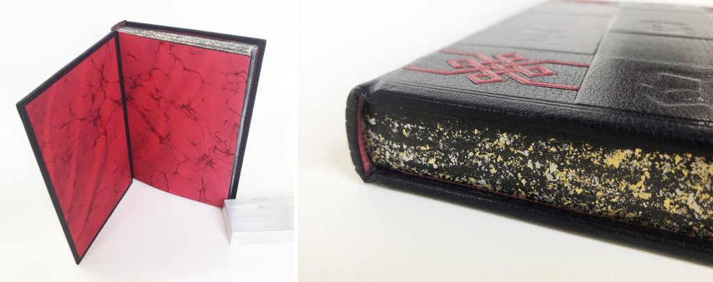
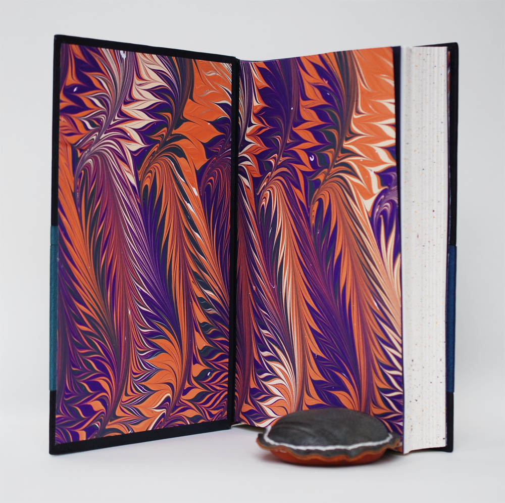
The endbands are sewn over a rectangular core with bands of yellow, blue and green thread. The head edge has been painted black to mask the addition of blank black pages. The edge was then sprinkled with gold leaf and a few flecks of palladium. The paste downs and flyleaves come from a collection of decorative papers that were donated by Todd Pattison. Both patterns matched the aesthetic of Ash’s binding perfectly. The paste downs include hand-stamped scenes in indigo, while the flyleaves are printed with gold in a pattern similar to dragon scales.
Prior to coming to NBSS, Ash was already a small business owner and as they progressed through the program they began incorporating more of their binding work and services into their established business. Through binding, Ash has found acceptance as an artist and has found this craft to be the perfect outlet for their creative energy. This energy will hopefully translate into more fine bindings, more marbling and more collaborations with other artists. The latter being very important for Ash as they really enjoy connecting with authors in particular, to craft a unique binding of their work.
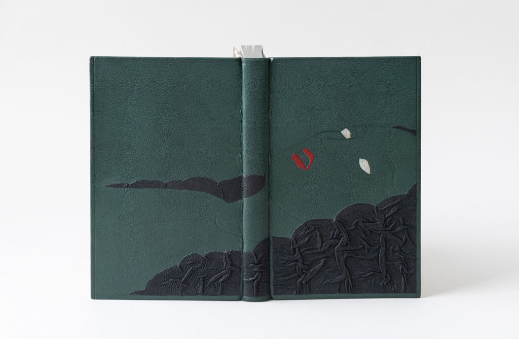
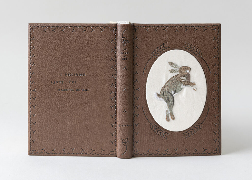
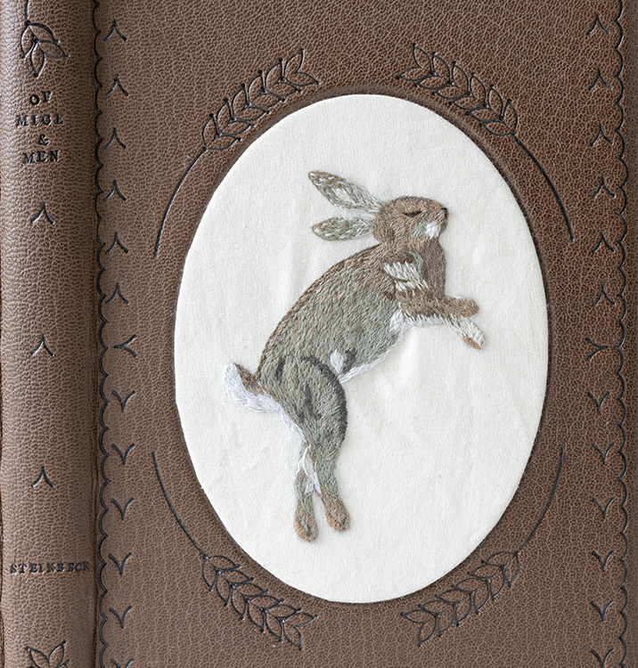
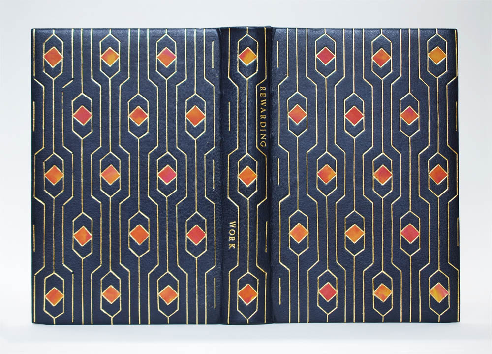
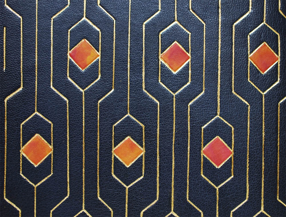
Stephanie Sieverding
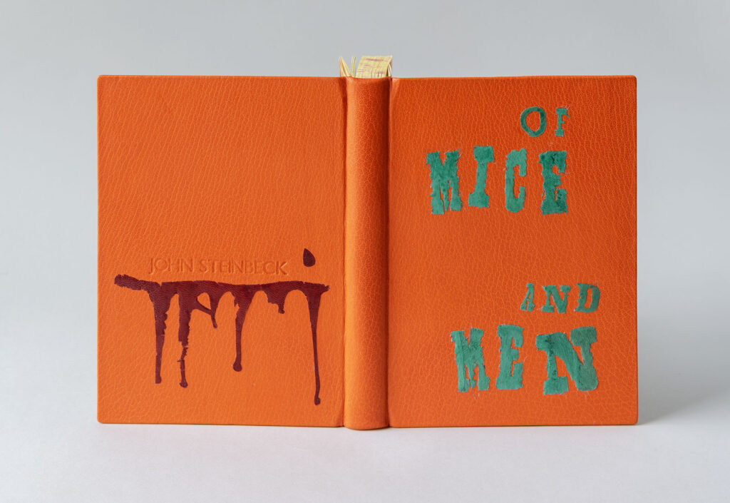
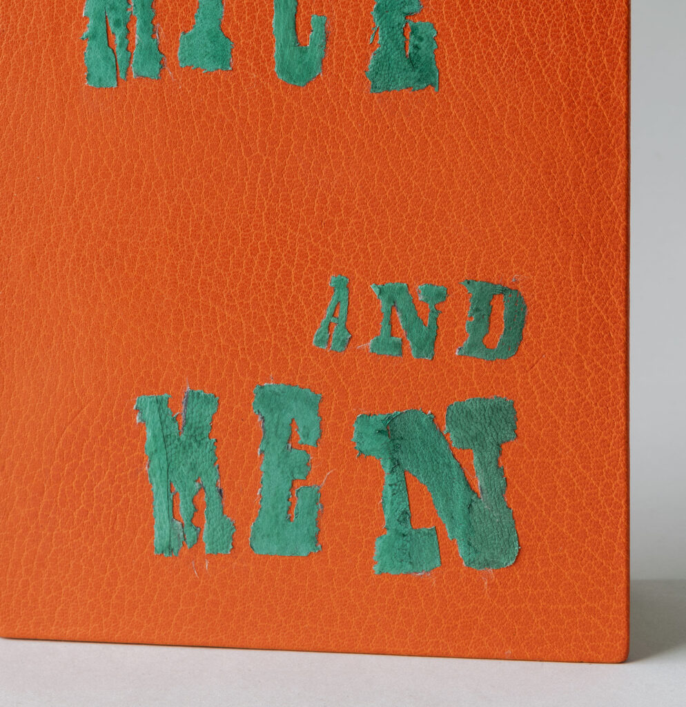
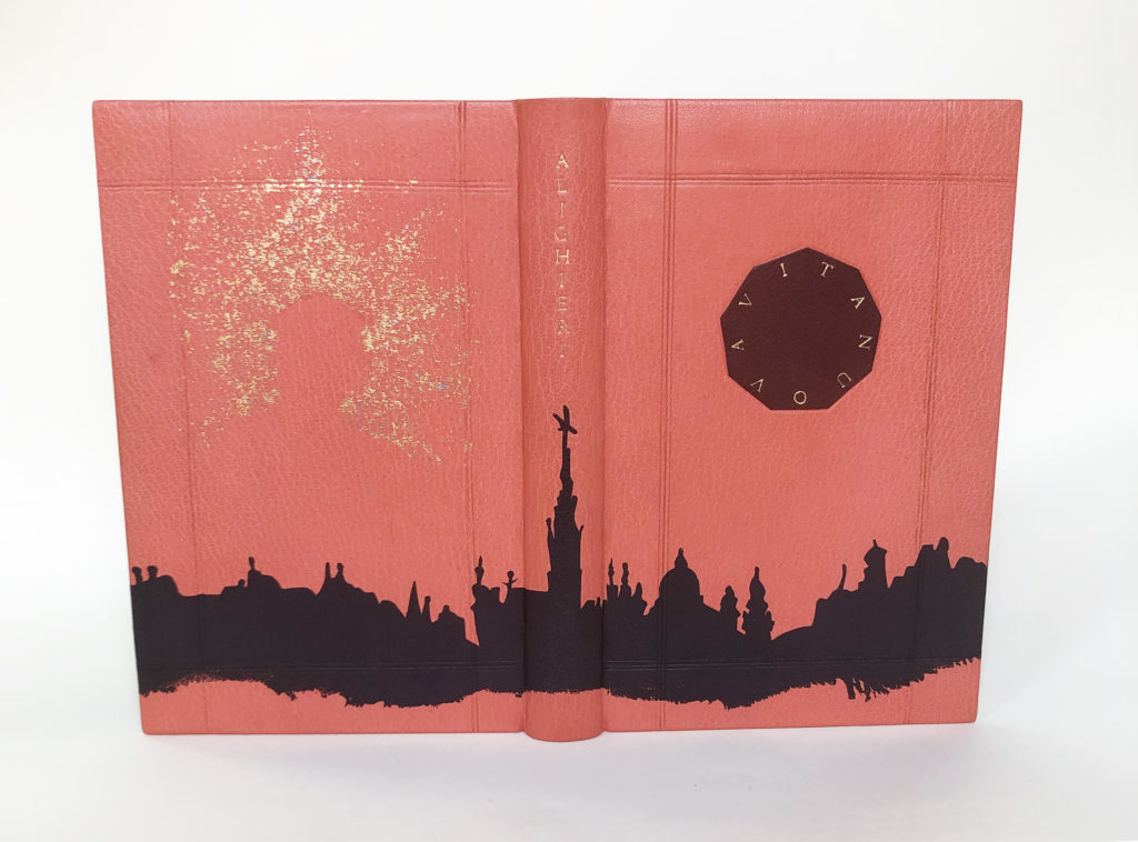
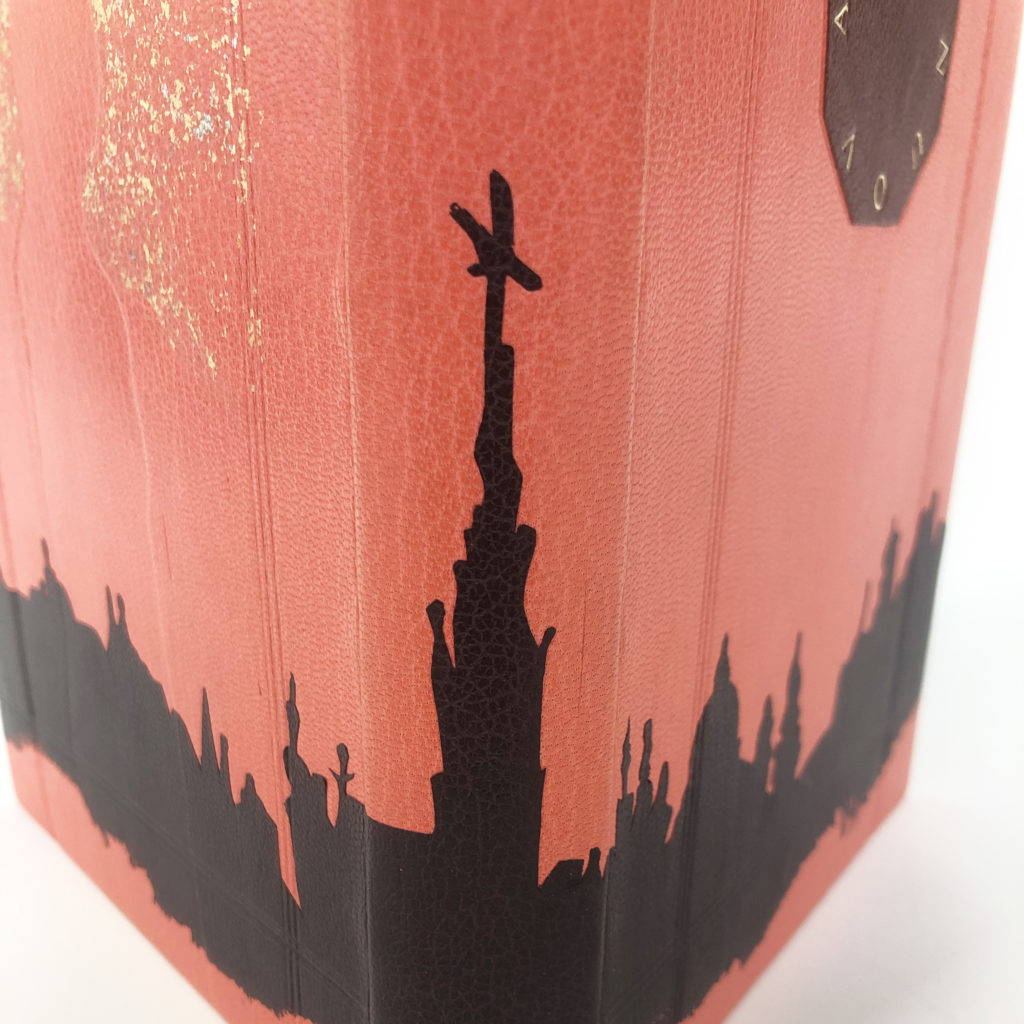
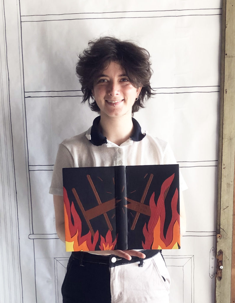
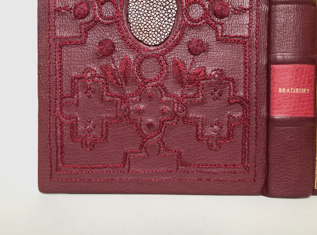
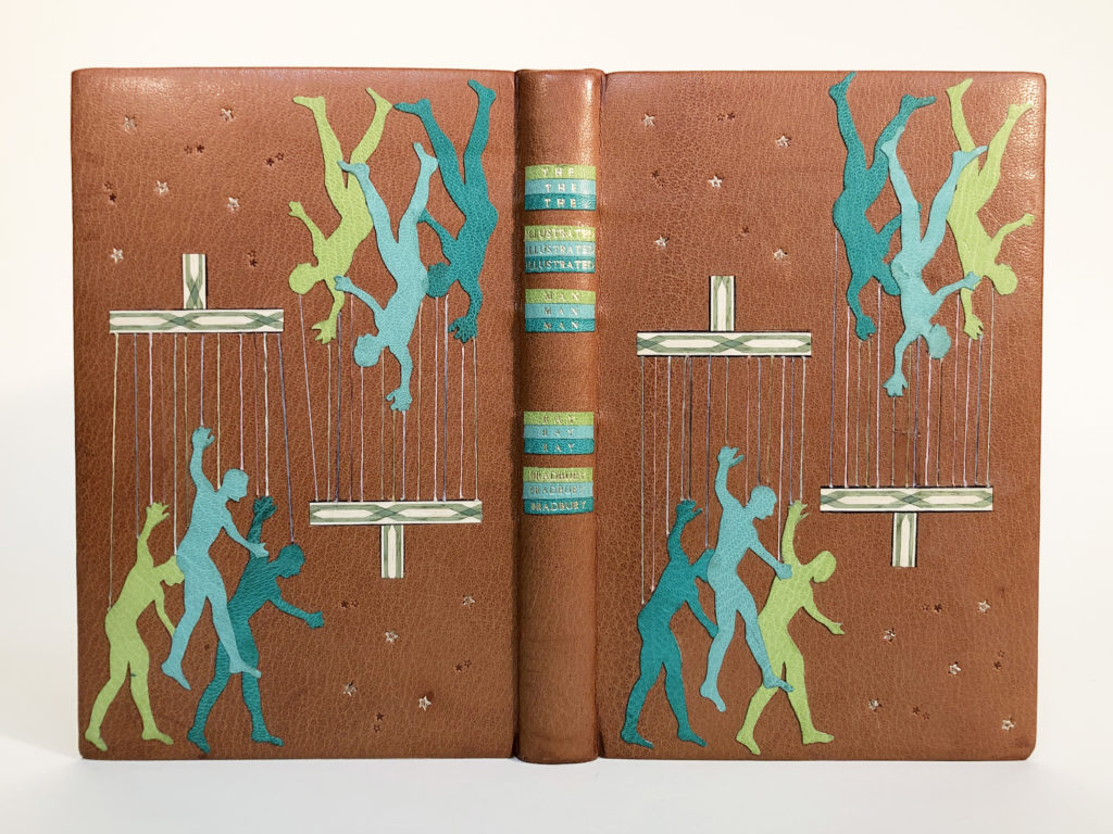
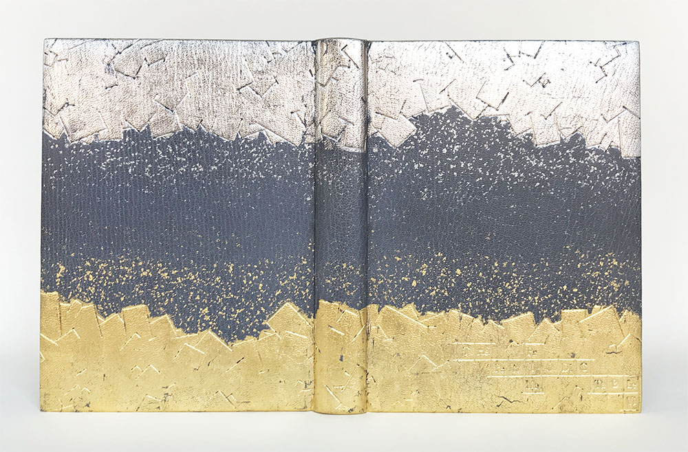
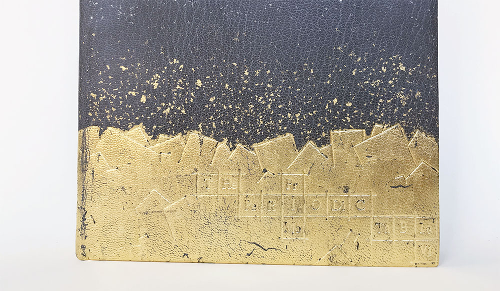
Stephanie’s two designs are split by the spine of the book which is minimally gold tooled to outline the false raised bands. The front cover takes influence from the illustration of the Knight of the Folding-Stick while the back cover pulls imagery from the poem The Binder’s Curse. This poem lists off the myriad of calamities that could occur in the bindery or during the binding process. In her binding, Stephanie embraced these curses and illustrated them across the back cover, however, she does offer a small triumph with the decoration on the back cover doublure.
Stephanie crafted her binding using a simple color palette of black, red, tan and yellow metals. However, she employed a wide range of techniques across the binding. Beginning with the back cover, Stephanie has recreated some of the curses using a range of onlay techniques and carbon tooling. The top right hand corner features a tunnel with a mouse at the entrance. The black and red stripes butt against each other to create the illusion of depth through the board. A wrinkled onlay surrounds the entrance where a light grey mouse awaits. This small scene depicts the first line of curses listed in the poem: “May rats and mice devour your paste, Your paper and your leather,”. Other elements that Stephanie highlights from the list of curses include a hair left under the leather, using patches to hide errors, newsprint transferring onto leather and unintentionally overlapping elements.
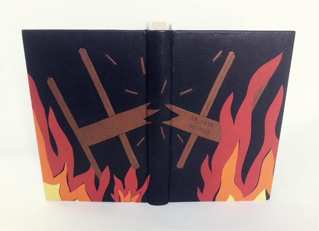
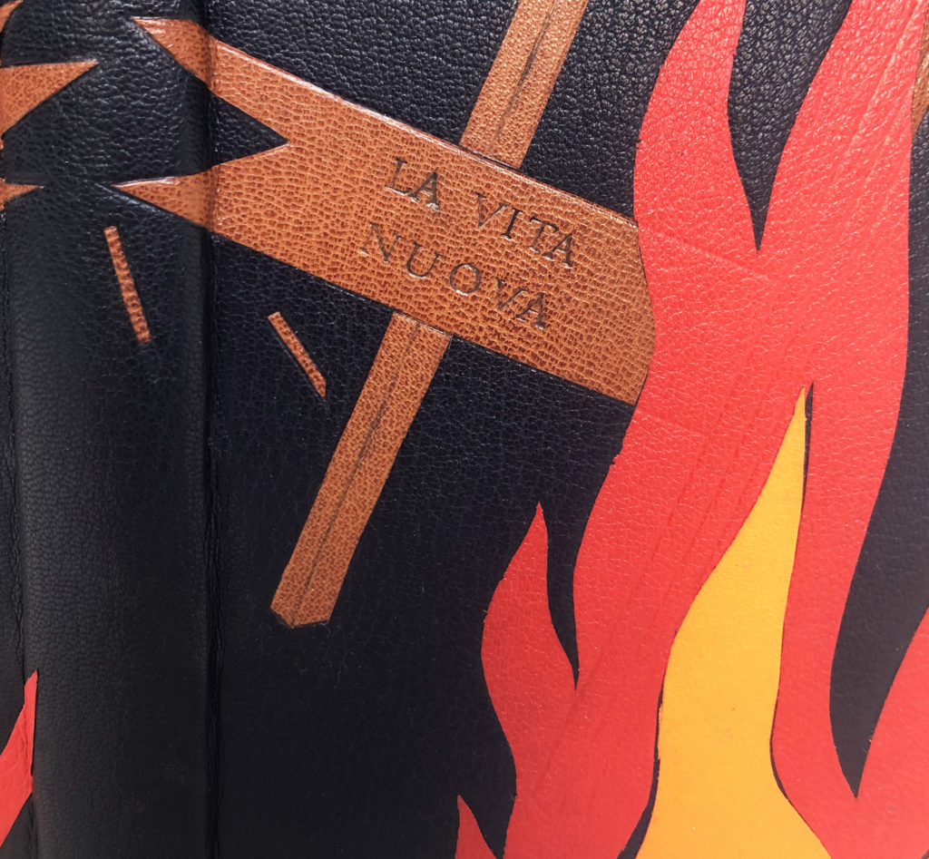
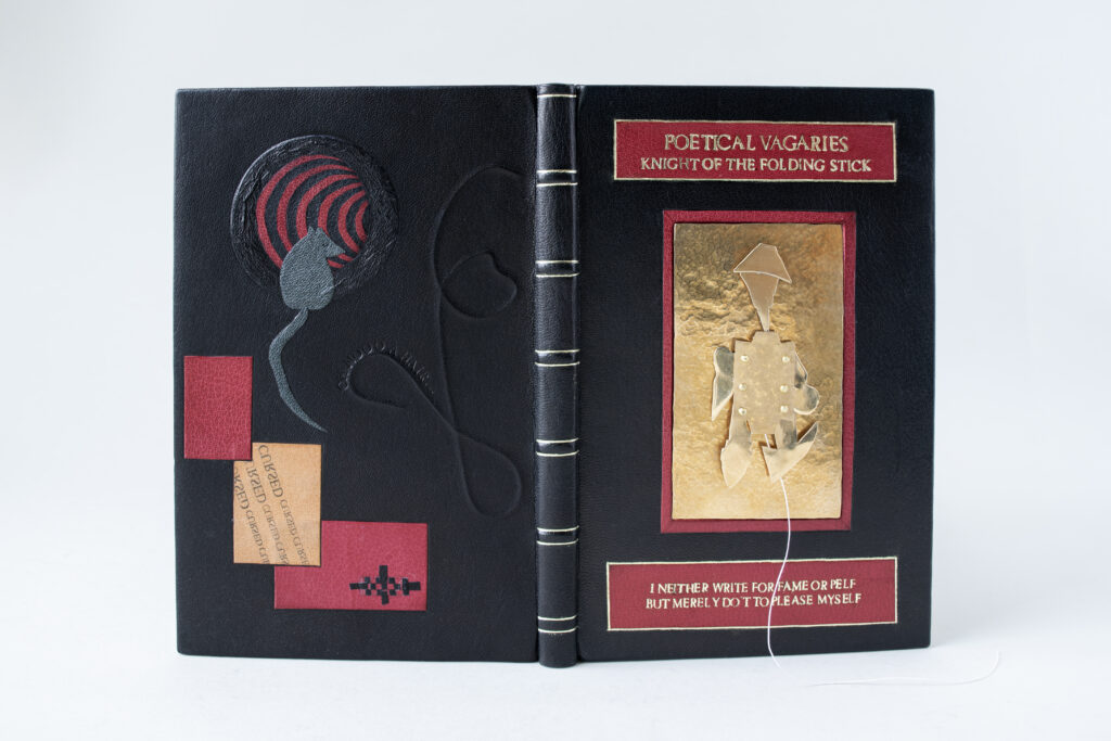
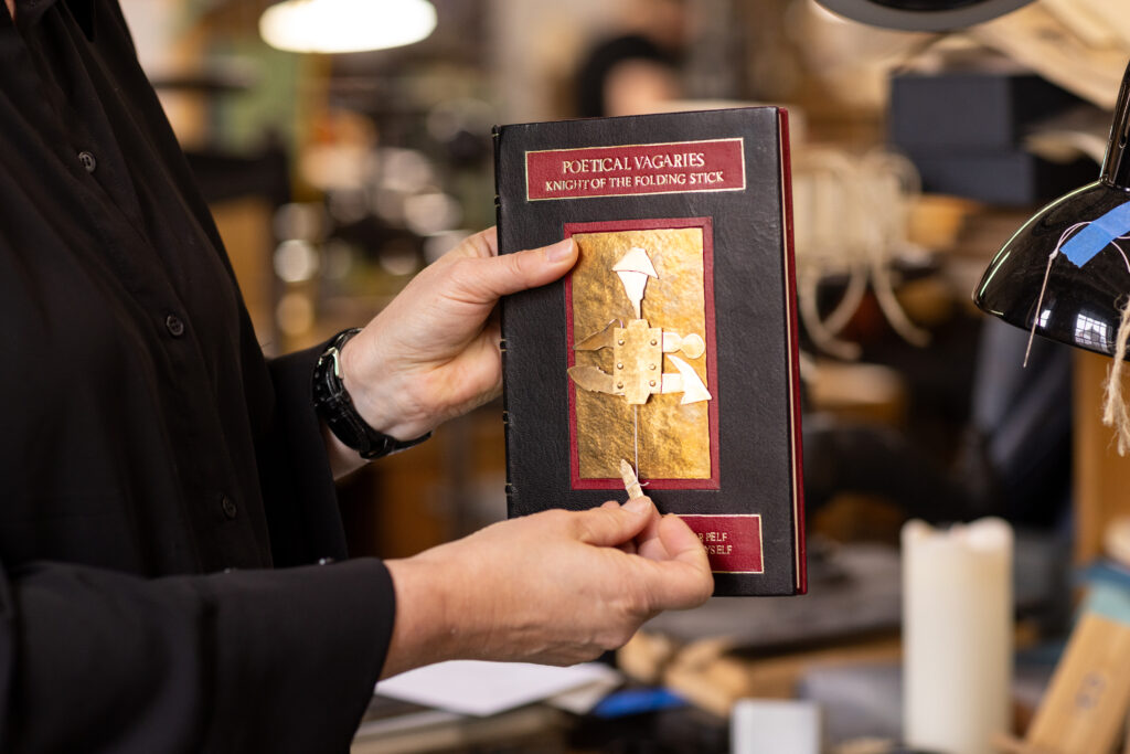
After seeing the illustration of the knight, Stephanie said that she felt compelled to create an animated version of the knight out of brass. This material being something her father worked with a lot gave her confidence to engage with it to craft the knight. The backplate was hammered to create texture, while other pieces were sanded and polished. The head and helmet were sealed to prevent tarnishing. After assembling several knights of different sizes to test the pulling mechanism, Stephanie finally landed on a solution that would allow for easy pulling action of the string. The rivets were hammered to the body plate and are part of the mechanics. The title at the top of the cover and quote at the bottom were hand-tooled and gilt on a tooled red goatskin onlay. The quote “I neither write for fame or Pelf, But merely do’t to please myself.” comes from the title page of the text and was selected by Stephanie as she felt it perfectly captured the author’s sense of humor.
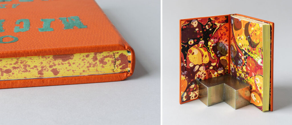
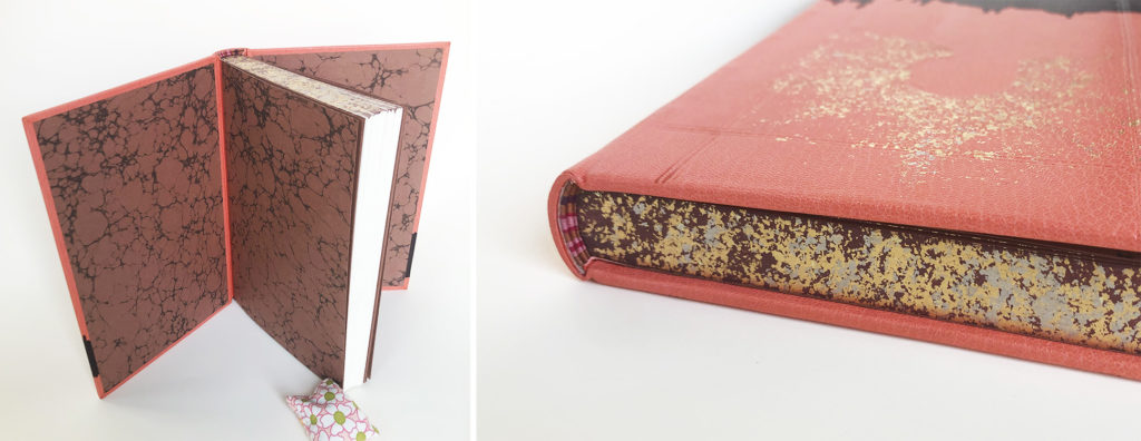
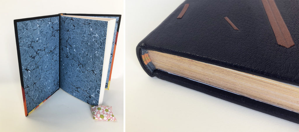
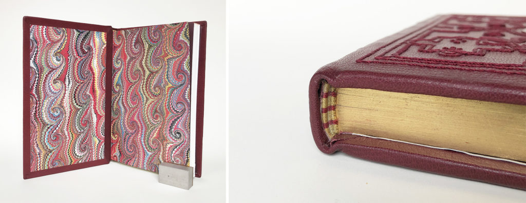
The French double-core endbands are sewn with bands of yellow, white and blue and sit atop a sprinkled edge over green pigment. Upon opening the back cover, you find the mice have made their way through the tunnel and transformed into golden rodents. These onlays were surface gilt by Stephanie to represent wins over those pesky curses. The fly leaves were marbled by Stephanie using watercolor paints and the pops of green and blue are a nice reprieve from the covers while also connecting with the edge decoration and endbands.
Stephanie began her journey into bookbinding as a hobbyist before finding Community Education courses at NBSS. Once her daughter was a bit older, she decided to enter the full-time program. After graduation, Stephanie will be setting up a private practice in a studio space at home. She found so many aspects of the program to be interesting and plans to offer a range of services while also developing a product line. The long process of crafting a fine binding also really appealed to Stephanie and she is already working on her next binding.
Suehade Soto
@suehade_inc
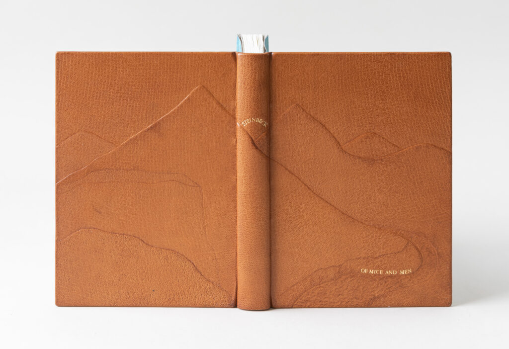
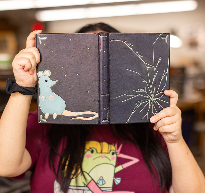
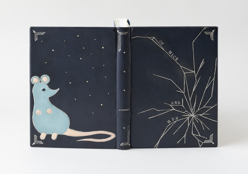
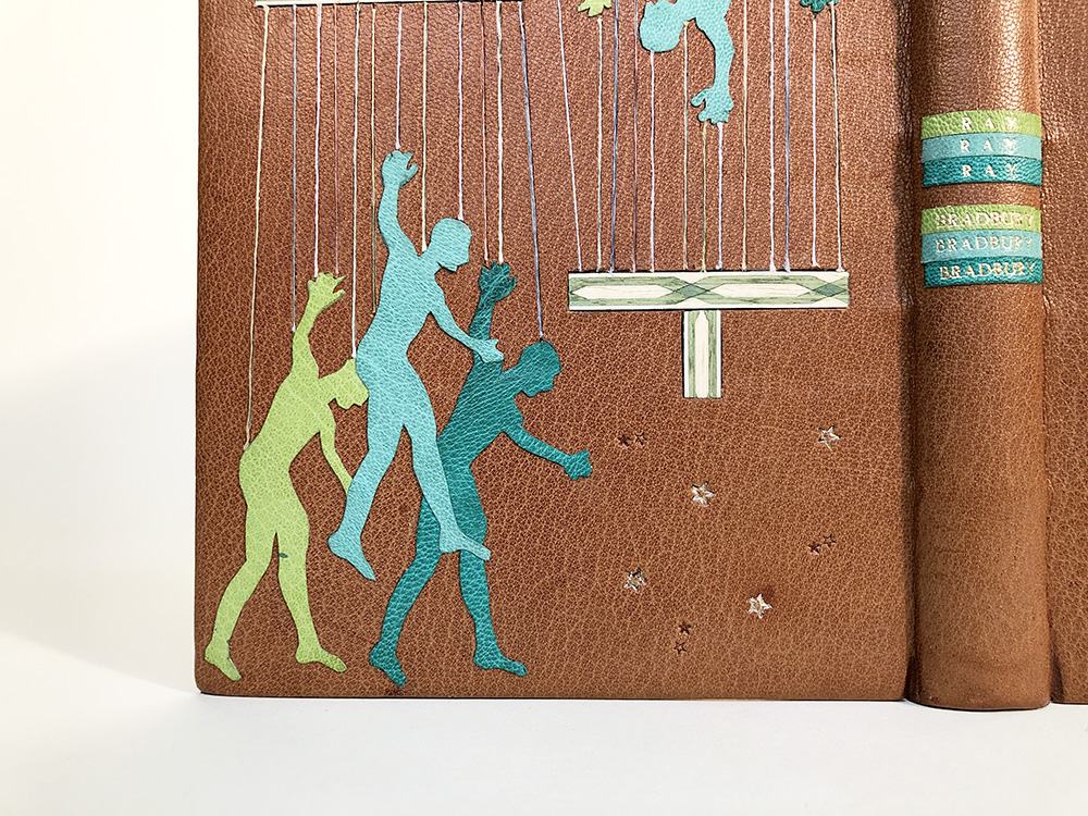
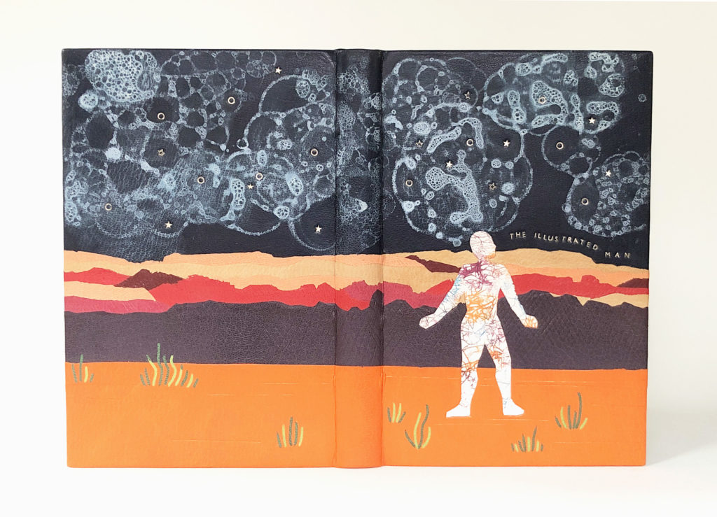
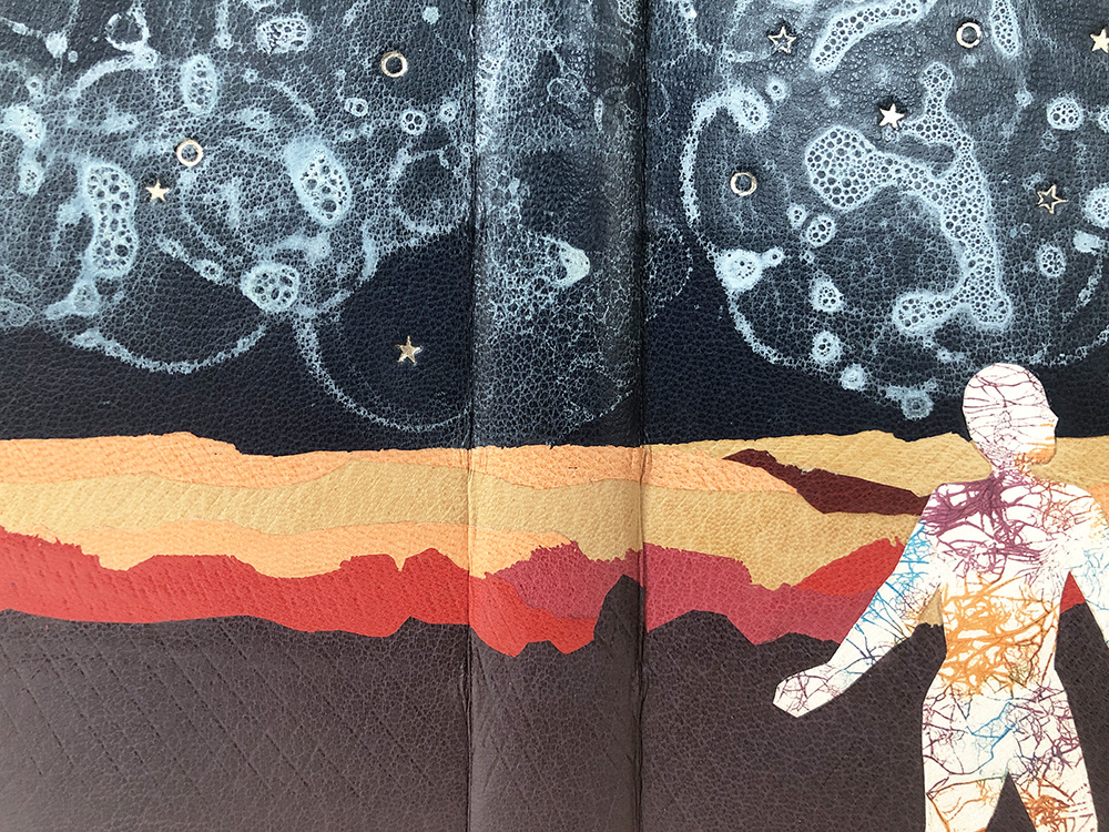
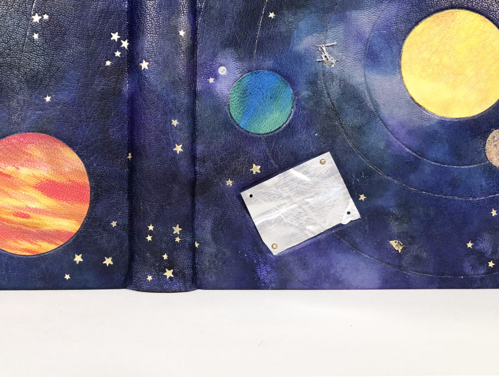
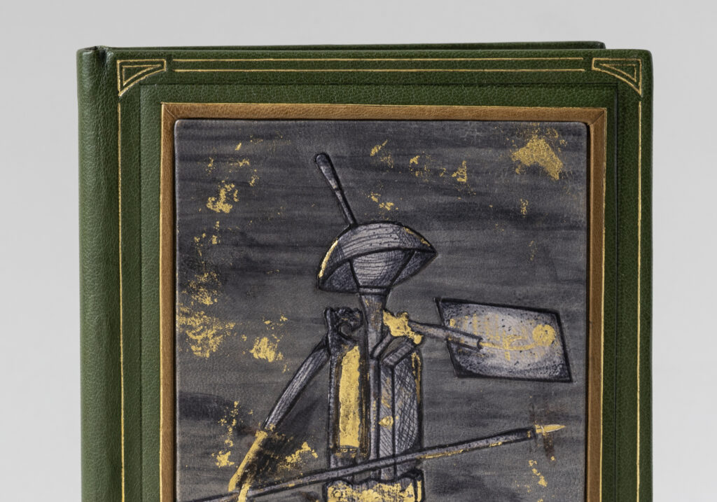
In Suehade’s design we get to see the knight as it appears in the original illustration set atop a stark, desolate backdrop. His hat is a paste bowl with a brush “feather”. His body is formed with a backing hammer, plough, tenon saw and gold cushion. His legs are press shears and his arms are comprised of a polishing iron and fillet. He holds a press board as a shield and wields a press pin like a spear. One tool that is missing is the actual folding stick, which we refer to today as a folder and is typically made from bone, wood or horn. The bone folder is mentioned by Bradford as being one of the most basic tools for a bookbinder, in fact it was the first professional tool I ever bought and one that I still cherish to this day. Peachey notes this omission of the folding stick as being an ironic injustice as the rest of the knight’s body is made solely from bookbinding tools and equipment. Suehade chose to incorporate a literal bone folder in her design and gave it a pocket, so it can be unsheathed at any moment.
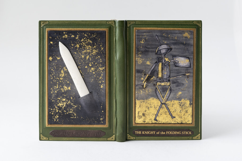
After building up the boards with an extra layer to accommodate the decorative panels, Suehade covered her binding in green goatskin. While all the decorative elements were dyed with the same batch of diluted black dye, Suehade worked with a range of undyed skins with different undertones to achieve a variety of results. The background on the front cover panel was first dyed to create a streaky effect, then the bottom portion was textured before being surface gilt to depict the ground. The knight is so skillfully dyed by Suehade; through her technique she was able to create dimension and similar markings to the engraved illustration. This single tooled onlay was then hand-painted with dye to create the bold black outlines. Any metal tool that makes up the knight’s body was given a surface gilt highlight.
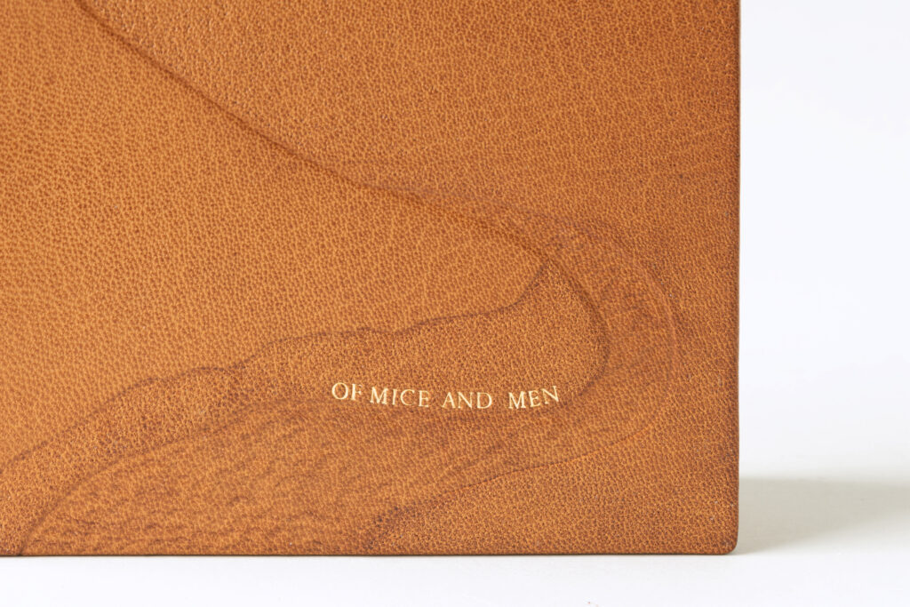
Both panels were given sprinkled backgrounds using gold leaf. The panel on the back cover has a more solid background to make the bone folder really pop from its surroundings. Suehade created a slight well for the bone folder, which serves to keep it anchored to the binding. After covering a slit was carefully cut into the leather and a pocket was formed to hold the bone folder just like in an apron or tool belt. It was important for Suehade to make the bone folder accessible, to give the tool action and purpose. The two plaques at the bottom of each panel were also hand-dyed, with the front cover piece featuring a condensed version of the title stamped in gold and the back cover piece featuring the phrase Keep dark, Can’t tell stamped in blind.
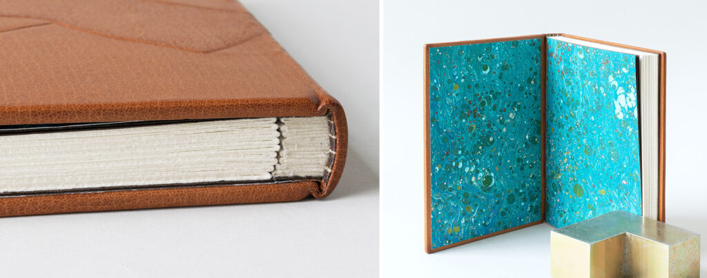
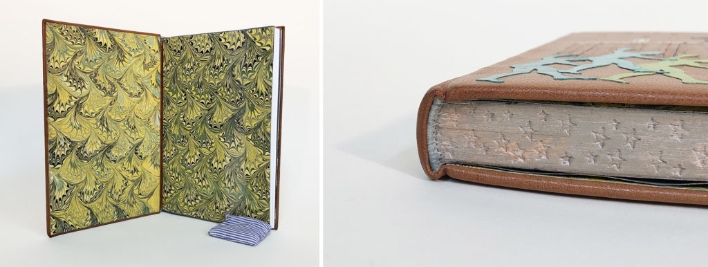
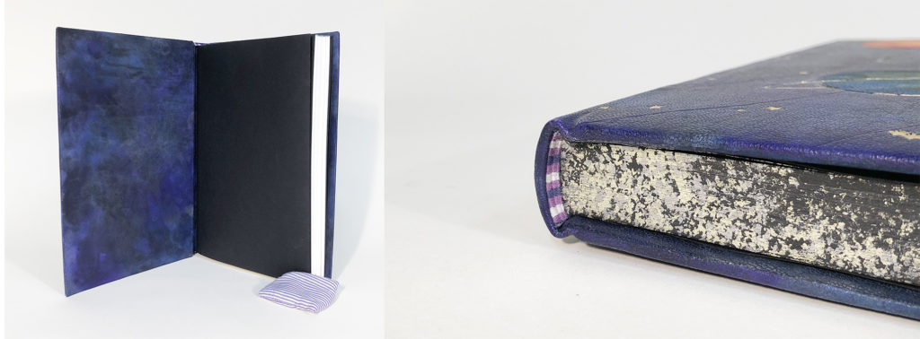
Each panel is framed first by a tan goatskin tooled onlay then a blind tooled line which accentuates the cushioned board underneath. A final gilt border with corner motifs creates structure to the overall design. The rectangular endbands are sewn with light brown, maroon, dark brown and metallic gold threads. The head edge was given a wash of dark brown pigment before being sprinkled with gold leaf. The interior side of each board compliments the exterior with a sunken panel of black pig suede framed by a light brown onlay. This is paired with a textured opalescent paper for the fly leaves.
While studying for her BFA in Oregon, Suehade took a course on illuminated manuscripts. Even though her focus was on sculpture and installation, this blip into the world of bookbinding was enough to create intrigue. During a bout of traveling and being exposed to a variety of art and bindings, Suehade redirected her focus to find a school to study bookbinding. NBSS offered her a foundation in techniques while building on the hand skills she developed during her BFA studies. Suehade plans to continue with her education by taking a course later this year at the American Academy of Bookbinding. She hopes to find opportunities within various institutions to better understand the field of bookbinding and conservation and what it has to offer.
Annie Ujifusa
@annieuji
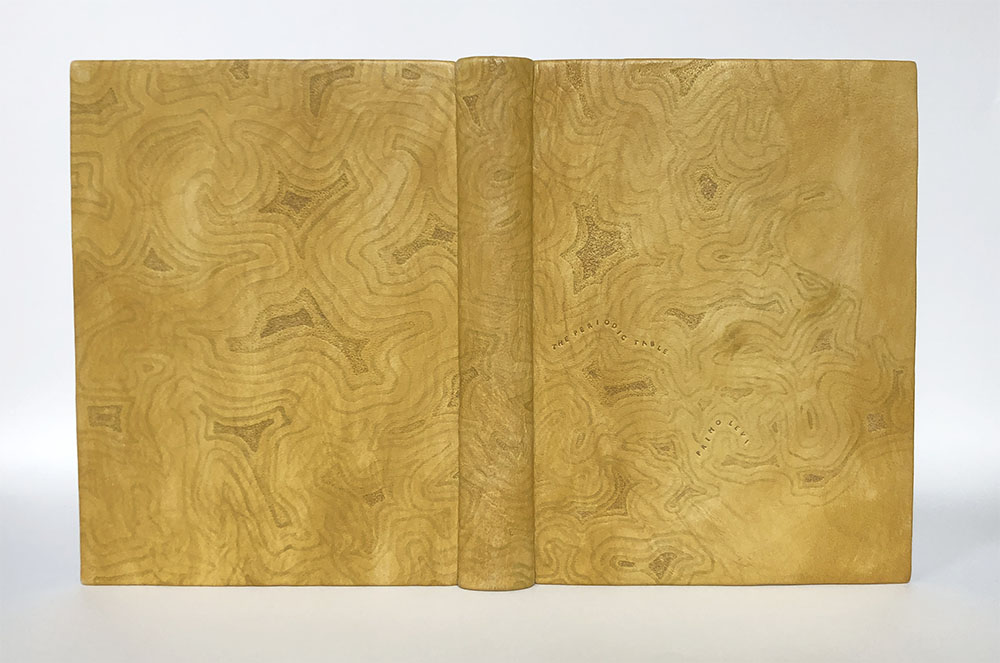
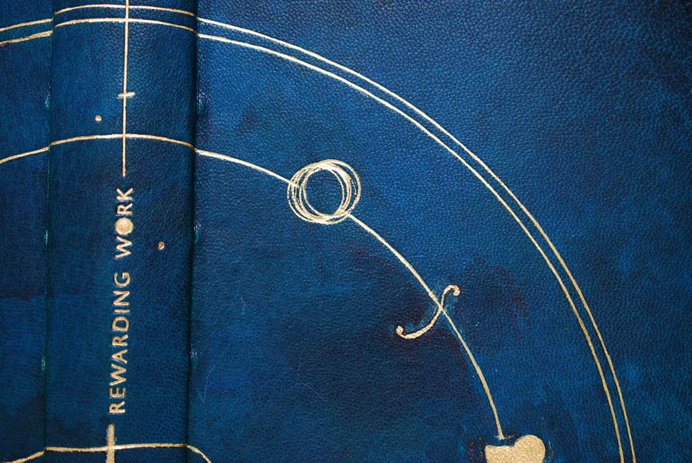
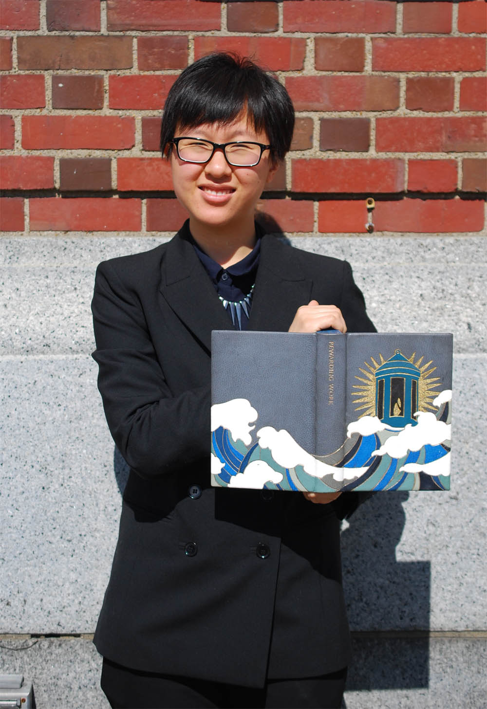
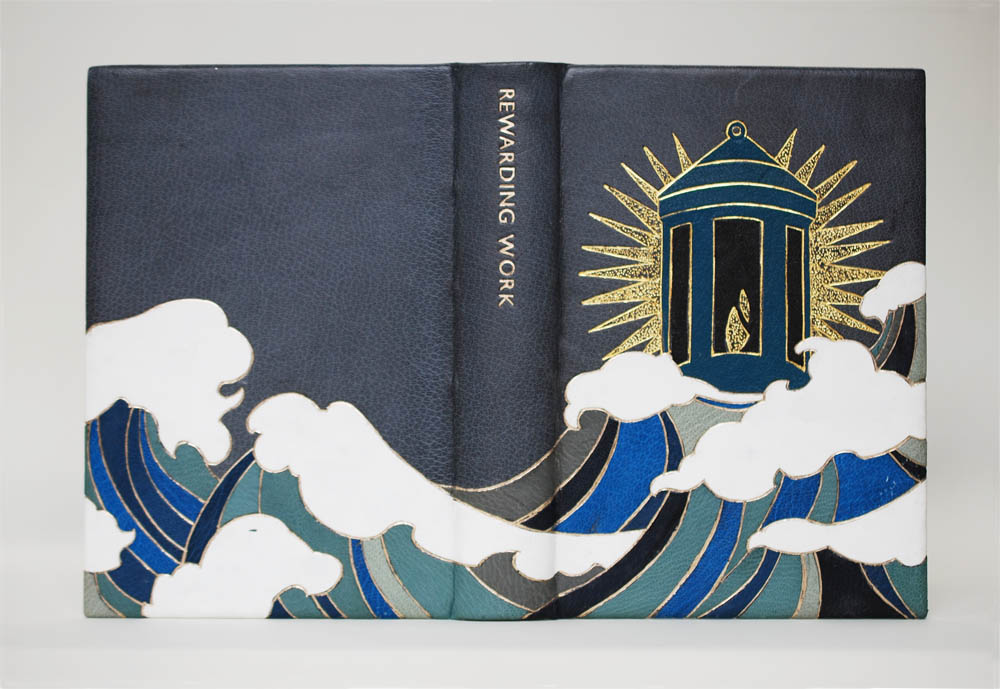
When I spoke with Annie back in February, she had many ideas bouncing around. Her love of maritime and naval history suggested she should focus on the many poems related to the War of 1812. Her love of maps pulled her in the direction of using the poem The World’s a huge Bindery as inspiration. Before we spoke in April, I was the most excited to see where she landed with her design and I love that her focus went straight to a single tool: the line palette. As I’ve mentioned before, Bradford writes about the bindery and his tools and the ownership over tools. So it felt only fitting for Annie to create a binding-centric design for a collection of poetry on bookbinding that both utilized and featured her favorite tool.

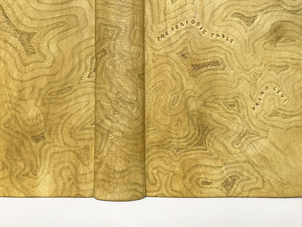
When I asked Annie how she came to attend NBSS, she talked about stumbling upon a tutorial on a Byzantine binding where she witnessed the steps of how a binding could be crafted from start to finish. This was her aha moment. One step in particular that intrigued her the most (and the one that she looked forward to learning the most) was gold tooling. So when it came time to learn this incredibly difficult technique in her second year, she was so worried that she would hate it or it would be beyond her abilities. Although her first attempt at titling was by her account horrific, overall she was able to pick up the process quickly and feels lucky to have connected so seamlessly to the intricate nature of tooling. So, Annie stripped away the more complex and modern designs for a sophisticated, classic look that could celebrate her favorite tool. Bound in a maroon goatskin, the geometric design of the cover lives within a single gold tooled frame. The blind tooled diaper pattern is filled with a line palette in a semé pattern with dots at each corner of intersecting lines.
Initially planning to gold tool the entire design, Annie did the center first and decided that it was perfect. The tooling template was simply flipped from the front cover in order to tool the same pattern on the backside, the only change being that the line palette would be flipped upside down. Speaking of being upside down, Annie had the unfortunate discovery that when adding the spine piece with the false bands onto the leather while covering, she had done so upside down. A mistake only discovered after covering was complete. And while it was difficult news to share, I commended Annie on persevering and finding a way to pivot. While the title is tooled right-side up, she chose to flip the author’s name. Without even knowing about Annie’s error, this decision felt intentional and fitting for the text.
Annie worked with fellow binder and tool maker, Brien Beidler to have an illustration of hers transformed into a finishing tool. Brien was able to suggest ways of augmenting her illustration to make it a more successful impression. This resulted in some shading on the handle and the separate line that runs across the top of the tool. The endbands are sewn in a symmetrical pattern around a rectangular core with burgundy, baby blue and beige grey threads. This was Annie’s subtle nod to her love of maritime history and Bradford’s patriotic tone towards the War of 1812. These colors are muted versions of the red, white and blue that adorn our nation’s flag. Annie made the decorative papers for the paste downs and fly leaves by sprinkling gold leaf over black paper with the use of gum arabic.
Over the past 2 years, Annie has felt affirmed in her choice to attend NBSS. She has really enjoyed learning about conservation and engaging with historical materials and bindings. And she is just enamored by gold tooling. Over the summer she interned at the Boston Public Library’s Rare Book Room for 10 weeks and starting soon after graduation she will head back to the BPL as their newly hired Conservation Technician.
– – –
Thanks to each of the students in this year’s graduating class for chatting with me back in February and then chatting with me again over Zoom in April. And a big thanks to Jeff Altepeter, Head of the Bookbinding Department, for allowing me to steal away his students yet again. I always look forward to this moment every year and I can’t wait to see these bindings in person later this summer. I wish each of these students the best of luck as they embark into the field after graduation.
If you want more interviews from past classes check out the list here.