RSS Feed

‘bookbinding’ Category

  1. December // Book Artist of the Month: Sarah Bryant

    December 2, 2014 by Erin Fletcher

    FigureStudy-SarahBryant

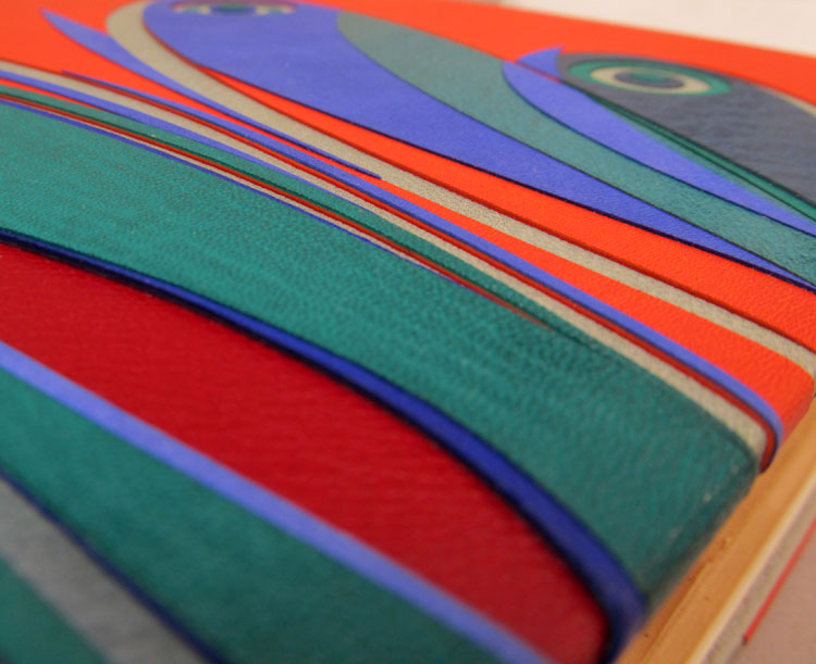
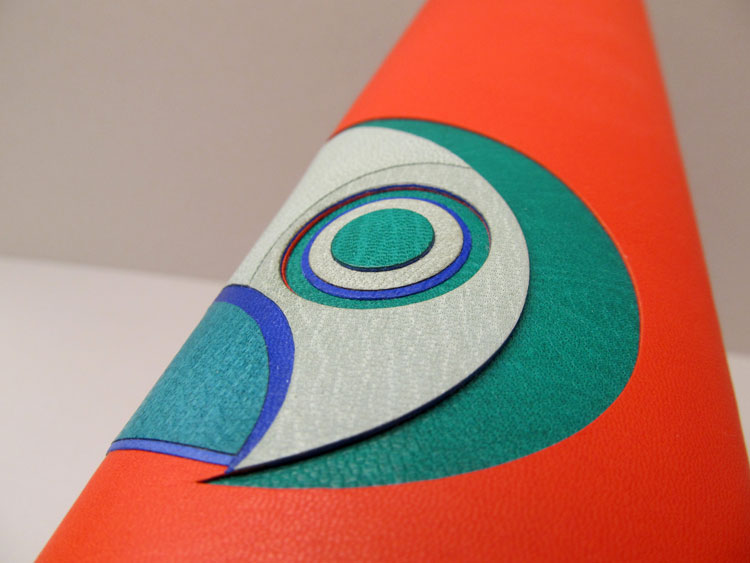
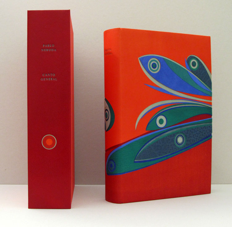
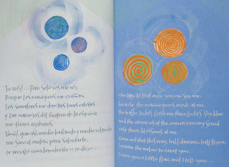
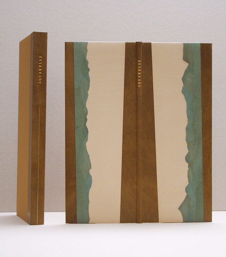
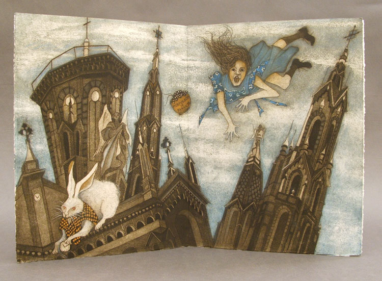
    As a work still in progress, Figure Study is a creative collaborative project between book artist and printer Sarah Bryant (Big Jump Press) and her biology professor cousin, Dave Allen. In the interview below, I’ve asked Sarah a series of questions about this project because its production is partially possible due to a successful Kickstarter fund. And of, course due to the brilliance of the design and content of the project.

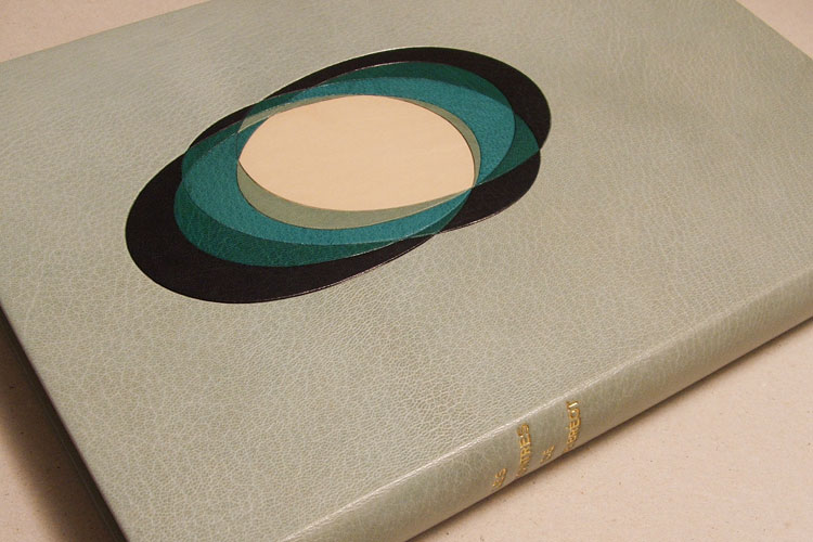
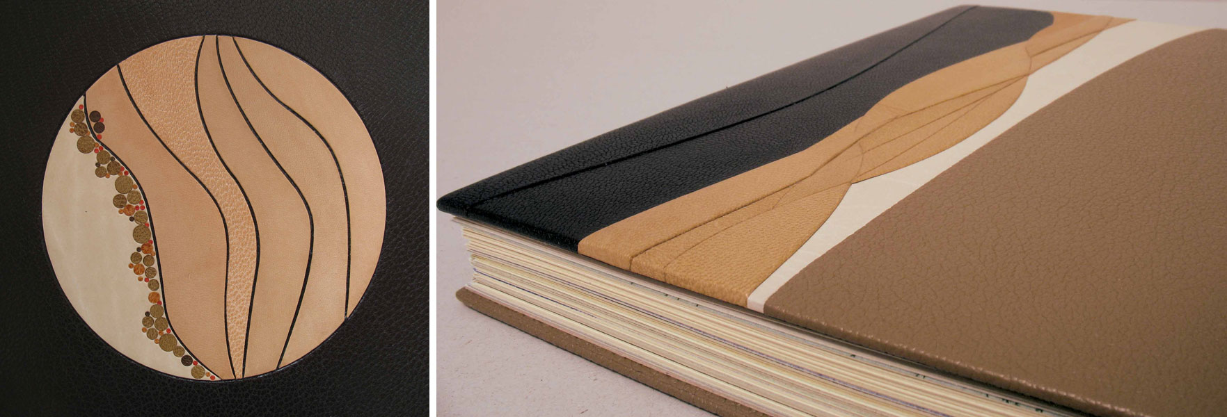
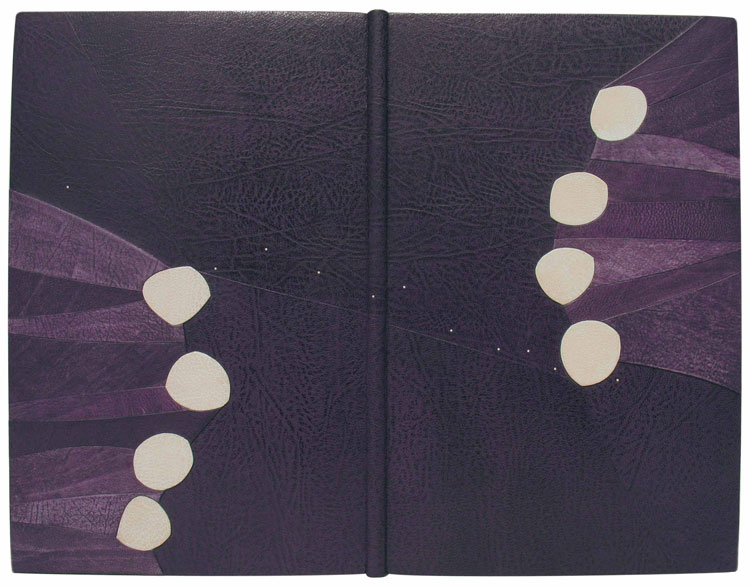
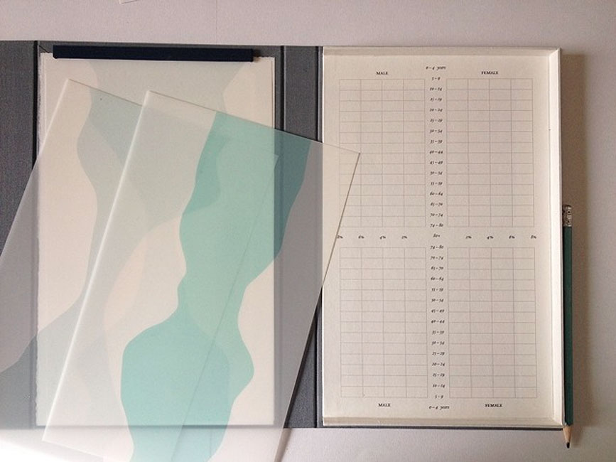
    Figure Study is a book about population data. Housed in a custom box is a series of population diagrams printed on drafting film. The translucency of the drafting film allows one to arrange the prints in unique combinations creating new sets of data and artistic forms.

    FigureStudy2-SarahBryant

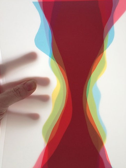
    Figure Study has an interactive element. How do you see the owner of this work connecting with the population diagrams?
    I hope that the process of comparing the shapes will be a truly addictive one. I find it that way. Of course, the owner of the book will be able to look at the figures in a purely analytical way if they wish, layering a sheet of drafting film printed with a figure onto a grid and using the index to determine which regions are represented. But additionally the layering yields beautiful forms and stark contrasts that appeal to both the analytical parts of our brains and our more basic appetite for creating and experimenting.

    It is interesting to me that over the last two years or so I have made three “books” that are essentially composed of loose sheets that can be rearranged. I didn’t set out to do it this way, but somewhere in the back of my mind I have been interested in the viewer reshuffling and recombining the content. I think this book is the natural conclusion of that impulse because the reshuffling of the data is so essential to the core of the book. Comparing, revealing differences and similarities, investigating.

    – – – – – – – – – – –

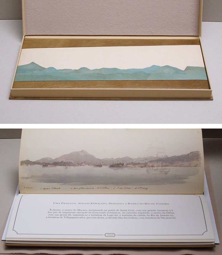
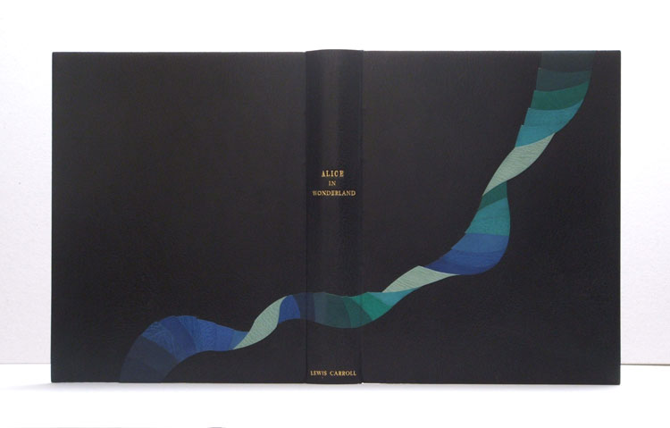
    I’m really excited to present this interview with Sarah Bryant. I continue to enjoy the work she produces and was pushed to conduct this interview from as a suggestion given by Michelle Ray, who I interviewed last year. Sarah is creating really interesting artist books in beautifully designed and bound formats. I recently made a pledge toward Sarah and Dave’s successful Kickstarter fund and am anxiously awaiting my reward. I see Kickstarter as a potential avenue for other book artists to fund their ambitious projects and a goal of this interview was to discuss the entire process with Sarah.

    Check out the interview after the jump for more about Sarah, her background and creative process. Come back each Monday during the month of December for more about Sarah’s work.

    read more >


  2. Bookbinder of the Month: Sol Rébora

    November 30, 2014 by Erin Fletcher

    CantoGeneral-SolRebora

    This binding of Pablo Neruda’s Canto General is the most recent binding Sol Rébora has completed and the most important book she has worked with to date. This first edition copy was printed in a limited 500 copies. This particular copy is number 52 and is signed by Pablo Neruda, Diego Rivera and David A. Siqueiros with additional signatures by Cesar Chavez, Carlos Fuentes and Baldemar Velasquez (American labor union activist).

    CantoGeneral3-SolRebora

    The text is printed in black and red with original color printed endpapers illustrated by Diego Rivera (left/front endpaper) and David A. Siqueiros (right/back endpaper). (Click image to enlarge)

    CantoGeneral2-SolRebora

    Why the book is so important to Sol:
    This epic book consists of 15 sections and over 300 separate poems tracing the history of Spanish America. Canto General is considered by many to be the most important work of political poetry of the 20th century in Latin America.

    About this work, I may say this book was sent to me at a perfect time.

    I had been working with the inlay technique used on this binding for the last two years. I had the feeling that I had worked with it enough as to feel free to create any design I wanted, without any fear of the inlay process, but also because I decided to trust my capacity to find solutions to any problem.

    The other important point is: I had spent 15 days in Mexico in February, for bookbinding reasons, sharing time with wonderful people who taught me a lot about their history. Two months later I went to Guatemala, to the Francisco Marroquín University to teach bookbinding. There I had been in contact with their culture, almost completely with the history of Mesoamerica.

    My feeling coming back to Argentina was that I had to make a book, may be an art book, to convey all of my experiences and my feelings on these wonderful trips.

    Two months later, I got this binding commission from Heritage Book Shop and I could believe in such a great opportunity. Pablo Neruda, Canto General, first edition. [As Sol mentions again] The book considered by many to be the most important work of political poetry of the 20th century in Latin America.

    – – – – – – – – – – –

    The book is bound in full leather in the French-style of fine binding. The design is created using thirteen different colors creating the several levels of relief and low relief. The thirteen colors come from goatskin and buffalo leather supplied through Argentina, Mexico, England and France. The title is tooled in green on the spine. The doublures are French goatskin with a design of inlayed circles.

    CantoGeneral7-SolRebora CantoGeneral6-SolRebora CantoGeneral5-SolReboraCantoGeneral4-SolRebora

    The front and back flyleaves are made from Argentinean suede. The book is housed in a matching custom clamshell box covered in orange goatskin leather with the title tooled in turquoise.

    CantoGeneral8-SolRebora

    The design for Canto General is quite beautiful and energetic. The complexity of the design is displayed in the various recessed and raised layers. When you approach a design of this complexity, how detailed and thorough are your steps leading to the final bindings? Are you creating multiple drawings and models of the design?
    To make a design for any binging, I prepare sheets of paper, many are the size of the full cover. I make a fold to place the spine and to have clear sense of where the hinge falls. I start the drawing by composing the three planes (top, back and spine) separately and together simultaneously.

    CantoGeneral9-SolRebora

    After several drawings, I put a selection of them on the studio wall. After mediating over the selection, I choose a final design. Then I scan the design and I start to make color tests in Photoshop.

    CantoGeneral10-SolRebora

    So then I start to work over the book. To place each of these inlay pieces I need a map. This map is the replica of the design, on a translucent (60 gr.) paper. It will help me locate each piece and put it in its rightful place.

    I always use the same map, I do not combine it with another, with this method I can be quite sure the pieces will find the right place. The first pieces of leather on the covers needs to be compensated with paper to make it all level, so I get a flat surface again and start to place the next pieces.

    CantoGeneral11-SolRebora

    The same applies to the spine, every element is thinner, as thin as paper, and that will be strengthened by the following layers of leather. The mosaics are superimposed as well as I keep working. To cut each piece of leather I use a mold-made on heavy paper, (240 gr. in this case). Out of that mold each piece of leather is like a puzzle. Once the entire top is covered, I make the head cup and fold over the turn-ins.


  3. Bookbinder of the Month: Sol Rébora

    November 23, 2014 by Erin Fletcher

    LesRencontres1-SolRebora

    This is my favorite binding to date from bookbinder Sol Rébora. A french text bound in full goatskin with onlays that create a striking, eye-catching design. The overlapping ellipses are creating by using a combination of goatskin and calf. Combining these two skins as onlays is a technique Sol has used in other bindings (like this one or this one). I quite love the look of the textured goat against the smooth calf.

    The binding was created for Les Rencontres de M. de Bréot, which is a novel written by French author Henri-François-Joseph de Regnier in 1904.

    Although it’s hard to choose a favorite, I think this binding might be the one. Did this design stem from a love of 20th century French design binding?
    It could be, I bound this book for an Argentinean bookseller. He participates every year in the Antiquarian book fair in Paris and I specially bound this book so that he could show my work at this fair in Paris. It is a French book and so there you have the result.

    LesRencontres2-SolRebora LesRencontres4-SolRebora


  4. Featured on Fine Books Magazine

    November 19, 2014 by Erin Fletcher

    Crucible-ErinFletcher

    This past weekend, Boston hosted the 36th Annual International Antiquarian Book Fair. The fair was filled with so many wonderful treasures. I was pleased to discover a few embroidered bindings, a collection of Gaylord Schanilec’s little books, a copy of the Nuremberg Chronicles (bound in alum-tawed skin over wooden boards) and a design binding by David Esslemont. I also got the chance to leaf through Diane Jacob’s Nourish, which has been featured on the blog.

    But I have to say that I was most excited to see my books displayed at the booth of Lux Mentis. Rebecca Rego Barry wrote up a short little overview of the fair for Fine Books Magazine, which includes some of her highlights. Thanks Rebecca, for being awed by my binding of The Crucible and writing about it. Check out the post here.


  5. Bookbinder of the Month: Sol Rébora

    November 16, 2014 by Erin Fletcher

    FaustoA-SolRebora

    In this post on Sol Rébora, I am presenting two of her bindings of the text Fausto. Just as was the case with the two bindings she completed on Alice in Wonderland, Sol found inspiration in the individual editions, thus creating two independent and unique design bindings. Fausto was written by Argentinian poet Estanislao del Campo is 1866; the story describes a laborer that goes to see Charles Gounod’s opera Faust and believes the events to really be happening.

    The binding above is bound in full black goatskin. The circular design includes strips of goatskin and calf, offering a nice variety of textures. The title is tooled in gold along the spine.

    The binding below is bound in full calfskin with detail along the front cover fore edge in the signature style we’ve seen on some of Sol’s other bindings. On this binding, the goatskin and calf onlays sit on five tooled levels. The title is tooled in gold along the spine. FaustoB-SolRebora

    These two bindings of Faust0 are quite different. Can you talk about the concepts behind each binding and what made you design them differently?
    After the explanation of the process I use to make a design binding, probably there are not too much to say about.

    Those are totally different editions, different clients, different years, and different prices, which is another very important point that I didn’t mention before, and it is a big condition of course.

    Most of the tooling on your bindings seem reserved to the titles or is done blind. Is there a reason for excluding this technique from your bindings?
    Well, maybe I don’t use traditional tooling on my designs, besides the titles, but it just depend on the designs, if I feel it needs it, I used traditional tooling to make gold lines it as I did on Milongas, Borges.

    I think I just use what I need when I need.

    I mostly like to work with a metal or brass folder, a very thin tool which helps me to make the finishing work on the inlay and the onlay. I do not love the strong lines around the inlays and my feeling is that it makes the composition looks stronger.

    FaustoAB-SolRebora

    Click image to enlarge.


  6. My Hand // Hand Sewn Headbands on Dune

    November 11, 2014 by Erin Fletcher

    DuneHeadband-ErinFletcher

    After reacquainting myself (with the help of Jane Greenfield and Jenny Hille’s Headbands: How to Work Them) on the techniques for sewing a French double core headband, I embarked on creating the headbands for Dune. The headbands are made up of four different colored threads wrapped around two leather cords of different sizes. A third row of thread is created around a core of thread referred to as the bead. You can see this in the image above, the colored thread is wrapped around the white thread that is dangling in front of the headband. The beading step also locks the tension, keeping everything nice and orderly as you move further along the cord.

    Three of the colored threads will be used as embroidered elements on the design of the binding. The dark brown thread was incorporated to extend the dark brown pigment from the edge decoration onto the headband itself. (Click on the image to enlarge).

    DuneHeadband2-ErinFletcher

    With the headbands completed, I will be moving forward with the spine linings and board shaping. I foresee a bit of sanding in my future.


  7. Bookbinder of the Month: Sol Rébora

    November 9, 2014 by Erin Fletcher

    BaladaParaUnLoco1-SolRebora

    Sol Rébora bound this special one of a kind text by calligrapher Nancy Leavitt after a serendipitous meeting. The book is bound in the French-style of fine binding in full violet goatskin. The decoration is divided into six levels with onlays in purple and white goatskin.

    The text within this binding is a special edition by Nancy Leavitt. Do have a connection with Nancy, who is a calligrapher and book artist based in Northern Maine?
    I met Nancy in New York in 2006, at the 100th Anniversary Guild of Book Workers Conference. I love her work and I like her very much; she is really a beautiful person and a great artist. I proposed to her that we make a book together and she accepted; so we started to work on it. We looked for a topic which we both like to work with and [settled on the subject of] Tango. After some research we chose [the popular song] Balada para un loco [by poet Hector Ferrer].

    Sometime later she had finished the book, she sent it to me by mail, and I worked on the binding. Both of us worked totally free on our feelings.

    BaladaParaUnLoco2-SolReboraBaladaParaUnLoco3-SolRebora

    Nancy found a way to make a translation, which is very difficult for Tango. With the text and the song, she found a base to create the book.

    Later I bound the book, working with the same process I use for every design binding, but with the plus that I had been part of the creating process of the text in some way. I sent the design to Nancy before I began, (even if she didn’t ask it) and she liked it very much, so I started to work on it.

    It was a wonderful experience.

    Did you find inspiration in the text or do you draw from another source?
    To explain my way to work on a design or to find inspiration I have quite a clear process of work.

    As a starting point in the design process, I engaged in the act of reading the text of the book to be bound or I inquire about the context and history of the edition. To continue as a general basis of the process, I found very necessary to observe carefully all the aspects of the book:

    – Typography: The design of the typeface, its predominant form, size and color.
    – Print Layout: Book cover, typographic case and blank surfaces around the text.
    – Paper: Color, texture and paper weight.
    – Illustrations: Techniques used for illustrations, predominant color, size and quantity thereof.
    – Size and shape of the book: I observe the size of the book, number of booklets [signatures], leaflets or free sheets, and finally the weight of the book.

    From the evaluation of these conditions, I can begin to work on the design of the binding:
    – Structure and construction process: What may be the most appropriate structure and format and sewing by weight.
    – Materials to use: wire, paper, paperboard, leather, fabric, or alternative materials such as acrylic, wood, metal, etc.
    – Textures: Choosing textures in every material used for union or for opposition to the qualities that brings the book.
    – Colors: Colors of the materials I decide to use.
    – Design: Drawings, designs, models, colors and material testing.

    I think the openness and the preservation are the most important points on the construction process of a contemporary design binding, together with “good techniques and aesthetic criteria”.

    These are technical conditions that a binding should have to preserve the criteria that the book brings from the edition, which is accompanied by an aesthetic thought of form and color text, based on the text, work which is responsible editors, designers and illustrators.

    The design and the aesthetics or the artistic expression of the binding should be integrated to create one piece with intellectual and sensory reading from the outside. Finally, I would say the construction techniques of the structure, along with the design of the cover and applied materials, play together to achieve this unit.


  8. My Hand // A Desert Inspired Edge for Dune

    November 6, 2014 by Erin Fletcher

    I am currently working on a first edition copy of Dune by Frank Herbert for two reasons: 1) I plan to submit it to a bookbinding competition with the hopes that it will travel around the country and 2) there is a towering stack of books from the Dune series on my husband’s bookcase and he deserves a finely bound copy of his favorite (he exhaustively quotes from) book.

    At the beginning of the design phase, I consulted with my husband for inspiration and to make sure I was capturing the spirit of this iconic science fiction novel with precision (I may have subconsciously derived some inspiration from both Lynch’s visual masterpiece and Jodorowsky’s sadly unfinished film). After finalizing my design, I began working on the binding. First step was to remove it from its trade binding and mend the signatures. After the book was re-sewn, then rounded and backed, I ploughed the edges in preparation for the edge decoration.

    DuneEdgeDecoration-ErinFletcher

    At this point in the process, I’ve already completed the decoration on the fore edge and will go through the steps to decorate the tail edge in this post. As always, I decorate the edges in the following order: fore edge, tail edge, head edge. The book is placed between two wooden finishing boards that are angled at the top in order to apply more pressure to the book’s edge.

    Before I can apply any decoration, I need to scrap and sand the edge until it has a smooth feeling and an almost sheen-like finish. I scrap the edge first with a curved scraper, then I sand the edge beginning with a course grit sandpaper and work the edge with a finer and finer grit to get that nice luster finish.

    DuneEdgeDecoration2-ErinFletcher

    The sanding phase can be an arduous task in the decoration process, but quite necessary to a successful edge. I usually sand the edge smooth, then apply my base layer of pigment, allow it to dry, then sand the edge smooth again. After the second phase of sanding, I’m ready to apply the final base layer of pigment. For the edge on Dune, I wanted to achieve the look of a cracked, dry desert ground by combining gouache and gold leaf.

    The mixture of gouache also included water and paste. I paint the mixture onto the edge, then use a sponge to thin down the color. I allow the first layer to dry a bit before applying more pigment with a sponge which offers a mottled and textured effect to the edge.

    As this layer is drying, I draw out the imagery to represent the cracks of the dry ground on some Frisket film. The cracks are going to be gilt onto the edge, the Frisket film is used to mask out the areas I don’t want to be gilt. Frisket is a great material to work with because it has a low tack and will not disturb the gouache layer underneath.

    DuneEdgeDecoration3-ErinFletcher

    In the image above you can see the mottled gouache layer through the clear Frisket film (which is also hanging over the edge of the spine). The exposed areas will be covered by gold leaf.

    in the next step, I apply a PVA wash as the size (adhesive) for the gold leaf. At first the PVA wash absorbs quickly into the edge, but eventually the PVA wash will sit on top the edge. At this point, the gold leaf can be laid down. The PVA wash acts almost like a vacuum as it sucks the gold leaf to the edge.

    Before the PVA wash is completely dry underneath, the leaf needs to be set; this can be done by carefully applying downward pressure with a piece of flannel wrapped around the squishy part of my thumb. A second layer of gold leaf is laid down using the same steps, this creates a more vibrant and fuller look to the gilding.

    DuneEdgeDecoration4-ErinFletcher

    Once the PVA wash is completely dry, I burnish the edge and remove the Frisket film. This initial burnishing of the edge is done through a protective layer of silicone release paper. After some time, when I know the edge is dry and the decoration is secure, I burnish the edge once more (this time the agate burnisher is in direct contact with the edge).

    For the final step of the decoration process, I add some accents of dark brown gouache (this mixture also included water and paste). The darker pigment is added simply with a brush in the desired areas. When I am satisfied with the decoration and the last bit of gouache is dry, I burnish the edge on last time.

    After removing the book from the press, I whack the edge against the edge of the table. This cracks open the text block, separating the pages. This step can be a bit nerve-racking, at this point any poorly attached layer can crack or flack off. Luckily my edges came out beautifully!

    DuneEdgeDecoration5-ErinFletcher

    Now on to the headbands, but not before I cap up (wrap up with a thin paper) the text block. After spending three days creating such a complex decorative edge, I want to make sure it stays safe from any scrapes or scuffs.


  9. Bookbinder of the Month: Sol Rébora

    November 2, 2014 by Erin Fletcher

    SolRebora

    The design on these two bindings are very stylistic of Sol Rebora’s fine binding work. I wanted to ask her about the technique behind this signature look.

    These bindings are bound in a similar fashion with the boards built up with 7 different layers. Are these layers covered in leather off the book and then attached?
    The way I used to build the different layers of relief is:
    I cover the lower layers first, then I use some cardboard, with different thicknesses, and finally I cover the cardboards with very thin leather, working within traditional onlay techniques.

    SolRebora2

    The binding on the left is Cartas de Anastasio el Pollo. The binding is covered in calfskin at the spine with the remaining portion covered in various goatskin relief onlays. The edge to edge doublures are matching the leather near the fore edge of the covers. Sol shared an image of one of the illustrations, which demonstrates her inspiration for the binding design.

    CartasDeAnastasioElPollo-SolRebora CartasDeAnastasioElPollo2-SolRebora

    The binding on the right is Acuarelas. Published by Livraria Kozmos Editora in 1991, this artful text includes watercolors by Lieutenant Robert Pearce. The binding is full leather constructed in four sections. The spine and front edges are covered in a beige goatskin, the central panel is natural box calf and the relief onlays are a series of blue goatskin. The latter has been worked to get different tones of the same color.

    The title has been tooled in gold along the spine.

    Acuarelas-SolReboraAcuarelas2-SolRebora

    The doublures are also beige goatskin, with a single vertical line tooled in gold. The flyleaves are also goatskin from Argentina.

    From Sol on the design concept:
    The design is based on the watercolours in the book, which show outlines of the Brazilian coast taken from the sea. To simulate the movement of the water, I took photos of the water in a swimming pool, printed the pictures and working with a transparent paper, copied the strongest lines. I then developed them to get the feeling of movement. The pieces of blue leather were sanded and burnished to get different tones of the same color.

    Acuarelas3-SolRebora


  10. November // Bookbinder of the Month: Sol Rébora

    November 1, 2014 by Erin Fletcher

    AliceInWonderlandBlack-SolReboraSol Rébora has bound two copies of Alice in Wonderland. Both designs are stark opposites, one bound in full black goatskin and one bound in full white goatskin. The binding above was bound in 2006, with the design executed in a series of blue onlays and title tooled in gold.

    The design on Alice in Wonderland (black) is stunning, the blue onlays run so fluidly across the covers. Did you hand-dye the blue onlays for this binding? Can you discuss the concept behind the design?
    I had read the book and the image of Alice falling along the stairs, plus the kind of dream that she led, gave me part of the idea for the design.

    Also the special perspective of the illustrations helps me to spread this design across the covers.

    I had used different colors of blue, but I didn’t dye them. The tone of a single skin of leather can change, depending on the section. I choose the piece I wanted depending on the tone and “direction” of the grain. Where the grain changes, the tone of the color changes; I can get different tones from the same skin of leather.

    AliceInWonderlandBlack2-SolReboraAliceInWonderlandBlack5-SolRebora

    The elegant ribbon-like set of onlays continues onto both the front and back doublures. The flyleaves are inlayed with a series of dots that extend the flow of the onlays.

    AliceInWonderlandBlack4-SolReboraAliceInWonderlandBlack3-SolRebora– – – – – – – – – – – –

    AliceInWonderlandWhite-SolRebora

    Sol’s response continues:
    Now, you may see I had bound the same book with a total different design; this one is full white leather with big flowers, all across the cover. Those flowers are done with inlay techniques, full color using blue, green, orange and yellow.

    I had done this design for the same book, same edition, with the same illustrations, but three years later and for a different client. (I didn’t have that wonderful white French leather in my hands when I bound the first Alice, and I didn’t have the beautiful Harmatan black leather when I bound the second Alice.)

    I should say that, being in Buenos Aires, I also have to play with the leathers I have at the moment to make decisions on my designs.

    – – – – – – – – – – – –

    Bound in the French-style of fine binding in full white goatskin, this Alice in Wonderland (white) was completed in 2010. The mosaic-like flowers are created through layers of goatskin. The lines and title are smoke tooled.

    AliceInWonderlandWhite2-SolReboraAliceInWonderlandWhite3-SolRebora

    I was introduced to the work of Sol Rébora through Pamela Train Leutz’s book The Thread That Binds. Her interview with Pamela was inspiring and led me to investigate her work further. Sol lives and works in Buenos Aires, Argentina. Up until now I’ve interview bookbinders from Canada, United States and England. I’m excited to present the point of a view from a bookbinder living in South America.

    In order to become the talented bookbinder she is now, Sol had to look into study opportunities outside of Argentina in order to grow within her field. Read the interview after the jump to explore more about bookbinding in Argentina and how Sol became a bookbinder. Come back each Sunday in the month of November to see more work from Sol.

    read more >


  • My name is Erin Fletcher, owner and bookbinder of Herringbone Bindery in Boston. Flash of the Hand is a space where I share my process and inspirations.
    The StudioNewsletterInstagramEmail me
  • Archives