RSS Feed

‘bookbinding’ Category

  1. My Hand // Goose Eggs & Other Fowl Expressions

    March 16, 2015 by Erin Fletcher

    GooseEggs4-ErinFletcher

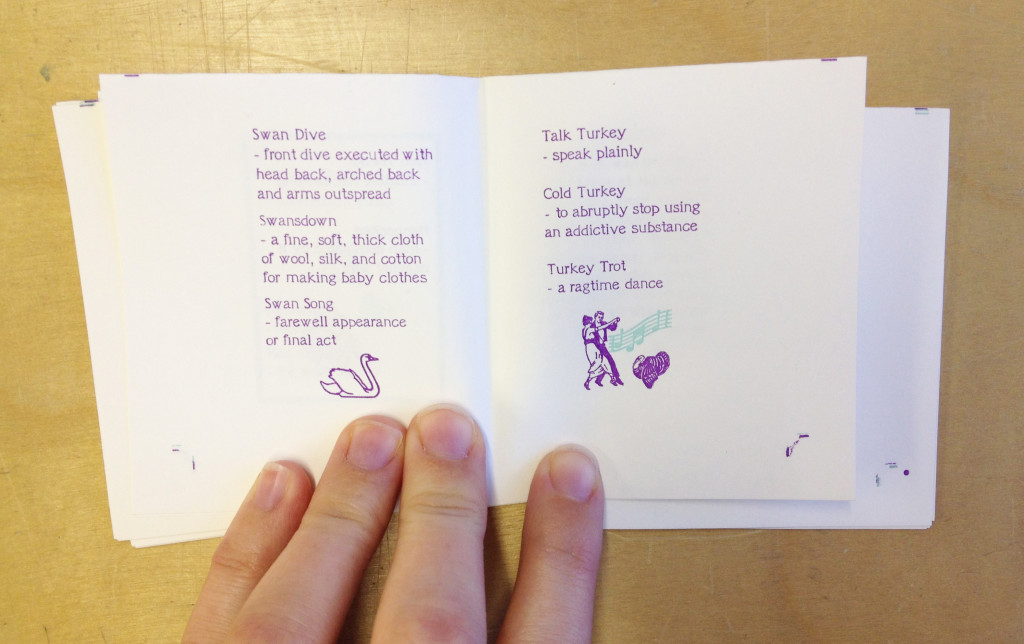
    At the Guild of Book Workers’ Standards Conference in DC, I picked up a couple miniature text blocks from Gabrielle Fox. One of the them being Goose Eggs & Other Fowl Expressions printed by Rebecca Press in 1991. The letterpress printing was done in a vibrant purple with hints of mint blue and bright yellow. The image below is a spread from the book.

    GooseEggs-ErinFletcher

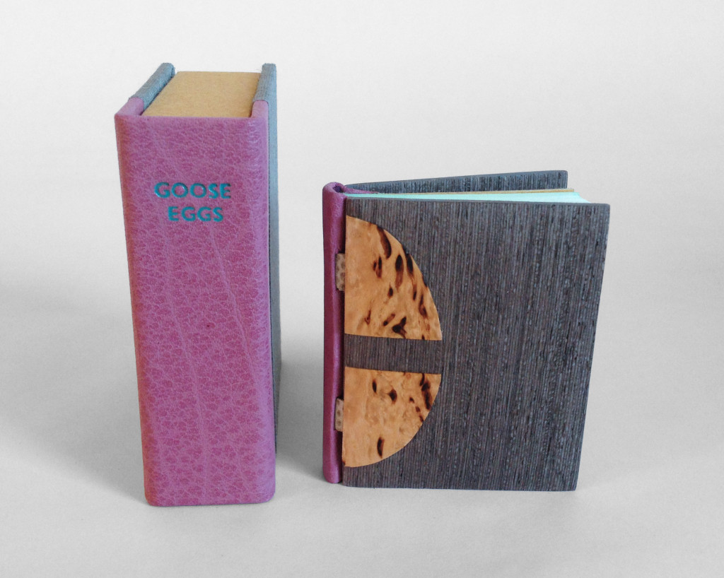
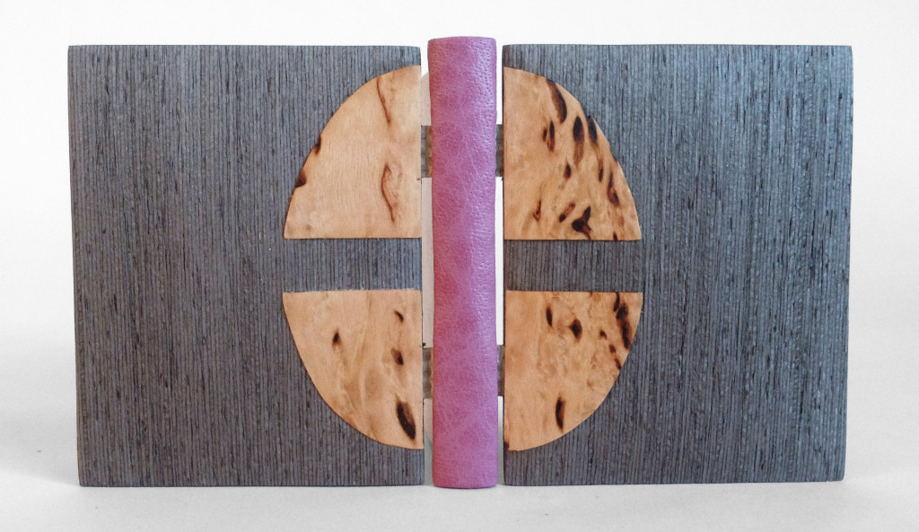
    For the binding, I decided to test the limitations of the Dorfner binding in a miniature format. Last year I had the chance to learn this very special binding structure. Unfortunately not from Edgard Claes himself, but from Colin Urbina who had the opportunity to take a workshop from the celebrated Belgian binder. The Dorfner-style binding was originally developed by German binder Otto Dorfner.

    I sadly did not take any images during the process of creating this binding as it was the first miniature I’ve ever bound and was delighted by how quickly I was able to move through each step. So needless to say, I forgot to stop and take images, but I will explain the binding process a bit in this post.

    GooseEggs6-ErinFletcher

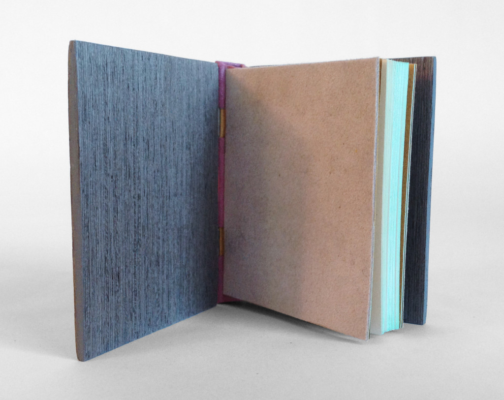
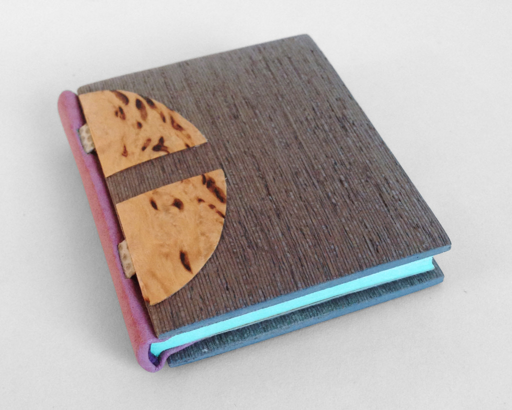
    The book is sewn on two silver snakeskin tapes (initially lined with silk) before being rounded and backed. The edges were properly prepped for a layer of mint blue gouache paint. Leather wrapped headbands decorate the head and tail in a skin that perfectly matches the purple ink from the text block.

    The spine piece is wrapped in mauve buffalo skin, which was shaped and the headcaps were formed off the book. After cutting away to expose the tapes, the spine piece is attached to the text block and then the light grey suede flyleaves are put in place.

    GooseEggs5-ErinFletcher

    Now comes the fun part. The MDF boards are carefully shaped, first with a power sander and then by hand to offer an elegant cushioned edge. Afterward, the boards are laminated on both sides with a wood veneer. For this binding, I used an unknown wood that I found in a sample pack of domestic and exotic woods (so if anyone can identify this wood, please let me know). A channel is cut out of the veneer and the tapes are glued down to attach the board. To hide the tapes a second veneer is cut and glued down. For this binding, I cut four tabs out of Karelian birch in the shape of a goose egg.

    GooseEggs3-ErinFletcher

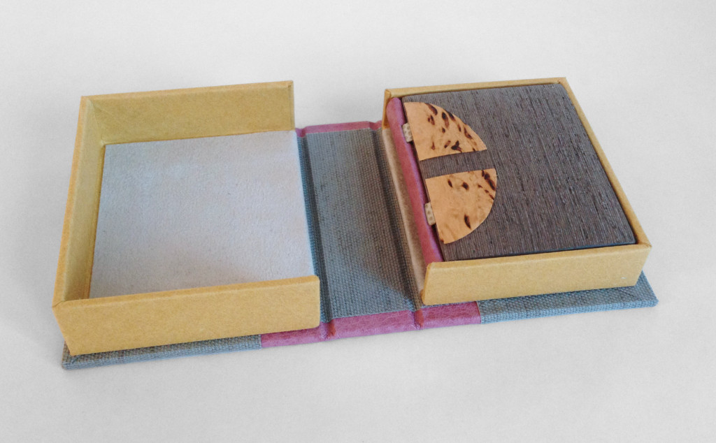
    The book is housed in a tiny clamshell box. The spine is covered in the same mauve buffalo skin and silver canapetta cloth that mimics the veneer on the cover boards. The trays are covered in a yellow handmade paper from Katie MacGregor, which was also used as the book’s endpapers. The book is protected with a light grey suede lining.

    GooseEggs1-ErinFletcher

    Goose Eggs is the second Dorfner binding that I’ve made to date. I really love this structure, it has a unique elegance and it can be assembled rather quickly. So I’m looking forward to working with this structure again and hope to incorporate some common elements of my work like gold tooling and embroidery. I also hope to learn more about marquetry in order to create intricate designs in the veneer.
  2. Bookbinder of the Month: Tracey Rowledge

    March 15, 2015 by Erin Fletcher

    AuggieWrensChristmasStory1997-TraceyRowledge

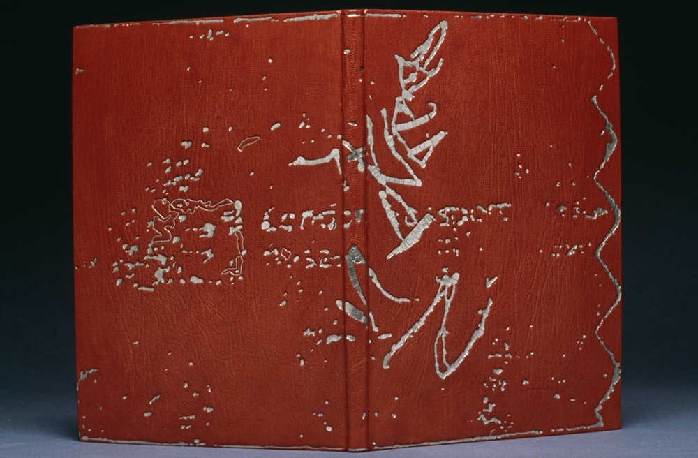
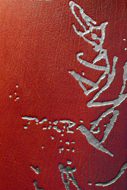
    This is one of my favorite bindings from Tracey Rowledge; the tooling is brilliantly executed and in such a way that is perplexing. Which is precisely why it was included in the interview. Tracey bound this edition of Auggie Wren’s Christmas Story by Paul Auster in 1997 using native red goatskin.

    I’m really intrigued by the design for the binding of Auggie Wren’s Christmas Story that you created in 1997. I would love to hear about the steps involved in executing the design; from the detailed image of this book, the tooling appears staggered, as if the depth of the impressions varied. Were you using a series of hand-made tools to create the overall design and this effect?
    This was a pivotal binding for me, as this image dictated that I alter my gold tooling technique from using albumen glaire and laying the gold on the book, to using BS Glaire and picking the gold up on the tool (Ivor’s method). The tooling was done using a series of pallets and irregular shape brass finishing tools (which I’d made), that overlapped in order to fill various shapes in the image. This was the first time I’d used Caplain leaf (18 carat), it’s a difficult leaf to work with as it’s quite brittle. It remains a favourite leaf to use as it doesn’t tarnish and has a wonderful melancholic tone.

    This book took about 100 hours to gold tool.

    AuggieWrensChristmasStory1997detail-TraceyRowledge


  3. Bookbinder of the Month: Tracey Rowledge

    March 8, 2015 by Erin Fletcher

    SatyrAgainstMankind-TraceyRowledge

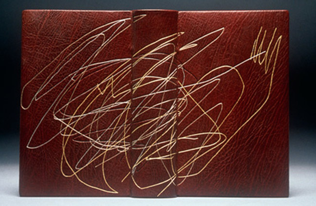
    The two bindings featured in this post are earlier pieces from Tracey Rowledge, but I think they represent her core interests in melding simple marks into complex gold tooled designs. The binding above is an edition of A Satyr Against Mankind by The Earl of Rochester, which was bound in a chestnut brown goatskin in 1999.

    Below is one of two bindings Tracey has completed on Ulysses by James Joyce. This particular one being the earlier binding done in 1996. Also bound in a chestnut brown goatskin; the majority of the design is gold tooled with subtle touches of blind tooled lines.

    Ulysses-TraceyRowledge

    There is a sense of exploration in the design these two bindings. The execution itself is awe inspiring and I set out to discuss Tracey’s technique and process for creating such expressive tooled designs.

    The gold tooled design on these two bindings is reminiscent of Ivor Robinson’s work; the style is very free and uncontrived. Do you execute this form of design directly on the book in a spontaneous manner or are you tracing out the design from a planned drawing?
    Thank you for the compliment of writing that these two bindings are reminiscent of Ivor’s work, for me what we have in common is leather, gold leaf and the drawn line. Ivor’s work is majestic in its rightness, the tooled lines have a tension and a stillness, which in some works causes the image to reverberate. My interest is to capture the energy of mark-making via the non-gestural process of gold tooling, I’m interested in the play between how something looks and how it is made. How can something that was made intuitively with a pen or pencil be transcribed by the painstaking process of gold tooling – and yet it can. To gold tool a gestural image you need to transfer the image onto the cover by blinding it in through a hand-made paper template, then you blind-in direct to ensure the grain is crushed in the impression and is of the correct depth; then you paint two layers of BS Glaire into all the impressions and then you gold tool each impression with up to nine layers of gold (this is done by gold tooling three layers at a time). This means that I will go into each impression up to five times.

    For something to look spontaneous it needs to have been painstakingly planned and meticulously executed – Ivor and I certainly had that in common!

    You have been noted to incorporate several shades of gold in your tooling. What are the qualities to mixing different tones of gold?
    The different golds are my pallet of colours. Using a gold that is more yellow or more grey will alter the balance of the image and will take it away from being what I think of as standard gold tooling. Using Moongold can make an image appear playful and delicate, using Caplain can give an image a solemn feel. It depends on what I’m wanting to convey as to what colour leather or paper I use to cover the book and what type of gold leaf I use.


  4. March // Bookbinder of the Month: Tracey Rowledge

    March 1, 2015 by Erin Fletcher

    FourQuartets1997a-TraceyRoweledge

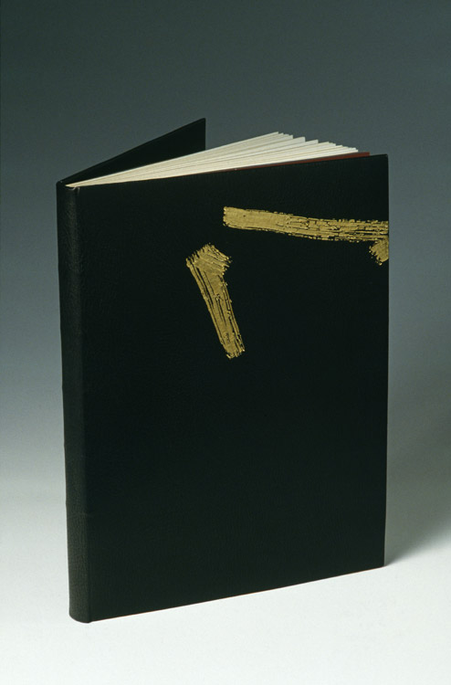
    Tracey Rowledge bound her first copy of T.S. Eliot’s Four Quartets in 1997 (shown above) years before she would revisit the text again with a parallel binding in 2014.

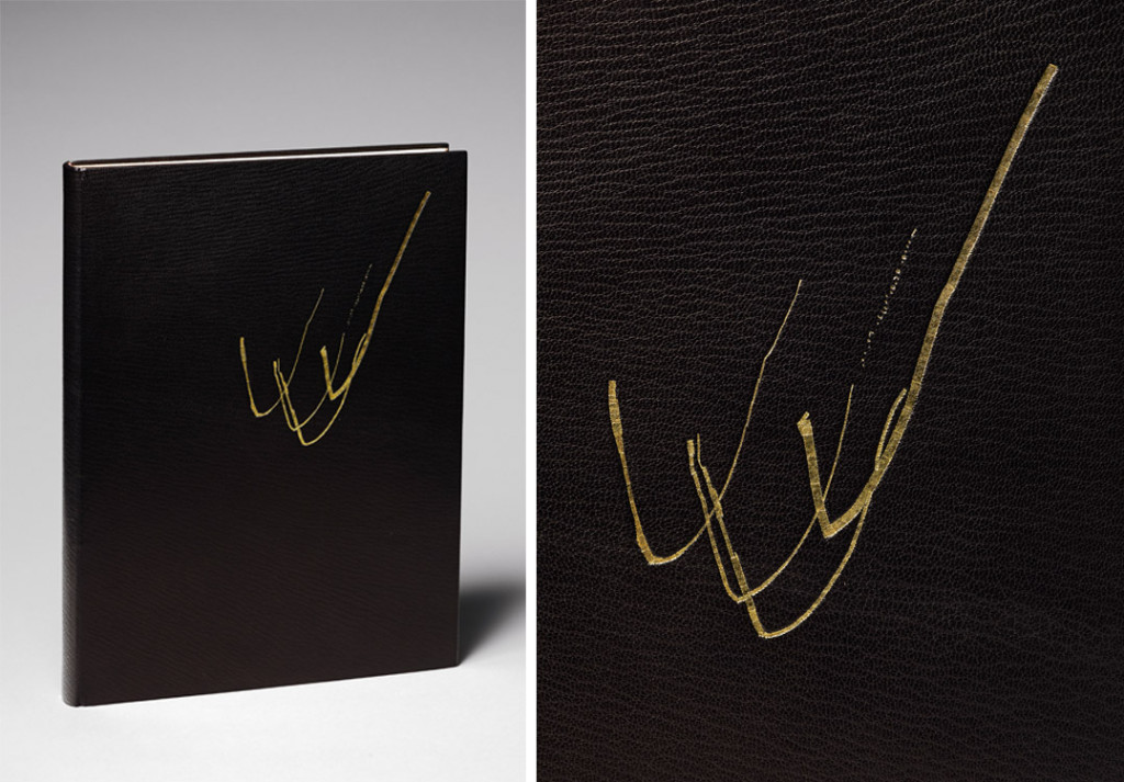
    You have created two very similar bindings for T.S. Eliot’s Four Quartets; bound in black goatskin with gold tooled markings. The gold tooled design on the earlier binding offers freedom and movement while the gold tooled design on the later binding feels more direct and deliberate. Can you discuss your concept behind each binding?
    For the first binding I was conscious of T. S. Eliot’s dislike for images on the covers of his books, so I decided to create two brush marks that evoked the flow of his writing, rather than creating an image depicting anything I perceived to be pictorial. This was a very early fine binding and as the book was letterpress printed on thick paper, it was my first rounded-only fine binding (i.e. not backed). It was also the most technically demanding gold tooling I’d undertaken to date.

    FourQuartets1997b-TraceyRoweledge

    Ivor (Robinson) very generously told me that my first binding of Four Quartets would be one of his desert island books, and it was during the second binding of this book that Ivor died. The image on this book responds to the text, to my first binding of the book, but also, and for me just as importantly, this image contains my thank you letter to Ivor, it was the perfect and most poignant place for it.

    FourQuartet2014-TraceyRoweledge

    – – – – – – – – – – –

    I’m so pleased to present the following interview with Tracey Rowledge. I didn’t know of Tracey’s work until Haein Song, whom I interviewed back in February of 2014, suggested that I interview her. What I came to discover is that Tracey is a keen artist who found a calling in bookbinding. Her artistic curiosities continue to influence her design choices as she blends together her artist techniques with those common to bookbinding. In the interview, I question Tracey both about her bookbinding and artwork and how the two have influenced each other.
    Check out the interview after the jump for more about Tracey, her background and creative process. Come back each Sunday during the month of March for more about Tracey’s work. You can subscribe to the blog to receive email reminders, so you never miss post.

    read more >


  5. My Hand // Covering Dune

    February 10, 2015 by Erin Fletcher

    CoveringDune1-ErinFletcher

    As I have mentioned on a prior post, my inspiration for the binding of Dune came from several sources: my husband (super fan) plus Lynch and Jodorowsky’s cinematic interpretations. Once I put pencil to paper, I drew from the geometric shapes and simple forms of the French Art Deco design bindings of the 1920s/30s.

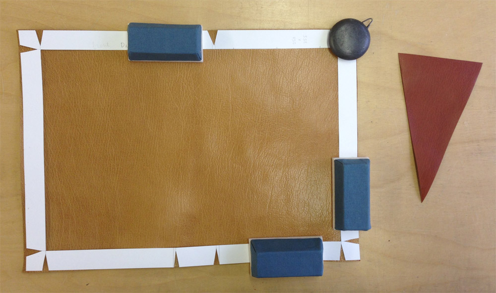
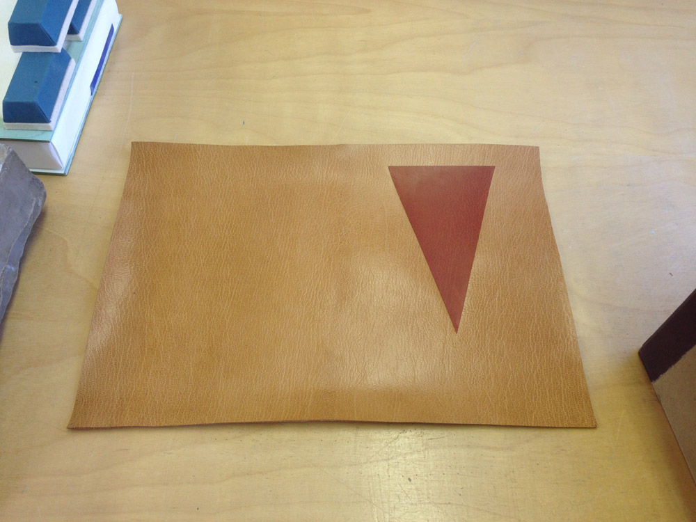
    After creating a plaquette of the final design, I outlined the steps of execution for the covering and design work. The isosceles triangle onlay was to be embroidered, which meant it needed to be attached before any paring. The triangle onlay was pared to be incredibly thin from a terracotta Harmatan goatskin then glued down to the base tan Harmatan goatskin using PVA. It’s crucial to use PVA, since the steps for covering requires moisture which could lift the onlay if paste were used.

    In the image above, I’ve laid down a paper template (this paper template is the exact dimensions of the book, it includes the turn-ins and width of the joint). It also has the markings showing me where to glue the terra-cotta triangle onlay. Once the triangle was in place, I sandwich the leather between two acrylic boards and put it in the press to dry.

    CoveringDune2-ErinFletcher

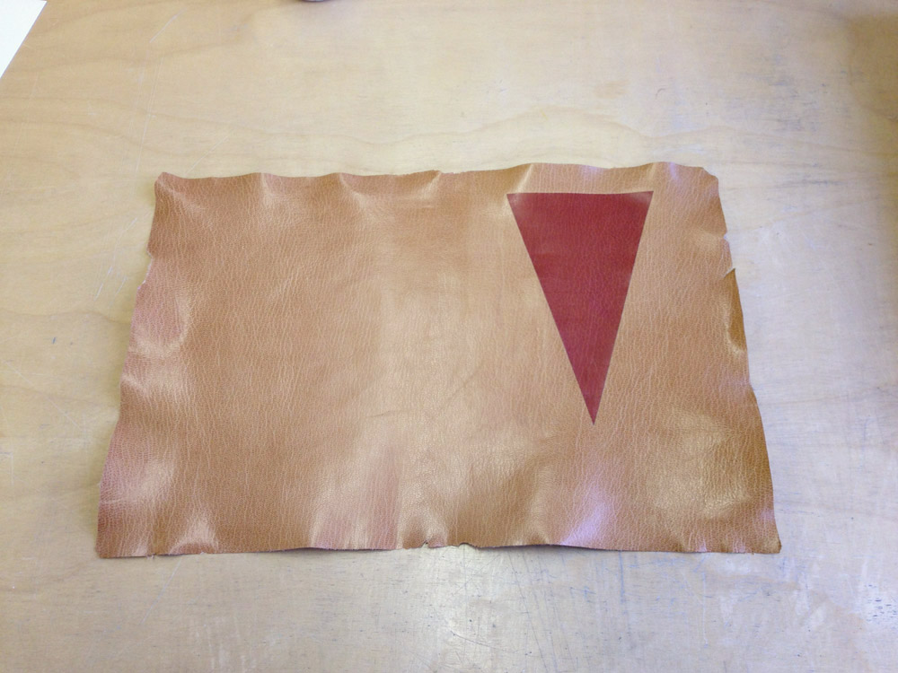
    At this point, the leather is ready to be pared. The paring went through several stages. I began by paring the whole piece of leather using a Schärf-fix, this process turned the triangle onlay into a back-pared onlay. Next I pared the edges down in preparation to use a spokeshave to cushion pare the rest.

    CoveringDune5-ErinFletcher

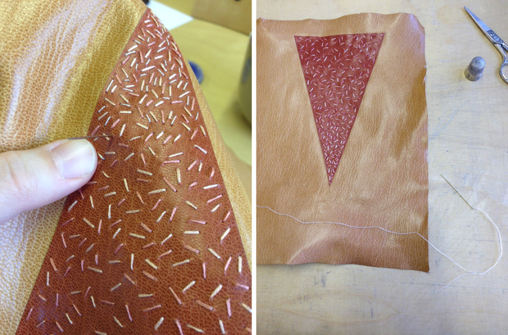
    Once the skin was perfectly pared, I got straight to the embroidery of the triangle onlay. I used three different shades of pink in varying thread thickness to sew lines in a random manner (being more densely applied near the point of the triangle).

    CoveringDune6-ErinFletcher

    With the embroidery complete and the leather pared, I continued with the final steps of the plan: covering the book. I’m going to keep you in suspense to see the full design once the binding is complete! Stay tuned!


  6. Moving Images: Guild of Book Workers Promo Video

    January 23, 2015 by Erin Fletcher

    Check out this delightful promotional video from the Guild of Book Workers. It was filmed during the 2014 Standards of Excellence Seminar in Las Vegas. The Guild of Book Workers has a unique appreciation for its younger members and really encourages the growth of all its member through dedicated support and access to information.


  7. Book Artist of the Month: Sarah Bryant

    December 29, 2014 by Erin Fletcher

    Shift-SarahBryant

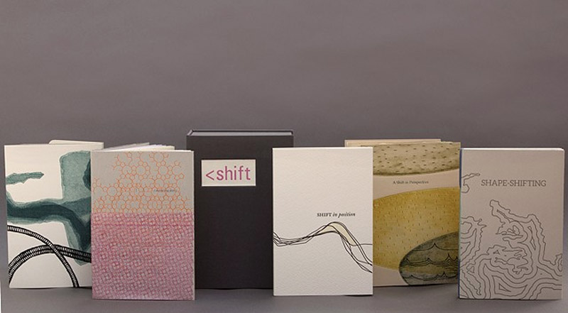
    Sarah Bryant is apart of the five-person collaborative group Shift-Lab, which she discusses more in-depth below. The image above shows the full spread of their first collaborative project, Shift, which was created in 2014 in an edition of 20. Each of the five artists created a small letterpress printed book that reflects a shift in perspective as well as a matching print. Both the books and prints were displayed at the San Francisco Center for the Book in 2014.

    The books are housed together in a custom drop-spine box shown third from the left with a printed title label.

    ShiftBaldwin-SarahBryant

    detail of Katie Baldwin’s book

    ShiftTreacy-SarahBryant

    left: detail of Tricia Treacy’s book | right: detail of Denise Bookwalter’s book

    ShiftChadwick-SarahBryant

    detail of Macy Chadwick’s book

    Can you discuss the collaborative group Shift-Lab. Who are its members and what type of projects do you work on together?
    Shift-lab is made up of myself, Katie Baldwin, Denise Bookwalter, Macy Chadwick and Tricia Treacy. We started as a group in the summer of 2013 and since then we’ve produced a book project (Shift) for an exhibition at the San Francisco Center for Book Arts, staged a pair of printing events (I had to be a remote participant, unfortunately,) and met for a week in North Carolina to print a project together. We will be exhibiting together at the Codex Book Fair in February, and are working on plans to meet for a skill share/book project next summer. You can find us all at shift-lab.org.

    Shift is a set of five books all with the same theme. Each of us created an edition of 20 books of the same dimensions. These five books are housed together in an enclosure. The books vary in content, Katie’s is an exploration into the different diggings of the Erie Canal. Tricia was interested in the shift key on a keyboard. I was having trouble sleeping while I was working on this project, and so my book evolved into a body shifting and moving in bed.

    ShiftInPosition-SarahBryant

    For your book Shift in Position, how did you monitor your sleeping behavior and then transfer the imagery into a print?
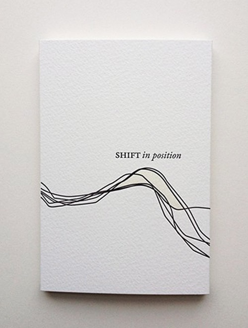
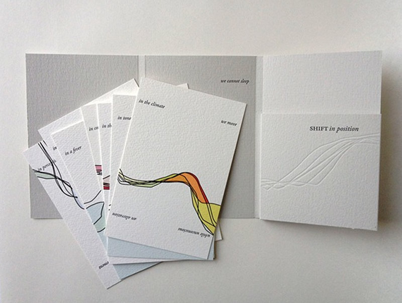
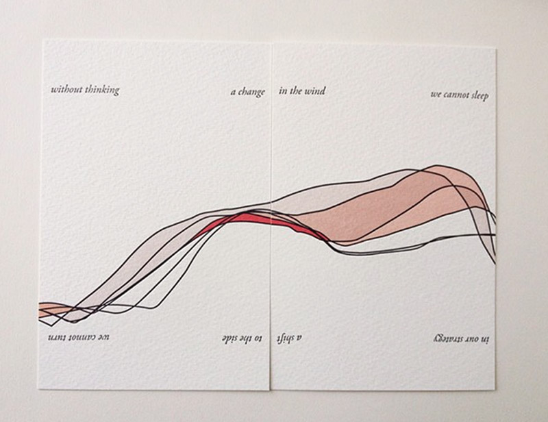
    I was spending a good portion of each night around this time rolling and repositioning myself in the hopes of getting to sleep. I didn’t monitor this activity, exactly, but took dozens of photographs of myself as I repeated the familiar movements I was doing each night. These photos were taken against a white background. I traced the shifting line of my body over and over again and layered these lines, creating the basic imagery for the book. The “book” is actually a series of panels that can be rearranged. Some of the imagery locks in together, some doesn’t. Text related to shift and change printed on the top and bottom of each panels always locks in to make some kind of sense. I wanted the process of rearranging the panels to be reminiscent of the kind of non-restful process dreaming that I was slipping in and out of at night.

    ShiftInPosition2-SarahBryant ShiftInPosition3-SarahBryant


  8. Book Artist of the Month: Sarah Bryant

    December 22, 2014 by Erin Fletcher

    Simulations-SarahBryant

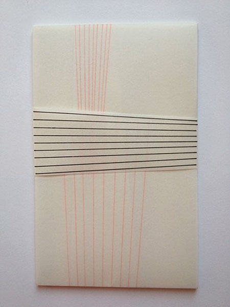
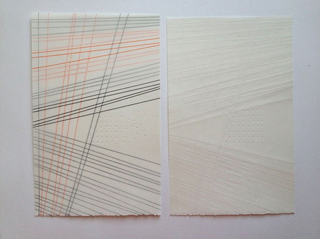
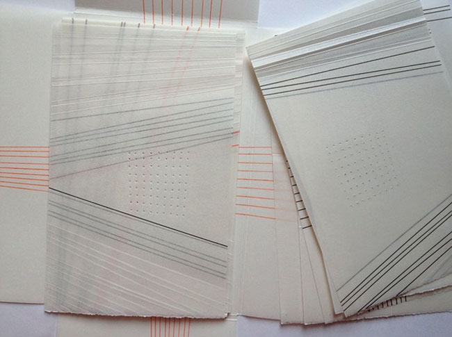
    I really enjoyed this week’s response by Sarah Bryant on her inspiration and creative process behind Simulations on a Two-dimensional Grid. You can read about it below, but first the specs. Simulations was created in 2013 in an edition of ten. Zerkall paper is used for the pages and have been manipulated with letterpress printing, hand-drawn imagery, wax and folding. The loose pages are bound up in a waxed paper wrapper also decorated with hand-drawn imagery.

    Simulations2-SarahBryant Simulations3-SarahBryant

    Two sources of inspiration are behind this artist book: Barb Tetenbaum’s Aritst Book Idealation Deck and David Allen’s 2011 dissertation. Can you talk about how these two pieces came together as a guide for the concept of this artist book?
    So in late 2012, Barb Tetenbaum invited me to participate in a show using a set of cards that she and Julie Chen had developed over several years called “The Artist Book Ideation Deck.” The deck has categories for structure, paper, layout, technique, text, image, color, and description. It also has “adjective” cards. Barb and Julie drew random hands from this deck for all of the artists who would be making a book for the show. My hand went as follows:

    Imagery: none
    Structure: unbound/boxed
    Text: collaborate with writer/poet/other
    Layout: across folds
    Color: favorite
    Technical: hand drawn, painted/collaged, etc.
    Paper: pre-treated, crumpled, painted, pasted, etc.
    Describe: narrative
    Adjectives: personal, scientific, ordinary, complicated, colorful

    Dave Allen and I had been talking at this point about collaborating on a book, (this was just before his visit to the UK and the beginning of our Figure Study project,) so I turned to him for some text. He sent me a few excerpts from his PhD thesis for the University of Michigan and I selected this one: Simulations on a two-dimensional grid reveal that if the conditions are met to destabilize the spatially homogenous equilibrium then individual patches cycle out of phase with their neighbors. At any particular time the grid has a checkerboard-like structure (Figure 2.1), and through time individual patches exhibit a two-cycle.

    We worked together to pair it down to the following: Simulations on a two-dimensional grid reveal that if conditions are met to destabilize the equilibrium, individuals cycle out of phase with their neighbors. This felt more like a universal text, open-ended enough to invite us in and call for different interpretations.

    Once the text was selected, it was time to work with it and knead it into a book using the external prompts that came from the Ideation Deck. I used a series of folds, expanding from sheet to sheet, to disturb a grid made up of holes and lines. I loved this project, it forced me to do some new things that I surely wouldn’t have attempted without a set of instructions. Waxing the pages, for example. Also the loose sheet format that I have adopted for two subsequent projects.

    Several people have pointed out that my book is not strictly following the guidelines set by the deck. It does have imagery, for example, even if that imagery is minimal. And of course this is true. But the deck is meant to generate ideas, and so I considered the cards as prompts rather than unbreakable rules. You can still get the decks, by the way. I use mine all the time in classes or just to get my mind moving.

    – – – – – – – – – – –

    Setting limitations for a project can bring unique challenges and even heighten creativity. I was so thrilled to learn about Tetenbaum and Chen’s Idealation Deck. I may need to get my own copy and begin exploring artist books again.

    If you’d like to read a more in-depth description of Simulations, check out Heather Doyle-Maier’s review on the Abecedarian Gallery Blog, where she describes the tactile qualities of the book.


  9. Book Artist of the Month: Sarah Bryant

    December 15, 2014 by Erin Fletcher

    AlMutanabbiStreet-SarahBryant

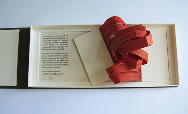
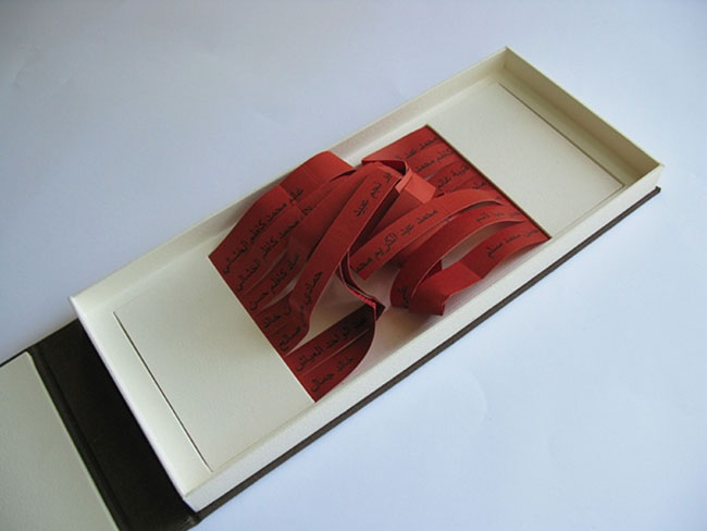
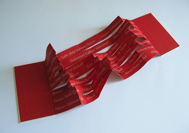
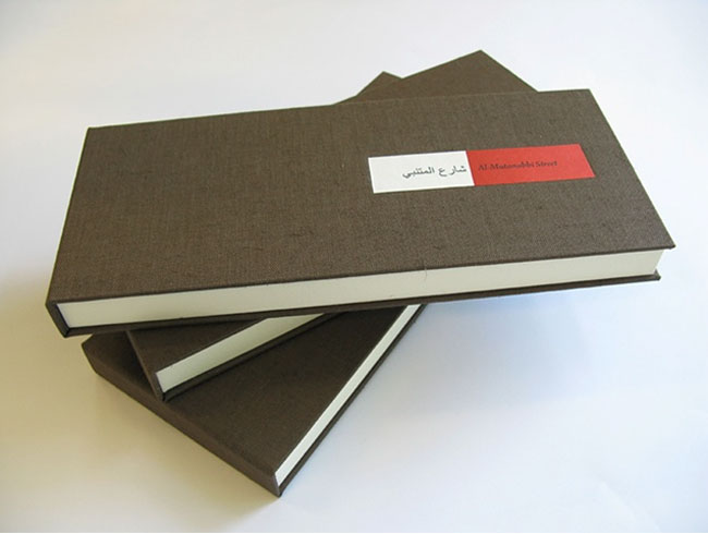
    For the traveling exhibit Al-Mutanabbi Street Starts Here, Sarah Bryant crafted Al-Mutanabbi Street to memorialize those who lost there lives to a car bomb on March 5, 2007. Bound between two boards is an entangled ribbon of red paper letterpress printed with an incomplete list of names. This altered accordion lays open in a custom box; the colophon is print on the base of the box hidden under the book’s cover.

    AlMutanabbiStreet2-SarahBryant AlMutanabbiStreet3-SarahBryant

    The text of this artist book rests in a position of entanglement and chaos, but in fact the lines of paper can be separated rather easily. The names printed on the underside represent a portion of those who lost their lives. I’ve seen a variety of books from this show and really love the simplicity of your piece, which is also largely impactful. It presents itself like a memorial; can you talk about your concept for this artist book?

    I wasn’t sure how to approach this book. I had no personal connection to the bombing or to the affected community, or, frankly, to any tragedy of this scale. I was concerned that in an attempt to honor the dead and the community to which they belonged, I might make a bumbling and insensitive book. So I tried to keep it simple and avoid pretending an understanding that I could not have.

    I printed the names of the dead in Arabic and English, each name lining up with it’s counterpart on the two sides of the strips of paper, and housed them in a structure that I hoped conveyed a sense of violence and loss. I wanted the names to be legible, but fragile, and in a position of distress. The box is vaguely coffin-like. I am glad to hear your reaction to the book, thank you.

    AlMutanabbiStreet4-SarahBryant


  10. Book Artist of the Month: Sarah Bryant

    December 8, 2014 by Erin Fletcher

    Biography-SarahBryant

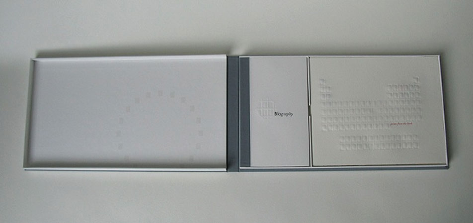
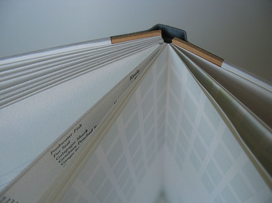
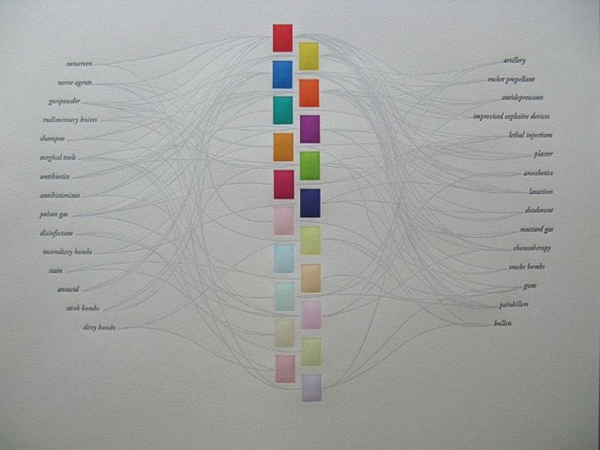
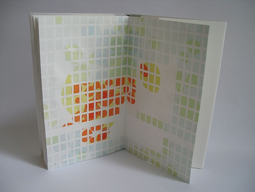
    In 2010, Sarah Bryant completed Biography, which explores of the alternative roles played by the chemical elements found in the human body. Each element is represented as a specific colored rectangle, which are used in various diagrams throughout the book. As you progress through the book the diagrams become less clear and are interrupted with blind stamped organic shapes. Biography won the 2011 Minnesota Center for Book Arts Prize in addition to receiving the Award for Artistic Excellence at the Pyramid Atlantic Book Arts Fair in late 2010.

    Printed in an edition of 75 using letterpress techniques from polymer plates on Zerkall Book, Biography was bound as a hardcover drum leaf enclosed in a clamshell box. Numbers one through ten are bound as a deluxe edition (pictured above), which include additional prints from the book, as well as a ghost print creating during the printing process. The deluxe edition comes in a larger clamshell box designed to house both the book and set of prints.

    Biography4-SarahBryant Biography3-SarahBryant Biography5-SarahBryant

    In The Bonefolder article Evolution of an Artist’s Book, you mention that Biography took 2 years to complete. The inspiration led to extensive research and preparation before embarking on months of printing. Is this an average amount of time needed to complete a project?
    Most of my big books take about two years. Dave and I first conceived of Figure Study in January of 2013 and I have set a release date to coincide with the Codex Book Fair and Symposium in February of 2015. I started working on Fond when I was at Wells College in early 2011 and released it in the fall of 2012. Two years seems to be my average these days. But in the background there are other things emerging. While the larger projects are proceeding at their slow pace, I am working on quicker, smaller things. A book I printed with Shift-lab, a collaboration between myself, Katie Baldwin, Denise Bookwalter, and Tricia Treacy took me about six months in 2013. Simulations on a Two-Dimensional Grid, a book I created for the Ideation by Chance show at the Seager Gray Gallery in Mill Valley, California, took me a few months. Those books were done in smaller editions and in response to external collaborations and deadlines.

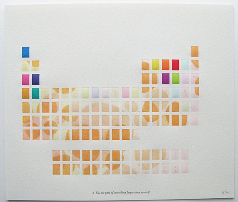
    Since I’m not a printmaker, the printing process behind You are part of something larger than yourself is puzzling to me. Can you walk me through the printing steps for this particular print?

    Biography2-SarahBryant

    Aha! Yes I can. And, in fact, if you really want to know more about it, a lecture I gave at Wells college several years ago contains a detailed description of that process, with photos! Thanks to Peter Verheyen, you can find it on youtube here:

    My description begins at 29:09 and ends about three minutes later.

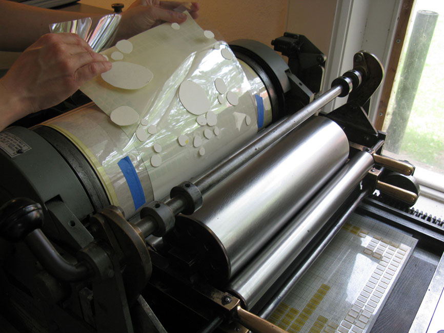
    That spread and one other in the book toward the end, (described in the above video,) are pressure printed against a polymer plate of the periodic table grid. I inked the press in two colors (for a color shift) and printed the first run, then cleaned the press and inked it again in the reverse and so on so that there are many layers and colors at play. The blob-shaped forms are generated by paper cutouts that I have attached to the impression cylinder of the press. So the printed imagery is coming from the combination of the traditional, inked relief surface (the grid in the bed of the press) and the uneven pressure created by the paper shapes on the cylinder.

    BiographyProcess-SarahBryant


  • My name is Erin Fletcher, owner and bookbinder of Herringbone Bindery in Boston. Flash of the Hand is a space where I share my process and inspirations.
    The StudioNewsletterInstagramEmail me
  • Archives