RSS Feed

‘bookbinding’ Category

  1. Bookbinder of the Month: Ben Elbel

    July 19, 2015 by Erin Fletcher

    Sonnet-BenElbelandMarjaWilgenkamp

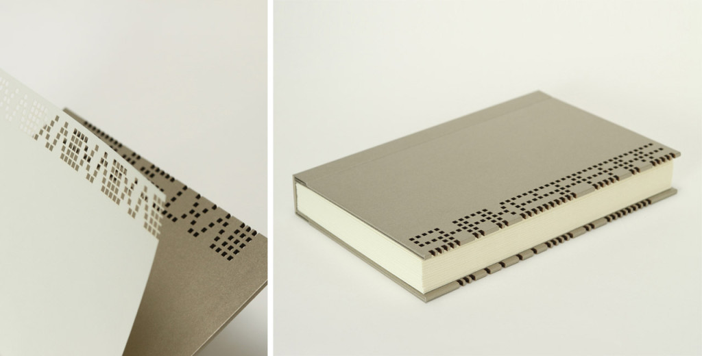
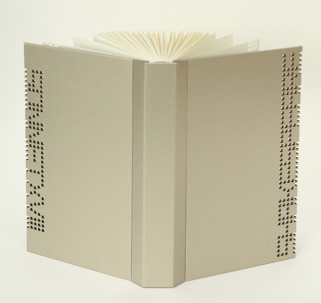
    In Sonnet XVII, Dutch bookbinder Marja Wilgenkamp has reimagined Shakespeare by using a process developed by the artist collective La Société Anonyme. The sonnet was initially read out aloud and recorded, which was then encoded into binary code. The code was then printed making it potentially accessible to the future.

    Offset printed in an edition of 65 copies on Hahnemuhle Ingres paper, the book is still available for purchase here.

    Ben Elbel executed the binding according to Marja’s design. The binding is covered in So Silk paper. The text has been laser cut into the cover boards and flyleaves; inspiration for the design came from costuming seen during Shakespeare’s time.

    ‘Dos Rapporte’ is another structure that you’ve developed and is the style of binding you used on Sonnet XVIII, a collaborative project between you and Marja Wilgenkamp. Can you talk about its design and function and why you chose to use it on this project?
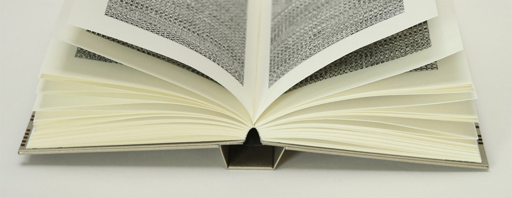
    There have been many efforts in recent years to improve the opening of books and the dos rapporte is my own personal contribution to the subject. In a few words let’s say it is a mixture of a type of industrial brochure as practiced by (among others) the dutch company Hexspoor + Gary Frost’s sewn board binding + the old fashioned springback binding. What is special about my design is that the spine is made separately from the book (this is what ‘dos rapporté’ refers to) and is attached by gluing its inner part, the one that folds back on itself, onto the boards. This makes for a very fluid opening action as well as an interesting profile and a very clean hinge on the outside.

    Sonnet3-BenElbelandMarjaWilgenkamp

    We thought that the strict character of the structure would work well with the laser cut pattern that Marja designed for this edition.
    Sonnet2-BenElbelandMarjaWilgenkamp


  2. Bookbinder of the Month: Ben Elbel

    July 12, 2015 by Erin Fletcher

    OnionSkin3-BenElbel

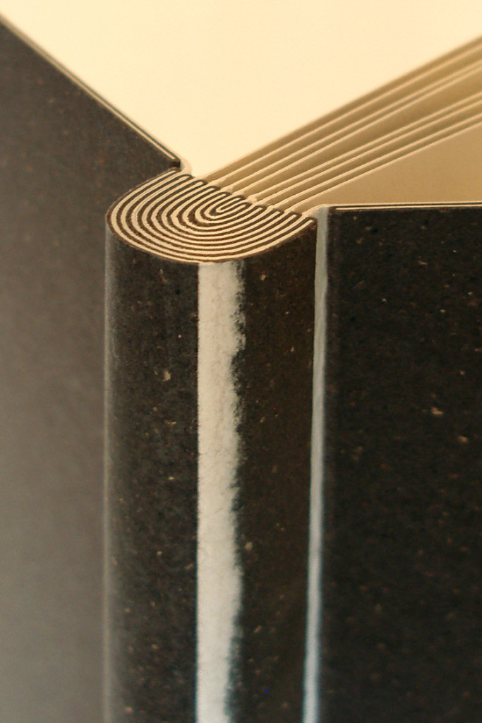
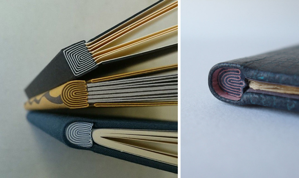
    I love this structure developed by Ben Elbel, which he appropriately named Onion Skin Binding. A lovely description inspired by layering effect that creates the mesmerizing maze-like spine. In this post I talk about this structure with Ben starting with its development to how he’s adapted the structure.

    The Onion Skin is another one of your innovative structures. Did you develop the structure around an existing project or was it simply a product of play and experimentation?
    Absolutely a product of play back in my student years when I had a lot of time on my hands. :)

    It was born from playing around with the idea of guards/stubs in photo albums. I introduced colour, and tried to use uninterrupted pieces of paper and suddenly the pattern was born. Readability is a key element of my personal work. I like to be able to follow a line, understand how something is built and be able to take it appart mentally. This is also the idea behind my ‘dos rapporté’ binding.

    OnionSkin2-BenElbel

    The Onion Skin binding is another structure that you offer as an online workshop and is also how I learned the technique. I found it to be surprisingly simple once I understood the pattern of the layering. Is this a challenging structure to teach (particularly online)?
    Exactly as you say. Once you have understood the sequence it is very simple to make, and consequently very simple to teach too.

    If you don’t have the opportunity to take Ben’s online course, you can simply purchase his comprehensive tutorial here.

    You’ve really played around with this structure; can you talk about how you’ve adapted the binding?
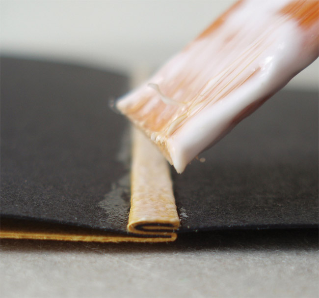
    I have adapted the principle for a single section binding- the signature is sewn on a single stub made from different layers of paper, which are then folded and glued around the initial connection, until it is thick enough to form shoulders to accommodate boards, exactly as in a traditional binding.

    OnionSkin5-BenElbel


  3. Makin’ Care of Business Interview

    July 8, 2015 by Erin Fletcher

    MCoBLogo

    Check out my interview on Makin’ Care of Business! Rachel Binx is a three-time business owner (MonochōmeGifpop, and Meshu), who started this amazing collection of interviews with other makers who have turned their passion into a small business. She encourages everyone she interviews to speak honestly about their experiences on starting a business, the successes and struggles.

    I did my best to follow these guidelines, I hope you enjoy and please spend some time perusing the other great interviews she has done.


  4. Bookbinder of the Month: Ben Elbel

    July 5, 2015 by Erin Fletcher

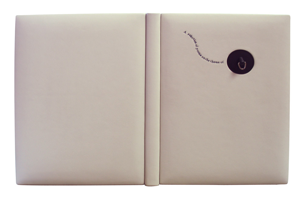
    Water-BenElbelFor the Designer Bookbinders International Bookbinding Competition in 2009, binders were invited to produce a binding for the set book Water, a collection of poems and illustrations based on the the theme of water. The set book was published by Incline Press in a limited, letterpress edition that included images from various talented illustrators and marblers. This was the first international competition since the organization began offering competitions back in 1975.

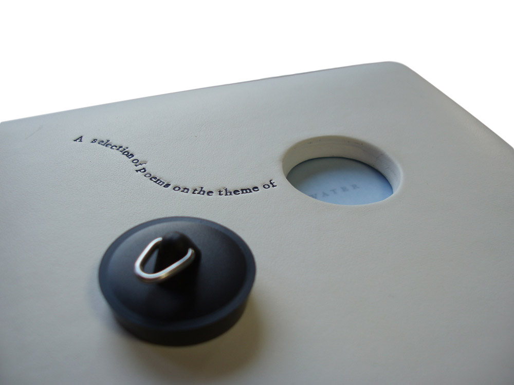
    Ben Elbel put together a beautiful binding in white calf (and quite impressive in how pristine it looks). The bath plug fits snugly into the front cover, but is easily removable to reveal the end of the title.

    This binding is so clever and probably the first binding of yours I ever saw. Can you talk about the process of fitting the plug into the front cover?
    This binding was my entry for the 2009 Designer Bookbinders international competition and was among the prize winners.

    My initial plan was to have the boards produced from enameled steel, the material from old fashioned bath tubs, but a quote from a supplier made me change my mind.

    The boards are made up from 2x 3mm boards, so a total thickness of 6mm. They are heavily beveled around the edges but retain full thickness in the middle to accomodate the plug. The leather was also very thick and I had to thin it down locally to turn it in the hole. This is how I did it.

    Water2-BenElbel


  5. July // Bookbinder of the Month: Ben Elbel

    July 1, 2015 by Erin Fletcher

    BovenKamer1-BenElbel

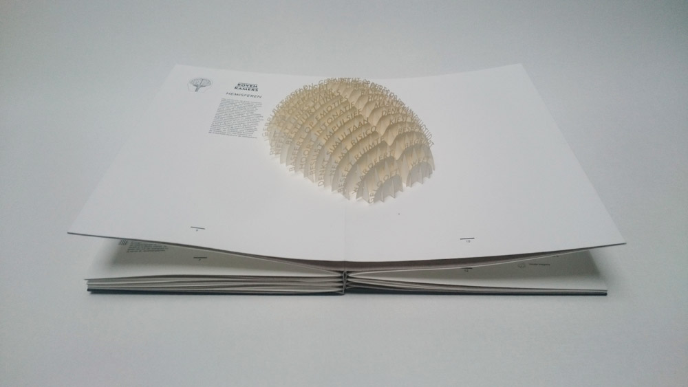
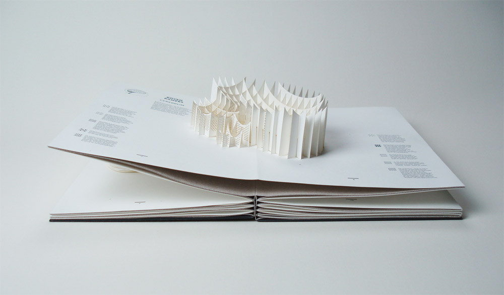
    Boven Kamers is a collaborative Dutch pop-up book between neuroscientist Gerard J. Boer, professor Harry B.M. Uijlings, paper artist Ingrid Siliakus and graphic designer Moon Brouwer. The book contains a total of six laser cut pop-up spreads which send the reader on a tour through the human brain and its functions. Printed in a limited edition of 50, each book is numbered and signed.

    Ben Elbel‘s innovative rebinding of this book was just completed earlier this year.

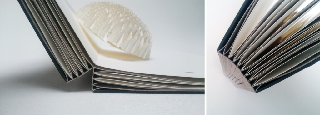
    I have been waiting in anticipation to see this binding after you spoke to me about it. In your newsletter on this binding, you mention that the compensation folios are sewn together. The spine opens to a sharp ‘V’ allowing the pages to lay flat, can you elaborate on the sewing structure and any treatment done to the spine?
    Boven Kamers (literally means upper rooms in Dutch, a colloquial expression meaning brain), is an exploration of the human brain in the form of a pop up book, by the young Dutch designer and publisher Moon Brouwer.

    I was commissioned to re-bind the book by the Dutch Royal Library (The Hague).

    When I first received it, the book presented itself as a series of folios laminated with one another, each folio containing a pop up. A hard cover was provided but disconnected from the textblock.

    Technically, the challenge was to provide compensation for the pop-ups as well as a perfectly flat surface for them to smoothly unfold, all of this without sewing and without introducing blank pages between the folios.

    After some research I concluded that none of the existing binding structures (traditional or contemporary) were quite suitable to do all this, so I created a new one from scratch.

    BovenKamer7-BenElbelBovenKamer4-BenElbel

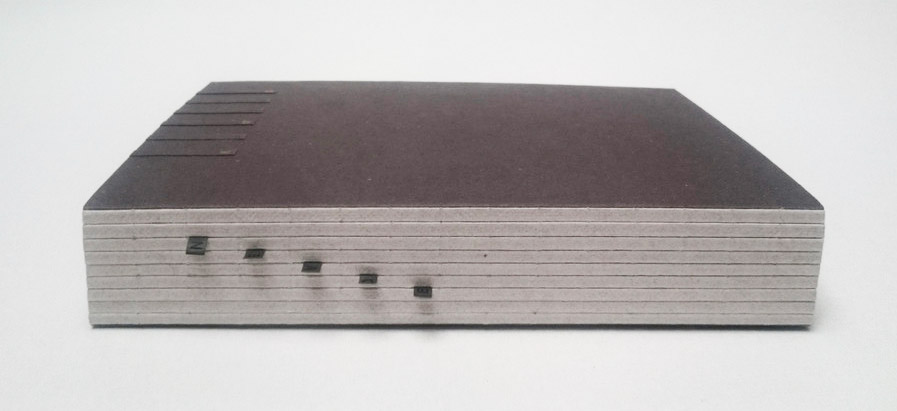
    It took about a year and the result is a series of ‘T’ elements made from heavy paper, sewn with one another. The folios are inserted between each T and secured only at the fore-edge. On the next images one can see how the spread ‘floats’ on top of the binding, allowing the pop up to fully unfold. The original cover was mounted at the back of the book and a lettering was created, on the spine and front board, to evoke a kind of staircase leading to the upper rooms.

    BovenKamer6-BenElbel

    You can read a bit more about the binding and see some images of the book at various stages through the design process here.

    – – – – – – – – – – –

    Ben and I have kept in contact ever since he embarked on offering online courses (more on that in the interview). His work and business ethic are quite inspiring as Elbel Libro has expanded beyond the traditional bindery. He ceases to amaze me with his sleek designs and innovative binding structures. There seems to be no stopping his creativity.

    Check out the interview after the jump and make sure you come back during the month of July for even more probing questions regarding a selection of Ben’s work. You can get email reminders by subscribing to the blog, just click hereread more >


  6. Seventh Triennial Helen Warren DeGolyer Exhibition and Bookbinding Competition // 2015 – Winners Announced

    June 16, 2015 by Erin Fletcher

    On June 5th, a conference was held at the Bridwell Library at Southern Methodist University in Dallas, Texas. During the conference, the winners of the Seventh Helen Warren DeGolyer Triennial Exhibition and Competition were announced. Established in 1997, the DeGolyer Competition is hosted every three years to inspire and encourage the craft of bookbinding in the United States.

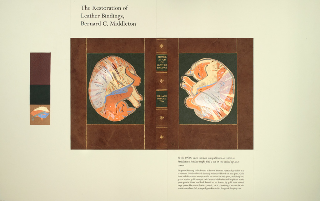
    After a title has been selected from the Bridwell Library Special Collections, American bookbinders are invited to propose a design and submit an example of their work. Three winners are then selected and announced during the conference. The title chosen for the 2015 competition was Bernard C. Middleton’s The Restoration of Leather Bindings. The winner of this year’s competition received a $6,000 commission to bind Ms. DeGolyer’s copy of Middleton’s manual, which has been signed by the author. Middleton’s classic work is a comprehensive overview of traditional restoration techniques specifically on leather bindings.

    The winning proposal was submitted by Priscilla Spitler. Here’s part of her proposal statement: If one was to visit Bernard Middleton’s bindery in the 1970s, when this text was published, it would not have been unusual to find a cat or two curled up in a corner.

    DeGolyerProposal-PriscillaSpitler

    Priscilla plans to cover the book in brown Hewit goatskin with raised bands on the spine. Traditional gold tooling will accent the spine and frame the two cats on the front and back boards. The sleeping cats will be made up of several goatskin onlays recessed on large green leather panels.

    Priscilla has been submitting to the DeGolyer Competition since it was established and won the grand prize for the first time in 2009 for her proposal of John Grave’s Goodbye to a River: A Narrative. You can read more about Priscilla’s background in bookbinding and see the fine binding she submitted along with her 2015 proposal here.

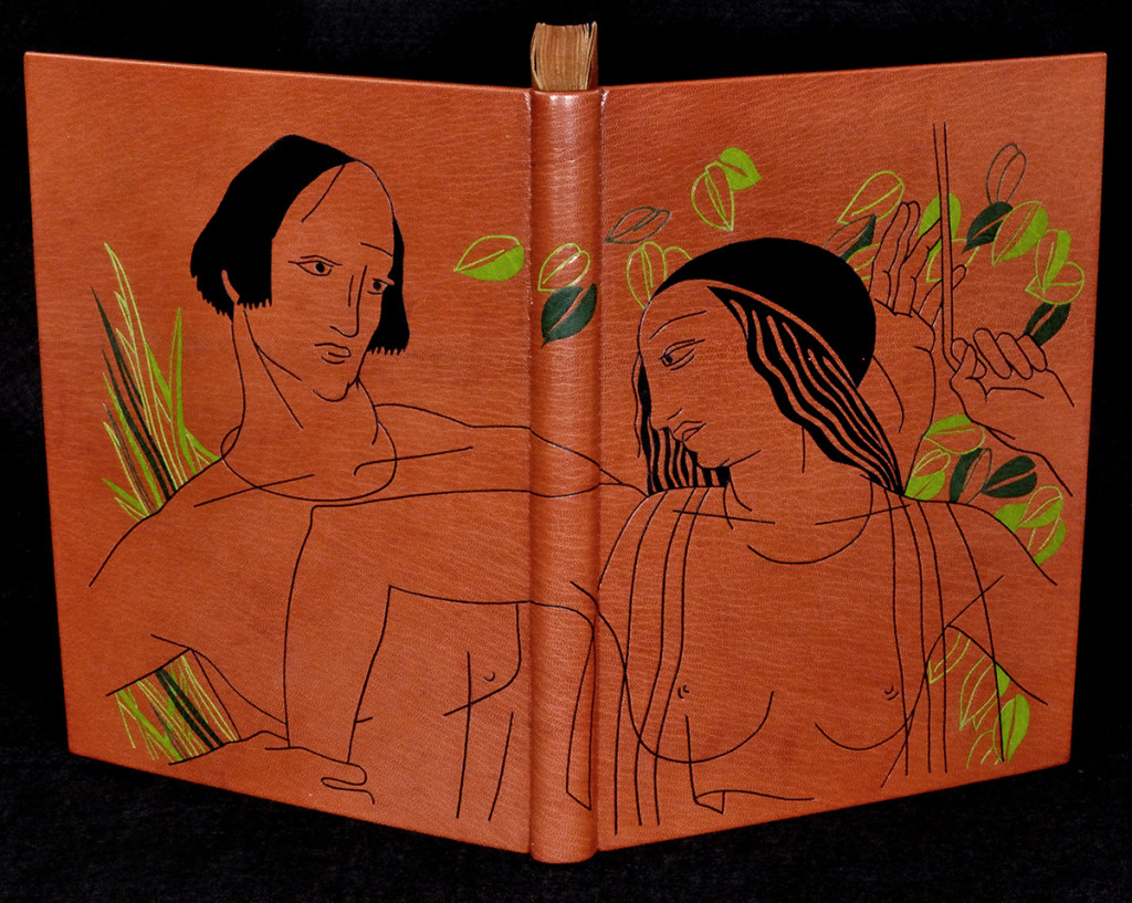
    The $2,000 award went to Jana Pullman for Excellence in Fine Binding, which recognizes quality in structure and technique. In addition to the proposal, binders are also asked to submit a complete binding showing techniques similar to those they are proposing. Jana submitted her binding of William Shakespeare’s Venus and Adonis, illustrated and signed by Rockwell Kent.

    DeGolyerProposal-JanaPullman

    Bound in terracotta goatskin with black and green back-pared onlays and thin leather onlays creating the outlines. Jana celebrates the artistic brilliance of Rockwell Kent by using one of his illustrations found in the text as the decoration for the binding. Copper accents adorn the head edge and endpapers.

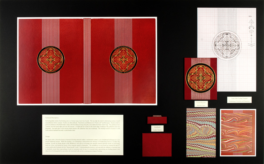
    The $1,000 Award for Design was given to Samuel Feinstein for his proposal. This honor is awarded to a proposal that demonstrates originality, effectiveness and appropriateness to the selected book. Here is a portion of Samuel’s proposal: My design seeks to show the beauty of historical binding elements within a modernized context, a use of traditional techniques in a manner which is not strictly traditional. 

    Samuel was a classmate of mine at North Bennet Street School and I’m so pleased to see his work receive such an award.

    DeGolyerProposal-SamuelFeinstein

    During the planning stages of a design fine binding, I expect a percentage of the design to evolve during the binding process. So submitting a proposal with the design fully realized and explained was a challenge that I wanted to explore, which is how I came to send in the following proposal.

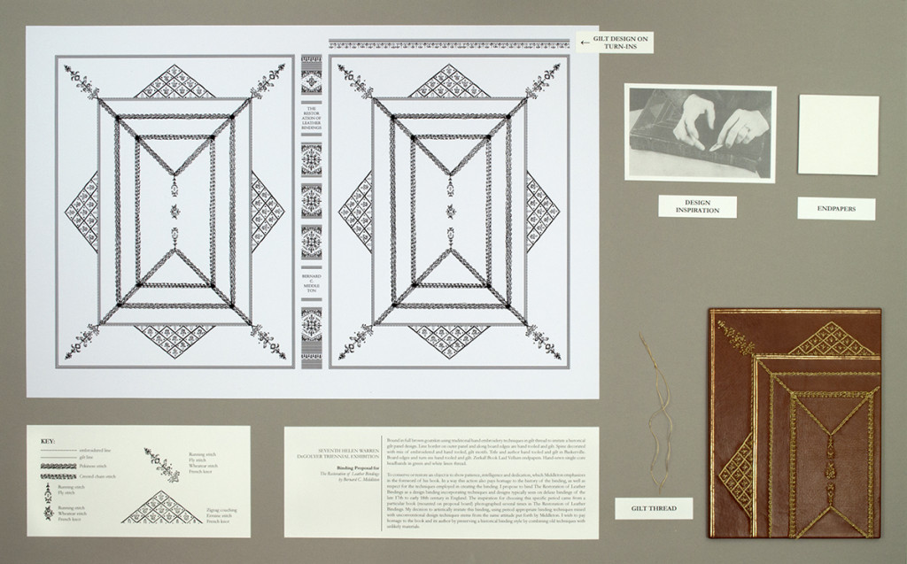
    DeGolyerProposal-ErinFletcher

    My proposed binding would be covered in brown goatskin and decorated using traditional hand embroidery techniques in gilt thread to imitate a historical gilt panel design. Other elements of the design such as the line border and motifs on spine would be gold tooled. Every aspect of the binding was influenced by the books being conversed within Middleton’s manual.

    Here’s my proposal statement:
    To conserve an object is to show patience, intelligence and dedication, qualities which Middleton emphasizes in the foreword of his book. In a way restoring a volume also pays homage to the history of the binding, as well as respect for the techniques employed in creating the binding. I propose to bind The Restoration of Leather Bindings as a design binding incorporating techniques and designs typically seen on deluxe bindings of the late seventeenth to early eighteenth century in England. The inspiration for choosing this specific period came from a particular book (mounted on proposal board) photographed several times in The Restoration of Leather Bindings. My decision to artistically imitate this binding, using period-appropriate techniques mixed with unconventional design techniques stems from the same attitude put forth by Middleton. I wish to pay homage to the book and its author by preserving a historical binding style by combining old techniques with unlikely materials.

    This year’s competition inspired seventeen other American binders to submit a proposal. You can see them all here.


  7. North Bennet Street School // Student & Alumni Exhibit 2015 – Part Two

    May 28, 2015 by Erin Fletcher

    In addition to the set books I wrote about in Part One of this post, the Student and Alumni Exhibit at North Bennet Street School includes a selection of bindings produced by current students and alumni of the full-time program. In this post, I’ll be highlighting some of my favorites.

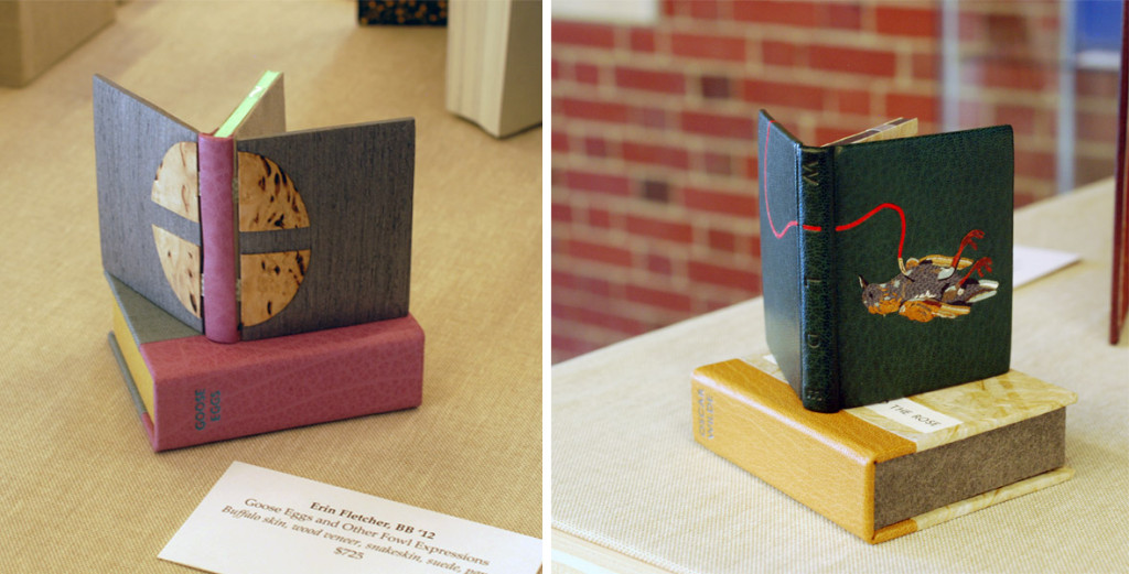
    I’ll start with my own bindings. This year I submitted two miniature bindings, which I’ve completed within the last 8 months. The book on the left is Goose Eggs & Other Fowl Expressions bound in the Dorfner-style with wood veneer boards. I wrote about the process a few months ago, you can check that out here.

    The second binding is The Nightingale and the Rose by Oscar Wilde. The book is bound as a traditional French-style fine binding. The nightingale on the front board is created using various back-pared onlays, feathered onlays and embroidery. For those of you who know the story, there is also a small wood veneer inlay that represents the rose’s thorn. The binding includes tan goatskin doublures. The back doublure showcases the rose and was created in the same manner as the nightingale.

    ErinFletcher-NBSSExhibit

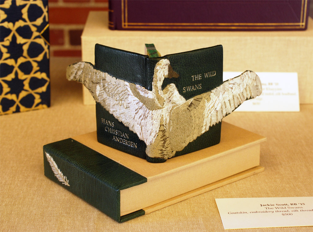
    Next up is Jacqueline Scott’s embroidered binding of Hans Christian Andersen’s The Wild Swans. Jacqueline is apart of the 2015 graduating class and I featured her set book in the first post. Her work is so stellar and I had the delightful opportunity to see this book as it took a journey to became this very gorgeous binding.

    The embroidery is so delicately handled and the feather embroidered on the spine of the box adds just the perfect amount of intrigue. The swan’s wings extend beyond the fore edge and are covered on the backside with matching green goatskin leather. I can’t wait to see how Jacqueline continues to explore embroidery in her work.

    JaquelineScott-NBSSExhibit

    The rest of the images were taken after the exhibit was fully installed, so please pardon any glares, shadows or my reflection. I would also like to note that I had intended to include the work of Rebecca Koch and Anne McLain, but it was rather difficult to capture an accurate photograph of their bindings due to reflection and glare issues. So sorry you two but I would like to say that loved your bindings!
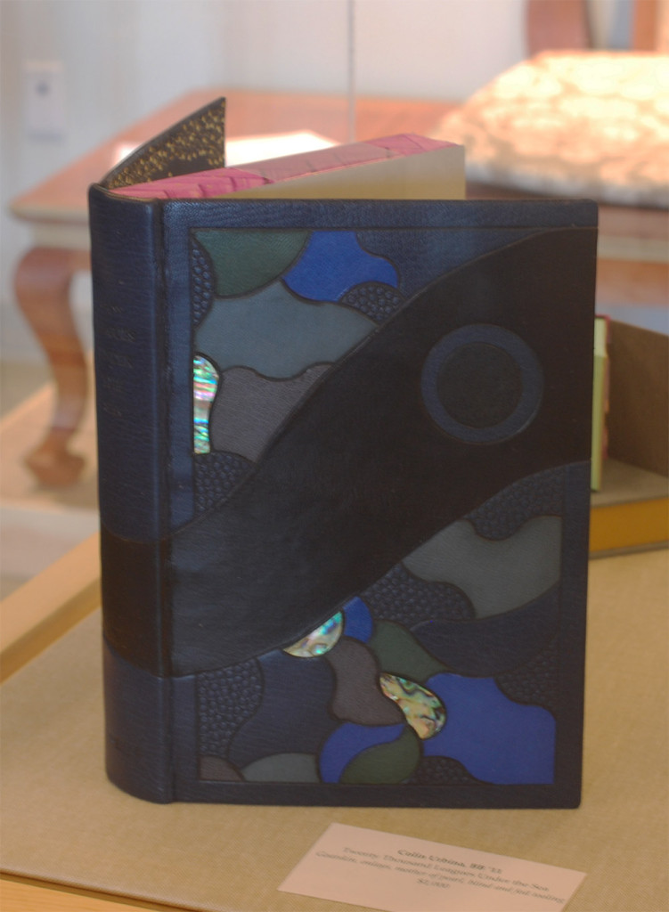
    The following binding was recently bound by my charming bindery mate Colin Urbina, 2011. In his binding of Twenty Thousand Leagues Under the Sea by Jules Verne, he created an abstract underwater scene with several tooled leather onlays and inlays of pearl. Other portions of the design are texturized with an open circle tool and by pressing sandpaper into the wet leather. The title and author are blind tooled on the spine.

    The head edge is painted in a vibrant purple with brushstrokes that cross over one another. Colin put in matching edge-to-edge doublures and added a frame of ascending “bubbles” using the same open circle tool.

    ColinUrbina-NBSSExhibit

    GabrielleCooksey-NBSSExhibit

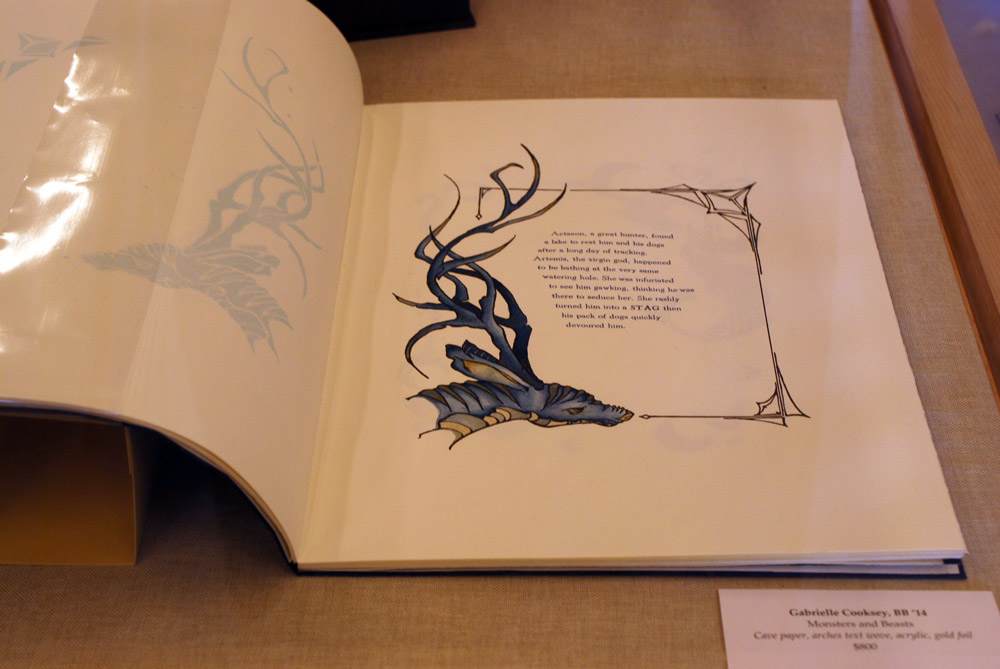
    Monsters and Beasts is the work of the incredibly talented Gabrielle Cooksey, 2014. Unfortunately, I don’t know much about this piece. But I believe that everything from the illustrations to the printing were all done by Gabrielle. It’s absolutely beautiful work!

    KaitlinBarber-NBSSExhibit

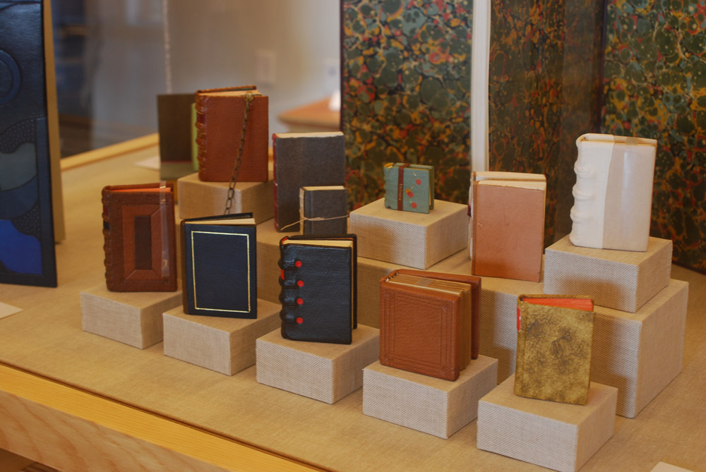
    Kaitlin Barber is the master of miniatures (and there always seems to be one in every class). In this adorable and wildly impressive collection of bindings, Kaitlin has miniaturized a selection of historical bindings she learned over the course of her time at North Bennet Street School. She’ll be apart of the 2015 graduating class and I wrote more about her work in the first post.

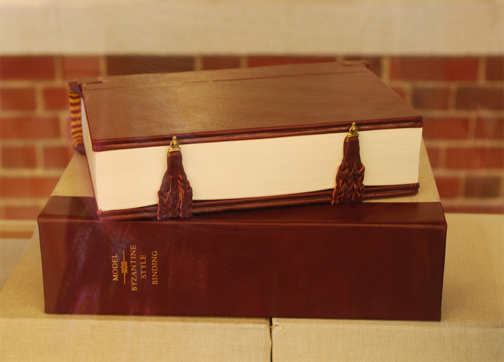
    Continuing on with the topic of historical structures, the students were treated to a week long workshop in the spring with Dr. Georgios Boudalis. Using his extensive understanding of Byzantine culture, he taught the students none other than a traditional 12th century Byzantine structure. Todd Davis, 2016, included his binding in the exhibit. The bindings are quite massive and required a lot of detailed work, such as board shaping, primary and secondary headbands, braided straps and clasps. After all that blood, sweat and tears, the class bound some really lovely models.

    ToddDavis-NBSSExhibit

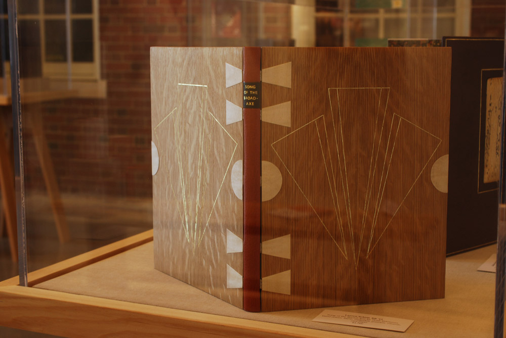
    The next binding on my list of favorites was done by another studio mate of mine, Lauren Schott, 2013. Bound in the Dorfner-style (same as Goose Eggs) with wood veneer boards and a leather spine. Lauren’s design on this binding of Walt Whitman’s Song of the Broad-Axe is so elegant.

    Lauren and I are both a big fan of incorporating shapes and symmetry into our designs. The front and back board are gold tooled onto the wood veneer; the tooling sits in the veneer so that at certain angles becomes almost invisible.

    LaurenSchott-NBSSExhibit

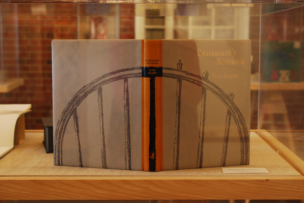
    And to round out the favorites is this stunning binding from Johanna Smick Weizenecker, 2010. This binding of Chairmaker’s Notebook is a quarter leather goatskin binding with semi-hidden corners. The design on the front and back cover continues onto the spine as an onlay. The title and author are hand titled using black and copper foils.

    JohannaSmickWeizenecker-NBSSExhibit

    So that concludes this year’s Student and Alumni exhibit at the North Bennet Street School. I hope you enjoyed this overview and I want to thank all of you who were able came out to see the show in person!


  8. North Bennet Street School // Student & Alumni Exhibit 2015 – Part One

    May 20, 2015 by Erin Fletcher

    It’s graduation season, which means it’s time for this year’s post on the North Bennet Street School’s Student and Alumni Show. (You can read the past two years here and here). This is an event that I always look forward to. The graduating students are each given a copy of the same book (a set book) and asked to create a design fine binding. The amount of creativity and talent that goes into each binding really displays each student’s personality. The exhibit is currently on view at the North Bennet Street School in Boston, Massachusetts until May 29th. If you are around, please pay a visit to see these bindings up close.

    The set book for this year’s graduating class is the The Rubáiyát of Omar Khayyám. It’s a beautifully illustrated book printed in a rather large format, which is something many of the students discussed with me. After photographing each book*, I had a discussion with each binder. We talked about the inspiration behind their designs, their thoughts on the binding process and what challenges they faced.

    * I want to note that the photographs were taken in various spaces at the school under not ideal lighting. So you may see variation in color for some of the bindings.

    Kaitlin Barber

    Rubaiyat-KaitlinBarber

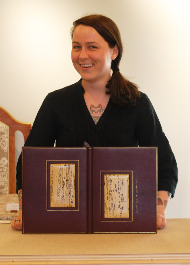
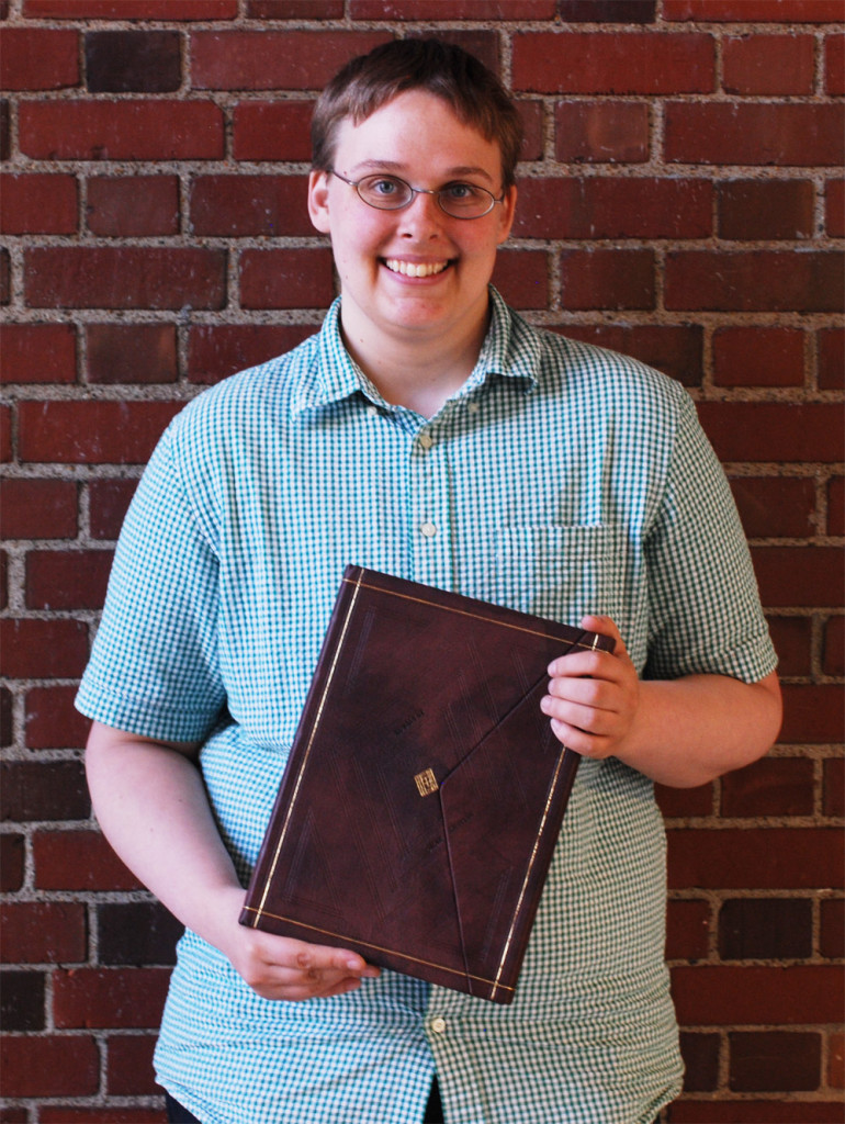
    Kaitlin Barber‘s approach to her design stems from her admiration of 18th century tooled panel and Cambridge panel patterns. Though in her design, she reinterpreted this look in a sleek and modern way. The binding is covered in a maroon goatskin with a raised window framing two inset panels of spalted tamarind. Kaitlin’s decision to use wood was inspired from an article by Helene Jolie and during a workshop taught by Jim Croft. In the article, Helene writes about the variety of materials one might employ as an inset panel, while Jim introduced shaping possibilities during his workshop.

    I think Kaitlin’s use of the spalted tamarind is genius, not only is it really beautiful and is elegantly shaped, but it also acts as symbolism for the message of life and death peppered throughout the book’s text. The dark abstract shapes in the spalted wood occurs when fungus enters the tree often causing it to die.

    Rubaiyat3-KaitlinBarber

    Gold tooled borders highlight the spalted tamarind as well as frame the entire the book. The title is tooled alongside the front panel. The head edge is airbrush with a brilliant blue acrylic, then sprinkled using gold leaf. The French double core headbands are sewn with silk threads. Kaitlin used a marble paper as her paste down and flyleaves.

    One of the main challenges Kaitlin faced during the binding process was working with such a large format, specifically when it came to paring the leather. Due to its size the leather included many areas of the skin such as the arm pits and backbone. These parts of the skin will react differently when being pared; the arm pits are stretchy while the backbone is a bit tougher. In the end it was a really great learning experience for Kaitlin.

    After graduation Kaitlin will continue in her internship at the Boston Public Library’s Rare Book Room, which began in January and will run through the summer.

    Lauren Calcote

    Rubaiyat-LaurenCalcote

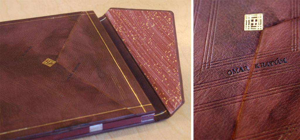
    Lauren Calcote’s interpretation of The Rubáiyát is brilliant. The text is notably one of the most famous pieces of Persian literature, which was translated into English for the first time by poet Edward Fitzgerald in 1859. Considering this relationship between its origins and the initial translation, Lauren played with the binding structure by combining a fine binding and Islamic binding.

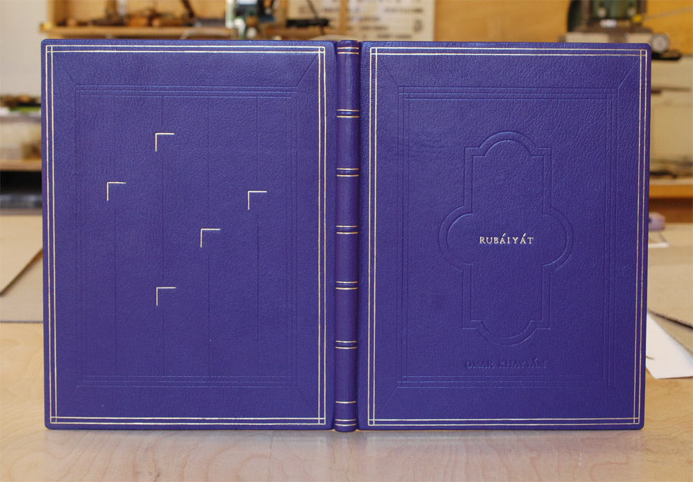
    The book is covered in fair goat that was hand-dyed by Lauren in a beautiful mottled aubergine purple. The fore edge flap speaks to the Islamic binding structure, but sits on top instead of underneath the front cover. The flap lays inside a well securely fastened with a hidden magnet.

    Rubaiyat2-LaurenCalcote

    Decoration on the front and back covers include gold and blind tooled lines laid out in a geometric design inspired by Persian patterns. The title is carbon-tooled on the front cover. The poet’s last name appears on the front of the flap and in the well.

    Other details include the custom-made endpapers reminiscent of those found in Islamic bindings. The paste down and fly leaf are hand painted with sprinkles of gold leaf. The edges of the text block are decorated in the same fashion. The headbands follow the Islamic chevron pattern around a round core.
    Planning this hybrid structure was an enjoyable challenge for Lauren, particularly finding the right fit for the flap by making sure it didn’t sit too proud. Another issue came during covering, Lauren initially wanted to cover the book in one full piece (from flap to front fore edge). Yet to achieve the desired height for the flap, Lauren choose to cover the base of the well with a separate thinner piece of leather. This seam is absolutely flawless and I would have never known if Lauren hadn’t explained the process to me. So bravo, Lauren.

    The last major design hurdle was where to tool and how to tool (mainly on the flap and well). She flip-flopped between tooling the well and leaving it bare. Lauren and I discussed how tooling the well was definitely the better decision. That the design works whether the flap is open or closed.
    After graduation, Lauren will be spending the next six months at the Boston Athenaeum as the 2015 Lisa von Clemm fellow.

    Joshua Crotty

    Rubaiyat-JoshuaCrotty

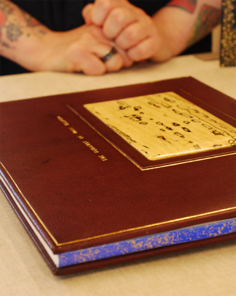
    On December 1, 1948 an unidentified man was found dead on Somerton Beach in Australia. This mystery was dubbed The Taman Shud Case, a phrase meaning ended or finished in Persian. Found in a hidden pocket of the man’s trousers was a printed scrap of paper, which turned out to be removed from the final page of The Rubáiyát of Omar Khayyám.
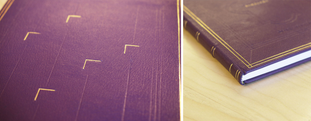
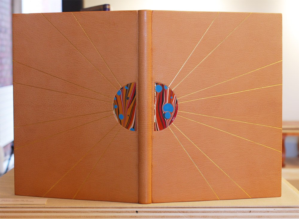
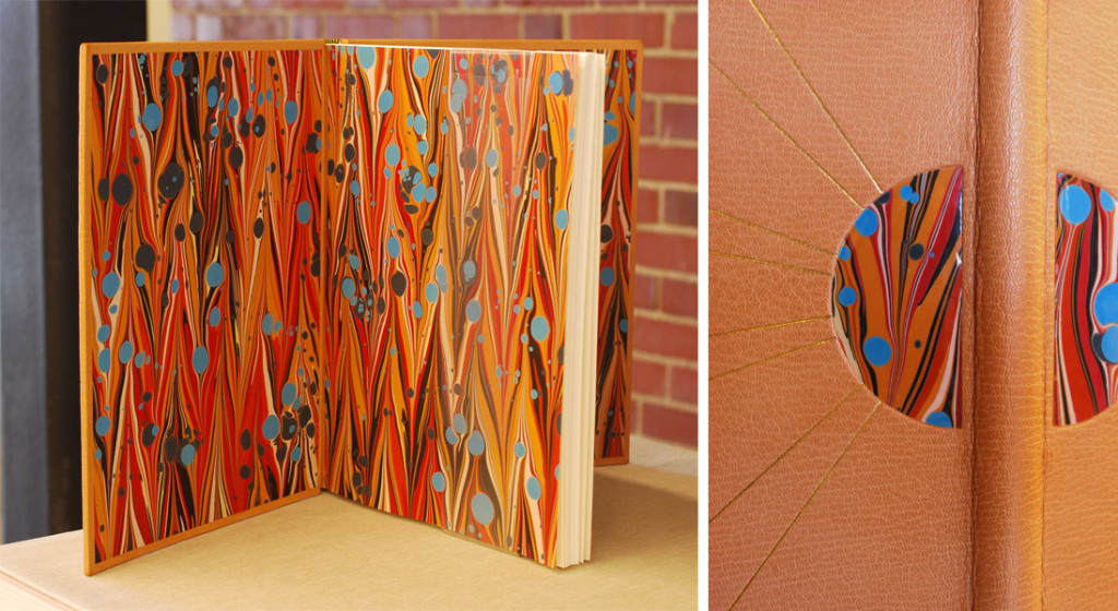
    This eerie tale is where Joshua Crotty drew his design inspiration. This simplistic design conveys a sense of heat, like being stranded on an Australian beach or Persian desert. The binding is covered in a beautiful sandy tan goatskin. The central inlaid design is created using marbled paper laminated to mylar representing a hot, golden sun. Gold tooled lines radiate from the half-circle inlays creating the rays of the sun.

    Rubaiyat2-JoshuaCrotty

    Joshua creates a fluid design by using the same marbled paper as the paste down and flyleaf. The head edge is gilded in the rough with gold leaf. I really love simple designs that are captivating and strong. Joshua’s inspiration is intriguing and really shines through; his simple design is ambiguous and holds a little bit of mystery.

    Joshua’s talents as a binder has already landed him in an impressive position as a hand bookbinder for the U.S. Government Publishing Office. His job is to serve the needs of Congress by creating finely crafted bindings to suit their needs. Joshua relocated to D.C. during his last semester at North Bennet Street School and this became one his major challenges during the binding process. He left behind a nice large bench to working on a kitchen table while also dealing with D.C.’s humidity; experiencing extended drying time made things a bit tough. These challenges didn’t hinder his ability to create crisp, clean gold tooled lines. Beautiful binding Joshua!

    Megan Gibes

    Rubaiyat-MeganGibes

    The Rubáiyát of Omar Khayyám was the title given by translator Edward Fitzgerald, whom I mentioned above. A ruba’i is a two-stanza with two parts per line, hence the word rubáiyát (a word derived from the Arabic language root for “four”) means “quatrains”.1

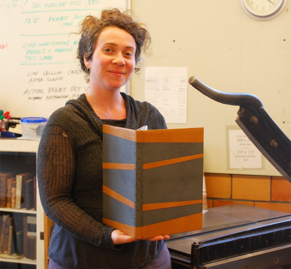
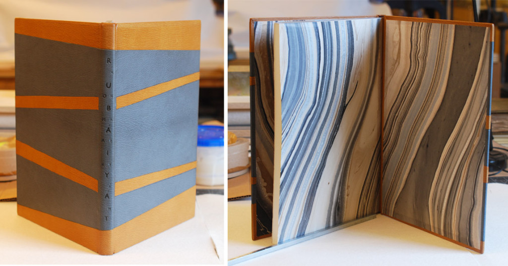
    As Megan Gibes describes the inspiration behind her design she explains that the poems are broken up into four lines with the crescendo occurring in the third line. The binding is covered in a medium gray goatskin with stripes of onlays in tan goatskin representing these four lines. The inner onlays are tooled, while the onlays near the head and tail are back-pared. This clean, minimalistic design is exactly what Megan wanted to achieve from the beginning as a way to juxtapose the grandiose bindings generally associated with The Rubáiyát.

    Rubaiyat2-MeganGibes

    The title is carbon-tooled down the length of the spine with Rubáiyát sandwiched between Omar and Khayyám (click on the image above for a better view). The head edge is shaded with graphite and gauffered with a thin line palette. The headbands are sewn in silk over a single parchment core. Megan sourced the perfect marbled paper to line the boards and fly leaf. This large-scale marbled design works so well with the format of this binding, while also tying in the color scheme Megan chose for the cover.

    Megan and I chatted about the challenges of creating a fine binding, how overwhelming the process can seem. Megan’s strategy was to isolate each step and to only move forward when she felt completely satisfied. One challenge that arose came during the paring process and some miscalculations. By edge paring the leather a bit too short, this left with a visual drop in the leather after covering. Megan added a patched onlay, which fixed the situation and actually looks quite seamless.

    After graduation, Megan will be moving across the country to Santa Barbara, California. She’s been hired as the Head Binder for Neve Albums where she’ll be producing unique albums, guests books and custom boxes. Neve Albums brought on Megan to help establish an in-house bindery to help expand their business. Best of luck Megan, sounds like a great gig!

    Shannon Kerner

    Rubaiyat-ShannonKerner

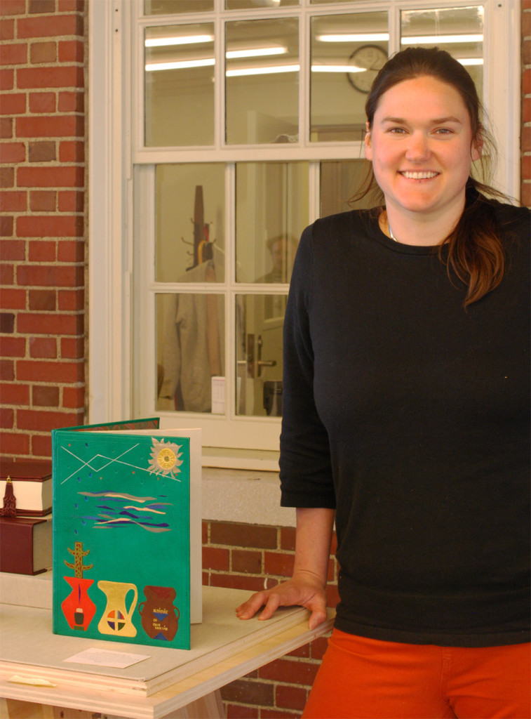
    Omar Khayyám lived during the 11th and 12th century making a living as a mathematician, astronomer, philosopher and poet. His poetry includes several themes such as life, death and love. For her design, Shannon Kerner reinterpreted these themes using symbols found on Southwestern Native American rock wall art.

    Rubaiyat2-ShannonKerner

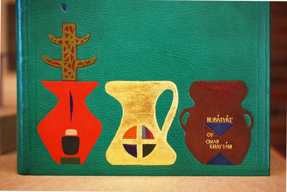
    The shapes of each vase is derived from typical Persian styles. The first vase represents the spirit of the ancestor with the tree of good life growing from the ancestor and falling rain. The symbol on the center vase represents the virgin. The final vase includes the title tooled in gold along with the symbol for the water clan, which is represented by two inverted triangles inside of a rectangle. This final symbol, just like the vases, are symbols for water and life, which circles back around to the first vase.

    As I mentioned before, Omar Khayyám worked as an astronomer and was tasked with reforming the calendar in order to minimize seasonal errors; this was something Shannon wanted to reflect in her design. The top half of the design includes a sun created through surfacing gilding palladium and gold. The rain passes through a dreamy cloudscape and blind tooled stars representing the night sky.

    Rubaiyat3-ShannonKerner

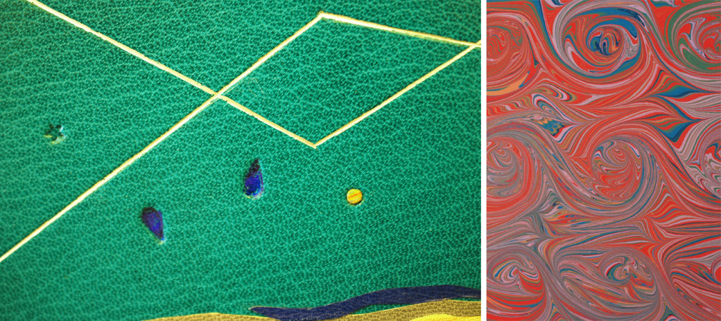
    Shannon’s binding is bound in a bright teal goatskin with several layered onlays. Other decorative elements include surface gilding, foil tooling and blind tooling. The head edge was rough edge gilt. The paste down and flyleaf are covered with a hand marbled paper made by Shannon (detail shown above).

    Shannon employed a variety of techniques in her binding. One particular element that I found intriguing was her use of three different colored foils within the teardrop tool, which offers an elegant subtly to the design. As we chatted about her process, she pointed out the challenges presented when creating the sun. The center is surface gilt with gold leaf, while the outer rays are surface gilt with palladium leaf. Butting up these two leaves meant that the Frisket (a masking film) would be placed on the gold leaf. This film pulled up some of the leaf, but Shannon successfully mended any losses creating a striking image for her overall design.

    Come graduation, Shannon is looking forward to her next step and where it might take her. She is anxiously awaiting to hear the results of prior interviews.

    Lindsay Nakashima

    Rubaiyat2-LindsayNakashima

    Earlier this year, Boston College exhibited the work of Mark Esser, who was the first instructor at North Bennet Street School and is apart of a lineage of master bookbinders. His work greatly inspired Lindsay Nakashima as she approached her design for The Rubáiyát. Lindsay also planned to utilize both gouges and palettes as a challenge to work with the tools she has been introduced to over the course of the second school year.

    The binding is covered in a vibrant purple chieftain goatskin from Hewit (best represented in the image below). The other students chose to use Harmatan goatskin for their bindings, but Lindsay was attracted to not only the lush color, but the heavy grain. This was also a great opportunity to play around with a different type of leather, to get a sense of how it can be manipulated and tooled.

    Rubaiyat-LindsayNakashima

    The head edge is rough edge gilt with French double core headbands wrapped in silk. Zerkall paper was used for the paste down and fly leaf. Lindsay’s binding has quite a classic, clean look. She emphasizes the back corner, which offers a more elegant (or dare I say more feminine) feel for the size of the binding.

    Lindsay’s most challenging aspect of this process was the gold tooling, which most binders can attest to its difficulties. Yet tooling on an unfamiliar leather can heighten the challenge. Lindsay noted that the chieftain goat felt less spongy and less susceptible to making an impression. But Lindsay plowed through the process and created beautifully tooled lines.

    After graduation, Lindsay will be moving back home to Austin, Texas where she’ll be setting up a bindery space. Her intentions will be to open this space for teaching simple workshops while also bringing in restoration commissions under the name Nakashima Books. Best of luck, Lindsay.

    Jacqueline Scott

    Rubaiyat-JacquelineScott

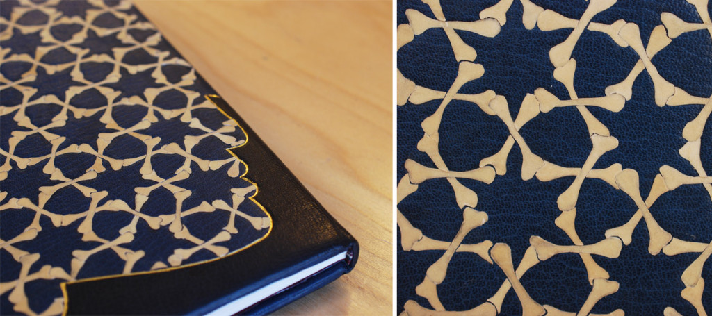
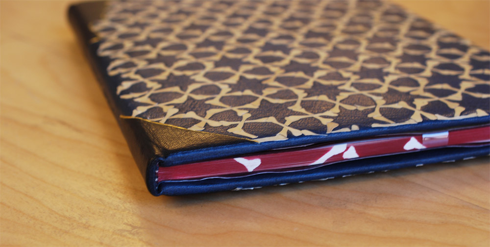
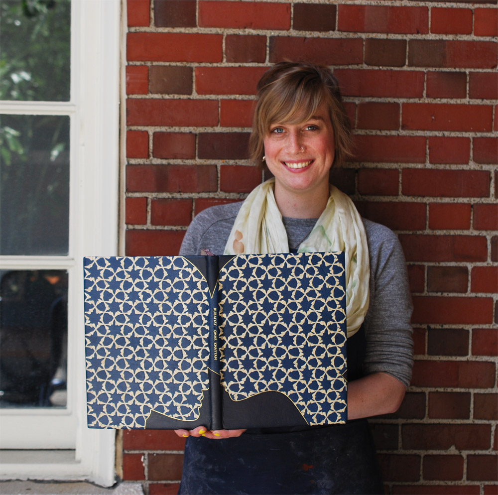
    Death is a reoccurring theme in Khayyám’s poetry and one that inspired many of the students in this exhibit. Jacqueline combined this theme with a love story threaded throughout the text. These themes are represented by the profile of a couple embracing and bones. Jacqueline’s book is bound in a blue goatskin with over 400 parchment back-pared onlays, these parchment bones create a classic Arabic geometric design.

    Jacqueline’s work with the parchment is quite impressive and I asked about her approach to using this unconventional material as a back-pared onlay. In her initial tests she overlapped two bones, but this created too much bulk and tore during the paring process. She also backed the parchment with tissue using gelatin. Jacqueline used this tissue as a barrier between the PVA and parchment, plus the tissue increases the opaqueness of the onalys. A little setback occurred during covering when the gelatin lifted from the moisture in the paste, but Jacqueline was able to reattach any raised onlays.

    Rubaiyat2-JacquelineScott

    The shape of the couple is accented by dark blue gold tooled onlays. The title is gold tooled down the length of the spine. The head edge is airbrushed with a deep red, bone shapes are masked out revealing the white of pages underneath. The boards are lined with matching edge-to-edge doublures and cork paper fly leaves.

    Rubaiyat3-JacquelineScott

    After graduation, Jacqueline will begin the first of three internships. Starting with a month-long internship at the Francis Loeb Library which is affiliated with the Harvard Design School. I’m looking forward to seeing Jacqueline later in the summer at the University of Virginia during her second internship while I’ll be attending Rare Book School.

    Jeff Altepeter

    Rubaiyat-JeffAltepeter

    The success of the student’s bindings are due to the instruction from Jeff Altepeter and I thought it best to end this post with his colorful binding. Jeff drew inspiration from The Great Omar. In 1909, Sangorski & Sutcliffe was commissioned to create a sumptuous binding for The Rubáiyát of Omar Khayyám. Given carte blanche and a limitless budget, the remarkable firm created the most ornate binding with thousands of jewels, complex gold tooled designs and leather onlays. Upon completion in 1911, the binding was shipped a year later to New York by way of the Titanic.

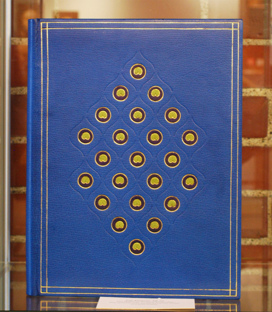
    Jeff pulled a single element from “The Great Omar”: the peacock (also a common motif on Sangorski & Sutcliffe bindings). His abstract interpretation of the peacock feather is laid out in a lozenge-like pattern. Instead of the traditional straight lines he employed the ogee finishing tool, which is a long, thin “S” shape. This tool created a very elegant, feather-like border around the “eye”. This center shape is made up of two gold tooled onlays. The inner one is tooled from a custom made finishing tool. Jeff is a master at crafting his own finishing tools; he made a few variations of the tool before settling on an open design rather than a closed one.

    The book is bound in a brilliant blue goatskin with an airbrushed head edge and hand sewn French double core headbands in silk. Marbled paper lines the inside of the covers and flyleaves.

    I asked the students about their challenges during the binding process and I posed the same question to Jeff. In an ideal situation, a binder wants a comfortable amount of time between each step. Yet for an instructor these steps might get rushed in order to show the process to students in a timely fashion. And there are less chances to tweak your design within these time constraints. But I think Jeff was able to capture the spirit of The Great Omar.

    So there you have it. My best to the graduating class of 2015 as you enter the world of bookbinding and conservation!

    1 Wikipedia


  9. My Hand // Dune

    May 1, 2015 by Erin Fletcher

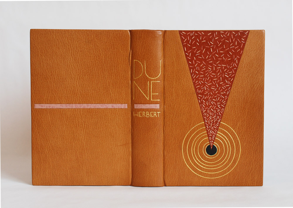
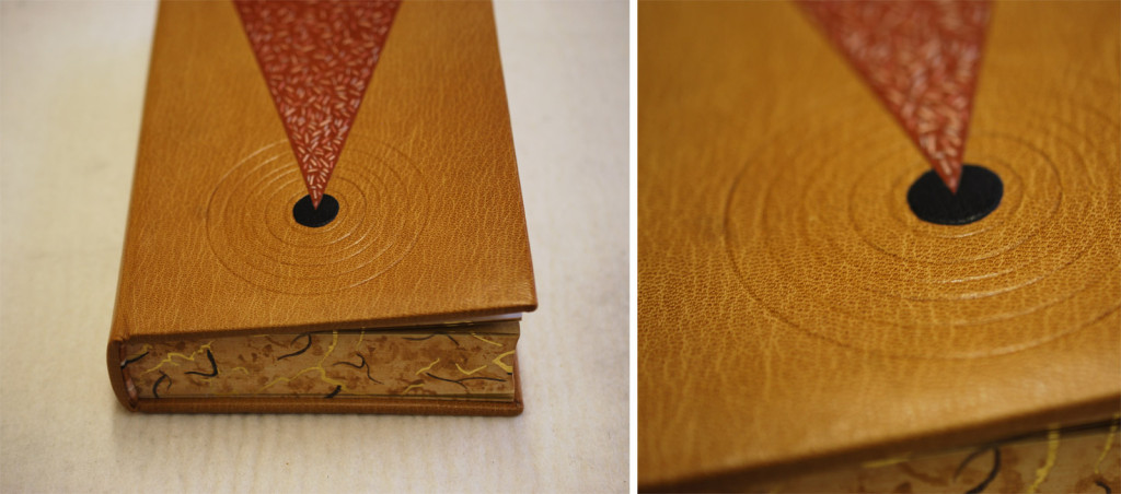
    It’s been a while since I wrote about my binding of the science fiction classic Dune. After sharing my technique for the edge decoration, hand-sewn headbands and the process of covering, I’m finally ready to unveil the finished binding.

    Dune11a-ErinFletcher

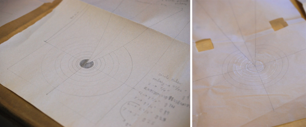
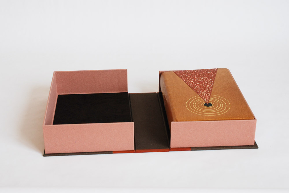
    So now I’ll go over the steps that led to the finished look. After covering and letting the book rest, I began working on the remainder of the design for the front cover, which included a series of concentric circles. All seven circles would be tooled using gold leaf, but only the inner circle would also include a leather onlay. In the image below (on the left) is my initial sketch of the front cover design. It includes a list specifying the size gouge for each circle. The image on the right is the final outline drawn on tracing paper, which includes fewer circles due to spacing issues. This also became the template I would use to transfer the design to the book (hence the wrinkles and cut out squares).

    Dune13-ErinFletcher

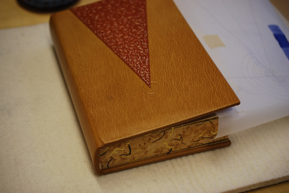
    In the image below you can see the tooling template attach to the underside of the front board. At this point, I’ve flipped it off the book to check the placement of the first circle.

    Dune8-ErinFletcher

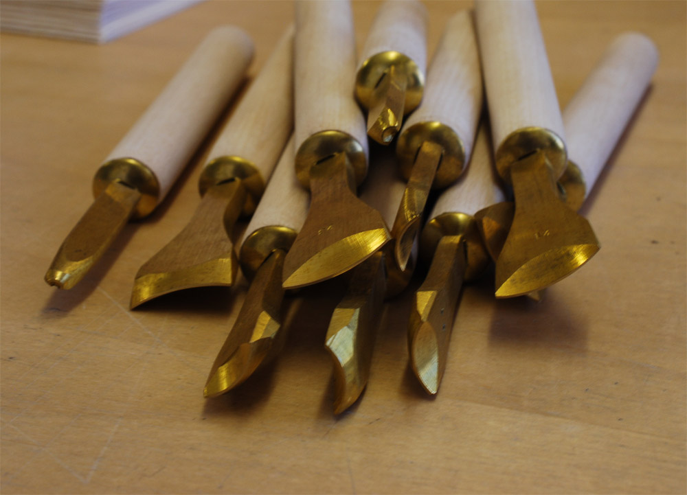
    Happy with the first circle, I continued working my way through the remaining 6 circles. Each circle was initially placed onto the leather with a plastic circle template and thin bone folder. I then used the appropriately sized gouge to make the first impression, with the tool being cold. Below is an image of all the different gouges used on the binding.

    Dune12-ErinFletcherDune9-ErinFletcher

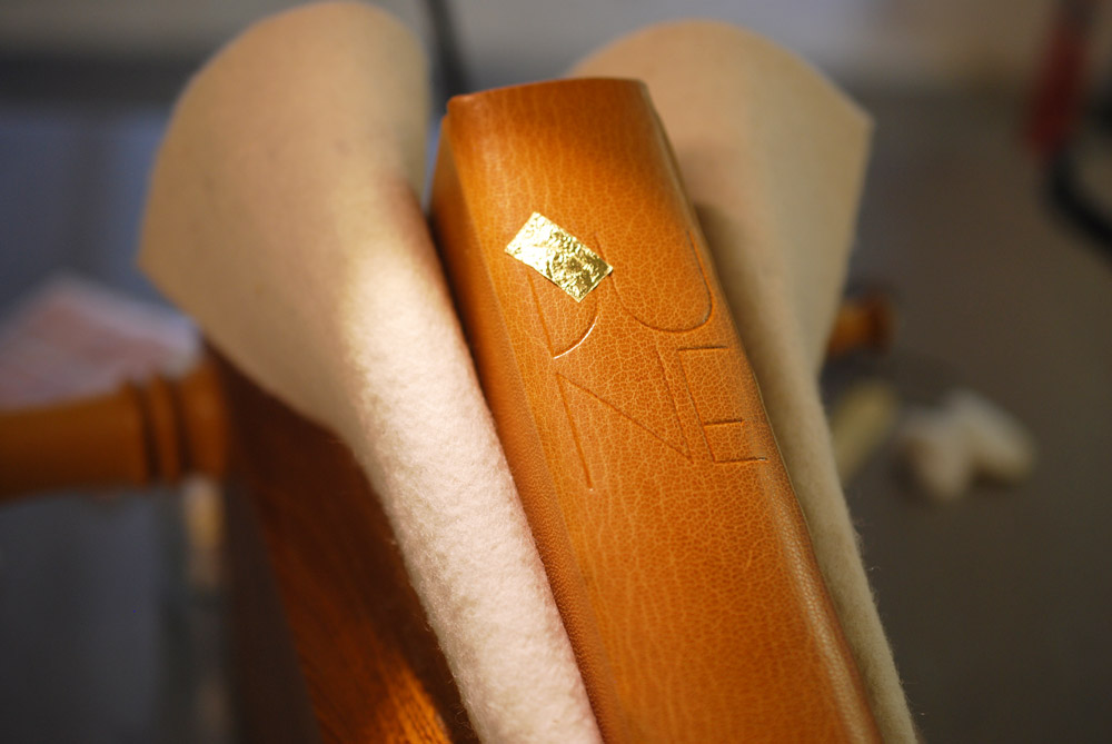
    In the midst of winter and in an incredibly dry studio, I began to add the gold to the circles. After a few failed attempts and some adjustments I made to the atmosphere, the gold started to stick. In between the tooling process on the front cover, I moved to the spine where I tooled in the title and author’s last name.

    Inspired by the lettering seen on French fine bindings from the 1920s and 30s, I used a combination of gouges and line palettes to design my own alphabet. In the image below, I’ve finished the initial blind layer and am about to begin the gold tooling.

    Dune10-ErinFletcher

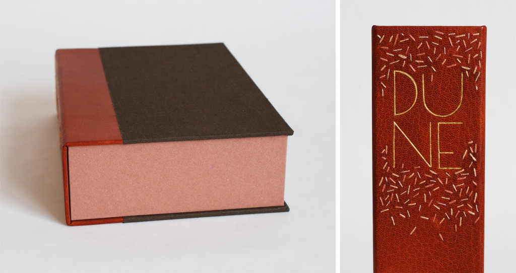
    The title and author’s name are divided by a blind tooled onlay of buffalo skin in a lovely light pink, which also appears on the back cover. This design is again a play on the French fine bindings from the 1920s and 30s.

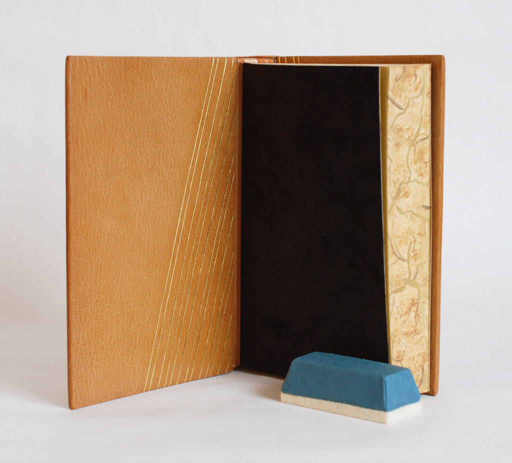
    With the outside complete, I moved to the inside of the book. The fly leaves are a soft suede in dark brown which matches the onlay on the front cover. The matching DUNEblures (a silly nicknamed coined by my witty studio mate Colin Urbina) are tooled in a design that mirrors itself on the back cover. The angle of the lines match that of the triangle on the front cover. The spacing between the lines is consistent with the spacing between the concentric circles.

    Dune14-ErinFletcher

    The book is housed in a quarter leather clamshell box using the same terracotta goatskin as for the triangle back-pared onlay. The leather has been embroidered in the same fashion and tooled with the title. The rest of the case is covered in brown Canapetta cloth. The trays are covered with handmade paper I bought from Katie MacGregor and lined with the same suede as the fly leaves.

    Dune16-ErinFletcher Dune15-ErinFletcher

    In mid-April, I received the exciting news that my binding of Dune will join the Guild of Book Workers Traveling Exhibit: Vessel! This will be the second time I’ve participated in a GBW show and what’s more exciting is that this exhibit will be hosted by the North Bennet Street School. So halfway through the tour, I’ll get the chance to revisit my binding.

    The exhibit will open later this year in California and I’ll be writing a post to remind those nearby.


  10. Book Artist of the Month: Natalie Stopka

    April 27, 2015 by Erin Fletcher

    BotanicalPrintBook-NatalieStopka

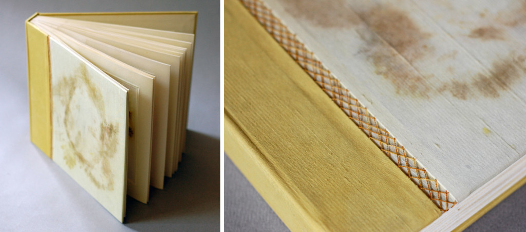
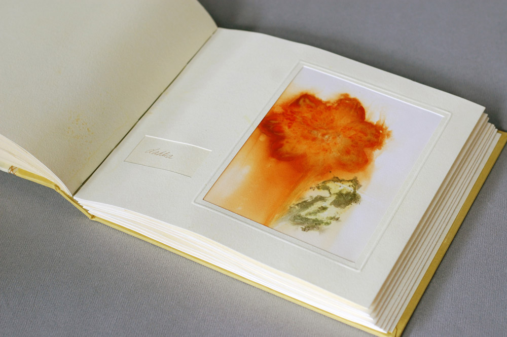
    In this final post with Natalie Stopka, we continue the discussion on her techniques that employ natural pigments for dying and image making by looking at her 2012 artist book Botanica.

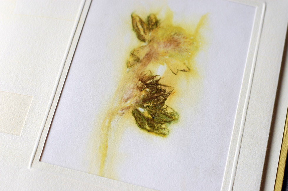
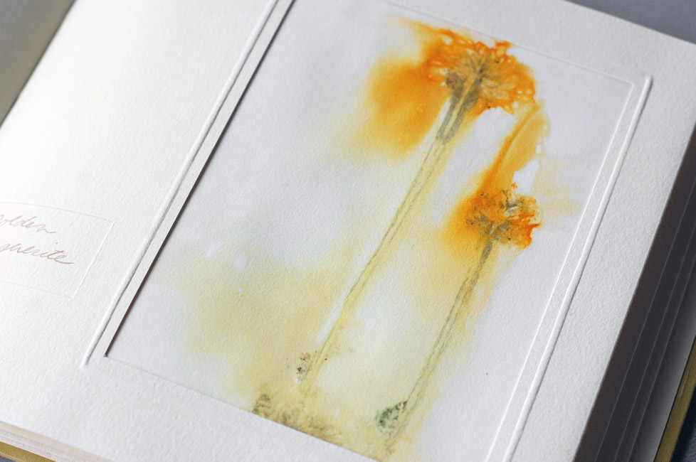
    This binding consists of a series of eco-prints that are brilliant in both color and detail. Can you discuss the process behind eco-printing?
    Eco printing is the process of making a plant print using only the natural colorants contained within the plant. As opposed to nature printing in which pigment is applied to the surface of natural objects, in eco printing the plants can be smashed, pressed, bundled, soaked, steamed, or even frozen to coax the dye colorants out. There are a variety of techniques and terms to describe them. Hapa zome is the pounding of fresh plants directly onto a fiber substrate, and bundle dyeing involves tightly wrapping plant or other dye materials in fabric before burying or steaming them.

    Botanica2-NatalieStopka

    To create Botanica, I gathered a dozen different dye plants one August day. These included mint, yarrow, dahlia, coreopsis, and goldenrod. Each specimen was folded within alum-mordanted paper, guarded with additional paper, and vigorously smashed with a mallet to break down the plant fibers and transfer the colorants within. I lowered this sandwich, with the plant still inside, briefly into a pot of simmering water. The hot water further drew out the dyes, creating an aura of color around the plant image, and made the print as permanent as possible. I was left with two mirrored images of each plant to create an edition of two books.

    Botanica4-NatalieStopka

    In binding the books I adopted a flat back variation of Richard W. Horton’s light album structure, with each print mounted inside an accordion fold of naturally dyed paper. The paper as well as the silk book cloth and thread on the cover were dyed with a mix of wildflowers.

    Botanica5-NatalieStopka


  • My name is Erin Fletcher, owner and bookbinder of Herringbone Bindery in Boston. Flash of the Hand is a space where I share my process and inspirations.
    The StudioNewsletterInstagramEmail me
  • Archives