RSS Feed

‘bookbinding’ Category

  1. December // Bookbinder of the Month: Kathy Abbott

    December 1, 2015 by Erin Fletcher

    OnACalmShore-KathyAbbott

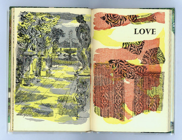
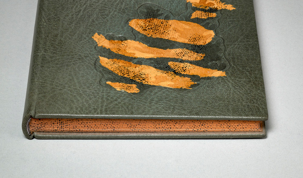
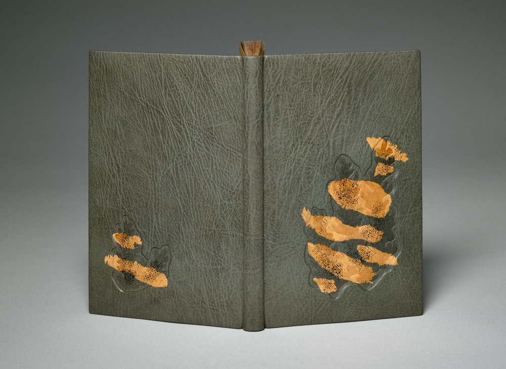
    On a Calm Shore is a 1960 edition by Frances Cornford with illustrations by Christopher Cornford. In 2015, Kathy Abbott bound this copy in full grey goatskin with recessed and embossed onlays with relief printing. The edges are decorated and printed to match the design on the covers.

    Can you walk us through the processes used to create the layered design in the recessed areas of the binding?
    This text-block was a very unusual choice for me as it was printed in the 1960’s on modern paper and was heavily illustrated. I am usually drawn to early 20th century, letterpressed printed books from private presses, with no illustrations. When I found this text in a second-hand bookshop, I was delighted: the poems were charming and the illustrations were so vibrant and alive, that I just had to buy it.

    OnACalmShore2-KathyAbbott

    I made this binding for an exhibition in London last year called: Covered. I have responded to the references to the sea in the poetry and to the layered screen-printed illustrations by the author’s son, Christopher Cornford on this binding. I felt that the structure had to be a fine binding over layered pasteboards so that I could sculpt the boards easily, and cover it in beautiful grainy leather, to create different textures.

    OnACalmShore3-KathyAbbott

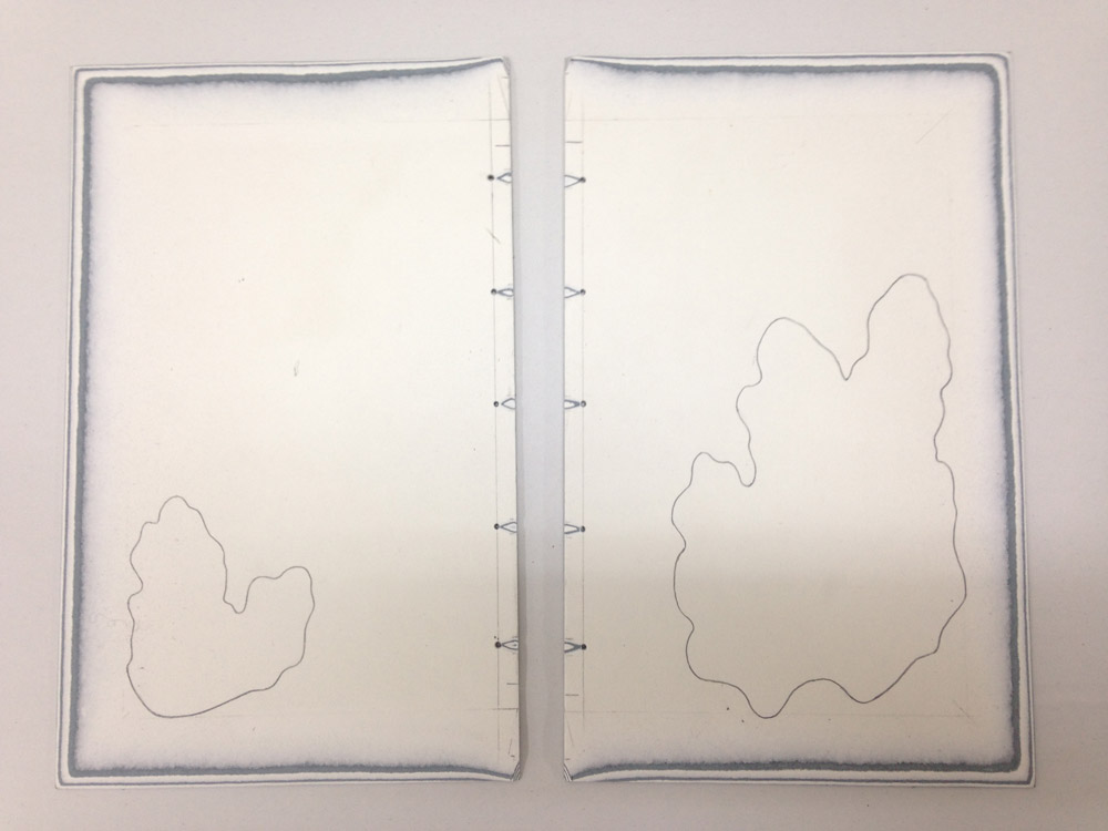
    Boards before lacing onto the book.

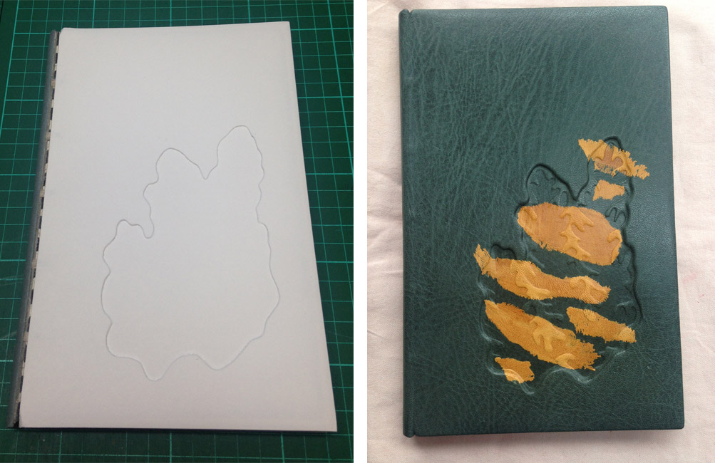
    To create this design, I cut away parts of the boards; laced the boards on and lined the outside with paper to form a solid ground for the leather. I then covered the book with Nigerian goatskin, pushing the leather into the recesses with a very fine-pointed bone folder. I made seaweed-y shapes from millboard (a very laborious job achieved by cutting out the shapes with a scalpel and making bespoke sanding tools to get into the nooks and crannies) and then pressed the millboard pieces really hard into the dampened recessed areas of the covers. I applied the feathered yellow onlays, pressed the millboard shapes in again and then relief printed on top with acrylic ink through scrim, to achieve the texture, which is consistently used within the book’s illustrations.
    OnACalmShore4-KathyAbbott

    left: Boards laced onto book with design cut out | right: Binding covered in goatskin with feathered onlays.

    My response to each book I bind dictates the technique I must employ, often pushing me outside anything I have ever tackled before, and forces me to be on the edge of my practice technically: I always embrace this process.

    What techniques did you employ to carry that pattern onto the edge decoration?
    I coloured the edges with terracotta coloured acrylic ink and then used the same relief printing technique for the texture.

    OnACalmShore5-KathyAbbott

    This interview comes as a suggestion from Haein Song after I interviewed her back in February 2014. Not knowing anything about Kathy or her work, I soon discovered that, though her bindings may appear simplistic, her designs are meticulously planned and thoughtfully executed. In addition to her striking designs, I was pulled in by the gorgeous leathers used to cover her bindings. In the interview, I ask Kathy about her design processes, techniques and her strategy for choosing the perfect skin. She also goes into the concept behind Tomorrow’s Past and the ease of publishing a bookbinding manual.

    Check out the interview after the jump for more about Kathy’s training and her creative process. Come back each Sunday during the month of December for more on Kathy’s work. You can subscribe to the blog to receive email reminders, so you never miss post.
    read more >


  2. Bonus // Bookbinder of the Month: Tini Miura

    October 25, 2015 by Erin Fletcher

    YouCanJudge-TiniMiura

    In a recent competition put on by the Washington University Libraries Special Collections, the public was encouraged to judge books by their covers and cast their vote for favorite binding. Fittingly, the book being bound was Bernard C. Middleton’s You Can Judge a Book By Its Cover, which was published by Mel Kavin and designed by Ward Ritchie in miniature form back in 1995 (which is presumably around the time it was bound as well).

    The first book of this edition was designed and bound by Tini and Einen Miura and printed by Henry Morris. Later on, 32 more binders were invited to create their own unique binding and to celebrate the artistry of the miniature book.

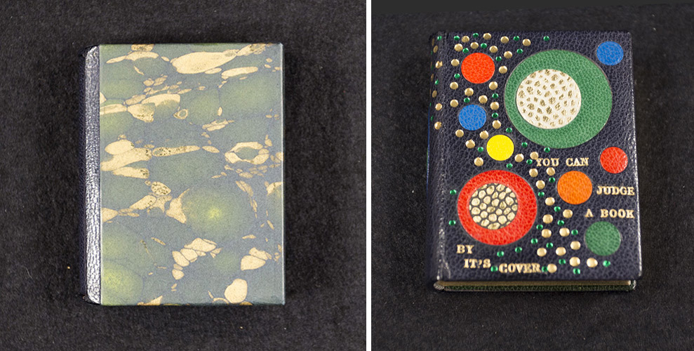
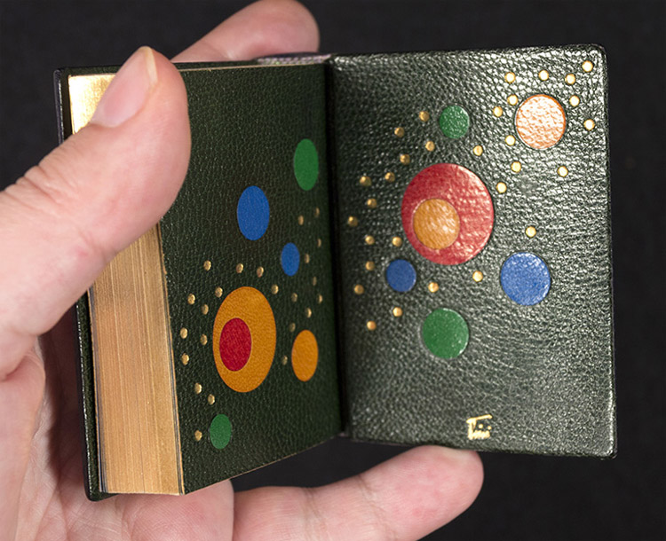
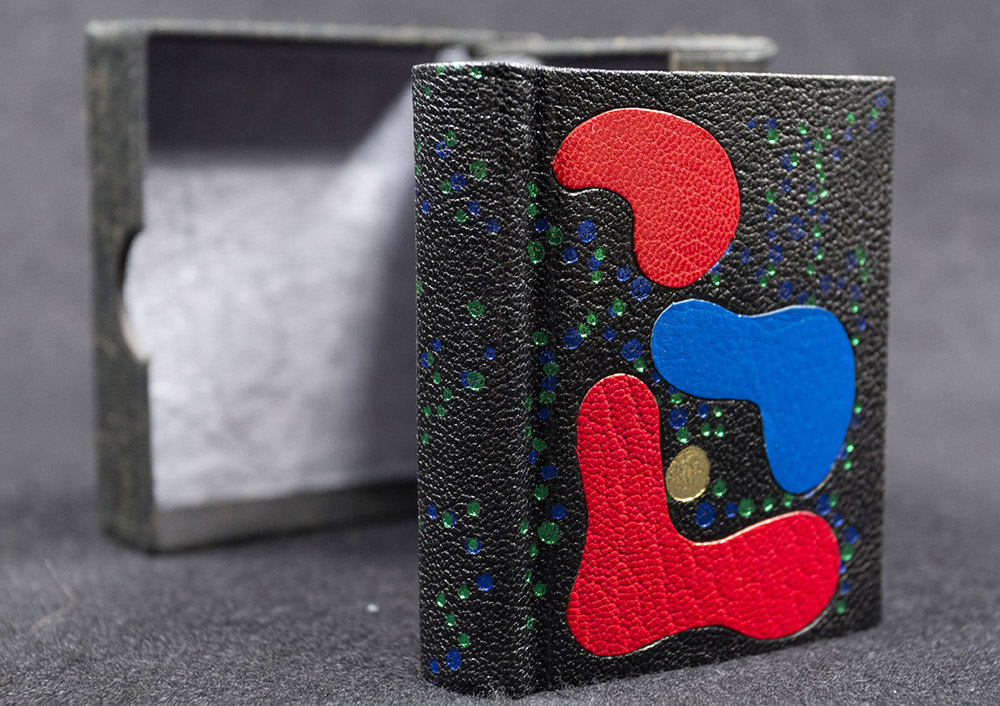
    Tini bound the book in black morocco. She used the onlaid shapes and design to tell a story about the author. The ascending tooled area represents Bernard Middleton’s larger than life character. Running along side this path are circle onlays of various sizes and colors, which show the abundance of information he has shared with the world throughout his professional life.

    In the image above, the book is shown on the right with the slipcase pictured on the left. Tini also made a miniature chemise, which would be placed around the book before sliding it into the slipcase.

    YouCanJudge2-TiniMiura

    The edges are gilt and headbands handsewn in colored silk. The doublures, seen above, have multicolored circular onlays and tooling.

    The scale of many of the bindings in your book A Master’s Bibliophile Bindings: Tini Miura 1980 – 1990 are quite large. For the final post in your interview I would like to talk about two miniatures you did for Bernard Middleton’s You Can Judge a Book by Its Cover. What challenges did you come across when scaling down the binding and decorating processes?
    Usually my books are large, because they are limited edition livre d’artiste. They have signed original images by artists like Picasso, Leger, Roualt, etc. and are extremely expensive.

    I prefer large books that open well and can be enjoyed easily, while lying on a table. Small books have to be held on both sides to keep them open, there is no weight to the text. But I have enjoyed doing some immensely. No change in binding steps for miniatures.

    – – – – – – – – – – –

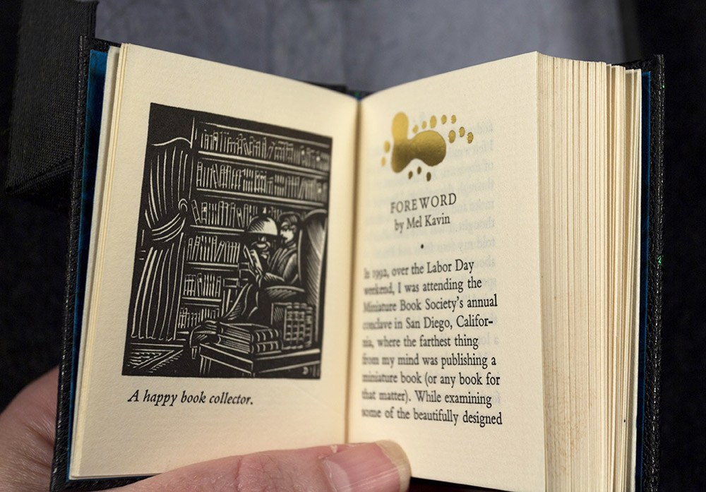
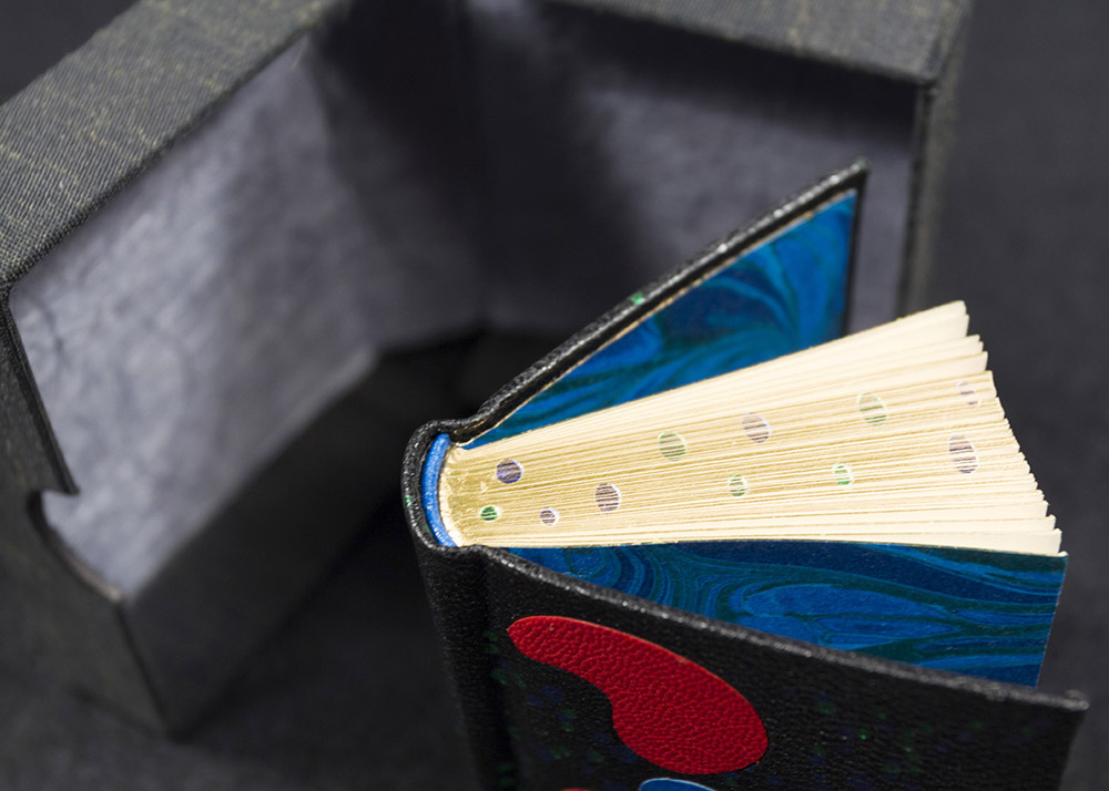
    Tini bound an additional copy of Middleton’s book in black morocco with several colored inlays (inspired by the shape printed at the top of the foreword) and foil tooling.

    YouCanJudge3-TiniMiuraYouCanJudge4-TiniMiura

    The edges have been gilt and gauffered with colored polka dots. The endpapers are marbled. The book lives in a small clamshell box.

    YouCanJudge6-TiniMiura


  3. Guild of Book Workers – Standards of Excellence Seminar // Cleveland 2015

    October 25, 2015 by Erin Fletcher

    I woke up very, very early on a Thursday morning to catch a flight out of Boston to Cleveland in order to attend the evening festivities planned for the first day of the Guild of Book Workers Standards of Excellence Seminar. I was delighted to be on the same flight with Deborah Howe, Collections Conservator at the Baker-Berry Library at Dartmouth College. The weekend-long event filled with book-related discussions had officially begun.

    We arrived in Cleveland to a brisk, yet sunny morning. My wonderful friends and colleagues, Henry Hebért and Jeanne Goodman, picked us up at the airport and we were off to the hotel located just a short walk from Lake Erie (and the Rock and Roll Hall of Fame).

    The first day of Standards began with book-related tours across the city. At the last moment, I was able to snag a spot on the tour of the Cleveland Museum of Art. Our docent, a fellow GBW member, gave us a brief tour through the Western Art galleries, stopping from time to time to show off books from their spectacular collection. It was a real treat to see some fine examples of Western-style bindings and manuscripts.

    StandardsCleveland1-ErinFletcher

    In 2002, the Museum underwent renovations that included this beautiful 39,000 square foot enclosed glass atrium that connects the original building with the newer wing and is where we met our tour guide. (click to enlarge images)

    StandardsCleveland2-ErinFletcher

    We appropriately began our tour of early bindings with an Egyptian Book of the Dead of Hori scroll on papyrus dating roughly around 1969 – 945 BC. We swiftly made our way to the 11th century as our docent pointed out this beautiful Byzantine binding with the primary headbands still intact.

    We then saw a small collection of illuminated manuscripts with pigments that had been wonderfully preserved and appeared as bright as if they were created yesterday.

    StandardsCleveland4-ErinFletcher

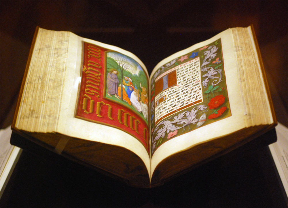
    As a great lover of Flemish art, Queen Isabella treasured her library of devotional books; on display at the museum is a Book of Hours crafted for her by the most talented manuscript painters active in Ghent and Bruges during early 1500s. This circle of artists were renowned for their border decoration that often featured realistically painted flowers, scrolling acanthus leaves, birds and butterflies.

    StandardsCleveland3-ErinFletcher

    The Gotha Missal dating from about 1370 – 72 is shown in the image above (left) opens to a lovely miniature painting with vines running along the margins. Since the interest for most displayed book is in the content, binders get to see very little of the actual binding. Fortunately, the CMA has digitized and photographed a large portion of their collection. The leather binding over wooden boards is quite a beautiful example of a decorative medieval binding. The tooling could have been completed with a decorative roll and covers the entire surface of the covers.

    Next in the tour was a highly decorated leather case with cut-work and hand painted details in blue once used to cover a Qu’ran dated to sometime in the 15th century. We also saw a leaf from a Jain manuscript from India dating to sometime in the 15th – 16th century. But the final piece we saw was by far my favorite.

    StandardsCleveland5-ErinFletcher

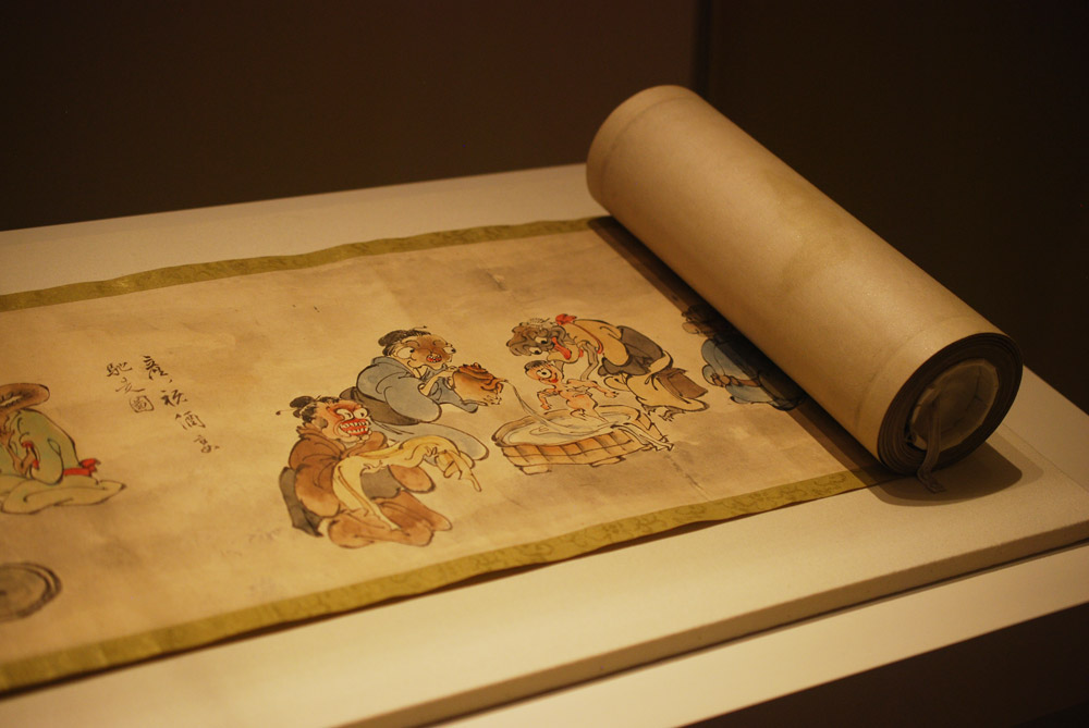
    An Illustrated Marriage of Apparitions (Bakemono konrei emaki) is a humorous hand scroll created in the mid-1800s. The story is mainly told through imagery with cartouches scattered amongst the illustrations as a way to describe the scene (much like a comic book). The scroll is displayed open to the part of the story with the birth of the first child between two apparitions or bakemono. A procession of 100 whimsical and supernatural monsters follow the couple through their matchmaking, engagement, marriage and finally to childbirth.

    StandardsCleveland6-ErinFletcher

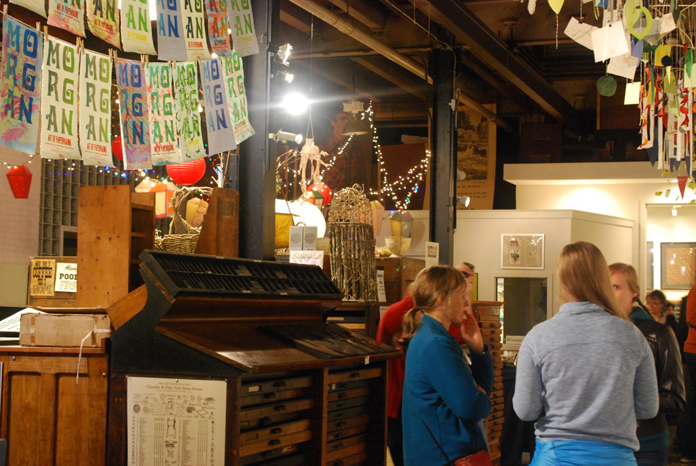
    The evening reception occurred at the Morgan Art of Papermaking Conservatory and Education Foundation. This was my first time at the Morgan and I was blown away by the size of the space. It was covered with a multitude of various creations. From what I could gather, the space was divided into different areas, a small shop right near the entrance, an area for printing, the center of the room was used as an exhibitions space, and the back half was for paper making and other workshops. I did miss out on the tour of the garden just outside the building in the back, but I heard it was absolutely gorgeous.

    StandardsCleveland7-ErinFletcher

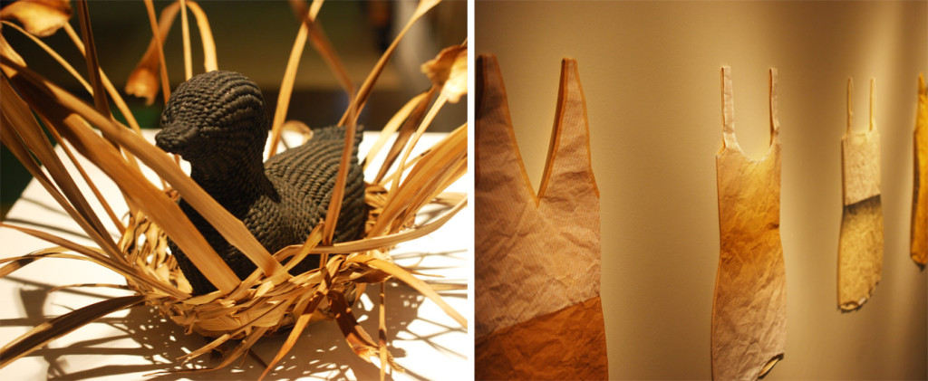
    Buoyancy was the exhibit on view at the Morgan, which explores themes of water and swimming and includes the work of Aimee Lee and Kristen Martincic. I really enjoyed Kristen’s realistic paper recreations of objects used in the water. Aimee created a large and impressive assortment of intricately woven sculptural ducks from hanji dyed with natural pigments.

    StandardsCleveland8-ErinFletcher

    left: Aimee Lee | right: Kristen Martincic

    Being that we were on the turf of the Midwest Chapter, members were invited to bring books for a pop-up exhibit. To our delight, this was also on display during the opening reception.

    StandardsCleveland9-ErinFletcher

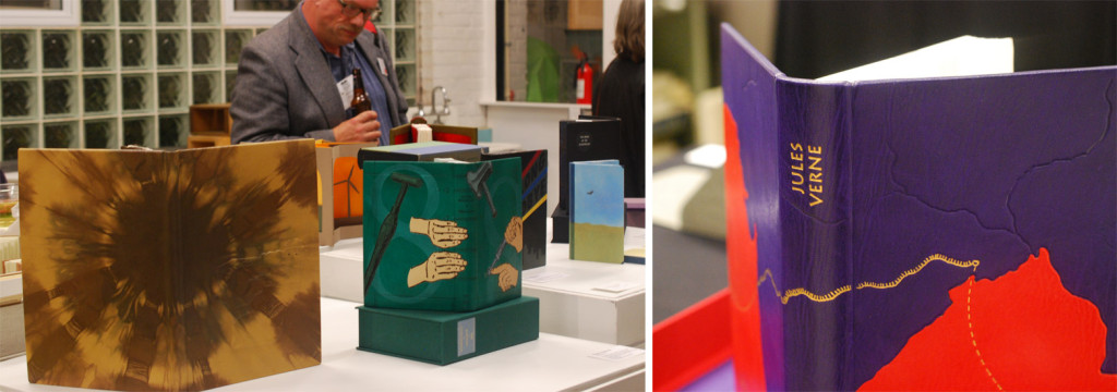
    The books on display in the image above from left to right are: Cris Clair Takacs: Remembering Jan Bohuslav Sobota, Karen Hanmer: Bookbinding with Numerous Engravings and Diagrams and Richard BakerLe Tour du Monde en Quatre-Vingts Jours (Around the World in Eighty Days).

    StandardsCleveland10-ErinFletcher

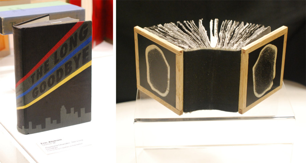
    Working down the exhibit table is Eric Alstrom’s The Long Goodbye (seen on the left) and Charles Wisseman‘s World Bones. 

    StandardsCleveland11-ErinFletcher

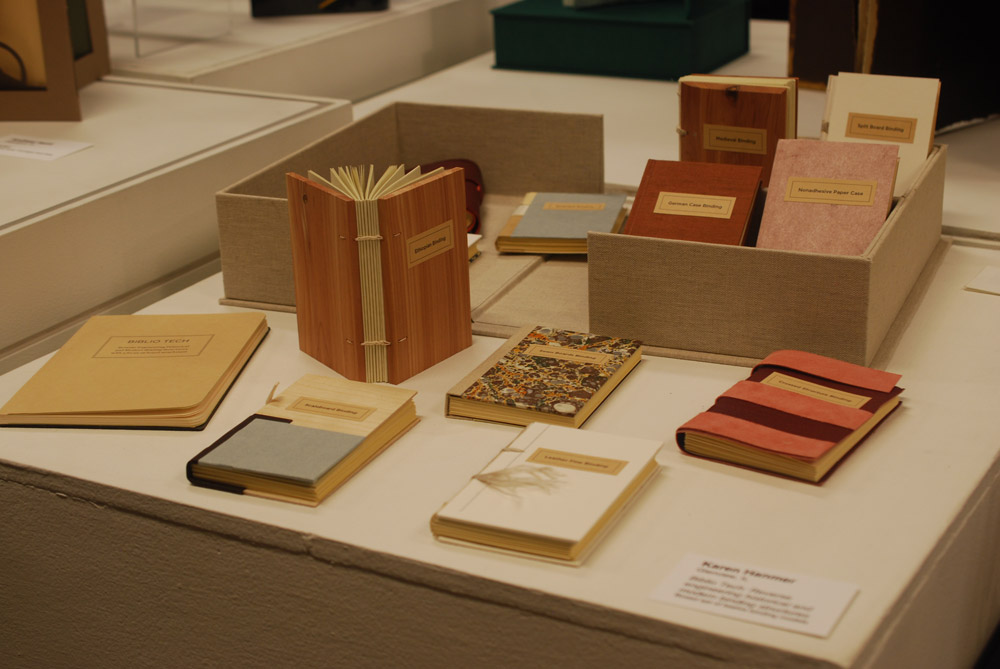
    Next up Biblio Tech: Reverse engineering historical and modern binding structures from Karen Hanmer.

    StandardsCleveland12-ErinFletcher

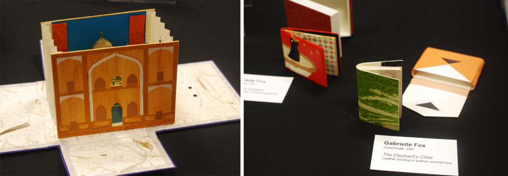
    On the left is Tunnel of Love from Mary Uthuppuru with miniatures from Gabrielle Fox on the right.
    StandardsCleveland13-ErinFletcher

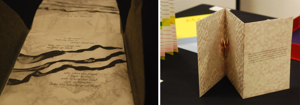
    Wrapping up my tour of the exhibit table is Joanna Kluba‘s Rainer Maria Rilke: Poems on the left and Emily Martin‘s Who Gets to Say on the right.

    That concludes day one of the Standards Seminar. Stay tuned for part two of the post soon.


  4. Bookbinder of the Month: Tini Miura

    October 25, 2015 by Erin Fletcher

    Alice-TiniMiura

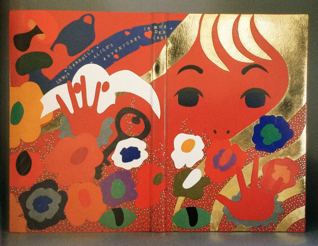
    Alice’s Adventures in Wonderland is one of those titles that has been bound so many different ways and by so many different binders. In 1983, Tini Miura, added her binding to this list with her brightly colored, kaleidoscopic design for an equally mind-bending story. This particular edition was published by the Pennyroyal Press in 1982.

    Bound in red morocco with several onlays that run the spectrum of color between white and black with tooling in gold and green foil. The doublures are a dark red sheepskin and the edges have been in gilt in the rough.

    I love your interpretation of this book, the design emotes feelings of chaos and helplessness. In many of your designs you incorporate floral elements. What does the flower mean within your designs, specifically for this binding and in general?
    It is a fairytale-like story and the things Alice encounters, like rabbit, teapot, etc. Therefore I chose fantasy flowers to make the whole interpretation happen in a “wonderland”.

    Flowers are a wonder of nature that bring joy – like  beautiful words. They do something to your soul, you feel alive and joyful (colors and music does that to me as well).

    When I do a book and see the design in my head, the design becomes this image which I physically execute. After reading the story, if it is not worldwide known literature, I often understand the design after I read the book. I know that is weird. But I feel it is a present and I don’t ever change or complain – just go with it.

    Another reoccurring design element are the built up areas of tiny tooled shapes, which usually flow across the binding. What can you say about the use of this in your work?
    The small dots or squares are my “Pixie” dust, magic or wonderment in the words or stories.


  5. Bookbinder of the Month: Tini Miura

    October 18, 2015 by Erin Fletcher

    AGlimpseOfThomasTraherne-TiniMiura

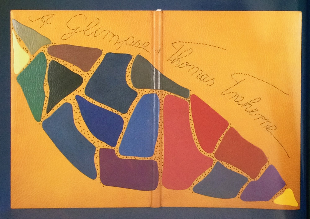
    Another one of my favorite bindings from Tini Miura. This edition of A Glimpse of Thomas Traherne includes illustrations by Ann Brunskill and was published in 1978 by The Worlds End Press in London. The design on this binding is like an abstract puzzle compiled of “pieces” that represent parts of Traherne’s poetry to offer a picture of his creativity.

    Bound in 1990 in yellow morocco where each onlay is a single, unique color. The title is stretched across the binding and each letter is created through repetitive tooled dots through brown foil. Tini creatively ties together the title and puzzle by tooling a diamond motif through brown foil strewn in the negative spaces between the onlays.

    This is one of the few examples where the title is transformed into a design element. Can you talk about why for this particular binding, you chose to display the title this way as opposed to using type?
    The colored onlay pieces are freely moving over the surface, like a line of a poem is following the former to make a verse. The overall image represents the several verses that make up the poem.

    If I had used letters, then I would have felt an interruption in the free flow of the onlay “verses”. The “dotted” words of the title are, so to speak a “miniature” image of the flowing line of colored “verses”. Kind of two interpretations of the same idea – making spoken words visible, like the vibrations of energy they are.

  6. Client Work // Ye Sette of Odd Volumes

    October 15, 2015 by Erin Fletcher

    SetteOddVolumes-ErinFletcher

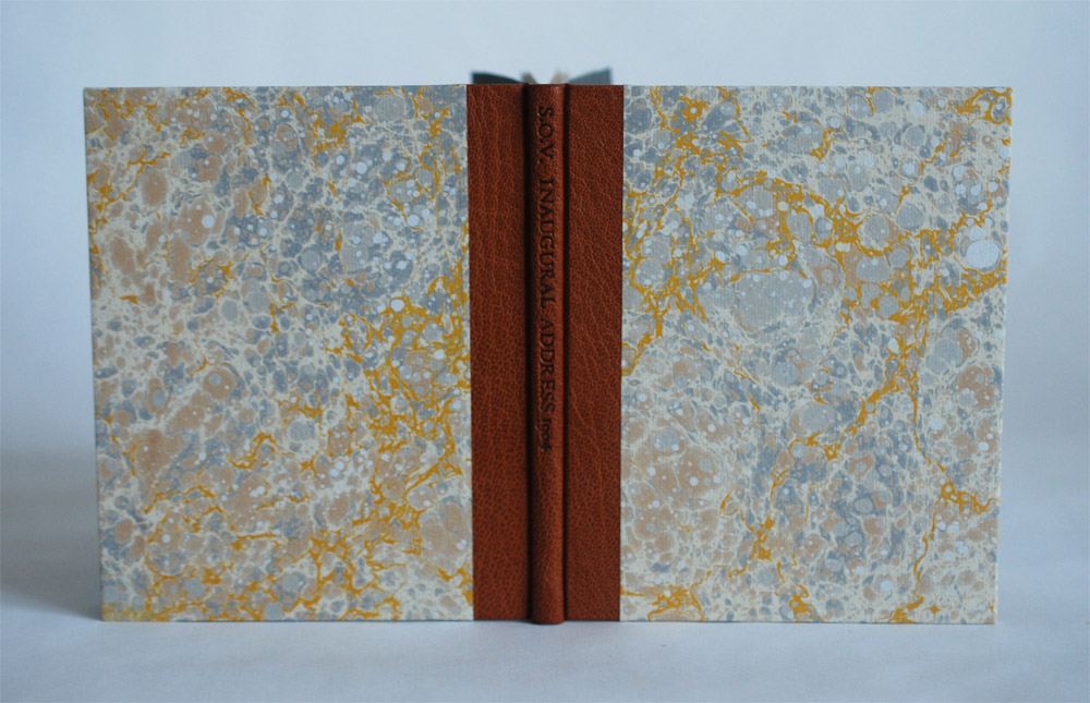
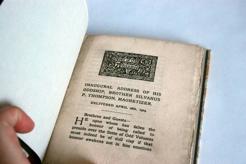
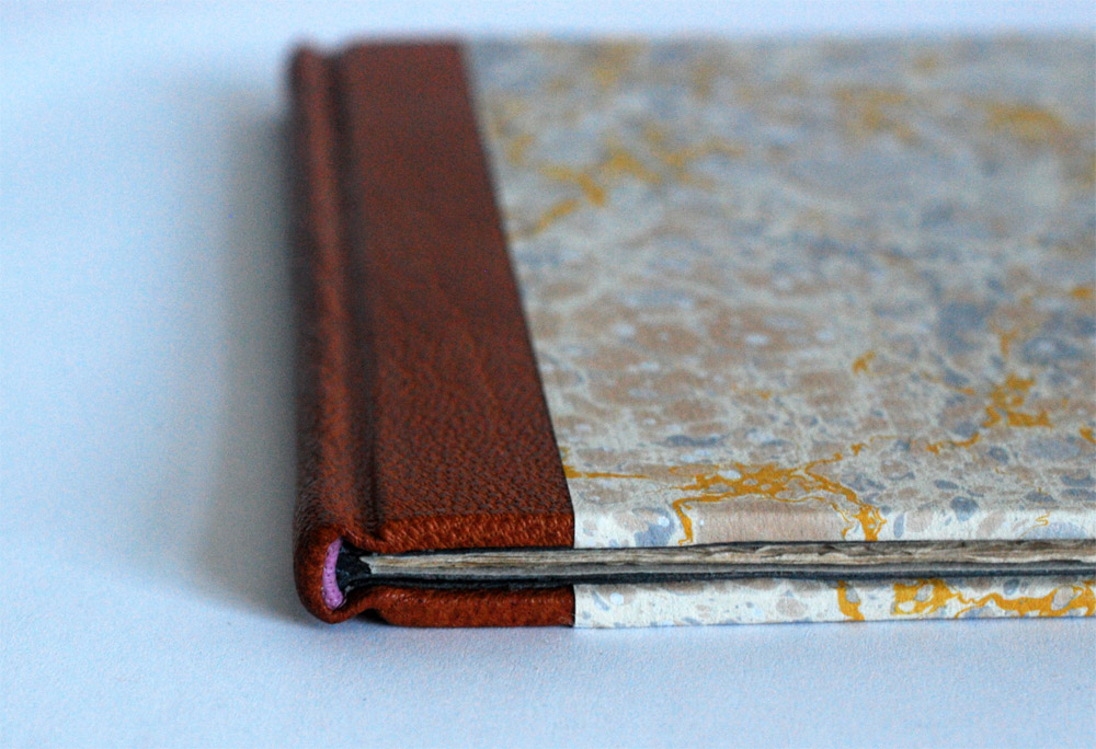
    It’s been a while since I’ve posted on my own work due to having a crazy summer, but I recently completed this binding of the 1904 Inaugural Address of his Oddship, Brother Silvanus P. Thompson, Magnetizer for Ye Sette of Odd Volumes. I’m sharing this particular project because it has a really great back story and is the slimmest book I’ve ever bound in leather.

    SetteOddVolumes2-ErinFletcher

    My client who presented me with this project is a member of the Club of Odd Volumes, a private social club founded in 1887 and is a society of bibliophiles with the following mission statement:

    The objects shall be to promote an interest in, and a love for whatever will tend to make literature attractive as given in the form of printed and illustrated volumes, to mutally assist in making researches and collections of first and rare editions, and to promote elegance in the production of Odd Volumes.

    The club’s headquarters is located at the former home of Sarah Wyman Whitman in the neighborhood of Beacon Hill in Boston, Massachusetts. The Club of Odd Volumes is a direct influence of Ye Sette of Odd Volumes, an English bibliophile dining-club formed in 1878.

    As I mentioned above, this particular pamphlet is the inaugural address of Brother Silvanus P. Thompson. During the planning phase for the binding, I did some investigative work on dear old Silvanus. At the age of 27, Thompson was appointed to professor of Physics at the City and Guilds Technical College in Finsbury, England. He had a talent for communicating complicated scientific concepts in a clear and interesting manner. He is best known for this work as an electrical engineer and his most enduring publication, Calculus Made Easy, a 1910 book that teaches the fundamentals of infinitesimal calculus.

    What really spurred my curiosity was the descriptor of Magnetizer added to the end of Thompson’s name in the pamphlet’s title. In 1910, Thompson was involved in early attempts to stimulate the brain using a magnetic field. After this death this technique would eventually be recognized as Transcranial Magnetic Stimulation. This story really inspired me to use a sheet of the hand marbled paper that I made while I was a student at the North Bennet Street School.

    The stone pattern of the marbling has a very organic, almost cellular feel to it. The movement of the yellow veins reminded me of electric currents flowing through the brain. What a perfect fit!

    The structure of the binding is inspired by Ingela Dierick’s article Single Section Bradel Binding in The New Bookbinder (Volume 32, 2012). I’ve created a binding from this tutorial before and even posted about it on the blog. If you want to see/read more about the process, check out this prior post.
    SetteOddVolumes4-ErinFletcher

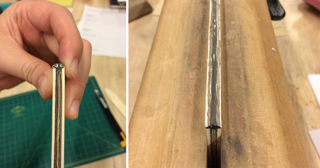
    The single signature pamphlet is sewn on a stub of equal thickness. This stub is then shaped to create a false round, which allows you to continue with a binding suitable for a leather covering. In the image above you can see the finished binding. Below you can see the book right after I’ve shaped the spine with the help of hemp cord that create false shoulders (in the image on the right, you can see that I also painted the cord to blend in with the grey colored paper used for the stub).

    SetteOddVolumes5-ErinFletcher

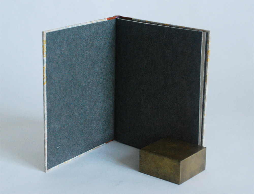
    Other details of the binding include leather wrapped headbands in mauve buffalo skin that add a small pop of color. The paste down and flyleaf are Cave Paper in granite. I also hand tooled in blind an abbreviated title onto the spine: S.O.V. INAUGURAL ADDRESS 1904.

    SetteOddVolumes3-ErinFletcher

    I find these single signature bindings to be just as challenging as a multiple signature book. But it offers a certain level of satisfaction to turn something so thin and simple into a substantial leather binding.


  7. Bookbinder of the Month: Tini Miura

    October 11, 2015 by Erin Fletcher

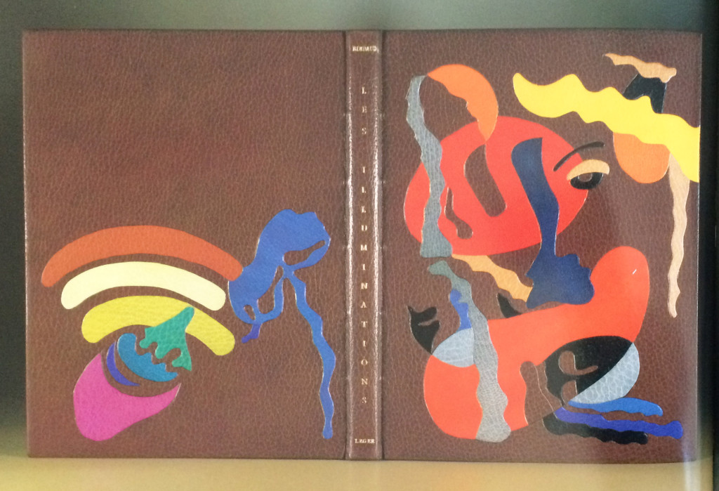
    LesIlluminations-TiniMiura

    I think this binding from Tini Miura of Les Illuminations by Arthur Rimbaud and is one of my favorite bindings in her portfolio. Published in 1949, this edition includes illustrations by Fernand Leger. Bound in 1985, the book is covered in brown morocco and includes a series of colorful onlays. The title and last names of the author and illustrator are gold tooled onto the spine. There are also a few subtle blind tooled lines within the design on the front cover.

    Tini embraced the range of colors from Leger’s illustrations, which reflect the visual impact of Rimbaud’s poetry.

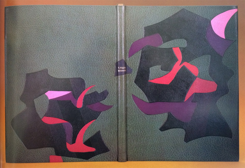
    I also wanted to include Tini’s binding of Miennes by Tristan Tzara in this post because of its visual similarity to her binding of Les Illuminations (in that they are both unique to her typical way of designing).

    Miennes-TiniMiura

    Bound in 1989, this book is covered in grey morocco with onlays in black, purple, red and pink leather. The title and author are gold tooled over an onlay on the spine. Tini’s response to the design in her book (A Master’s Bibliophile Bindings, 1990) is as follows:
    The colors and forms express the state of mind in a devastated society after the First World War, when Dadaism’s leader Tristan Tzara rejected the traditional ideas of formal beauty.

    The designs on these two bindings have very unique looks from your other work. Can you talk about the inspiration behind the designs?
    It is difficult to capture an artist’s images without copying him. I try to find spaces between the shapes of their illustrations to honor them and keep the feeling they invoked me.

    Les Illuminations incorporates a wide spectrum of colored leather. Do you dye your leathers to produce the perfect shades or are you sourcing your leather from different tanneries? Do you use a combination of vegetable and chrome-tanned skins?
    I have a large range of leathers, all bought in Paris. I don’t dye them myself for durability reasons.


  8. Bookbinder of the Month: Tini Miura

    October 4, 2015 by Erin Fletcher

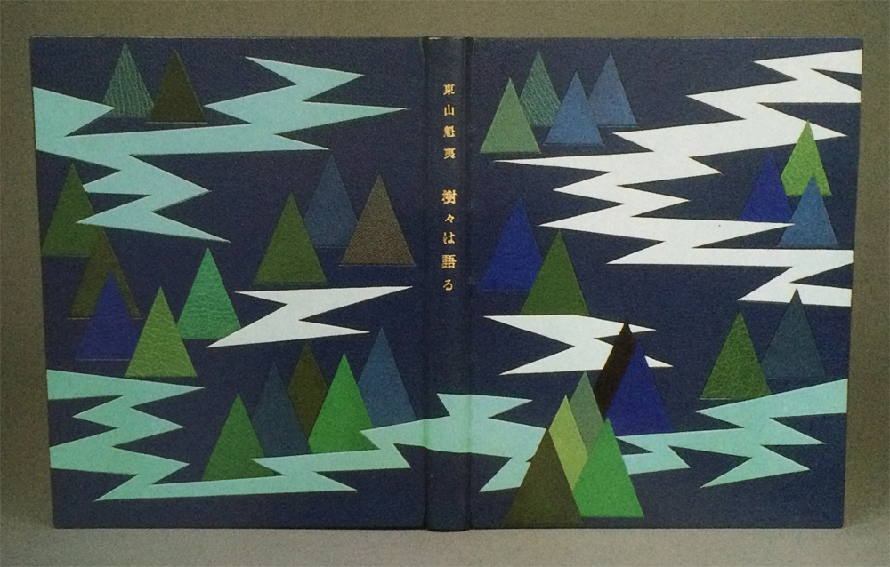
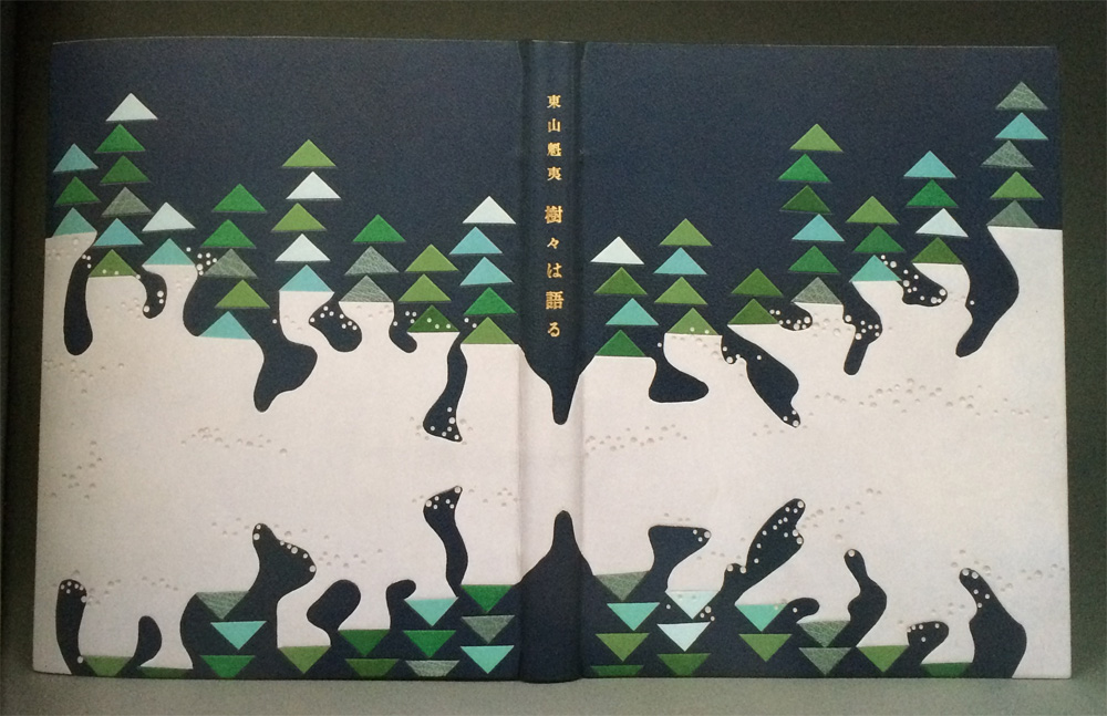
    TreeTalks2

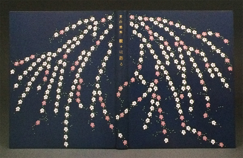
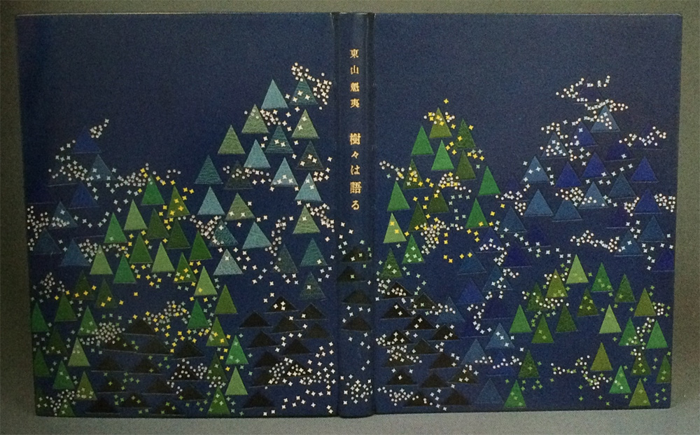
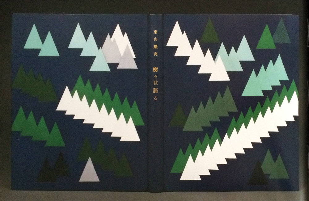
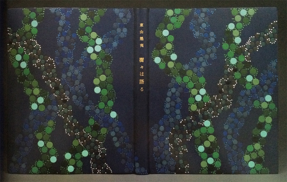
    Trees Talk includes the work of Kaii Higashiyama, a highly respected painter in Japan whose work captures the spirit of the four seasons. The reproductions in this book are a collection of trees paired with poetry reflecting the words spoken by the trees.

    In 1985, Tini Miura bound an impressive 23 editions of Trees Talk in full leather decorative bindings.

    The designs are a mix of geometric patterns to more organic shapes, but the color palette is limited to shades of blue and green with pops of pink and neutrals such as white, gray and black. Was it challenging to reinterpret a set of work 23 different ways? Was the assembly done like an edition or did you work on each binding separately?
    This edition is showing the work of Kaii Higashiyame, the most famous Japanese artist when I arrived. The main colors used for this book’s illustrations by the artist were: blues, greens, white on every page. I followed the feeling of these images by mainly using his color range.

    I bound the book during a 4-month period, from book block preparation until covering and another 5 months for the execution of the design.

    I often hear: oh, I can tell your designs are influenced by Japanese art. My professor in Paris complained that my colors were too sad, I had guests who came to my slide shows leave, shaking their heads: too colorful.
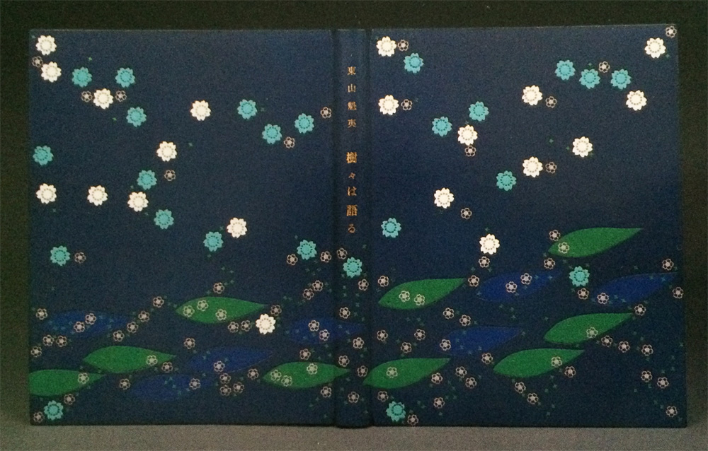
    My color choice always has to do with the content (in my mind ) colors in Scandinavia are mainly: blue, green, white, grey, violet….usually the literary themes there are not the same as in Spain for example. Colors in the North of Europe are different than those in the Mediterranean region, so are the feelings evoked by colors.

    TreeTalks7 TreeTalks1 TreeTalks4 TreeTalks3 TreeTalks6 TreeTalks5


  9. October // Bookbinder of the Month: Tini Miura

    October 1, 2015 by Erin Fletcher

    LaCreationBlue-TiniMiura

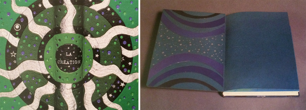
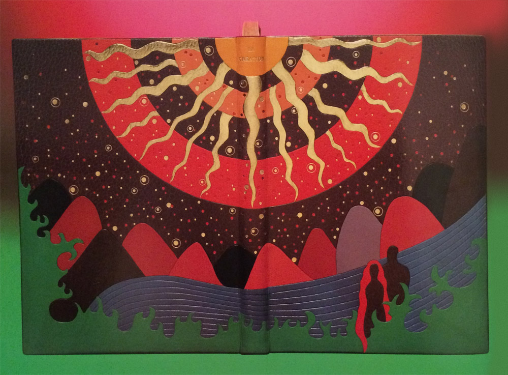
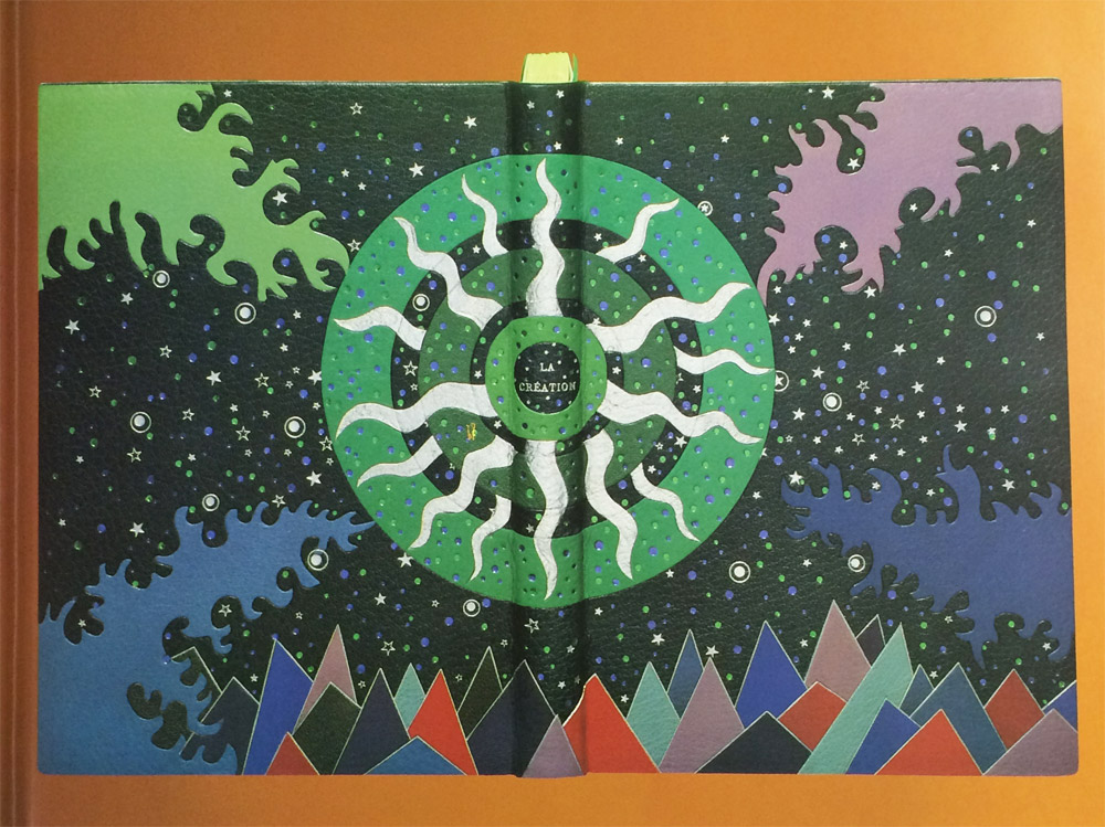
    La Création (from the Old Testament) is a two volume set and was bound two ways by Tini Miura in 1983. The book itself was published in Paris in 1928 and includes illustrations by François-Louis Schmied. The first book is bound in dark blue morocco. The explosive design was created by using a large collection of colored onlays and platinum tooling. The central design of concentric circles symbolizes the calmness amongst darkness and chaos. Click on the image below to see a detailed image of the design.

    LaCreationBlue5-TiniMiura

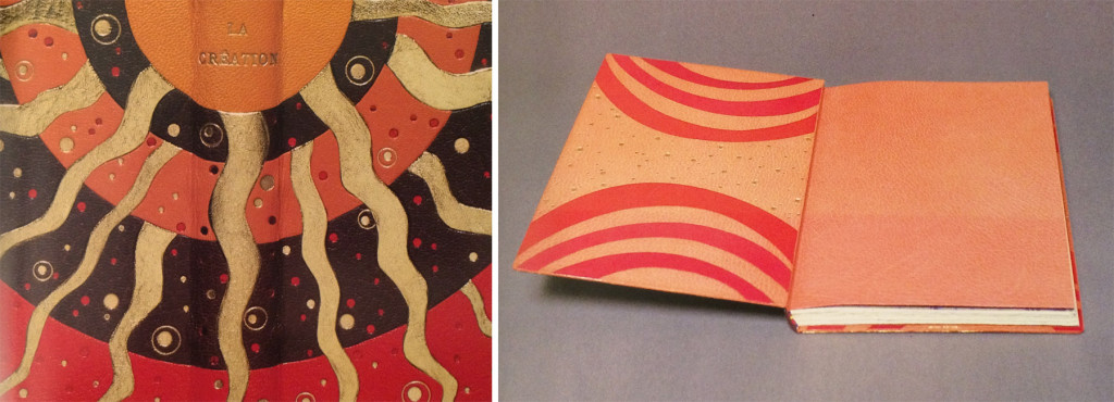
    The doublures are a pale blue morocco with cool-colored onlays and platinum tooling. The fly leaf is one of her recognizable oleaugraphs (more on that in the interview below).

    LaCreationRed-TiniMiura

    The second binding in La Création is equally expressive, but designed in a warmer palette eluding to the birth of life. This binding contains the suite of illustrations by F.L. Schmied in black and white and is bound in a wine colored morocco. An impressive collection of onlays create the pictorial design along with another explosive central design similar to the first binding. Small tooled shapes are speckled across the background and emphasized with gold and red foils.

    LaCreationRed3-TiniMiura

    The doublures are created in a similar fashion to the other binding using pink morocco and onlays in rose. The tooling is completed with gold foil.

    I think it can be tricky to create a cohesive and attractive design when adding multiple layers of color and tooled elements. Your interpretations of La Création are an example of when this design strategy is successful. When you are building designs this complex, where do you begin? Can you walk through your process for laying out your designs in leather?
    I saw the image in my mind and understood this was from the old testament: In the beginning………The word created the vibrations which are spreading throughout our universe.

    1. I begin with the idea sketch, indicate colors, shapes etc.
    2. make a scale to scale drawing, indicate numbers of lines and curves from the set of the gilding tools
    3. transfer this design onto a long fiber Japanese paper
    4. attach this Japanese paper
    5. begin the tracing using my warm tools through the paper
    6. remove the paper, begin deepen the impressions
    7. moisten parts of the leather, using a warm gilding tool “ crushing” the deep leather grain to a solid line by gradually increasing the temperature and pressure. ( to have an uninterrupted gold line all grain has to be “ crushed “ to a level where no hight differences exist.)
    8. onlay: thinly pared leather is wetted, placed over the shape it is meant for, tapped down by using a soft brush as not to tear or stretch the shape, using a warm gilding tool follow the lines, remove the leather, let dry between board, when dry, cut desired shape holding a penknife at an 45 degree angle. Roughen the form on the original leather on the book with dull side of binders knife for a better hold. Paste out the onlay, wet the roughened shape, paste onlay. down. Press under a thin Japanese paper with fingers or flat hand, pick up excess paste, trace outlines, let dry under weight.

    – – – – – – – – – – –

    Tini Miura became a household name during my time at the North Bennet Street School. Our instructor, Jeff Altepeter, was taught by her while at the American Academy of Bookbinding and so her techniques would emerge into demonstrations every once in a while. For the interview this month, I’m going to be mainly focusing on bindings from her book A Master’s Bibliophile Bindings: Tini Miura 1980 – 1990. This book was my first exposure to her work and when I first fell for her expressive and colorful designs. Tini has had a long and prolific career as a binder and teacher, so I hope you enjoy her responses on those experiences.

    Check out the interview after the jump and make sure you come back during the month of October for even more enlightening responses regarding a selection of Tini’s work. You can get email reminders by subscribing to the blog, just click here.

    read more >


  10. Bookbinder of the Month: Ben Elbel

    July 26, 2015 by Erin Fletcher

    BreakfastAtTiffanys6-BenElbel

    I am wrapping up this month’s interview with Ben Elbel by showcasing his recent binding of Breakfast at Tiffany’s. Read on to discover the technique behind the decorative covers and what secrets lay within the binding.

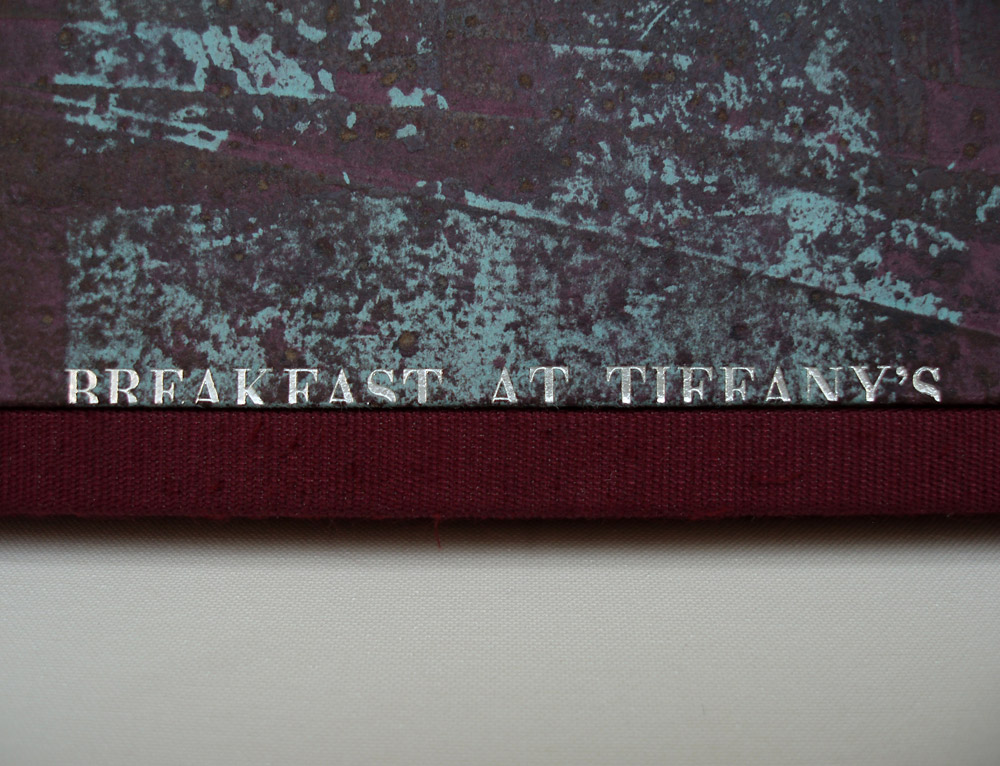
    Breakfast at Tiffany’s is covered in beautifully decorated leather, which caught me by surprise. Having only seen this binding online, my initial guess is that the boards are covered in paper. Can you describe how you manipulated the leather to achieve such a wonderful range of color and texture?
    Indeed it is leather, not paper. The technique consists essentially of glueing thin paper to suede leather and then sanding away the paper. I have never actually tried replacing leather with paper but I imagine that paper would probably tear during the process.

    BreakfastAtTiffanys4-BenElbel

    A few years back I was terrified about doing anything to a material. I used materials as they came from the suppliers and found it increasingly frustrating because bookbinding materials only come in a limited range of colours.

    I was working at Shepherds Bookbinders at the time and because we had a splitting machine there were bags full of beautiful suede that would go straight to the bin. So one evening after work I started messing around with suede, glue, leather dyes, papers, etc, having absolutely no idea what I was doing.

    There were a couple of ‘happy accidents’ and after some time, I had identified what had lead to those happy accidents and found that I had a process, so simple that I was even able to teach it. I have a nice collection of these pieces and they are a great starting point for a design binding.

    In this binding, you’ve included a hidden component. The front cover opens up to reveal two panels of text, can you elaborate on your concept for this part of the binding? Does it have a magnetic closure?
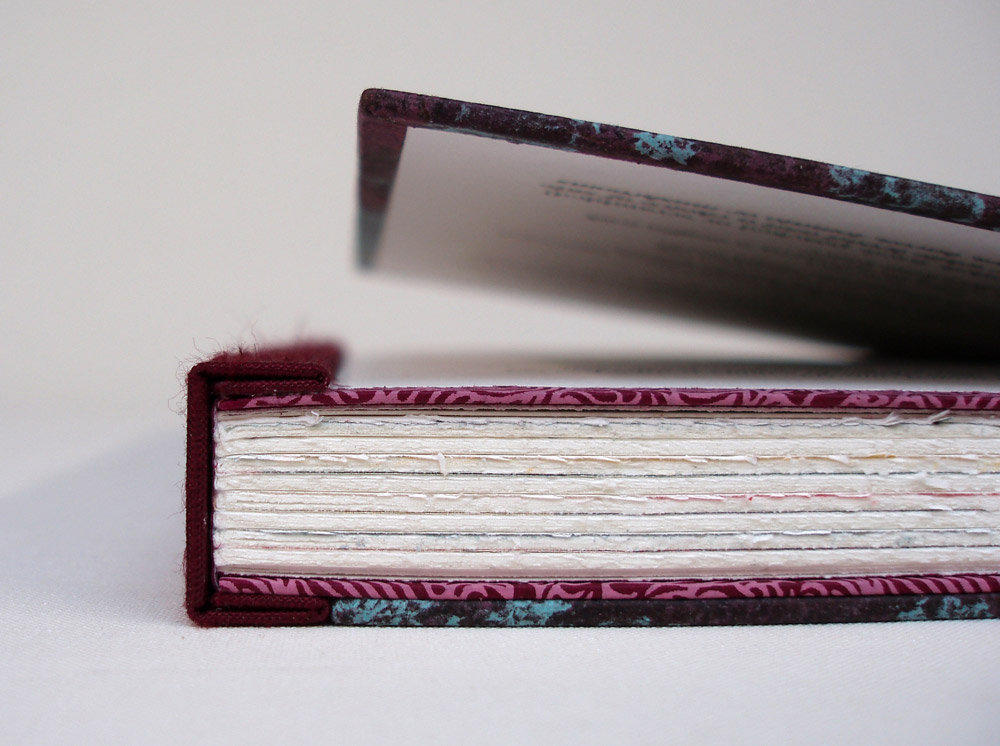
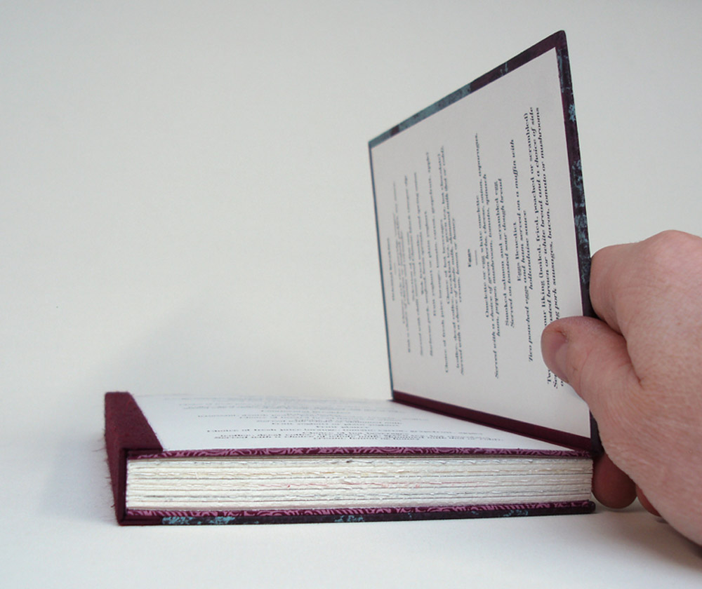
    The latest version of my dos rapporté binding has boards made of two layers, hinged at the fore-edge. The two layers are glued together with a flange from the textblock in between. The aim is to provide a very strong cover to text attachment, but of course it is very tempting to see a design opportunity; why not include something in there, and shut the boards with magnets rather than glue.

    BreakfastAtTiffanys3-BenElbel

    The opportunity came with Breakfast at Tiffany’s, the set book from Designer Bookbinders 2014 Competition. At the time we were also producing menus for a hotel in London, and this is how a breakfast menu ended up between the two layers of the front board.

    BreakfastAtTiffanys2-BenElbel


  • My name is Erin Fletcher, owner and bookbinder of Herringbone Bindery in Boston. Flash of the Hand is a space where I share my process and inspirations.
    The StudioNewsletterInstagramEmail me
  • Archives