RSS Feed

‘bookbinding’ Category

  1. My Hand // Feed Sacks: The Colourful History of a Frugal Fabric

    August 4, 2017 by Erin Fletcher

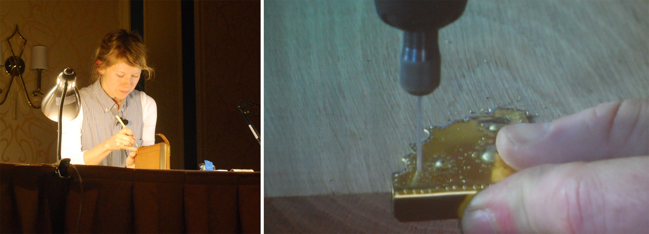
    I was recently invited, along with fourteen other talented binders, to bind a copy of Feed Sacks: The Colourful History of a Frugal Fabric by Linzee Kull McCray. This project all began when Todd Pattison, received a generous gift of unbound copies from the publisher and designer of Feed Sacks, Janine Vanpool at UPPERCASE Magazine.

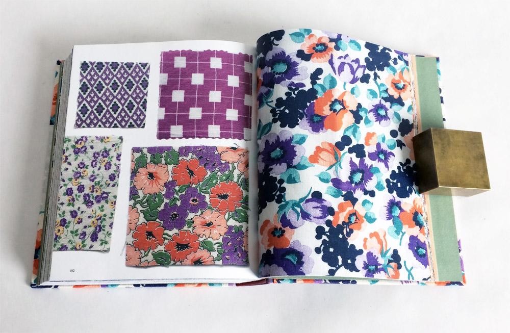
    The book offers insight into how a plain utilitarian fabric evolved into a highly sought after commodity that was soon crafted into trendy garments, homewares and toys by housewives and seamstresses. The book also contains a plethora of images, which include scans from the impressive collections of two vintage feed sack collectors.

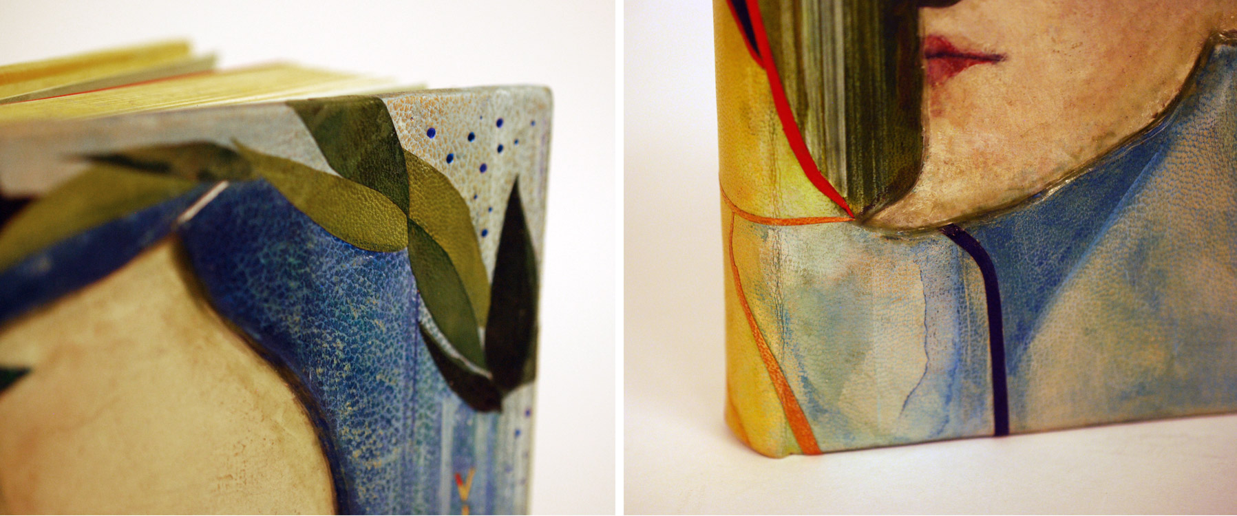
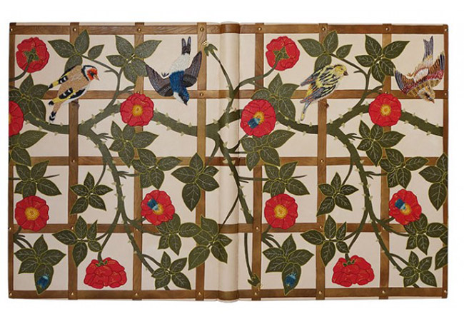
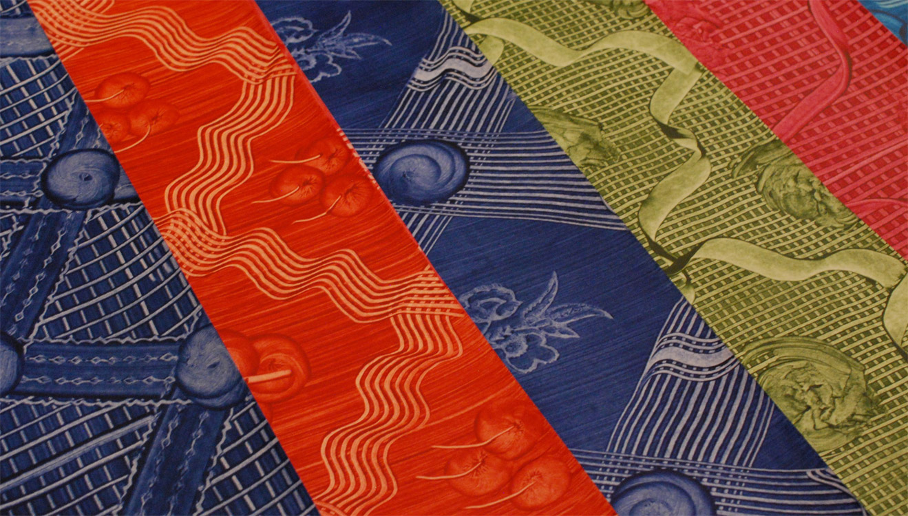
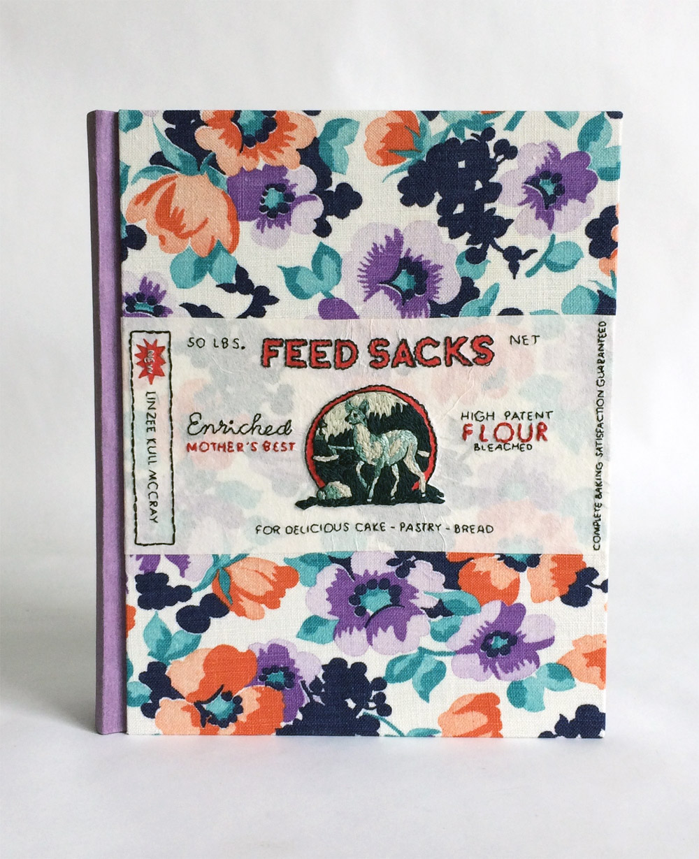
    For my binding, I wanted to incorporate an authentic feed sack fabric and I just so happen to find a pattern straight from the book.

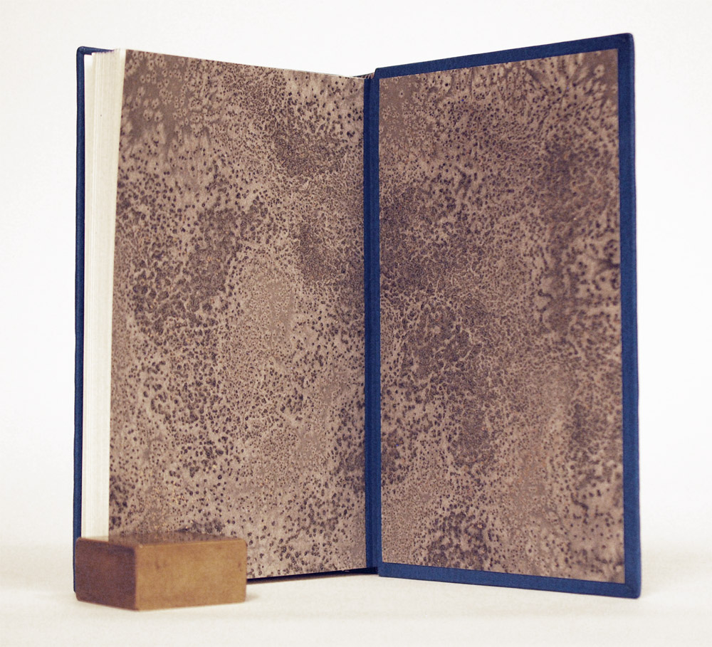
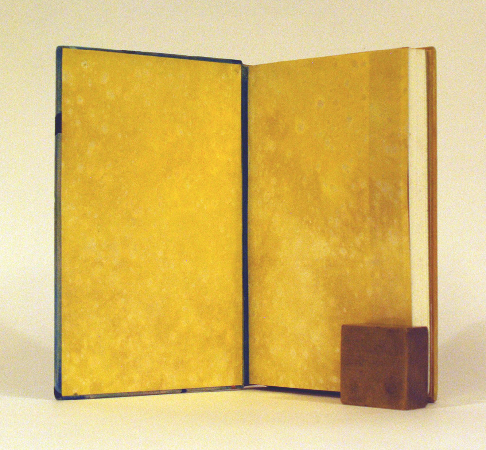
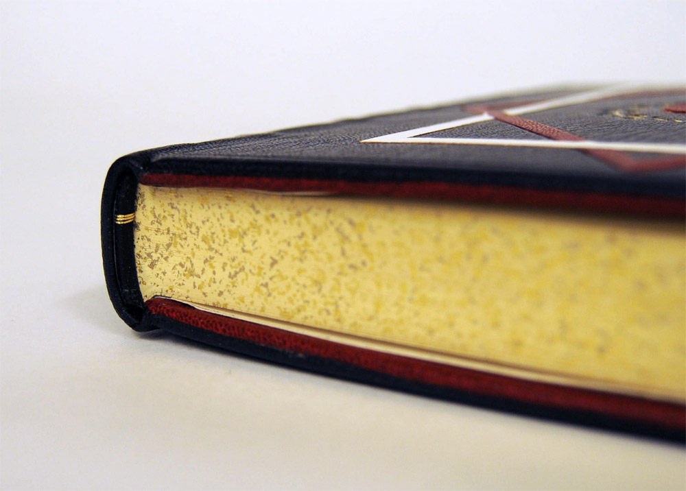
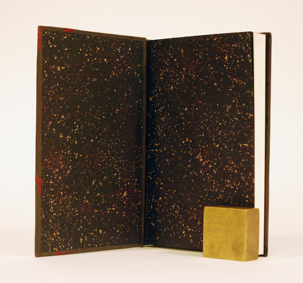
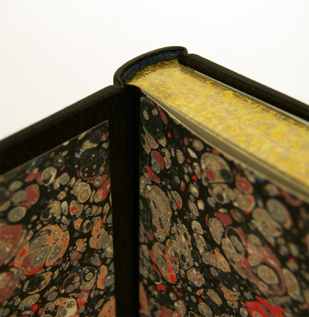
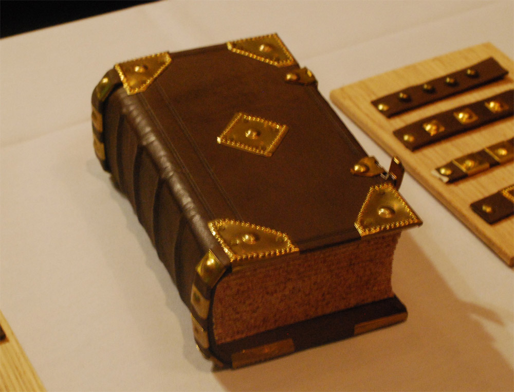
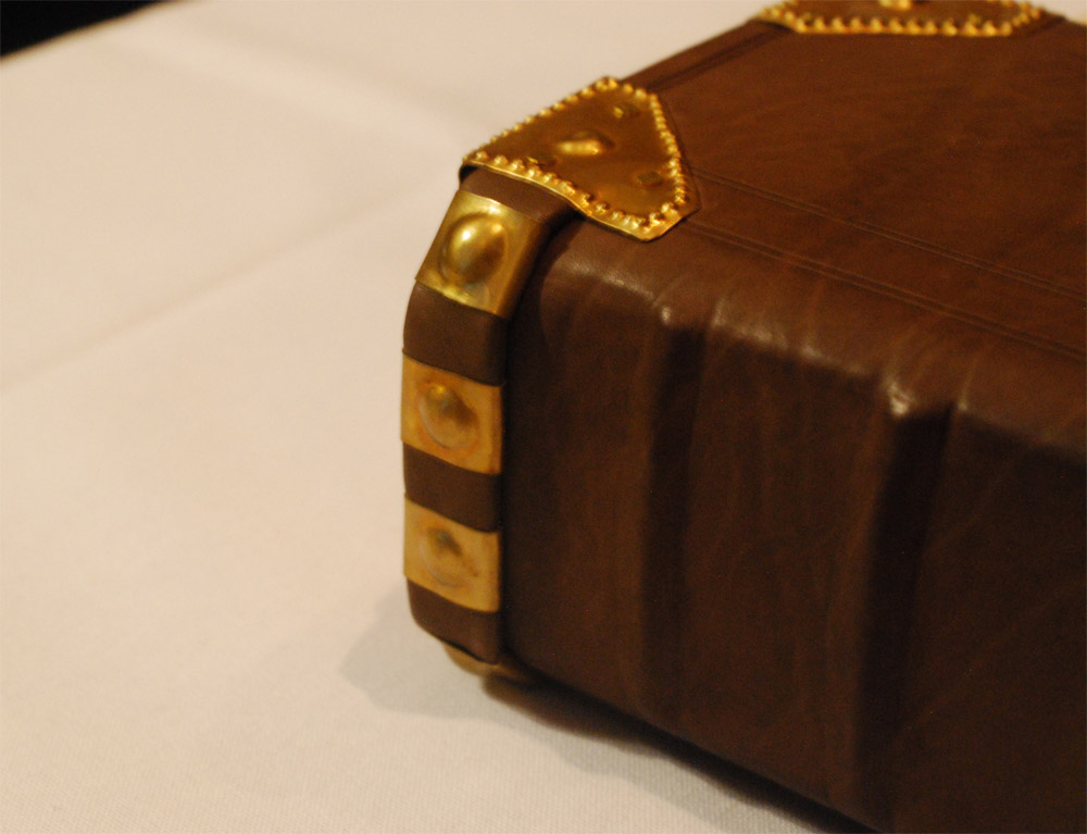
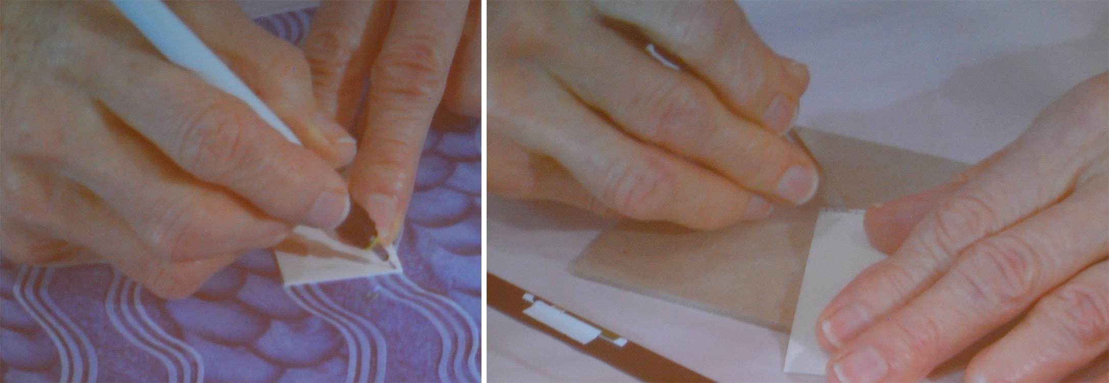
    The book itself is bound as a 3-Part Bradel binding. The spine is covered in handmade paper from Katie MacGregor. The endpapers are a combination of paper from Katie MacGregor and Hook Pottery Paper. The boards are covered in the vintage fabric and wrapped with a hand embroidered Japanese tissue. The design of the wrapper pulls elements from the labels found on feed sacks, taking cues from the language and typography used. I used Okawara tissue for the wrapper and cotton embroidery floss. The center motif was back with a piece of muslin to strengthen the area prior to stitching. The vibrant red was added with colored pencil.

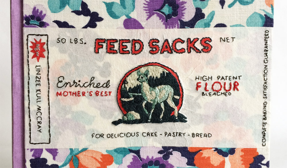
    Embroidering onto tissue was a very delicate process, but one that I had been interested in testing out for a while. In hindsight, I would have done things a bit differently. Working directly on the tissue caused warping and wrinkling, which was impossible to correct. In the future, I would attach the tissue to the covering material first, sewing through both layers.

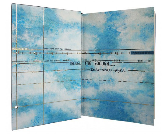
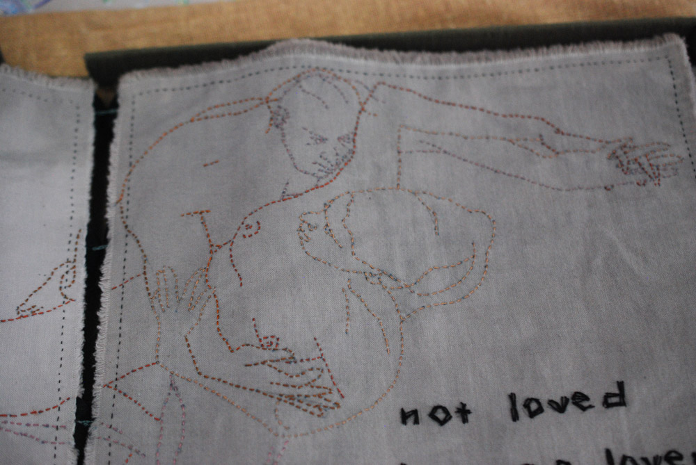
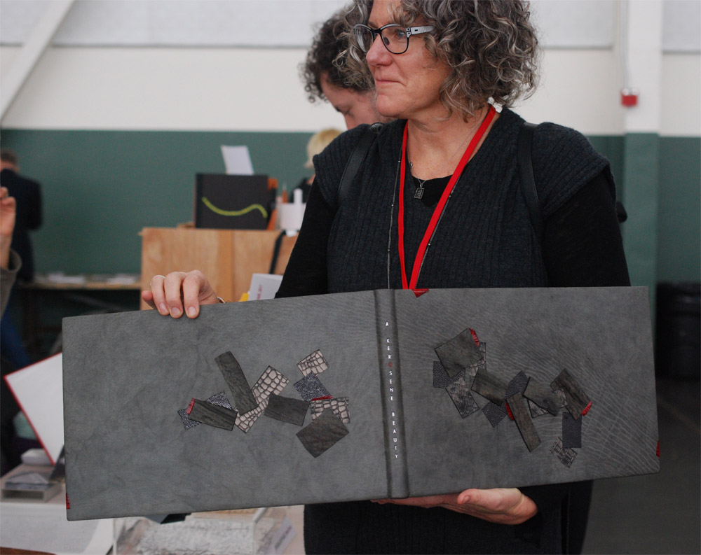
    To see more images of my binding and the other binder’s interpretations of the text, check out the online gallery here.

    SaveSave


  2. North Bennet Street School // Student & Alumni Exhibit 2017 – Alumni Work

    May 18, 2017 by Erin Fletcher

    In the second portion of my post on the Student and Alumni Exhibit at North Bennet Street School, I want to highlight some of the pieces showcasing the talents of our alumni. If you missed the post where I interviewed the graduating class on their set book, check it out here.

    I’ll start with my own bindings. This year I chose to submit two recently completed bindings. The first is a miniature binding of Bobbie Sweeney’s Rookwood printed by Mosaic Press in 1983. The text chronicles the Rookwood Pottery studio founded in 1880 by Maria Longworth Nichols who fell in love with the Arts & Crafts movement. She and her employees pioneered a variety of different pottery styles and glazes over the course of Rookwood’s existence.

    Bound in a Dorfner-style binding, the boards are covered with stone veneer with onlays of wood veneer and handmade paper. The interior side of the board is also covered in stone veneer facing a suede fly leaf. The edges have been sprinkled with purple gouache. The box is covered in dark grey buffalo skin with a back-pared onlay of light grey buffalo skin in one variation of the Rookwood insignia.

    The second binding I chose to submit was completed just last month after working on it for over a year. This fine binding of Italo Calvino’s Invisible Cities is bound in two buffalo skins, with dark grey on top and light grey on the bottom. The top is adorned with a series of onlays in green goatskin (show in both leather and suede), ruby Novasuede, stone veneer and multilayered palladium gilt pieces. The bottom half is embroidered in a matching thread in such a way that partially mimics the top portion. All of the lines on the top are palladium tooled and the bottom are blind. I was greatly inspired by all of the imagery in Calvino’s abstract telling of a conservation between Kublai Khan and Marco Polo. I will be posting on this binding further, there is so much to reveal about the edge decoration and doublures.

    Colin Urbina, BB’11
    Next up is another lovely miniature, this one was bound by Colin Urbina.

    Colin’s binding of Shaman is covered in a medium brown goatskin and adorned with onlays of stone veneer. Illustrations gleaned from the text are stamped in red foil. The head edge is sprinkled with red acrylic paint. The title is stamped in the same red foil along the spine of the book.  The box for this miniature book is quite large because it holds the book, a paper folder of loose prints and a map (displayed open). The spine of the box is covered in a tan goatskin stamped in blind with the same icons from the book.

    Samuel Feinstein, BB’12
    As always, Samuel Feinstein impresses with his incredible tooling abilities. His binding of Dante Gabriel Rossetti’s Ballads and Sonnets is covered in a bright blue goatskin and intricate gold tooling. His work is always teetering on the line of classic design and modernism.

    Gabby Cooksey, BB’14
    The Book of Penumbra comes from the very talented Gabby Cooksey. Her work is always fresh and interesting and splendidly weird. The cover stands out in a unique way against the rest of the bindings and so does the technique. Gabby arranged the illustrations from the book in a chaotic way before debossing them into the black goatskin. Contrast is created through the application of varnish on the raised areas. The text block was also illustrated and printed by Gabby, you can read more about the work here.

    Becky Koch, BB’12
    My dear friend Becky Koch submitted this delightful little binding of The Farm by Wendell Berry. I love the array of colors she used to capture such a bucolic landscape.

    The sun is beaming over the country side, literally beaming with Becky’s use surfacing gilding in gold leaf. Oh, I love that little patch of blue. Brilliantly place amongst a sea of mainly reds and browns. The title has been hand-tooled with carbon.

    Fionnuala Gerrity, BB’ 11
    Last up is Trinity is a small, but not quite miniature, laced vellum binding containing hand calligraphed pages from Maryanne Grebenstein. The transparent vellum reveals Fionnuala’s painting underneath.


  3. North Bennet Street School // Student & Alumni Exhibit 2017 – The Set Book

    May 16, 2017 by Erin Fletcher

    The end of the year is approaching at North Bennet Street School and the graduating students have just put the final touches on their design bindings. As many of my readers already know, I look forward to conducting these interviews and speaking with the students about their work every year. The exhibit will run from May 16 – 31 (click here for opening hours). If you are around the Boston area, come see the show in person to truly appreciate the craftsmanship of each binding. As the name of the exhibit implies, the pieces on display are showcasing work from both students and alumni of the school. This first post will focus on the Set Book bound be each of the seven graduating students. My next post will highlight some of my favorite alumni pieces from the show.

    Each graduating student is given a copy of the same book (referred to as the set book) and asked to create a full leather design binding. The set book for this year was La Vita Nouva by Dante Alighieri. Expressed in the medieval genre of courtly love, a combination of prose and verse, the text was originally published in 1295. It is notable for having been written in Italian, a departure from the use of Latin typical of Dante’s other works. I spoke with each binder about how the book inspired their designs and material choices. We also spoke candidly about the challenges and successes they faced while constructing their bindings.

    Before we get started I want to say how truly impressed I am with all of the students bindings. The skills and techniques presented by their work is so impressive. They should all be very proud of their work.

    Marc Hammonds

    As I mentioned above, La Vita Nouva was written in the late 13th century and Marc Hammonds found great inspiration from that time period. Particularly focusing on the visual aspects of a 13th manuscript, Marc stylized illuminated initials into modern letters and put them on the outside of the book. Bound in Russell’s Oasis navy blue for its rich color and heavy grain, Marc polished the leather before tooling. The letters are formed with gouges and lines in gold leaf with maroon goatskin onlays. The motif centered on each board harkens back to the flourishes found within illuminated initials. Also tooled in gold leaf, the design is formed with gouges, dots, a leaf and bookend by two gold tooled maroon goatskin onlays. Marc created his own finishing tool in order to match the leaf to that of historical design.

    Marc cleverly contains his design within two thoughtfully placed borders. The first can be seen in the image above as a blind tooled double line fencing in his design. The second is placed subtly along the edge of the boards anchored at the endcaps with a bold gold tooled square. You can see this in the image below along with the French double-core endbands in red and blue.

    The head edge of Marc’s binding has been rough-edge gilt. The interior is adorned with a paste down and flyleaf in German marbled paper. At the corner are three gold tooled dots. With his binding, Marc has successfully reinterpreted historical patterns and shapes into a sleek and modern design. The title is hand tooled down the spine, in a font created with the use of line tools and a few gouges. The modern sans serif font fully rounds out Marc’s design.

    After graduation Marc is planning to move back to the South in pursuit of edition work. If you have a chance to see the show in person, Marc has another beautifully tooled design binding on display. I hope he intends to continue along this line of work. He is quite skilled already in tooling and I can tell that he has an eye for great design.

    Kate Levy

    The numbers three and nine are peppered throughout La Vita Nouva. Dante uses numerology to provide proof for Beatrice’s divine qualities, sometimes stretching connections to create truths. Kate Levy chose to base her design on this descriptive language rather than the relationship it describes. Keeping to a simple and minimalistic look, Kate covered her binding in bright blue Russell’s Oasis goatskin and adorned each board with 9 parchment discs. These discs were sprinkled with a mixture of double gold, moon gold and palladium leaf.

    Through trial and error, Kate found the perfect process for creating her celestial spheres. Using a combination of white calf and grey kid parchment (the latter was hand-dyed by Kate during a workshop at Pergamena) she laminated the cut-out circles to one layer of paper prior to sprinkling. Afterward, each piece was layered to three more pieces of paper, all cut through one at a time. Kate constructed the boards with the top layer laser cut with nine holes, which allows the parchment discs to lay partially sunken.

    Building on the significance of numbers, Kate borders each cover board with three blind tooled lines. The spine is segmented by three sets of three lines equally a total of nine. The sets at the head and tail are gold tooled along with the title, which is separated by the blind tooled set of lines. The endbands are wrapped in black goatskin and taupe colored thread. The endbands are paired with a gilded edge in moon gold. The base was painted with ultramarine blue which cools the tone of the moon gold.

    The celestial feeling of Kate’s binding continues onto the inside of the binding with these incredible endpapers. Painted with sumi ink and sprinkled with salt, the crystals react and distort the pigment. The paper is also sprinkled with moon gold adding a subtle shimmer and vibrancy. Kate’s design is visually striking and quite alluring. The amount of movement she was able to create with such a simple design is quite impressive and each part of the binding is working beautifully as a whole.

    After graduation, Kate will be moving into Third Year Studio becoming one of my studio mates. I’m very much looking forward to having her vision and skill in the bindery. In addition, Kate will be working as an intern for a 1-month stint at the Francis Loeb Library at Harvard University in June. Afterward Kate will be heading to Lowell for a 10-week long project at the Northeast Region of the National Park Service, where she’ll be working with their new book conservator to set up a lab and work on items for the John Quincy Adams House and Franklin Delano Roosevelt House. You can see more of her work here.

    Rebecca Métois

    Rebecca Métois chose to embrace the sacred love described by Dante by intertwining a portrait of himself with Beatrice. Set up like a Venn diagram, Dante is portrayed on the left in yellow with Beatrice on the right in blue. Where their faces overlap the painting turns to green. A sliver of red leather acts as a division between the two characters while also framing the edge of her face.

    With a background in painting, Rebecca explored her technique on leather with the use of leather dyes and alcohol based paints. Working on a canvas of undyed Hewit goat, Rebecca put down a base coat of leather dyes. Then worked in details with the alcohol based paints or manipulated the pigments with straight alcohol to create washes or areas of erasure. The more you look at the binding the more details come to light. A laurel spray spans from Dante’s crown to Beatrice’s with an array of green leather onlays, some painted and others left untouched.

    Rebecca painted Beatrice’s face off the book on a piece of Arches Wove with gouache and ink, sealing with encaustic to protect the pigment and to evoke the quality of a classic oil painting. The painting of Beatrice’s face is set inside her hairline and Dante’s profile which were carved out of the board and shaped slightly before covering.

    Tooling through foil was used throughout the book in splashes of dots in both blue and yellow. The title is tooled through both gold and red foil. Rebecca expressed that painting on leather was rather different from painting on a traditional canvas. The image could not be built up in the same way as the leather was not as forgiving. Tooling also became more difficult on the painted surface.

    The inside is covered with handmade paper from Katherine Radcliffe chosen for its celestial quality. The head edge of the book is painted in a similar fashion with a base of yellow gouache and sprinkled with gold and palladium leaf. The endbands are French double-core with gold and light grey threads. One detail I particularly enjoyed about the interior of Rebecca’s book was her decision to color the hinge for the front of the book blue and the back of the book yellow to match the exterior.

    Rebecca will be shifting her workspace to Lowell and hopes to bring in conservation related commissions. She’ll be renting a bench from Todd Davis, a 2016 graduate from North Bennet. Rebecca will also be joining Kate at the Northeast Region of the National Park Service. Although her focus will be on conservation, she plans to continue her work with design bindings and fine tune her technique. You can check out more of her work if you visit the exhibit, her binding of To Kill a Mockingbird is equally creative and impressive. Or go online to her website.

    Natalie Naor

    This could not be a more perfect book for Natalie Naor to bind. Having studied courtly love in college and lived abroad in Florence, Natalie pulled from these experiences when designing her book. Inspired by both the architecture of Italy and the sublime love portrayed in La Vita Nouva, Natalie placed Dante and Beatrice at a distance separated by the spine of the book and by a screen of gold tooling.

    Taking cues from the text and the Italian landscape, Natalie chose a terracotta goatskin to cover the binding. Using Dante’s references to her garments, Beatrice’s silhouette is set behind the screen and made from two back-pared onlays in red and white goatskin. Dante is portrayed in a black goatskin onlay with details in the same red and white goatskin used on Beatrice. Natalie beveled the edges of the onlays at different lengths creating subtle definition and shape.

    Natalie highlights the diamonds (both large and small) on the spine with tooled onlays in red goatskin. The title and author are hand-tooled in gold leaf. Pulling from the celestial references in the text and vaulted church ceilings, Natalie painted the head edge with a mixture of navy and Prussian blue gouache then densely sprinkled with gold leaf. The endbands are wrapped with dark blue goatskin and wrapped with 9 yellow-gold threads. The paste down and endpapers are reminiscent of marbling seen in architecture. The muted tone works beautifully with Natalie’s concept and compliments her color palette.

    Natalie’s ambitions paid off as she successfully transformed her illustrative design with the use of traditional design techniques. The vibrancy and warmth of her binding certainly sets it apart from the others. Natalie’s skills and passion have landed her 6-months at the Boston Athenaeum as the Lisa Von Clemm fellow. You can keep up with Natalie’s work as she continues to hone her skills in conservation and bookbinding by checking out her website.

    Caitlin Mai O’Brien

    Caitlin Mai O’Brien found inspiration in wanting to create a design for her binding that would have been recognizable to Dante. Covered in dark brown Russell’s goatskin, the spine has false raised bands with a classic title piece tooled in gold leaf. The interlaced design on the covers are formed with a total of sixteen red and white goatskin onlays referring to Beatrice’s garments as described by Dante. The central motif is composed of a gold tooled onlay in red goatskin embraced by stylized gold tooled laurels.

    The endbands are wrapped in the same dark brown goatskin with 3 wraps of metallic thread, three being a significant number from the text. Both the board edge and head edge decoration are offering a glimpse of what will be revealed on the interior side of the covers. The edge is decorated with a base of fluid acrylic in titan buff and sprinkled with a mixture of gold and moon gold leaf.

    Caitlin decorated the fly leaves in the same manner as the head edge, sprinkling both gold and moon gold leaf on Rives paper. The edges of the board are partially covered with red goatskin onlays which span down to the inside of the board bordering a highly gilded panel of parchment.

    Caitlin chose to reference the celestial themes of the book and Dante’s reference to the number nine on the interior side of the binding. She surface gilt these panels of Pergamena calf parchment leaving two circular areas exposed. The front panel showcases a celestial map reminiscent of those from the 6th to the 13th century and highlights the significance of the number nine. Within the map, Caitlin uses a series of decorative tools to represent earth, moon, planets, stars and the outer realm where god resides. Both panels are also tooled using handle letters in two Latin phrases that bookend the text.

    Within Caitlin’s binding she pairs a lovely classic design with this luminous interior. It’s quite breathtaking when you open the book and become enveloped by the glow of gold. The texture that she created with her surfacing gilding is also gorgeous. It offers an appropriate aged look, which ties the whole design together. After graduation, Caitlin will be moving to Washington, D.C. She is currently in the process of interviewing with the Library of Congress for their General Collections.

    Rebecca Philio

    Dante yearns for Beatrice so intensely, yet he can only admire her from afar. This intense love erupts violently within Dante, leaving him alone with his thoughts of her. Pulling from such a graphic portrayal of love, Rebecca Philio created her design with an exploding heart. Building up the design on the board first, the heart is projecting from the cover as it bursts and bleeds. Rebecca covered her binding in a dark brown Russell’s goatskin and built up texture in her design with feathered onlays in two tones of red, grey and black.

    Rebecca used a mixture of acrylic and methyl cellulose to create the dripping effect. This was done on the book with the aid of a sponge and syringe for more precision. The title is hand tooled on the spine with moon gold. The feathered onlays progress to black as they move their way on to the back cover where you can find Dante tooled in a combination of carbon and foil.

    The endbands are wrapped in red leather and placed against a graphite edge with sprinkling in red acrylic. The somber color palette continues to the interior with black Ingres paper sprinkled with moon gold and red acrylic. These endpapers also connect to the celestial themes of the book.

    Rebecca’s design went through a few stages before landing on the use of feathered onlays. But this was definitely the right choice, the amount of texture and movement she created through those onlays really make her concept excel. After graduation, Rebecca will be staying in Boston for a 10-week preservation internship at the Boston Athenaeum. You can catch a glimpse of Rebecca’s work at her website. Check it out here.

    Linnea Vegh

    Linnea Vegh’s response to the text was quite different from her classmates, but she also found inspiration in the numerology presented by Dante. Looking beyond the text, Linnea researched life around the 13th century and what influenced art at the time. Combining Islamic influences, the discovery of celestial bodies and perfect geometry, Linnea formed a design representing a modern view of Dante’s objectification of Beatrice. Dante idolizes Beatrice, putting her on this divine pedestal, from this disassociation portrayed in the text Linnea reimagines Beatrice as an isohedron. The central shape is formed with several equilateral triangles, a perfect shape made from three equal sides.

    Linnea used a dark brown goatskin from Pergamena with a slight blueish tint to cover her book. The tooled onlays are a combination of dark blue Russell’s goatskin and the same dark brown Pergamena goat. The tooling around the onlays is done in moon gold, whereas the stars are tooled in moon gold, lemon gold, palladium and double gold. The subtle variations in the leaf and dot size creates a unique sparkle and movement to the background.

    The backside of the isohedron is blind tooled with an Ascona tool. Linnea presents two views of the isohedron, the front is direct and confrontational while the shape on the back is rotated slightly to distort our view. The author and title are tooled in moon gold. The text is paired with two additional tooled onlays in dark blue goat.

    The head edge is decorated with yellow ochre boule before being sprinkled with gold and moon gold. The endbands are wrapped in the same dark blue goatskin. Linnea chose a stone and stormont marbled paper as her pastedown and fly leaves, which she made during a workshop with Chena River.

    Reading La Vita Nouva with a modern lens, there are many aspects that stand out as unacceptable. Yet Linnea found a way to incorporate her response with the themes of the text into a gorgeous design. It may appear less direct, but Linnea formed a strong design that presents Dante’s work in a new light. After graduation Linnea will be spending her summer at Dartmouth College for a 2-month internship. You can follow her work on Instagram through the name runninghands.

    That brings us to the end of the interview. I have to say again how impressed I am with the finished bindings. Everyone’s personalities and interests shine through their designs. The range of work also makes a more dynamic presentation of Dante’s La Vita Nouva.

    Check out past interviews by clicking on the following years: 2016, 2015, 2014, 2013


  4. Catching Up With Hannah Brown // No. 5

    April 30, 2017 by Erin Fletcher

    For the final installment, I asked Hannah Brown about her binding of Love is Enough by William Morris. Just like The Tempest, shown in the previous post, Hannah used fair calf and an array of colored leather onlays. The design includes four beautifully embroidered birds and five beetles. At the points of intersection on the trellis, Hannah has attached twenty-eight gold plated brass pieces. Smaller details in the design have been blind and gold tooled.

    The cover design is complimented with a patterned endpaper. The book lives in a teak box with a frosted prespex lid, which allows you to view the book.

    I had the chance to see this binding in person, while visiting last year’s Antiquarian Book Fair in NYC. First I want to say that it is absolutely gorgeous and I may have stared at it for an awkward length of time. The embroidery on the birds, is some of the most detailed embroidery I’ve seen on your work. As your work evolves the embroidery is becoming more painterly and reads more traditional in style. For the final question of the month, I’d love for you to talk about how your think you’re previous work has informed the way you build a design today, particularly how you’ve grown from simple machine embroidery to complex and layered hand embroidery.
    Thank you for your comments! It was an absolutely wonderful text block to be commissioned to bind. I am starting to see my embroidery work more like “painting” with thread. Through various social media channels I am now aware of more embroidery artists who are inspiring me to develop my embroidery skills further. I love the way that colour can by built up so subtly with the threads whilst adding a pleasing texture to the surface of the leather on a binding.

    One thing that I am very careful with though is durability, books are made to be used so I have to be very mindful of this when placing my stitches. The difference between utilising embroidery techniques on bindings in comparison to general embroidery on things like wall art is that is has to be designed to be handled. I make sure I tether down my stitches as well as possible to avoid the design catching or being abraded prematurely over time and take extra care when placing stitches over the board joints.

    During my time working at the V&A Museum I had the pleasure of looking at a variety of embroidered bindings from the National Art Library’s collection (the library housed within the museum). It was wonderful to see how the stitching had held out over time, on some better than others due to the amount of handling!

    Machine embroidery has its purposes and is good for producing lines quickly but to me now looks too rigid due to the way it punches the holes in the leather and the regularity of the stitches created. I love the layers than can be built up using hand embroidery as it has far more depth and accuracy to it and following years of practice my fingers are now toughened to it. I have a feeling that binding by binding my work will continue to evolve in this way, especially as my collection of threads grows and grows in size! I have started to teach some classes in embroidery techniques for fine bindings and hope to grow on this and therefore spread my knowledge further in this field.


  5. Catching Up With Hannah Brown // No. 4

    April 23, 2017 by Erin Fletcher

    Last year, Hannah Brown created this impeccable binding of Shakespeare’s The Tempest. Bound in full leather, Hannah first dyed the fair calf in a mottled effect, which provides the perfect stormy backdrop. The rest of the design is comprised of a variety of colored onlays, silk embroidery and blind, carbon and gold tooling.

    The endpapers have a similar mottled effect as the leather cover. Yet Hannah achieved this decoration by placing the paper over  textured surface before rolling on gold letterpress ink. The book is housed in an oak box and frosted acrylic lid.
    This might be one of the most ambitious designs you’ve created thus far. First, I’d love to know how you kept track of all those little onlays as you were working.
    I worked word by word and made sure there was no draft to blow the pieces away once they had been cut out! The key to ease of cutting was to regularly change my scalpel blade. As the words got smaller and smaller they became too tricky to pierce from leather so I embroidered them instead which gave me more control.

    Many of your bindings are done in goatskin, but The Tempest is bound in a hand-dyed calfskin. Did you find the calf to be more susceptible to scuffs during the embroidery process?
    Yes, this was my first time working with calf. I bought this skin as fair calf and it was dyed in a stippled pattern which I thought might help mask any possible scuffs that would occur during the embroidery process. I always make sample boards ahead of working on a binding so I was able to test whether this was going to be an issue ahead of working on the actual covering leather. Fortunately I had no issues with scuffing of the leather and since then have gone on to bind another binding in fair calf with even less margin for error!

    I will definitely use more calf in the future as I felt the smooth nature of the surface lent itself well to being embroidered. It was tough to back-pare and work ahead of applying the embroidery but I was very pleased with the end result.


  6. Catching Up With Hannah Brown // No. 3

    April 16, 2017 by Erin Fletcher

    Hannah Brown covered this binding of David Mitchell‘s Cloud Atlas in dark blue goatskin. An embroidered outline of a world map expands across the entire binding. To create contrast between land formations and water, Hannah blinded in a short line tool in a dense sporadic pattern.

    The longitude and latitude lines are gold-tooled and cross at six points across the map. These points are marked with brass tubing, which are inset into the boards, giving the viewer a peek of the endpapers. As you open the cover, the same longitude and latitude lines appear in gold. The background is decorated with watercolor altered by salt crystals, then painted with acrylic. The book is housed in a Rosewood box with a frosted acrylic lid patterned in the same fashion as the book.

    Lately, I’ve been thinking about the many ways a book can be exhibited. If displayed fully open, the viewer has an opportunity to collect more information on the binder’s concept. However, when parts of the book are hidden from view, how does that change the viewer’s perception of the binder’s work? When I look through your portfolio it is common to see a detailed cover paired with a custom interior that plays off your design. While working on the design are you conscious of how the different planes of the binding work as individual sides and as a whole?
    Absolutely, I love the fact that there are so many dimensions to a book, with new aspects of the design revealing themselves as you open it up – it gives a lot of scope for illustrating the content. There are so many skills required to make a successful binding, it is a three dimensional object and therefore needs to be planned and executed as such. However with that I feel you need to be a master of so many trades, especially using the variety of materials that I do on one binding paired with it’s box; a designer, a printmaker, a draughtsman, a carpenter, a juggler…the list goes on!

    I always try and make my endpapers marry in some way with the book design, whether they are just a similar colour palette or perhaps directly inspired by an illustration within the cover design, I feel it is important there is some connection between them. On a number of my previous bindings I have incorporated holes cut through the boards in the cover design so part of the endpapers can be seen. This is the case with Cloud Atlas to some degree with different diameter brass rods inset into the boards through which you can see the painted cloud endpapers. Another example of this on a larger scale was on a binding I did of, William Blake’s Watercolour Designs for the Poems of Thomas Gray where a cat was illustrated on the endpapers and also, Randall Davies and His Books of Nonsense with hexagonal viewing holes.

    In terms of the actual displaying of bindings, without mirrors or walk around cabinets it is very difficult to show all aspects of the book as a whole. When I worked as mount-maker at the V&A Museum I used to make a lot of book cradles for displaying open bindings in exhibitions. I always found it incredible that the cradles had to be made not just specific to the book, but to the actual page of the book that was to be open. They were rarely able to be reused again due to the fact that the profile of the book would change if opened on a different page.

    For Cloud Atlas in particular, how does the interior design speak to the cover?
    The design of this binding I found to be very challenging as there are so many stories and themes running through the book. The novel consists of six interconnected stories, however the main characters do not directly interact with one another but their lives are infinitely connected and affected by the actions of the others. The first five stories are broken into two parts – each being interrupted or halted at a pivotal moment. After the sixth story, which is completed in one central section, the other five stories are closed, in reverse chronological order, and each ends with the main character reading or observing the chronologically previous work in the chain. The main characters are also linked in spirit through the reoccurring image of a comet-shaped birthmark which are also depicted at crossing points on the cover.

    The cover design is based on a map of the world, the points marked by the crossing of the longitude and latitude lines are placed where each of the six stories within the book are set. Each longitude line on the cover design has an additional design element running along it to tie in with the theme of the stories as follows (from top to bottom); a train track (the character travels by train between London and Hull), stylised musical notes (the character is a composer who writes “Cloud Atlas Sextet”), typewriter letters (the character is a 1970’s journalist), troughs and peaks (the character travels across seas and over mountains), quote marks in a futuristic font (the story is based in the far future) and finally the embroidered words of the very last quote of the entire book to tie it all together, “Yet what is any ocean but a multitude of drops?”.

    As well as being able to “spy” the clouds on the endpapers through the brass rods inset into the cover, I chose to also run the longitude and latitude lines through onto the endpapers and doublures and also show quotes from each of the stories on them. The atlas of clouds in the sky ties all the stories together therefore was a key part of my design choice.


  7. My Trip to Codex

    February 26, 2017 by Erin Fletcher

    At the beginning of February, I flew to San Francisco to attend the Codex Book Fair for the first time. The Codex Foundation was formed in 2005 by fine press printer, Peter Rutledge Koch and paper conservator, Susan Filter. Since 2007, the Codex Book Fair and Symposium has run biennially, growing from 120 exhibitors in its first year to 220 in 2017. The venue has also been upgraded to the Craneway Pavilion (once known as the Ford Assembly Plant) to accommodate this ever growing event. The Symposium runs in conjunction with the fair and features keynote speakers within the field of artist books.

    The fair itself runs for four days, unfortunately I only had a chance to be there for the final two days. Needless to say, there was so much to see and so many people to chat with that I was unable to make it all the way through. If you are planning to attend in the future, give yourself four full days. You’re going to need it.

    This year, Codex hosted exhibitors from 26 different countries, who were there to showcase their artist books and fine press editions. In addition, various institutions that offer courses and programs in bookbinding and book arts were displaying work from current students and alumni. A handful of vendors could be spotted amongst the tables selling beautiful handmade papers and tools, plus leather and other binding materials.

    I had a really great time and would recommend making the trip if you are at all interested in bookbinding, book arts and printmaking. It will certainly open your eyes up to the vast levels of skill and creativity amongst our field. Below are some of the highlights from my visit to Codex.

    One of the first things to catch my eye were three bindings by Jonathan Tremblay. His work is so flawless and it was great to get the chance to handle these bindings and chat with Jonathan about his work. The best part of the raised inlay shown on the binding above, is that Jonathan hand-painted the exposed suede edges in a grain-like pattern so that it would blend in seamlessly. A truly amazing detail. Jonathan’s work was on display at A. Piroir Studio-Gallery, a fine press based out of Montréal.

    This lovely cloth book bound around brown thorns and embroidered with erotic images was constructed by Lois Morrison. Her work Leah, interprets an excerpt from the Old Testament. Lois’ illustrations are so expressive, her initial sketch in light blue pencil is still visible under the stitches (a detail that I just loved).

    Coleen Curry discussed a recent binding she completed for Nawakum Press. Her work is so textural and this piece was no exception. Combining a Pergamena grey goatskin with onlays of shark and sanded alligator skin. Really beautiful work.

    The book on the left is by Rhiannon Alpers and is such a creative and lovely way of utilizing the structure of the Secret Belgian binding. She was a delight to chat with and see her work in person. The work on the right is by the phenomenal printer and book artist Karen Kunc. Karen is from my home state of Nebraska, where she runs Constellation Studios. It was great to catch some insight on how this art form is being received in the midwest, particularly in an area that lacks exposure to book arts.

    Vellicate by Karen Hardy includes human hair and this amazing translucent clamshell box. She went through the book arts and printmaking MFA Program at The University of the Arts in Philadelphia and is currently living in Asheville, North Carolina.

    A small selection from Vamp & Tramp Booksellers.

    This binding by Sol Rébora was one of many delightful finds at her table. It was so wonderful to meet Sol in person since interviewing her for the blog back in 2014. The delicate precision of her work is inspiring and Sol was kind enough to speak about the many details of her work.

    Towards the end of the final day, I made a quick stop at Tomorrow’s Past to say hello to Tracey Rowledge and Kathy Abbott. Above are two fine examples from their table. The two bindings on the right are stone veneer staple bindings bound by Sün Evrard.

    Well that’s just a small sample of the things I saw during my trip to Codex. As I mentioned before, it’s definitely worth making the trip. You’ll leave feeling inspired and emboldened to make work, plus you might walk away with an armful of goodies.


  8. A visit to the Annual UK Bookbinding Competition Exhibit

    November 14, 2016 by Erin Fletcher

    During my visit to London, I was delighted to have my trip overlap with the 2016 Annual UK Bookbinding Competition Exhibit. A collection of bindings are on display at the St. Bride Foundation and during the opening reception on November 10th, many of the exhibitors received awards for their work. The exhibit is sponsored by Designer Bookbinders and The Folio Society, who provided the set book: La Vita Nuova by Dante Alighieri. Written between 1292 and 1294 as an innovative mix of prose and poetry, La Vita Nuova is considered Dante’s fist major work. The text is an expression on the torments and joys of young love before transcending into the ether.

    In addition to the set book, many of the binders chose to submit an additional binding. If you are in the London area, the exhibit will be on view until November 24th. Check out my some of my favorite pieces from the show. I absolutely loved Ann Tout and Glenn Malkin’s books, but the bright red leather on their bindings were difficult to photograph well (on that line, please excuse any awkward reflections and glare).

    Kaitlin Barber

    vitanuova-kaitlinbarber

    Kaitlin Barber‘s interpretation of Vita Nuova extended beyond the book form with her 3-dimensional piece representing Dante’s dream of Beatrice in flames. The binding is covered with hand-dyed goatskin and decorated using the Sunago technique in gold leaf. Kaitlin’s binding won the St. Bride Foundation Prize for Finishing.

    vitanuova-kaitlinbarber2

    Kaitlin’s second submission was In Smoke: Ten Variations on Eugenio Montale by Gary Michael Dault. Kaitlin created another beautiful binding using a hand-dyed leather that creates so much movement.

    insmoke-kaitlinbarber

    The front and back boards have been debossed with leaves, with the front accented in gold leaf. The consistent themes of nature and repeated imagery of foliage and gardens within the text inspired Kaitlin’s design. The second place Clothworkers’ Prize of the Open Choice Book was awarded to Kaitlin’s second entry. I am so happy for Kaitlin, as a fellow North Bennet Street grad, it’s so great to see her skill and creativity grow. Congrats Kaitlin!

    insmoke-kaitlinbarber2


    Bec Britain

    vitanuova-becbritain

    Bec Britain created this gorgeous binding for Vita Nuova. As the exhibit pamphlet reads “the design reflects Dante’s evolving sense of the limitations of courtly love and its transition into sacred love.” The central design is created with crimson leather onlays, tooling and ink. Bec was awarded the Harmatan Ltd Leather Prize, which she completely deserves. Her combination of techniques created such a sleek and captivating design.

    vitanuova-becbritain2


    Jeanette Koch

    vitanuova-jeanettekoch

    Jeanette Koch’s binding for Vita Nuova is covered in terra-cotta and burgundy goatskin. The leather is cut-out to reveal laminated decorative paper and transparent vellum. I love the way Jeanette transformed the decorative paper in her design.

    The edges are decorated with watercolor, palladium and gold leaf. Jeanette was honored with the Lisa von Clemm Prize for this binding.

    vitanuova-jeanettekoch2

    Jeanette also submitted a binding of the late 14th-century Sir Gawain and the Green Knight, an Arthurian story on chivalric romance.

    sirgawainandthegreenknight-jeanettekoch

    This is one of my favorite bindings from the exhibit. The judges seems to agree, as Jeanette received The Judges’ Award and the Arthur Johnson Prize for this binding. Covered in green and burgundy French goatskin; Jeanette chose a beautiful green skin with stunning grain detail at the spine.

    Like Vita Nuova, this binding also has cut-outs revealing laminated decorative Japanese paper and vellum.

    sirgawainandthegreenknight-jeanettekoch2


    Kaori Maki

    vitanuova-kaorimaki

    I was so in awe of Kaori Maki‘s binding for Vita Nuova, which was bound in alum-tawed goatskin. Kaori decorated her binding with an intricate and bold floral design using back-pared, cushioned onlays dyed red. Kaori’s binding received second place for The Folio Society Prize for the Set Book, which was so well deserved, her decorative work was so unique and captivating.

    vitanuova-kaorimaki2


    Yuko Matsuno

    throughthewoods-yukomatsuno

    The most celebrated binding of the evening was crafted by Yuko Matsuno. Her binding of Through the Woods by H.E. Bates is bound in grey goatskin with decorative underlays. Ink-dotted calfskin and Zerkall paper peeks through a forest silhouette with animal onlays of colored Gampi and cushioned calfskin.

    The edges and endpapers are decorated using soft pastel to mimic the imagery from the cover. Yuko received first place for The Clothworkers’ Prize for the Open Choice Book and the ultimate prize: The Mansfield Medal for the Best Book in the Competition.

    throughthewoods-yukomatsuno2


  9. Guild of Book Workers – Standards of Excellence Seminar // Charleston 2016

    October 24, 2016 by Erin Fletcher

    After an adventuresome time in Durham, North Carolina, where I consumed delicious local brews, lost at shuffle board, ate so many southern dishes, visited Duke’s conservation lab, toured a lemur center and discovered that I’m still allergic to mosquito bites, Henry and I embarked on our drive to Charleston, South Carolina.

    Upon our arrival we were greeted by Tropical Storm Julia, but luckily the next few days proved to be quite lovely with very little rain. After checking in, I began to rummage through my conference packet and found my name tag, which was beautifully done by local calligrapher Elizabeth Porcher Jones.

    charlestonstandards15

    Day One:
    The conference began with a tour to the Charleston Library Society, an absolutely charming space that also served as the venue for the opening reception later that evening. Our tour began with Anna Smith, Special Collections Librarian, who gave us an overview the Society’s establishment and shared a few treasures from their collection. We were then led to the first floor by Kerri Harding, Director of Bindery and Conservation Studio, where she showed off their delightfully quaint bindery space. Having just relocated to Charleston, Kerri shared with us the range of her upcoming projects: a presentation leather binding, rehousing and holiday ornaments showcasing the Society’s newest titles.

    charlestonstandards1a charlestonstandards2

    Day Two:
    The first presentation of the conference was Drawn to the Writing given by calligrapher Cheryl Jacobsen. As a freelance artist living in Iowa City, Cheryl’s work ranges from design and lettering to illustrations and art. She began her presentation with her personal history on how her interest in art and lettering developed before going into a slideshow of her work. Cheryl is also an adjunct assistant professor at the University of Iowa, teaching courses at the Center for the Book. Over the course of the presentation, Cheryl created a certificate to commemorate the conference using a variety of letter forms. She spoke about line formation (this included pressure and hand position), nib use, ink/pigment preferences and tricks of the trade.

    charlestonstandards3

    At the end of presentation, the audience was rewarded with a copy of the certificate Cheryl produced during the presentation (she even offered to add your name to the certificate). We were also allowed to handle some of her artist books.

    charlestonstandards4

    For the afternoon presentation, the topic switched to bookbinding in Exploration of history and techniques for Pennsylvania German Liturgical Bookbinding before 1850. The presentation was divided into two parts: Chela Metzger, Head of Library Conservation at UCLA, demonstrated the construction of the binding and Erin Hammeke, Senior Conservator at Duke University, demonstrated the techniques used to create the bosses and clasps traditionally seen on this style of binding.

    charlestonstandards5

    Chela quickly went through the construction of the binding. The book used in the demonstration was sewn in an abbreviated pattern (usually 2-on) using thicker supports (usually two supports as one), the shoulders are quite narrow and the edges were (historically) ploughed. The wooden boards (oak or beech; usually quarter-sawn) are heavily shaped along the spine and fore edge on both sides of the board. The fore edge is also notched in preparation for the clasps. The spine is lined with linen strips that extend beyond the shoulder. Unlike most wooden board structures, the boards are not laced-in. The sewing supports are frayed and adhered to the first and last leaf, then the linen is adhered to sandwich the frayed cords. The text block edge is colored after the boards are attached, then the hand-sewn or hand-woven endbands are stuck-on.

    One of my favorite parts of the presentation was the brief demo given by Chela on the technique behind the woven endbanding material. Using a make-shift back-strap loom (popsicle crafts!), she wove a traditional white and blue endband strip. A variety of endbands have been spotted on these bindings. The image below (on the right) shows just two varieties with the hand woven style on the bottom.

    charlestonstandards6charlestonstandards7

    Chela’s portion of the presentation continued with the covering of the book and tying up the spine (this step ensures that the leather adheres to either side of the supports). The last step presented by Chela is one of the defining characteristics of this binding: the leather spine straps. Appearing on the spine at the head and tail (and sometimes the middle) many examples are seen adorned with brass studs or domes.

    charlestonstandards9 charlestonstandards8

    Using a 24-gauge brass sheet, Erin demonstrated the process for creating the corner pieces for the binding. Beginning with a flat piece of brass, Erin roughly traced out the design with a sharpie. Then she cut down the brass close to her design with metal snips; shaping it even further with needle files and emory paper. Supporting the brass with a lead block, Erin began to decorate the brass corner piece by striking the back with steel punches. This did not create a hole, rather pushed the brass into a shape that would be raised on the front side. In the image above (on the right), Erin uses a drill to create holes where the nails will be inserted when attaching the furniture to the book. After attaching this corner piece to the book, Erin began to bend the extended brass around the edge of the board with her fingers and finished its shape by striking the brass with a planishing hammer.

    Day two ended with a social gathering at a local pub for a Mentor-Mentee Happy Hour, those new to their field were encouraged to speak with the more accomplished participants. Afterward, I broke off with some friends for a very quick bite to eat before going on a Ghost and Dungeons tour through Charleston.

    Day Three:
    One the third and final day of the conference, two more presentations were given. The morning presentation was given by Betsy Palmer Eldridge on Paper Conservation Treatment Revisited. In 1989, Betsy gave a presentation at the Standards conference in Portland, this year she presented a revised version of that lecture.

    charlestonstandards10

    Betsy was introduced to book arts during her time at Wellesley College in 1957 and further advanced her training in Germany and France. In 1973, she moved to Toronto, where she established and maintained her private conservation studio. Betsy has been an active member of the Guild since 1960 and the Canadian Bookbinders and Book Artists Guild since 1983. Betsy gave an overview of a variety of conservation techniques and tricks she has picked up along the way. Many of the presentation materials she referred to were used in her original presentation 27 years ago, it was quite interesting to see how the materials had changed or retained their vibrancy over the years.

    The final presentation was on Herrnhuter Paste Paper given by Deborah Evetts. At the start of her presentation the audience received a brief history lesson paired with images of these papers collected from several sources. During the last third of the 18th century, a group of Moravian sisters living in a religious community at Herrnhut in Saxony created what came to be a very recognizable style of paste paper. The sisters traditionally used olive, bright or grayish blue, mustard yellows and reds in their papers. Deborah has seen several examples and has recreated tools to mimic the patterns seen on these historical papers. Herrnhuter Papers were used as both cover papers and endpapers on many common types of books such as ledgers and almanacs, but examples have also been found on works of literature, non-fiction and other genres.

    charlestonstandards11

    After the slideshow, Deborah moved onto discussing tools and paste preparation. She began with a quick demonstration on making your own tools such as combs, rolls and mylar templates. The first image below shows Deborah marking out a small piece of plastic and then cutting out the teeth using a sharp scalpel blade. Combs can be made from binder’s board, plastic container lids or vertical blinds. The second image below shows three different styles of paper that utilize the same decorative roll and the handmade rolls that Deborah has made. The designs were carved out of linoleum and attached to craft rollers.

    charlestonstandards13charlestonstandards12

    Over the course of the presentation, Deborah created several styles of the historical patterns seen on Herrnhuter Papers. She demystified so many patterns. One in particular that I was excited to see was the two-finger swirl. The crowd gave Deborah a round of applause after each paper blossomed before our eyes. Deborah was so delightful and high-spirited in her presentation and it was a great way to end this year’s series of presentations.

    charlestonstandards14

    At the end of the evening, we all gathered in the Colonial Ballroom at the Francis Marion Hotel for the banquet and live auction. Also during this time, two members of the Guild are rewarded with the Laura Young Award and the GBW Lifetime Achievement Award. Catherine Burkhard was awarded the former for her dedication and long-time service to the Guild. The latter was awarded to Peter Verheyen, celebrating his achievements in the fields of conservation, bookbinding, book arts and creating a thriving online community. As the night came to a close, I allowed my nose to be traced, said my goodbyes and wished everyone  safe travel back home. Looking forward to next year’s conference in Tacoma, Washington!


  10. Onward to Charleston, South Carolina

    September 10, 2016 by Erin Fletcher

    screen-shot-2016-09-10-at-9-30-16-am

    I am on my way to Charleston, South Carolina for the annual Standards of Excellence Seminar put on by the Guild of Book Workers. My trip begins in North Carolina with fellow guest bloggers, Henry Hébert and Jeanne Goodman. This will be my second trip to North Carolina and my first to South Carolina. I’m looking forward to traditional Carolina barbecue, lemurs, exploring the southern landscape and oh, yes all things books. This year I’m looking forward to touring the Charleston Library Society, the presentations (particularly the ones given by Chela Metzger & Erin Hammeke and Betsy Palmer Eldridge) and the vendor room.

    I’ll be writing a review of the seminar shortly after I return, so look for it around the end of September.


  • My name is Erin Fletcher, owner and bookbinder of Herringbone Bindery in Boston. Flash of the Hand is a space where I share my process and inspirations.
    The StudioNewsletterInstagramEmail me
  • Archives