RSS Feed

‘book artist of the month’ Category

  1. May // Book Artist of the Month: Roni Gross

    May 2, 2014 by Erin Fletcher

    Tikilluarit3-RoniGross

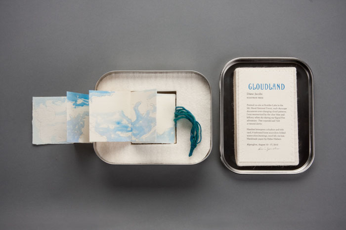
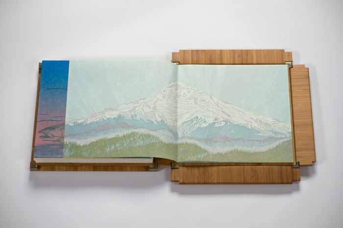
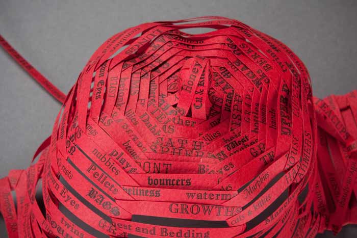
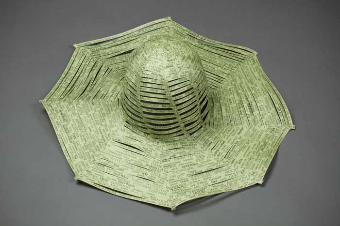
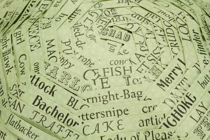
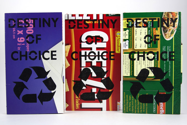
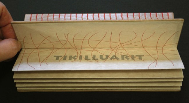
    Tikilluarit was created for the An Inventory of Al-Mutanabbi Street exhibition, which began in 2012, exhibiting nationally and internationally until 2015. The exhibition showcases a collection of artist books and broadsides that are a response to the explosion of a car bomb in Al-Mutanabbi Street, the historic center of bookselling and arts culture in Baghdad, back in March 2007. The exhibit came to Cambridge and was exhibited in three parts. Unfortunately, the session I attended did not included this particular work (I wrote a post about it).

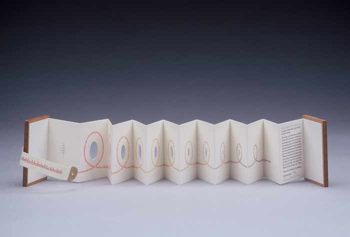
    Tikilluarit is the collaborative work of three artists. But Roni Gross is the star of this post; her concept transformed a written piece into a conceptual binding. The sonnet, which makes up the text of the book, was recast from a Greenlandic series by Nancy Campbell titled “The Hunter Teaches Me To Speak” (originally published in Modern Poetry in Translation). The word ‘tikilluarit’ means ‘welcome’ in Kalaallisut, the native language in Greenland. The sonnet is as follows:

    The hunter teaches me to speak
    I place my fingers round his neck and feel
    his gorge rise – or is he swallowing
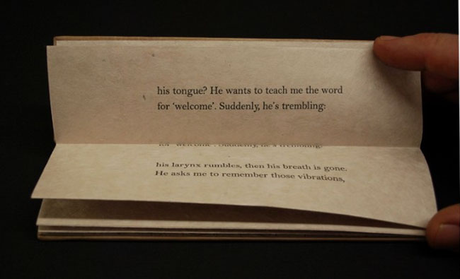
    his tongue? He wants to teach me the word
    for ‘welcome’. Suddenly, he’s trembling:
    his larynx rumbles, then his breath is gone.
    He asks me to remember those vibrations,
    and, anxious as a nurse who takes a pulse,
    touches my throat to judge its contortions.
    Will I ever learn these soft uvulars?
    I’m so eager, I forget that the stress
    always falls on the second syllable.
    My echo of his welcome is grotesque.
    He laughs, an exorcism of guillemets,
    dark flocks of sound I’ll never net, or say.

    Tikilluarit1-RoniGrossTikilluarit2-RoniGross

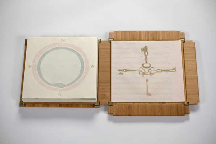
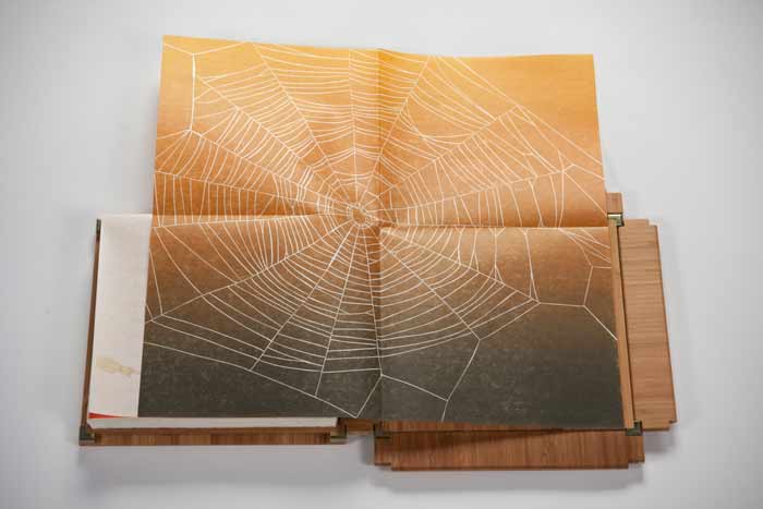
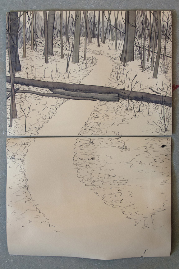
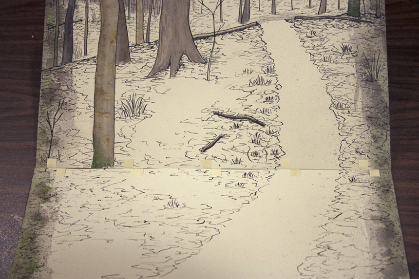
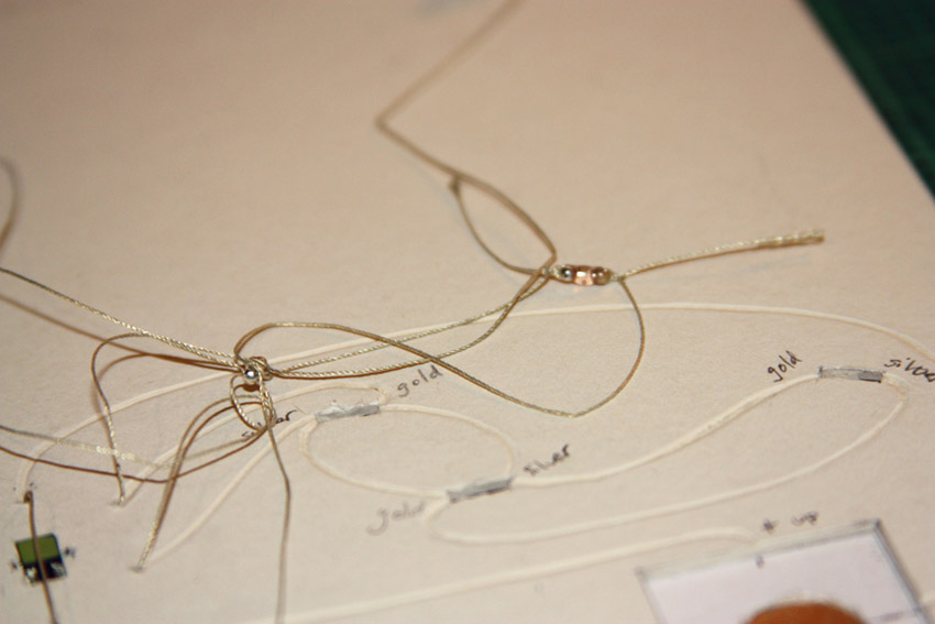
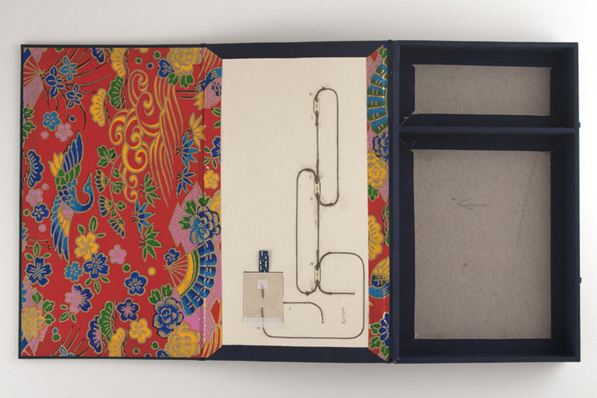
    The modified accordion binding was executed by Biruta Auna using calfskin while Roni designed and letterpress printed the text on Mitsumata paper.

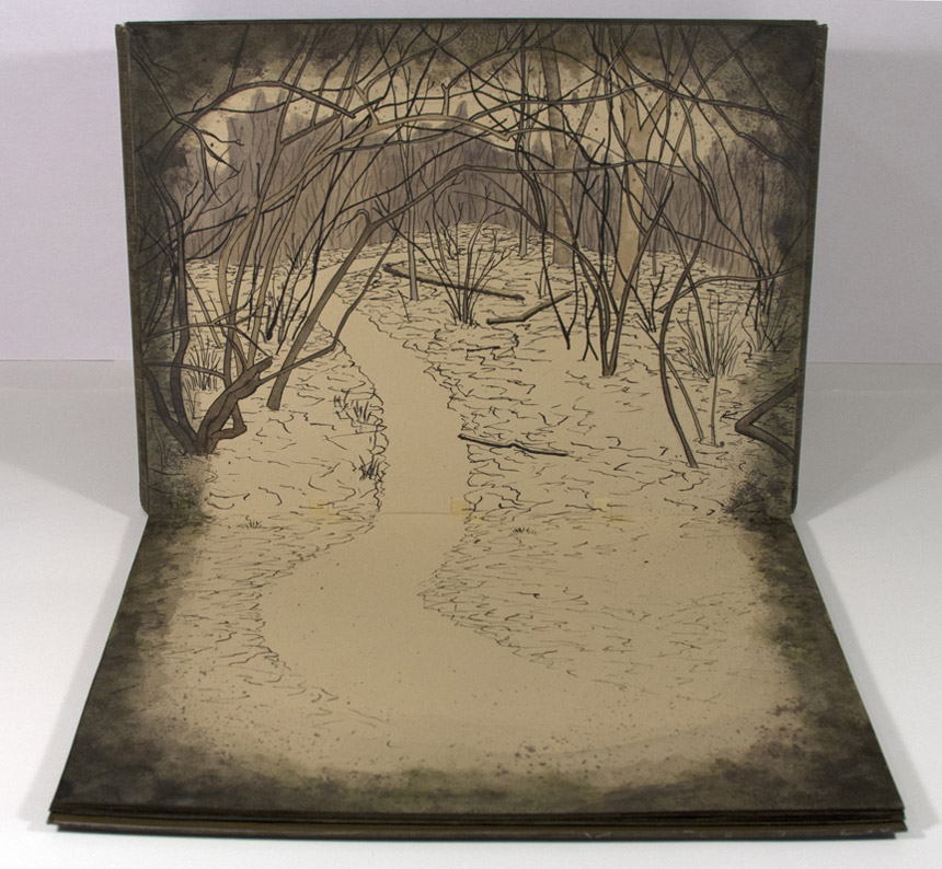
    Tikilluarit is bound in such a way that offers little access to the interior parts of the book. How does the text and binding correlate to one another?
    The poem speaks about a person trying to mimic the sound of a word spoken by another person by placing a hand around the throat of the speaker. The spine side of the book was made to be as visually important as the text block, which serves in effect, as the throat of the book. The text moves up and into the spine as if going down the throat. The exposed sewing is similar to the anatomy of the vocal cords.

    Tikilluarit4-RoniGross

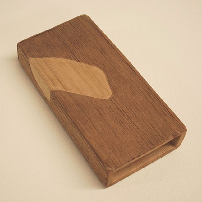
    The fourth collaborator is Peter Schell who crafted the unique sound sculpture that is paired with the deluxe edition of the book. In addition the deluxe edition includes a waxed linen wrap to house both the book and sound sculpture.

    Paired with the book is a wooden sound sculpture that can be activated by shaking it. What does the element of sound bring to the experience of this piece?
    The speaker in the poem says of the difficulty in learning to the language…”dark sounds that I will never net or say”. The wooden sculpture has an abstract wing pattern on the outside, which refers to an arctic bird which make a tinkling sound as its wings beat across the water. A sound that the human voice would not be able to replicate. It is another way of amplifying the words so that you can experience the poem in a physical way.

    – – – – – – – – – – – – – –

    I went into this interview not knowing very much about Roni, her history, her work or her artistic outlook. Through the interview, I hope you come to realize what I have: that Roni has a great appreciation for her artistic community and brings together unique artists in collaboration to expand on the concept of the book by conjuring up the senses. Enjoy the interview after the jump and sign up to receive email notifications so you don’t miss a post throughout the month of May which will feature more of Roni’s work.

    read more >


  2. Book Artist of the Month: Diane Jacobs

    February 24, 2014 by Erin Fletcher

    Cloudland1-DianeJacobs

    Housed inside this tin box is the miniature artist book Cloudland. Painted on site in the Mt. Hood National Forest, Diane Jacobs captures the altering cloud patterns viewed across the sky with the use of watercolor and slight burning of the paper. The eight accordions inside the tin fold out to 18″ long by 2.5″ tall.

    Cloudland2-DianeJacobs Cloudland3-DianeJacobs

    I was particularly drawn to this artist book due to my fondness for clouds and the gorgeous typeface you used for the title page. The cloud formations were painted on site at Boulder Lake in the Mt. Hood National Park, was this outing planned or were you unexpectedly struck by inspiration?
    I painted all the accordion folios on site. I had an idea to do a book about clouds before going on the Alpenglow backpacking trip with Signal Fire. The first part of the trip was backpacking then we could retrieve art supplies for the remaing 3 days where we were stationed at Boulder Lake. While planning for the trip I folded up some paper trimmings to take with me. For CLOUDLAND I used handmade cotton paper scraps from Helen Hiebert.


  3. Book Artist of the Month: Diane Jacobs

    February 17, 2014 by Erin Fletcher

    Nourish1-DianeJacobs

    Housed in an elegantly crafted bamboo box are a series of prints under the title Nourish. This unique artist book was created by book artist Diane Jacobs in 2012. The book explores both the natural and man-made systems in which we as humans depend on in our daily lives. As you advance through the book, these complex systems are displayed within a delicate balance of beauty and harshness. 

    Nourish5-DianeJacobs Nourish2-DianeJacobs Nourish3-DianeJacobs Nourish4-DianeJacobs

    This is such a beautiful artist book and is quite complex with the range of materials. The illustrations are so delicately printed; I especially love the ghost image on the reverse. The structure is so flawless, can you talk about the choices you made for how the prints would be housed and read?
    My goals were to investigate color, play with the transparency of gorgeous Gampi paper, wow the viewer with complex reduction prints, and engage with the viewer to ask questions and think more deeply about the interconnectedness of all living things and the state of the environment. At first I thought the book would be bound but soon realized it needed to be free and every folio needed to be opened twice (or four times in the case of the starling murmuration). I wanted the box to collapse and this took a lot of ingenuity by Mark Burdon. The clincher was relinquishing the idea of purchasing a prefab hinge. Once we realized we had to design it, it came more quickly.

    Watch the video below to see how the book unfolds.


  4. Book Artist of the Month: Diane Jacobs

    February 10, 2014 by Erin Fletcher

    WovenUndergarments-DianeJacobs

    Over a three year period, Diane Jacobs, compiled a list of slang and derogatory words used to exploit women. Sources for this list came from friends, family, strangers and several slang dictionaries. The words were set individually out of type and letterpress printed. These printed strips were then used to weave women’s undergarments and hats offering references to women’s craft, the body and our misogynist culture. 

    WovenUndergarments2-DianeJacobs

    This work has been exhibited at the Gallery Paule Anglim in San Francisco and the Hoffman Gallery at Oregon College of Art & Craft.

    WovenUndergarments3-DianeJacobs WovenUndergarments4-DianeJacobs

    I think it’s important to distinguish that a word can be ingested as either derogatory or empowering based on the context of the situation. I think your Woven Paper Undergarment series is teetering towards empowerment; allowing the woman to be in control and wear these words with confidence and pride. Can you talk about your overall concept behind this work?
    I am really glad you feel that way. I started this body of work after an experience I had in a Bart station in San Francisco right after being at a Gorilla Girls event. A man asked me for a quarter and I gave it to him. He said “thanks honey” and I said “ don’t call me honey” and he flew out of control calling me every name in the book. After that I picked up a dictionary on slang and derogatory words. I painstakingly hand-set many many words for this body of work. The words lost their negative power and I reclaimed them.


  5. Book Artist of the Month: Diane Jacobs

    February 3, 2014 by Erin Fletcher

    TheBlackHole-DianeJacobs

    The Black Hole is an intimate miniature accordion that explores the personal issues one may feel about body hair and so of, course it includes a surprise hairball at the end. The accordion can be read on either side and is letterpress printed with wooden covers and a parchment strap. This artist book was created in an edition of 45 by Diane Jacobs back in 2003. 

    TheBlackHole2-DianeJacobs

    In your work, you demonstrate the versatility of hair as a medium by forming hairballs, felted shapes and using full locks of hair to loose strands. Do you enjoy manipulating hair one way more than another?
    I love to roll my own hair into balls. It is very easy because of it being curly and relatively fine. But I discovered that I can pretty much roll anyone’s hair into a ball. I like comparing different hair color and texture in the ball form. I like the association of a hairball being something else when put in a different context such as the hairballs in the gum ball machine. I also enjoy weaving hair in the combs to spell out words.

    HairChart-DianeJacobs Tails-DianeJacobs Combs-DianeJacobs

    I noticed you only use hair with natural color. Do you avoid artificially colored hair for a reason?
    I am sure some of the hair I use is dyed. Personally I have always liked the natural  color of someone’s hair. I have used a bit of blue hair but that has been the only really artificially colored hair I have in my massive collection.


  6. February // Book Artist of the Month: Diane Jacobs

    February 2, 2014 by Erin Fletcher

    HairTalk3-DianeJacobs

    Hair Talk is a three volume artist book set that was created by Diane Jacobs over the course of three years from 2009 to 2011. The structure is inspired from a binding by Roberta Lavadour, except in this case, Diane binds the series in human hair. The content within each book are the collected replies to a set of questions, where an individual wrote about their feelings regarding their own hair. 

    The books are letterpress printed and bound with covers made from Cave Paper. 

    HairTalk2-DianeJacobs

    When binding this book with human hair, did you find the material to be tricky to work with or did you treat the hair first (like a bookbinder would wax their thread)?
    I learned this binding from Roberta Lavadour. It is a twine binding technique that she invented. Instead of twine I used human hair and transparent thread that resembles hair. Each folio is a set of four questions, so in order for that particular person’s responses to stay together I needed to sew each folio individually into the spine. With Roberta’s book, she would sew a thick signature with each twine line. I did not treat the hair with anything. It was a little tricky, but do able.

    The way a person chooses to wear and style their hair can suggest a lot about them, whether these connotations be positive or negative. What did you hope to extract from this survey and what did you find to be surprising?
    I was surprised that more people did not want to trade their hair in for different hair. The majority of people wanted to keep their hair. My questions were not about style (that would have been interesting) they were:            
    Question 1: Describe your hair (color, texture, body, length…)
    Question 2: What don’t you like about your hair?
    Question 3: What do you like about your hair?
    Question 4: Would you trade your hair in for different hair? If so, what would it be?

    HairTalk4-DianeJacobs HairTalk5-DianeJacobsHairTalk-DianeJacobs

    Diane’s work is intriguing and thought provoking. She is driven by the language that inhabits issues surrounding women, racism, equality and other social issues. Her work spans over several mediums from artist books and sculptures to prints and two-dimensional pieces. This month long interview will cover some of Diane’s artist books plus a few additional pieces I found to be relevant to my set of questions. 

    See the interview after the jump and come back each Monday during the month of February for more posts on the work of Diane Jacobs. She discusses her materials and inspirations sources such as feminism and nature. 

    read more >


  7. Book Artist of the Month: Mary Uthuppuru

    January 27, 2014 by Erin Fletcher

    UndefinedLines4-MaryUthuppuru

    In 2012, Mary Uthuppuru created Undefined Lines. This unique artist book is designed with a cover that converts into an easel, making the image heavy content read as a guided tour along a trail commonly traveled by Mary. Using ink and watercolors to layout each scene on Rives BFK, the pages have a very soft, nostalgic feeling.

    UndefinedLines2-MaryUthuppuruUndefinedLines3-MaryUthuppuruUndefinedLines-MaryUthuppuru

    Undefined Lines is a really unique structure. The binding acts as an easel to direct the point of view of the imagery. Where did your inspiration come from for this structure?
    I chose to depict a hike I take every morning in a forest near my house. It is there that I sort out the agenda for the day, contemplate what might be on my mind or just clear my head. Being a little reserved with letting imagery be the message in my books, I decided that this book would be centered on large ink drawings with watercolors.

    This structure was a complete response to the content. In an unusual way, unusual to me, I created the pages of the book before considering how it would come together in the binding. As I finished the image panels, it occurred to me that I did two things: I created single sheets that then needed to be bound, and the image format begged for each page to be upright when viewed.

    UndefinedLines-inprocess-MaryUthuppuru

    So I leaved through all of the books about artist books I could find, hoping something would trigger an idea for my unique situation. First, I stumbled upon one of Claire Van Vliet’s bindings and I remembered the quilted books for which I first came to know her. The Lilly Library has a copy of her book Woven and Interlocking Book Structures from the Janus so I paid a visit and found a binding style that worked for my pages. The woven paper allowed me to bind the single sheets in an elegant and mostly hidden way. Another inspiration for the binding came from Susan Skarsgard, from whom I took a class at the Paper and Book Intensive in 2011. She showed us a non-adhesive structure that allowed the spine piece to slide into the cover to allow for the pages to open completely flat, something I found out I needed once I decided on the cover format.

    UndefinedLines-inprocess2-MaryUthuppuru

    Woven binding detail.

    Next, was to find a way to get the pages upright. I wanted the viewer to have the experience that they were walking through the forest with me. With the images as large as they are, I thought this would be possible especially if I could get the pages to turn towards the viewer. As each page is turned down, the viewer would find themselves in a new scene. I looked for inspiration in objects that are propped up for use that already exist like iPad cases and art easels. I made a few mock ups, but none of those things would work without making the book look clunky. Remembering that the box itself could act as the “easel”, I found the simplest ways possible to prop up the book. Having the box act as the cover in the form of a multi-flap portfolio was a good solution not only can all of the flaps be folded back for my purposes, but it also had a good-for-travel sort of feel. Once all the flaps are closed, it is self-contained.

    UndefinedLines5-MaryUthuppuru

    Last week you discussed your use of painted tissue for the cover of Fantasy & Nonsense. For Undefined Lines, Interpreter of Maladies and other works you’ve used paste cloth. Can you talk about your process for creating paste cloth?
    I first learned about paste cloth at my first Standards in 2008 in Toronto. Martha Cole demonstrated her beautiful technique of creating and using paste cloth for books as well as textile pieces. She even provided everyone with her recipes. I don’t use her recipe but I make a very simple recipe for mine which is just paste cooked as though you are using it for repair work, strained and thinned to the desired consistency, then divide the paste to be mixed with Golden acrylic paints. For the cloth, I use undyed natural cotton or linen…usually cotton since it has a consistent texture and tight weave that provides a nice smooth surface for combing if desired. All of my paste work with paste cloth is done on Mylar taped to a hard surface for drying.

    PasteCloth-MaryUthuppuru

    The cloth is sprayed with water and spread flat on the Mylar. At this stage, I make sure the fabric is laying evenly and the threads are not warped or distorted. The cloth is then pasted out with clear paste until the whole piece is evenly coated. Using your hands or a long ruler, turn the pasted cloth over onto the same piece of Mylar and smooth out gently with your hands getting rid of any air bubbles. At this point, you have to start making design decisions. If you plan on combing or drawing through the paste, then you need to decide if you will allow the color of the cloth to come through, by applying a layer of clear paste first, or if you want to build different colors on top of one another, in which case you just start your painting. If you are merely painting a design with the paste/paint mixture, you are ready to begin. Paste cloth lends itself to building rich designs by layering different colors or patterns on top of one another which is really fun to play with depending on the book’s subject matter.

    – – – – – – – – – – –

    Thanks Mary for a wonderful interview. It was great of you to share some of your techniques and creative processes.

    – – – – – – – – – – –

    UPDATE: Check out this wonderful review on Undefined Lines over at the Abecedarian Gallery Blog. The post includes a great slideshow of each page of the book!


  8. Book Artist of the Month: Mary Uthuppuru

    January 20, 2014 by Erin Fletcher

    FantasyAndNonsense-MaryUthuppuruIn 2012, the Rocky Mountain Chapter of the Guild of Book Workers held an juried exhibit of design bindings based on a book of James Whitcomb Riley poetry called Fantasy & Nonsense. The text block was beautifully letterpress printed by Tryst Press and includes wonderful and whimsical wood engravings by Berrot Hubrecht. 

    Mary Uthuppuru’s binding of Fantasy & Nonsense is covered in a thin hand-painted tissue, which allows the scattered LED lights embedded in the covers to shine through. These lights glow at alternating intervals and represent the goblin’s “green glass eyes” as described in the poem Nine Little Goblins. The book is housed in a cloth covered clamshell box, which contains a compartment holding three spare batteries. Watch the video below to see the LED lights in action.

    The exhibition was held in conjunction with the 2012 Standards of Excellence conference in Salt Lake City, Utah. At the time the books were on display at the University of Utah’s J. Willard Marriott Library, where Mary’s binding was awarded second place. 

    There are so many creative elements in this binding and so many design questions I have for you. Can you talk about your process for creating the painterly look of the cover?
    While I usually use paste cloth (Mary will discuss her paste cloth technique in next week’s post) when I want total control over cover design for my bindings, this book had unusual needs. Paste cloth, while thin, would not allow me the translucency that I needed for the LED lights. Not only did I need the cover material to allow light through, but I needed it to look like the surrounding material when the light was off. For this reason, I turned to Japanese tissue mounted to cotton. The tissue could be painted exactly how I wanted, and in the areas where the LEDs would be placed, I could thin it even more. This way, when everything was painted, it would blend in, but when the lights were on, it would have the effect I wanted.

    The steps for getting from plans to the final book are as follows: create the cover design on a piece of paper to scale, plan the circuitry and light placement, bind the book, add circuitry, work on the cover material. (You’ll find some in-progress images below: layout of design and circuitry, layout of circuitry on front cover boards and detail of wiring.)

    FantasyAndNonsense_process1-MaryUthuppuruFantasyAndNonsense_process2-MaryUthuppuru FantasyAndNonsense_process3-MaryUthuppuru

    The general design for the cover was painted on the tissue, predominately the midnight blue background and the trees. Next, the dry painted tissue was mounted to the cloth with PVA/Klucel G mixture. Once dry, the material was lined up with the paper design and holes were punched where the eyes in the design were to be. I then toned a thinner tissue to match the surrounding areas and put that in place. Finally, the painted design was completed and attached to the book being careful to line up the eyes over the LEDs.

    FantasyAndNonsense_process5-MaryUthuppuru

    Back of covering material and back cover of binding.FantasyAndNonsense_process6-MaryUthuppuruCovering material and front cover of binding.

    Your use of soft circuitry is very exciting and I’m looking forward to seeing how your work progresses with this technique. When did you first experiment with combining this technology with your bookbinding work? What challenges have you experienced? 
    I first started using the soft circuitry when Leah Buechley came from MIT to Indiana University to give a lecture and workshop about the promotion of these materials. I lucked out because my friend was helping put the workshop together and was able to get me a seat. During the workshop, we each created our own soft circuit using conductive thread, a battery and an LED light. The workshop was given in hopes of putting this technology in the hands of people, specifically educators, who make things and have the potential to distribute these skills to kids, especially girls. During the lecture, Leah explained these goals further and showed some amazing applications of the circuitry.

    After this exposure to the potential uses, I was really interested to try the technology in books too, but I wanted to wait until it actually fit the project at hand. It is easy to be excited about a technique or tool and use it just because you are excited about it. It is especially the case with lights and circuitry. It is my feeling that once you add lights to something, that you are trying to draw attention or add extra glitz. I wanted to be careful to reserve this eye catching element for a purpose, not just an adornment. It was this project that was perfect for the lights.

    The challenge comes when you try to figure out how to hide all the electronic components that, while small, are tricky to keep from distracting from the overall design. I wanted to avoid sacrificing my aesthetic to allow the new components, so it can be tricky. With Fantasy & Nonsense, the biggest challenge was hiding the LEDs under the book cloth and trying to figure out how to wrap the conductive threads around the spine.

    CircuitryBox-MaryUthuppuru

    It also required some additional education on my part since the lights are timed with a microcontroller that had to be programmed. I applied these similar techniques to a box I made and donated to the Guild of Book Workers Standards of Excellence auction. The box has a moon (which is also a button) that when pressed, lights up three lanterns. It was built so that when the lid is lifted, there is a panel that folds out and reveals the circuitry. Also included were supplies for a small project and a tutorial for how to put something like that together. (All of this is available for download on my website.)

    CircuitryBox3-MaryUthuppuru


  9. Book Artist of the Month: Mary Uthuppuru

    January 13, 2014 by Erin Fletcher

    InterpreterOfMaladies5-MaryUthuppuru

    Mary Uthuppuru received ‘Best Binding’ for her work based on Interpreter of Maladies. This award was given at the opening reception for the second edition of One Book, Many Interpretations exhibition at the Chicago Public Library in 2011. A total of ten titles were chosen by the CPL, a handful of bindings were created for each title and the award for ‘Best Binding’ was awarded to one binding for each title. 

    Housed in a beautifully shaped slipcase are nine individual books. Each book is bound in the Bradel binding style with handmade paste cloth. Details explained below are hand stenciled. Titles are stamped in gold. 

    This piece is so complex; you divided Interpreter of Maladies into nine books, which can be arranged two different ways to create either a map of India or the United States. I’ve never read these short stories by Jhumpa Lahiri, what inspiration did you find within the text to execute the binding in this manner? 
    This was my first competition binding and it was a perfect book for me because I have an intimate look into the content of Lahiri’s subject matter. Interpreter of Maladies is a compilation of nine stories featuring Indian people both in India and the United States as they deal with cross cultural issues and in some cases, the westernization of India. While the stories are about a specific culture, Lahiri writes them in such a way that they speak to a more universal experience.

    My husband is the son of an Indian father and a Japanese mother who moved to the United States for college in the 1960s. They moved here at a time when communication and travel is nothing like it is today. Letters were written and silences between phone calls were very long if at all possible. My first memories of visiting them were the numerous maps throughout the house. After a while it became clear that when you move to a new country with your family on the other side of the world, especially at the time that they did, there is comfort in looking at a map and seeing the two places a little closer together. It is this element that helped me tie the content of Interpreter with what became familiar to me.

    Since the stories take place in India and the United States I wanted both maps to be a part of the design. However, I didn’t want to overload the books with too many design features. Having the maps only appear one at a time as simple line drawings inset in the cover was the perfect solution. Additionally, I wanted the ability to create an intense color similar to marigolds, a flower present in various aspects of Indian culture, so I created paste cloth for my cover material. This also allowed me to easily stencil guides for arranging the maps into both configurations without which would make it nearly impossible for the viewer to figure out their order.

    InterpreterOfMaladies-process2-MaryUthuppuru

    Stencils used to create guides to help in arranging maps.

    This shuffling of book covers and rearranging them to create the two countries helped reinforced the difficulty of the themes in the book: life is a challenge, and when you move to a new place or what once was familiar changes, you have to make adjustments…and it can be difficult.

    – – – – – – – – – – –

    Below are images of the map blueprints and how the covers can be arranged to create both the United States and India. 

    InterpreterOfMaladies-process4-MaryUthuppuruInterpreterOfMaladies2-MaryUthuppuruInterpreterOfMaladies6-MaryUthuppuru


  10. Book Artist of the Month: Mary Uthuppuru

    January 6, 2014 by Erin Fletcher

    DestinyOfChoice1-MaryUthuppuru

    Can books save the world? Can artist books raise consciousness, create awareness or change thinking? These were the questions that EcoEditions aimed to answer through a collection of artist books that could raise awareness on the state of our environment. For her submission, Mary Uthuppuru, created Destiny of Choice in a small unique edition of three. Each book is bound in the Ethopian style with a tab closure on the fore edge. The title is hand stenciled on three unique covers sourced from boxes that were headed to the recycling bin.

    DestinyOfChoice4-MaryUthuppuru

    The text block is made from trash entirely sourced from Mary’s house. Which is also the major influence for creating this book. Most of us assume our trash is going straight to a landfill, but we lose sight of the fact that it may not. Mary’s concern with reducing the amount of waste that comes out of her household is an attitude that more people need to obtain.

    The books were sewn with dental floss (which Mary notes was unused for hygienic purposes). The illustrations and text have been inkjet printed onto packaging material. Other bits of trash including plastic bags and plastic netting were scattered throughout the text block.

    DestinyOfChoice3-MaryUthuppuruDestinyOfChoice2-MaryUthuppuru

    This artist book is brilliant; once again you successfully bring together humor and interactive elements. Destiny of Choice was part of EcoEditions, an exhibition at 23Sandy Gallery. Did you create this artist book specifically for the exhibition?
    This book was created for the EcoEditions exhibit. It was also a part of the hoped for quarterly project with Kristin of Space Paste Press. As mentioned earlier, we hoped to create more advanced projects than the one book per month endeavor. At the time, we were both thinking of environmental themes so it sounded like a really good goal, create a book that can also be submitted to an exhibit.

    I was really happy with the way the book turned out. Since I was already thinking of the theme, it was great timing. The theme asks artists to illicit change through the content of their artwork.  When trying to get people to change or realize that what they might be doing is harmful, I don’t think it is best to begin by ordering them around. I don’t listen this way, so I wanted to avoid a book full of preaching. The Choose Your Own Adventure format seemed really appropriate to me because the arrangement is playful, inviting the reader in. As a kid, I used to read choose your own adventure books all the time and I always approached them with a sense of reserve. I was choosing what would happen to the characters in the story, which hit home for me. So I wanted that same feeling to translate through this book.

    A favored story-telling method of mine is to anthropomorphize sometimes unexpected objects. In this case, a plastic bag is the main character of the story and while the reader decides what happens, the bag is doing the action. The reader chooses between recycling and throwing it away then how the bag gets from the garbage can or recycling bin at home to its final destination. Many people have heard about the gyres (islands of garbage) in the middle of the ocean. We all know about landfills. It is a very contemporary concern all over the world, and one that I have on my mind daily.


  • My name is Erin Fletcher, owner and bookbinder of Herringbone Bindery in Boston. Flash of the Hand is a space where I share my process and inspirations.
    The StudioNewsletterInstagramEmail me
  • Archives