RSS Feed

‘book artist of the month’ Category

  1. Bookbinder of the Month: Eduardo Giménez Burgos // Post Two

    January 6, 2019 by Erin Fletcher

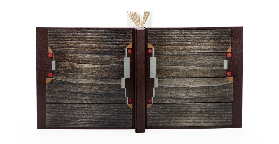
    This is a binding of Los cachorros by Mario Vargas Llosa bound by Eduardo Giménez in the Oriental binding using dark brown shagreen leather. The design includes inlays of dyed wood veneers and brown calfskin, with red suede onlaid dots. Eduardo used grey Fabriano Roma paper for the endleaves.

    You often incorporate wood veneer into your designs. What draws you to use this material?
    I discovered very soon that wood and leather were working very well together. Wood veneers offer a big warmth to the covers. Each wood is different, has different grain and textures, and allows dyeing, polishing and the application of waxes or varnish, which adds a very pleasant visual and olfactory component as a whole with the skin. Nevertheless, wood is a living material and it is difficult to work with.

    You used the new Oriental binding structure for Los cachorros. This is not a structure that I am familiar with and have only seen a few other binders use. Can you talk about the structure and why it was a suitable choice for Los cachorros.
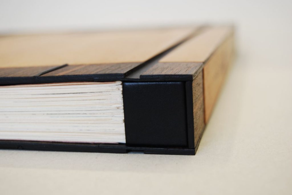
    The Oriental style binding is actually a Western version of the classical Chinese and Japanese binding. It uses hard covers and leather, contrary to its counterparts, but the form and its aesthetics are somehow preserved. I have always considered this form very beautiful. It is also a conservation binding, since the signatures are sewn on guards and they are not rounded with the hammer, neither are touched by the glue. In addition the book can be opened flat.

    side view of Don Quijote Samurai bound in the Oriental-style binding

    I think that I would not be able to give an explanation to your question of why it is a suitable choice for this book particularly. I always try that the binding is pleasant to look at. We might possibly think that an Oriental binding must only be good for an Oriental book. But, if we have adapted the structure and the materials in the Western world: why shouldn´t we also use it for a Western book?
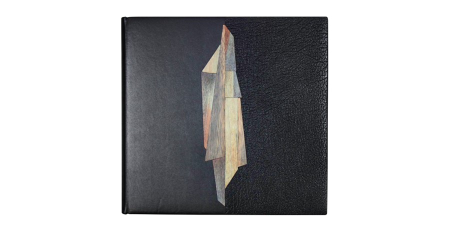
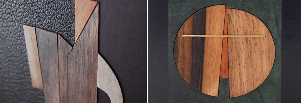
    Eduardo bound this copy of Pablo Neruda’s Una casa en la arena with a striking design where black calfskin meets black Morocco goatskin at the center of the front cover. The central design is a collage of perfectly fitted pieces of dyed wood veneer onlaid between the two skins. This binding was awarded the Best Creative Binding for the International Bookbinding Competition of the National Library of Scotland in 2011.

    Upon first glance, the central design on Una casa en la arena acted as a distraction from the two distinct leathers. But I really love the use of both calf and goatskin on the covers. When working with wood veneer, are you treating them as inlays or onlays? I notice that on Una casa en la arena (left), the veneer sits proud of the cover, where as on Mozart (right), the veneer appears flush to the cover.
    The use of two skins of the same colour and of different texture to get a good effect was the result of experimentation. The design rests on both covers over a central axis divided by the two skins that are placed at the same level. The book by Neruda contains a few beautiful photos of his house in Isla Negra (Chile). In them it is possible to see his collection of ship wooden figureheads with their straight bearing and their rich adornments. My work with small irregular pieces of dyed wood veneer, placed in the shape of a puzzle, was trying to produce that effect.
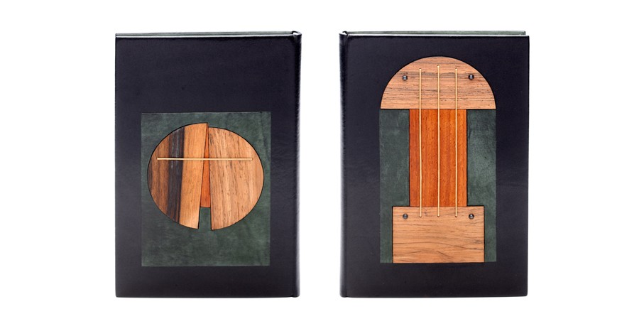
    I work interchangeably with both options, inlays and onlays. In Mozart, I played with different levels in the mosaics, and I believe they gave a more dynamic aspect to the composition. In Una casa, I treated the wood veneer proud of the cover to form a more stylized, more linear figure. The pieces were there, on my table, I only had to give them an order. I often try to find an appropriate way of composing my materials placing instinct before reason.
  2. Book Artist of the Month: Amy Borezo

    May 29, 2016 by Erin Fletcher

    SomeLines-AmyBorezo

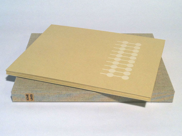
    For the final installment in my month-long interview with Amy Borezo, I am featuring an artist book she made in 2013/14. Some Lines was printed and bound in an edition of 40 copies. The first twenty copies were printed and bound by graduate students at the University of Dallas while Amy was a visiting artist; the remaining twenty copies were printed and bound by Amy with the last 5 copies bound in a deluxe edition.

    Some Lines is bound as an accordion binding and housed in a cloth presentation box.

    Something that I enjoy about your work is the complexity behind the clean and simple imagery you employ. Can you talk about the concept behind Some Lines and the swift timeframe in which this book was first printed?
    I was doing research for another artist’s book on Artificial Intelligence. I am interested in distilling complex ideas down into their most basic form. AI is incredibly complex, but most teaching around it starts with Aristotle’s Categories in which he attempts to classify everything into a few simplified categories (substance, bodies, living bodies, animals, man). AI is doing something similar–teaching a computer how to classify everything that can be classified. From Aristotle’s classification system, the first branching tree information diagrams emerged. The Porphyrian Tree is a diagram of Aristotle’s Categories.

    SomeLines1-AmyBorezo

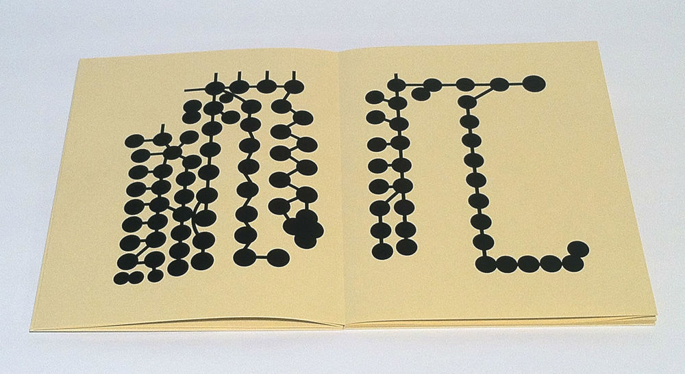
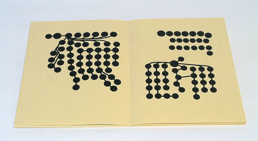
    I worked with the Porphyrian Tree diagram for a while and it wasn’t quite coalescing into a book. In my research I also came across another early branching diagram that showed the geneology of Christ. I was fascinated by this diagram because it contained a narrative within it, a story. I was also interested in how diagrams are often used to represent a viewpoint, not necessarily a fact. Data can be manipulated in its presentation. Those are some of the ideas behind Some Lines. I am also interested in the idea of drawing through time, a concept I explored in Labor/Movement. The roundels in the diagram each represent a person and most are linked by a line to another roundel through either birth or marriage. In this way, the geneology diagram represents a drawing made through generations.

    I designed the book to be printed and bound in an edition of 40 in 4 days during a residency at the University of Dallas. I had graduate students in printmaking helping with the printing and binding. We only ended up completing half of the edition there and I bound the second half in my studio. I didn’t know when designing the book that the University of Dallas is a Catholic university. It was a great experience to create that work there and have discussions with students about the concept.

    SomeLines2-AmyBorezo

    Within the description of Some Lines on your website, you mention an interest in AI (artificial intelligence). With the growing focus and development with AI and virtual reality, I am wondering if you plan to incorporate this topic into a future artist’s book?
    I might go back to AI in another work. I do have a partially finished artist’s book *in my mind* around this concept. But then again, it might be time to move on. I am not sure yet. I am quite interested in science fiction as a genre, as I’ve mentioned before, as I think it’s an extremely useful lens through which to examine the present. I love allegory. But of course, AI is no longer science fiction–it’s already here. Maybe that’s why I am not as interested in it as much right now! There usually needs to be a sense for me that a subject is fresh for examination.


  3. Book Artist of the Month: Amy Borezo

    May 22, 2016 by Erin Fletcher

    ToddWebb-AmyBorezo

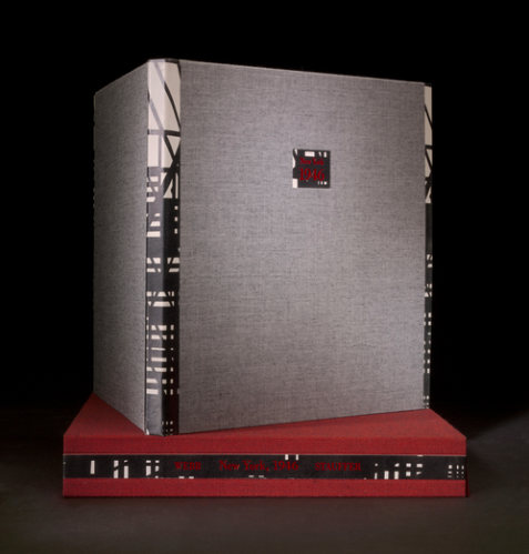
    So far this month, the focus has been on Amy Borezo‘s artist books. Beyond that work, Amy is also a talented edition binder working with several fine presses and the level of craftsmanship she brings to this facet of her work is not to go unnoticed. She has worked with 21st Editions on variety of projects including the binding shown above. Todd Webb: New York 1946 was published by 21st Editions in an edition of 37. The spine and fore edge are covered with alum-tawed goatskin with a letterpress printed graphic that reflects the photography of Todd Webb.

    What is the creative process like when working with an artist or printer on an edition project? Do you often work collaboratively when developing the binding?
    It is usually a collaborative process to varying degrees. My goal is always to elevate and further the content of the work through the binding. To that end, I first take in as much information about the project as I can including looking at imagery and reading the text of the work if there is one. With some clients I will then come up with two or three options, usually as a digital sketch that I create in Indesign. We’ll have a meeting, look at material samples, and they will choose which direction to go in. Then we will make refinements or edits of the design together. With other clients, they pretty much have the design/vision and just need someone to execute it.

    SouthernLandscape-AmyBorezo

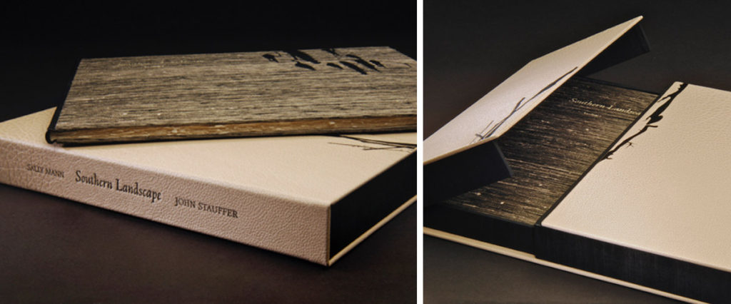
    Southern Landscape showcases the photography of Sally Mann with text by John Stauffer, another publication from 21st Editions. This edition of 58 is bound in the modified Bradel structure. The spine is goatskin and the boards are covered in a beautifully textured silk. The book is housed in a full buffalo skin presentation box that opens with a gatefold. The two halves meet together in the center and overlap slightly to make a seamless and secure closure.

    AberrationOfLight-AmyBorezo

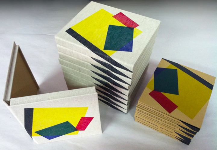
    Sedimental Records approached Amy to create housing for a DVD of Aberration of Light: Dark Chamber Disclosure, a site-specific live projection performance at the 36th Toronto International Film Festival. The project was performed by Brooklyn-based artist Sandra Gibson and Luis Recoder with audio composed by Olivia Block. Amy created two styles of packaging, an edition of 30 clamshell boxes covered in linen with a four-color relief print and an edition of 30 cases covered in paper with the same four-color print.

    Do you tend to work within a limited number of structures for edition work?
    Yes and no. Budget constraints, client desires, and intended audience limit the structures to a large extent. I am open to making anything from highly experimental to very traditional (and labor intensive) structures, according to what is right for the project. For fine press clients, it is mostly a modified Bradel structure with an Oxford hollow, sewn on tapes or cords. For artists, the needs are more variable. I’ve done editions of drum leaf books, sewn board bindings, accordion books, and others.

    TheKingOfTheAlps-AmyBorezo

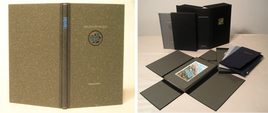
    Amy has also worked with Abigail Rorer of The Lone Oak Press on several projects. Shown above is On the Hunt for the King of the Alps, which Amy bound in both a regular and deluxe edition. The regular edition is shown in the image on the left-hand side and is bound as a quarter leather binding with a faux stone paper covering the boards. The deluxe edition includes the book with an extra suite of prints housed in a 4-flap, an original watercolor of the plant, a herbarium specimens sheet and a short essay about attempting to grow the plant. Everything is housed in a black clamshell box.

    Extinction-AmyBorezo

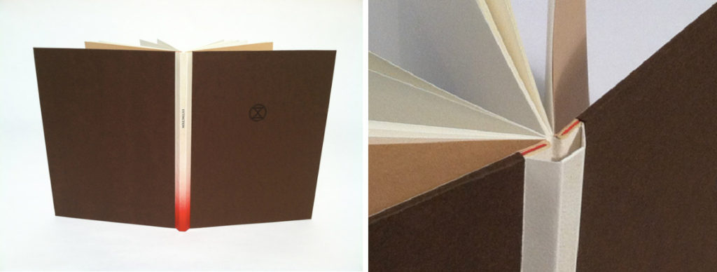
    Extinction memorializes five animals that have unfortunately ceased to exist or are nearly extinct. Another work from Abigail Rorer, Amy bound this edition of 100 as a Sewn-Board binding. Vellum is used to cover the spine, which is stamped with the title and airbrushed with a bright, blood-like red towards the tail. A subtle addition that makes Amy’s work truly unique. The boards are covered in a handmade Spanish Arpa paper and stamped with the project’s logo (and X within a circle). You can view the inside of the book here at Abigail’s website.


  4. Book Artist of the Month: Amy Borezo

    May 15, 2016 by Erin Fletcher

    RaisingTheSupineDome1-AmyBorezo

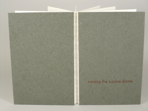
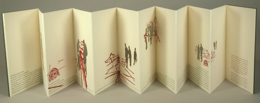
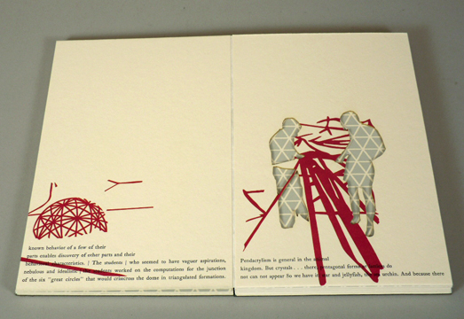
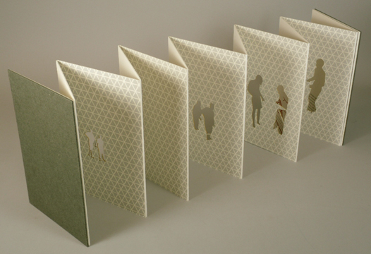
    Amy Borezo completed Raising the Supine Dome in 2010 in an edition of 35 (a few copies are still available). Text and imagery are printed on thick rag paper, Holyoke Fine Paper and then adhered to the both sides of a continuous sheet of Tyvek. Therefore, this accordion binding has double-thick pages with exposed Tyvek hinges. Laser cutting occurred after adhering the pages to the Tyek. Cave Paper is used as the covering materials for the front and back boards.


    This binding has such a satisfying weight and heft to it. During my visit to your studio, it was a delight to examine its construction in person. You used Tyvek at the hinge to connect each panel. I wanted to ask about your choice of material for this step and how it has held up over time.
    The Tyvek has held up very well over time. I just saw a copy that has been in a collection that gets heavy use and it’s like new! I like handling it because it feels so indestructible and architectural, in keeping with the concept of the book. I believe I came across Tyvek as a material while working at the Wide Awake Garage. I knew I’d be hinging together pages and I wanted the hinge to be tough. I used a heat sensitive adhesive like Fusion 4000 to adhere the Tyvek to the pages. You do have to experiment with Tyvek as sometimes excessive heat can make the Tyvek warp a bit. But I didn’t have any problems using it.

    RaisingTheSupineDome2-AmyBorezo RaisingTheSupineDome3-AmyBorezo RaisingTheSupineDome4-AmyBorezo

    Buckminster Fuller was a visionary, forward-looking architect. Tyvek has a somewhat futuristic flavor – a paper that doesn’t tear and is made from synthetic material. It was a perfect fit for the project. Because it doesn’t tear, it almost feels like you can arrange the panels of the book into various architectural shapes. Going further, Buckminster Fuller’s geodesic domes are visually all about the lines where two planes meet. The hinge areas become important as reflections of the design of the geodesic dome.


  5. Book Artist of the Month: Amy Borezo

    May 8, 2016 by Erin Fletcher

    LaborMovement1-AmyBorezo

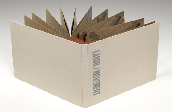
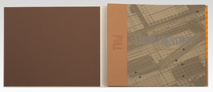
    Labor/Movement (seven workers) was printed and bound by Amy Borezo in 2012 in an edition of 25. Bound on an unsupported concertina binding with folios pamphlet-sewn to the peaks of the concertina. The folios were then sealed along the fore edge. The text is nestled inside a cloth covered case with only the back hinge of the concertina adhered to the back of the case. This constructions allows the reader/viewer to pull out the first flap of the concertina, expanding all of the pleats fully and exposing a portion of each page to be viewed simultaneously (as shown in the image below).

    I want to focus primarily on the structure of this book, which engages the concept of the text in a very subtle and beautiful way. The text and imagery is developed around various forms of movement; the pages themselves can be turned and expanded in various ways that mirror the ideas within the text. How did you develop the structure for this book? Did you work through several models before finalizing the look?
    I made another book many years ago with this structure, which I believe is based on a design by Keith Smith. I love how the book expands in a very physical way. Even the sound that the pages make when they slide on top of each other is very satisfying. This book has to be performed by the reader/viewer, which ties in nicely with the content of the work. It asks the reader/viewer to be aware of her actions and body in space, and this ask is reiterated in the text.

    LaborMovement2-AmyBorezoLaborMovement3-AmyBorezo

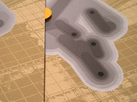
    When the book is fully extended, you can see a portion of each page simultaneously to each of the other pages. I feel that this is a very cinematic way of experiencing the book, similar to stop-action animation. The series of images in Labor/Movement show a pattern of movement over time, and when you see a portion of each image overlapping the next, the connection between the images is much more fluid than if you were seeing one whole image and then turning the page to see the next whole image. I don’t think I considered any other structure, but I did make a few dummies to make sure it would function well.
    The structure also allows the book to be read in many different ways. It can also be opened and paged through like a traditional codex. I like to make artwork that is multi-layered in form and content.

    LaborMovement4-AmyBorezo


  6. May // Book Artist of the Month: Amy Borezo

    May 1, 2016 by Erin Fletcher

    TheColourOutOfSpace-AmyBorezo

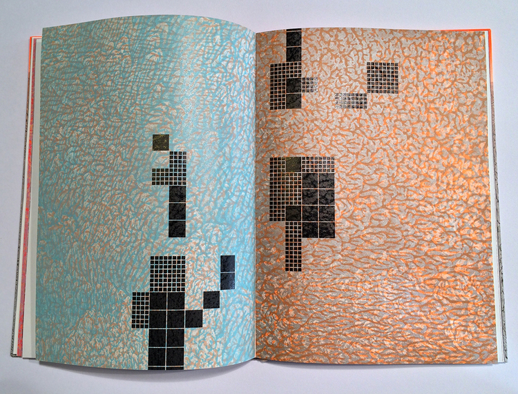
    The Colour Out of Space stems from the imagination of horror writer H.P. Lovecraft and also happens to be the focus of Amy Borezo‘s most recent artist’s book. A strange color emerges from the devastation left by a meteorite that hits a small fictional town in Western Massachusetts. The ill effects this foreign objects leaves on the land, vegetation and the people of the town mirrors Lovecraft’s own disdain for industrialization and modernization.
    TheColourOutOfSpace5-AmyBorezo

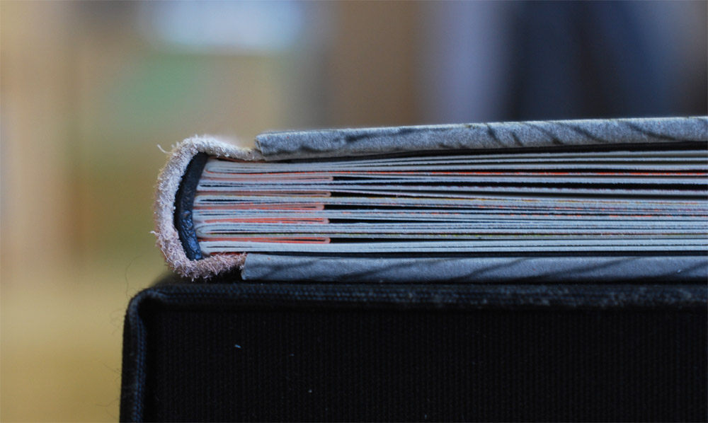
    Bound in an edition of 40, the binding is a three-part Bradel structure with the text block sewn onto a shaped concertina.
    TheColourOutOfSpace6-AmyBorezo

    This is a photo I took of Amy’s book, which is why is appears different than the others.

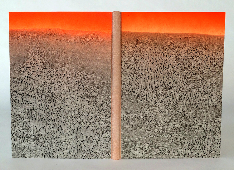
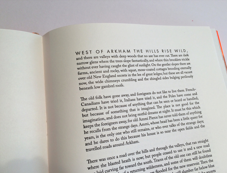
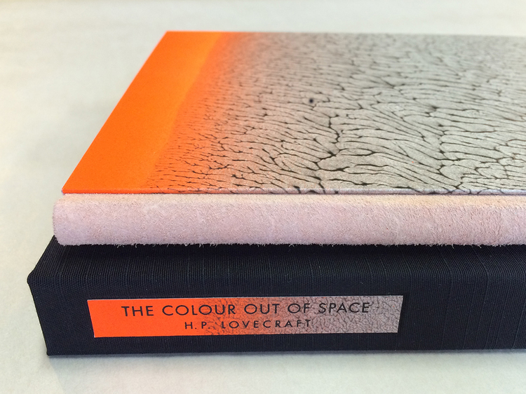
    The spine is covered with buffalo suede and the boards are covered with a beautifully designed pulled paste paper. Relief printing was achieved on a letterpress through photopolymer plates and printed on Zerkall Book. The body text is Caslon with titles in Futura.

    The book is housed in a cloth presentation box. The title and author are printed on scraps of the same paste paper used on the covers.

    TheColourOutOfSpace4-AmyBorezo

    One of the last things we discussed during my visit to your studio, was the technique behind your incredible pulled paste papers. For the paper used on The Colour Out of Space, the rhythm of the pull created that gorgeous pattern. Can you share your process for making pulled paste papers?
    After adding acrylic paint to the paste in the desired amount, I brush out a large, even area onto a sheet of mylar. I have a water bottle nearby in case the mixture needs more moisture. I lay the sheet of paper down onto the pasted area and press the sheet into the paste mixture gently by using a brayer on the back of the sheet of paper. I then pull up the sheet from one direction. For the covers of The Colour Out of Space, I then also let the sheet gently back down and pulled from a different direction. This allowed the “veins” created by the pulling to orient both vertically and horizontally. It also creates more surprises. No two sheets were alike and I enjoyed the “dance” of pulling in different directions to create different effects.

    How does the paste paper reflect the story?
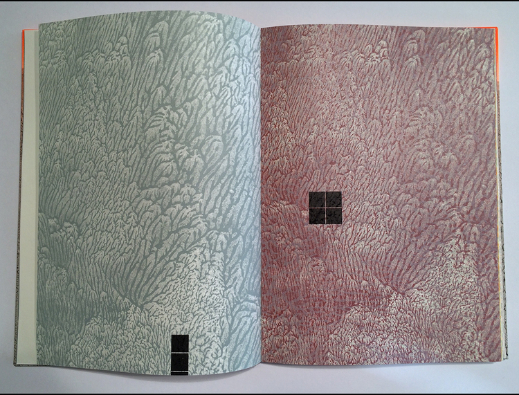
    I was searching for a way to evoke the landscape and setting of the story without being literal or illustrating it. Because I live very near what many consider to be the site of the fictional story, I am familiar with the landscape. A big part of my “research” for this project, was simply walking along wooded paths near the site. There are large, imposing trees along the paths that lead to the reservoir that submerged a few towns. I wanted to capture the dark romanticism inherent there. The pulled patterns mimic patterns found in the natural world like rock formations, sediment at the edge of water, foliage. At the same time, the paste papers also reminded me of wallpaper patterns of the nineteenth century and the kind of neo-Gothic interior world that Lovecraft embodies. Not only do I use the paste papers on the cover of the book but I also created photopolymer plates from the papers I made. I then used these plates to print the imagery for the book. I printed the veined, pulled patterns in multiple colors and layered these on top of each other. These then become the backdrop to the “geometry” of the encroaching reservoir. The organic forms of the pulled papers are a foil to this rigidity.

    TheColourOutOfSpace2-AmyBorezoTheColourOutOfSpace3-AmyBorezo

    With many of your prior artist’s books, you used the accordion structure in some way. Can you talk about why this particular binding is different and what influenced you to use a different structure?
    As a painter I kept coming back to the accordion format because it allowed me to create a larger scale “canvas” when the pages are fully extended. But, with this book, a more traditional format seemed fitting because of Lovecraft’s own distaste for the modern, and because I was printing a full story, which I hadn’t done before. I wanted to make a traditional codex, but enhance it with slightly unusual features like the suede spine, the shaped concertina, and the fluorescent orange airbrushing detail. I also very much wanted to use the shaped concertina structure because I had developed it a few years ago on a book for a client, but I had not had the chance to use it on my own work. Sewing into the shaped concertina also allows for imagery to subtly emerge among the passages of text.

    – – – – – – – – – – –

    While I was a student at North Bennet Street School, I made the decision that upon graduation, Boston was to become my new home. So I began to investigate the community around me, which is how I stumbled upon Shelter Bookworks and the amazingly talented Amy Borezo. I was lured in by her artist’s books; their inventiveness and flawless printing really heightened my desire to work within this medium again. To say the least, Amy’s work is inspiring.

    Last month, I had the chance to visit her studio in Orange, Massachusetts. She shared with me each of her artist’s books and some work she had done for Abigail Rorer and 21st Editions. Check out the interview after the jump (my first interview of the year) and come back each Sunday during the month of May for more on Amy’s work. You can subscribe to the blog and receive email reminders, so you never miss post.

    read more >


  7. Book Artist of the Month: Natalie Stopka

    April 27, 2015 by Erin Fletcher

    BotanicalPrintBook-NatalieStopka

    In this final post with Natalie Stopka, we continue the discussion on her techniques that employ natural pigments for dying and image making by looking at her 2012 artist book Botanica.

    This binding consists of a series of eco-prints that are brilliant in both color and detail. Can you discuss the process behind eco-printing?
    Eco printing is the process of making a plant print using only the natural colorants contained within the plant. As opposed to nature printing in which pigment is applied to the surface of natural objects, in eco printing the plants can be smashed, pressed, bundled, soaked, steamed, or even frozen to coax the dye colorants out. There are a variety of techniques and terms to describe them. Hapa zome is the pounding of fresh plants directly onto a fiber substrate, and bundle dyeing involves tightly wrapping plant or other dye materials in fabric before burying or steaming them.

    Botanica2-NatalieStopka

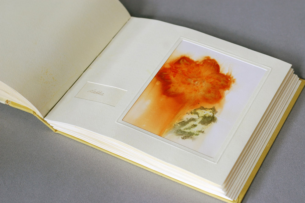
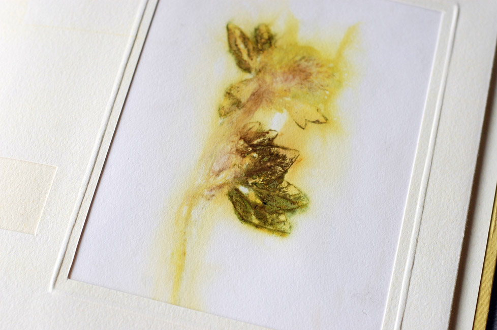
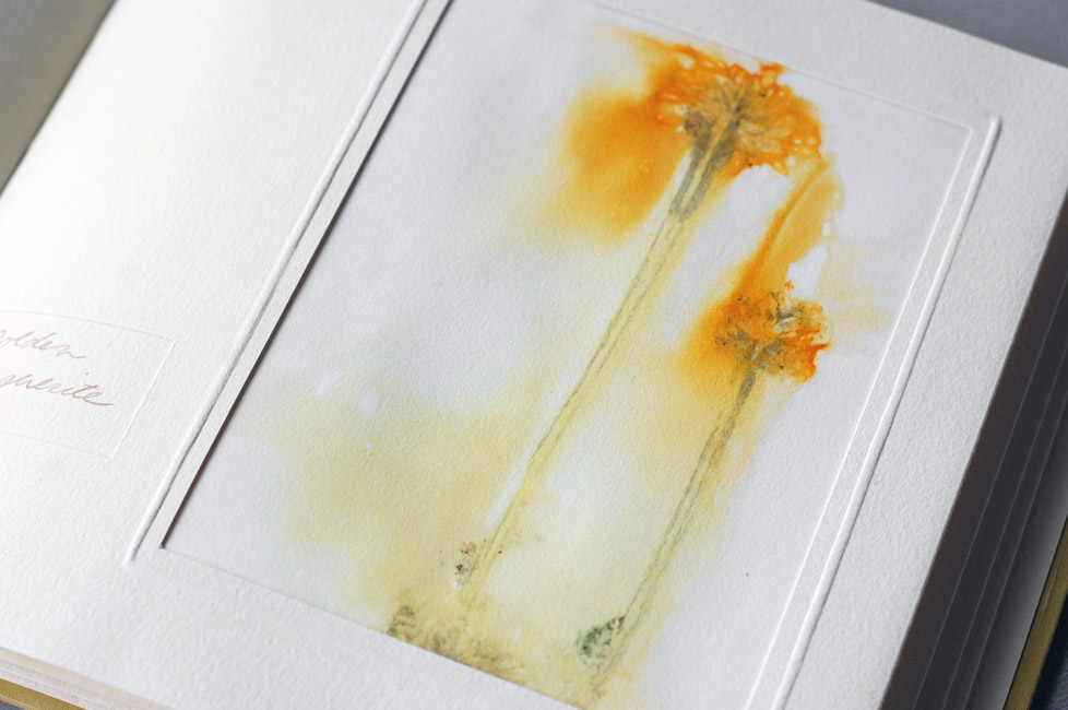
    To create Botanica, I gathered a dozen different dye plants one August day. These included mint, yarrow, dahlia, coreopsis, and goldenrod. Each specimen was folded within alum-mordanted paper, guarded with additional paper, and vigorously smashed with a mallet to break down the plant fibers and transfer the colorants within. I lowered this sandwich, with the plant still inside, briefly into a pot of simmering water. The hot water further drew out the dyes, creating an aura of color around the plant image, and made the print as permanent as possible. I was left with two mirrored images of each plant to create an edition of two books.

    Botanica4-NatalieStopka

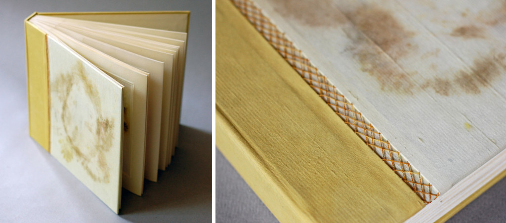
    In binding the books I adopted a flat back variation of Richard W. Horton’s light album structure, with each print mounted inside an accordion fold of naturally dyed paper. The paper as well as the silk book cloth and thread on the cover were dyed with a mix of wildflowers.

    Botanica5-NatalieStopka


  8. Book Artist of the Month: Natalie Stopka

    April 20, 2015 by Erin Fletcher

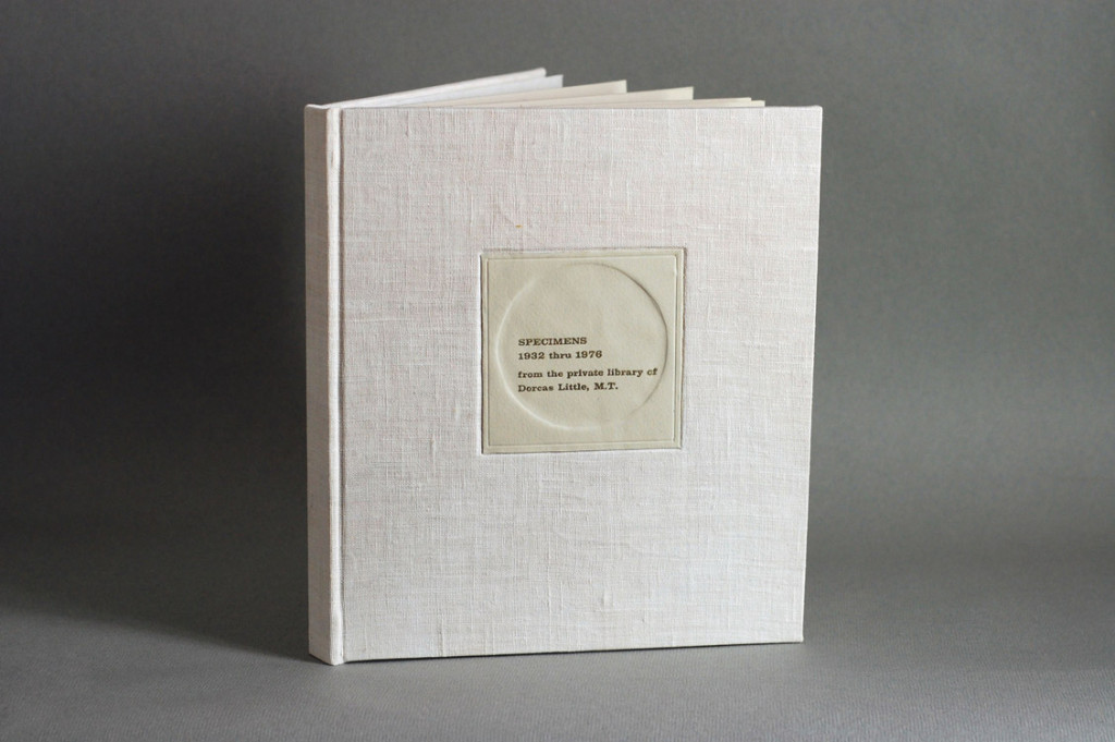
    Specimens1-NatalieStopka

    Up until this post, Natalie Stopka has shared her techniques for natural dyeing, as well as her methods for marbling and suminagashi. In the last two posts for the month, we’ll look at two artist book projects starting with her 2011 book Specimens.

    Can you talk about the concept behind this work and your inspiration for the book’s structure?
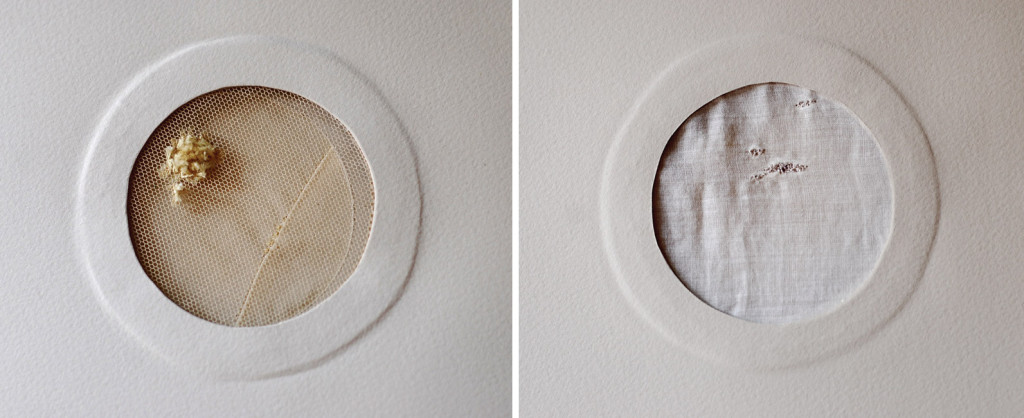
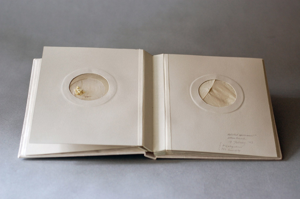
    I’m very interested in the notion of fabricated histories, including artifacts of dubious or bogus provenance such as the Voynich Manuscript or Cottingley fairy photographs. In creating Specimens I bound together the textile fragment collection of the (fictional) Dorcas Little, seemingly a phony collection that she had created and catalogued in the mid-1900s. Each textile fragment was hand sewn from vintage materials to look as if the fibers were is some aspect growing or reproducing. Mounted in a petri-shaped window, each piece is visible from both sides.

    Specimens3-NatalieStopkaSpecimens4-NatalieStopka

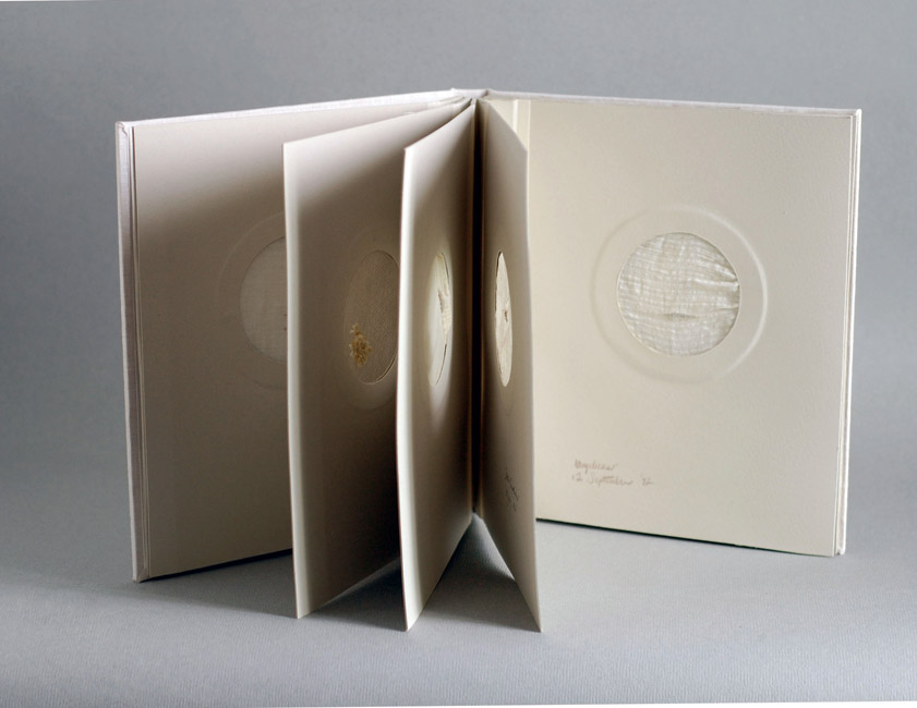
    I have a love/hate attitude towards album structures, which are very useful for a book such as this, but generally inelegant and tedious to bind. I elected to use a double guarded album binding, which has the institutional appearance I was hoping for, but a somewhat more graceful movement. As if, in order to augment the appearance of authenticity, the collection’s owner had commissioned the housing.

    Specimens2-NatalieStopka


  9. Book Artist of the Month: Natalie Stopka

    April 13, 2015 by Erin Fletcher

    AblateVesiculate-NatalieStopka

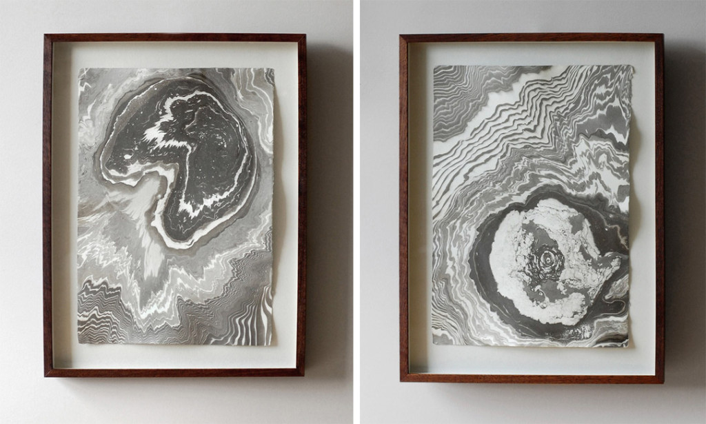
    LEFT: Ablate | RIGHT: Vesiculate

    Then & Now: Ten Years of Residencies at the Center for Book Arts is an upcoming exhibition celebrating two of the Center’s core programs. Among the 50 exhibiting artists who participated in these programs over the last ten years is Natalie Stopka.

    Floe-NatalieStopka

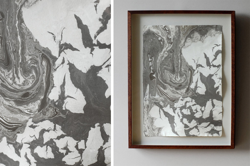
    Floe (detail on left)

    Some of her recent suminagashi work, like those shown in the images above will be included in the exhibit. If you find yourself in the New York area, check out Natalie’s work in person. The exhibit will run from April 17th until June 27th.

    MarbledBooks-NatalieStopka

    Last week’s post focused on Natatlie’s technique and process for natural dyes. This week’s post will focus on her work with marbling and suminagashi.

    Can you discuss your techniques for marbling; what type of size and pigment do you prefer to work with?
    I prefer to work with caragheenan and acrylic pigments when marbling. We undertook a side-by-side comparison of caragheenan and methyl cellulose in a marbling workshop I taught, and for me the clear champion is caragheenan.

    MarblingProcess-NatalieStopka

    Of course, I have written repeatedly about my preference for natural and historically founded materials, but in marbling I use modern synthetic pigments and surfactants. What can I say? They work like a charm – but one day I would like to expand my practice to include earth pigments. It would be very satisfying to create images of stone formations from pulverized stone.

    I am often asked if natural dyes can be used for marbling, but by definition dyes are water soluble, so working around that would be too complex a process to be practicable. However, it is quite handy to marble on naturally dyed paper or fabric, as both the marbling substrate and most dyes (adjective dyes) require mordanting as a preparatory step. And whether you work with natural or synthetic pigments, the natural dyes give a beautiful base tone.

    Sumi-NatalieStopka

    Suminagashi is my escape from the detail-oriented aspects of bookbinding which demand focused hand work. Because suminagashi developed within the compass of Buddhism, the entire approach is at odds with western bookbinding and marbling. Rather than formulate a plan for what each print will be, I can work intuitively. I find that allowing the work to guide me rather than the reverse is very freeing and expressive. To do this I stick to traditional Japanese washi, sumi ink and brushes, a few experimental ingredients, and Don Guyot’s sumifactant.

    Sumi2-NatalieStopka

    You’ve marbled a variety of materials including paper, silk and linen. What unique properties do each of these materials offer and what challenges, if any, do you find?
    The only challenge in using a variety of materials is getting to know each one, and finding some dependable papers and fabrics with the right quality of absorption. The biggest variable in the range of fabrics I use is the crispness of the print each produces. A tight, even weave like silk haboti picks up a very crisp image while a slubby, loosely woven linen makes the image appear more ‘pixelated’.


  10. Book Artist of the Month: Natalie Stopka

    April 6, 2015 by Erin Fletcher

    CompleteDye-NatalieStopka

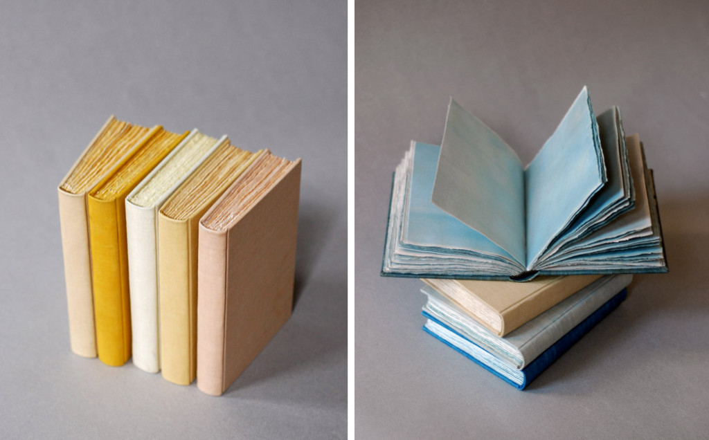
    As a continuation from last week’s post, I extended the conversation on natural dyes with book artist, Natalie Stopka. During her time at the Center for Book Arts as a Van Lier/Stein Scholar, Natalie also completed a collection of case bindings, where each component beautifully represents the subtleties of natural dyes.

    CompleteDye2-NatalieStopka

    The variation between the different materials is subtle and beautiful. I wonder what your inspiration was for this project?
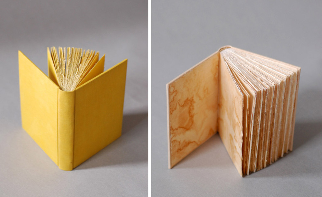
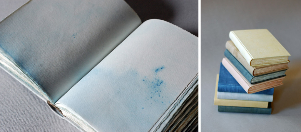
    Besides my enjoyment of the process of foraging and dyeing with plants, I love the sympathy between natural dyes and fibers, as well as the resonance of using historical methods with historical materials. Prior to the discovery of synthetic dye in 1856, all books were decorated with naturally derived dyes, inks, and pigments. That is a lot of artistic heritage that has been largely supplanted in the past 150 years. I wanted to create some books that were all of a piece referencing that period just prior to the advent of synthetics, using a hollow-back structure with linen book cloth, hand sewn headbands, uncut pages folded down from full sheets, and, of course, natural dyes. I ended up binding a dozen books in different colors, partly as an exercise in honing my binding skills, as well as a continuation of my dye experiments.

    Can you walk through your dying process from the creation of the pigments to the dying of the materials? Where did you learn these techniques?
    Beginning with the techniques I learned at the Textile Arts Center, I extended my natural dye experiments into bookbinding. There was some trial and error at first as I selected and mordanted paper samples. Papermakers generally color the pulp with pigment prior to forming sheets, so there is not a lot of information on how to dye paper, or how the dyes and mordants affect it over time. But paper is just cellulose fiber like many fabrics I had experience dyeing, so I jumped in. I decided to use Zerkall Ingres, which is quite absorbent due to its composition, but also has good wet strength. And when folded down it makes a lovely signature size.

    The first step in dyeing is to source or collect plant material. In this case I used plants I foraged in upstate New York including oak leaves, cherry bark, Queen Anne’s lace, apple bark, and yarrow, the only exception being indigo. I chopped and soaked or simmered the plant material to extract the dye, then strained the dye liquor into a big stainless steel vat containing the mordanted paper and other book materials. After about 12 hours in the vat, everything was ready to carefully remove and dry.

    DyeProcess-NatalieStopka

    As with my embroidered botanical illustrations, these books demonstrate the different shades of color (sometimes slight) that result when a single dye is applied to various substrates. The linen cover, silk headbanding thread, Zerkall Ingres pages, and linen binding thread were all dyed in the same vat. The endpapers were made from the uppermost sheet of paper in the bath, which became patterned by the evaporation of the dye. My favorite book was dyed with black cherry bark – I left the dye vat outside overnight, and a light frost left crystal patterns on the endpapers! Initially I expected the papers to take the dye evenly in a uniform shade, but most dyes were absorbed with a good deal of variation, making a richly toned surface.

    CompleteDye3-NatalieStopka


  • My name is Erin Fletcher, owner and bookbinder of Herringbone Bindery in Boston. Flash of the Hand is a space where I share my process and inspirations.
    The StudioNewsletterInstagramEmail me
  • Archives