RSS Feed

‘binder of the month’ Category

  1. Bookbinder of the Month: Monique Lallier

    May 4, 2014 by Erin Fletcher

    LaColouerduVent-MoniqueLallier

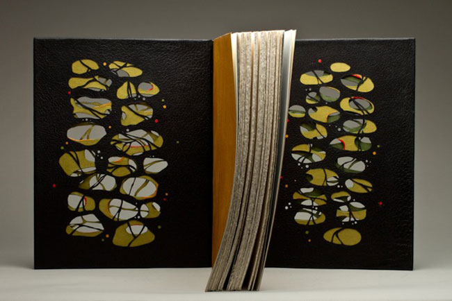
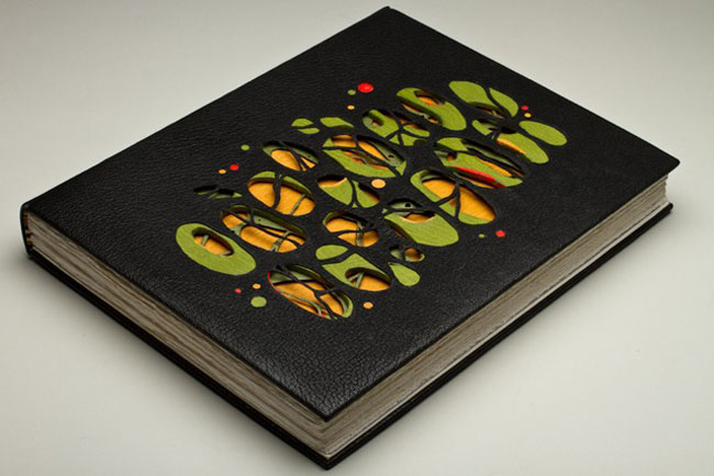
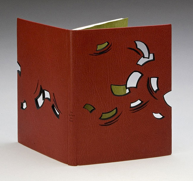
    La Couleur du Vent was bound in 2013 by Monique Lallier for the ARA-Canada exhibition that I may have mentioned just once or twice (even thrice) in the past. I brought up the window element in Monique’s work during the interview on the first of the month with her binding The Drawings of Caravaggio. When I saw Monique’s binding of Interpreter of Maladies at an exhibition in Chicago, I was awed and intrigued by its construction. With this binding Monique began experimenting with laser cutting technology to create detailed and intricate work. 
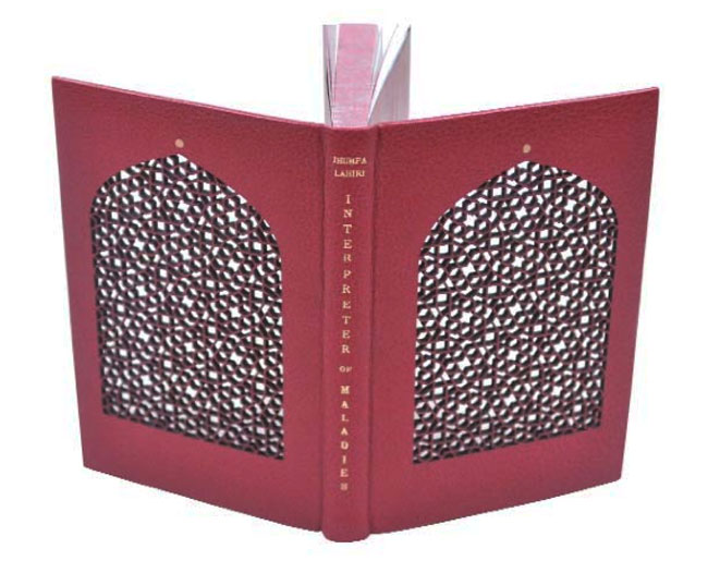
    IntrepreterOfMaladies1-MoniqueLallierI want to further the discussion from last week on the progression of the window element in your designs. Except this time I would like to focus on technique. The covers of La Colouer du Vent and Interpreter of Maladies were laser cut to achieve the intricacies of the design. Do you approach the structure differently on a fine binding when including laser cut elements?
    When I choose to use laser cutting I have to do a “case” binding as I have to finish the inside doublures before the laser cutting and the cover has to be flat on the table of the laser cutter. I still consider it a fine binding. 

    Did you have to alter anything about the process from your first attempt to the most recent one?
    I think I figured it out right on the first time and it worked well, so I repeated the same technique.

    – – – – – – – – – – –

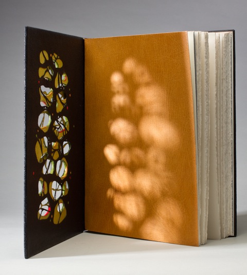
    In addition, during the interview, I included a sneak peek of one of Monique’s recent bindings of Les Sonnets by Shakespeare. The complexity of the design is literally jaw-dropping. Two layers of board have been cut and sandwiched between the covering leather and leather doublures, which have also been laser cut.
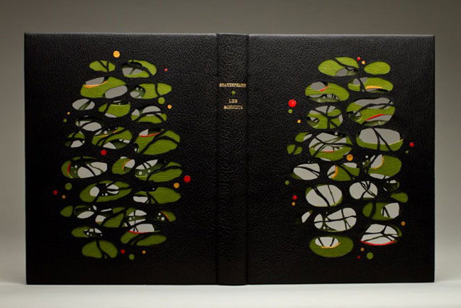
    LesSonnets-MoniqueLallier LesSonnets2-MoniqueLallier LesSonnets3-MoniqueLallier


  2. May // Bookbinder of the Month: Monique Lallier

    May 1, 2014 by Erin Fletcher

    DrawingsOfCaravaggio-MoniqueLallier

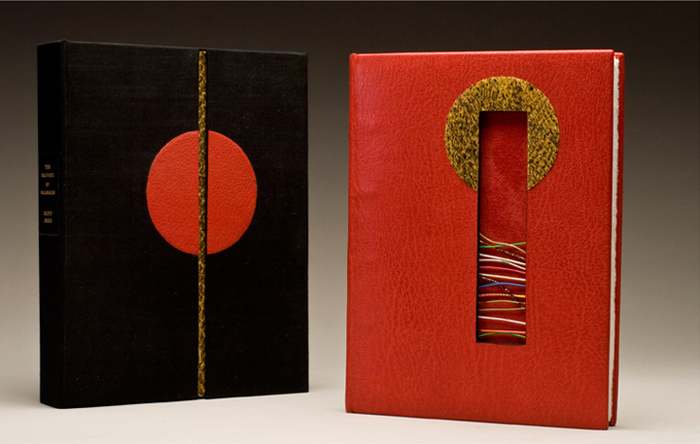
    This stunning binding was created by Monique Lallier almost ten years ago. Yet the design appears so fresh and relevant to the experimentations happening with contemporary design bindings. When you land on Monique’s website, this is the binding you are greeted with and it will, no doubt, cause you to click through every single page of the gallery. The Drawings of Caravaggio by Ally Jones was bound in full scarlet leather in the French technique. The boards have been cut to reveal the red suede fly leaves through a collection of wires that have been embedded into the thickness of the board. Straddled around the top edge of the cut-out is an onlay of snakeskin. 

    The book is housed in a box covered in black silk with matching red and snakeskin onlays.

    If I remember correctly you told me that this is one of the first bindings you completed and that it is still your favorite. I love this binding as well for many reasons: the use of bright colors, contrasting textures from the goatskin, suede flyleaves and snakeskin onlay and the inclusion of a window cut-out of the cover. This window element is peppered throughout your portfolio. What does this element bring to your designs and why do you keep coming back to it?
    This binding was done in 2005. I had done the “window element” before to give space for an agate in 1985, so I suppose it evolved to an opening that was not totally filled-in like The Fables of Aesop where I have wires imbedded in the thickness of the front board and you see, through the opening to the lion stamped on the leather fly leave, or this Caravaggio, also with wires imbedded in the thickness of the boards. It was done in an advanced class for AAB (American Academy of Bookbinding) and I wanted to show the students how to line the thickness of the boards with black leather in this case.

    I suppose I keep coming back to it because I like the effect of “seeing through”, like in Les Sonnets (shown below) where the boards, the covering leather and the leather doublures are all cut out. In this case, it was to illustrate how Les Sonnets have an impression on you. (More images on this binding later!)

    LesSonnets4-MoniqueLallier

    Monique’s work is awe-inspiring. Not only do I find her bindings to be so, but also her involvement in the bookbinding community.  Our community and the craft of bookbinding thrives when talented and dedicated people like Monique become teachers. Between my first and second year at North Bennet Street School, I jumped at the opportunity to take a week-long private workshop with Monique at her home in North Carolina, where I absorbed everything she had to offer (no doubt an infinitesimal amount to the vast knowledge she holds).

    I’m really honored that Monique agreed to be interviewed for my blog, which she has complimented me about several times. So without furthering gushing, please enjoy the interview after the jump. Stay updated with posts by signing up for an email subscription. Since Monique has an ample collection of work, each week I’ll be showcasing multiple bindings including a few newly bound and unseen works!

    read more >


  3. Bonus // Bookbinder of the Month: Lang Ingalls

    March 31, 2014 by Erin Fletcher

    KingOfTheAlps-LangIngalls

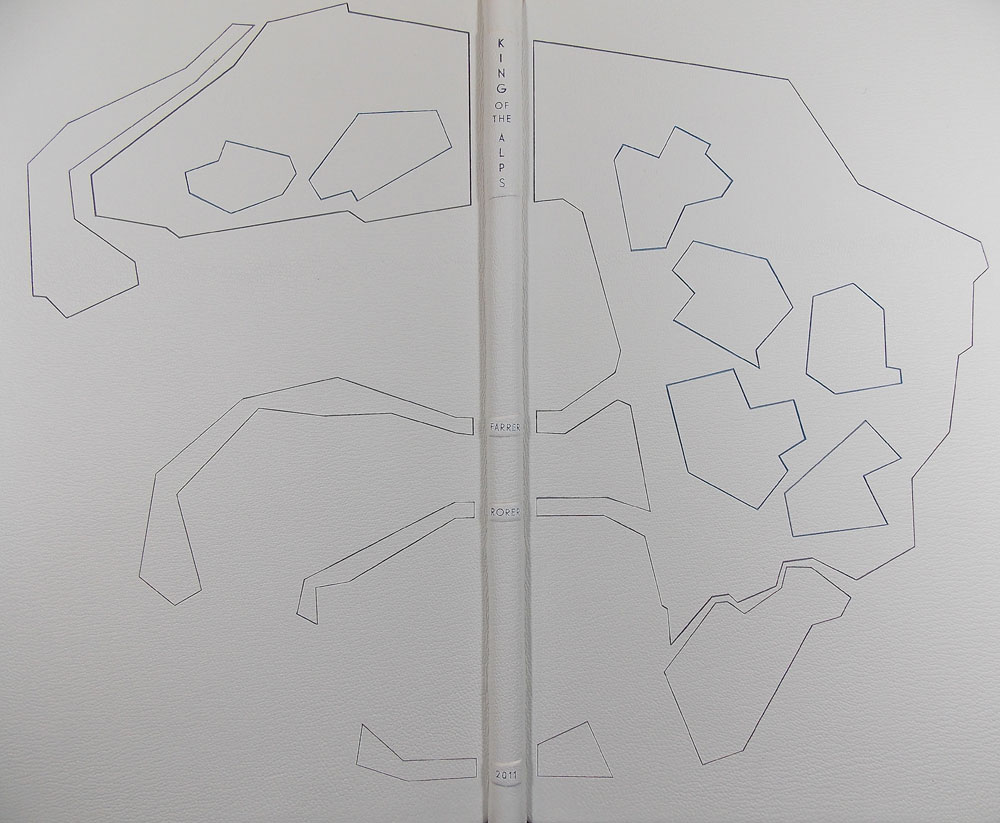
    Just one more bonus binding from Lang Ingalls to end out the month. King of the Alps by Reginald Farrer with illustrations by Abigail Rorer was bound by Lang in 2013. The Lone Oak Press edition is signed by the illustrator.

    Bound in the French technique in full white alum-tawed goat. The geometric design on the covers is an interpretation of one of the illustrations. Lang continues to use the incision technique in which a thin line of leather is removed and painted with acrylics in grey and blue tones. The same palette continues on the inside with blue leather edge-to-edge doublures and grey suede flyleaves. The title, author, illustrator and date of edition are on decorative onlays on the spine.


  4. Bookbinder of the Month: Lang Ingalls

    March 30, 2014 by Erin Fletcher

    Ici-LangIngalls

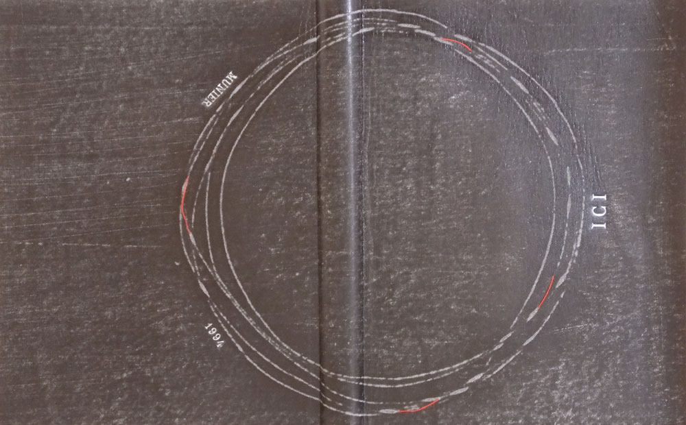
    On exhibit from June 20th to September 14th of this year is Lang Ingalls‘ binding of Ici by Roger Munier. The exhibit is sponsored by ARA France in partnership with the city of NÎmes and its renowned Carré d’Art Library for the XIth FIRA International Forum & Exhibition.

    This edition is copy 13 of 47 and is signed by the author. Bound in the reliure à cru structure in black sanded calf with sewn red thread elements. The binding is complete with squared suede headbands, suede doublures and suede flyleaves. The title, author and date are hand tooled on both covers.

    This binding stands out in your portfolio due to the absence of color in the design, however the treatment of the leather is exceptional. It reminds me of how a photocopied image begins to degrade and become fuzzy with each subsequent copy. Was this effect created through a dyeing or printing process?
    This binding was made in Paris with Ana Ruiz-Larrea last fall. The structure is called reliure a cru, a soft-cover leather binding. The text is about how all things go round, all things in life. I decided on a circular element and taped #18 thread to the back of black calf. I sanded and — viola! — the calf was distressed and the circle came through. There is a hint of red in the text, the initial letter at the start of the copy, and I borrowed from that when I made small sewings of red thread through parts of the circle. The French teach that 2/3 of your design is on the recto and 1/3 is on the verso, thus the placings of these tiny thread elements, while considering the title, author and year.


  5. Bookbinder of the Month: Lang Ingalls

    March 23, 2014 by Erin Fletcher

    Chanson-LangIngalls2

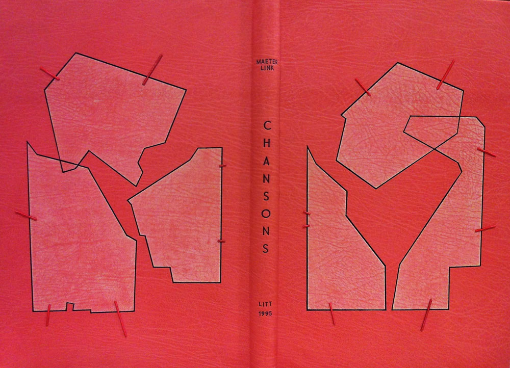
    Chansons is a text written by the Belgian poet and playwright Maurice Maeterlink. This particular 1995 edition is in French and includes engravings by Ginette Litt; the copy is signed by Litt and bibliophile G.A. Dassonville. Lang Ingalls bound this copy in 2013 and it will be exhibited from April 4 to June 30 of this year in a show titled ‘Belgian Writers, a Binding Homage’ sponsored by Bibliotheca Wittockiana and ARA Belgica.

    The binding is bound in the French technique in pink goatskin. Lang describes the cover design inspiration and techniques below in response to my question. However, not shown are the hand-sewn silk headbands and black suede pastedowns and flyleaves.

    Once again, you’ve created such a beautiful binding. I would just love for you to discuss your concept behind the design and how you translated that into the materials used on the binding.
    This binding is recent, and one that took a long time to develop, and one that is amongst my favorites I’ve made. The shapes on both the recto and verso are taken from the etchings of Ginette Litt, one for each song (six). The shapes were removed and sanded, then re-adhered to the covers. The incision lines were painted black. The small connecting lines are thin twine that has been wound with silk thread in a near-pink hue, then adhered in a tooled line. The title is blind tooled then painted in the same black as the incisions.


  6. Bookbinder of the Month: Lang Ingalls

    March 16, 2014 by Erin Fletcher

    FantasyAndNonsense-LangIngalls

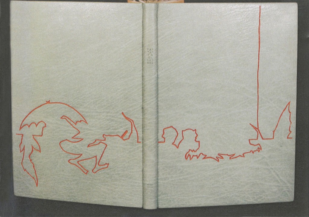
    The exhibition showcasing design bindings of the Tryst Press edition of Fantasy & Nonsense has been mentioned a few times on the blog. I first discussed the exhibition with my own submission, then again when I featured the work of Coleen Curry and Mary Uthuppuru. The book itself is a compilation of works by the American poet James Whitcomb Riley paired with beautiful wood engravings by Berrot H. Hubrecht. Each of the exhibitors really captured the whimsy of the poems and illustrations, transforming each binding into a unique object.

    Lang Ingalls‘ binding of Fantasy & Nonsense is no different in this respect. Her simple yet elegant design extracts the illustrations and complies them to form an intriguing landscape across the open binding. Lang created the binding in 2012 for the exhibition which was hosted by the Rocky Mountain Chapter of the Guild of Book Workers and displayed at the J. Willard Marriott Library at the University of Utah. Bound in the French technique in full light blue goatskin. The linear design was painted with acrylic inside a pulled leather line. Other design elements include colored head edge, custom paste paper endsheets and hand tooled title in blind on the spine.

    I love the color palette on this binding. Even though I had the opportunity to view this binding in person, I was stumped by how you created such a fine line of color in the leather. Can you talk about the technique you employed in this binding?
    This is one of the techniques I learned form Hélène Jolis — it is called an incision line. You actually cut the two sides of the line with a scalpel, remove the leather and paint with acrylics (yes, you need a paintbrush with only three bristles!) inside the line. I advise an optivisor for the work…


  7. Bookbinder of the Month: Lang Ingalls

    March 9, 2014 by Erin Fletcher

    GoTellItOnTheMountain2-LangIngalls

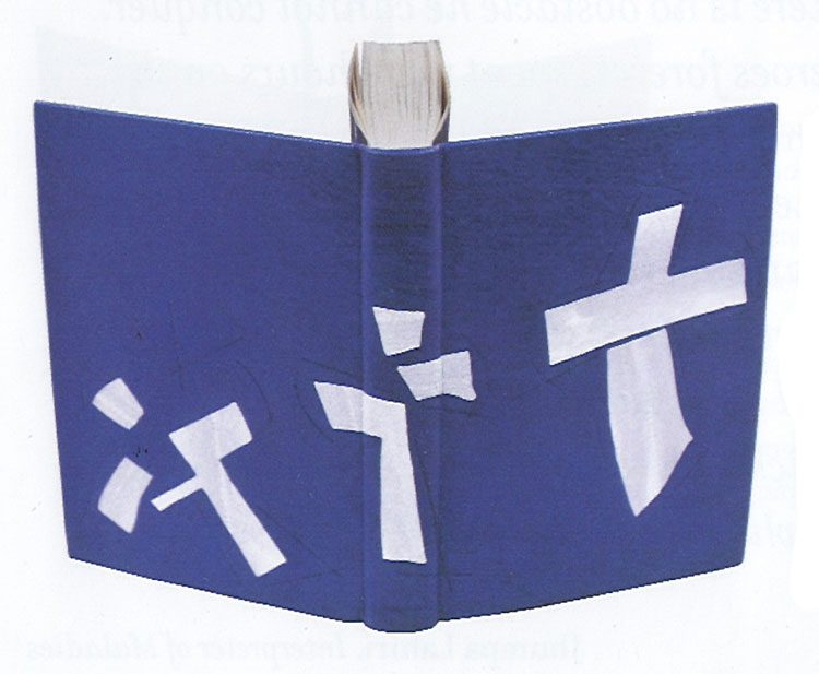
    In 2011, Lang Ingalls won the Best Binding Award from the Chicago Public Library’s One Book Many Interpretations exhibition for her binding of Go Tell It on the Mountain by James Baldwin. It was during the reception for this exhibition that I met Lang. I was drawn to her binding because of the stark contrast between the rich purple leather and bright white onlays.

    Bound in the French technique and covered in purple goatskin. Spanning across the covers and spine are white eel onlays.  Other design details along with the title are hand tooled blind.

    This is the binding that led to our being introduced during an exhibit in Chicago. I am so attracted to the brilliant contrast between the vivid purple leather and the bright white eel skin onlays. I have little experience using exotic leathers, how does eel skin compare to traditional bookbinding leathers?
    This eel skin is really really thin, perfect for onlays, and not difficult to execute. I had fun deciding which way the spine parts would go to complement the design.


  8. March // Bookbinder of the Month: Lang Ingalls

    March 1, 2014 by Erin Fletcher

    LaCouleurDuVent-Lang Ingalls

    At this point I think it’s safe to say that I have found the recent ARA-Canada exhibition La Couleur du Vent to be filled with many beautiful and inspiring bindings. This particular binding was created by Lang Ingalls and is the fourth binding from the exhibition to be featured on the blog (the other three: Sonya Sheats, Coleen Curry and Karen Hanmer).

    So in case you missed those three posts I highly recommend you check them out after reading this one, but first let me summarize the exhibit. This international design binding exhibition was put together by ARA-Canada in partnership with École Estienne in Paris. The exhibition started in 2013 in Paris before traveling to Quebec then Montreal (which ended on February 28th). The show will continue to travel during this year, showing in Trois-Rivières from March to April. La Couleur du Vent is a collection of poems by Gilles Vigneault, illustrated and designed by Nastassja Imiolek under the artistic direction of Cécile Côté.

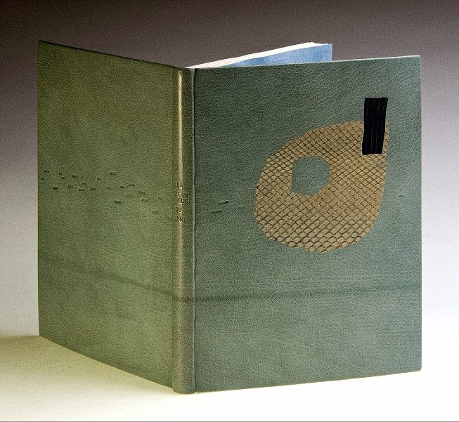
    Let’s get back to Lang’s binding. The set text is bound in the French technique using sea foam blue goatskin. On the front cover are inlays of python and lizard. A series of irregular shapes are tooled blind and span across the full length of the binding with the title also tooled blind on the spine. What I love most about this binding (besides the superb color choices) is the bold inclusion of the spine. Lang so wonderfully highlights the material and uses the natural elements of the leather to create an even more compelling design.

    This binding is stunning. The design you’ve created really celebrates the natural qualities of the materials. Can you talk about your concept behind the design?
    I bought the python and lizard used for the inlays in Paris years ago, but really love the texture and color of them — I tend to make monochromatic color choices in my books, this one is an example of that.

    – – – – – – – – – – –

    I chose to interview Lang for a few different reasons. Her work has been and continues to display thoughtful experimentation and courage with her materials. Her designs continue to engage and perplex me. She’s also just a wonderful person to be around. Lang is part of a handful of people I look forward to seeing once a year at the Guild of Book Workers Standard of Excellence Conference. Lastly, Lang’s educational experiences have greatly differed from my own. Since graduating from North Bennet Street School and having the opportunity to study with various guest instructors I’ve come to value the importance of creating what Lang describes as a ‘tool box’: gathering techniques on structures and decoration from binders with various talents and backgrounds.

    After the jump is my interview with Lang, it discusses heavily her varied educational experiences. Every Sunday this month I will feature some more of Lang’s bindings, so don’t forget to email subscribe and receive reminders when posts go live. You won’t want to miss out!

    read more >


  9. Bookbinder of the Month: Haein Song

    February 23, 2014 by Erin Fletcher

    RomeoAndJuliet1-HaeinSong

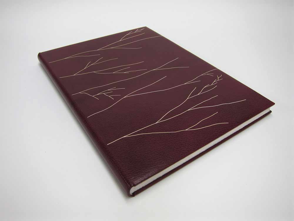
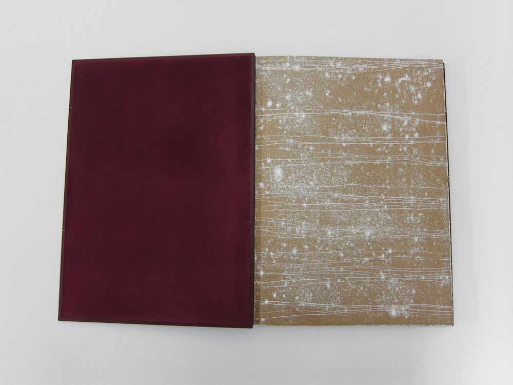
    In 2012, Haein Song bound this copy of Shakespeare’s Romeo and Juliet in full leather maroon goatskin. The delicate linear design was created by applying a series of natural goatskin onlays. The endpapers are monprinted in gold with suede doublures. 

    RomeoAndJuliet3-HaeinSong RomeoAndJuliet2-HaeinSong

    At first glance, the decorative elements appear to be hand tooled, but those thin lines are actually several onlays. Did you find it difficult to manipulate such delicate and thin pieces of leather?
    Leather pieces are paired down very thin (0.2.mm) and I cut them into long lines of a width of 1mm. It isn’t easy to glue the pieces so I put pva and paste mix on the glass surface then lay the piece on top so it can catch the adhesives. Then with a help of scalpel and tweezers I lay them on the the cover of the book based on my design. I think the idea of doing it seems more challenging than actually executing it. Once you are used to the thinness and longness of the piece it become a little bit like a drawing tool. And when I was laying down the pieces I had a feeling that I was drawing with a leather.

    RomeoAndJulietOnlays-HaeinSong


  10. Bookbinder of the Month: Haein Song

    February 16, 2014 by Erin Fletcher

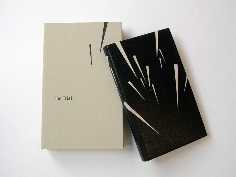
    TheTrial1-HaeinSong

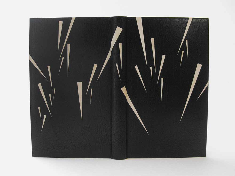
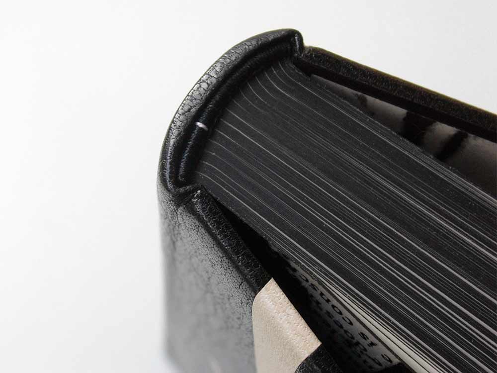
    The striking design on this fine binding of The Trial by Franz Kafka was created by the talented Haein Song in 2011. This Folio Society edition is covered in full black goatskin with reverse pared natural goatskin onlays. Keeping in fashion with her other bindings, the endpapers are hand printed and sit opposite a leather joint. 

    TheTrial2-HaeinSong

    The head edge and tail edge of the text block are decorated with black acrylic, leaving the whiteness of the paper on the fore edge exposed. Breaking up the edge decoration like this can be very interesting for the overall concept of the design and I think Haein is really playful in this area of the book. 

    TheTrial4-HaeinSong TheTrial3-HaeinSong

    You’ve created design bindings for some prominent authors such as Camus, Kafka and Kipling. Do you have an affinity for these authors? Do you plan to bind more of their works?
    I’m an admirer of few authors, which include Beckett, Camus, Kafka, Borges, Pessoa, Calvino, Kundera, Perec, Hesse and Carroll. I’m also very fond of playwriters associated with The Theatre of the Absurd. Whenever I have an urge and space I look for some of those authors’ books and I have few waiting to be bound. How I came to bookbinding is from the love of reading and interest in language. I don’t think it was easy for me to acquire a second language after being a grown-up so my love is mixed with the frustration I had to go through. And some of the authors I mentioned above express what I want to say through their books eloquently, articulately and poetically.


  • My name is Erin Fletcher, owner and bookbinder of Herringbone Bindery in Boston. Flash of the Hand is a space where I share my process and inspirations.
    The StudioNewsletterInstagramEmail me
  • Archives