RSS Feed

‘binder of the month’ Category

  1. Bookbinder of the Month: Edgar Mansfield

    November 18, 2012 by Erin Fletcher

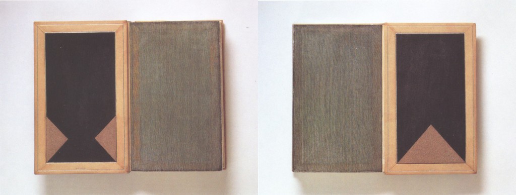
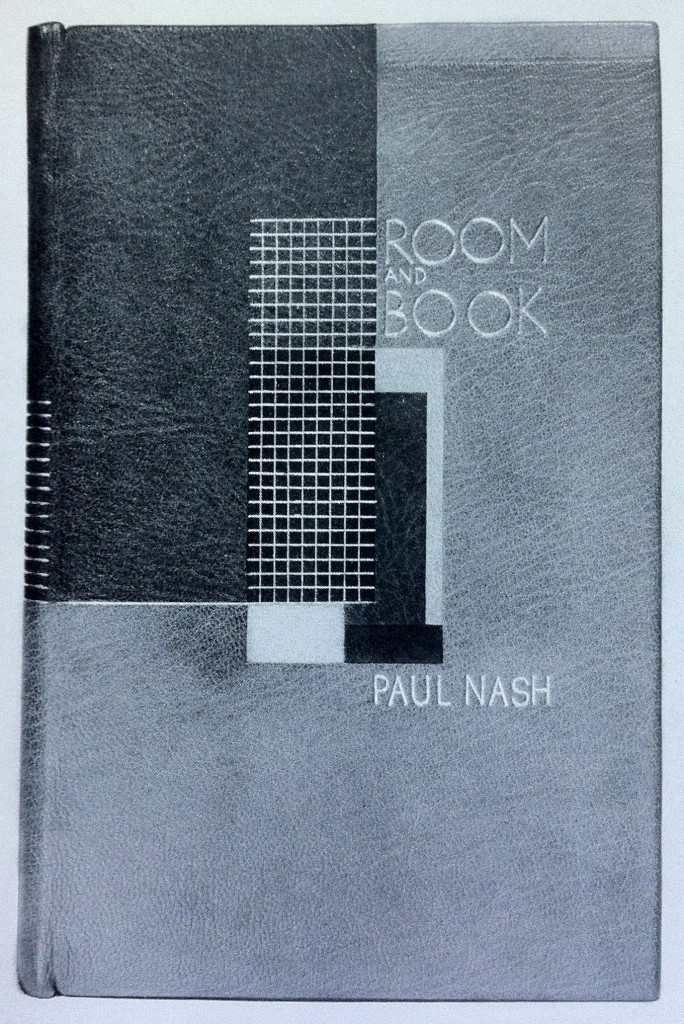
    This is an earlier binding from Edgar Mansfield, before he really developed his expressionist style. Room and Book by Paul Nash was published by Soncino Press in 1932 and was bound by Mansfield in 1941. Covered in yellow ochre and red brown morocco with inlays in natural, red, browns and black. All tooling in gold. 

    I particularly love this binding because of its rigidly angular and balanced design; a nice transition from the popular Art Deco bindings and to the surrealist and expressionist designs he’s best known for. 

  2. Bookbinder of the Month: Edgar Mansfield

    November 11, 2012 by Erin Fletcher

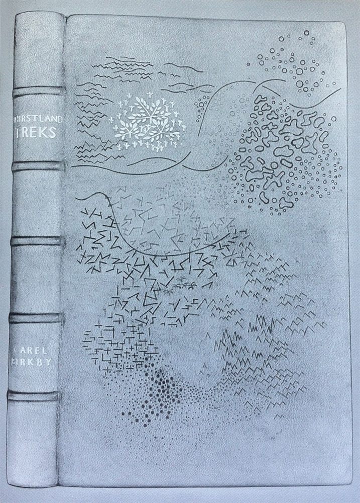
    I wish this image were in color, it’s a really striking design; the marks are almost sketch-like appearing at random to build a dimensional landscape. Thirstland Treks by Carel Birkby was printed by Faber and Faber in 1936 and this copy was bound by Edgar Mansfield in 1948. Covered in a native dyed yellow-brown morocco skin with slight creasing in the grain. The tooling is a combination of light and dark blind with a small amount of gold on the cover and spine.

    This is the first experiment with using the grain as an active and expressive element in the design.

    Reference: Modern Design in Bookbinding: The Work of Edgar Mansfield, pg. 27


  3. Bookbinder of the Month: Edgar Mansfield

    November 4, 2012 by Erin Fletcher

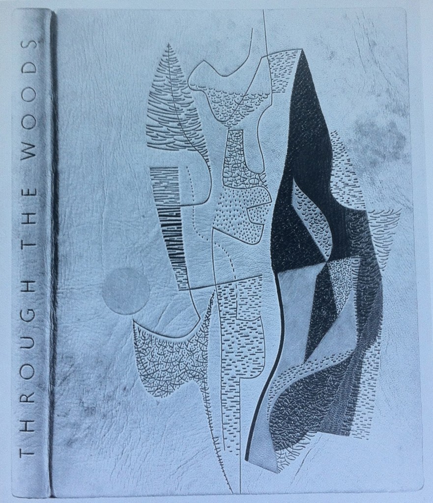
    Throughout Edgar Mansfield’s career as a bookbinder, he bound several copies of Victor Gollancz’s Through the Woods. Twelve of them are represented in The Work of Edgar Mansfield. The binding in the first image was bound in 1958; covered in a native tanned natural morocco with brown markings (both natural and added by Mansfield). The grain creases were induced during covering. All tooling is blind, with inlays of rust-red, greens and chrome yellow.

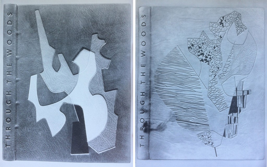
    left side: Bound in 1959 in a native dyed red morocco. The inlaid design spans over four levels built into the cover; inlay leather of chrome yellow, warm black, stone, neutralised green, natural and lemon yellow. All tooling in blind.

    right side: Bound in 1959 in a native tanned natural morocco with natural markings. The grain was creased during covering. All tooling in blind; the solid areas are built up with a short pallet to produce tonal and textural variations.

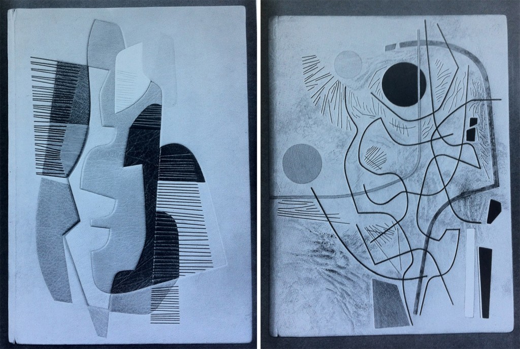
    left side: Bound in 1960 in a native tanned natural morocco. Inlaid design spans over three levels built into the cover; inlay leather of white, yellows, orange, browns and greens. Tooling in green and blind.

    right side: Bound in 1960 in a native tanned natural morocco with creases added to the grain while covering. Brown staining was added to the areas of the leather built up. Recessed inlays in yellow, red, white, black, grey and green. Tooling in light and dark blind.


  4. November // Bookbinder of the Month: Edgar Mansfield

    November 3, 2012 by Erin Fletcher

    Edgar Mansfield was born in London in 1907. Four years later his parents took him to New Zealand where he spent the next 23 years of his life before returning to England. 

    Starting in 1948, Mansfield began teaching at the London School of Printing, where in regards to bookbinding was a advocate for expressive design inspired by the spirit of the book as opposed to decorative pattern making. Mansfield developed as a binder outside of traditional training, his approach was first as an artist and then a craftsman. However, his execution was impeccable; he excelled in inlays and onlays, shaped his own finishing tools, and developed a technique to heighten the texture of leather during cover. Fellow binder Trevor Jones wrote the following after Mansfield’s death in 1996:

    The nature of the surface of a Mansfield binding and its tactile quality is most important, as befits the work of a sculptor. His preference was always for unpolished and unpressed goatskin enlivened with surface markings and blemishes, especially the native tanned and dyed skins once obtainable from Nigeria that displayed variations of tone and colour, if necessary with his own added ink markings. He often heightened the grain texture on the leather of his bindings by rolling the damp skin on itself before pasting, and later brushing towards the spine with the palm of his hand across the surface of the leather in the act of covering the book….

    read more >


  5. Bookbinder of the Month: Rose Adler

    October 28, 2012 by Erin Fletcher

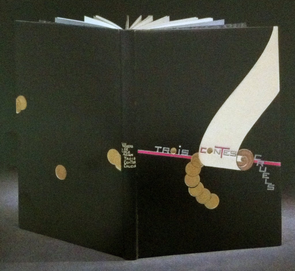
    Bound in full black calf is this 1927 edition of Auguste de Villiers de L’Isle-Adam’s Trois contes cruels with illustrations by Jean-Emile Laboureur.  Rose Adler created the design for the binding in 1929, which was then executed by Emmanuel Lecarpentier. The scroll design is created with ivory and beige calf onlays with a purple calf line onlay running behind and roundels are tooled in solid gilt. Title is tooled in aluminum, inlays of purple calf and gilt tooling, author’s name and title tooled in gilt on the spine. Doublures in beige calf with a pattern of black and purple calf at the bottom where Rose Adler’s signature can be found. Endleaves of alternating purple and aluminum watered silk; second endleaves of glazed aluminum paper. 

    The design is representative of the geometric focus of the first period of the Art Deco era. The design is quite striking, the roundels and descending title create a perfect balance along either side of the scroll.  

    Check out Art Deco Bookbindings: The Work of Pierre Legrain and Rose Adler for more of Rose Adler’s work.  


  6. Bookbinder of the Month: Rose Adler

    October 21, 2012 by Erin Fletcher

    Simulacre, a surrealist novella by Michel Leiris with illustration by French artist André Masson was printed in 1925. The binding was designed by Rose Adler and executed by Emmanuel Lecarpentier in 1927. Bound in full black calf with an inlay of cabochon of agate capping off a semi-oval of coral-pink crocodile set within an aluminum fillet. Title on the spine overlaps an inlay of red calf, tooled with aluminum on the black and black on the red. 

    The edges are gilt in aluminum, full leather doublures lacquered in gilt with endleaves of black watered silk. This is an impeccable binding, the vast negative space is perfectly balance against the bold and highly textured crocodile skin.


  7. Bookbinder of the Month: Rose Adler

    October 14, 2012 by Erin Fletcher

    In 1930, Rose Adler created this design for Francis de Croisset’s Aux fétes de Kapurthala, the binding was executed by Emmanuel Lecarpentier for Jacque Doucet’s collection. Bound in citron calf, the front cover has an inlay of cabochon of chrysoprase topped with a patterned band of black and ivory calf outlined in a gold gilt fillet, at the base of the cover is an inlay of black calf. The title and author’s name has been tooled blind along the spine. Edges are gilt with aluminum. Doublures of ivory calf line the inside of each board paired with black watered silk flyleaves.  

    The book is housed in a wrapper and slipcase decorated with black, orange and gold paper, bordered with citron calf. The wrapper doublure is done with almond-green, hard-grained leather.


  8. Bookbinder of the Month: Rose Adler

    October 7, 2012 by Erin Fletcher

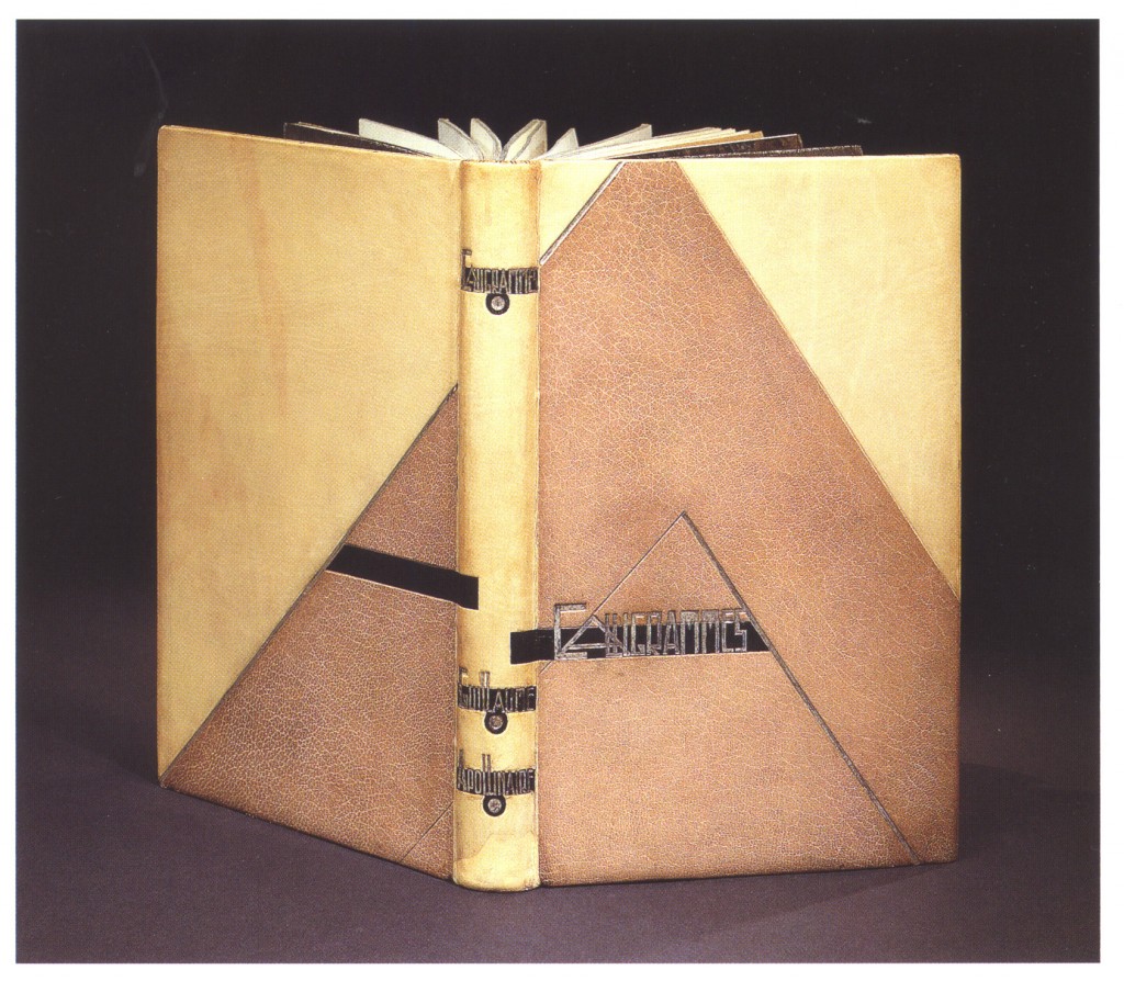
    In 1918, this copy of Guillaume Apollinaire’s Calligrammes: Poémes de la paix et de la guerre was printed with an original etching by Pablo Picasso (engraved by René Jaudon) and an original drawing by René Jaudon. In 1925, Rose Adler created the design and the binding was executed by Adolphe Cuzin for Jacques Doucet’s collection.

    Bound in ivory calfskin with overlapping inlays of black calf and beige goatskin. All tooling on cover and gilding on the edges has been done in aluminum. The turn-ins are ivory calf embellished with aluminum fillets bordering an inlay panel of black calf with a mosaic of beige goatskin. The fly leaf is silver lamé (fabric woven or knit with thin ribbons of metallic threads). The binding is housed in a wrapper and slipcase of aluminum paper framed by red and black calf.  The title and author’s name are tooled over three inlays of beige goatskin in aluminum over a black spine.


  9. October // Bookbinder of the Month: Rose Adler

    October 1, 2012 by Erin Fletcher

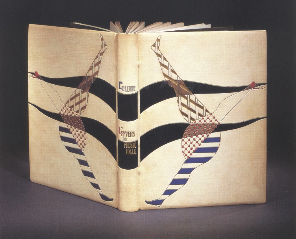
    This copy of Colette’s L’Envers du Music-Hall with illustrations by Jean-Emile Laboureur was printed in Paris in 1926. The binding was signed and designed by Rose Adler and executed by Emmanuel Lecarpentier in 1929 for the bibliophile Jacques Doucet. Bound in ivory calf, the dancer’s legs are highlighted with royal blue, red, beige and black calf. On the spine the author’s name has been tooled in aluminum with an inlay of royal blue calf for the initial, while the title has been tooled in both gold and aluminum with an inlay of pink calf for the initial and royal blue for the apostrophe.  

    Unfortunately there is not a lot written about Rose Adler. However, she is one of my favorite binders, working and living during one of the most exciting eras in terms of art and culture: Art Deco of the 1920’s and 30’s. Rose took on the profession of offering her design work as both a cabinetmaker and bookbinder. As a bookbinder she worked closely with her teacher, Pierre Legrain, who greatly influenced her design work and craftsmanship and much of her work was commissioned by Jacques Doucet.

    Rose was particularly fond of calfskin because of its smooth qualities. She masterfully designed bindings, carefully considering the book itself and the materials. Like many other binders at the time, she incorporated an assortment of other materials into her work like lizard and crocodile skins, agate and lapis stones, aluminum for edge gilding and tooling, and lacquer as a finish. 

    Rose was born in 1892 and lived until 1959.


  10. Bookbinder of the Month: Sybil Pye

    September 30, 2012 by Erin Fletcher

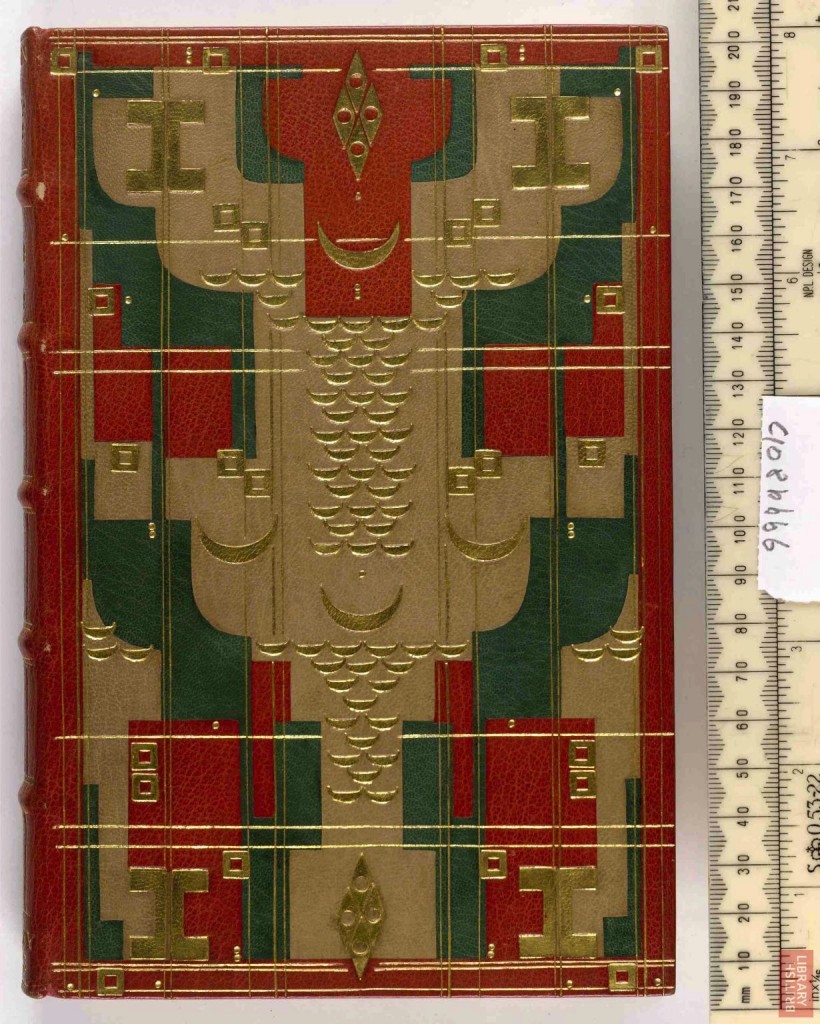
    Even though this book is more heavily tooled then her other bindings, she keeps to the same rhythm of repeating her signature tools in order to create the design.  The same tool is used in each corner and lines are used to break up the already complex design. This edition of Francois Villon’s Ballades and Miscellaneous Poems was printed in 1900 by the Eragny Press and bound by Sybil in 1928.  Covered in red goatskin over 5 raised bands, the design also includes onlays of green and natural goatskin. This book can be seen in detail online at the British Library.


  • My name is Erin Fletcher, owner and bookbinder of Herringbone Bindery in Boston. Flash of the Hand is a space where I share my process and inspirations.
    The StudioNewsletterInstagramEmail me
  • Archives