RSS Feed

‘feature book of the week’ Category

  1. Bookbinder of the Month: Jan Sobota

    December 23, 2012 by Erin Fletcher

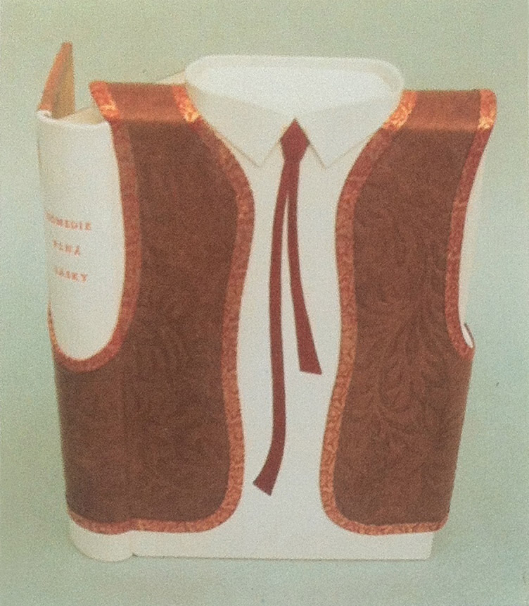
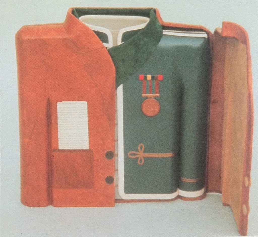
    rachlik_sobotaIn the spirit of Christmas, I offer this binding by Jan Sobota that appears like box within a box. In 1986, Sobota completed this layered book object of Frantisek Rachlik’s Komedie plna lasky (Comedy Full of Love), a story about the life of Jindrich Mosna, a famous Czech actor during the nineteenth century. Each layer of the book object represents three different costumes from his most important roles. 

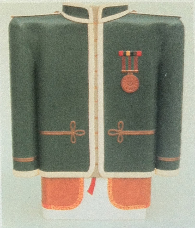
    The book object lives inside a box sculpted out of board to mimic a newspaper reporter’s jacket. It is covered in natural sheepskin and includes buttons and a pocket with document, with details outlined in blind tooling. The second layer of protection is a slipcase modeled after a soldier’s uniform. Also sculpted out of board, the slipcase is covered in blue calfskin with onlays of various colors embellishing the jacket. Blind tooling is also used to finish off the details.rachlik2_sobota rachlik3_sobotaFinally, the boards of this box-binding are sculpted with board to represent the costume of a Czech peasant, covered in white goatskin and natural cowhide. Relief onlays, gold and blind tooling complete the design. 

  2. Bookbinder of the Month: Jan Sobota

    December 16, 2012 by Erin Fletcher

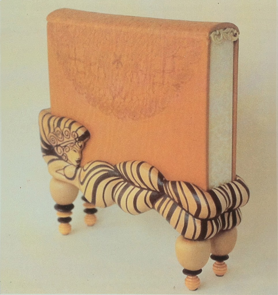
    rimskalyrika_jansobotaThis book object and stand were crafted by Jan Sobota in 1987, the book is Rimska Lyrika (Lyrics of the Roman Empire). The book is covered in natural calfskin with blind tooling, decorative edges and headbands. The stand is made of binders board and balsa wood covered with natural goatskin and dark red onlays. The overall design is a canopy bed with slightly erotic elements inspired by the old Roman lyrics. 

    resource: The New Bookbinder: Journal of Designer Bookbinders. Volume 10, 1990.


  3. Bookbinder of the Month: Jan Sobota

    December 9, 2012 by Erin Fletcher

    Over the course of 10 years, Jan Sobota participated in four Helen Warren DeGolyer Triennial Competitions. Every three years the Bridwell Library on Southern Methodist University’s campus chooses a book from their collection to be rebound by an individual binder. Each participant offers a proposal binding for the chosen title in addition to an example of their work. The winner of the Helen Warren DeGolyer Award receives a commission to bind the selected book according to their design proposal.  Two other prizes are awarded for excellence in fine binding and design. 

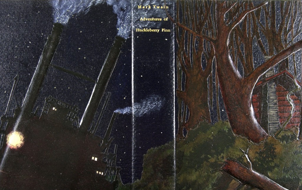
    The first time Sobota entered this competition was in 2003, creating a proposal for Mark Twain’s Adventures of Huckleberry Finn. His design was given the Judge’s Distinction of Interpretation award:

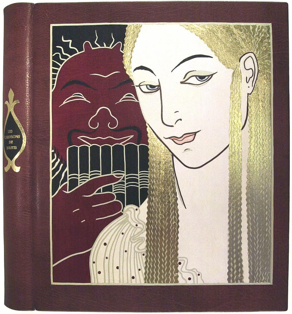
    An example of his work submitted for the 2003 competition:

    This binding of Les Chansons de Bilitis by Pierre Loüys is translated from Greek and includes illustrations by G. Barbier engraved on wood by François Schmied. This edition was printed in Paris in 1922. A triple cover board binding structure bound in brown Harmatan goatskin for the top layer, gold leather for the middle and dark blue goatskin for the doublures with blue suede leather flyleaves. The same gold leather was used to create wrapped headbands, the top edge was gilt. 


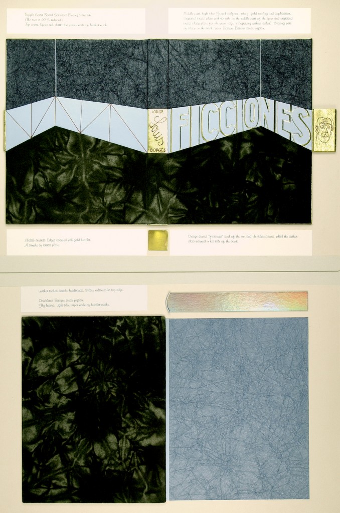
    For the Fourth Helen Warren DeGolyer Exhibition in 2006, Sobota presented his proposal for Jorge Luis Borges’ Ficciones:

    Sobota proposed a triple cover board binding structure, to be covered in dark blue paper made of leather-maché, light blue French box calf (title in relief outlined in gold tooling) and batik suede pigskin. A brass plate on the spine engraved with the author’s name along with a brass clasp along the foredge engraved with the author’s portrait. The middle board would be covered with gold leather and doublures of batik suede pigskin. The flyleaves would be light blue paper of leather-maché. Double core leather-tooled headbands and silver multi-metallic gilt top edge.

    “The design depicts the ‘fictitious’ soul of the text and the illustrations, which the author also suggests in the title of the book”. The 1987 edition of Ficciones includes illustrations by Gabriela Aberastury, Julio Pagnao, Mirta Ripoll, Raúl Russo and Alicia Scavino.

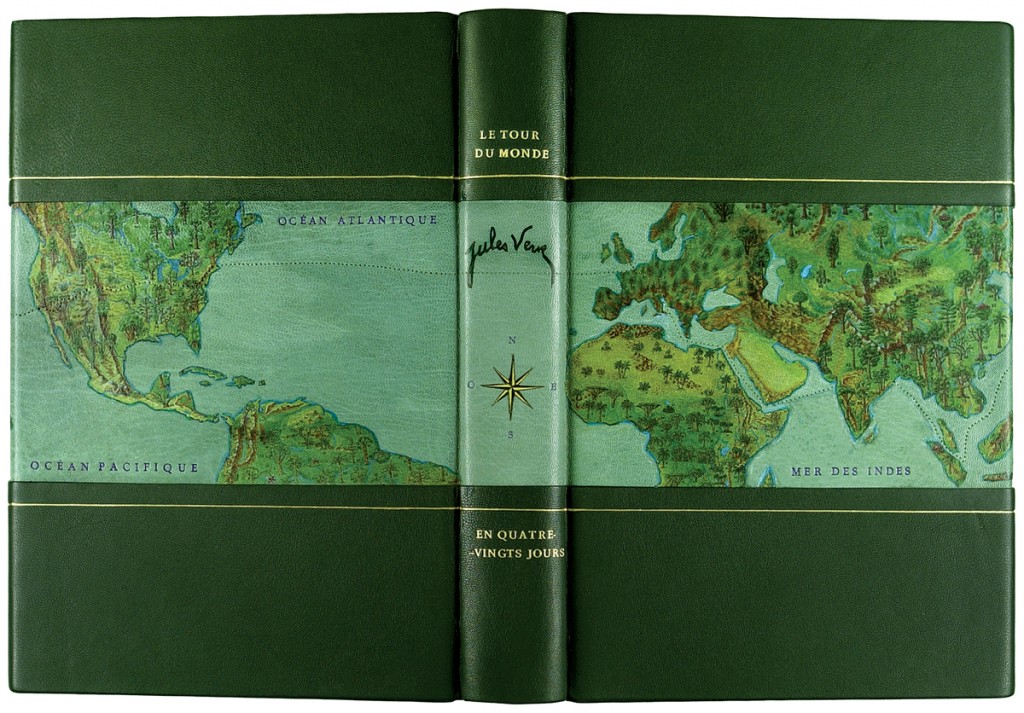
    An example of Sobota’s work included in the 2006 submission was a binding of Jules Verne’s Le Tour Du Monde En Quatre-Vingts Jours:


    John Grave’s Goodbye to a River: A Narrative was chosen for the Fifth Helen Warren DeGolyer Competition in 2009. Here is Sobota’s proposal submission: 

    read more >


  4. Bookbinder of the Month: Jan Sobota

    December 2, 2012 by Erin Fletcher

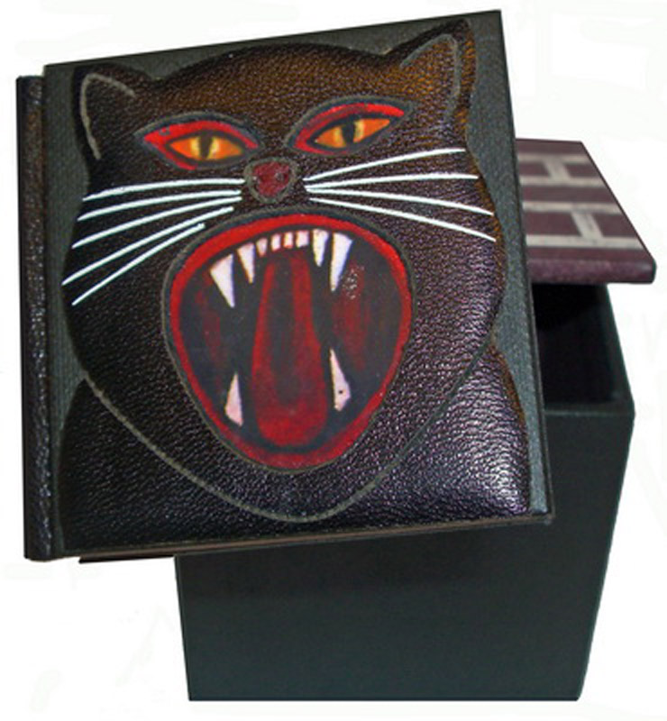
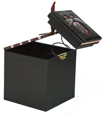
    Jan Sobota produced several miniature bindings, which were included in various exhibitions. This binding of Edgar Allen Poe’s The Black Cat was published in a small edition of 20 by Jan and Jarmilla in 2009. This book-object was designed as a ‘Jack-in-the-Box’, the book is permanently attached to a spring that jumps forward as you open the lid. The black cat silhouette on the front cover is laser cut and finished with hand painting and tooling in white foil.

    The box is covered in black binders’ cloth and the lid is hand tooled in a pattern resembling a brick wall. The box measures 2.75″ x 2.75″ and the book measures 2.3″ x 2.3″.

    resource: J. & J. Book Arts Studio


  5. Bookbinder of the Month: Edgar Mansfield

    November 25, 2012 by Erin Fletcher

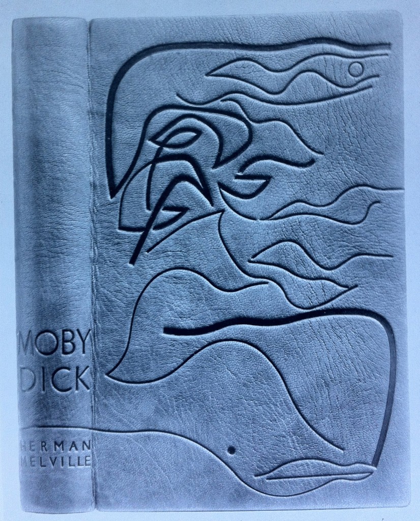
    Moby Dick by Herman Melville is the classic novel possessing the iconic white sperm whale, whose image graces the cover of this binding by Edgar Mansfield. Following the design of Baudelaire’s Les Fleurs du Mal (1952) and A Rage to Live by John O’Hara (1952), Mansfield created this design for Moby Dick in 1953. Tooling in black, Mansfield creates movement and depth with variations in tone and line width.  The book is bound in a native dyed red morocco.

     Les Fleurs du Mal by Baudelaire (The Harvill Press. 1952), bound in yellow morocco inlaid in red and black, tooled in blind

    A Rage to Live by John O’Hara (Random House. 1949), bound in orange-red morocco tooled in blind


  6. Bookbinder of the Month: Edgar Mansfield

    November 18, 2012 by Erin Fletcher

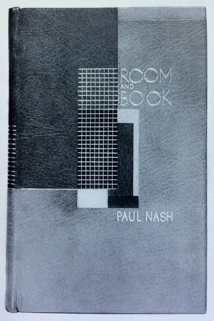
    This is an earlier binding from Edgar Mansfield, before he really developed his expressionist style. Room and Book by Paul Nash was published by Soncino Press in 1932 and was bound by Mansfield in 1941. Covered in yellow ochre and red brown morocco with inlays in natural, red, browns and black. All tooling in gold. 

    I particularly love this binding because of its rigidly angular and balanced design; a nice transition from the popular Art Deco bindings and to the surrealist and expressionist designs he’s best known for. 


  7. Bookbinder of the Month: Edgar Mansfield

    November 11, 2012 by Erin Fletcher

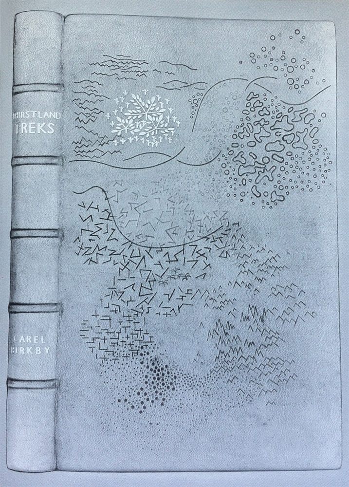
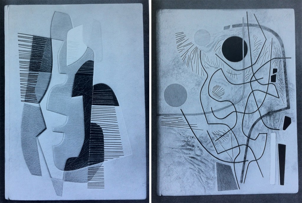
    I wish this image were in color, it’s a really striking design; the marks are almost sketch-like appearing at random to build a dimensional landscape. Thirstland Treks by Carel Birkby was printed by Faber and Faber in 1936 and this copy was bound by Edgar Mansfield in 1948. Covered in a native dyed yellow-brown morocco skin with slight creasing in the grain. The tooling is a combination of light and dark blind with a small amount of gold on the cover and spine.

    This is the first experiment with using the grain as an active and expressive element in the design.

    Reference: Modern Design in Bookbinding: The Work of Edgar Mansfield, pg. 27


  8. Bookbinder of the Month: Edgar Mansfield

    November 4, 2012 by Erin Fletcher

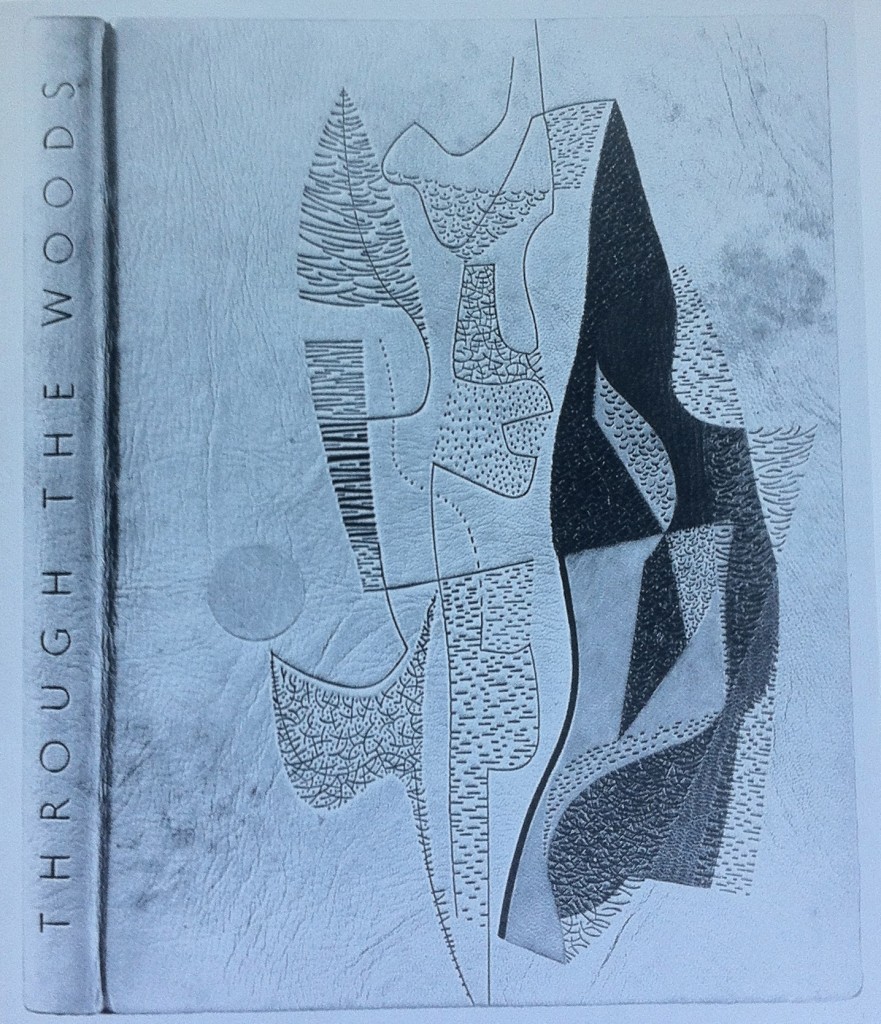
    Throughout Edgar Mansfield’s career as a bookbinder, he bound several copies of Victor Gollancz’s Through the Woods. Twelve of them are represented in The Work of Edgar Mansfield. The binding in the first image was bound in 1958; covered in a native tanned natural morocco with brown markings (both natural and added by Mansfield). The grain creases were induced during covering. All tooling is blind, with inlays of rust-red, greens and chrome yellow.

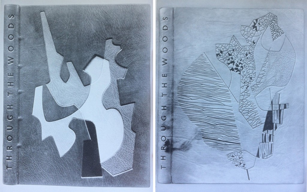
    left side: Bound in 1959 in a native dyed red morocco. The inlaid design spans over four levels built into the cover; inlay leather of chrome yellow, warm black, stone, neutralised green, natural and lemon yellow. All tooling in blind.

    right side: Bound in 1959 in a native tanned natural morocco with natural markings. The grain was creased during covering. All tooling in blind; the solid areas are built up with a short pallet to produce tonal and textural variations.

    left side: Bound in 1960 in a native tanned natural morocco. Inlaid design spans over three levels built into the cover; inlay leather of white, yellows, orange, browns and greens. Tooling in green and blind.

    right side: Bound in 1960 in a native tanned natural morocco with creases added to the grain while covering. Brown staining was added to the areas of the leather built up. Recessed inlays in yellow, red, white, black, grey and green. Tooling in light and dark blind.


  9. Bookbinder of the Month: Rose Adler

    October 28, 2012 by Erin Fletcher

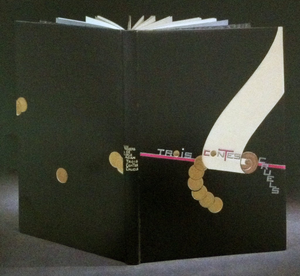
    Bound in full black calf is this 1927 edition of Auguste de Villiers de L’Isle-Adam’s Trois contes cruels with illustrations by Jean-Emile Laboureur.  Rose Adler created the design for the binding in 1929, which was then executed by Emmanuel Lecarpentier. The scroll design is created with ivory and beige calf onlays with a purple calf line onlay running behind and roundels are tooled in solid gilt. Title is tooled in aluminum, inlays of purple calf and gilt tooling, author’s name and title tooled in gilt on the spine. Doublures in beige calf with a pattern of black and purple calf at the bottom where Rose Adler’s signature can be found. Endleaves of alternating purple and aluminum watered silk; second endleaves of glazed aluminum paper. 

    The design is representative of the geometric focus of the first period of the Art Deco era. The design is quite striking, the roundels and descending title create a perfect balance along either side of the scroll.  

    Check out Art Deco Bookbindings: The Work of Pierre Legrain and Rose Adler for more of Rose Adler’s work.  


  10. Bookbinder of the Month: Rose Adler

    October 21, 2012 by Erin Fletcher

    Simulacre, a surrealist novella by Michel Leiris with illustration by French artist André Masson was printed in 1925. The binding was designed by Rose Adler and executed by Emmanuel Lecarpentier in 1927. Bound in full black calf with an inlay of cabochon of agate capping off a semi-oval of coral-pink crocodile set within an aluminum fillet. Title on the spine overlaps an inlay of red calf, tooled with aluminum on the black and black on the red. 

    The edges are gilt in aluminum, full leather doublures lacquered in gilt with endleaves of black watered silk. This is an impeccable binding, the vast negative space is perfectly balance against the bold and highly textured crocodile skin.


  • My name is Erin Fletcher, owner and bookbinder of Herringbone Bindery in Boston. Flash of the Hand is a space where I share my process and inspirations.
    The StudioNewsletterInstagramEmail me
  • Archives