RSS Feed

‘feature book of the week’ Category

  1. Bookbinder of the Month: Lori Sauer

    March 24, 2013 by Erin Fletcher

    glassroom-lorisauer

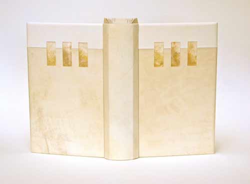
    The Glass Room by Simon Mawer is a novel about a Jewish family and the house they built in Czechoslovakia prior to WWII. The house is based on the Villa Tugendhat, designed by the architect Mies van der Rohe in Brno in the late 1920s. The building was inscribed on the National List of Cultural Heritage in 1969 and after renovations is open to the public. The story in the novel details the plight of the family as they are forced to leave the country and the subsequent uses their house was put to.

    In 2009, Lori Sauer bound The Glass Room for the Man Booker Prize. The binding is a dos rapporté structure and is covered in two shades of vellum. The Perspex (also known as Plexiglass) inlays have dyed Tyvek underneath to simulate onyx. Lori had wanted to use real onyx as it was a major feature in the house, but the cost of having it thinly sliced for inlays was too high. The onyx wall is located in the living room of the house and is partially translucent, changing its appearance with the evening sun. The doublures are dyed Tyvek made to look similar to veins in onyx.

    The house and its design dominate the novel. It is a very modern building with large rooms and lots of glass. Built when art deco was at its peak, Lori chose to design a binding around the motifs and in the spirit of the architecture.
  2. Bookbinder of the Month: Lori Sauer

    March 17, 2013 by Erin Fletcher

    brothergiles-lorisauer

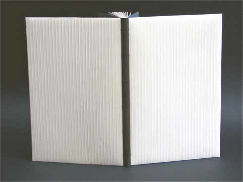
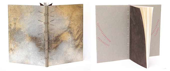
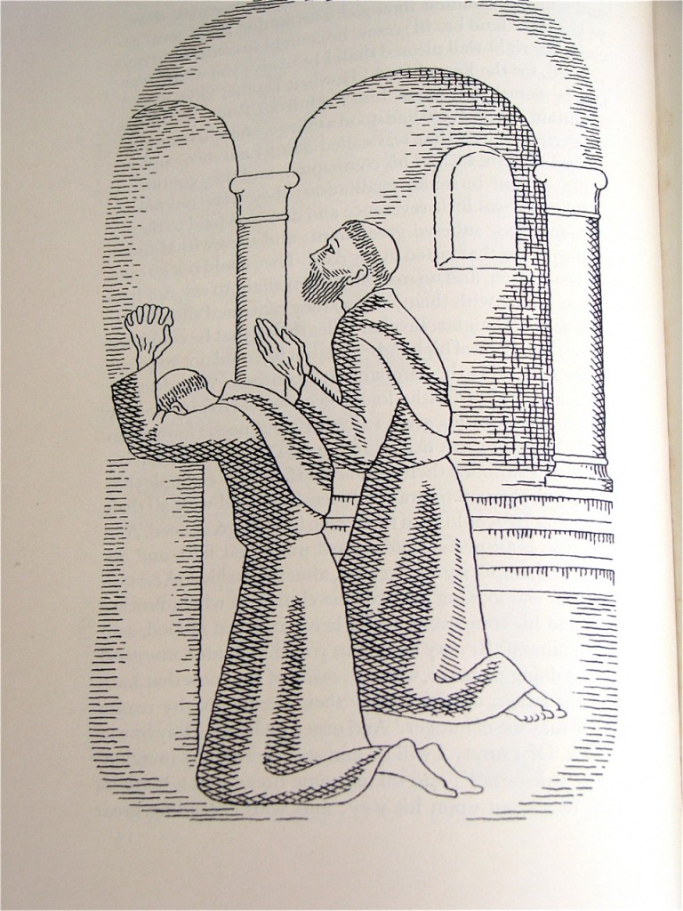
    This book was bound in 2009 by Lori Sauer as a modified sewn-board binding with a wooden spine. The boards are covered in natural vellum and the spine is attached with threads and vellum strips that are laced into the boards. I find the unusual pattern of the vellum to be quite alluring; it adds a great amount of depth and texture. The doublures are Japanese paper with suede flyleaves. The doublures are embroidered with silk in a crosshatch motif, inspired by the method used in the illustrations.

    brother giles illustrations

    The Life and Chapters of Sundry Goodly, Sayings of the Teachings of Brother Giles was printed by the City of Birmingham School of Printing in 1941 with illustrations by Neil Leitch MacCuaig. The book is comprised of wise words and sayings by a companion of St Francis, Brother Giles. 


  3. Bookbinder of the Month: Lori Sauer

    March 10, 2013 by Erin Fletcher

    water-lorisauer

    The first Designer Bookbinders International Competition was organized in conjunction with the Bodleian Library in 2009. Each binder involved submitted a binding of the set book Water, which is a collection of poems and illustrations based on the theme of water. The set book was published by Incline Press in a limited, letterpress edition.

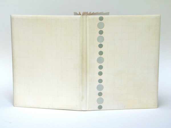
    In 2008, Lori Sauer bound a copy of Water as a stub binding covered in three stages: the spine attached first with the covers stuck on afterwards. The binding is covered in white vellum and the surfaces are decorated with impressions of circles that sit on a graphite grid. The rear board has pairs of circles and the front has single, larger circles. Onlaid colored circles run down the length of the front board. The spine has a pattern of plus symbols. The doublures are Fabriano Roma.

    Lori describes the text as being filled with a myriad of styles of illustrations and poems from different writers, adding to its broad theme. The circles of her design are simply the symbols for the chemical composition of water, two hydrogen atoms plus one oxygen. The onlaid colored circles on the front cover were added a couple of years after completing the binding as Lori felt a focus was needed to the design. I certainly think the addition of the circles offers a focal point to the viewer, then you slowly begin to realize the complex pattern of lines and circles underneath. 


  4. Bookbinder of the Month: Lori Sauer

    March 3, 2013 by Erin Fletcher

    kyffin1-lorisauer

    Kyffin: A Celebration is a collection of essays about the Welsh artist Kyffin Williams. This book was published and letterpress printed by Gwas Gregynog Press (2007) in a limited edition containing linocut prints from the artist. Production began with the artist’s collaboration, but Kyffin died before its completion. In 2008, Lori Sauer bound a copy of this book as a modified sewn-board binding. 

    The boards are covered in embossed vellum that is drummed on and the spine is shaped from black African hardwood. Doublures and flyleaves are Fabriano Roma in black and blue/grey, the colours of the linocuts.

    Lori wrote me a few words regarding her concept for the cover design.
    Illustrated books present the challenge of how to design the cover, especially this one with such strong images. I never want to imitate the artist or transfer their work to the outside. My aim is to be complimentary and pick up on ideas of tone and intent. In this case the binding uses the colours of the text and the texture of author’s medium.


  5. Bonus // Bookbinder of the Month: Hannah Brown

    February 24, 2013 by Erin Fletcher

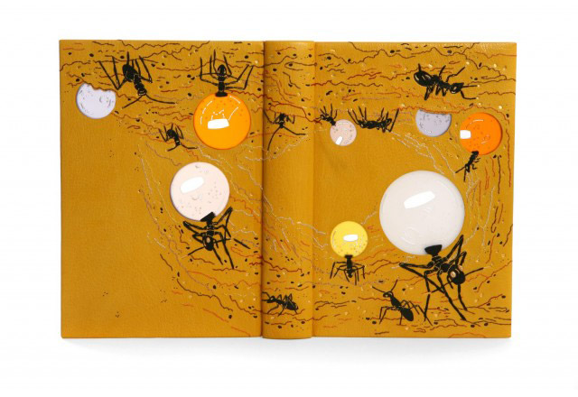
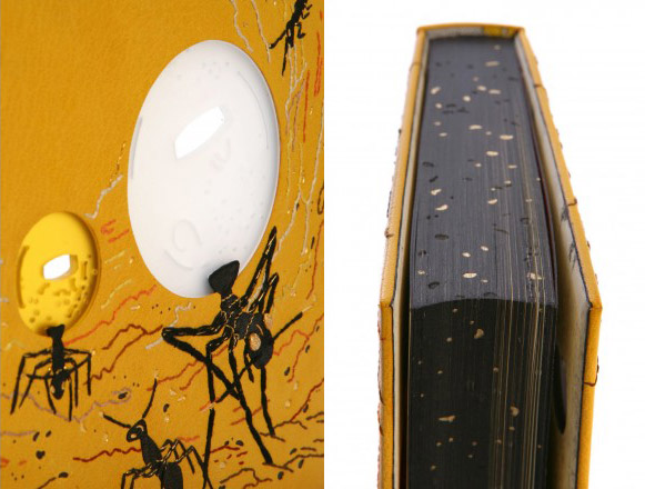
    thesonglines_hannahbrown1The Songlines by Bruce Chatwin with illustrations by Simon Pemberton is a Folio Society edition published in 2010. Hannah Brown bound this copy in 2011 as a full leather binding in yellow goatskin with black back-pared leather onlays. Embroidery is done over the onlays with silk and metallic threads in gold, orange, purple, brown, white, black and rust. Frosted acrylic ‘windows’ were lathe-turned, hand-pierced and drilled then set into the front and back boards. The larger ant’s eyes are gold-plated, hand-shaped and patterned brass pieces, inserted through the book covers. The smaller ant’s eyes are tooled with gold, additional tooling in both carbon and gold using handmade finishing tools. 

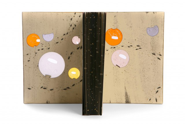
    Edges are painted with acrylic and tooled with carbon and gold foil. Endpapers and doublures are soft-plate off-set printed with a design of walking ants, appearing to move around the acrylic ‘windows’. Both elements are tooled with gold foils.

    thesonglines_hannahbrown2 thesonglines_hannahbrown3

    I’m completely blown away by the design on this book. Can you talk more about your initial concept and how you approached making it a reality?
    The book is a direct account of the author’s travels in Australia. In the book there are references to honey ants, which is what I decided to base my design on. Honey ants (or ‘repletes’, as they are also known) are ants that are gorged with food so that their abdomens swell enormously. Other ants then extract nourishment from them, they function essentially as living larders. They are found deep underground and are valued highly during time of little food and water.

    I was amazed by these insects and wanted to draw attention to the fact that they have peculiarly large abdomens. I had by chance recently ordered some samples of frosted, coloured acrylic and this seemed a perfect material to use to illustrate their bodies. I used a metal working lathe to turn the frosted acrylic into discs, and cut corresponding holes into the boards before insetting the acrylic in. I really liked that fact that the bodies seemed to light up when the covers of the book were opened.  


  6. Bookbinder of the Month: Hannah Brown

    February 24, 2013 by Erin Fletcher

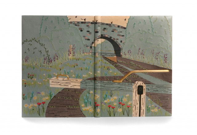
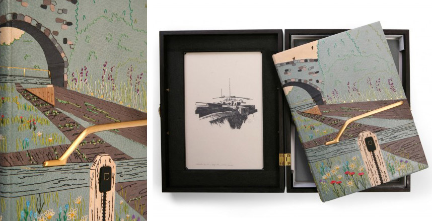
    locksoftheoxfordcanal_hannahbrown1The Locks of the Oxford Canal: A Journey from Oxford to Coventry was published by The Whittington Press in 1984 and includes fifty wood engravings by John Craig. In 2011, Hannah Brown bound a copy for the Designer Bookbinders Annual Competition, receiving the Mansfield Medal for Best Book. The binding is full leather in a turquoise goatskin with various leather onlays and inlays of pink eel skin, turquoise shagreen and yellow, grey and cream goatskin. All embroidery is done over the onlays with colored silk and metallic threads. Two gold-plated, hand-shaped brass pieces were inserted through the covers and recessed into the boards. Tooling in carbon and gold.

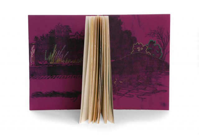
    Doublures have been soft-plate off-set printed to include two images taken from the book and are hand-embroidered and tooled with gold foils. The book is housed in an oak box stained black with suede dyes. The front and back include recessed frosted acrylic panels with cut out sections, brass wire, gold foil tooling and sewn details. 
    locksoftheoxfordcanal_hannahbrown2 locksoftheoxfordcanal_hannahbrown4

    Can you go over the process of embroidering onto leather, when did you first introduce this technique into your fine bindings? How do you decide between machine-sewn to hand-sewn embroidery?
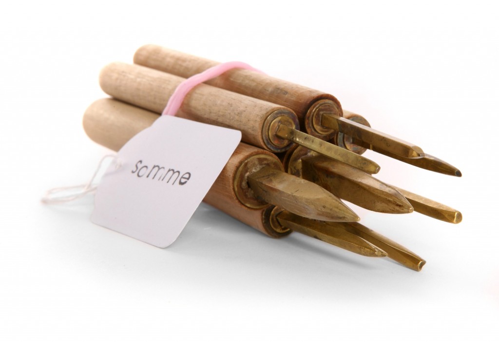
    Ever since my first design binding, ‘The Somme: A Eyewitness History’, I have added sewn detail to the leather. During the first couple of years of making fine bindings, the sewn detail was always done using my sewing machine. This method could however be a little hit and miss with fear of the sewing machine foot leaving marks on the leather.

    The first book that I decided to hand embroider was in 2010, ‘Wildlife in a Southern County’, as I felt the design would appear stronger with hand-sewn outlines. From this point on I have largely chosen to embroider the leather by hand as it gives me more control.

    My most ambitious embroidered binding to date has been on my Shakespeare competition entry, ‘Flowers From Shakespeare’s Garden’, the embroidery alone taking me over one hundred hours to complete. I love the way that it is possible to build up depth of colour and different textures by using a variety of embroidery stitches. I have had no formal embroidery training but have taught myself by experimenting on sample boards.

    I begin by creating a base colour on the covering leather by adding coloured leather onlays. I then back pare these and build up the design by adding silk threads in a variety of colours.


  7. Bookbinder of the Month: Hannah Brown

    February 17, 2013 by Erin Fletcher

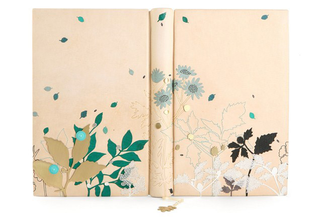
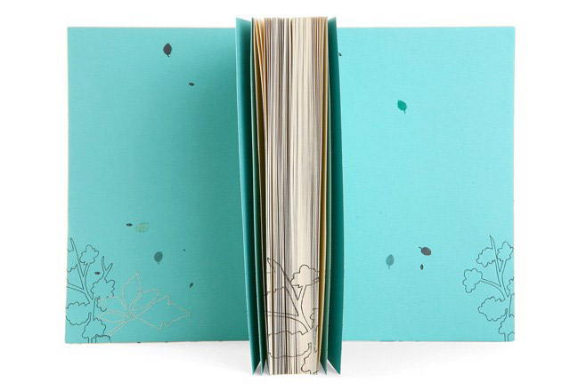
    wordstoliveby_hannahbrown1Words to Live By was bound by Hannah Brown in 2009 in a cream alum-tawed goatskin with various leather onlays in green, black, grey and turquoise. Additional leaf pieces of acid-etched stainless steel are hand-sewn onto covers with metallic thread; leaf outlines are machine-sewn. Various hand-pierced leaves and plant details in brass and silver are scattered throughout the design. Hand-tooling in carbon and Moon gold with hand-made finishing tools. Head edge of text block is painted with turquoise acrylic. 

    wordstoliveby_hannahbrown2


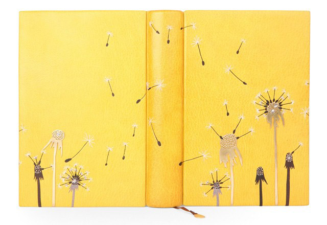
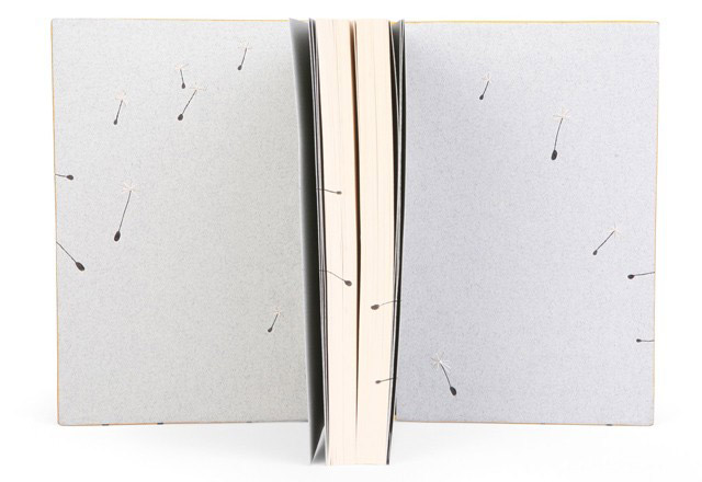
    glimpsesofnature_hannahbrown1In 2009, Hannah Brown bound Glimpses of Nature by Andrew Wilson in a mustard-yellow goatskin with various leather onlays in dark brown, black and grey. Each dandelion seed head was hand-sewn with white and metallic thread. The binding also includes three hand-pierced and drilled brass dandelions. Hand-tooling in carbon and gold with hand-made finishing tools.

    glimpsesofnature_hannahbrown2More dialogue after the jump…

    read more >


  8. Bookbinder of the Month: Hannah Brown

    February 10, 2013 by Erin Fletcher

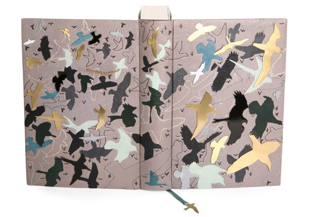
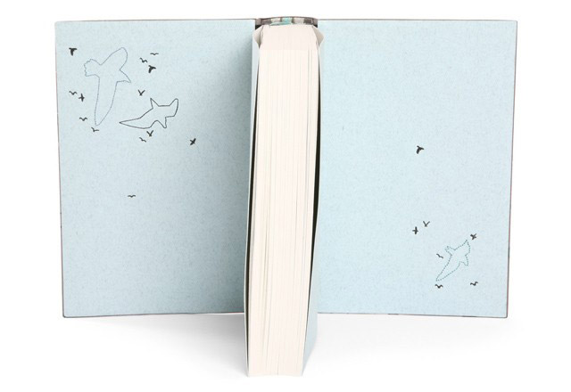
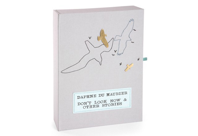
    dontlooknow_hannahbrown1This edition of Daphne Du Maurier’s Don’t Look Now and Other Stories was published by the Folio Society in 2007 and bound by Hannah Brown in 2008 for the Designer Bookbinders Annual Competition, receiving the Mansfield Medal for Best Book. Bound in a dark grey goatskin with miscellaneous leather bird onlays in black, grey, dark green, pale turquoise and dark turquoise. Bird outlines are machine-sewn with twenty-four additional bird silhouettes in hand-pierced brass. Hand-tooled birds in carbon and Moon gold with hand-made finishing tools.

    The book is housed in a drop-back box covered in a pale grey bookcloth highlighted with elements from the binding.

    dontlooknow_hannahbrown2 dontlooknow_hannahbrown3dontlooknow_hannahbrown4

    Metal pieces appear a lot in your binding. How did you start working with this material, do you cut and shape the metal pieces yourself?
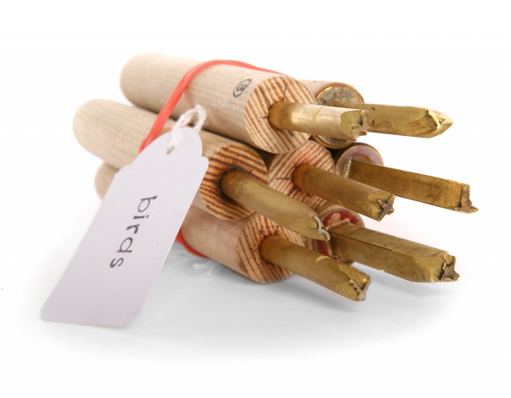
    I began to learn how to work with metal whilst doing my degree course in Brighton. Visually I have always liked the appearance of the pierced metal against leather. I tend to always use brass as the base metal, in my early books I lacquered the metal to prevent tarnishing, however I have now moved on to getting the brass pieces I use gold-plated.

    I do pierce the shapes out myself, I also solder posts on to the reverse of the shapes and attach them to the boards by drilling holes and feeding these posts through. I do not trust glues to withstand the test of time and feel far happier knowing that the metal is physically fixed through the covers. I have also started to experiment with acid etching to create texture on the flat metal surface, and intend to do more with this on future bindings.


  9. Bookbinder of the Month: Hannah Brown

    February 3, 2013 by Erin Fletcher

    thesomme_hannahbrown1

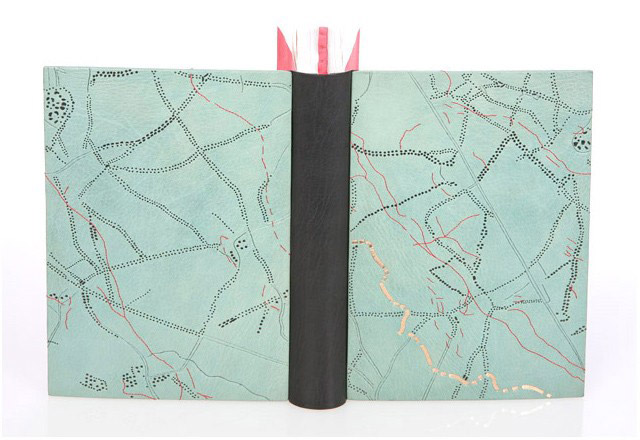
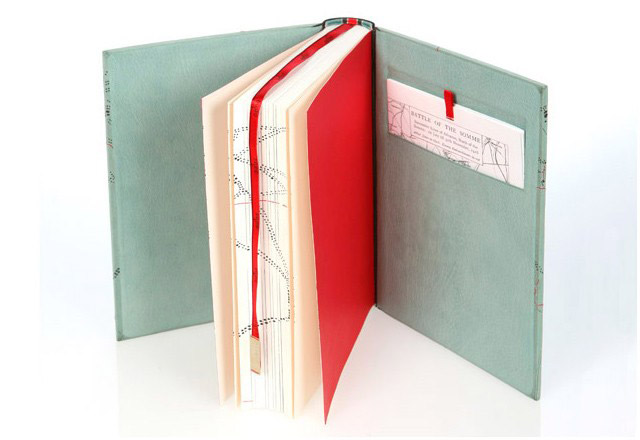
    The Somme: An Eye Witness History is a Folio Society edition published in 2006 and bound by Hannah Brown in 2007. Boards are covered in pale turquoise goatskin with a dark grey goatskin spine piece. The covers were machine-sewn with red thread and hand-tooled in carbon and Moon gold with handmade finishing tools. The ribbon bookmark was hand-tooled to indicate the scale of map depicted on the boards.thesomme_hannahbrown2thesomme_hannahbrown3


  10. Bookbinder of the Month: Jan Sobota

    December 30, 2012 by Erin Fletcher

    asimov_sobota

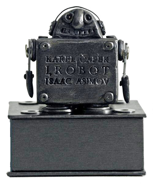
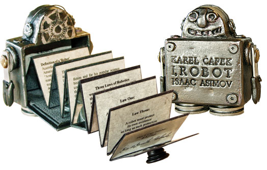
    I’m finishing off this month of Jan Sobota bindings with another miniature book that was created in collaboration with his wife Jarmila. Inside the hand-sculpted robot lives an accordion book of sixteen panels. The text explores the birth and usage of the word “robot”, which is first used by the Czech playwright Karel Čapek in 1920 (the word “robot” derives from a Czech word meaning forced labor or serf). The term “robotics” was coined by the Russian writer Isaac Asimov.

    The accordion-fold panels fold ingeniously into a compartment in the back the 2 3/4″ tall metal robot. A metal panel is held in place with a magnet affixed to the back of the robot’s head, securing the pages inside the robot. The robot is made with the use of A+B EpoPutty plasticine and metal parts and finished with an application of patina, the front is engraved with three lines: Karel Čapek / I, Robot / Isaac Asimov.

    This binding was created in 2007 in an edition of 30, each copy is signed by both Jan and Jarmila Sobota. The book object is housed in a suede-lined clamshell box. 

    asimov_sobota2resource: J. & J. Book Arts Studio


  • My name is Erin Fletcher, owner and bookbinder of Herringbone Bindery in Boston. Flash of the Hand is a space where I share my process and inspirations.
    The StudioNewsletterInstagramEmail me
  • Archives